Embed Size (px)
Citation preview
Transportation Research Part A 44 (2010) 815–829
Contents lists available at ScienceDirect
Transportation Research Part A
journal homepage: www.elsevier .com/locate / t ra
The dynamics of fare and frequency choice in urban transit
Ian SavageDepartment of Economics and the Transportation Center, Northwestern University, 2001 Sheridan Road, Evanston, Illinois 60208, USA
a r t i c l e i n f o a b s t r a c t
Article history:Received 15 January 2009Received in revised form 20 July 2010Accepted 24 August 2010
Keywords:TransitFaresFrequencyOptimalitySubsidyChicago
0965-8564/$ - see front matter � 2010 Elsevier Ltddoi:10.1016/j.tra.2010.08.002
E-mail address: [email protected] There is a separate literature, spurred by deregul
Golay (1986).
This paper investigates the choice of fare and service frequency by urban mass transitagencies. A more frequent service is costly to provide but is valued by riders due to shorterwaiting times at stops, and faster operating speeds on less crowding vehicles. Empiricalanalyses in the 1980s found that service frequencies were too high in most of the citiesstudied. For a given budget constraint, social welfare could be improved by reducing ser-vice frequencies and using the money saved to lower fares. The cross-sectional nature ofthese analyses meant that researchers were unable to address the question of when theoversupply occurred. This paper seeks to answer that question by conducting a time-seriesanalysis of the bus operations of the Chicago Transit Authority from 1953 to 2005. Thepaper finds that it has always been the case that too much service frequency was providedat too high a fare. The imbalance between fares and service frequency became larger in the1970s when the introduction of operating subsidies coincided with an increase in the unitcost of service provision.
� 2010 Elsevier Ltd. All rights reserved.
1. Introduction
Economists have long recognized that for a given budget constraint, urban mass transportation firms can choose both theprice (‘‘fare”) charged and the frequency at which the buses run (‘‘service level”). The reason is that there is a difference be-tween the units of demand (such as passenger trips) and the units of supply (vehicle miles). Moreover, as described in theseminal paper by Mohring (1972), passengers also contribute to the ‘‘production” as well as the consumption of transit ser-vices by offering the scarce resource of their own time.
This paper is a time-series empirical investigation of two issues. The first is to determine how the socially optimal com-bination of fares and service levels has changed over time. The second is whether the combination actually chosen by thetransit agency diverges from the socially optimal one, and whether there have been any trends in the magnitude of the diver-gence. Data for the investigation are annual observations for the Chicago Transit Authority’s bus services for the period from1953 to 2005.
2. Theoretical background
The theoretical literature on fare and service level choice developed in the 1970s as transit systems were transitioningfrom commercial enterprises to highly subsidized publicly-owned organizations. The modeling is relatively straightforwardin an urban transit context because there is usually monopoly provision.1
. All rights reserved.
ation in Britain in 1986, on frequency setting in a competitive environment. See, for example, Foster and
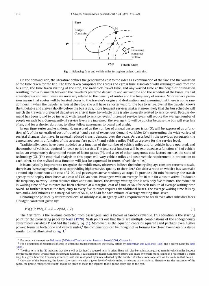
Fare
Vehicle Miles
P*
VM*
A
M
Increasing consumer welfare
Budget Constraint
Fig. 1. Balancing fares and vehicle miles for a given budget constraint.
816 I. Savage / Transportation Research Part A 44 (2010) 815–829
On the demand side, the literature defines the generalized cost to the rider as a combination of the fare and the valuationof the time taken for the trip. The time taken comprises the access and egress time associated with walking to and from thebus stop, the time taken waiting at the stop, the in-vehicle travel time, and any wasted time at the origin or destinationresulting from a mismatch between the traveler’s preferred departure and arrival time and the schedule of the buses. Transitaccess/egress and wait times are inversely related to the density of routes and the frequency of service. More service provi-sion means that routes will be located closer to the traveler’s origin and destination, and assuming that there is some ran-domness in when the traveler arrives at the stop, she will have a shorter wait for the bus to arrive. Even if the traveler knowsthe timetable and arrives shortly before the bus is due, more frequent services makes it more likely that the bus schedule willmatch the traveler’s preferred departure or arrival time. In-vehicle time is also inversely related to service level. Because de-mand has been found to be inelastic with regard to service levels,2 increased service levels will reduce the average number ofpeople on each bus. Consequently, if service levels are increased, the average trip will be quicker because the bus will stop lessoften, and for a shorter duration, to allow fellow passengers to board and alight.
In our time-series analysis, demand, measured as the number of annual passenger trips (Q), will be expressed as a func-tion, q(�), of the generalized cost of travel g(�) and a set of exogenous demand variables (X) representing the wide variety ofsocietal changes that have, in general, reduced transit demand over the years. As described in the previous paragraph, thegeneralized cost is a function of the average fare paid (P) and vehicle miles (VM) as a proxy for the service level.
Traditionally, costs have been modeled as a function of the number of vehicle miles and/or vehicle hours operated, andthe number of vehicles required for peak period service. The total cost function will be expressed as a function, c(�), of vehiclemiles, an exogenously determined vector of factor prices (Y), and a set of other exogenous cost factors such as the state oftechnology (Z). (The empirical analysis in this paper will vary vehicle miles and peak vehicle requirement in proportion toeach other, so the stylized cost function will just be expressed in terms of vehicle miles.)
It is analytically important to recognize that while many observers believe the industry displays constant returns to scale,there is an increasing marginal cost to providing higher service quality to the rider.3 Consider a route on which a bus can makea round trip in one hour at a cost of $100, and passengers arrive randomly at stops. To provide a 20-min frequency, the transitagency must deploy three buses at a cost of $300 an hour. Passengers wait on average for 10 min for a bus to arrive. To doublethe frequency to every 10 min requires three additional buses. The average waiting time is now only five minutes. The reductionin waiting time of five minutes has been achieved at a marginal cost of $300, or $60 for each minute of average waiting timesaved. To further increase the frequency to every five minutes requires six additional buses. The average waiting time falls bytwo-and-a-half minutes at a marginal cost of $600, or $240 for each minute of average waiting time saved.
Denoting the politically determined level of subsidy as B, an agency with a requirement to break even after subsidies facesa budget constraint given by:
2 For3 For
(2008).4 The
averagelong. In
5 Onlpaper, t
P�q½gðP;VMÞ;X� þ B ¼ cðVM; Y; ZÞ: ð1Þ
The first term is the revenue collected from passengers, and is known as farebox revenue. This equation is the startingpoint for the pioneering paper by Nash (1978). Nash points out that there are multiple combinations of the endogenouslydetermined variables P and VM that satisfy Eq. (1). Moreover, as the equation contains squared (and perhaps even higherpower) terms in both price and vehicle miles,4 the combinations can be thought of as forming the closed boundary of a shapesimilar to that illustrated in Fig. 1.5
empirical surveys see Balcombe (2004) and Transportation Research Board (2004, Chapter 9).a discussion of economies of scale in urban bus transportation see the review article by Berechman and Giuliano (1985) and a recent paper by Iseki
first term in Eq. (1) indicates that there will be (at least) a squared term in price. There will also be (at least) a squared term in-vehicle miles becausewaiting time, which enters the demand function, is calculated by dividing a measure of time and space by vehicle miles. (Think of a route that is 5 milesa given hour the frequency of service is 60 min multiplied by 5 miles divided by the number of vehicle miles operated on the route in that hour.)
y part of this boundary, the lowest fare consistent with a given level of vehicle miles, is relevant to the analysis. Therefore, for the remainder of thehe phrase ‘‘budget constraint” should be taken to mean the segment that is to the south and to the east.
I. Savage / Transportation Research Part A 44 (2010) 815–829 817
Nash discusses alternative management objectives that can be pursued within the budget constraint. These includedmaximizing vehicle miles, maximizing passenger trips, and maximizing social welfare. The latter two objectives would beanalytically identical if the agency just served one market, but would differ if passengers could be segmented into separatemarkets (such as by route or time of day) with differing demand characteristics.
Social welfare is defined as the combination of passengers’ surplus and the transit agency’s profit/loss. The former is thearea under the demand curve and above the equilibrium level of generalized cost to the user.6 As the transit agency has tobreak even after subsidies, the latter is defined by Eq. (1) as equivalent to �B. The Lagrangian maximization problem subject to abudget constraint is given by:
6 Alteimplicaadopted
7 For8 A re
London
Max L ¼Z 1
gðP;VMÞq½gðP;VMÞ;X�dg � B� kfP�q½gðP;VMÞ;X� � cðVM;Y; ZÞ þ Bg: ð2Þ
Diagrammatically, the socially optimal combination is determined by overlaying the budget constraint with the contoursof a social welfare ‘‘hill.” Transit riders unambiguously prefer more service and lower fares, so welfare is increasing towardthe southeast in Fig. 1. There will be a tangency point, denoted by A, where welfare is maximized. When fares and servicelevels are at their optimal combination, denoted by P� and VM�, the literature describes them as ‘‘balanced.”
Further theoretical examination of the nature of the maximization problem has occupied many writers over the past30 years (Glaister and Collings, 1978; Panzar, 1979; J.O. Jansson, 1979; K. Jansson, 1993; Frankena, 1983; Savage and Small,2010). Authors have investigated issues such as allowing endogenous determination of the size of the transit vehicles, con-trasting situations where passengers are unaware of the timetable and arrive randomly at stops with situations where theyknow the timetable and select the departure that most closely coincides with their preferred travel time, and whether thefrequency selected by a profit maximizing monopolist differs from the socially optimal frequency.
3. Dynamics in the theoretical model
One of the objectives of this paper is to empirically investigate how the balance point may have changed over time due tovariation in the exogenous variables B, X, Y and Z. Utilizing Fig. 1 to illustrate some comparative static results, an increase insubsidies (B) will shift the relevant portion of the budget constraint moves downward and to the right. For a given level ofvehicle miles the agency can afford to reduce the fares (as transit is generally regarded as price inelastic7), or for a given levelof fares the agency can provide more vehicle miles. The balance point will also move down and to the right indicating that in-creased subsidies should lead to lower optimal fares and increased vehicle miles.
If exogenous factors reduce demand (X), the budget constraint will move upward and to the left. That is to say, in thereverse direction of that associated with an increase in subsidy. Exogenous decreases in demand will lead to a higher bal-anced level of fares, and a decrease in vehicle miles.
An increase in exogenous factor prices (Y) or an adverse exogenous change in technology (Z) will make the relevant part ofthe budget constraint steeper, which is to say it pivots upward relative to the origin. One can unambiguously conclude thatthe balanced level of vehicle miles will decrease, but is unclear whether the balanced level of fares will increase or decrease.This will depend on the shape of the budget constraint and the contours of the welfare hill.
4. Empirical literature
An empirical literature in the early 1980s investigated whether actual fares and service levels deviated from the theoret-ically optimal combination. Glaister (1987), using data from 1982, found that in four of five major British cities there was toomuch service provided at too high a fare. Dodgson (1987) conducted a similar, but somewhat simplified, analysis for Aus-tralian cities using 1982/1983 data and unambiguously found that service was overprovided. An analysis of Chicago in1994 by Savage and Schupp (1997) found results that were in line with the situation in Australia.8
A more recent paper by Glaister (2001) re-estimated his models using data from the late 1990s. In the interim, the Britishbus industry went through privatization and, outside London, deregulation. In contrast to the previous findings, he nowfound that transit riders would prefer the provision of more service at a higher fare. Moreover, in several cities it would evenmake commercial sense to provide more service. Glaister does not explain the conundrum of why some transit companiesare missing out on the profitable provision of additional service. A possible explanation for the reversal in findings is thatderegulation has led to a substantial decline in unit costs, which presumably has made expansion of service less costlyand hence relatively more attractive.
Excepting Glaister (2001), the empirical literature suggests that, in actuality, transit agencies have chosen to locate to thenortheast of the balance point (for example at point M in Fig. 1). The traditional folklore explanation is that transit managers
rnatively one could, as did Nash (1978), measure passengers’ total welfare as the area under the inverse demand curve. However, this has the analyticaltion that the first order conditions are derived for the quantity of passengers and fares, yet the agency is choosing fares and vehicle miles. We have
the alternative surplus specification used by Panzar (1979) in a paper discussing the choice of fares and frequencies by an airline.empirical surveys see Balcombe (2004) and Transportation Research Board (2004, Chapter 12).cent paper by Parry and Small (2009) finds considerable welfare benefits from increasing subsidies to reduce fares in Los Angeles, Washington, DC, and
, but does not address the issue of the optimal mix of fares and service levels.
0
20,000,000
40,000,000
60,000,000
80,000,000
100,000,000
120,000,000
140,000,000
$0.00
$0.20
$0.40
$0.60
$0.80
$1.00
$1.20
$1.40
1953 1958 1963 1968 1973 1978 1983 1988 1993 1998 2003
Average Fare Vehicle Miles
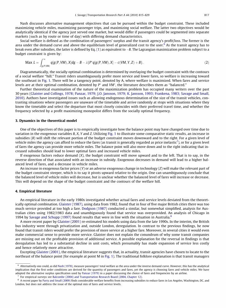
Fig. 2. Trends in real average fare (left axis) and vehicle miles (right axis).
818 I. Savage / Transportation Research Part A 44 (2010) 815–829
have a preference for attempting to maintain service output and employment in a declining market. Nash (1978) formalizedthis objective as ‘‘bus mile maximization.” The implied reasoning for the mangers’ preference is twofold. First, because tran-sit is heavily unionized, managers have shied away from the disutility of negotiating job cuts. Second, because they partiallyrely on taxpayer funding, transit agencies feel obligated to provide service to all neighborhoods, including those that gener-ate limited levels of demand. Moreover, when politicians serve on the boards, or oversight committees, of transit agenciesthey may insist on minimum levels of service provision in the districts that they represent. The rationale being that the sightof buses out on the street is a tangible indication to voters that their representatives are doing their job in providing the‘‘benefits” of transit.
These explanations would suggest that the incentives for the overprovision of service arose or became stronger in the late1960s and the 1970s as transit in most developed countries experienced declining demand, the introduction of substantialsubsidies, and the taking of many previously privately owned operations into the public sector. However, the cross-sectionalnature of the previous literature does not provide any insight into when or why the disparity arose. The current analysis,which utilizes a lengthy time series for one city, aims to investigate the magnitude of the disparity over time, and whetherthe size of the disparity can be explained by changes in the demand and cost functions, and political decisions on the amountof subsidy available.
5. The application to Chicago
The Chicago Transit Authority (CTA) presents a unique opportunity for a time-series analysis. In most cities it is difficult toobtain a lengthy and/or consistent time series of comparable data because of mergers of neighboring companies, expansionof service into newly developed suburbs, regionalization of finances, and privatization and contracting of service. In contrast,the CTA’s basic structure has changed little in 60 years. It has been publicly owned since 1947, was not permitted to expandgeographically to serve the new suburbs that emerged after the Second World War,9 has been untouched by privatization, andstill directly operates its own regular route bus and rail services. While regional mechanisms for transportation financingemerged in the 1970s, the CTA continued to have its own corporate governance, and responsibility for service planning and pric-ing. In 2005, it provided service with a peak requirement of 1700 buses, and 1000 railcars on seven ‘‘elevated” rail routes, in theCity of Chicago and the older inner suburbs.
An earlier analysis by Savage and Schupp (1997) concerned both bus and elevated rail services in 1994. In contrast, thispaper is solely concerned with the bus system, but has a lengthy time series of data. The rail system is not analyzed becausechanges in service output have primarily been associated with new line construction (in the late 1960s, early 1980s, andmid-1990s). In contrast, changes in the bus system have been more gradual and reflective of social and land use changes.The paper uses the shorthand term ‘‘bus” to mean the service on the surface city streets. This service has been providedby a combination of streetcars (which were eliminated by 1958), trolleybuses (which replaced streetcars on many routes
9 These suburbs were served by private and municipal systems that ultimately became part of a separate publicly owned suburban bus company in the 1970sand 1980s. The only major exception was the CTA provision of partial replacement service for a defunct private system in the adjacent suburb of Evanston in1973. However, the amount of mileage was small, representing a fraction of a percent of CTA output.
0
100,000,000
200,000,000
300,000,000
400,000,000
500,000,000
600,000,000
700,000,000
800,000,000
900,000,000
1,000,000,000
1953 1958 1963 1968 1973 1978 1983 1988 1993 1998 2003
Actual At 1953 Fare and Service Levels
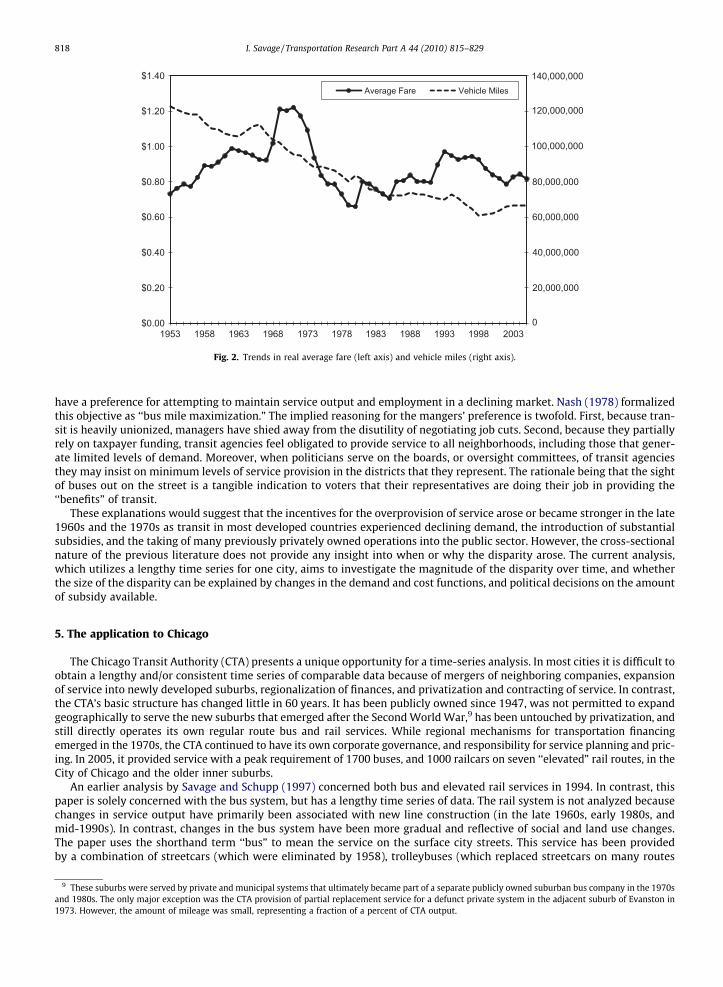
Fig. 3. Trends in surface system unlinked passenger trips.
I. Savage / Transportation Research Part A 44 (2010) 815–829 819
but were themselves eliminated by 1973) and motor buses. The analysis starts in 1953 following the acquisition by the CTAof the Chicago Motor Coach Company in October 1952, and continues to 2005.
While the basic structure of the CTA has not changed, there has been considerable variation in the endogenous and exog-enous variables. The trends in the two main endogenous variables are shown in Fig. 2. Vehicle miles, which are plotted on theright-hand axis, have declined almost continually, and are now 45% below their 1953 value. There were small service in-creases in the mid-1960s and after 1999. In contrast, real average fare (calculated as farebox revenue divided by ridership,and expressed in 2005 dollars using the Consumer Price Index), that is plotted on the left-hand axis, has varied considerably.It increased in the 1950s and 1960s, and reached a record high level in the late 1960s. Real fares fell considerably in the1970s as the nominal fare was held almost constant during an era of high inflation. Real fares started to rise again in the1980s, but there was another 10 year freeze in nominal fares between 1993 and 2003.
Fig. 3 shows a graph of ridership on the surface system. Ridership is measured as annual unlinked trips (a journey thatrequires a transfer to another bus or to the elevated rail system is counted as two trips). Actual ridership, shown as the solidline, fell by two-thirds between 1953 and 2005. Of course, the rise in real fares and the decline in service levels have beenpartly to blame. A counterfactual estimate of demand based on the holding fares and vehicle miles at their 1953 values canbe found by applying elasticities calculated in Savage (2004). This is shown as the dashed line. The continual downwardslope of this dashed line represents the relentless erosion of demand due to the exogenous conditions. The exogenous factorsinclude the end of the 6 day workweek, the rise of home-based entertainment (television), the rise of automobile ownership,the movement of population from traditional cities to the suburbs, and the outward migration of workplaces. Of course, overthe long run, transit policy may have influenced some of these social changes such as the choice of residential and workplacelocation. There does seem to be some leveling off in the downward trend in recent years due to a modest repopulating andgentrification of the inner city.
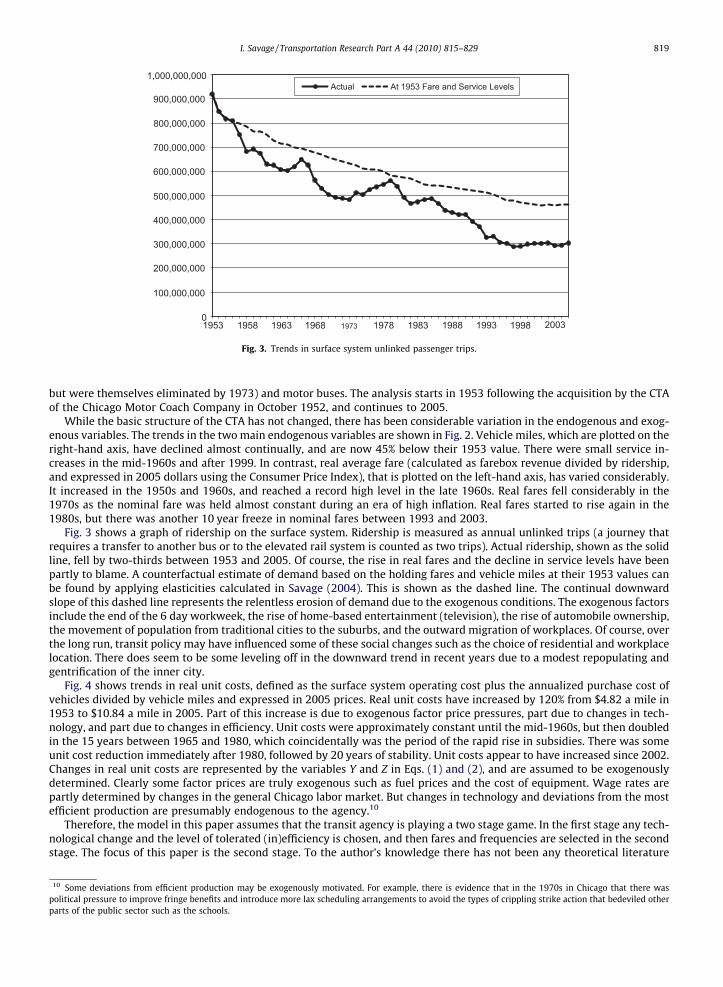
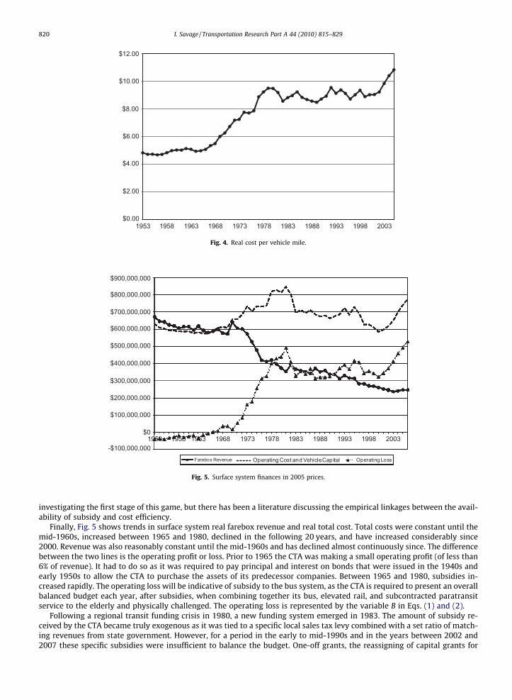
Fig. 4 shows trends in real unit costs, defined as the surface system operating cost plus the annualized purchase cost ofvehicles divided by vehicle miles and expressed in 2005 prices. Real unit costs have increased by 120% from $4.82 a mile in1953 to $10.84 a mile in 2005. Part of this increase is due to exogenous factor price pressures, part due to changes in tech-nology, and part due to changes in efficiency. Unit costs were approximately constant until the mid-1960s, but then doubledin the 15 years between 1965 and 1980, which coincidentally was the period of the rapid rise in subsidies. There was someunit cost reduction immediately after 1980, followed by 20 years of stability. Unit costs appear to have increased since 2002.Changes in real unit costs are represented by the variables Y and Z in Eqs. (1) and (2), and are assumed to be exogenouslydetermined. Clearly some factor prices are truly exogenous such as fuel prices and the cost of equipment. Wage rates arepartly determined by changes in the general Chicago labor market. But changes in technology and deviations from the mostefficient production are presumably endogenous to the agency.10
Therefore, the model in this paper assumes that the transit agency is playing a two stage game. In the first stage any tech-nological change and the level of tolerated (in)efficiency is chosen, and then fares and frequencies are selected in the secondstage. The focus of this paper is the second stage. To the author’s knowledge there has not been any theoretical literature
10 Some deviations from efficient production may be exogenously motivated. For example, there is evidence that in the 1970s in Chicago that there waspolitical pressure to improve fringe benefits and introduce more lax scheduling arrangements to avoid the types of crippling strike action that bedeviled otherparts of the public sector such as the schools.
$0.00
$2.00
$4.00
$6.00
$8.00
$10.00
$12.00
1953 1958 1963 1968 1973 1978 1983 1988 1993 1998 2003
Fig. 4. Real cost per vehicle mile.
-$100,000,000
$0
$100,000,000
$200,000,000
$300,000,000
$400,000,000
$500,000,000
$600,000,000
$700,000,000
$800,000,000
$900,000,000
Farebox Revenue Operating Cost and Vehicle Capital Operating Loss
1953 1958 1963 1968 1973 1978 1983 1988 1993 1998 2003
Fig. 5. Surface system finances in 2005 prices.
820 I. Savage / Transportation Research Part A 44 (2010) 815–829
investigating the first stage of this game, but there has been a literature discussing the empirical linkages between the avail-ability of subsidy and cost efficiency.
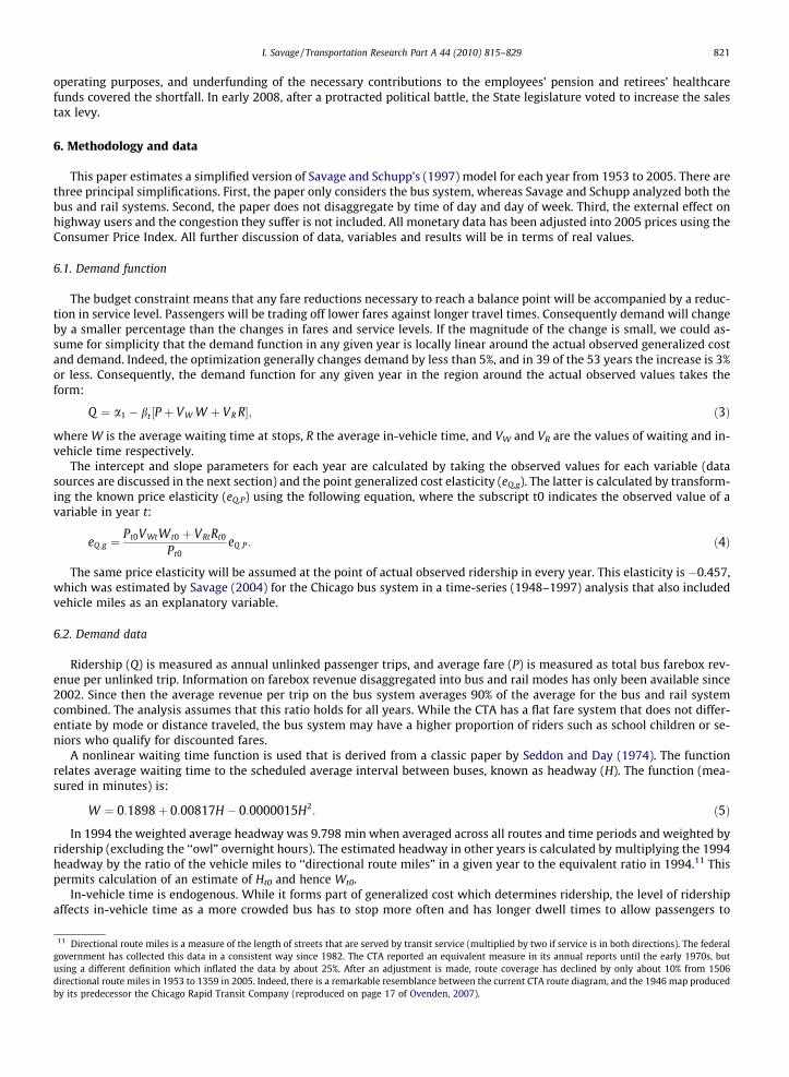
Finally, Fig. 5 shows trends in surface system real farebox revenue and real total cost. Total costs were constant until themid-1960s, increased between 1965 and 1980, declined in the following 20 years, and have increased considerably since2000. Revenue was also reasonably constant until the mid-1960s and has declined almost continuously since. The differencebetween the two lines is the operating profit or loss. Prior to 1965 the CTA was making a small operating profit (of less than6% of revenue). It had to do so as it was required to pay principal and interest on bonds that were issued in the 1940s andearly 1950s to allow the CTA to purchase the assets of its predecessor companies. Between 1965 and 1980, subsidies in-creased rapidly. The operating loss will be indicative of subsidy to the bus system, as the CTA is required to present an overallbalanced budget each year, after subsidies, when combining together its bus, elevated rail, and subcontracted paratransitservice to the elderly and physically challenged. The operating loss is represented by the variable B in Eqs. (1) and (2).
Following a regional transit funding crisis in 1980, a new funding system emerged in 1983. The amount of subsidy re-ceived by the CTA became truly exogenous as it was tied to a specific local sales tax levy combined with a set ratio of match-ing revenues from state government. However, for a period in the early to mid-1990s and in the years between 2002 and2007 these specific subsidies were insufficient to balance the budget. One-off grants, the reassigning of capital grants for
I. Savage / Transportation Research Part A 44 (2010) 815–829 821
operating purposes, and underfunding of the necessary contributions to the employees’ pension and retirees’ healthcarefunds covered the shortfall. In early 2008, after a protracted political battle, the State legislature voted to increase the salestax levy.
6. Methodology and data
This paper estimates a simplified version of Savage and Schupp’s (1997) model for each year from 1953 to 2005. There arethree principal simplifications. First, the paper only considers the bus system, whereas Savage and Schupp analyzed both thebus and rail systems. Second, the paper does not disaggregate by time of day and day of week. Third, the external effect onhighway users and the congestion they suffer is not included. All monetary data has been adjusted into 2005 prices using theConsumer Price Index. All further discussion of data, variables and results will be in terms of real values.
6.1. Demand function
The budget constraint means that any fare reductions necessary to reach a balance point will be accompanied by a reduc-tion in service level. Passengers will be trading off lower fares against longer travel times. Consequently demand will changeby a smaller percentage than the changes in fares and service levels. If the magnitude of the change is small, we could as-sume for simplicity that the demand function in any given year is locally linear around the actual observed generalized costand demand. Indeed, the optimization generally changes demand by less than 5%, and in 39 of the 53 years the increase is 3%or less. Consequently, the demand function for any given year in the region around the actual observed values takes theform:
11 Diregovernmusing adirectioby its p
Q ¼ a1 � bt ½P þ VW W þ VR R�; ð3Þ
where W is the average waiting time at stops, R the average in-vehicle time, and VW and VR are the values of waiting and in-vehicle time respectively.
The intercept and slope parameters for each year are calculated by taking the observed values for each variable (datasources are discussed in the next section) and the point generalized cost elasticity (eQ,g). The latter is calculated by transform-ing the known price elasticity (eQ,P) using the following equation, where the subscript t0 indicates the observed value of avariable in year t:
eQ ;g ¼Pt0VWtWt0 þ VRtRt0
Pt0eQ ;P: ð4Þ
The same price elasticity will be assumed at the point of actual observed ridership in every year. This elasticity is �0.457,which was estimated by Savage (2004) for the Chicago bus system in a time-series (1948–1997) analysis that also includedvehicle miles as an explanatory variable.
6.2. Demand data
Ridership (Q) is measured as annual unlinked passenger trips, and average fare (P) is measured as total bus farebox rev-enue per unlinked trip. Information on farebox revenue disaggregated into bus and rail modes has only been available since2002. Since then the average revenue per trip on the bus system averages 90% of the average for the bus and rail systemcombined. The analysis assumes that this ratio holds for all years. While the CTA has a flat fare system that does not differ-entiate by mode or distance traveled, the bus system may have a higher proportion of riders such as school children or se-niors who qualify for discounted fares.
A nonlinear waiting time function is used that is derived from a classic paper by Seddon and Day (1974). The functionrelates average waiting time to the scheduled average interval between buses, known as headway (H). The function (mea-sured in minutes) is:
W ¼ 0:1898þ 0:00817H � 0:0000015H2: ð5Þ
In 1994 the weighted average headway was 9.798 min when averaged across all routes and time periods and weighted byridership (excluding the ‘‘owl” overnight hours). The estimated headway in other years is calculated by multiplying the 1994headway by the ratio of the vehicle miles to ‘‘directional route miles” in a given year to the equivalent ratio in 1994.11 Thispermits calculation of an estimate of Ht0 and hence Wt0.
In-vehicle time is endogenous. While it forms part of generalized cost which determines ridership, the level of ridershipaffects in-vehicle time as a more crowded bus has to stop more often and has longer dwell times to allow passengers to
ctional route miles is a measure of the length of streets that are served by transit service (multiplied by two if service is in both directions). The federalent has collected this data in a consistent way since 1982. The CTA reported an equivalent measure in its annual reports until the early 1970s, but
different definition which inflated the data by about 25%. After an adjustment is made, route coverage has declined by only about 10% from 1506nal route miles in 1953 to 1359 in 2005. Indeed, there is a remarkable resemblance between the current CTA route diagram, and the 1946 map producedredecessor the Chicago Rapid Transit Company (reproduced on page 17 of Ovenden, 2007).
822 I. Savage / Transportation Research Part A 44 (2010) 815–829
board and alight. In 1994 an average bus passenger’s trip was 2.37 miles long, and he or she would be delayed as a result of10.81 other passengers boarded the vehicle. The generally accepted average boarding times for the type of vehicles used bythe CTA is 2.5 s (0.042 min). Therefore, based on known average speed, in-vehicle time in minutes is given by the equation:
12 Themiles, anumberamountskeptici
13 Thethat the2008). F
R ¼ 13:212þ 0:042ðð2:37 � QÞ=VMÞ: ð6Þ
If there were no passengers on board, the bus would take 13.212 min to travel 2.37 miles. This equation permits calcu-lation of Rt0.12
A standard approach has been used to valuing time. In-vehicle time (VR) is valued at half the average wage rate in a givenyear, and waiting time (VW) at twice this amount (for a review of the absolute values and the ratios of various components ofjourney time see Wardman, 2004). Data on average hourly wages for private non-agricultural industries was obtained fromthe annual Economic Report of the President and adjusted using a methodology described by Gordon (1995). Gordon’s mod-ification is based on the labor share of the national income accounts, and includes allowance for increases in overtime pay-ments, and employer paid fringe benefits and social security contributions. Real wages have increased over the past 50 yearsand the real values of time have similarly increased.13 Of course, it is rather heroic to assume that the socioeconomic charac-teristics of riders have remained constant for 50 years and hence that the value of time of transit riders has remained a constantproportion of the real average wage rate in the economy. In defense of this assumption, it should be pointed out that even todaythe CTA has a very diverse ridership, with plenty of middle and upper income riders especially on the busy services along thelakefront. One would imagine that those riders who abandoned transit for the automobile had the highest value of time andwere the least price sensitive. This would imply that transit riders today would prefer less frequent service at lower fares com-pared with their counterparts in the 1950s.
6.3. Bus operating costs
Costs are the combination of operating costs and the capital costs of vehicles. Operating cost data disaggregated into busand rail components are available since 1982. An appendix to Savage (2004) discusses how total CTA operating costs can bedisaggregated by mode for earlier years. The annualized cost of vehicles, which would normally appear in the capital budget,is also included, as this will vary as service levels are optimized. The purchase costs are annualized over a 12 year life, and areassumed (as was the case in 1994) to be equivalent to 7.31% of operating costs.
In the 1994 analysis, costs were divided by line item into (1) costs that vary with the number of vehicle hours or milesoperated, (2) cost that vary with the number of vehicles owned, and (3) costs that are invariant with the level of service pro-vided (see Table 4 in Savage and Schupp, 1997). For the bus system, about 16% of costs fall into the third category. Becausethis analysis does not disaggregate by time of day or day of week, any changes in vehicle miles will also require a propor-tionate change in the vehicle requirement. Consequently, items (1) and (2) can be amalgamated and expressed in terms of anaverage unit cost per vehicle mile. This will also be taken to be the marginal cost of a vehicle mile. In other words, we areassuming that short run marginal cost is constant and equal to average variable cost, and that there are some overhead coststhat are fixed in the short run. This is consistent with the finding of a contemporary estimation for bus companies in the USMidwest, including the CTA, by Harmatuck (2005).
Denoting the observed operating costs in a given year as OCt0, the cost function used in the optimization is given by:
Ct ¼ 0:16ð1:0731 OCt0Þ þ 0:84½ð1:0731 OCt0Þ=VMt0ÞVMt: ð7Þ
6.4. Optimization process
The basic methodology is to start from the actual observed fare and service level in a given year (Pt0 and VMt0, respec-tively), and then move along a fixed budget constraint (at the actual observed level of subsidy Bt) to find the combinationof fare and vehicle miles that maximize transit riders’ social welfare. Computational simplification was possible becausethe analysis treats riders as a single market, and does not disaggregate by rider type or by time of day or day of week. Con-sequently, the combination of fare and vehicle miles that maximizes rider welfare will occur at the point where ridership ismaximized.
The analysis assumes that any changes in vehicle miles are manifested as changes in the frequency on existing routesrather than by changes in the network structure. Changes in vehicle miles have an inverse effect on headways:
Ht ¼ Ht0ðVMt0=VMtÞ: ð8Þ
average trip length of 2.37 miles will be taken to be constant over time. While the federal government data does require reporting of total passengernd hence the ratio to unlinked passenger trips is the average trip length, this data is not definitive. As it charges a flat fare, the CTA only knows theof boardings. The average trip lengths used to factor this number up to passenger miles is found from annual surveys. The data show an unlikelyof volatility from year-to-year, and data are not available before 1982. Data on passenger miles for bus transit should normally be treated with some
sm.analysis also uses the conventional assumption that the intertemporal income elasticity of the value of time is unity. While some authors have arguedvalue should be less than unity (e.g., Wardman, 2001), there is also recent empirical evidence in favor of the unity assumption (Fosgerau, 2005; Swärdh,or a general discussion of this issue see Section 4 of Hensher and Goodwin (2004).
I. Savage / Transportation Research Part A 44 (2010) 815–829 823
Hence changes in waiting time can be calculated using Eq. (5).Changes in both fare and vehicle miles affect in-vehicle time (Rt) as ridership (Qt) appears on the right-hand side of Eq.
(6).14 Of course, ridership is also a function of in-vehicle time. Therefore, some manipulation and collecting of terms is neces-sary. Substituting Eq. (3) into Eq. (6) and collecting terms produces:
14 To gis estimand len
Rt ¼1
1þ 0:09954 bt VRtVMt
" #13:212þ 0:09954
at � btðPt þ VWt WtÞVMt
� �: ð9Þ
The mathematics of the optimization is a two stage process. The first stage involves substituting Eqs. (5), (8), and (9) intoEq. (3), and then substituting Eqs. (3) and (7) into Eq. (1). The budget constraint then comprises fixed parameters and the fareand vehicle mile variables. The budget constraint can then be manipulated to obtain an expression for fare in terms of vehiclemiles. As the budget constraint takes on the closed form illustrated in Fig. 1, only the lowest fare for a given level of vehiclemiles is used. The second stage involves substituting the relationship between fare and vehicle miles given by the budgetconstraint back into Eq. (3) and finding the level of fares that maximizes passenger numbers. This produces the balancedvalues of fare and vehicle miles for each year (P�t and VM�
t respectively).
7. Other considerations excluded from the optimization
7.1. Road congestion
Savage and Schupp (1997) also attempted to quantify the benefits of reduced congestion for road users resulting fromimprovements in transit services. Benefits were assumed to only accrue in peak periods when congestion is the most severe.Reductions in road traffic were associated with the mode switching of a subset of the new transit riders who were formerlyauto drivers or taxi passengers. The calculations were problematic. There was comparatively little information of the previ-ous mode choice of new transit riders. Moreover, there was little to no quantitative information available on the level of con-gestion actually experienced on the city’s arterial and local streets. Given the rather heroic assumptions and calculationsrequired in the earlier analysis, this paper does not attempt to extrapolate these benefits to other years.
Savage and Schupp (1997) did have some startling findings. In the weekday peak period, reducing fares on the buses wasfound to generate additional congestion reduction benefits equivalent to 9% of the benefits accruing directly to bus riders inthe peak. However, improving bus service by operating more vehicle miles actually had a negative net effect on traffic con-gestion! A marginal bus mile was estimated to remove just 1.24 auto miles from the road. Unfortunately, the Highway Capac-ity Manual (TRB, 2000, p. 12:41) recommends that a bus that stops in the roadway rather than in bus bays is counted as theequivalent of 4.37 cars in traffic flow models. Overall, a third of the benefits to bus riders in the weekday peak periods fromincreased frequencies were offset by the worse road congestion that the additional buses caused.
Therefore, in interpreting the findings of this paper, the reader should remember that incorporating road congestionwould reinforce the argument that society would be better off if less transit service was provided at a lower fare. Evidenceon the magnitude of this effect is discussed later.
7.2. Other benefits of transit
Neither the earlier literature nor this paper quantifies the wider benefits of transit. It is frequently argued that transitserves a social role by providing the ability for persons of modest means and/or those who live in socially segregated areasto access jobs and hence share in the economic vitality of the city (O’Regan and Quigley, 1999). Transit can also affect landuse patterns, and bring about agglomeration economies. Chicago is an example of what Thomson (1977) termed a ‘‘weakcentered city.” These cities have to struggle to maintain a downtown, and to discourage economic activity from movingto the suburbs. A subsidized radial transit system is part of the cost of supporting an active and viable downtown.
Compared with fare and travel time savings, it is difficult to assign monetary values to social and land use benefits. How-ever, it is reasonable to assume that the magnitude of these latter benefits will monotonically increase with transit systemridership. Therefore balancing fares and service levels so that demand and rider benefits are maximized should also be asso-ciated with maximizing these other benefits within a given budget constraint.
8. Results
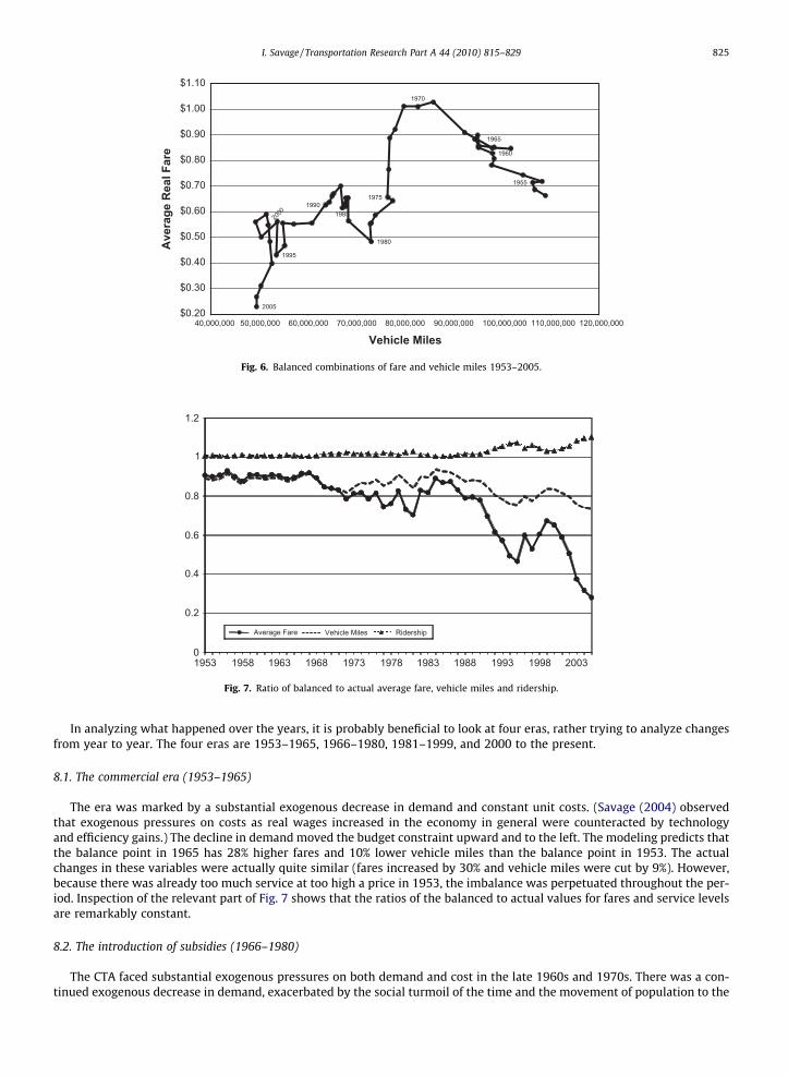
The actual and the calculated balanced levels of fares and service levels in each year are shown in Table 1. The table alsoshows the actual ridership and the estimated ridership at the balance point. Figures can be used to illustrate the answers tothe two questions that this paper set out to answer. The first question concerns how the balance point has changed overtime. The trajectory of the balance point is shown in Fig. 6, with fares are plot on the vertical axis and vehicle miles on
ive some idea of the variation in in-vehicle time, the average load factor (passenger miles divided by bus miles) declined by 40% from 1953 to 2005, andated to have speeded up the average journey by 18 s. The balancing of fares and frequency, taking 2005 as an example, would boost load factors by 49%gthen the average journey by 13 s. The load factor at the balance point in 2005 would still be lower than the actual load factor in 1953.
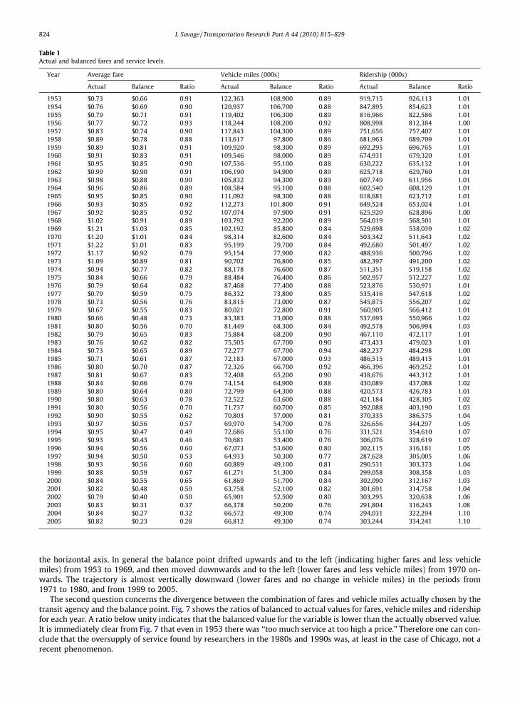
Table 1Actual and balanced fares and service levels.
Year Average fare Vehicle miles (000s) Ridership (000s)
Actual Balance Ratio Actual Balance Ratio Actual Balance Ratio
1953 $0.73 $0.66 0.91 122,363 108,900 0.89 919,715 926,113 1.011954 $0.76 $0.69 0.90 120,937 106,700 0.88 847,895 854,623 1.011955 $0.79 $0.71 0.91 119,402 106,300 0.89 816,966 822,586 1.011956 $0.77 $0.72 0.93 118,244 108,200 0.92 808,998 812,384 1.001957 $0.83 $0.74 0.90 117,843 104,300 0.89 751,656 757,407 1.011958 $0.89 $0.78 0.88 113,617 97,800 0.86 681,963 689,709 1.011959 $0.89 $0.81 0.91 109,920 98,300 0.89 692,295 696,765 1.011960 $0.91 $0.83 0.91 109,546 98,000 0.89 674,931 679,320 1.011961 $0.95 $0.85 0.90 107,536 95,100 0.88 630,222 635,132 1.011962 $0.99 $0.90 0.91 106,190 94,900 0.89 625,718 629,760 1.011963 $0.98 $0.88 0.90 105,832 94,300 0.89 607,749 611,956 1.011964 $0.96 $0.86 0.89 108,584 95,100 0.88 602,540 608,129 1.011965 $0.95 $0.85 0.90 111,092 98,300 0.88 618,681 623,712 1.011966 $0.93 $0.85 0.92 112,273 101,800 0.91 649,524 653,024 1.011967 $0.92 $0.85 0.92 107,074 97,900 0.91 625,920 628,896 1.001968 $1.02 $0.91 0.89 103,792 92,200 0.89 564,019 568,501 1.011969 $1.21 $1.03 0.85 102,192 85,800 0.84 529,698 538,039 1.021970 $1.20 $1.01 0.84 98,314 82,600 0.84 503,342 511,643 1.021971 $1.22 $1.01 0.83 95,199 79,700 0.84 492,680 501,497 1.021972 $1.17 $0.92 0.79 95,154 77,900 0.82 488,936 500,796 1.021973 $1.09 $0.89 0.81 90,702 76,800 0.85 482,397 491,200 1.021974 $0.94 $0.77 0.82 88,178 76,600 0.87 511,351 519,158 1.021975 $0.84 $0.66 0.79 88,484 76,400 0.86 502,957 512,227 1.021976 $0.79 $0.64 0.82 87,468 77,400 0.88 523,876 530,971 1.011977 $0.79 $0.59 0.75 86,332 73,800 0.85 535,416 547,618 1.021978 $0.73 $0.56 0.76 83,815 73,000 0.87 545,875 556,207 1.021979 $0.67 $0.55 0.83 80,021 72,800 0.91 560,905 566,412 1.011980 $0.66 $0.48 0.73 83,383 73,000 0.88 537,693 550,966 1.021981 $0.80 $0.56 0.70 81,449 68,300 0.84 492,578 506,994 1.031982 $0.79 $0.65 0.83 75,884 68,200 0.90 467,110 472,117 1.011983 $0.76 $0.62 0.82 75,505 67,700 0.90 473,433 479,023 1.011984 $0.73 $0.65 0.89 72,277 67,700 0.94 482,237 484,298 1.001985 $0.71 $0.61 0.87 72,183 67,000 0.93 486,515 489,415 1.011986 $0.80 $0.70 0.87 72,326 66,700 0.92 466,396 469,252 1.011987 $0.81 $0.67 0.83 72,408 65,200 0.90 438,676 443,312 1.011988 $0.84 $0.66 0.79 74,154 64,900 0.88 430,089 437,088 1.021989 $0.80 $0.64 0.80 72,799 64,300 0.88 420,573 426,783 1.011990 $0.80 $0.63 0.78 72,522 63,600 0.88 421,184 428,305 1.021991 $0.80 $0.56 0.70 71,737 60,700 0.85 392,088 403,190 1.031992 $0.90 $0.55 0.62 70,803 57,000 0.81 370,335 386,575 1.041993 $0.97 $0.56 0.57 69,970 54,700 0.78 326,656 344,297 1.051994 $0.95 $0.47 0.49 72,686 55,100 0.76 331,521 354,610 1.071995 $0.93 $0.43 0.46 70,681 53,400 0.76 306,076 328,619 1.071996 $0.94 $0.56 0.60 67,073 53,600 0.80 302,115 316,181 1.051997 $0.94 $0.50 0.53 64,933 50,300 0.77 287,628 305,005 1.061998 $0.93 $0.56 0.60 60,889 49,100 0.81 290,531 303,373 1.041999 $0.88 $0.59 0.67 61,271 51,300 0.84 299,058 308,358 1.032000 $0.84 $0.55 0.65 61,869 51,700 0.84 302,090 312,167 1.032001 $0.82 $0.48 0.59 63,758 52,100 0.82 301,691 314,758 1.042002 $0.79 $0.40 0.50 65,901 52,500 0.80 303,295 320,638 1.062003 $0.83 $0.31 0.37 66,378 50,200 0.76 291,804 316,243 1.082004 $0.84 $0.27 0.32 66,572 49,300 0.74 294,031 322,294 1.102005 $0.82 $0.23 0.28 66,812 49,300 0.74 303,244 334,241 1.10
824 I. Savage / Transportation Research Part A 44 (2010) 815–829
the horizontal axis. In general the balance point drifted upwards and to the left (indicating higher fares and less vehiclemiles) from 1953 to 1969, and then moved downwards and to the left (lower fares and less vehicle miles) from 1970 on-wards. The trajectory is almost vertically downward (lower fares and no change in vehicle miles) in the periods from1971 to 1980, and from 1999 to 2005.
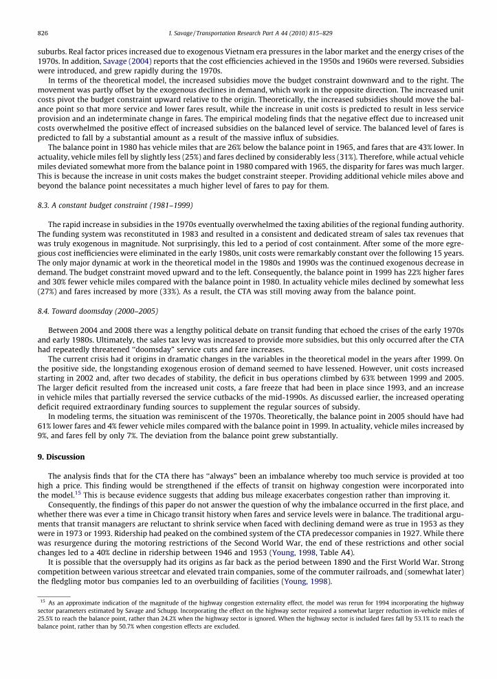
The second question concerns the divergence between the combination of fares and vehicle miles actually chosen by thetransit agency and the balance point. Fig. 7 shows the ratios of balanced to actual values for fares, vehicle miles and ridershipfor each year. A ratio below unity indicates that the balanced value for the variable is lower than the actually observed value.It is immediately clear from Fig. 7 that even in 1953 there was ‘‘too much service at too high a price.” Therefore one can con-clude that the oversupply of service found by researchers in the 1980s and 1990s was, at least in the case of Chicago, not arecent phenomenon.
1
Average Fare Vehicle Miles Ridership
0
0.2
0.4
0.6
0.8
1.2
1953 1958 1963 1968 1973 1978 1983 1988 1993 1998 2003
Fig. 7. Ratio of balanced to actual average fare, vehicle miles and ridership.
1955
1960
1965
1970
1975
1980
1985 1990
1995
2005$0.20
$0.30
$0.40
$0.50
$0.60
$0.70
$0.80
$0.90
$1.00
$1.10
40,000,000 50,000,000 60,000,000 70,000,000 80,000,000 90,000,000 100,000,000 110,000,000 120,000,000
Ave
rage
Rea
l Far
e
Vehicle Miles
Fig. 6. Balanced combinations of fare and vehicle miles 1953–2005.
I. Savage / Transportation Research Part A 44 (2010) 815–829 825
In analyzing what happened over the years, it is probably beneficial to look at four eras, rather trying to analyze changesfrom year to year. The four eras are 1953–1965, 1966–1980, 1981–1999, and 2000 to the present.
8.1. The commercial era (1953–1965)
The era was marked by a substantial exogenous decrease in demand and constant unit costs. (Savage (2004) observedthat exogenous pressures on costs as real wages increased in the economy in general were counteracted by technologyand efficiency gains.) The decline in demand moved the budget constraint upward and to the left. The modeling predicts thatthe balance point in 1965 has 28% higher fares and 10% lower vehicle miles than the balance point in 1953. The actualchanges in these variables were actually quite similar (fares increased by 30% and vehicle miles were cut by 9%). However,because there was already too much service at too high a price in 1953, the imbalance was perpetuated throughout the per-iod. Inspection of the relevant part of Fig. 7 shows that the ratios of the balanced to actual values for fares and service levelsare remarkably constant.
8.2. The introduction of subsidies (1966–1980)
The CTA faced substantial exogenous pressures on both demand and cost in the late 1960s and 1970s. There was a con-tinued exogenous decrease in demand, exacerbated by the social turmoil of the time and the movement of population to the
826 I. Savage / Transportation Research Part A 44 (2010) 815–829
suburbs. Real factor prices increased due to exogenous Vietnam era pressures in the labor market and the energy crises of the1970s. In addition, Savage (2004) reports that the cost efficiencies achieved in the 1950s and 1960s were reversed. Subsidieswere introduced, and grew rapidly during the 1970s.
In terms of the theoretical model, the increased subsidies move the budget constraint downward and to the right. Themovement was partly offset by the exogenous declines in demand, which work in the opposite direction. The increased unitcosts pivot the budget constraint upward relative to the origin. Theoretically, the increased subsidies should move the bal-ance point so that more service and lower fares result, while the increase in unit costs is predicted to result in less serviceprovision and an indeterminate change in fares. The empirical modeling finds that the negative effect due to increased unitcosts overwhelmed the positive effect of increased subsidies on the balanced level of service. The balanced level of fares ispredicted to fall by a substantial amount as a result of the massive influx of subsidies.
The balance point in 1980 has vehicle miles that are 26% below the balance point in 1965, and fares that are 43% lower. Inactuality, vehicle miles fell by slightly less (25%) and fares declined by considerably less (31%). Therefore, while actual vehiclemiles deviated somewhat more from the balance point in 1980 compared with 1965, the disparity for fares was much larger.This is because the increase in unit costs makes the budget constraint steeper. Providing additional vehicle miles above andbeyond the balance point necessitates a much higher level of fares to pay for them.
8.3. A constant budget constraint (1981–1999)
The rapid increase in subsidies in the 1970s eventually overwhelmed the taxing abilities of the regional funding authority.The funding system was reconstituted in 1983 and resulted in a consistent and dedicated stream of sales tax revenues thatwas truly exogenous in magnitude. Not surprisingly, this led to a period of cost containment. After some of the more egre-gious cost inefficiencies were eliminated in the early 1980s, unit costs were remarkably constant over the following 15 years.The only major dynamic at work in the theoretical model in the 1980s and 1990s was the continued exogenous decrease indemand. The budget constraint moved upward and to the left. Consequently, the balance point in 1999 has 22% higher faresand 30% fewer vehicle miles compared with the balance point in 1980. In actuality vehicle miles declined by somewhat less(27%) and fares increased by more (33%). As a result, the CTA was still moving away from the balance point.
8.4. Toward doomsday (2000–2005)
Between 2004 and 2008 there was a lengthy political debate on transit funding that echoed the crises of the early 1970sand early 1980s. Ultimately, the sales tax levy was increased to provide more subsidies, but this only occurred after the CTAhad repeatedly threatened ‘‘doomsday” service cuts and fare increases.
The current crisis had it origins in dramatic changes in the variables in the theoretical model in the years after 1999. Onthe positive side, the longstanding exogenous erosion of demand seemed to have lessened. However, unit costs increasedstarting in 2002 and, after two decades of stability, the deficit in bus operations climbed by 63% between 1999 and 2005.The larger deficit resulted from the increased unit costs, a fare freeze that had been in place since 1993, and an increasein vehicle miles that partially reversed the service cutbacks of the mid-1990s. As discussed earlier, the increased operatingdeficit required extraordinary funding sources to supplement the regular sources of subsidy.
In modeling terms, the situation was reminiscent of the 1970s. Theoretically, the balance point in 2005 should have had61% lower fares and 4% fewer vehicle miles compared with the balance point in 1999. In actuality, vehicle miles increased by9%, and fares fell by only 7%. The deviation from the balance point grew substantially.
9. Discussion
The analysis finds that for the CTA there has ‘‘always” been an imbalance whereby too much service is provided at toohigh a price. This finding would be strengthened if the effects of transit on highway congestion were incorporated intothe model.15 This is because evidence suggests that adding bus mileage exacerbates congestion rather than improving it.
Consequently, the findings of this paper do not answer the question of why the imbalance occurred in the first place, andwhether there was ever a time in Chicago transit history when fares and service levels were in balance. The traditional argu-ments that transit managers are reluctant to shrink service when faced with declining demand were as true in 1953 as theywere in 1973 or 1993. Ridership had peaked on the combined system of the CTA predecessor companies in 1927. While therewas resurgence during the motoring restrictions of the Second World War, the end of these restrictions and other socialchanges led to a 40% decline in ridership between 1946 and 1953 (Young, 1998, Table A4).
It is possible that the oversupply had its origins as far back as the period between 1890 and the First World War. Strongcompetition between various streetcar and elevated train companies, some of the commuter railroads, and (somewhat later)the fledgling motor bus companies led to an overbuilding of facilities (Young, 1998).
15 As an approximate indication of the magnitude of the highway congestion externality effect, the model was rerun for 1994 incorporating the highwaysector parameters estimated by Savage and Schupp. Incorporating the effect on the highway sector required a somewhat larger reduction in-vehicle miles of25.5% to reach the balance point, rather than 24.2% when the highway sector is ignored. When the highway sector is included fares fall by 53.1% to reach thebalance point, rather than by 50.7% when congestion effects are excluded.
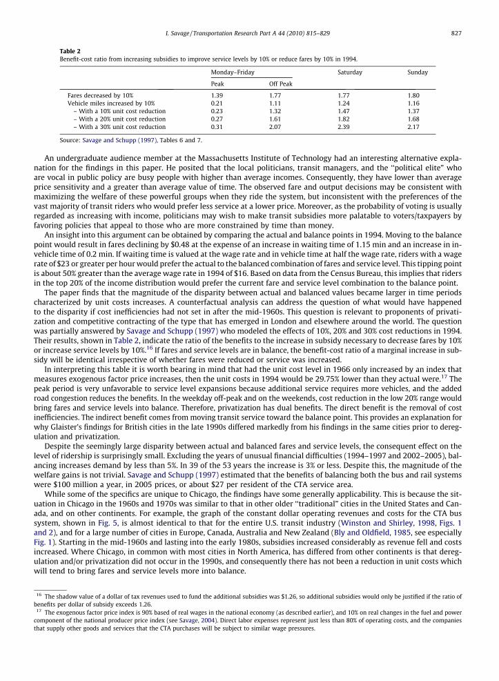
Table 2Benefit-cost ratio from increasing subsidies to improve service levels by 10% or reduce fares by 10% in 1994.
Monday–Friday Saturday Sunday
Peak Off Peak
Fares decreased by 10% 1.39 1.77 1.77 1.80Vehicle miles increased by 10% 0.21 1.11 1.24 1.16
– With a 10% unit cost reduction 0.23 1.32 1.47 1.37– With a 20% unit cost reduction 0.27 1.61 1.82 1.68– With a 30% unit cost reduction 0.31 2.07 2.39 2.17
Source: Savage and Schupp (1997), Tables 6 and 7.
I. Savage / Transportation Research Part A 44 (2010) 815–829 827
An undergraduate audience member at the Massachusetts Institute of Technology had an interesting alternative expla-nation for the findings in this paper. He posited that the local politicians, transit managers, and the ‘‘political elite” whoare vocal in public policy are busy people with higher than average incomes. Consequently, they have lower than averageprice sensitivity and a greater than average value of time. The observed fare and output decisions may be consistent withmaximizing the welfare of these powerful groups when they ride the system, but inconsistent with the preferences of thevast majority of transit riders who would prefer less service at a lower price. Moreover, as the probability of voting is usuallyregarded as increasing with income, politicians may wish to make transit subsidies more palatable to voters/taxpayers byfavoring policies that appeal to those who are more constrained by time than money.
An insight into this argument can be obtained by comparing the actual and balance points in 1994. Moving to the balancepoint would result in fares declining by $0.48 at the expense of an increase in waiting time of 1.15 min and an increase in in-vehicle time of 0.2 min. If waiting time is valued at the wage rate and in vehicle time at half the wage rate, riders with a wagerate of $23 or greater per hour would prefer the actual to the balanced combination of fares and service level. This tipping pointis about 50% greater than the average wage rate in 1994 of $16. Based on data from the Census Bureau, this implies that ridersin the top 20% of the income distribution would prefer the current fare and service level combination to the balance point.
The paper finds that the magnitude of the disparity between actual and balanced values became larger in time periodscharacterized by unit costs increases. A counterfactual analysis can address the question of what would have happenedto the disparity if cost inefficiencies had not set in after the mid-1960s. This question is relevant to proponents of privati-zation and competitive contracting of the type that has emerged in London and elsewhere around the world. The questionwas partially answered by Savage and Schupp (1997) who modeled the effects of 10%, 20% and 30% cost reductions in 1994.Their results, shown in Table 2, indicate the ratio of the benefits to the increase in subsidy necessary to decrease fares by 10%or increase service levels by 10%.16 If fares and service levels are in balance, the benefit-cost ratio of a marginal increase in sub-sidy will be identical irrespective of whether fares were reduced or service was increased.
In interpreting this table it is worth bearing in mind that had the unit cost level in 1966 only increased by an index thatmeasures exogenous factor price increases, then the unit costs in 1994 would be 29.75% lower than they actual were.17 Thepeak period is very unfavorable to service level expansions because additional service requires more vehicles, and the addedroad congestion reduces the benefits. In the weekday off-peak and on the weekends, cost reduction in the low 20% range wouldbring fares and service levels into balance. Therefore, privatization has dual benefits. The direct benefit is the removal of costinefficiencies. The indirect benefit comes from moving transit service toward the balance point. This provides an explanation forwhy Glaister’s findings for British cities in the late 1990s differed markedly from his findings in the same cities prior to dereg-ulation and privatization.
Despite the seemingly large disparity between actual and balanced fares and service levels, the consequent effect on thelevel of ridership is surprisingly small. Excluding the years of unusual financial difficulties (1994–1997 and 2002–2005), bal-ancing increases demand by less than 5%. In 39 of the 53 years the increase is 3% or less. Despite this, the magnitude of thewelfare gains is not trivial. Savage and Schupp (1997) estimated that the benefits of balancing both the bus and rail systemswere $100 million a year, in 2005 prices, or about $27 per resident of the CTA service area.
While some of the specifics are unique to Chicago, the findings have some generally applicability. This is because the sit-uation in Chicago in the 1960s and 1970s was similar to that in other older ‘‘traditional” cities in the United States and Can-ada, and on other continents. For example, the graph of the constant dollar operating revenues and costs for the CTA bussystem, shown in Fig. 5, is almost identical to that for the entire U.S. transit industry (Winston and Shirley, 1998, Figs. 1and 2), and for a large number of cities in Europe, Canada, Australia and New Zealand (Bly and Oldfield, 1985, see especiallyFig. 1). Starting in the mid-1960s and lasting into the early 1980s, subsidies increased considerably as revenue fell and costsincreased. Where Chicago, in common with most cities in North America, has differed from other continents is that dereg-ulation and/or privatization did not occur in the 1990s, and consequently there has not been a reduction in unit costs whichwill tend to bring fares and service levels more into balance.
16 The shadow value of a dollar of tax revenues used to fund the additional subsidies was $1.26, so additional subsidies would only be justified if the ratio ofbenefits per dollar of subsidy exceeds 1.26.
17 The exogenous factor price index is 90% based of real wages in the national economy (as described earlier), and 10% on real changes in the fuel and powercomponent of the national producer price index (see Savage, 2004). Direct labor expenses represent just less than 80% of operating costs, and the companiesthat supply other goods and services that the CTA purchases will be subject to similar wage pressures.
828 I. Savage / Transportation Research Part A 44 (2010) 815–829
Finally, while the paper has analyzed a transportation problem, if service level is viewed as a measure of product quality,this problem can be generalized to one that firms face in many industries in both the public and private sectors (see Spence(1975) and Sheshinski (1976) for the underlying theory, and Crawford and Shum (2007) for a recent empirical application).Firms have to decide on the quality as well as the price of their product, given that quality is valued by the customer butcostly to provide.
10. Conclusions
Empirical analyses in the 1980s and 1990s found that transit agencies tended to provide more service, at higher fares,than the combination that maximized rider benefits. This literature was typically cross-sectional in nature comparing theexperiences in different cities. The cross-sectional nature of these analyses meant that researchers were unable to addressthe question of when and why the oversupply occurred.
This paper takes a time-series approach and analyses the surface transit (motor bus/trolley bus/streetcar) service pro-vided by the Chicago Transit Authority between 1953 and 2005. The CTA provides the analyst with a unique opportunityto make a time-series analysis of a firm that has changed very little in its general structure for more than 50 years, buthas witnessed wild swings in price, output and the degree of subsidization.
The paper calculates how the social welfare maximizing combination of fares and service levels has changed over timedue to exogenous changes in the demand and cost functions, and political decisions on changing the budget constraint(i.e., subsidy) faced by the agency. The paper also compares the optimal combination with the actual choices made by transitauthority management. The paper finds that even in the 1950s, there was too much service provided at too high a fare. Theimbalance between fares and service frequency became larger in the 1970s when the introduction of operating subsidiescoincided with an increase in the unit cost of service provision.
Acknowledgment
I would like to thank David M. Levinson (University of Minnesota) for asking a question at a presentation of my 2004 pa-per that sparked my interest in undertaking this analysis.
References
Balcombe, R. (Ed.), 2004. The Demand for Public Transport: A Practical Guide. Report TRL593. TRL Limited, Wokingham, UK.Berechman, J., Giuliano, G., 1985. Economies of scale in bus transit: a review of concepts and evidence. Transportation 12, 313–332.Bly, P.H., Oldfield, R.H., 1985. Relationships between Public Transport Subsidies and Fares, Service, Costs and Productivity. Research Report 24. Transport
and Road Research Laboratory, Crowthorne, UK.Crawford, G.S., Shum, M., 2007. Monopoly quality degradation and regulation in cable television. Journal of Law and Economics 50, 181–209.Dodgson, J.S., 1987. Benefits of changes in urban public transport subsidies in the major Australian cities. In: Glaister, S. (Ed.), Transport Subsidy. Policy
Journals, Newbury, UK, pp. 52–62.Fosgerau, M., 2005. Unit Income Elasticity of the Value of Travel Time Savings. Danish Transport Research Institute, Mimeo.Foster, C., Golay, J., 1986. Some curious old practices and their relevance to equilibrium in bus competition. Journal of Transport Economics and Policy 20,
191–216.Frankena, M.W., 1983. The efficiency of public transport objectives and subsidy formulas. Journal of Transport Economics and Policy 17, 67–76.Glaister, S., 1987. Allocation of urban public transport subsidy. In: Glaister, S. (Ed.), Transport Subsidy. Policy Journals, Newbury, UK, pp. 27–39.Glaister, S., 2001. The economic assessment of local transport subsidies in large cities. In: Grayling, A. (Ed.), Any More Fares? Delivering Better Bus Services.
Institute for Public Policy Research, London, pp. 55–76.Glaister, S., Collings, J.J., 1978. Maximization of passenger miles in theory and practice. Journal of Transport Economics and Policy 12, 304–321.Gordon, R.J., 1995. The American Real Wage Since 1963: Is it Unchanged or has it More than doubled? Northwestern University, Mimeo.Harmatuck, D.J., 2005. Cost functions and efficiency: estimates of Midwest bus transit systems. Transportation Research Record 1932, 43–53.Hensher, D.A., Goodwin, P., 2004. Using values of travel time savings for toll roads: avoiding some common errors. Transport Policy 11, 171–181.Iseki, H., 2008. Economies of scale in bus transit service in the USA: how does cost efficiency vary by agency size and level of contracting? Transportation
Research Part A 42, 1086–1097.Jansson, J.O., 1979. Marginal cost pricing of scheduled transport services. Journal of Transport Economics and Policy 13, 268–294.Jansson, K., 1993. Optimal public transport price and service frequency. Journal of Transport Economics and Policy 27, 33–50.Mohring, H., 1972. Optimization and scale economies in urban bus transportation. American Economic Review 62, 591–604.Nash, C.A., 1978. Management objectives, fares and service in bus transport. Journal of Transport Economics and Policy 12, 70–85.O’Regan, K.M., Quigley, J.M., 1999. Accessibility and economic opportunity. In: Gómez-Ibáñez, J.A., Tye, W.B., Winston, C. (Eds.), Essays in Transportation
Economics and Policy: A Handbook in Honor of John R. Meyer. Brookings Institution, Washington, DC, pp. 437–466.Ovenden, M., 2007. Transit Maps of the World. Penguin, London.Panzar, J.C., 1979. Equilibrium and welfare in unregulated airline markets. American Economic Review 69, 92–95.Parry, I.W.H., Small, K.A., 2009. Should urban transit subsidies be reduced? American Economic Review 99, 700–724.Savage, I., 2004. Management objectives and the causes of mass transit deficits. Transportation Research Part A 38, 181–199.Savage, I., Schupp, A., 1997. Evaluating transit subsidies in Chicago. Journal of Public Transportation 1, 93–117.Savage, I., Small, K.A., 2010. A comment on ‘‘subsidization of urban public transport and the Mohring effect”. Journal of Transport Economics and Policy 44,
373–380.Seddon, P.A., Day, M.P., 1974. Bus passenger waiting times in Greater Manchester. Traffic Engineering and Control 15, 442–445.Sheshinski, E., 1976. Price, quality and quantity regulation in monopoly situations. Economica 43, 127–137.Spence, A.M., 1975. Monopoly, quality, and regulation. Bell Journal of Economics 6, 417–429.Swärdh, J.-E., 2008. Is the Intertemporal Income Elasticity of the Value of Travel Time Unity? Swedish National Road and Transport Research Institute,
Mimeo.Thomson, J.M., 1977. Great Cities and their Traffic. Penguin, Harmondsworth, UK.Transportation Research Board, 2000. Highway Capacity Manual. National Research Council, Washington, DC.
I. Savage / Transportation Research Part A 44 (2010) 815–829 829
Transportation Research Board, 2004. Traveler Response to Transportation System Changes. Transit Cooperative Research Program (TCRP) Report 95.National Research Council, Washington, DC.
Wardman, M., 2001. Inter-temporal Variations in the Value of Time. Institute for Transport Studies Working Paper 566. University of Leeds.Wardman, M., 2004. Public transport values of time. Transport Policy 11, 363–377.Winston, C., Shirley, C., 1998. Alternative Route: Toward Efficient Urban Transportation. Brookings Institution Press, Washington, DC.Young, D.M., 1998. Chicago Transit: An Illustrated History. Northern Illinois University Press, DeKalb, IL.