Embed Size (px)
Citation preview

CONGRESS OF THE UNITED STATESCONGRESSIONAL BUDGET OFFICE
OCTOBER 2020
The Distribution of Household Income, 2017
0
100
200
300
400
Federal TaxesIncome BeforeTransfers and Taxes
Income AfterTransfers and Taxes
Means−Tested Transfers
Thousands of DollarsAverage Income, Means-Tested Transfers, and Federal Taxes
+ - =
LowestQuintile
HighestQuintile

www.cbo.gov/publication/56575
At a GlanceThe Congressional Budget Office regularly analyzes the distribution of income in the United States and how that distribution has changed over time. As an update to that series, this report presents the distributions of household income, means-tested transfers, and federal taxes between 1979 and 2017 (the most recent year for which tax data were available when this analysis was conducted).
• Income. Households at the top of the income distribution received significantly more income than households at the bottom. Between 1979 and 2017, average income, both before and after means-tested transfers and federal taxes, grew for all quintiles (or fifths) of the distribution, but it increased more among the highest quintile than among all others.
• Means-Tested Transfers. Means-tested transfers are cash payments and in-kind benefits from federal, state, and local governments designed to assist individuals and families who have low income and few assets. Between 1979 and 2017, households in the lowest quintile received more than half of all means-tested transfers. Average means-tested transfer rates, which are the ratios of total means-tested transfers to total income before transfers and taxes, rose over the 39-year period, primarily driven by an increase in Medicaid spending.
• Federal Taxes. In general, higher-income households paid a higher average federal tax rate than lower-income households. Average federal tax rates fell between 1979 and 2017 across the income distribution, with the sharpest decline in the lowest quintile.
• Income Inequality. Income inequality, as measured by the Gini coefficients for income both before and after transfers and taxes, rose between 1979 and 2017. (A Gini coefficient is a standard measure of income inequality that summarizes an entire distribution in a single number.) The degree to which transfers and taxes reduced income inequality over that same period increased.

Contents
Summary 1How Did Means-Tested Transfers and Federal Taxes Affect Household Income in 2017? 2How Were Means-Tested Transfers and Federal Taxes Distributed in 2017? 2What Are the Trends in Household Income and Income Inequality? 3
Income Before Transfers and Taxes 5Exhibits 1–6
Means-Tested Transfers 12Exhibits 7–9
Federal Taxes 16Exhibits 10–16
Income After Transfers and Taxes 24Exhibits 17–21
Income Inequality 30Exhibits 22–23
Appendix A: Data and Methods 33
Appendix B: Definitions 38
About This Document 40

List of ExhibitsIncome Before Transfers and Taxes 5
1. Average Household Income Before Transfers and Taxes, 2017 62. Composition of Income Before Transfers and Taxes, 2017 73. Trends in the Distribution of Income Before Transfers and Taxes, 1979 to 2017 84. Cumulative Growth in Income Before Transfers and Taxes Among Households in the Highest Quintile, 1979 to 2017 95. Composition of Income Before Transfers and Taxes Among Households in the Top 1 Percent, 1979 to 2017 106. Shares of Income Before Transfers and Taxes, 1979 to 2017 11
Means-Tested Transfers 12
7. Average Means-Tested Transfer Rates Among Selected Income Groups, by Transfer Source, 2017 138. Average Means-Tested Transfer Rates Among Selected Income Groups, 1979 to 2017 149. Average Means-Tested Transfer Rates Among Households in the Lowest Quintile, by Transfer Source, 1979 to 2017 15
Federal Taxes 16
10. Average Federal Tax Rates, by Income Group, 2017 1711. Average Federal Tax Rates, by Income Group, 1979 to 2017 1812. Average Federal Tax Rates Among Households in the Top 1 Percent, 1979 to 2017 1913. Average Federal Tax Rates, by Tax Source, 2017 2014. Average Federal Tax Rates, by Tax Source, 1979 to 2017 2115. Average Refundable Tax Credit Rates Among Selected Income Groups, 1979 to 2017 2216. Shares of Federal Taxes, 1979 to 2017 23

IIILIST OF EXHIBITS THE DISTRIBUTION OF HOUSEHOLD INCOME, 2017
Income After Transfers and Taxes 24
17. Average Household Income After Transfers and Taxes, 2017 2518. Trends in the Distribution of Income After Transfers and Taxes, 1979 to 2017 2619. Cumulative Growth in Income After Transfers and Taxes Among Households in the Highest Quintile, 1979 to 2017 2720. Shares of Income After Transfers and Taxes, 1979 to 2017 2821. Shares of Income Before and After Transfers and Taxes, 2017 29
Income Inequality 30
22. Income Inequality As Measured by the Gini Coefficient, 1979 to 2017 3123. Reduction in Income Inequality Stemming From Means-Tested Transfers and Federal Taxes, 1979 to 2017 32

NotesNumbers in the text, tables, exhibits, and figures may not add up to totals because of rounding.
Unless otherwise indicated, all years referred to in this report are calendar years.
All dollar amounts are in 2017 dollars and are rounded to the nearest hundred. To convert dollar amounts, the Congressional Budget Office used the price index for personal consumption expenditures from the Bureau of Economic Analysis.
Some of the exhibits and the figures have shaded vertical bars that indicate the duration of recessions. (A recession extends from the peak of a business cycle to its trough.)
Unless otherwise noted, “income” refers to household income before accounting for means-tested transfers and federal taxes, “transfers” refers to means-tested transfers, and “taxes” refers to federal taxes. See Appendix B for additional definitions.
Specific colors have been used to represent certain income concepts in the exhibits and the figures: Green denotes income before transfers and taxes, blue denotes means-tested transfers, orange denotes federal taxes, and purple denotes income after transfers and taxes.
Supplemental data, additional data for researchers, and a table builder are posted along with this report on CBO’s website (www.cbo.gov/publication/56575). The supplemental data and the additional data for researchers present detailed information on income, means-tested transfers, federal taxes, and household types.

Summary
In 2017, household income was unevenly dis-tributed among the roughly 128 million house-holds in the United States, which received a total of about $14.1 trillion in annual income, the Congressional Budget Office estimates.1 The agency also estimates that the average income among households in the highest quintile (or fifth) of the distribution was more than 14 times the average income of households in the lowest quintile:
• Average income before means-tested transfers and federal taxes among households in the lowest quintile of the income distribution was about $21,300.
• Average income before transfers and taxes among households in the highest quintile was about $309,400.
Furthermore, income within the highest quin-tile was skewed toward the very top of the dis-tribution: Average income among households in the bottom half of the highest quintile (the
1. In this report, CBO estimates that 315 million people lived in those households. The agency’s estimate of the U.S. population excludes members of the armed forces on active duty and people in institutions such as prisons or nursing homes.
81st to 90th percentiles) was about $165,600; average income among the 1.2 million house-holds in the top 1 percent of the distribution was about $2.0 million; and average income among the approximately 11,000 households in the top 0.01 percent of the distribution was about $48.5 million.
Income before transfers and taxes consists of market income and social insurance benefits (such as benefits from Social Security and Medicare) and excludes means-tested transfers and federal taxes.2 Means-tested transfers are cash payments and in-kind benefits from federal, state, and local governments that are designed to assist individuals and families who have low income and few assets. They include benefits from government programs such as Medicaid and the Children’s Health Insurance Program (CHIP), the Supplemental Nutrition Assistance Program (SNAP, for-merly known as the Food Stamp program), and Supplemental Security Income (SSI). Federal taxes consist of individual income taxes (net of refundable tax credits, such as the earned income
2. Market income comprises labor income (including cash wages, employers’ contributions for health insurance premiums, and payroll taxes paid by employers), business income, capital income (including realized capital gains), and income from other nongovernmental sources.
tax credit and the child tax credit), payroll taxes, corporate income taxes, and excise taxes.
For this report, CBO focused on the distribution of household income in 2017 because that is the most recent year for which relevant data from tax returns were available.3 In addition, CBO assessed trends in household income, means-tested trans-fers, federal taxes, and income inequality over the 39-year period beginning in 1979 and ending in 2017.4
3. Although data from tax returns include information on tax filers’ family structure and age, they do not include information about their race, ethnicity, or education. The supplemental data posted along with this report include additional distributional data for three types of households: elderly-headed households, households with children, and nonelderly childless households. The additional data, broken out by household type, are reported for each income group. The supplemental data are available at www.cbo.gov/publication/56575.
4. Annual income is only one measure of economic well-being. In this report, CBO does not assess trends in the distributions of other measures of economic well-being, such as household income measured over a longer period, household consumption, or household wealth. Nor does this report analyze the considerable variation in income, taxes paid, and tax rates within each income group, which cannot be captured by calculating averages alone.

2OcTOBEr 2020 THE DISTrIBuTIOn OF HOuSEHOLD IncOmE, 2017
Many households experience changes in their income, transfers, taxes, or household composi-tion from year to year. As a result, the households in any given group of the income distribution in 2017 do not necessarily represent the same house-holds in that group in prior years.5 Therefore, this analysis focuses on the changes in the overall distribution of household income rather than the experiences of particular households.
How Did Means-Tested Transfers and Federal Taxes Affect Household Income in 2017?Federal fiscal policies have significant effects on the economic resources available to U.S. households.6 Before means-tested transfers and federal taxes are taken into account, average income among all households in 2017 was $110,700, CBO esti-mates. Means-tested transfers provided households
5. Much research has been conducted on the related topic of economic mobility. For a comprehensive overview of that research, see Federal Reserve Bank of St. Louis and the Board of Governors of the Federal Reserve System, Economic Mobility: Research and Ideas on Strengthening Families, Communities, and the Economy (2016), https://tinyurl.com/ycykrhbv. See also Katherine Bradbury, Family Characteristics and Macroeconomic Factors in U.S. Intragenerational Family Income Mobility, 1978–2014, Opportunity and Inclusive Growth Institute System Working Paper 19-08 (Federal Reserve Bank of Minneapolis, October 2019), https://tinyurl.com/y2wrztu6 (PDF, 2.45 MB).
6. Federal monetary, regulatory, and trade policies also affect the distribution of household income. The direct distributional effects of those federal policies, however, are not examined in this report. Although some state-level means-tested transfers are included in this analysis, most state and local fiscal policies are not examined here.
an additional $5,600 in income, on average, that year. Federal taxes amounted to $23,000 per household, on average. The net effect of means-tested transfers and federal taxes was to decrease household income by $17,400, on average, bring-ing average household income after transfers and taxes to $93,300 in 2017.
Those averages, however, obscure a significant amount of variation in household income and in how means-tested transfers and federal taxes affect income. In 2017, means-tested transfers and federal taxes caused household income to be more evenly distributed (see Summary Figure 1, upper panel). Those transfers and taxes had these effects:
• They increased income among households in the lowest quintile by $14,600 (or 69 percent), on average, to $35,900; and
• They decreased income among households in the highest quintile by $79,700 (or 26 percent), on average, to $229,700.
How Were Means-Tested Transfers and Federal Taxes Distributed in 2017? In 2017, the average means-tested transfer rate among all households was about 5 percent, CBO estimates—that is, in total, means-tested transfers received by households were equal to 5 percent of all income before transfers and taxes. However, the average rate varied significantly by income group. Among households in the lowest quintile of the income distribution (ranked by income before transfers and taxes), the average means-tested transfer rate was about 70 percent; among households in the middle quintile, the average rate
was about 5 percent; and among households in the highest quintile, the average rate was less than one-half of one percent.
In 2017, the average federal tax rate also varied sig-nificantly by income group. Among all households it was about 21 percent, CBO estimates. Among households in the lowest quintile, the average rate was about 1 percent; in the middle quintile it was about 14 percent; and in the highest quintile it was about 26 percent. The average federal tax rate among households in the top 1 percent of the income distribution in 2017 was about 32 percent.
Means-tested transfers and federal taxes are thus both progressive—that is, low-income households receive a larger share of their income as means-tested transfers than high-income households do, and high-income households pay a larger share of their income in federal taxes than low-income households do. In 2017, means-tested transfers went overwhelmingly to low-income households—just over half of such transfers went to households in the lowest income quintile, and more than three-quarters went to households in the lowest two quintiles.
Not all households receive means-tested trans-fers, but virtually all households pay federal taxes in some form (that is, individual income taxes, payroll taxes, corporate taxes, or excise taxes).7 Households at the top of the income distribution
7. Some households near the lower end of the income distribution have net negative average federal tax rates—that is, refundable tax credits exceed the payroll taxes, corporate taxes, and excise taxes paid by those households.

3OcTOBEr 2020 THE DISTrIBuTIOn OF HOuSEHOLD IncOmE, 2017
pay the majority of federal taxes. Households in the highest income quintile, which received about 55 percent of all income, paid more than two-thirds of all federal taxes in 2017, CBO estimates. In contrast, households in the lowest quintile, which received about 4 percent of all income, paid less than one-half of one percent of federal taxes in that year.
Because of the progressive structure of means-tested transfers and federal taxes, the distribution of income after transfers and taxes was more even than the distribution of income before transfers and taxes. In 2017, those transfers and taxes boosted the lowest quintile’s share of total income by nearly 4 percentage points, CBO estimates. In contrast, among households in the highest quintile, the share of income after transfers and taxes was almost 7 percentage points lower than the share of income before transfers and taxes.
What Are the Trends in Household Income and Income Inequality?According to CBO’s estimates, between 1979 and 2017, average household income before transfers and taxes grew more among households at the top of the income distribution than among those at the bottom. Among households in the highest quintile, average real (inflation-adjusted) income in 2017 was 108 percent higher than it was in 1979. In comparison, among households in the lowest quintile and the middle three quintiles, average income before transfers and taxes was 35 percent greater in 2017 than in 1979 (see Summary Figure 1, lower panel). Because of those differences in cumulative growth rates, income inequality was greater in 2017 than it was in 1979.
Summary Figure 1 .
Average Income, Means-Tested Transfers, and Federal Taxes, 2017, and Cumulative Growth in Average Income, 1979 to 2017
0
100
200
300
400
Income BeforeTransfersand Taxes
Means−TestedTransfers
FederalTaxes
Income AfterTransfersand Taxes
−250
255075
100125
1980 1985 1990 1995 2000 2005 2010 2015 1980 1985 1990 1995 2000 2005 2010 2015
0
100
200
300
400
Income BeforeTransfersand Taxes
Means−TestedTransfers
FederalTaxes
Income AfterTransfersand Taxes
−250
255075
100125
1980 1985 1990 1995 2000 2005 2010 2015 1980 1985 1990 1995 2000 2005 2010 2015
Highest Quintile
Middle Three Quintiles
Lowest Quintile
Highest Quintile
Middle Three Quintiles
Lowest Quintile
+ - =
Percent
Thousands of Dollars
LowestQuintile
Average Income, Means-Tested Transfers, and Federal Taxes
Cumulative Growth in Average IncomeIncome Before Transfers and Taxes Income After Transfers and Taxes
*
HighestQuintile
Source: Congressional Budget Office.
All dollar amounts are in 2017 dollars.
To calculate growth rates, CBO first converted all dollar amounts to 2017 dollars. To convert amounts, CBO used the Bureau of Economic Analysis’s price index for personal consumption expenditures.
For detailed definitions of income measures and information on the methods underlying this analysis, see “Appendix A: Data and Methods” and “Appendix B: Definitions.”
* = between zero and $500.

4OcTOBEr 2020 THE DISTrIBuTIOn OF HOuSEHOLD IncOmE, 2017
From 1979 to 2017, among households in the lowest income quintile, cumulative growth in income after transfers and taxes was greater than cumulative growth in income before transfers and taxes—86 percent versus 35 percent. That faster growth is attributable both to an increase in means-tested transfers (especially Medicaid) and to a reduction in federal taxes—the latter largely the result of increased refundable tax credits provided through the individual income tax.
The expansion of means-tested transfers, partic-ularly Medicaid, further up the income scale and
generally declining average federal tax rates in the middle three income quintiles (the 21st to 80th percentiles) had a similar effect: Cumulative growth in income after transfers and taxes was larger for those groups than it was before transfers and taxes—49 percent versus 35 percent.
In contrast, in the highest quintile, cumulative growth in income before and after transfers and taxes was similar—108 percent versus 111 percent, respectively. Households in the top 1 percent of the income distribution experienced the largest cumulative growth in income after transfers and
taxes. In 2017, real income after transfers and taxes for that income group was 261 percent greater than it was in 1979, CBO estimates.
Overall, the transfer programs and the tax system reduced income inequality by more in 2017 than they did in 1979. Consequently, inequality of income after transfers and taxes increased by less than inequality of income before transfers and taxes.

Income Before Transfers and Taxes
Income before transfers and taxes consists of market income plus social insurance benefits. Market income comprises wages and other forms of labor income (including cash wages, employers’ contributions for health insurance pre-miums, and payroll taxes paid by employers), business income, capital income (including capital gains), and other income sources. Social insurance benefits include Social Security and Medicare benefits, unemployment insurance, and workers’ compensation. Notably, income before transfers and taxes excludes the effects of governmental policies carried out through means-tested transfer programs or the federal tax system.
Income before transfers and taxes is skewed toward households at the top of the income distribution. As a result, those households receive an outsized share of income before transfers and taxes.
The composition of income before transfers and taxes varies throughout the distribution. For most households, labor income is the majority of income before transfers and taxes. But among households at the top of the income distribu-tion, capital income constitutes a greater portion of income before transfers and taxes than for the rest of households. Additionally, as income rises, social insurance benefits tend to decline as a share of income.
Between 1979 and 2017, income before transfers and taxes grew faster in real terms among households in the highest quintile of the distribution than households in the lower quintiles. As a result, the share of income before transfers and taxes received by the highest income quintile increased over that 39-year period.

6OcTOBEr 2020 THE DISTrIBuTIOn OF HOuSEHOLD IncOmE, 2017
Income before transfers and taxes was skewed toward the top of the income distribution in 2017. Among households in the highest quintile, average income before transfers and taxes was $309,400 that year, compared with $74,900 among households in the middle quintile and $21,300 among those in the lowest quintile.
Moreover, income before transfers and taxes was skewed toward the very top of the distribution within the highest quintile. Average income before transfers and taxes among households in the 81st to 90th percentiles (the lower half of the highest quintile) was $165,600 in 2017, whereas income among households in the top 1 percent of the distribution (1.2 million house-holds) averaged $2 million.
Incomes within the top 1 percent also varied widely: Average income before transfers and taxes among the approximately 11,000 house-holds in the top 0.01 percent was $48.5 million in 2017, compared with $5.7 million among households in the 99.9th to 99.99th percentiles and $1.1 million among those in the 99th to 99.9th percentiles.
Exhibit 1 .
Average Household Income Before Transfers and Taxes, 2017
Lowest Quintile
Second Quintile
Middle Quintile
Fourth Quintile
81st to 90th Percentiles
91st to 95th Percentiles96th to 99th Percentiles
Top 1 Percent
0 0.5 1.0 1.5 2.0
HighestQuintile
Millions of Dollars
Millions of Dollars
Top 1 Percent
99th to 99.9th Percentiles
99.9th to 99.99th PercentilesTop 0.01 Percent
0 10 20 30 40 50
Top 0.01 Percent99.9th to 99.99th Percentiles
48.55.7
1.1
Source: Congressional Budget Office.
All dollar amounts are in 2017 dollars.
Income groups are created by ranking households by income before transfers and taxes, adjusted for household size. Each quintile (fifth) contains approximately the same number of people. The lowest quintile does not include households with negative income.
For detailed definitions of income measures and information on the methods underlying this analysis, see “Appendix A: Data and Methods” and “Appendix B: Definitions.”

7OcTOBEr 2020 THE DISTrIBuTIOn OF HOuSEHOLD IncOmE, 2017
The composition of income before transfers and taxes varied throughout the distribution in 2017. Labor income constituted the majority of income for most income groups, except the top 0.01 percent and the 99.9th to 99.99th percentiles.
Labor income was a smaller proportion of average income before transfers and taxes among households in the lowest quintile and in the top 1 percent of the distribution than among those in between. In the lowest quintile, labor income was 61 percent of income before transfers and taxes in 2017, compared with 68 percent among households in the middle three quintiles and 70 percent among those in the 81st to 99th per-centiles. Within the top 1 percent, labor income was, on average, just one-third of income before transfers and taxes in 2017.
Among the top 1 percent of the distribution, business income and capital income (including capital gains) were, on average, a larger percent-age of income than in lower income groups. Among households in the top 0.01 percent, capital income was an average of 66 percent of income before transfers and taxes in 2017.
On average, social insurance benefits were a greater portion of income before transfers and taxes among households in the lowest quintile than among higher-income households. Social insurance benefits were one-quarter of income before transfers and taxes among households in the lowest quintile, compared with 4 percent among households in the highest quintile.
Exhibit 2 .
Composition of Income Before Transfers and Taxes, 2017Percent
0
10
20
30
40
50
60
70
80
LowestQuintile
Middle ThreeQuintiles
81st to 99thPercentiles
99th to 99.9thPercentiles
99.9th to 99.99thPercentiles
Top 0.01Percent
Other Market Income
Capital Income andCapital Gains
Business Income
Social Insurance BenefitsLabor Income
* *
Top 1 Percent
Source: Congressional Budget Office.
Other market income includes income received in retirement for past services and other nongovernmental sources of income.
For detailed definitions of income measures and information on the methods underlying this analysis, see “Appendix A: Data and Methods” and “Appendix B: Definitions.”
* = between zero and 0.5 percent.

8OcTOBEr 2020 THE DISTrIBuTIOn OF HOuSEHOLD IncOmE, 2017
Average income before transfers and taxes grew in real terms between 1979 and 2017 among households in each quintile. That growth was, however, unevenly distributed. Among house-holds in the highest quintile, average income before transfers and taxes increased by 108 per-cent over the 39-year period, from $149,000 in 1979 to $309,400 in 2017 (in 2017 dollars). By comparison, average income before transfers and taxes grew by a cumulative 35 percent both among households in the lowest quintile (from $15,700 in 1979 to $21,300 in 2017) and among those in the middle three quintiles (from $57,700 in 1979 to $77,800 in 2017).
Compared with the rest of the distribution, households in the highest quintile received a larger share of their income as capital income, which tends to rise or fall more with the econ-omy than other forms of income. As a result, that quintile experienced the largest relative swings in income before transfers and taxes over economic cycles. For example, during the 2007–2009 recession, the highest quintile’s average income before transfers and taxes fell by 18 percent, compared with 5 percent among households in the middle three quintiles and 6 percent among those in the lowest quintile.
In the years following that recession, income before transfers and taxes began to grow for all quintiles, though more rapidly for some groups than others. By 2017, the top three quintiles each reached their highest average income before transfers and taxes for the entire 39-year period. Meanwhile, the bottom two quintiles neared their highs set in 2007.
Exhibit 3 .
Trends in the Distribution of Income Before Transfers and Taxes, 1979 to 2017
0
50
100
150
200
250
300
350
1980 1985 1990 1995 2000 2005 2010 2015
−20
0
20
40
60
80
100
120
1980 1985 1990 1995 2000 2005 2010 2015
Highest Quintile
Lowest Quintile
Middle Three Quintiles
Highest Quintile
Lowest Quintile
Middle Three Quintiles
PercentCumulative Growth
Average Income Before Transfers and TaxesThousands of Dollars
Source: Congressional Budget Office.
All dollar amounts are in 2017 dollars.
To calculate growth rates, CBO first converted all dollar amounts to 2017 dollars. To convert amounts, CBO used the Bureau of Economic Analysis’s price index for personal consumption expenditures.
For detailed definitions of income measures and information on the methods underlying this analysis, see “Appendix A: Data and Methods” and “Appendix B: Definitions.”

9OcTOBEr 2020 THE DISTrIBuTIOn OF HOuSEHOLD IncOmE, 2017
Average income before transfers and taxes more than doubled for households in the highest quintile between 1979 and 2017. It grew faster, however, among households at the very top of the distribution than among those at the lower end of the quintile. From 1979 to 2017, income before transfers and taxes grew by the following amounts:
• 80 percent among households in the 81st to 99th percentiles, or at an average annual rate of 1.6 percent, from $126,000 to $226,800;
• 171 percent among households in the 99th to 99.9th percentiles, or at an average annual rate of 2.7 percent, from $407,200 to $1.1 million;
• 335 percent among households in the 99.9th to 99.99th percentiles, or at an average annual rate of 3.9 percent, from $1.3 million to $5.7 million; and
• 515 percent among households in the top 0.01 percent of the distribution, or at an average annual rate of 4.9 percent, from $7.9 million to $48.5 million.
Income volatility tends to be greater among higher-income groups. Households in the top 1 percent of the distribution derive most of their income from business income and capital income, which fluctuate more in response to economic conditions than labor income. Those fluctuations affect the income of individual households, contributing to the year-to-year changes in the set of households included in higher-income groups.
Exhibit 4 .
Cumulative Growth in Income Before Transfers and Taxes Among Households in the Highest Quintile, 1979 to 2017Percent
Top 0.01Percent
99.9th to99.99thPercentiles
99th to99.9thPercentiles
81st to 99thPercentiles
−100
0
100
200
300
400
500
600
700
800
1980 1985 1990 1995 2000 2005 2010 2015
Source: Congressional Budget Office.
To calculate growth rates, CBO first converted all dollar amounts to 2017 dollars. To convert amounts, CBO used the Bureau of Economic Analysis’s price index for personal consumption expenditures.
For detailed definitions of income measures and information on the methods underlying this analysis, see “Appendix A: Data and Methods” and “Appendix B: Definitions.”

10OcTOBEr 2020 THE DISTrIBuTIOn OF HOuSEHOLD IncOmE, 2017
Between 1979 and 2017, the composition of income before transfers and taxes changed among households in the top 1 percent of the distribution, as different forms of income grew at different rates. (Additionally, changes in tax laws affected how certain forms of income were categorized over the period.)
Of the five components of income before trans-fers and taxes, business income expanded fastest, growing more than sevenfold over the 39-year period. As a share of income among households in the top 1 percent, business income rose from 11 percent in 1979 to 23 percent in 2017. Meanwhile, average capital income (including capital gains) grew at a slower pace than other forms of income. As a result, it declined as a share of income among households in the top 1 percent of the distribution, from 54 percent of income in 1979 to 41 percent in 2017. Labor income remained roughly constant at about one-third of income among such households from 1979 to 2017. Within that same group, other market income and social insurance benefits together made up, on average, just 3 percent of income during the period.
Over economic cycles, capital income was more volatile than other forms of income. Much of that volatility is attributable either to behavioral responses to changes in tax laws (in 1986 and 2012, for example) or to significant expansions and contractions of asset prices (in 2001 and 2007, for example).
Exhibit 5 .
Composition of Income Before Transfers and Taxes Among Households in the Top 1 Percent, 1979 to 2017Millions of Dollars
0
0.5
1.0
1.5
2.0
2.5
1980 1985 1990 1995 2000 2005 2010 2015
CapitalIncome andCapitalGains
OtherMarketIncome
BusinessIncome
SocialInsuranceBenefits
LaborIncome
Source: Congressional Budget Office.
All dollar amounts are in 2017 dollars.
Other market income includes income received in retirement for past services and other nongovernmental sources of income.
For detailed definitions of income measures and information on the methods underlying this analysis, see “Appendix A: Data and Methods” and “Appendix B: Definitions.”

11OcTOBEr 2020 THE DISTrIBuTIOn OF HOuSEHOLD IncOmE, 2017
Between 1979 and 2017, the highest quin-tile’s share of income before transfers and taxes increased. In total, that group received more than half of all income before transfers and taxes in 2017, whereas the lowest quintile received 4 percent. The share of income before transfers and taxes among households in the top 1 per-cent of the distribution was 17 percent in 2017, CBO estimates.
Between 1979 and 2017, the share of income among the top 1 percent increased by 8 per-centage points. Meanwhile, the share of income among the middle three quintiles fell by 7 per-centage points, and the lowest quintile’s share fell by 1 percentage point.
The share of income before transfers and taxes among the top 1 percent of the distribution tended to increase during economic expansions and fall during economic downturns. That group’s share of income in 2017 remained below its 2007 peak of 19 percent.
Exhibit 6 .
Shares of Income Before Transfers and Taxes, 1979 to 2017 Percent
Top 1Percent
81st to 99thPercentiles
MiddleThreeQuintiles
LowestQuintile0
10
20
30
40
50
60
70
80
90
100
110
1980 1985 1990 1995 2000 2005 2010 2015
Source: Congressional Budget Office.
Shares may not add up to 100, because households with negative income are not shown, and because of rounding.
For detailed definitions of income measures and information on the methods underlying this analysis, see “Appendix A: Data and Methods” and “Appendix B: Definitions.”

Means-Tested Transfers
Means-tested transfers are cash payments and in-kind benefits from federal, state, and local governments that are designed to assist individuals and families who have low income and few assets. This analysis focuses on the average means-tested transfer rate, which is the ratio of average means-tested transfers to average income before transfers and taxes in a given income group.
Means-tested transfers go overwhelmingly to households near the bottom of the income distribution.1 In 2017, more than half of means-tested transfers went to households in the lowest quintile.2 Between 1979 and 2017, means-tested transfer rates doubled among households in that quintile—growth that is attributable to increases in the number of individuals and families receiving benefits and increases in the average cost of those benefits per recipient.
Eligibility for some means-tested transfer programs has expanded since 1979. Consequently, means-tested transfers pro-vided to individuals and families in the second and the middle income quintiles increased over the 1979–2017 period.
Over that 39-year period, growth in means-tested transfer rates was primarily driven by spending on Medicaid, which was the largest—and fastest growing—means-tested transfer program. During that time, the number of peo-ple enrolled in Medicaid or the Children’s Health Insurance Program (CHIP) increased almost fivefold, from about 20 million in 1979 to 94 million in 2017.3 Furthermore, the average benefit per recipient—in 2017 dollars—increased from $1,700 in 1979 to $5,500 in 2017.
1. In this analysis, CBO classified means-tested transfers in four categories: Medicaid and the Children’s Health Insurance Program, the Supplemental Nutrition Assistance Program, Supplemental Security Income, and other means-tested transfers. The other means-tested transfers that are analyzed in this report are housing assistance programs, low-income subsidies for Part D of Medicare (which covers prescription drugs), Temporary Assistance for Needy Families, child nutrition programs, cost-sharing reductions under the Affordable Care Act, the Low Income Home Energy Assistance Program, and state and local government general assistance programs.
2. Although means-tested transfers are designed to assist people with low income, the data indicate that some high-income households receive benefits from the transfer programs. That phenomenon may occur for several reasons. For example, some people have income that varies during the year and may therefore qualify for benefits on the basis of low monthly income even though their annual income is high. In addition, some people who qualify for benefits because their own income is low live in high-income households. Finally, a portion of the benefits reported as going to higher-income households probably reflects some misreporting of income, program participation, and benefit amounts in the survey data that underlie CBO’s estimates.
3. CBO’s estimates represent the number of recipients who were ever on Medicaid or CHIP in a given calendar year. Furthermore, the estimates apply to the noninstitutionalized population; they do not include recipients living in nursing homes and other long-term care facilities. The CHIP program began in 1998.

13OcTOBEr 2020 THE DISTrIBuTIOn OF HOuSEHOLD IncOmE, 2017
In 2017, average means-tested transfer rates were highest among households in the lowest quintile, nearing 70 percent—that is, in total, means-tested transfers received by households in that quintile equaled 70 percent of all income before transfers and taxes in the quintile. For each of the four types of means-tested transfer programs, average transfer rates were highest in the lowest quintile and declined as income rose.
Medicaid and CHIP make up more than 70 per-cent of all means-tested transfers analyzed in this report (as measured by the average cost to the government of providing those benefits). Among households in the lowest quintile, average Medicaid and CHIP benefits were 46 percent of average income before transfers and taxes. Medicaid and CHIP transfer rates were 11 per-cent in the second quintile and 4 percent in the middle quintile.
SNAP constitutes about 9 percent of all means-tested transfers analyzed here. Average SNAP transfer rates in the lowest quintile were 8 per-cent. They were 1 percent in the second quintile and 0.2 percent in the middle quintile.
SSI accounts for about 8 percent of means-tested transfers. Among households in the lowest quintile, average SSI transfer rates were 6 per-cent, compared with less than 1 percent in the second and middle quintiles.
Together, programs categorized as “Other Transfers” make up about 13 percent of means-tested transfers. Among households in the lowest quintile, those other transfer rates were 10 percent.
Exhibit 7 .
Average Means-Tested Transfer Rates Among Selected Income Groups, by Transfer Source, 2017Percent
0
10
20
30
40
50
Medicaid and CHIP SNAP SSI Other Transfers
MiddleQuintile
SecondQuintile
LowestQuintile
* *
Source: Congressional Budget Office.
Average means-tested transfer rates for both the fourth quintile and the highest quintile are less than 0.5 percent for all sources and transfer programs, except the average transfer rate for Medicaid in the fourth quintile, which is 1.2 percent.
Other transfers consist of housing assistance programs; low-income subsidies for Part D of Medicare (which covers prescription drugs); Temporary Assistance for Needy Families; child nutrition programs; cost-sharing reductions under the Affordable Care Act; the Low Income Home Energy Assistance Program; and state and local government general assistance programs.
For detailed definitions of income measures and information on the methods underlying this analysis, see “Appendix A: Data and Methods” and “Appendix B: Definitions.”
CHIP = Children’s Health Insurance Program; SNAP = Supplemental Nutrition Assistance Program; SSI = Supplemental Security Income; * = between zero and 0.5 percent.

14OcTOBEr 2020 THE DISTrIBuTIOn OF HOuSEHOLD IncOmE, 2017
Beginning in the early 1980s, means-tested transfers as a share of total income increased among households in the bottom three quin-tiles. Average means-tested transfer rates more than doubled among households in the lowest income quintile, rising from 32 percent in 1979 to 70 percent in 2017. They also increased among households in the second quintile over that period, from 2 percent to 15 percent, and among households in the middle quintile, from 1 percent to 5 percent.
Although means-tested transfer rates trended upward over the 39-year period, broader economic conditions caused fluctuations from year to year, particularly among households in the lowest quintile. Generally, means-tested transfer rates rose during recessions, as incomes decreased and more households became eligible for transfers. That growth typically continued for several years after each recession before declining during periods of economic expansion. As a consequence of the 2007–2009 recession, average means-tested transfer rates among households in the lowest quintile rose from 47 percent in 2007 to 63 percent in 2010.
Expansions in eligibility and increased transfer spending also contributed to rising means-tested transfer rates over the 39-year period. Increases in Medicaid enrollment and costs accounted for more than 80 percent of the growth in means-tested transfer rates in each quintile between 1979 and 2017. Within the lowest quintile, means-tested transfer rates peaked at 72 percent in 2014 after many states expanded Medicaid eligibility under the Affordable Care Act.
Exhibit 8 .
Average Means-Tested Transfer Rates Among Selected Income Groups, 1979 to 2017Percent
0
20
40
60
80
1980 1985 1990 1995 2000 2005 2010 2015
Middle Quintile
Second Quintile
Lowest Quintile
Source: Congressional Budget Office.
Average means-tested transfer rates for the highest two quintiles have been less than 2 percent since 1979.
For detailed definitions of income measures and information on the methods underlying this analysis, see “Appendix A: Data and Methods” and “Appendix B: Definitions.”
15OcTOBEr 2020 THE DISTrIBuTIOn OF HOuSEHOLD IncOmE, 2017
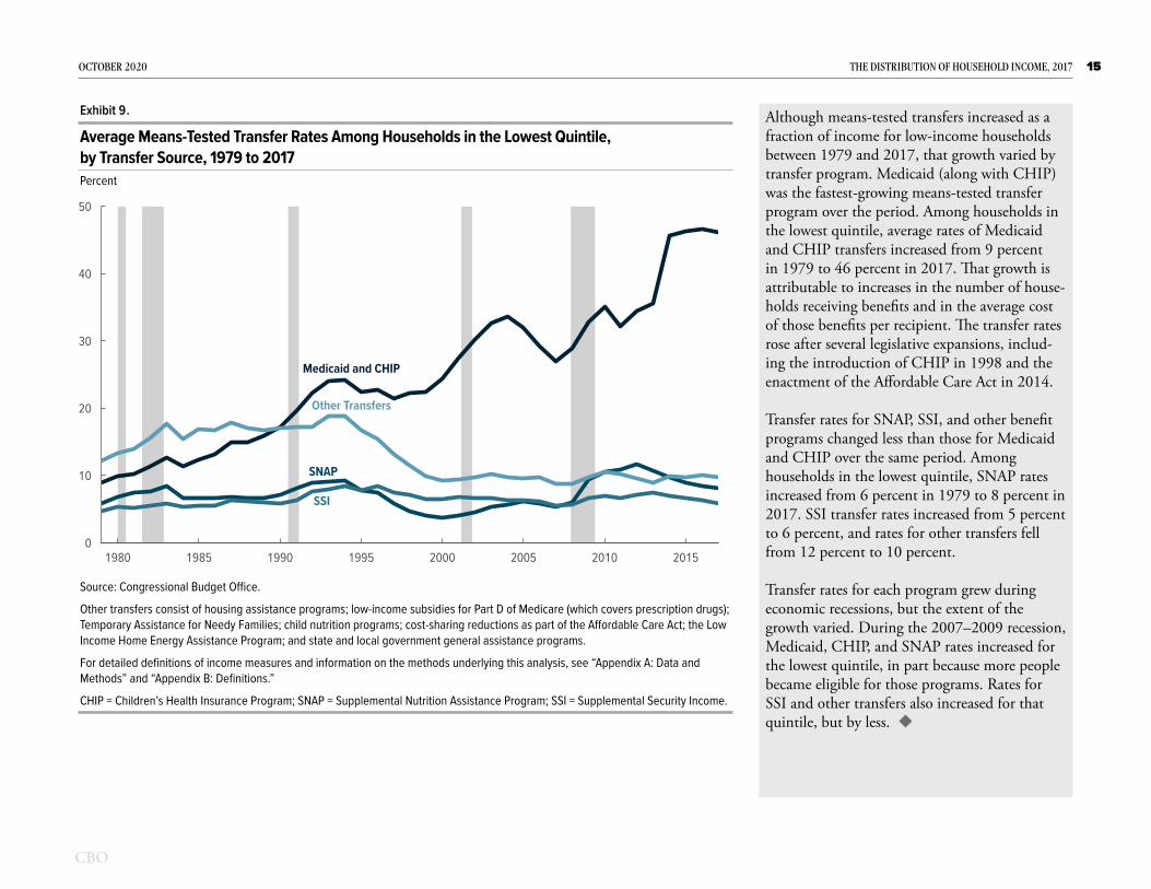
Although means-tested transfers increased as a fraction of income for low-income households between 1979 and 2017, that growth varied by transfer program. Medicaid (along with CHIP) was the fastest-growing means-tested transfer program over the period. Among households in the lowest quintile, average rates of Medicaid and CHIP transfers increased from 9 percent in 1979 to 46 percent in 2017. That growth is attributable to increases in the number of house-holds receiving benefits and in the average cost of those benefits per recipient. The transfer rates rose after several legislative expansions, includ-ing the introduction of CHIP in 1998 and the enactment of the Affordable Care Act in 2014.
Transfer rates for SNAP, SSI, and other benefit programs changed less than those for Medicaid and CHIP over the same period. Among households in the lowest quintile, SNAP rates increased from 6 percent in 1979 to 8 percent in 2017. SSI transfer rates increased from 5 percent to 6 percent, and rates for other transfers fell from 12 percent to 10 percent.
Transfer rates for each program grew during economic recessions, but the extent of the growth varied. During the 2007–2009 recession, Medicaid, CHIP, and SNAP rates increased for the lowest quintile, in part because more people became eligible for those programs. Rates for SSI and other transfers also increased for that quintile, but by less.
Exhibit 9 .
Average Means-Tested Transfer Rates Among Households in the Lowest Quintile, by Transfer Source, 1979 to 2017Percent
0
10
20
30
40
50
1980 1985 1990 1995 2000 2005 2010 2015
Medicaid and CHIP
SNAP
SSI
Other Transfers
Source: Congressional Budget Office.
Other transfers consist of housing assistance programs; low-income subsidies for Part D of Medicare (which covers prescription drugs); Temporary Assistance for Needy Families; child nutrition programs; cost-sharing reductions as part of the Affordable Care Act; the Low Income Home Energy Assistance Program; and state and local government general assistance programs.
For detailed definitions of income measures and information on the methods underlying this analysis, see “Appendix A: Data and Methods” and “Appendix B: Definitions.”
CHIP = Children’s Health Insurance Program; SNAP = Supplemental Nutrition Assistance Program; SSI = Supplemental Security Income.

Federal Taxes
In this analysis, federal taxes consist of individual income taxes, payroll taxes, corporate income taxes, and excise taxes. The taxes allocated to households in the analysis account for approximately 94 percent of all federal revenues collected in 2017.1 Individual income taxes and payroll taxes are the largest tax sources, followed by corporate taxes and excise taxes.2 CBO’s examination of household income focuses on the average federal tax rate, which is calculated by dividing total federal taxes in an income group by total income before transfers and taxes in that group.
Average federal tax rates generally rise with income. Households in the highest income quintile, which received about 55 percent of all income in 2017, paid more than two-thirds of federal taxes that year. In contrast, households in the lowest quintile, which received about 4 percent of all income, paid less than one-half of one percent of federal taxes that year. Among households in the lowest two quintiles, individual income taxes are negative, on average, because they include refundable tax credits, which can result in net payments from the government.3
Year-to-year fluctuations in average federal tax rates are caused both by underlying changes in the income distribution and by legislative changes to federal tax rules. For most income groups, the average federal tax rate fell over the 39-year period analyzed here; the lowest income quintile experienced the sharpest decrease. The average federal tax rate among households in the middle of the income distribution also decreased but not as much as it did among households in the lowest quintile. In contrast, the average federal tax rate for households in the 81st to 99th percentiles of the income distribution was relatively stable over the 1979–2017 period. The average rate for the top 1 percent of the distribution was significantly more volatile than that of other income groups.
1. The remaining federal revenue sources not allocated to U.S. households include states’ deposits for unemployment insurance, estate and gift taxes, net income earned by the Federal Reserve, customs duties, and miscellaneous fees and fines. Because of the complexity of estimating state and local taxes for individual households, this report considers federal taxes only. Researchers differ about whether state and local taxes are, on net, regressive, proportional, or slightly progressive, but most agree that state and local taxes are less progressive than federal taxes. For estimates of the distribution of state and local taxes, see Meg Wiehe and others, Who Pays? A Distributional Analysis of the Tax Systems in All 50 States, 6th ed. (Institute on Taxation and Economic Policy, October 2018), https://itep.org/whopays/; and Gerald Prante and Scott Hodge, The Distribution of Tax and Spending Policies in the United States, Special Report No. 211 (Tax Foundation, November 2013), https://tinyurl.com/roj9t2g (PDF, 5.1 MB).
2. Federal taxes allocated to households in this analysis are based on tax liabilities incurred in calendar year 2017.
3. In the federal budget, the portion of refundable credits that reduces the amount of taxes owed is counted as a reduction in revenues, and the portion that exceeds a filer’s tax liability is treated as an outlay. In the analysis presented here, CBO treated the refundable and nonrefundable portions of the credit jointly. For more details on the history and economic effects of refundable tax credits, see Congressional Budget Office, Refundable Tax Credits (January 2013), www.cbo.gov/publication/43767.

17OcTOBEr 2020 THE DISTrIBuTIOn OF HOuSEHOLD IncOmE, 2017
Average federal tax rates generally rise with income. In 2017, average federal tax rates were higher among higher-income groups than among lower-income groups. The highest quintile’s average federal tax rate was 26 per-cent, compared with 14 percent for the middle quintile and 1 percent for the lowest quintile. Within the highest quintile, average tax rates were higher at the top of the distribution, reach-ing 32 percent among households in the top 1 percent.
Within that top 1 percent, average tax rates were relatively flat. In 2017, households in the top 0.01 percent paid a slightly lower average federal tax rate than the next highest income group (the 99.9th to 99.99th percentiles). That is because capital income, which is generally taxed at lower rates under the individual income tax, accounts for a larger share of income for the highest income group, causing a lower average individual income tax rate. That lower individ-ual income tax rate was, however, partially offset by a higher average corporate tax rate. (CBO allocates 75 percent of the burden of corporate income taxes to owners of capital in proportion to their capital income and 25 percent of the corporate income tax to workers in proportion to their labor income.)
Exhibit 10 .
Average Federal Tax Rates, by Income Group, 2017
Lowest Quintile
Second Quintile
Middle Quintile
Fourth Quintile
81st to 90th Percentiles
91st to 95th Percentiles96th to 99th Percentiles
Top 1 Percent
0 5 10 15 20 25 30 35
HighestQuintile
99th to 99.9th Percentiles
99.9th to 99.99th PercentilesTop 0.01 Percent
0 5 10 15 20 25 30 35
Top 1 Percent
Percent
Percent
Top 0.01 Percent99.9th to 99.99th Percentiles
31.332.9
31.1
Source: Congressional Budget Office.
Income groups are created by ranking households by income before transfers and taxes, adjusted for household size. Each quintile (fifth) contains approximately the same number of people. The lowest quintile does not include households with negative income.
For detailed definitions of income measures and information on the methods underlying this analysis, see “Appendix A: Data and Methods” and “Appendix B: Definitions.”

18OcTOBEr 2020 THE DISTrIBuTIOn OF HOuSEHOLD IncOmE, 2017
Between 1979 and 2017, changes in tax laws and in underlying income caused the average federal tax rate to decline for the lowest quin-tile and fluctuate for the top 1 percent of the distribution. Average federal tax rates declined most sharply among households in the lowest quintile, falling from a peak of 12.1 percent in 1984 to 1.3 percent in 2017. The introduction and expansion of refundable tax credits lowered the average individual tax rate among low-income taxpayers, particularly between 2007 and 2009 (see Exhibit 15).
Among households in the middle three quin-tiles, the average federal tax rate declined from 19.3 percent in 1979 to 14.9 percent in 2017. Over the nearly four decades, the average federal tax rate among households in the 81st to 99th percentiles remained comparatively steady, changing from 25.1 percent in 1979 to 23.7 percent in 2017.
Among households in the top 1 percent of the distribution, the average federal tax rate began to fall in the late 1990s and then rose in 2013. That dip coincided with reductions in the top statutory marginal individual income tax rate and the tax rate on dividends and capital gains in the late 1990s and early 2000s. In 2013, the top marginal tax rate returned to 39.6 percent, just as higher tax rates on capital gains and new taxes enacted as part of the Affordable Care Act went into effect. In 2017, the average federal tax rate among households in the top 1 percent fell as their capital gains increased.
Exhibit 11 .
Average Federal Tax Rates, by Income Group, 1979 to 2017Percent
−5
0
5
10
15
20
25
30
35
40
1980 1985 1990 1995 2000 2005 2010 2015
Top 1 Percent
81st to 99th Percentiles
Middle Three Quintiles
Lowest Quintile
Source: Congressional Budget Office.
For detailed definitions of income measures and information on the methods underlying this analysis, see “Appendix A: Data and Methods” and “Appendix B: Definitions.”

19OcTOBEr 2020 THE DISTrIBuTIOn OF HOuSEHOLD IncOmE, 2017
Average federal tax rates among households in the top 1 percent of the income distribution have varied over time, ranging from a low of 25 percent in 1986 to a high of 35 percent in 1979. Average federal tax rates generally moved in tandem across the three subgroups of the top 1 percent; however, the rates diverged in the mid-2010s, mid-1990s, and early 1980s.
During the mid-2010s and mid-1990s, the average federal tax rate among households in the top one-tenth of one percent of the distribution (that is, the top 0.01 percent and the 99.9th to 99.99th percentiles combined) increased more than that of the 99th to 99.9th percentiles in response to changes in tax laws. In 1993 and 2013, the top marginal individual income tax rate increased to 39.6 percent. Because higher-income households had more income subject to the top rate, the top 0.1 percent’s average federal tax rate increased more than that of the 99th to 99.9th percentiles.
In general, households in higher income groups tended to pay higher average federal tax rates than households in lower income groups. However, in most years since the mid-1990s, households in the top 0.01 percent paid a lower average federal tax rate than did households in the 99.9th to 99.99th percentiles because a larger portion of the former group’s income consisted of capital income, which is generally taxed at lower rates under the individual income tax. That group’s average federal tax rate tended to fall in periods with large capital gains, such as the late 1990s, mid-2000s, and 2017.
Exhibit 12 .
Average Federal Tax Rates Among Households in the Top 1 Percent, 1979 to 2017Percent
0
5
10
15
20
25
30
35
40
1980 1985 1990 1995 2000 2005 2010 2015
Top 0.01 Percent
99.9th to 99.99thPercentiles
99th to 99.9thPercentiles
Source: Congressional Budget Office.
For detailed definitions of income measures and information on the methods underlying this analysis, see “Appendix A: Data and Methods” and “Appendix B: Definitions.”

20OcTOBEr 2020 THE DISTrIBuTIOn OF HOuSEHOLD IncOmE, 2017
Of the four types of federal taxes included in this analysis, the individual income tax is the most progressive. Average individual income tax rates ranged from –11 percent in the lowest quintile to 17 percent in the highest quintile. For the two lowest quintiles, average individual income tax rates were negative in 2017 because of refundable tax credits (see Exhibit 15).
Payroll tax rates were lower at the top of the distribution because a greater share of those households’ earnings was above the maximum amount subject to Social Security payroll taxes ($127,200 in 2017) and because labor income was a smaller share of their total income. Average payroll tax rates for the lower four quin-tiles were about 9 percent, but the average was 6.5 percent among households in the highest quintile.
The average corporate income tax borne by households increases with income. In 2017, the average corporate tax rate was 2.5 percent among households in the highest quintile and 4.8 percent among households in the top 1 per-cent of the distribution.
Unlike the other three types of federal taxes, excise taxes are regressive: The amount of excise taxes paid relative to income is greatest for low-er-income households, which tend to spend a larger share of their income on taxed goods and services. In 2017, the average excise tax rate was 2.2 percent for the lowest quintile, compared with 0.9 percent for the middle quintile and 0.4 percent for the highest quintile.
Exhibit 13 .
Average Federal Tax Rates, by Tax Source, 2017 Percent
−15
−10
−5
0
5
10
15
20
Individual Income Taxes Payroll Taxes Corporate Income Taxes Excise Taxes
*
LowestQuintile
HighestQuintile
Source: Congressional Budget Office.
For detailed definitions of income measures and information on the methods underlying this analysis, see “Appendix A: Data and Methods” and “Appendix B: Definitions.”
* = between zero and 0.5 percent.

21OcTOBEr 2020 THE DISTrIBuTIOn OF HOuSEHOLD IncOmE, 2017
In 2017, the average federal tax rate among all households in the United States was 21 percent, which is approximately equal to the average rate for the entire 1979–2017 period. Each of the four federal taxes that combine to make up that average—individual income taxes, payroll taxes, corporate income taxes, and excise taxes—had a distinct pattern over the 39-year period.
Over the period, the average individual income tax ranged from a high of 12.1 percent in 1981 to a low of 7.5 percent in 2009. In 2017, the average individual income tax rate was 10.5 per-cent, which was the highest since 2001. Between 2009 and 2017, individual income tax rates rose as various tax provisions enacted during the 2007–2009 recession expired and new, higher tax rates went into effect for high-income tax-payers in 2013.
In 2017, the average payroll tax rate was 7.8 per-cent, having held roughly constant since 2015. That rate was just below the 39-year average payroll tax rate of 7.9 percent. Payroll taxes fell in 2011 and 2012 because of a reduction in the Social Security payroll tax rate but rose again in 2013, when the Medicare payroll tax rate was increased for high-income taxpayers.
Average corporate tax rates fell from 3.4 percent in 1979 to 1.8 percent in 2017. The average corporate income tax rate declined each year since 2014. As the smallest component of the overall federal tax rate, the average excise tax rate was relatively stable over the entire 1979–2017 period, amounting to 1.0 percent in 1979 and 0.7 percent in 2017.
Exhibit 14 .
Average Federal Tax Rates, by Tax Source, 1979 to 2017 Percent
0
5
10
15
20
25
1980 1985 1990 1995 2000 2005 2010 2015
All Federal Taxes
Individual Income Taxes
Payroll Taxes
Corporate Income Taxes
Excise Taxes
Source: Congressional Budget Office.
For detailed definitions of income measures and information on the methods underlying this analysis, see “Appendix A: Data and Methods” and “Appendix B: Definitions.”

22OcTOBEr 2020 THE DISTrIBuTIOn OF HOuSEHOLD IncOmE, 2017
In 1979, the earned income tax credit (EITC) was the only refundable tax credit in effect. Since then, several new refundable tax credits have been enacted, including the child tax credit in 1998 and the premium tax credit for health insurance coverage established by the Affordable Care Act in 2014. Additionally, the Congress increased the credit amount and income param-eters of the EITC and the child tax credit several times over the years. As a result, the refundable tax credit rate—that is, total refundable tax cred-its divided by total income before transfers and taxes—among households in the lowest income quintile increased from approximately 1 percent in 1979 to 12.5 percent in 2017.
Because of refundable tax credits, the average individual income tax rates among households in the lowest and second quintiles were negative in 2017: –11 percent and –1 percent, respec-tively (see Exhibit 13). Without those tax cred-its, the average individual income tax rate for those two quintiles would have been positive: about 2 percent and 3 percent, respectively.
Each refundable credit has its own eligibility criteria and therefore varies in its response to economic changes. The two largest credits, the EITC and the child tax credit, tend to increase during economic recessions. Also, two tem-porary refundable credits were enacted during the 2007–2009 recession. Overall, the average refundable tax credit rate for the lowest quintile rose by 6 percentage points between 2007 and 2009, reaching 14.2 percent, its highest level over the 39-year period.
Exhibit 15 .
Average Refundable Tax Credit Rates Among Selected Income Groups, 1979 to 2017 Percent
0
5
10
15
1980 1985 1990 1995 2000 2005 2010 2015
Middle Quintile
Second Quintile
Lowest Quintile
Source: Congressional Budget Office.
Major individual income tax credits consist of the earned income tax credit; the child tax credit; postsecondary education tax credits (the American Opportunity Tax Credit—formerly the Hope credit—and the Lifetime Learning credit); the premium tax credit; the 2008 economic stimulus payments; and the Making Work Pay tax credit. Major individual income tax credits include both the refundable and nonrefundable portions of the credit, when applicable.
For detailed definitions of income measures and information on the methods underlying this analysis, see “Appendix A: Data and Methods” and “Appendix B: Definitions.”

23OcTOBEr 2020 THE DISTrIBuTIOn OF HOuSEHOLD IncOmE, 2017
The share of federal taxes paid by households in the highest quintile increased from 55 percent in 1979 to 69 percent in 2017. That group’s share of income before transfers and taxes also increased over the period, although to a lesser extent than its share of federal taxes. Most of that 14 percentage-point increase in the federal tax share occurred in the top 1 percent of the distribution, whose share of all federal taxes rose by 11 percentage points, from 14 percent in 1979 to 25 percent in 2017. Those households’ share of income before transfers and taxes also rose, although to a lesser extent, from 9 percent in 1979 to 17 percent in 2017.
Between 1979 and 2017, the shares of individ-ual income taxes, payroll taxes, and corporate taxes became increasingly concentrated in the highest quintile, whereas the distribution of shares of excise taxes remained relatively con-stant. The highest quintile’s share of individual income taxes rose from 65 percent in 1979 to 87 percent in 2017, and its share of payroll and corporate taxes each rose by 10 percentage points.
The share of taxes paid by higher-income households exceeded their share of income; the opposite is true for lower-income households. In 2017, households in the highest quintile received 55 percent of income before transfers and taxes and paid 69 percent of federal taxes. Households in the lowest quintile paid 0.2 per-cent of federal taxes and received 3.7 percent of income before transfers and taxes.
Exhibit 16 .
Shares of Federal Taxes, 1979 to 2017Percent
Top 1Percent
81st to 99thPercentiles
LowerThreeQuintiles
FourthQuintile
0
10
20
30
40
50
60
70
80
90
100
110
1980 1985 1990 1995 2000 2005 2010 2015
Source: Congressional Budget Office.
Shares may not add up to 100, because households with negative income are not shown, and because of rounding.
For detailed definitions of income measures and information on the methods underlying this analysis, see “Appendix A: Data and Methods” and “Appendix B: Definitions.”

Income After Transfers and Taxes
Income after transfers and taxes is income before transfers and taxes plus means-tested transfers minus federal taxes. Because of the progressivity of means-tested transfers and federal taxes (driven primarily by the size and structure of the individual income tax), income after transfers and taxes is less skewed toward households at the top of the distri-bution than income before transfers and taxes. From 1979 to 2017, income after transfers and taxes grew more evenly across the income distribution than income before transfers and taxes.
The average income after transfers and taxes of households in different income groups grew at different rates because of changes in means-tested transfer programs, federal tax laws, and economic conditions. Income grew significantly faster among households in the highest quintile than for all other income groups, mainly because of changes in income before transfers and taxes.

25OcTOBEr 2020 THE DISTrIBuTIOn OF HOuSEHOLD IncOmE, 2017
Because of the progressivity of means-tested transfers and of the federal tax system, income after transfers and taxes was less skewed than income before transfers and taxes. Among households in the lowest quintile, average income after transfers and taxes was about 69 percent higher than income before transfers and taxes in 2017—$35,900 versus $21,300 (see Exhibit 1). Average income after transfers and taxes in the middle quintile was $68,000. Because, overall, households in the middle quin-tile paid more in federal taxes than they received in means-tested transfers, average income after transfers and taxes for that quintile was about $6,900 less than the average income before transfers and taxes for the group.
Among households in the highest quintile, average income after transfers and taxes was about $229,700 in 2017. Because households at the top of the income distribution paid signifi-cantly more in federal taxes than they received in means-tested transfers, income for that quintile after transfers and taxes was about $79,700 less than the group’s income before transfers and taxes, on average. Among households in the top 1 percent of the income distribution, income after transfers and taxes was $1.3 million, on average—about $618,000 less than that group’s income before transfers and taxes. The average income after transfers and taxes for the top 0.01 percent was $33.3 million in 2017, or $15.2 million less than that group’s average income before transfers and taxes.
Exhibit 17 .
Average Household Income After Transfers and Taxes, 2017
Lowest Quintile
Second Quintile
Middle Quintile
Fourth Quintile
81st to 90th Percentiles
91st to 95th Percentiles96th to 99th Percentiles
Top 1 Percent
0 0.5 1.0 1.5 2.0
HighestQuintile
99th to 99.9th Percentiles
99.9th to 99.99th PercentilesTop 0.01 Percent
0 10 20 30 40 50
Millions of Dollars
Millions of Dollars
Top 1 Percent
Top 0.01 Percent99.9th to 99.99th Percentiles 33.33.8
0.8
Source: Congressional Budget Office.
All dollar amounts are in 2017 dollars.
Income groups are created by ranking households by income before transfers and taxes, adjusted for household size. Each quintile (fifth) contains approximately the same number of people. The lowest quintile does not include households with negative income.
For detailed definitions of income measures and information on the methods underlying this analysis, see “Appendix A: Data and Methods” and “Appendix B: Definitions.”

26OcTOBEr 2020 THE DISTrIBuTIOn OF HOuSEHOLD IncOmE, 2017
All five quintiles reached their highest average income after transfers and taxes for the 39-year period in 2017. Income after transfers and taxes grew fastest among households at the top of the income distribution. However, it grew more evenly across the distribution than income before transfers and taxes because of the progres-sivity of the transfers and the federal tax system.
Within the lower four quintiles, average federal tax rates fell over time, and average means-tested transfer rates increased. As a result, the average income after transfers and taxes grew more quickly than the average income before transfers and taxes for those income groups. The lowest quintile’s average income after transfers and taxes grew by a cumulative 86 percent between 1979 and 2017, and its average income before transfers and taxes grew by 35 percent. Similarly, the middle three quintiles’ average income after transfers and taxes grew by a cumulative 49 per-cent over that period, and their income before transfers and taxes grew by 35 percent.
Among the highest quintile, average federal tax rates declined over time, so income after transfers and taxes grew slightly more quickly than income before transfers and taxes. That group’s income after transfers and taxes grew by a cumulative 111 percent, rising from an average of $108,800 in 1979 to $229,700 in 2017. In comparison, the highest quintile’s income before transfers and taxes grew by 108 percent.
Exhibit 18 .
Trends in the Distribution of Income After Transfers and Taxes, 1979 to 2017
0
50
100
150
200
250
1980 1985 1990 1995 2000 2005 2010 2015
−20
0
20
40
60
80
100
120
1980 1985 1990 1995 2000 2005 2010 2015
Highest Quintile
Lowest Quintile
Middle Three Quintiles
Highest Quintile
LowestQuintile
Middle Three Quintiles
Cumulative GrowthPercent
Average Income After Transfers and TaxesThousands of Dollars
Source: Congressional Budget Office.
All dollar amounts are in 2017 dollars.
To calculate growth rates, CBO first converted all dollar amounts to 2017 dollars. To convert amounts, CBO used the Bureau of Economic Analysis’s price index for personal consumption expenditures.
For detailed definitions of income measures and information on the methods underlying this analysis, see “Appendix A: Data and Methods” and “Appendix B: Definitions.”

27OcTOBEr 2020 THE DISTrIBuTIOn OF HOuSEHOLD IncOmE, 2017
Between 1979 and 2017, income after transfers and taxes grew most quickly among households in the top 0.01 percent of the distribution, spurred by strong growth in income before transfers and taxes and a reduction in average tax rates. Among those households, income after transfers and taxes grew by 601 percent, or at an average annual rate of 5.3 percent, increasing from an average of $4.7 million (in 2017 dollars) in 1979 to $33.3 million in 2017. Income among households in the 99.9th to 99.99th percentiles grew at an average annual rate of 4.2 percent, or 372 percent in total, from $806,300 in 1979 to $3.8 million in 2017. Growth among households in the 99th to 99.9th percentiles averaged 2.7 percent per year, or 179 percent in total, rising from $273,400 in 1979 to $763,500 in 2017. Among households in the 81st to 99th percentiles, income grew by 84 percent, or 1.6 percent per year, on average, rising from $94,500 in 1979 to $174,100 in 2017.
Among households in the top 0.01 percent of the distribution, reductions in the average federal tax rate over the period caused income after transfers and taxes to grow by a cumulative 86 percentage points more than income before transfers and taxes; for the 99.9th to 99.99th percentiles, it grew by 37 percentage points more. In contrast, among the 81st to 99th percentiles and the 99th to 99.9th percentiles, growth rates in income after transfers and taxes were approximately equal to the growth in income before transfers and taxes.
Exhibit 19 .
Cumulative Growth in Income After Transfers and Taxes Among Households in the Highest Quintile, 1979 to 2017Percent
−100
0
100
200
300
400
500
600
700
800
1980 1985 1990 1995 2000 2005 2010 2015
Top 0.01Percent
99.9th to99.99thPercentiles
99th to99.9thPercentiles
81st to 99thPercentiles
Source: Congressional Budget Office.
To calculate growth rates, CBO first converted all dollar amounts to 2017 dollars. To convert amounts, CBO used the Bureau of Economic Analysis’s price index for personal consumption expenditures.
For detailed definitions of income measures and information on the methods underlying this analysis, see “Appendix A: Data and Methods” and “Appendix B: Definitions.”

28OcTOBEr 2020 THE DISTrIBuTIOn OF HOuSEHOLD IncOmE, 2017
Between 1979 and 2017, households in the top 1 percent of the distribution received an increas-ing share of income after transfers and taxes, amounting to a gain of 6 percentage points. The middle three quintiles’ shares of income after transfers and taxes, in contrast, decreased by 5 percentage points over the period.
In 1979, the middle three quintiles received more than half of all income after transfers and taxes: 51 percent. By 2017, that share had declined to 46 percent. Meanwhile, the top 1 percent’s share of income after transfers and taxes rose from 7 percent in 1979 to 14 percent in 2017. Shares of income for the lowest quintile and the remainder of the highest quintile were comparatively constant over the period: the low-est quintile’s share fell by 0.3 percentage points, and the 81st to 99th percentiles’ share grew by 1 percentage point.
Because the share of taxes increased between 1979 and 2017 for households in the top 1 percent (see Exhibit 16), that group’s share of income after transfers and taxes grew more slowly than its share of income before transfers and taxes: The latter increased by 8 percentage points over the period, 2 percentage points more than the share of income after transfers and taxes. The group’s share of income after transfers and taxes fluctuated over the 39-year period in response to economic conditions and shifts in tax and transfer policies, peaking in 2007 at 17 percent.
Exhibit 20 .
Shares of Income After Transfers and Taxes, 1979 to 2017Percent
Top 1Percent
81st to 99thPercentiles
MiddleThreeQuintiles
LowestQuintile0
10
20
30
40
50
60
70
80
90
100
110
1980 1985 1990 1995 2000 2005 2010 2015
Source: Congressional Budget Office.
Shares may not add up to 100, because households with negative income are not shown, and because of rounding.
For detailed definitions of income measures and information on the methods underlying this analysis, see “Appendix A: Data and Methods” and “Appendix B: Definitions.”

29OcTOBEr 2020 THE DISTrIBuTIOn OF HOuSEHOLD IncOmE, 2017
In 2017, income both before and after transfers and taxes was skewed toward the top of the dis-tribution. However, income after transfers and taxes was more evenly distributed than income before transfers and taxes.
Households in the lower three quintiles received a larger share of income after transfers and taxes than of income before transfers and taxes in 2017. The lowest quintile received 7 percent of income after transfers and taxes, compared with 4 percent of income before transfers and taxes. The middle quintile’s share of income after transfers and taxes was 14 percent, and its share of income before transfers and taxes was 13 per-cent. Because households in the lower quintiles received more in means-tested transfers than they paid in taxes, the transfer and tax systems combined to increase their shares of income.
In contrast, the share of income after transfers and taxes for the highest quintile was about 7 percentage points less than the share of income before transfers and taxes. Because those house-holds paid more in taxes than they received in transfers, the transfer and tax systems combined to reduce their share of income from 55 percent to 49 percent. Much of that decline was expe-rienced by households in the top 1 percent of the distribution, whose share of income after transfers and taxes was 14 percent, 3 percentage points lower than their share of income before transfers and taxes.
Exhibit 21 .
Shares of Income Before and After Transfers and Taxes, 2017Percent
0
10
20
30
40
50
60
Lowest Quintile Second Quintile Middle Quintile Fourth Quintile Highest Quintile
IncomeBefore
Transfersand Taxes Income
AfterTransfersand TaxesTop 1
PercentTop 1
Percent
81st to99th
Percentiles81st to99th
Percentiles
Source: Congressional Budget Office.
For detailed definitions of income measures and information on the methods underlying this analysis, see “Appendix A: Data and Methods” and “Appendix B: Definitions.”

Income Inequality
As the distribution of income shifted in the United States between 1979 and 2017, so did the degree of income inequality.1 A standard measure of income inequality is the Gini coefficient, which summarizes an entire distribution in a single number that ranges from zero to one. At the theoretical extremes, a value of zero means that income is distributed equally among all income groups, whereas a value of one indicates that all income is received by the high-est-income group, and none is received by any of the lower-income groups.
The Gini coefficient can also be interpreted as a measure of one-half of the average difference in income between every pair of households in the population, divided by the average income of the total population. For example, the Gini coefficient based on income before transfers and taxes of 0.521 for 2017 indicates that the average difference in income before transfers and taxes between pairs of households in that year was equal to 104.2 percent (twice 0.521) of average household income, or about $75,200 (adjusted to account for differences in household size).
CBO’s analysis compares Gini coefficients based on four different income measures: market income, income before transfers and taxes, income after transfers but before taxes, and income after transfers and taxes. Social insurance benefits, transfers, and taxes tend to reduce income inequality as measured by the Gini coefficient. Still, the Gini coefficients based on each of the four income measures indicate a rise in income inequality between 1979 and 2017; changes in the distribution of market income caused much of that increase.
The degree to which federal taxes and means-tested transfers reduce income inequality can be measured by the dif-ference between the Gini coefficient for income before transfers and taxes and the Gini coefficient for income after transfers and taxes. That difference has fluctuated over time, as average federal tax rates and means-tested transfer rates have changed. But overall, the degree to which income inequality was reduced by transfers and taxes increased between 1979 and 2017.
1. A significant body of research has examined changes in U.S. income inequality over time using various data sources and measures of income. For recent examples, see Thomas Piketty, Emmanuel Saez, and Gabriel Zucman, “Distributional National Accounts: Methods and Estimates for the United States,” The Quarterly Journal of Economics, vol. 133, no. 2 (May 2018), pp. 553–609; and Gerald Auten and David Splinter, “Income Inequality in the United States: Using Tax Data to Measure Long-term Trends” (draft, December 2019), https://tinyurl.com/y53tqqfx (PDF, 485 KB).

31OcTOBEr 2020 THE DISTrIBuTIOn OF HOuSEHOLD IncOmE, 2017
Between 1979 and 2017, income inequality as measured by the Gini coefficient for all four income measures increased. Increases in mar-ket income at the top of the distribution drove much of the rising income inequality over that time. Of the four measures of income presented here, income inequality as measured by market income is the highest. Social insurance bene-fits, particularly Social Security and Medicare benefits, reduced income inequality relative to market income inequality. (Those benefits are included in income before transfers and taxes.) The progressive structures of means-tested transfers and federal taxes also reduced income inequality, but by smaller amounts than social insurance benefits did.
During periods of economic expansion, such as the mid-1990s and mid-2000s, income inequal-ity tended to increase. Whereas income grew for all groups, including those at the bottom of the distribution, inequality increased because income at the top grew more.
There were also several temporary drops in income inequality over the years. Some drops, such as that in 2008, were largely attributable to economic recessions that brought about signifi-cant capital income losses—and, to a somewhat lesser extent, labor income losses—at the top of the income distribution. Other drops, including the decline in 2013, followed changes in tax laws that probably caused some high-income households to shift the realization of capital gains into the prior year.
Exhibit 22 .
Income Inequality As Measured by the Gini Coefficient, 1979 to 2017 Gini Coefficient
0.2
0.3
0.4
0.5
0.6
0.7
1980 1985 1990 1995 2000 2005 2010 2015
Based onMarket Income
Based onIncome Before
Transfers and Taxes
Based on IncomeAfter Transfers
and TaxesBased on Income
After Transfers but Before Taxes
0
Source: Congressional Budget Office.
The Gini coefficient is a measure of income inequality that ranges from zero (the most equal distribution of income) to one (the least equal distribution of income).
For detailed definitions of income measures and information on the methods underlying this analysis, see “Appendix A: Data and Methods” and “Appendix B: Definitions.”

32OcTOBEr 2020 THE DISTrIBuTIOn OF HOuSEHOLD IncOmE, 2017
The Gini coefficient for income after trans-fers and taxes is lower than the coefficient for income before transfers and taxes because means-tested transfers and federal taxes in the United States are progressive. Although the degree to which transfers and federal taxes reduce income inequality varies from year to year, the extent to which they have done so has increased since 1979.
In 2017, the Gini coefficient for income after transfers and taxes was 0.434—that is, 0.087 less than the Gini coefficient for income before transfers and taxes (see Exhibit 22). That reduc-tion in inequality is larger than in 1979, when transfers and federal taxes reduced the Gini coefficient by 0.060, from 0.412 to 0.352.
The reduction in inequality as a result of taxes increased in the early 1990s, after lawmakers expanded the EITC and raised top individual marginal tax rates. It increased again after higher individual income tax rates went into effect in 2013, particularly for households at the top of the income distribution.
Similarly, means-tested transfers increasingly lessened income inequality when transfer rates grew among households in the lowest quintile. Major expansions in transfer rates occurred in the early 1990s, during the 2007–2009 reces-sion, and in 2014 after Medicaid expanded under the Affordable Care Act.
Exhibit 23 .
Reduction in Income Inequality Stemming From Means-Tested Transfers and Federal Taxes, 1979 to 2017Change in Gini Coefficient
−0.10
−0.08
−0.06
−0.04
−0.02
0
1980 1985 1990 1995 2000 2005 2010 2015
Smallerreductionin incomeinequality
Largerreductionin incomeinequality
Source: Congressional Budget Office.
To measure the effect of means-tested transfers and federal taxes on inequality in each year, CBO subtracted the Gini coefficient for income before transfers and taxes from the Gini coefficient for income after transfers and taxes. A Gini coefficient value of zero indicates complete equality, and a value of one indicates complete inequality; thus, a negative change in the Gini coefficient indicates that inequality was reduced. The more negative the change, the greater the reduction in inequality.
For detailed definitions of income measures and information on the methods underlying this analysis, see “Appendix A: Data and Methods” and “Appendix B: Definitions.”

Appendix A: Data and Methods
The Congressional Budget Office has released its analyses of the distribution of household income and federal taxes on a regular basis for more than 30 years.1 This appendix provides additional details about CBO’s methodology and the most important assumptions underlying its analyses. The estimates in this report were produced using the agency’s framework for analyzing the distributional effects of both means-tested transfers and federal taxes.2 That framework uses income before transfers and taxes, which consists of market income plus social insurance benefits. The measure is used to rank households when creating income groups and serves as the denominator when calculating average
1. For links to reports in this series going back to 2001, see Congressional Budget Office, “Major Recurring Reports,” www.cbo.gov/about/products/major-recurring-reports.
2. For more details about CBO’s current framework and how it differs from the agency’s previous approach to distributional analyses, see Kevin Perese, CBO’s New Framework for Analyzing the Effects of Means-Tested Transfers and Federal Taxes on the Distribution of Household Income, Working Paper 2017-09 (Congressional Budget Office, December 2017), www.cbo.gov/publication/53345.
means-tested transfer rates and average federal tax rates.3
Unit of AnalysisCBO uses households as the unit of analysis in its distributional reports. A household consists of the people who share a housing unit regardless of their
3. Social insurance benefits consist of benefits provided through Social Security (Old Age, Survivors, and Disability Insurance); Medicare (measured as the average cost to the government of providing those benefits, net of offsetting receipts); unemployment insurance; and workers’ compensation. Although those social insurance benefits are often considered forms of government transfers, they are included in the base measure of income CBO used to rank households; however, the distributional effects of those benefit programs are not directly examined in this report. Social Security and Medicare, in particular, provide substantial resources to retirees and significantly affect the distribution of household income. In CBO’s estimation, when analyzing the distributional effects of those programs, it is more appropriate to use lifetime measures of income earned, payroll taxes paid, and benefits received. The framework used for analyzing the distribution of household income in this report is based on annual income data and, therefore, is less suitable for analyzing the distributional effects of those retirement benefit programs.
relationship.4 The data used in CBO’s analyses come from two primary sources: One provides data on tax-filing units, and the other provides house-hold-level data. A household can consist of more than one tax-filing unit, such as a married couple and their adult child.
To incorporate data on tax-filing units into the analysis, the agency creates tax-filing units from the household-level data on the basis of the relationship and income information collected by household surveys. After both data sources are organized using the same unit of analysis—tax-filing units—they are statistically matched to create a database with information from both sources (see the next section for details on the statistical matching methodol-ogy). For the final presentation of distributional results, data for those statistically matched tax-filing
4. The U.S. Treasury’s Office of Tax Analysis uses family units in its distributional analyses. Family units are similar to household units but exclude unrelated persons living together. The Internal Revenue Service, the Joint Committee on Taxation, and the Urban–Brookings Tax Policy Center all use tax-filing units as the unit of analysis in their distributional analyses.

OCTOBER 2020 THE DISTrIBuTIOn OF HOuSEHOLD IncOmE, 2017 34
units are combined and represented at the house-hold level.
DataThe core data used in CBO’s distributional analyses were obtained from the Statistics of Income (SOI), a nationally representative sample of individ-ual income tax returns collected by the Internal Revenue Service. The number of returns sampled grew over the period studied—1979 to 2017—rising from roughly 90,000 in some of the early years to more than 300,000 in later years. This sample of tax returns becomes available to CBO approximately two years after the returns are filed.
Tax-return information is supplemented with data from the Annual Social and Economic Supplement of the Census Bureau’s Current Population Survey (CPS), which contains survey data on the demo-graphic characteristics and income of a large sample of households.5 The two sources are combined by statistically matching each SOI record to a corre-sponding CPS record on the basis of demographic characteristics and income. Each pairing results in a new record that takes on some characteristics of
5. The CPS sampling frame seeks to represent the civilian noninstitutionalized population of the United States. As such, the scope of CBO’s analysis is limited to that target population. People living in correctional facilities, nursing homes, and on military bases are not included in this analysis. However, members of the Armed Forces living in civilian housing units on a military base or in a household not on a military base are included. In 2014, the Census Bureau split the CPS sample into two groups to test new income and health insurance questions on a smaller subsample. For this report, CBO used the data corresponding to survey questions that were consistent with those used in prior years.
the CPS record and some characteristics of the SOI record.6
The first step in the statistical matching process is to align the unit of analysis by constructing tax-fil-ing units from CPS households. A tax-filing unit is a single person or a married couple plus any depen-dents. In CBO’s analysis, the heads of CPS house-holds (and their spouses, if present) are designated as tax-filing units. Tax rules are used to determine whether other members of the household can be claimed as dependents on the basis of their age, relationship with the primary tax-filing unit, and income.7 People who meet those criteria are classi-fied as dependents; those who do not are classified as separate tax-filing units within the household. When multiple people could claim one member of a household as a dependent, the agency assumes that the household chooses the arrangement that results in the most advantageous tax situation—for example, two unmarried, cohabitating partners with two children might each claim one child and file as a head of household if doing so lowers their combined taxes.
6. For a general description and evaluation of statistical matching, see Marcello D’Orazio, Marco Di Zio, and Mauro Scanu, Statistical Matching: Theory and Practice (John Wiley & Sons, 2006), http://dx.doi.org/10.1002/0470023554; and Michael L. Cohen, “Statistical Matching and Microsimulation Models,” in Eric A. Hanushek and Constance F. Citro, eds., Improving Information for Social Policy Decisions: The Uses of Microsimulation Modeling—Volume II: Technical Papers (The National Academies Press, 1991), http://dx.doi.org/10.17226/1853.
7. A dependent may be considered a tax-filing unit if he or she received income above a certain threshold in a given tax year.
Next, the agency divides the tax-filing unit records in each file into 15 demographic groups on the basis of marital status (married or single); number of dependents (zero, one, or two or more); whether the tax-filing unit can be claimed as a dependent (yes or no); and whether the tax filer and his or her spouse (if applicable) are 65 or older (neither, one, or both). Records from the two files are matched within the same demographic groups, with certain exceptions. Because the CPS file contains fewer head-of-household tax-filing units (single parents with dependent children) than the SOI file does, some SOI head-of-household tax-filing units are matched with single tax-filing units without chil-dren and married tax-filing units from the CPS. The deficit in head-of-household filers in the CPS data probably reflects some combination of misre-porting of filing status in the SOI and a failure of the algorithm that creates tax units for the CPS to account for complex living arrangements.
Within each demographic group, CBO estimates an ordinary least squares (OLS) regression model of total income as a function of all the income items that are common to both the SOI and the CPS—such as wages, interest, dividends, rental income, business income and losses, pension income, and unemployment insurance. The OLS models are estimated using the SOI data. CBO applies the coefficients estimated from the regression models to the records in both files to construct a predicted total income variable. Tax-unit records in both files (independently within each demographic cell) are then sorted in descending order by predicted total income.
The SOI data and the CPS data come from sam-ples, and therefore each record from both files has

OCTOBER 2020 THE DISTrIBuTIOn OF HOuSEHOLD IncOmE, 2017 35
a sample weight associated with it. The sum of all the sample weights in the SOI file represents the total number of tax units that filed taxes in a given year. The sum of all the weights in the CPS file represents all of the tax units in the United States—both those that filed a tax return and those that did not. The SOI file contains many more records than the CPS file yet represents fewer total tax units. Therefore, the average sample weight in the SOI file is lower than the average sample weight in the CPS file.
Because of those differences in sample weights, SOI and CPS records are not matched on a one-to-one basis. Within each demographic group, matching begins with the record from each file that represents the highest predicted total income. Of the two records, the one with the lower sample weight is matched to only one corresponding record from the other file. The record with the higher weight is “split” and is available (with its weight reduced) to be matched to the next record in the other file. (In practice, the highest-income SOI records have very low sample weights, so the matching algorithm matches the top CPS record to many SOI records.)
That process is repeated until all the SOI records are exhausted. Each matched pairing results in a new record with the demographic characteristics of the CPS record and the income reported in the SOI. Some types of income, such as certain types of transfer payments and in-kind benefits, appear only in the CPS records; values for those items are drawn directly from that survey. Income values for CPS records that represent nonfiling tax units are taken directly from the CPS. Residual CPS records (those with the lowest predicted income) are
assumed to represent tax-filing units that did not file a tax return.
Finally, households are reconstructed from tax-filing units on the basis of relationships reported in the CPS. In general, CPS tax-filing units will have been matched to multiple SOI tax-filing units. When CPS tax-filing units are combined at the household level, multiple replications of a given household are created to cover all possible combinations of the matched SOI–CPS tax units. Each household replication is appropriately weighted so that the sum of all the replications equals the original CPS household-level sample weight.8
Income MeasuresMost distributional analyses rely on a measure of annual income as the metric for ranking house-holds from least economically secure to most economically secure. In CBO’s analyses, informa-tion on taxable income sources comes from the SOI, whereas information on nontaxable income sources and income for tax-filing units that do not file individual income tax returns comes from the CPS. Among households at the top of the distribution, the vast majority of income data are drawn from the SOI. In contrast, among house-holds in the lower and middle quintiles, a larger portion of income data is drawn from the CPS (see Table A-1).
8. For a graphical presentation of the statistical matching algorithm, see Kevin Perese, “Statistically Matching Administrative Tax Data With Household Survey Data” (presentation at a Washington Center for Equitable Growth workshop on distributional national accounts, Washington, D.C., July 21, 2017), www.cbo.gov/publication/52914.
Most measures of income are drawn from fed-eral tax returns, and those income measures are not adjusted to match the Bureau of Economic Analysis's national income and product accounts. Therefore, this analysis does not capture income that is underreported or misreported to the Internal Revenue Service as a result of tax noncompliance.9 Underreported income that is excluded from this analysis may affect the distribution of income.10
Incidence of Federal TaxesCBO allocates the individual income taxes and the employee’s share of payroll taxes to the households paying those taxes directly. CBO also allocates the employer’s share of payroll taxes to employees because employers appear to pass on their share of payroll taxes to employees by paying lower wages than they otherwise would.11
9. For a description of tax noncompliance, see Internal Revenue Service, Federal Tax Compliance Research: Tax Gap Estimates for Tax Years 2011–2013, Publication 1415 (September 2019), www.irs.gov/pub/irs-pdf/p1415.pdf (1.39 MB).
10. Other researchers have found that as a result of tax noncompliance, tax data may understate income, particularly at the top of the distribution. See Andrew Johns and Joel Slemrod, “The Distribution of Income Tax Noncompliance,” National Tax Journal, vol. 63, no. 3. (September 2010), https://tinyurl.com/y4cqarg9 (PDF, 309 KB); and John Sabelhaus and Somin Park, “U.S. Income Inequality Is Worse and Rising Faster Than Policymakers Probably Realize” (Washington Center for Equitable Growth, May 2020), https://tinyurl.com/ybquz5ac.
11. In theory, if the payroll tax did not exist, an employee’s salary and wages would be higher by approximately the amount of the payroll tax. Therefore, CBO adds the employer’s share of payroll taxes to households’ earnings when calculating income before transfers and taxes.

OCTOBER 2020 THE DISTrIBuTIOn OF HOuSEHOLD IncOmE, 2017 36
CBO allocates excise taxes to households according to their consumption of taxed goods and services. Excise taxes on intermediate goods, which are paid by businesses, are allocated to households in proportion to their overall consumption. CBO assumes that household spending patterns across income and demographic groups in the CPS are similar to those observed in the Bureau of Labor Statistics’ Consumer Expenditure Survey.
There is far less consensus among researchers about how to allocate corporate income taxes (and taxes on capital income generally). CBO allocates 75 percent of the burden of corporate income taxes to owners of capital in proportion to their income from interest, dividends, rents, and adjusted capital gains. The agency adjusts capital gains by scaling them to their long-term historical level given the size of the economy and the applicable tax rate;
that method reduces the effects of large year-to-year variations in the total amount of gains realized. The remaining 25 percent of the corporate income tax is allocated to workers in proportion to their labor income.12
Adjusting Income to Account for Differences in Household SizeHouseholds with identical income can differ in ways that affect their economic status. For example, a larger household generally needs more income to support a given standard of living than a smaller one does. However, economies of scale in some types of consumption—housing, in particular—can mean that two people generally do not need twice the income to live as well as one person who lives alone. Because of those known economies of scale, household income is an imperfect measure of economic status.
To better rank households by their relative eco-nomic status, CBO adjusts the income measure, dividing household income by an adjustment factor known as an equivalence scale. Various equivalence scales are in use today, and a significant, if some-what dated (though still useful) body of literature explores why and how alternative equivalence scales should be calculated for the purpose of setting
12. For a more detailed discussion of CBO’s methodology for allocating corporate taxes, see Congressional Budget Office, The Distribution of Household Income and Federal Taxes, 2008 and 2009 (July 2012), www.cbo.gov/publication/43373.
Table A-1 .
Weighted and Unweighted Sample Sizes, 2017
Statistically Matched Data Set (Weighted)
Income Group Households IndividualsCPS (Unweighted)
HouseholdsSOI (Unweighted)
Tax Units
Negative Income 592,333 1,378,831 1,527 18,665Lowest Quintile 24,805,748 61,653,744 13,601 21,805Second Quintile 26,422,625 63,043,740 14,012 29,792Middle Quintile 25,394,024 63,037,692 13,180 36,377Fourth Quintile 25,242,766 63,039,584 12,668 40,957Highest Quintile 25,221,597 63,038,442 12,920 203,096
81st to 90th Percentiles 12,653,251 31,519,054 5,968 26,62491st to 95th Percentiles 6,387,967 15,759,354 3,007 23,50996th to 99th Pecentiles 4,979,766 12,608,036 2,546 42,212Top 1 Percent 1,200,612 3,151,998 1,399 110,751
99th to 99.9th Percentiles 1,081,787 2,836,803 928 52,69399.9th to 99.99th Pecentiles 107,503 283,676 406 46,518Top 0.01 Percent 11,323 31,519 65 11,539
All Quintiles 127,679,092 315,192,034 67,909 350,691
Source: Congressional Budget Office.
CPS = Current Population Survey; SOI = Statistics of Income (a nationally representative sample of individual income tax returns collected by the Internal Revenue Service).

OCTOBER 2020 THE DISTrIBuTIOn OF HOuSEHOLD IncOmE, 2017 37
public policy parameters—specifically, those related to measuring poverty and means-tested programs.13
To account for household economies of scale, the equivalence scale should take a value between one and the number of people in the household. An equivalence scale equal to one would make no change to the income measure and would not account for the greater needs of larger households. At the other end of the spectrum, an adjustment scale equal to the number of people in the house-hold would imply that each person requires the same resources, which would not capture the ben-efits of shared consumption—most significantly, housing expenses—within the household.
A generalized formula for calculating an equiva-lence scale can be expressed as follows:
ES = ne,
where n is the number of people in the household and e is an elasticity parameter for household size that ranges from zero to one, with larger values implying smaller economies of scale.14 To adjust
13. See, for example, OECD Project on Income Distribution and Poverty, “What Are Equivalence Scales?” (accessed July 21, 2020), https://tinyurl.com/y62frerd (PDF, 388 KB); Constance F. Citro and Robert T. Michaels, eds., Measuring Poverty: A New Approach (The National Academies Press, 1995), http://dx.doi.org/10.17226/4759; and Patricia Ruggles, Drawing the Line: Alternative Poverty Measures and Their Implications for Public Policy (Urban Institute Press, 1990).
14. Some equivalence scales have additional parameters to differentiate between the needs of additional adults and additional children, in which case the formula would be ES = 1 + (α na + γ nc)e where α and γ are weights between
household income for differences in household size, CBO uses an equivalence scale known as the square root scale.15 Under that method, adjusted house-hold income is calculated as household income divided by the square root of the number of people in the household.
Calculating the equivalence scale as the square root of the number of people in the household is the same as setting the elasticity parameter for house-hold size to 0.5 because √n = n0.5. Using 0.5 as the elasticity parameter for household size is convenient for several reasons:
• It is the midpoint in the range of possible values for the parameter (n0 < n0.5 < n1).
• It implies that each additional person increases the household’s needs but at a decreasing rate.
zero and one applied to the additional number of adults and children (na and nc) in the household, respectively.
15. The most recent distributional analyses by the Treasury and the Organisation for Economic Co-operation and Development (OECD) also adjust for household or family size using the square root equivalence scale. By contrast, recent studies by government agencies in the United Kingdom and Australia use a more complex adjustment called the modified OECD equivalence scale (although it is no longer used by the OECD), which gives a full weight to the first adult in a household, a half weight to the second adult, and a 0.3 weight to each child. The Urban–Brookings Tax Policy Center, the Internal Revenue Service, the Joint Committee on Taxation, and economists Thomas Piketty and Emmanuel Saez all use tax units as their units of analysis and do not make any adjustments for differences in tax-unit size.
• The resulting household-size adjustment is similar to the family-size adjustments the Census Bureau uses in setting U.S. poverty thresholds.
• It is transparent and relatively easy to understand.
Applying the square root equivalence scale to adjust income for differences in household sizes means that some households with higher income (but more people living in them) may be considered equivalent in income to households with lower income (but fewer people living in them).
CBO adjusts income for household size using the square root equivalence scale only for the purpose of ranking households and assigning them to income groups. All other income measures pre-sented in the agency’s distributional analyses are unadjusted. CBO presents households in adjusted household income quintiles and provides additional detail for smaller, percentile-based groupings of households within the highest income quintile (the 81st through 90th percentiles, the 91st through 95th percentiles, the 96th through 99th percen-tiles, the 99th to 99.9th percentiles, the 99.9th to 99.99th percentiles, and the top 0.01 percent). Each quintile contains approximately 20 percent of the civilian noninstitutionalized U.S. popula-tion, and each full percentile (that is, a percentile expressed as a whole number) contains approx-imately 1 percent of the population. However, because household sizes vary, the adjusted house-hold income quintiles contain slightly differ-ent numbers of households (see Table A-1 on page 36).

Appendix B: Definitions
Household income, unless otherwise indicated, refers to income before accounting for the effects of means-tested transfers and federal taxes. Throughout this report, that income concept is called income before transfers and taxes. It consists of market income plus social insurance benefits.
Market income consists of the following:
• Labor income. Wages and salaries, including those allocated by employees to 401(k) and other employment-based retirement plans; employer-paid health insurance premiums (as measured by the Census Bureau’s Current Population Survey); the employer’s share of Social Security, Medicare, and federal unemployment insurance payroll taxes; and the share of corporate income taxes borne by workers.
• Business income. Net income from businesses and farms operated solely by their owners, partnership income, and income from S corporations.
• Capital income (including capital gains). Net profits realized from the sale of assets (but not increases in the value of assets that have not been realized through sales); taxable and tax-exempt interest; dividends paid by corporations (but not dividends from S corporations, which are considered part of business income); positive rental income; and the share of corporate income taxes borne by capital owners.
• Other income sources. Income received in retirement for past services and other nongovernmental sources of income.
Social insurance benefits consist of benefits from Social Security (Old Age, Survivors, and Disability Insurance), Medicare (measured by the average cost to the government of providing those ben-efits), unemployment insurance, and workers’ compensation.
Income after transfers and taxes is income before transfers and taxes plus means-tested transfers minus federal taxes.
Means-tested transfers are cash payments and in-kind services provided through federal, state, and local government assistance programs. Eligibility to receive such transfers is determined primarily on the basis of income, which must be below certain thresholds. Means-tested transfers are provided through the following programs: Medicaid and the Children’s Health Insurance Program (measured by the average cost to the government of providing those benefits); the Supplemental Nutrition Assistance Program (formerly known as the Food Stamp program); housing assistance programs; Supplemental Security Income; Temporary Assistance for Needy Families and its predecessor, Aid to Families With Dependent Children; child nutrition programs; the Low Income Home Energy Assistance Program; and state and local government general assistance programs.
Federal taxes consist of individual income taxes, payroll (or social insurance) taxes, corporate income taxes, and excise taxes. In this analysis, taxes for a given year are the amount a house-hold owes on the basis of income received that year, regardless of when the taxes are paid. Taxes from those four sources accounted for 94 percent

OCTOBER 2020 THE DISTrIBuTIOn OF HOuSEHOLD IncOmE, 2017 39
of federal revenues in fiscal year 2017. Revenue sources not examined in this report include states’ deposits for unemployment insurance, estate and gift taxes, net income of the Federal Reserve remit-ted to the Treasury, customs duties, and miscel-laneous fees and fines. Federal taxes comprise the following:
• Individual income taxes. Individual income taxes are paid by U.S. citizens and residents on their income from all sources, except those sources exempted under the law. Individual income taxes can be negative because they include the effects of refundable tax credits, which can result in net payments from the government. Specifically, if the amount of the refundable tax credit exceeds a filer’s tax liability before that credit is applied, the government pays that excess to the filer.
• Payroll taxes. Payroll taxes are levied primarily on wages and salaries and generally have a single rate and few exclusions, deductions, or credits. Payroll taxes include those that fund the Social Security trust funds, the Medicare trust fund, and unemployment insurance trust funds. The federal portion of the
unemployment insurance payroll tax covers only administrative costs for the program; state-collected unemployment insurance payroll taxes are not included in CBO’s measure of federal taxes (even though they are recorded as revenues in the federal budget). Households can be entitled to a future social insurance benefits, including Social Security, Medicare, and unemployment insurance, as a result of paying payroll taxes. In this analysis, average payroll tax rates capture the taxes paid in a given year and do not capture the benefits households may receive in the future.
• Corporate income taxes. Corporate income taxes are levied on the profits of U.S.-based corporations organized as C corporations. In its analysis, CBO allocated 75 percent of corporate income tax in proportion to each household’s share of total capital income (including capital gains) and 25 percent to households in proportion to their share of labor income.
• Excise taxes. Sales of a wide variety of goods and services are subject to federal excise taxes. Most revenues from excise taxes are attributable
to the sale of motor fuels (gasoline and diesel fuel), tobacco products, alcoholic beverages, and aviation-related goods and services (such as aviation fuel and airline tickets).
Average means-tested transfer rates are calculated as means-tested transfers divided by income before transfers and taxes.
Average federal tax rates are calculated as federal taxes divided by income before transfers and taxes.
Income groups are created by ranking households by their size-adjusted income before transfers and taxes. A household consists of people sharing a housing unit, regardless of their relationships. The income quintiles (fifths) contain approximately the same number of people but slightly differ-ent numbers of households. Similarly, each full percentile (hundredth) contains approximately the same number of people but a different number of households. If a household has negative income (that is, if its business or investment losses are larger than its other income), it is excluded from the lowest income group but included in totals.

About This Document
This report by the Congressional Budget Office was prepared at the request of the Ranking Member of the Senate Finance Committee. In keeping with CBO’s mandate to provide objective, impartial analysis, the report makes no recommendations.
Ellen Steele wrote the report, with guidance from Edward Harris, John McClelland, and Joseph Rosenberg. Bilal Habib, Kevin Perese, Kurt Seibert, and Naveen Singhal contributed to the analysis. Tess Prendergast fact-checked the report.
Mark Doms, Jeffrey Kling, and Robert Sunshine reviewed the report. The editor was Scott Craver, and the graphics editor was Robert Rebach. An electronic version of the report is available on CBO’s website (www.cbo.gov/publication/56575).
CBO continually seeks feedback to make its work as useful as possible. Please send any comments to [email protected].
Phillip L. Swagel Director October 2020