Embed Size (px)
Citation preview

The development of my Horror poster
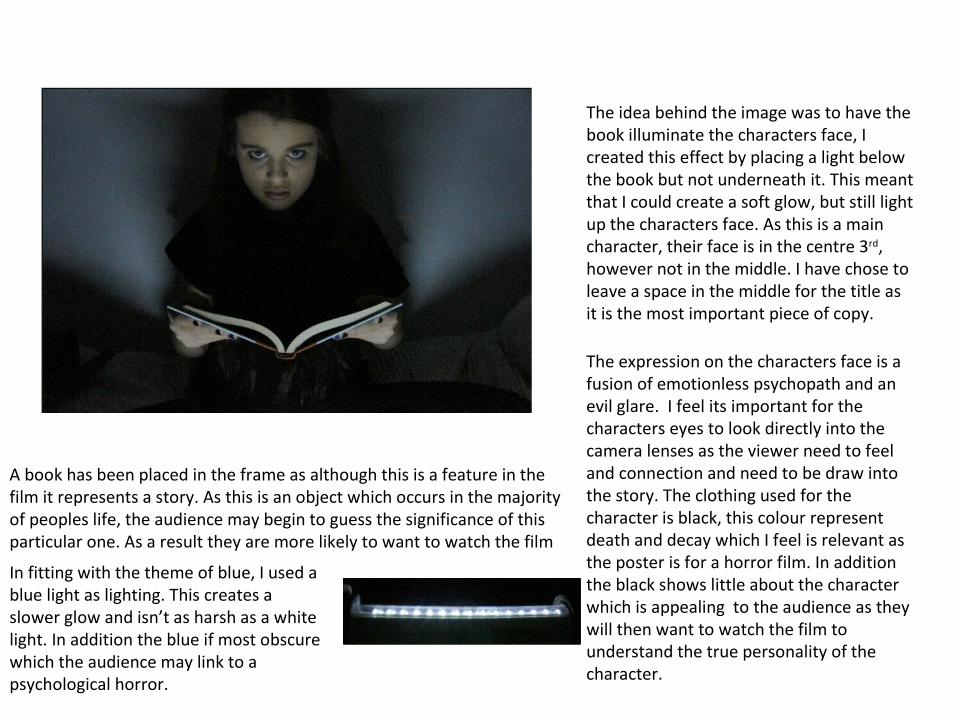
The idea behind the image was to have the book illuminate the characters face, I created this effect by placing a light below the book but not underneath it. This meant that I could create a soft glow, but still light up the characters face. As this is a main character, their face is in the centre 3rd, however not in the middle. I have chose to leave a space in the middle for the title as it is the most important piece of copy.
The expression on the characters face is a fusion of emotionless psychopath and an evil glare. I feel its important for the characters eyes to look directly into the camera lenses as the viewer need to feel and connection and need to be draw into the story. The clothing used for the character is black, this colour represent death and decay which I feel is relevant as the poster is for a horror film. In addition the black shows little about the character which is appealing to the audience as they will then want to watch the film to understand the true personality of the character.
A book has been placed in the frame as although this is a feature in the film it represents a story. As this is an object which occurs in the majority of peoples life, the audience may begin to guess the significance of this particular one. As a result they are more likely to want to watch the film
In fitting with the theme of blue, I used a blue light as lighting. This creates a slower glow and isn’t as harsh as a white light. In addition the blue if most obscure which the audience may link to a psychological horror.

The original photo wasn’t engaging nor did it look professional. I used adobe Photoshop to edit my image, first I blacked out the back ground as the viewer could see a bed. This allows for space for a credit box, in addition it improves the over all appearance as the photo looks darker which is one of the conventions of horror. Apart from the background I also edited the character face, I made her eyes a sharper and brighter blue which stands out to grab the audiences attention. Furthermore the colour blue fits in with the colour scheme which is effective as it creates consistency. To create more definition in the characters face I darkened her eye browns, this acts in contrast to the light blue eyes which are associated with innocence.
As previously stated, the black space in the middle of the image was for the title. Using Photoshop I layered text on top of the image, I chose a similar style to text that it featured in the trailer to create a link between the two. The font is simple and clear for the reader which makes it convenient, however the font could be considered part of the images. The word deactivate is placed above the book and within the beam of light, this shows the audience that the opening of the book has caused the disruption. It appears that the word has risen out of the book.
In the original image the character had a blue nail, to keep in fitting with the characters personality I used Photoshop to refill the finger nail with black.
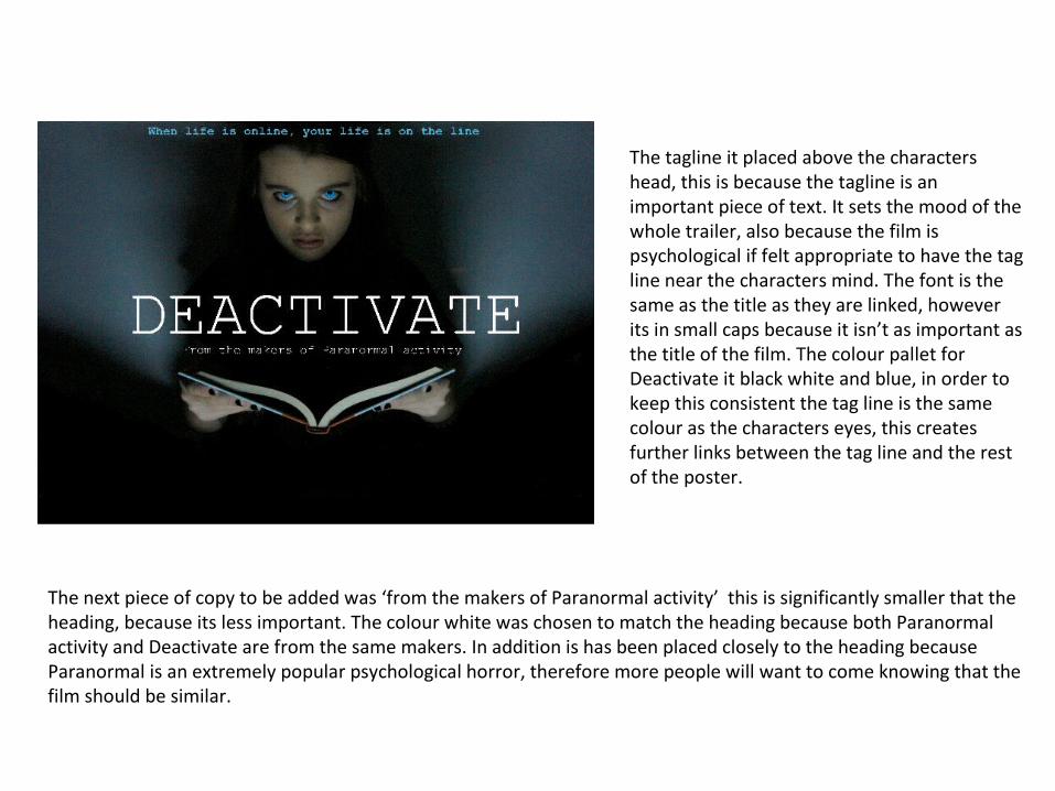
The tagline it placed above the characters head, this is because the tagline is an important piece of text. It sets the mood of the whole trailer, also because the film is psychological if felt appropriate to have the tag line near the characters mind. The font is the same as the title as they are linked, however its in small caps because it isn’t as important as the title of the film. The colour pallet for Deactivate it black white and blue, in order to keep this consistent the tag line is the same colour as the characters eyes, this creates further links between the tag line and the rest of the poster.
The next piece of copy to be added was ‘from the makers of Paranormal activity’ this is significantly smaller that the heading, because its less important. The colour white was chosen to match the heading because both Paranormal activity and Deactivate are from the same makers. In addition is has been placed closely to the heading because Paranormal is an extremely popular psychological horror, therefore more people will want to come knowing that the film should be similar.

To make the title stand out and almost look like it is floating, I added a drop down shadow. It doesn’t deviate far away from the title, but it can be seen easily which is effective as the word looks like its floating out of the book. I added the date below the book, this is because the date it important so it should be close to the image. To enhance the significance of the date, I increase it size so it bigger then the text about Paranormal activity however it doesn’t take away from the title. The date has been made blue to closely link it with the film, the date and the tag line act like the fame for all the important information.
In addition I added a credit box beneath the image, I looked at other posters for inspiration as to what needs to be mentioned and what doesn’t. two of the main influences were Attack the block and Eagle. By looking at these I found out what needed to be mentioned, In addition the Attack the block poster inspired the website featured on my poster.
As seen previously the book contained both blue and orange, I used Photoshop and the paint brush tool to colour in the orange section with blue. This meant that the overall look is more professional and the book fit in with the colour pallet.
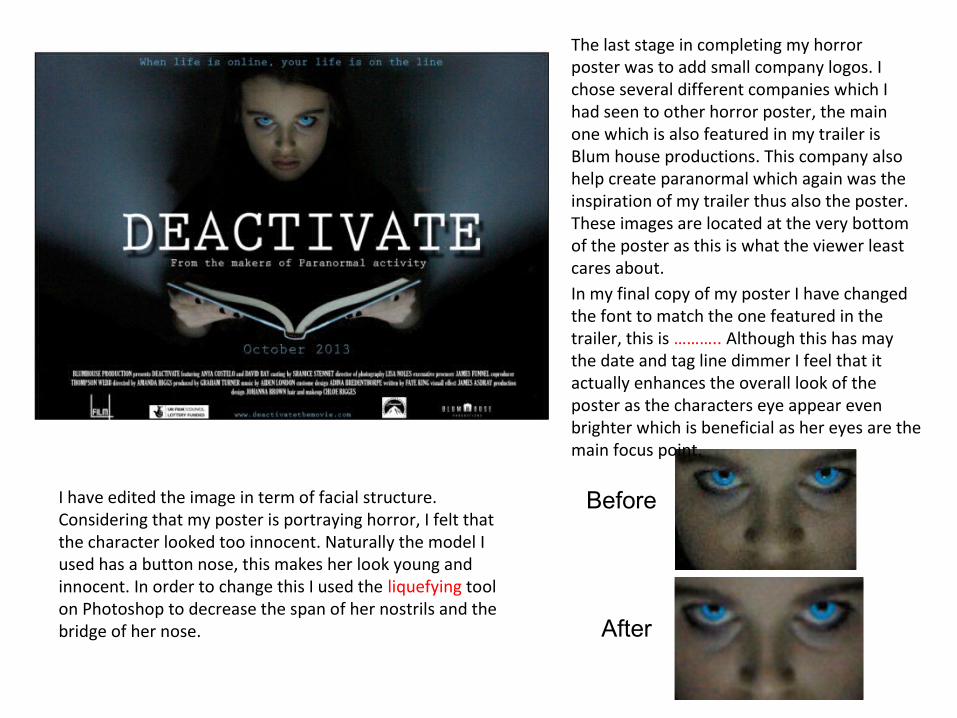
The last stage in completing my horror poster was to add small company logos. I chose several different companies which I had seen to other horror poster, the main one which is also featured in my trailer is Blum house productions. This company also help create paranormal which again was the inspiration of my trailer thus also the poster. These images are located at the very bottom of the poster as this is what the viewer least cares about. In my final copy of my poster I have changed the font to match the one featured in the trailer, this is ……….. Although this has may the date and tag line dimmer I feel that it actually enhances the overall look of the poster as the characters eye appear even brighter which is beneficial as her eyes are the main focus point.
Before
After
I have edited the image in term of facial structure. Considering that my poster is portraying horror, I felt that the character looked too innocent. Naturally the model I used has a button nose, this makes her look young and innocent. In order to change this I used the liquefying tool on Photoshop to decrease the span of her nostrils and the bridge of her nose.
How effective is the combination of your main product and ancillary texts?I have created a character poster, this is effective as the audience are given a small clue as to what the
film is about whereas a poster which includes a location may give too much away. This fits in with the genre which is psychological as the audience are left guessing and anticipating where this character fits in within the film . This also fits with my trailer which follows the psychological conventions of psychological horror by using hand held camera shots so the audience are unsure to the villain is.
Both my horror poster and trailer are effective together as they both use the codes and conventions of psychological horror, this helps to reinforce the characteristics of psychological horror. The audience can understand that the film will included an unconventional approach, with lots of confusion but in the end an explanation. The combination of the poster and trailer help viewer to decided whether this is their type of horror film, this is beneficial as I want to reach my target audience in order to get the best response.
One consistent theme seen through out the poster and the trailer is the colour pallet I have chosen, firstly the colour blue was use in the trailer as it represented the logo of Face book. As this is an important aspect of the trailer I felt it only appropriate to carry it out through out the poster, this helps create a link between the trailer and the poster. This is an important link as the audience can begin to identify the colour blue with more then just a colour, though using it several times the colour blue now represent social net working, teenagers and psychological harm.
I have only created one character poster, I have done this because there is only one character who is different, and deviated from the social norms which are associated with teenagers. If I were to create posters for the victims I don’t believe that they would be engaging as they purposely represent stereotypical teenagers.
I think my poster along side the trailer will generate a buzz as the character is appealing, through watching the trailer the viewer will what to know who this character it. The viewers can ask the question ‘is she the murdered?’, this question helps to keep as buzz as the view will want to find out the answer.