Embed Size (px)
Citation preview

The Buckminster Fuller Institute:A Web Design Critique
Zaakea Al-Barati, Keitha Hart, Anne-Marie Viola, Corina Waggoner
LIS 654

The Buckminster Fuller Institute
• An organization inspired by the late design scientist, Buckminster Fuller, promoting eco-friendly design
Online Entity: www.bfi.org
• An archive of Fuller’s designs and theories, and a platform for discussion on these and related related topics
• Large proportion of user-generated content, fostering a sense of community

Target Audience:
Adults interested in “green” design, sustainability, and/or the works and
theories of Buckminster Fuller.

Four Design Considerations:
(1) The Homepage(2) Persistent and Local Navigation(3) Content(4) Registration

The Homepage
As appears on Firefox browser
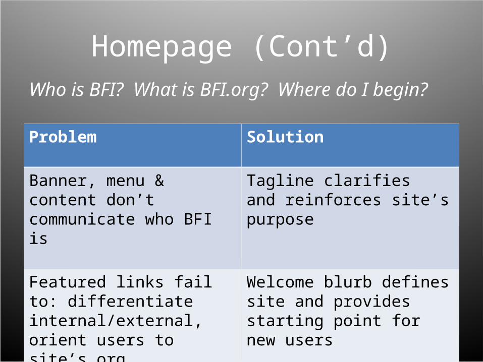
Homepage (Cont’d)
Problem Solution
Banner, menu & content don’t communicate who BFI is
Tagline clarifies and reinforces site’s purpose
Featured links fail to: differentiate internal/external, orient users to site’s org, (microsites lead away)
Welcome blurb defines site and provides starting point for new users
Who is BFI? What is BFI.org? Where do I begin?

Persistent and Local Navigation:Giving Users a Sense of Location
• Right-column navigation: not persistent throughout site
• Not inclusive of several main sections of site
• Despite large volume of content, lack of persistent search box

Persistent and Local Navigation (Cont’d)
• Breadcrumbs utilized, but are not descriptive at the end level
• Utilities should be limited to 4 or 5 links, and situated at the top, not in the footer

Content

Content: Disseminate Your Information!
Problem Solution
Blog format isn’t conducive to browsing; lots of scrolling necessary to examine content
Post articles as hyperlinks, with one-paragraph intros on main content sites; archiving of older articles
Content tags occupy too much space and displace other sidebar elements
Cut off the list of tags half-way through, and link users to a tags page to “see more”
It’s unclear when articles are posted Date articles
Many dead links Site maintenance

Registration

Registration (Cont’d)
• Access points are too discreet• Not much difference in site
appearance when logged in or out
• Would benefit from creation of a prominent registration section

A Note on Browser Compatibility
…but IE is missing elements!!
Same HTML code…
Conclusion
• BFI.org fails in presenting to users the myriad of resources and information it possesses.
• Site identifiers including a tagline and welcome blurb would be instrumental in defining the site to new users.
• Persistent navigation and a revised layout would help to facilitate browsing and better present content.

Our Proposed Revision: