Embed Size (px)
Citation preview

The Boom and Bust of U.S. Housing Prices from Various Geographic Perspectives
Jeffrey P. Cohen, Cletus C. Coughlin, and David A. Lopez
This paper summarizes changes in housing prices during the recent U.S. boom and bust from variousgeographic perspectives. Nationally, the Standard & Poor’s/Case-Shiller house price index more thandoubled in nominal terms during the boom and has fallen by roughly a third subsequently. During theboom, housing prices tended to rise much faster in metropolitan areas in the East and West Coast regionsthan in the country’s interior. After adjusting for inflation, 7 of 19 metropolitan areas have experiencedreal declines in housing prices from the start of the boom to the present. Although lower-priced housesshowed a larger percentage increase during the boom, higher-priced houses fared relatively better overthe boom and bust. Changes in land prices, which are not easily measured, appear to have driven hous-ing prices to a greater extent than changes in the prices of housing structures. Internationally, sevencountries experienced housing booms and busts; however, these countries tended to have larger boomsand smaller absolute busts than the United States. (JEL R31)
Federal Reserve Bank of St. Louis Review, September/October 2012, 94(5), pp. 341-67.
B eginning in the late 1990s, U.S. housing prices rose substantially and subsequently fellsharply.1 Because many jobs are related to the value of housing through spending byhouseholds and the public sector, especially local governments, the recent swings in
housing prices and housing-related employment have had significant macroeconomic andmicroeconomic consequences.2 Not surprisingly, interest in the movements of housing pricesover time and across geographic areas has heightened.
This paper is primarily a descriptive review of the recent boom and bust in U.S. housingprices from various geographic perspectives. Our focus is on presenting facts rather than pro-viding explanations for the housing price changes. Thus, we do not present models of houseprice determination. Nor do we examine the literature assessing the importance of fundamen-tals (e.g., wages and interest rates) for housing prices changes or the effect of other factors thatcontribute to bubbles. However, numerous references providing and examining explanationsfor the housing bubble, as well as housing price changes in its aftermath, are presented through-out the paper.3 Admittedly, the cited references are only a subset of the existing literature.
Jeffrey P. Cohen is an associate professor of economics at the University of Hartford. Cletus C. Coughlin is senior vice president and policyadviser to the president, and David A. Lopez is a senior research associate at the Federal Reserve Bank of St. Louis. Jeffrey P. Cohen acknowl-edges support by the Lincoln Institute of Land Policy and the University of Hartford.
© 2012, The Federal Reserve Bank of St. Louis. The views expressed in this article are those of the author(s) and do not necessarily reflect theviews of the Federal Reserve System, the Board of Governors, or the regional Federal Reserve Banks. Articles may be reprinted, reproduced,published, distributed, displayed, and transmitted in their entirety if copyright notice, author name(s), and full citation are included. Abstracts,synopses, and other derivative works may be made only with prior written permission of the Federal Reserve Bank of St. Louis.
Federal Reserve Bank of St. Louis REVIEW September/October 2012 341
We examine both national and metropolitan area changes in housing prices. Our review ofmetropolitan areas allows for comparisons across these areas and, more generally, across regions.In addition, we review changes in prices within and across metropolitan areas by housing tiers.For example, housing prices in a metropolitan area are grouped into three categories: low, middle,and high tiers. Then, within a metropolitan area, the behavior of prices across the three cate-gories is compared and, across metropolitan areas, the behavior of prices for each category iscompared. To complete our review, we compare the recent U.S. experience with those of numer-ous advanced foreign economies.
A portion of our review of national and metropolitan area housing prices examines thechanges in land prices and structure prices separately over the boom and bust periods. Asstressed by Davis and Heathcote (2007) and Davis and Palumbo (2008), the price of a house canbe separated into its physical structure, which is reproducible, and a plot of land, which is non-reproducible. These components serve different functions. The physical structure is an essentialinput for housing services as well as for leisure, while land, especially its geographic location,plays a key role in access to employment, public goods, and amenities.
These different functions and their varying degrees of reproducibility suggest that physicalstructures and land are priced differently. As a result, it is not surprising that the prices of struc-tures and land behave differently over time. Especially useful for our analysis are the estimatesgenerated by Davis and his co-authors (2007, 2008) of these prices over time, covering the recentU.S. housing price boom and bust for the nation overall and many individual metropolitanareas. The extent of the boom and bust has varied across metropolitan areas. The Davis datasetsand other research allow us to assess how changes in the prices of land and structures have indi-vidually contributed to the changes in housing prices.4
NATIONAL HOUSING PRICESWe begin by reviewing recent changes in housing prices at the national level. Exact dating
of the beginning of the boom and the beginning of the bust depends on the dataset used tomeasure national housing prices. We select dates that are generally consistent with multipledatasets. We date the beginning of the boom as 1998:Q1. The start of the bust likely occurred in2006; we date the end of the boom and the beginning of the bust as 2006:Q2. Generally speak-ing, the bust (or post-boom) period runs through 2012:Q1; however, at this time some metro-politan and international data are available only through an earlier date. As will become readilyapparent, disagreements occur regarding the precise timing of the boom and bust periods. Evenif consensus is reached on the national boom and bust dates, there is still considerable variationacross individual metropolitan areas. Such variation also exists across countries, but not allcountries have experienced housing price changes that can be characterized as a boom and bust.For our comparisons, we use the national dates, as defined above, for our comparisons.
Some Basic Facts on the Boom and the Bust
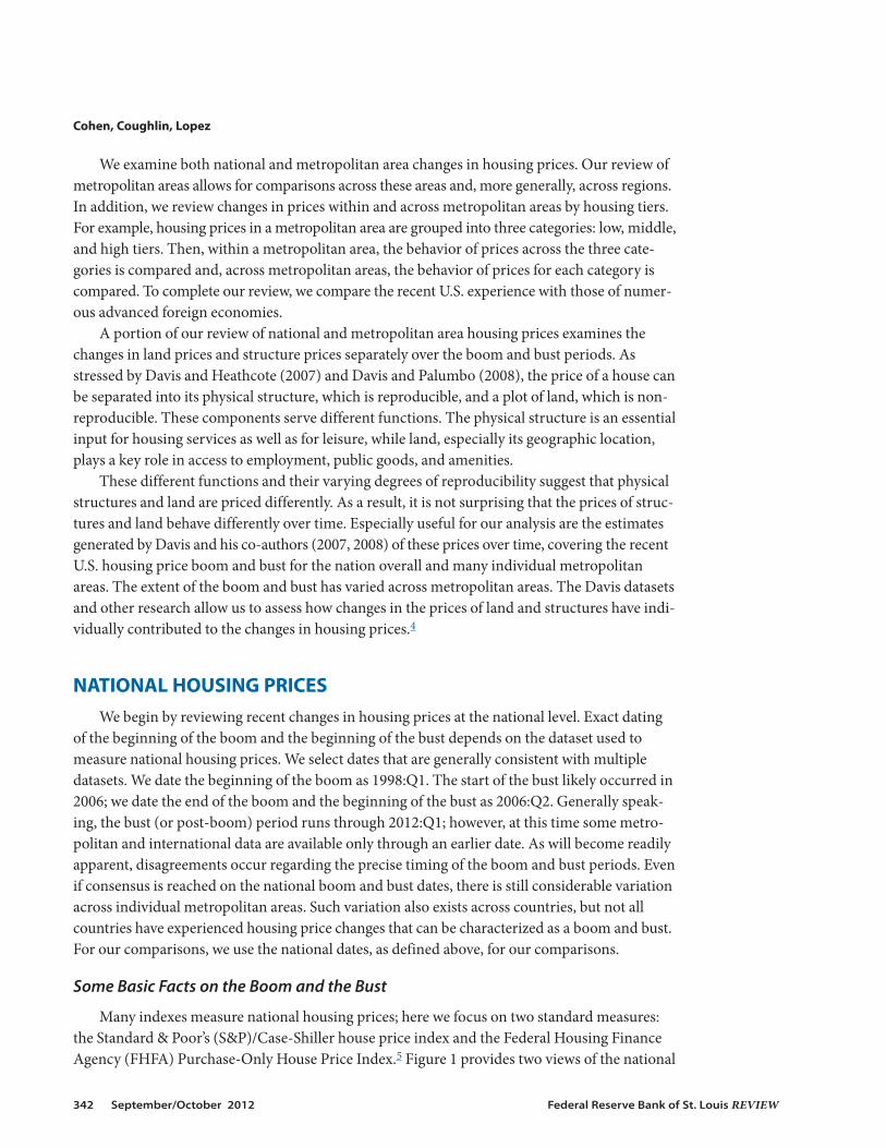
Many indexes measure national housing prices; here we focus on two standard measures:the Standard & Poor’s (S&P)/Case-Shiller house price index and the Federal Housing FinanceAgency (FHFA) Purchase-Only House Price Index.5 Figure 1 provides two views of the national
Cohen, Coughlin, Lopez
342 September/October 2012 Federal Reserve Bank of St. Louis REVIEW
Cohen, Coughlin, Lopez
Federal Reserve Bank of St. Louis REVIEW September/October 2012 343
0
50
100
150
200
250
1991 1995 1999 2003 2007 2011
S&P/Case-Shiller HPI: U.S. National
Index (SA), 2000:Q1 = 100
1998:Q1HPI = 86.39
2006:Q2HPI = 189.47
2012:Q1HPI = 127.32
Figure 1A
S&P/Case-Shiller House Price Index (1991:Q1–2012:Q1)
NOTE: The shaded areas indicate U.S. recessions as determined by the National Bureau of Economic Research. HPI, house price index; SA, seasonally adjusted.
–20
–15
–10
–5
0
5
10
15
20
1991 1995 1999 2003 2007 2011
Core PCE (year/year)
Percent (SA)
S&P/Case-Shiller HPI: U.S. National (year/year)
1998:Q1HPI = 4.77Core PCE = 1.51
2006:Q2HPI = 7.45Core PCE = 2.27
2012:Q1HPI = –1.86Core PCE = 1.98
Figure 1B
Core PCE Rate and Year-Over-Year Changes in the S&P/Case-Shiller HPI (1991:Q1–2012:Q1)
NOTE: The shaded areas indicate U.S. recessions. HPI, house price index; SA, seasonally adjusted.
S&P/Case-Shiller index since 1991. Figure 1A shows the level, while Figure 1B shows the year-over-year changes in this quarterly index. As Figure 1A shows, the level of this index began toincrease at a faster pace beginning in 1998:Q1. It peaked in 2006:Q1 and subsequently has gen-erally declined to its present level (as of 2012:Q1).
Meanwhile, Figure 1B highlights the following: (i) the significantly larger increases on ayear-over-year basis in housing prices during the boom period and the subsequent generaldecline in house prices, (ii) the faster pace of housing price increases relative to the core inflationpersonal consumption expenditure (PCE) index during the boom, and (iii) the faster growth ofthe core inflation PCE index relative to the pace of housing price changes during the subsequentperiod. In nominal terms, housing prices more than doubled, with an increase of 119 percentduring the boom period and a decline of 33 percent during the bust period. Overall housingprices increased 47 percent during the entire period (1998:Q1–2012:Q1).
The view changes slightly when housing prices are expressed in inflation-adjusted terms.Using the core inflation PCE index (see Figure 1B), housing prices increased 89 percent duringthe boom period and decreased 39 percent during the bust period.6 The overall housing priceincrease was 14 percent.
Figure 2 shows two views of the FHFA Purchase-Only House Price Index since 1991. Figure 2A shows that the level of this index began to increase at a faster pace beginning in1998:Q1. It peaked in 2007:Q1 and has subsequently generally declined to its present level (as of2012:Q1). Figure 2B shows the following: (i) the significantly larger increases in housing pricesduring the boom period and the general decline in house prices subsequently, (ii) the faster paceof housing price increases relative to the core inflation PCE index during the boom, and (iii) thefaster pace of the core inflation PCE index relative to the pace of housing price changes duringthe subsequent period. In nominal terms, housing prices increased 83 percent during the boomperiod and declined 18 percent during the bust period. The overall housing price increase was49 percent.
The view changes slightly when housing prices are expressed in inflation-adjusted terms.Using the core inflation PCE index (see Figure 2B), housing prices increased 57 percent duringthe boom period and decreased 26 percent during the bust period. The overall housing priceincrease was 16 percent.
Thus, despite the fact that the S&P/Case-Shiller index showed a larger boom and a largerbust than the FHFA purchase-only index, the two indexes are remarkably similar when thebeginning of the boom is compared with the present.7 To date, the increase in inflation-adjustedhousing prices is virtually identical: 14 percent using the S&P/Case-Shiller index and 16 percentusing the FHFA Purchase-Only index.
The aggregate market values of homes using the two indexes are also roughly similar at thebeginning of the boom compared with their most recent values. For example, using the S&P/Case-Shiller index, Davis and co-authors (2007, 2008) estimate an aggregate market value ofhomes of $10.9 trillion for 1998:Q1; using the FHFA housing price index, they estimate a valueof $11.4 trillion.8 Using the most recent estimates for 2012:Q1, the respective estimates are $19.5trillion and $20.8 trillion. As suggested above by the differences in percentage changes duringthe boom period, the estimates for 2006:Q2 differ substantially, with an estimate of $28.4 trillionbased on the S&P/Case-Shiller index and $24.9 trillion based on the FHFA index.
Cohen, Coughlin, Lopez
344 September/October 2012 Federal Reserve Bank of St. Louis REVIEW

Cohen, Coughlin, Lopez
Federal Reserve Bank of St. Louis REVIEW September/October 2012 345
50
100
150
200
250
1991 1995 1999 2003 2007 2011
FHFA HPI: Purchase-Only, U.S.
Index (SA), 1999:Q1 = 100
1998:Q1HPI = 121.21
2006:Q2HPI = 221.25
2012:Q1HPI = 181.03
Figure 2A
FHFA House Price Index (1991:Q1–2012:Q1)
NOTE: The shaded areas indicate U.S. recessions. HPI, house price index; SA, seasonally adjusted.
–15
–10
–5
0
5
10
15
1991 1995 1999 2003 2007 2011
Core PCE (year/year)
Percent (SA)
FHFA HPI: Purchase-Only, U.S. (year/year)
1998:Q1HPI = 3.94Core PCE = 1.51
2006:Q2HPI = 7.26Core PCE = 2.27
2012:Q1HPI = –0.48Core PCE = 1.98
Figure 2B
Core PCE Rate and Year-Over-Year Changes in the FHFA HPI (1991:Q1–2012:Q1)
NOTE: The shaded areas indicate U.S. recessions. HPI, house price index; SA, seasonally adjusted.
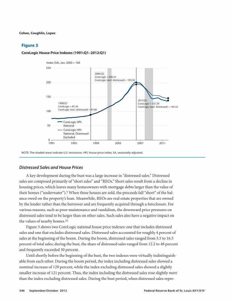
Distressed Sales and House Prices
A key development during the bust was a large increase in “distressed sales.” Distressedsales are composed primarily of “short sales” and “REOs.” Short sales result from a decline inhousing prices, which leaves many homeowners with mortgage debts larger than the value oftheir homes (“underwater”).9 When these houses are sold, the proceeds fall “short” of the bal-ance owed on the property’s loan. Meanwhile, REOs are real estate properties that are ownedby the lender rather than the borrower and are frequently acquired through a foreclosure. Forvarious reasons, such as poor maintenance and vandalism, the downward price pressures ondistressed sales tend to be larger than on other sales. Such sales also have a negative impact onthe values of nearby homes.10
Figure 3 shows two CoreLogic national house price indexes: one that includes distressedsales and one that excludes distressed sales. Distressed sales accounted for roughly 4 percent ofsales at the beginning of the boom. During the boom, distressed sales ranged from 3.5 to 16.5percent of total sales; during the bust, the share of distressed sales ranged from 12.2 to 48 percentand frequently exceeded 30 percent.
Until shortly before the beginning of the bust, the two indexes were virtually indistinguish-able from each other. During the boom period, the index including distressed sales showed anominal increase of 129 percent, while the index excluding distressed sales showed a slightlysmaller increase of 121 percent. Thus, the index including the distressed sales rose slightly morethan the index excluding distressed sales. During the bust period, when distressed sales repre-
Cohen, Coughlin, Lopez
346 September/October 2012 Federal Reserve Bank of St. Louis REVIEW
0
50
100
150
200
250
1991 1995 1999 2003 2007 2011
Index (SA), Jan. 2000 = 100
CoreLogic HPI:National, Distressed Excluded
CoreLogic HPI: National
1998:Q1CoreLogic = 87.34CoreLogic (excl. distressed) = 87.66
2006:Q2CoreLogic = 200.25CoreLogic (excl. distressed) = 193.50
2012:Q1CoreLogic = 137.29CoreLogic (excl. distressed) = 145.32
Figure 3
CoreLogic House Price Indexes (1991:Q1–2012:Q1)
NOTE: The shaded areas indicate U.S. recessions. HPI, house price index; SA, seasonally adjusted.
sented a relatively much larger share of sales than during the boom period, the decline in hous-ing prices including distressed sales was relatively much larger—falling 31 percent—than the 25percent decline in housing prices excluding distressed sales.
Housing Prices: Structure Versus Land
As stated earlier, a house consists of two components, a physical structure that can bereproduced and a nonreproducible plot of land. As such, the value of land is the capitalizedmarket value of a home’s location. Davis and Heathcote’s (2007) seminal contribution to thestudy of housing prices constructed the first constant-quality price and quantity indexes for theaggregate stock of residential land in the United States.11 Rather than repeat the details of theirestimation process, we focus on using their estimates of land values, structure values, and hous-ing prices.12
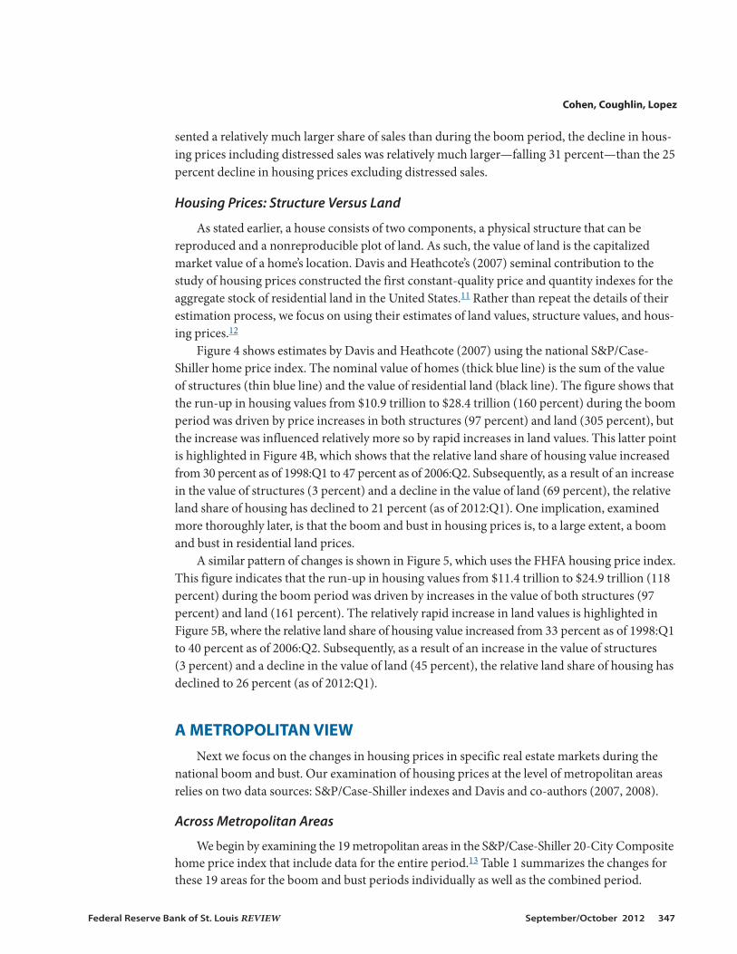
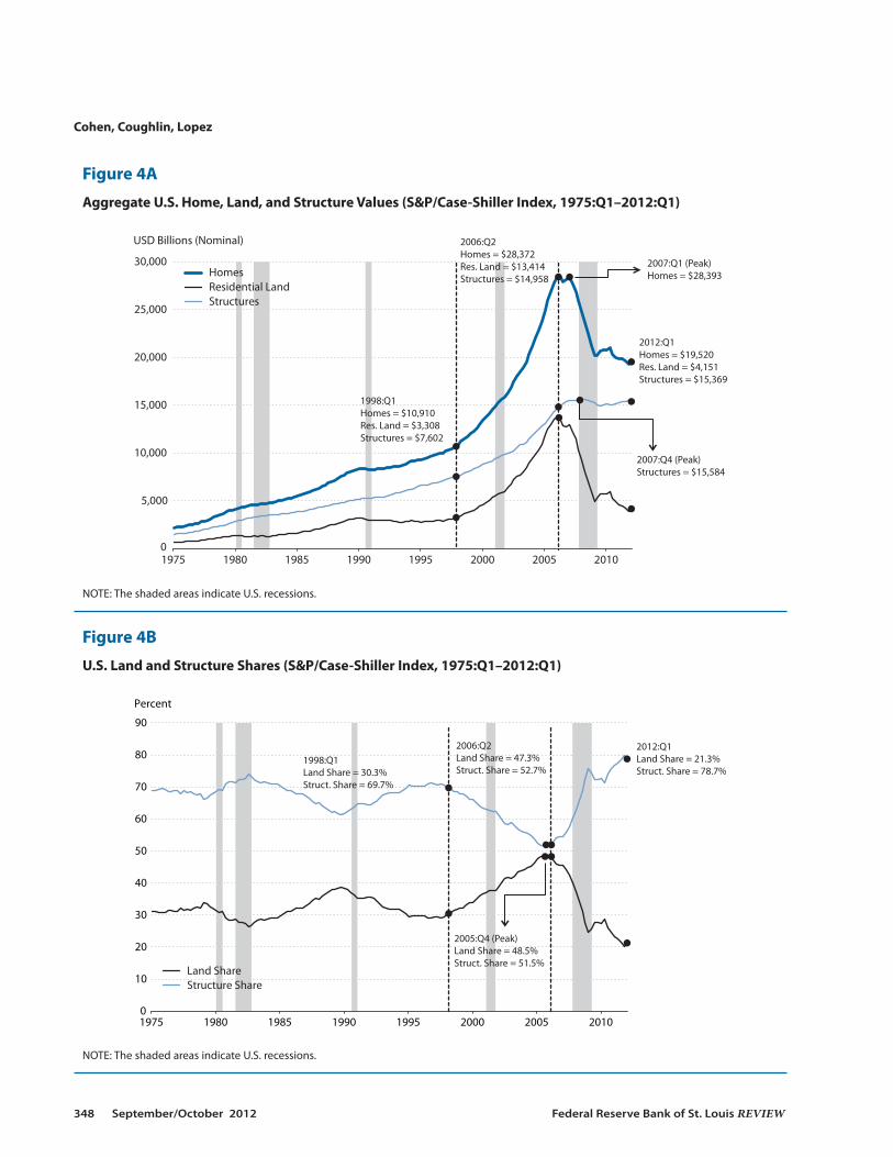
Figure 4 shows estimates by Davis and Heathcote (2007) using the national S&P/Case-Shiller home price index. The nominal value of homes (thick blue line) is the sum of the valueof structures (thin blue line) and the value of residential land (black line). The figure shows thatthe run-up in housing values from $10.9 trillion to $28.4 trillion (160 percent) during the boomperiod was driven by price increases in both structures (97 percent) and land (305 percent), butthe increase was influenced relatively more so by rapid increases in land values. This latter pointis highlighted in Figure 4B, which shows that the relative land share of housing value increasedfrom 30 percent as of 1998:Q1 to 47 percent as of 2006:Q2. Subsequently, as a result of an increasein the value of structures (3 percent) and a decline in the value of land (69 percent), the relativeland share of housing has declined to 21 percent (as of 2012:Q1). One implication, examinedmore thoroughly later, is that the boom and bust in housing prices is, to a large extent, a boomand bust in residential land prices.
A similar pattern of changes is shown in Figure 5, which uses the FHFA housing price index.This figure indicates that the run-up in housing values from $11.4 trillion to $24.9 trillion (118percent) during the boom period was driven by increases in the value of both structures (97percent) and land (161 percent). The relatively rapid increase in land values is highlighted inFigure 5B, where the relative land share of housing value increased from 33 percent as of 1998:Q1to 40 percent as of 2006:Q2. Subsequently, as a result of an increase in the value of structures (3 percent) and a decline in the value of land (45 percent), the relative land share of housing hasdeclined to 26 percent (as of 2012:Q1).
A METROPOLITAN VIEWNext we focus on the changes in housing prices in specific real estate markets during the
national boom and bust. Our examination of housing prices at the level of metropolitan areasrelies on two data sources: S&P/Case-Shiller indexes and Davis and co-authors (2007, 2008).
Across Metropolitan Areas
We begin by examining the 19 metropolitan areas in the S&P/Case-Shiller 20-City Compositehome price index that include data for the entire period.13 Table 1 summarizes the changes forthese 19 areas for the boom and bust periods individually as well as the combined period.
Cohen, Coughlin, Lopez
Federal Reserve Bank of St. Louis REVIEW September/October 2012 347
Cohen, Coughlin, Lopez
348 September/October 2012 Federal Reserve Bank of St. Louis REVIEW
0
5,000
10,000
15,000
20,000
25,000
30,000
1975 1980 1985 1990 1995 2000 2005 2010
Homes Residential Land Structures
USD Billions (Nominal)
1998:Q1Homes = $10,910Res. Land = $3,308Structures = $7,602
2006:Q2Homes = $28,372Res. Land = $13,414Structures = $14,958
2012:Q1Homes = $19,520Res. Land = $4,151Structures = $15,369
2007:Q4 (Peak)Structures = $15,584
2007:Q1 (Peak)Homes = $28,393
Figure 4A
Aggregate U.S. Home, Land, and Structure Values (S&P/Case-Shiller Index, 1975:Q1–2012:Q1)
NOTE: The shaded areas indicate U.S. recessions.
0
10
20
30
40
50
60
70
80
90
1975 1980 1985 1990 1995 2000 2005 2010
Percent
Land ShareStructure Share
1998:Q1Land Share = 30.3%Struct. Share = 69.7%
2006:Q2Land Share = 47.3%Struct. Share = 52.7%
2012:Q1Land Share = 21.3%Struct. Share = 78.7%
2005:Q4 (Peak)Land Share = 48.5%Struct. Share = 51.5%
Figure 4B
U.S. Land and Structure Shares (S&P/Case-Shiller Index, 1975:Q1–2012:Q1)
NOTE: The shaded areas indicate U.S. recessions.

Cohen, Coughlin, Lopez
Federal Reserve Bank of St. Louis REVIEW September/October 2012 349
0
5,000
10,000
15,000
20,000
25,000
30,000
1975 1980 1985 1990 1995 2000 2005 2010
USD Billions (Nominal)
Homes Residential Land Structures
1998:Q1Homes = $11,402Res. Land = $3,800Structures = $7,602
2006:Q2Homes = $24,857Res. Land = $9,899Structures = $14,958
2012:Q1Homes = $20,843Res. Land = $5,474Structures = $15,369
2007:Q4 (Peak)Structures = $15,584
2007:Q1 (Peak)Homes = $25,477
2007:Q2 (Peak)Res. Land = $10,005
Figure 5A
Aggregate U.S. Home, Land, and Structure Values (FHFA Index, 1975:Q1–2012:Q1)
NOTE: The shaded areas indicate U.S. recessions.
0
10
20
30
40
50
60
70
80
1975 1980 1985 1990 1995 2000 2005 2010
Percent
Land ShareStructure Share
1998:Q1Land Share = 33.3%Struct. Share = 66.7%
2006:Q2Land Share = 39.8%Struct. Share = 60.2%
2012:Q1Land Share = 26.3%Struct. Share = 73.7%
2005:Q2 (Peak)Land Share = 40.8%Struct. Share = 59.2%
Figure 5B
U.S. Land and Structure Shares (FHFA Index, 1975:Q1–2012:Q1)
NOTE: The shaded areas indicate U.S. recessions.

The metropolitan areas vary greatly in terms of the percentage changes in housing prices.For example, during the boom period, nominal housing prices more than tripled (i.e., increasedmore than 200 percent) in three areas: Los Angeles (232 percent), San Diego (212 percent), andMiami (207 percent). Meanwhile, housing prices increased by less than 50 percent in Cleveland(33 percent), Charlotte (34 percent), and Detroit (46 percent).14 To provide some perspective,assume two houses, each valued at $100,000, in Cleveland and Los Angeles at the beginning ofthe housing boom.15 At the end of the national boom, the value of the house in Cleveland wouldbe $133,000, while the value of the house in Los Angeles would be $332,000, roughly a $200,000difference.16
Similarly, the declines in housing prices during the bust period vary greatly. For example,the three cities with the largest percentage declines—Las Vegas (–62 percent), Phoenix (–54percent), and Miami (–50 percent)—experienced housing price declines of at least 50 percent,
Cohen, Coughlin, Lopez
350 September/October 2012 Federal Reserve Bank of St. Louis REVIEW
Table 1
Percent Change in House Prices across Metropolitan Areas
Percent Change, Percent Change, Nominal House Price Index Values Real House Price Index Values
Boom Bust Overall Boom Bust Overall Area (1998:Q1–2006:Q2) (2006:Q2–2012:Q1) (1998:Q1–2012:Q1) (1998:Q1–2006:Q2) (2006:Q2–2012:Q1) (1998:Q1–2012:Q1)
Atlanta 51.0 (16) –35.4 (9) –2.4 (17) 29.9 (16) –41.7 (9) –24.3 (17)
Boston 121.1 (10) –15.9 (17) 85.9 (5) 90.2 (10) –24.2 (17) 44.2 (5)
Charlotte 34.2 (18) –11.4 (18) 18.9 (15) 15.5 (18) –20.1 (18) –7.8 (15)
Chicago 85.1 (14) –35.3 (10) 19.8 (14) 59.3 (14) –41.7 (10) –7.1 (14)
Cleveland 33.3 (19) –20.1 (16) 6.5 (16) 14.7 (19) –27.9 (16) –17.4 (16)
Denver 71.3 (15) –9.2 (19) 55.5 (7) 47.4 (15) –18.1 (19) 20.7 (7)
Detroit 45.9 (17) –43.8 (5) –18.0 (19) 25.5 (17) –49.3 (5) –36.4 (19)
Las Vegas 150.3 (9) –61.5 (1) –3.7 (18) 115.4 (9) –65.3 (1) –25.3 (18)
Los Angeles 231.5 (1) –40.6 (7) 96.9 (2) 185.2 (1) –46.4 (7) 52.8 (2)
Miami 206.8 (3) –49.7 (3) 54.4 (9) 164.0 (3) –54.6 (3) 19.7 (9)
Minneapolis 107.2 (11) –34.2 (11) 36.3 (12) 78.3 (11) –40.7 (11) 5.8 (12)
New York 156.5 (8) –25.6 (13) 90.7 (3) 120.7 (8) –32.9 (13) 48.0 (3)
Phoenix 160.8 (7) –53.6 (2) 21.1 (13) 124.4 (7) –58.1 (2) –6.0 (13)
Portland 86.1 (13) –24.6 (14) 40.2 (10) 60.1 (13) –32.0 (14) 8.8 (10)
San Diego 212.2 (2) –39.4 (8) 89.3 (4) 168.6 (2) –45.3 (8) 46.9 (4)
San Francisco 180.2 (4) –40.7 (6) 66.2 (6) 141.1 (4) –46.5 (6) 28.9 (6)
Seattle 104.5 (12) –24.0 (15) 55.5 (8) 76.0 (12) –31.4 (15) 20.6 (8)
Tampa 161.7 (6) –46.9 (4) 38.9 (11) 125.2 (6) –52.1 (4) 7.8 (11)
Wash., D.C. 178.1 (5) –28.3 (12) 99.4 (1) 139.3 (5) –35.3 (12) 54.7 (1)
NOTE: Nominal values of the S&P/Case-Shiller house price index series were deflated using the Bureau of Economic Analysis (BEA)’s core PCEprice index. These real values were obtained by first reindexing Haver Analytics’ core PCE and nominal S&P/Case-Shiller series for each metro-politan area to 100 at 2000:Q1, and then dividing the reindexed S&P Case-Shiller series with the reindexed core PCE series. The numbers inparentheses indicate the rank within the 19 metropolitan areas. During both the boom period and the entire period, the metropolitan areawith the largest increase is ranked 1, while the area with the smallest increase is ranked 19. During the bust period, the metropolitan area withthe largest (absolute) decrease is ranked 1, while the area with the smallest (absolute) decrease is ranked 19.
while the four cities with the smallest declines—Denver (–9 percent), Charlotte (–11 percent),Boston (–16 percent), and Cleveland (–20 percent)—experienced declines of 20 percent or less.To provide some perspective, assume two houses, each valued at $200,000, in Las Vegas andDenver at the beginning of the national bust. At the end of the period, the value of the house inLas Vegas would be $76,000, while the value of the house in Denver would be $182,000, roughlya $100,000 difference.
The variation carries over to the changes over the entire period for the metropolitan areas.For example, three areas—Detroit (–18 percent), Las Vegas (–4 percent), and Atlanta (–2 per-cent)—experienced overall declines for the entire period, while in three other areas—Washington,D.C. (99 percent), Los Angeles (97 percent), and New York (91 percent)—housing prices nearlydoubled over the period. As a result, the hypothetical $100,000 house at the beginning of theboom would be valued at $82,000 in Detroit and $199,000 in Washington, D.C.
The disparity across metropolitan areas remains when adjusted for inflation, but the increasesduring the boom are much smaller and the decreases during the bust are much larger in absoluteterms. For example, during the boom, the real increases in Los Angeles, San Diego, and Miamiare 185 percent, 169 percent, and 164 percent, respectively, compared with the nominal increasesof 232 percent, 212 percent, and 207 percent. During the bust, the real decreases in Las Vegas,Phoenix, and Miami are 65 percent, 58 percent, and 55 percent, respectively, rather than thenominal decreases of 62 percent, 54 percent, and 50 percent.
After adjusting for inflation, seven metropolitan areas have experienced housing pricedeclines for the entire period. In addition to Detroit (–36 percent) and Las Vegas (–25 percent),Atlanta (–24 percent), Cleveland (–17 percent), Charlotte (–8 percent), Chicago (–7 percent),and Phoenix (–6 percent) also experienced declines in real housing prices. Overall, two metro-politan areas experienced real housing price increases of more than 50 percent: Washington,D.C. (55 percent) and Los Angeles (53 percent).
To explore potential relationships across the periods for the metropolitan areas, we calculatedsimple rank correlation coefficients. The range of this statistic is from –1 to +1. When comparingtwo sets of ranks, values close to –1 (+1) indicate that metropolitan areas ranked higher in oneperiod tend to be ranked lower (higher) in the second period, while a value near 0 indicates littleor no association. First, we find that the rank correlation between the boom and bust periods is0.53.17 Thus, metropolitan areas with the larger booms tended to have larger busts. Second, wefind a rank correlation of 0.68 between the boom period and overall. This result suggests thatmetropolitan areas with the largest booms tended to maintain their rank for the period overall.Third, we find a rank correlation of –0.22 between the bust period and overall. This suggeststhat metropolitan areas with the largest busts tended to have smaller overall changes; however,in contrast to the two other rank correlations, this rank correlation is not statistically significant.
Within Metros, Across Tiers and Across Metros, Within Tiers
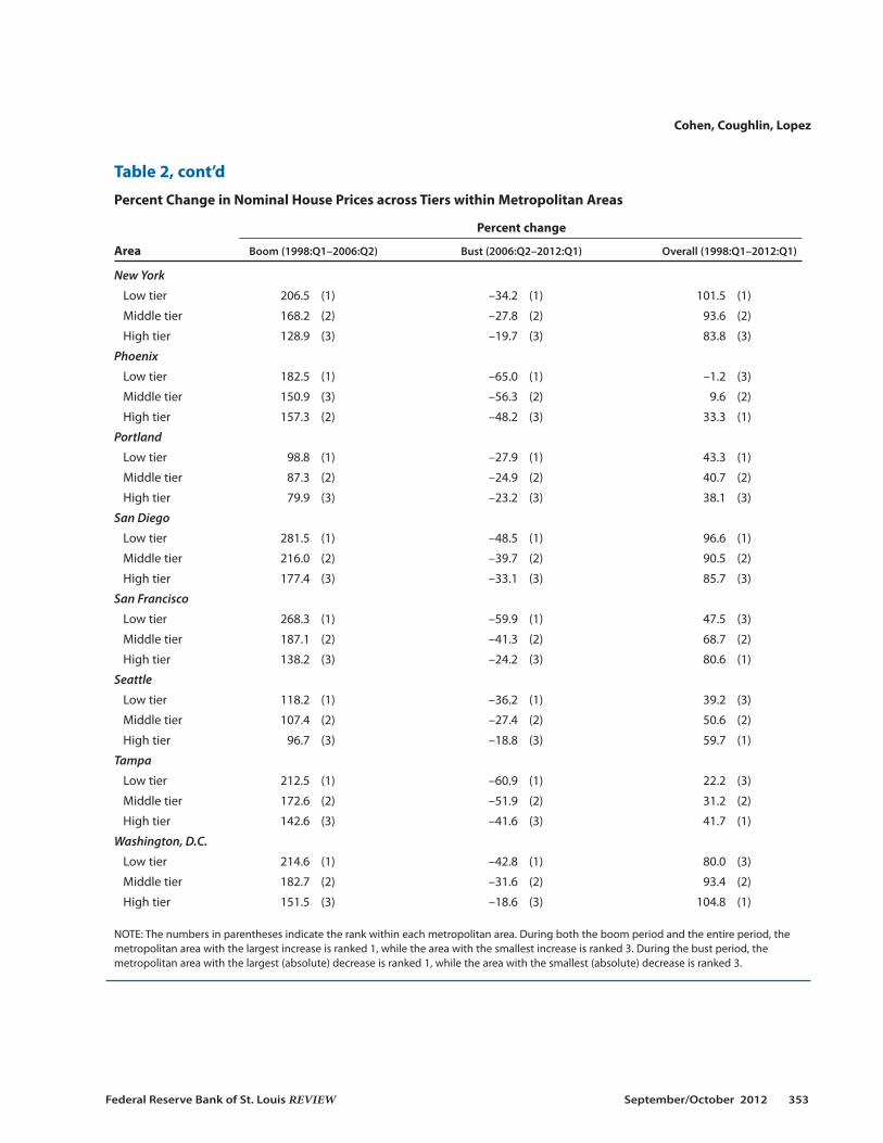
Here we examine the 16 metropolitan areas in the S&P/Case-Shiller 20-City Compositehome price index that include data for the entire period. Table 2 summarizes the percentagechanges in housing prices within these areas across housing price tiers. These tiers are con-structed so the same number of sales occur in each of the three tiers for a given time period.Then, each repeat-sale pair is assigned to one of the three tiers depending on the first sale price.
Cohen, Coughlin, Lopez
Federal Reserve Bank of St. Louis REVIEW September/October 2012 351

Cohen, Coughlin, Lopez
352 September/October 2012 Federal Reserve Bank of St. Louis REVIEW
Table 2
Percent Change in Nominal House Prices across Tiers within Metropolitan Areas
Percent change
Area Boom (1998:Q1–2006:Q2) Bust (2006:Q2–2012:Q1) Overall (1998:Q1–2012:Q1)
Atlanta
Low tier 61.0 (1) –63.9 (1) –41.9 (3)
Middle tier 46.0 (3) –41.6 (2) –14.7 (2)
High tier 51.2 (2) –26.3 (3) 11.4 (1)
Boston
Low tier 184.6 (1) –28.2 (1) 104.3 (1)
Middle tier 129.2 (2) –19.4 (2) 84.8 (2)
High tier 98.3 (3) –9.7 (3) 79.0 (3)
Chicago
Low tier 96.1 (1) –53.6 (1) –9.1 (3)
Middle tier 90.3 (2) –40.7 (2) 12.9 (2)
High tier 76.5 (3) –28.8 (3) 25.7 (1)
Denver
Low tier 76.9 (1) –15.2 (1) 50.0 (3)
Middle tier 67.6 (3) –7.3 (3) 55.3 (1)
High tier 70.2 (2) –8.9 (2) 55.0 (2)
Las Vegas
Low tier 164.2 (1) –70.0 (1) –20.6 (3)
Middle tier 148.4 (2) –63.0 (2) –8.1 (2)
High tier 142.7 (3) –57.5 (3) 3.3 (1)
Los Angeles
Low tier 316.9 (1) –53.5 (1) 94.0 (3)
Middle tier 248.1 (2) –41.6 (2) 103.4 (1)
High tier 188.0 (3) –31.6 (3) 97.1 (2)
Miami
Low tier 264.9 (1) –65.2 (1) 27.0 (3)
Middle tier 215.4 (2) –53.8 (2) 45.9 (2)
High tier 184.0 (3) –43.2 (3) 61.4 (1)
Minneapolis
Low tier 144.3 (1) –48.0 (1) 27.0 (3)
Middle tier 103.5 (2) –35.2 (2) 31.8 (2)
High tier 93.6 (3) –29.0 (3) 37.5 (1)
Cohen, Coughlin, Lopez
Federal Reserve Bank of St. Louis REVIEW September/October 2012 353
Table 2, cont’d
Percent Change in Nominal House Prices across Tiers within Metropolitan Areas
Percent change
Area Boom (1998:Q1–2006:Q2) Bust (2006:Q2–2012:Q1) Overall (1998:Q1–2012:Q1)
New York
Low tier 206.5 (1) –34.2 (1) 101.5 (1)
Middle tier 168.2 (2) –27.8 (2) 93.6 (2)
High tier 128.9 (3) –19.7 (3) 83.8 (3)
Phoenix
Low tier 182.5 (1) –65.0 (1) –1.2 (3)
Middle tier 150.9 (3) –56.3 (2) 9.6 (2)
High tier 157.3 (2) –48.2 (3) 33.3 (1)
Portland
Low tier 98.8 (1) –27.9 (1) 43.3 (1)
Middle tier 87.3 (2) –24.9 (2) 40.7 (2)
High tier 79.9 (3) –23.2 (3) 38.1 (3)
San Diego
Low tier 281.5 (1) –48.5 (1) 96.6 (1)
Middle tier 216.0 (2) –39.7 (2) 90.5 (2)
High tier 177.4 (3) –33.1 (3) 85.7 (3)
San Francisco
Low tier 268.3 (1) –59.9 (1) 47.5 (3)
Middle tier 187.1 (2) –41.3 (2) 68.7 (2)
High tier 138.2 (3) –24.2 (3) 80.6 (1)
Seattle
Low tier 118.2 (1) –36.2 (1) 39.2 (3)
Middle tier 107.4 (2) –27.4 (2) 50.6 (2)
High tier 96.7 (3) –18.8 (3) 59.7 (1)
Tampa
Low tier 212.5 (1) –60.9 (1) 22.2 (3)
Middle tier 172.6 (2) –51.9 (2) 31.2 (2)
High tier 142.6 (3) –41.6 (3) 41.7 (1)
Washington, D.C.
Low tier 214.6 (1) –42.8 (1) 80.0 (3)
Middle tier 182.7 (2) –31.6 (2) 93.4 (2)
High tier 151.5 (3) –18.6 (3) 104.8 (1)
NOTE: The numbers in parentheses indicate the rank within each metropolitan area. During both the boom period and the entire period, themetropolitan area with the largest increase is ranked 1, while the area with the smallest increase is ranked 3. During the bust period, themetro politan area with the largest (absolute) decrease is ranked 1, while the area with the smallest (absolute) decrease is ranked 3.

Cohen, Coughlin, Lopez
354 September/October 2012 Federal Reserve Bank of St. Louis REVIEW
Table 3
Percent Change in Nominal House Prices across Metropolitan Areas within Tiers
Percent change
Tier Boom (1998:Q1–2006:Q2) Bust (2006:Q2–2012:Q1) Overall (1998:Q1–2012:Q1)
Low tier
Atlanta 61.0 (16) –63.9 (4) –41.9 (16)
Boston 184.6 (8) –28.2 (14) 104.3 (1)
Chicago 96.1 (14) –53.6 (7) –9.1 (14)
Denver 76.9 (15) –15.2 (16) 50.0 (6)
Las Vegas 164.2 (10) –70.0 (1) –20.6 (15)
Los Angeles 316.9 (1) –53.5 (8) 94.0 (4)
Miami 264.9 (4) –65.2 (2) 27.0 (10)
Minneapolis 144.3 (11) –48.0 (10) 27.0 (11)
New York 206.5 (7) –34.2 (13) 101.5 (2)
Phoenix 182.5 (9) –65.0 (3) –1.2 (13)
Portland 98.8 (13) –27.9 (15) 43.3 (8)
San Diego 281.5 (2) –48.5 (9) 96.6 (3)
San Francisco 268.3 (3) –59.9 (6) 47.5 (7)
Seattle 118.2 (12) –36.2 (12) 39.2 (9)
Tampa 212.5 (6) –60.9 (5) 22.2 (12)
Washington, D.C. 214.6 (5) –42.8 (11) 80.0 (5)
Middle tier
Atlanta 46.0 (16) –41.6 (5) –14.7 (16)
Boston 129.2 (10) –19.4 (15) 84.8 (5)
Chicago 90.3 (13) –40.7 (8) 12.9 (13)
Denver 67.6 (15) –7.3 (16) 55.3 (7)
Las Vegas 148.4 (9) –63.0 (1) –8.1 (15)
Los Angeles 248.1 (1) –41.6 (6) 103.4 (1)
Miami 215.4 (3) –53.8 (3) 45.9 (9)
Minneapolis 103.5 (12) –35.2 (10) 31.8 (11)
New York 168.2 (7) –27.8 (12) 93.6 (2)
Phoenix 150.9 (8) –56.3 (2) 9.6 (14)
Portland 87.3 (14) –24.9 (14) 40.7 (10)
San Diego 216.0 (2) –39.7 (9) 90.5 (4)
San Francisco 187.1 (4) –41.3 (7) 68.7 (6)
Seattle 107.4 (11) –27.4 (13) 50.6 (8)
Tampa 172.6 (6) –51.9 (4) 31.2 (12)
Washington, D.C. 182.7 (5) –31.6 (11) 93.4 (3)
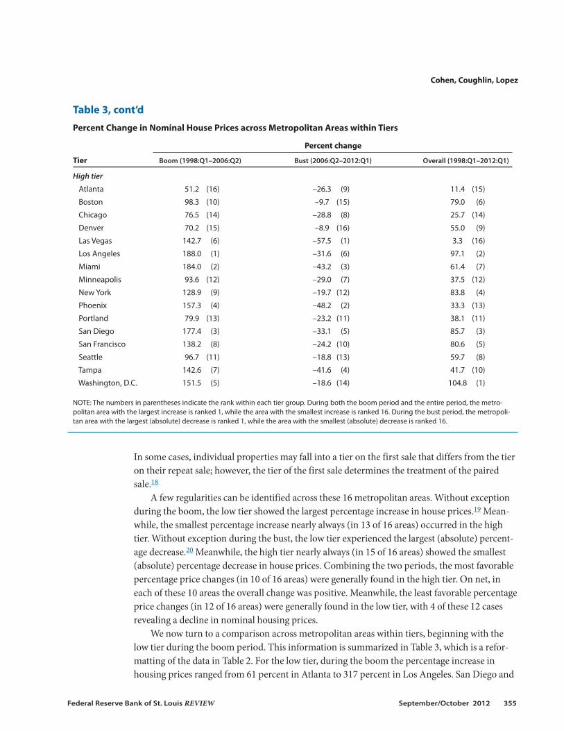
In some cases, individual properties may fall into a tier on the first sale that differs from the tieron their repeat sale; however, the tier of the first sale determines the treatment of the pairedsale.18
A few regularities can be identified across these 16 metropolitan areas. Without exceptionduring the boom, the low tier showed the largest percentage increase in house prices.19 Mean -while, the smallest percentage increase nearly always (in 13 of 16 areas) occurred in the hightier. Without exception during the bust, the low tier experienced the largest (absolute) percent-age decrease.20 Meanwhile, the high tier nearly always (in 15 of 16 areas) showed the smallest(absolute) percentage decrease in house prices. Combining the two periods, the most favorablepercentage price changes (in 10 of 16 areas) were generally found in the high tier. On net, ineach of these 10 areas the overall change was positive. Meanwhile, the least favorable percentageprice changes (in 12 of 16 areas) were generally found in the low tier, with 4 of these 12 casesrevealing a decline in nominal housing prices.
We now turn to a comparison across metropolitan areas within tiers, beginning with thelow tier during the boom period. This information is summarized in Table 3, which is a refor-matting of the data in Table 2. For the low tier, during the boom the percentage increase inhousing prices ranged from 61 percent in Atlanta to 317 percent in Los Angeles. San Diego and
Cohen, Coughlin, Lopez
Federal Reserve Bank of St. Louis REVIEW September/October 2012 355
Table 3, cont’d
Percent Change in Nominal House Prices across Metropolitan Areas within Tiers
Percent change
Tier Boom (1998:Q1–2006:Q2) Bust (2006:Q2–2012:Q1) Overall (1998:Q1–2012:Q1)
High tier
Atlanta 51.2 (16) –26.3 (9) 11.4 (15)
Boston 98.3 (10) –9.7 (15) 79.0 (6)
Chicago 76.5 (14) –28.8 (8) 25.7 (14)
Denver 70.2 (15) –8.9 (16) 55.0 (9)
Las Vegas 142.7 (6) –57.5 (1) 3.3 (16)
Los Angeles 188.0 (1) –31.6 (6) 97.1 (2)
Miami 184.0 (2) –43.2 (3) 61.4 (7)
Minneapolis 93.6 (12) –29.0 (7) 37.5 (12)
New York 128.9 (9) –19.7 (12) 83.8 (4)
Phoenix 157.3 (4) –48.2 (2) 33.3 (13)
Portland 79.9 (13) –23.2 (11) 38.1 (11)
San Diego 177.4 (3) –33.1 (5) 85.7 (3)
San Francisco 138.2 (8) –24.2 (10) 80.6 (5)
Seattle 96.7 (11) –18.8 (13) 59.7 (8)
Tampa 142.6 (7) –41.6 (4) 41.7 (10)
Washington, D.C. 151.5 (5) –18.6 (14) 104.8 (1)
NOTE: The numbers in parentheses indicate the rank within each tier group. During both the boom period and the entire period, the metro -politan area with the largest increase is ranked 1, while the area with the smallest increase is ranked 16. During the bust period, the metropoli-tan area with the largest (absolute) decrease is ranked 1, while the area with the smallest (absolute) decrease is ranked 16.

San Francisco have the next-largest changes with increases of 281 percent and 268 percent,respectively. During the bust, the percentage changes (i.e., declines) in housing prices rangedfrom –15 percent in Denver to –70 percent in Las Vegas.
Given these changes during the boom and bust periods, is there any association betweenthem? For example, did areas experiencing the largest percentage increases in low-tier housingprices during the boom experience the largest (absolute) percentage decreases during the bust?To answer this question, we calculate a simple rank correlation coefficient. In the present case,the rank correlation coefficient is 0.21, which indicates a small, but not statistically significant,association across the two periods.
During the entire period under consideration, large percentage differences occurred in thechanges in low-tier housing prices across metropolitan areas. Housing prices more than doubledin Boston (104 percent) and New York (102 percent), while housing prices declined in four cities:Atlanta (–42 percent), Las Vegas (–21 percent), Chicago (–9 percent), and Phoenix (–1 percent).
For the middle tier, identical to the low tier, housing prices during the boom rose the mostin percentage terms in Los Angeles (248 percent) and San Diego (216 percent). Miami was aclose third with an increase of 215 percent. Also identical to the low tier, housing prices rose theleast in Atlanta (46 percent) and Denver (68 percent). In fact, the rank correlation coefficientusing the low and middle tiers during the boom period is 0.98, indicating a high degree of asso-ciation. In other words, the ranking of areas from the largest to the smallest in terms of housingprice percentage changes is virtually identical for the low and middle tiers.
During the bust period, Denver experienced the smallest decline (–7 percent), while LasVegas experienced the largest decline (–63 percent). In fact, the rank correlation coefficient usingthe low and middle tiers for the bust period is also 0.98, indicating that the ranking of housingprice percentage changes is virtually identical for the low and middle tiers. Meanwhile, the sim-ple rank correlation coefficient using the boom and bust periods for the middle tier is 0.37, sug-gesting a positive but statistically insignificant association.
During the entire period under consideration, similar to the low tier, Los Angeles (103 per-cent) and New York (94 percent) were among the areas with the largest increases for the middletier. Atlanta (–15 percent) and Las Vegas (–8 percent) were the only two middle tier areas withoverall declines in housing prices. Comparing the overall changes for the middle tier with thosefor the low tier yields a rank correlation coefficient of 0.94, suggesting little difference acrosstiers in terms of the ranking of housing price changes.
Turning to the high tier, as occurred in the other tiers during the boom period, Los Angelesexperienced the largest percentage increase (188 percent). In light of the preceding results, it isnot surprising that Miami (184 percent) and San Diego (177 percent) also showed large increases.It is also not surprising that Atlanta (51 percent) and Denver (70 percent) showed the smallestincreases. The similarity across tiers during the boom period is reflected in the rank correlationcoefficients. For the high and low tiers the rank correlation coefficient is 0.88, while for the highand middle tiers the rank correlation coefficient is 0.93.
During the bust period for the high tier, Denver experienced the smallest decline (–9 per-cent), while Las Vegas experienced the largest decline (–57 percent). Using the boom and bustperiods for the high tier, the rank correlation coefficient is 0.55, indicating that areas with thelargest percentage increases during the boom period tended to have the largest (absolute) per-
Cohen, Coughlin, Lopez
356 September/October 2012 Federal Reserve Bank of St. Louis REVIEW

centage decreases during the bust. Is there any similarity across tiers during the bust period?Using the high and low tiers, the rank correlation coefficient is 0.85, while using the high andmiddle tiers the rank correlation coefficient is 0.90. Thus, it appears that across areas the tiersbehaved similarly.
Across Metropolitan Areas: Land Versus Structure
The importance of land and structures in determining house values across metropolitanareas can be examined by using data from Davis and co-authors (2007, 2008).21 Using additionaldata, we repeat calculations analogous to those in Davis and Palumbo (2008) and highlight someof the key observations across metropolitan areas during the national boom and bust in hous-ing prices.
Based on Table 4, which shows the inflation-adjusted levels of home values as well as thecomponents of structure and land, and Table 5, which shows the percentage changes in these
Cohen, Coughlin, Lopez
Federal Reserve Bank of St. Louis REVIEW September/October 2012 357
Table 4
Components of Home Value by Geographic Region
Component value ($)
Region Home Structure Land Land’s share of value (%)
1998:Q1
Midwest 148,169 109,388 38,781 25
Southeast 147,047 93,539 53,508 35
Southwest 140,778 95,458 45,320 29
East Coast 207,709 113,200 94,509 44
West Coast 294,145 108,705 185,440 58
Full sample 189,984 105,537 84,447 38
2006:Q2
Midwest 195,896 135,656 60,240 27
Southeast 204,030 126,733 77,297 35
Southwest 205,476 122,345 83,130 34
East Coast 434,659 148,119 286,541 64
West Coast 706,972 145,988 560,984 76
Full sample 356,472 136,766 219,706 47
2012:Q1
Midwest 138,425 130,930 7,495 5
Southeast 132,780 119,843 12,936 9
Southwest 155,990 133,846 22,145 13
East Coast 286,100 166,311 119,789 39
West Coast 388,773 168,691 220,082 48
Full sample 224,564 145,427 79,138 23
NOTE: Nominal values for home, structure, and land values are deflated with the BEA’s core PCE index (2004 = 100). Unweighted averages aretaken across sample cities in each region. A total of 46 MSAs are included in the full sample (see the appendix). The land share percentages foreach geographic region were obtained by averaging the individual land share percentages for all the MSAs within each geographic region.

levels for the boom period, the bust period, and overall, a number of observations are apparent.Table 4 shows that average home values tend to be much higher for metropolitan areas on theEast and West Coasts than in the Midwest, Southeast, and Southwest. For example, housingprices during 1998:Q1 for metropolitan areas in the East Coast region were 40 percent higherthan in the Midwest, 41 percent higher than in the Southeast, and 48 percent higher than in theSouthwest. Meanwhile, housing prices in the West Coast region were roughly double those inthe Midwest, Southeast, and Southwest.
We now turn to observations highlighted by Table 5. First, during the boom period, homevalues increased substantially more in metropolitan areas on the East Coast and West Coastthan in metropolitan areas elsewhere. In metropolitan areas on the East Coast and West Coast,real home prices more than doubled, while in metropolitan areas elsewhere (i.e., Midwest,
Cohen, Coughlin, Lopez
358 September/October 2012 Federal Reserve Bank of St. Louis REVIEW
Table 5
Change in Components of Home Value by Geographic Region
Cumulative change in value (%)
Change in land’s share of value Region Home Structure Land (percentage points)
1998:Q1–2006:Q2
Midwest 30 24 61 2.5
Southeast 42 37 62 –0.1
Southwest 42 27 79 5.3
East Coast 107 32 204 19.5
West Coast 141 34 231 17.4
Full sample 73 30 130 9.3
2006:Q2–2012:Q2
Midwest –27 –4 –80 –21.8
Southeast –33 –4 –81 –26.1
Southwest –18 9 –65 –21.1
East Coast –33 12 –59 –24.4
West Coast –45 15 –65 –27.6
Full sample –31 6 –70 –23.9
1998:Q1–2012:Q1
Midwest –6 19 –72 –19.3
Southeast –9 32 –79 –26.1
Southwest 13 39 –39 –15.8
East Coast 36 48 21 –4.9
West Coast 30 55 3 –10.1
Full sample 13 38 –32 –14.6
NOTE: Nominal values for home, structure, and land values are deflated with the BEA’s core PCE index (2004 = 100). Unweighted averages ofthe individual percent changes for each MSA are taken across sample cities in each region. A total of 46 MSAs are included in the full sample(see the appendix). The changes in land share percentages were obtained by averaging the individual differences in MSA land share percent-ages for the two quarters in question.
Southeast, and Southwest) the increase was less than 50 percent. Second, during the bust, thepercentage declines in the metropolitan areas on the East Coast and West Coast were onlyslightly larger than in other areas. Third, over the entire period (i.e., the beginning of the boomto the present [as of 2012:Q1]) home prices showed substantial increases in the metropolitanareas on the East Coast and West Coast and only small changes elsewhere.
In addition to grouping the metropolitan areas into regions, we also examined patterns inhousing price changes across the 46 metropolitan areas. A rank correlation coefficient of 0.74indicates that metropolitan areas with the largest percentage gains in housing values during theboom also tended to be the areas with the largest percentage declines during the bust. With arank correlation of 0.69, the same pattern holds between the boom and overall changes in hous-ing prices. However, no statistically significant relationship was found between the bust andoverall changes in housing prices.
Shifting to an examination of the relative importance of changes in land values relative tostructure values, a number of observations stand out. First, Table 4 shows that at the beginningof the boom, the land share of a home’s total value was substantially larger in metropolitan areason the East Coast and West Coast than elsewhere. For example, the land share was 44 percenton the East Coast and 58 percent on the West Coast, while it was 25 percent in the Midwest, 35percent in the Southeast, and 29 percent in the Southwest.
Second, during the boom, the land share of a home’s total value rose substantially in metro-politan areas on the East Coast and West Coast, while this share changed minimally elsewhere.Using Table 5 (rounded values), the land share increased 20 percentage points on the East Coastand 17 percentage points on the West Coast, while it increased 2 percentage points in the Midwest,was roughly unchanged in the Southeast, and increased 5 percentage points in the Southwest.
Third, during the bust, the land share of a home’s total value declined substantially in metro-politan areas throughout the United States. The average decline was 24 percentage points nation -ally, ranging from 21 percentage points in metropolitan areas in the Southwest to 28 percentagepoints in metropolitan areas on the West Coast.
Fourth, the current land share of a home’s total value is only marginally lower than it was atthe beginning of the boom in metropolitan areas on the East Coast and West Coast, while it issubstantially lower elsewhere. For example, the land share is 5 percentage points lower on theEast Coast and 10 percentage points lower on the West Coast, while it is 20 percentage pointslower in the Midwest, 26 percentage points lower in the Southeast, and 16 percentage pointslower in the Southwest. Thus, the land share of a home’s total value has remained relativelyhigher on the East Coast and West Coast than elsewhere in the United States.
Examining the 46 metropolitan areas individually provides additional insights concerningchanges in land prices and structure prices across these areas. No statistically significant relation-ship was found for land price percentage changes using the boom and bust periods. However,metropolitan areas with the largest percentage increases in land prices during the boom alsotended to have the largest increases overall, and metropolitan areas with the largest percentagedeclines during the bust tended to have the smallest increases overall. The rank correlation coeffi-cients were 0.54 and –0.82, respectively.
The rank correlation of –0.40 for structure prices suggests that metropolitan areas with thelargest percentage increases in structure prices during the boom tended to be the areas with the
Cohen, Coughlin, Lopez
Federal Reserve Bank of St. Louis REVIEW September/October 2012 359

smallest percentage declines during the bust. In addition, metropolitan areas with the largestpercentage increases in structure prices during the boom also tended to have the largest increasesoverall, and metropolitan areas with the largest percentage declines during the bust tended tohave smaller increases overall. The rank correlation coefficients were 0.79 and –0.81, respectively.
In contrast to Davis and co-authors (2007, 2008), Kuminoff and Pope (2011) estimate themarket value of residential structures as opposed to the replacement cost of residential structures.It is certainly possible that these two measures could differ. If so, then the estimates of residentialland by these groups of authors would differ as well. In fact, this is what Kuminoff and Pope(2011) find when they compare their annual estimates for 1998-2009 for Miami, San Francisco,Boston, and Charlotte with those of Davis and Palumbo (2008). Kuminoff and Pope (2011) findevidence suggesting that the market values of structures may have exceeded their replacementcosts during the boom period.22 This implies that during the boom period the land shares esti-mated by Kuminoff and Pope (2011) should tend to be less than those estimated by Davis andPalumbo (2008).23 Moreover, an implication of Kuminoff and Pope’s (2011) study is that changesin the market value of structures played a larger role in home price volatility than implied byDavis and Palumbo (2008).24
HOUSING PRICES ABROAD: DIFFERENCES AND SIMILARITIESTo provide a broader geographic perspective, we explore how housing prices in other coun-
tries changed during the boom and bust in housing prices in the United States.25 Not surprisingly,we find much diversity across countries; however, the patterns in housing prices for 7 of the 18countries examined are roughly similar to those in the United States.
Table 6 provides a summary of the experiences of the United States and 18 foreign countries.The price index for each country is consistent with the FHFA quarterly housing price index usedpreviously. For comparability across countries, we use inflation-adjusted housing prices.26 Thetable reports the inflation-adjusted housing prices for each country for the periods used for theU.S. boom and bust. A few facts stand out. First, during the boom, the increase in the UnitedStates was not especially large. The U.S. increase ranked 15th among the 19 countries. Second,during the bust, the U.S. decline was relatively large. Only Ireland experienced a larger decline.Third, the rank correlation across countries between the boom and the bust is small (0.22) andis not statistically significant.
Obviously, a specific country’s boom and bust need not exactly coincide with the U.S. expe-rience, so the following discussion of similarity/dissimilarity relies on both the actual numbersin the table and an assessment based on the pattern of price changes during recent years. Webegin by looking at the countries that did not experience housing price changes similar tothose in the United States. These countries fall into one of two categories: First, two countries—Germany and Japan—experienced no boom in housing prices, but rather had a general declinein inflation-adjusted housing prices from 1998 onward. For example, during the boom period,while U.S. prices rose 50 percent, housing prices in Germany and Japan declined 11 percent and26 percent, respectively. From the beginning of the boom period to the present, German andJapanese prices fell by 16 percent and 32 percent, respectively, while U.S. prices rose by 16 percent.
Cohen, Coughlin, Lopez
360 September/October 2012 Federal Reserve Bank of St. Louis REVIEW
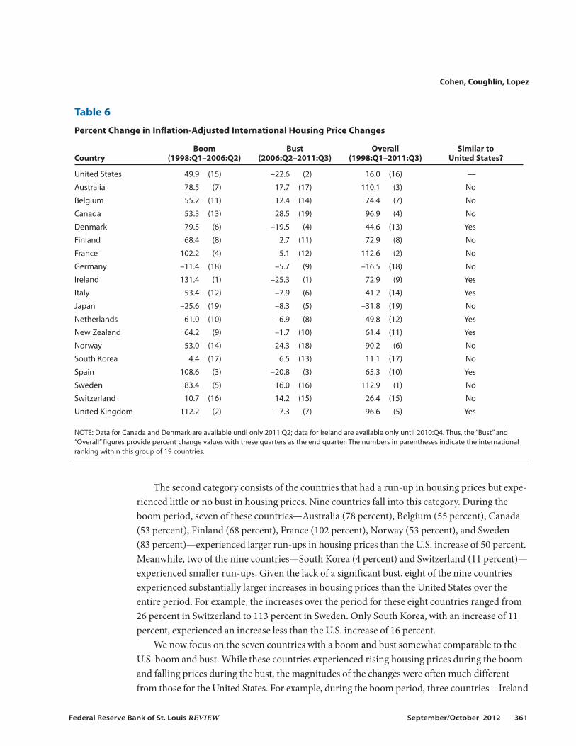
The second category consists of the countries that had a run-up in housing prices but expe-rienced little or no bust in housing prices. Nine countries fall into this category. During theboom period, seven of these countries—Australia (78 percent), Belgium (55 percent), Canada(53 percent), Finland (68 percent), France (102 percent), Norway (53 percent), and Sweden (83 percent)—experienced larger run-ups in housing prices than the U.S. increase of 50 percent.Meanwhile, two of the nine countries—South Korea (4 percent) and Switzerland (11 percent)—experienced smaller run-ups. Given the lack of a significant bust, eight of the nine countriesexperienced substantially larger increases in housing prices than the United States over theentire period. For example, the increases over the period for these eight countries ranged from26 percent in Switzerland to 113 percent in Sweden. Only South Korea, with an increase of 11percent, experienced an increase less than the U.S. increase of 16 percent.
We now focus on the seven countries with a boom and bust somewhat comparable to theU.S. boom and bust. While these countries experienced rising housing prices during the boomand falling prices during the bust, the magnitudes of the changes were often much differentfrom those for the United States. For example, during the boom period, three countries—Ireland
Cohen, Coughlin, Lopez
Federal Reserve Bank of St. Louis REVIEW September/October 2012 361
Table 6
Percent Change in Inflation-Adjusted International Housing Price Changes
Boom Bust Overall Similar to Country (1998:Q1–2006:Q2) (2006:Q2–2011:Q3) (1998:Q1–2011:Q3) United States?
United States 49.9 (15) –22.6 (2) 16.0 (16) —
Australia 78.5 (7) 17.7 (17) 110.1 (3) No
Belgium 55.2 (11) 12.4 (14) 74.4 (7) No
Canada 53.3 (13) 28.5 (19) 96.9 (4) No
Denmark 79.5 (6) –19.5 (4) 44.6 (13) Yes
Finland 68.4 (8) 2.7 (11) 72.9 (8) No
France 102.2 (4) 5.1 (12) 112.6 (2) No
Germany –11.4 (18) –5.7 (9) –16.5 (18) No
Ireland 131.4 (1) –25.3 (1) 72.9 (9) Yes
Italy 53.4 (12) –7.9 (6) 41.2 (14) Yes
Japan –25.6 (19) –8.3 (5) –31.8 (19) No
Netherlands 61.0 (10) –6.9 (8) 49.8 (12) Yes
New Zealand 64.2 (9) –1.7 (10) 61.4 (11) Yes
Norway 53.0 (14) 24.3 (18) 90.2 (6) No
South Korea 4.4 (17) 6.5 (13) 11.1 (17) No
Spain 108.6 (3) –20.8 (3) 65.3 (10) Yes
Sweden 83.4 (5) 16.0 (16) 112.9 (1) No
Switzerland 10.7 (16) 14.2 (15) 26.4 (15) No
United Kingdom 112.2 (2) –7.3 (7) 96.6 (5) Yes
NOTE: Data for Canada and Denmark are available until only 2011:Q2; data for Ireland are available only until 2010:Q4. Thus, the “Bust” and“Overall” figures provide percent change values with these quarters as the end quarter. The numbers in parentheses indicate the internationalranking within this group of 19 countries.
(131 percent), the United Kingdom (112 percent), and Spain (109 percent)—had inflation-adjusted housing price increases that were more than double the U.S. rate of 50 percent. Theremaining four countries—Denmark (80 percent), Italy (53 percent), the Netherlands (61 per-cent), and New Zealand (64 percent)—also had larger increases than the United States. Duringthe bust, the (absolute) percentage declines in these seven countries were either roughly equalto or somewhat less than the U.S. decline. Overall, these seven countries—Denmark (45 percent),Ireland (73 percent), Italy (41 percent), the Netherlands (50 percent), New Zealand (61 percent),Spain (65 percent), and the United Kingdom (97 percent)—have had much larger increasesthan the U.S. increase of 16 percent.
CONCLUSIONThe housing market in the United States continues to draw much attention. This paper
attempts to summarize key changes in housing prices during recent years from both a nationaland a metropolitan-area perspective. In addition, our examination of 18 other advanced foreigneconomies reveals that the boom and bust of housing prices was not simply a U.S. event.
Using 1998:Q1 as the beginning of the boom and 2006:Q2 as the turning point separatingthe boom from the bust, several observations about housing prices can be made. From a nationalperspective, the S&P/Case-Shiller index more than doubled in nominal terms during the boomand has fallen by roughly a third subsequently. Overall, this index shows an increase of slightlyless than 50 percent. Meanwhile, the FHFA Purchase-Only index shows a relatively smallerrun-up during the boom (83 percent) and a relatively smaller decline during the bust (18 per-cent). However, the overall change in this index is slightly less than 50 percent, which is virtuallythe same as the change in the S&P/Case-Shiller index. In inflation-adjusted terms, the overallchange in the S&P/Case-Shiller index is 14 percent and in the FHFA index is 16 percent.
An important development during the bust was the increasing frequency of distressed sales,which often exceeded 30 percent of total sales, which is far greater than during the boom. Giventhe downward price pressure associated with distressed sales, it is no surprise that the CoreLogicnational housing price index including distressed sales has fallen more rapidly (–31 percent)than one that excludes distressed sales (–25 percent) during the bust period.
Major differences are seen across metropolitan areas with regard to housing price changes.While national developments played a key role in housing prices at the metropolitan level, vari-ous other factors undoubtedly also affected these prices. During the boom, housing prices tendedto rise much faster in metropolitan areas on both coasts than in the interior. In the three metro-politan areas with the largest percentage increases—Los Angeles, San Diego, and Miami—nom-inal housing prices tripled.
During the bust, housing price declines across metropolitan areas also varied greatly. Threeareas—Las Vegas, Phoenix, and Miami—experienced nominal declines of 50 percent or more.Meanwhile, housing prices in Denver and Charlotte declined 9 and 11 percent, respectively.Metropolitan areas with the larger booms tended to have the larger busts.
After adjusting for inflation, 7 of 19 metropolitan areas experienced real declines in housingprices from the start of the boom (1998:Q1) to the present (2012:Q1). Overall, housing prices
Cohen, Coughlin, Lopez
362 September/October 2012 Federal Reserve Bank of St. Louis REVIEW
declined the most in Detroit: 36 percent in inflation-adjusted terms. Meanwhile, on the otherend of the spectrum, housing prices increased the most in Washington, D.C.: 55 percent ininflation-adjusted terms.
A number of regularities emerged when housing prices in metropolitan areas were separatedby price. During the boom, houses in the low tier had the largest percentage increase, whilehouses in the high tier tended to have the smallest percentage increase. During the bust, housesin the low tier experienced the largest (absolute) percentage decrease, while houses in the hightier generally experienced the smallest (absolute) percentage decrease. Combining the twoperiods, the most favorable percentage price changes were generally found in the high tier.
Because the price of a house can be separated into the price of its physical structure and theprice of the land on which it is located, we explored the limited evidence concerning the changesin the prices of these two components. It appears that changes in land prices, especially for citieson the coasts, have driven housing prices to a greater extent than changes in the prices of struc-tures. However, Kuminoff and Pope (2011) suggest that the magnitude of this factor might beless than suggested by estimates of Davis and co-authors (2007, 2008).
Finally, during the present boom and bust it is clear that the United States was not alone. Ofthe 18 foreign countries reviewed, 7 experienced booms and busts roughly similar to the U.S.experience. However, these countries tended to have larger booms and smaller absolute busts.As a result, for the entire period these countries experienced larger inflation-adjusted increasesin housing prices than the United States. A complete explanation of the U.S. experience mightprovide some insights that apply to these other countries. Moreover, the experiences of these 18countries might provide instructive information for policymakers and others.
NOTES1 Davis and Heathcote (2007) and Davis and Palumbo (2008) (see www.lincolninst.edu/subcenters/land-values/) esti-
mate a decline in home values of more than $8 trillion using the Standard and Poor’s (S&P)/Case-Shiller housingprice index and $4 trillion to $5 trillion using the Federal Housing Finance Agency housing price index. A FederalReserve Board white paper (Board of Governors of the Federal Reserve Board, 2012) reported that home equity sinceearly 2006 had declined more than $7 trillion.
2 Boldrin et al. (2012) analyze the importance of housing in the Great Recession. See Anderson (2010) and Rueben andLei (2010) for a discussion of the impact of housing prices on the public sector.
3 For example, Foote, Gerardi, and Willen (2012) conclude that borrowers and investors acted on overly optimisticbeliefs about house prices rather than being deceived by financial industry insiders during the boom. Pinto (2011)explores how government housing policies contributed to the buildup and collapse of the housing and mortgagemarkets. Levitin and Wachter (2011) stress the role of an excess of mispriced mortgage financing. Taylor (2007)argues that the Federal Open Market Committee played a major role in the bubble by keeping the federal funds ratetoo low for too long. Glaeser, Gyourko, and Saiz (2008) develop a boom-bust model in which locations with a moreelastic housing supply have relatively smaller price increases and fewer and shorter bubbles. For a discussion of thecontinuing weakness in the housing market, see the Federal Reserve Board white paper (2012). Weak labor marketconditions and various housing market factors, such as a large number of houses for sale, a decline in the supply ofmortgage credit, and a costly foreclosure process, are noted.
4 We also examine estimates by Kuminoff and Pope (2011).
5 The S&P/Case-Shiller national home price index is a quarterly index of single-family home prices. Based on a repeat-sales methodology, the quality of houses used in the index is constant. The actual sales prices of homes are recorded,and when a specific house is resold, this new sales price is matched to its earlier sales price. The difference in this salepair is aggregated with other sale pairs into an index. The FHFA house price index, produced by the Federal HousingFinance Agency, is also a repeat-sales index; it uses information on mortgage transactions for single-family proper-
Cohen, Coughlin, Lopez
Federal Reserve Bank of St. Louis REVIEW September/October 2012 363

ties with mortgages purchased or securitized by the Federal National Mortgage Association (Fannie Mae) or FederalHome Loan Mortgage Corporation (Freddie Mac). See Rappaport (2007) for additional information on nationalindexes.
6 Various prices indexes could have been used for the inflation adjustment. Our use of the core inflation PCE indexsimply follows Davis and Heathcote (2007). In the section on international housing prices, we follow Mack andMartínez-García (2011) and use the respective country’s headline inflation PCE index.
7 Rappaport (2007) discusses how the value weighting used in the S&P/Case-Shiller index rather than weighting bythe number of housing units as in the FHFA index might explain the relatively larger boom and bust in the formerindex. This weighting difference leads Rappaport (2007) to conclude that the FHFA index is better than the S&P/Case-Shiller index for estimating price changes for single-family houses, while the latter index provides a better estimateof the investment returns from owning a representative sample of U.S. homes.
8 See endnote 1.
9 The Federal Reserve Board white paper (2012) reported that 12 million mortgages were underwater as of 2011:Q3,with aggregate negative equity of $700 billion. For about 8.6 million of these mortgages, with $425 billion in nega-tive equity, borrowers were current on their payments.
10 Recent studies of the impact of foreclosures on housing prices include those by Leonard and Murdoch (2009);Immergluck and Smith (2006); Frame (2010); Lin, Rosenblatt, and Yao (2009); Rogers and Winter (2009); Sumell(2009); Schuetz, Been, and Ellen (2008); Harding, Rosenblatt, and Yao (2009); and Clauretie and Daneshvary (2009).One common finding is that foreclosed houses sell for less than otherwise comparable houses. For example,Campbell, Giglio, and Pathak (2011) found that over a 20-year period foreclosed houses in Massachusetts sold for 27percent less than other comparable houses. A second common finding is that foreclosures lower the value of nearbyhouses. For houses that are 0.05 miles from a foreclosed house, Campbell, Giglio, and Pathak (2011) found a pricedecline of 1 percent. Meanwhile, for roughly the same distance, Hartley (2010) found a decline of 2 percent in high-density Census tracts and a statistically insignificant effect in low-density Census tracts.
11 Determining the value of land used for residential housing is challenging. Indirect methods are typically used; how-ever, some research has measured the value of vacant land, while other research has used plots with structuresslated to be demolished (i.e., teardowns) and then replaced by new housing to measure land values. See Haughwout,Orr, and Bedoll (2008) and Dye and McMillen (2007).
12 See Davis and Heathcote (2006) for details on the data and methodology underlying their estimates. For up-to-dateestimates, see the “Land and Property Values in the US” section of the Lincoln Institute of Land Policy website(www.lincolninst.edu/resources).
13 We exclude Dallas because of a lack of data before 2000. Also, the term “metropolitan area” does not necessarilymean metropolitan statistical area (MSA). For example, New York and Chicago are not identical to their MSAs. (Seewww.standardandpoors.com/indices/main/en/us. Click on the Economic tab and see S&P Indices–S&P/Case-ShillerHome Price Indices; choose Index Methodology, November 2009, from the menu on the left side of the page.)
14 Such variation across metropolitan housing markets is not surprising. Glaeser, Gottlieb, and Tobio (2012) found thathigher initial prices, warmer winters, lower population density, and less-educated citizens explained more than 70percent of the variation in price growth across 300 metropolitan areas between 1996 and 2006. A major researchchallenge is pinning down the effects of national and local factors in explaining housing price dynamics. In additionto local factors, Saks (2008) finds that national shocks have different effects on housing prices across metropolitanareas.
15 Given the differential in housing prices in these two areas, the two houses are not assumed to be identical.
16 A comparable house would have sold for a higher price in Los Angeles than in Cleveland at the beginning of theboom, so the difference in prices for a comparable house at the end of the boom would have exceeded $200,000.
17 During both the boom period and the entire period, the metropolitan area with the largest increase is ranked 1,while the area with the smallest increase is ranked 19. During the bust period, the metropolitan area with the largest(absolute) decrease is ranked 1, while the area with the smallest (absolute) decrease is ranked 19.
18 For additional details on these indexes, see Davis and Heathcote (2006).
19 This result is likely due to statistical as well as financial reasons. See the Lincoln Institute of Land Policy website (end-note 12) for a statistical reason, termed a “value effect.” Armesto and Garriga (2009) suggest that buyers in the lowtier were affected to a larger degree by some financial factors that contributed to the boom and bust. Interest-onlyloans and increasing opportunities to purchase with no or a very small down payment were likely more importantfor those purchasing lower-priced houses than for those purchasing higher-priced houses.
Cohen, Coughlin, Lopez
364 September/October 2012 Federal Reserve Bank of St. Louis REVIEW
20 The Federal Reserve Board white paper (2012) highlights a large decline in demand for a group that generally pur-chased low-tier housing. The share of 29- to 34-year-olds acquiring a mortgage for the first time between mid-1999and mid-2001 was 17 percent, but this share was 9 percent between mid-2009 and mid-2011.
21 The appendix lists the 46 metropolitan areas and their grouping into regions.
22 See Table 3 in Kuminoff and Pope (2011) for the numerical estimates. Within metropolitan areas during the boom,the premiums tended to be most pronounced for structures in high-amenity neighborhoods.
23 Kuminoff and Pope (2011) find that their results outside the bubble period are similar to those of Davis and Palumbo(2008).
24 The preceding discussion about the relative importance of land and structure price changes for housing pricechanges is connected to the elasticity of housing supply. Accurate measures of this elasticity are crucial for identify-ing the share of a price change that should be attributed to fundamentals. In addition to Glaeser, Gyourko, and Saiz(2008), Goodman and Thibodeau (2008) have explored the effects of different elasticities across metropolitan areas.They conclude that much of the large increases in housing prices on the East Coast and in California, where they alsotend to find speculative activity, can be attributed to inelastic supply.
25 See the Dallas Fed’s International House Price Database (www.dallasfed.org/institute/houseprice/index.cfm) andMack and Martínez-García (2011). The Dallas Fed’s database contains housing price information for Australia,Belgium, Canada, Denmark, Finland, France, Germany, Ireland, Italy, Japan, the Netherlands, New Zealand, Norway,South Korea, Spain, Sweden, Switzerland, the United Kingdom, and the United States.
26 Nominal housing prices, which are seasonally adjusted and then rebased so that 2005 = 100, are deflated by thecountry’s PCE deflator.
REFERENCESAnderson, John E. “Shocks to the Property Tax Base and Implications for Local Public Finance.” Unpublished manu-
script, 2010, University of Nebraska–Lincoln; www.taxpolicycenter.org/events/upload/Anderson-paper.pdf.
Armesto, Michelle T. and Garriga, Carlos. “Examining the Housing Crisis by Home Price Tier.” Federal Reserve Bank ofSt. Louis Monetary Trends, August 2009; http://research.stlouisfed.org/publications/mt/20090801/cover.pdf.
Board of Governors of the Federal Reserve System. “The U.S. Housing Market: Current Conditions and PolicyConsiderations.” White paper, January 4, 2012; http://federalreserve.gov/publications/other-reports/files/housing-white-paper-20120104.pdf.
Boldrin, Michele; Garriga, Carlos; Peralta-Alva, Adrian and Sanchez, Juan. “Reconstructing the Great Recession.”Unpublished manuscript, Federal Reserve Bank of St. Louis, May 2012.
Campbell, John Y.; Giglio, Stefano and Pathak, Parag. “Forced Sales and House Prices.” American Economic Review,August 2011, 101(5), pp. 2108-31.
Clauretie, Terrence M. and Daneshvary, Nasser. “Estimating the Home Foreclosure Discount Corrected for Spatial PriceInterdependence and Endogeneity of Marketing Time.” Real Estate Economics, 2009, 37(1), pp. 43-67.
Davis, Morris A. and Heathcote, Jonathan. “Appendix to ‘The Price and Quantity of Residential Land in the UnitedStates.’” University of Wisconsin–Madison, November 2006; www.marginalq.com/morris/landdata_files/2006-11-Davis-Heathcote-Land.appendix.pdf.
Davis, Morris A. and Heathcote, Jonathan. “The Price and Quantity of Residential Land in the United States.” Journal ofMonetary Economics, November 2007, 54(8), pp. 2595-620.
Davis, Morris A. and Palumbo, Michael G. “The Price of Residential Land in Large US Cities.” Journal of Urban Economics,January 2008, 63(1), pp. 352-84.
Dye, Richard F. and McMillen, Daniel P. “Teardowns and Land Values in the Chicago Metropolitan Area.” Journal ofUrban Economics, January 2007, 61(1), pp. 45-63.
Foote, Christopher L.; Gerardi, Kristopher S. and Willen, Paul S. “Why Did So Many People Make So Many Ex Post BadDecisions? The Causes of the Foreclosure Crisis.” Public Policy Discussion Paper Series No. 12-2, Federal ReserveBank of Boston, May 2012; www.bos.frb.org/economic/ppdp/2012/ppdp1202.pdf.
Cohen, Coughlin, Lopez
Federal Reserve Bank of St. Louis REVIEW September/October 2012 365

Frame, W. Scott. “Estimating the Effect of Mortgage Foreclosures on Nearby Property Values: A Critical Review of theLiterature.” Federal Reserve Bank of Atlanta Economic Review, 2010, 95(3), pp. 1-9;www.frbatlanta.org/documents/pubs/economicreview/er10no3_frame.pdf.
Glaeser, Edward L.; Gottlieb, Joshua D. and Tobio, Kristina. “Housing Booms and City Centers.” American EconomicReview: Papers and Proceedings, May 2012, 102(3), pp. 127-33.
Glaeser, Edward L.; Gyourko, Joseph and Saiz, Albert. “Housing Supply and Housing Bubbles.” Journal of UrbanEconomics, September 2008, 64(2), pp. 198-217.
Goodman, Allen C. and Thibodeau, Thomas G. “Where Are the Speculative Bubbles in U.S. Housing Markets?” Journalof Housing Economics, June 2008, 17(2), pp. 117-37.
Harding, John P.; Rosenblatt, Eric and Yao, Vincent W. “The Contagion Effect of Foreclosed Properties.” Journal of UrbanEconomics, November 2009, 66(3), pp. 164-78.
Hartley, Daniel. “The Effect of Foreclosures on Nearby Housing Prices: Supply or Disamenity?” Working Paper No. 10-11,Federal Reserve Bank of Cleveland, September 2010, revised December 2011;www.clevelandfed.org/research/workpaper/2010/wp1011r.pdf.
Haughwout, Andrew F.; Orr, James and Bedoll, David. “The Price of Land in the New York Metropolitan Area.” FederalReserve Bank of New York Current Issues in Economics and Finance, 2008, 14(3); www.newyorkfed.org/research/current_issues/ci14-3.pdf.
Immergluck, Dan and Smith, Geoff. “The External Costs of Foreclosure: The Impact of Single-Family MortgageForeclosures on Property Values.” Housing Policy Debate, 2006, 17(1), pp. 57-79;www.nw.org/network/neighborworksProgs/foreclosuresolutions/pdf_docs/hpd_4closehsgprice.pdf.
Kuminoff, Nicolai V. and Pope, Jaren C. “The Value of Residential Land and Structures during the Great Housing Boomand Bust.” Working Paper No. WP11NK1, Lincoln Institute of Land Policy, July 2011;www.lincolninst.edu/pubs/dl/1965_1286_KuminoffPope_Final.pdf.
Leonard, Tammy C. and Murdoch, James C. “The Neighborhood Effects of Foreclosures.” Journal of GeographicalSystems, December 2009, 11(4), pp. 317-32.
Levitin, Adam J. and Wachter, Susan M. “Explaining the Housing Bubble.” Georgetown Law Journal, April 2012, 100(4),pp. 1177-258; http://georgetownlawjournal.org/files/2012/04/LevitinWachter.pdf.
Lin, Zhenguo; Rosenblatt, Eric and Yao, Vincent W. “Spillover Effects of Foreclosures on Neighborhood Property Values.”Journal of Real Estate Finance and Economics, May 2009, 38(4), pp. 387-407.
Mack, Adrienne and Martínez-García, Enrique. “A Cross-Country Quarterly Database of Real House Prices: A Methodological Note.” Federal Reserve Bank of Dallas Globalization and Monetary Policy Institute Working PaperNo. 99, December 2011, revised February 2012; www.dallasfed.org/assets/documents/institute/wpapers/2011/0099.pdf.
Pinto, Edward J. “Government Housing Policies in the Lead-up to the Financial Crisis: A Forensic Study.” AmericanEnterprise Institute Papers and Studies, February 5, 2011; www.aei.org/papers/economics/financial-services/housing-finance/government-housing-policies-in-the-lead-up-to-the-financial-crisis-a-forensic-study/.
Rappaport, Jordan. “A Guide to Aggregate House Price Measures.” Federal Reserve Bank of Kansas City EconomicReview, Second Quarter 2007, 92(2), pp. 41-71; www.kc.frb.org/PUBLICAT/ECONREV/PDF/2q07rapp.pdf.
Rogers, William H. and Winter, William. “The Impact of Foreclosures on Neighboring Housing Sales.” Journal of RealEstate Research, 2009, 31(4), pp. 455-79;http://aux.zicklin.baruch.cuny.edu/jrer/papers/pdf/past/vol31n04/04.455_480.pdf.
Rueben, Kim and Lei, Serena. “What the Housing Crisis Means for State and Local Governments.” Lincoln Institute ofLand Policy Land Lines, October 2010, pp. 8-13; www.taxpolicycenter.org/uploadedpdf/1001459-Housing-Crisis.pdf.
Saks, Raven E. “Reassessing the Role of National and Local Shocks in Metropolitan Area Housing Markets.” Brookings-Wharton Papers on Urban Affairs, 2008, No. 9, pp. 95-126; http://muse.jhu.edu/journals/brookings-wharton_papers_on_urban_affairs/v2008/2008.saks.pdf.
Schuetz, Jenny; Been, Vicki and Ellen, Ingrid Gould. “Neighborhood Effects of Concentrated Mortgage Foreclosures.”Journal of Housing Economics, December 2008, 17(4), pp. 306-19.
Cohen, Coughlin, Lopez
366 September/October 2012 Federal Reserve Bank of St. Louis REVIEW

Sumell, Albert J. “The Determinants of Foreclosed Property Values: Evidence from Inner-City Cleveland.” Journal ofHousing Research, 2009, 18(1), pp. 45-61.
Taylor, John B. “Housing and Monetary Policy,” in Housing, Housing Finance, and Monetary Policy. Federal Reserve Bankof Kansas City Symposium, Jackson Hole, Wyoming, August 30-September 1, 2007, pp. 463-76; www.kansascityfed.org/PUBLICAT/SYMPOS/2007/PDF/Taylor_0415.pdf.
Cohen, Coughlin, Lopez
Federal Reserve Bank of St. Louis REVIEW September/October 2012 367
APPENDIX
Metropolitan Areas and Their Grouping into Regions (Davis and co-authors, 2007, 2008)
Region Cities Region Cities
Midwest Buffalo
Chicago
Cincinnati
Cleveland
Columbus
Detroit
Indianapolis
Kansas City
Milwaukee
Minneapolis/St. Paul
Pittsburgh
Rochester
St. Louis
Southeast Atlanta
Birmingham
Charlotte
Memphis
Tampa
Southwest Dallas
Denver
Fort Worth
Houston
New Orleans
Oklahoma City
Phoenix
Salt Lake City
San Antonio
East Coast Baltimore
Boston
Hartford
Miami
New York City
Norfolk
Philadelphia
Providence
Washington, D.C.
West Coast Los Angeles
Oakland
Portland
Sacramento
San Bernardino
San Diego
San Francisco
San Jose
Santa Ana
Seattle

368 September/October 2012 Federal Reserve Bank of St. Louis REVIEW

Close
Research FocusCletus Couglin’s research focuses on regional economics and international trade.
Cletus C. CoughlinSenior vice president and policy adviser to the president, Federal Reserve Bank of St. Louis
http://research.stlouisfed.org/econ/coughlin/
David A. LopezSenior research associate, Federal Reserve Bank of St. Louis
Research FocusDavid Lopez currently assists Cletus Coughlin and David Wheelock with their research in economic history,banking, and international trade. His research interests also include economic development and public policy.
Research FocusProfessor Cohen is an applied microeconomist with specific interests in applying spatial econometrics tech-niques to problems in the areas of urban and regional economics; transportation, land use, and housing; andenvironmental and health economics.
Jeffrey P. CohenAssociate professor of economics, University of Hartford
http://www.hartford.edu/barney/faculty/cohen.aspx