Embed Size (px)
DESCRIPTION
describing test
Citation preview
Illustrator 10 is packed with tools for creating brilliant graphics, but all
those palettes, menu items, and techniques can seem overwhelming.
Relax! With two friendly experts at your side, you’ll be able to transform
your creative ideas into sophisticated graphics for use on the Web, in
print, or in dynamic media projects — in no time!
Ted Alspach is Group Product Manager, Illustration Products, Adobe
Systems, Inc. Barbara Obermeier cowrote Photoshop 6 For Dummies and
teaches computer graphics at UC Santa Barbara and Ventura College.
Illustrato
r®10
*85555-AJGAEc ,!7IA7G4-fdgdgg!:p;M;L;t;tISBN 0-7645-3636-2
Graphics/Illustrator
$21.99 US
$32.99 CN
£18.99 UK
Explanations in plain English
“Get in, get out” information
Icons and other navigational aids
Tear-out cheat sheet
Top ten lists
A dash of humor and fun
AlspachObermeier
The pain-free way to create brilliant graphics —
no experience required!
Ted Alspach Group Product Manager, IllustrationProducts, Adobe Systems, Inc.
Barbara Obermeier Coauthor of Photoshop 6 For Dummies
The fun and easy way™ to
create great professional artwork — on a Mac or PC!
Illustrator® 10
Get the scoop onnew visual effects
and Web toolsA Reference
for theRest of Us!®
FREE daily eTips atdummies.com
@
� Find listings of all our books
� Create your ownpersonalized book withHungry Minds a la Carte™
� Sign up for daily eTips atwww.dummiesdaily.com
Features nifty time-savingtricks that help you
produce designs faster
For more plain-English
advice, see:
3636-2 Cover 9/24/01 1:13 PM Page 1
Bonus Chapter 1
Studying Advanced Typography(Type 1,000,001)
In This Chapter� Creating type on a path
� Making type flow within shapes
� Making type flow around shapes
� Linking text blocks together
� Changing the path, not the type
� Using type as a mask
� Turning type into paths
In this chapter, we describe how to get the most out of type and how toturn Illustrator from a glorified word-processor into an astounding type-
modifying tool that can do just about anything to type, such as put it on irreg-ularly shaped paths, wrap it around objects, give it an irregular shape, andput objects in it — and that’s just for openers.
Typing on a PathMany people think that Illustrator is paths. A path is a series of anchor pointsand straight and curved line segments that define shapes. (For more informa-tion on paths, see Chapters 7 and 8.) And putting type on a path has longbeen one of the greatest capabilities of Illustrator. That said, you’re upagainst a bizarre learning curve when using type in Illustrator. Initially, get-ting the type onto the path is pretty straightforward — but manipulating thetype after that is a bit harder, and the effort required, such as for putting typeon both sides of a circle, is downright silly.
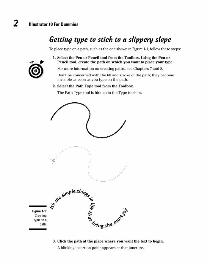
Getting type to stick to a slippery slopeTo place type on a path, such as the one shown in Figure 1-1, follow these steps:
1. Select the Pen or Pencil tool from the Toolbox. Using the Pen orPencil tool, create the path on which you want to place your type.
For more information on creating paths, see Chapters 7 and 8.
Don’t be concerned with the fill and stroke of the path; they becomeinvisible as soon as you type on the path.
2. Select the Path Type tool from the Toolbox.
The Path Type tool is hidden in the Type toolslot.
3. Click the path at the place where you want the text to begin.
A blinking insertion point appears at that juncture.
Figure 1-1:Creating
type on apath.
2 Illustrator 10 For Dummies
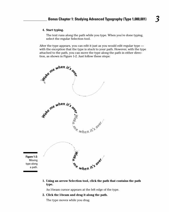
4. Start typing.
The text runs along the path while you type. When you’re done typing,select the regular Selection tool.
After the type appears, you can edit it just as you would edit regular type —with the exception that the type is stuck to your path. However, with the typeattached to the path, you can move the type along the path in either direc-tion, as shown in Figure 1-2. Just follow these steps:
1. Using an arrow Selection tool, click the path that contains the pathtype.
An I-beam cursor appears at the left edge of the type.
2. Click the I-beam and drag it along the path.
The type moves while you drag.
Figure 1-2:Moving
type alonga path.
3Bonus Chapter 1: Studying Advanced Typography (Type 1,000,001)
3. Release the mouse button when the type is where you want it.
Be careful when you drag the I-beam cursor along the path. If you acciden-tally move the tip of your cursor below the path, the type flips upside downon the path. (As industry wags say of weird stuff that consistently happensonscreen, “That’s a feature, not a bug!” In this case, it is a feature, believe it ornot.) Don’t panic; just move the cursor back above the path and watch whilethe type rights itself.
Press the Alt key (Option on a Mac) to duplicate text while you drag it along apath. Doing so duplicates both the type and the path. (Even though you don’tactually see the duplicated path, it’s there.)
In the next section, you find out how to use this technique to create type onboth the top and bottom of a circle.
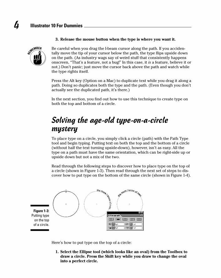
Solving the age-old type-on-a-circle mysteryTo place type on a circle, you simply click a circle (path) with the Path Typetool and begin typing. Putting text on both the top and the bottom of a circle(without half the text turning upside-down), however, isn’t as easy. All thetype on a path must have the same orientation, which can be right-side up orupside down but not a mix of the two.
Read through the following steps to discover how to place type on the top ofa circle (shown in Figure 1-3). Then read through the next set of steps to dis-cover how to put type on the bottom of the same circle (shown in Figure 1-4).
Here’s how to put type on the top of a circle:
1. Select the Ellipse tool (which looks like an oval) from the Toolbox todraw a circle. Press the Shift key while you draw to change the ovalinto a perfect circle.
Figure 1-3:Putting type
on the topof a circle.
4 Illustrator 10 For Dummies
See Chapter 4 for more on the Ellipse tool.
2. Select the Path Type tool from the Toolbox and click the top of thecircle.
A blinking insertion point appears on the top of the circle.
3. Type your text.
Notice that the type starts to run down the right side of the circle. Don’tworry; it’s all part of the plan.
4. In the Paragraph palette, click the Align Center button.
You can find the Paragraph palette by choosing Window➪ Type➪Paragraph. The Align Center button is the second button from the leftalong the top row of buttons in the Paragraph palette. After you clickthe Align Center button, the text centers itself on the top of the circle.
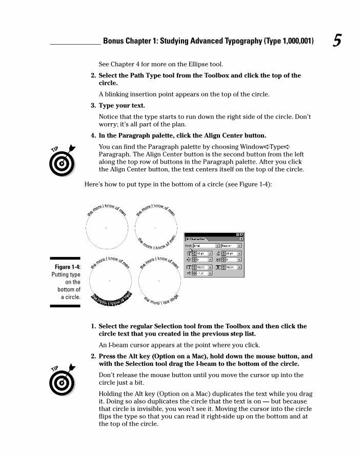
Here’s how to put type in the bottom of a circle (see Figure 1-4):
1. Select the regular Selection tool from the Toolbox and then click thecircle text that you created in the previous step list.
An I-beam cursor appears at the point where you click.
2. Press the Alt key (Option on a Mac), hold down the mouse button, andwith the Selection tool drag the I-beam to the bottom of the circle.
Don’t release the mouse button until you move the cursor up into thecircle just a bit.
Holding the Alt key (Option on a Mac) duplicates the text while you dragit. Doing so also duplicates the circle that the text is on — but becausethat circle is invisible, you won’t see it. Moving the cursor into the circleflips the type so that you can read it right-side up on the bottom and atthe top of the circle.
Figure 1-4:Putting type
on thebottom of
a circle.
5Bonus Chapter 1: Studying Advanced Typography (Type 1,000,001)
3. In the Character palette, click the down triangle of the Baseline Shiftfield until the type appears outside (below) the circle.
The Baseline Shift field is at the bottom left of the Character palette. If itisn’t visible, choose Show Options from the Character palette’s pop-upmenu.
4. Select the Type tool from the Toolbox and then select the type at thebottom of the circle.
5. Type the text that you want to appear at the bottom of the circle.
In this set of steps, you actually create two separate circles with type onthem. Because the circles overlap precisely, however, you get the illusion thatthe type is on just one circle. If you click and drag the circle with theSelection tool, you drag away the circle with the text in the bottom, thusdestroying the illusion.
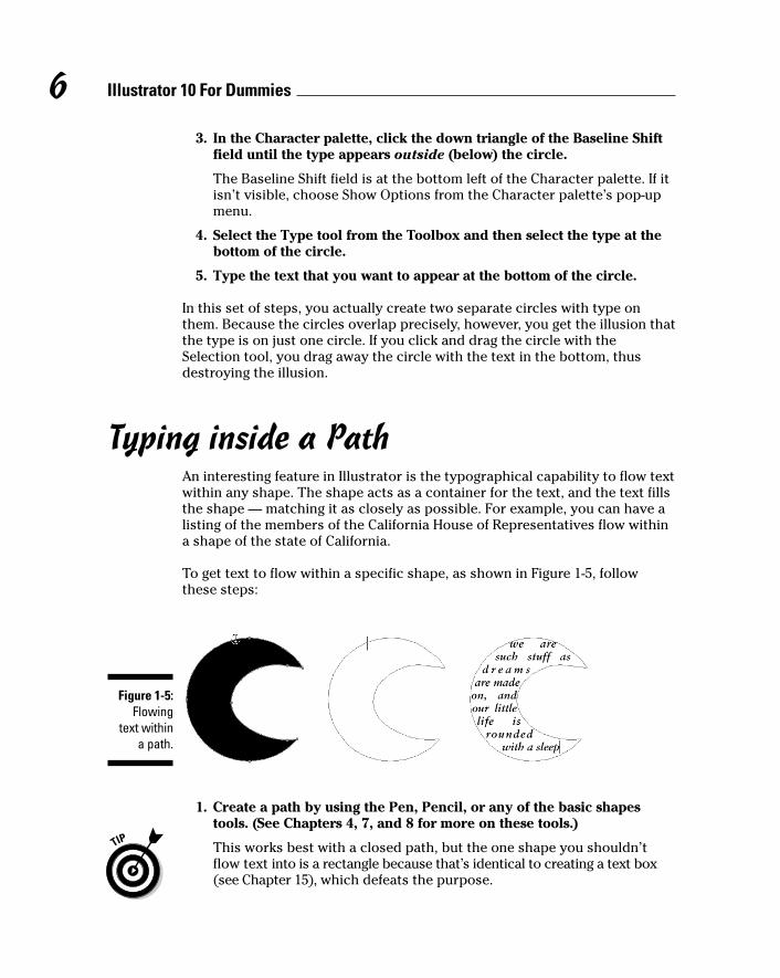
Typing inside a PathAn interesting feature in Illustrator is the typographical capability to flow textwithin any shape. The shape acts as a container for the text, and the text fillsthe shape — matching it as closely as possible. For example, you can have alisting of the members of the California House of Representatives flow withina shape of the state of California.
To get text to flow within a specific shape, as shown in Figure 1-5, followthese steps:
1. Create a path by using the Pen, Pencil, or any of the basic shapestools. (See Chapters 4, 7, and 8 for more on these tools.)
This works best with a closed path, but the one shape you shouldn’tflow text into is a rectangle because that’s identical to creating a text box(see Chapter 15), which defeats the purpose.
Figure 1-5:Flowing
text withina path.
6 Illustrator 10 For Dummies
2. Select the Area Type tool from the Toolbox.
3. Click the path through which you want type to flow.
4. Start typing.
While you type, text flows within the object.
For best results with text, make sure that you activate (click) Justify All Lines inthe Paragraph palette. (See Chapter 15 for details.) This feature spreads lines oftype evenly to the left and right edges of the path. In addition, use fairly smalltype because large letters usually can’t fill in the details of the path.
You can adjust the path of area type just as you do any other path by clickingand dragging a point with the Direct Selection tool (Chapter 6) or by usingthe Pencil tool (Chapter 8) to edit the path.
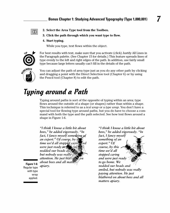
Typing around a PathTyping around paths is sort of the opposite of typing within an area; typeflows around the outside of a shape (or shapes) rather than within a shape.This technique is referred to as a text wrap or a type wrap. You don’t have aspecial tool for flowing type around paths, but you do have to choose a com-mand with both the type and the path selected. See how text flows around ashape in Figure 1-6.
Figure 1-6:Regular type
with typewrap
applied.
7Bonus Chapter 1: Studying Advanced Typography (Type 1,000,001)
To flow text around the outside of a shape, follow these steps:
1. Create a text box by clicking and dragging with the Type tool.
2. Type text into the box until it’s full.
3. Create a path by using any of the Illustrator tools and place the pathin front of the text.
You get the best results by using a closed path rather than an open one.You can use as many paths and text boxes as you want (We used threebees and one text box in Figure 1-6). All text wraps around all paths.
4. Choose the regular Selection tool from the Toolbox.
5. Select the text and the path by holding the Shift key while clickingeach of them.
6. Choose Type➪ Wrap➪ Make.
The text flows around the shape.
The most important thing to do when you wrap text around a path is to makesure that the path is in front of the text. Typically, if you try to make textwrap around a path and the procedure doesn’t work, the shape is probablybehind the text. If this happens, click the path with the Selection tool andchoose Object➪ Arrange➪ Bring to Front, which moves the object in front ofthe text. Select the path and the text again and then choose Type➪ Wrap➪Make. To undo the wrap, choose Type➪ Wrap➪ Release.
You can use several shapes for the text to wrap around, or you can add ashape later by selecting the new shape with the Selection tool, along with theexisting text and/or shape objects, and choosing Type➪ Wrap➪ Make.
Flowing Type from Path to PathAny text that’s within a shape (area type or rectangle type) can be linked toother paths so that the text flows from one path to another. For instance, astory about a pesky fruit fly can start in a path in the shape of a banana andthen continue automatically into normal rectangular columns of text.Whenever changes occur in the text within the banana shape, the text in therectangle moves accordingly.
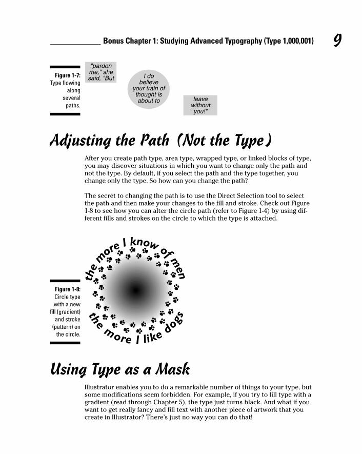
This process works by selecting the path that currently has text in it alongwith another path (or paths). You then choose Type➪ Blocks➪ Link. Figure 1-7shows text that’s linked so that it flows among several different shapes. Thetext flows from shape to shape in the chronological order that they were cre-ated. If you don’t see any change when you choose Link, your first text boxprobably doesn’t have enough text in it to overflow into the linked box. Justtype more in the first text box, and flowing will prevail. To undo the link,choose Type➪ Block➪ Unlink.
8 Illustrator 10 For Dummies
Adjusting the Path (Not the Type)After you create path type, area type, wrapped type, or linked blocks of type,you may discover situations in which you want to change only the path andnot the type. By default, if you select the path and the type together, youchange only the type. So how can you change the path?
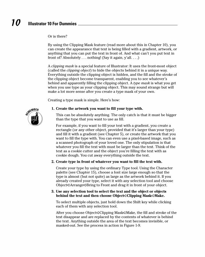
The secret to changing the path is to use the Direct Selection tool to selectthe path and then make your changes to the fill and stroke. Check out Figure1-8 to see how you can alter the circle path (refer to Figure 1-4) by using dif-ferent fills and strokes on the circle to which the type is attached.
Using Type as a MaskIllustrator enables you to do a remarkable number of things to your type, butsome modifications seem forbidden. For example, if you try to fill type with agradient (read through Chapter 5), the type just turns black. And what if youwant to get really fancy and fill text with another piece of artwork that youcreate in Illustrator? There’s just no way you can do that!
Figure 1-8:Circle typewith a new
fill (gradient)and stroke
(pattern) onthe circle.
Figure 1-7:Type flowing
alongseveral
paths.
9Bonus Chapter 1: Studying Advanced Typography (Type 1,000,001)
Or is there?
By using the Clipping Mask feature (read more about this in Chapter 10), youcan create the appearance that text is being filled with a gradient, artwork, oranything that you can put the text in front of. And what can’t you put text infront of? Absolutely . . . nothing! (Say it again, y’all. . . .)
A clipping mask is a special feature of Illustrator: It uses the front-most object(called the clipping object) to hide the objects behind it in a unique way.Everything outside the clipping object is hidden, and the fill and the stroke ofthe clipping object become transparent, enabling you to see whatever’sbehind and apparently filling the clipping object. A type mask is what you getwhen you use type as your clipping object. This may sound strange but willmake a lot more sense after you create a type mask of your own.
Creating a type mask is simple. Here’s how:
1. Create the artwork you want to fill your type with.
This can be absolutely anything. The only catch is that it must be biggerthan the type that you want to use as fill.
For example, if you want to fill your text with a gradient, you create arectangle (or any other object, provided that it’s larger than your type)and fill it with a gradient (see Chapter 5), or create the artwork that youwant to fill the type with. You can even use a pixel-based image, such asa scanned photograph of your loved one. The only stipulation is thatwhatever you fill the text with must be larger than the text. Think of thetext as a cookie cutter and the object you’re filling the text with ascookie dough. You cut away everything outside the text.
2. Create type in front of whatever you want to fill the text with.
Create your type by using the ordinary Type tool. Using the Characterpalette (see Chapter 15), choose a font size large enough so that thetype is almost (but not quite) as large as the artwork behind it. If youalready created your type, select it with any selection tool and chooseObject➪ Arrange➪ Bring to Front and drag it in front of your object.
3. Use any selection tool to select the text and the object or objectsbehind the text and then choose Object➪ Clipping Mask➪ Make.
To select multiple objects, just hold down the Shift key while clickingeach of them with any selection tool.
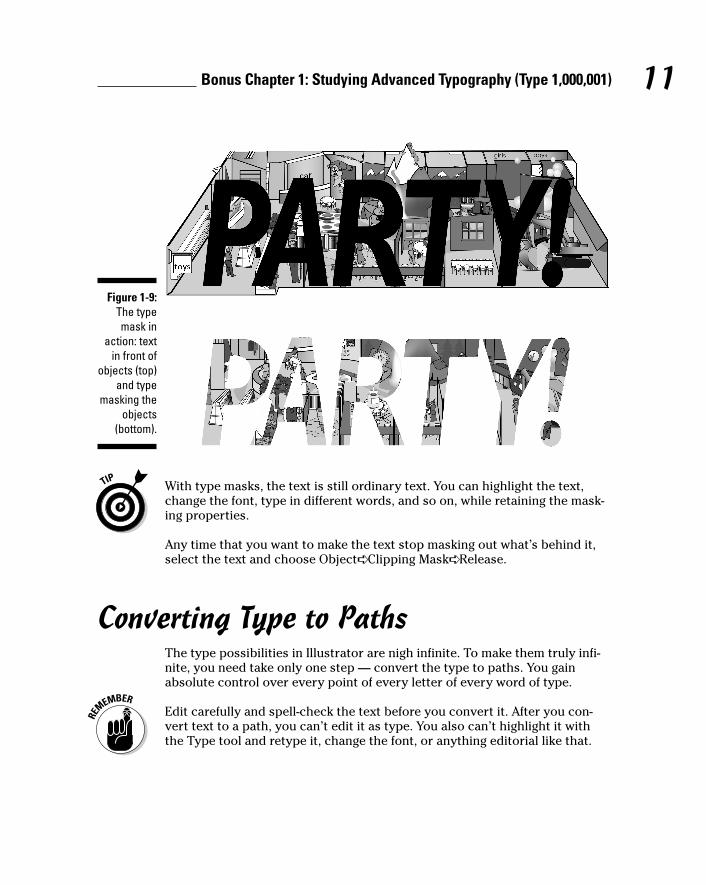
After you choose Object➪ Clipping Mask➪ Make, the fill and stroke of thetext disappear and are replaced by the contents of whatever is behindthe text. Anything outside the area of the text becomes invisible, ormasked-out. See the process in action in Figure 1-9.
10 Illustrator 10 For Dummies
With type masks, the text is still ordinary text. You can highlight the text,change the font, type in different words, and so on, while retaining the mask-ing properties.
Any time that you want to make the text stop masking out what’s behind it,select the text and choose Object➪ Clipping Mask➪ Release.
Converting Type to PathsThe type possibilities in Illustrator are nigh infinite. To make them truly infi-nite, you need take only one step — convert the type to paths. You gainabsolute control over every point of every letter of every word of type.
Edit carefully and spell-check the text before you convert it. After you con-vert text to a path, you can’t edit it as type. You also can’t highlight it withthe Type tool and retype it, change the font, or anything editorial like that.
Figure 1-9:The typemask in
action: textin front of
objects (top)and type
masking theobjects
(bottom).
11Bonus Chapter 1: Studying Advanced Typography (Type 1,000,001)
You may want to make this conversion for the following reasons:
� To manipulate type like you do any other object in Illustrator: Typestops being type and becomes just another Illustrator path, at whichpoint you can do absolutely anything to it that you can do to otherpaths.
� To bypass the need for the font files associated with the type: If yougive someone a graphic file containing a type that isn’t installed on therecipient’s computer, the graphic won’t display or print properly ifopened in Illustrator or placed into a page-layout program. Convertingthe type to paths creates a file that displays and prints exactly as youcreated it, regardless of the fonts installed on the recipient’s computer.
This action is also a good way to make sure that the text can’t beretyped. You should always convert text to paths for any logo that yousend to other people, which helps guarantee that the logo will alwayslook how you created it.
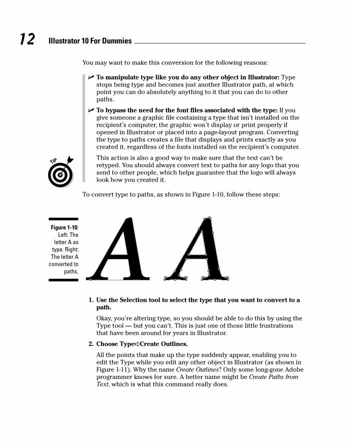
To convert type to paths, as shown in Figure 1-10, follow these steps:
1. Use the Selection tool to select the type that you want to convert to apath.
Okay, you’re altering type, so you should be able to do this by using theType tool — but you can’t. This is just one of those little frustrationsthat have been around for years in Illustrator.
2. Choose Type➪ Create Outlines.
All the points that make up the type suddenly appear, enabling you toedit the Type while you edit any other object in Illustrator (as shown inFigure 1-11). Why the name Create Outlines? Only some long-gone Adobeprogrammer knows for sure. A better name might be Create Paths fromText, which is what this command really does.
Figure 1-10:Left: The
letter A astype. Right:The letter A
converted topaths.
12 Illustrator 10 For Dummies

Figure 1-11:Here’s the
letter A fromFigure 1-10
after thepoints aremoved —
and agradient fillis applied.
13Bonus Chapter 1: Studying Advanced Typography (Type 1,000,001)

14 Illustrator 10 For Dummies
Bonus Chapter 2
Ten Tantalizing TechniquesIn This Chapter� Tackling three-dimensional (totally tubular) text
� Tracing a pixel-based image for good art fast (good fast art?)
� Lighting up a (virtual) neon glow around an image
� Applying Auto Trace to text for a funky, “ancient” look
� Stringing up your artwork and scattering 3-D pearls
� Cleaning up after Illustrator (facing the aftermath of creativity)
� Getting animated as text writes itself onscreen
� Dropping into the (perspective) shadows
� Ghosting part of an image to get visual interest and legibility
� Getting Illustrator to build a cube for you
In this book, we focus on individual tools and features of Illustrator —which is fine, as far as it goes. After you have a handle on using the tools
and features by themselves, the next level of mastery is to combine them. Inalmost infinite ways, you can produce almost anything that you can visualize.To harness the true power of Illustrator, use all its different capabilities in asynergistic whole that surrounds us and binds the galaxy together . . . oops.Got a bit carried away there. Peruse this chapter to discover how to use mul-tiple features and functions to create some specific spectacular results.
Making Text Three-DimensionalGradients are great for giving dimension to things. Unfortunately, gradientswork only when you fill areas with them, and your only options are radial orlinear gradients. Gradients don’t flow along strokes, and you can’t make themmatch complex shapes. Or can you? By using the Blend tool, you can creategradients in any shape your heart desires! In the following example, we usetext, but this works with paths of all sorts.
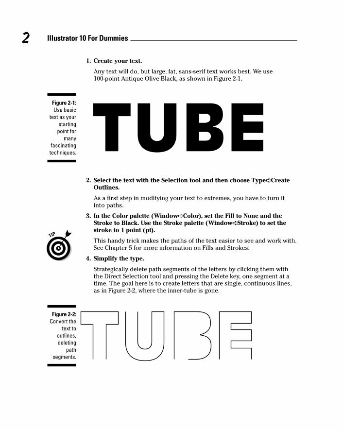
1. Create your text.
Any text will do, but large, fat, sans-serif text works best. We use 100-point Antique Olive Black, as shown in Figure 2-1.
2. Select the text with the Selection tool and then choose Type➪ CreateOutlines.
As a first step in modifying your text to extremes, you have to turn itinto paths.
3. In the Color palette (Window➪ Color), set the Fill to None and theStroke to Black. Use the Stroke palette (Window➪ Stroke) to set thestroke to 1 point (pt).
This handy trick makes the paths of the text easier to see and work with.See Chapter 5 for more information on Fills and Strokes.
4. Simplify the type.
Strategically delete path segments of the letters by clicking them withthe Direct Selection tool and pressing the Delete key, one segment at atime. The goal here is to create letters that are single, continuous lines,as in Figure 2-2, where the inner-tube is gone.
Figure 2-2:Convert the
text tooutlines,deleting
pathsegments.
Figure 2-1:Use basic
text as yourstarting
point formany
fascinatingtechniques.
2 Illustrator 10 For Dummies
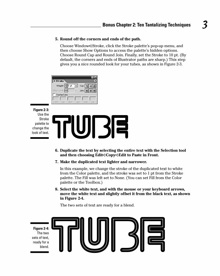
5. Round off the corners and ends of the path.
Choose Window➪ Stroke, click the Stroke palette’s pop-up menu, andthen choose Show Options to access the palette’s hidden options.Choose Round Cap and Round Join. Finally, set the Stroke to 10 pt. (Bydefault, the corners and ends of Illustrator paths are sharp.) This stepgives you a nice rounded look for your tubes, as shown in Figure 2-3.
6. Duplicate the text by selecting the entire text with the Selection tooland then choosing Edit➪ Copy➪ Edit to Paste in Front.
7. Make the duplicated text lighter and narrower.
In this example, we change the stroke of the duplicated text to whitefrom the Color palette, and the stroke was set to 1 pt from the Strokepalette. The Fill was left set to None. (You can set Fill from the Colorpalette or the Toolbox.)
8. Select the white text, and with the mouse or your keyboard arrows,move the white text and slightly offset it from the black text, as shownin Figure 2-4.
The two sets of text are ready for a blend.
Figure 2-4:The two
sets of text,ready for a
blend.
Figure 2-3:Use theStroke
palette tochange thelook of text.
3Bonus Chapter 2: Ten Tantalizing Techniques
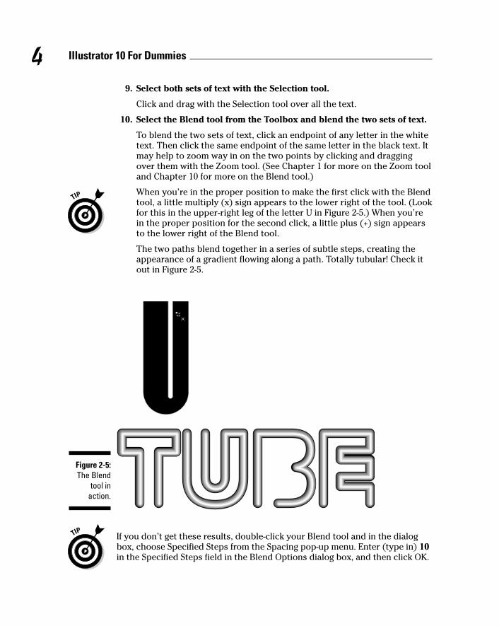
9. Select both sets of text with the Selection tool.
Click and drag with the Selection tool over all the text.
10. Select the Blend tool from the Toolbox and blend the two sets of text.
To blend the two sets of text, click an endpoint of any letter in the whitetext. Then click the same endpoint of the same letter in the black text. Itmay help to zoom way in on the two points by clicking and draggingover them with the Zoom tool. (See Chapter 1 for more on the Zoom tooland Chapter 10 for more on the Blend tool.)
When you’re in the proper position to make the first click with the Blendtool, a little multiply (x) sign appears to the lower right of the tool. (Lookfor this in the upper-right leg of the letter U in Figure 2-5.) When you’rein the proper position for the second click, a little plus (+) sign appearsto the lower right of the Blend tool.
The two paths blend together in a series of subtle steps, creating theappearance of a gradient flowing along a path. Totally tubular! Check itout in Figure 2-5.
If you don’t get these results, double-click your Blend tool and in the dialogbox, choose Specified Steps from the Spacing pop-up menu. Enter (type in) 10in the Specified Steps field in the Blend Options dialog box, and then click OK.
Figure 2-5:The Blend
tool inaction.
4 Illustrator 10 For Dummies
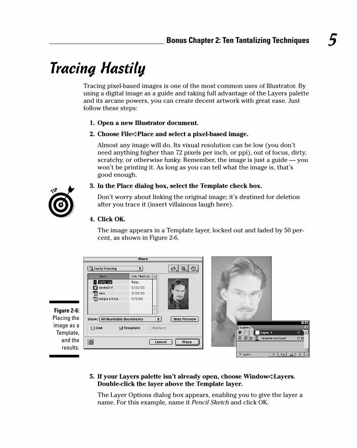
Tracing HastilyTracing pixel-based images is one of the most common uses of Illustrator. Byusing a digital image as a guide and taking full advantage of the Layers paletteand its arcane powers, you can create decent artwork with great ease. Justfollow these steps:
1. Open a new Illustrator document.
2. Choose File➪ Place and select a pixel-based image.
Almost any image will do. Its visual resolution can be low (you don’tneed anything higher than 72 pixels per inch, or ppi), out of focus, dirty,scratchy, or otherwise funky. Remember, the image is just a guide — youwon’t be printing it. As long as you can tell what the image is, that’sgood enough.
3. In the Place dialog box, select the Template check box.
Don’t worry about linking the original image; it’s destined for deletionafter you trace it (insert villainous laugh here).
4. Click OK.
The image appears in a Template layer, locked out and faded by 50 per-cent, as shown in Figure 2-6.
5. If your Layers palette isn’t already open, choose Window➪ Layers.Double-click the layer above the Template layer.
The Layer Options dialog box appears, enabling you to give the layer aname. For this example, name it Pencil Sketch and click OK.
Figure 2-6:Placing theimage as a
Template,and theresults.
5Bonus Chapter 2: Ten Tantalizing Techniques
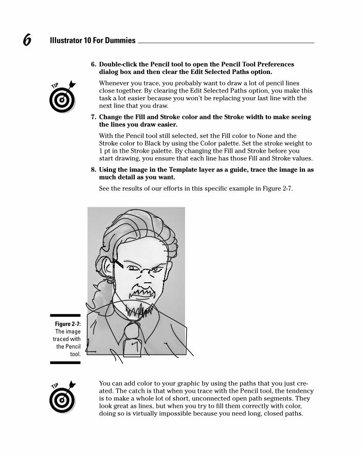
6. Double-click the Pencil tool to open the Pencil Tool Preferencesdialog box and then clear the Edit Selected Paths option.
Whenever you trace, you probably want to draw a lot of pencil linesclose together. By clearing the Edit Selected Paths option, you make thistask a lot easier because you won’t be replacing your last line with thenext line that you draw.
7. Change the Fill and Stroke color and the Stroke width to make seeingthe lines you draw easier.
With the Pencil tool still selected, set the Fill color to None and theStroke color to Black by using the Color palette. Set the stroke weight to1 pt in the Stroke palette. By changing the Fill and Stroke before youstart drawing, you ensure that each line has those Fill and Stroke values.
8. Using the image in the Template layer as a guide, trace the image in asmuch detail as you want.
See the results of our efforts in this specific example in Figure 2-7.
You can add color to your graphic by using the paths that you just cre-ated. The catch is that when you trace with the Pencil tool, the tendencyis to make a whole lot of short, unconnected open path segments. Theylook great as lines, but when you try to fill them correctly with color,doing so is virtually impossible because you need long, closed paths.
Figure 2-7:The image
traced withthe Pencil
tool.
6 Illustrator 10 For Dummies
Fortunately, you can easily join the separate open path segments intoclosed paths. To make the graphic as editable as possible, create colorin one layer and keep your original pencil sketch safely hidden in a dif-ferent layer. The next step shows how.
9. Duplicate the Pencil Sketch layer.
In the Layers palette, drag the pencil sketch layer onto the Create NewLayer button. This action creates a new layer with the same contents asthe Pencil Sketch layer.
10. To avoid confusion, name the duplicate layer. Double-clicking thisnew layer opens the Layer Options dialog box, in which you name thislayer Color; then click OK.
11. Click the View button in the Layers palette (the eye icon to the left ofthe layer name) for the Pencil Sketch layer to hide it.
Hiding the Pencil Sketch layer enables you to focus on coloring theimage. After you hide the Pencil Sketch layer, you join your various linesto create closed paths around all the major shapes in the artwork. Youthen fill those paths with color later on.
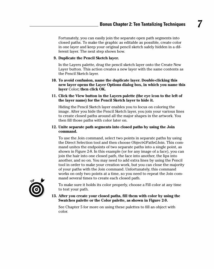
12. Unite separate path segments into closed paths by using the Joincommand.
To use the Join command, select two points in separate paths by usingthe Direct Selection tool and then choose Object➪ Path➪ Join. This com-mand unites the endpoints of two separate paths into a single point, asshown in Figure 2-8. In this example (or for any image of a face), you canjoin the hair into one closed path, the face into another, the lips intoanother, and so on. You may need to add extra lines by using the Penciltool in order to make your creation work, but you can close the majorityof your paths with the Join command. Unfortunately, this commandworks on only two points at a time, so you need to repeat the Join com-mand several times to create each closed path.
To make sure it holds its color properly, choose a Fill color at any timeto test your path.
13. After you create your closed paths, fill them with color by using theSwatches palette or the Color palette, as shown in Figure 2-9.
See Chapter 5 for more on using these palettes to fill an object withcolor.
7Bonus Chapter 2: Ten Tantalizing Techniques
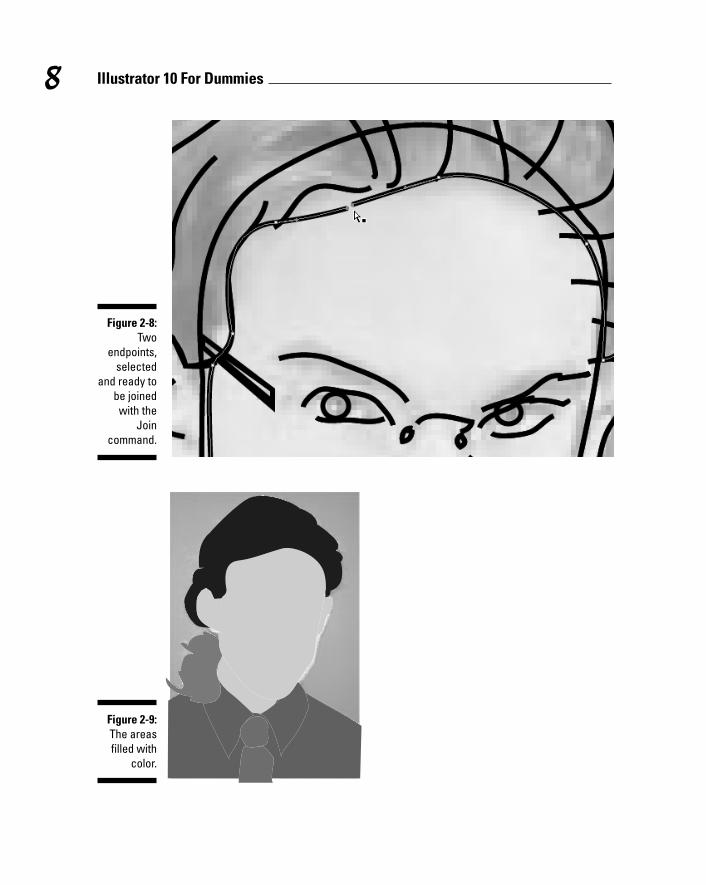
Figure 2-9:The areasfilled with
color.
Figure 2-8:Two
endpoints,selected
and ready tobe joinedwith the
Joincommand.
8 Illustrator 10 For Dummies
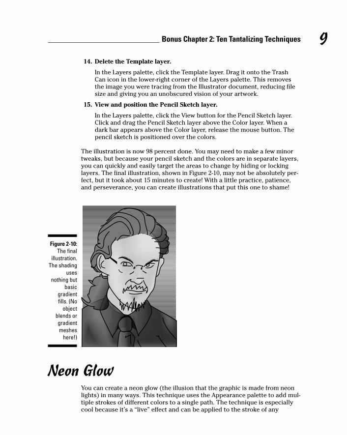
14. Delete the Template layer.
In the Layers palette, click the Template layer. Drag it onto the TrashCan icon in the lower-right corner of the Layers palette. This removesthe image you were tracing from the Illustrator document, reducing filesize and giving you an unobscured vision of your artwork.
15. View and position the Pencil Sketch layer.
In the Layers palette, click the View button for the Pencil Sketch layer.Click and drag the Pencil Sketch layer above the Color layer. When adark bar appears above the Color layer, release the mouse button. Thepencil sketch is positioned over the colors.
The illustration is now 98 percent done. You may need to make a few minortweaks, but because your pencil sketch and the colors are in separate layers,you can quickly and easily target the areas to change by hiding or lockinglayers. The final illustration, shown in Figure 2-10, may not be absolutely per-fect, but it took about 15 minutes to create! With a little practice, patience,and perseverance, you can create illustrations that put this one to shame!
Neon GlowYou can create a neon glow (the illusion that the graphic is made from neonlights) in many ways. This technique uses the Appearance palette to add mul-tiple strokes of different colors to a single path. The technique is especiallycool because it’s a “live” effect and can be applied to the stroke of any
Figure 2-10:The final
illustration.The shading
usesnothing but
basicgradientfills. (No
objectblends orgradientmeshes
here!)
9Bonus Chapter 2: Ten Tantalizing Techniques
path — even to text! You can change the path or enter in new text, and theglow matches the changes! Best of all, even though it may be labor-intensiveto create, you can save the effect as a Style to apply to other objects at anypoint in the future just by clicking in the Style palette.
For this technique, you need the Appearance palette, the Swatches palette,the Stroke palette, and the Styles palette. Find them all under the Windowmenu, open them, and you’re ready to rock. Just follow these steps:
1. Open a new document in Illustrator.
2. Create a piece of simple artwork.
In this example, we create a star by using the Star tool (see Chapter 4 forinfo on basic shapes), but this technique works equally well with text,path segments, or any other object.
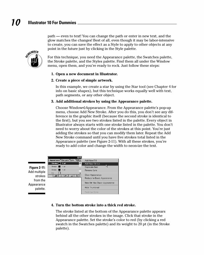
3. Add additional strokes by using the Appearance palette.
Choose Window➪ Appearance. From the Appearance palette’s pop-upmenu, choose Add New Stroke. After you do this, you don’t see any dif-ference in the graphic itself (because the second stroke is identical tothe first), but you see two strokes listed in the palette. Every object inIllustrator always starts with one stroke listed in the palette. You don’tneed to worry about the color of the strokes at this point. You’re justadding the strokes so that you can modify them later. Repeat the AddNew Stroke command until you have five strokes total listed in theAppearance palette (see Figure 2-11). With all these strokes, you’reready to add color and change the width to neon-ize the text.
4. Turn the bottom stroke into a thick red stroke.
The stroke listed at the bottom of the Appearance palette appearsbehind all the other strokes in the image. Click that stroke in theAppearance palette. Set the stroke’s color to red (by clicking a redswatch in the Swatches palette) and its weight to 20 pt (in the Strokepalette).
Figure 2-11:Add multiple
strokes from the
Appearancepalette.
10 Illustrator 10 For Dummies
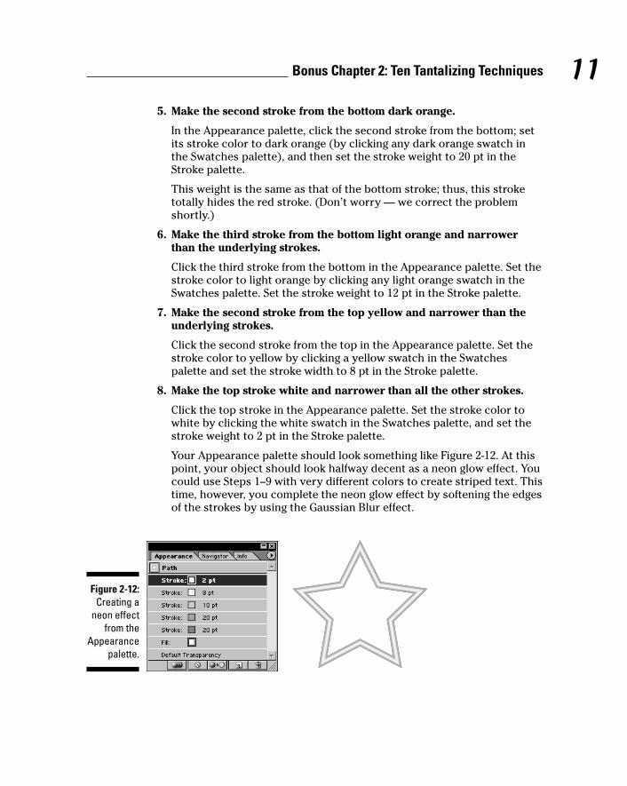
5. Make the second stroke from the bottom dark orange.
In the Appearance palette, click the second stroke from the bottom; setits stroke color to dark orange (by clicking any dark orange swatch inthe Swatches palette), and then set the stroke weight to 20 pt in theStroke palette.
This weight is the same as that of the bottom stroke; thus, this stroketotally hides the red stroke. (Don’t worry — we correct the problemshortly.)
6. Make the third stroke from the bottom light orange and narrowerthan the underlying strokes.
Click the third stroke from the bottom in the Appearance palette. Set thestroke color to light orange by clicking any light orange swatch in theSwatches palette. Set the stroke weight to 12 pt in the Stroke palette.
7. Make the second stroke from the top yellow and narrower than theunderlying strokes.
Click the second stroke from the top in the Appearance palette. Set thestroke color to yellow by clicking a yellow swatch in the Swatchespalette and set the stroke width to 8 pt in the Stroke palette.
8. Make the top stroke white and narrower than all the other strokes.
Click the top stroke in the Appearance palette. Set the stroke color towhite by clicking the white swatch in the Swatches palette, and set thestroke weight to 2 pt in the Stroke palette.
Your Appearance palette should look something like Figure 2-12. At thispoint, your object should look halfway decent as a neon glow effect. Youcould use Steps 1–9 with very different colors to create striped text. Thistime, however, you complete the neon glow effect by softening the edgesof the strokes by using the Gaussian Blur effect.
Figure 2-12:Creating a
neon effectfrom the
Appearancepalette.
11Bonus Chapter 2: Ten Tantalizing Techniques
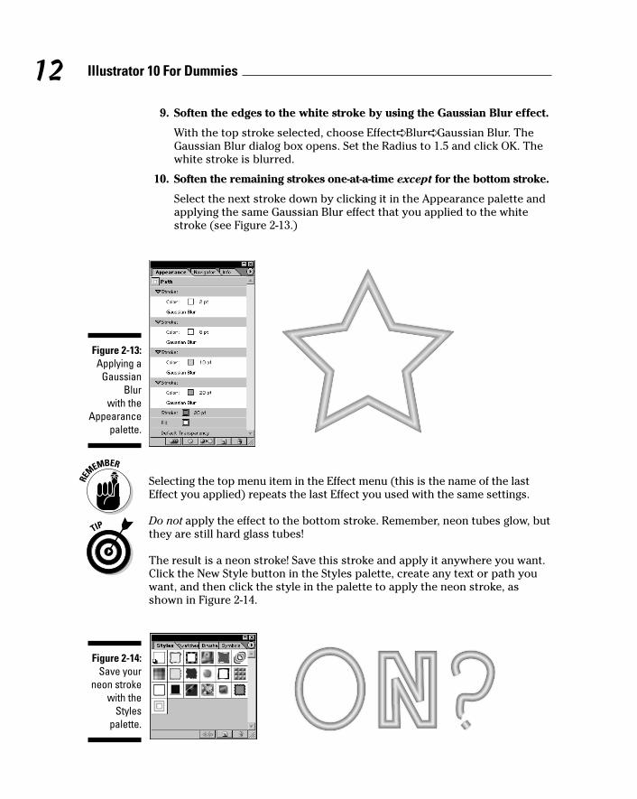
9. Soften the edges to the white stroke by using the Gaussian Blur effect.
With the top stroke selected, choose Effect➪ Blur➪ Gaussian Blur. TheGaussian Blur dialog box opens. Set the Radius to 1.5 and click OK. Thewhite stroke is blurred.
10. Soften the remaining strokes one-at-a-time except for the bottom stroke.
Select the next stroke down by clicking it in the Appearance palette andapplying the same Gaussian Blur effect that you applied to the whitestroke (see Figure 2-13.)
Selecting the top menu item in the Effect menu (this is the name of the lastEffect you applied) repeats the last Effect you used with the same settings.
Do not apply the effect to the bottom stroke. Remember, neon tubes glow, butthey are still hard glass tubes!
The result is a neon stroke! Save this stroke and apply it anywhere you want.Click the New Style button in the Styles palette, create any text or path youwant, and then click the style in the palette to apply the neon stroke, asshown in Figure 2-14.
Figure 2-14:Save your
neon strokewith the
Stylespalette.
Figure 2-13:Applying a
GaussianBlur
with theAppearance
palette.
12 Illustrator 10 For Dummies
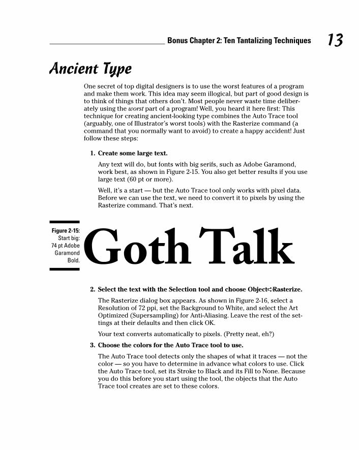
Ancient TypeOne secret of top digital designers is to use the worst features of a programand make them work. This idea may seem illogical, but part of good design isto think of things that others don’t. Most people never waste time deliber-ately using the worst part of a program! Well, you heard it here first: Thistechnique for creating ancient-looking type combines the Auto Trace tool(arguably, one of Illustrator’s worst tools) with the Rasterize command (acommand that you normally want to avoid) to create a happy accident! Justfollow these steps:
1. Create some large text.
Any text will do, but fonts with big serifs, such as Adobe Garamond,work best, as shown in Figure 2-15. You also get better results if you uselarge text (60 pt or more).
Well, it’s a start — but the Auto Trace tool only works with pixel data.Before we can use the text, we need to convert it to pixels by using theRasterize command. That’s next.
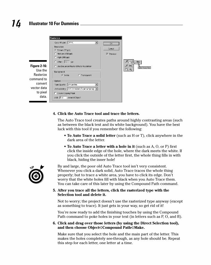
2. Select the text with the Selection tool and choose Object➪ Rasterize.
The Rasterize dialog box appears. As shown in Figure 2-16, select aResolution of 72 ppi, set the Background to White, and select the ArtOptimized (Supersampling) for Anti-Aliasing. Leave the rest of the set-tings at their defaults and then click OK.
Your text converts automatically to pixels. (Pretty neat, eh?)
3. Choose the colors for the Auto Trace tool to use.
The Auto Trace tool detects only the shapes of what it traces — not thecolor — so you have to determine in advance what colors to use. Clickthe Auto Trace tool, set its Stroke to Black and its Fill to None. Becauseyou do this before you start using the tool, the objects that the AutoTrace tool creates are set to these colors.
Figure 2-15:Start big:
74 pt AdobeGaramond
Bold.
13Bonus Chapter 2: Ten Tantalizing Techniques
4. Click the Auto Trace tool and trace the letters.
The Auto Trace tool creates paths around highly contrasting areas (suchas between the black text and its white background). You have the bestluck with this tool if you remember the following:
• To Auto Trace a solid letter (such as H or T), click anywhere in thedark area of the letter.
• To Auto Trace a letter with a hole in it (such as A, O, or P) firstclick the inside edge of the hole, where the dark meets the white. Ifyou click the outside of the letter first, the whole thing fills in withblack, hiding the inner hole!
By and large, the poor old Auto Trace tool isn’t very consistent.Whenever you click a dark solid, Auto Trace traces the whole thingproperly; but to trace a white area, you have to click its edge. Don’tworry that the white holes fill with black when you Auto Trace them.You can take care of this later by using the Compound Path command.
5. After you trace all the letters, click the rasterized type with theSelection tool and delete it.
Not to worry; the project doesn’t use the rasterized type anyway (exceptas something to trace). It just gets in your way, so get rid of it!
You’re now ready to add the finishing touches by using the CompoundPath command to poke holes in your text (in letters such as P, O, and B).
6. Click and drag over those letters (by using the Direct Selection tool),and then choose Object➪ Compound Path➪ Make.
Make sure that you select the hole and the main part of the letter. Thismakes the holes completely see-through, as any hole should be. Repeatthis step for each letter, one letter at a time.
Figure 2-16:Use the
Rasterizecommand to
convertvector data
to pixeldata.
14 Illustrator 10 For Dummies
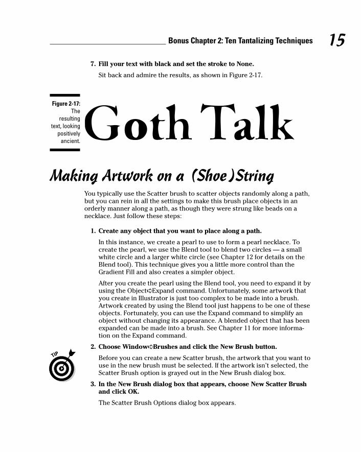
7. Fill your text with black and set the stroke to None.
Sit back and admire the results, as shown in Figure 2-17.
Making Artwork on a (Shoe)StringYou typically use the Scatter brush to scatter objects randomly along a path,but you can rein in all the settings to make this brush place objects in anorderly manner along a path, as though they were strung like beads on anecklace. Just follow these steps:
1. Create any object that you want to place along a path.
In this instance, we create a pearl to use to form a pearl necklace. Tocreate the pearl, we use the Blend tool to blend two circles — a smallwhite circle and a larger white circle (see Chapter 12 for details on theBlend tool). This technique gives you a little more control than theGradient Fill and also creates a simpler object.
After you create the pearl using the Blend tool, you need to expand it byusing the Object➪ Expand command. Unfortunately, some artwork thatyou create in Illustrator is just too complex to be made into a brush.Artwork created by using the Blend tool just happens to be one of theseobjects. Fortunately, you can use the Expand command to simplify anobject without changing its appearance. A blended object that has beenexpanded can be made into a brush. See Chapter 11 for more informa-tion on the Expand command.
2. Choose Window➪ Brushes and click the New Brush button.
Before you can create a new Scatter brush, the artwork that you want touse in the new brush must be selected. If the artwork isn’t selected, theScatter Brush option is grayed out in the New Brush dialog box.
3. In the New Brush dialog box that appears, choose New Scatter Brushand click OK.
The Scatter Brush Options dialog box appears.
Figure 2-17:The
resultingtext, looking
positivelyancient.
15Bonus Chapter 2: Ten Tantalizing Techniques
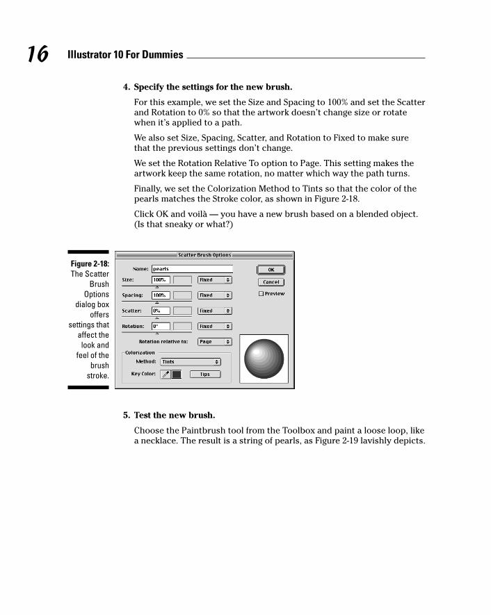
4. Specify the settings for the new brush.
For this example, we set the Size and Spacing to 100% and set the Scatterand Rotation to 0% so that the artwork doesn’t change size or rotatewhen it’s applied to a path.
We also set Size, Spacing, Scatter, and Rotation to Fixed to make surethat the previous settings don’t change.
We set the Rotation Relative To option to Page. This setting makes theartwork keep the same rotation, no matter which way the path turns.
Finally, we set the Colorization Method to Tints so that the color of thepearls matches the Stroke color, as shown in Figure 2-18.
Click OK and voilà — you have a new brush based on a blended object.(Is that sneaky or what?)
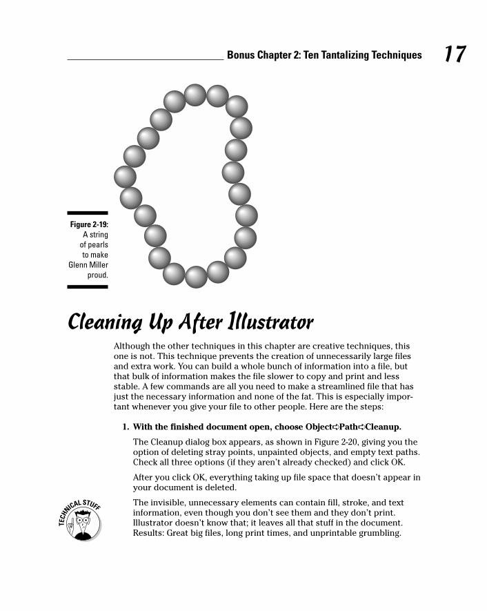
5. Test the new brush.
Choose the Paintbrush tool from the Toolbox and paint a loose loop, likea necklace. The result is a string of pearls, as Figure 2-19 lavishly depicts.
Figure 2-18:The Scatter
BrushOptions
dialog boxoffers
settings thataffect thelook and
feel of thebrush
stroke.
16 Illustrator 10 For Dummies
Cleaning Up After IllustratorAlthough the other techniques in this chapter are creative techniques, thisone is not. This technique prevents the creation of unnecessarily large filesand extra work. You can build a whole bunch of information into a file, butthat bulk of information makes the file slower to copy and print and lessstable. A few commands are all you need to make a streamlined file that hasjust the necessary information and none of the fat. This is especially impor-tant whenever you give your file to other people. Here are the steps:
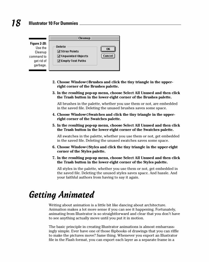
1. With the finished document open, choose Object➪ Path➪ Cleanup.
The Cleanup dialog box appears, as shown in Figure 2-20, giving you theoption of deleting stray points, unpainted objects, and empty text paths.Check all three options (if they aren’t already checked) and click OK.
After you click OK, everything taking up file space that doesn’t appear inyour document is deleted.
The invisible, unnecessary elements can contain fill, stroke, and textinformation, even though you don’t see them and they don’t print.Illustrator doesn’t know that; it leaves all that stuff in the document.Results: Great big files, long print times, and unprintable grumbling.
Figure 2-19:A string
of pearls to make
Glenn Millerproud.
17Bonus Chapter 2: Ten Tantalizing Techniques
2. Choose Window➪ Brushes and click the tiny triangle in the upper-right corner of the Brushes palette.
3. In the resulting pop-up menu, choose Select All Unused and then clickthe Trash button in the lower-right corner of the Brushes palette.
All brushes in the palette, whether you use them or not, are embeddedin the saved file. Deleting the unused brushes saves some space.
4. Choose Window➪ Swatches and click the tiny triangle in the upper-right corner of the Swatches palette.
5. In the resulting pop-up menu, choose Select All Unused and then clickthe Trash button in the lower-right corner of the Swatches palette.
All swatches in the palette, whether you use them or not, get embeddedin the saved file. Deleting the unused swatches saves some space.
6. Choose Window➪ Styles and click the tiny triangle in the upper-rightcorner of the Styles palette.
7. In the resulting pop-up menu, choose Select All Unused and then clickthe Trash button in the lower-right corner of the Styles palette.
All styles in the palette, whether you use them or not, get embedded inthe saved file. Deleting the unused styles saves space. And hassle. Andyour faithful authors from having to say it again.
Getting AnimatedWriting about animation is a little bit like dancing about architecture.Animation makes a lot more sense if you can see it happening. Fortunately,animating from Illustrator is so straightforward and clear that you don’t haveto see anything actually move until you put it in motion.
The basic principle in creating Illustrator animations is almost embarrass-ingly simple. Ever have one of those flipbooks of drawings that you can riffleto make the pictures move? Same thing. Whenever you export an Illustratorfile in the Flash format, you can export each layer as a separate frame in a
Figure 2-20:Use the
Cleanupcommand to
get rid ofgarbage.
18 Illustrator 10 For Dummies
movie. What you wind up with is a stack of layered images. When the framesplay, the effect is as though you were clicking through the layers (showingthe next one and hiding the previous one) really fast. Play begins at thebottom layer and goes upward in order to the top layer.
For a simple (but entertaining) example of this effect, the following stepsdemonstrate how to animate text to make it look as though it’s typing itself:
1. Create a new document in Illustrator.
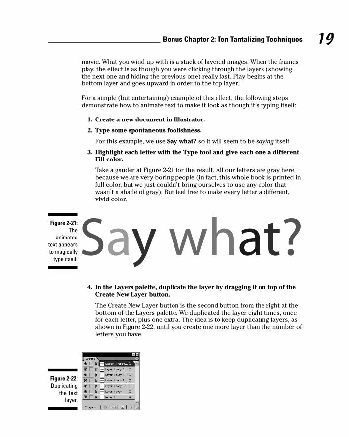
2. Type some spontaneous foolishness.
For this example, we use Say what? so it will seem to be saying itself.
3. Highlight each letter with the Type tool and give each one a differentFill color.
Take a gander at Figure 2-21 for the result. All our letters are gray herebecause we are very boring people (in fact, this whole book is printed infull color, but we just couldn’t bring ourselves to use any color thatwasn’t a shade of gray). But feel free to make every letter a different,vivid color.
4. In the Layers palette, duplicate the layer by dragging it on top of theCreate New Layer button.
The Create New Layer button is the second button from the right at thebottom of the Layers palette. We duplicated the layer eight times, oncefor each letter, plus one extra. The idea is to keep duplicating layers, asshown in Figure 2-22, until you create one more layer than the number ofletters you have.
Figure 2-22:Duplicating
the Textlayer.
Figure 2-21:The
animatedtext appearsto magically
type itself.
19Bonus Chapter 2: Ten Tantalizing Techniques
5. Hide all layers except for the second layer from the top by clickingthe View button.
The View button (the eyeball icon) sits to the left of the layer name inthe Layers palette.
6. Highlight the last letter in the text and press the Delete key.
In our case, we deleted the question mark.
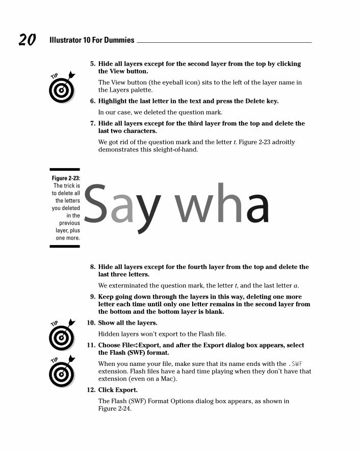
7. Hide all layers except for the third layer from the top and delete thelast two characters.
We got rid of the question mark and the letter t. Figure 2-23 adroitlydemonstrates this sleight-of-hand.
8. Hide all layers except for the fourth layer from the top and delete thelast three letters.
We exterminated the question mark, the letter t, and the last letter a.
9. Keep going down through the layers in this way, deleting one moreletter each time until only one letter remains in the second layer fromthe bottom and the bottom layer is blank.
10. Show all the layers.
Hidden layers won’t export to the Flash file.
11. Choose File➪ Export, and after the Export dialog box appears, selectthe Flash (SWF) format.
When you name your file, make sure that its name ends with the .SWFextension. Flash files have a hard time playing when they don’t have thatextension (even on a Mac).
12. Click Export.
The Flash (SWF) Format Options dialog box appears, as shown inFigure 2-24.
Figure 2-23:The trick is
to delete allthe letters
you deletedin the
previouslayer, plusone more.
20 Illustrator 10 For Dummies
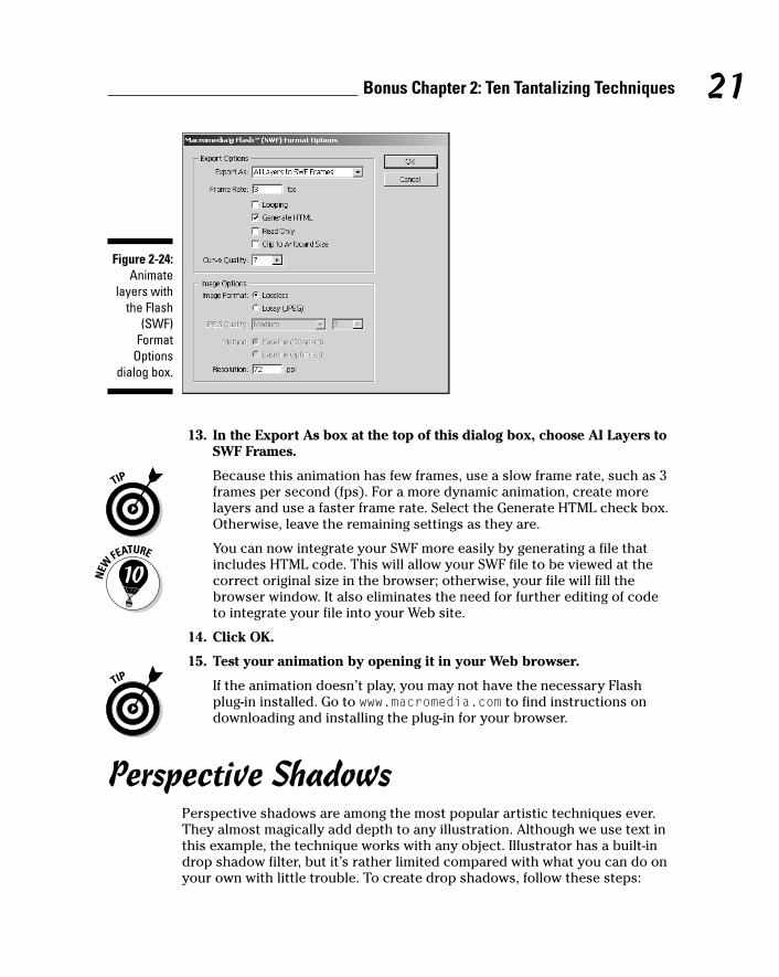
13. In the Export As box at the top of this dialog box, choose AI Layers toSWF Frames.
Because this animation has few frames, use a slow frame rate, such as 3frames per second (fps). For a more dynamic animation, create morelayers and use a faster frame rate. Select the Generate HTML check box.Otherwise, leave the remaining settings as they are.
You can now integrate your SWF more easily by generating a file thatincludes HTML code. This will allow your SWF file to be viewed at thecorrect original size in the browser; otherwise, your file will fill thebrowser window. It also eliminates the need for further editing of codeto integrate your file into your Web site.
14. Click OK.
15. Test your animation by opening it in your Web browser.
If the animation doesn’t play, you may not have the necessary Flashplug-in installed. Go to www.macromedia.com to find instructions ondownloading and installing the plug-in for your browser.
Perspective ShadowsPerspective shadows are among the most popular artistic techniques ever.They almost magically add depth to any illustration. Although we use text inthis example, the technique works with any object. Illustrator has a built-indrop shadow filter, but it’s rather limited compared with what you can do onyour own with little trouble. To create drop shadows, follow these steps:
Figure 2-24:Animate
layers withthe Flash
(SWF)Format
Optionsdialog box.
21Bonus Chapter 2: Ten Tantalizing Techniques
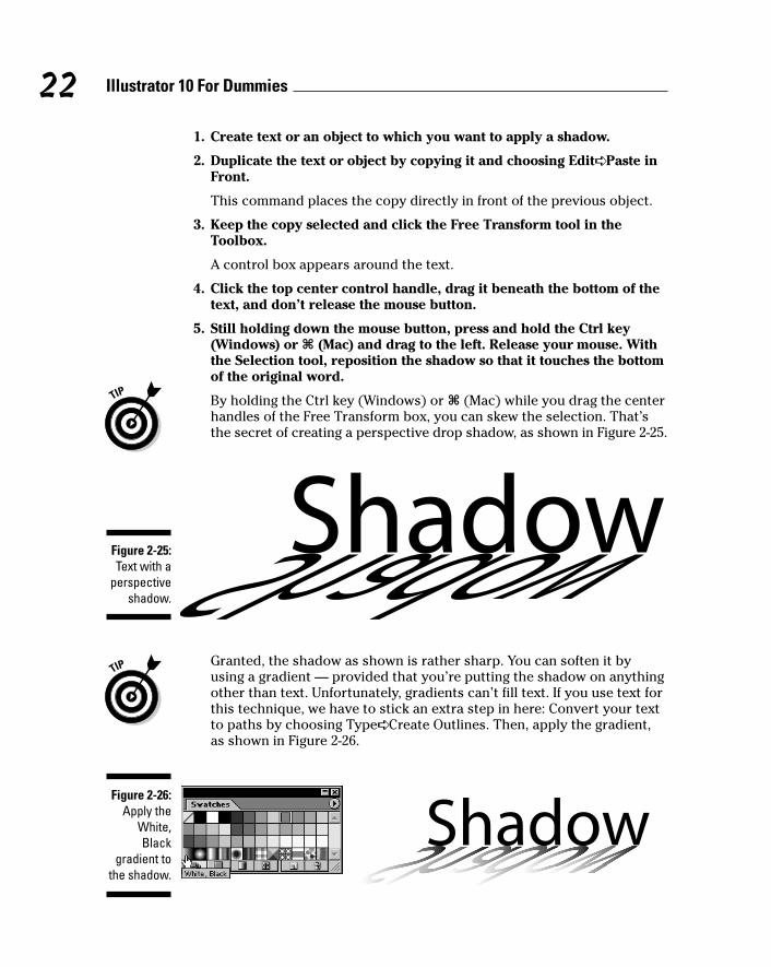
1. Create text or an object to which you want to apply a shadow.
2. Duplicate the text or object by copying it and choosing Edit➪ Paste inFront.
This command places the copy directly in front of the previous object.
3. Keep the copy selected and click the Free Transform tool in theToolbox.
A control box appears around the text.
4. Click the top center control handle, drag it beneath the bottom of thetext, and don’t release the mouse button.
5. Still holding down the mouse button, press and hold the Ctrl key(Windows) or Ô (Mac) and drag to the left. Release your mouse. Withthe Selection tool, reposition the shadow so that it touches the bottomof the original word.
By holding the Ctrl key (Windows) or Ô (Mac) while you drag the centerhandles of the Free Transform box, you can skew the selection. That’sthe secret of creating a perspective drop shadow, as shown in Figure 2-25.
Granted, the shadow as shown is rather sharp. You can soften it byusing a gradient — provided that you’re putting the shadow on anythingother than text. Unfortunately, gradients can’t fill text. If you use text forthis technique, we have to stick an extra step in here: Convert your textto paths by choosing Type➪ Create Outlines. Then, apply the gradient,as shown in Figure 2-26.
Figure 2-26:Apply the
White,Black
gradient tothe shadow.
Figure 2-25:Text with a
perspectiveshadow.
22 Illustrator 10 For Dummies
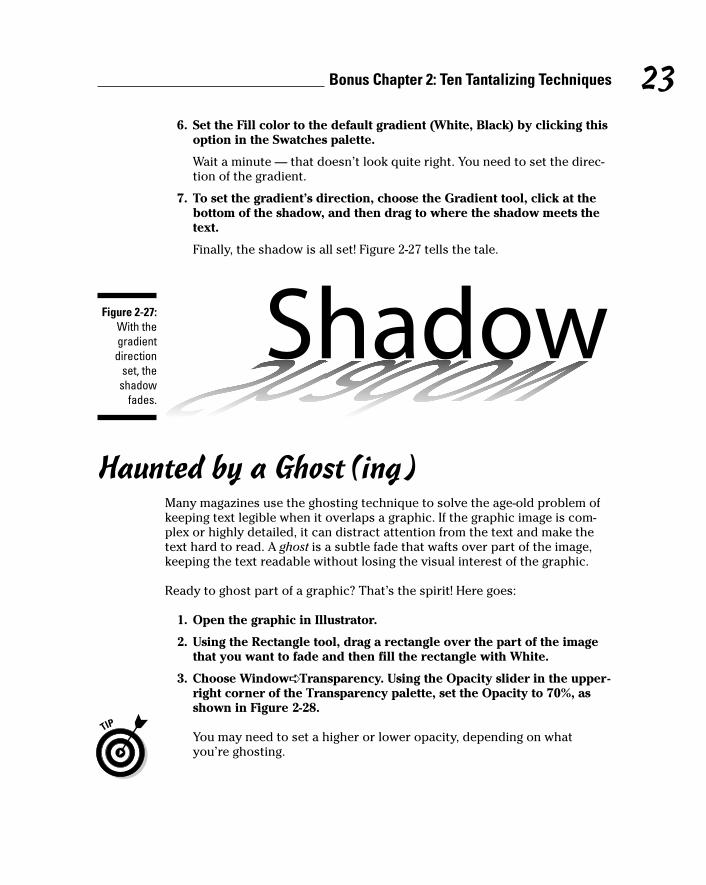
6. Set the Fill color to the default gradient (White, Black) by clicking thisoption in the Swatches palette.
Wait a minute — that doesn’t look quite right. You need to set the direc-tion of the gradient.
7. To set the gradient’s direction, choose the Gradient tool, click at thebottom of the shadow, and then drag to where the shadow meets thetext.
Finally, the shadow is all set! Figure 2-27 tells the tale.
Haunted by a Ghost(ing)Many magazines use the ghosting technique to solve the age-old problem ofkeeping text legible when it overlaps a graphic. If the graphic image is com-plex or highly detailed, it can distract attention from the text and make thetext hard to read. A ghost is a subtle fade that wafts over part of the image,keeping the text readable without losing the visual interest of the graphic.
Ready to ghost part of a graphic? That’s the spirit! Here goes:
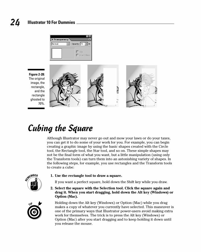
1. Open the graphic in Illustrator.
2. Using the Rectangle tool, drag a rectangle over the part of the imagethat you want to fade and then fill the rectangle with White.
3. Choose Window➪ Transparency. Using the Opacity slider in the upper-right corner of the Transparency palette, set the Opacity to 70%, asshown in Figure 2-28.
You may need to set a higher or lower opacity, depending on whatyou’re ghosting.
Figure 2-27:With thegradientdirection
set, theshadow
fades.
23Bonus Chapter 2: Ten Tantalizing Techniques
Cubing the SquareAlthough Illustrator may never go out and mow your lawn or do your taxes,you can get it to do some of your work for you. For example, you can begincreating a graphic image by using the basic shapes created with the Circletool, the Rectangle tool, the Star tool, and so on. These simple shapes maynot be the final form of what you want, but a little manipulation (using onlythe Transform tools) can turn them into an astonishing variety of shapes. Inthe following steps, for example, you use rectangles and the Transform toolsto create a cube:
1. Use the rectangle tool to draw a square.
If you want a perfect square, hold down the Shift key while you draw.
2. Select the square with the Selection tool. Click the square again anddrag it. When you start dragging, hold down the Alt key (Windows) orOption (Mac).
Holding down the Alt key (Windows) or Option (Mac) while you dragmakes a copy of whatever you currently have selected. This maneuver isone of the primary ways that Illustrator power-users avoid making extrawork for themselves. The trick is to press the Alt key (Windows) orOption (Mac) after you start dragging and to keep holding it down untilyou release the mouse.
Figure 2-28:The original
image, therectangle,
and therectangle
ghosted to70%.
24 Illustrator 10 For Dummies
3. With the second box still selected, choose Object➪ Transform➪Transform Again.
As if summoned from another dimension, a third box appears.
The Transform Again command is another way that Illustrator power-users avoid extra work. This command repeats the last transformationmade on the currently selected object. Transformations don’t have to bemade by using the Transform tools. Copying by using the Alt key(Windows) or Option (Mac) is considered a transformation, as is simplymoving by dragging.
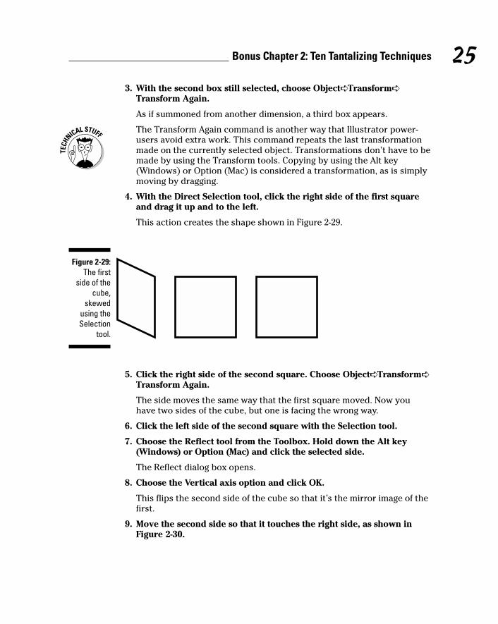
4. With the Direct Selection tool, click the right side of the first squareand drag it up and to the left.
This action creates the shape shown in Figure 2-29.
5. Click the right side of the second square. Choose Object➪ Transform➪Transform Again.
The side moves the same way that the first square moved. Now youhave two sides of the cube, but one is facing the wrong way.
6. Click the left side of the second square with the Selection tool.
7. Choose the Reflect tool from the Toolbox. Hold down the Alt key(Windows) or Option (Mac) and click the selected side.
The Reflect dialog box opens.
8. Choose the Vertical axis option and click OK.
This flips the second side of the cube so that it’s the mirror image of thefirst.
9. Move the second side so that it touches the right side, as shown inFigure 2-30.
Figure 2-29:The first
side of thecube,
skewedusing theSelection
tool.
25Bonus Chapter 2: Ten Tantalizing Techniques
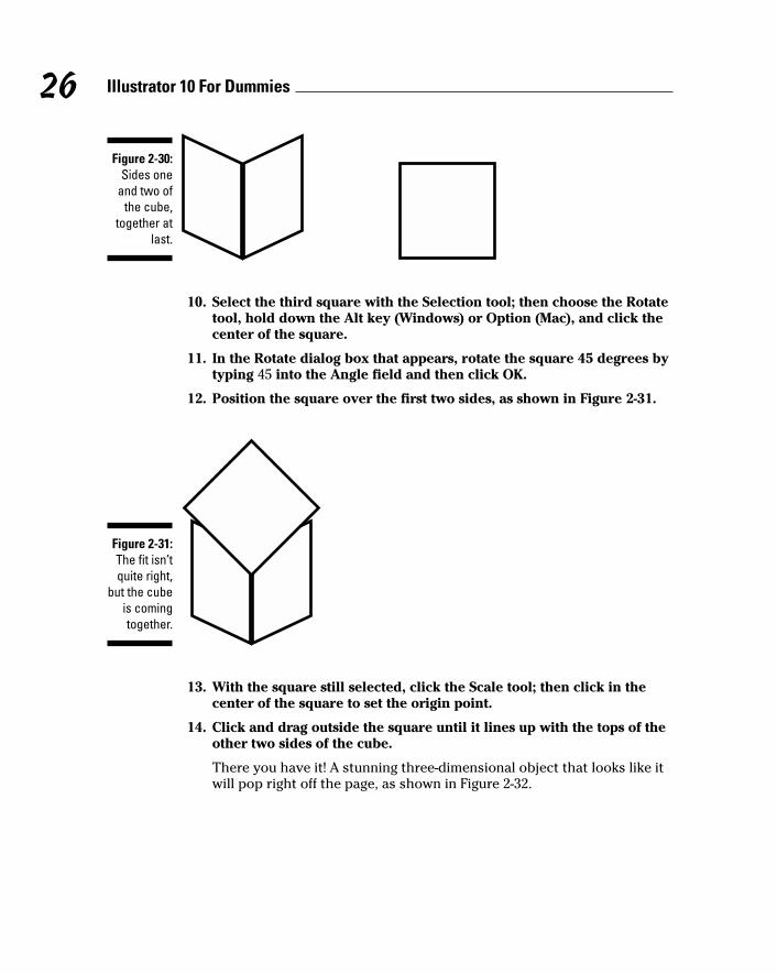
10. Select the third square with the Selection tool; then choose the Rotatetool, hold down the Alt key (Windows) or Option (Mac), and click thecenter of the square.
11. In the Rotate dialog box that appears, rotate the square 45 degrees bytyping 45 into the Angle field and then click OK.
12. Position the square over the first two sides, as shown in Figure 2-31.
13. With the square still selected, click the Scale tool; then click in thecenter of the square to set the origin point.
14. Click and drag outside the square until it lines up with the tops of theother two sides of the cube.
There you have it! A stunning three-dimensional object that looks like itwill pop right off the page, as shown in Figure 2-32.
Figure 2-31:The fit isn’tquite right,
but the cubeis comingtogether.
Figure 2-30:Sides one
and two ofthe cube,
together atlast.
26 Illustrator 10 For Dummies
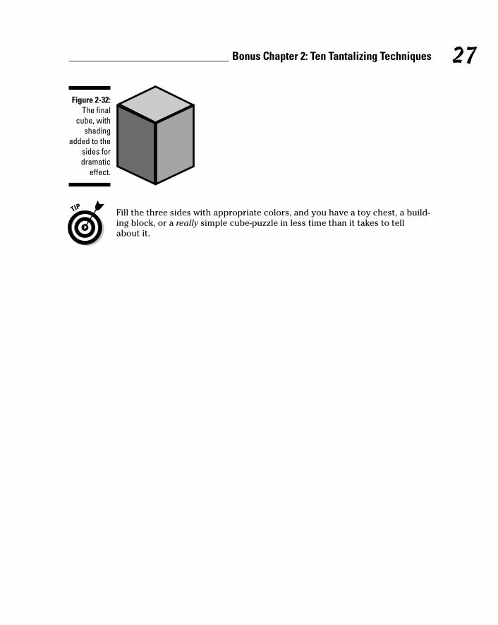
Fill the three sides with appropriate colors, and you have a toy chest, a build-ing block, or a really simple cube-puzzle in less time than it takes to tellabout it.
Figure 2-32:The final
cube, withshading
added to thesides fordramatic
effect.
27Bonus Chapter 2: Ten Tantalizing Techniques

28 Illustrator 10 For Dummies