Embed Size (px)
Citation preview
Technical Analysis by Trader /elaluu (Dario) Admin from Simba Stocks
Contents Chapter 1: Customizing and Setting Up TradingView ................................................................. 3 Chapter 2: Risk Management Basics ............................................................................................ 9 Chapter 3: Candlestick Patterns ................................................................................................. 12 Chapter 4: Moving Averages ...................................................................................................... 17
Using Moving Averages with Strategy .................................................................................... 18 Chapter 5 - Relative Strength Index ........................................................................................... 22
Using RSI as a Strategy ............................................................................................................ 22 Bullish Divergence ............................................................................................................... 23 Bearish Divergence .............................................................................................................. 23
Chapter 6: MACD and Histogram ............................................................................................... 25 Using MACD and Histogram as a Strategy .............................................................................. 26
Chapter 7: Supports and Resistances ......................................................................................... 28 The Basics ................................................................................................................................ 28 Identification References ........................................................................................................ 30 Candle Clusters ........................................................................................................................ 30 Order blocks (single candles) .................................................................................................. 31 Trendlines ................................................................................................................................ 32 Moving Averages ..................................................................................................................... 32
Chapter 8: Fibonacci Retracement ............................................................................................. 34 How to Use it ........................................................................................................................... 35 Looking for Confirmation ........................................................................................................ 37
Chapter 9: Fibonacci Extensions ................................................................................................ 40 Chapter 10: Mastering Timeframes ........................................................................................... 43
What is Multiple TF Analysis? ................................................................................................. 43 Looking into the Charts ........................................................................................................... 43
Chapter 11: Risk Management – Advanced Strategy ................................................................ 46 Chapter 12: Introduction to Elliot Waves .................................................................................. 49
The Basics ................................................................................................................................ 49 The Three Rules ....................................................................................................................... 52 The Three Guidelines .............................................................................................................. 52 How to Recognize Waves ........................................................................................................ 53
Chapter 13: Chart Patterns ......................................................................................................... 55 Patterns Applied on Charts ..................................................................................................... 58
Chapter 14: Summary ................................................................................................................. 61
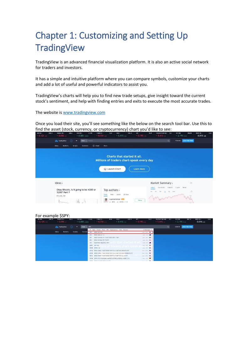
Chapter 1: Customizing and Setting Up TradingView TradingView is an advanced financial visualization platform. It is also an active social network for traders and investors. It has a simple and intuitive platform where you can compare symbols, customize your charts and add a lot of useful and powerful indicators to assist you. TradingView’s charts will help you to find new trade setups, give insight toward the current stock’s sentiment, and help with finding entries and exits to execute the most accurate trades. The website is www.tradingview.com Once you load their site, you’ll see something like the below on the search tool bar. Use this to find the asset (stock, currency, or cryptocurrency) chart you’d like to see:
For example $SPY:
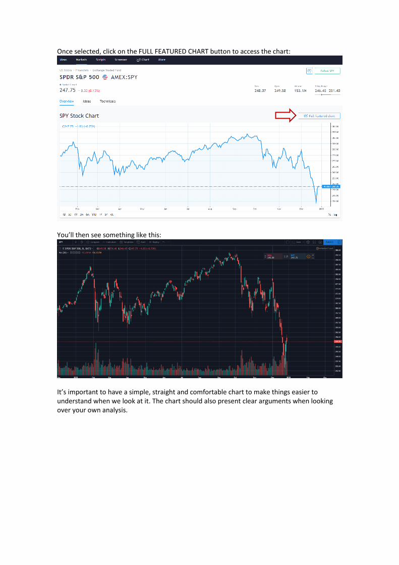
Once selected, click on the FULL FEATURED CHART button to access the chart:
You’ll then see something like this:
It’s important to have a simple, straight and comfortable chart to make things easier to understand when we look at it. The chart should also present clear arguments when looking over your own analysis.
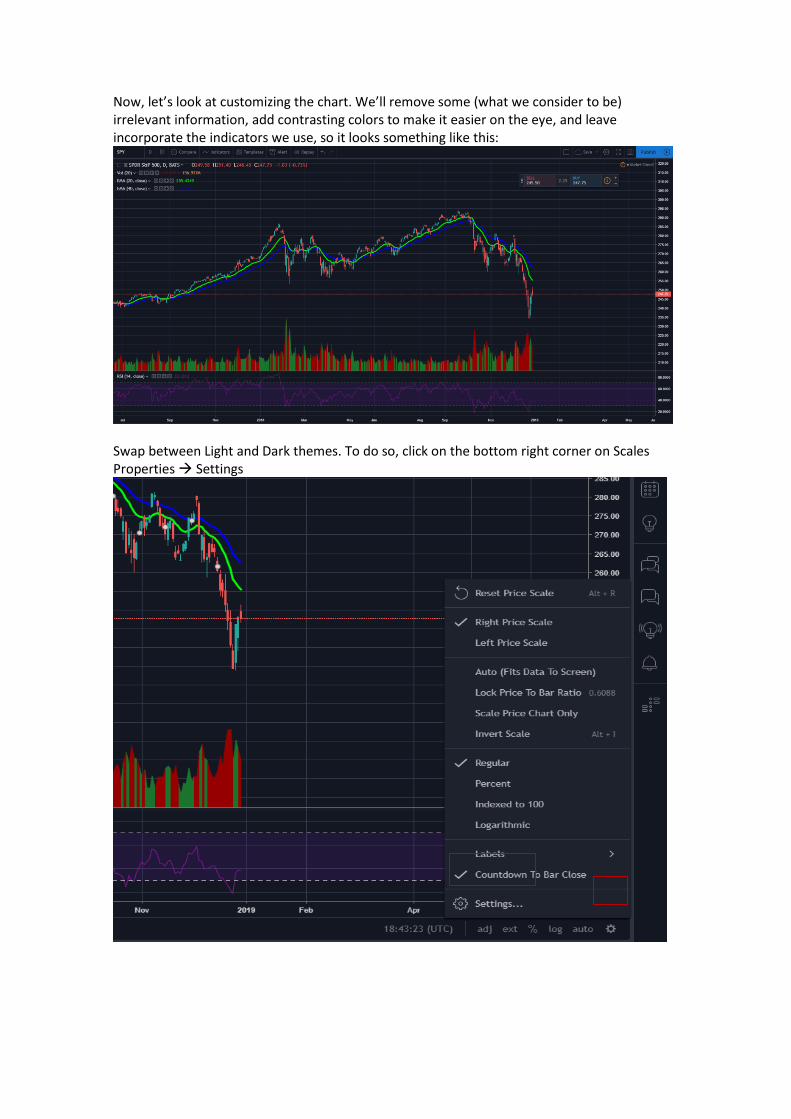
Now, let’s look at customizing the chart. We’ll remove some (what we consider to be) irrelevant information, add contrasting colors to make it easier on the eye, and leave incorporate the indicators we use, so it looks something like this:
Swap between Light and Dark themes. To do so, click on the bottom right corner on Scales Properties → Settings
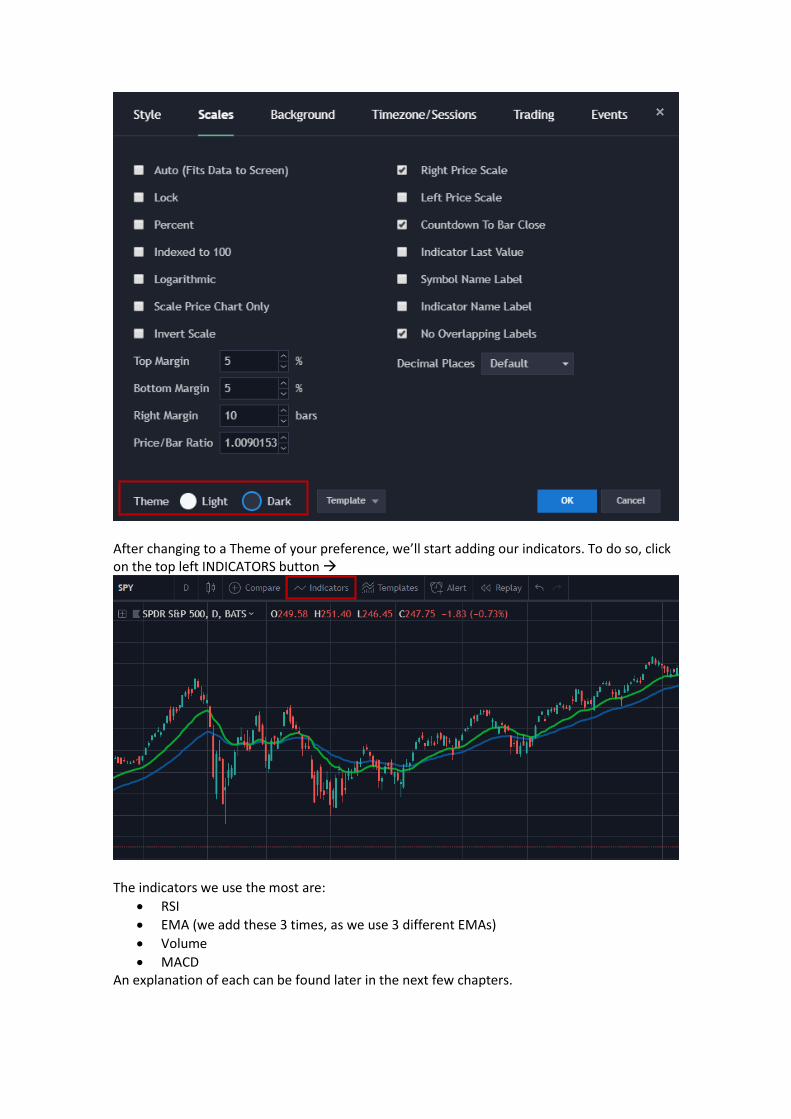
After changing to a Theme of your preference, we’ll start adding our indicators. To do so, click on the top left INDICATORS button →
The indicators we use the most are:
• RSI
• EMA (we add these 3 times, as we use 3 different EMAs)
• Volume
• MACD An explanation of each can be found later in the next few chapters.
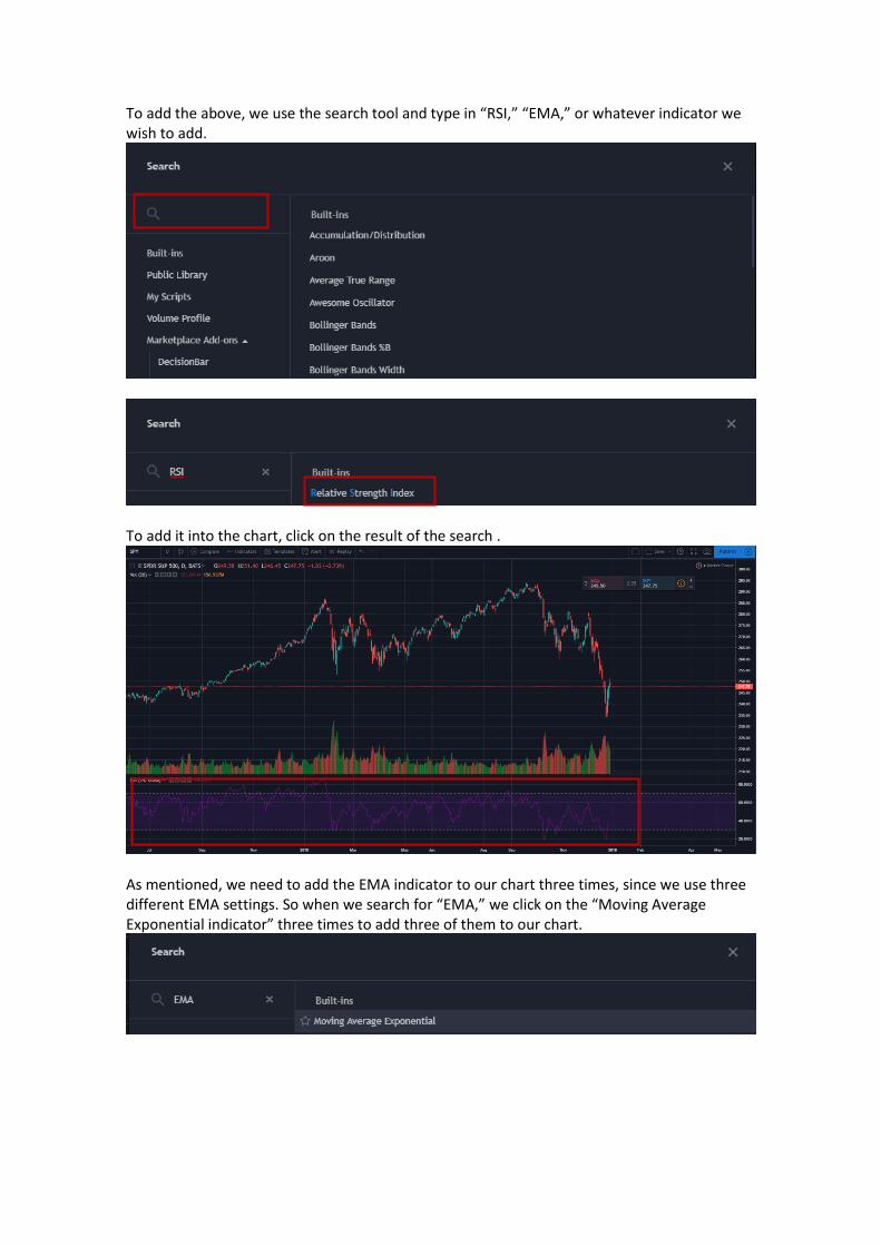
To add the above, we use the search tool and type in “RSI,” “EMA,” or whatever indicator we wish to add.
To add it into the chart, click on the result of the search .
As mentioned, we need to add the EMA indicator to our chart three times, since we use three different EMA settings. So when we search for “EMA,” we click on the “Moving Average Exponential indicator” three times to add three of them to our chart.
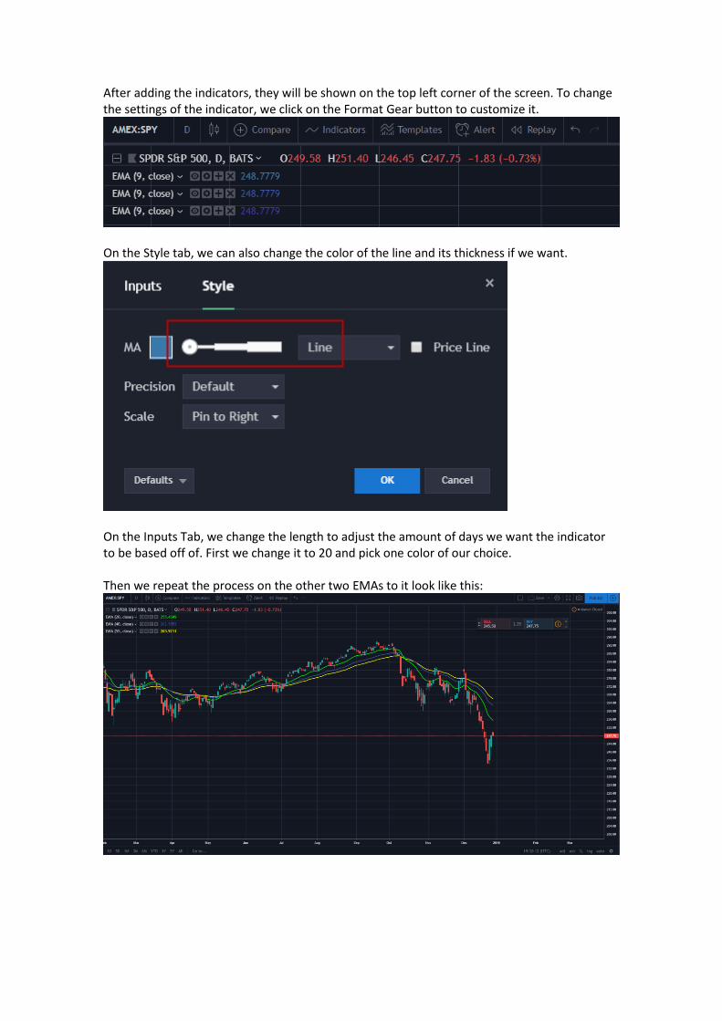
After adding the indicators, they will be shown on the top left corner of the screen. To change the settings of the indicator, we click on the Format Gear button to customize it.
On the Style tab, we can also change the color of the line and its thickness if we want.
On the Inputs Tab, we change the length to adjust the amount of days we want the indicator to be based off of. First we change it to 20 and pick one color of our choice. Then we repeat the process on the other two EMAs to it look like this:
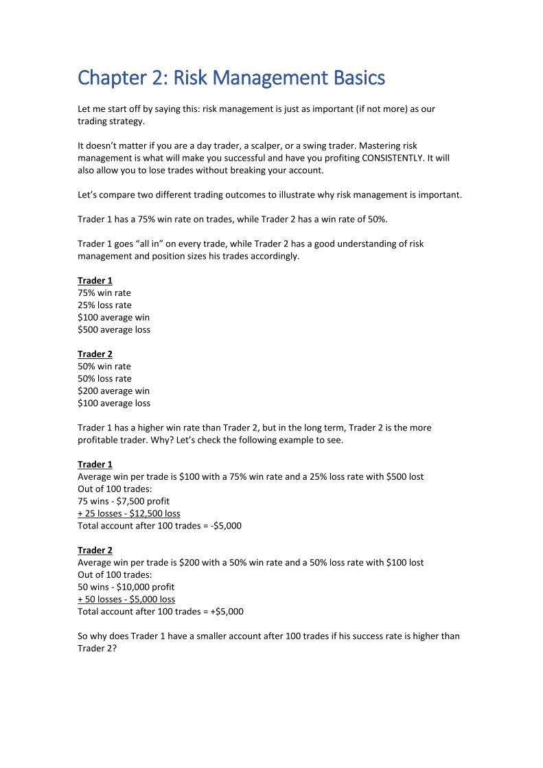
Chapter 2: Risk Management Basics Let me start off by saying this: risk management is just as important (if not more) as our trading strategy. It doesn’t matter if you are a day trader, a scalper, or a swing trader. Mastering risk management is what will make you successful and have you profiting CONSISTENTLY. It will also allow you to lose trades without breaking your account. Let’s compare two different trading outcomes to illustrate why risk management is important. Trader 1 has a 75% win rate on trades, while Trader 2 has a win rate of 50%. Trader 1 goes “all in” on every trade, while Trader 2 has a good understanding of risk management and position sizes his trades accordingly. Trader 1 75% win rate 25% loss rate $100 average win $500 average loss Trader 2 50% win rate 50% loss rate $200 average win $100 average loss Trader 1 has a higher win rate than Trader 2, but in the long term, Trader 2 is the more profitable trader. Why? Let’s check the following example to see. Trader 1 Average win per trade is $100 with a 75% win rate and a 25% loss rate with $500 lost Out of 100 trades: 75 wins - $7,500 profit + 25 losses - $12,500 loss Total account after 100 trades = -$5,000 Trader 2 Average win per trade is $200 with a 50% win rate and a 50% loss rate with $100 lost Out of 100 trades: 50 wins - $10,000 profit + 50 losses - $5,000 loss Total account after 100 trades = +$5,000 So why does Trader 1 have a smaller account after 100 trades if his success rate is higher than Trader 2?
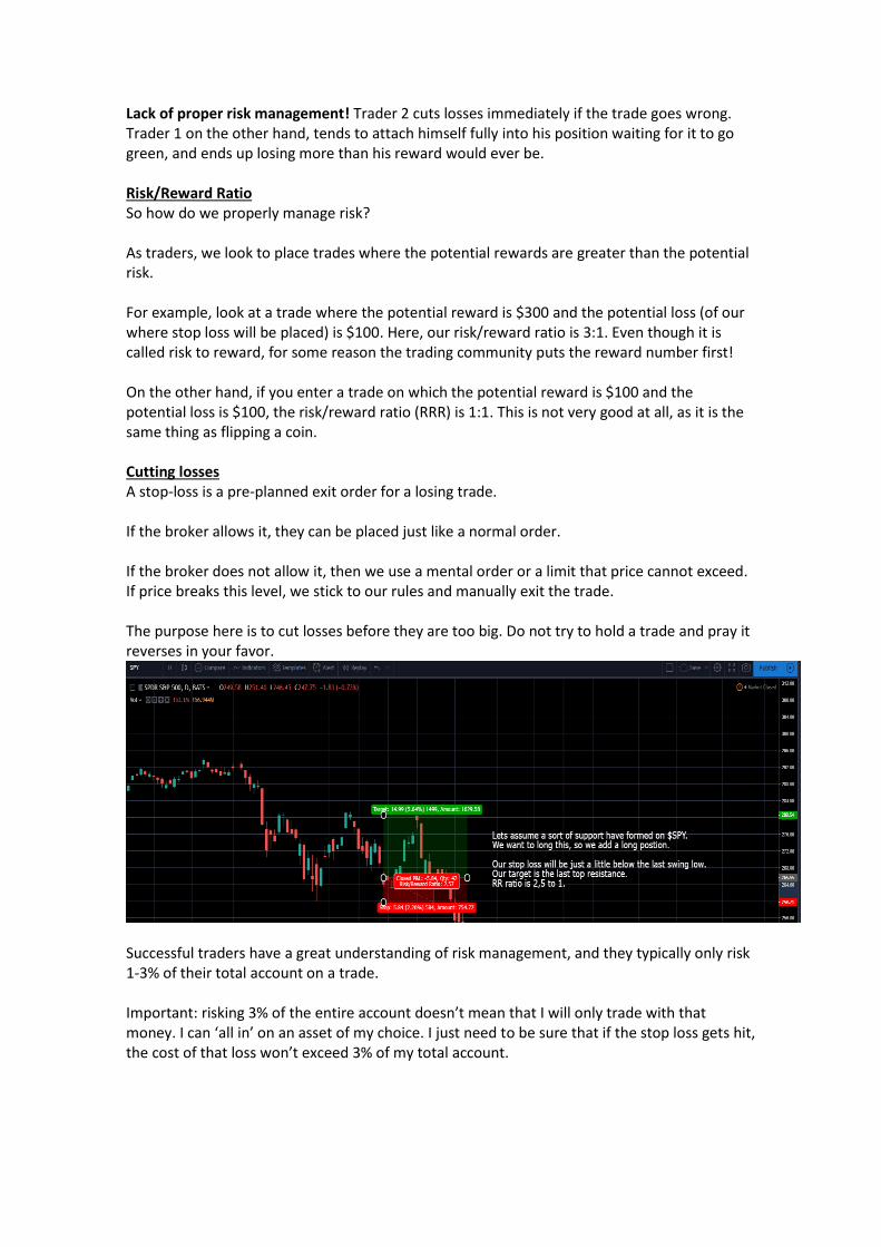
Lack of proper risk management! Trader 2 cuts losses immediately if the trade goes wrong. Trader 1 on the other hand, tends to attach himself fully into his position waiting for it to go green, and ends up losing more than his reward would ever be. Risk/Reward Ratio So how do we properly manage risk? As traders, we look to place trades where the potential rewards are greater than the potential risk. For example, look at a trade where the potential reward is $300 and the potential loss (of our where stop loss will be placed) is $100. Here, our risk/reward ratio is 3:1. Even though it is called risk to reward, for some reason the trading community puts the reward number first! On the other hand, if you enter a trade on which the potential reward is $100 and the potential loss is $100, the risk/reward ratio (RRR) is 1:1. This is not very good at all, as it is the same thing as flipping a coin. Cutting losses A stop-loss is a pre-planned exit order for a losing trade. If the broker allows it, they can be placed just like a normal order. If the broker does not allow it, then we use a mental order or a limit that price cannot exceed. If price breaks this level, we stick to our rules and manually exit the trade. The purpose here is to cut losses before they are too big. Do not try to hold a trade and pray it reverses in your favor.
Successful traders have a great understanding of risk management, and they typically only risk 1-3% of their total account on a trade. Important: risking 3% of the entire account doesn’t mean that I will only trade with that money. I can ‘all in’ on an asset of my choice. I just need to be sure that if the stop loss gets hit, the cost of that loss won’t exceed 3% of my total account.
For example: Total account value: $1,000. I place a long position on $SPY. The trade goes wrong and my stop loss is hit. I only lose $30. $SPY itself trades around $250 at the writing of this PDF and option contracts are around $1.50-2.50 themselves. So let’s say that we buy 1 share of $SPY. If we are willing to risk 3% of our account, we can afford to only lose $30 total. This means we can hold $SPY until $220 at which point it will sell automatically to prevent further losses. The upside potential that we see is our target of $280 shown at the top of the green box highlighted in the picture above. Of course I can buy more shares of $SPY (or contracts if trading options), but if the share price moves down less than $30, we will be risking too much and will hit our stoploss of 3% sooner. This in turn can place the R:R out of our favor.
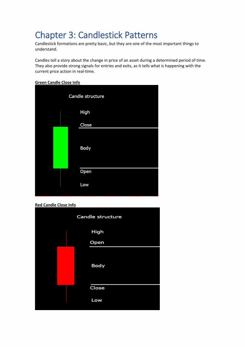
Chapter 3: Candlestick Patterns Candlestick formations are pretty basic, but they are one of the most important things to understand. Candles tell a story about the change in price of an asset during a determined period of time. They also provide strong signals for entries and exits, as it tells what is happening with the current price action in real-time. Green Candle Close Info
Red Candle Close Info
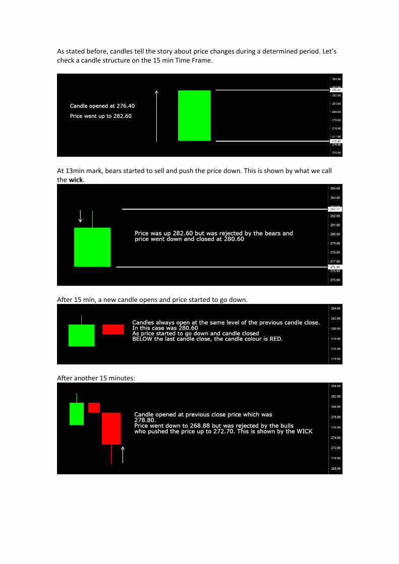
As stated before, candles tell the story about price changes during a determined period. Let’s check a candle structure on the 15 min Time Frame.
At 13min mark, bears started to sell and push the price down. This is shown by what we call the wick.
After 15 min, a new candle opens and price started to go down.
After another 15 minutes:
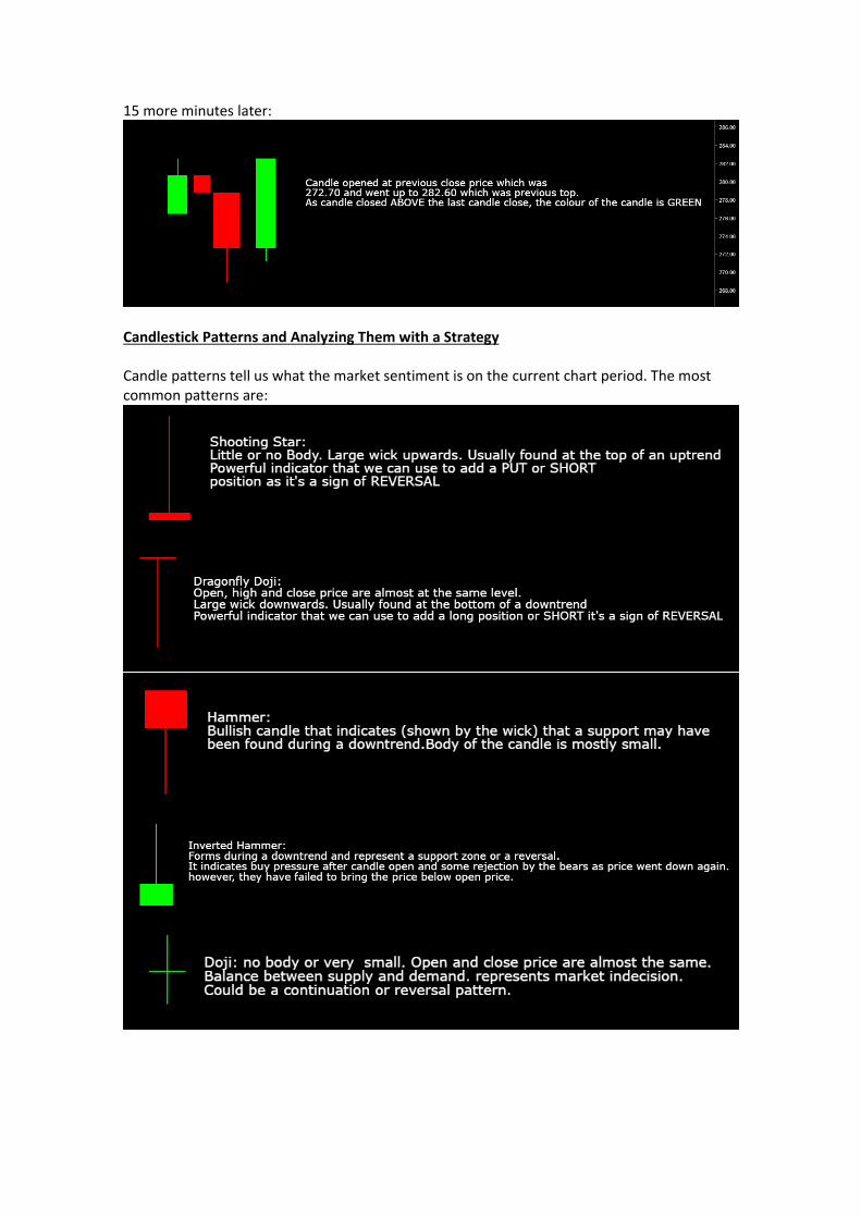
15 more minutes later:
Candlestick Patterns and Analyzing Them with a Strategy Candle patterns tell us what the market sentiment is on the current chart period. The most common patterns are:
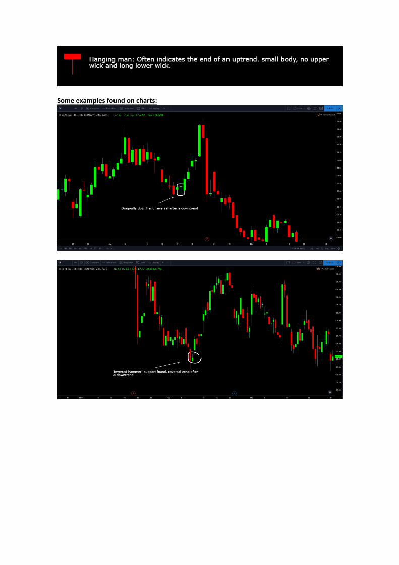
Some examples found on charts:
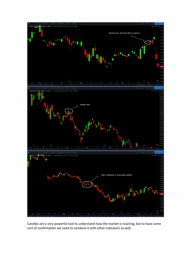
Candles are a very powerful tool to understand how the market is reacting, but to have some sort of confirmation we need to combine it with other indicators as well.
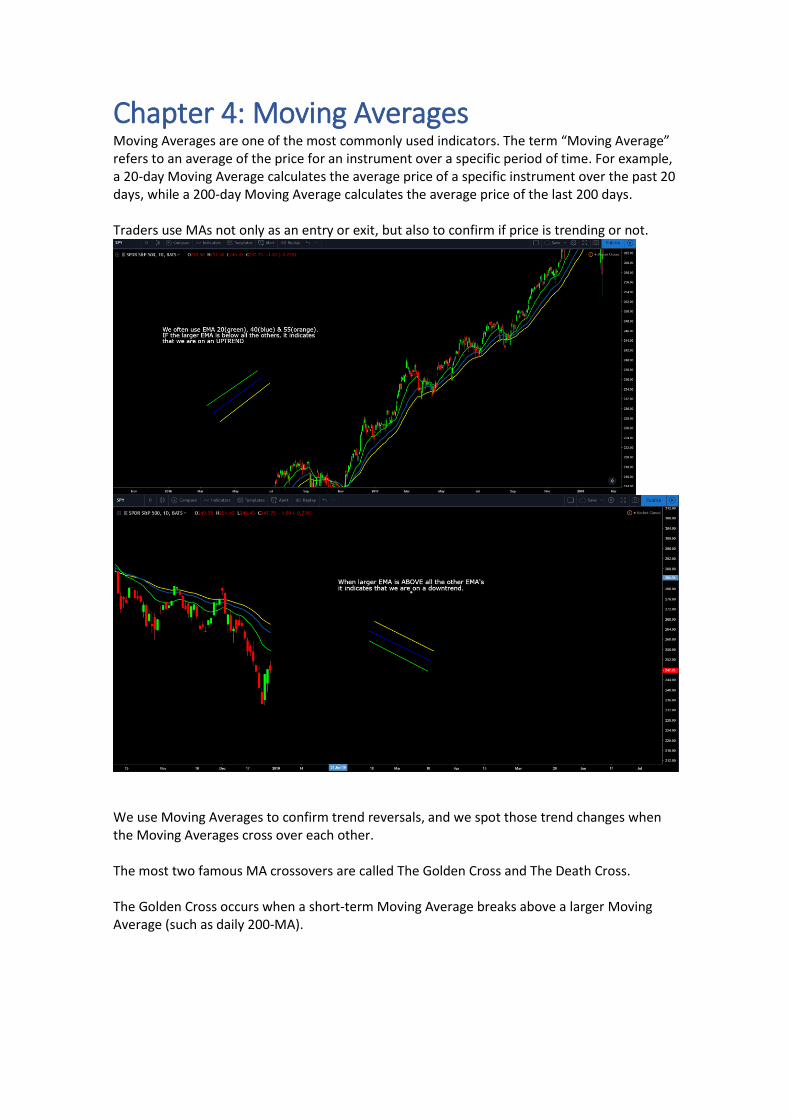
Chapter 4: Moving Averages Moving Averages are one of the most commonly used indicators. The term “Moving Average” refers to an average of the price for an instrument over a specific period of time. For example, a 20-day Moving Average calculates the average price of a specific instrument over the past 20 days, while a 200-day Moving Average calculates the average price of the last 200 days. Traders use MAs not only as an entry or exit, but also to confirm if price is trending or not.
We use Moving Averages to confirm trend reversals, and we spot those trend changes when the Moving Averages cross over each other. The most two famous MA crossovers are called The Golden Cross and The Death Cross. The Golden Cross occurs when a short-term Moving Average breaks above a larger Moving Average (such as daily 200-MA).
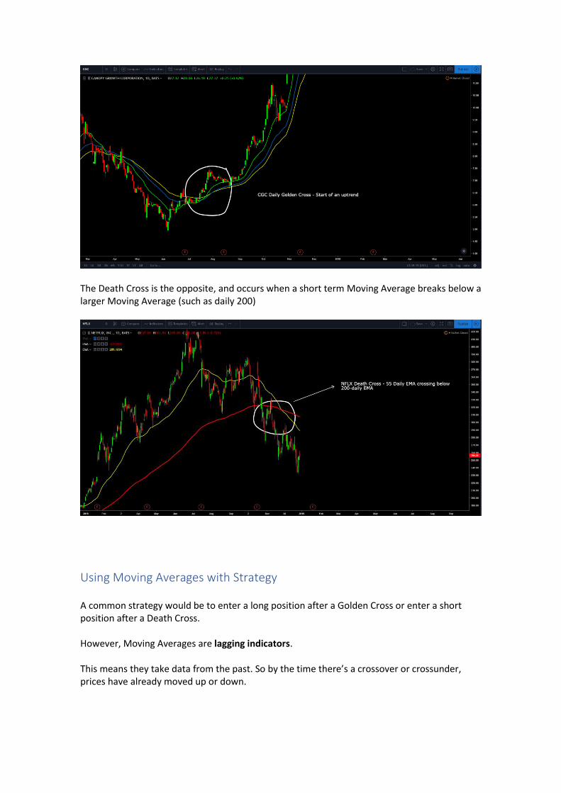
The Death Cross is the opposite, and occurs when a short term Moving Average breaks below a larger Moving Average (such as daily 200)
Using Moving Averages with Strategy A common strategy would be to enter a long position after a Golden Cross or enter a short position after a Death Cross. However, Moving Averages are lagging indicators. This means they take data from the past. So by the time there’s a crossover or crossunder, prices have already moved up or down.
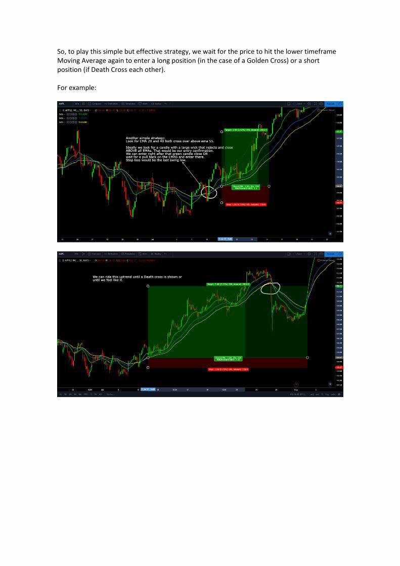
So, to play this simple but effective strategy, we wait for the price to hit the lower timeframe Moving Average again to enter a long position (in the case of a Golden Cross) or a short position (if Death Cross each other). For example:
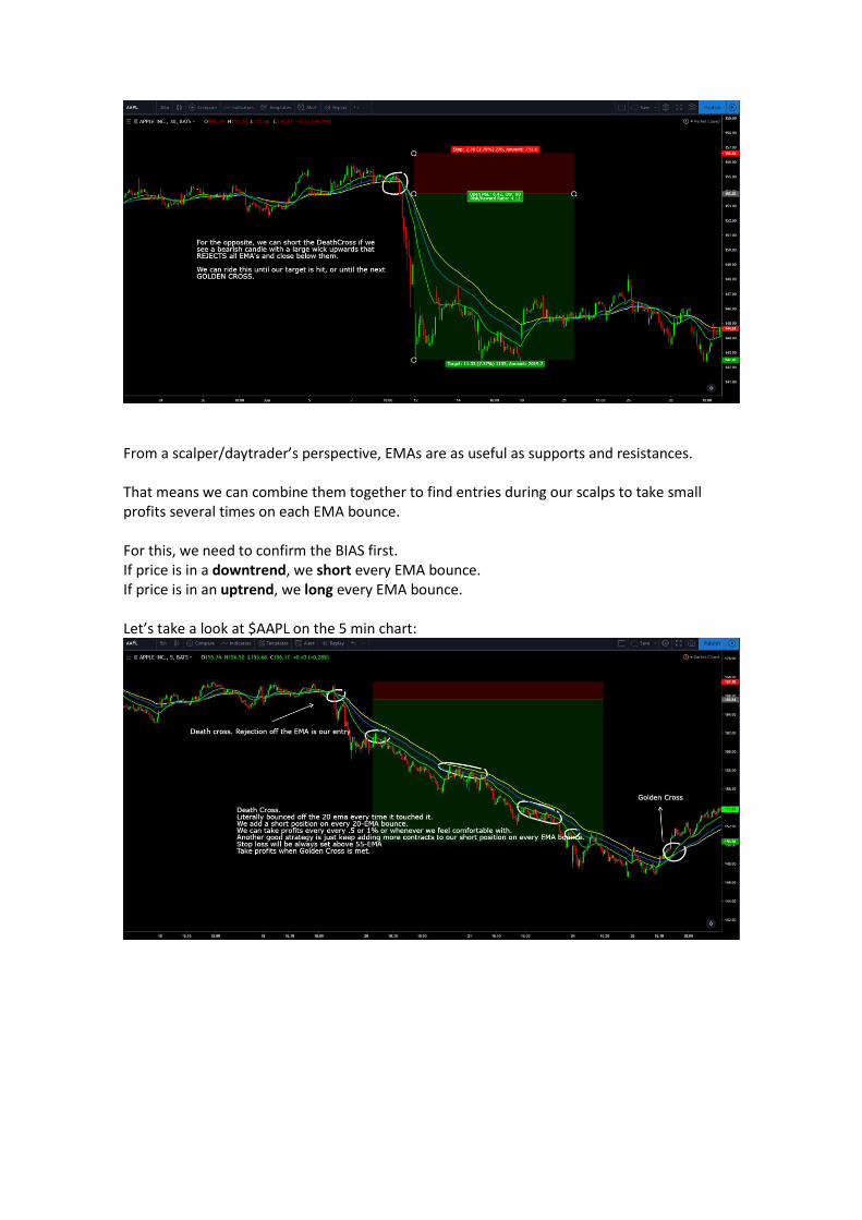
From a scalper/daytrader’s perspective, EMAs are as useful as supports and resistances. That means we can combine them together to find entries during our scalps to take small profits several times on each EMA bounce. For this, we need to confirm the BIAS first. If price is in a downtrend, we short every EMA bounce. If price is in an uptrend, we long every EMA bounce. Let’s take a look at $AAPL on the 5 min chart:
It’s the same here on $GE:
Also there was a nice swing trade opportunity on $DIS:
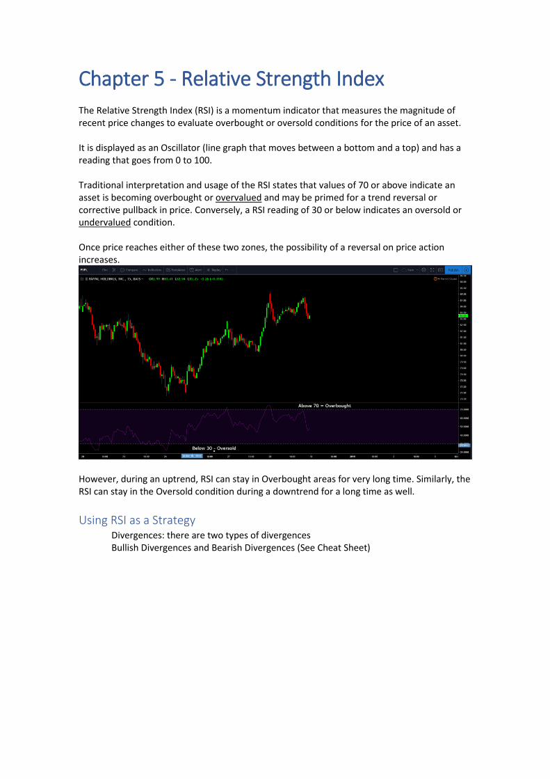
Chapter 5 - Relative Strength Index The Relative Strength Index (RSI) is a momentum indicator that measures the magnitude of recent price changes to evaluate overbought or oversold conditions for the price of an asset. It is displayed as an Oscillator (line graph that moves between a bottom and a top) and has a reading that goes from 0 to 100. Traditional interpretation and usage of the RSI states that values of 70 or above indicate an asset is becoming overbought or overvalued and may be primed for a trend reversal or corrective pullback in price. Conversely, a RSI reading of 30 or below indicates an oversold or undervalued condition. Once price reaches either of these two zones, the possibility of a reversal on price action increases.
However, during an uptrend, RSI can stay in Overbought areas for very long time. Similarly, the RSI can stay in the Oversold condition during a downtrend for a long time as well.
Using RSI as a Strategy Divergences: there are two types of divergences Bullish Divergences and Bearish Divergences (See Cheat Sheet)
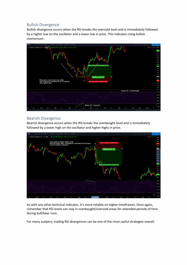
Bullish Divergence Bullish divergence occurs when the RSI breaks the oversold level and is immediately followed
by a higher low on the oscillator and a lower low in price. This indicates rising bullish
momentum.
Bearish Divergence Bearish divergence occurs when the RSI breaks the overbought level and is immediately
followed by a lower high on the oscillator and higher highs in price.
As with any other technical indicator, it’s more reliable on higher timeframes. Once again, remember that RSI levels can stay in overbought/oversold areas for extended periods of time during bull/bear runs. For many scalpers, trading RSI divergences can be one of the most useful strategies overall.
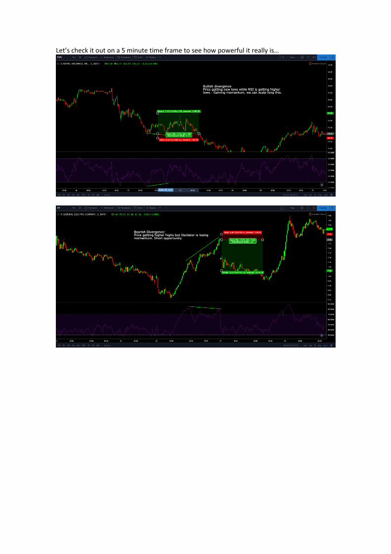
Let’s check it out on a 5 minute time frame to see how powerful it really is…
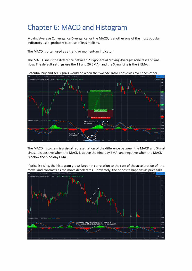
Chapter 6: MACD and Histogram Moving Average Convergence Divergence, or the MACD, is another one of the most popular indicators used, probably because of its simplicity. The MACD is often used as a trend or momentum indicator. The MACD Line is the difference between 2 Exponential Moving Averages (one fast and one slow. The default settings use the 12 and 26 EMA), and the Signal Line is the 9 EMA. Potential buy and sell signals would be when the two oscillator lines cross over each other.
The MACD histogram is a visual representation of the difference between the MACD and Signal Lines. It is positive when the MACD is above the nine-day EMA, and negative when the MACD is below the nine-day EMA. If price is rising, the histogram grows larger in correlation to the rate of the acceleration of the move, and contracts as the move decelerates. Conversely, the opposite happens as price falls.
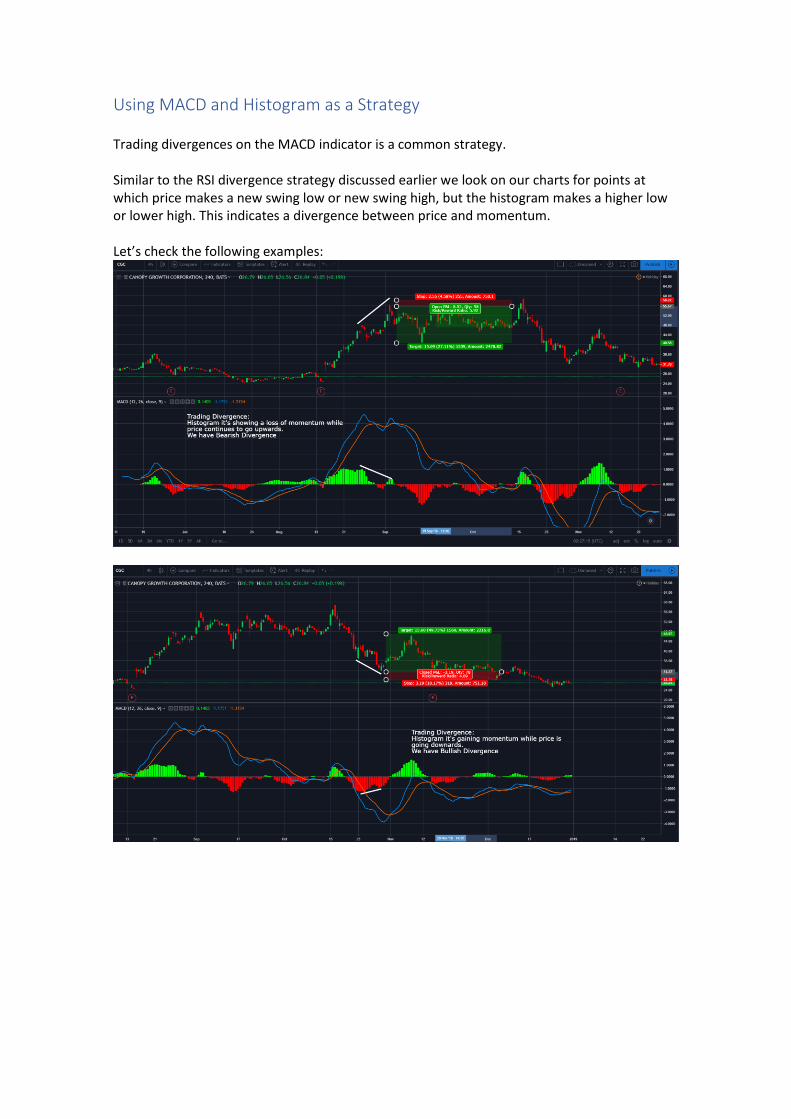
Using MACD and Histogram as a Strategy Trading divergences on the MACD indicator is a common strategy. Similar to the RSI divergence strategy discussed earlier we look on our charts for points at which price makes a new swing low or new swing high, but the histogram makes a higher low or lower high. This indicates a divergence between price and momentum. Let’s check the following examples:
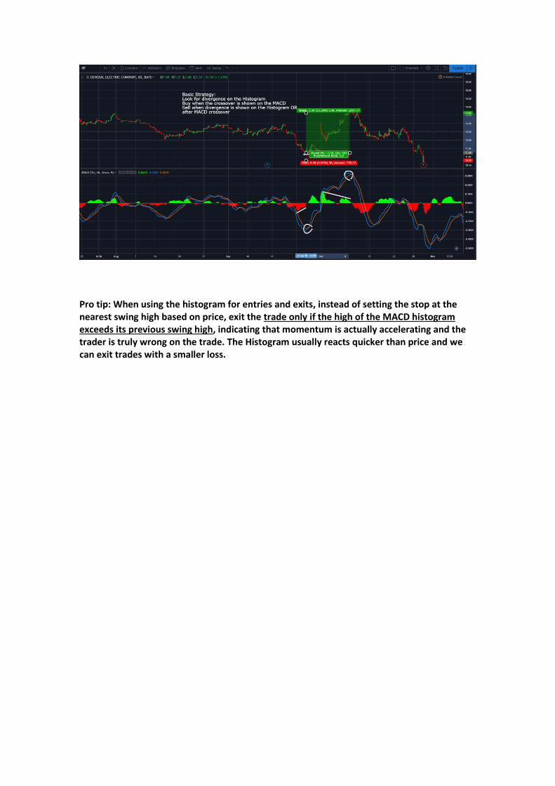
Pro tip: When using the histogram for entries and exits, instead of setting the stop at the nearest swing high based on price, exit the trade only if the high of the MACD histogram exceeds its previous swing high, indicating that momentum is actually accelerating and the trader is truly wrong on the trade. The Histogram usually reacts quicker than price and we can exit trades with a smaller loss.
Chapter 7: Supports and Resistances
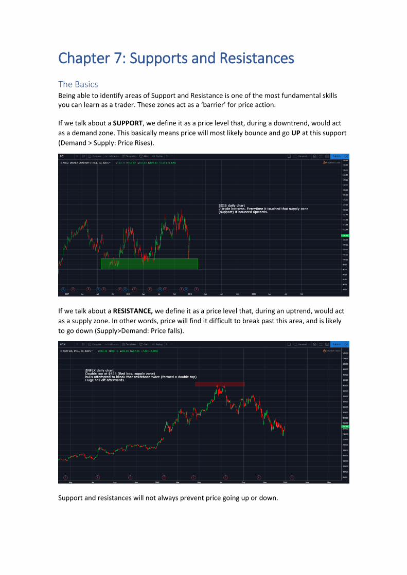
The Basics Being able to identify areas of Support and Resistance is one of the most fundamental skills you can learn as a trader. These zones act as a ‘barrier’ for price action. If we talk about a SUPPORT, we define it as a price level that, during a downtrend, would act
as a demand zone. This basically means price will most likely bounce and go UP at this support
(Demand > Supply: Price Rises).
If we talk about a RESISTANCE, we define it as a price level that, during an uptrend, would act
as a supply zone. In other words, price will find it difficult to break past this area, and is likely
to go down (Supply>Demand: Price falls).
Support and resistances will not always prevent price going up or down.
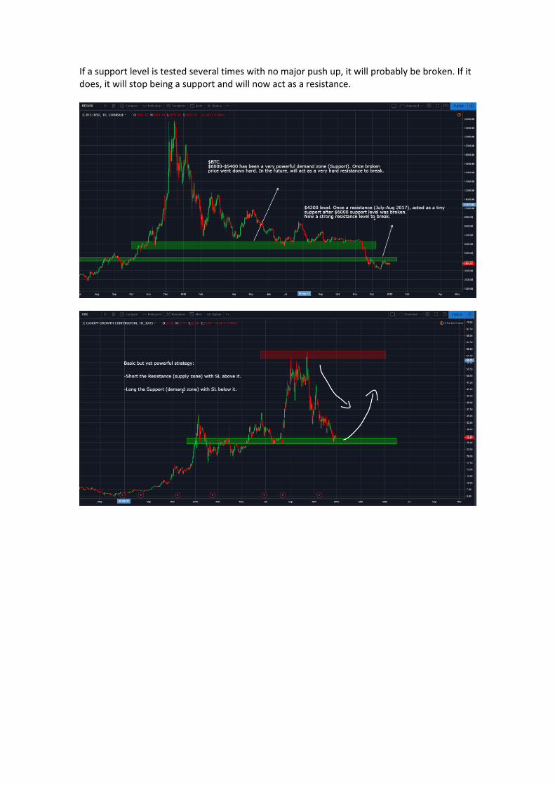
If a support level is tested several times with no major push up, it will probably be broken. If it does, it will stop being a support and will now act as a resistance.
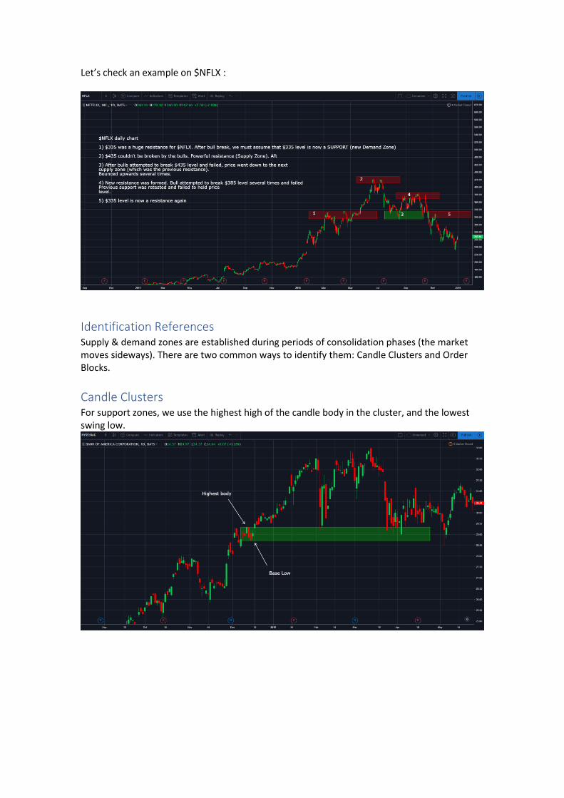
Let’s check an example on $NFLX :
Identification References
Supply & demand zones are established during periods of consolidation phases (the market moves sideways). There are two common ways to identify them: Candle Clusters and Order Blocks.
Candle Clusters For support zones, we use the highest high of the candle body in the cluster, and the lowest swing low.
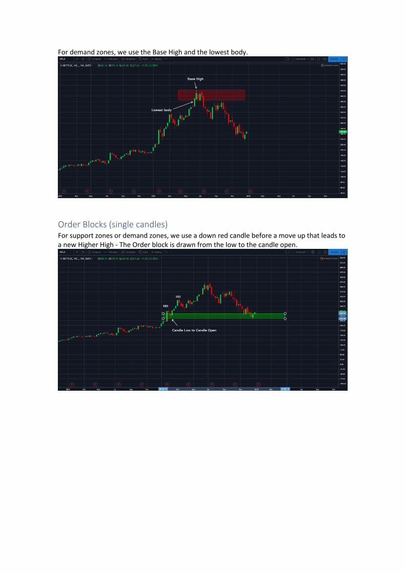
For demand zones, we use the Base High and the lowest body.
Order Blocks (single candles) For support zones or demand zones, we use a down red candle before a move up that leads to a new Higher High - The Order block is drawn from the low to the candle open.
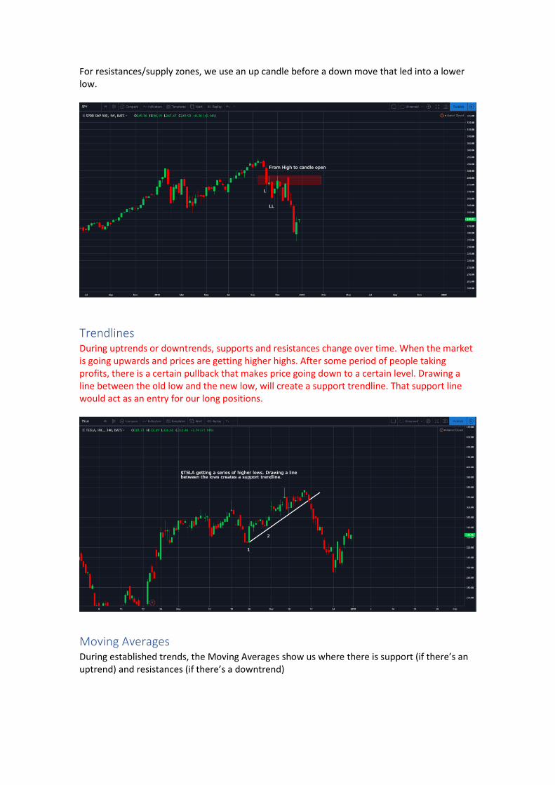
For resistances/supply zones, we use an up candle before a down move that led into a lower low.
Trendlines
During uptrends or downtrends, supports and resistances change over time. When the market is going upwards and prices are getting higher highs. After some period of people taking profits, there is a certain pullback that makes price going down to a certain level. Drawing a line between the old low and the new low, will create a support trendline. That support line would act as an entry for our long positions.
Moving Averages
During established trends, the Moving Averages show us where there is support (if there’s an uptrend) and resistances (if there’s a downtrend)
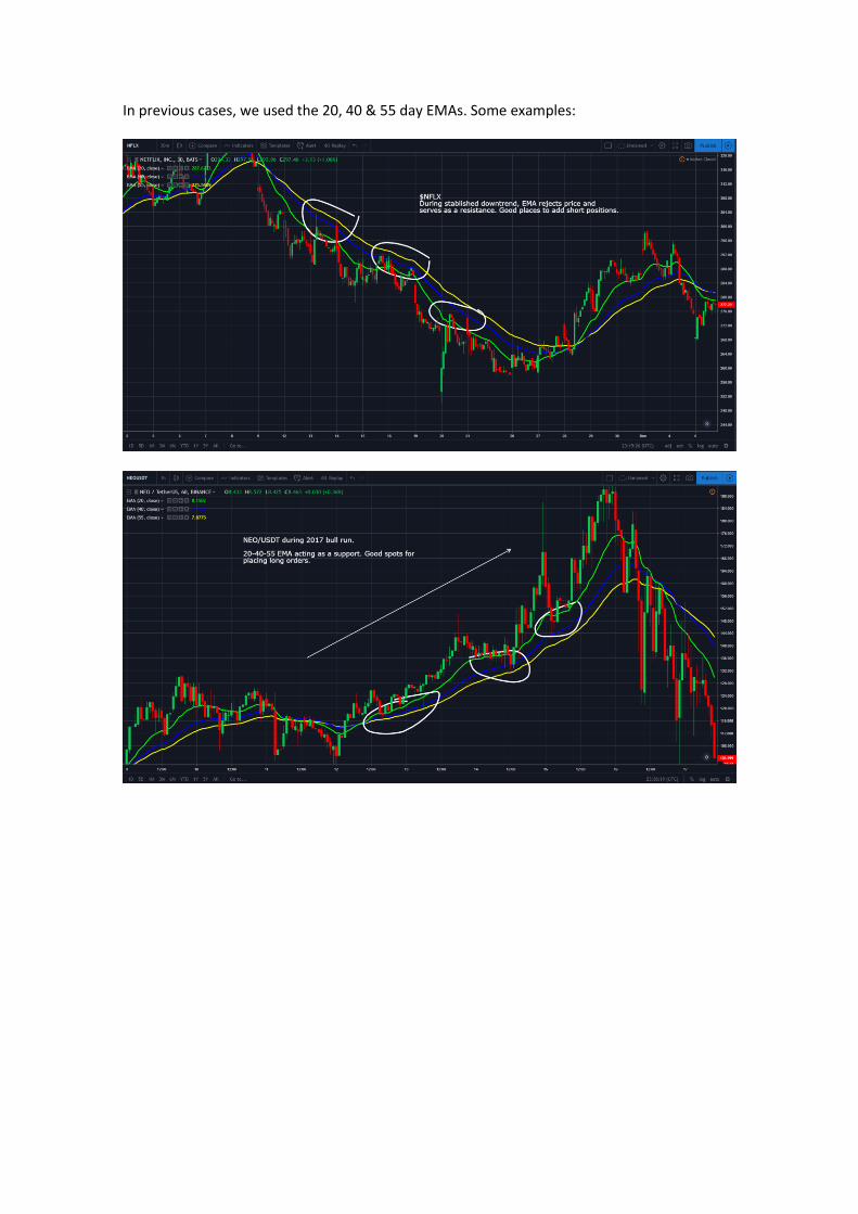
In previous cases, we used the 20, 40 & 55 day EMAs. Some examples:
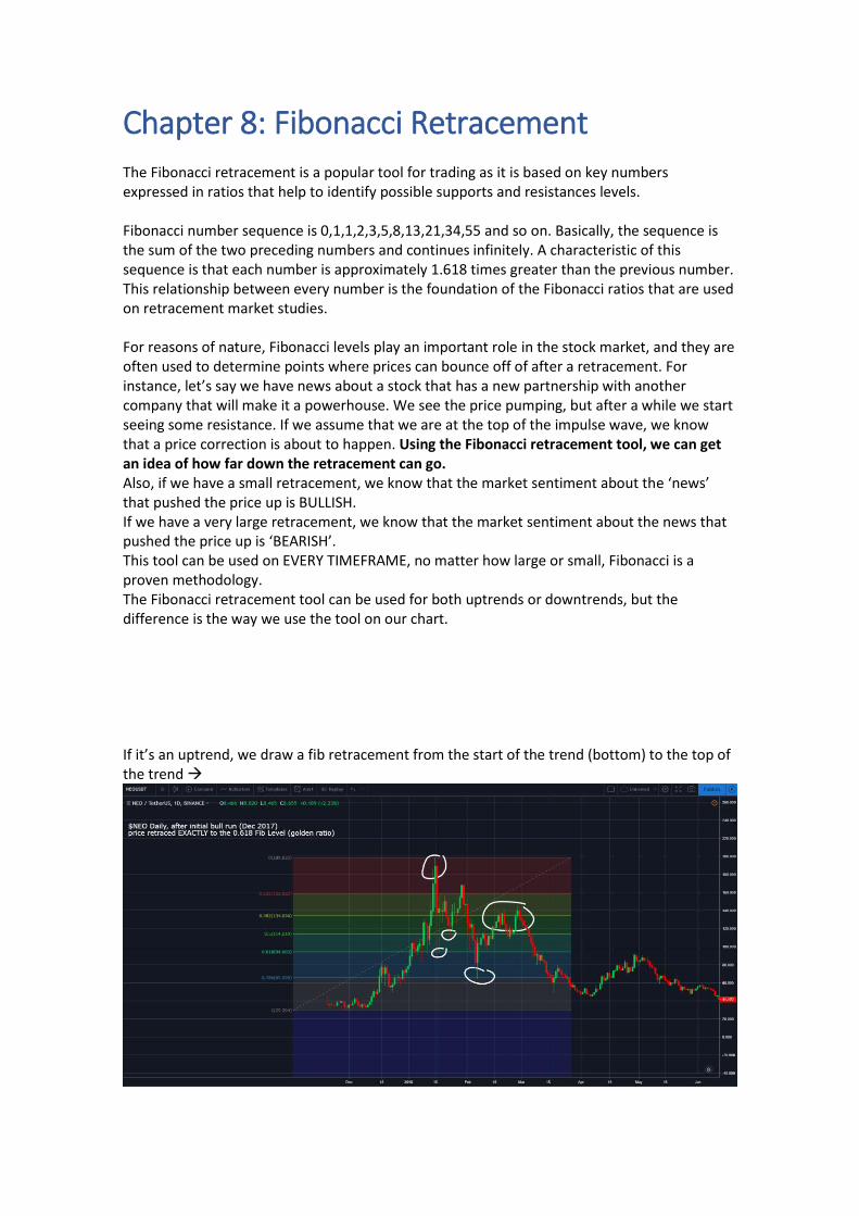
Chapter 8: Fibonacci Retracement The Fibonacci retracement is a popular tool for trading as it is based on key numbers expressed in ratios that help to identify possible supports and resistances levels. Fibonacci number sequence is 0,1,1,2,3,5,8,13,21,34,55 and so on. Basically, the sequence is the sum of the two preceding numbers and continues infinitely. A characteristic of this sequence is that each number is approximately 1.618 times greater than the previous number. This relationship between every number is the foundation of the Fibonacci ratios that are used on retracement market studies. For reasons of nature, Fibonacci levels play an important role in the stock market, and they are often used to determine points where prices can bounce off of after a retracement. For instance, let’s say we have news about a stock that has a new partnership with another company that will make it a powerhouse. We see the price pumping, but after a while we start seeing some resistance. If we assume that we are at the top of the impulse wave, we know that a price correction is about to happen. Using the Fibonacci retracement tool, we can get an idea of how far down the retracement can go. Also, if we have a small retracement, we know that the market sentiment about the ‘news’ that pushed the price up is BULLISH. If we have a very large retracement, we know that the market sentiment about the news that pushed the price up is ‘BEARISH’. This tool can be used on EVERY TIMEFRAME, no matter how large or small, Fibonacci is a proven methodology. The Fibonacci retracement tool can be used for both uptrends or downtrends, but the difference is the way we use the tool on our chart. If it’s an uptrend, we draw a fib retracement from the start of the trend (bottom) to the top of the trend →
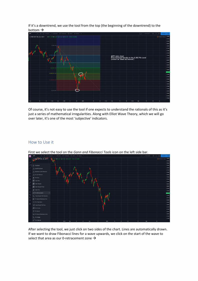
If it’s a downtrend, we use the tool from the top (the beginning of the downtrend) to the bottom →
Of course, it’s not easy to use the tool if one expects to understand the rationals of this as it’s just a series of mathematical irregularities. Along with Elliot Wave Theory, which we will go over later, it’s one of the most ‘subjective’ indicators.
How to Use it First we select the tool on the Gann and Fibonacci Tools icon on the left side bar.
After selecting the tool, we just click on two sides of the chart. Lines are automatically drawn. If we want to draw Fibonacci lines for a wave upwards, we click on the start of the wave to select that area as our 0-retracement zone →
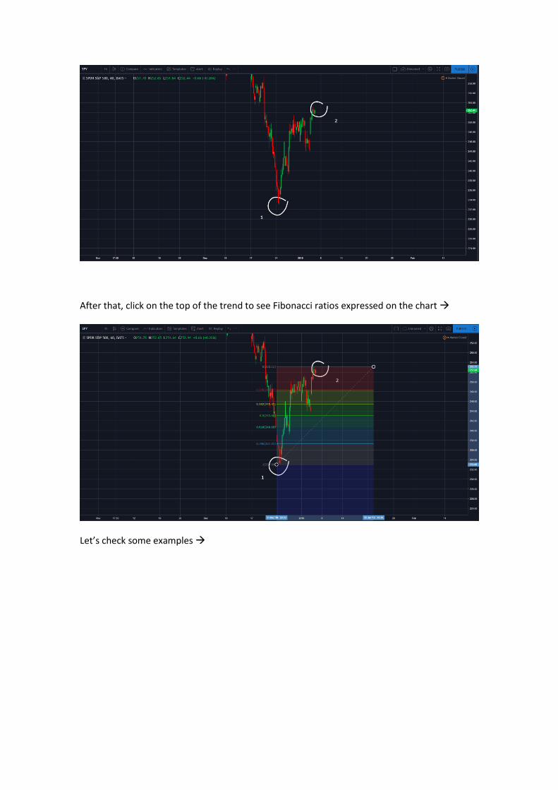
After that, click on the top of the trend to see Fibonacci ratios expressed on the chart →
Let’s check some examples →
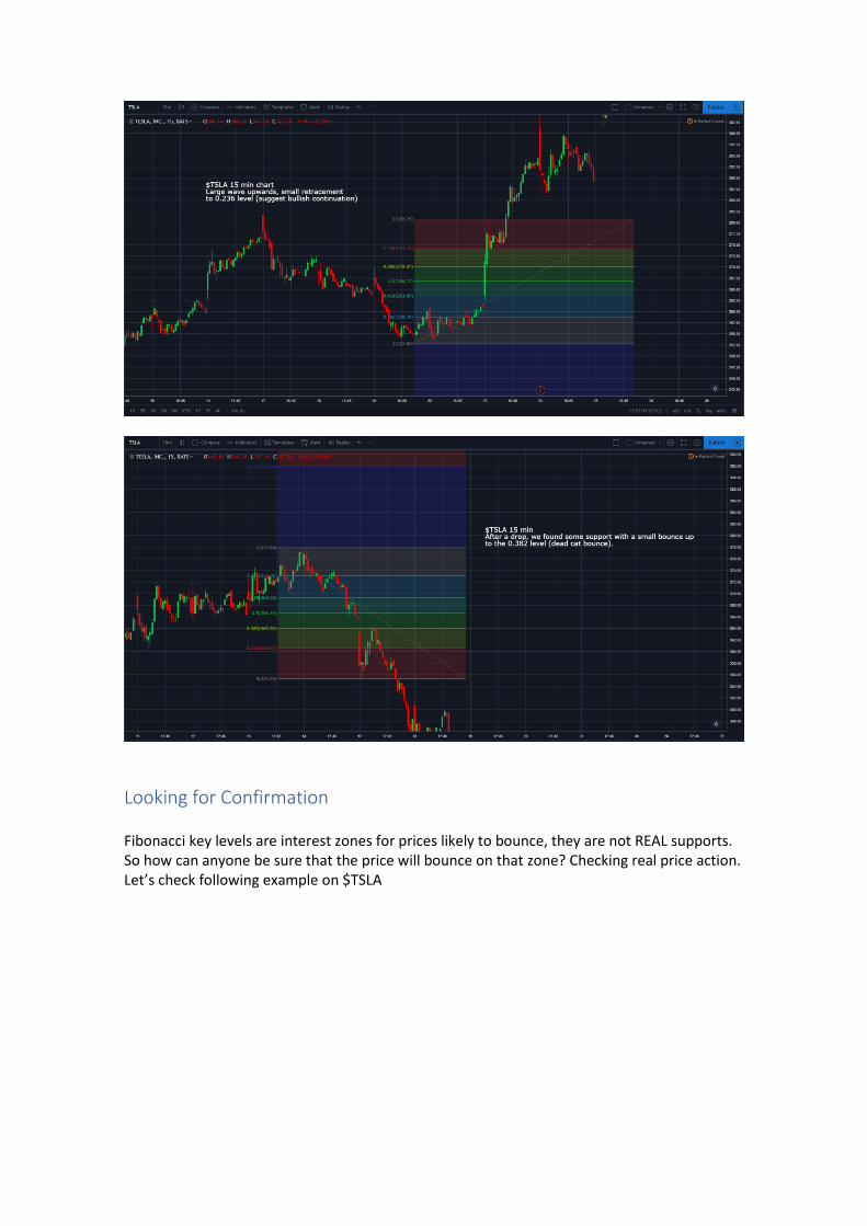
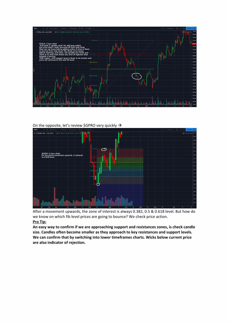
Looking for Confirmation Fibonacci key levels are interest zones for prices likely to bounce, they are not REAL supports. So how can anyone be sure that the price will bounce on that zone? Checking real price action. Let’s check following example on $TSLA
On the opposite, let’s review $GPRO very quickly →
After a movement upwards, the zone of interest is always 0.382, 0.5 & 0.618 level. But how do we know on which fib level prices are going to bounce? We check price action. Pro Tip: An easy way to confirm if we are approaching support and resistances zones, is check candle size. Candles often become smaller as they approach to key resistances and support levels. We can confirm that by switching into lower timeframes charts. Wicks below current price are also indicator of rejection.
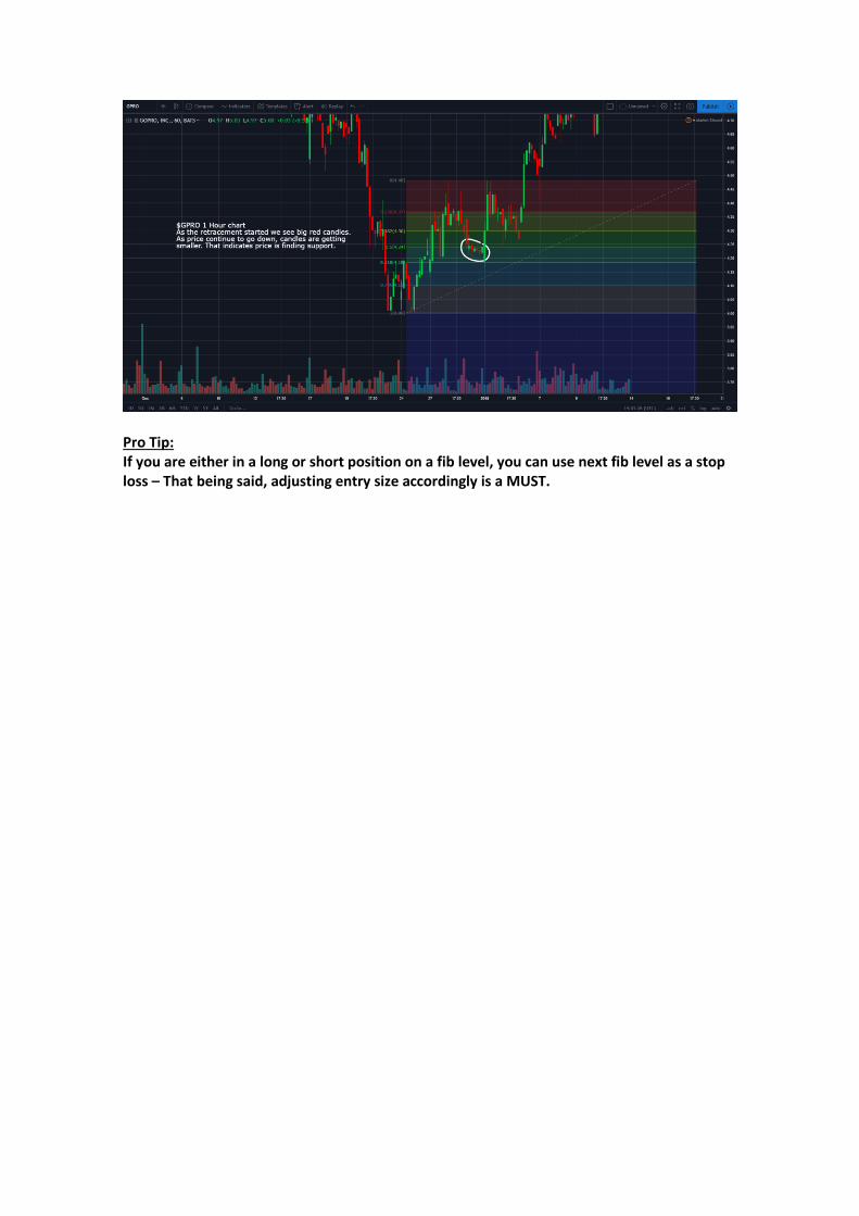
Pro Tip: If you are either in a long or short position on a fib level, you can use next fib level as a stop loss – That being said, adjusting entry size accordingly is a MUST.
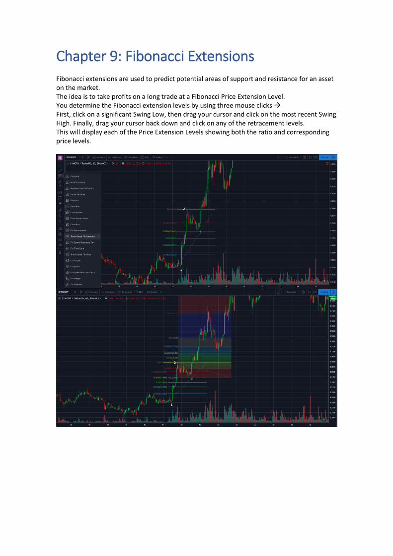
Chapter 9: Fibonacci Extensions Fibonacci extensions are used to predict potential areas of support and resistance for an asset on the market. The idea is to take profits on a long trade at a Fibonacci Price Extension Level. You determine the Fibonacci extension levels by using three mouse clicks → First, click on a significant Swing Low, then drag your cursor and click on the most recent Swing High. Finally, drag your cursor back down and click on any of the retracement levels. This will display each of the Price Extension Levels showing both the ratio and corresponding price levels.
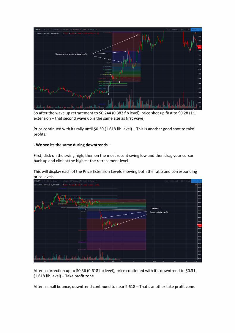
So after the wave up retracement to $0.244 (0.382 fib level), price shot up first to $0.28 (1:1 extension – that second wave up is the same size as first wave) Price continued with its rally until $0.30 (1.618 fib level) – This is another good spot to take profits. - We see its the same during downtrends – First, click on the swing high, then on the most recent swing low and then drag your cursor back up and click at the highest the retracement level. This will display each of the Price Extension Levels showing both the ratio and corresponding price levels.
After a correction up to $0.36 (0.618 fib level), price continued with it’s downtrend to $0.31 (1.618 fib level) – Take profit zone. After a small bounce, downtrend continued to near 2.618 – That’s another take profit zone.

Chapter 10: Mastering Timeframes Every timeframe has its own chart structure. They are also independent of other timeframes. The direction of the larger timeframe will always overrule the lower TF. The prices in the lower time frames tend to respect the support and resistance points of the higher TF structure (Daily Market Structure Level). The support and resistance areas in the higher time frame can be validated by the action of lower TFs (Daily Market structure level).
What is Multiple TF Analysis?
A smaller TF could look choppy and hard to read, but then when you switch to a larger one you can see it much clearer and simpler. In this case, we would choose to trade on the larger one, because it would be easier for us because it’s defining the market condition. Drilling down the chart will give us the ability to identify smaller trends which, in the end, feeds the larger trends. It will let us know if a trend is starting, or if a trend is already established. Trading just in only one timeframe will not give you any of this information (15-min chart, for example, if you want to scalp). If an asset is not ‘trending’ (going on a staircase up or down) it’s likely to be oscillating (between an established support and resistance level).
Looking into the Charts
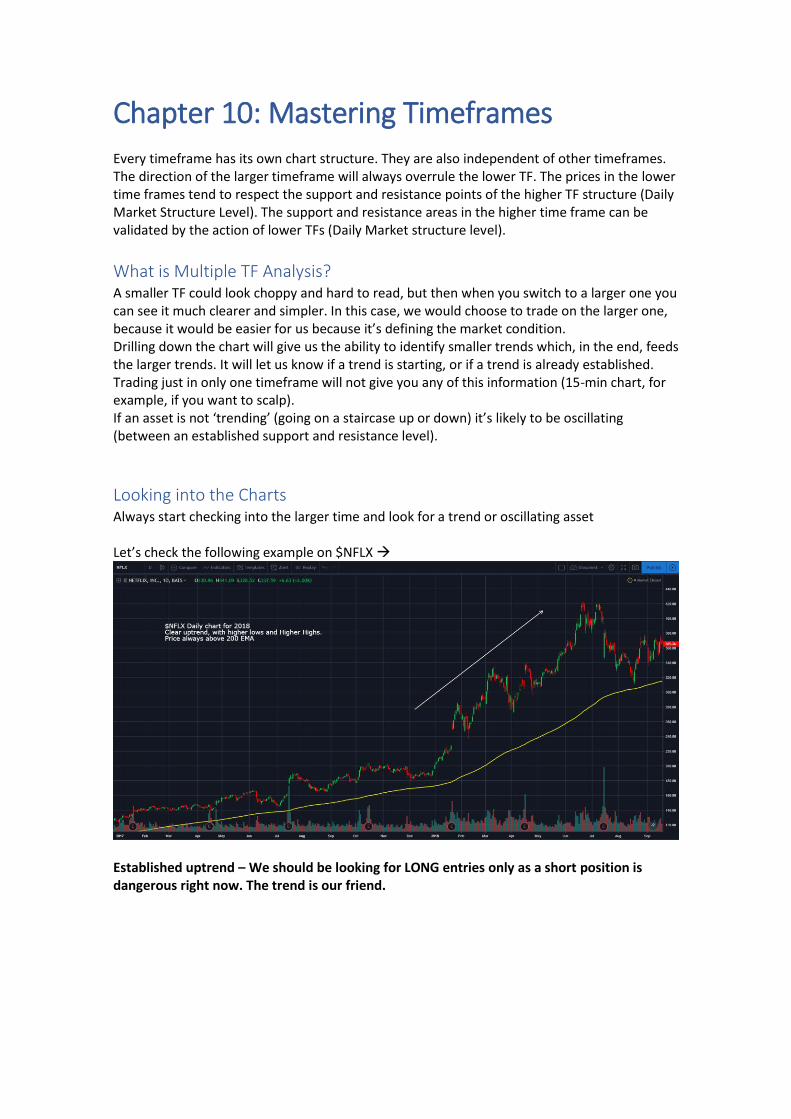
Always start checking into the larger time and look for a trend or oscillating asset Let’s check the following example on $NFLX →
Established uptrend – We should be looking for LONG entries only as a short position is dangerous right now. The trend is our friend.
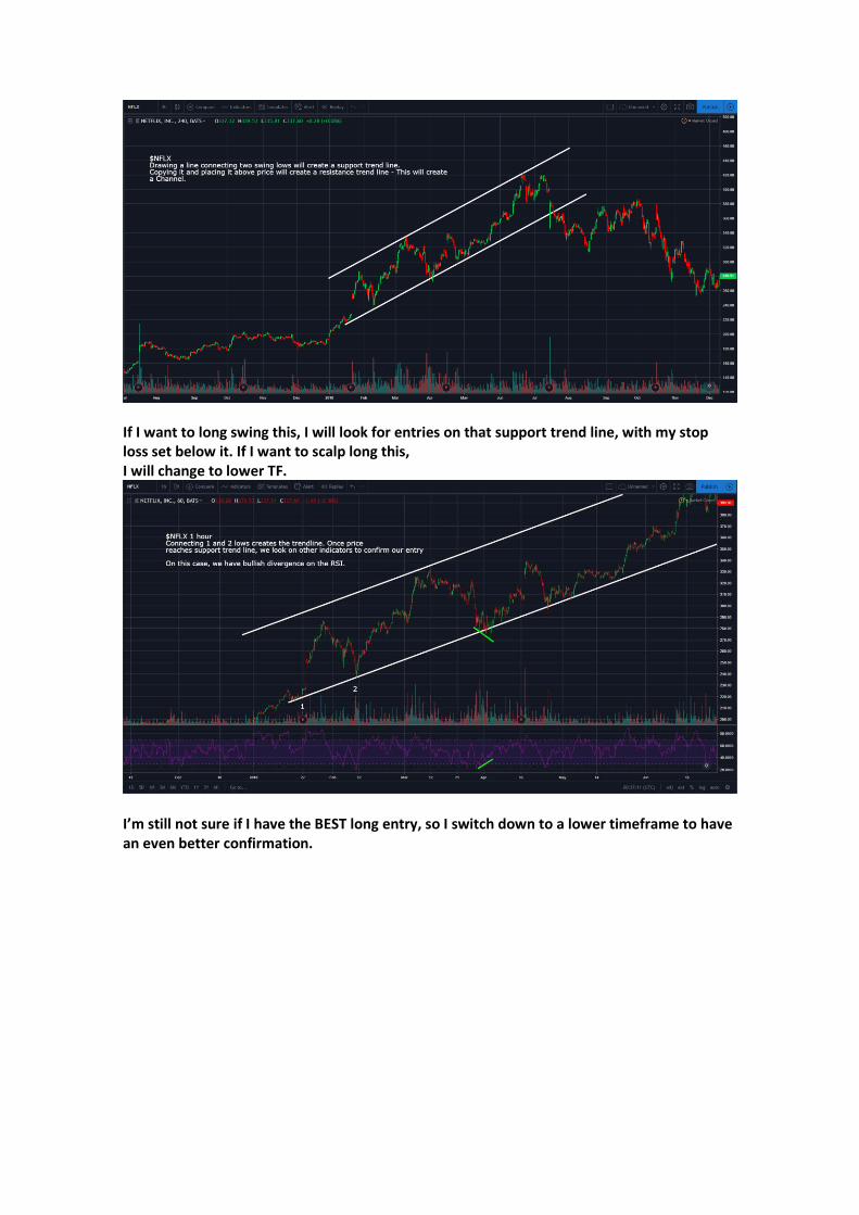
If I want to long swing this, I will look for entries on that support trend line, with my stop loss set below it. If I want to scalp long this, I will change to lower TF.
I’m still not sure if I have the BEST long entry, so I switch down to a lower timeframe to have an even better confirmation.
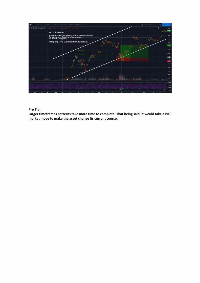
Pro Tip: Larger timeframes patterns take more time to complete. That being said, it would take a BIG market move to make the asset change its current course.
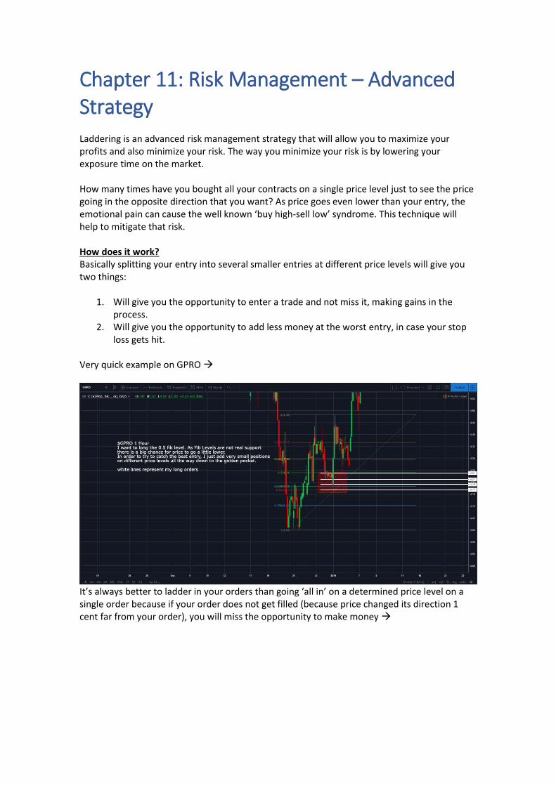
Chapter 11: Risk Management – Advanced Strategy Laddering is an advanced risk management strategy that will allow you to maximize your profits and also minimize your risk. The way you minimize your risk is by lowering your exposure time on the market. How many times have you bought all your contracts on a single price level just to see the price going in the opposite direction that you want? As price goes even lower than your entry, the emotional pain can cause the well known ‘buy high-sell low’ syndrome. This technique will help to mitigate that risk. How does it work? Basically splitting your entry into several smaller entries at different price levels will give you two things:
1. Will give you the opportunity to enter a trade and not miss it, making gains in the process.
2. Will give you the opportunity to add less money at the worst entry, in case your stop loss gets hit.
Very quick example on GPRO →
It’s always better to ladder in your orders than going ‘all in’ on a determined price level on a single order because if your order does not get filled (because price changed its direction 1 cent far from your order), you will miss the opportunity to make money →
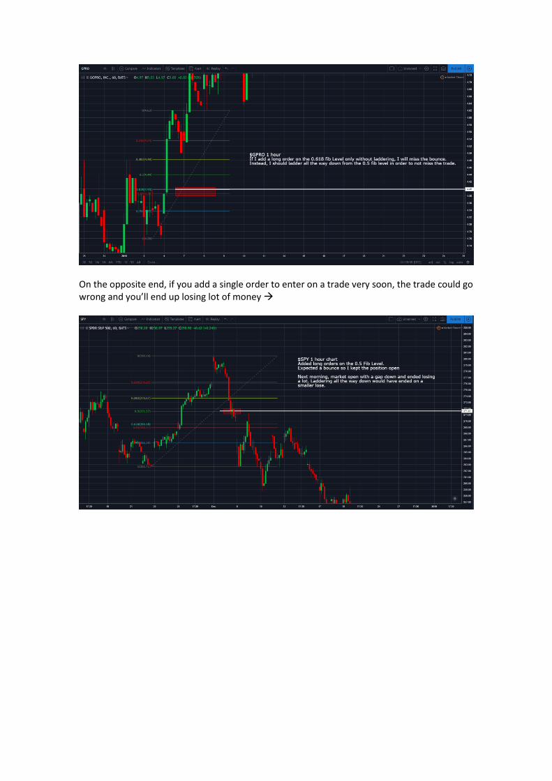
On the opposite end, if you add a single order to enter on a trade very soon, the trade could go wrong and you’ll end up losing lot of money →
Chapter 12: Introduction to Elliot Waves
The Basics
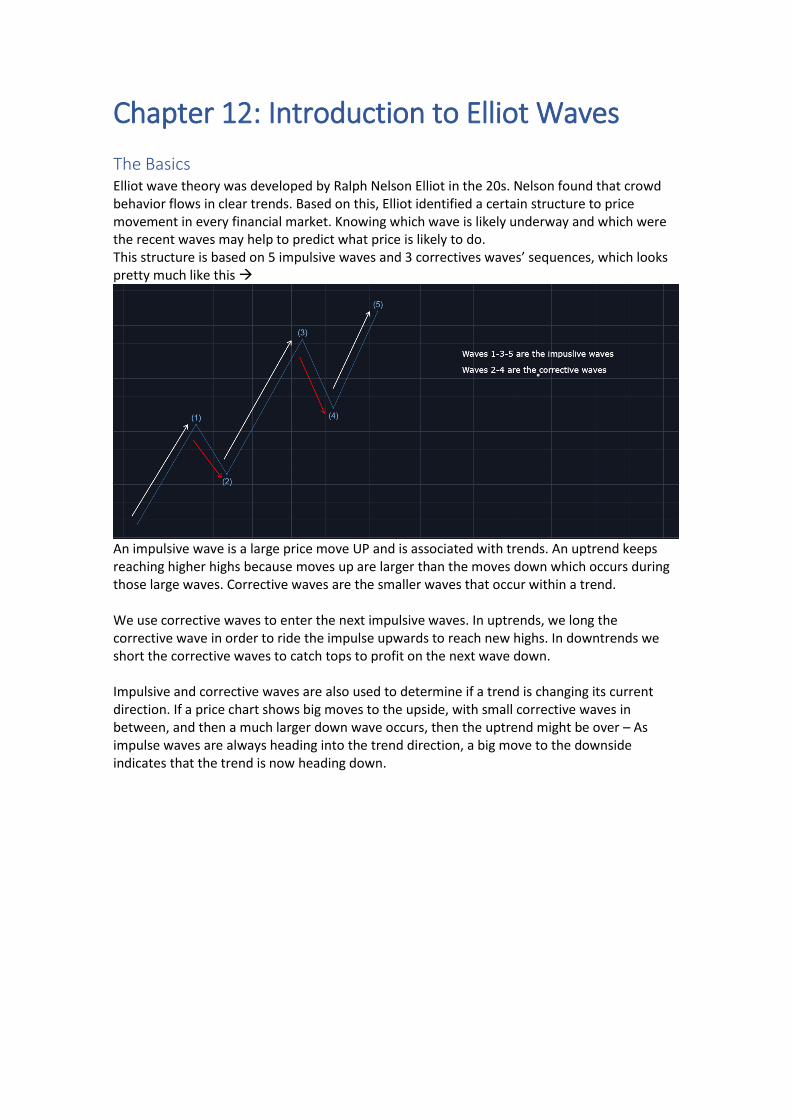
Elliot wave theory was developed by Ralph Nelson Elliot in the 20s. Nelson found that crowd behavior flows in clear trends. Based on this, Elliot identified a certain structure to price movement in every financial market. Knowing which wave is likely underway and which were the recent waves may help to predict what price is likely to do. This structure is based on 5 impulsive waves and 3 correctives waves’ sequences, which looks pretty much like this →
An impulsive wave is a large price move UP and is associated with trends. An uptrend keeps reaching higher highs because moves up are larger than the moves down which occurs during those large waves. Corrective waves are the smaller waves that occur within a trend. We use corrective waves to enter the next impulsive waves. In uptrends, we long the corrective wave in order to ride the impulse upwards to reach new highs. In downtrends we short the corrective waves to catch tops to profit on the next wave down. Impulsive and corrective waves are also used to determine if a trend is changing its current direction. If a price chart shows big moves to the upside, with small corrective waves in between, and then a much larger down wave occurs, then the uptrend might be over – As impulse waves are always heading into the trend direction, a big move to the downside indicates that the trend is now heading down.
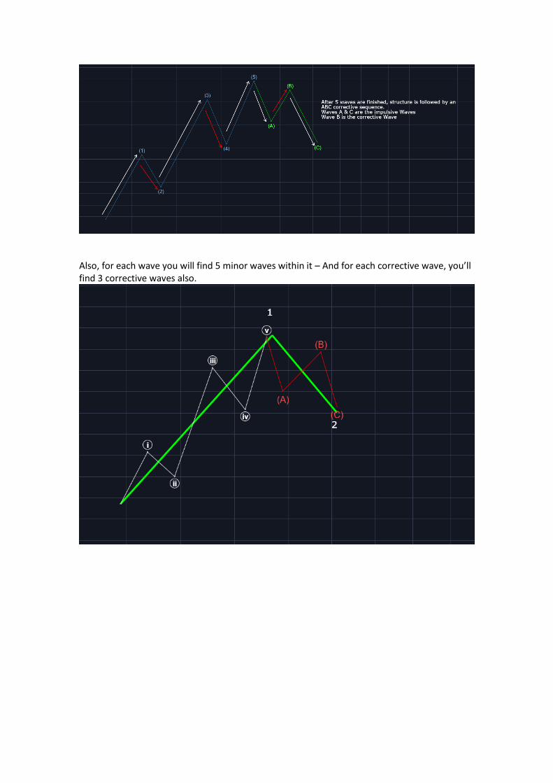
Also, for each wave you will find 5 minor waves within it – And for each corrective wave, you’ll find 3 corrective waves also.
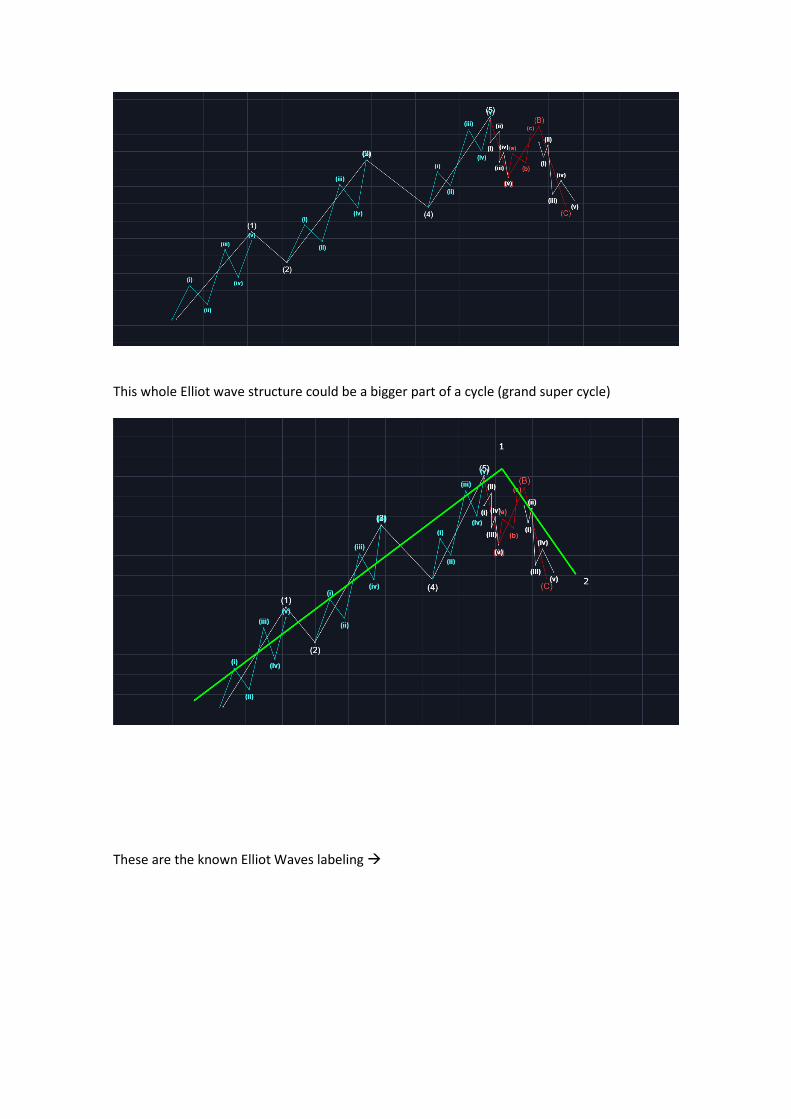
This whole Elliot wave structure could be a bigger part of a cycle (grand super cycle)
These are the known Elliot Waves labeling →
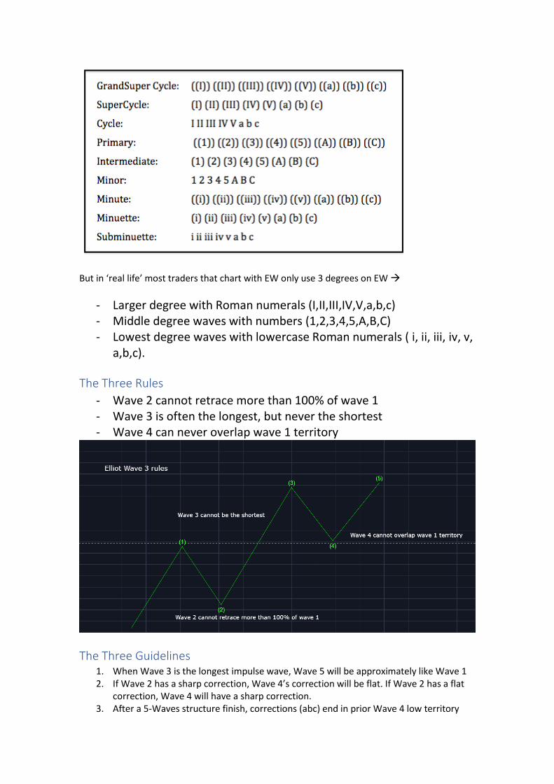
But in ‘real life’ most traders that chart with EW only use 3 degrees on EW →
- Larger degree with Roman numerals (I,II,III,IV,V,a,b,c) - Middle degree waves with numbers (1,2,3,4,5,A,B,C) - Lowest degree waves with lowercase Roman numerals ( i, ii, iii, iv, v,
a,b,c).
The Three Rules
- Wave 2 cannot retrace more than 100% of wave 1 - Wave 3 is often the longest, but never the shortest - Wave 4 can never overlap wave 1 territory
The Three Guidelines 1. When Wave 3 is the longest impulse wave, Wave 5 will be approximately like Wave 1 2. If Wave 2 has a sharp correction, Wave 4’s correction will be flat. If Wave 2 has a flat
correction, Wave 4 will have a sharp correction. 3. After a 5-Waves structure finish, corrections (abc) end in prior Wave 4 low territory
How to Recognize Waves
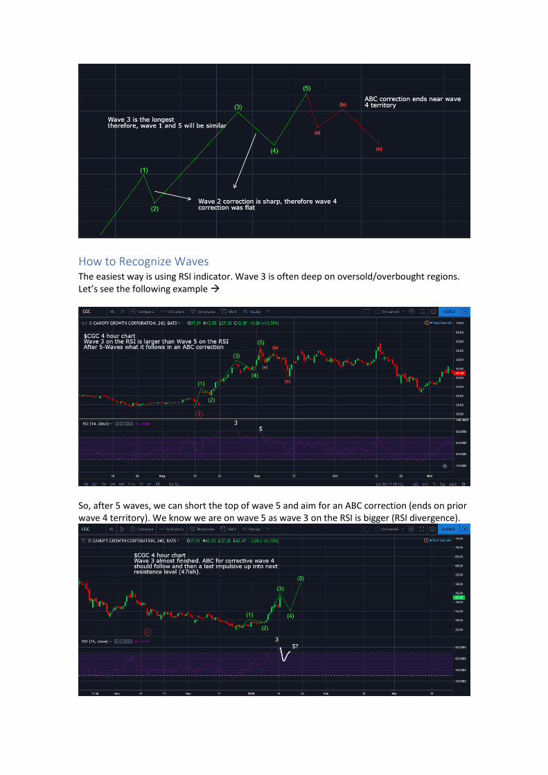
The easiest way is using RSI indicator. Wave 3 is often deep on oversold/overbought regions. Let’s see the following example →
So, after 5 waves, we can short the top of wave 5 and aim for an ABC correction (ends on prior wave 4 territory). We know we are on wave 5 as wave 3 on the RSI is bigger (RSI divergence).

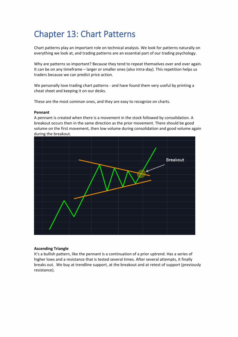
Chapter 13: Chart Patterns Chart patterns play an important role on technical analysis. We look for patterns naturally on everything we look at, and trading patterns are an essential part of our trading psychology. Why are patterns so important? Because they tend to repeat themselves over and over again. It can be on any timeframe – larger or smaller ones (also intra-day). This repetition helps us traders because we can predict price action. We personally love trading chart patterns - and have found them very useful by printing a cheat sheet and keeping it on our desks. These are the most common ones, and they are easy to recognize on charts. Pennant A pennant is created when there is a movement in the stock followed by consolidation. A breakout occurs then in the same direction as the prior movement. There should be good volume on the first movement, then low volume during consolidation and good volume again during the breakout.
Ascending Triangle It’s a bullish pattern, like the pennant is a continuation of a prior uptrend. Has a series of higher lows and a resistance that is tested several times. After several attempts, it finally breaks out. We buy at trendline support, at the breakout and at retest of support (previously resistance).
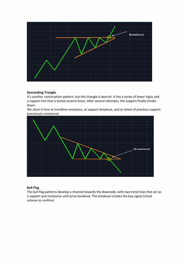
Descending Triangle It’s another continuation pattern, but this triangle is bearish. It has a series of lower highs and a support line that is tested several times. After several attempts, the support finally breaks down. We short it here at trendline resistance, at support breakout, and at retest of previous support (previously resistance).
Bull Flag The bull flag patterns develop a channel towards the downside, with two trend lines that act as a support and resistance until price breakout. The breakout creates the buy signal (check volume to confirm)
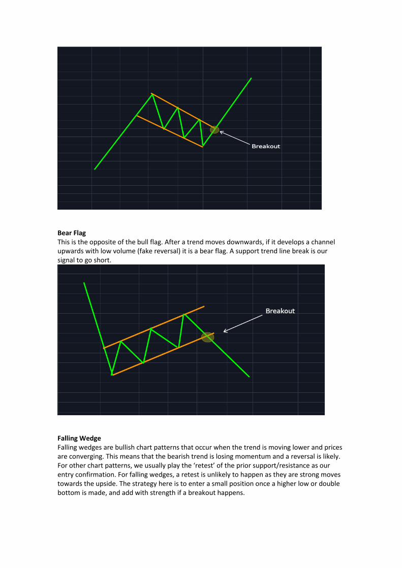
Bear Flag This is the opposite of the bull flag. After a trend moves downwards, if it develops a channel upwards with low volume (fake reversal) it is a bear flag. A support trend line break is our signal to go short.
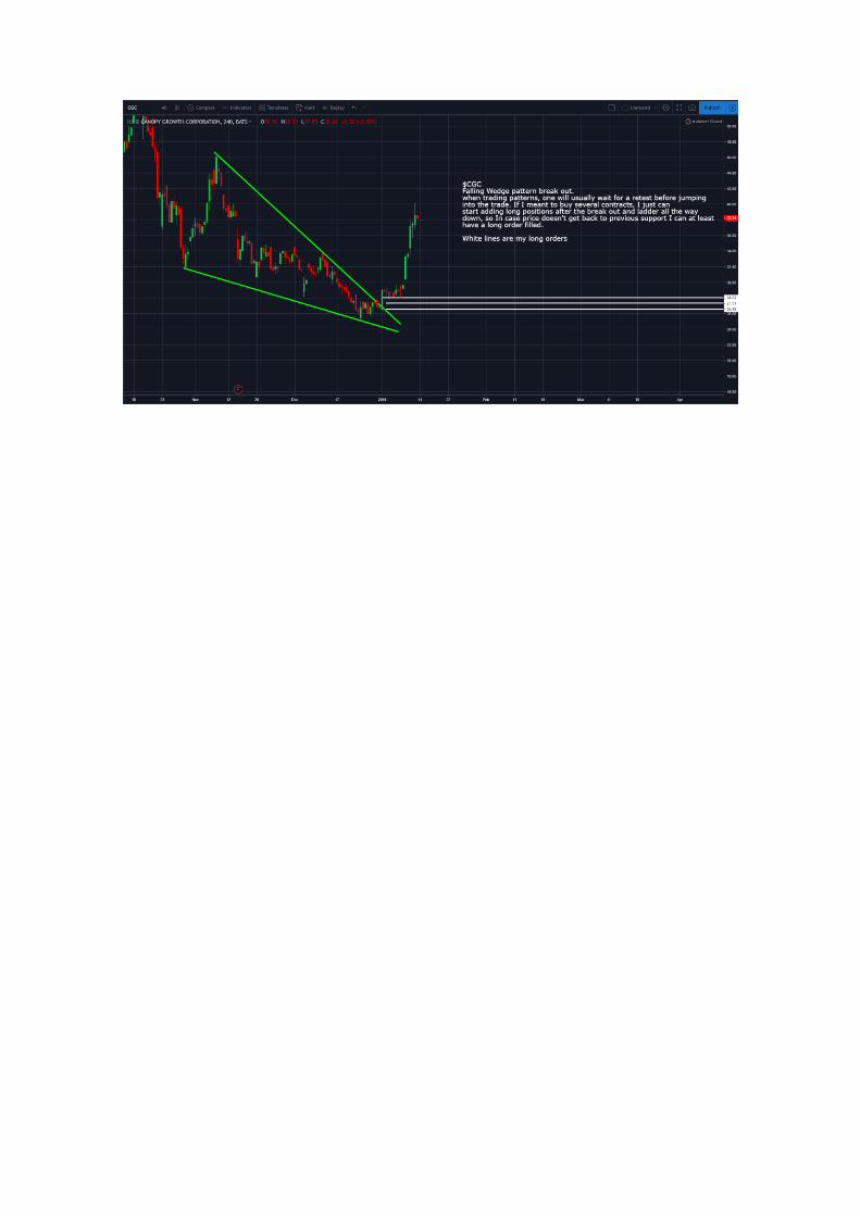
Falling Wedge Falling wedges are bullish chart patterns that occur when the trend is moving lower and prices are converging. This means that the bearish trend is losing momentum and a reversal is likely. For other chart patterns, we usually play the ‘retest’ of the prior support/resistance as our entry confirmation. For falling wedges, a retest is unlikely to happen as they are strong moves towards the upside. The strategy here is to enter a small position once a higher low or double bottom is made, and add with strength if a breakout happens.
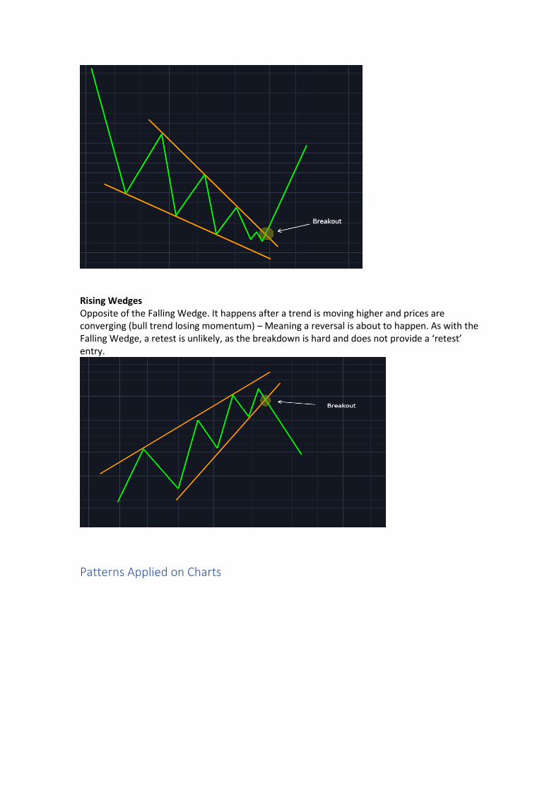
Rising Wedges Opposite of the Falling Wedge. It happens after a trend is moving higher and prices are converging (bull trend losing momentum) – Meaning a reversal is about to happen. As with the Falling Wedge, a retest is unlikely, as the breakdown is hard and does not provide a ‘retest’ entry.
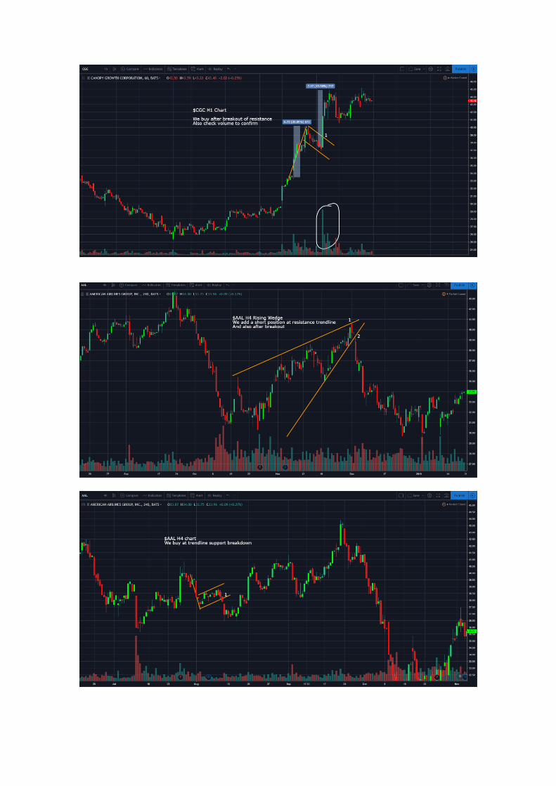
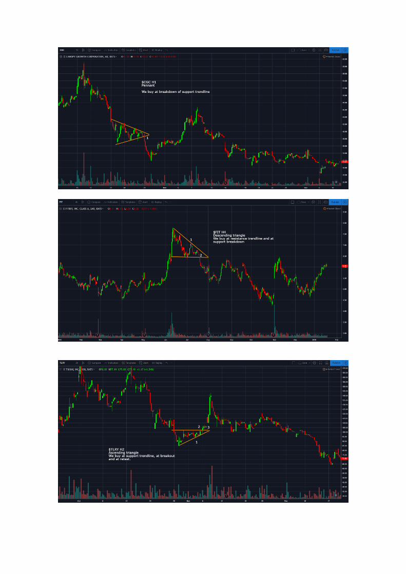
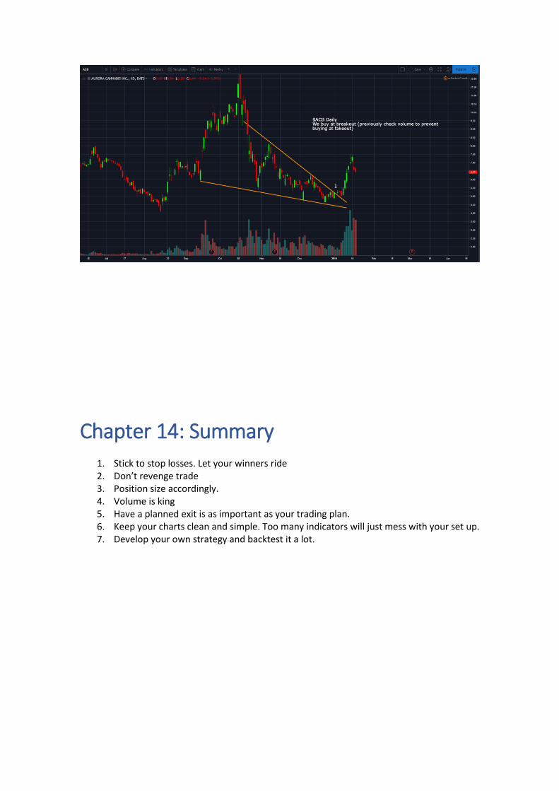
Patterns Applied on Charts
Chapter 14: Summary
1. Stick to stop losses. Let your winners ride 2. Don’t revenge trade 3. Position size accordingly. 4. Volume is king 5. Have a planned exit is as important as your trading plan. 6. Keep your charts clean and simple. Too many indicators will just mess with your set up. 7. Develop your own strategy and backtest it a lot.