Embed Size (px)
Citation preview

Team Indigo
Final Presentation

Problem Statement
The current interface for Jenzabar at https://sis.olin.edu has several usability issues.
We hope to redesign this interface by looking at the problem from square one, answering the question,
"What do students and faculty need in a system which knows about courses and grades and enrollment and advising?“
rather than the much different question,
"How can we make it possible for users to get access to all the cool features Jenzabar offers?"

Solution Overview
• Interviewing and Working with Users
• Personas, Tasks, Goals, Scenarios
• Various Levels of Prototyping
• Heuristic Evaluations and Usability Studies
• Iterative Design

Initial Feedback
• Students can’t find courses
• Registration is too complicated (unless you know CGI)
• Unnecessary overlapping
• Most features aren’t even known
• Faculty grading is exorbitantly frustrating
• Advising takes too many clicks and backtracking (unless you know CGI)
• Multiple-screen pages, and buttons in the worst places

Personas
Eloise
Bio-engineer, pre-med, obsessed over GPA
Understands computers, but not technologically amazing
Wants an interface that holds her hand but doesn’t waste her time

Personas
Johnston
Huey Lewis and the News, Perrier.
Duck a L‘Orange. Acts British, but isn't.
Always chooses the library over Google.
Likes the “advising” part of advising, but hates the computer part and will give up if the interface pushes back.

Initial Scenarios
Students
Registering for classes: building a wish-list before registration
Checking grades and GPA
Viewing Schedule
Faculty
Email students in a course
Enter and submit grades
Clear advisees and meet with others

Prelim Design
Faculty
Students

Students VS Faculty
Too much interface, too little time
FINAL DECISION – Good Interface Design over R & D Project
Student side:
Registration has new potential, but the rest works
Faculty side:
No new features, but all existing features terrible to use

The Flow

Low Fidelity

Low Fidelity

Low Fidelity

First Interactive

First Interactive

First Interactive

Heuristic Evaluation
• Fixed multiple grading
• Confirmation messages
• Wording wording wording
• Clear/Unclear Selected = Clear Selected/Unclear Unselected

Second Interactive
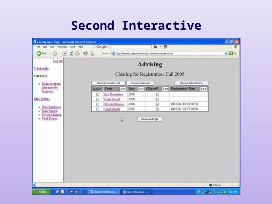
Second Interactive

Usability Study
• Rearranged sidebar
• Included clearing option on student page
• Made multiple grading an option, not a requirement
• Automatic submission to fix the multiple model crisis