Embed Size (px)
Citation preview

Tableau tutorial using the city of Ottawa 2011-2013 crime Data
Tableau is a free tool that according to its mission statement helps “people see and understand data”. The program helps the people for whom we write stories understand them better by seeing certain trends by pointing and clicking. Journalists are using Tableau to tell excellent stories that you’ll find on this syllabus and by subscribing to listserves such as the National Institute for Computer Assisted Reporting, which goes by the more well-known acronym familiar to data journalists, NICAR. Subscribing to the NICAR listserv will be well worth your while. For it is a venue where some of the best journalists in North America and beyond discuss tools like Excel, Fusion Tables, Tableau, how they use them, the problems they encounter.
The best way to learn any of these tools is to practice, practice, practice. Tableau has some wonderful online tutorials. The NICAR listserv is an excellent place to pick up tips.
Let’s get started.
We’ll continue to work with the 2011-2012 Ottawa Crime data, which we’ve used to learn filtering, sorting, ratios and pivot tables in Excel, and creating heat maps in Fusion Tables. Now we’ll see how the same data set in Tableau helps people see trends in an interactive fashion.
If you haven’t done so already, the first step is to download the public version of Tableau. (Once you improve, you might want to graduate to the professional version).
1) Download the 2011-2012 Ottawa crime data we’ll be using for this tutorial.
2) Once you download, the Tableau Public icon will appear on your
desktop.

3) Select the “Open Data” tab
4) Select the Microscoft Excel open to obtain the Excel workbook
we’ve already downloaded in step one.

5) 6) Select the OttawaCrime2011-2012 worksheet ( You can upload
Excel workbooks with multiple worksheets from which to choose. For the sake of simplicity, we’re using a workbook with one worksheet.)
7) What you get is an interface that resembles a pivot table.

8) 9) For a good explanation of the “Measures” “Dimensions”
categories, this Tableau training video is a good place to start the instructional video, Tableau Public Training
10) The Measures and Dimensions contain the fields in the Excel worksheet. The values (what we do the math on) are under Measures. The fields containing text are in Dimensions. Let’s move “Year” up to Dimensions, as we only want to group by year, not do any math with those values.

11)
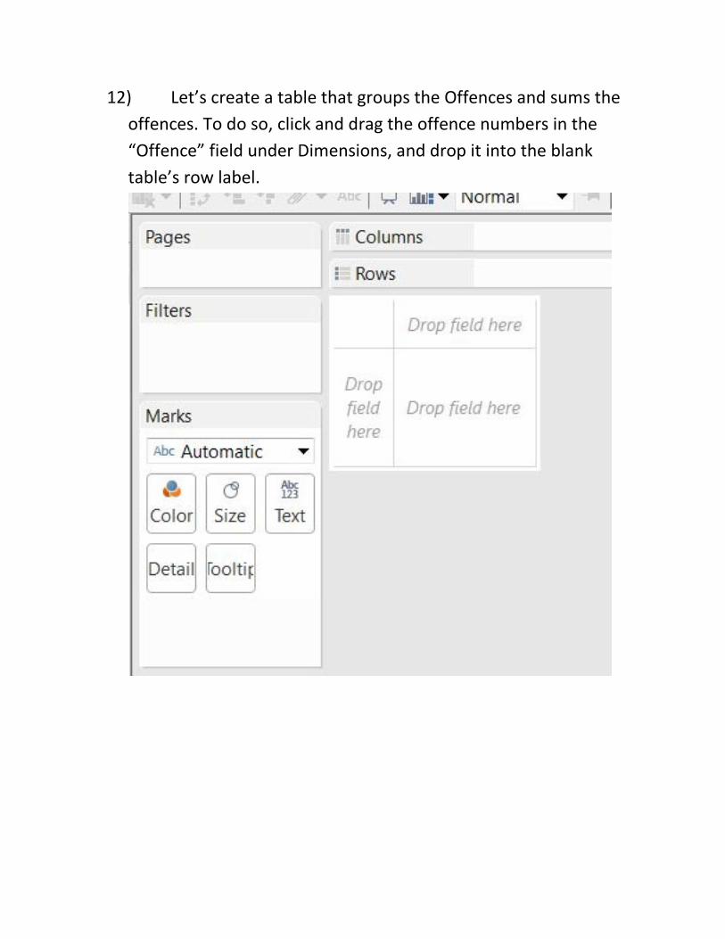
12) Let’s create a table that groups the Offences and sums the offences. To do so, click and drag the offence numbers in the “Offence” field under Dimensions, and drop it into the blank table’s row label.

13)

14) You can see that Offences the row labels ( just like a pivot table). Now let’s drop the numbers into the column, which, because Tableau treats as a number will appear as such.

15)

16) You can see that the Actual field appears in the Marks section. This is where the math occurs, as well as the formatting, a task similar to Excel.
17) Before sorting them in descending order, let’s format the numbers as currency with zero decimal points.

18)

19) 20) Once you’ve made your “Number” selection with zero
decimal points, close the “Format SUM(Actual) box to the left of the table, make the table wider by placing your cursor on the table’s outer right-hand boundary until the cursor turns sideways, and then drag it to create more space.
21) Drag the “Year” from Tableau’s Dimensions section into the Columns section.

22) 23) We can see that, just like in a pivot table, Tableau has
grouped the values by year. 24) This will do. Name the worksheet, Offences and go to a new
one. 25) In this one, we will repeat the same steps we used to get the
Offences table, but instead using the Offences value, we’ll use the Percapita value.
26) Your table should look like this.

27) 28) Name this worksheet “Percapita” and create a third one. We
don’t have to worry about the numbers because they’re already formatted properly.
29) Now let’s repeat the same steps we to get a second percapita worksheet

30) 31) Now we’ll calculate the percent difference from 2011 to
2012 in the percapita numbers.

32)
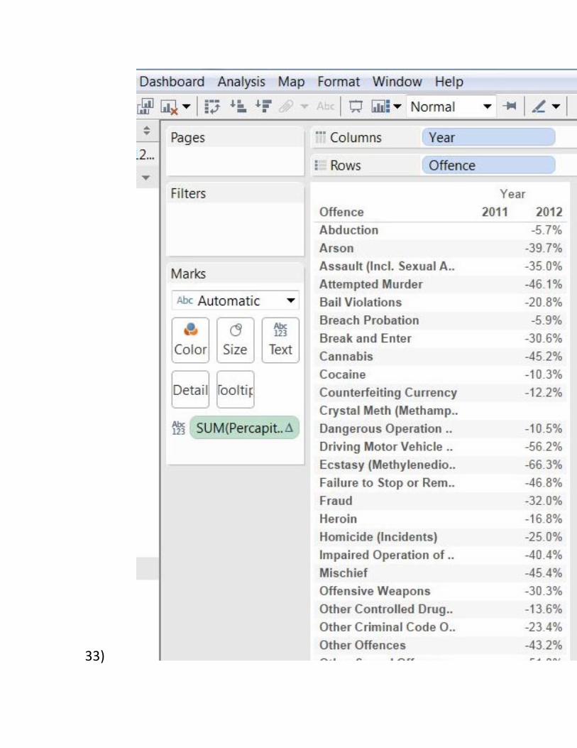
33)

34) The 2012 column now has the percent difference between the two years. In other words, whether the numbers have increased or decreased. We can do the same for the percapita numbers.
35) Rename the Worksheet “PerCapitaPercentDiff” 36) Right click on the adjacent tab and select the “New
Dashboard” option. 37) The Dashboard is where we will link the tables, which you
can see on the left-hand side.
38) 39) Drag the Offences worksheet into the adjacent space.

40) 41) Drag the Percapita workbook just below the Offences table
and release the cursor.

42) 43) Drag the percent difference icon and place it to the right of
the Offences table.

44) 45) I have also widened the Offences and Percapita tables by
returning to the respective worksheets and manually using the cursor to drag and widen each table, a process explained in step 20. I left the PerCapitaPercentDiff the same with to allow it to fit better with the other two.

46) 47) We want to use the Offences table as a filter. In other
words, when we click on a value in that table, it will produce corresponding values in the other two tables.

48) 49) By choosing Theft $500 and Under, we can see the Percapita
rates for each year and the percent difference in those rates. 50) Rename the Dashboard. 51) Let’s make this dashboard a tad more interesting by turning
the Offence table into a bar graph. 52) To do so, return to the Offences worksheet, where you’ll see
a floating “Show Me” box to the right.
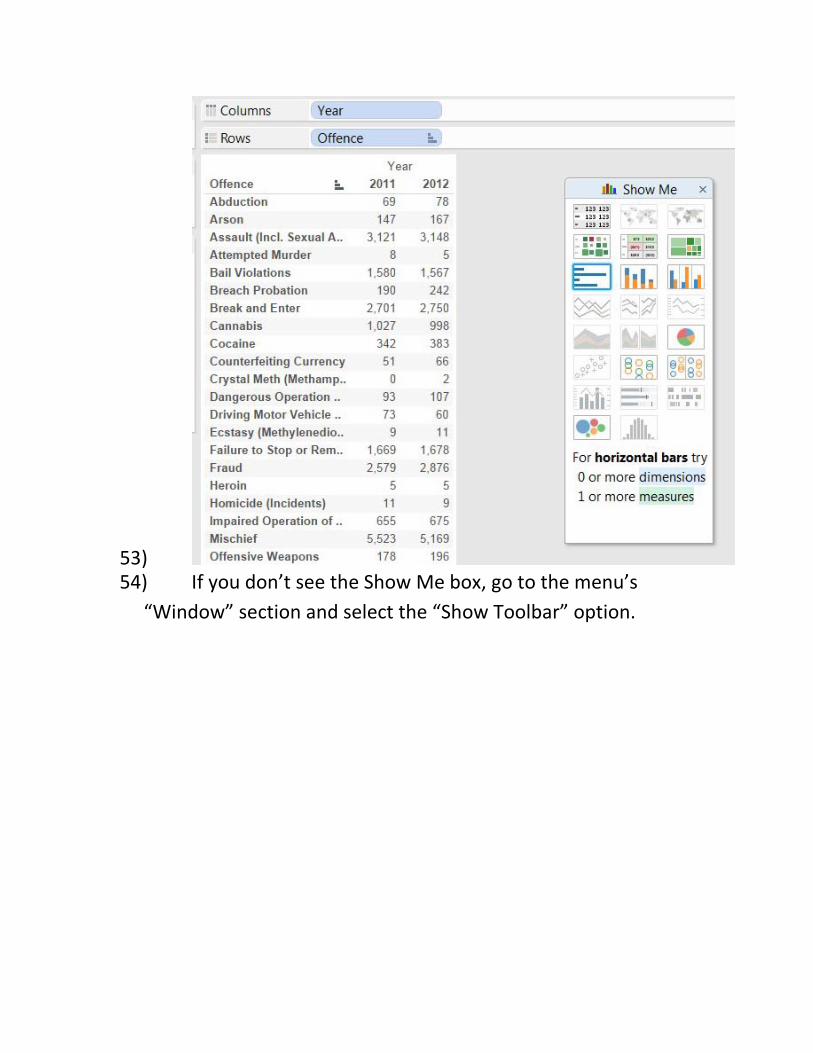
53) 54) If you don’t see the Show Me box, go to the menu’s
“Window” section and select the “Show Toolbar” option.

55) 56) Whatever is highlighted in the Show Me Box represents the
presentation options that are available to us. Let’s choose the horizontal bar graph in the red circle.

57) 58) Now return to the dashboard to see what happens when we
choose a value in the Offences table.

59) 60) The options are endless. We can slice and dice this data in
many different ways. For instance, you may want to group one of the worksheets by ward, allowing people to select where they live to see frequency with which certain offences are being committed, and whether the trend is increasing or decreasing.