Embed Size (px)
Citation preview
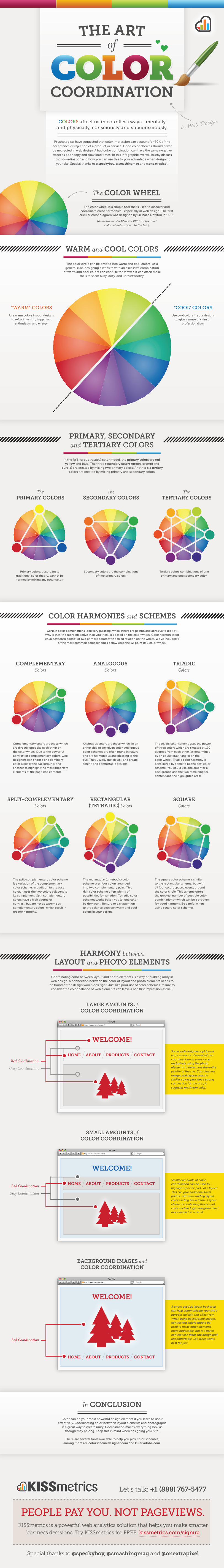
The ArT
ColorColorof
The Color Wheel
“warm” colors “cool” colors
The color wheel is a simple tool that’s used to discover and coordinate color harmonies—especially in web design. The first
circular color diagram was designed by Sir Isaac Newton in 1666.
Psychologists have suggested that color impression can account for 60% of the
acceptance or rejection of a product or service. Good color choices should never
be neglected in web design. A bad color combination can have the same negative
effect as poor copy and slow load times. In this infographic, we will briefly discuss
color coordination and how you can use this to your advantage when designing
your site. Special thanks to @speckyboy, @smashingmag and @onextrapixel.
The color circle can be divided into warm and cool colors. As a general rule, designing a website with an excessive combination
of warm and cool colors can confuse the viewer. It can often make the site seem busy, dirty, and untrustworthy.
Use warm colors in your designs to reflect passion, happiness,
enthusiasm, and energy.
Use cool colors in your designs to give a sense of calm or
professionalism.
WArm and Cool colors
In the RYB (or subtractive) color model, the primary colors are red, yellow and blue. The three secondary colors (green, orange and
purple) are created by mixing two primary colors. Another six tertiary colors are created by mixing primary and secondary colors.
PrimAry, SeCondAryand TerTiAry colors
ThePrimAry ColorS
Primary colors, according to traditional color theory, cannot be formed by mixing any other color.
TheSeCondAry ColorS
Secondary colors are the combinations of two primary colors.
TheTerTiAry ColorS
Tertiary colors combinations of one primary and one secondary color.
CoordinATion
Certain color combinations look very pleasing, while others are painful and abrasive to look at. Why is that? It’s more objective than you think: it’s based on the color wheel. Color harmonies (or color schemes) consist of two or more colors with a fixed relation on the wheel. We’ve included 6
of the most common color schemes below used the 12-point RYB color wheel.
Color hArmonieS and SChemeS
ComPlemenTAryColors
Complementary colors are those which are directly opposite each other on the color wheel. Due to the powerful contrast of complementary colors, web designers can choose one dominant color (usually the background) and another to highlight the most important elements of the page (the content).
Analogous colors are those which lie on either side of any given color. Analogous color schemes are often found in nature and are harmonious and pleasing to the eye. They usually match well and create serene and comfortable designs.
The triadic color scheme uses the power of three colors which are situated at 120 degrees from each other (as determined by an equilateral triangle) on the color wheel. Triadic color harmony is considered by some to be the best color scheme. You could use one color for a background and the two remaining for content and the highlighted areas.
AnAlogouSColors
TriAdiCColors
SPliT-ComPlemenTAryColors
reCTAngulAr(TeTrAdiC) Colors
SquAreColors
colors affect us in countless ways—mentallyand physically, consciously and subconsciously. in Web Design
The split-complementary color scheme is a variation of the complementary color scheme. In addition to the base color, it uses the two colors adjacent to its complement. Split complementary colors have a high degree of contrast, but are not as extreme as complementary colors, which result in greater harmony.
The rectangular (or tetradic) color scheme uses four colors arranged into two complementary pairs. This rich color scheme offers plenty of possibilities for variation. Tetradic color schemes works best if you let one color be dominant. Be sure to pay attention to the balance between warm and cool colors in your design.
The square color scheme is similar to the rectangular scheme, but with all four colors spaced evenly around the color circle. This scheme offers the greatest number of possible color combinations—which can be a problem for good harmony. Be careful when using square color schemes.
(An example of a 12-point RYB “subtractive”color wheel is shown to the left.)
Coordinating color between layout and photo elements is a way of building unity in web design. A connection between the color of layout and photo elements needs to
be found or the design won’t look right. Just like poor use of color schemes, failure to consider the color balance of web elements can leave a bad first impression as well.
hArmony betweenlAyouT and PhoTo elemenTS
Let’s talk: +1 (888) 767-5477
KISSmetrics is a powerful web analytics solution that helps you make smarter business decisions. Try KISSmetrics for FREE: kissmetrics.com/signup
PeoPle Pay you. Not Pageviews.
Special thanks to @speckyboy, @smashingmag and @onextrapixel
Smaller amounts of color coordination can be used to highlight specific parts of a layout. This can give additional focal points, with surrounding layout colors acting like a frame. Layout elements containing this accent color such as logos are given much more impact as a result.
SmAll AmounTS ofColor CoordinATion
WelCome!
home AbouT ProduCTS ConTACTRed Coordination
Gray Coordination
Some web designers opt to use large amounts of layout/photo coordination—in some cases exclusively using the photo elements to determine the entire palette of the site. Coordinating images and layouts around similar colors provides a strong connection for the user, it suggests maximum unity.
lArge AmounTS ofColor CoordinATion
WelCome!
home AbouT ProduCTS ConTACT
Red Coordination
Gray Coordination
A photo used as layout backdrop can help communicate your site’s purpose quickly and effectively. When using background images, contrasting colors should be used to make other elements more noticeable, but too much contrast can make the design look uncomfortable. See what works best for you.
bACkground imAgeS andColor CoordinATion
WelCome!
home AbouT ProduCTS ConTACT
Red Coordination
Color can be your most powerful design element if you learn to use it effectively. Coordinating color between layout elements and photographs
is a great way to create unity. Coordination makes everything look as though they belong. Keep this in mind when designing your site.
There are several tools available to help you pick color schemes, among them are colorschemedesigner.com and kuler.adobe.com.
In ConCluSion