Embed Size (px)
Citation preview
Welcome Back Our fourth issue of The Mathematical Bridge focuses on Statistics across Stage 3 and 4 Mathematics. As the strand of Statistics and Probability is quite large and contains a number of different and interrelated concepts, we have chosen to separate the two for the purposes of our newsletter so we can focus on each one and the complexities they involve. Please note that as the continuum of learning develops from Stage 2 into 3 and 4, the investigations undertaken in Chance are recorded and analysed as part of Data in table and graph form. As these concepts develop, more links and connections between the concepts can be seen and explored. Our fifth edition that will be released later in Term 4 will be on Probability specifically. We hope you find these resources useful and we welcome any feedback and/or suggestions.
Teaching focus for Stage 3 Data Collection, interpretation and evaluation In Stage 3, ‘Students need to be provided with opportunities to discuss what information can be drawn from various data displays. Advantages and disadvantages of different representations of the same data should be explicitly taught.’ Background Knowledge, mathematics K-10 syllabus. Along with students developing their skills in collecting data and drawing graphs, they need to begin to be critical about data. Students need to be able to make informed choices about the data they collect, communicate their findings through the way in which the data is represented and be able to justify those reasons. Our new syllabus has ‘upped the ante’ in regards to the language used to specifically name and classify data, this provides a clear flow from the way data is handled in Stage 4.
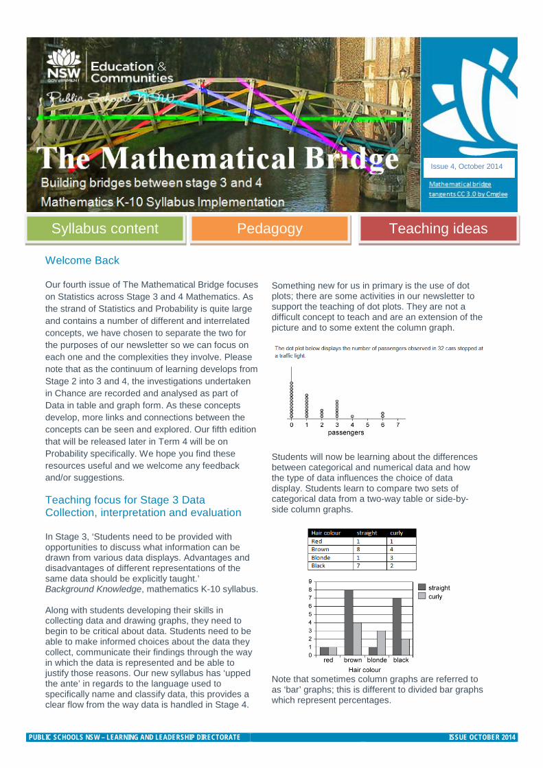
Something new for us in primary is the use of dot plots; there are some activities in our newsletter to support the teaching of dot plots. They are not a difficult concept to teach and are an extension of the picture and to some extent the column graph.
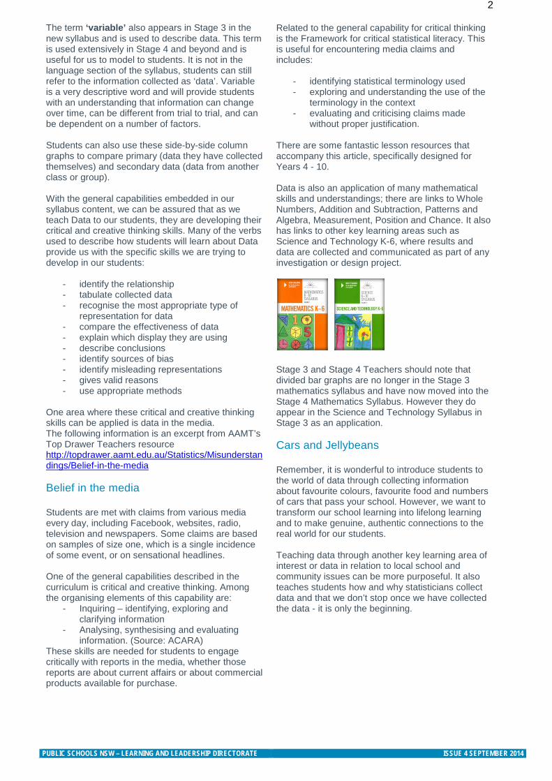
Students will now be learning about the differences between categorical and numerical data and how the type of data influences the choice of data display. Students learn to compare two sets of categorical data from a two-way table or side-by-side column graphs.
Note that sometimes column graphs are referred to as ‘bar’ graphs; this is different to divided bar graphs which represent percentages.
Syllabus content Pedagogy Teaching ideas
Issue 4, October 2014
PUBLIC SCHOOLS NSW – LEARNING AND LEADERSHIP DIRECTORATE ISSUE OCTOBER 2014
2 The term ‘variable’ also appears in Stage 3 in the new syllabus and is used to describe data. This term is used extensively in Stage 4 and beyond and is useful for us to model to students. It is not in the language section of the syllabus, students can still refer to the information collected as ‘data’. Variable is a very descriptive word and will provide students with an understanding that information can change over time, can be different from trial to trial, and can be dependent on a number of factors. Students can also use these side-by-side column graphs to compare primary (data they have collected themselves) and secondary data (data from another class or group). With the general capabilities embedded in our syllabus content, we can be assured that as we teach Data to our students, they are developing their critical and creative thinking skills. Many of the verbs used to describe how students will learn about Data provide us with the specific skills we are trying to develop in our students:
- identify the relationship - tabulate collected data - recognise the most appropriate type of
representation for data - compare the effectiveness of data - explain which display they are using - describe conclusions - identify sources of bias - identify misleading representations - gives valid reasons - use appropriate methods
One area where these critical and creative thinking skills can be applied is data in the media. The following information is an excerpt from AAMT’s Top Drawer Teachers resource http://topdrawer.aamt.edu.au/Statistics/Misunderstandings/Belief-in-the-media Belief in the media Students are met with claims from various media every day, including Facebook, websites, radio, television and newspapers. Some claims are based on samples of size one, which is a single incidence of some event, or on sensational headlines. One of the general capabilities described in the curriculum is critical and creative thinking. Among the organising elements of this capability are:
- Inquiring – identifying, exploring and clarifying information
- Analysing, synthesising and evaluating information. (Source: ACARA)
These skills are needed for students to engage critically with reports in the media, whether those reports are about current affairs or about commercial products available for purchase.
Related to the general capability for critical thinking is the Framework for critical statistical literacy. This is useful for encountering media claims and includes:
- identifying statistical terminology used - exploring and understanding the use of the
terminology in the context - evaluating and criticising claims made
without proper justification.
There are some fantastic lesson resources that accompany this article, specifically designed for Years 4 - 10. Data is also an application of many mathematical skills and understandings; there are links to Whole Numbers, Addition and Subtraction, Patterns and Algebra, Measurement, Position and Chance. It also has links to other key learning areas such as Science and Technology K-6, where results and data are collected and communicated as part of any investigation or design project. Stage 3 and Stage 4 Teachers should note that divided bar graphs are no longer in the Stage 3 mathematics syllabus and have now moved into the Stage 4 Mathematics Syllabus. However they do appear in the Science and Technology Syllabus in Stage 3 as an application. Cars and Jellybeans Remember, it is wonderful to introduce students to the world of data through collecting information about favourite colours, favourite food and numbers of cars that pass your school. However, we want to transform our school learning into lifelong learning and to make genuine, authentic connections to the real world for our students. Teaching data through another key learning area of interest or data in relation to local school and community issues can be more purposeful. It also teaches students how and why statisticians collect data and that we don’t stop once we have collected the data - it is only the beginning.
PUBLIC SCHOOLS NSW – LEARNING AND LEADERSHIP DIRECTORATE ISSUE 4 SEPTEMBER 2014
3 Focus for Stage 4: Data Collection and representation The focus in Stage 4 Statistics is for students to: • identify variables as categorical or numerical
(discrete or continuous) data • identify and distinguish between a ‘population’
and a ‘sample’ • investigate techniques for collecting data
and consider their implications and limitations • collect and interpret data from primary and
secondary sources, including surveys • construct and interpret frequency tables,
histograms and polygons • construct and interpret dot plots, stem-and-leaf
plots, divided bar graphs, sector graphs and line graphs.
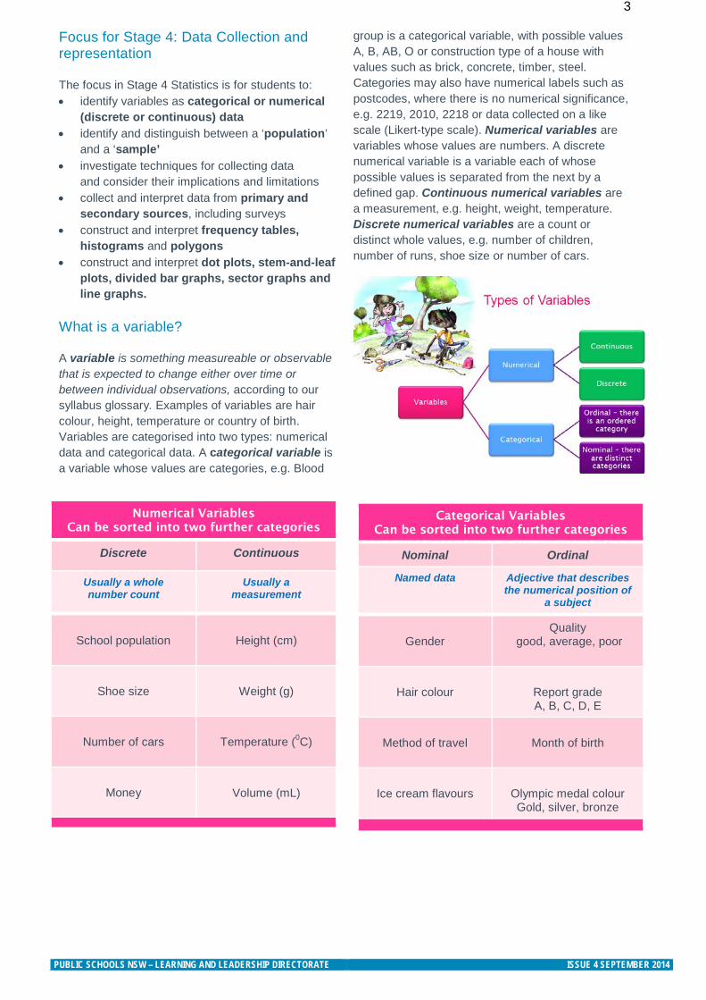
What is a variable? A variable is something measureable or observable that is expected to change either over time or between individual observations, according to our syllabus glossary. Examples of variables are hair colour, height, temperature or country of birth. Variables are categorised into two types: numerical data and categorical data. A categorical variable is a variable whose values are categories, e.g. Blood
group is a categorical variable, with possible values A, B, AB, O or construction type of a house with values such as brick, concrete, timber, steel. Categories may also have numerical labels such as postcodes, where there is no numerical significance, e.g. 2219, 2010, 2218 or data collected on a like scale (Likert-type scale). Numerical variables are variables whose values are numbers. A discrete numerical variable is a variable each of whose possible values is separated from the next by a defined gap. Continuous numerical variables are a measurement, e.g. height, weight, temperature. Discrete numerical variables are a count or distinct whole values, e.g. number of children, number of runs, shoe size or number of cars.
Numerical Variables Can be sorted into two further categories
Discrete Continuous
Usually a whole number count
Usually a measurement
School population
Height (cm)
Shoe size
Weight (g)
Number of cars
Temperature (0C)
Money
Volume (mL)
Categorical Variables Can be sorted into two further categories
Nominal Ordinal
Named data Adjective that describes the numerical position of
a subject
Gender
Quality good, average, poor
Hair colour
Report grade A, B, C, D, E
Method of travel
Month of birth
Ice cream flavours
Olympic medal colour Gold, silver, bronze
PUBLIC SCHOOLS NSW – LEARNING AND LEADERSHIP DIRECTORATE ISSUE 4 SEPTEMBER 2014
4 How is data collected?
Once students have identified variables as numerical or categorical we begin to build an understanding of the various ways we collect data. Three ways of collecting data are identified in the Stage 4 syllabus: collecting data by sample, census or observation.
A sample is part of a population. It is a subset of the population, often randomly selected for the purpose of estimating the value of a characteristic of the population as a whole. A population is the complete set of individuals, object, places etc. that we want information, about and a census is an attempt to collect information about the whole population. For example a randomly selected group of 8 year old children (the sample) might be selected to estimate the incidence of tooth decay in 8 year old children in Australia (the population). We collect data by observation, e.g. the direction travelled by vehicles arriving at an intersection or type of native animals in a local area. We also collect data by a census or sample, e.g. a census to collect data about income or education of Australians and a sample for TV ratings. Students are encouraged to discuss the practicalities of collecting data through a census compared to a sample, including limitations due to population size, e.g. in countries such as China and India, a census is conducted only once per decade. Investigating techniques for collecting data and considering their implications and limitations Next students explore the practicalities and implications of obtaining data through sampling. Students collect data using a random process, e.g. numbers from a page in a phone book, or from a random number generator, and identify issues that may make it difficult to obtain representative data from either primary or secondary sources.
Students are encouraged to discuss the constraints that may limit the collection of data or result in unreliable data, e.g. lack of proximity to the location where data could be collected, lack of access to digital technologies, or cultural sensitivities that may influence the results. Students may also investigate and question the selection of data used to support a particular viewpoint, e.g. the selective use of data in product advertising.
Students identify the difference between data collected from primary and secondary sources, e.g. data collected in the classroom compared to data drawn from a media source. The difference between primary and secondary data sources are
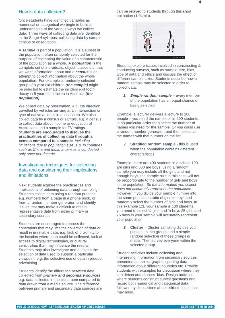
can be relayed to students through this short animation (1:04min).
Students explore issues involved in constructing & conducting surveys, such as sample size, bias, type of data and ethics and discuss the effect of different sample sizes. Students describe how a random sample may be selected in order to collect data.
1. Simple random sample – every member of the population has an equal chance of being selected
Example: a lecturer delivers a lecture to 200 people – you need the names of all 200 students, in no particular order then select the number of names you need for the sample. Or you could use a random number generator, and then select all the names with that number on the list.
2. Stratified random sample - this is used when the population contains different characteristics.
Example: there are 400 students in a school 100 are girls and 300 are boys, using a random sample you may include all the girls and not enough boys, the sample size in this case will not be proportionate to the number of girls and boys in the population. So the information you collect does not accurately represent the population. However, if you divide your sample number into the same population ratio of girls to boys and randomly select the number of girls and boys. In this example 1:3, your sample is 100 students, you need to select ¼ girls and ¾ boys 25 girls and 75 boys in your sample will accurately represent your population.
3. Cluster – Cluster sampling divides your population into groups and a simple random selection of these groups is made. Then survey everyone within the selected group.
Student activities include collecting and interpreting information from secondary sources presented as tables, graphs, sporting data, information about different countries etc. Provide students with examples for discussion where they can detect and discuss bias. Design activities where students construct survey questions and record both numerical and categorical data, followed by discussions about ethical issues that may arise.
PUBLIC SCHOOLS NSW – LEARNING AND LEADERSHIP DIRECTORATE ISSUE 4 SEPTEMBER 2014
5 Data representation
Looking closely at the continuum of learning from Stage 3 to Stage 4 you can see that students are constructing data displays, including tables, column graphs, dot plots and line graphs, appropriate for the data type. Students describe and interpret data presented in tables, column graphs, dot plots and line graphs. They then progress to interpreting two-way tables and side-by-side column graphs which are new to the Stage 3 syllabus. Students are expected to compare a range of data displays to determine the most appropriate display for particular sets of data, as well as interpret and critically evaluate data presented in digital media.
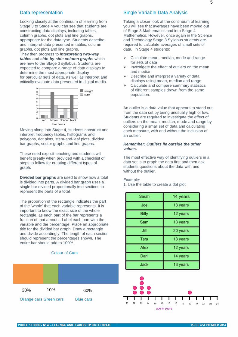
Moving along into Stage 4, students construct and interpret frequency tables, histograms and polygons, dot plots, stem-and-leaf plots, divided bar graphs, sector graphs and line graphs. These need explicit teaching and students will benefit greatly when provided with a checklist of steps to follow for creating different types of graph. Divided bar graphs are used to show how a total is divided into parts. A divided bar graph uses a single bar divided proportionally into sections to represent the parts of a total. The proportion of the rectangle indicates the part of the 'whole' that each variable represents. It is important to know the exact size of the whole rectangle, as each part of the bar represents a fraction of that amount. Label each part with the variable and the percentage. Place an appropriate title for the divided bar graph. Draw a rectangle and divide accordingly. The length of each section should represent the percentages shown. The entire bar should add to 100%.
Colour of Cars
Orange cars Green cars Blue cars
Single Variable Data Analysis
Taking a closer look at the continuum of learning you will see that averages have been moved out of Stage 3 Mathematics and into Stage 4 Mathematics. However, once again in the Science and Technology Stage 3 Syllabus students are required to calculate averages of small sets of data. In Stage 4 students:
Calculate mean, median, mode and range for sets of data
Investigate the effect of outliers on the mean and median
Describe and interpret a variety of data displays using mean, median and range
Calculate and compare summary statistics of different samples drawn from the same population.
An outlier is a data value that appears to stand out from the data set by being unusually high or low. Students are required to investigate the effect of outliers on the mean, median, mode and range by considering a small set of data and calculating each measure, with and without the inclusion of an outlier.
Remember: Outliers lie outside the other values.
The most effective way of identifying outliers in a data set is to graph the data first and then ask students questions about the data with and without the outlier.
Example: 1. Use the table to create a dot plot
60% 30%
10%
PUBLIC SCHOOLS NSW – LEARNING AND LEADERSHIP DIRECTORATE ISSUE 4 SEPTEMBER 2014
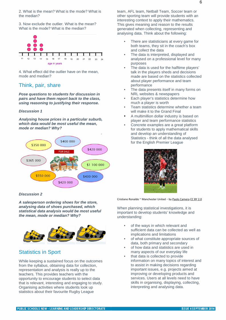
6 2. What is the mean? What is the mode? What is the median?
3. Now exclude the outlier. What is the mean? What is the mode? What is the median?
4. What effect did the outlier have on the mean, mode and median?
Think, pair, share Pose questions to students for discussion in pairs and have them report back to the class, using reasoning to justifying their response.
Discussion 1
Analysing house prices in a particular suburb, which data would be most useful the mean, mode or median? Why?
Discussion 2
A salesperson ordering shoes for the store, analysing data of shoes purchased, which statistical data analysis would be most useful the mean, mode or median? Why?
Statistics in Sport While keeping a sustained focus on the outcomes from the syllabus, obtaining data for collection, representation and analysis is really up to the teachers. This provides teachers with the opportunity to encourage students to select data that is relevant, interesting and engaging to study. Organising activities where students look up statistics about their favourite Rugby League
team, AFL team, Netball Team, Soccer team or other sporting team will provide students with an interesting context to apply their mathematics. This gives meaning and reason to the results generated when collecting, representing and analysing data. Think about the following:
• There are statisticians at every game for both teams, they sit in the coach’s box and collect the data
• The data is interpreted, displayed and analysed on a professional level for many purposes
• The data is used for the halftime players’ talk in the players sheds and decisions made are based on the statistics collected about player performance and team performance
• The data presents itself in many forms on NRL websites & newspapers
• Each player’s statistics determine how much a player is worth
• Team statistics determine whether a team will make it to the Grand Final
• A multimillion dollar industry is based on player and team performance statistics
• Concrete examples are a great platform for students to apply mathematical skills and develop an understanding of Statistics - think of all the data analysed for the English Premier League
Cristiano Ronaldo ~ Manchester United – by Paolo Camera CC BY 2.0
When planning statistical investigations, it is important to develop students’ knowledge and understanding:
• of the ways in which relevant and sufficient data can be collected as well as implications and limitations
• of what constitute appropriate sources of data, both primary and secondary
• of how data and statistics are used in many aspects of our everyday life
• that data is collected to provide information on many topics of interest and to assist in making decisions regarding important issues, e.g. projects aimed at improving or developing products and services. Users at all levels need to have skills in organising, displaying, collecting, interpreting and analysing data.
PUBLIC SCHOOLS NSW – LEARNING AND LEADERSHIP DIRECTORATE ISSUE 4 SEPTEMBER 2014
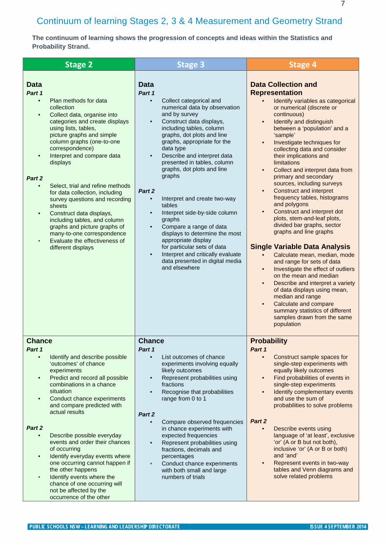
7 Continuum of learning Stages 2, 3 & 4 Measurement and Geometry Strand
The continuum of learning shows the progression of concepts and ideas within the Statistics and Probability Strand.
Stage 2 Stage 3 Stage 4 Data Part 1
• Plan methods for data collection
• Collect data, organise into categories and create displays using lists, tables, picture graphs and simple column graphs (one-to-one correspondence)
• Interpret and compare data displays
Part 2
• Select, trial and refine methods for data collection, including survey questions and recording sheets
• Construct data displays, including tables, and column graphs and picture graphs of many-to-one correspondence
• Evaluate the effectiveness of different displays
Data Part 1
• Collect categorical and numerical data by observation and by survey
• Construct data displays, including tables, column graphs, dot plots and line graphs, appropriate for the data type
• Describe and interpret data presented in tables, column graphs, dot plots and line graphs
Part 2
• Interpret and create two-way tables
• Interpret side-by-side column graphs
• Compare a range of data displays to determine the most appropriate display for particular sets of data
• Interpret and critically evaluate data presented in digital media and elsewhere
Data Collection and Representation
• Identify variables as categorical or numerical (discrete or continuous)
• Identify and distinguish between a ‘population’ and a ‘sample’
• Investigate techniques for collecting data and consider their implications and limitations
• Collect and interpret data from primary and secondary sources, including surveys
• Construct and interpret frequency tables, histograms and polygons
• Construct and interpret dot plots, stem-and-leaf plots, divided bar graphs, sector graphs and line graphs
Single Variable Data Analysis
• Calculate mean, median, mode and range for sets of data
• Investigate the effect of outliers on the mean and median
• Describe and interpret a variety of data displays using mean, median and range
• Calculate and compare summary statistics of different samples drawn from the same population
Chance Part 1
• Identify and describe possible ‘outcomes’ of chance experiments
• Predict and record all possible combinations in a chance situation
• Conduct chance experiments and compare predicted with actual results
Part 2
• Describe possible everyday events and order their chances of occurring
• Identify everyday events where one occurring cannot happen if the other happens
• Identify events where the chance of one occurring will not be affected by the occurrence of the other
Chance Part 1
• List outcomes of chance experiments involving equally likely outcomes
• Represent probabilities using fractions
• Recognise that probabilities range from 0 to 1
Part 2
• Compare observed frequencies in chance experiments with expected frequencies
• Represent probabilities using fractions, decimals and percentages
• Conduct chance experiments with both small and large numbers of trials
Probability Part 1
• Construct sample spaces for single-step experiments with equally likely outcomes
• Find probabilities of events in single-step experiments
• Identify complementary events and use the sum of probabilities to solve problems
Part 2
• Describe events using language of ‘at least’, exclusive ‘or’ (A or B but not both), inclusive ‘or’ (A or B or both) and ‘and’
• Represent events in two-way tables and Venn diagrams and solve related problems
PUBLIC SCHOOLS NSW – LEARNING AND LEADERSHIP DIRECTORATE ISSUE 4 SEPTEMBER 2014
8
Stage 4: Teaching Ideas
collects, represents and interprets single sets of data, using appropriate statistical displays MA4-19SP communicates and connects mathematical ideas using appropriate terminology, diagrams and
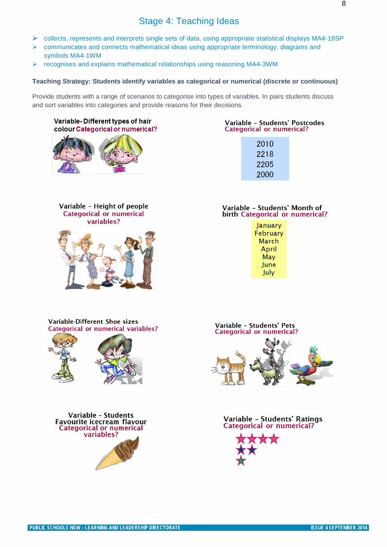
symbols MA4-1WM recognises and explains mathematical relationships using reasoning MA4-3WM Teaching Strategy: Students identify variables as categorical or numerical (discrete or continuous) Provide students with a range of scenarios to categorise into types of variables. In pairs students discuss and sort variables into categories and provide reasons for their decisions.
PUBLIC SCHOOLS NSW – LEARNING AND LEADERSHIP DIRECTORATE ISSUE 4 SEPTEMBER 2014
9
Stage 4: Teaching Ideas
collects, represents and interprets single sets of data, using appropriate statistical displays MA4-19SP analyses singe set of data using measures of location and range MA4-20SP communicates and connects mathematical ideas using appropriate terminology, diagrams and
symbols MA4-1WM recognises and explains mathematical relationships using reasoning MA4-3WM
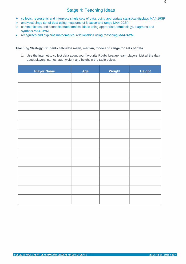
Teaching Strategy: Students calculate mean, median, mode and range for sets of data
1. Use the internet to collect data about your favourite Rugby League team players. List all the data about players’ names, age, weight and height in the table below.
Player Name
Age
Weight
Height
PUBLIC SCHOOLS NSW – LEARNING AND LEADERSHIP DIRECTORATE ISSUE 4 SEPTEMBER 2014
10
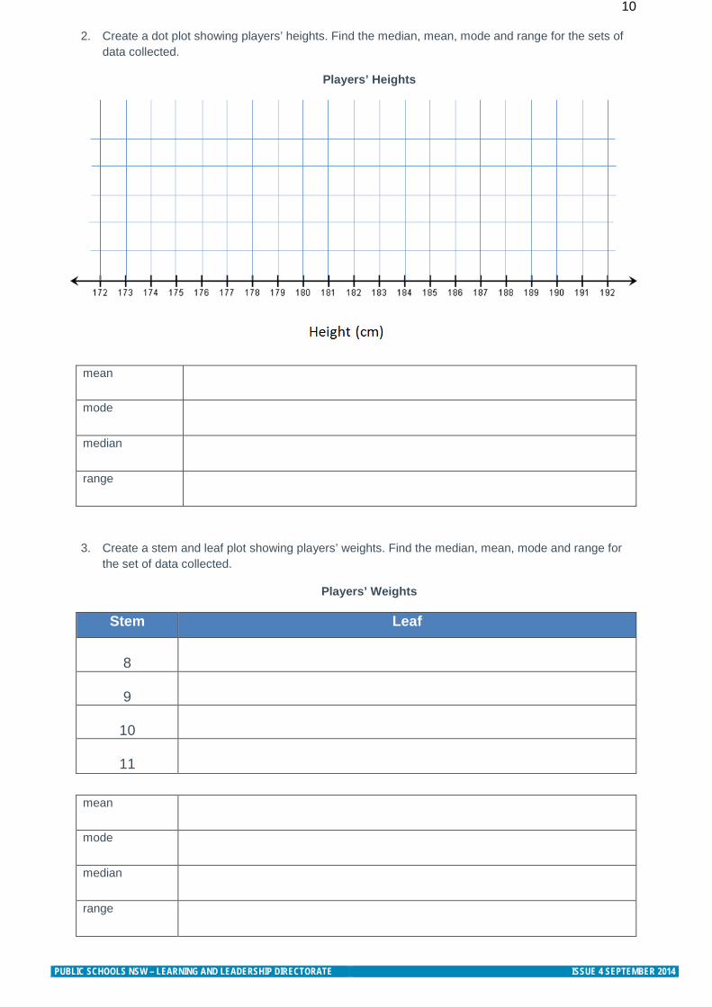
2. Create a dot plot showing players’ heights. Find the median, mean, mode and range for the sets of data collected.
Players’ Heights
mean
mode
median
range
3. Create a stem and leaf plot showing players’ weights. Find the median, mean, mode and range for the set of data collected.
Players’ Weights
Stem Leaf
8
9
10
11
mean
mode
median
range
PUBLIC SCHOOLS NSW – LEARNING AND LEADERSHIP DIRECTORATE ISSUE 4 SEPTEMBER 2014
11
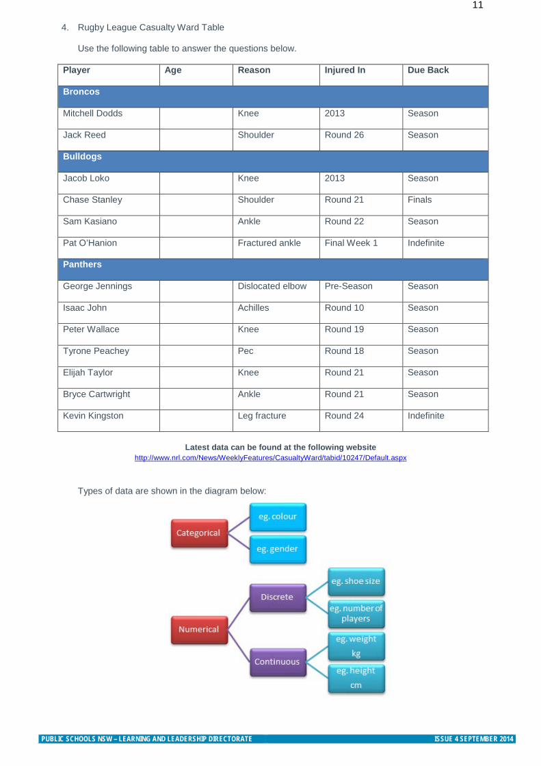
4. Rugby League Casualty Ward Table
Use the following table to answer the questions below.
Player Age Reason Injured In Due Back
Broncos
Mitchell Dodds Knee 2013 Season
Jack Reed Shoulder Round 26 Season
Bulldogs
Jacob Loko Knee 2013 Season
Chase Stanley Shoulder Round 21 Finals
Sam Kasiano Ankle Round 22 Season
Pat O’Hanion Fractured ankle Final Week 1 Indefinite
Panthers
George Jennings Dislocated elbow Pre-Season Season
Isaac John Achilles Round 10 Season
Peter Wallace Knee Round 19 Season
Tyrone Peachey Pec Round 18 Season
Elijah Taylor Knee Round 21 Season
Bryce Cartwright Ankle Round 21 Season
Kevin Kingston Leg fracture Round 24 Indefinite
Latest data can be found at the following website
http://www.nrl.com/News/WeeklyFeatures/CasualtyWard/tabid/10247/Default.aspx
Types of data are shown in the diagram below:
PUBLIC SCHOOLS NSW – LEARNING AND LEADERSHIP DIRECTORATE ISSUE 4 SEPTEMBER 2014
12
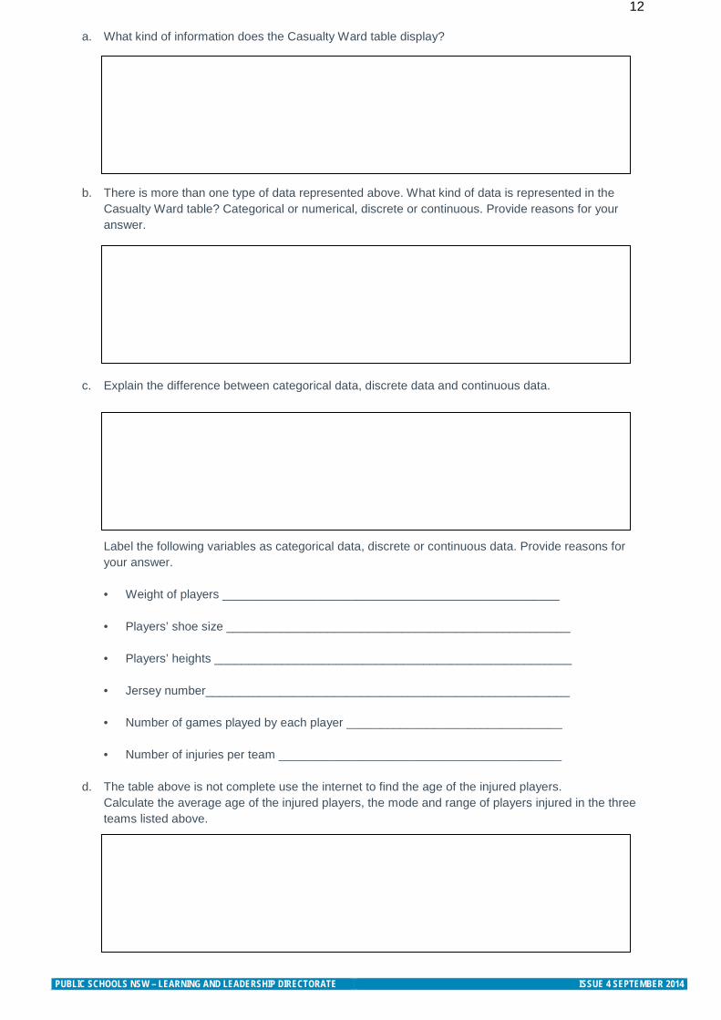
a. What kind of information does the Casualty Ward table display?
b. There is more than one type of data represented above. What kind of data is represented in the Casualty Ward table? Categorical or numerical, discrete or continuous. Provide reasons for your answer.
c. Explain the difference between categorical data, discrete data and continuous data.
Label the following variables as categorical data, discrete or continuous data. Provide reasons for your answer. • Weight of players __________________________________________________
• Players’ shoe size ___________________________________________________ • Players’ heights _____________________________________________________ • Jersey number______________________________________________________ • Number of games played by each player ________________________________ • Number of injuries per team __________________________________________
d. The table above is not complete use the internet to find the age of the injured players.
Calculate the average age of the injured players, the mode and range of players injured in the three teams listed above.
PUBLIC SCHOOLS NSW – LEARNING AND LEADERSHIP DIRECTORATE ISSUE 4 SEPTEMBER 2014
13
Stage 4: Teaching Ideas
collects, represents and interprets single sets of data, using appropriate statistical displays MA4-19SP analyses singe set of data using measures of location and range MA4-20SP communicates and connects mathematical ideas using appropriate terminology, diagrams and
symbols MA4-1WM recognises and explains mathematical relationships using reasoning MA4-3WM
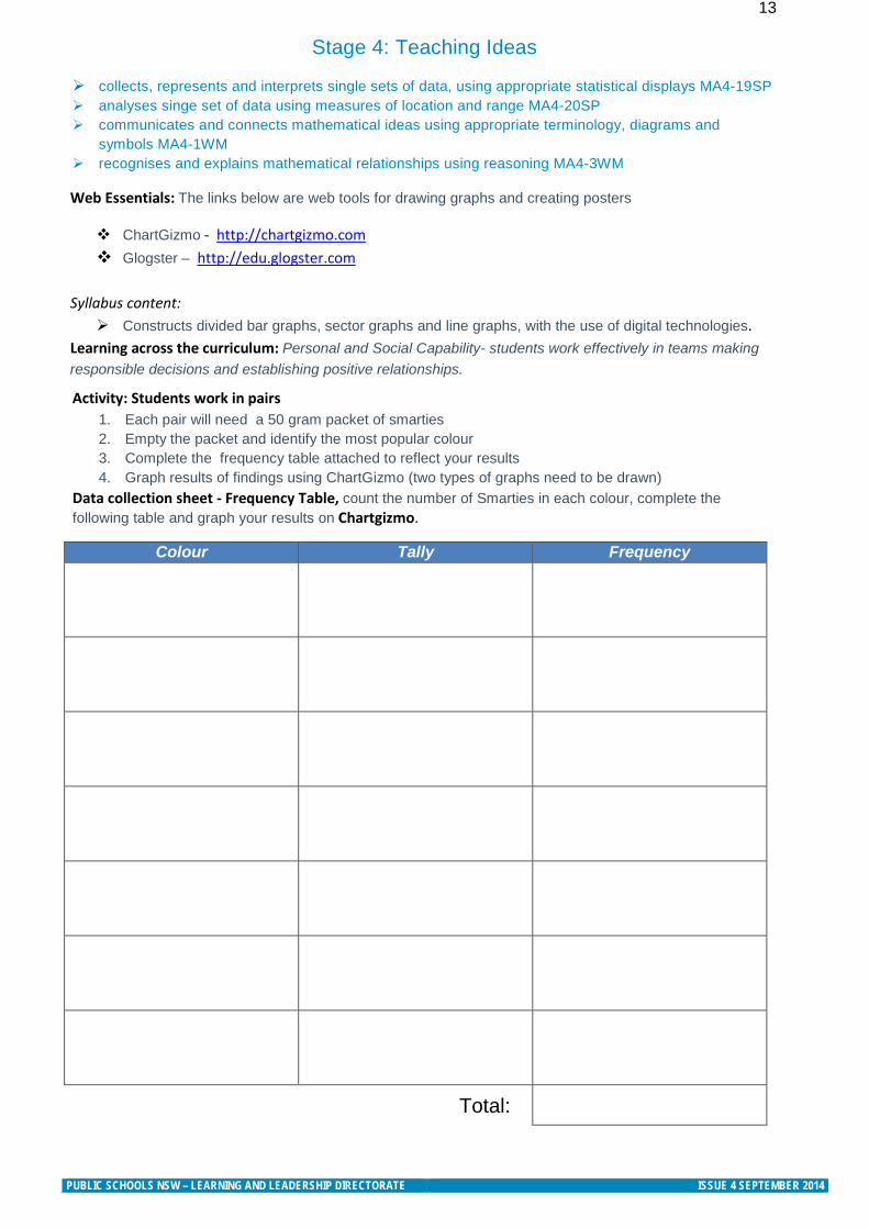
Activity: Students work in pairs 1. Each pair will need a 50 gram packet of smarties 2. Empty the packet and identify the most popular colour 3. Complete the frequency table attached to reflect your results 4. Graph results of findings using ChartGizmo (two types of graphs need to be drawn)
Data collection sheet - Frequency Table, count the number of Smarties in each colour, complete the following table and graph your results on Chartgizmo.
Web Essentials: The links below are web tools for drawing graphs and creating posters
ChartGizmo - http://chartgizmo.com Glogster – http://edu.glogster.com
Syllabus content: Constructs divided bar graphs, sector graphs and line graphs, with the use of digital technologies.
Learning across the curriculum: Personal and Social Capability- students work effectively in teams making responsible decisions and establishing positive relationships.
Colour Tally Frequency
Total:
PUBLIC SCHOOLS NSW – LEARNING AND LEADERSHIP DIRECTORATE ISSUE 4 SEPTEMBER 2014
14 From findings:
1. Compare findings as a class and discuss 2. Save graphs from ChartGizmo and imbed your graphs onto Glogster to create a poster 3. Your Glogs will be presented to the class
Further activities and discussion questions
1. Type of data: What is the difference between numerical and categorical data? What kind of data did you collect? Categorical or numerical data?
2. Drawing conclusions from data: Analyse the sample data and write three sentences which draw conclusions from the data displayed. You will need to find the mean and mode of your data, e.g. “The Smartie colour with the lowest frequency is yellow” or “The graph shows that most of the Smarties are red”
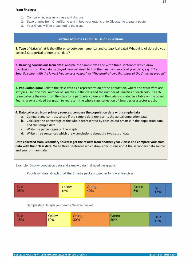
3. Population data: Collate the class data as a representation of the population, where the team data are samples. Find the total number of Smarties in the class and the number of Smarties of each colour. Each team collects the data from the class for a particular colour and the data is collated in a table on the board. Teams draw a divided bar graph to represent the whole class collection of Smarties or a sector graph.
4. Data collected from primary sources: compare the population data with sample data a. Compare and contrast to see if the sample data represents the actual population data. b. Calculate the percentage of the whole represented by each colour Smartie in the population data
and the sample data. c. Write the percentages on the graph. d. Write three sentences which draw conclusions about the two sets of data.
Data collected from Secondary sources: get the results from another year 7 class and compare your class data with their class data. Write three sentences which draw conclusions about the secondary data source and your primary data
Example: Display population data and sample data in divided bar graphs
Population data: Graph of all the Smartie packets together for the entire class
Sample data: Graph your teams Smartie packet
Red 25%
Orange 40%
Green 5%
Yellow 15%
Green 30%
Orange 30%
Yellow 10%
Red 15%
Blue 15%
Blue 15%
PUBLIC SCHOOLS NSW – LEARNING AND LEADERSHIP DIRECTORATE ISSUE 4 SEPTEMBER 2014
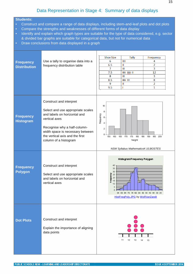
15 Data Representation in Stage 4: Summary of data displays
Students: • Construct and compare a range of data displays, including stem-and-leaf plots and dot plots • Compare the strengths and weaknesses of different forms of data display • Identify and explain which graph types are suitable for the type of data considered, e.g. sector
& divided bar graphs are suitable for categorical data, but not for numerical data • Draw conclusions from data displayed in a graph
Frequency Distribution
Use a tally to organise data into a frequency distribution table
Frequency Histogram
Construct and interpret Select and use appropriate scales and labels on horizontal and vertical axes Recognise why a half-column-width space is necessary between the vertical axis and the first column of a histogram
NSW Syllabus MathematicsK-10,BOSTES Frequency Polygon
Construct and interpret Select and use appropriate scales and labels on horizontal and vertical axes
HistFreqPoly.JPG by WolfVanZandt
Dot Plots
Construct and interpret Explain the importance of aligning data points
PUBLIC SCHOOLS NSW – LEARNING AND LEADERSHIP DIRECTORATE ISSUE 4 SEPTEMBER 2014
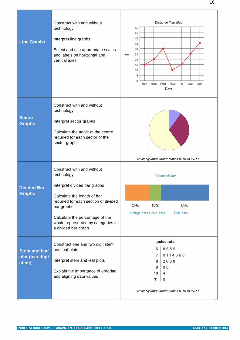
16 Line Graphs
Construct with and without technology Interpret line graphs Select and use appropriate scales and labels on horizontal and vertical axes
Distance Travelled
Days
Sector Graphs
Construct with and without technology Interpret sector graphs Calculate the angle at the centre required for each sector of the sector graph
NSW Syllabus Mathematics K-10,BOSTES Divided Bar Graphs
Construct with and without technology Interpret divided bar graphs Calculate the length of bar required for each section of divided bar graphs Calculate the percentage of the whole represented by categories in a divided bar graph
Stem and leaf plot (two digit stem)
Construct one and two digit stem and leaf plots Interpret stem and leaf plots Explain the importance of ordering and aligning data values
NSW Syllabus Mathematics K-10,BOSTES
km
PUBLIC SCHOOLS NSW – LEARNING AND LEADERSHIP DIRECTORATE ISSUE 4 SEPTEMBER 2014
17
Checklists to assist students with unpacking Tables and Graphs
Include a checklist or steps for interpreting and constructing graphs at the top of student worksheets and tasks. This provides students with a strategy for thinking and unpacking any graph or table they come across. With practise and reference to the checklists students will become fluent in their approach to interpreting graphs. Listed below are examples of checklists that can be provided for students.
Strategies for reading and interpreting tables 1. What is the title? 2. What are the headings on each row? 3. What are the headings on each column? 4. Are the values increasing or decreasing? 5. What information can I read from the table?
Strategies for reading and interpreting graphs 1. What is the title? What type of graph is it?
2. Look at the horizontal axis
What is the label on the axis? What is the scale being used? What is the unit of measurement?
3. Look at the vertical axis
What is the label on the axis? What is the scale being used? What is the unit of measurement?
4. How are numbers shown? Thousands, hundreds, fractions, decimals or percentages. What do these
numbers represent?
Strategies for constructing Line graphs 1. Create an appropriate scale on each axis. 2. Label each axis, include the units of measurement. 3. Chose an appropriate title for the graph. 4. Plot each coordinate carefully on the graph. 5. Join each point with a straight continuous line. 6. Always use a ruler when constructing line graphs and be precise
Strategies for constructing Column graphs 1. Columns are equally spaced apart. 2. Columns may be vertical or horizontal. 3. The graph starts one column width into the horizontal axis. 4. Each column has the same width. 5. Label both the vertical and horizontal axes. 6. Place the appropriate scale on both axes. 7. Label the graph with an appropriate title.
PUBLIC SCHOOLS NSW – LEARNING AND LEADERSHIP DIRECTORATE ISSUE 4 SEPTEMBER 2014
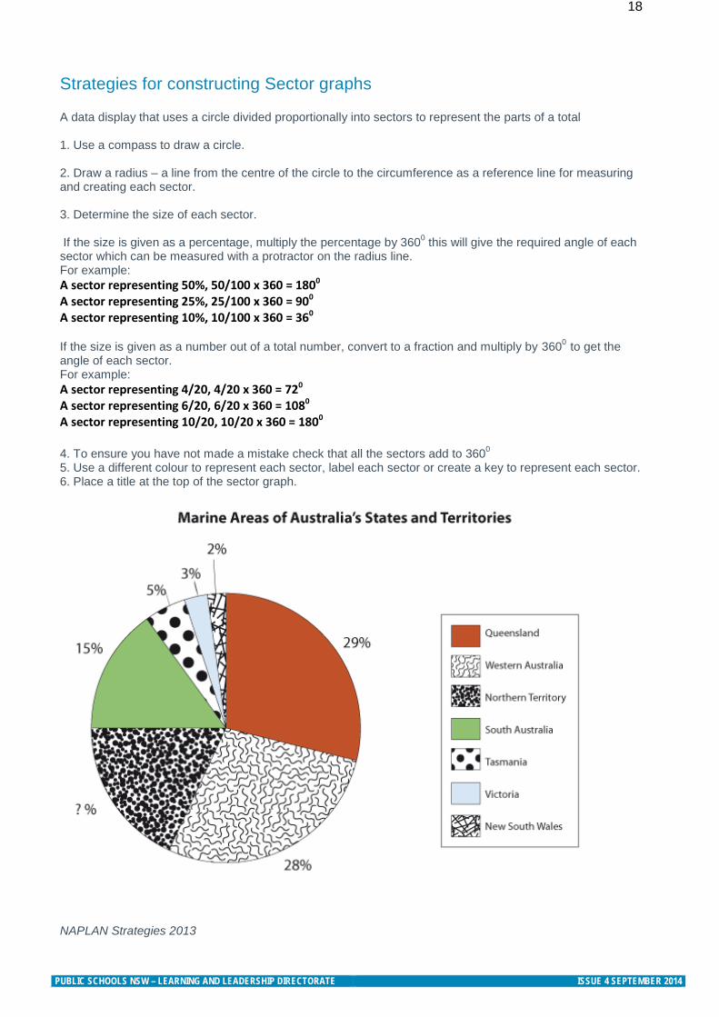
18 Strategies for constructing Sector graphs A data display that uses a circle divided proportionally into sectors to represent the parts of a total 1. Use a compass to draw a circle. 2. Draw a radius – a line from the centre of the circle to the circumference as a reference line for measuring and creating each sector. 3. Determine the size of each sector. If the size is given as a percentage, multiply the percentage by 3600 this will give the required angle of each sector which can be measured with a protractor on the radius line. For example: A sector representing 50%, 50/100 x 360 = 1800 A sector representing 25%, 25/100 x 360 = 900 A sector representing 10%, 10/100 x 360 = 360
If the size is given as a number out of a total number, convert to a fraction and multiply by 3600 to get the angle of each sector. For example: A sector representing 4/20, 4/20 x 360 = 720 A sector representing 6/20, 6/20 x 360 = 1080 A sector representing 10/20, 10/20 x 360 = 1800 4. To ensure you have not made a mistake check that all the sectors add to 3600 5. Use a different colour to represent each sector, label each sector or create a key to represent each sector. 6. Place a title at the top of the sector graph.
NAPLAN Strategies 2013
PUBLIC SCHOOLS NSW – LEARNING AND LEADERSHIP DIRECTORATE ISSUE 4 SEPTEMBER 2014
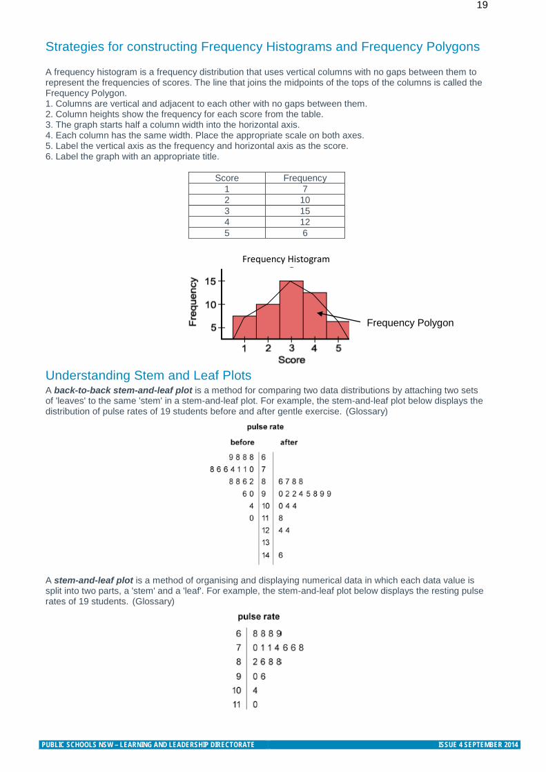
19 Strategies for constructing Frequency Histograms and Frequency Polygons
A frequency histogram is a frequency distribution that uses vertical columns with no gaps between them to represent the frequencies of scores. The line that joins the midpoints of the tops of the columns is called the Frequency Polygon. 1. Columns are vertical and adjacent to each other with no gaps between them. 2. Column heights show the frequency for each score from the table. 3. The graph starts half a column width into the horizontal axis. 4. Each column has the same width. Place the appropriate scale on both axes. 5. Label the vertical axis as the frequency and horizontal axis as the score. 6. Label the graph with an appropriate title.
Score Frequency 1 7 2 10 3 15 4 12 5 6
Frequency Histogram
Understanding Stem and Leaf Plots A back-to-back stem-and-leaf plot is a method for comparing two data distributions by attaching two sets of 'leaves' to the same 'stem' in a stem-and-leaf plot. For example, the stem-and-leaf plot below displays the distribution of pulse rates of 19 students before and after gentle exercise. (Glossary)
A stem-and-leaf plot is a method of organising and displaying numerical data in which each data value is split into two parts, a 'stem' and a 'leaf'. For example, the stem-and-leaf plot below displays the resting pulse rates of 19 students. (Glossary)
Frequency Polygon
PUBLIC SCHOOLS NSW – LEARNING AND LEADERSHIP DIRECTORATE ISSUE 4 SEPTEMBER 2014
20 Data Investigation and Interpretation a guide for teachers
The Improving Mathematics Education in Schools (TIMES) Project released this guide for teachers about Data representation and interpretations in Stage 5. There are teaching ideas and investigations for data representation and analysis.
This resource plus many more can be found on SCOOTLE
PUBLIC SCHOOLS NSW – LEARNING AND LEADERSHIP DIRECTORATE ISSUE 4 SEPTEMBER 2014
21
Stage 2 Teaching Ideas- Data
These lesson ideas are specifically for Stage 2 and build knowledge that is required for students in Stage 3. You may like to explore these concepts with your Stage 3 students to gain knowledge of their current level of understanding. Strand: Statistics and Probability Substrand: Data Outcomes: WM2-1WM uses appropriate technology terminology to describe, and symbols to represent mathematical ideas WM2-2WM selects and uses appropriate mental or written strategies, or technology, to solve problems WM2-3WM checks the accuracy of a statement and explains the reasoning used MA2-18SP selects appropriate methods to collect data, and constructs, compares, interprets and evaluates data displays, including tables, picture graphs and column graphs Students: Collect data, organise it into categories, and create displays using lists, tables, picture graphs and simple column graphs, with and without the use of digital technologies (ACMSP069)
Identify questions or issues for categorical variables; identify data sources and plan methods of data collection and recording
Collect data and create a list or table to organise the data, eg collect data on the number of each colour of lollies in a packet
Construct vertical and horizontal column graphs and picture graphs that represent data using one-to-one correspondence
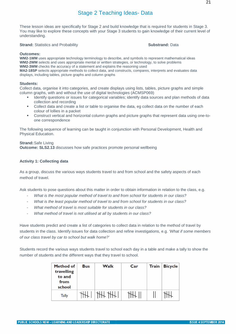
The following sequence of learning can be taught in conjunction with Personal Development, Health and Physical Education. Strand: Safe Living Outcome: SLS2.13 discusses how safe practices promote personal wellbeing Activity 1: Collecting data As a group, discuss the various ways students travel to and from school and the safety aspects of each method of travel. Ask students to pose questions about this matter in order to obtain information in relation to the class, e.g.
- What is the most popular method of travel to and from school for students in our class? - What is the least popular method of travel to and from school for students in our class? - What method of travel is most suitable for students in our class? - What method of travel is not utilised at all by students in our class?
Have students predict and create a list of categories to collect data in relation to the method of travel by students in the class. Identify issues for data collection and refine investigations, e.g. ‘What if some members of our class travel by car to school but walk home?’ Students record the various ways students travel to school each day in a table and make a tally to show the number of students and the different ways that they travel to school.
PUBLIC SCHOOLS NSW – LEARNING AND LEADERSHIP DIRECTORATE ISSUE 4 SEPTEMBER 2014
22 Activity 2: Creating a column graph Ask students to use this data to construct a column graph, using grid paper. Discuss with students:
- How will grid paper assist you in constructing a column graph? - What will you name the horizontal and vertical axes? - What would be an appropriate title for your column graph?
Activity 3: Interpreting and evaluating the graph Ask students, in small groups, to interpret the information in the graph. Ask students questions such as:
- What is the most popular way of travelling to and from school? - What is the least popular way of travelling to and from school? - What is the safest method of travel? Why? - What safety considerations would you need to be aware of if: catching the train; riding a bike;
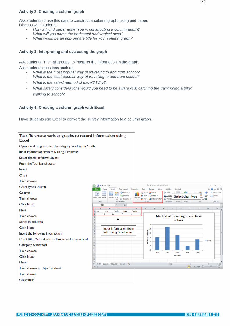
walking to school? Activity 4: Creating a column graph with Excel Have students use Excel to convert the survey information to a column graph.
PUBLIC SCHOOLS NSW – LEARNING AND LEADERSHIP DIRECTORATE ISSUE 4 SEPTEMBER 2014
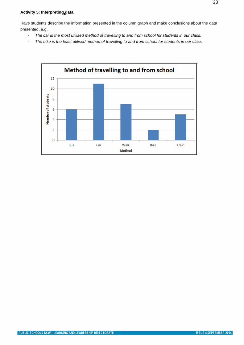
23 Activity 5: Interpreting data Have students describe the information presented in the column graph and make conclusions about the data presented, e.g.
- The car is the most utilised method of travelling to and from school for students in our class. - The bike is the least utilised method of travelling to and from school for students in our class.
PUBLIC SCHOOLS NSW – LEARNING AND LEADERSHIP DIRECTORATE ISSUE 4 SEPTEMBER 2014
24
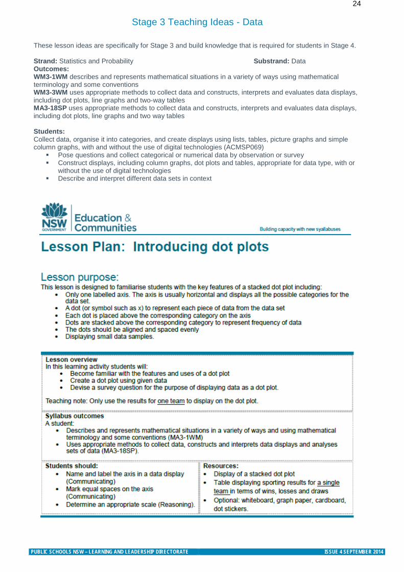
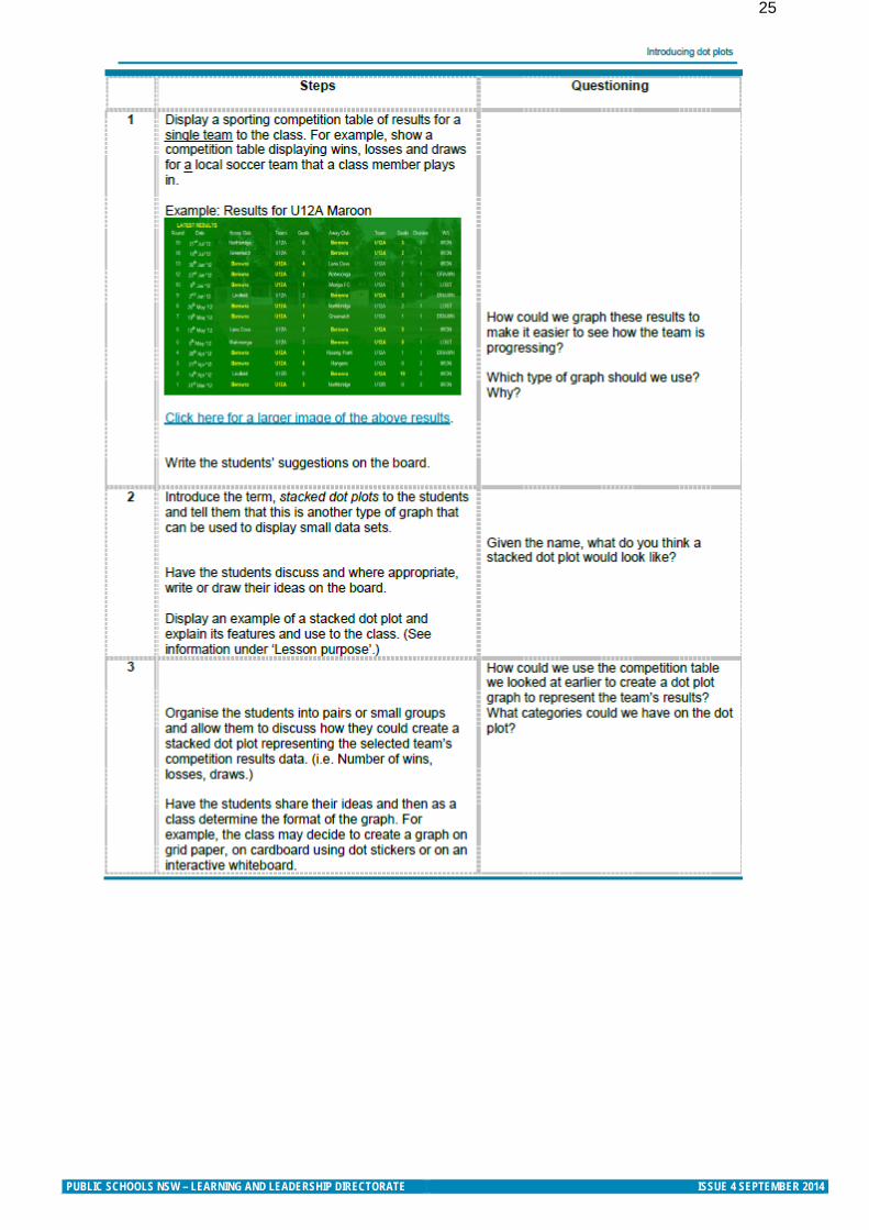
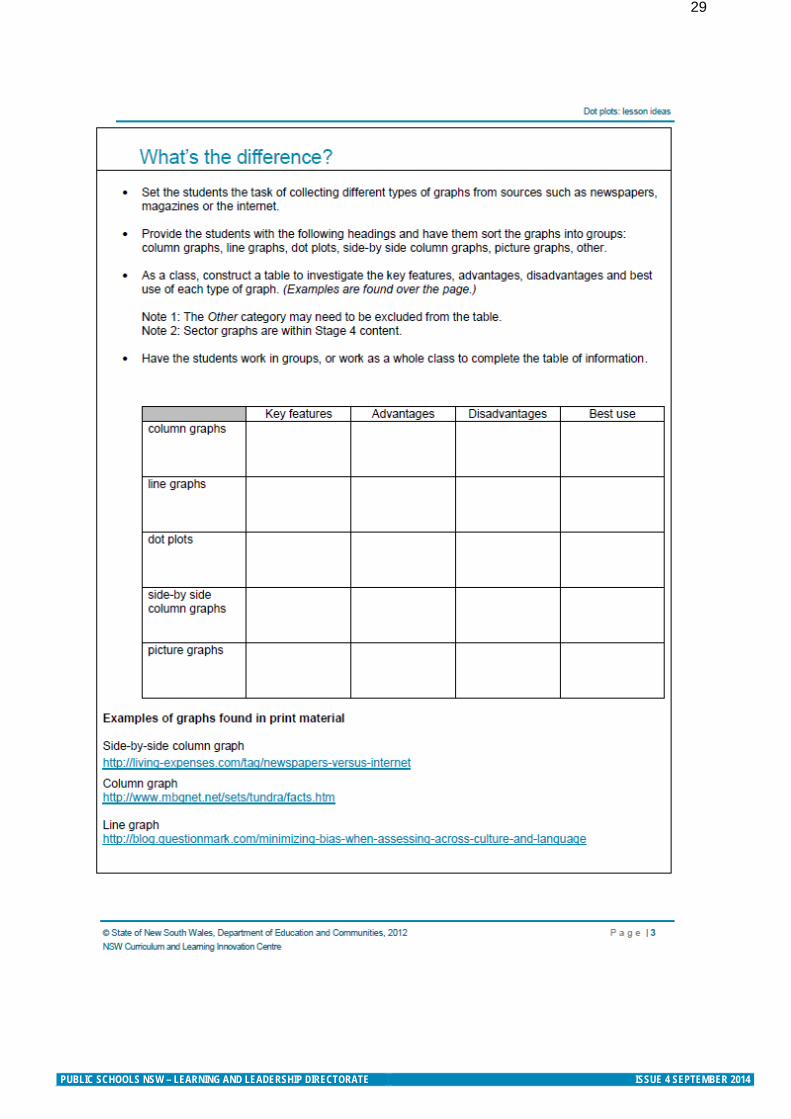
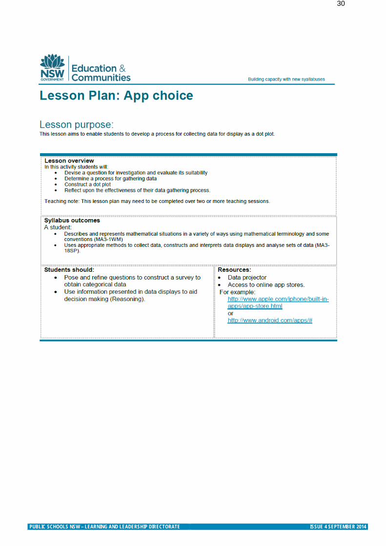
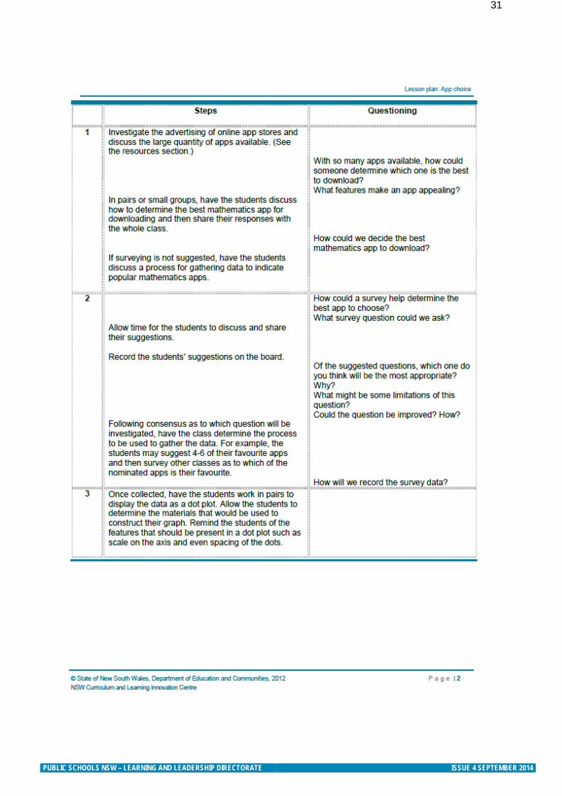
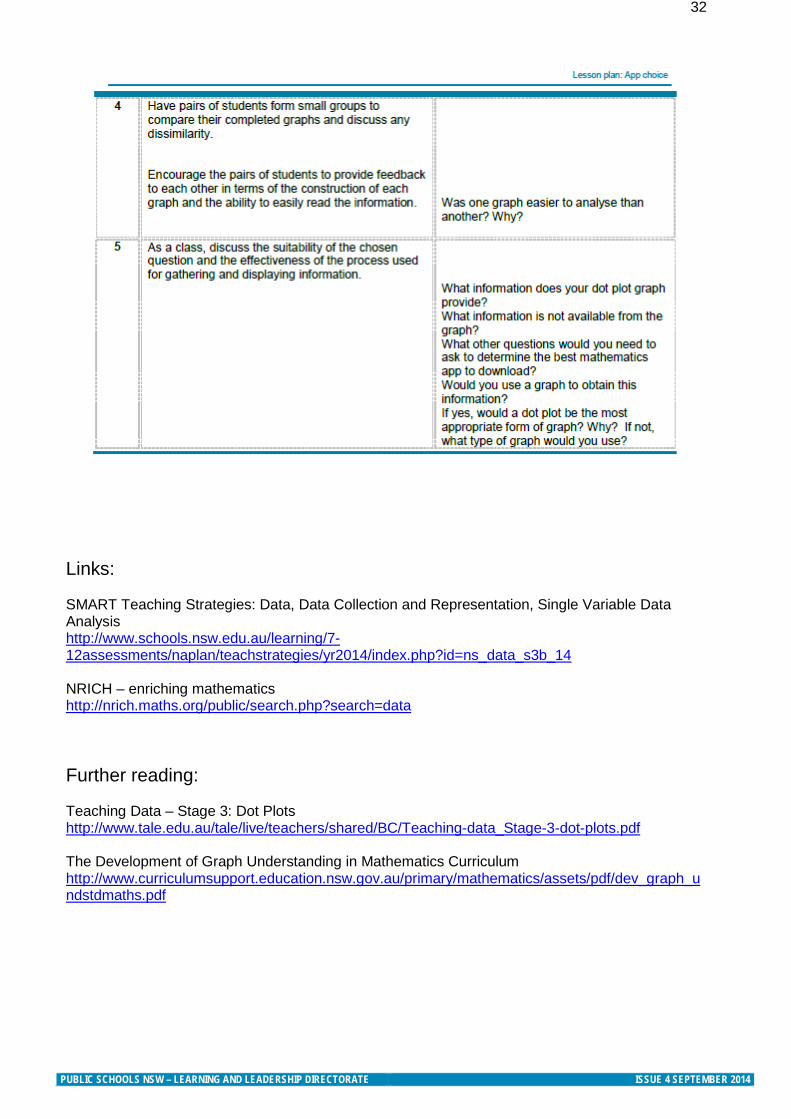
Stage 3 Teaching Ideas - Data
These lesson ideas are specifically for Stage 3 and build knowledge that is required for students in Stage 4. Strand: Statistics and Probability Substrand: Data Outcomes: WM3-1WM describes and represents mathematical situations in a variety of ways using mathematical terminology and some conventions WM3-3WM uses appropriate methods to collect data and constructs, interprets and evaluates data displays, including dot plots, line graphs and two-way tables MA3-18SP uses appropriate methods to collect data and constructs, interprets and evaluates data displays, including dot plots, line graphs and two way tables Students: Collect data, organise it into categories, and create displays using lists, tables, picture graphs and simple column graphs, with and without the use of digital technologies (ACMSP069)
Pose questions and collect categorical or numerical data by observation or survey Construct displays, including column graphs, dot plots and tables, appropriate for data type, with or
without the use of digital technologies Describe and interpret different data sets in context
PUBLIC SCHOOLS NSW – LEARNING AND LEADERSHIP DIRECTORATE ISSUE 4 SEPTEMBER 2014
25
PUBLIC SCHOOLS NSW – LEARNING AND LEADERSHIP DIRECTORATE ISSUE 4 SEPTEMBER 2014
26
PUBLIC SCHOOLS NSW – LEARNING AND LEADERSHIP DIRECTORATE ISSUE 4 SEPTEMBER 2014
27
PUBLIC SCHOOLS NSW – LEARNING AND LEADERSHIP DIRECTORATE ISSUE 4 SEPTEMBER 2014
28
PUBLIC SCHOOLS NSW – LEARNING AND LEADERSHIP DIRECTORATE ISSUE 4 SEPTEMBER 2014
29
PUBLIC SCHOOLS NSW – LEARNING AND LEADERSHIP DIRECTORATE ISSUE 4 SEPTEMBER 2014
30
PUBLIC SCHOOLS NSW – LEARNING AND LEADERSHIP DIRECTORATE ISSUE 4 SEPTEMBER 2014
31
PUBLIC SCHOOLS NSW – LEARNING AND LEADERSHIP DIRECTORATE ISSUE 4 SEPTEMBER 2014
32
Links: SMART Teaching Strategies: Data, Data Collection and Representation, Single Variable Data Analysis http://www.schools.nsw.edu.au/learning/7-12assessments/naplan/teachstrategies/yr2014/index.php?id=ns_data_s3b_14 NRICH – enriching mathematics http://nrich.maths.org/public/search.php?search=data Further reading: Teaching Data – Stage 3: Dot Plots http://www.tale.edu.au/tale/live/teachers/shared/BC/Teaching-data_Stage-3-dot-plots.pdf The Development of Graph Understanding in Mathematics Curriculum http://www.curriculumsupport.education.nsw.gov.au/primary/mathematics/assets/pdf/dev_graph_undstdmaths.pdf
PUBLIC SCHOOLS NSW – LEARNING AND LEADERSHIP DIRECTORATE ISSUE 4 SEPTEMBER 2014
33
Subscription link DEC Mathematics Curriculum network Click on this image to be added to our network list for all newsletters and professional learning information
Scootle
MANSW
GeoGebra Institute Applets and teaching ideas
Further information Learning and Leadership Directorate
Primary Mathematics Advisor [email protected] Primary Mathematics AC Advisor [email protected]
Secondary Mathematics AC Advisor [email protected]
Secondary Mathematics Advisor [email protected]
Level 3, 1 Oxford Street Sydney NSW 2000 9266 8091 Nagla Jebeile 9244 5459 Katherin Cartwright © October 2014 NSW Department of Education and Communities
PUBLIC SCHOOLS NSW – LEARNING AND LEADERSHIP DIRECTORATE ISSUE 4 SEPTEMBER 2014

DATA INVESTIGATION AND INTERPRETATION
10YEAR
The Improving Mathematics Education in Schools (TIMES) Project
A guide for teachers - Year 10 June 2011
STATISTICS AND PROBABILITY Module 8

Data Investigation and Interpretation
(Statistics and Probability : Module 8)
For teachers of Primary and Secondary Mathematics
510
Cover design, Layout design and Typesetting by Claire Ho
The Improving Mathematics Education in Schools (TIMES)
Project 2009‑2011 was funded by the Australian Government
Department of Education, Employment and Workplace
Relations.
The views expressed here are those of the author and do not
necessarily represent the views of the Australian Government
Department of Education, Employment and Workplace Relations.
© The University of Melbourne on behalf of the International
Centre of Excellence for Education in Mathematics (ICE‑EM),
the education division of the Australian Mathematical Sciences
Institute (AMSI), 2010 (except where otherwise indicated). This
work is licensed under the Creative Commons Attribution‑
NonCommercial‑NoDerivs 3.0 Unported License. 2011.
http://creativecommons.org/licenses/by‑nc‑nd/3.0/

Helen MacGillivray
10YEAR
DATA INVESTIGATION AND INTERPRETATION
The Improving Mathematics Education in Schools (TIMES) Project
A guide for teachers - Year 10 June 2011
STATISTICS AND PROBABILITY Module 8

DATA INVESTIGATION AND INTERPRETATION
{4} A guide for teachers
ASSUMED BACKGROUND FROM F-9
It is assumed that in Years F‑9, students have had many learning experiences involving
choosing and identifying questions or issues from everyday life and familiar situations,
planning statistical investigations and collecting or accessing data, and have become
familiar with the concepts of statistical variables and of subjects of a data investigation. It
is assumed that students are now familiar with categorical, count and continuous data,
have had learning experiences in recording, classifying and exploring individual datasets
of each type, using tables and column graphs for categorical data and count data with a
small number of different counts treated as categories, and dotplots, stem‑and‑leaf plots
and histograms for continuous and count data. It is assumed that students are familiar
with the use of frequencies and relative frequencies of categories (for categorical data) or
of counts (for count data) or of intervals of values (for continuous data), and that students
have used and interpreted averages (that is, sample means), medians and ranges of
quantitative (that is, count or continuous) data. Students have used tables and graphs to
explore more than one set of categorical data on the same subjects, investigating data
on pairs of categorical variables. Students have used stem‑and‑leaf plots and histograms
to explore continuous data (and count data with many different values) and categorical
data on the same subjects, comparing features of the continuous data, on the same scale,
across categories.
Through learning experiences in many familiar and everyday contexts, students have
come to recognise the need for data to be obtained randomly in circumstances that are
representative of a more general situation or larger population with respect to the issues
of interest. Students have examined the challenges of obtaining randomly representative
data, emphasizing the importance of clear reporting of how, when and where data are
obtained or collected, and of identifying the issues or questions for which data are desired
to be representative. Throughout the years, students have seen a variety of examples of
collecting data, with Years 8 and 9 explicitly identifying surveys, observational studies and
experimental investigations, and contrasting sampling with taking a census.
In order to understand how to interpret and report information from data, students have
developed some understanding of the effects of sampling variability. Consideration of
such effects has been implicit throughout data investigations in all years with more explicit
focus and allowance for sampling variability in commenting on data, developing in Years 8
and 9.

{5}The Improving Mathematics Education in Schools (TIMES) Project
MOTIVATION
Statistics and statistical thinking have become increasingly important in a society that
relies more and more on information and calls for evidence. Hence the need to develop
statistical skills and thinking across all levels of education has grown and is of core
importance in a century which will place even greater demands on society for statistical
capabilities throughout industry, government and education.
A natural environment for learning statistical thinking is through experiencing the process
of carrying out real statistical data investigations from first thoughts, through planning,
collecting and exploring data, to reporting on its features. Statistical data investigations
also provide ideal conditions for active learning, hands‑on experience and problem‑
solving. No matter how it is described, the elements of the statistical data investigation
process are accessible across all educational levels.
Real statistical data investigations involve a number of components: formulating a problem
so that it can be tackled statistically; planning, collecting, organising and validating data;
exploring and analysing data; and interpreting and presenting information from data in
context. No matter how the statistical data investigative process is described, its elements
provide a practical framework for demonstrating and learning statistical thinking, as well as
experiential learning in which statistical concepts, techniques and tools can be gradually
introduced, developed, applied and extended as students move through schooling.
CONTENT
In this module, in the context of statistical data investigations, we build on the content
of Years F‑9 to extend the focus in Year 9 on comparing quantitative data across the
categories of one or more categorical variables, and to extend the exploration in Year 6 of
association between categorical variables, to exploration of possible relationships between
continuous variables.
Quartiles and boxplots are introduced and used to further develop the learning
experiences in comparing quantitative data across categories of one or more categorical
variables. Boxplots are compared with histograms, and the relative merits of the four types
of plots for quantitative data (dotplots, stem‑and‑leaf plots, histograms and boxplots)
are compared. Comparisons are made with regard to location, spread and shape, with
reference to plots and/or the summary statistics of sample means, medians, quartiles and
ranges, as appropriate.

{6} A guide for teachers
Scatterplots are used to investigate and comment on possible relationships between
continuous variables. Examples include situations involving time, and examples from
digital media illustrate graphical techniques for exploring more complex situations with
social, environmental and health ramifications.
Count data with many different values (usually large values) of counts, may also be
explored using the plots and summary statistics that are used for continuous data,
because of the many different values. For convenience in this module, we will use the
terms continuous data and continuous variable, with the understanding that count data
with many different values of counts may also be treated in the same ways. One example
on such data – on the number of blinks per minute – is included as illustration.
Throughout this module, students build on their understanding of the importance of clear
reporting of how, when and where data are obtained or collected, and of identifying the
issues or questions for which data are desired to be representative. In the direct extension
of Year 9 content, this module makes use of the Year 9 examples of data investigations
initiated, designed, planned and carried out by students. In exploring relationships
amongst quantitative variables, this module uses examples ranging from student data
investigations to issues of international concern and importance.
Throughout F‑10, the examples and new content of modules are developed within the
statistical data investigation process through the following:
• considering initial questions that motivate an investigation;
• identifying issues and planning;
• collecting, handling and checking data;
• exploring and interpreting data in context.
The examples consider situations familiar and accessible to students and build on
situations considered in F‑9.
SUMMARY OF STUDENT DATA INVESTIGATION EXAMPLES.
The following are brief summaries of some data investigations initiated, designed and
undertaken entirely by students, involving a number of variables including one or more
quantitative variables and at least categorical variable. These will be used in the examples
of this module. Most are used in the examples in the Year 9 module, and more details are
provided there, particularly on the details of the planning, practicalities and collecting of the
data. The groups of students involved chose their context and the aspects of it of interest
to them, identified the variables and subjects of the investigation, planned the practicalities
of the data collection to obtain randomly representative data, carried out appropriate pilot
studies and collected their data, then explored and reported on their data.
For each example below, the students were interested in a number of questions and
issues, only some of which are explored in this module.

{7}The Improving Mathematics Education in Schools (TIMES) Project
EXAMPLE A: GOGOGO!
The students in this group were interested in investigating whether speed of approaching
traffic lights tended to be different for green or amber traffic lights and whether this was
affected by driver gender, age or vehicle type, colour or make. They recorded data only
for vehicles that had free approach to the lights – that is, not impeded in any way by other
vehicles. To collect information on speed, they recorded the time in seconds that vehicles
took to pass through a 50 metre section just before the set of lights. They also recorded
gender and (broad) age group of driver, and colour, type and make of vehicle.
In this module, we consider only the time to travel the 50 metre section (in seconds) and
the colour of the lights.
EXAMPLE B: HOW OFTEN DO PEOPLE BLINK?
This group of students decided to conduct a simple survey on opinions on a topic such
as travel, asking questions for one minute. There were four students in the group and they
collected their data in pairs. One member of the pair asked the questions while the other
unobtrusively counted the number of times each subject blinked. The students used the
same questions, and stayed in the same pairs of investigators to collect their data. The
investigators recorded the gender and age of the subject, the number of blinks in the
minute of the survey, whether the questions were asked inside or outside, in the morning
or afternoon, the subject’s eye colour, and whether the subject wore glasses or not. They
also recorded the pair who collected the data for each subject. They discovered during
their exploration of the data that this last variable was important. It happened by accident
more than design, that the group of two boys and two girls decided to collect their data in
same gender pairs – that is, the two girls formed one pair of collectors and the two boys
formed the other pair. In this module, we consider the number of blinks per minute, the
gender of the subject and the gender of the observer pair, but in practice, as with other
examples in these modules, all of the variables are likely to be of interest, and it is likely
that combinations of variables could affect the number of blinks.
EXAMPLE C: OPTICAL ILLUSIONS
There are pictures that can be looked at in two ways. For example, there is a well‑known
father and son optical illusion (see, for example, http://www.moillusions.com/2010/07/
father‑and‑son‑optical‑illusion.html ). The group of students who thought of this topic
were interested not only in which picture people saw first and how long they took in
seeing it, but also whether they were interested in seeing the other picture and whether
they were right or left‑handed. The investigators also recorded each subject’s gender and
age. A brief explanation was given to each subject before showing the picture, namely,
“I’m going to show you a picture that could be seen as a picture of an old man or of a
young man. Tell me as soon as you’ve seen either the old or the young man, and which
one you see.”
In this module, we consider only the variables time to see a picture, which picture was
seen and the gender of the subject.

{8} A guide for teachers
EXAMPLE D: THE FLIGHT OF PAPER PLANES
This student group investigated variables that might affect the distance and the flight time
of different designs and materials of paper aeroplanes. The experiment was conducted
in an enclosed space to minimise the influence of the weather. Three different plane
designs were made using three different types of paper (rice, plain and cartridge), and each
combination was thrown four times by each of four different throwers. For each throw, the
flight time, distance, type of landing (nosedive/glide), position on landing (upright/not) and
whether there had been any obstacles, were all recorded. All flights took place on the same
day in the same location. The order in which the planes were thrown was randomised.
In this module, the flight times, flight distance, and the design and paper type will be considered.
EXAMPLE E: BODY STATISTICS
The students conducting this investigation were interested in a variety of body
measurement data and the person’s ability to perform unique body‑related skills (touching
toes, touch nose with tongue, curl tongue). They took nine different body measurements
as well as recording gender and age and the three body‑related skills. In this module, we
will consider head circumference (measured around eyebrows, in cm), age, shoulder
width (shoulder tip to shoulder tip, in cm) and gender.
EXAMPLE F: REFLEXES
The group conducted an experiment to investigate human reflexes. A ruler was dropped
(from 15.2cm above the hand and by the same group member) on the count of three and
the aim was to catch the ruler as quickly as possible. The subjects forearm was positioned
perpendicular to the body while the thumb was at right angles with the fingers. A green
fluorescent and a clear ruler were used, and each subject was asked to catch each ruler,
once each with each hand (right/left). For each subject, a coin toss randomised both the
order of which the different rulers were dropped and also which hand the subject would
use first. Distances were measured from the bottom of the ruler to the catching position.
For each subject, age, gender, and dominant hand were recorded as well as the result for
each of their “catches”, including if they missed altogether.
QUARTILES AND BOXPLOTS
Students have become familiar with the concept and use of medians of quantitative data
since Year 7. When the data are ordered from smallest to largest, the median of the data is
the “middle” observation, with an equal number of the observations less than it and greater
than it.
For an odd number of observations, the median is the middle observation. For example,
for 51 observations, the median is the 26th observation after the data are ordered from
smallest to largest, because the 26th observation has 25 values on each side of it. Thus for
an odd number of observations, the median is one of the data values, and it has half of the
rest of the observations on each side of it.

{9}The Improving Mathematics Education in Schools (TIMES) Project
For an even number of observations, any value between the middle two has equal
numbers of observations on each side of it, and the convention is that we take the median
as the midpoint of the two central values. Hence for an even number of observations, the
median is not one of the observations and it has half of the observations on each side of it.
If a stem‑and‑leaf plot is readily available, it is easy to obtain the median from it. Below are
two stem‑and‑leaf plots for the data of Example B, of the number of times per minute a
person blinks, one for the 48 females and the other for the 53 males in the dataset.
EXAMPLE B: MEDIAN NUMBER OF BLINKS PER MINUTE FOR FEMALES AND MALES
Number of blinks per minute for 48 females of Example B
Leaf unit = 1.0
0 4
0 78889
1 111224
1 55666667799
2 233333444
2 5789
3 334
3 5789
4 00
4 88
5 3
For 48 observations, the median is the midpoint of the 24th and the 25th (ordered)
observations. From the stem‑and‑leaf, we see that the 24th is 22 and the 25th is 23, so the
median is taken as 22.5. Note that the variable is number of blinks per minute – a count
variable – but we do not round the median to a whole number because it is giving us an
estimate of the number of blinks that females are equally‑likely to blink more or less than.
Number of blinks per minute for 53 males of Example B
Leaf unit = 1.0
0 2
0 56678
1 1133444
1 55566677778899
2 12223344
2 55668
3 012244
3 558
4 24
4 7
5 0

{10} A guide for teachers
For the 53 males, the median is the 27th observation as it has 26 observations of either
side of it. From the stem‑and‑leaf plot, we see that the 27th observation is 19. Note that it
is immaterial that there are two values of 19 in the dataset – 19 is still the 27th observation
whether we approach it from the top or the bottom of this dataset.
The quartiles divide the (ordered) dataset into halves again, so that the quartiles plus
the median divide the dataset into 4 with equal numbers of observations in each
“quarter”. Hence, once the median has divided the data into two, with equal numbers of
observations in each “half”, then the lower quartile can be thought of as the median of
the lower half of the data, and the upper quartile can be thought of as the median of the
upper half.
This is illustrated using the above example.
EXAMPLE B: QUARTILES FOR THE NUMBER OF BLINKS PER MINUTE FOR FEMALES AND MALES
For the 48 females, the group below the median has 24 observations. Hence the median
of this group is taken as the midpoint between the 12th and 13th observation from the
smallest. Looking at the stem‑and‑leaf plot, this is the midpoint of 14 and 15, and so
the lower quartile is 14.5. The group above the median also has 24 observations, from
observation number 25 to observation number 48. Hence the median of this group is
taken as the midpoint between the 12th and 13th observations from the largest. Looking
at the stem‑and‑leaf plot, this is the midpoint between 33 and 29, and hence the upper
quartile is 31.
For the 53 males, the group below the median has 26 observations. Hence the median
of this group is the midpoint between the 13th and 14th observations. From the stem‑
and‑leaf plot, we see this is the midpoint between 14 and 15 and hence is 14.5. The group
above the median also has 26 observations, from observation number 28 to observation
number 53, and the upper quartile is therefore the midpoint between the 13th and 14th
observations from the largest. Looking at the stem‑and‑leaf plot, this is the midpoint
between 30 and 28. Hence the upper quartile is 29.
We have seen that the median provides information on where the data are centred
or located, and that the overall range from minimum to maximum provides some
information on the spread of the data. However, the smallest or largest observation can
sometimes be quite a distance from the bulk of the data, and the overall range could be
misleading with regard to where most of the data are. A measure of spread that is not as
vulnerable to extremes is the inter‑quartile range – the distance between the quartiles. This
gives the range of the middle 50% of the data.
In the above example, for the females, the median number of blinks per min is 22.5 and
the inter‑quartile distance is 16.5. For the males, the median number of blinks is 19 and the
inter‑quartile distance is 14.5. There is little difference between females and males, with the
females having a slightly higher median and being slightly more variable than the males.

{11}The Improving Mathematics Education in Schools (TIMES) Project
The minimum, maximum, median and the two quartiles, are sometimes called the five
number summary. Sometimes the lower quartile is called the first quartile, because it
marks the first quarter of the (ordered) data. The median is then the second quartile
although this term is very seldom used, and the upper quartile is called the third quartile
because it marks three‑quarters of the way through the data from smallest to largest.
These five summary statistics are the key information in a boxplot which is explained via
the diagram below.
maximum
3rd quartile
1st quartile
minimum
median
50
% o
f d
ata
The above diagram is the simplest form of boxplot, but it has a disadvantage in that there
is no information on how far the minimum and the maximum are from the rest of the
data. A version of the boxplot more often used in statistics draws the “whiskers” from the
box to the data points that are within a certain distance from the edges of the box, and
marks the data points that are outside this distance by *’s. The boxplot below illustrates
this for the overall dataset of Example B.
BOXPLOT OF NUMBER OF BLINKS
NO
. OF
BLI
NK
S
10
20
50
60
30
40
d
1.5 d
*
0
Upper quartile
Lower quartile
If the inter‑quartile distance is denoted by d, then the whiskers go out to the last data point
inside the distance 1.5d from the edges of the box. Any data points outside this distance
from the box are marked by *’s.

{12} A guide for teachers
We see in the boxplot of number of blinks that there is only one data point further away
than 1.5 times the inter‑quartile distance from the quartiles, and hence this gives little
further information than the simpler boxplot showing only the five number summary.
However for other datasets, the simpler boxplot may hide information that shows with the
better version of the boxplot.
Note that the axis giving the values of the data is vertical. We will see why in the examples
below – it is for ease of presenting many boxplots on one graph. So in the boxplot above,
the median is approximately 21, and the lower and upper quartiles are approximately 14
and 29.
Note also that the horizontal dimension of the boxplot above has no meaning.
When a number of boxplots are presented on the same graph, this dimension simply
accommodates the number of boxplots.
In the examples in the Year 9 module, it is seen that comparing more than two histograms
on the same scale is not necessarily straightforward, while back to back stem‑and‑leaf plots
can compare only two groups of data at once. Many boxplots can be drawn on the same
graph and hence boxplots provide a convenient way of comparing many groups at once.
Of course there are disadvantages and cautions to go with this quick and easy graphical
comparison of groups of data. Apart from providing only a summary of the data with
much detail omitted, the main caution in using boxplots is because there is no information
on numbers of observations. An associated caution is that boxplots should not be used
for small sets of data. Guidelines are sometimes given, but from the fact that boxplots
essentially divide the data into 4 groups with roughly equal numbers of observations in
each, we can see that 20 or more observations per group is reasonable, and that boxplots
for fewer than 12 observations per group could be misleading.
How do boxplots compare with the other plots used for continuous data? To illustrate, below
is a dotplot and a histogram for the overall number of blinks presented above in a boxplot.
7 14 21 28 35 42 49
NO. OF BLINKS
NO. OF BLINKS
FREQ
UE
NC
Y
5
10
10
20
25
50
15
30
20
400 0

{13}The Improving Mathematics Education in Schools (TIMES) Project
We see that the data are slightly skew to the right, which is shown in the boxplot by the
upper half of the box being slightly longer than the lower half, and the upper whisker
being longer than the lower whisker. Notice that both the dotplot and the histogram
suggest that there may be two groups in these data, but a boxplot cannot suggest this.
Despite the disadvantages of boxplots, we see in the examples in the next section just
how useful they are in comparing continuous data across a number of categories.
USING BOXPLOTS TO COMPARE CONTINUOUS DATA ACROSS CATEGORIES; COMPARISONS WITH HISTOGRAMS AND DOTPLOTS
Data on the continuous variable (or count data with many different values) of some of the
above examples are now explored across one or two of the categorical variables, using
boxplots (on the same scale). Some comparisons with histograms and dotplots are also made.
EXAMPLE A: GOGOGO!
Below are boxplots and histograms on the same scale for the time in seconds to travel the
last 50 metre section and the colour of the lights.
BOXPLOT OF TIME IN SECS
LIGHTS
TIM
E IN
SE
CS
2
3
6
7
GREEN
4
AMBER
5
0
*
*
HISTOGRAM OF TIME IN SECS
TIME IN SECS
FREQ
UE
NC
Y
2
4
10
12
14
16
18
6
8
03 4 75 62
3 4 75 62

{14} A guide for teachers
The boxplots give us an instant comparison, showing that the time of approach to amber
lights is generally less than that of approach to green, with the difference in medians being
about 0.6 sec over 50 metres. The inter‑quartile distances are similar and generally the
variation in times is similar. There are two extreme values for the times to approach green
– one large and one small. These extreme values in the histogram give the impression
of the times to approach green being more variable than the times to approach amber,
but note how the boxplots emphasize that they are extremes and that apart from them,
the variability in times to approach amber and green are not too dissimilar. The times
to approach green are skew to the right; the times to approach amber are slightly
asymmetric but are not particularly skew to right or left.
EXAMPLE C: OPTICAL ILLUSIONS
Below are histograms, dot plots and boxplots on the time to see a picture in secs and
which picture was seen (old or young man).
HISTOGRAM OF TIME TO SEE IN SECS
TIME TO SEE IN SECS
OLD YOUNG
FRE
QU
EN
CY
10
20
30
40
01.6 3.2 8.0 9.6 11.24.8 6.40.0
1.6 3.2 4.8 6.40.0
1.4 2.8 4.2 5.6 7.0 8.4 9.8
TIME TO SEE
YOUNG
OLD

{15}The Improving Mathematics Education in Schools (TIMES) Project
OLD OR YOUNG
TIM
E T
O S
EE
2
4
10
YOUNG
6
OLD
8
0
****
**
We see how the boxplots reflect the dot plots and the histograms. The median times to
see a picture are much the same whether a person sees the old or young man first, but
for those who saw the old man first, the times are very skew to the right, more variable
for the central 50% of subjects’ times, and there are a number who took much longer. For
those who saw the picture of the young man first, the times are only slightly skew to the
right, and even the slowest to see the young man was not an extreme time for those who
saw the old man.
Does there tend to be any difference if the subject is a boy or girl? Below are boxplots
of the time to see a picture, across the combination of which picture was seen first and
whether the subject was a boy or girl.
GENDER
OLD OR YOUNG
TIM
E T
O S
EE
2
4
10
GIRL GIRL
6
BOY BOY
YOUNGOLD
8
0
**
*
**
*
We see that although the overall tendencies noted above apply to both boys and girls,
there was a much greater contrast in the times for boys to see the old man or the young
man than there is for girls. Although the median time to see each picture was about the
same, for the boys who saw the young man first, the times were much less variable and
much less skew to the right than for the boys who saw the old man first.
Note how being able to look at four boxplots on the same scale in just one graph provides
an excellent overview of the comparisons across datasets. However we would need
to check how many are in each group to ensure we do not have boxplots with greatly
uneven numbers of observations. In this example there are at least 40 in each group of a
total of 203 observations.

{16} A guide for teachers
EXAMPLE B: HOW OFTEN DO PEOPLE BLINK?
For this example in the Year 9 module, it was noted that there is little difference between
the male and female subjects, but there seems to be quite a difference in the number of
blinks per minute of subject depending on whether they were interviewed by a male or a
female, remembering that the two pairs of collectors consisted of an interviewer and an
observer and the two pairs were both females or both males. The number of blinks per
minute tended to be generally greater and more variable for the female interviewer than
the male interviewer. Could this be due to the way the interviewer asked the questions or
a difference in response to male and female interviewers?
A question that immediately arises is whether the different combinations of interviewer
and subject genders show any effects. Below are histograms and boxplots of the number
of blinks per minute with the data divided into the 4 groups formed by these different
combinations.
HISTOGRAM OF NUMBER OF BLINKS
FRE
QU
EN
CY
FEMALE, FEMALE OBSERVER
MALE, FEMALE OBSERVER MALE, MALE OBSERVER
NO. OF BLINKS
MALE, MALE OBSERVER
8 24 32 40 48 560 16
8 24 32 40 48 560 16
2.5
5.0
7.5
10.0
0.0
2.5
5.0
7.5
10.0
0.0
BOXPLOTS OF NUMBER OF BLINKS
GENDER
OBSERVER
NO
. OF
BLI
NK
S
10
20
50
60
MALE MALE
MALE OBSERVER
30
FEMALE FEMALE
FEMALE OBSERVER
40
0
**

{17}The Improving Mathematics Education in Schools (TIMES) Project
The boxplots provide us with an instant overview that emphasizes the differences
between female and male observers for female and male subjects. The numbers of blinks
are more variable for both subject genders for female observers, but much more for
female subjects than male subjects. For the male observers, the median and the spread
of the number of blinks are similar for female and male subjects but the female data are
considerably skew to the right, and much more than the male data.
If we are just using the boxplots, we should check the numbers of observations in each
group. There are approximately 25 subjects in each of the four groups, so there are no
problems in using boxplots.
Once again we see the usefulness of boxplots in an overview of comparisons between
more than two groups of continuous data (Note that in this case the data are count data
but with many different values so using plots and graphs designed for continuous data
is appropriate).
EXAMPLE D: THE FLIGHT OF PAPER PLANES
In the Year 9 module, histograms and stem‑and‑leaf plots are considered for the flight
times in seconds for the different designs and for the different paper types. The flight
times for the three designs are considered and the flight times for the three paper
types are considered, and then the flight times for the three paper types are considered
separately for each of the three designs. However in the Year 9 module, this involves
looking at 9 stem‑and‑leaf plots or 9 histograms. It can be quite difficult to compare more
than two histograms, and even when the stem‑and‑leaf plots are done in groups of three
on the same scale, it is difficult to gain an overview of the combined effects of design and
paper type.
Below are boxplots of the flight times split by both design and type of paper. There are 16
observations for each combination of design and paper type, so it is appropriate to use
boxplots and we also know that we have equal numbers of observations in each boxplot.
Note that the reason we have equal numbers of observations in each group is because
this was an experimental investigation, with controls over all the experimental variables
of plane design, paper type and thrower (4 throwers), with each combination of design,
paper type and thrower replicated 4 times in a random order. There were two response
variables observed: flight time and distance of landing point of plane. (Also observed were
the landing position, type of landing and whether there was any interference.)

{18} A guide for teachers
BOXPLOT OF FLIGHT TIME
PAPER
DESIGN
FLIG
HT
TIM
E
1
2
5
6
STINGRAY GLIDERNICK'S PAPER AEROPLANE
3
GENERIC
RICECARTRIDGE PLAIN RICECARTRIDGE PLAIN RICECARTRIDGE PLAIN
4
0
*
****
*
**
Again the boxplots give us a quick overall view of the data. We see the comparisons for
the different paper types within and across designs. For the generic design, the rice paper
has more chance of giving a longer flight time but it also tends to be more variable. For
Nick’s design, the plain paper tends to produce longer flight times but they also are more
variable, and if the rice paper gives good flight times, they tend to be as good as or better
than the plain paper. For the stingray glider, the cartridge paper is best but again it is most
variable, except that if the rice paper works well, it gives exceptional flight times.
Overall the stingray glider and Nick’s design seem to be the best choices, but using
different papers for each (plain for Nick’s, cartridge for stingray). Using rice paper seems
capable of producing exceptional flight times but only occasionally.
SCATTERPLOTS AND EXPLORING RELATIONSHIPS BETWEEN QUANTITATIVE VARIABLES
In the section above, and in the Year 9 module, we have been using various plots to
explore and compare datasets of continuous data (and of count data with many different
values) across categories of one or more categorical variables. This can also be viewed
as exploring relationships between a continuous variable and one or more categorical
variables. Such comparisons are of interest in many and varied situations and contexts.
Another type of situation that arises many times in applications across all disciplines,
is exploring relationships between quantitative variables. This is often in the context
of exploring if and how a continuous variable varies across one or more quantitative
variables. The plot that is used to explore this is the scatterplot. Although it can be used for
only two quantitative variables at a time, it is very useful for data exploration. The examples
below also show how a categorical variable can be included, and the next section shows
how it can be used dynamically and how other variables can be incorporated in it.

{19}The Improving Mathematics Education in Schools (TIMES) Project
To explore possible relationships between two variables, it tends not to matter which one
is assigned to the y‑axis and which to the x‑axis. However, if interest is in how one variable
varies, or is affected by, another, then the first should be assigned to the y‑axis and the
second to the x‑axis so that we can see what tends to happen to the y‑variable as the
x‑variable changes.
The x‑variable can be any quantitative variable (continuous or count) but the y‑variable
should be a continuous variable (or a count variable taking many different values).
For a dataset consisting of pairs of quantitative values – that is, a dataset consisting of pairs
of values with each pair observed on the same subject – a scatterplot plots points on a
plot with two axes, with the horizontal axis corresponding to the first value of each pair,
and the vertical axis corresponding to the second value of each pair.
EXAMPLE E: BODY STATISTICS
Below is a scatterplot of head circumference (measured around eyebrows, in cm), and
age in years.
SCATTERPLOT OF HEAD VS AGE
AGE
HE
AD
45
50
65
55
60
0 10 4020 5030 60 70
Each dot represents one observation with a pair of values. The first value of the pair is on
the horizontal axis and the second value of the pair is on the vertical axis. For example, the
point highlighted in the above plot corresponds to a person of age 39 years with a head
circumference of 52.5cm.
Looking at the plot, does there seem to be any relationship between head circumference
and age? Obviously there are a few children in this dataset with ages less than 12 and
smaller heads than most of the older subjects, but not by much and there are quite a few
older people with head circumferences as small, and one aged about 35 years with a
smaller head circumference than the child aged 2 years which seems highly unlikely. This
datapoint would have to be checked in case it was a mistake, but there is another subject
aged 22 years with a head circumference of not much more. Perhaps the reliability of the
measures of head circumference need to be checked.

{20} A guide for teachers
In general, what the plot shows is that there is very little relationship between head
circumference and age, but there is a lot of variability! That is, for people of the same
approximate age, there is a lot of variability in their head circumferences.
Below is a scatterplot of head circumference (measured around eyebrows, in cm), and
shoulder width in cm.
SCATTERPLOT OF HEAD VS SHOULDERS
SHOULDERS
HE
AD
45
50
65
55
60
20 25 4030 4535 50 55
We see that people with wide shoulders tend to have bigger heads, but that people with
smaller or medium shoulder widths can have a wide range of head circumferences.
Clearly age should be taken into account and so should gender. We can look at part of
this dataset, restricting to adults for example, but how can we allow for gender?
This scatterplot is repeated below, restricted to people at least 18 years old, and with
different symbols for males and females.
SCATTERPLOT OF HEAD VS SHOULDERS
In this plot different symbols are used for females and males in plotting head
circumference against shoulder width. We see that for males and females, there is very little
relationship between head circumference and shoulder width, and that there appears to be
a group of females with unusually small head circumferences for their shoulder widths.
There is no particular reason why we should plot head circumference on the vertical axis
and shoulder widths on the horizontal axis. Below is the plot of the same data, with the
axes reversed.
SHOULDERS
HE
AD
45
50
65
55
60
35 40 5545 50
FEMALE MALEGENDER

{21}The Improving Mathematics Education in Schools (TIMES) Project
SCATTERPLOT OF SHOULDERS VS HEAD
HEAD
SHO
ULD
ER
S
35
40
55
45
50
45 50 6555 60
FEMALE MALEGENDER
We see that there is a lot of variation in male shoulder widths for similar head sizes,
although there is a slight tendency for larger shoulders to correspond to larger heads.
This tendency is also present in the females, but again we see that there appears to be
two different groups. Perhaps there are different ethnic groups present in the data?
Note that in scatterplots, because we are focussing on possible relationships between the
variables, the horizontal and vertical scales cover the range of the data; they do not need
to start at 0. Forcing the scales of scatterplots to start at 0 would often tend to obscure
information in the data. For example, below is a scatterplot of the head circumferences (in
cm) and the heights (in cm) for the dataset of Example E for ages 11 and above, with the
horizontal and vertical axes starting at 0. This plot is virtually useless for seeing how head
circumference varies with height in this dataset, as all the points are crowded together in
one corner of the plot.
HEIGHT_CM
HE
AD
_C
M
10
0
20
50
70
30
40
60
500 150100 200

{22} A guide for teachers
EXAMPLE F: REFLEXES
A ruler was dropped (from15.2cm above the hand and by the same person for each
subject) on the count of three and the aim for each subject was to catch the ruler as
quickly as possible. The subject’s forearm was positioned perpendicular to the body while
the thumb was at right angles with the fingers. A green fluorescent and a clear ruler were
used, and each subject was asked to catch each ruler, once each with each hand (right/
left). For each subject, a coin toss randomised both the order of which the different rulers
were dropped and also which hand the subject would use first. Distances were measured
in cm from the bottom of the ruler to the catching position. For each subject, age,
gender, and dominant hand were recorded as well as the result for each of their “catches”,
including if they missed altogether.
Below are scatterplots of the reflex distances for the fluorescent and the clear rulers
caught with the right hand, and of the reflex distance for the fluorescent ruler caught with
the right and then the left hand versus age (in years), with different symbols for dominant
hand. Remember that the smaller distances represent faster reflexes.
We see, as expected, that reflexes with the fluorescent and the clear rulers, caught with
the right hand, tend to be related, with people who are slower in catching the clear
ruler also tending to be slower in catching the fluorescent ruler. However, it is possibly
surprising how much variation there is between the two catches, given these are the same
subjects catching with the same hand. Possibly, there is considerable natural variation in
this activity; that is, it is not easy for a person to obtain very similar results each time.
For the catches with the right hand, we see that older people do tend to have slower
reflexes than younger people in general, but that there is enormous variation in the
reflexes of younger people. Not surprisingly, the left‑handed people did not tend to have
the fastest reflexes catching the ruler with the right hand, but what is interesting is that
their reflexes with the right hand did not tend to vary much with age.
SCATTERPLOT OF RIGHT FLUORESCENT VS RIGHT CLEAR
RIGHT CLEAR
RIG
HT
FLU
OR
ESC
EN
T
5
0
10
25
15
20
30
1510 2520 30

{23}The Improving Mathematics Education in Schools (TIMES) Project
SCATTERPLOT OF RIGHT FLUORESCENT VS AGE
AGE
RIG
HT
FLU
OR
ESC
EN
T
5
0
10
25
15
20
30
30 40 5010 20 7060 80 90 100
L RR/L HANDED
The most striking aspect of the scatterplot of the reflexes for catching the fluorescent ruler
with the left hand is the increase in variation for both right‑handed and left‑handed subjects.
SCATTERPLOT OF LEFT FLUORESCENT VS AGE
AGE
LEFT
FLU
OR
ESC
EN
T
5
0
10
25
15
20
30
30 40 5010 20 7060 80 90 100
L RR/L HANDED

{24} A guide for teachers
EXAMPLE G: FISHING
The scatterplot below shows the weights (in gm) and the lengths (in mm) of fish caught
during a weekend fishing expedition (on Stradbroke Island in Queensland).
SCATTERPLOT OF WEIGH_GM VS LENGTH_MM
LENGTH_MM
WE
IGH
T_
GM
200
0
400
1000
600
800
200 250 300100 150 400350 450
We can see that as length increases, weight also tends to increase, and it appears to be
a reasonably linear sort of trend, but what is interesting in this plot, is that there appear to
be a number of subgroups of fish. In these sub‑groups, not only do the ranges of weights
and lengths tend to differ, but it appears that the relationship between weight and length
may differ to at least some extent between these groups.
EXAMPLE H: GUESSING TIME PERIODS
The scatterplot below shows the estimates of 10 seconds for subjects ranging in age, with
their ages given in their decades. Can age group be treated here as a quantitative variable?
Yes, because we can think in terms of measuring ages in decades. Is the scatterplot
useful? In some ways it is, because it is like having 6 dotplots on the same scale on the
same plot that enables an overview of the variation in guesses across the age groups.
The plot does not show any relationship between size of guess and age, although it does
show that the guesses are much more variable for some age groups than others.
SCATTERPLOT OF 10 SEC GUESS VS AGE GROUP
AGE GROUP
10 S
EC
GU
ESS
5.0
0
7.5
15.0
10.0
12.5
3 4 51 2 6

{25}The Improving Mathematics Education in Schools (TIMES) Project
Note that categorical variables cannot and should not be used as either of the variables
in a scatterplot. Giving numerical codes to the categories of a categorical variable does
NOT turn it into a quantitative variable. Equal interval lengths of values of quantitative
variables must represent the same quantity.
DYNAMIC AND CLEVER SCATTERPLOTS IN DIGITAL MEDIA
The examples of scatterplots above illustrate their value in exploring data and the
variety and extent of situations in which they are potentially useful. But the examples
also illustrate that often we have more than two variables whose variation and inter‑
relationships we would like to explore. We see above that a categorical variable can
be included in a scatterplot through using different symbols, but that there are often
situations when we would like to explore the variation and inter‑relationships of more than
two quantitative variables.
The excellent Gapminder resources at http://www.gapminder.org/ provide an amazing
extent of innovative and dynamic plots of data from official international and national
sources, particularly focussed on public health issues. These plots cleverly combine
three continuous and one categorical variable and a fourth variable of time is able to
be included dynamically as the viewer follows the development of the plots over time.
Gapminder users can choose or adjust their variables, capture a plot at a timepoint (a
particular year) or capture a “worm trail” plot that follows the development of two of the
continuous variables for selected categories of the categorical variable.
Another feature of Gapminder that firmly places it in top quality resources is that full
details are available on exactly how data were collected, and any challenges or problems
that exist in the collection of such data.
Some examples of captured plots and screen captures are given below, with comments.
EXAMPLE I: LIFE EXPECTANCY, INCOME PER PERSON, POPULATION, WORLD REGION AND TIME
The plots below show two of the plots in the sequence of plots over years, of life
expectancy and income per person for the countries of the world. The population of the
country (the third continuous variable) is represented by the size of the bubble, and the
region of the world is represented by the colour of the bubble.
We see that there is a relationship, with life expectancy tending to increase as income
per person increases, but it does tend to “plateau” and there is much variation, particularly
amongst the countries with lower incomes per person, and in African countries in 2007.

{26} A guide for teachers

EXAMPLE J: CO2 EMISSIONS, INCOME, POPULATION, WORLD REGION AND YEAR
Below is a screen capture of one of the plots over time of CO2 emissions (in tonnes per
person) versus income per person, for each country, again with bubble size representing
population size and with bubble colour representing a region of the world.
Note that the relationship between CO2 emissions per person and income per person is
curved and appears to have less variation than for life expectancy and income per person,
but the variation increases as the income per person increases.
In the dynamic plots on the Gapminder website, the country’s name appears as the cursor
moves across a bubble. The next example includes the names of some countries.

{28} A guide for teachers
EXAMPLE K: MATHS RESULTS FOR GRADE 8
The plot below is a screen capture of one of the plots over time of 8th grade Maths
results, income per person, with the size of the bubbles representing the relevant
population and the colour of the bubble representing region of the world. The data are
based on an international maths test for children in 4th and 8th grades, from the TIMSS
(Trends in International Mathematics and Science Study).
LINKS ACROSS F-10
From F‑9, students have gradually developed understanding and familiarity with concepts
and usage of the statistical data investigative process, types of data and variables, types of
investigations and some graphical and summary presentations of data appropriate for the
different types of data. Students have planned and carried out data investigations involving
different types of variables and used a variety of graphical and summary presentations of
data to explore and comment on features of data in relation to issues of interest. In Year
6 they have considered questions or issues involving two or more categorical variables,
exploring how data from one categorical variable may be affected by another. In Year 9,
students have extended these concepts and experiences to data investigations involving
at least one quantitative (mostly continuous) and at least one categorical variable, and
used histograms and stem‑and‑leaf plots on the same scale, and the summary statistics
of mean, median and range, to explore and comment on features of quantitative data

{29}The Improving Mathematics Education in Schools (TIMES) Project
across categories of a categorical variable, including some concepts of shape of data.
Year 10 continues this theme, introducing boxplots as another graphical tool for such
comparisons. From this focus on relationships between continuous and categorical
variables, Year 10 then moves to consider using scatterplots to explore relationships
between quantitative (usually continuous) variables, including examples involving also a
categorical variable, and examples available in digital media that follow relationships over
time in a dynamic way.
Throughout Years 1‑10, in considering more and more aspects of data investigations,
students have experienced and discussed the challenges of obtaining randomly
representative data, with emphasis on the importance of clear reporting of how, when
and where data are obtained or collected, and of identifying the issues or questions for
which data are desired to be randomly representative. In Year 8, students used real data
and simulations, including re‑sampling from real data, to illustrate how sample data and
data summaries such as sample proportions and averages can vary across samples. The
concepts explored in Years 7 and 8 of the effects of sampling variability and of describing
and/or allowing for variability within and across datasets, have been an important part of
learning to comment on data in Years 9 and 10.
In exploring the practicalities and implications of obtaining data that can be used to
comment on general situations or populations with respect to issues of interest, students
have developed understanding of the nature of censuses, surveys, observational studies
and experimental investigations.
Throughout, concepts are introduced, developed and demonstrated in contexts
that continue the ongoing development of experiential learning of the statistical data
investigation process. The examples continue to illustrate the extent of statistical
thinking involved in all aspects of a statistical data investigation, including identifying the
questions/issues, in planning and implementing obtaining of data, in exploring data and in
commenting on information obtained from data in context.

www.amsi.org.au
The aim of the International Centre of Excellence for
Education in Mathematics (ICE‑EM) is to strengthen
education in the mathematical sciences at all levels‑
from school to advanced research and contemporary
applications in industry and commerce.
ICE‑EM is the education division of the Australian
Mathematical Sciences Institute, a consortium of
27 university mathematics departments, CSIRO
Mathematical and Information Sciences, the Australian
Bureau of Statistics, the Australian Mathematical Society
and the Australian Mathematics Trust.
The ICE‑EM modules are part of The Improving
Mathematics Education in Schools (TIMES) Project.
The modules are organised under the strand
titles of the Australian Curriculum:
• Number and Algebra
• Measurement and Geometry
• Statistics and Probability
The modules are written for teachers. Each module
contains a discussion of a component of the
mathematics curriculum up to the end of Year 10.