Embed Size (px)
Citation preview

1
Summary. Modern Bayesian inference is highly computational but commonly pro-ceeds without reference to modern developments in statistical graphics. This shouldchange. Visualization has two important roles to play in Bayesian data analysis:
(1) For model checking, graphs of data or functions of data and estimated model(for example, residual plots) can be visually compared to corresponding graphsof replicated data sets. This is the fully-model-based version of exploratory dataanalysis. The goal is to use graphical tools to explore aspects of the data not capturedby the fitted model.
(2) For model understanding, graphs of inferences can be used to summarizeestimates and uncertainties about batches of parameters in hierarchical and otherstructured models. Traditional tools of summarizing models (such as looking at coef-ficients and analytical relationships) are too crude to usefully summarize the multiplelevels of variation and uncertainty that arise in Bayesian hierarchical models.
Our discussion is limited to relatively simple static displays. Having set up con-ceptual structures for model checking and model understanding, we anticipate thatresearchers in interactive graphics will develop appropriate tools for these tasks.

Visualization in Bayesian Data Analysis
Jouni Kerman1, Andrew Gelman2, Tian Zheng3, and Yuejing Ding4
1 Columbia University [email protected] Columbia University [email protected] Columbia University [email protected] Columbia University [email protected]
1 Introduction
Modern Bayesian statistical science commonly proceeds without reference tostatistical graphics; both involve computation, but they are rarely consideredconnected. The traditional views of the usage of Bayesian statistics and sta-tistical graphics have a certain clash of attitudes. Bayesians might do someexploratory data analysis (EDA) to start, but once the model or class of mod-els is specified, analysis continues with the fitting of the data; graphs are thentypically used to check convergence of simulations, or used as teaching aidsor as presentations – but not as part of the data analysis. Exploratory dataanalysis seems to have no formal place in Bayesian statistics once a model hasactually been fit. With this extreme view, some people would see the connec-tion between Bayesian inference and graphics only through convergence plotsof Markov chain simulations, and histograms and kernel density plots of theresulting estimates of scalar parameters.
On the other hand, the traditional attitude of users of statistical graphics isthat “all models are wrong”; we are supposed to get as close to data as possiblewithout reference to a model, which just incorporates undesired componentsof subjectivity and parametric assumptions into preliminary analysis. In a trueTukey tradition, even if a graphical method can be derived from a probabilitymodel (e.g., rootograms from the Poisson distribution), we still don’t mentionthe model, because the graph should stand or fall on its own.
Given these seemingly incompatible attitudes, how can we then integratethe inherently model-based Bayesian inference with the (apparently) inher-ently model-aversive nature of statistical graphics? Our attitude is a synthe-sis of ideas adopted from statistical graphics and Bayesian data analysis. Thefundamental idea is that we consider all statistical graphs to be implicit or ex-
plicit comparisons to a reference distribution, that is, to a model. This idea isintroduced in [8]; the article proposes an approach to unify EDA with formalBayesian statistical methods. The connection between EDA and goodness-of-fit testing is discussed in [7]. These two articles formalize the graphical
4 Jouni Kerman, Andrew Gelman, Tian Zheng, and Yuejing Ding
model-checking ideas presented in [5, 4, 3] which have been applied informallyin various applied contexts for a long time (e.g. [6, 15]).
EDA and its role in model understanding and model checking
Exploratory data analysis, aided by graphs, is done to look for patterns in thedata. Here the reference distributions are typically implicit, but are alwaysthere in the mind of the modeler. In an early article on EDA by Tukey [18],he focused on “graphs intended to let us see what may be happening overand above what we have already described,” which suggests that these graphscan be built upon existing models. After all, to look for the unexpected isto look for something that differs from something that we were expecting –the reference model. For example, even simple time series plots are viewedimplicitly as comparisons to zero, a horizontal line, linearity, or monotonicity,and so forth. Looking at two-way scatterplots imply usually a reference toan assumed model of independence. Before looking at a histogram, we havecertain baselines of comparison (symmetric distribution, bimodal, skewed) inour minds. In the Bayesian sense, looking at inferences and deciding whetherthey “make sense” can be interpreted to be a comparison of the estimates toour prior knowledge, that is, to a prior model.
The ideas that EDA gives us can be more powerful than before if used withsophisticated models. Even if one believes that graphical methods should bemodel-free, it can still be useful to have provisional models to make EDA moreeffective. EDA can be thought of as an implicit comparison to a multilevelmodel; in addition, EDA can be applied to inferences as well as to raw data.
In Bayesian probability model understanding and model checking, the ref-erence distribution can be formally obtained by computing the predictivedistribution of the observables, also called the replication distribution. Drawsfrom the posterior predictive distribution represent our posterior knowledgeof the (marginal) distribution of the observables. Model fit can be assessed bycomparing the observed values with posterior predictive draws; discrepanciesrepresent departures from the model. Comparisons are usually best done bygraphs, since the models for the observables are usually complex. However,depending on the complexity of the model, often very sophisticated graphicalchecks need to be devised and tailored to the model. In this article, we reviewthe principles, show examples on how to apply them to a data analysis, anddiscuss potential extensions.
Comparable non-Bayesian approaches
Our Bayesian data visualization tools make use of posterior uncertainty assummarized by simulation draws of parameters and replicated data. A similarnon-Bayesian analysis might compute a point estimate of parameters and then
Visualization in Bayesian Data Analysis 5
simulate data using a parametric bootstrap. This reduces to (Bayesian) pos-terior predictive checking if the parameter estimates are estimated precisely(if the point estimate has no posterior variance).
A confidence interval (point estimate plus minus standard errors) summa-rizes approximately the posterior uncertainty about a parameter. In a multi-level model, a common non-Bayesian approach is to compute point estimatesfor the hyperparameters and then simulate the modeled parameters.
The visualization tools described in this article should also work in thesenon-Bayesian settings.
2 Visualization for Understanding and Checking Models
The key to Bayesian inference is its unified treatment of uncertainty andvariability; we would like to use this in data visualization (e.g., [19], chapter15) as well as in data analysis in general [13].
Using statistical graphics in model-based data analysis
EDA is the search for unanticipated areas of model misfit. Confirmatory dataanalysis (CDA), on the other hand, quantifies the extent to which these dis-crepancies could be expected to occur by chance. We would like to applythe same principles to the more complex models that can be fit today usingmethods such as Bayesian inference and nonparametric statistics. Complexmodeling makes EDA more effective in the sense of being able to capturemore subtle patterns in data. Conversely, when complex models are beingused, graphical checks are more necessary than ever to detect areas of modelmisfit.
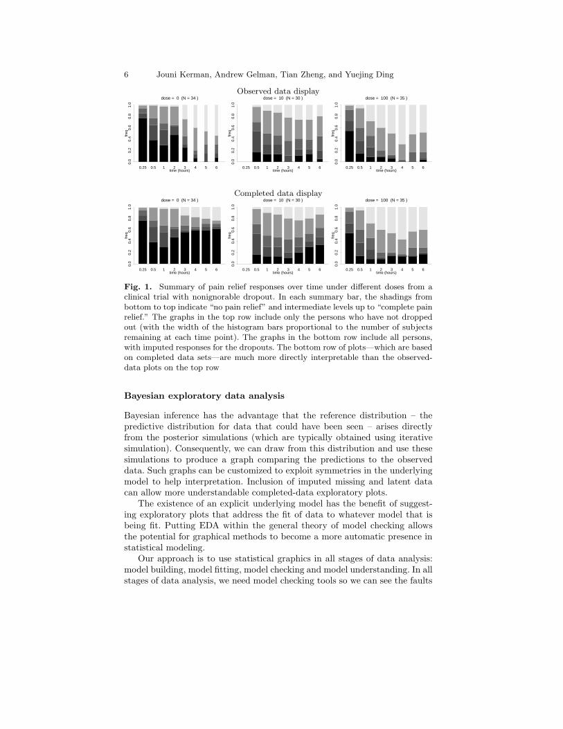
We, like other statisticians, do statistical modeling in an iterative fashion,exploring our modeling options, starting with simple models, and expand-ing the models into more complex, more realistic models, putting in as muchstructure as possible, at each stage trying to find deficiencies in our model,building new models, and iterating the process until we are satisfied. Then,we use simulation-based model checks (comparisons of observed data to repli-cations under the model); to find patterns that represent deviations from thecurrent model. Moreover, we apply the methods and ideas of EDA to struc-tures other than raw data, such as plots of parameter inferences, latent data,completed data [10]; Figure 1 illustrates this.
At a theoretical level, we look at the model, identify different sorts ofgraphical displays with different symmetries or invariancies in an explicit orimplicit reference distribution of test variables. This serves two purposes: toput some theoretical structure on graphics and EDA, so that graphical meth-ods can be interpreted in terms of implicit models and to give guidelines onhow most effectively to express a model check as a graphical procedure.
6 Jouni Kerman, Andrew Gelman, Tian Zheng, and Yuejing Ding
Observed data display
time (hours)
freq
0.0
0.2
0.4
0.6
0.8
1.0
0.25 0.5 1 2 3 4 5 6
dose = 0 (N = 34 )
time (hours)
freq
0.0
0.2
0.4
0.6
0.8
1.0
0.25 0.5 1 2 3 4 5 6
dose = 10 (N = 30 )
time (hours)
freq
0.0
0.2
0.4
0.6
0.8
1.0
0.25 0.5 1 2 3 4 5 6
dose = 100 (N = 35 )
Completed data display
time (hours)
freq
0.0
0.2
0.4
0.6
0.8
1.0
0.25 0.5 1 2 3 4 5 6
dose = 0 (N = 34 )
time (hours)
freq
0.0
0.2
0.4
0.6
0.8
1.0
0.25 0.5 1 2 3 4 5 6
dose = 10 (N = 30 )
time (hours)
freq
0.0
0.2
0.4
0.6
0.8
1.0
0.25 0.5 1 2 3 4 5 6
dose = 100 (N = 35 )
Fig. 1. Summary of pain relief responses over time under different doses from aclinical trial with nonignorable dropout. In each summary bar, the shadings frombottom to top indicate “no pain relief” and intermediate levels up to “complete painrelief.” The graphs in the top row include only the persons who have not droppedout (with the width of the histogram bars proportional to the number of subjectsremaining at each time point). The graphs in the bottom row include all persons,with imputed responses for the dropouts. The bottom row of plots—which are basedon completed data sets—are much more directly interpretable than the observed-data plots on the top row
Bayesian exploratory data analysis
Bayesian inference has the advantage that the reference distribution – thepredictive distribution for data that could have been seen – arises directlyfrom the posterior simulations (which are typically obtained using iterativesimulation). Consequently, we can draw from this distribution and use thesesimulations to produce a graph comparing the predictions to the observeddata. Such graphs can be customized to exploit symmetries in the underlyingmodel to help interpretation. Inclusion of imputed missing and latent datacan allow more understandable completed-data exploratory plots.
The existence of an explicit underlying model has the benefit of suggest-ing exploratory plots that address the fit of data to whatever model that isbeing fit. Putting EDA within the general theory of model checking allowsthe potential for graphical methods to become a more automatic presence instatistical modeling.
Our approach is to use statistical graphics in all stages of data analysis:model building, model fitting, model checking and model understanding. In allstages of data analysis, we need model checking tools so we can see the faults
Visualization in Bayesian Data Analysis 7
and shortcomings in our model. Understanding complex probability modelsoften requires complex tools. Simple test statistics and p-values just do notsuffice, so we need graphs to aid us. More often than not we need to customizethe graphs to the problem; we are not usually satisfied by looking only ata standard graph. However, new and better standard methods of graphicaldisplay should be developed.
Considering that graphs are equivalent to model checks, “exploratory”data analysis is not done only in the beginning of the modeling process; re-exploring the model is done at each stage after model fitting. Building a new,complex model may bring unforeseen problems in the fit; in anticipation ofthese, we explore the fitted model with standard and customized statisticalgraphs that are then used to attempt to falsify the model and to find waysto improve it, or to discard it completely and start all over again. It is alsostandard for our practice not to do model averaging or concentrate on thepredictor selection in regression problems; our models usually evolve to moreand more complex ones.
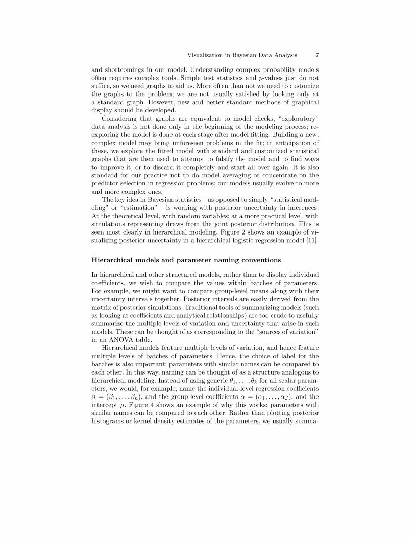
The key idea in Bayesian statistics – as opposed to simply “statistical mod-eling” or “estimation” – is working with posterior uncertainty in inferences.At the theoretical level, with random variables; at a more practical level, withsimulations representing draws from the joint posterior distribution. This isseen most clearly in hierarchical modeling. Figure 2 shows an example of vi-sualizing posterior uncertainty in a hierarchical logistic regression model [11].
Hierarchical models and parameter naming conventions
In hierarchical and other structured models, rather than to display individualcoefficients, we wish to compare the values within batches of parameters.For example, we might want to compare group-level means along with theiruncertainty intervals together. Posterior intervals are easily derived from thematrix of posterior simulations. Traditional tools of summarizing models (suchas looking at coefficients and analytical relationships) are too crude to usefullysummarize the multiple levels of variation and uncertainty that arise in suchmodels. These can be thought of as corresponding to the “sources of variation”in an ANOVA table.
Hierarchical models feature multiple levels of variation, and hence featuremultiple levels of batches of parameters. Hence, the choice of label for thebatches is also important: parameters with similar names can be compared toeach other. In this way, naming can be thought of as a structure analogous tohierarchical modeling. Instead of using generic θ1, . . . , θk for all scalar param-eters, we would, for example, name the individual-level regression coefficientsβ = (β1, . . . , βn), and the group-level coefficients α = (α1, . . . , αJ), and theintercept µ. Figure 4 shows an example of why this works: parameters withsimilar names can be compared to each other. Rather than plotting posteriorhistograms or kernel density estimates of the parameters, we usually summa-
8 Jouni Kerman, Andrew Gelman, Tian Zheng, and Yuejing Ding
−2.0 −1.0 0.00.0
0.4
0.8
Alaska
linear predictor
Pr
(sup
port
Bus
h)
−2.0 −1.0 0.00.0
0.4
0.8
Arizona
linear predictor
Pr
(sup
port
Bus
h)
−2.0 −1.0 0.00.0
0.4
0.8
Arkansas
linear predictor
Pr
(sup
port
Bus
h)
−2.0 −1.0 0.00.0
0.4
0.8
Delaware
linear predictor
Pr
(sup
port
Bus
h)
−2.0 −1.0 0.00.0
0.4
0.8
Colorado
linear predictor
Pr
(sup
port
Bus
h)
−2.0 −1.0 0.00.0
0.4
0.8
Connecticut
linear predictor
Pr
(sup
port
Bus
h)−2.0 −1.0 0.00.
00.
40.
8
California
linear predictor
Pr
(sup
port
Bus
h)
−2.0 −1.0 0.00.0
0.4
0.8
District of Columbia
linear predictor
Pr
(sup
port
Bus
h)
Fig. 2. Displaying a fitted hierarchical logistic regression model, along withinferential uncertainty. Eight states are shown from a voting preference modelPr(yi = 1) = logit−1(αj[i] + Xiβ) including all 50 U.S. states. The solid blackline is the median estimate for the probability of a survey respondent in that statesupporting George Bush for President in 1988. The gray lines represent randomdraws from the posterior distribution of the logistic regression coefficients. The dotsshown are the observed data (zeros and ones), vertically jittered to make them moredistinguishable.This figure demonstrates several principles of Bayesian visualization: (1) small mul-tiples: parallel plots displaying the hierarchical structure of the data and model;(2) graphs used to understand the fitted model; (3) fitted model and the data onthe same graph; (4) graphical display of posterior uncertainty. Also a principle ofBayesian inference is illustrated: in Alaska we have no data but nevertheless we wereable to draw predictions from the model.General principles of “good graphics” are used: common scale for all graphs withbounds at 0 and 1; clear axis labeling; jittering (which works for the moderate sam-ple sizes of this example); thin lines and small dots; ordering of the small plots bysome meaningful criterion (here by decreasing support for Republicans) rather thanalphabetically.The distribution of the linear predictor is skewed because the most important singlepredictor by far was indicator for African-American, which has expected value 0.12.The common scaling of the axes means that we do not actually need to label the exeson each graph; however, in this case we find the repeated labels to be convenient.Labeling only some graphs (as is done with Trellis plots) saves space but, to oureyes, makes the graph more of a puzzle to read, especially as presentation graphics
rize the parameters (at least, for a first look of the inferences) by plottingtheir posterior intervals.
Model checking
As stated earlier, we view statistical graphics as implicit or explicit modelchecks. Conversely, we view model checking as comparison of data to repli-
Visualization in Bayesian Data Analysis 9
cated data under the model, including both exploratory graphics and confir-matory calculations such as p-values. Our goal is not the classical goal of iden-tifying whether the model fits or not – and certainly not the goal of classifyingmodels into correct and incorrect, which is the focus of the Neyman-Pearsontheory of Type 1 and Type 2 errors. We rather seek to understand in whatways the data depart from the fitted model. From this perspective, the twokey components of an exploratory model check are (1) the graphical displayand (2) the reference distribution to which the data are compared.
The appropriate display depends on the aspects of the model beingchecked, but in general, graphs of data or functions of data and estimatedmodels (for example, residual plots) can be visually compared to correspond-ing graphs of replicated data sets. This is the fully-model-based version ofexploratory data analysis. The goal is to use graphical tools to explore as-pects of the data not captured by the fitted model.
3 Example: A Hierarchical Model of Structure in Social
Networks
As an example, we take the problem of estimating the size of social networks[20]. The model uses a negative-binomial model with an overdispersion pa-rameter:
yik ∼ Negative-binomial(mean = aibk, overdispersion = ωk),
where the groups (subpopulations) are indexed by k (k = 1, . . . ,K) and therespondents are indexed by i (i = 1, . . . , n). In this study, n = 1370 andK = 32. Each respondent is asked how many people he or she knows in eachof the K subpopulations. The subpopulations are identified by names (peoplecalled Nicole, Michael, Stephanie, etc.), and by certain characteristics (airlinepilots, people with HIV, in prison, etc.).
Without going into the details, we remark that ai is an individual-levelparameter indicating the propensity of the person i to know persons in othergroups (we call this a “gregariousness” parameter); it is modeled to be ai = eαi
where αi ∼ N(µα, σ2α); similarly, bk is a group-level prevalency (or group size)
parameter with a model bk = eβk where βk ∼ N(µβ , σ2β). The overdispersion
parameter vector ω = (ω1, . . . , ωK) and the hyperparameters are assignednoninformative (or, weakly informative) prior distributions.
The model is fit using a combination of Gibbs and Metropolis algorithms,so our inferences for the modeled parameters (a, b, ω), and the hyperparame-ters, (µα, σα, µβ , σβ), are obtained as simulated draws from their joint poste-rior distribution.
Model-informed exploratory data analysis
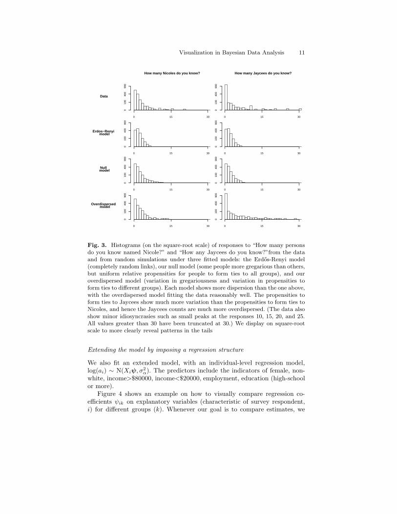
Figure 3 displays a small portion of an exploratory data analysis, with his-tograms of responses for two of the survey questions, along with simulations

10 Jouni Kerman, Andrew Gelman, Tian Zheng, and Yuejing Ding
of what could appear under three fitted models. The last of the models is theone we used; as the EDA shows, the fit is still not perfect.
A first look at the estimates
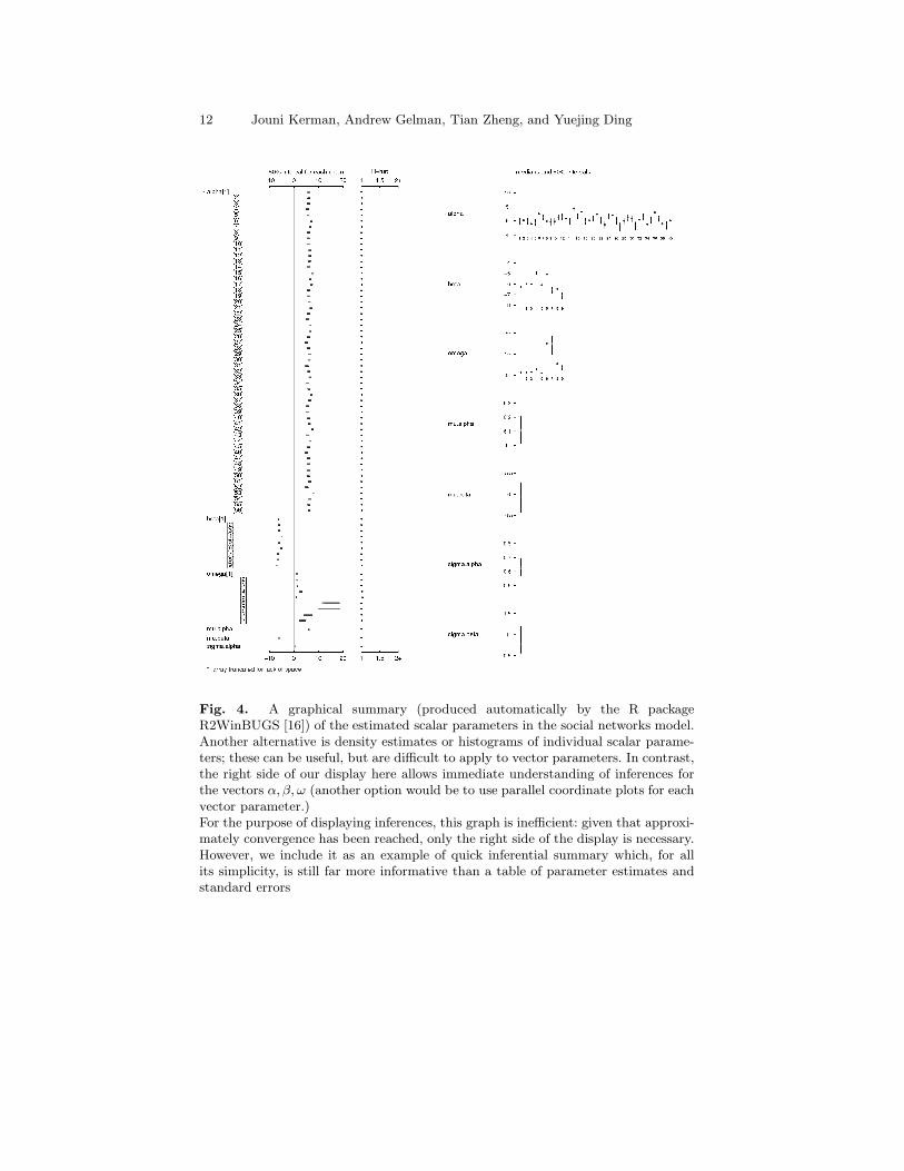
We might summarize the estimated posterior distributions of the scalar pa-rameters as histograms, but in most cases we find displaying intervals a moreconcise way to display the inferences; our goal here is not just the estimates,but also the comparison of the parameters within each batch.
We display the parameter estimates with their 50% and 95% posteriorintervals as shown in Figure 4. Along with the estimates, the graph summarizesthe convergence statistic graphically. Since there are over 1300 quantities inthe model, all of them cannot be displayed on one sheet. For smaller models,this graph provides a quick summary of the results – but of course this is justa starting point.
We are usually satisfied with the convergence of the algorithm if the valuesof the R convergence statistic [9] are below 1.1 for all scalar parameters. Avalue of R close to 1.0 implies good mixing of the chains; if however R > 1.1for some of the parameters, we let the sampler iterate more. By using a scalarsummary rather than looking at trace plots, we are able to quickly assess themixing of all the parameters in a model.
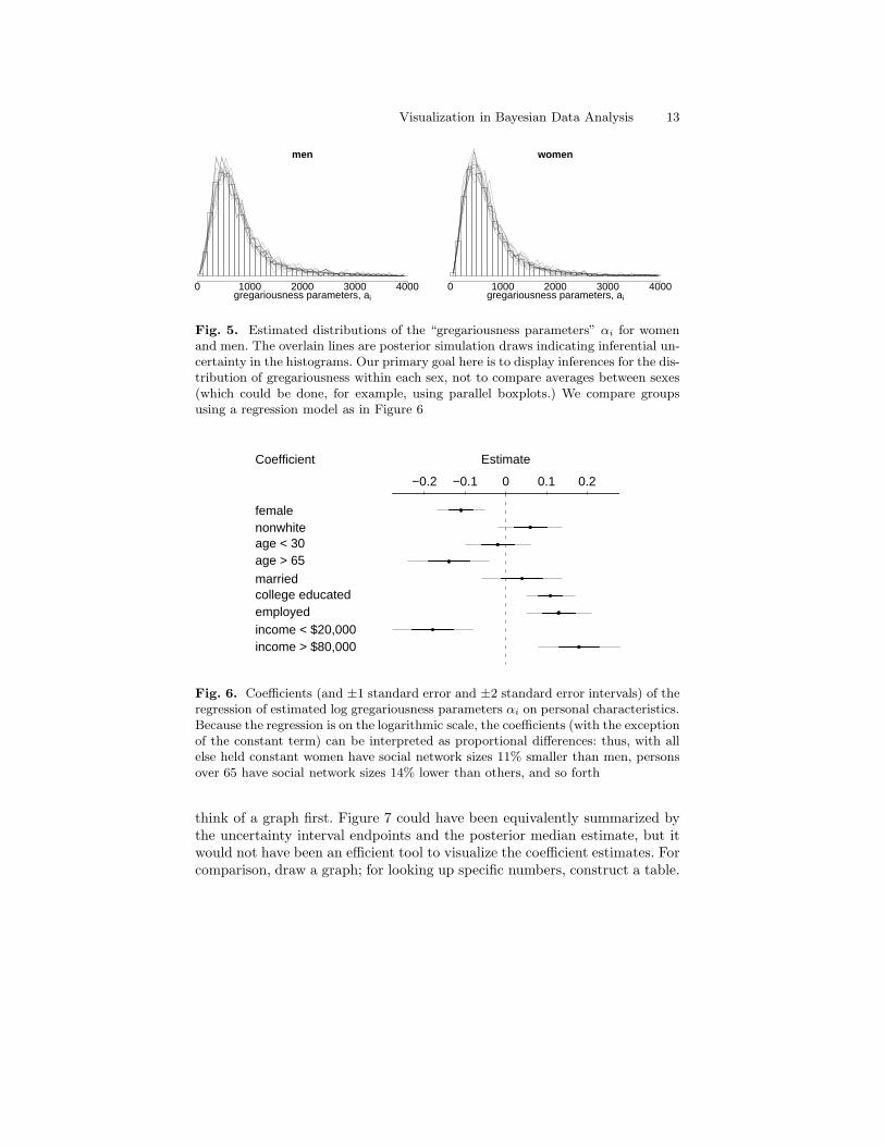
Distribution of social network sizes ai
We proceed to summarize the estimates of the 1370 parameters ai. A tableof numbers would be useless unless we want to find the numerical posteriorestimates for a certain person in the study; our goal is rather to visualize theposterior distribution of the ai, so a histogram is a much more appropriatesummary. It is interesting to see how men and women differ in their perceived“gregariousness”; we therefore display the posterior mean estimates of ai astwo separate histograms by dividing αi into men’s and women’s estimates.See Figure 5.
A histogram derived from the posterior means of hundreds of parameters isstill but a point estimate; we also want to visualize the posterior uncertainty
in the histogram. In the case of one scalar, we always draw the posteriorintervals that account for the uncertainty in estimation; in the case of a vectorthat is shown as a histogram, we similarly want to display the uncertainty inthe histogram estimate. To do this, we sample (say, twenty) vectors from thematrix of simulations and overlay the new twenty histogram estimates as lineson the average histograms. This gives us a rough idea how good an estimatethe histogram is. As a rule of thumb, we don’t plot the “theta-hats” (pointestimates), we plot the “thetas” (posterior draws representing the randomvariables) themselves.
Visualization in Bayesian Data Analysis 11
How many Nicoles do you know? How many Jaycees do you know?
Data
0 15 30
010
040
090
0
0 15 30
010
040
090
0
Erdos−Renyi model
0 15 30
010
040
090
0
0 15 30
010
040
090
0
Null model
0 15 30
010
040
090
0
0 15 30
010
040
090
0
Overdispersed model
0 15 30
010
040
090
0
0 15 30
010
040
090
0
Fig. 3. Histograms (on the square-root scale) of responses to “How many personsdo you know named Nicole?” and “How any Jaycees do you know?”from the dataand from random simulations under three fitted models: the Erdos-Renyi model(completely random links), our null model (some people more gregarious than others,but uniform relative propensities for people to form ties to all groups), and ouroverdispersed model (variation in gregariousness and variation in propensities toform ties to different groups). Each model shows more dispersion than the one above,with the overdispersed model fitting the data reasonably well. The propensities toform ties to Jaycees show much more variation than the propensities to form ties toNicoles, and hence the Jaycees counts are much more overdispersed. (The data alsoshow minor idiosyncrasies such as small peaks at the responses 10, 15, 20, and 25.All values greater than 30 have been truncated at 30.) We display on square-rootscale to more clearly reveal patterns in the tails
Extending the model by imposing a regression structure
We also fit an extended model, with an individual-level regression model,log(ai) ∼ N(Xiψ, σ
2α). The predictors include the indicators of female, non-
white, income>$80000, income<$20000, employment, education (high-schoolor more).
Figure 4 shows an example on how to visually compare regression co-efficients ψik on explanatory variables (characteristic of survey respondent,i) for different groups (k). Whenever our goal is to compare estimates, we
12 Jouni Kerman, Andrew Gelman, Tian Zheng, and Yuejing Ding
Fig. 4. A graphical summary (produced automatically by the R packageR2WinBUGS [16]) of the estimated scalar parameters in the social networks model.Another alternative is density estimates or histograms of individual scalar parame-ters; these can be useful, but are difficult to apply to vector parameters. In contrast,the right side of our display here allows immediate understanding of inferences forthe vectors α, β, ω (another option would be to use parallel coordinate plots for eachvector parameter.)For the purpose of displaying inferences, this graph is inefficient: given that approxi-mately convergence has been reached, only the right side of the display is necessary.However, we include it as an example of quick inferential summary which, for allits simplicity, is still far more informative than a table of parameter estimates andstandard errors
Visualization in Bayesian Data Analysis 13
men
gregariousness parameters, ai
0 1000 2000 3000 4000
women
gregariousness parameters, ai
0 1000 2000 3000 4000
Fig. 5. Estimated distributions of the “gregariousness parameters” αi for womenand men. The overlain lines are posterior simulation draws indicating inferential un-certainty in the histograms. Our primary goal here is to display inferences for the dis-tribution of gregariousness within each sex, not to compare averages between sexes(which could be done, for example, using parallel boxplots.) We compare groupsusing a regression model as in Figure 6
Coefficient Estimate
−0.2 −0.1 0 0.1 0.2
femalenonwhiteage < 30age > 65
marriedcollege educatedemployedincome < $20,000income > $80,000
Fig. 6. Coefficients (and ±1 standard error and ±2 standard error intervals) of theregression of estimated log gregariousness parameters αi on personal characteristics.Because the regression is on the logarithmic scale, the coefficients (with the exceptionof the constant term) can be interpreted as proportional differences: thus, with allelse held constant women have social network sizes 11% smaller than men, personsover 65 have social network sizes 14% lower than others, and so forth
think of a graph first. Figure 7 could have been equivalently summarized bythe uncertainty interval endpoints and the posterior median estimate, but itwould not have been an efficient tool to visualize the coefficient estimates. Forcomparison, draw a graph; for looking up specific numbers, construct a table.

14 Jouni Kerman, Andrew Gelman, Tian Zheng, and Yuejing Ding
Characteristics of survey respondent,i
Group,k
NicoleAnthony
Kimberly
RobertStephanie
American Indians
Widower under 65
Commercial PilotJaycees
Homeless
Male in Prison
Female
−1 −0.5 0 0.5 1
Nonwhite
−1 −0.5 0 0.5 1 1.5 2
Income >80,000
−1 −0.5 0 0.5 1 1.5
Income<20,000
−1.5 −1 −0.5 0 0.5 1 1.5
Education
−0.5 0 0.5 1
Employment
−1 −0.5 0 0.5
Fig. 7. A graph comparing the estimates from a more complex version of the socialnetworks model, using individual-level regression predictors: log(ai) ∼ N(Xiψ, σ2
α).The rows (Nicole, Anthony, etc.) refer to the groups and the columns refer to the var-ious predictors. Comparison is efficient when coefficients are rearranged into “tableof graphs” like this
Posterior predictive checks
A natural way to assess the fit of a Bayesian model is to look at how wellthe predictions from the model are consistent with the observed data [9].We do this by comparing the posterior predictive simulations with the data.In our social networks example, we create a set of predictive simulations bysampling new data independently from the negative binomial distributionsgiven the parameter vectors a, b, ω drawn from the posterior simulations
already calculated. We draw, say, L simulations, y(1)ik , . . . , y
(L)ik for each i, k.
Each set of simulations {y(ℓ)ik }L
ℓ=1 is an approximation of the marginal posteriordistribution of yik, denoted by y
repik , where “rep” stands for the “replication
distribution”; yrep stands for the n×K replicated observation matrix.It is possible to find a numerical summary (that is, a test statistic) for
some feature of the data (such as standard deviation, mean, etc.) and thencompare it to the corresponding summary of yrep but in addition we prefer todraw graphical test statistics since a few single numbers rarely can catch thecomplexity of the data. In general notation, for some suitable test function T ,which may thus be a graph, we compare T (y) with T (yrep).
Plots of data compared with replicated data
For the social networks model, we choose to compare the data and the predic-tions by plotting the observed versus expected proportions of responses yik.For each subpopulation k, we compute the proportion of the 1370 respondentsfor which yik equals 0, 1, 3, 5, 9, 10, and finally those with yik ≥ 13. These

Visualization in Bayesian Data Analysis 15
Pr(y=0) Pr(y=1) Pr(y=3) Pr(y=5) Pr(y=9) Pr(y=10) Pr(y>=13)
Censored at 1
0.0 0.4 0.8
0.0
0.4
0.8
simulated
data
0.00 0.15 0.30
0.00
0.15
0.30
simulated
data
0.00 0.10
0.00
0.10
simulated
data
0.00 0.04 0.08
0.00
0.04
0.08
simulated
data
0.000 0.015 0.030
0.00
00.
015
0.03
0
simulated
data
0.00 0.03 0.06
0.00
0.03
0.06
simulated
data
0.00 0.10 0.20
0.00
0.10
0.20
simulated
data
Censored at 3
0.0 0.4 0.8
0.0
0.4
0.8
simulated
data
0.00 0.15 0.30
0.00
0.15
0.30
simulated
data
0.00 0.10
0.00
0.10
simulated
data
0.00 0.04 0.08
0.00
0.04
0.08
simulated
data
0.000 0.015
0.00
00.
015
simulated
data
0.00 0.03 0.06
0.00
0.03
0.06
simulated
data
0.00 0.02 0.04
0.00
0.02
0.04
simulated
data
Censored at 5
0.0 0.4 0.8
0.0
0.4
0.8
simulated
data
0.00 0.15 0.30
0.00
0.15
0.30
simulated
data
0.00 0.10
0.00
0.10
simulated
data
0.00 0.04 0.08
0.00
0.04
0.08
simulated
data
0.000 0.015
0.00
00.
015
simulated
data
0.00 0.03 0.06
0.00
0.03
0.06
simulated
data
0.00 0.02 0.04
0.00
0.02
0.04
simulated
data
No censoring
0.0 0.4 0.8
0.0
0.4
0.8
simulated
data
0.00 0.15 0.30
0.00
0.15
0.30
simulated
data
0.00 0.10
0.00
0.10
simulated
data
0.00 0.04 0.08
0.00
0.04
0.08
simulated
data
0.000 0.015 0.030
0.00
00.
015
0.03
0
simulated
data
0.00 0.03 0.06
0.00
0.03
0.06
simulated
data
0.00 0.02 0.04 0.06
0.00
0.02
0.04
0.06
simulated
data
Fig. 8. Model checking graphs: observed vs. expected proportions of responses yik
of 0, 1, 3, 5, 9, 10, and ≥ 13. Each row of plots compares actual data to the estimatefrom one of four fitted models. The bottom row shows our main model, and thetop three rows show models fit censoring the data at 1, 3, and 5. In each plot, eachdot represents a subpopulation, with names in gray, non-names in black, and 95%posterior intervals indicated by horizontal lines
values are then compared to posterior predictive simulations under the model.Naturally, we plot the uncertainty intervals of Prk(yik = m) instead of theirpoint estimates.
The bottom row of Figure 8 shows the plots. On the whole, the model fitsthe aggregate counts fairly well, but tends to under-predict the proportion ofrespondents who know exactly one person in a category. In addition, the dataand predicted values for y = 9 and y = 10 show the artifact that people aremore likely to answer with round numbers.
The three first rows of Figure 8 shows the plots for three alternative models[20]. This plot illustrates one of our main principles: whenever we need tocompare a series of graphs, we plot them side by side on the same page sovisual comparison is efficient [1, 17]. There is no advantage in scattering closelyrelated graphs over several pages.
4 Challenges of Graphical Display of Bayesian Inferences
We expect that the quality of statistical analyses would benefit greatly ifgraphs were more routinely used as part of the data analysis. Exploratorydata analysis would be more effective if it could be implemented as a part

16 Jouni Kerman, Andrew Gelman, Tian Zheng, and Yuejing Ding
of software for complex modeling. To some extent this is done with residualplots in regression models, but for complex models there is potential for muchmore progress.
As discussed in detail in [8], we anticipate four challenges: (1) Integratingthe automatic generation of replication distributions into the computing en-vironment; (2) Choosing the replication distribution – it is not an automatictask since the task requires selecting which parameters to resample and whichto keep constant; (3) Choosing the test variables; (4) Displaying test variablesas graphs. In the near future, automatic features for simulating replicationdistributions and performing standard model checks should be possible.
Integrating graphics and Bayesian modeling
We fit Bayesian models routinely with such software as BUGS [2], bringing thesimulations over to R [14] using R2WinBUGS [16]. Summarizing simulationsin R can also be done in a more natural way by converting the simulationmatrices into vectors of random variable objects [13]. BUGS has also its lim-itations; we also fit complex models in R using the “Universal Markov chainsampler” Umacs [12].
We are currently investigating how to define an integrated Bayesian com-puting environment where modeling, fitting, and automatic generation ofreplications for model checking is possible. It requires further effort to de-velop standardized graphical displays for Bayesian model checking and under-standing. An integrated computing environment is nevertheless the necessarystarting point, since functions that generate such complex graphical displaysshould have full access to the models, the data, and predictions.
The environment must also take into account the fact that we fit multiplemodels with possibly different sets of observations; without a system that candistinguish multiple models (and the inferences associated with them) it isnot possible to do comparison across them.
5 Summary
Exploratory data analysis and modeling can work well together: in our appliedresearch, graphs are used for model understanding and model checking. In theinitial phase we create plots to reveal to us how the models work, and thenplot data as compared to the model to see where more work is needed.
We gain insight to the shortcomings of the model by doing graphical modelchecks. Graphs are most often drawn for comparison to an implicit referencedistributions (e.g., Poisson model for rootograms, independence-with-mean-zero for residual plots, or normality for quantile-quantile plots), but we wouldalso include more general comparisons; for example, a time series plot is im-plicitly compared to a constant line. In Bayesian data analysis, the reference

Visualization in Bayesian Data Analysis 17
distribution can be formally obtained by computing the replication distribu-tion of the observables; the observed quantities can be plotted against drawsfrom the replication distribution to compare the fit of the model.
We aim to make graphical displays an integrated and an automatic part ofour data analysis. Standardized graphical tests must be developed and theseshould be routinely generated by the modeling and model-fitting environment.
6 Acknowledgements
We thank Matt Salganik for collaboration with the social networks project,and the National Science Foundation for financial support.
References
1. J. Bertin. Semiology of Graphics. University of Wisconsin Press, 1967/1983.Translation by W. J. Berg.
2. BUGS Project. BUGS: Bayesian Inference Using Gibbs Sampling.http://www.mrc-bsu.cam.ac.uk/bugs/, 2004.
3. A. Buja, D. Asimov, C. Hurley, and J. A. McDonald. Elements of a viewingpipeline for data analysis. In W. S. Cleveland and M. E. McGill, editors, Dy-
namic Graphics for Statistics, pages 277–308, Belmont, CA, 1988. Wadsworth.4. A. Buja and D. Cook. Inference for data visualization.
Talk given at Joint Statistical Meetings 1999. Available athttp://www-stat.wharton.upenn.edu/~buja/PAPERS/jsm99.ps.gz, 1999.
5. A. Buja, D. Cook, and D. F. Swayne. Interactive high-dimensional data visual-ization. Journal of Computational and Graphical Statistics, 5:78–99, 1996.
6. R. R. Bush and F. Mosteller. Stochastic Models for Learning. Wiley, New York,1955.
7. A. Gelman. A Bayesian formulation of exploratory data analysis and goodness-of-fit testing. International Statistical Review, 71:369–382, 2003.
8. A. Gelman. Exploratory data analysis for complex models (with discussion).Journal of Computational and Graphical Statistics, 13:755–779, 2004.
9. A. Gelman, J. B. Carlin, H. S. Stern, and D. B. Rubin. Bayesian Data Analysis.Chapman & Hall/CRC, London, 2nd edition, 2003.
10. A. Gelman, I. V. Mechelen, G. Verbeke, D. F. Heitjan, and M. Meulders. Mul-tiple imputation for model checking: Completed-data plots with missing andlatent data. Biometrics, 61:74–85, 2005.
11. A. Gelman, B. Shor, J. Bafumi, and D. Park. Rich state, poor state, red state,blue state: What’s the matter with Connecticut? Technical report, ColumbiaUniversity, Department of Political Science, New York, 2005.
12. J. Kerman. Umacs: A Universal Markov Chain Sampler. Technical report,Department of Statistics, Columbia University, 2006.
13. J. Kerman and A. Gelman. Manipulating and summarizing posterior simula-tions using random variable objects. Technical report, Department of Statistics,Columbia University, 2005.

18 Jouni Kerman, Andrew Gelman, Tian Zheng, and Yuejing Ding
14. R Development Core Team. R: A language and environment for statistical
computing. R Foundation for Statistical Computing, Vienna, Austria, 2004.15. B. D. Ripley. Statistical Inference for Spatial Processes. Cambridge University
Press, New York, 1988.16. S. Sturtz, U. Ligges, and A. Gelman. R2WinBUGS: A package for running
WinBUGS from R. Journal of Statistical Software, 12(3):1–16, 2005.17. E. R. Tufte. Envisioning Information. Graphics Press., Cheshire, Conn., 1990.18. J. W. Tukey. Some graphic and semigraphic displays. In T. A. Bancroft, editor,
Statistical Papers in Honor of George W. Snedecor, Ames, IA, 1972. Iowa StateUniversity Press.
19. L. Wilkinson. The Grammar of Graphics. Springer, New York, 2nd edition,2005.
20. T. Zheng, M. J. Salganik, and A. Gelman. How many people do you knowin prison?: Using overdispersion in count data to estimate social structure innetworks. Journal of the American Statistical Association, 2006. To appear.