Embed Size (px)
Citation preview
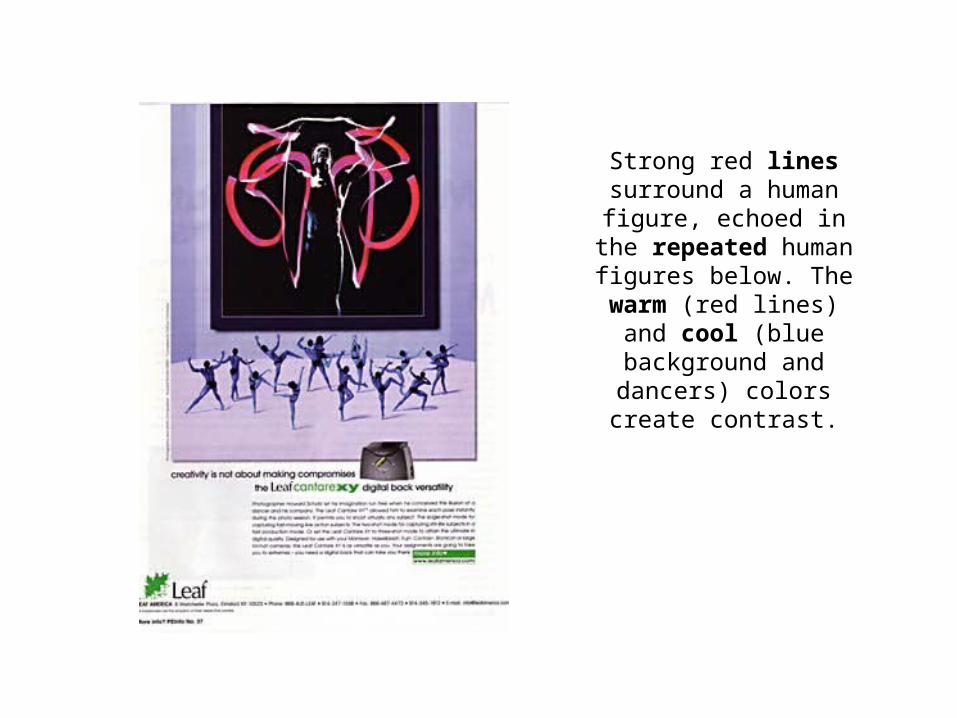
Strong red lines surround a human
figure, echoed in the repeated human figures below. The warm (red lines) and cool (blue
background and dancers) colors create
contrast.
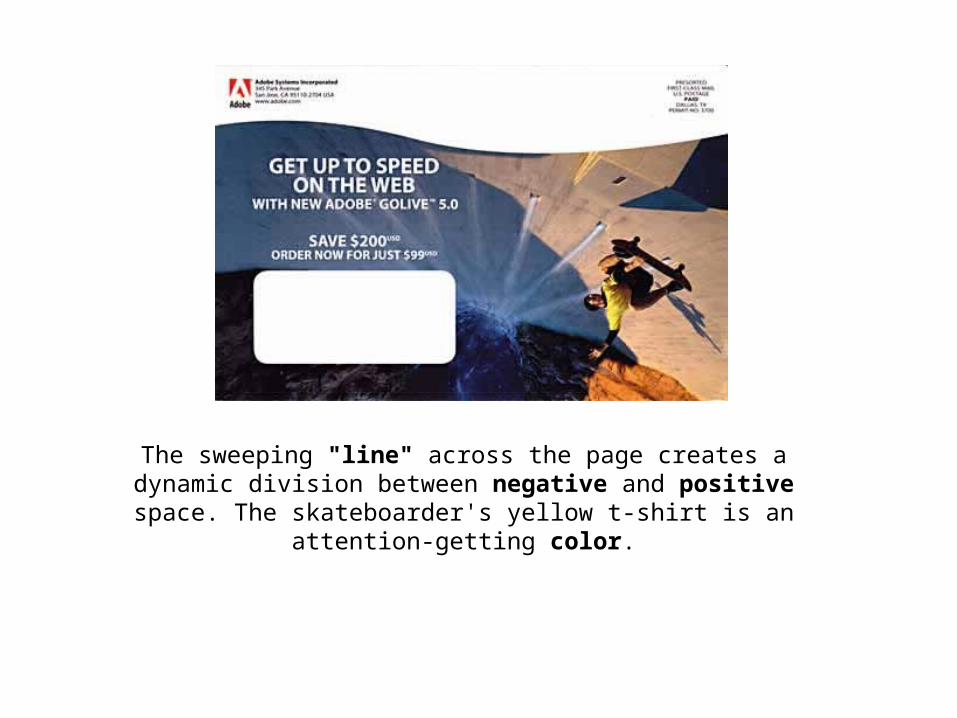
The sweeping "line" across the page creates a dynamic division between negative and positive space. The
skateboarder's yellow t-shirt is an attention-getting color.
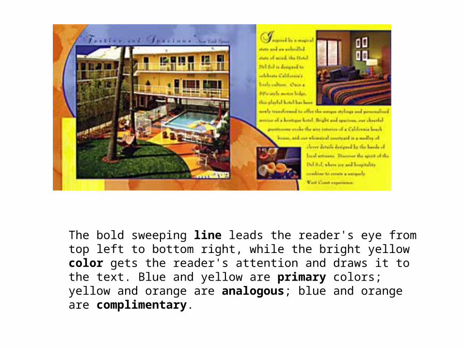
The bold sweeping line leads the reader's eye from top left to bottom right, while the bright yellow color gets the reader's attention and draws it to the text. Blue and yellow are primary colors; yellow and orange are analogous; blue and orange are complimentary.
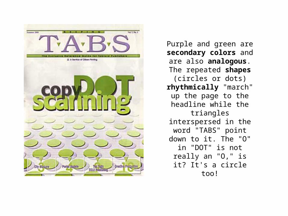
Purple and green are secondary colors and are
also analogous. The repeated shapes (circles or dots) rhythmically "march" up the page to the headline
while the triangles interspersed in the word "TABS" point down to it. The "O" in "DOT" is not really an "O," is it? It's a
circle too!
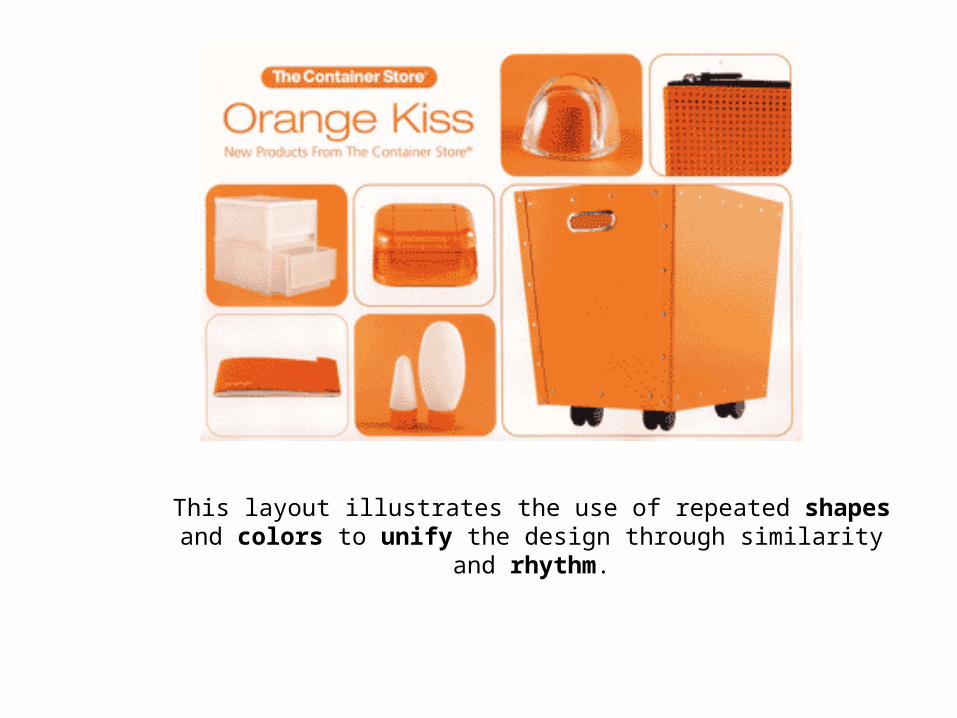
This layout illustrates the use of repeated shapes and colors to unify the design through similarity and rhythm.
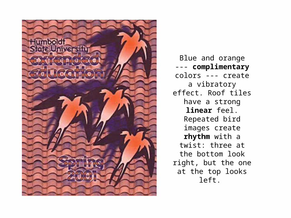
Blue and orange --- complimentary colors --- create a vibratory
effect. Roof tiles have a strong linear feel.
Repeated bird images create rhythm with a
twist: three at the bottom look right, but the one at
the top looks left.
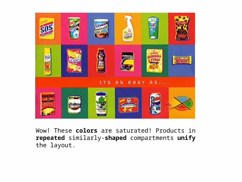
Wow! These colors are saturated! Products in repeated similarly-shaped compartments unify the layout.
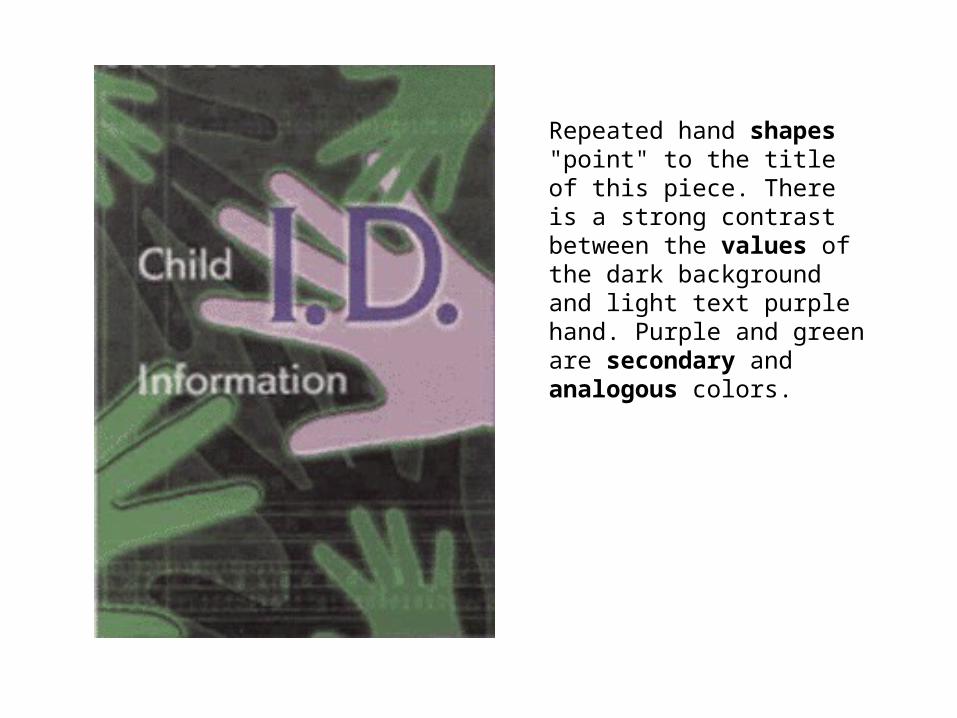
Repeated hand shapes "point" to the title of this piece. There is a strong contrast between the values of the dark background and light text purple hand. Purple and green are secondary and analogous colors.
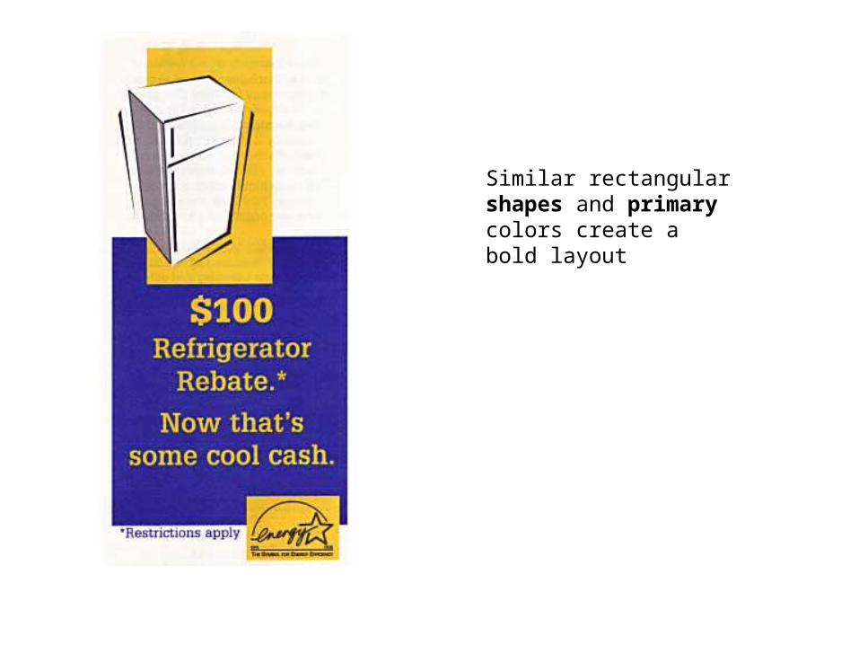
Similar rectangular shapes and primary colors create a bold layout
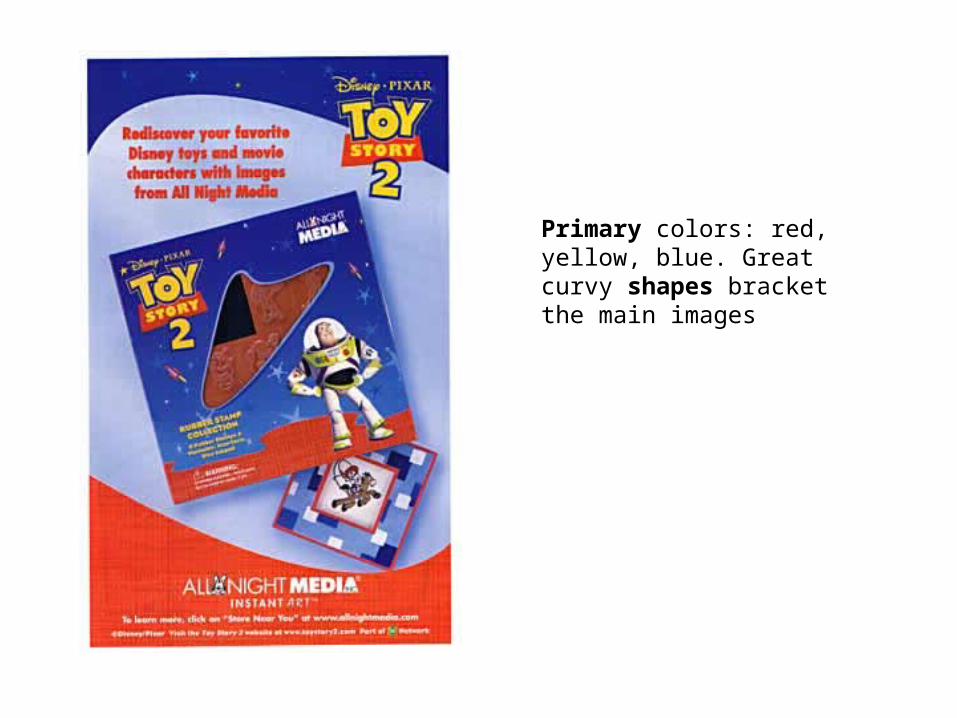
Primary colors: red, yellow, blue. Great curvy shapes bracket the main images
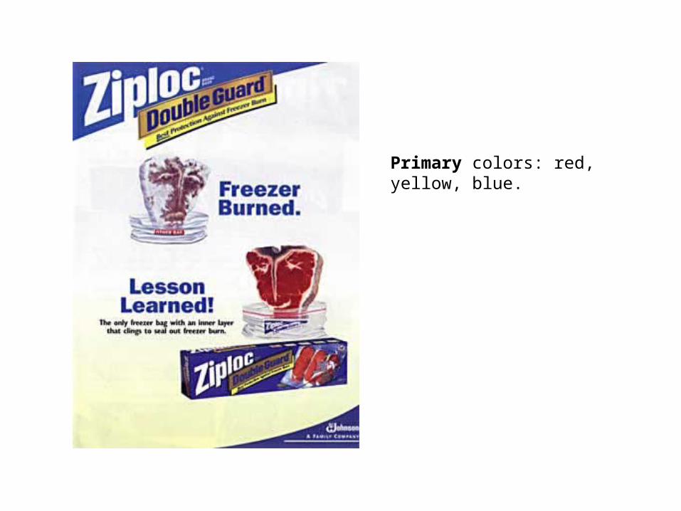
Primary colors: red, yellow, blue.
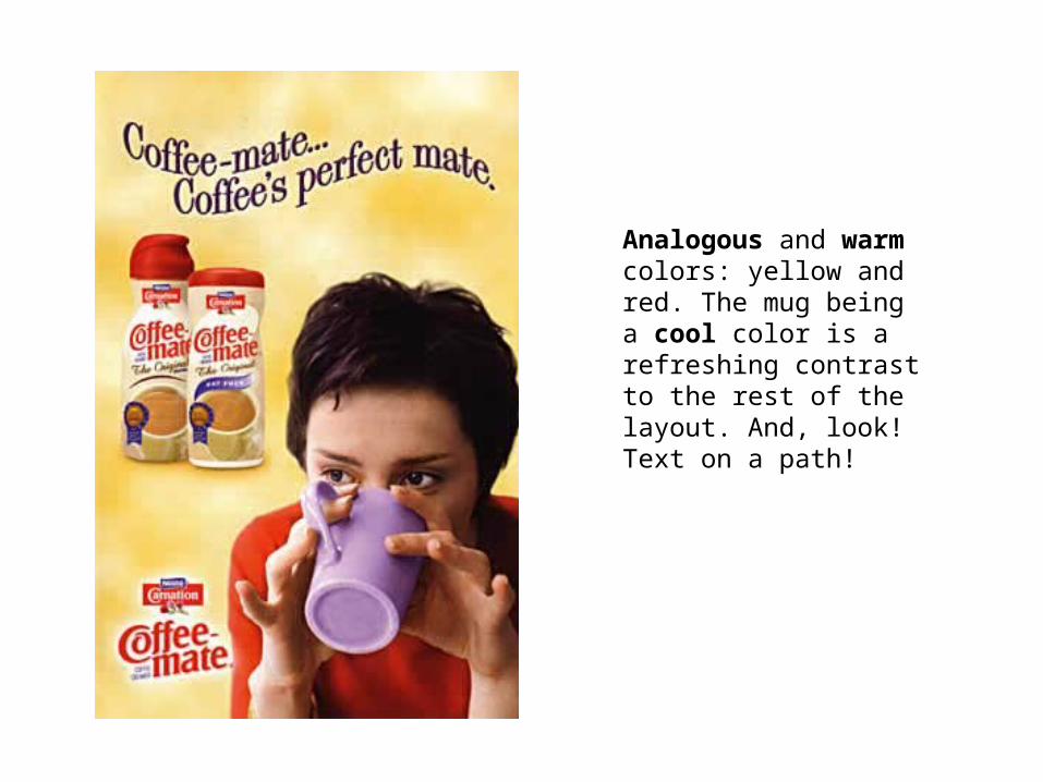
Analogous and warm colors: yellow and red. The mug being a cool color is a refreshing contrast to the rest of the layout. And, look! Text on a path!
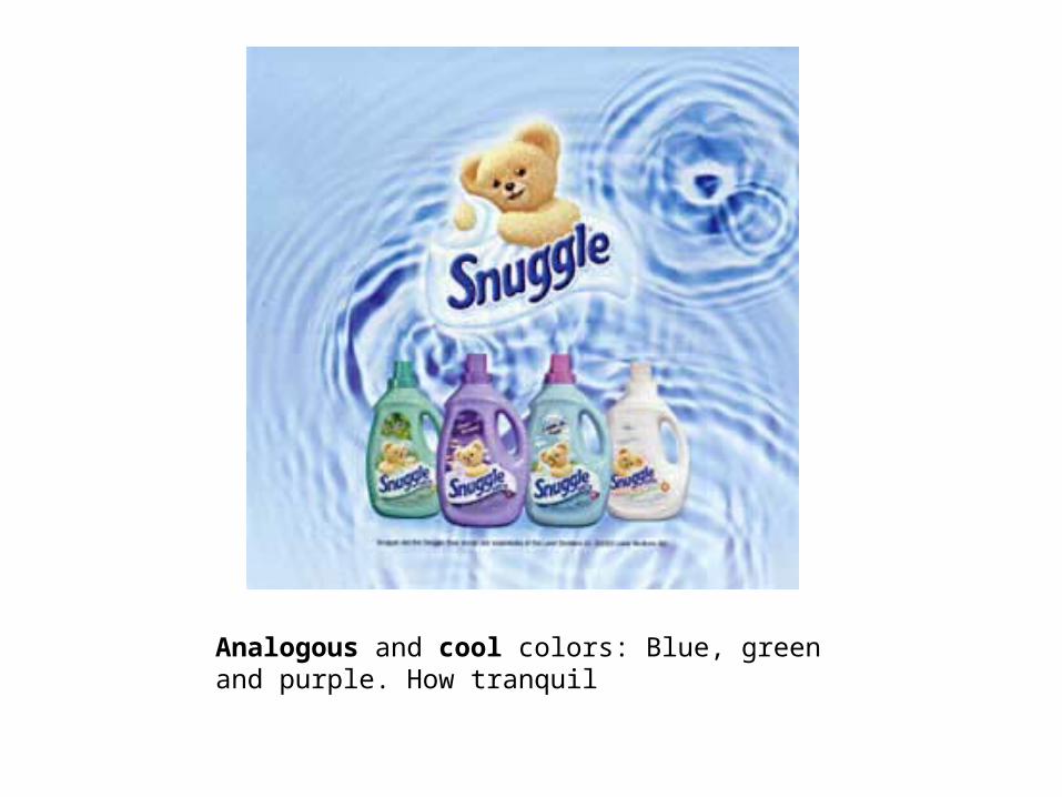
Analogous and cool colors: Blue, green and purple. How tranquil
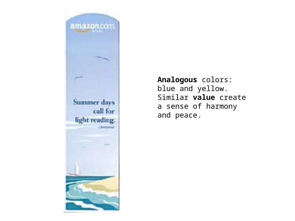
Analogous colors: blue and yellow. Similar value create a sense of harmony and peace.
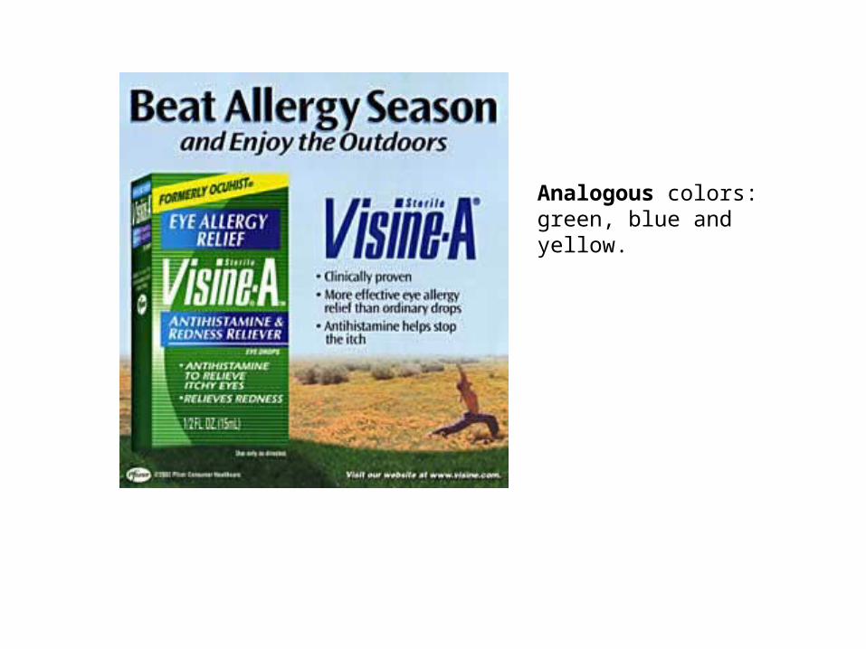
Analogous colors: green, blue and yellow.
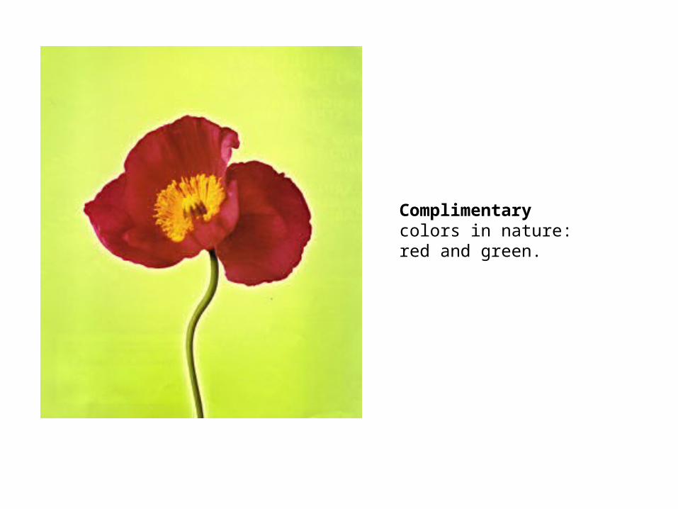
Complimentary colors in nature: red and green.
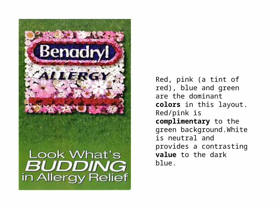
Red, pink (a tint of red), blue and green are the dominant colors in this layout. Red/pink is complimentary to the green background.White is neutral and provides a contrasting value to the dark blue.
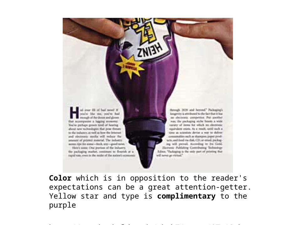
Color which is in opposition to the reader's expectations can be a great attention-getter. Yellow star and type is complimentary to the purple
http://www.humboldt.edu/~hmh7/notes/07_19.html
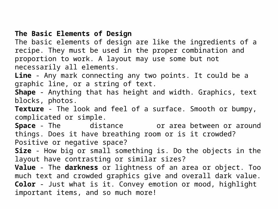
The Basic Elements of DesignThe basic elements of design are like the ingredients of a recipe. They must be used in the proper combination and proportion to work. A layout may use some but not necessarily all elements.Line - Any mark connecting any two points. It could be a graphic line, or a string of text.Shape - Anything that has height and width. Graphics, text blocks, photos.Texture - The look and feel of a surface. Smooth or bumpy, complicated or simple.Space - The distance or area between or around things. Does it have breathing room or is it crowded? Positive or negative space?Size - How big or small something is. Do the objects in the layout have contrasting or similar sizes?Value - The darkness or lightness of an area or object. Too much text and crowded graphics give and overall dark value.Color - Just what is it. Convey emotion or mood, highlight important items, and so much more!
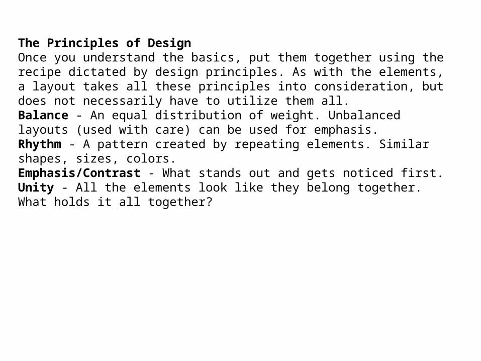
The Principles of DesignOnce you understand the basics, put them together using the recipe dictated by design principles. As with the elements, a layout takes all these principles into consideration, but does not necessarily have to utilize them all.Balance - An equal distribution of weight. Unbalanced layouts (used with care) can be used for emphasis.Rhythm - A pattern created by repeating elements. Similar shapes, sizes, colors.Emphasis/Contrast - What stands out and gets noticed first.Unity - All the elements look like they belong together. What holds it all together?