Embed Size (px)
Citation preview
Strategies for Crowdsourcing Social Data AnalysisWesley Willett?, Jeffrey Heer†, Maneesh Agrawala?
?Computer Science Division, University of California, Berkeley{willettw, maneesh}@cs.berkeley.edu
†Computer Science Department, Stanford [email protected]
ABSTRACTWeb-based social data analysis tools that rely on public dis-cussion to produce hypotheses or explanations of patternsand trends in data rarely yield high-quality results in prac-tice. Crowdsourcing offers an alternative approach in whichan analyst pays workers to generate such explanations. Yet,asking workers with varying skills, backgrounds and moti-vations to simply “Explain why a chart is interesting” canresult in irrelevant, unclear or speculative explanations ofvariable quality. To address these problems, we contributeseven strategies for improving the quality and diversity ofworker-generated explanations. Our experiments show thatusing (S1) feature-oriented prompts, providing (S2) good ex-amples, and including (S3) reference gathering, (S4) chartreading, and (S5) annotation subtasks increases the qualityof responses by 28% for US workers and 196% for non-US workers. Feature-oriented prompts improve explanationquality by 69% to 236% depending on the prompt. We alsoshow that (S6) pre-annotating charts can focus workers’ at-tention on relevant details, and demonstrate that (S7) gener-ating explanations iteratively increases explanation diversitywithout increasing worker attrition. We used our techniquesto generate 910 explanations for 16 datasets, and found that63% were of high quality. These results demonstrate thatpaid crowd workers can reliably generate diverse, high-qual-ity explanations that support the analysis of specific datasets.
Author KeywordsInformation Visualization; Social Data Analysis; Crowdsourcing
ACM Classification KeywordsH.5.3 Group & Organization Interfaces: Collaborative computing.
INTRODUCTIONMaking sense of large datasets is fundamentally a humanprocess. While automated data mining tools can find recur-ring patterns, outliers and other anomalies in data, only peo-ple can currently provide the explanations, hypotheses, andinsights necessary to make sense of the data [22, 24]. Socialdata analysis tools such as Sense.us [8], Pathfinder [18] andMany Eyes [30] address this problem by allowing groups ofweb-based volunteers to collaboratively explore visualiza-tions, propose hypotheses, and seek out new insights. Con-trolled experiments have shown that groups can use thesetools to discover new, unexpected findings [8, 29]. However,
To appear at CHI 2012.
eliciting high-quality explanations of the data requires seed-ing the discussion with prompts, examples,and other startingpoints to encourage contributions [8, 32].
Outside the lab, in real-world web-based deployments, thevast majority of the visualizations in these social data anal-ysis tools yield very little discussion. Even fewer visualiza-tions elicit high-quality analytical explanations that are clear,plausible, and relevant to a particular analysis question.
We recently surveyed the Many Eyes website and found thatfrom 2006 to 2010, users published 162,282 datasets butgenerated only 77,984 visualizations and left just 15,464 com-ments. We then randomly sampled 100 of the visualizationscontaining comments and found that just 11% of the com-ments included a plausible hypothesis or explanation for thedata in the chart. The low level of commenting may repre-sent a shortage of viewers or may be due to lurking – a com-mon web phenomenon in which visitors explore and readdiscussions, but do not contribute to them [31, 20]. Whencomments do appear, they are often superficial or descrip-tive rather than explanatory (Figures 2a, 2b). Higher-qualityanalyses sometimes take place off-site [5] but tend to occuraround limited (often single-image) views of the data cu-rated by a single author. Ultimately, marshaling the analyticpotential of crowds calls for a more systematic approach tosocial data analysis; one that explicitly encourages users togenerate good hypotheses and explanations.
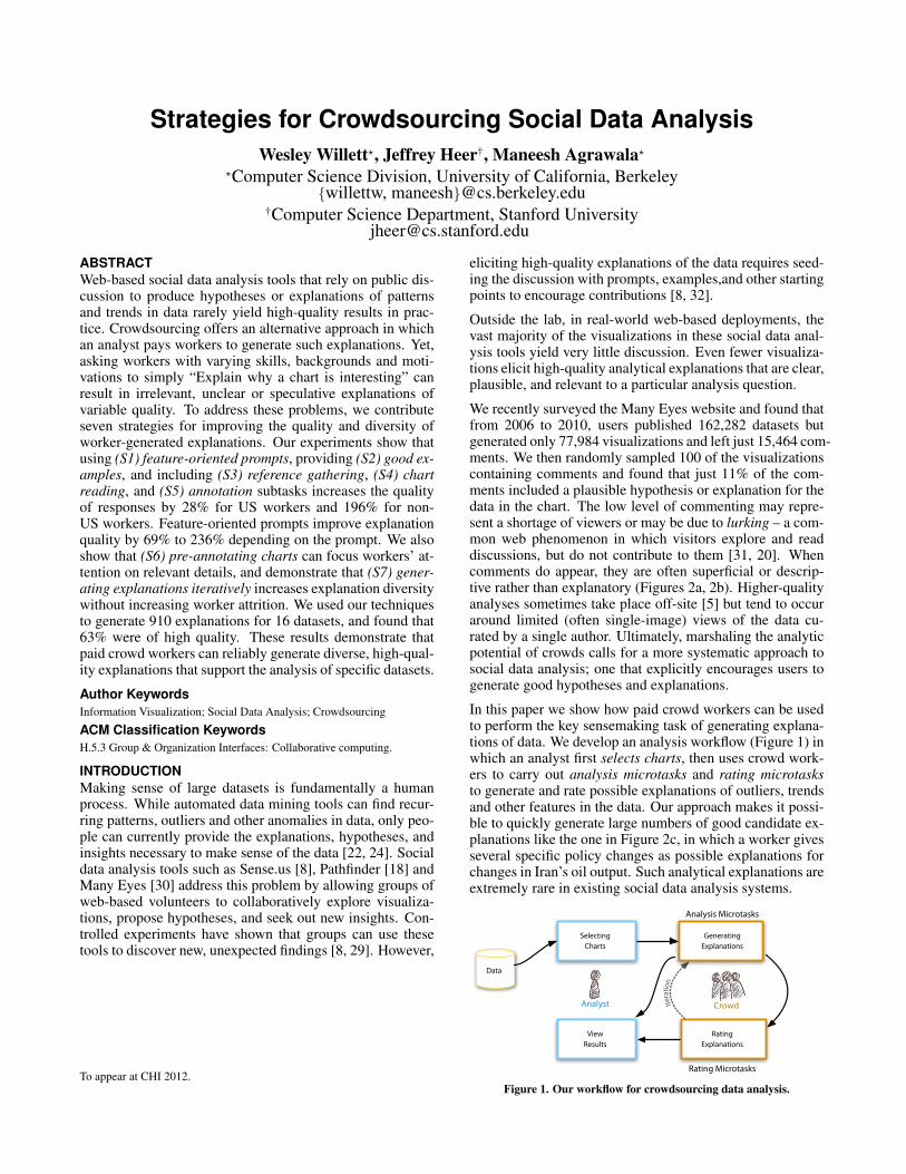
In this paper we show how paid crowd workers can be usedto perform the key sensemaking task of generating explana-tions of data. We develop an analysis workflow (Figure 1) inwhich an analyst first selects charts, then uses crowd work-ers to carry out analysis microtasks and rating microtasksto generate and rate possible explanations of outliers, trendsand other features in the data. Our approach makes it possi-ble to quickly generate large numbers of good candidate ex-planations like the one in Figure 2c, in which a worker givesseveral specific policy changes as possible explanations forchanges in Iran’s oil output. Such analytical explanations areextremely rare in existing social data analysis systems.
Iteratio
n
Data
ViewResults
RatingExplanations
SelectingCharts
GeneratingExplanations
Analyst Crowd
Analysis Microtasks
Rating Microtasks
Figure 1. Our workflow for crowdsourcing data analysis.
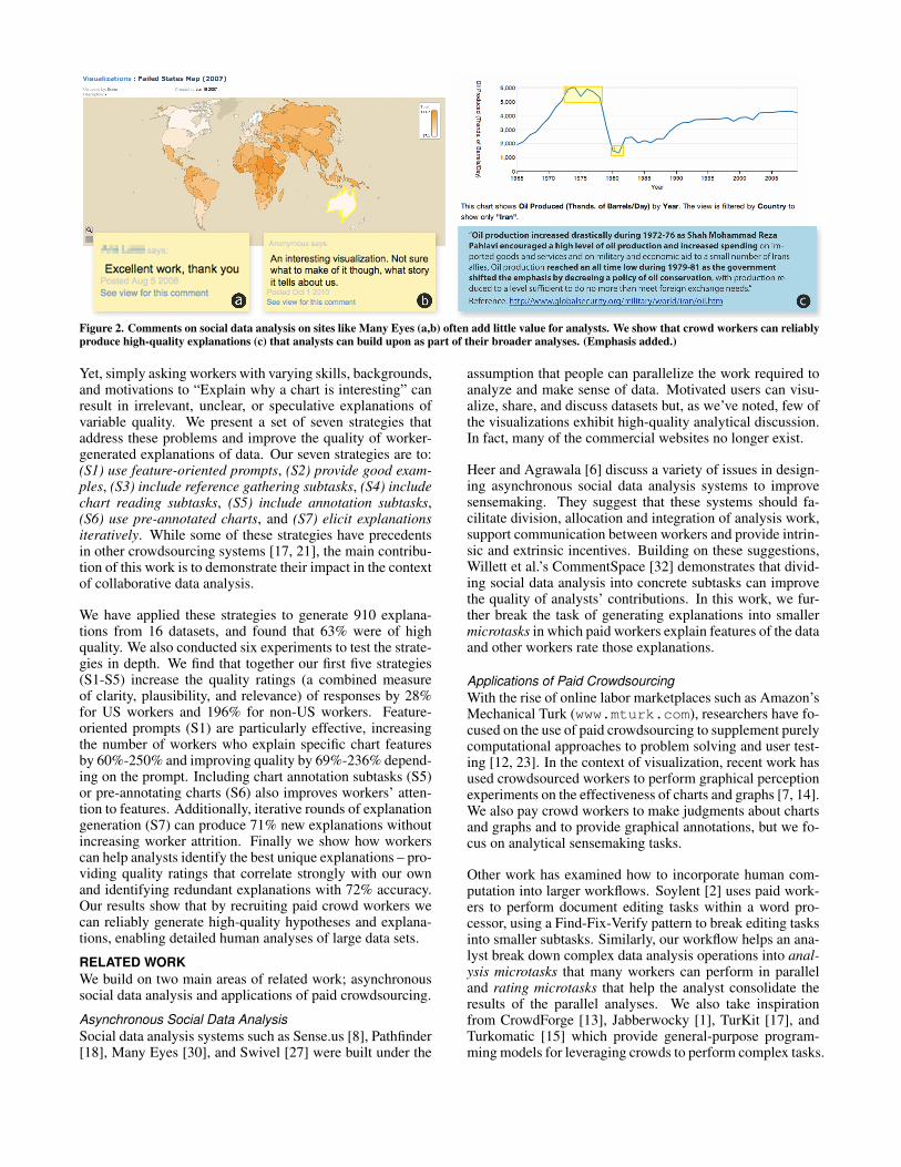
Figure 2. Comments on social data analysis on sites like Many Eyes (a,b) often add little value for analysts. We show that crowd workers can reliablyproduce high-quality explanations (c) that analysts can build upon as part of their broader analyses. (Emphasis added.)
Yet, simply asking workers with varying skills, backgrounds,and motivations to “Explain why a chart is interesting” canresult in irrelevant, unclear, or speculative explanations ofvariable quality. We present a set of seven strategies thataddress these problems and improve the quality of worker-generated explanations of data. Our seven strategies are to:(S1) use feature-oriented prompts, (S2) provide good exam-ples, (S3) include reference gathering subtasks, (S4) includechart reading subtasks, (S5) include annotation subtasks,(S6) use pre-annotated charts, and (S7) elicit explanationsiteratively. While some of these strategies have precedentsin other crowdsourcing systems [17, 21], the main contribu-tion of this work is to demonstrate their impact in the contextof collaborative data analysis.
We have applied these strategies to generate 910 explana-tions from 16 datasets, and found that 63% were of highquality. We also conducted six experiments to test the strate-gies in depth. We find that together our first five strategies(S1-S5) increase the quality ratings (a combined measureof clarity, plausibility, and relevance) of responses by 28%for US workers and 196% for non-US workers. Feature-oriented prompts (S1) are particularly effective, increasingthe number of workers who explain specific chart featuresby 60%-250% and improving quality by 69%-236% depend-ing on the prompt. Including chart annotation subtasks (S5)or pre-annotating charts (S6) also improves workers’ atten-tion to features. Additionally, iterative rounds of explanationgeneration (S7) can produce 71% new explanations withoutincreasing worker attrition. Finally we show how workerscan help analysts identify the best unique explanations – pro-viding quality ratings that correlate strongly with our ownand identifying redundant explanations with 72% accuracy.Our results show that by recruiting paid crowd workers wecan reliably generate high-quality hypotheses and explana-tions, enabling detailed human analyses of large data sets.
RELATED WORKWe build on two main areas of related work; asynchronoussocial data analysis and applications of paid crowdsourcing.
Asynchronous Social Data AnalysisSocial data analysis systems such as Sense.us [8], Pathfinder[18], Many Eyes [30], and Swivel [27] were built under the
assumption that people can parallelize the work required toanalyze and make sense of data. Motivated users can visu-alize, share, and discuss datasets but, as we’ve noted, few ofthe visualizations exhibit high-quality analytical discussion.In fact, many of the commercial websites no longer exist.
Heer and Agrawala [6] discuss a variety of issues in design-ing asynchronous social data analysis systems to improvesensemaking. They suggest that these systems should fa-cilitate division, allocation and integration of analysis work,support communication between workers and provide intrin-sic and extrinsic incentives. Building on these suggestions,Willett et al.’s CommentSpace [32] demonstrates that divid-ing social data analysis into concrete subtasks can improvethe quality of analysts’ contributions. In this work, we fur-ther break the task of generating explanations into smallermicrotasks in which paid workers explain features of the dataand other workers rate those explanations.
Applications of Paid CrowdsourcingWith the rise of online labor marketplaces such as Amazon’sMechanical Turk (www.mturk.com), researchers have fo-cused on the use of paid crowdsourcing to supplement purelycomputational approaches to problem solving and user test-ing [12, 23]. In the context of visualization, recent work hasused crowdsourced workers to perform graphical perceptionexperiments on the effectiveness of charts and graphs [7, 14].We also pay crowd workers to make judgments about chartsand graphs and to provide graphical annotations, but we fo-cus on analytical sensemaking tasks.
Other work has examined how to incorporate human com-putation into larger workflows. Soylent [2] uses paid work-ers to perform document editing tasks within a word pro-cessor, using a Find-Fix-Verify pattern to break editing tasksinto smaller subtasks. Similarly, our workflow helps an ana-lyst break down complex data analysis operations into anal-ysis microtasks that many workers can perform in paralleland rating microtasks that help the analyst consolidate theresults of the parallel analyses. We also take inspirationfrom CrowdForge [13], Jabberwocky [1], TurKit [17], andTurkomatic [15] which provide general-purpose program-ming models for leveraging crowds to perform complex tasks.
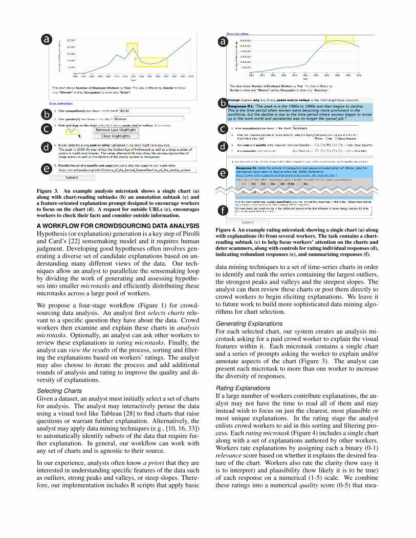
Figure 3. An example analysis microtask shows a single chart (a)along with chart-reading subtasks (b) an annotation subtask (c) anda feature-oriented explanation prompt designed to encourage workersto focus on the chart (d). A request for outside URLs (e), encouragesworkers to check their facts and consider outside information.
A WORKFLOW FOR CROWDSOURCING DATA ANALYSISHypothesis (or explanation) generation is a key step of Pirolliand Card’s [22] sensemaking model and it requires humanjudgment. Developing good hypotheses often involves gen-erating a diverse set of candidate explanations based on un-derstanding many different views of the data. Our tech-niques allow an analyst to parallelize the sensemaking loopby dividing the work of generating and assessing hypothe-ses into smaller microtasks and efficiently distributing thesemicrotasks across a large pool of workers.
We propose a four-stage workflow (Figure 1) for crowd-sourcing data analysis. An analyst first selects charts rele-vant to a specific question they have about the data. Crowdworkers then examine and explain these charts in analysismicrotasks. Optionally, an analyst can ask other workers toreview these explanations in rating microtasks. Finally, theanalyst can view the results of the process, sorting and filter-ing the explanations based on workers’ ratings. The analystmay also choose to iterate the process and add additionalrounds of analysis and rating to improve the quality and di-versity of explanations.
Selecting ChartsGiven a dataset, an analyst must initially select a set of chartsfor analysis. The analyst may interactively peruse the datausing a visual tool like Tableau [28] to find charts that raisequestions or warrant further explanation. Alternatively, theanalyst may apply data mining techniques (e.g., [10, 16, 33])to automatically identify subsets of the data that require fur-ther explanation. In general, our workflow can work withany set of charts and is agnostic to their source.
In our experience, analysts often know a priori that they areinterested in understanding specific features of the data suchas outliers, strong peaks and valleys, or steep slopes. There-fore, our implementation includes R scripts that apply basic
Figure 4. An example rating microtask showing a single chart (a) alongwith explanations (b) from several workers. The task contains a chart-reading subtask (c) to help focus workers’ attention on the charts anddeter scammers, along with controls for rating individual responses (d),indicating redundant responses (e), and summarizing responses (f).
data mining techniques to a set of time-series charts in orderto identify and rank the series containing the largest outliers,the strongest peaks and valleys and the steepest slopes. Theanalyst can then review these charts or post them directly tocrowd workers to begin eliciting explanations. We leave itto future work to build more sophisticated data mining algo-rithms for chart selection.
Generating ExplanationsFor each selected chart, our system creates an analysis mi-crotask asking for a paid crowd worker to explain the visualfeatures within it. Each microtask contains a single chartand a series of prompts asking the worker to explain and/orannotate aspects of the chart (Figure 3). The analyst canpresent each microtask to more than one worker to increasethe diversity of responses.
Rating ExplanationsIf a large number of workers contribute explanations, the an-alyst may not have the time to read all of them and mayinstead wish to focus on just the clearest, most plausible ormost unique explanations. In the rating stage the analystenlists crowd workers to aid in this sorting and filtering pro-cess. Each rating microtask (Figure 4) includes a single chartalong with a set of explanations authored by other workers.Workers rate explanations by assigning each a binary (0-1)relevance score based on whether it explains the desired fea-ture of the chart. Workers also rate the clarity (how easy itis to interpret) and plausibility (how likely it is to be true)of each response on a numerical (1-5) scale. We combinethese ratings into a numerical quality score (0-5) that mea-
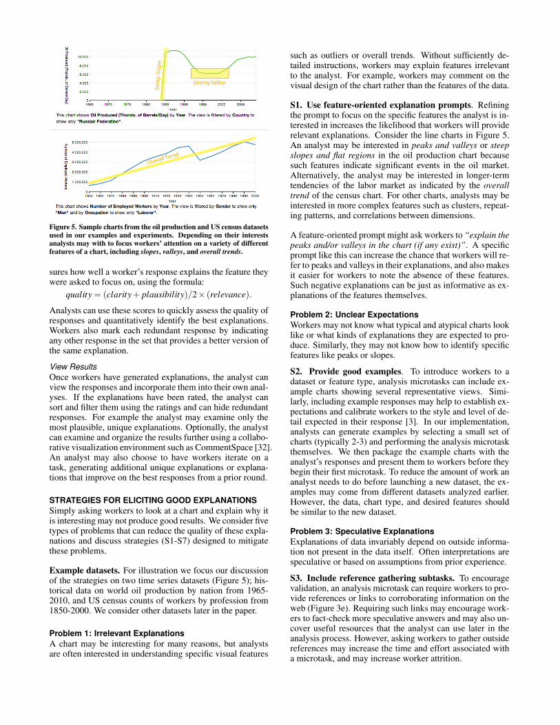
Figure 5. Sample charts from the oil production and US census datasetsused in our examples and experiments. Depending on their interestsanalysts may with to focus workers’ attention on a variety of differentfeatures of a chart, including slopes, valleys, and overall trends.
sures how well a worker’s response explains the feature theywere asked to focus on, using the formula:
quality = (clarity+ plausibility)/2× (relevance).
Analysts can use these scores to quickly assess the quality ofresponses and quantitatively identify the best explanations.Workers also mark each redundant response by indicatingany other response in the set that provides a better version ofthe same explanation.
View ResultsOnce workers have generated explanations, the analyst canview the responses and incorporate them into their own anal-yses. If the explanations have been rated, the analyst cansort and filter them using the ratings and can hide redundantresponses. For example the analyst may examine only themost plausible, unique explanations. Optionally, the analystcan examine and organize the results further using a collabo-rative visualization environment such as CommentSpace [32].An analyst may also choose to have workers iterate on atask, generating additional unique explanations or explana-tions that improve on the best responses from a prior round.
STRATEGIES FOR ELICITING GOOD EXPLANATIONSSimply asking workers to look at a chart and explain why itis interesting may not produce good results. We consider fivetypes of problems that can reduce the quality of these expla-nations and discuss strategies (S1-S7) designed to mitigatethese problems.
Example datasets. For illustration we focus our discussionof the strategies on two time series datasets (Figure 5); his-torical data on world oil production by nation from 1965-2010, and US census counts of workers by profession from1850-2000. We consider other datasets later in the paper.
Problem 1: Irrelevant ExplanationsA chart may be interesting for many reasons, but analystsare often interested in understanding specific visual features
such as outliers or overall trends. Without sufficiently de-tailed instructions, workers may explain features irrelevantto the analyst. For example, workers may comment on thevisual design of the chart rather than the features of the data.
S1. Use feature-oriented explanation prompts. Refiningthe prompt to focus on the specific features the analyst is in-terested in increases the likelihood that workers will providerelevant explanations. Consider the line charts in Figure 5.An analyst may be interested in peaks and valleys or steepslopes and flat regions in the oil production chart becausesuch features indicate significant events in the oil market.Alternatively, the analyst may be interested in longer-termtendencies of the labor market as indicated by the overalltrend of the census chart. For other charts, analysts may beinterested in more complex features such as clusters, repeat-ing patterns, and correlations between dimensions.
A feature-oriented prompt might ask workers to “explain thepeaks and/or valleys in the chart (if any exist)”. A specificprompt like this can increase the chance that workers will re-fer to peaks and valleys in their explanations, and also makesit easier for workers to note the absence of these features.Such negative explanations can be just as informative as ex-planations of the features themselves.
Problem 2: Unclear ExpectationsWorkers may not know what typical and atypical charts looklike or what kinds of explanations they are expected to pro-duce. Similarly, they may not know how to identify specificfeatures like peaks or slopes.
S2. Provide good examples. To introduce workers to adataset or feature type, analysis microtasks can include ex-ample charts showing several representative views. Simi-larly, including example responses may help to establish ex-pectations and calibrate workers to the style and level of de-tail expected in their response [3]. In our implementation,analysts can generate examples by selecting a small set ofcharts (typically 2-3) and performing the analysis microtaskthemselves. We then package the example charts with theanalyst’s responses and present them to workers before theybegin their first microtask. To reduce the amount of work ananalyst needs to do before launching a new dataset, the ex-amples may come from different datasets analyzed earlier.However, the data, chart type, and desired features shouldbe similar to the new dataset.
Problem 3: Speculative ExplanationsExplanations of data invariably depend on outside informa-tion not present in the data itself. Often interpretations arespeculative or based on assumptions from prior experience.
S3. Include reference gathering subtasks. To encouragevalidation, an analysis microtask can require workers to pro-vide references or links to corroborating information on theweb (Figure 3e). Requiring such links may encourage work-ers to fact-check more speculative answers and may also un-cover useful resources that the analyst can use later in theanalysis process. However, asking workers to gather outsidereferences may increase the time and effort associated witha microtask, and may increase worker attrition.
Problem 4: Inattention to Chart DetailIn an effort to increase their payment, workers may proceedquickly through the microtask without thoughtfully consid-ering the prompt. They may also attempt to scam the task byentering junk responses. Even well-intentioned workers maynot attend to the chart features specified in the instructions.
S4. Include chart reading subtasks. Chart reading ques-tions (Figure 3b) can focus workers by requiring them to in-spect axes, legends or series (“What country is shown in thischart?”), to extract a value from the chart (“In what year didthe number of workers peak?”), or perform a computationbased on the chart (“How many more workers were there in2000 than in 1900?”). Such questions force workers to fa-miliarize themselves with the data and can draw attention toimportant aspects of a particular chart like missing data ora non-zero axis. Additionally, because “gold standard” an-swers to such chart reading questions are known a priori, wecan automatically check workers’ answers and eliminate re-sponses from spammers or workers who do not understandthe instructions. Including such gold standard questions is awell known technique for improving result quality in crowd-sourcing tasks [21, 26]. In our case these questions also helpdirect workers’ attention to chart details.
S5. Include annotation subtasks. Requiring workers tovisually search for and mark features in the chart can fur-ther focus their attention on those details. For example, themicrotask may ask workers to first annotate relevant fea-tures of a chart and then explain those features (Figure 3c).Such annotations encourage attention to details and supportdeixis [9], allowing workers to ground their explanations bypointing directly to the features they are explaining. In ourimplementation each annotation is labeled with a unique let-ter (“A”,“B”,“C”,...) so workers can refer to them in theirtext explanations. The worker-drawn annotations are alsoamenable to further computation. For example, when sum-marizing responses, a system could aggregate marks frommultiple workers to highlight hot spots on a particular chart,or to calculate a collective “best guess” for the overall trendof a time series [6].
S6. Use pre-annotated charts. Alternatively, the analystcan pre-annotate visual features in the chart (Figure 5) sothat workers pay attention to those details. Such annota-tions help focus workers on specific chart details and alsoreduce irrelevant explanations (Problem 1). Although pre-annotating charts greatly reduces the possibility that workerswill attempt to explain the wrong feature, creating such an-notations may require the analyst to perform additional datamining or manual annotation on the dataset.
Problem 5: Lack of DiversityMultiple workers may generate similar explanations whileleaving the larger space of possible explanations unexplored.
S7. Elicit explanations iteratively. As with other humancomputation tasks [17], analysis microtasks can be run inmultiple, sequential stages, in which workers see a chartalong with the best explanations generated in prior itera-tions. The analyst may elicit more diverse responses by ask-ing workers to generate explanations that are different from
the earlier ones. Alternatively, the analyst can increase ex-planation quality by asking workers to expand and improveupon the earlier explanations.
DEPLOYMENTWe have deployed our crowdsourced data analysis workflowon Amazon’s Mechanical Turk and used workers to gener-ate 910 explanations for 64 different charts drawn from 16different datasets.
Our deployment included the census and oil datasets de-scribed earlier, as well as data on world development (UNfood price indices, life expectancy data by nation), economics(US foreign debt, employment and housing indices for majorUS cities, return on investment data for US universities), andsports (team winning percentages from the NBA and MLB,historical batting averages of professional baseball players,olympic medal counts by nation, and Tour de France stand-ings). As a proof-of-concept, we generated a set of 2 to 5charts for each dataset that exhibited a particular character-istic, such as sharp peaks, valleys or steep slopes. In somecases we selected charts by hand, while in others we usedour data-mining scripts to automatically select the charts.
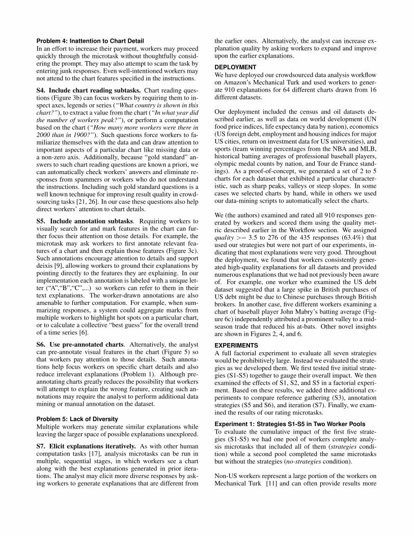
We (the authors) examined and rated all 910 responses gen-erated by workers and scored them using the quality met-ric described earlier in the Workflow section. We assignedquality >= 3.5 to 276 of the 435 responses (63.4%) thatused our strategies but were not part of our experiments, in-dicating that most explanations were very good. Throughoutthe deployment, we found that workers consistently gener-ated high-quality explanations for all datasets and providednumerous explanations that we had not previously been awareof. For example, one worker who examined the US debtdataset suggested that a large spike in British purchases ofUS debt might be due to Chinese purchases through Britishbrokers. In another case, five different workers examining achart of baseball player John Mabry’s batting average (Fig-ure 6c) independently attributed a prominent valley to a mid-season trade that reduced his at-bats. Other novel insightsare shown in Figures 2, 4, and 6.
EXPERIMENTSA full factorial experiment to evaluate all seven strategieswould be prohibitively large. Instead we evaluated the strate-gies as we developed them. We first tested five initial strate-gies (S1-S5) together to gauge their overall impact. We thenexamined the effects of S1, S2, and S5 in a factorial experi-ment. Based on these results, we added three additional ex-periments to compare reference gathering (S3), annotationstrategies (S5 and S6), and iteration (S7). Finally, we exam-ined the results of our rating microtasks.
Experiment 1: Strategies S1-S5 in Two Worker PoolsTo evaluate the cumulative impact of the first five strate-gies (S1-S5) we had one pool of workers complete analy-sis microtasks that included all of them (strategies condi-tion) while a second pool completed the same microtasksbut without the strategies (no-strategies condition).
Non-US workers represent a large portion of the workers onMechanical Turk [11] and can often provide results more
Figure 6. Sample explanations generated for charts showing universitytuition and graduation rates (a), olympic medal counts by country (b),and historical batting averages (c). In each case we asked workers toexplain a single outlier on a pre-annotated chart. (Emphasis added.)
quickly and cheaply than US-based workers. However, stud-ies of Mechanical Turk have shown that workers from out-side the United States exhibit poorer performance on contentanalysis [25] and labeling tasks [4]. We designed the exper-iment to determine if a similar performance gap exists fordata analysis tasks and whether our strategies could improveresults from these workers.
We hypothesized that: (1) Results from US workers wouldbe of higher quality than results from non-US workers, but(2) employing strategies S1-S5 would increase the quality ofexplanations produced by workers in both groups.
MethodsOver the course of the experiment, we ran 200 analysis mi-crotasks using Mechanical Turk. We divided these micro-tasks into 8 experimental conditions:
2 strategy variants×2 worker pools×2 datasets = 8
The microtask in the no-strategies condition asked work-ers to “explain why any interesting sections of chart mighthave occurred”. In the strategies condition, the microtask(Figure 3) included a feature-oriented prompt (S1) ask-ing workers to “explain why any strong peaks and/or valleys
in the chart might have occurred” and an annotation sub-task (S5) that instructed workers to highlight those peaksand valleys. The microtask was preceded by instructionsthat included three example charts (S2) with annotationsand explanations. The strategies condition also included areference-gathering subtask (S3) that required workers toprovide the URL of a website that corroborated their expla-nation. To help safeguard against scammers, we includedchart-reading (S4) subtasks in both conditions. We alsoasked workers to fill out a demographic questionnaire.
We used both the oil production and US census datasets andselected five charts from each dataset with the largest vari-ance. All of the resulting charts exhibited a range of featuresincluding peaks, valleys, slopes, and large-scale trends.
We collected five explanations for each of the charts. Wealso restricted each worker to a single condition (either strate-gies or no-strategies) and allowed workers to explain eachchart only once, for a maximum of 10 responses per worker.We paid workers $0.05 per microtask during some early tri-als, but later increased the pay rate to $0.20 per microtask toreduce completion time. We based these rates on prior stud-ies [7, 19] which have shown that while pay rate impactscompletion time, it has little impact on response quality.
ResultsOver the course of the experiment, 104 different workersproduced responses for the 200 microtasks. To assess howwell workers understood the tasks, we (the authors) calcu-lated quality scores for each response (as described in theWorkflow section). We also analyzed the content of the re-sponses, labeling each one as either an “explanation” if itexplained the chart features or a “description” if it simplydescribed the features. We also examined whether or noteach response referred to “peaks or valleys”,“steep slopesor flat regions”, or an “overall trend”.
We observed no significant difference in response quality,completion time, or length between the census and oil pro-ductions datasets in either worker population, indicating thatproducing explanations was of similar difficulty across bothdatasets. Thus, we combine the results from both datasets inall subsequent analyses.
Worker Pools. We found that worker pool had a significantmain effect on quality (F1,198 = 12.2, p < 0.01). Responsequality was higher for US workers (µ = 2.23,σ = 1.79) thanfor non-US workers (µ = 1.37,σ = 1.87) (Figure 7) in partbecause 83% of responses from US workers contained rel-evant explanations, while only 42% of responses from non-US workers did so. Instead, 34% of non-US workers de-scribed the chart rather than explaining it, and 24% producedresponses that were so poorly written we could not classifythem. The poor performance of non-US workers may reflecttheir lack of familiarity with the datasets as well as a lan-guage barrier. In our demographic questionnaire, only 35%of non-US workers in the census conditions could accuratelydescribe the US census, versus 100% of US workers. Lessthan 20% of non-US workers reported English as their nativelanguage, versus 95% of US workers.
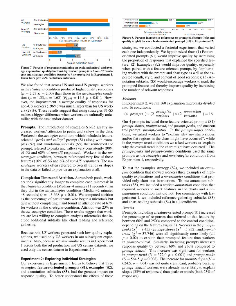
Figure 7. Percent of responses containing an explanation(top) and aver-age explanation quality(bottom), by worker group (US / non-US work-ers) and strategy condition (strategies / no-strategies) in Experiment 1.Error bars give 95% confidence intervals.
We also found that across US and non-US groups, workersin the strategies condition produced higher quality responses(µ = 2.27,σ = 2.00) than those in the no-strategies condi-tion (µ = 1.33,σ = 1.62) (F1,198 = 14.5, p < 0.01). How-ever, the improvement in average quality of responses fornon-US workers (196%) was much larger than for US work-ers (28%). These results suggest that using strategies S1-S5makes a bigger difference when workers are culturally unfa-miliar with the task and/or dataset.
Prompts. The introduction of strategies S1-S5 greatly in-creased workers’ attention to peaks and valleys in the data.Workers in the strategies condition, which included a feature-oriented “peaks and valleys” prompt (S1) along with exam-ples (S2) and annotation subtasks (S5) that reinforced theprompt, referred to peaks and valleys very consistently (90%of US and 68% of non-US responses). Workers in the no-strategies condition, however, referenced very few of thesefeatures (16% of US and 6% of non-US responses). The no-strategies workers often referred to overall trends or slopesin the data or failed to provide an explanation at all.
Completion Times and Attrition. Across both pools, work-ers took significantly longer to complete each microtask inthe strategies condition (Median=4 minutes 11 seconds) thanthey did in the no-strategies condition (Median=2 minutes48 seconds) (t = −3.668, p < 0.01). We computed attritionas the percentage of participants who began a microtask butquit without completing it and found an attrition rate of 67%for workers in the strategies condition. Attrition was 23% inthe no-strategies condition. These results suggest that work-ers are less willing to complete analysis microtasks that in-clude additional subtasks like chart reading and referencegathering.
Because non-US workers generated such low quality expla-nations, we used only US workers in our subsequent exper-iments. Also, because we saw similar results in Experiment1 across both the oil production and US census datasets, weused only the census dataset in Experiments 2-5.
Experiment 2: Exploring Individual StrategiesOur experience in Experiment 1 led us to believe that threestrategies, feature-oriented prompts (S1), examples (S2),and annotation subtasks (S5), had the greatest impact onresponse quality. To better understand the effects of these
Figure 8. Percent increase in references to prompted feature (left) andquality (right) for each feature-oriented prompt (S1) in Experiment 2.
strategies, we conducted a factorial experiment that variedeach one independently. We hypothesized that: (1) Feature-oriented prompts (S1) would improve quality by increasingthe proportion of responses that explained the specified fea-ture; (2) Examples (S2) would improve quality, especiallywhen paired with a feature-oriented prompt, by familiariz-ing workers with the prompt and chart type as well as the ex-pected length, style, and content of good responses; (3) An-notation subtasks (S5) would encourage workers to mark theprompted feature and thereby improve quality by increasingthe number of relevant responses.
MethodsIn Experiment 2, we ran 160 explanation microtasks dividedinto 16 conditions:
(4 prompts )× (2 examplesvariants )× (2 annotation
variants ) = 16
Our 4 prompts included three feature-oriented prompts (S1)prompt-slopes, prompt-trend, and prompt-peaks, and one con-trol prompt, prompt-control. In the prompt-slopes condi-tions, we asked workers to “explain why any sharp slopesand/or flat regions in the chart might have occurred”, whilein the prompt-trend conditions we asked workers to “explainwhy the overall trend in the chart might have occurred”. Theprompt-peaks and prompt-control conditions used the sameprompts as the strategies and no-strategies conditions fromExperiment 1, respectively.
To test the examples strategy (S2), we included an exam-ples condition that showed workers three examples of high-quality explanations and a no-examples conditions that pro-vided only short text instructions. To test annotation sub-tasks (S5), we included a worker-annotation condition thatrequired workers to mark features in the charts and a no-annotation condition that did not. For consistency with Ex-periment 1, we included reference-gathering subtasks (S3)and chart-reading subtasks (S4) in all conditions.
ResultsPrompts. Including a feature-oriented prompt (S1) increasedthe percentage of responses that referred to that feature bybetween 60% and 250% compared to the control condition,depending on the feature (Figure 8). Workers in the prompt-peaks (χ2 = 8.455), prompt-slopes (χ2 = 5.952), and prompt-trend (χ2 = 37.746) were all significantly more likely (allp < 0.02) to explain their prompted feature than workersin prompt-control. Similarly, including prompts increasedresponse quality by between 69% and 236% compared toprompt-control. This increase was significant for workersin prompt-trend (U = 372.0, p < 0.001) and prompt-peaks(U = 564.5, p= 0.008). The increase for prompt-slopes (U =624.5, p = .064) was not quite significant, probably becauseprompt-control workers were already more likely to explainslopes (35% of responses) than peaks or trends (both 23% ofresponses).
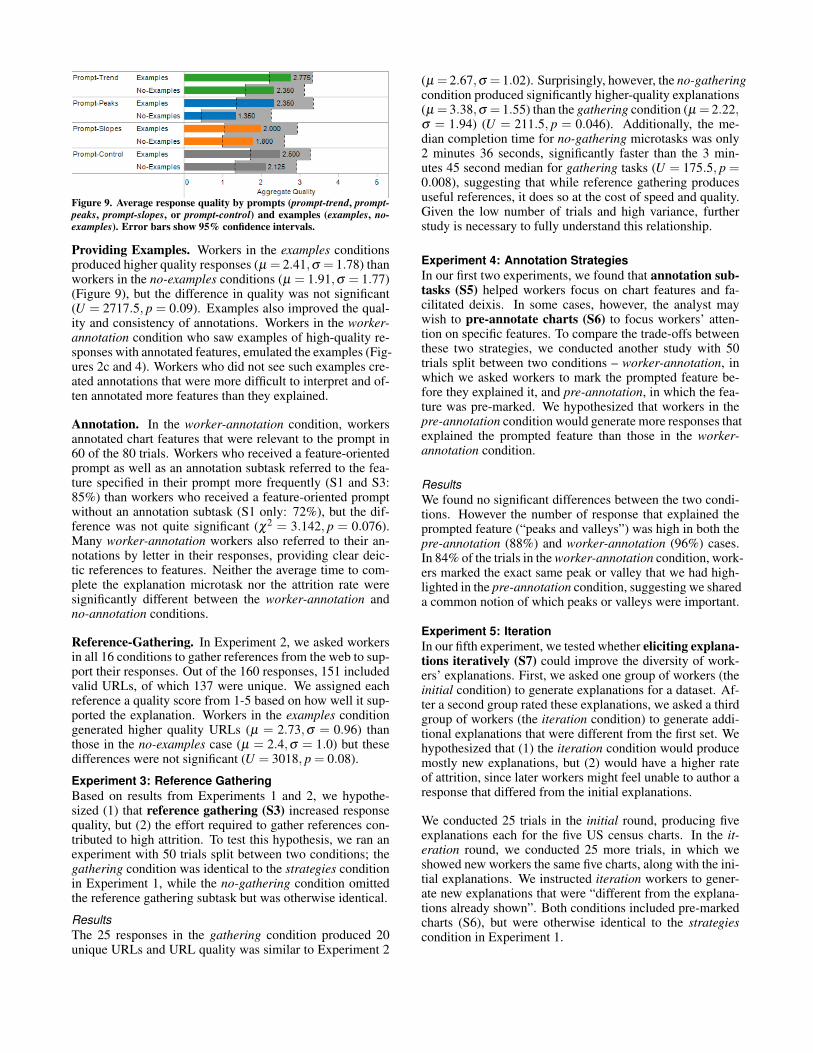
Figure 9. Average response quality by prompts (prompt-trend, prompt-peaks, prompt-slopes, or prompt-control) and examples (examples, no-examples). Error bars show 95% confidence intervals.
Providing Examples. Workers in the examples conditionsproduced higher quality responses (µ = 2.41,σ = 1.78) thanworkers in the no-examples conditions (µ = 1.91,σ = 1.77)(Figure 9), but the difference in quality was not significant(U = 2717.5, p = 0.09). Examples also improved the qual-ity and consistency of annotations. Workers in the worker-annotation condition who saw examples of high-quality re-sponses with annotated features, emulated the examples (Fig-ures 2c and 4). Workers who did not see such examples cre-ated annotations that were more difficult to interpret and of-ten annotated more features than they explained.
Annotation. In the worker-annotation condition, workersannotated chart features that were relevant to the prompt in60 of the 80 trials. Workers who received a feature-orientedprompt as well as an annotation subtask referred to the fea-ture specified in their prompt more frequently (S1 and S3:85%) than workers who received a feature-oriented promptwithout an annotation subtask (S1 only: 72%), but the dif-ference was not quite significant (χ2 = 3.142, p = 0.076).Many worker-annotation workers also referred to their an-notations by letter in their responses, providing clear deic-tic references to features. Neither the average time to com-plete the explanation microtask nor the attrition rate weresignificantly different between the worker-annotation andno-annotation conditions.
Reference-Gathering. In Experiment 2, we asked workersin all 16 conditions to gather references from the web to sup-port their responses. Out of the 160 responses, 151 includedvalid URLs, of which 137 were unique. We assigned eachreference a quality score from 1-5 based on how well it sup-ported the explanation. Workers in the examples conditiongenerated higher quality URLs (µ = 2.73,σ = 0.96) thanthose in the no-examples case (µ = 2.4,σ = 1.0) but thesedifferences were not significant (U = 3018, p = 0.08).
Experiment 3: Reference GatheringBased on results from Experiments 1 and 2, we hypothe-sized (1) that reference gathering (S3) increased responsequality, but (2) the effort required to gather references con-tributed to high attrition. To test this hypothesis, we ran anexperiment with 50 trials split between two conditions; thegathering condition was identical to the strategies conditionin Experiment 1, while the no-gathering condition omittedthe reference gathering subtask but was otherwise identical.
ResultsThe 25 responses in the gathering condition produced 20unique URLs and URL quality was similar to Experiment 2
(µ = 2.67,σ = 1.02). Surprisingly, however, the no-gatheringcondition produced significantly higher-quality explanations(µ = 3.38,σ = 1.55) than the gathering condition (µ = 2.22,σ = 1.94) (U = 211.5, p = 0.046). Additionally, the me-dian completion time for no-gathering microtasks was only2 minutes 36 seconds, significantly faster than the 3 min-utes 45 second median for gathering tasks (U = 175.5, p =0.008), suggesting that while reference gathering producesuseful references, it does so at the cost of speed and quality.Given the low number of trials and high variance, furtherstudy is necessary to fully understand this relationship.
Experiment 4: Annotation StrategiesIn our first two experiments, we found that annotation sub-tasks (S5) helped workers focus on chart features and fa-cilitated deixis. In some cases, however, the analyst maywish to pre-annotate charts (S6) to focus workers’ atten-tion on specific features. To compare the trade-offs betweenthese two strategies, we conducted another study with 50trials split between two conditions – worker-annotation, inwhich we asked workers to mark the prompted feature be-fore they explained it, and pre-annotation, in which the fea-ture was pre-marked. We hypothesized that workers in thepre-annotation condition would generate more responses thatexplained the prompted feature than those in the worker-annotation condition.
ResultsWe found no significant differences between the two condi-tions. However the number of response that explained theprompted feature (“peaks and valleys”) was high in both thepre-annotation (88%) and worker-annotation (96%) cases.In 84% of the trials in the worker-annotation condition, work-ers marked the exact same peak or valley that we had high-lighted in the pre-annotation condition, suggesting we shareda common notion of which peaks or valleys were important.
Experiment 5: IterationIn our fifth experiment, we tested whether eliciting explana-tions iteratively (S7) could improve the diversity of work-ers’ explanations. First, we asked one group of workers (theinitial condition) to generate explanations for a dataset. Af-ter a second group rated these explanations, we asked a thirdgroup of workers (the iteration condition) to generate addi-tional explanations that were different from the first set. Wehypothesized that (1) the iteration condition would producemostly new explanations, but (2) would have a higher rateof attrition, since later workers might feel unable to author aresponse that differed from the initial explanations.
We conducted 25 trials in the initial round, producing fiveexplanations each for the five US census charts. In the it-eration round, we conducted 25 more trials, in which weshowed new workers the same five charts, along with the ini-tial explanations. We instructed iteration workers to gener-ate new explanations that were “different from the explana-tions already shown”. Both conditions included pre-markedcharts (S6), but were otherwise identical to the strategiescondition in Experiment 1.
ResultsThe 25 trials in the initial condition produced 36 distinct ex-planations, while the 25 trials in the iteration condition pro-duced 35 explanations. Of the iteration explanations, 71%had not been proposed in the first round. The attrition ratefor the iteration condition (75.3%) was also slightly lowerthan the attrition rate in the initial round (80.2%), indicat-ing that iteration can increase the diversity of explanationswithout increasing attrition.
Experiment 6: RatingIn order for rating microtasks to provide an effective meansof sorting explanations and identifying duplicates, workersmust be able to generate consistent ratings. To test this,we conducted a final experiment in which we asked work-ers to rate a subset of the explanations generated during ourbroader deployment. We hypothesized that (1) quality rat-ings assigned by workers would be similar to our own qual-ity ratings and that (2) workers would consistently detect andlabel redundant explanations.
MethodsWe asked 243 Mechanical Turk workers to rate 192 differentexplanations across 37 charts. Using the interface shownin Figure 4, workers rated each response according to thecriteria (relevance, clarity, and plausibility) described in theWorkflow section. We compared these ratings against ourown quality ratings for the same results.
Workers also indicated redundancy as follows: for each ex-planation, workers could mark at most one other response asproviding a better version of the same explanation. For eachworker, we then formed a redundancy graph with the expla-nations as the nodes. We linked two explanations with anundirected edge if the worker marked them as redundant. Toidentify groups of redundant explanations we computed thetransitive closure of this graph. Each connected componentthen represented a unique explanation and all explanationswithin a component were redundant.
To reduce scamming in the rating microtask we also includedone “gold standard” explanation on five of the charts. Wepurposely based the content of each “gold standard” expla-nation on one of the worker-generated explanations, but mod-ified the language to ensure that workers could not identify itas an exact duplicate. We used these “gold standard” expla-nation with known redundancy to test whether or not work-ers could successfully detect redundant explanations.
ResultsIn total, the workers produced 1,334 individual ratings forthe 192 different explanations. We compared these to ourown quality ratings for the same responses.
Rating Consistency. A Pearson’s chi-square test showedvery strong agreement (χ2 = 78.81, p< 0.01) between work-ers’ relevance scores and our own, indicating that workerswere good at identifying responses that did not explain therequested feature. A Spearman’s rank correlation coefficient
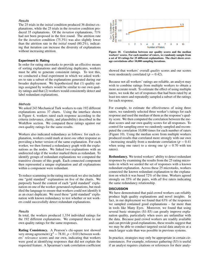
Figure 10. Correlation between our quality scores and the medianworkers’ scores. For each number of raters, we randomly sample froma set of 10 ratings for 25 different explanations. The chart shows aver-age correlations after 10,000 sampling iterations.
showed that workers’ overall quality scores and our scoreswere moderately correlated (ρ = 0.42).
Because not all workers’ ratings are reliable, an analyst maywish to combine ratings from multiple workers to obtain amore accurate result. To estimate the effect of using multipleraters, we took the set of responses that had been rated by atleast ten raters and repeatedly sampled a subset of the ratingsfor each response.
For example, to estimate the effectiveness of using threeraters, we randomly selected three worker’s ratings for eachresponse and used the median of them as the response’s qual-ity score. We then computed the correlation between the me-dian scores and our own quality scores for all responses. Tocontrol for sampling error we randomly sampled and recom-puted the correlation 10,000 times for each number of raters(Figure 10). Using the median score from multiple workersproduced results that correlated more strongly with our own- increasing steadily from a moderate correlation (ρ = 0.41when using one rater) to a strong one (ρ = 0.70 with tenraters).
Redundancy. We tested workers’ ability to detect redundantresponses by examining the results from the 25 rating micro-tasks in which we seeded the set of responses with a knownredundant explanation. Across these 25 microtasks, workersconnected the known redundant explanation to the explana-tion on which it was based 72% of the time. Workers agreedstrongly on 35% of the pairs, with all five raters indicatingthe same redundancy relationship.
DISCUSSIONWe have demonstrated that paid crowd workers can reliablyproduce high quality explanations and novel insights. Infact, in our deployment we found that 63% of the responseswe sampled contained good explanations – far more thanin tools like Many Eyes. Moreover, we found that usingseveral basic strategies (S1-S5) can greatly improve expla-nation quality, particularly when users are unfamiliar withthe data. Because paid crowd workers are readily availableand can provide good explanations, these results suggest thatwe may be able to conduct targeted social data analysis at amuch larger scale than was possible in previous systems.
In practice, strategies may only be appropriate in certain cir-cumstances. For example, reference gathering (S3) is usefulif an analyst requires citations or references for their analy-
ses. However, in our experience, reference gathering causesworkers to take longer and can reduce the diversity of ex-planations, since workers cannot pose hypotheses for whichthey have no references. Instead, it may be better to makereferences optional or provide bonuses for good references.
Similarly, while both annotation strategies we tested (S5,S6)improved workers’ attention to prompted details, they areuseful in different situations. Annotation subtasks (S5) aremore useful when the specific features of interest are not yetknown, while pre-annotated charts (S6) are useful for direct-ing workers’ attention to more subtle features that are rele-vant to the analyst, but not obvious to workers.
Finally, our analysis of workers’ performance on rating mi-crotasks demonstrates that crowd workers can provide high-quality ratings that correlate strongly with our own. How-ever, using multiple workers produces more accurate ratings.Redundancy checking subtasks provide a reliable approachfor identifying unique explanations, however, quality-controlmechanisms such as “gold standard” questions with knownresponses may be necessary to make certain that workers un-derstand the task.
While crowd workers generated good explanations for thewide range of public-interest datasets we tested, they mayfare less well with domain-specific data. In future work, weplan to apply similar strategies to elicit targeted analysis helpfrom expert communities, volunteers, and enthusiasts.
CONCLUSIONOur work demonstrates how the key sensemaking task ofgenerating explanations can be broken down and performedsystematically by paid workers. Relying on paid crowd work-ers rather than ad-hoc volunteers allows us to marshal theanalytic power of hundreds of workers in a systematic way.By packaging simple charts within analysis microtasks anddispatching them en-masse to the crowd, we can solicit largenumbers of high-quality explanations much more predictablythan we could using existing social data analysis platforms.Moreover, we demonstrate that using a straightforward setof strategies, we can mitigate common problems such as ir-relevant explanations, unclear and speculative worker expec-tations, and inattention to chart detail.
ACKNOWLEDGEMENTSWe would like to thank Bjorn Hartmann for his helpful in-put. This work was partially supported by NSF grants CCF-0963922 & CCF-0964173 and a gift from Greenplum/EMC.
REFERENCES1. Ahmad, S., Battle, A., Malkani, Z., and Kamvar, S. The jabberwocky
programming environment for structured social computing. In Proc.UIST (2011).
2. Bernstein, M. S., Little, G., Miller, R. C., Hartmann, B., Ackerman,M. S., Karger, D. R., Crowell, D., and Panovich, K. Soylent: a wordprocessor with a crowd inside. In Proc. UIST (2010), 313–322.
3. Boud, D. Enhancing learning through self assessment. Routledge,1995.
4. Chandler, D., and Kapelner, A. Breaking monotony with meaning:Motivation in crowdsourcing markets. U. of Chicago mimeo (2010).
5. Danis, C. M., Viegas, F. B., Wattenberg, M., and Kriss, J. Your placeor mine?: Visualization as a community component. In Proc. CHI(2008), 275–284.
6. Heer, J., and Agrawala, M. Design considerations for collaborativevisual analytics. Information Visualization 7, 1 (2008), 49–62.
7. Heer, J., and Bostock, M. Crowdsourcing graphical perception: Usingmechanical turk to assess visualization design. In Proc. CHI (2010),203–212.
8. Heer, J., Viegas, F., and Wattenberg, M. Voyagers and voyeurs:Supporting asynchronous collaborative visualization. Comm. of theACM 52, 1 (2009), 87–97.
9. Hill, W. C., and Hollan, J. D. Deixis and the future of visualizationexcellence. In Proc. of IEEE Visualization (1991), 314–320, 431.
10. Hurley, C. B., and Oldford, R. W. Pairwise Display ofHigh–Dimensional Information via Eulerian Tours and HamiltonianDecompositions. JCGS 19, 4 (2010), 861–886.
11. Ipeirotis, P. Demographics of mechanical turk. New York University,Tech. Rep (2010).
12. Kittur, A., Chi, E. H., and Suh, B. Crowdsourcing user studies withmechanical turk. In Proc. CHI (2008), 453–456.
13. Kittur, A., Smus, B., and Kraut, R. Crowdforge: crowdsourcingcomplex work. In CHI Extended Abstracts, ACM (2011), 1801–1806.
14. Kong, N., Heer, J., and Agrawala, M. Perceptual guidelines forcreating rectangular treemaps. IEEE TVCG 16 (2010), 990–998.
15. Kulkarni, A., Can, M., and Hartman, B. CollaborativelyCrowdsourcing Workflows with Turkomatic. In Proc. CSCW (2012).
16. Lee, E.-K., Cook, D., Klinke, S., and Lumley, T. Projection pursuit forexploratory supervised classification. JCGS 14, 4 (2005), 831–846.
17. Little, G., Chilton, L., Goldman, M., and Miller, R. Turkit: tools foriterative tasks on mechanical turk. In Proc. SIGKDD, ACM (2009).
18. Luther, K., Counts, S., Stecher, K., Hoff, A., and Johns, P. Pathfinder:an online collaboration environment for citizen scientists. In Proc.CHI (2009), 239–248.
19. Mason, W., and Watts, D. J. Financial incentives and the ”performanceof crowds”. SIGKDD Explor. Newsl. 11 (May 2010), 100–108.
20. Nielsen, J. Participation inequality: Encouraging more users tocontribute. Jakob Nielsen’s Alertbox (2006).http://www.useit.com/alertbox/participation inequality.html.
21. Oleson, D., Sorokin, A., Laughlin, G., Hester, V., Le, J., and Biewald,L. Programmatic gold: Targeted and scalable quality assurance incrowdsourcing. In Proc. HComp (2011).
22. Pirolli, P., and Card, S. The sensemaking process and leverage pointsfor analyst technology as identified through cognitive task analysis.The Analyst 2005, 1–6.
23. Quinn, A. J., and Bederson, B. B. Human Computation: A Survey andTaxonomy of a Growing Field. In Proc. CHI (2011).
24. Russell, D. M., Stefik, M. J., Pirolli, P., and Card, S. K. The coststructure of sensemaking. In Proc. CHI (1993), 269–276.
25. Shaw, A. D., Horton, J. J., and Chen, D. L. Designing incentives forinexpert human raters. In Proc. CSCW (2011), 275–284.
26. Sorokin, A., and Forsyth, D. Utility data annotation with amazonmechanical turk. In Computer Vision and Pattern RecognitionWorkshops (2008), 1 –8.
27. Swivel. http://www.swivel.com.28. Tableau. http://www.tableausoftware.com.29. Viegas, F., Wattenberg, M., McKeon, M., Van Ham, F., and Kriss, J.
Harry potter and the meat-filled freezer: A case study of spontaneoususage of visualization tools. In Proc. HICSS, Citeseer (2008).
30. Viegas, F., Wattenberg, M., Van Ham, F., Kriss, J., and McKeon, M.Manyeyes: a site for visualization at internet scale. IEEE TVCG 13, 6(2007), 1121–1128.
31. Whittaker, S., Terveen, L., Hill, W., and Cherny, L. The dynamics ofmass interaction. In Proc. CSCW (1998), 257–264.
32. Willett, W., Heer, J., Agrawala, M., and Hellerstein, J.CommentSpace: Structured Support for Collaborative VisualAnalysis. In Proc. CHI (2011).
33. Wills, G., and Wilkinson, L. Autovis: automatic visualization.Information Visualization 9 (March 2010), 47–69.