Embed Size (px)
Citation preview
Steppenwolf Graphic
Standards
By Juliet Rutter - Fall Term 2016
STEPPENWOLF
2
Table of Contents
Introduction Pg. 3Glossary Pg. 4Logo and Logotype Pg. 5Use of Space Pg. 6Color Pg. 7Typeography Pg. 8Business Card Pg. 9Evelope Pg. 10Letterhead Pg. 11T-Shirt Pg. 12Display Ad Pg. 13Poster Pg. 14
3
Introduction
Steppenwolf has chosen to rebrand itself to demand attention on a global scale. We have expanded our programming to include touring overseas and in response to that, our marketing team has developed a new brand and a whole new set of graphic standards to show the world who we are.
Steppenwolf is a non-profit theatre company. We operate primarily in Chicago, IL with our three theater spaces and bar. There is always a show happening at Steppenwolf which sets us apart from many other theatre groups who usually have point in the year where their theaters go dark. Not us, we pride ourselves on running year-round with innovative, contemporary, and/or experimental theatre. We have many educational programs as well as events that show our acknowledgement and appreciation for people in our community that do us service such as Women in the Arts and Veterans’ Night.
Most of our yearly income is through individual donations, subscriptions, and earned income. Our organization is proud to say that our subscription base is higher than ever because of the engaging programming that we offer. Individual donations have also been on the rise for many years. With the addition of our new “Front Bar”, we are expected to be able to rely even more on earned income.
Steppenwolf has always worked to raise the bar of excellence in theatre, to create new works, and edu-cate people in our community about how to improve their lives with theatre. Therefore, our new logo and graphic standards reflect Steppenwolf ’s boldness, strength, class, and camaraderie. It is unique and it draws the eye of any onlooker. To represent itself on the global stage, Steppenwolf will hold true to these new standards and will continue to represent themselves with high quality theatre.
4
Glossary
Aesthetic A set of principles underlying and guiding the work of a particular piece of artBackdrop The color or picture that is behind all other elements on a design.Balance Design elements are similar on opposite areas of the design to allow for a sense of equal weight on either side.Bleed The instance where elements of the design encroach on the area of the marginCollateral Materials meant to promote an organization that are not explicit forms of advertisingContour An outline, especially one representing or bounding the shape or form of an elementElements of Design Color, line, shape, value, texture are all of the aspects of a pieceEmphasis To have attention drawn to an element or piece of information in a pieceLogotype The type related to a logoRelativity A state of dependance on the location of other elements in a designScale Proportionality based on the relative size of a pieceTypography The style and appearence of type
5
Logo and Logotype
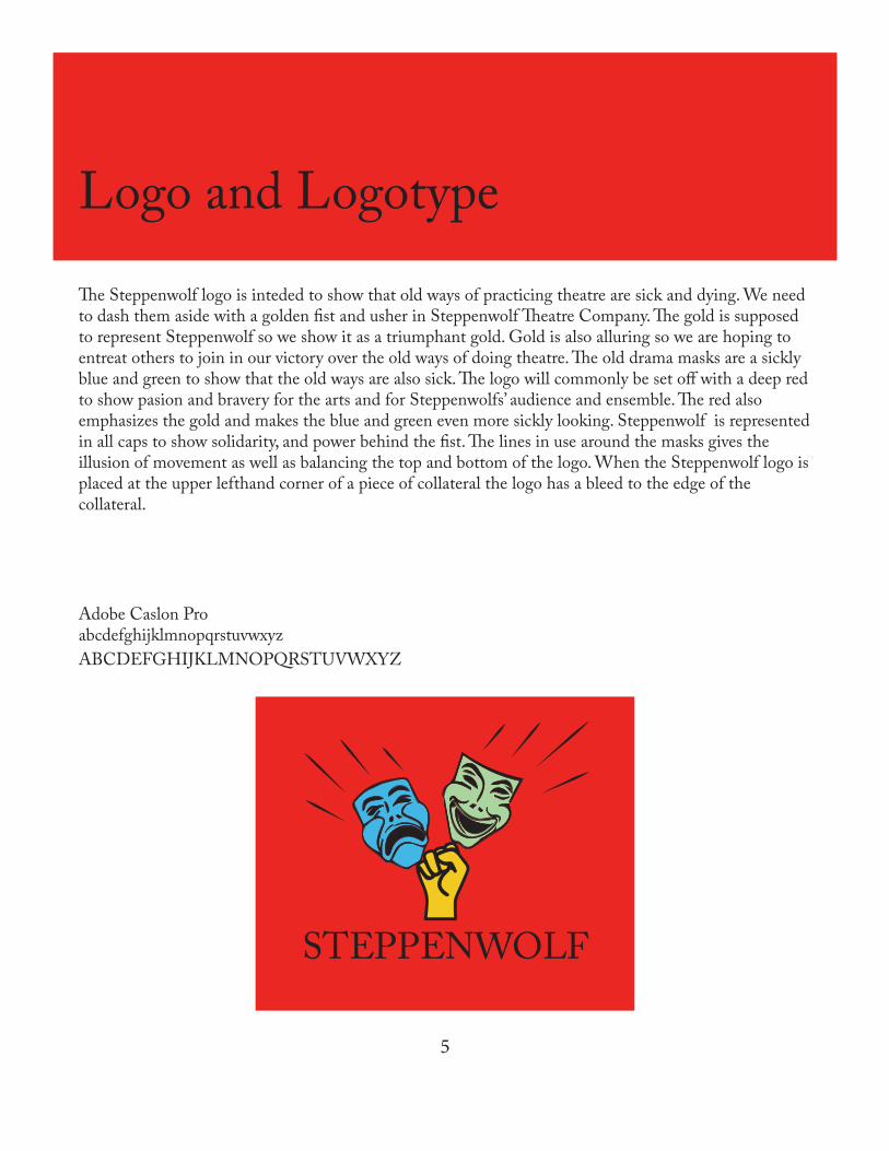
The Steppenwolf logo is inteded to show that old ways of practicing theatre are sick and dying. We need to dash them aside with a golden fist and usher in Steppenwolf Theatre Company. The gold is supposed to represent Steppenwolf so we show it as a triumphant gold. Gold is also alluring so we are hoping to entreat others to join in our victory over the old ways of doing theatre. The old drama masks are a sickly blue and green to show that the old ways are also sick. The logo will commonly be set off with a deep red to show pasion and bravery for the arts and for Steppenwolfs’ audience and ensemble. The red also emphasizes the gold and makes the blue and green even more sickly looking. Steppenwolf is represented in all caps to show solidarity, and power behind the fist. The lines in use around the masks gives the illusion of movement as well as balancing the top and bottom of the logo. When the Steppenwolf logo is placed at the upper lefthand corner of a piece of collateral the logo has a bleed to the edge of the collateral.
Adobe Caslon ProabcdefghijklmnopqrstuvwxyzABCDEFGHIJKLMNOPQRSTUVWXYZ
STEPPENWOLF
6
Use of Space
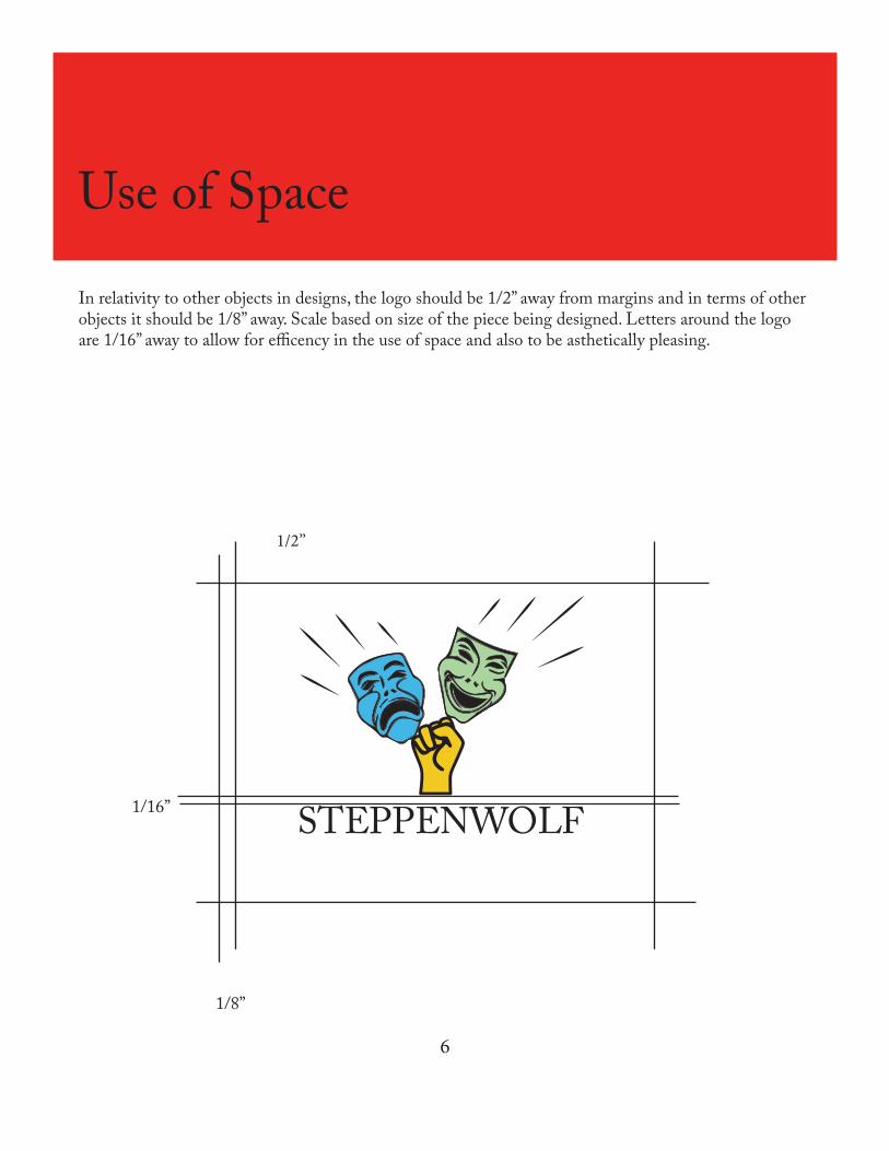
In relativity to other objects in designs, the logo should be 1/2” away from margins and in terms of other objects it should be 1/8” away. Scale based on size of the piece being designed. Letters around the logo are 1/16” away to allow for efficency in the use of space and also to be asthetically pleasing.
STEPPENWOLF
1/2”
1/8”
1/16”
7
Color
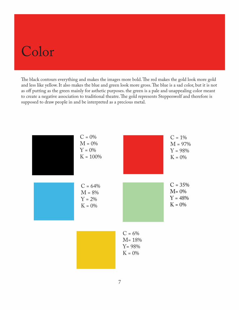
The black contours everything and makes the images more bold. The red makes the gold look more gold and less like yellow. It also makes the blue and green look more gross. The blue is a sad color, but it is not as off putting as the green mainly for asthetic purposes. the green is a pale and unappealing color meant to create a negative association to traditional theatre. The gold represents Steppenwolf and therefore is supposed to draw people in and be interpreted as a precious metal.
C = 1%M = 97%Y = 98%K = 0%
C = 64%M = 8%Y = 2%K = 0%
C = 6%M= 18%Y= 98%K = 0%
C = 35%M= 0%Y = 48%K = 0%
C = 0%M = 0%Y = 0%K = 100%
8
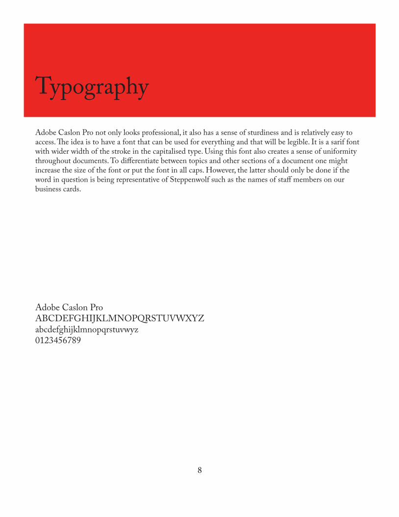
Typography
Adobe Caslon Pro not only looks professional, it also has a sense of sturdiness and is relatively easy to access. The idea is to have a font that can be used for everything and that will be legible. It is a sarif font with wider width of the stroke in the capitalised type. Using this font also creates a sense of uniformity throughout documents. To differentiate between topics and other sections of a document one might increase the size of the font or put the font in all caps. However, the latter should only be done if the word in question is being representative of Steppenwolf such as the names of staff members on our business cards.
Adobe Caslon ProABCDEFGHIJKLMNOPQRSTUVWXYZabcdefghijklmnopqrstuvwyz0123456789
9
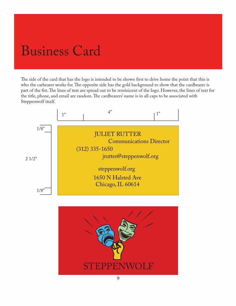
Business Card
The side of the card that has the logo is intended to be shown first to drive home the point that this is who the carbearer works for. The opposite side has the gold background to show that the cardbearer is part of the fist. The lines of text are spread out to be reminicent of the logo. However, the lines of text for the title, phone, and email are random. The cardbearers’ name is in all caps to be associated with Steppenwolf itself.
1” 1”
1/8”
1/8”
2 1/2”
4”
JULIET RUTTERCommunications Director
(312) [email protected]
steppenwolf.org1650 N Halsted AveChicago, IL 60614
STEPPENWOLF
10
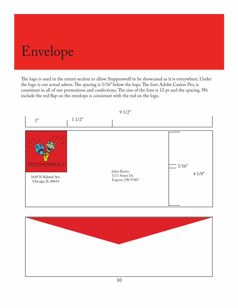
Envelope
1650 N Halsted AveChicago, IL 60614
Juliet Rutter1111 Street Dr.Eugene, OR 97407
STEPPENWOLF
4 1/8”
9 1/2”
1/16”
The logo is used in the return section to allow Steppenwolf to be showcased as it is everywhere. Under the logo is our actual adress. The spacing is 1/16” below the logo. The font Adobe Casion Pro, is consistant in all of our promotions and confections. The size of the font is 12 pt and the spacing. We include the red flap on the envelope is consistant with the red on the logo.
1” 1 1/2”
11
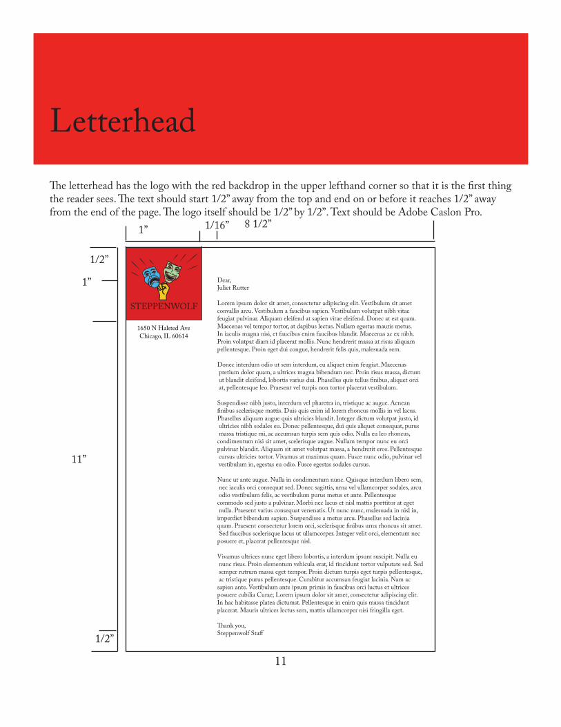
Letterhead
The letterhead has the logo with the red backdrop in the upper lefthand corner so that it is the first thing the reader sees. The text should start 1/2” away from the top and end on or before it reaches 1/2” away from the end of the page. The logo itself should be 1/2” by 1/2”. Text should be Adobe Caslon Pro.
Chicago, IL 606141650 N Halsted Ave
Dear, Juliet Rutter
Lorem ipsum dolor sit amet, consectetur adipiscing elit. Vestibulum sit amet convallis arcu. Vestibulum a faucibus sapien. Vestibulum volutpat nibh vitae feugiat pulvinar. Aliquam eleifend at sapien vitae eleifend. Donec at est quam. Maecenas vel tempor tortor, at dapibus lectus. Nullam egestas mauris metus.In iaculis magna nisi, et faucibus enim faucibus blandit. Maecenas ac ex nibh. Proin volutpat diam id placerat mollis. Nunc hendrerit massa at risus aliquam pellentesque. Proin eget dui congue, hendrerit felis quis, malesuada sem.
Donec interdum odio ut sem interdum, eu aliquet enim feugiat. Maecenas pretium dolor quam, a ultrices magna bibendum nec. Proin risus massa, dictum ut blandit eleifend, lobortis varius dui. Phasellus quis tellus �nibus, aliquet orci at, pellentesque leo. Praesent vel turpis non tortor placerat vestibulum.
Suspendisse nibh justo, interdum vel pharetra in, tristique ac augue. Aenean �nibus scelerisque mattis. Duis quis enim id lorem rhoncus mollis in vel lacus. Phasellus aliquam augue quis ultricies blandit. Integer dictum volutpat justo, id ultricies nibh sodales eu. Donec pellentesque, dui quis aliquet consequat, purus massa tristique mi, ac accumsan turpis sem quis odio. Nulla eu leo rhoncus, condimentum nisi sit amet, scelerisque augue. Nullam tempor nunc eu orci pulvinar blandit. Aliquam sit amet volutpat massa, a hendrerit eros. Pellentesque cursus ultricies tortor. Vivamus at maximus quam. Fusce nunc odio, pulvinar vel vestibulum in, egestas eu odio. Fusce egestas sodales cursus.
Nunc ut ante augue. Nulla in condimentum nunc. Quisque interdum libero sem, nec iaculis orci consequat sed. Donec sagittis, urna vel ullamcorper sodales, arcu odio vestibulum felis, ac vestibulum purus metus et ante. Pellentesque commodo sed justo a pulvinar. Morbi nec lacus et nisl mattis porttitor at eget nulla. Praesent varius consequat venenatis. Ut nunc nunc, malesuada in nisl in, imperdiet bibendum sapien. Suspendisse a metus arcu. Phasellus sed lacinia quam. Praesent consectetur lorem orci, scelerisque �nibus urna rhoncus sit amet. Sed faucibus scelerisque lacus ut ullamcorper. Integer velit orci, elementum nec posuere et, placerat pellentesque nisl.
Vivamus ultrices nunc eget libero lobortis, a interdum ipsum suscipit. Nulla eu nunc risus. Proin elementum vehicula erat, id tincidunt tortor vulputate sed. Sed semper rutrum massa eget tempor. Proin dictum turpis eget turpis pellentesque, ac tristique purus pellentesque. Curabitur accumsan feugiat lacinia. Nam ac sapien ante. Vestibulum ante ipsum primis in faucibus orci luctus et ultrices posuere cubilia Curae; Lorem ipsum dolor sit amet, consectetur adipiscing elit. In hac habitasse platea dictumst. Pellentesque in enim quis massa tincidunt placerat. Mauris ultrices lectus sem, mattis ullamcorper nisi fringilla eget.
�ank you,Steppenwolf Sta�
STEPPENWOLF
1/2”
1/2”
1”
1” 1/16” 8 1/2”
11”
12
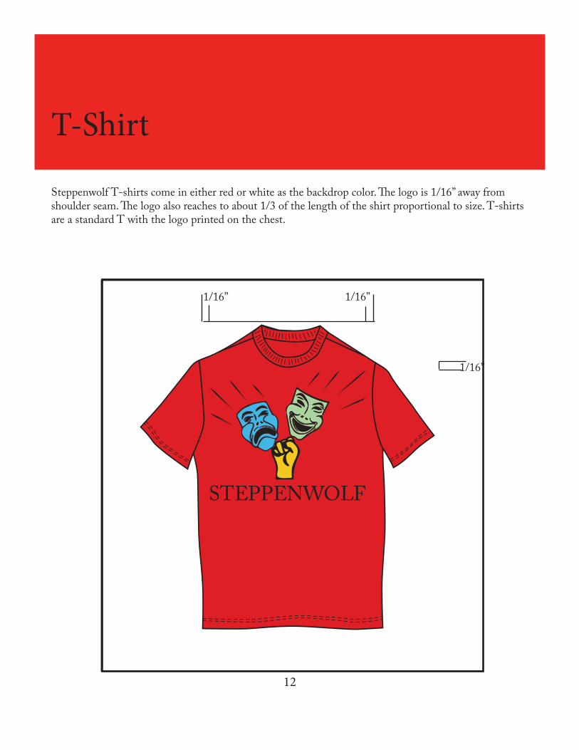
T-Shirt
Steppenwolf T-shirts come in either red or white as the backdrop color. The logo is 1/16” away from shoulder seam. The logo also reaches to about 1/3 of the length of the shirt proportional to size. T-shirts are a standard T with the logo printed on the chest.
STEPPENWOLF
1/16” 1/16”
1/16”
13
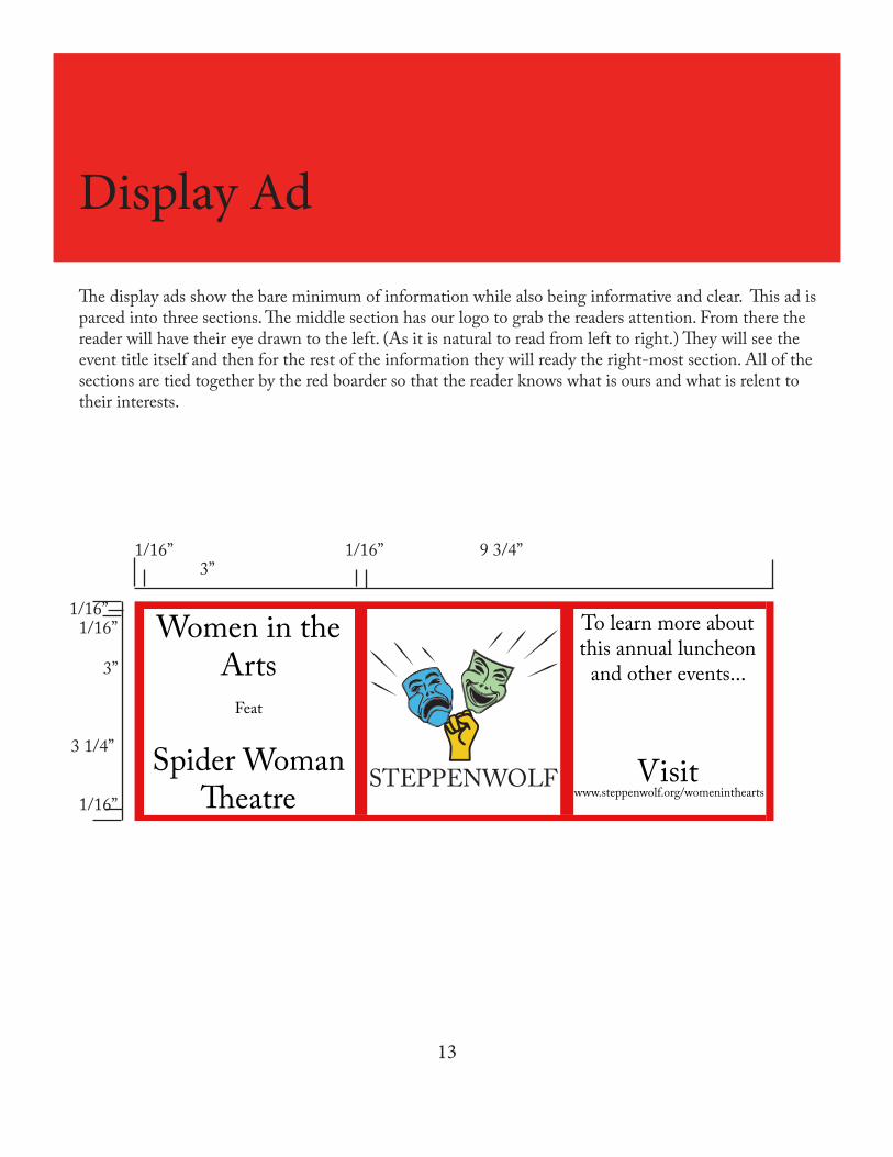
Display Ad
The display ads show the bare minimum of information while also being informative and clear. This ad is parced into three sections. The middle section has our logo to grab the readers attention. From there the reader will have their eye drawn to the left. (As it is natural to read from left to right.) They will see the event title itself and then for the rest of the information they will ready the right-most section. All of the sections are tied together by the red boarder so that the reader knows what is ours and what is relent to their interests.
STEPPENWOLF
Women in the Arts
Feat
Spider Woman �eatre
To learn more about this annual luncheon
and other events...
Visit www.steppenwolf.org/womeninthearts
9 3/4”
3 1/4”
1/16”
1/16”
1/16”
1/16”3”
1/16”
3”
14
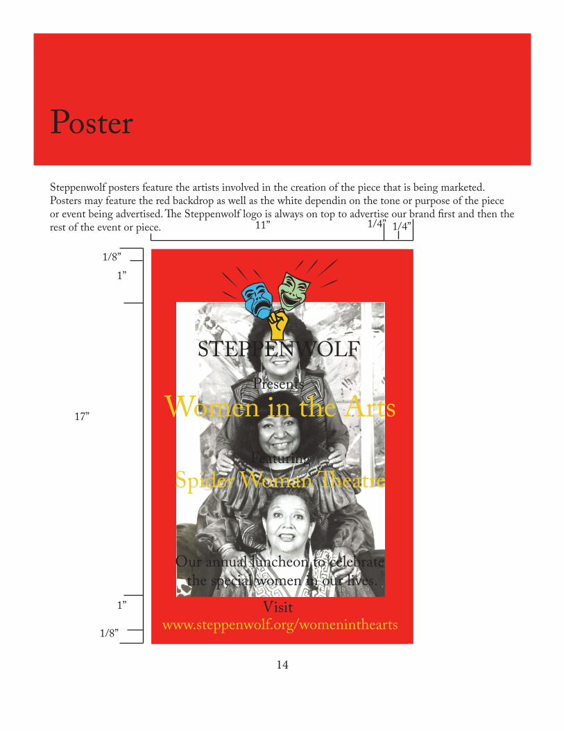
Poster
Steppenwolf posters feature the artists involved in the creation of the piece that is being marketed. Posters may feature the red backdrop as well as the white dependin on the tone or purpose of the piece or event being advertised. The Steppenwolf logo is always on top to advertise our brand first and then the rest of the event or piece.
Presents
STEPPENWOLF
Our annual luncheon to celebrate the special women in our lives.
Women in the ArtsFeaturing
Spider Woman �eatre
Visitwww.steppenwolf.org/womeninthearts
1/4” 1/4”
1/8”1”
1”
1/8”
17”
11”