Embed Size (px)
Citation preview

Paper TT17
Stellar Graphics Using SAS® (but not necessarily SAS/GRAPH®)
P. Chris Holland1, U.S. Food and Drug Administration, Silver Spring, MD Yan Zhu, Rockville, MD
ABSTRACT SAS® has come a long way since its old days of text-based scatter plots. With Version 9, high-resolution graphics via SAS/GRAPH® are now virtually ubiquitous throughout SAS statistical procedures and the output delivery system (ODS). These tools can help advance SAS’s stature for producing publication-quality graphics. There are still, however, other lesser-known alternatives that, despite their ease-of-use and high-quality, continue to hide in the shadows of the more cutting-edge pure SAS-based solutions. This paper demonstrates some of these alternatives and compares them with those that instead involve exclusive use of SAS/GRAPH for producing graphical output. INTRODUCTION As far as SAS/GRAPH software has come in the past few years, it still has its limitations. The almost limitless amount of available customizations that SAS programmers have at their disposal comes at the price of making simple, nice-looking output sometimes hard to achieve without a tried-and-true template to start with. As a result, other packages are often used in lieu of SAS/GRAPH for graphical summaries. Two such packages are Microsoft Excel (known for it’s ease of use and wide availability) and R, an open-source statistical package that is similar to S and S-plus. The problem with using outside packages, however, is the seam requiring human intervention in order to transfer data from SAS to the non-SAS software. This paper looks at some SAS solutions that make communicating with and transferring data to other software packages more seamless. These solutions use features like Dynamic Data Exchange (DDE) for communicating with Windows® software (such as Excel), PROC EXPORT for creating data files that other packages can read and/or open, and the X command for running other packages via SAS. This paper will explore 3 options for using SAS to create 4 types of graphical output. The 3 options include pure SAS/GRAPH output, SAS-controlled Excel graphics, and SAS-controlled R graphs. The 4 types of graphical output will include scatter plots, bar charts, Kaplan-Meier curves, and lattice plots. All solutions will be geared toward a “production environment”, meaning that the code is meant to be run in batch mode with the objective of creating a number of different graphic files automatically—with no manual intervention during program execution. All resulting figures appear in the appendix. Full program code and the output files are available online at http://www.holland-hut.com/pharmasug06. THE SCATTER PLOT The scatter plot has been one of the most common diagnostic tools for statisticians for quite some time. Although it is probably most often used for simple, crude looks at data distributions, there is sometimes the need to refine such output for presentation purposes. Three methods for producing such output are demonstrated below. SAS/GRAPH Output The advantage to a pure SAS solution for producing graphics is the lack of a need for any sort of data importing or exporting. The following SAS/GRAPH code creates a scatter plot of the relationship between study subjects’ baseline values for a given efficacy endpoint and the post-baseline results following treatment with one of two study medications—a placebo and the experimental treatment:
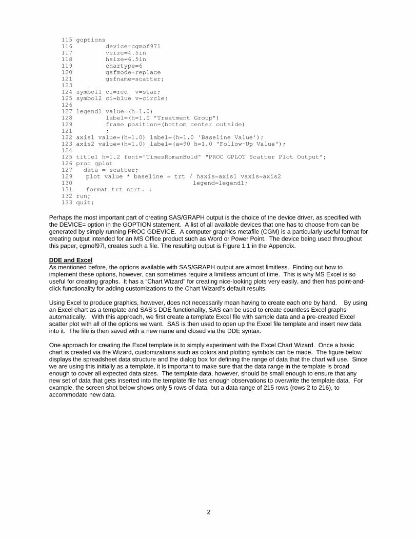
101 %let path = [insert path name here]; 102 libname library "&path"; 103 104 proc format; 105 value ntrt 0 = 'Placebo' 106 1 = 'Test Drug' ; 108 run; 109 110 data scatter; 111 set library.scatter; 112 run; 113 114 filename scatter "&path.\sas-graph-scatter.cgm";
1 Disclaimer: Views expressed in this paper are those of the author and not, necessarily, of the Food and Drug Administration and must not be taken to represent policy or guidance on behalf of the FDA.
1
2
115 goptions 116 device=cgmof97l 117 vsize=4.5in 118 hsize=6.5in 119 chartype=6 120 gsfmode=replace 121 gsfname=scatter; 123 124 symbol1 ci=red v=star; 125 symbol2 ci=blue v=circle; 126 127 legend1 value=(h=1.0) 128 label=(h=1.0 "Treatment Group") 129 frame position=(bottom center outside) 121 ; 122 axis1 value=(h=1.0) label=(h=1.0 'Baseline Value'); 123 axis2 value=(h=1.0) label=(a=90 h=1.0 "Follow-Up Value"); 124 125 title1 h=1.2 font="TimesRomanBold" "PROC GPLOT Scatter Plot Output"; 126 proc gplot 127 data = scatter; 129 plot value * baseline = trt / haxis=axis1 vaxis=axis2 130 legend=legend1; 131 format trt ntrt. ; 132 run; 133 quit;
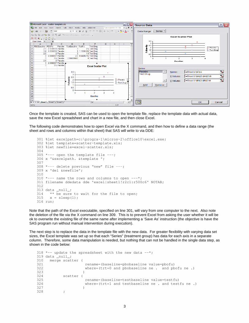
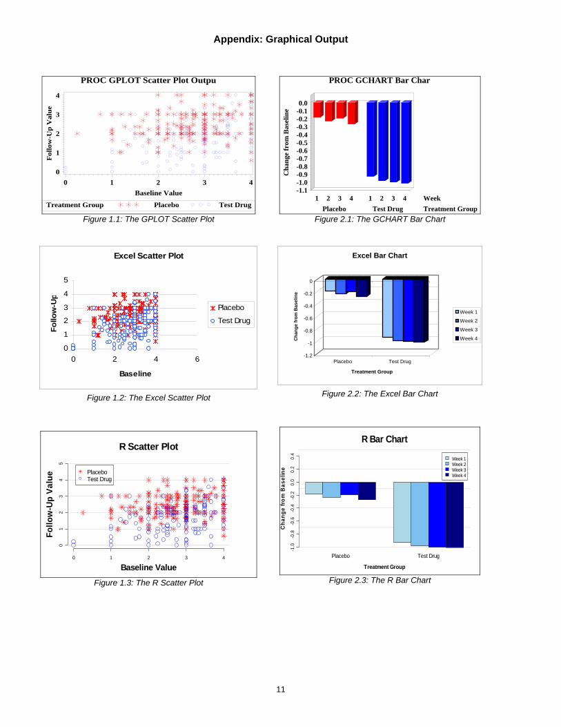
Perhaps the most important part of creating SAS/GRAPH output is the choice of the device driver, as specified with the DEVICE= option in the GOPTION statement. A list of all available devices that one has to choose from can be generated by simply running PROC GDEVICE. A computer graphics metafile (CGM) is a particularly useful format for creating output intended for an MS Office product such as Word or Power Point. The device being used throughout this paper, cgmof97l, creates such a file. The resulting output is Figure 1.1 in the Appendix. DDE and Excel As mentioned before, the options available with SAS/GRAPH output are almost limitless. Finding out how to implement these options, however, can sometimes require a limitless amount of time. This is why MS Excel is so useful for creating graphs. It has a “Chart Wizard” for creating nice-looking plots very easily, and then has point-and-click functionality for adding customizations to the Chart Wizard’s default results. Using Excel to produce graphics, however, does not necessarily mean having to create each one by hand. By using an Excel chart as a template and SAS’s DDE functionality, SAS can be used to create countless Excel graphs automatically. With this approach, we first create a template Excel file with sample data and a pre-created Excel scatter plot with all of the options we want. SAS is then used to open up the Excel file template and insert new data into it. The file is then saved with a new name and closed via the DDE syntax. One approach for creating the Excel template is to simply experiment with the Excel Chart Wizard. Once a basic chart is created via the Wizard, customizations such as colors and plotting symbols can be made. The figure below displays the spreadsheet data structure and the dialog box for defining the range of data that the chart will use. Since we are using this initially as a template, it is important to make sure that the data range in the template is broad enough to cover all expected data sizes. The template data, however, should be small enough to ensure that any new set of data that gets inserted into the template file has enough observations to overwrite the template data. For example, the screen shot below shows only 5 rows of data, but a data range of 215 rows (rows 2 to 216), to accommodate new data.
3
Once the template is created, SAS can be used to open the template file, replace the template data with actual data, save the new Excel spreadsheet and chart in a new file, and then close Excel. The following code demonstrates how to open Excel via the X command, and then how to define a data range (the sheet and rows and columns within that sheet) that SAS will write to via DDE:
301 %let excelpath=c:\progra~1\micros~2\office10\excel.exe; 302 %let template=scatter-template.xls; 303 %let newfile=excel-scatter.xls; 304 305 *--- open the template file ---; 306 x "&excelpath. &template "; 307 308 *--- delete previous “new” file ---; 309 x "del &newfile"; 310 310 *--- name the rows and columns to open ---*; 311 filename ddedata dde "excel|sheet1!r2c1:r500c6" NOTAB; 312 313 data _null_; 314 ** be sure to wait for the file to open; 315 x = sleep(1); 316 run;
Note that the path of the Excel executable, specified on line 301, will vary from one computer to the next. Also note the deletion of the file via the X command on line 309. This is to prevent Excel from asking the user whether it will be ok to overwrite the existing file of the same name after implementing a ‘Save As’ instruction (the objective is have the SAS program run without manual intervention during execution). The next step is to replace the data in the template file with the new data. For greater flexibility with varying data set sizes, the Excel template was set up so that each “Series” (treatment group) has data for each axis in a separate column. Therefore, some data manipulation is needed, but nothing that can not be handled in the single data step, as shown in the code below:
318 *-- update the spreadsheet with the new data --*; 319 data _null_; 310 merge scatter ( 321 rename=(baseline=pbobaseline value=pbofu) 322 where=(trt=0 and pbobaseline ne . and pbofu ne .) 323 ) 324 scatter ( 325 rename=(baseline=testbaseline value=testfu) 326 where=(trt=1 and testbaseline ne . and testfu ne .) 327 ) 328 ;
4
329 file ddedata; 330 331 placebo='Placebo'; 332 testdrug='TestDrug'; 333 put pbobaseline '09'x pbofu '09'x Placebo '09'x testbaseline '09'x testfu '09'x TestDrug '09'x ; 334 ormat pbobaseline pbofu testbaseline testfu null.; f335 run;
Note the absence of a BY statement. This is one rare instance where such a thing would be permissible with a MERGE. Also note the last line of the data step-- the FORMAT statement. The NULL. format (not shown), assigns any missing value to the text string “=1/0” (missing values will result in the data step if the TRT=0 and TRT=1 groups do not have an equal number of observations). This is done so that Excel will read this string as a formula and assign a null value to the cell-- it will show up as “#DIV/0!”. Otherwise, empty or missing cells that are inside the defined data range will cause problems in the chart. If the value is one that Excel recognizes as a null value, however, the value will be ignored. For some reason, writing “#NULL!” to the cell did not result in Excel recognizing the field as a null value. Once the data step above is executed, the spreadsheet data will have been updated. The file then just needs to be closed with the new file name.
334 *-- name Excel system commands --*; 335 filename ddecmds dde "excel|system"; 336 337 *-- save and close Excel --*; 338 *-- note, macro vars can not be used here --*; 339 data _null_; 340 file ddecmds; 341 put '[save.as("excel_scatter.xls")]'; 342 put '[quit()]'; 343 run; 344 345 data _null_; 346 ** be sure to wait for the file to save and close; 347 x = sleep(1); 348 run;
The resulting scatter plot is saved within the new Excel file. It can then be imported as a Chart Object into files such as Word documents or Power Point presentations, which is how Figure 1.2 was imported. The “point-and-click” means by which options can be set in the Excel file is a very user-friendly feature. One limitation, however, is the inability to make the title and axis names data driven, so they need to be added by hand for each graph. The next solution will not have these limitations. SAS Running R Code The last alternative first requires some background since this approach is probably the least familiar to readers. The solution involves the use of the R statistical package. R is a free package that is very similar to the S language and environment, which later developed into S-plus. It has a particular strength with graphics, which makes it worth exploring as an alternative to SAS graphics. With some advanced set-up, SAS can be used to interact with R automatically. With our “production-environment” approach in mind, we first need to develop an R function (similar to a SAS macro) to accommodate the variations to be expected from one plot to the next. For our scatter plot, we are using a function called scatter_plot_function. In conjunction with development of the function, we need to also develop some sample R code that will call the function. Once the R code is finalized, we will write a SAS program that will create the data file(s) that R can read from and then write iterations of this R code to an R-script file. Each iteration will provide new parameter values for the R function, such as a new sub-set of data, new titles and footnotes, and a new output file name. As the last step, we will use the X command to batch submit the R program that was just written by SAS. The R code below is for a simplified example that provides just one iteration:
401 ## R program for creating scatter plots using the scatter_plot_function.r file 402 ## Source: source('[insert path here]/r-scatter.r'); 403 404 path <- '[insert path here]'; 405 406 ## include the function
5
407 source(paste(path,'scatter-plot-function.r',sep='')); 408 409 ## Read in the data file 410 filname <- paste(path, 'scatter.txt',sep='') 411 dat <- read.table(filname, header=TRUE, sep='\t') 412 attach(dat) 413 414 ## Create the X- and Y-variables for the two treatment groups 415 baseline0 <- dat[TRT==0, 4]; baseline1 <- dat[TRT==1,4] 416 followup0 <- dat[TRT==0, 3]; followup1 <- dat[TRT==1,3] 417 418 ## Define the title and footnote 419 title <- c('R Scatter Plot') 420 footnt<- c(' ') 421 422 ## Define the graphics device and output file 423 win.metafile(file=paste(path,'r-scatter.wmf',sep=''), width=8, height=5) 424 425 ## Define the colors, legend, and labels 426 colors <- c('red', 'blue') 427 legnd <- c('Placebo','Test Drug') 428 xlabel <- c('Baseline Value') 429 ylabel <- c('Follow-up Value') 430 431 ## Call the function and plot it 432 scatter_plot_function(baseline0, followup0, baseline1, followup1, title, legnd, footnt,xlabel, ylabel, colors)
Part of the key is using the most appropriate output device. Since, for this paper, graphs are being imported into an MS Word document, the win.metafile device function is being specified in line 423. Other available device functions are png, jpeg, and bmp. The following SAS program does three important things. First it creates a tab-delineated data file via PROC EXPORT that the R code will use for data importation. It then uses a DATA _NULL_ to write the above R code to an R program file. Lastly, it uses the X command to submit the new program file as a batch program for R to process.
501 ********************************; 502 ** R scatter plot; 503 ********************************; 504 data exportfile; 505 set efficacy (keep=usubjid trt baseline value where=(baseline ne . and value ne .)); 506 run; 507 508 proc export 509 data = exportfile 510 outfile = "efficacy.txt" 511 dbms=tab 512 replace; 513 run; 514 515 %let r_program=scatter_plot; 516 filename scatter "&path\&r_program..r"; 517 518 data _null_; 529 520 file scatter; 521 522 put "## R program for creating scatter plots using the scatter_plot_function.r file "; 523 put "## Source: source('[insert path name]/scatter_plot.r'); "; 524 put " "; 525 put "path <- '[insert path name]'; "; 526 put " "; [PUT code from above] . . 527 run; 528
6
529 ** Run the batch script in R; 530 x "R-spawn <&r_program..r> &r_program..out" ;
In this simple example, only one iteration is submitted. In a true production environment, a data set with instructions for each interation (such as titles, file names, and WHERE clauses for selecting subsets of the data) would be SET into the DATA _NULL_. Repeated function calls could then be written to the script file with each new observation in the data set. Figure 1.3 contains the resulting scatter plot. Note the “R-spawn” command in line 530. R-spawn is a .bat file with the following two lines:
Rterm --vanilla exit
Rterm is the R executable for submitting programs in batch mode. It must be in the program path in order for this to work. In Windows, right-click on ‘My Computer’, go to ‘Properties’, click on the ‘Advanced’ tab, and click on ‘Environment Variables’ to modify the program path (note, however, that this might not work for everyone). BAR CHARTS SAS/GRAPH Output The VBAR3D statement in PROC GCHART provides 3-dimensional bar charts. Using the same set of GOPTIONS from the scatter plot example we can produce a 3-D bar chart on the efficacy parameter’s mean changes from baseline over time. The code below runs on data from the previous example, after going through a PROC MEANS to get the mean values:
601 pattern1 value=solid color=red; 602 pattern2 value=solid color=blue; 603 604 axis1 value=(h=1.0) label=(h=1.0 'Week'); 605 axis2 value=(h=1.0) label=(a=90 h=1.0 "Change from Baseline"); 606 607 title1 h=1.2 font="TimesRomanBold" "PROC GCHART Bar Chart"; 608 proc gchart 609 data = means; 610 where trt ne . and week ne .; 611 617 vbar3d week /group=trt sumvar=change 618 axis=axis1 raxis=axis2 619 patternid=group cframe=white outside=sum 620 ; 621 label trt="Treatment Group"; 622 format trt ntrt. ; 623 run; 624 quit;
The resulting chart is in Figure 2.1. Putting treatment groups side-by-side within a week might be preferable (that is, switching the week and the treatment group), but this causes formatting problems since the text for the treatment groups is too long to fit in together. A legend could help, but PROC GCHART will only accept legends for subgroups, which create stacked bars instead of juxtaposed ones. Overall, though, the chart quality is good and is fairly simple to code. DDE and Excel The code used for the Excel scatter plot can be largely recycled for the Excel bar chart. The most important thing to remember is to modify the row and column specifications in the DDE FILENAME statements. Contrary to the SAS bar chart, the colors in the Excel chart change only from one “series” (week) to the next, but not between groups (in this case, treatment groups). So to make all Placebo bars the same color and all Test Drug bars a different color would require changing the layout so that the treatment group is the “legend” variable and week is the x-axis variable. Overall, though, like the SAS/GRAPH bar chart, the quality is good and the ease of use is perhaps even better (the actual chart is represented by Figure 2.2). SAS Running R Code R does not have a function for 3-dimensional bar charts, but the standard 2-dimensional charts can be generated with the barplot function. Similar to the other R-based solutions, a user-defined function that primarily uses a combination of other R functions is developed with the idea of having a SAS program create an R script for generating multiple bar charts. An example chart can be seen in Figure 2.3.
7
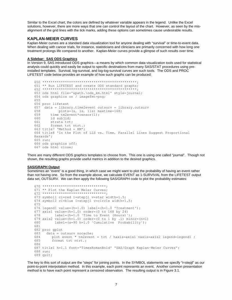
Similar to the Excel chart, the colors are defined by whatever variable appears in the legend. Unlike the Excel solutions, however, there are more ways that one can control the layout of the chart. However, as seen by the mis-alignment of the grid lines with the tick marks, adding these options can sometimes cause undesirable results. KAPLAN-MEIER CURVES Kaplan-Meier curves are a standard data visualization tool for anyone dealing with “survival” or time-to-event data. When dealing with cancer trials, for instance, statisticians and clinicians are primarily concerned with how long one treatment prolongs life compared to another. Kaplan-Meier curves provide a glimpse of such results over time. A Sidebar: SAS ODS Graphics In Version 9, SAS introduced ODS graphics—a means by which common data visualization tools used for statistical analysis could quickly and easily be output to specific destinations from many SAS/STAT procedures using pre-installed templates. Survival, log-survival, and log-log-survival curves are such tools. The ODS and PROC LIFETEST code below provides an example of how such graphs can be produced:
650 **********************************************; 651 ** Run LIFETEST and create ODS standard graphs; 652 **********************************************; 653 ods html file="&path.\ods_km.html" style=journal; 654 ods graphics on / imagefmt=png; 655 656 proc lifetest 657 data = library.time2event outsurv = library.outsurv 658 plots=(s, ls, lls) maxtime=168; 659 time tm2event*censor(1); 660 id subjid; 661 strata trt; 662 format trt ntrt.; 663 title7 "Method = KM"; 664 title8 "In the Plot of LLS vs. Time, Parallel Lines Suggest Proportional Hazards"; 665 run; 666 ods graphics off; 667 ods html close;
There are many different ODS graphics templates to choose from. This one is using one called “journal”. Though not shown, the resulting graphs provide useful metrics in addition to the desired graphics. SAS/GRAPH Output Sometimes an “event” is a good thing, in which case we might want to plot the probability of having an event rather than not having one. So from the example above, we calculate EVENT as 1-SURVIVAL from the LIFETEST output data set, OUTSURV. We can then apply the following SAS/GRAPH code to plot the probability estimates:
670 *******************************; 671 ** Plot the Kaplan Meier Curves; 672 *******************************; 673 symbol1 ci=red i=stepjl v=star width=1.5; 674 symbol2 ci=blue i=stepjl v=circle width=1.5; 675 676 legend1 value=(h=1.0) label=(h=1.0 "Treatment"); 677 axis1 value=(h=1.0) order=(0 to 168 by 24) 678 label=(h=1.0 'Time to Event (Hours)'); 679 axis2 value=(h=1.0) order=(0 to 1 by .1) minor=(n=1) 680 label=(a=90 h=1.0 'Cumulative Probability'); 681 682 proc gplot 683 data = outsurv nocache; 684 plot event * tm2event = trt / haxis=axis1 vaxis=axis2 legend=legend1 ; 685 format trt ntrt.; 686 687 title1 h=1.1 font="TimesRomanBold" "SAS/Graph Kaplan-Meier Curves"; 688 run; 689 quit;
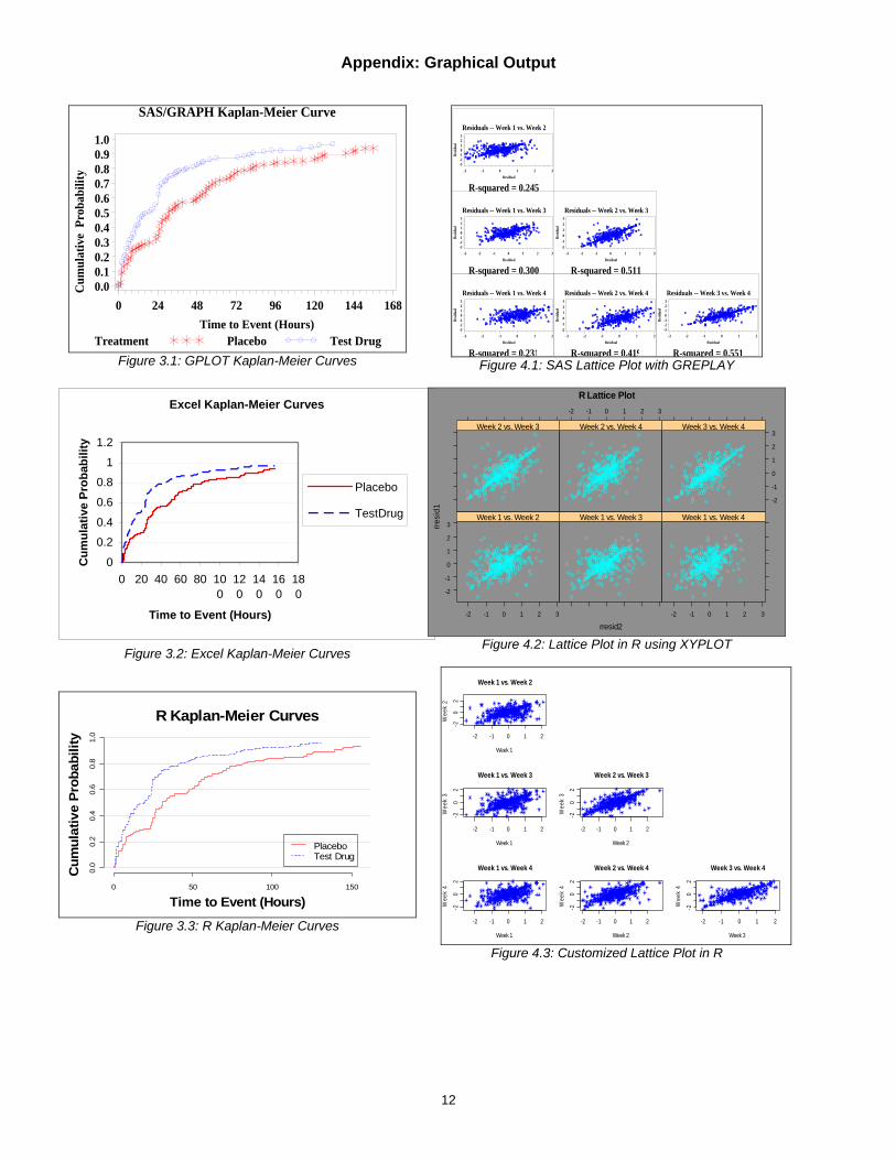
The key to this sort of output are the “steps” for joining points. In the SYMBOL statements we specify “i=stepjl” as our point-to-point interpolation method. In this example, each point represents an event. Another common presentation method is to have each point represent a censored observation. The resulting output is in Figure 3.1.

8
DDE and Excel Since steps are not an available point-joining method for Excel plots, the data have to be manipulated by carrying forward the previous timepoint’s probability estimate to a new observation at the current timepoint. Since these new observations are not actual events, the plot is limited to just presenting the curves without any symbols. It is with these more advanced statistical presentations that the limitations with Excel graphs become more apparent. The Excel representation of these data is in Figure 3.2. SAS Running R Code Like SAS, R does have a procedure for connecting the dots with steps. It does not, however, allow for symbols to be presented as well. This can be achieved with an additional use of the points function, but this has been omitted for the sake of code simplicity. The R Kaplan-Meier curves can be seen in Figure 3.3. LATTICE PLOTS Two-dimensional plots can offer a view of three dimensions of data—the x-axis, the y-axis, and whatever group is defined by the different lines, bars, or symbols. Beyond that, plots can get cluttered quickly if too much information is added to a single plot. Lattice plots are matrtix-like plots within a plot. They can offer a unique snapshot of data relative to a fourth dimension or relationship of interest. When modeling longitudinal data, one objective is to find the correct correlation structure for the within-subject effect. Diggle, et. al recommend using a series of scatter plots to display the relationship of the model residuals from one timepoint to the next. This will be our motivation for producing lattice plots. SAS/GRAPH Output Lattice plots are not a trivial matter in SAS. Fortunately, Perry Watts has written an entire book on the matter (see the references). The first trick is to use PROC GREPLAY is create the appropriate template. The code below creates a template for a 3x3 lower-triangular matrix of plots:
700 ** Create a 3x3 GREPLAY Template; 701 goptions reset=global gunit=pct border cback=white 702 colors=(black blue green red) 703 ftext="TimesRoman" htitle=6 htext=3 704 ; 705 proc greplay tc=sasuser.l3r3 nofs; 706 tdef l3r3 des='3x3 Grid' 707 708 %macro define; 709 %let cnt=0; 710 %do y = 99 %to 33 %by -33; 711 %do x = 0 %to 66 %by 33; 712 %let cnt=%eval(&cnt+1); 713 &cnt/llx=&x lly=%eval(&y-33) 714 ulx=&x uly=&y 715 urx=%eval(&x+33) ury=&y 716 lrx=%eval(&x+33) lry=%eval(&y-33) 717 color=black 718 %end; 719 %end; 720 %mend; 721 %define; 722 723 template l3r3; 724 list template; 725 quit;
Once the template is saved, it can be referred to in GREPLAY procedure calls. The following code is within a macro. Repeated PLOT statements from PROC GPLOT are submitted within nested loops. The plots are then sent to the graphics destination via PROC GREPLAY, using similar nested loops:
736 goptions nodisplay ; 737 proc gplot data=resids; 738 %do i = 1 %to %eval(&LASTWEEK-1); 739 %do j = %eval(&i+1) %to &LASTWEEK; 740 plot resid&i*resid&j / &opts name="resids&i&j"; 741 title5 h=3.0 "Residuals -- Week &i vs. Week &j";
9
742 footnote h=2.5 "R-squared = &&rsqr&i&j"; 743 run; 744 %end; 745 %end; 746 quit; 747 748 goptions display; 749 proc greplay nofs tc=sasuser.l3r3 template=l3r3; 750 igout gseg; 751 treplay 752 %let cnt=0; 753 %do j = 2 %to &LASTWEEK; 754 %do i = 1 %to %eval(&LASTWEEK-1); 755 %let cnt=%eval(&cnt+1); 756 %if &i<&j %then 757 &cnt: resids&i&j; 758 759 %end; 760 %end; 761 ; 762 run; quit;
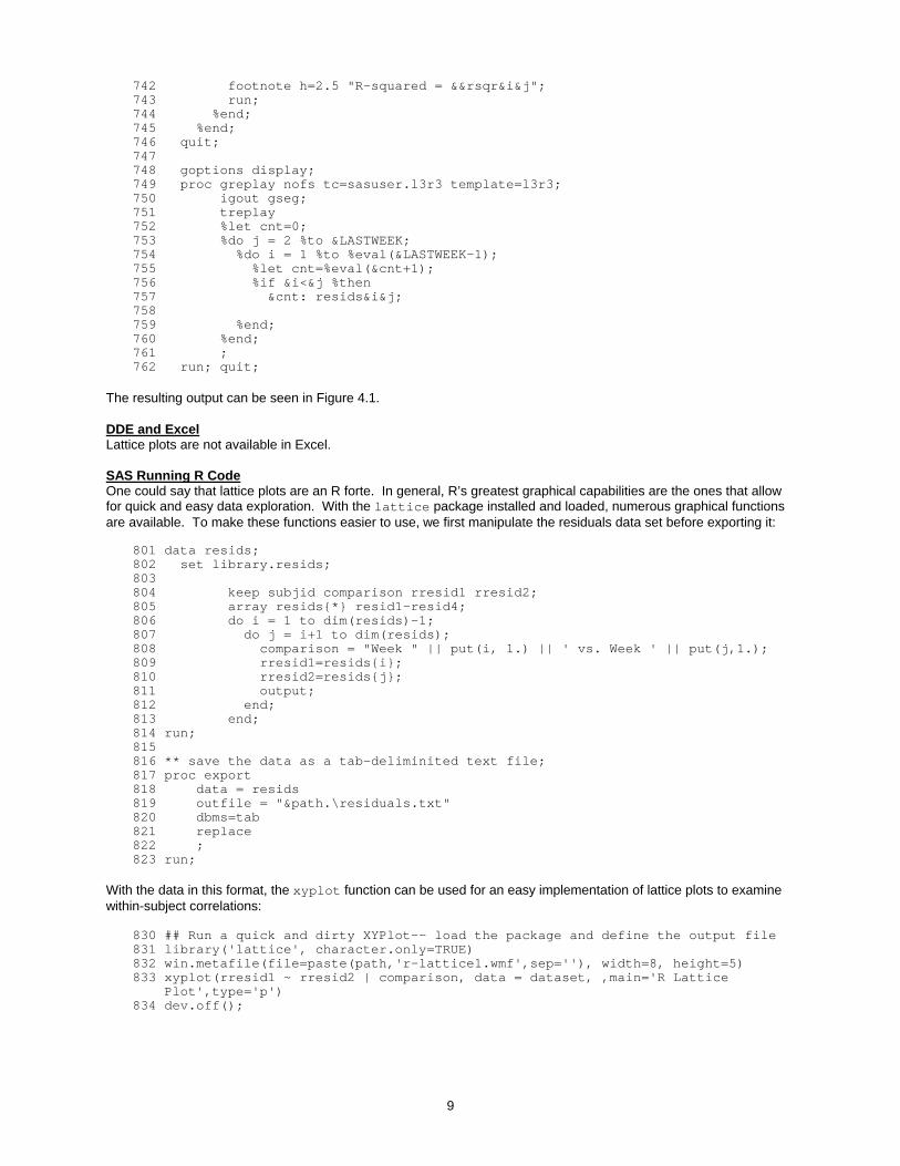
The resulting output can be seen in Figure 4.1. DDE and Excel Lattice plots are not available in Excel. SAS Running R Code One could say that lattice plots are an R forte. In general, R’s greatest graphical capabilities are the ones that allow for quick and easy data exploration. With the lattice package installed and loaded, numerous graphical functions are available. To make these functions easier to use, we first manipulate the residuals data set before exporting it:
801 data resids; 802 set library.resids; 803 804 keep subjid comparison rresid1 rresid2; 805 array resids{*} resid1-resid4; 806 do i = 1 to dim(resids)-1; 807 do j = i+1 to dim(resids); 808 comparison = "Week " || put(i, 1.) || ' vs. Week ' || put(j,1.); 809 rresid1=resids{i}; 810 rresid2=resids{j}; 811 output; 812 end; 813 end; 814 run; 815 816 ** save the data as a tab-deliminited text file; 817 proc export 818 data = resids 819 outfile = "&path.\residuals.txt" 820 dbms=tab 821 replace 822 ; 823 run;
With the data in this format, the xyplot function can be used for an easy implementation of lattice plots to examine within-subject correlations:
830 ## Run a quick and dirty XYPlot-- load the package and define the output file 831 library('lattice', character.only=TRUE) 832 win.metafile(file=paste(path,'r-lattice1.wmf',sep=''), width=8, height=5) 833 xyplot(rresid1 ~ rresid2 | comparison, data = dataset, ,main='R Lattice Plot',type='p') 834 dev.off();

10
The resulting output can be seen in Figure 4.2. For further customizations, the mfcol settings in the par function can be used to first define the matrix-like layout, and then repeated calls to the plot function can produce the individual plots. In this case, because of the similarities from one plot call to the next, loops within the SAS program that creates the R code are used:
840 put "par(mfcol=c(3,3))"; 841 put "footnt<- c(' ') "; 842 843 ** use a SAS loop to create the necessary statements; 844 do i = 1 to 3; 845 do j = 2 to 4; 846 if j<=i then 847 put blankplot; 848 else 849 do; 850 iweek = "Week " || put(i,1.); 851 jweek = "Week " || put(j,1.); 852 comp = "'" || trim(iweek) || " vs. " || trim(jweek) || "'"; 853 put "subset = dataset[comparison==" comp ",]"; 854 put "plot(subset$rresid1, subset$rresid2, xlab='" iWeek "', ylab='" jWeek "',"; 855 put "type='p', col='blue', pch=8, main=as.character(subset$comparison[1])) "; 856 put " "; 857 end; 858 end; 859 end; 860 put "dev.off();";
The results of this approach are shown in Figure 4.3. CONCLUSION SAS users who are encumbered with the task of producing a slew of plots, charts, and graphs, do not need to feel limited to or intimidated by SAS/GRAPH. Although SAS/GRAPH can be used to create great looking output, the syntax and amount to learn can be overwhelming to new users. Some users may not even have access to SAS/GRAPH. Other viable options include using SAS to automatically create Excel or R graphs. All solutions, however, have their pros and cons. Excel graphs can easily be customized via pointing and clicking and using the various menus. They are limited, however, to more basic line plots, bar charts, and pie charts. R graphs, like SAS graphs, are extremely customizable, and have the added benefit of being particularly useful for data exploration and routine diagnostic checks. The syntax, however, is a whole other language unto itself. It can be a rewarding option, but requires time to learn. REFERENCES SAS Institute Inc. 2005. SAS OnlineDoc® 9.1.3. Cary, NC: SAS Institute Inc. Shostak, Jack (2005), SAS Programming in the Pharmaceutical Industry, Cary, ND: SAS Institute Inc. Diggle PJ, Liang K-Y, Zeger SL (1994), Analysis of Longitudinal Data, Oxford, Clarendon Press. Watts, Perry (2002). Multiple-Plot Displays: Simplified with Macros, Cary, ND: SAS Institute, Inc. Murrell, Paul (2005), R Graphics, Chapman & Hall <http://www.stat.auckland.ac.nz/~paul/RGraphics/rgraphics.html> CONTACT INFORMATION P. Chris Holland, MS Mathematical Statistician, Food and Drug Administration Phone: (301) 796-2129, e-mail: [email protected] Full program code and output files are available at http://www.holland-hut.com/pharmasug06 SAS and all other SAS Institute Inc. product or service names are registered trademarks or trademarks of SAS Institute Inc. in the USA and other countries. ® indicates USA registration.
Appendix: Graphical Output
PROC GPLOT Scatter Plot Output
Treatment Group Placebo Test Drug
Follo
w-U
p V
alue
0
1
2
3
4
Baseline Value0 1 2 3 4
Figure 1.1: The GPLOT Scatter Plot
Excel Scatter Plot
0
1
2
3
4
5
0 2 4 6
Baseline
Follo
w-U
p
Placebo
Test Drug
Figure 1.2: The Excel Scatter Plot
R Scatter Plot
Baseline Value
Follo
w-U
p Va
lue
0 1 2 3 4
01
23
45
PlaceboTest Drug
Figure 1.3: The R Scatter Plot
PROC GCHART Bar Chart
Cha
nge
from
Bas
elin
e
-1.1-1.0-0.9-0.8-0.7-0.6-0.5-0.4-0.3-0.2-0.10.0
WeekTreatment GroupPlacebo Test Drug
1 2 3 4 1 2 3 4
Figure 2.1: The GCHART Bar Chart
-1.2
-1
-0.8
-0.6
-0.4
-0.2
0
Cha
nge
from
Bas
elin
e
Placebo Test Drug
Treatment Group
Excel Bar Chart
Week 1
Week 2
Week 3
Week 4
Figure 2.2: The Excel Bar Chart
Placebo Test Drug
Week 1Week 2Week 3Week 4
R Bar Chart
Treatment Group
Cha
nge
from
Bas
elin
e-1
.0-0
.8-0
.6-0
.4-0
.20.
00.
20.
4
Figure 2.3: The R Bar Chart
11
Appendix: Graphical Output
SAS/GRAPH Kaplan-Meier Curve
Treatment Placebo Test Drug
Cum
ulat
ive
Pro
babi
lity
0.00.10.20.30.40.50.60.70.80.91.0
Time to Event (Hours)0 24 48 72 96 120 144 168
Figure 3.1: GPLOT Kaplan-Meier Curves
Excel Kaplan-Meier Curves
0
0.2
0.4
0.6
0.8
1
1.2
0 20 40 60 80 100
120
140
160
180
Time to Event (Hours)
Cum
ulat
ive
Prob
abili
ty
Placebo
TestDrug
Figure 3.2: Excel Kaplan-Meier Curves
R Kaplan-Meier Curves
Time to Event (Hours)
Cum
ulat
ive
Prob
abili
ty
0 50 100 150
0.0
0.2
0.4
0.6
0.8
1.0
PlaceboTest Drug
Figure 3.3: R Kaplan-Meier Curves
Residuals -- Week 1 vs. Week 2
R-squared = 0.245
Resid
ual
-3-2-10123
Residual-2 -1 0 1 2 3
Residuals -- Week 1 vs. Week 3
R-squared = 0.300
Resid
ual
-3-2-10123
Residual-3 -2 -1 0 1 2 3
Residuals -- Week 2 vs. Week 3
R-squared = 0.511
Resid
ual
-2-10123
Residual-3 -2 -1 0 1 2 3
Residuals -- Week 1 vs. Week 4
R-squared = 0.231
Resid
ual
-3-2-10123
Residual-3 -2 -1 0 1 2
Residuals -- Week 2 vs. Week 4
R-squared = 0.419
Resid
ual
-2-10123
Residual-3 -2 -1 0 1 2
Residuals -- Week 3 vs. Week 4
R-squared = 0.551
Resid
ual
-3-2-10123
Residual-3 -2 -1 0 1 2
Figure 4.1: SAS Lattice Plot with GREPLAY
R Lattice Plot
rresid2
rresi
d1
-2
-1
0
1
2
3
-2 -1 0 1 2 3
Week 1 vs. Week 2 Week 1 vs. Week 3
-2 -1 0 1 2 3
Week 1 vs. Week 4
Week 2 vs. Week 3
-2 -1 0 1 2 3
Week 2 vs. Week 4
-2
-1
0
1
2
3Week 3 vs. Week 4
Figure 4.2: Lattice Plot in R using XYPLOT
-2 -1 0 1 2
-20
2
Week 1 vs. Week 2
Week 1
Wee
k 2
-2 -1 0 1 2
-20
2
Week 1 vs. Week 3
Week 1
Wee
k 3
-2 -1 0 1 2
-20
2
Week 1 vs. Week 4
Week 1
Wee
k 4
-2 -1 0 1 2
-20
2
Week 2 vs. Week 3
Week 2
Wee
k 3
-2 -1 0 1 2
-20
2
Week 2 vs. Week 4
Week 2
Wee
k 4
-2 -1 0 1 2
-20
2
Week 3 vs. Week 4
Week 3
Wee
k 4
Figure 4.3: Customized Lattice Plot in R
12