Embed Size (px)
Citation preview

Chapter 1
Describing Data: Graphical
Statistics for Business and Economics
7th Edition
Copyright © 2010 Pearson Education, Inc. Publishing as Prentice Hall Ch. 1-1

After completing this chapter, you should be able to: Explain how decisions are often based on incomplete
information Explain key definitions:
Population vs. Sample Parameter vs. Statistic Descriptive vs. Inferential Statistics
Describe random sampling Explain the difference between Descriptive and Inferential
statistics Identify types of data and levels of measurement
Copyright © 2010 Pearson Education, Inc. Publishing as Prentice Hall Ch. 1-2
Chapter Goals

After completing this chapter, you should be able to: Create and interpret graphs to describe categorical
variables: frequency distribution, bar chart, pie chart, Pareto diagram
Create a line chart to describe time-series data Create and interpret graphs to describe numerical variables:
frequency distribution, histogram, ogive, stem-and-leaf display Construct and interpret graphs to describe relationships
between variables: Scatter plot, cross table
Describe appropriate and inappropriate ways to display data graphically
Copyright © 2010 Pearson Education, Inc. Publishing as Prentice Hall Ch. 1-3
Chapter Goals(continued)

Dealing with Uncertainty
Everyday decisions are based on incomplete information
Consider:
Will the job market be strong when I graduate? Will the price of Yahoo stock be higher in six months
than it is now? Will interest rates remain low for the rest of the year if
the federal budget deficit is as high as predicted?
Copyright © 2010 Pearson Education, Inc. Publishing as Prentice Hall Ch. 1-4
1.1

Dealing with Uncertainty
Numbers and data are used to assist decision making
Statistics is a tool to help process, summarize, analyze, and interpret data
Copyright © 2010 Pearson Education, Inc. Publishing as Prentice Hall Ch. 1-5
(continued)

Key Definitions
A population is the collection of all items of interest or under investigation
N represents the population size A sample is an observed subset of the population
n represents the sample size
A parameter is a specific characteristic of a population A statistic is a specific characteristic of a sample
Copyright © 2010 Pearson Education, Inc. Publishing as Prentice Hall Ch. 1-6
1.2

Population vs. Sample
Copyright © 2010 Pearson Education, Inc. Publishing as Prentice Hall Ch. 1-7
a b c d
ef gh i jk l m n
o p q rs t u v w
x y z
Population Sample
Values calculated using population data are called parameters
Values computed from sample data are called statistics
b c
g i n
o r u
y

Examples of Populations
Names of all registered voters in the United States
Incomes of all families living in Daytona Beach Annual returns of all stocks traded on the New
York Stock Exchange Grade point averages of all the students in your
university
Copyright © 2010 Pearson Education, Inc. Publishing as Prentice Hall Ch. 1-8

Random Sampling
Simple random sampling is a procedure in which each member of the population is chosen strictly by
chance, each member of the population is equally likely to be
chosen, every possible sample of n objects is equally likely to
be chosen
The resulting sample is called a random sample
Copyright © 2010 Pearson Education, Inc. Publishing as Prentice Hall Ch. 1-9

Descriptive and Inferential Statistics
Two branches of statistics: Descriptive statistics
Graphical and numerical procedures to summarize and process data
Inferential statistics Using data to make predictions, forecasts, and
estimates to assist decision making
Copyright © 2010 Pearson Education, Inc. Publishing as Prentice Hall Ch. 1-10

Descriptive Statistics
Collect data e.g., Survey
Present data e.g., Tables and graphs
Summarize data e.g., Sample mean =
Copyright © 2010 Pearson Education, Inc. Publishing as Prentice Hall Ch. 1-11
iXn

Inferential Statistics
Copyright © 2010 Pearson Education, Inc. Publishing as Prentice Hall Ch. 1-12
Estimation e.g., Estimate the population
mean weight using the sample mean weight
Hypothesis testing e.g., Test the claim that the
population mean weight is 140 pounds
Inference is the process of drawing conclusions or making decisions about a population based on
sample results

Types of Data
Data
Categorical Numerical
Discrete ContinuousExamples: Marital Status Are you registered to
vote? Eye Color (Defined categories or
groups)
Examples: Number of Children Defects per hour (Counted items)
Examples: Weight Voltage (Measured characteristics)
Copyright © 2010 Pearson Education, Inc. Publishing as Prentice Hall Ch. 1-13

Measurement Levels
Interval Data
Ordinal Data
Nominal Data
Quantitative Data
Qualitative Data
Categories (no ordering or direction)
Ordered Categories (rankings, order, or scaling)
Differences between measurements but no true zero
Ratio DataDifferences between measurements, true zero exists
Copyright © 2010 Pearson Education, Inc. Publishing as Prentice Hall Ch. 1-14

Graphical Presentation of Data
Data in raw form are usually not easy to use for decision making
Some type of organization is needed Table Graph
The type of graph to use depends on the variable being summarized
Copyright © 2010 Pearson Education, Inc. Publishing as Prentice Hall Ch. 1-15
1.3

Graphical Presentation of Data
Techniques reviewed in this chapter:
CategoricalVariables
NumericalVariables
• Frequency distribution • Bar chart• Pie chart• Pareto diagram
• Line chart• Frequency distribution• Histogram and ogive• Stem-and-leaf display• Scatter plot
(continued)
Copyright © 2010 Pearson Education, Inc. Publishing as Prentice Hall Ch. 1-16

Tables and Graphs for Categorical Variables
Categorical Data
Graphing Data
Pie Chart
Pareto Diagram
Bar Chart
Frequency Distribution
Table
Tabulating Data
Copyright © 2010 Pearson Education, Inc. Publishing as Prentice Hall Ch. 1-17

The Frequency Distribution Table
Example: Hospital Patients by Unit Hospital Unit Number of Patients
Cardiac Care 1,052 Emergency 2,245Intensive Care 340Maternity 552Surgery 4,630
(Variables are categorical)
Summarize data by category
Copyright © 2010 Pearson Education, Inc. Publishing as Prentice Hall Ch. 1-18

Bar and Pie Charts
Bar charts and Pie charts are often used for qualitative (category) data
Height of bar or size of pie slice shows the frequency or percentage for each category
Copyright © 2010 Pearson Education, Inc. Publishing as Prentice Hall Ch. 1-19

Bar Chart Example
Hospital Patients by Unit
0
1000
2000
3000
4000
5000
Car
diac
Car
e
Emer
genc
y
Inte
nsiv
eC
are
Mat
erni
ty
Surg
ery
Num
ber
of
patie
nts
per
year
Hospital Number Unit of Patients
Cardiac Care 1,052Emergency 2,245Intensive Care 340Maternity 552Surgery 4,630
Copyright © 2010 Pearson Education, Inc. Publishing as Prentice Hall Ch. 1-20

Hospital Patients by Unit
Emergency25%
Maternity6%
Surgery53%
Cardiac Care12%
Intensive Care4%
Pie Chart Example
(Percentages are rounded to the nearest percent)
Hospital Number % of Unit of Patients Total
Cardiac Care 1,052 11.93Emergency 2,245 25.46Intensive Care 340 3.86Maternity 552 6.26Surgery 4,630 52.50
Copyright © 2010 Pearson Education, Inc. Publishing as Prentice Hall Ch. 1-21

Pareto Diagram
Used to portray categorical data A bar chart, where categories are shown in
descending order of frequency A cumulative polygon is often shown in the
same graph Used to separate the “vital few” from the “trivial
many”
Copyright © 2010 Pearson Education, Inc. Publishing as Prentice Hall Ch. 1-22

Pareto Diagram Example
Example: 400 defective items are examined for cause of defect:
Source of Manufacturing Error Number of defects
Bad Weld 34Poor Alignment 223
Missing Part 25Paint Flaw 78
Electrical Short 19Cracked case 21
Total 400
Copyright © 2010 Pearson Education, Inc. Publishing as Prentice Hall Ch. 1-23

Pareto Diagram Example
Step 1: Sort by defect cause, in descending orderStep 2: Determine % in each category
Source of Manufacturing Error Number of defects % of Total Defects
Poor Alignment 223 55.75Paint Flaw 78 19.50Bad Weld 34 8.50
Missing Part 25 6.25Cracked case 21 5.25
Electrical Short 19 4.75Total 400 100%
(continued)
Copyright © 2010 Pearson Education, Inc. Publishing as Prentice Hall Ch. 1-24

Pareto Diagram Examplecum
ulative % (line graph)%
of d
efec
ts in
eac
h ca
tego
ry
(bar
gra
ph)
Pareto Diagram: Cause of Manufacturing Defect
0%
10%
20%
30%
40%
50%
60%
Poor Alignment Paint Flaw Bad Weld Missing Part Cracked case Electrical Short0%
10%
20%
30%
40%
50%
60%
70%
80%
90%
100%
Step 3: Show results graphically(continued)
Copyright © 2010 Pearson Education, Inc. Publishing as Prentice Hall Ch. 1-25

Graphs for Time-Series Data
A line chart (time-series plot) is used to show the values of a variable over time
Time is measured on the horizontal axis
The variable of interest is measured on the vertical axis
Copyright © 2010 Pearson Education, Inc. Publishing as Prentice Hall Ch. 1-26
1.4

Line Chart Example
Magazine Subscriptions by Year
0
50
100
150
200
250
300
350
1990
1991
1992
1993
1994
1995
1996
1997
1998
1999
2000
2001
2002
2003
2004
2005
2006Th
ousa
nds
of s
ubsc
ribe
rs
Copyright © 2010 Pearson Education, Inc. Publishing as Prentice Hall Ch. 1-27

Numerical Data
Stem-and-LeafDisplay
Histogram Ogive
Frequency Distributions and
Cumulative Distributions
Graphs to Describe Numerical Variables
Copyright © 2010 Pearson Education, Inc. Publishing as Prentice Hall Ch. 1-28
1.5

Frequency Distributions
What is a Frequency Distribution? A frequency distribution is a list or a table …
containing class groupings (categories or ranges within which the data fall) ...
and the corresponding frequencies with which data fall within each class or category
Copyright © 2010 Pearson Education, Inc. Publishing as Prentice Hall Ch. 1-29

Why Use Frequency Distributions?
A frequency distribution is a way to summarize data
The distribution condenses the raw data into a more useful form...
and allows for a quick visual interpretation of the data
Copyright © 2010 Pearson Education, Inc. Publishing as Prentice Hall Ch. 1-30

Class Intervals and Class Boundaries
Each class grouping has the same width Determine the width of each interval by
Use at least 5 but no more than 15-20 intervals Intervals never overlap Round up the interval width to get desirable
interval endpoints
intervalsdesiredofnumbernumbersmallestnumberlargestwidthintervalw
Copyright © 2010 Pearson Education, Inc. Publishing as Prentice Hall Ch. 1-31

Frequency Distribution Example
Example: A manufacturer of insulation randomly selects 20 winter days and records the daily high temperature
24, 35, 17, 21, 24, 37, 26, 46, 58, 30, 32, 13, 12, 38, 41, 43, 44, 27, 53, 27
Copyright © 2010 Pearson Education, Inc. Publishing as Prentice Hall Ch. 1-32

Frequency Distribution Example
Sort raw data in ascending order:12, 13, 17, 21, 24, 24, 26, 27, 27, 30, 32, 35, 37, 38, 41, 43, 44, 46, 53, 58
Find range: 58 - 12 = 46 Select number of classes: 5 (usually between 5 and 15) Compute interval width: 10 (46/5 then round up)
Determine interval boundaries: 10 but less than 20, 20 but less than 30, . . . , 60 but less than 70
Count observations & assign to classes
(continued)
Copyright © 2010 Pearson Education, Inc. Publishing as Prentice Hall Ch. 1-33

Frequency Distribution Example
Interval Frequency
10 but less than 20 3 .15 1520 but less than 30 6 .30 3030 but less than 40 5 .25 25 40 but less than 50 4 .20 2050 but less than 60 2 .10 10 Total 20 1.00 100
RelativeFrequency Percentage
Data in ordered array:12, 13, 17, 21, 24, 24, 26, 27, 27, 30, 32, 35, 37, 38, 41, 43, 44, 46, 53, 58
(continued)
Copyright © 2010 Pearson Education, Inc. Publishing as Prentice Hall Ch. 1-34

Histogram
A graph of the data in a frequency distribution is called a histogram
The interval endpoints are shown on the horizontal axis
the vertical axis is either frequency, relative frequency, or percentage
Bars of the appropriate heights are used to represent the number of observations within each class
Copyright © 2010 Pearson Education, Inc. Publishing as Prentice Hall Ch. 1-35

Histogram : Daily High Tem perature
0
3
65
4
2
00123
4567
0 10 20 30 40 50 60
Freq
uenc
y
Temperature in Degrees
Histogram Example
(No gaps between
bars)
Interval
10 but less than 20 320 but less than 30 630 but less than 40 540 but less than 50 450 but less than 60 2
Frequency
0 10 20 30 40 50 60 70
Copyright © 2010 Pearson Education, Inc. Publishing as Prentice Hall Ch. 1-36

Histograms in Excel
Select Data Tab
1
Copyright © 2010 Pearson Education, Inc. Publishing as Prentice Hall Ch. 1-37
Click on Data Analysis2

Choose Histogram
3
4
Input data range and bin range (bin range is a cell range containing the upper interval endpoints for each class grouping)
Select Chart Output and click “OK”
Histograms in Excel(continued)
(
Copyright © 2010 Pearson Education, Inc. Publishing as Prentice Hall Ch. 1-38

Questions for Grouping Data into Intervals
1. How wide should each interval be? (How many classes should be used?)
2. How should the endpoints of the intervals be determined?
Often answered by trial and error, subject to user judgment
The goal is to create a distribution that is neither too "jagged" nor too "blocky”
Goal is to appropriately show the pattern of variation in the data
Copyright © 2010 Pearson Education, Inc. Publishing as Prentice Hall Ch. 1-39

How Many Class Intervals?
Many (Narrow class intervals) may yield a very jagged distribution
with gaps from empty classes Can give a poor indication of how
frequency varies across classes
Few (Wide class intervals) may compress variation too much and
yield a blocky distribution can obscure important patterns of
variation. 0
2
4
6
8
10
12
0 30 60 More
TemperatureFr
eque
ncy
0
0.5
1
1.5
2
2.5
3
3.5
4 8 12 16 20 24 28 32 36 40 44 48 52 56 60
Mor
e
Temperature
Freq
uenc
y(X axis labels are upper class endpoints)
Copyright © 2010 Pearson Education, Inc. Publishing as Prentice Hall Ch. 1-40

The Cumulative Frequency Distribuiton
Class
10 but less than 20 3 15 3 1520 but less than 30 6 30 9 4530 but less than 40 5 25 14 7040 but less than 50 4 20 18 9050 but less than 60 2 10 20 100 Total 20 100
Percentage Cumulative Percentage
Data in ordered array:12, 13, 17, 21, 24, 24, 26, 27, 27, 30, 32, 35, 37, 38, 41, 43, 44, 46, 53, 58
Frequency Cumulative Frequency
Copyright © 2010 Pearson Education, Inc. Publishing as Prentice Hall Ch. 1-41

The OgiveGraphing Cumulative Frequencies
Ogive: Daily High Temperature
0
20
40
60
80
100
10 20 30 40 50 60Cum
ulat
ive
Perc
enta
ge
Interval endpoints
Interval
Less than 10 10 010 but less than 20 20 1520 but less than 30 30 4530 but less than 40 40 7040 but less than 50 50 9050 but less than 60 60 100
Cumulative Percentage
Upper interval
endpoint
Copyright © 2010 Pearson Education, Inc. Publishing as Prentice Hall Ch. 1-42
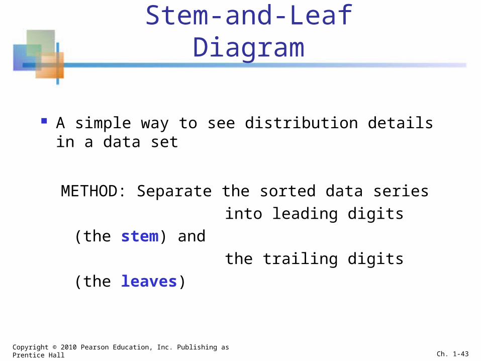
Stem-and-Leaf Diagram
A simple way to see distribution details in a data set
METHOD: Separate the sorted data series into leading digits (the stem) and the trailing digits (the leaves)
Copyright © 2010 Pearson Education, Inc. Publishing as Prentice Hall Ch. 1-43

Example
Here, use the 10’s digit for the stem unit:
Data in ordered array:21, 24, 24, 26, 27, 27, 30, 32, 38, 41
21 is shown as 38 is shown as
Stem Leaf
2 1
3 8
Copyright © 2010 Pearson Education, Inc. Publishing as Prentice Hall Ch. 1-44

Example
Completed stem-and-leaf diagram:Stem Leaves
2 1 4 4 6 7 73 0 2 84 1
(continued)
Data in ordered array:21, 24, 24, 26, 27, 27, 30, 32, 38, 41
Copyright © 2010 Pearson Education, Inc. Publishing as Prentice Hall Ch. 1-45

Using other stem units
Using the 100’s digit as the stem: Round off the 10’s digit to form the leaves
613 would become 6 1 776 would become 7 8 . . . 1224 becomes 12 2
Stem Leaf
Copyright © 2010 Pearson Education, Inc. Publishing as Prentice Hall Ch. 1-46

Using other stem units
Using the 100’s digit as the stem: The completed stem-and-leaf display:
Stem Leaves
(continued)
6 1 3 6 7 2 2 5 8 8 3 4 6 6 9 9 9 1 3 3 6 8 10 3 5 6 11 4 7 12 2
Data:
613, 632, 658, 717,722, 750, 776, 827,841, 859, 863, 891,894, 906, 928, 933,955, 982, 1034, 1047,1056, 1140, 1169, 1224
Copyright © 2010 Pearson Education, Inc. Publishing as Prentice Hall Ch. 1-47

Relationships Between Variables
Graphs illustrated so far have involved only a single variable
When two variables exist other techniques are used:
Categorical(Qualitative)
Variables
Numerical(Quantitative)
Variables
Cross tables Scatter plots
Copyright © 2010 Pearson Education, Inc. Publishing as Prentice Hall Ch. 1-48
1.6

Scatter Diagrams are used for paired observations taken from two numerical variables
The Scatter Diagram: one variable is measured on the vertical
axis and the other variable is measured on the horizontal axis
Scatter Diagrams
Copyright © 2010 Pearson Education, Inc. Publishing as Prentice Hall Ch. 1-49

Scatter Diagram Example
Cost per Day vs. Production Volume
0
50
100
150
200
250
0 10 20 30 40 50 60 70
Volume per Day
Cos
t per
Day
Volume per day
Cost per day
23 125
26 140
29 146
33 160
38 167
42 170
50 188
55 195
60 200
Copyright © 2010 Pearson Education, Inc. Publishing as Prentice Hall Ch. 1-50

Scatter Diagrams in Excel
Select the Insert tab12 Select Scatter type from
the Charts section
When prompted, enter the data range, desired legend, and desired destination to complete the scatter diagram
3
Copyright © 2010 Pearson Education, Inc. Publishing as Prentice Hall Ch. 1-51

Cross Tables
Cross Tables (or contingency tables) list the number of observations for every combination of values for two categorical or ordinal variables
If there are r categories for the first variable (rows) and c categories for the second variable (columns), the table is called an r x c cross table
Copyright © 2010 Pearson Education, Inc. Publishing as Prentice Hall Ch. 1-52

Cross Table Example
4 x 3 Cross Table for Investment Choices by Investor (values in $1000’s)
Investment Investor A Investor B Investor C Total Category
Stocks 46.5 55 27.5 129Bonds 32.0 44 19.0 95CD 15.5 20 13.5 49Savings 16.0 28 7.0 51
Total 110.0 147 67.0 324
Copyright © 2010 Pearson Education, Inc. Publishing as Prentice Hall Ch. 1-53
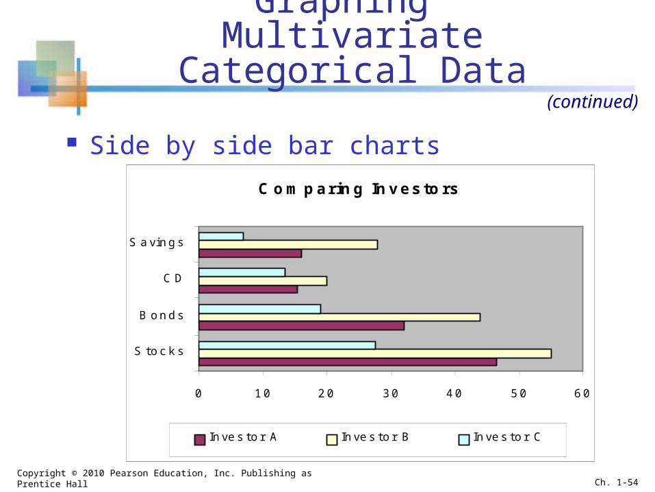
Graphing Multivariate Categorical Data
Side by side bar charts
(continued)
Comparing Investors
0 10 20 30 40 50 60
S toc k s
B onds
CD
S avings
Inves tor A Inves tor B Inves tor C
Copyright © 2010 Pearson Education, Inc. Publishing as Prentice Hall Ch. 1-54

Side-by-Side Chart Example Sales by quarter for three sales territories:
0
10
20
30
40
50
60
1st Qtr 2nd Qtr 3rd Qtr 4th Qtr
EastWestNorth
1st Qtr 2nd Qtr 3rd Qtr 4th QtrEast 20.4 27.4 59 20.4West 30.6 38.6 34.6 31.6North 45.9 46.9 45 43.9
Copyright © 2010 Pearson Education, Inc. Publishing as Prentice Hall Ch. 1-55

Data Presentation Errors
Goals for effective data presentation:
Present data to display essential information
Communicate complex ideas clearly and
accurately
Avoid distortion that might convey the wrong
message
Copyright © 2010 Pearson Education, Inc. Publishing as Prentice Hall Ch. 1-56
1.7
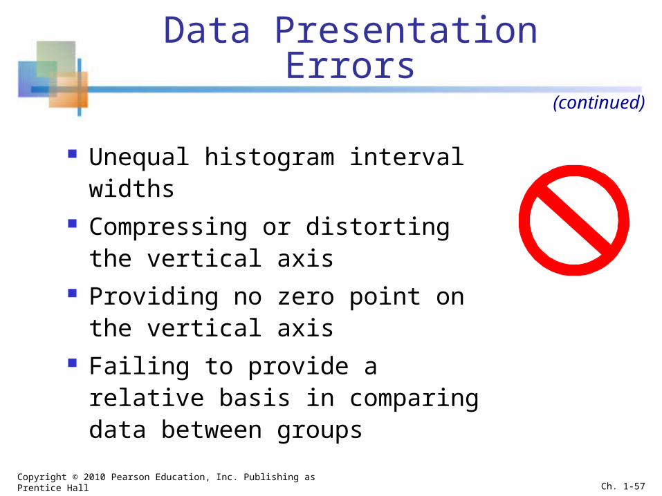
Data Presentation Errors
Unequal histogram interval widths Compressing or distorting the
vertical axis Providing no zero point on the
vertical axis Failing to provide a relative basis
in comparing data between groups
(continued)
Copyright © 2010 Pearson Education, Inc. Publishing as Prentice Hall Ch. 1-57

Chapter Summary
Reviewed incomplete information in decision making
Introduced key definitions: Population vs. Sample Parameter vs. Statistic Descriptive vs. Inferential statistics
Described random sampling Examined the decision making process
Copyright © 2010 Pearson Education, Inc. Publishing as Prentice Hall Ch. 1-58

Chapter Summary Reviewed types of data and measurement levels Data in raw form are usually not easy to use for decision
making -- Some type of organization is needed: Table Graph
Techniques reviewed in this chapter: Frequency distribution Bar chart Pie chart Pareto diagram
Line chart Frequency distribution Histogram and ogive Stem-and-leaf display Scatter plot Cross tables and side-by-side bar charts
Copyright © 2010 Pearson Education, Inc. Publishing as Prentice Hall Ch. 1-59
(continued)