Embed Size (px)
Citation preview
Statistical Process ControlCreation and Interpretation of Control Charts
Douglas B. Brown, Ph.D.
IVT Validation Week (Coronado, CA)
October 18 – 20, 2016
Disclaimer
The contents of this presentation represent
the opinions and views of the speaker and do
not necessarily represent any opinions or
views from Charles River Laboratories, its
subsidiaries, or any employee associated
with Charles River Laboratories.
2

The “Process” Lifecycle
3
• Stage 3 begins with the completion of the process or productvalidation.
• The purpose of this stage is the continual assurance that the validatedprocess is performing as it is intended (i.e., designed) throughout theentirety of the process’s operation.
• In other words, we want the process to stay in a controlled state.

Why should we be concerned about
Process Control?Referring to the 2011 Guidance for Industry on Process Validation…
Grace E. McNally, Senior Policy Advisor for the U.S. Food and Drug Administration, asked 3 questions during a May 2011 presentation concerning the Lifecycle Approach in the context of Process Validation:
1. Do I have confidence in my manufacturing process? Or, more specifically, what scientific evidence assures me that my process is capable of consistently delivering quality product?
2. How do I demonstrate that my process works as intended?
3. How do I know my process remains in control?
4

What is Control?The Four Process States• The ideal state
o The process is in statistical control and produces 100% conformance.
o The process has proven stability and target performance over time.
o It is predictable and its output meets expectations.
• The threshold stateo The process is in statistical control but produces the
occasional nonconformance.
o Although predictable, this process does not consistently meets expectations.
• The brink of chaos stateo The process is not in statistical control, however, it is not
producing defects.
o The process is unpredictable, but the outputs of the process still meet the requirements.
o The lack of defects leads to a false sense of security, however, as such a process can produce nonconformances at any moment. It is only a matter of time.
• The state of chaos o The process is not in statistical control and produces unpredictable levels of
nonconformance (e.g., Out of Specification)
5

Overview
• Statistical Process Control
• Creating Control Charts
• Establishing Zones/Limits
• Identifying Outliers in the Baseline (Background)
• Rules for “Out of Control” State
• Establishing Alert Flags
• Analyzing Control Charts
6

Statistical Process Control
• Statistical Process Control (SPC) is a method
of quality control which uses statistical methods to
compare (or evaluate) what is currently
happening to what has occurred historically.
• SPC can be applied to ANY process where the
"conforming product" output (i.e., product meeting
some type of specification(s)) can be measured.
• Monitoring and controlling a process (or system)
ensures that the operation is performing at its full
potential with minimal waste (or defects).
7

What Do I Monitor? • Identify the nature, source, and
extent of the variability within
your process, product, or
production (e.g., people,
equipment and instruments,
facilities and environment,
materials and reagents).
8
• Some degree of variability is inherently present in every process.
• Know AND understand the impact of the variability on the
effectiveness of your process.
• Controlling (and especially monitoring) the variability begins at the
initial stages of the validation lifecycle and is ongoing as the
process is used throughout Stage 3 until the process is
discontinued.

Statistical Process Control Techniques
• Graphical techniques are helpful in troubleshooting issues
related to quality.
• These techniques are often referred to as “Basic Tools of
Quality”.
• People can utilized these tools with minimal formal training in
statistics and they include:
o Histograms
o Scatter Diagrams
o Cause and Effect Diagrams
o Defect Concentration Diagrams
o Pareto Charts
o Check Sheets
o Control Charts
9

Histograms – I
• The purpose of a histogram is to graphically summarize
the distribution of a univariate data set (i.e., one variable
set of data). The histogram graphically shows the
following:
o Center (or location) of the data
o Spread (or the scale) of the data
o Skewness (or asymmetric
distribution) of the data
o Presence of potential outliers
o Presence of multiple modes in the
data
10

Histograms – II
The most common form of the histogram is obtained by
splitting the range of the data into equal-sized bins (called
classes). Then for each bin, the number of points from the
data set that fall into each bin are counted.
• Vertical axis: Frequency
(i.e., counts for each bin)
• Horizontal axis: Response
variable
11

Scatter Diagrams (or Plots)
• A type of diagram or plot using coordinates to
display values for typically 2 variables for a data
set.
• Typically,
– The vertical axis (Y-axis) is the
variable response
– The horizontal axis (X-axis) is
usually some variable we
suspect may be related to the
response
12

Cause and Effect Diagrams• Also know as Ishikawa or fishbone diagrams, identifies the potential
factors which may be a cause to an overall defect.
• Each cause or reason for imperfection is a source of variation.
• Causes are usually grouped into major categories to identify sources of
variation.
o Equipment: Any instruments, computers,
tools, etc. required to accomplish the job
o Process: How the method/procedure is
performed and the specific requirements for
doing it, such as policies, procedures, rules,
regulations and laws
o People: Anyone involved with the process
o Materials: Raw materials, parts, etc.
o Environment: The conditions, such as
location, time, temperature, and culture in
which the process operates
o Management: Physical and
Financial support
o Measurements: Data generated
from the process that are used
to evaluate its quality
13

Defect Concentration Diagrams
• A graphical tool that is used when analyzing the
causes of a product (or part) defect.
• It is a drawing of the product (or process) with all
relevant views displayed, onto which the
locations and frequencies of various defects
shown.
14

Pareto Charts and Check Sheets
• A Pareto chart is a bar chart that displays the relative
importance of problems in a format that is easy to
interpret.
o The most important problem is represented by the tallest bar.
o Generally, 80 % of the problems stem from 20% of the possible
causes (J.M. Juran).
• A check sheet is a tool for
collecting data for Pareto chart.
o Check sheets are simply a form
used to collect data; specifically, a
tally sheet of nonconformities
15
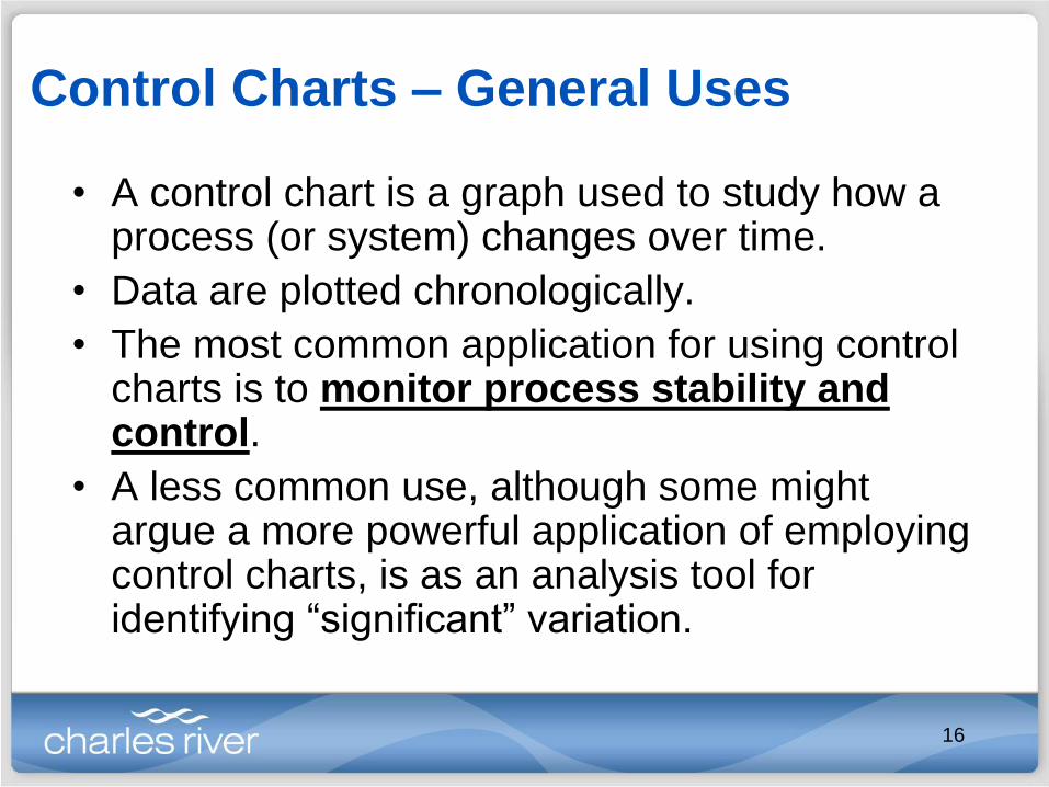
Control Charts – General Uses
• A control chart is a graph used to study how a process (or system) changes over time.
• Data are plotted chronologically.
• The most common application for using control charts is to monitor process stability and control.
• A less common use, although some might argue a more powerful application of employing control charts, is as an analysis tool for identifying “significant” variation.
16

Basic Variation Types
• When a process is stable and in control, it displays “common cause variation”.– This is variation that is inherent to the process
(e.g., instrument/equipment, reagents/materials, human beings)
• A process is in control when, based on past experience, it can be predicted how the process will vary (within limits) in the future.
• If the process is unstable, then the process displays “special cause variation” (i.e., non-random variation from an external factor(s)).
17

Basic Elements of a Control Chart
1. A control chart begins with a graphing (plotting) data
chronologically.
2. A Central Line (i.e., average or mean) is added as a visual
reference for detecting shifts or trends. This is also referred to as
the process location.
3. Upper and Lower Control Limits (UCL and LCL) are computed
from available data and placed equidistant from the Central Line.
This may also be labeled as the process dispersion.
18

Controlled Variation
• Controlled variation is characterized by a
stable and consistent pattern of variation over
time, and is associated with common causes.
• A process operating with controlled variation
has an outcome that is predictable within the
bounds of the control limits.
19

Uncontrolled Variation
• Uncontrolled variation is characterized by variation
that changes over time and is associated with special
causes.
• The outcomes of this process are UNprEDictAble.
20

Control Chart Limits
• Control chart limits are set based on the normal
distribution of the process generated data in which
– 68.3% of the data is within ±1 standard deviation from the
average.
– 95.4% of the data is within ±2 standard deviations from the
average.
– 99.7% of the data is within ±3 standard deviations from the
average.
• As such, plotting data that is not normally distributed
may signal an unexpectedly high rate of false alarms.
21

Control Chart and Normal Distribution
• Note that process capability and process stability are two different things...BUT they are related.
• A process should be stable (allowing only common cause variation to exist) and capable of consistently meeting defined specification before process control is addressed.
22

Control Limits v. Specification Limits – II
23
•The control limits assist personnel in
identifying changes which may (or may not)
lead the process or system into an “Out of
Specification” state.
•The “Out of Specification” state exists
when data (i.e., results) occur outside the
established specification limits; limits that
are determined externally by the client or
developer.
•A process is defined as being “Capable”
when the control limits are within or on the
specification limits (see Top Figure).
•A process is defined as being “Not
Capable” when one or both of the control
limits are outside of the specification limits
(see Bottom Figure).

What Type of Control Chart Should I Use?
• Variable Control Charts (measuring how much)
– X and Rm – Individual and moving average
– X and R – Median and range
– X-bar and S – Mean and SD
– X-bar and R – Mean and range
• Attribute Control Charts (counting how many)
– C Chart – Number of defects in sample
– U Chart – Number of defects per item
– NP Chart – Number of defective items
– P Chart – Proportion of defective items
24

Outline
• Statistical Process Control
• Creating Control Charts
• Establishing Zones/Limits
• Identifying Outliers in the
Baseline (Background)
• Rules for “Out of Control” State
• Establishing Alert Flags
• Analyzing Control Charts
25

Control Charting • There are many statistical software packages in market
(e.g., SAS, JMP, MiniTab, Tableau) Pro – many are excellent, easy to use software packages
Pro – many have pre-loaded charts and analyses (from simple to complex/advanced statistical analyses)
Con – packages can run from about $1000 to over $10,000 per year for a single license
Con – some software require an annual renewal fee, too
• If monetary constants prevent you from using this powerful tool, then you can use Microsoft Excel to create your own charts. Pro – you already own it and there are no user/licensing constraints
Con – it will require some work (time) and maintenance where marketed software do not
26

Background Information – I
• Using Microsoft Excel* (MS Excel), open a new
workbook (i.e., spreadsheet).
• Label columns with pertinent tracking information.
*Microsoft Office Excel 2007 is used throughout this presentation
27

Background Information – II
• Set the top 2 or 3 items
that are important for
determining the system’s
(or process’s) stable.
• Label/title the next set of
columns with the data to be
collectedo Positive
and/or
negative
controls
o Standard
curve points
o Concentration
points
o Flow rates
o Peak times
28

Background Information – III
• All data being analyzed
should use the SAME
equipment/instrument settings
or parameters
• Entered data (replicate points) may be used to
generate additional information for future evaluation
(e.g., mean, range)
29

Creating a Control Chart – I
• Highlight the
background
(historical) data
and dates
associated with
the selected data
to be plotted.
• Select the “Insert” tab
• Select the “Scatter” icon
• Select the “Scatter with Straight Lines and Markers”
30

Creating a Control Chart – II
• The Move Chart window will appear
o Select “New sheet” option
o Enter a title for your new worksheet
• The scatter plot
will appear within
the
spreadsheet
• Select the
“Design” tab and
then the “Move
Chart Location”
icon
31

Creating a Control Chart – III
• Select the “Design” tab and
then the “Select Data” icon
o The “Select Data
Source” window appears
o Select the “Edit”
button.
o The “Edit Series”
window will appear.
Enter:
Series Name
X-values = Time
Y-values = Item to be
trended
32

Creating a Control Chart – IV
• Delete the “Legend” entry from
the graph
• Add the vertical axis label
o Select the “Layout” tab
o Select the “Axis Titles”
icon
o Select the “Primary Vertical
Axis Title” menu option
o Select the “Rotated Title”
menu option
o Select the “Axis Title” and
type in a suitable title for
the y-axis (repeat for x-axis)
33

Outline
• Statistical Process Control
• Creating Control Charts
• Establishing Zones/Limits
• Identifying Outliers in the
Baseline (Background)
• Rules for “Out of Control” State
• Establishing Alert Flags
• Analyzing Control Charts
34

Establishing the Background Baseline – Ia
• Ideally, 50 data points should be used to
establish the background baseline.
• The baseline is established from data collected
under the current or established testing or
operating process (or system).
o The final procedure or process used during the
qualification and validation procedure is performed
under the same conditions
o These data points may be used to establish the first set
of data points for which the control chart zones and
alert flags are established.
35

Establishing the Background Baseline – Ib• If 50 data points are not available, then follow the suggested
guidelines, or use another justified system. Begin with a baseline containing a minimum of 10 data points (if possible).o After at least 30 total data points are acquired, adjust the baseline to use
the first 20 data points.
o After at least 40 total data points are acquired, adjust the baseline to use the first 30 data points.
o After at least 50 total data points are acquired, adjust the baseline to use the first 40 data points.
o After at least 60 total data points are acquired, adjust the baseline to use the first 50 data points.
• No baseline adjustments are needed unless the process (or system) changes with respect to the most recent validated (or established) state.
NOTE: If the process or system CHANGES, then all previous data should not be used and the trending must begin again.
However, if a Lot Test (or something equivalent) can demonstrate that the change does not affect the process or system, then the trending may continue as established (i.e., a new background baseline does not need to be created).
36
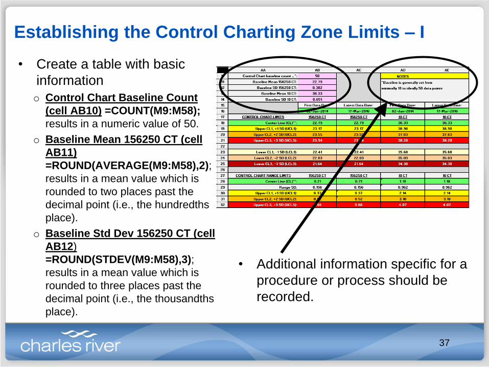
Establishing the Control Charting Zone Limits – I
• Create a table with basic
information
o Control Chart Baseline Count
(cell AB10) =COUNT(M9:M58);
results in a numeric value of 50.
o Baseline Mean 156250 CT (cell
AB11)
=ROUND(AVERAGE(M9:M58),2);
results in a mean value which is
rounded to two places past the
decimal point (i.e., the hundredths
place).
o Baseline Std Dev 156250 CT (cell
AB12)
=ROUND(STDEV(M9:M58),3);
results in a mean value which is
rounded to three places past the
decimal point (i.e., the thousandths
place).
• Additional information specific for a
procedure or process should be
recorded.
37

Establishing the Control Charting Zone Limits – II
o First Data Date (cell
AB16) =MIN(E9:E200);
the earliest date in which
data is being collected;
formula includes a large
range to accommodate
data to be added in the
future.
o Latest Data Date (cell
AC16) =MAX(E9:E200);
the latest (most recent)
date in which data is
being collected; formula
includes a large range to
accommodate data to be
added in the future.
38

Establishing the Control Charting Zone Limits – III
o Control Chart Zone
Limits
Zone C – GREEN ZONE;
data points are ±1 SD from
the mean (CL). Between the Upper Limit
Control 1 (UCL1) and Lower
Limit Control 1 (LCL1)
Zone B – YELLOW ZONE;
data points are ±2 SD from
the mean (CL). Between UCL1 and UCL2
Between LCL1 and LCL2
Zone A – ORANGE ZONE;
data points are ±3 SD from
the mean (CL). Between UCL2 and UCL3
Between LCL2 and LCL3
Out of Control – RED ZONE; data
points are MORE THAN ±3 SD from the
mean (CL). Above UCL3
Below LCL3
39

Establishing the Control Charting Zone Limits – IV
o Center Line (CL)
Cells AB18,AC18
Mean value for data set
Why are 2 cells required? Two
points are needed to make a
line.
=ROUND(AVERAGE(M9:M58
),2)
o UCL1 (cells AB19,AC19)
=ROUND(AB11+(1*AB12),2)
o UCL2 (cells AB20,AC20)
=ROUND(AB11+(2*AB12),2)
o UCL3 (cells AB21,AC21)
=ROUND(AB11+(3*AB12),2)
oLCL1 (cells AB23,AC23)=ROUND(AB11-(1*AB12),2)
oLCL2 (cells AB24,AC24)=ROUND(AB11-(2*AB12),2)
oLCL3 (cells AB25,AC25)=ROUND(AB11-(3*AB12),2)
40
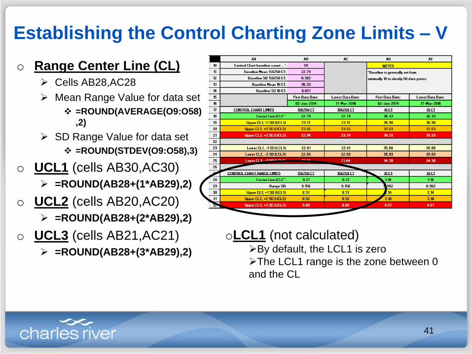
Establishing the Control Charting Zone Limits – V
o Range Center Line (CL)
Cells AB28,AC28
Mean Range Value for data set
=ROUND(AVERAGE(O9:O58)
,2)
SD Range Value for data set
=ROUND(STDEV(O9:O58),3)
o UCL1 (cells AB30,AC30)
=ROUND(AB28+(1*AB29),2)
o UCL2 (cells AB20,AC20)
=ROUND(AB28+(2*AB29),2)
o UCL3 (cells AB21,AC21)
=ROUND(AB28+(3*AB29),2)
oLCL1 (not calculated)By default, the LCL1 is zero
The LCL1 range is the zone between 0
and the CL
41

Establishing the Control Charting Zone Limits – VI
• Click on the plot and then
select the “Select Data”
option.
• The “Select Data
Source” window appears
• Select the “Edit” button
42

Establishing the Control Charting Zone Limits – VII
• The “Edit Series” window
appears.
• Enter an appropriate “Series
name:”
• Select the “Series X values:”
and enter the date range
o =‘Background_Current
Data’!$AB$16:$AC$16
• Select the “Series Y values:” and enter the date range
o CL: =‘Background_Current Data’!$AB$18:$AC$18
o UCL1: =‘Background_Current Data’!$AB$19:$AC$19
o UCL2 : =‘Background_Current Data’!$AB$20:$AC$20
o UCL3 : =‘Background_Current Data’!$AB$21:$AC$21
o LCL1: =‘Background_Current Data’!$AB$23:$AC$23
o LCL2 : =‘Background_Current Data’!$AB$24:$AC$24
o LCL3 : =‘Background_Current Data’!$AB$25:$AC$25
43

Establishing the Control Charting Zone Limits – VIII
• Click a line and then
select the “Format Data
Series” option.
• The “Format Data
Series” window appears
o Select the “Line Color”
option to change the color
of the line
o Select the “Line Style”
option to change the
appearance of the line
Repeat steps as needed
44

Establishing the Control Charting Zone Limits – IX
• Click a line and then select
the “Add Data Labels”
option.
o The numerical value for the line
appears on both ends of the line
o Delete the 1st (closest to Y-axis)
• Click on the data label and
select the “Format Data
Labels” option.
• The “Format Data Labels”
window appears.
o Select “Right” under the “Label
Position” heading
Repeat steps as needed
45

Adjusting the Plot Axis
• Both the X- and Y-
axis may be
adjusted
• Click on the X-axis
and select the
“Format Axis”
option
• Date conversions
o 1 month = 30.4375
days
o 1 week = 7.024 days
• Calendar Dates
o 01JAN2016 (ddMMMyyyy) = 42370 (generic numerical value)
• Adjust Minimum, Maximum, Major unit, Minor unit values as needed
• Adjust Y-axis as needed; following steps above as a guide
46
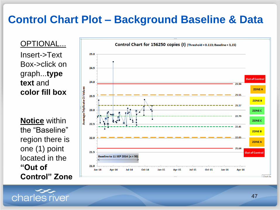
Control Chart Plot – Background Baseline & Data
Notice within
the “Baseline”
region there is
one (1) point
located in the
“Out of
Control” Zone
OPTIONAL...
Insert->Text
Box->click on
graph...type
text and
color fill box
47

Outline
• Statistical Process Control
• Creating Control Charts
• Establishing Zones/Limits
• Identifying Outliers in the
Baseline (Background)
• Rules for “Out of Control” State
• Establishing Alert Flags
• Analyzing Control Charts
48

Identifying Outliers in the Background Region – I
• When setting up the control charting zones, it is
important to evaluate data points that appear to be
significantly far away from the rest of the plotted
background data (but what is significant?)
• The Tukey Method is used to evaluate and identify
potential outliers.
• The Tukey Method sets the cutoff-values based on the
Interquartile Range.
• The data set may be visualize as a “Box and Whisker”
plot (which may be created using MS Excel).
49

Identifying Outliers in the Background Region – II
• Use the “Quartile” function to set the limitso Minimum (MIN) Value =QUARTILE(M9:M48,0)
o First (1st) Quartile =QUARTILE(M9:M48,1)
o Median (MED) Value =QUARTILE(M9:M48,2)
o Third (3rd) Quartile =QUARTILE(M9:M48,3)
o Maximum (MAX) Value =QUARTILE(M9:M48,4)
• These values are used to calculate the Low and HighExtreme Outlier Limits (or Far Lower Fence and FarUpper Fence, respectively).
50

Identifying Outliers in the Background Region – III
• IQR is the difference between
the 3rd and 1st Quartile values
=(M4-M2)
• 3IQR = Multiple IQR by 3
=3*(M4-M2)
• Low Extreme Outlier Limit is
the 3IQR – 1st Quartile value
=M2-(3*(M4-M2))
• High Extreme Outlier Limit is
the 3IQR + 3rd Quartile value
=M2+(3*(M4-M2))
51

Identifying Outliers in the Background Region – IV
• For Range Charts, only the High Extreme Outlier Limit
is created.
• In Column N, outliers for Control Charts may be identified
after the data points are entered by comparing the mean
value to the outlier criteria.
• =IF(OR(M32<$M$6,M32>$M$7),"OUTLIER Exist","")
52

Identifying Outliers in the Background Region – IV
• The statement
“OUTLIER
Exist” will
ONLY appear
when 1 of 2
logical
conditions is
met.
• The value in cell M32 (24.73) is LOWER than the value for
“LO Extreme Outliers:” M32<$M$6
• The value in cell M32 (24.73) is HIGHER than the value for
“HI Extreme Outliers:” M32>$M$7
53
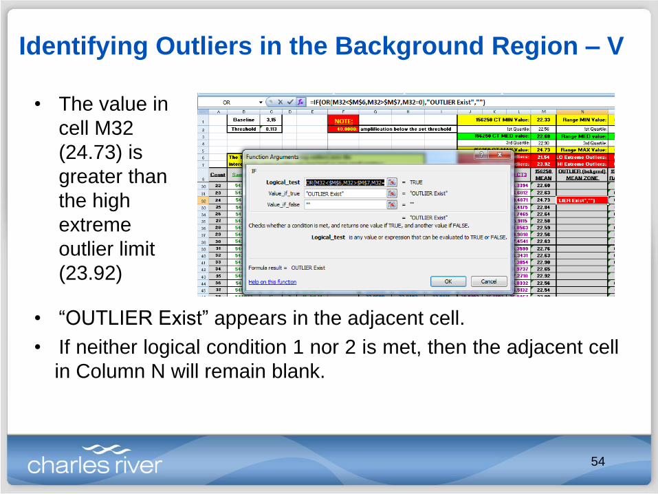
Identifying Outliers in the Background Region – V
• The value in
cell M32
(24.73) is
greater than
the high
extreme
outlier limit
(23.92)
• “OUTLIER Exist” appears in the adjacent cell.
• If neither logical condition 1 nor 2 is met, then the adjacent cell
in Column N will remain blank.
54

Identifying Outliers in the Background Region – VI
• Once a data point has been identified as an outlier, a
determination to keep or exclude the data point from
the population set must be made.
• Including extreme outlier data points may lead to...
1. “Masking” of data that otherwise would be flagged as the
system is trending toward an “Out of Control” state.
2. Falsely flagging data as trending towards an “Out of
Control” state when, in fact, the system is displaying its
normal variation range.
55

Identifying Outliers in the Background Region – VII
• Removing an extreme outlier data point WILL CHANGE: o Baseline count, mean, standard deviation
o CL, UCLs, LCLs
o Box and Whisker Plot
o Low and High Extreme Outlier Limits
56

Identifying Outliers in the Background Region – VIII
• After removing the high extreme outlier data point: o The Control Chart Zones and labels are changed
o Data that might be trending toward and “Out of Control” state is
now “unmasked”.NOTE: It is good practice to annotate your plots, especially when data has been
removed for any reason.
57

Identifying Outliers in the Background Region – IX
58

Outline
• Statistical Process Control
• Creating Control Charts
• Establishing Zones/Limits
• Identifying Outliers in the Baseline
(Background)
• Rules for “Out of Control” State
• Establishing Alert Flags
• Analyzing Control Charts
59

Rules for Determining “Out of Control” State - I
• Alert Flags (or Rule Violations) indicate that the
procedure, process, or system is not behaving
as established (or validated).
• When the current collected data are plotted the
the development of an “Out of Specification”
state may begin to materialize.
• Alert Flags are used to identify drift within a
system and/or some other not normal sudden
occurrence.
60

Rules for Determining “Out of Control” State - II
• SPC control limits (and later alert limits) are established by identifying
the 3-sigma level, both high and low (already discussed).
• Once a process is brought under control and the 1, 2, and 3-sigma
limits established, the sensitivity of the control chart for detecting drifts
before the 3-sigma control limit is reached, may now become
apparent.
• The decision-making criteria first was popularized by the Western
Electric Company (abbreviated as WECO … an American electrical
engineering and manufacturing company primary serving AT&T from 1881 – 1996).
• The WECO Rules were first implemented in the 1920's.
• These quality control guidelines were codified in the 1950's and form
the basis for many other rule sets.
61

Rules for Determining “Out of Control” State - III
• While there are many common individual rules in different industries
throughout the world, many industries have developed their own variations to
the WECO Rules. o Nelson Rules – The Nelson rules were first published in the October 1984 issue of the Journal
of Quality Technology in an article by Lloyd S Nelson.
o AIAG Rules – The (AIAG) Automotive Industry Action Group control rules are published in the
their industry group “Statistical Process Control Handbook”.
o Juran Rules - Joseph M. Juran was an international expert in quality control and defined these
rules in his “Juran's Quality Handbook”, McGraw-Hill Professional; 6 edition (May 19,
2010), ISBN-10:0071629734
o Hughes Rules
o Duncan Rules – Acheson Johnston Duncan was an international expert in quality control and
published his rules in the text book “Quality control and industrial statistics” (fifth edition). Irwin,
1986.
o Gitlow Rules - Dr. Howard S. Gitlow is an international expert in Sigma Six, TQM and SPC.
His rules are found in his book “Tools and Methods for the Improvement of Quality”,
1989, ISBN-10: 0256056803 .
o Westgard Rules – The Westgard rules are based on the work of James Westgard, a leading
expert in laboratory quality management . They are considered “Laboratory quality control
rules”. (www.quinn-curtis.com/spcnamedrulesets.htm)
62

Rules for Determining “Out of Control” State - IV
Rule 1 Flag. Out of Control (above UCL3 OR below
LCL3)
The most recent data point plots outside the either the HI or LO 3-
sigma limit.
Rule 1:
63

Rules for Determining “Out of Control” State – V
Rule 2 Flag. Zone A–HI (UCL2 UCL3) OR Zone A–LO
(LCL3 LCL2)
Two (2) of the three (3) most recent data points plot within Zone A
AND on the same side (either HI or LO).
Rule 2:
64

Rules for Determining “Out of Control” State – VI
Rule 3 Flag. Zone A/B–HI (UCL1 UCL3) OR Zone
A/B–LO (LCL3 LCL1)
Four (4) of the five (5) most recent data points plot within 2- or 3-
sigma of mean, AND on the same side (either HI or LO).
Rule 3:
65

Rules for Determining “Out of Control” State – VII
Rule 4 Flag. Nine (9) out of the last nine (9) datapoints plot on the same side of the centerline (CL)
The chance that a data point falls on the same side of the CL (ormean value) as one before it is 1 out of 2 (or 50%).
The probability that the next data point fall on the same side again is1 out of 4 (or 25%).
The probability that the next data point fall on the same side again is1 out of 8 (or 12.5%). Rule 4:
The probability that nine (9) data points fall on the same side is 1 out of 512 (or about 0.2%).
66

Rules for Determining “Out of Control” State – VIII
Rule 5 Flag. Eight (8) out of the last eight (8) data
points DO NOT fall within 1-sigma of the centerline
(CL) AND the data points occur on BOTH sides of the
centerline (CL)
Rule 5:
67
Rules for Determining “Out of Control” State – IX
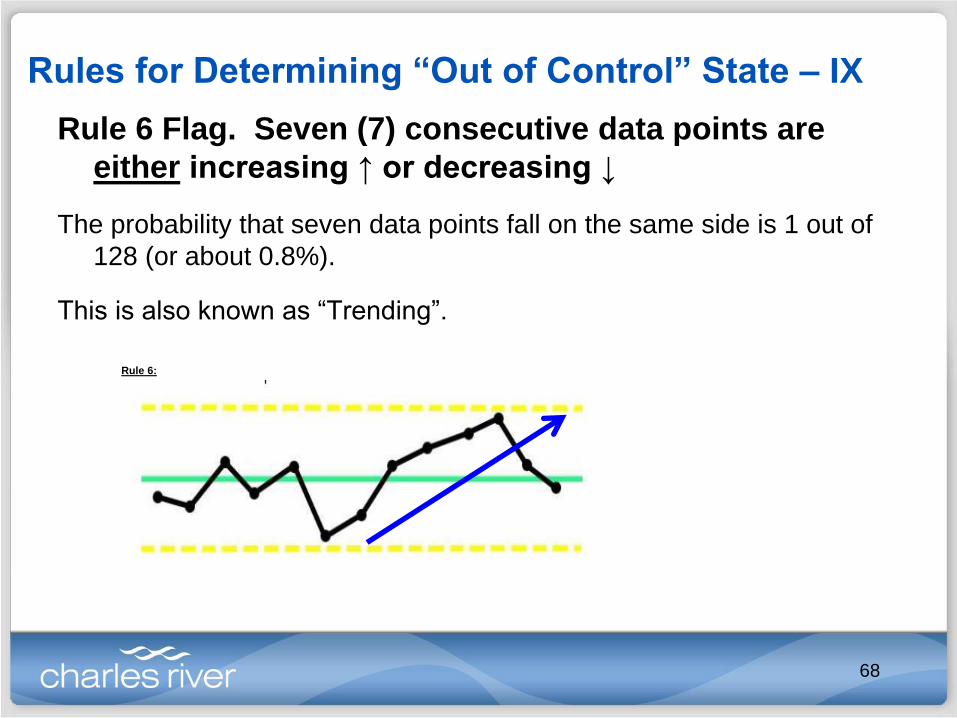
Rule 6 Flag. Seven (7) consecutive data points are
either increasing ↑ or decreasing ↓
The probability that seven data points fall on the same side is 1 out of
128 (or about 0.8%).
This is also known as “Trending”.
Rule 6:
68

Rules for Determining “Out of Control” State – X
Rule 7 Flag. Fourteen (14) consecutive data points
alternating direction
This is also known as “Oscillating”.
Rule 7:
69

Outline
• Statistical Process Control
• Creating Control Charts
• Establishing Zones/Limits
• Identifying Outliers in the
Baseline (Background)
• Rules for “Out of Control” State
• Establishing Alert Flags
• Analyzing Control Charts
70

Creating an Alert Flag Spreadsheet – I
• Begin by typing your selected rules at the top of
the spreadsheet.
• For quick reference and good practice for
displaying/discussion
71

Creating an Alert Flag Spreadsheet – II
• Entered data from a previous worksheet may be linked to
appear on this new worksheet.
72

Creating an Alert Flag Spreadsheet – III
• The “ZONE Value for (MEAN)” is determined to assist with the evaluation of the
(mean) data point value compared to previous recorded (mean) data points.
• By utilizing MS Excel’s IF/THEN function, mathematical equations can be created
to assist in determining if a process is drifting or trending toward an “Out of
Control” state.o If the value is greater than the UCL3 limit, then a value of 1,000,000 is assigned.
o If the value is less than the UCL3 limit, but greater than the UCL2 limit, then a value of 100,000
is assigned.
o If the value is less than the UCL2 limit, but greater than the UCL1 limit, then a value of 10,000
is assigned.
o If the value is less than the UCL1 limit, but greater than the CL, then a value of 1,000 is
assigned.
o If the value is less than the CL, but greater than the LCL1 limit, then a value of 100 is assigned.
o If the value is less than the LCL1, but greater than the LCL2 limit, then a value of 10 is
assigned.
o If the value is less than the LCL2, but greater than the LCL3 limit, then a value of 1 is assigned.
o If the value is less than the LCL3, then a value of 0 is assigned.
73

Creating an Alert Flag Spreadsheet – IV
• =IF(F10="","",IF(F10>'Background_Current Data
(I)'!$AB$21,1000000,IF(F10>'Background_Current Data
(I)'!$AB$20,100000,IF(F10>'Background_Current Data
(I)'!$AB$19,10000,IF(F10>'Background_Current Data
(I)'!$AB$18,1000,IF(F10>'Background_Current Data
(I)'!$AB$23,100,IF(F10>'Background_Current Data
(I)'!$AB$24,10,IF(F10>'Background_Current Data (I)'!$AB$25,1,0))))))))
• In this example, “F10” is the cell
containing the value being tested
against the conditions listed
above and the control charting
zone limits for this example are
found on the worksheet titled
'Background_Current Data (I)’
• The reported value appears in
the adjacent cell (e.g., cell G10)
NOTE: While there may be other methods (e.g., formulas, calculations) to relate a current data point to
previous ones, this is just one possible approach.
74

Creating an Alert Flag Spreadsheet – V
• For example, the Rule 1 Flago The MS Excel formula for this flag is:
=IF(F10="","",(IF(OR(VALUE(G10)=0,VALUE(G10)=1000000),"Rule 1 Flag","")))If the value is equal to either 0 or 1,000,000, then the data
point is labelled with a “Rule 1 Flag”.
This means that the data point is more than three (3) standard deviations away from the centerline (CL).
The “Rule 1 Flag” will appear in Column H (see next figure) in the same row as the cell containing the data point being evaluated.
NOTE: Due to the lengthy formulas, additional explanations for Rule Flag 2 through 7 are not described.
75
Creating an Alert Flag Spreadsheet – VI
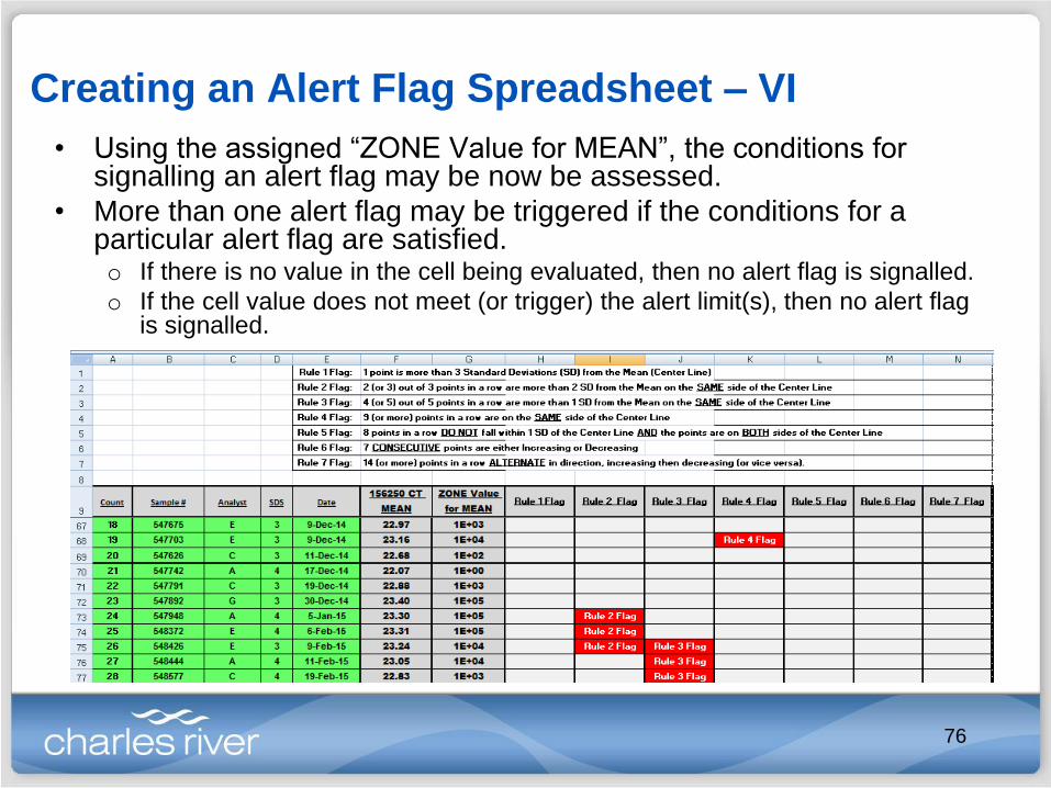
• Using the assigned “ZONE Value for MEAN”, the conditions for signalling an alert flag may be now be assessed.
• More than one alert flag may be triggered if the conditions for a particular alert flag are satisfied.o If there is no value in the cell being evaluated, then no alert flag is signalled.
o If the cell value does not meet (or trigger) the alert limit(s), then no alert flag is signalled.
76

Annotating the Control Chart Plots (optional)
• Use colored circles
and boxes along
with text to identify
the specific alert
flags.
• Note/annotate when
critical or key
material changes
(e.g., new dilutions
of reference/testing
standards, new lot
material and/or
same reagent from
different vendor is
introduced)
77

Outline
• Statistical Process Control
• Creating Control Charts
• Establishing Zones/Limits
• Identifying Outliers in the
Baseline (Background)
• Rules for “Out of Control” State
• Establishing Alert Flags
• Analyzing Control Charts
78

Analyzing the Control Chart Plots & Tables – I
• In the table,
there are
many “Out of
Control” alerts
associated
with Analyst F.
• If this analyst
is removed,
then a
different
picture
develops.
79

Analyzing the Control Chart Plots & Tables – II
• A clear shift for this
High Standard Curve
point can be seen
beginning around
December 2014.
• With a little more
investigation, it was
discovered that a
dilution error was made
in the creation of a
material used for the
creation of this assay
standard curve.
• This root cause for the
drift associated with this
assay was masked by
issues associated with
Analyst F.
80
Analyzing the Control Chart Plots & Tables – III
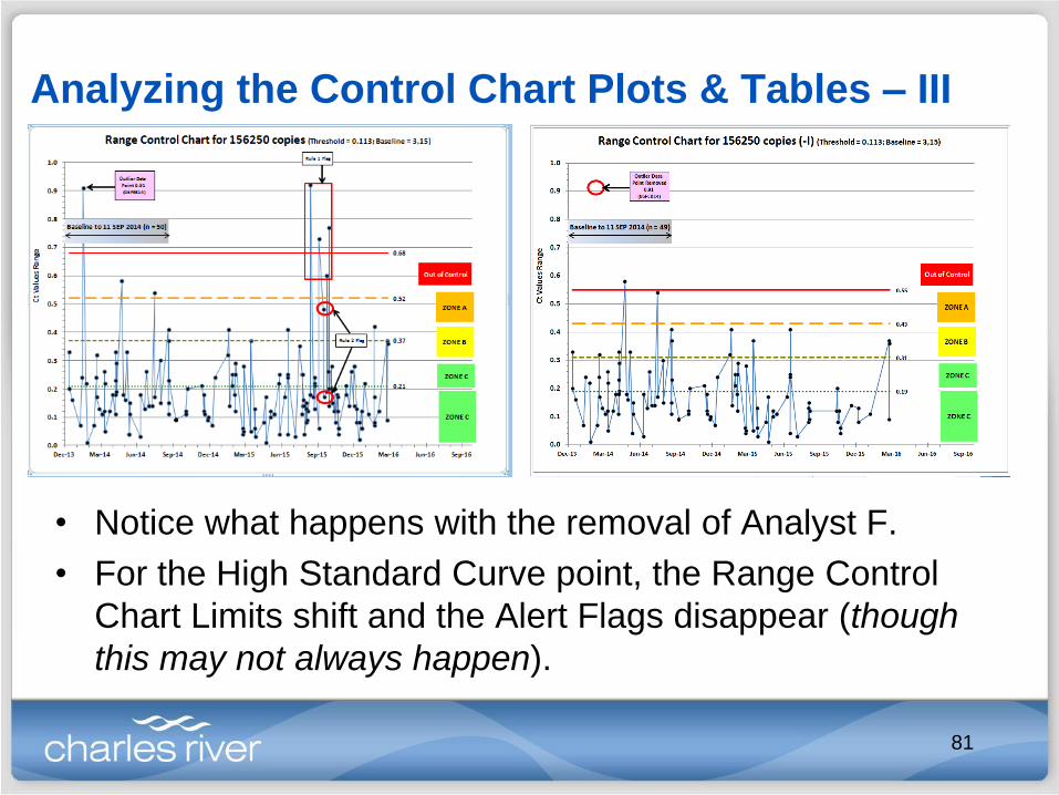
• Notice what happens with the removal of Analyst F.
• For the High Standard Curve point, the Range Control
Chart Limits shift and the Alert Flags disappear (though
this may not always happen).
81

Analyzing the Control Chart Plots & Tables – IV
• Notice what happens with the removal of Analyst F.
• For the Low Standard Curve point, some of the Alert
Flags disappear and other issues materialize.
82

Analyzing the Control Chart Plots & Tables – V
• Again, for the Low Standard Curve point, notice what
happens with the removal of Analyst F.
• Clearly, the impact from Analyst F can be seen.
83

Douglas B. Brown, Ph.D.Research Scientist, Methods Development and Validations
Charles River Laboratories, Biologics Testing Solutions
Malvern, PA
610-407-1071