Embed Size (px)
Citation preview
Centre for Distance Education, IAE, University of Ghana, Legon
Unit
4
Statistical Display of Data: Tables,
Graphs and Charts
UGRC 120 Numeracy Skills Unit 4 Statistical Display of Data
Centre for Distance Education, IAE, University of Ghana, Legon 23
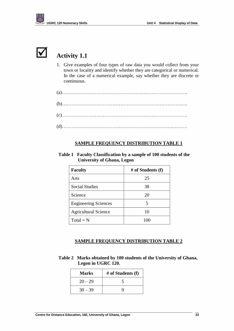
Activity 1.1
1. Give examples of four types of raw data you would collect from your
town or locality and identify whether they are categorical or numerical.
In the case of a numerical example, say whether they are discrete or
continuous.
(a)……………………………………………………………………..
(b)……………………………………………………………………..
(c)……………………………………………………………………..
(d)……………………………………………………………..………
SAMPLE FREQUENCY DISTRIBUTION TABLE 1
Table 1 Faculty Classification by a sample of 100 students of the
University of Ghana, Legon
Faculty # of Students (f)
Arts 25
Social Studies 38
Science 20
Engineering Sciences 5
Agricultural Science 10
Total = N 100
SAMPLE FREQUENCY DISTRIBUTION TABLE 2
Table 2 Marks obtained by 100 students of the University of Ghana,
Legon in UGRC 120.
Marks # of Students (f)
20 – 29 5
30 – 39 9
UGRC 120 Numeracy Skills Unit 4 Statistical Display of Data
Centre for Distance Education, IAE, University of Ghana, Legon 24
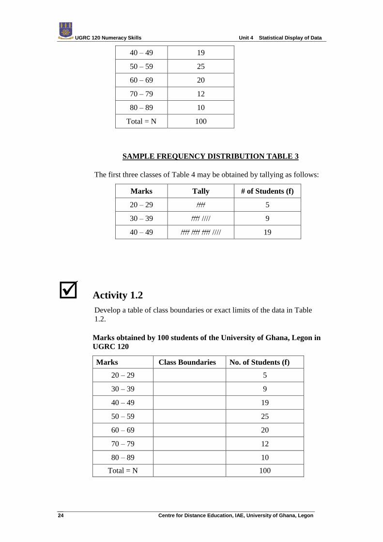
40 – 49 19
50 – 59 25
60 – 69 20
70 – 79 12
80 – 89 10
Total = N 100
SAMPLE FREQUENCY DISTRIBUTION TABLE 3
The first three classes of Table 4 may be obtained by tallying as follows:
Marks Tally # of Students (f)
20 – 29 //// 5
30 – 39 //// //// 9
40 – 49 //// //// //// //// 19
Activity 1.2
Develop a table of class boundaries or exact limits of the data in Table
1.2.
Marks obtained by 100 students of the University of Ghana, Legon in
UGRC 120
Marks Class Boundaries No. of Students (f)
20 – 29 5
30 – 39 9
40 – 49 19
50 – 59 25
60 – 69 20
70 – 79 12
80 – 89 10
Total = N 100
UGRC 120 Numeracy Skills Unit 4 Statistical Display of Data
Centre for Distance Education, IAE, University of Ghana, Legon 25
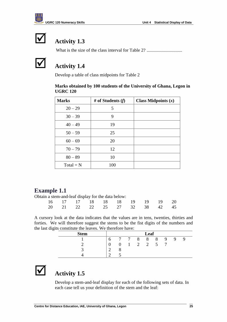
Activity 1.3
What is the size of the class interval for Table 2? ...............................
Activity 1.4
Develop a table of class midpoints for Table 2
Marks obtained by 100 students of the University of Ghana, Legon in
UGRC 120
Marks # of Students (f) Class Midpoints (x)
20 – 29 5
30 – 39 9
40 – 49 19
50 – 59 25
60 – 69 20
70 – 79 12
80 – 89 10
Total = N 100
Example 1.1 Obtain a stem-and-leaf display for the data below:
16 17 17 18 18 18 19 19 19 20
20 21 22 22 25 27 32 38 42 45
A cursory look at the data indicates that the values are in tens, twenties, thirties and
forties. We will therefore suggest the stems to be the fist digits of the numbers and
the last digits constitute the leaves. We therefore have:
Stem Leaf
1
2
3
4
6 7 7 8 8 8 9 9 9
0 0 1 2 2 5 7
2 8
2 5
Activity 1.5
Develop a stem-and-leaf display for each of the following sets of data. In
each case tell us your definition of the stem and the leaf:
UGRC 120 Numeracy Skills Unit 4 Statistical Display of Data
Centre for Distance Education, IAE, University of Ghana, Legon 26
(a) 10.5 , 11. 1 , 11. 2 , 11. 3 , 11. 5 , 12.0 , 12.2 , 12. 3 , 15.7 , 16.2
(b) 120 , 123 , 98 , 99 , 110 , 157 , 143 , 152 , 135 , 149.
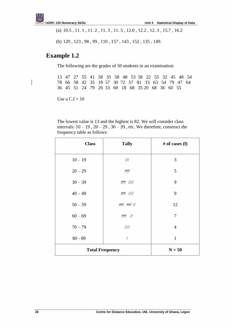
Example 1.2
The following are the grades of 50 students in an examination:
13 47 27 55 41 58 35 58 48 53 58 22 55 32 45 48 54
78 66 58 42 35 18 57 30 72 57 81 33 63 54 79 47 64
36 45 51 24 79 26 33 60 18 68 35 20 68 36 60 55
Use a C.I = 10
The lowest value is 13 and the highest is 82. We will consider class
intervals: 10 – 19 , 20 – 29 , 30 – 39 , etc. We therefore, construct the
frequency table as follows:
Class Tally # of cases (f)
10 – 19
20 – 29
30 – 39
40 – 49
50 – 59
60 – 69
70 – 79
80 - 89
///
////
//// ////
//// ////
//// //// //
//// //
////
/
3
5
9
9
12
7
4
1
Total Frequency N = 50
UGRC 120 Numeracy Skills Unit 4 Statistical Display of Data
Centre for Distance Education, IAE, University of Ghana, Legon 27
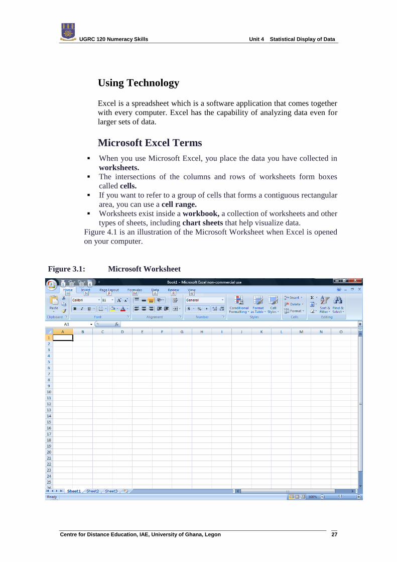
Using Technology
Excel is a spreadsheet which is a software application that comes together
with every computer. Excel has the capability of analyzing data even for
larger sets of data.
Microsoft Excel Terms
When you use Microsoft Excel, you place the data you have collected in
worksheets.
The intersections of the columns and rows of worksheets form boxes
called cells.
If you want to refer to a group of cells that forms a contiguous rectangular
area, you can use a cell range.
Worksheets exist inside a workbook, a collection of worksheets and other
types of sheets, including chart sheets that help visualize data.
Figure 4.1 is an illustration of the Microsoft Worksheet when Excel is opened
on your computer.
Figure 3.1: Microsoft Worksheet
UGRC 120 Numeracy Skills Unit 4 Statistical Display of Data
Centre for Distance Education, IAE, University of Ghana, Legon 28
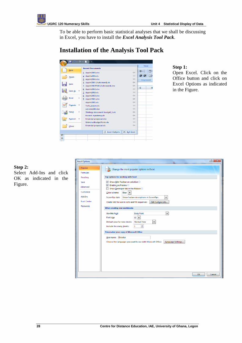
To be able to perform basic statistical analyses that we shall be discussing
in Excel, you have to install the Excel Analysis Tool Pack.
Installation of the Analysis Tool Pack
Step 1:
Open Excel. Click on the
Office button and click on
Excel Options as indicated
in the Figure.
Step 2:
Select Add-Ins and click
OK as indicated in the
Figure.
UGRC 120 Numeracy Skills Unit 4 Statistical Display of Data
Centre for Distance Education, IAE, University of Ghana, Legon 29
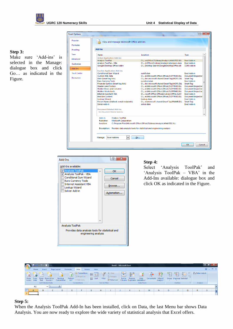
Step 3:
Make sure „Add-ins‟ is
selected in the Manage:
dialogue box and click
Go… as indicated in the
Figure.
Step 4:
Select „Analysis ToolPak‟ and
„Analysis ToolPak – VBA‟ in the
Add-Ins available: dialogue box and
click OK as indicated in the Figure.
Step 5:
When the Analysis ToolPak Add-In has been installed, click on Data, the last Menu bar shows Data
Analysis. You are now ready to explore the wide variety of statistical analysis that Excel offers.
UGRC 120 Numeracy Skills Unit 4 Statistical Display of Data
Centre for Distance Education, IAE, University of Ghana, Legon 30
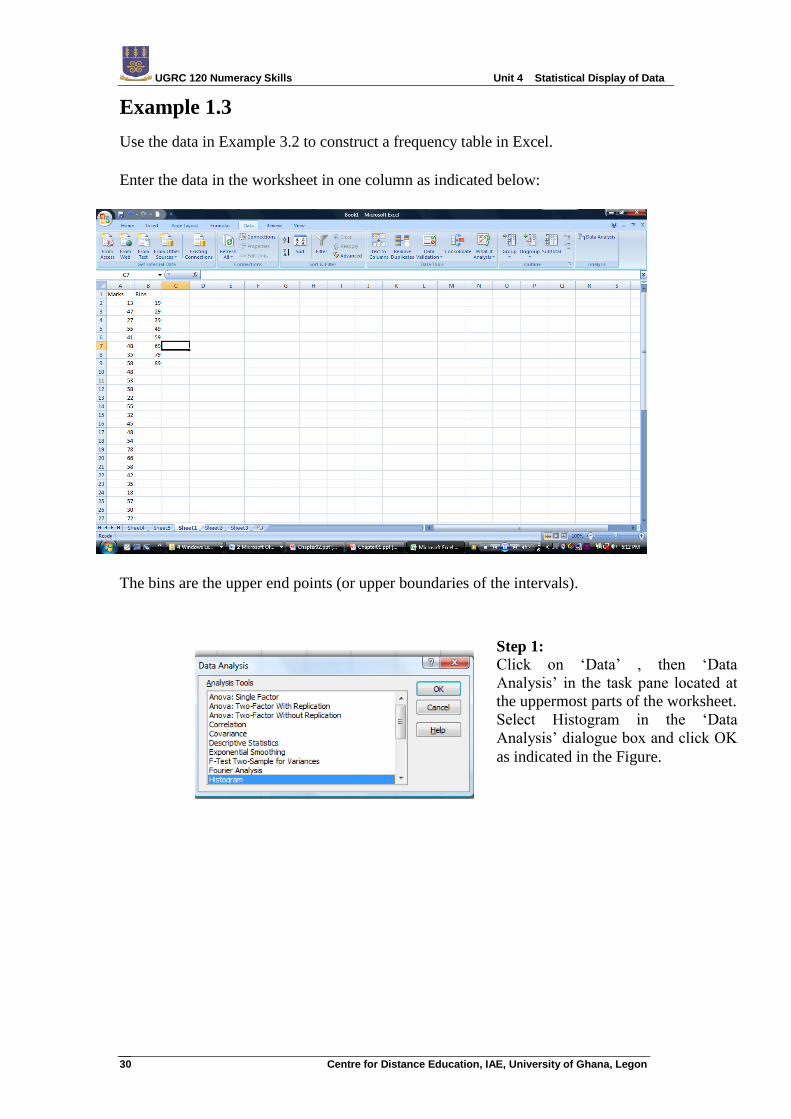
Example 1.3
Use the data in Example 3.2 to construct a frequency table in Excel.
Enter the data in the worksheet in one column as indicated below:
The bins are the upper end points (or upper boundaries of the intervals).
Step 1:
Click on „Data‟ , then „Data
Analysis‟ in the task pane located at
the uppermost parts of the worksheet.
Select Histogram in the „Data
Analysis‟ dialogue box and click OK
as indicated in the Figure.
UGRC 120 Numeracy Skills Unit 4 Statistical Display of Data
Centre for Distance Education, IAE, University of Ghana, Legon 31
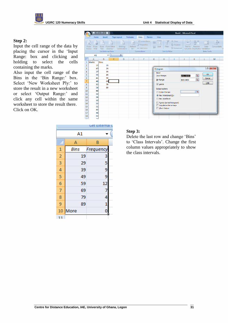
Step 2:
Input the cell range of the data by
placing the cursor in the „Input
Range: box and clicking and
holding to select the cells
containing the marks.
Also input the cell range of the
Bins in the „Bin Range:‟ box.
Select „New Worksheet Ply:‟ to
store the result in a new worksheet
or select „Output Range:‟ and
click any cell within the same
worksheet to store the result there.
Click on OK.
Step 3:
Delete the last row and change „Bins‟
to „Class Intervals‟. Change the first
column values appropriately to show
the class intervals.
UGRC 120 Numeracy Skills Unit 4 Statistical Display of Data
Centre for Distance Education, IAE, University of Ghana, Legon 32
Multi-Dimensional Tables
When we present data to show more than one characteristic or groups of
items, then we refer to it as Multi-dimensional tables. We present an
illustration of a multi-dimensional table as an example.
Example 1.4
The table below is the result of a survey into cinema attendance habits of
adult factory workers:
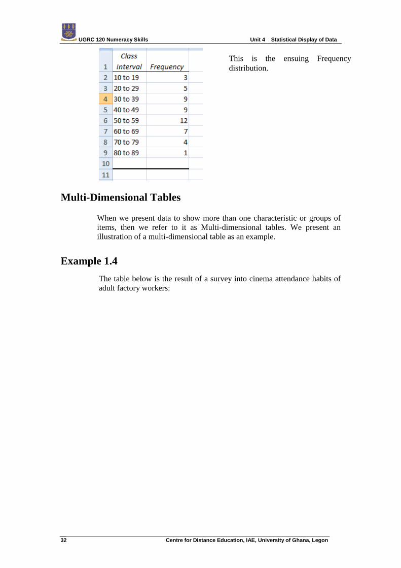
This is the ensuing Frequency
distribution.
UGRC 120 Numeracy Skills Unit 4 Statistical Display of Data
Centre for Distance Education, IAE, University of Ghana, Legon 33
Activity 1.6
In a` survey of 10, 048 persons, of whom 2, 703 were children under 16
years of age, 605 retired men and 2, 212 housewives, the following
information was obtained. Of those above age 16, there were 2, 720 males
16 and under 60, and 2, 931 females of this age group.
There were 227 males between 60 and 65 and 482 males above 65 and
270 and 515 females in these age ranges respectively.
Construct tables showing the distribution of the distribution of the sample
by work status and the adult population by age and sex. Use percentages
to help in making comparisons. Give you comment on the data.
UGRC 120 Numeracy Skills Unit 4 Statistical Display of Data
Centre for Distance Education, IAE, University of Ghana, Legon 34
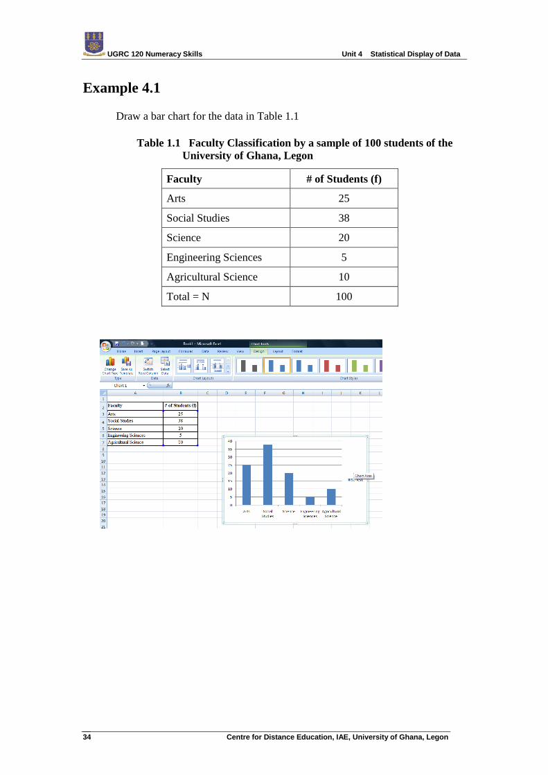
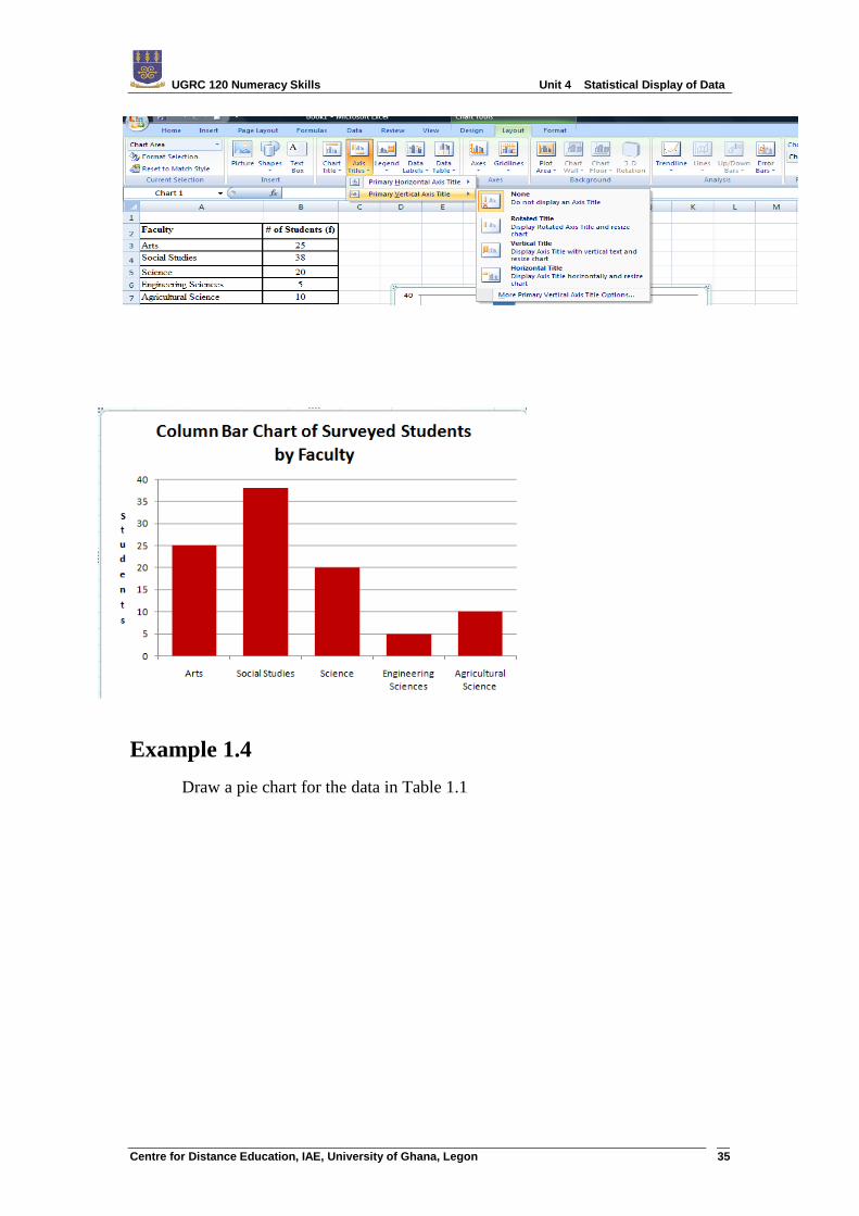
Example 4.1
Draw a bar chart for the data in Table 1.1
Table 1.1 Faculty Classification by a sample of 100 students of the
University of Ghana, Legon
Faculty # of Students (f)
Arts 25
Social Studies 38
Science 20
Engineering Sciences 5
Agricultural Science 10
Total = N 100
UGRC 120 Numeracy Skills Unit 4 Statistical Display of Data
Centre for Distance Education, IAE, University of Ghana, Legon 35
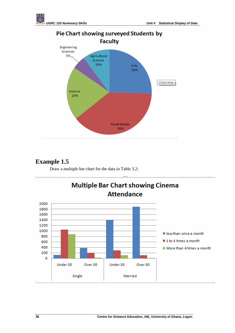
Example 1.4
Draw a pie chart for the data in Table 1.1
UGRC 120 Numeracy Skills Unit 4 Statistical Display of Data
Centre for Distance Education, IAE, University of Ghana, Legon 36
Example 1.5 Draw a multiple bar chart for the data in Table 3.2:
UGRC 120 Numeracy Skills Unit 4 Statistical Display of Data
Centre for Distance Education, IAE, University of Ghana, Legon 37
Activity 4.1
Use the multi-dimensional table you found in Activity 3.1 to draw a multiple bar
chart.
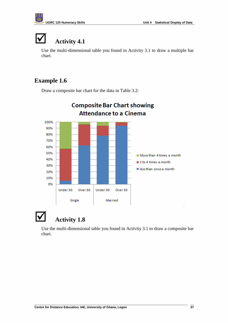
Example 1.6
Draw a composite bar chart for the data in Table 3.2:
Activity 1.8
Use the multi-dimensional table you found in Activity 3.1 to draw a composite bar
chart.
UGRC 120 Numeracy Skills Unit 4 Statistical Display of Data
Centre for Distance Education, IAE, University of Ghana, Legon 38
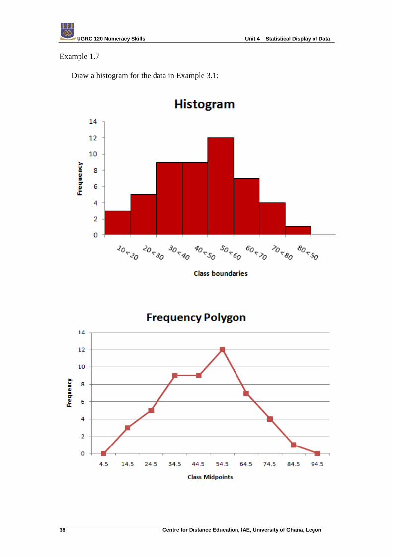
Example 1.7
Draw a histogram for the data in Example 3.1:
UGRC 120 Numeracy Skills Unit 4 Statistical Display of Data
Centre for Distance Education, IAE, University of Ghana, Legon 39
Activity 1.9
Collect data on the ages of 50 students in this class. Organize these data
into a frequency distribution using a class interval size of 10. Draw a
histogram and a frequency polygon for these data.
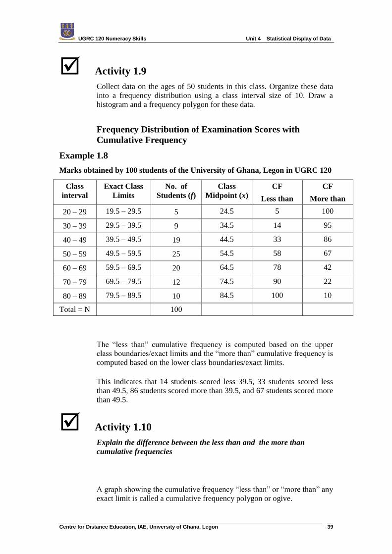
Frequency Distribution of Examination Scores with
Cumulative Frequency
Example 1.8
Marks obtained by 100 students of the University of Ghana, Legon in UGRC 120
Class
interval
Exact Class
Limits
No. of
Students (f)
Class
Midpoint (x)
CF
Less than
CF
More than
20 – 29 19.5 – 29.5 5 24.5 5 100
30 – 39 29.5 – 39.5 9 34.5 14 95
40 – 49 39.5 – 49.5 19 44.5 33 86
50 – 59 49.5 – 59.5 25 54.5 58 67
60 – 69 59.5 – 69.5 20 64.5 78 42
70 – 79 69.5 – 79.5 12 74.5 90 22
80 – 89 79.5 – 89.5 10 84.5 100 10
Total = N 100
The “less than” cumulative frequency is computed based on the upper
class boundaries/exact limits and the “more than” cumulative frequency is
computed based on the lower class boundaries/exact limits.
This indicates that 14 students scored less 39.5, 33 students scored less
than 49.5, 86 students scored more than 39.5, and 67 students scored more
than 49.5.
Activity 1.10 Explain the difference between the less than and the more than
cumulative frequencies
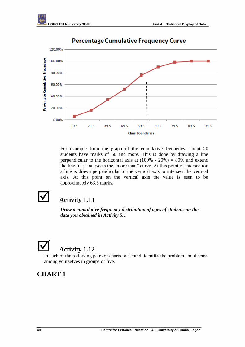
A graph showing the cumulative frequency “less than” or “more than” any
exact limit is called a cumulative frequency polygon or ogive.
UGRC 120 Numeracy Skills Unit 4 Statistical Display of Data
Centre for Distance Education, IAE, University of Ghana, Legon 40
For example from the graph of the cumulative frequency, about 20
students have marks of 60 and more. This is done by drawing a line
perpendicular to the horizontal axis at (100% - 20%) = 80% and extend
the line till it intersects the “more than” curve. At this point of intersection
a line is drawn perpendicular to the vertical axis to intersect the vertical
axis. At this point on the vertical axis the value is seen to be
approximately 63.5 marks.
Activity 1.11 Draw a cumulative frequency distribution of ages of students on the
data you obtained in Activity 5.1
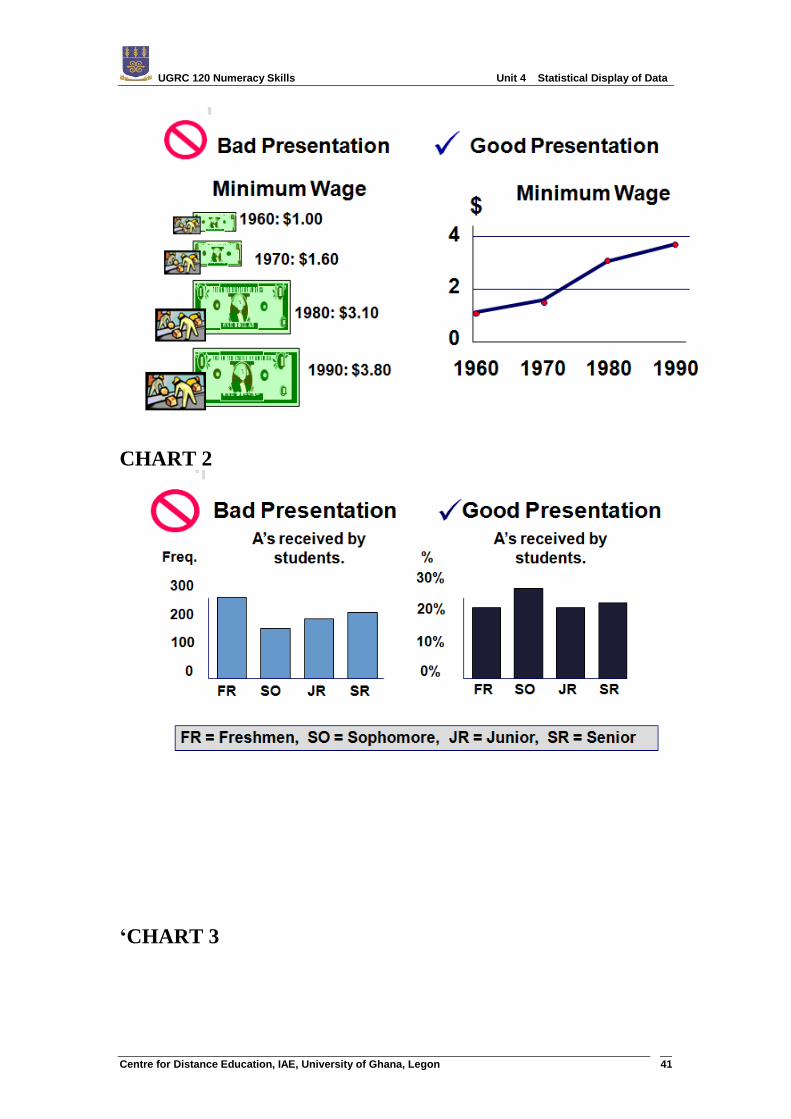
Activity 1.12 In each of the following pairs of charts presented, identify the problem and discuss
among yourselves in groups of five.
CHART 1
UGRC 120 Numeracy Skills Unit 4 Statistical Display of Data
Centre for Distance Education, IAE, University of Ghana, Legon 41
CHART 2
‘CHART 3
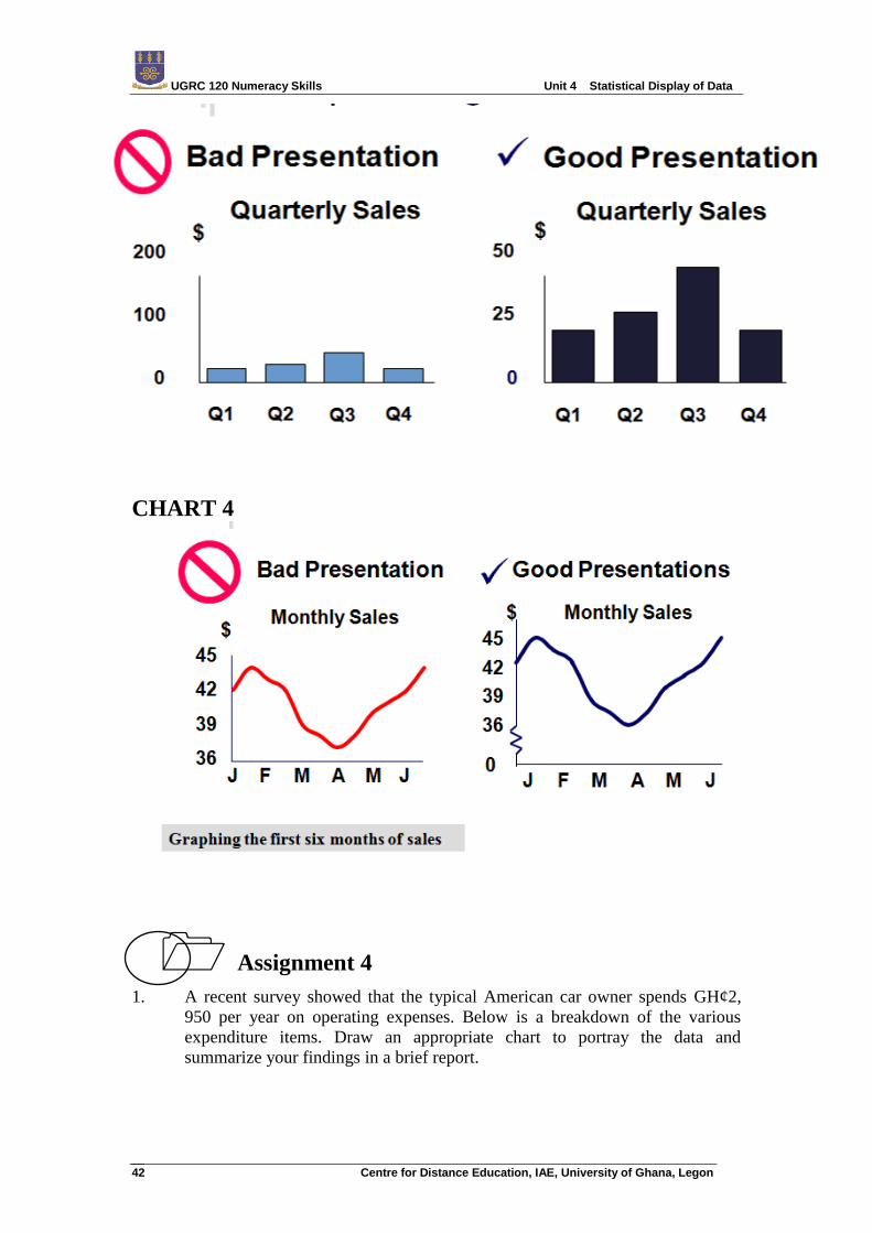
UGRC 120 Numeracy Skills Unit 4 Statistical Display of Data
Centre for Distance Education, IAE, University of Ghana, Legon 42
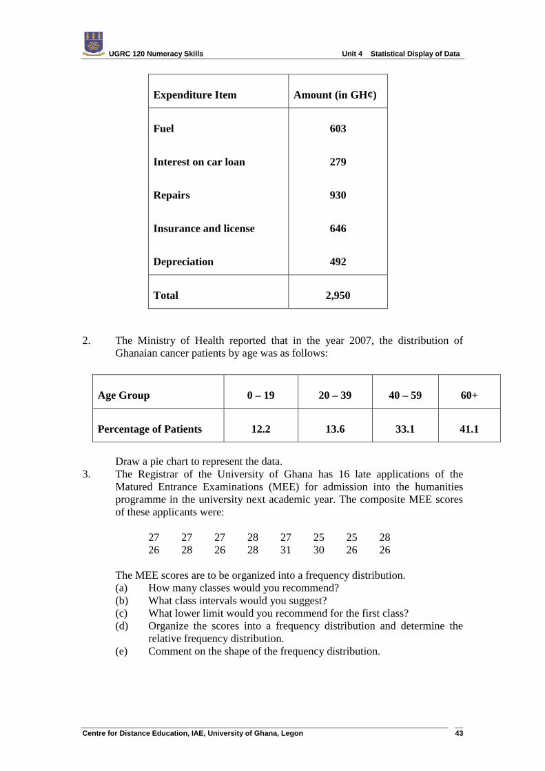
CHART 4
Assignment 4
1. A recent survey showed that the typical American car owner spends GH¢2,
950 per year on operating expenses. Below is a breakdown of the various
expenditure items. Draw an appropriate chart to portray the data and
summarize your findings in a brief report.
UGRC 120 Numeracy Skills Unit 4 Statistical Display of Data
Centre for Distance Education, IAE, University of Ghana, Legon 43
Expenditure Item Amount (in GH¢)
Fuel
Interest on car loan
Repairs
Insurance and license
Depreciation
603
279
930
646
492
Total 2,950
2. The Ministry of Health reported that in the year 2007, the distribution of
Ghanaian cancer patients by age was as follows:
Draw a pie chart to represent the data.
3. The Registrar of the University of Ghana has 16 late applications of the
Matured Entrance Examinations (MEE) for admission into the humanities
programme in the university next academic year. The composite MEE scores
of these applicants were:
27 27 27 28 27 25 25 28
26 28 26 28 31 30 26 26
The MEE scores are to be organized into a frequency distribution.
(a) How many classes would you recommend?
(b) What class intervals would you suggest?
(c) What lower limit would you recommend for the first class?
(d) Organize the scores into a frequency distribution and determine the
relative frequency distribution.
(e) Comment on the shape of the frequency distribution.
Age Group 0 – 19 20 – 39 40 – 59 60+
Percentage of Patients 12.2 13.6 33.1 41.1
UGRC 120 Numeracy Skills Unit 4 Statistical Display of Data
Centre for Distance Education, IAE, University of Ghana, Legon 44
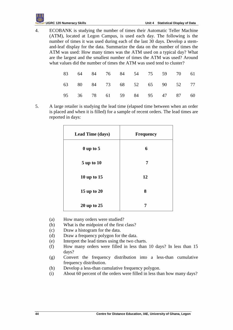
4. ECOBANK is studying the number of times their Automatic Teller Machine
(ATM), located at Legon Campus, is used each day. The following is the
number of times it was used during each of the last 30 days. Develop a stem-
and-leaf display for the data. Summarize the data on the number of times the
ATM was used: How many times was the ATM used on a typical day? What
are the largest and the smallest number of times the ATM was used? Around
what values did the number of times the ATM was used tend to cluster?
83 64 84 76 84 54 75 59 70 61
63 80 84 73 68 52 65 90 52 77
95 36 78 61 59 84 95 47 87 60
5. A large retailer is studying the lead time (elapsed time between when an order
is placed and when it is filled) for a sample of recent orders. The lead times are
reported in days:
Lead Time (days) Frequency
0 up to 5
5 up to 10
10 up to 15
15 up to 20
20 up to 25
6
7
12
8
7
(a) How many orders were studied?
(b) What is the midpoint of the first class?
(c) Draw a histogram for the data.
(d) Draw a frequency polygon for the data.
(e) Interpret the lead times using the two charts.
(f) How many orders were filled in less than 10 days? In less than 15
days?
(g) Convert the frequency distribution into a less-than cumulative
frequency distribution.
(h) Develop a less-than cumulative frequency polygon.
(i) About 60 percent of the orders were filled in less than how many days?