Embed Size (px)
Citation preview

Stanford Economics 266: International Trade— Lecture 16: Economic Geography (I)—
Stanford Econ 266 (Dave Donaldson)
Winter 2016 (lecture 16)
Stanford Econ 266 (Dave Donaldson) Economic Geography (I) Winter 2016 (lecture 16) 1 / 64

Plan for Today’s Lecture
1 Stylized facts about agglomeration of economic activity2 Testing sources of agglomeration:
1 Direct estimation2 Estimation from spatial equilibrium
Stanford Econ 266 (Dave Donaldson) Economic Geography (I) Winter 2016 (lecture 16) 2 / 64

Plan for Today’s Lecture
1 Stylized facts about agglomeration of economic activity2 Testing sources of agglomeration:
1 Direct estimation2 Estimation from spatial equilibrium
Stanford Econ 266 (Dave Donaldson) Economic Geography (I) Winter 2016 (lecture 16) 3 / 64

The Earth at Night
Stanford Econ 266 (Dave Donaldson) Economic Geography (I) Winter 2016 (lecture 16) 4 / 64

The US at Night
Stanford Econ 266 (Dave Donaldson) Economic Geography (I) Winter 2016 (lecture 16) 5 / 64

Growth occurs in pre-existing agglomerations: Burchfieldet al (2006, QJE)
Urban land circa 1976
Urban land built 1976–92
Water
Forest
Range and grassland
Agricultural land
WetlandsBare rock and sand
0 10 20 Kilometers
0 10 20 Miles
FIGURE IIaUrban Land in Atlanta, GA (Top Panel) and Boston, MA (Bottom Panel)
596 QUARTERLY JOURNAL OF ECONOMICS
Stanford Econ 266 (Dave Donaldson) Economic Geography (I) Winter 2016 (lecture 16) 6 / 64

Growth occurs in pre-existing agglomerations: Burchfieldet al (2006, QJE)
Urban land circa 1976
Urban land built 1976–92
Water
Forest
Range and grassland
Agricultural land
WetlandsBare rock and sand
0 10 20 Kilometers
0 10 20 Miles
FIGURE IIbUrban Land in San Francisco, CA (Top Panel) and Miami, FL (Bottom Panel)
597CAUSES OF SPRAWL
Stanford Econ 266 (Dave Donaldson) Economic Geography (I) Winter 2016 (lecture 16) 7 / 64

Growth occurs in pre-existing agglomerations: Burchfieldet al (2006, QJE)
Urban land circa 1976
Urban land built 1976–92
Water
Forest
Range and grassland
Agricultural land
WetlandsBare rock and sand
0 10 20 Kilometers
0 10 20 MilesTop panel:
Bottom panel:0 5 Kilometers
0 5 Miles
“Bad water” line
Bedrock aquifers
Incorporated places
FIGURE IIIUrban Land and Aquifers in San Antonio and Austin, TX (Top Panel), andUrban Land and Incorporated Places in Saint Louis, MO (Bottom Panel)
598 QUARTERLY JOURNAL OF ECONOMICS
Stanford Econ 266 (Dave Donaldson) Economic Geography (I) Winter 2016 (lecture 16) 8 / 64
Growth occurs in pre-existing agglomerations: Burchfieldet al (2006, QJE)
the pattern of residential development around them is very dif-ferent from the one they experienced in the 1970s. However, if wezoom out and look at the city from a distance, we see little change,at least in the proportions of sprawling and compact develop-ment: the new city is just like an enlarged version of the old city.
While our focus is on residential sprawl, it is of interest tocompare the distribution of residential land with that of commer-cial land. As it turns out, while the sort of places where Ameri-cans live has not changed substantially, the places where theyshop and work has. Figure VII is a counterpart to Figure IVgiving the distribution of commercial land (including industrialland and transportation networks) across areas with differentpercentages of developed land nearby. Looking first at the solidline, we see that the distribution for the stock of commercial landin 1976 is clearly bimodal. Commercial development in the 1970swas biased toward areas that were either very compact or verysprawling. Presumably the very compact commercial develop-ment is office buildings located downtown, while the scattereddevelopment is factories and malls located on the outskirts oftown.
Turning to the dashed line in Figure VII, we see that, unlikeresidential land, commercial land has become more biased over
FIGURE VIMean Percentage of Nonurban Land Turned Residential 1976–1992 by Initial
Percentage of Nonurban Land within One Square Kilometer
603CAUSES OF SPRAWL
Stanford Econ 266 (Dave Donaldson) Economic Geography (I) Winter 2016 (lecture 16) 9 / 64

Geographic Concentration of Industry: Ellison and Glaeser(JPE, 1997)
EG (1997) asks: Just how concentrated is economic activity withinany given industry in the US?
Key point: What is the right null hypothesis?If output, within an industry, is highly concentrated in a small numberof plants, then that industry will look very concentrated spatially,simply by nature of the small number of plants. (Consider extreme caseof one plant.)
EG develop an index (denoted γ and now known as “the EG index”)of localization that considers as its null hypothesis the randomlocation of plants within an industry. They call this a “dartboardapproach”.
We will only go into this briefly; see paper for details.See also Duranton and Overman (ReStud, 2005) on an axiomaticapproach to generalizing the EG index to correct for the lumpiness of“locations” in the data.
Stanford Econ 266 (Dave Donaldson) Economic Geography (I) Winter 2016 (lecture 16) 10 / 64

The EG Index (crash course)
Suppose that:
There are N firms in an industry, choosing which of M locations tolocate in (choice is vk for firm k). They enter sequentially.Firm k earns profits log πki = g(v1, ..., vk−1) + εki if it locates in i .Here, g(.) is a spillover term.
Suppose the following properties about εki :
I.I.D draws from a Weibull distribution with...... mean = xi , the overall manufacturing employment in location i .... and variance = γNAxi (1− xi ). γNA ∈ [0, 1] parameterizes thevariance of ‘natural advantages’
Spillover term g(.) =∑
l 6=k ekl(1− uli )(−∞), where:
ekl is a Bernoulli random variable equal to one with probability γS .Don’t specify dependence, but assume that ekl is symmetric andtransitive. (This will then imply that the sequential entry equilibrium isalso the rational expectations equilibrium for any entry order).uli is indicator variable equal to one if plant l is located in location i
Stanford Econ 266 (Dave Donaldson) Economic Geography (I) Winter 2016 (lecture 16) 11 / 64

The EG Index
Proposition 1:
The following is an unbiased estimator for γ ≡ γNA + γS − γNAγS :
γ =G − (1−
∑i x
2i )H
(1−∑
i x2i )(1− H)
(1)
Where:
G ≡∑
i (si − xi )2, with si ≡
∑k zkuki , where zk is the employment
(taken as exogenous) of plant k and uki is (again) the indicator forwhether plant k locates in location i .H ≡
∑k z
2k is the industry’s (employment-based) Herfindahl over
plants.
Note the implication that γ can’t separately identify the spillover γS
and natural advantage (γNA determinants of agglomeration. (But itwould be worrying if it could!)
Stanford Econ 266 (Dave Donaldson) Economic Geography (I) Winter 2016 (lecture 16) 12 / 64

EG (1997): Results
For industries that we might expect to be highly concentrated:
Autos: γ = 0.127Auto parts: γ = 0.089Carpets (ie Dalton, GA): γ = 0.378Electronics (ie Silicon Valley): γ = 0.059− 0.142
For industries that we might expect to not be highly concentrated:
Bottled/canned soft drinks: γ = 0.005Newspaper: γ = 0.002Concrete: γ = 0.012Ice: γ = 0.012
Stanford Econ 266 (Dave Donaldson) Economic Geography (I) Winter 2016 (lecture 16) 13 / 64
EG (1997): Results908 journal of political economy
Fig. 1.—Histogram of γ (four-digit industries)
B. How Concentrated Are They?
In this subsection, we try to use our models to get a feel for howmuch concentration there is. We begin by imposing no structureacross industries and simply computing the index γ defined by (5)for each of the 459 four-digit industries in our sample. A completelist of the γ’s we find can be found in appendix C of Ellison andGlaeser (1994) and is also available from the authors on request.15
A histogram illustrating the frequency distribution of these γ’s ispresented in figure 1. In the figure, each bar represents the numberof industries for which γ lies in an interval of width 0.01. The distri-bution in the figure appears to be quite skewed, with the mean being0.051 and the median being 0.026. The most striking feature of thefigure is the large number of industries falling into the range wedescribed as not very concentrated (γ , 0.02). The tallest bar is theone corresponding to values of γ between zero and 0.01, and 43percent of the industries have γ , 0.02. On the other side, the figuredisplays a thick right tail, with slightly more than a quarter of the
15 If one interprets γ’s as estimates of γ na 1 γ s 2 γ na γ s (as opposed to estimates ofthe realized sum of squared differences between the p’s and the x’s), these γ’s aremeasured with substantial errors. To get a feel for the magnitudes, we computedstandard errors by simulating a special case of our natural advantage model: thatof Dirichlet-distributed state sizes. Among industries with H , 0.02, the mean ofthe estimated standard errors is 0.02. The means for industries with H in the ranges0.02–0.05, 0.05–0.10, and 0.10–1.0 are 0.024, 0.041, and 0.072, respectively.
Stanford Econ 266 (Dave Donaldson) Economic Geography (I) Winter 2016 (lecture 16) 14 / 64

EG (1997): Results912 journal of political economy
TABLE 4
Most and Least Localized Industries
Four-Digit Industry H G γ
15 Most LocalizedIndustries
2371 Fur goods .007 .60 .632084 Wines, brandy, brandy spirits .041 .48 .482252 Hosiery not elsewhere classified .008 .42 .443533 Oil and gas field machinery .015 .42 .432251 Women’s hosiery .028 .40 .402273 Carpets and rugs .013 .37 .382429 Special product sawmills not elsewhere classified .009 .36 .373961 Costume jewelry .017 .32 .322895 Carbon black .054 .32 .303915 Jewelers’ materials, lapidary .025 .30 .302874 Phosphatic fertilizers .066 .32 .292061 Raw cane sugar .038 .30 .292281 Yarn mills, except wool .005 .27 .282034 Dehydrated fruits, vegetables, soups .030 .29 .283761 Guided missiles, space vehicles .046 .27 .25
15 Least LocalizedIndustries
3021 Rubber and plastics footwear .06 .05 2.0132032 Canned specialties .03 .02 2.0122082 Malt beverages .04 .03 2.0103635 Household vacuum cleaners .18 .17 2.0093652 Prerecorded records and tapes .04 .03 2.0083482 Small-arms ammunition .18 .17 2.0043324 Steel investment foundries .04 .04 2.0033534 Elevators and moving stairways .03 .03 2.0012052 Cookies and crackers .03 .03 2.00092098 Macaroni and spaghetti .03 .03 2.00083262 Vitreous china table, kitchenware .13 .12 2.00062035 Pickles, sauces, salad dressings .01 .01 2.00033821 Laboratory apparatus and furniture .02 .02 2.00022062 Cane sugar refining .11 .10 .00023433 Heating equipment except electric .01 .01 .0002
if firms choose identical locations, with natural advantages being in-dependent across geographic areas. If, on the other hand, the effectof spillovers (or the spatial correlation of natural advantage) issmoothly declining with distance, then those γ’s will reflect the ex-cess probability with which pairs of firms tend to locate in the samecounty, state, and region, respectively. To investigate the geographicscope of spillovers, we estimated γ’s from our county/three-digitdata set using counties, states, and the nine census regions as theunits of observation.
Figure 2 presents histograms of the γ’s estimated from the three
Stanford Econ 266 (Dave Donaldson) Economic Geography (I) Winter 2016 (lecture 16) 15 / 64

Duranton and Overman (ReStud, 2005)1082 REVIEW OF ECONOMIC STUDIES
(a) Basic Pharmaceuticals(SIC2441)
(b) Pharmaceutical Preparations(SIC2442)
(c) Other Agricultural and ForestryMachinery (SIC2932)
(d) Machinery for Textile, Apparel andLeather Production (SIC2954)
FIGURE 1
Maps of four illustrative industries
Stanford Econ 266 (Dave Donaldson) Economic Geography (I) Winter 2016 (lecture 16) 16 / 64

The EG Index: Co-agglomeration
Now suppose that:
corr(uki , uli ) = γj if plants k and l both belong to industry j , where γjis the same γ as above (in the single-industry case) but the value of γfor industry j .corr(uki , uli ) = γ0 otherwise.So γ0 measures economy-wide tendencies for industries toco-agglomerate.
Then we have Proposition 2: An unbiased estimator of γ0 is given by
γC ≡( G(1−
∑i x
2i )
)− H −∑
j γjw2j (1− Hj)
(1−∑
j w2j )
(2)
See Elison, Glaeser and Kerr (AER 2010) for more on industryco-agglomeration
Stanford Econ 266 (Dave Donaldson) Economic Geography (I) Winter 2016 (lecture 16) 17 / 64

Plan for Today’s Lecture
1 Stylized facts about agglomeration of economic activity2 Testing sources of agglomeration:
1 Direct estimation2 Estimation from spatial equilibrium
Stanford Econ 266 (Dave Donaldson) Economic Geography (I) Winter 2016 (lecture 16) 18 / 64

Why is output so agglomerated?
Three broad explanations:1 Some production input is exogenously agglomerated.
Natural resources (as in the wine industry in EG (1997))Institutions (“exogenous”?)
2 Some consumption amenity is exogenously or endogenouslyagglomerated
Nice places to live (for place-based amenities that are non-tradable)People (i.e. workers) just like to live near each otherSome non-tradable amenities that are endogenously provided but withIRTS in those goods’ production functions (e.g. opera houses)
3 Some production input agglomerates endogenously
Some positive externality (i.e. spillover) that depends on proximity.This almost surely explains Silicon Valley, Detroit, Boston biotech,carpets in Dalton, etc.This is what is usually meant by the term, ‘agglomeration economies’This source of agglomeration has attracted the greatest interest amongeconomists.
Stanford Econ 266 (Dave Donaldson) Economic Geography (I) Winter 2016 (lecture 16) 19 / 64

What are sources of possible (production-side)agglomeration economies?
The literature on this is enormous
Probably begins in earnest with Marshall (1890)Survey in Duranton and Puga (2004, Handbook of Urban and RegionalEcon)
Typically 3 forces for potential agglomeration economies:1 Thick markets (reduce search costs and idiosyncratic risk) for
imperfectly tradable inputs (e.g. workers)2 Increasing returns to scale combined with trade costs (on either inputs
or outputs) that increase with distance3 Knowledge spillovers that decrease on distance
Stanford Econ 266 (Dave Donaldson) Economic Geography (I) Winter 2016 (lecture 16) 20 / 64

Empirical work on the causes of agglomeration
Recent surveys on this in:
Redding (2010, J Reg. Sci. survey)Rosenthal and Strange (2004, Handbook of Urban and Regional Econ)Head and Mayer (2004, Handbook of Urban and Regional Econ)Overman, Redding and Venables (2004, Handbook of InternationalTrade)Combes et al textbook, Economic Geography
Broadly, three approaches:1 Estimating agglomeration economies directly
2 Estimating agglomeration economies from the extent of agglomerationin an observed spatial equilibrium.
3 Testing for multiple equilibria (which is often a consequence ofagglomeration economies)
Stanford Econ 266 (Dave Donaldson) Economic Geography (I) Winter 2016 (lecture 16) 21 / 64

Estimating agglomeration economies directly
A large literature has argued that if agglomeration economies existthen units of production (and factors) should be more productive ifthey are surrounded by other producersThree nice examples:
Henderson (2003, JUE) on across-firm (within-location) externalitiesMoretti (2004, AER) on local (within-city) human capital externalitiesArzaghi and Henderson (2008, REStud) on Manhatten’s advertisingindustry
A central challenge with this approach is an analogy to the challengethat faces the ‘peer effects’ literature (e.g. Manski, 1993): does oneunit actually affect a proximate unit, or are proximate units justsimilar on unobservable dimensions?Greenstone, Hornbeck and Moretti (JPE, 2010) consider a naturalexperiment approach to this question.
See also Greenstone and Moretti (2004) on how the same naturalexperiment affected total county land values (i.e. a measure of thewelfare effects of agglomeration economies).
Stanford Econ 266 (Dave Donaldson) Economic Geography (I) Winter 2016 (lecture 16) 22 / 64
Greenstone, Hornbeck and Moretti (2010)
GHM look at the effect that ‘million dollar plants’ (huge industrialplants) have on incumbent firms in the vicinity of the new MDP
Consider the following example (from paper):BMW did worldwide search for new plant location in 1991. 250locations narrowed to 20 US counties. Then announced 2 finalists:Omaha, NB and Greenville-Spartanburg, SC. Finally, choseGreenville-Spartanburg.Why? BMW says:
Low costs of production: low union density, supply of quality workers,numerous global firms in area (including 58 German companies), goodtransport infrastructure (rail, air, highway, port access), and access tokey local services.Subsidy ($115 million) received from local government.
GHM obtain list of the winner and loser counties for 82 MDPopenings and compare winners to losers (rather than comparingwinners to all 3,000 other counties, or to counties that look similar onobservables).
Stanford Econ 266 (Dave Donaldson) Economic Geography (I) Winter 2016 (lecture 16) 23 / 64

Greenstone, Hornbeck and Moretti (2010)
TABLE 3County and Plant Characteristics by Winner Status, 1 Year Prior to a Million Dollar Plant Opening
All Plants Within Same Industry (Two-Digit SIC)
WinningCounties
(1)
LosingCounties
(2)
All U.S.Counties
(3)
t-Statistic(Col. 1 �
Col. 2)(4)
t-Statistic(Col. 1 �
Col. 3)(5)
WinningCounties
(6)
LosingCounties
(7)
All U.S.Counties
(8)
t-Statistic(Col. 6 �
Col. 7)(9)
t-Statistic(Col. 6 �
Col. 8)(10)
A. County Characteristics
No. of counties 47 73 16 19Total per capita earnings ($) 17,418 20,628 11,259 �2.05 5.79 20,230 20,528 11,378 �.11 4.62% change, over last 6 years .074 .096 .037 �.81 1.67 .076 .089 .057 �.28 .57Population 322,745 447,876 82,381 �1.61 4.33 357,955 504,342 83,430 �1.17 3.26% change, over last 6 years .102 .051 .036 2.06 3.22 .070 .032 .031 1.18 1.63Employment-population ratio .535 .579 .461 �1.41 3.49 .602 .569 .467 .64 3.63Change, over last 6 years .041 .047 .023 �.68 2.54 .045 .038 .028 .39 1.57Manufacturing labor share .314 .251 .252 2.35 3.12 .296 .227 .251 1.60 1.17Change, over last 6 years �.014 �.031 �.008 1.52 �.64 �.030 �.040 �.007 .87 �3.17
B. Plant Characteristics
No. of sample plants 18.8 25.6 7.98 �1.35 3.02 2.75 3.92 2.38 �1.14 .70Output ($1,000s) 190,039 181,454 123,187 .25 2.14 217,950 178,958 132,571 .41 1.25% change, over last 6 years .082 .082 .118 .01 �.97 �.061 .177 .182 �1.23 �3.38Hours of labor (1,000s) 1,508 1,168 877 1.52 2.43 1,738 1,198 1,050 .92 1.33% change, over last 6 years .122 .081 .115 .81 .14 .160 .023 .144 .85 .13
Note.—For each case to be weighted equally, counties are weighted by the inverse of their number per case. Similarly, plants are weighted by the inverse of their number per county multipliedby the inverse of the number of counties per case. The sample includes all plants reporting data in the ASM for each year between the MDP opening and 8 years prior. Excluded are all plantsowned by the firm opening an MDP. Also excluded are all plants from two uncommon two-digit SIC values so that subsequently estimated clustered variance matrices would always be positivedefinite. The sample of all U.S. counties excludes winning counties and counties with no manufacturing plant reporting data in the ASM for 9 consecutive years. These other U.S. counties aregiven equal weight within years and are weighted across years to represent the years of MDP openings. Reported t-statistics are calculated from standard errors clustered at the county level. t-statistics greater than 2 are reported in bold. All monetary amounts are in 2006 U.S. dollars.
Stanford Econ 266 (Dave Donaldson) Economic Geography (I) Winter 2016 (lecture 16) 24 / 64
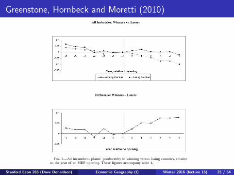
Greenstone, Hornbeck and Moretti (2010)identifying agglomeration spillovers 565
Fig. 1.—All incumbent plants’ productivity in winning versus losing counties, relativeto the year of an MDP opening. These figures accompany table 4.
log of output is regressed on the natural log of inputs, year by two-digitSIC industry fixed effects, plant fixed effects, case fixed effects, and theevent time indicators in a sample that is restricted to the years t p�7 through . The reported coefficients on the event time indi-t p 5cators reflect yearly mean TFP in winning counties (col. 1) and losingcounties (col. 2), relative to the year before the MDP opened. Column3 reports the yearly difference between estimated mean TFP in winningand losing counties.
Figure 1 graphs the estimated coefficients from table 4. The top panelseparately plots mean TFP in winning and losing counties (cols. 1 and2 of table 4). The bottom panel plots the differences in the estimatedwinner and loser coefficients (col. 3 of table 4).
The figure has three important features. First, in the years before theMDP opening, TFP trends among incumbent plants were very similarin winning and losing counties. Indeed, a statistical test fails to reject
Stanford Econ 266 (Dave Donaldson) Economic Geography (I) Winter 2016 (lecture 16) 25 / 64

Greenstone, Hornbeck and Moretti (2010)TABLE 5
Changes in Incumbent Plant Productivity Following an MDP Opening
All Counties: MDPWinners � MDP
Losers
MDP Counties: MDPWinners � MDP
Losers
All Counties:RandomWinners
(5)(1) (2) (3) (4)
A. Model 1
Mean shift .0442* .0435* .0524** .0477** � 0.0496***(.0233) (.0235) (.0225) (.0231) (.0174)
[$170 m]2R .9811 .9812 .9812 .9860 ∼0.98
Observations (plant byyear) 418,064 418,064 50,842 28,732 ∼400,000
B. Model 2
Effect after 5 years .1301** .1324** .1355*** .1203** �.0296(.0533) (.0529) (.0477) (.0517) (.0434)
[$429 m]Level change .0277 .0251 .0255 .0290 .0073
(.0241) (.0221) (.0186) (.0210) (.0223)Trend break .0171* .0179** .0183** .0152* � 0.0062
(.0091) (.0088) (.0078) (.0079) (.0063)Pre-trend �.0057 �.0058 �.0048 �.0044 �.0048
(.0046) (.0046) (.0046) (.0044) (.0040)2R .9811 .9812 .9813 .9861 ∼.98
Observations (plant byyear) 418,064 418,064 50,842 28,732 ∼400,000
Plant and industry byyear fixed effects Yes Yes Yes Yes Yes
Case fixed effects No Yes Yes Yes NAYears included All All All �7 ≤ t ≤ 5 All
Note.—The table reports results from fitting several versions of eq. (8). Specifically, entries are from a regressionof the natural log of output on the natural log of inputs, year by two-digit SIC fixed effects, plant fixed effects, andcase fixed effects. In model 1, two additional dummy variables are included for whether the plant is in a winning county7 to 1 years before the MDP opening or 0 to 5 years after. The reported mean shift indicates the difference in thesetwo coefficients, i.e., the average change in TFP following the opening. In model 2, the same two dummy variables areincluded along with pre- and post-trend variables. The shift in level and trend are reported, along with the pre-trendand the total effect evaluated after 5 years. In cols. 1, 2, and 5, the sample is composed of all manufacturing plants inthe ASM that report data for 14 consecutive years, excluding all plants owned by the MDP firm. In these models,additional control variables are included for the event years outside the range from through (i.e., �20t p �7 t p 5to �8 and 6 to 17). Column 2 adds the case fixed effects that equal one during the period that t ranges from �7through 5. In cols. 3 and 4, the sample is restricted to include only plants in counties that won or lost an MDP. Thisforces the industry by year fixed effects to be estimated solely from plants in these counties. For col. 4, the sample isrestricted further to include only plant by year observations within the period of interest (where t ranges from �7 to5). This forces the industry by year fixed effects to be estimated solely on plant by year observations that identify theparameters of interest. In col. 5, a set of 47 plant openings in the entire country were randomly chosen from the ASMin the same years and industries as the MDP openings (this procedure was run 1,000 times, and reported are the meansand standard deviations of those estimates). For all regressions, plant by year observations are weighted by the plant’stotal value of shipments 8 years prior to the opening. Plants not in a winning or losing county are weighted by theirtotal value of shipments in that year. All plants from two uncommon two-digit SIC values were excluded so that estimatedclustered variance-covariance matrices would always be positive definite. In brackets is the value in 2006 U.S. dollarsfrom the estimated increase in productivity: the percentage increase is multiplied by the total value of output for theaffected incumbent plants in the winning counties. Reported in parentheses are standard errors clustered at the countylevel.
* Significant at the 10 percent level.** Significant at the 5 percent level.*** Significant at the 1 percent level.
Stanford Econ 266 (Dave Donaldson) Economic Geography (I) Winter 2016 (lecture 16) 26 / 64
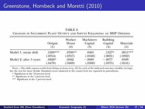
Greenstone, Hornbeck and Moretti (2010)
570 journal of political economy
TABLE 6Changes in Incumbent Plant Output and Inputs Following an MDP Opening
Output(1)
WorkerHours
(2)
MachineryCapital
(3)
BuildingCapital
(4)Materials
(5)
Model 1: mean shift .1200*** .0789** .0401 .1327* .0911***(.0354) (.0357) (.0348) (.0691) (.0302)
Model 2: after 5 years .0826* .0562 �.0089 �.0077 .0509(.0478) (.0469) (.0300) (.0375) (.0541)
Note.—The table reports results from fitting versions of eq. (8) for each of the indicated outcome variables (in logs).See the text for more details. Standard errors clustered at the county level are reported in parentheses.
* Significant at the 10 percent level.** Significant at the 5 percent level.*** Significant at the 1 percent level.
whether the MDP is owned by a foreign company, and whether it is anauto company. When these multiple measures were included jointly,none were significantly related to the estimated effect of the MDP’sopening.26
Ultimately, TFP is a residual, and residual labeling must be donecautiously. As an alternative way to examine the MDP impact, we estimatedirectly the changes in incumbent plant output (unadjusted for inputs)and inputs following an MDP opening. Contrasting changes in outputsand inputs can shed light on whether productivity increased withoutimposing the structural assumptions of the production function. Putanother way, are the incumbents producing more with less after theMDP opening? Factor input decisions also reflect firms’ optimizationdecisions and do not share many of the same potential biases as changesin technology (e.g., output price effects).
Table 6 reports estimated changes in incumbent plant output andinputs following an MDP opening. These estimates are from the model1 and model 2 versions of equation (8) but exclude the inputs as co-variates. For model 1, output increases by 12 percent (col. 1) and inputsincrease by 4–13 percent (cols. 2–5). For model 2, output increases by8 percent and inputs increase less. Across all specifications, it is strikingthat the change in all of the inputs is roughly equal to or less than theincrease in output. Overall, it appears that incumbent plants producedmore with less after the MDP opening, which is consistent with the TFP
26 Separate regressions of the case-specific effects on the MDP’s total output or theMDP’s total labor force generated statistically significant negative coefficients. This resultis consistent with the possibility that when the MDP is very large, incumbents are left tohire labor and other inputs that are inferior in unobserved ways. However, we failed tofind any significant differences when separately testing whether the productivity effectvaried by the ratio of the MDP’s output to countywide manufacturing output, whetherthe MDP is owned by a foreign company, or whether the MDP is an auto company.
Stanford Econ 266 (Dave Donaldson) Economic Geography (I) Winter 2016 (lecture 16) 27 / 64
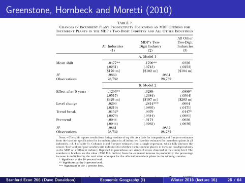
Greenstone, Hornbeck and Moretti (2010)572 journal of political economy
TABLE 7Changes in Incumbent Plant Productivity Following an MDP Opening for
Incumbent Plants in the MDP’s Two-Digit Industry and All Other Industries
All Industries(1)
MDP’s Two-Digit Industry
(2)
All OtherTwo-DigitIndustries
(3)
A. Model 1
Mean shift .0477** .1700** .0326(.0231) (.0743) (.0253)
[$170 m] [$102 m] [$104 m]2R .9860 .9861
Observations 28,732 28,732
B. Model 2
Effect after 5 years .1203** .3289 .0889*(.0517) (.2684) (.0504)
[$429 m] [$197 m] [$283 m]Level change .0290 .2814*** .0004
(.0210) (.0895) (.0171)Trend break .0152* .0079 .0147*
(.0079) (.0344) (.0081)Pre-trend �.0044 �.0174 �.0026
(.0044) (.0265) (.0036)2R .9861 .9862
Observations 28,732 28,732
Note.—The table reports results from fitting versions of eq. (8). As a basis for comparison, col. 1 reports estimatesfrom the baseline specification for incumbent plants in all industries (baseline estimates for incumbent plants in allindustries, col. 4 of table 5). Columns 2 and 3 report estimates from a single regression, which fully interacts thewinner/loser and pre/post variables with indicators for whether the incumbent plant is in the same two-digit industryas the MDP or a different industry. Reported in parentheses are standard errors clustered at the county level. Thenumbers in brackets are the value (2006 U.S. dollars) from the estimated increase in productivity: the percentageincrease is multiplied by the total value of output for the affected incumbent plants in the winning counties.
* Significant at the 10 percent level.** Significant at the 5 percent level.*** Significant at the 1 percent level.
brackets convert the estimated percentage changes into millions of 2006dollars.
The estimated changes are substantially larger in the MDP’s own two-digit industry. For example, the estimated increase in TFP for plants inthe same two-digit industry is a statistically significant 17 percent inmodel 1 and a poorly determined 33 percent at in model 2. Int p 5contrast, estimates for plants in other industries are a statistically insig-nificant 3.3 percent in model 1 and a marginally significant 8.9 percentin model 2.
Figures 3 and 4 graph annual changes in TFP, providing two-digitMDP industry and other industry analogues to figure 1. The two-digitMDP industry estimates are noisy because of the small sample size, whichwas also evident in the statistical results. Importantly, there is not anyevidence of differential trends in the years before the MDP’s opening,and statistical tests confirm this visual impression. As in figure 1, the
Stanford Econ 266 (Dave Donaldson) Economic Geography (I) Winter 2016 (lecture 16) 28 / 64
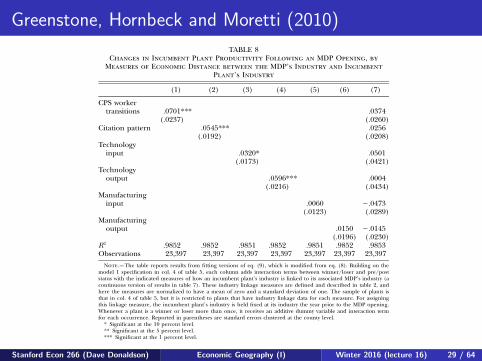
Greenstone, Hornbeck and Moretti (2010)576 journal of political economy
TABLE 8Changes in Incumbent Plant Productivity Following an MDP Opening, by
Measures of Economic Distance between the MDP’s Industry and IncumbentPlant’s Industry
(1) (2) (3) (4) (5) (6) (7)
CPS workertransitions .0701*** .0374
(.0237) (.0260)Citation pattern .0545*** .0256
(.0192) (.0208)Technology
input .0320* .0501(.0173) (.0421)
Technologyoutput .0596*** .0004
(.0216) (.0434)Manufacturing
input .0060 �.0473(.0123) (.0289)
Manufacturingoutput .0150 �.0145
(.0196) (.0230)2R .9852 .9852 .9851 .9852 .9851 .9852 .9853
Observations 23,397 23,397 23,397 23,397 23,397 23,397 23,397
Note.—The table reports results from fitting versions of eq. (9), which is modified from eq. (8). Building on themodel 1 specification in col. 4 of table 5, each column adds interaction terms between winner/loser and pre/poststatus with the indicated measures of how an incumbent plant’s industry is linked to its associated MDP’s industry (acontinuous version of results in table 7). These industry linkage measures are defined and described in table 2, andhere the measures are normalized to have a mean of zero and a standard deviation of one. The sample of plants isthat in col. 4 of table 5, but it is restricted to plants that have industry linkage data for each measure. For assigningthis linkage measure, the incumbent plant’s industry is held fixed at its industry the year prior to the MDP opening.Whenever a plant is a winner or loser more than once, it receives an additive dummy variable and interaction termfor each occurrence. Reported in parentheses are standard errors clustered at the county level.
* Significant at the 10 percent level.** Significant at the 5 percent level.*** Significant at the 1 percent level.
mechanism by which these ideas are shared is unclear, although boththe flow of workers across firms and the mythical exchange of ideasover beers between workers from different firms are possibilities. No-tably, there is more variation in these measures within two-digit indus-tries than in the CPS labor transitions measure.
Columns 5 and 6 provide little support for the flow of goods andservices in determining the magnitude of spillovers. Thus, the data failto support the types of stories in which an auto manufacturer encourages(or even forces) its suppliers to adopt more efficient production tech-niques. Recall that all plants owned by the MDP’s firm are droppedfrom the analysis, so this finding does not rule out this channel withinfirms. The finding on the importance of labor and technology flows isconsistent with the results in Dumais, Ellison, and Glaeser (2002) andEllison et al. (forthcoming), whereas the finding on input and outputflows stands in contrast with these papers’ findings.
In the column 7 specification, we include all the measures of eco-
Stanford Econ 266 (Dave Donaldson) Economic Geography (I) Winter 2016 (lecture 16) 29 / 64
Greenstone, Hornbeck and Moretti (2010)578 journal of political economy
TABLE 9Changes in Counties’ Number of Plants, Total Output, and Skill-Adjusted
Wages Following an MDP Opening
A. Census of Manufactures B. Census of Population
Dependent Variable:Log(Plants)
(1)
Dependent Variable:Log(Total Output)
(2)
Dependent Variable:Log(Wage)
(3)
Difference-in-difference .1255** .1454 .0268*
(.0550) (.0900) (.0139)2R .9984 .9931 .3623
Observations 209 209 1,057,999
Note.—The table reports results from fitting three regressions. In panel A, the dependent variables are the log ofnumber of establishments and the log of total manufacturing output in the county, based on data from the Census ofManufactures. Controls include county, year, and case fixed effects. Reported are the county-level difference-in-differenceestimates for receiving an MDP opening. Because data are available every 5 years, depending on the census year relativeto the MDP opening, the sample years are defined to be 1–5 years before the MDP opening and 4–8 years after theMDP opening. Thus, each MDP opening is associated with one earlier date and one later date. The col. 1 model isweighted by the number of plants in the county in years �6 to �10, and the col. 2 model is weighted by the county’stotal manufacturing output in years �6 to �10. In panel B, the dependent variable is log wage and controls includedummies for age by year, age squared by year, education by year, sex by race by Hispanic by citizen, and case fixedeffects. Reported is the county-level difference-in-difference estimate for receiving an MDP opening. Because data areavailable every 10 years, the sample years are defined to be 1–10 years before the MDP opening and 3–12 years afterthe MDP opening. As in panel A, each MDP opening is associated with one earlier date and one later date. The sampleis restricted to individuals who worked more than 26 weeks in the previous year, usually work more than 20 hours perweek, are not in school, are at work, and work for wages in the private sector. The number of observations reportedrefers to unique individuals: some Integrated Public Use Microdata Series county groups include more than one FederalInformation Processing Standard (FIPS), so all individuals in a county group were matched to each potential FIPS. Thesame individual may then appear in more than one FIPS, and observations are weighted to give each unique individualthe same weight. Reported in parentheses are standard errors clustered at the county level.
* Significant at the 10 percent level.** Significant at the 5 percent level.*** Significant at the 1 percent level.
Column 1 reports that the number of manufacturing plants increasedby roughly 12.5 percent in winning counties after the MDP opening. Alimitation of this measure is that it assumes that all plants are equal insize. The total value of output is economically more meaningful becauseit treats equally an increase in output at an existing plant and at a newplant. Column 2 reports that the opening of an MDP is associated witha 14.5 percent increase in total output in the manufacturing sector,although this is not estimated precisely.
Overall, these results are consistent with estimated increases in TFPsince it appears that the MDP attracted new economic activity to thewinning counties (relative to losing counties) in the manufacturing sec-tor. Presumably, these new manufacturing establishments decided tolocate in the winning counties to gain access to the productivity advan-tages generated by the spillover effect.
The second theoretical prediction is that if spillovers are positive, theprices of local inputs will increase as firms compete for these factors ofproduction. The most important locally supplied input for manufac-turing plants is labor. This prediction is tested using individual-levelwage data for winning and losing counties from the 1970, 1980, 1990,
Stanford Econ 266 (Dave Donaldson) Economic Geography (I) Winter 2016 (lecture 16) 30 / 64

Plan for Today’s Lecture
1 Stylized facts about agglomeration of economic activity2 Testing sources of agglomeration:
1 Direct estimation2 Estimation from spatial equilibrium
Stanford Econ 266 (Dave Donaldson) Economic Geography (I) Winter 2016 (lecture 16) 31 / 64

Market Access Approaches
A large literature has considered how the economic activity of aregion depends on that of other, nearby regions.
A very common approach (to the challenge of parameterizing howone region affects another) is to work with the concept of ‘marketaccess’. We will cover this approach now.
MA is usually defined in the context of a one-sector Krugman (1980)model but an observationally equivalent expression would derive inany one-sector gravity model (including neoclassical models withoutany externalities). So while the MA approach is interesting it doesn’tdirectly map to the estimation of agglomeration externalities.
However, we will also discuss recent approaches that addagglomeration externalities on top of a one-sector gravity model suchthat there is now a genuine agglomeration externality that can beestimated.
Stanford Econ 266 (Dave Donaldson) Economic Geography (I) Winter 2016 (lecture 16) 32 / 64

Redding and Venables (JIE, 2004): Set-up
Consider a (one-sector) gravity model with:
Xod = Aoc−θo τ−θod Pθ
dXd = SoSdτ−θod (3)
Where co is the cost of a unit input bundle in country o, τ is thetrade cost and Pd is the consumer price index in d . So and Sd areorigin and destination-specific fixed-effects, respectively.
Now suppose that co = wβo vαo P
γo where wo is the price of immobile
factors, vo = v is the price of mobile factors and Po is the price indexof a basket of intermediate inputs.
Stanford Econ 266 (Dave Donaldson) Economic Geography (I) Winter 2016 (lecture 16) 33 / 64

Redding and Venables (JIE, 2004): Set-up
Market clearing implies:
Yocθo =
∑d
τ−θod PθdXd
So:w1+θo = βAoL
−1o v−αθP−γθo
∑d
τ−θod PθdXd
RV (2004) think of this as:
lnwo = δ + δ1 lnSAo + lnMAo + εo
With SAo ≡ P−γθo as ‘supplier access’ and MAo ≡∑
d τ−θod Pθ
dXd as‘market access’. What is in εo?
RV (2004) show how SA and MA can be computed using estimates ofthe gravity equation (3).
Stanford Econ 266 (Dave Donaldson) Economic Geography (I) Winter 2016 (lecture 16) 34 / 64
Redding and Venables (JIE, 2004): ResultsFirst, look only at MA. FMA is MA but leaving out country’s own term in MA.
coefficients are positive and statistically significant at the 5% level, and with DMA(3)
included on its own, the model explains 73% of the cross-country variation in GDP per
capita. Finally, as a robustness test, column (5) enters log foreign and log domestic
market access (DMA(3)) as separate terms in the regression equation. Theory tells us
that this regression is misspecified, and we see that the R2 is lower than with the correct
specification (column (4)). However, both terms are positively signed and statistically
significant at the 5% level.
Figs. 1–4 plot log GDP per capita against the four alternative measures of log market
access considered in columns (1)–(4) of Table 2. Each country is indicated by a three-
letter code (see Appendix A for details). It is clear from these figures that the relationship
between GDP per capita and market access is very robust and is not due to the influence of
a few individual countries. In Fig. 1, using FMA alone, the main outliers are remote high
per capita income countries (Australia, New Zealand, Japan, and the USA). Remaining
figures use estimates of DMA, as required by theory, and each illustrates a different
treatment of the internal transportation costs. In Fig. 2, DMA is included with the same
measure of internal transport costs for all countries—making large countries outliers to the
right (India, China, USA) and small ones outliers to the left (e.g., Israel), exactly as would
be expected. Letting internal transport costs vary with area, and treating internal distance
identically to external distance (Fig. 3) seems to overcompensate—Singapore and Hong
Kong come to have much better market access than Germany or the USA. In Fig. 4, we let
internal transport costs vary with area, but allow the costs of transporting goods a given
distance internally to be lower than for the same external distance. This is the solution
which produces the best fit, as well as according with economic priors on the relative
magnitudes of internal and external transport costs.
Fig. 1. GDP per capita and FMA.
S. Redding, A.J. Venables / Journal of International Economics 62 (2004) 53–8266
Stanford Econ 266 (Dave Donaldson) Economic Geography (I) Winter 2016 (lecture 16) 35 / 64

Redding and Venables (JIE, 2004): ResultsFirst, look only at MA. DMA(1) is country’s own MA with τoo set to cost of shipping 100km.
5.3. Economic geography and per capita income: preferred specification
We now move on to present our preferred specification of the relationship between
economic geography and per capita income, where we control for cross-country variation
Fig. 2. GDP per capita and MA=DMA(1) + FMA.
Fig. 3. GDP per capita and MA=DMA(2) + FMA.
S. Redding, A.J. Venables / Journal of International Economics 62 (2004) 53–82 67
Stanford Econ 266 (Dave Donaldson) Economic Geography (I) Winter 2016 (lecture 16) 36 / 64
Redding and Venables (JIE, 2004): ResultsFirst, look only at MA. DMA(2) is country’s own MA with τoo set to average cost oftraveling distance in country of similar area but circular in shape.
5.3. Economic geography and per capita income: preferred specification
We now move on to present our preferred specification of the relationship between
economic geography and per capita income, where we control for cross-country variation
Fig. 2. GDP per capita and MA=DMA(1) + FMA.
Fig. 3. GDP per capita and MA=DMA(2) + FMA.
S. Redding, A.J. Venables / Journal of International Economics 62 (2004) 53–82 67
Stanford Econ 266 (Dave Donaldson) Economic Geography (I) Winter 2016 (lecture 16) 37 / 64
Redding and Venables (JIE, 2004): ResultsFirst, look only at MA. DMA(3) is country’s own MA with τoo set as in DMA(2) but withhalf the distance elasticity as for τod .
in technology and other determinants of income levels by including a series of control
variables drawn from the literature on fundamental determinants of cross-country income
levels (including Acemoglu et al., 2001; Gallup et al., 1998; Hall and Jones, 1999; Knack
and Keefer, 1997). In order to address the potential endogeneity of domestic market and
supply capacity, we follow Table 2 in presenting results with both total market access and
with foreign market access alone. In the interests of brevity, we restrict consideration to
our preferred measure of total market access (with DMA(3)).
The first set of control variables we introduce are measures of countries’ primary
resource endowments. These include arable land area per capita, hydrocarbons per capita
and a broader measure of mineral wealth (see Appendix A). We also control for two
other features of physical geography emphasised in the work of Gallup et al. (1998): the
fraction of a country’s land area in the geographical tropics and the prevalence of
malaria. Finally, a number of studies have emphasized the role of institutions, ‘social
capability,’ or ‘social infrastructure’ in determining levels of per capita income.16
Therefore, we augment the specification further by considering a number of other
institutional, social, and political characteristics of countries. These are a measure of the
risk of expropriation or protection of property rights (perhaps the most widely used
measure of institutions or ‘social capability’), socialist rule during 1950–1995 and the
occurrence of an external war.
Columns (1) and (3) of Table 3 report estimation results including all three sets of
controls for foreign and total market access, respectively. The availability of the data on
Fig. 4. GDP per capita and MA=DMA(3) + FMA.
16 See, for example, Acemoglu et al. (2001), Hall and Jones (1999), and Knack and Keefer (1997).
S. Redding, A.J. Venables / Journal of International Economics 62 (2004) 53–8268
Stanford Econ 266 (Dave Donaldson) Economic Geography (I) Winter 2016 (lecture 16) 38 / 64
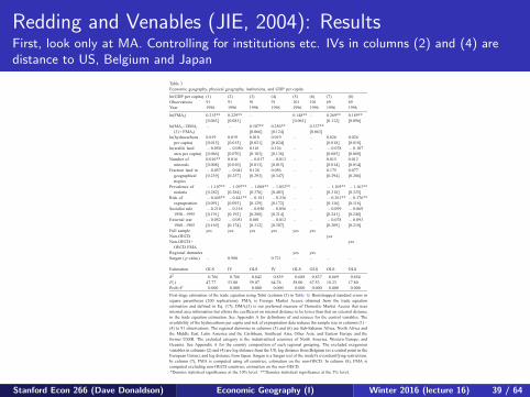
Redding and Venables (JIE, 2004): ResultsFirst, look only at MA. Controlling for institutions etc. IVs in columns (2) and (4) aredistance to US, Belgium and Japan
Table 3
Economic geography, physical geography, institutions, and GDP per capita
ln(GDP per capita) (1) (2) (3) (4) (5) (6) (7) (8)
Observations 91 91 91 91 101 101 69 69
Year 1996 1996 1996 1996 1996 1996 1996 1996
ln(FMAi) 0.215**
[0.063]
0.229**
[0.083]
– 0.148**
[0.061]
– 0.269**
[0.112]
0.189**
[0.096]
ln(MAi =DMAi
(3) + FMAi)
– – 0.307**
[0.066]
0.256**
[0.124]
0.337**
[0.063]
ln(hydrocarbons
per capita)
0.019
[0.015]
0.019
[0.015]
0.018
[0.021]
0.019
[0.024]
– – 0.026
[0.018]
0.026
[0.018]
ln(arable land
area per capita)
� 0.050
[0.066]
� 0.050
[0.070]
0.161
[0.103]
0.126
[0.136]
– – � 0.078
[0.085]
� 0.107
[0.088]
Number of
minerals
0.016**
[0.008]
0.016
[0.010]
� 0.017
[0.013]
� 0.013
[0.015]
– – 0.015
[0.014]
0.012
[0.014]
Fraction land in
geographical
tropics
� 0.057
[0.239]
� 0.041
[0.257]
0.128
[0.293]
0.056
[0.347]
– – 0.175
[0.294]
0.077
[0.286]
Prevalence of
malaria
� 1.107**
[0.282]
� 1.097**
[0.284]
� 1.008**
[0.376]
� 1.052**
[0.403]
– – � 1.105**
[0.318]
� 1.163**
[0.325]
Risk of
expropriation
� 0.445**
[0.091]
� 0.441**
[0.093]
� 0.181
[0.129]
� 0.236
[0.172]
– – � 0.361**
[0.116]
� 0.376**
[0.116]
Socialist rule
1950–1995
� 0.210
[0.191]
� 0.218
[0.192]
� 0.050
[0.208]
� 0.056
[0.214]
– – � 0.099
[0.241]
� 0.069
[0.248]
External war
1960–1985
� 0.052
[0.169]
� 0.051
[0.174]
0.001
[0.312]
� 0.012
[0.307]
– – � 0.078
[0.209]
� 0.093
[0.210]
Full sample yes yes yes yes yes yes
Non-OECD yes
Non-OECD+
OECD FMA
yes
Regional dummies yes yes
Sargan ( p-value) – 0.980 – 0.721 – – – –
Estimation OLS IV OLS IV OLS OLS OLS OLS
R2 0.766 0.766 0.842 0.839 0.688 0.837 0.669 0.654
F(�) 47.77 53.00 59.07 64.76 58.00 67.53 18.23 17.80
Prob>F 0.000 0.000 0.000 0.000 0.000 0.000 0.000 0.000
First-stage estimation of the trade equation using Tobit (column (3) in Table 1). Bootstrapped standard errors in
square parentheses (200 replications). FMAi is Foreign Market Access obtained from the trade equation
estimation and defined in Eq. (17); DMAi(3) is our preferred measure of Domestic Market Access that uses
internal area information but allows the coefficient on internal distance to be lower than that on external distance
in the trade equation estimation. See Appendix A for definitions of and sources for the control variables. The
availability of the hydrocarbons per capita and risk of expropriation data reduces the sample size in columns (1)–
(4) to 91 observations. The regional dummies in columns (5) and (6) are Sub-Saharan Africa, North Africa and
the Middle East, Latin America and the Caribbean, Southeast Asia, Other Asia, and Eastern Europe and the
former USSR. The excluded category is the industrialized countries of North America, Western Europe, and
Oceania. See Appendix A for the country composition of each regional grouping. The excluded exogenous
variables in columns (2) and (4) are log distance from the US, log distance from Belgium (as a central point in the
European Union), and log distance from Japan. Sargan is a Sargan test of the model’s overidentifying restrictions.
In column (7), FMA is computed using all countries, estimation on the non-OECD. In column (8), FMA is
computed excluding non-OECD countries, estimation on the non-OECD.
*Denotes statistical significance at the 10% level. **Denotes statistical significance at the 5% level.
S. Redding, A.J. Venables / Journal of International Economics 62 (2004) 53–82 69
Stanford Econ 266 (Dave Donaldson) Economic Geography (I) Winter 2016 (lecture 16) 39 / 64

Redding and Venables (JIE, 2004): ResultsNow, look only at SA. SA is just price index for (tradable) intermediates so first lookdirectly at that.
results excluding Tanzania, which is an outlier. In all three columns, the estimated
coefficient on supplier access is negative and statistically significant at the 5% level.
As predicted by the theoretical model, countries with higher levels of supplier access
are characterised by a lower relative price of machinery and equipment.
6.2. Market and supplier access
The wage equation (Eq. (20)) contains both market access and supplier access, and we
now extend the analysis of this relationship to incorporate information on supplier access,
SAi, and relate the estimated coefficients to underlying structural parameters of the model.
Again, we present results with both total market/supplier access and with foreign market/
supplier access alone. The first column of Table 5 reports the unconditional relationship
between income per capita and foreign supplier access and is the analogue of the foreign
market access specification in column (1) of Table 2. The estimated coefficient is positive
and highly statistically significant, and when included on its own foreign supplier access
explains 38% of the cross-country variation in income per capita. Column (4) of Table 5
presents the results using total supplier access; once again, the estimated coefficient is
positive and highly statistically significant, and the model now explains approximately
70% of the cross-country variation in per capita income.
While the high degree of correlation between market access and supplier access
means that it is difficult to separately identify their individual effects, we can proceed
by exploiting a theoretical restriction on the relative magnitude of their estimated
coefficients. From Eq. (14), the estimated values of B1 and B2 in Eq. (20) are related
to the structural parameters of the model as follows:
u1 ¼a
bðr � 1Þ ; u2 ¼1
br; implying u1 ¼ u2ar=ðr � 1Þ ð21Þ
Table 4
Supplier access and the relative price of machinery and equipment
ln(machinery and equipment relative price) (1) (2) (3)
Observations 46 46 45
Year 1985 1985 1985
ln(FSAi) � 0.150** [0.060] – –
ln(SAi =DSAi(3) + FSAi) – � 0.070** [0.030] � 0.083** [0.025]
Estimation OLS OLS OLS
R2 0.260 0.192 0.283
F(�) 19.31 14.08 30.78
Prob>F 0.000 0.001 0.000
First-stage estimation of the trade equation using Tobit (column (3) in Table 1). Bootstrapped standard errors in
square parentheses (200 replications). FSAi is Foreign Supplier Access obtained from the trade equation
estimation and defined in Eq. (18). DSAi(3) is our preferred measure of Domestic Supplier Access that uses
internal area information but allows the coefficient on internal distance to be lower than that on external distance
in the trade equation estimation.
*Denotes statistical significance at the 10% level. **Denotes statistical significance at the 5% level.
S. Redding, A.J. Venables / Journal of International Economics 62 (2004) 53–82 73
Stanford Econ 266 (Dave Donaldson) Economic Geography (I) Winter 2016 (lecture 16) 40 / 64
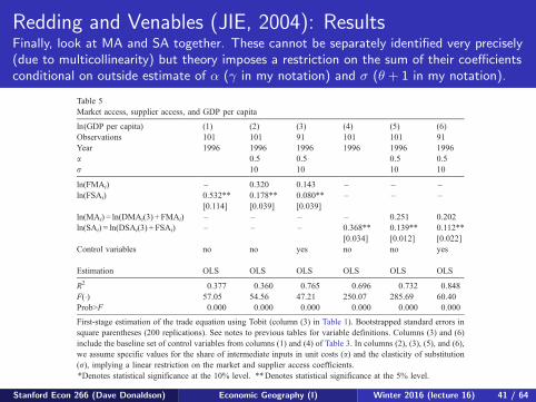
Redding and Venables (JIE, 2004): ResultsFinally, look at MA and SA together. These cannot be separately identified very precisely(due to multicollinearity) but theory imposes a restriction on the sum of their coefficientsconditional on outside estimate of α (γ in my notation) and σ (θ + 1 in my notation).
Thus, if we select values of a and r (the cost share of intermediates and the elasticity
of substitution between varieties), a linear restriction is imposed on the values of u1
and u2. We estimate Eq. (20) subject to this restriction, for a series of different values
of a and r. From the estimated value of u2, we then compute the implied value of b(the share of labour in unit costs).
Column (2) of Table 5 reports the regression results for foreign market access and
foreign supplier access using a share of intermediates in unit costs of a= 0.5 and an
elasticity of substitution between manufacturing varieties of r = 10. Column (3)
reestimates this specification including our baseline set of controls for exogenous
determinants of technical efficiency from Table 3. Columns (5) and (6) of Table 5
estimate analogous specifications for total market and supplier access.19 Table 6 reports
a range of values for r and a in the rows and columns, and the implied values of b in
the body of the table. An intermediate share of 50% (a = 0.5) and an elasticity of
Table 5
Market access, supplier access, and GDP per capita
ln(GDP per capita) (1) (2) (3) (4) (5) (6)
Observations 101 101 91 101 101 91
Year 1996 1996 1996 1996 1996 1996
a 0.5 0.5 0.5 0.5
r 10 10 10 10
ln(FMAi) – 0.320 0.143 – – –
ln(FSAi) 0.532**
[0.114]
0.178**
[0.039]
0.080**
[0.039]
– – –
ln(MAi) = ln(DMAi(3) + FMAi) – – – – 0.251 0.202
ln(SAi) = ln(DSAi(3) + FSAi) – – – 0.368**
[0.034]
0.139**
[0.012]
0.112**
[0.022]
Control variables no no yes no no yes
Estimation OLS OLS OLS OLS OLS OLS
R2 0.377 0.360 0.765 0.696 0.732 0.848
F(�) 57.05 54.56 47.21 250.07 285.69 60.40
Prob>F 0.000 0.000 0.000 0.000 0.000 0.000
First-stage estimation of the trade equation using Tobit (column (3) in Table 1). Bootstrapped standard errors in
square parentheses (200 replications). See notes to previous tables for variable definitions. Columns (3) and (6)
include the baseline set of control variables from columns (1) and (4) of Table 3. In columns (2), (3), (5), and (6),
we assume specific values for the share of intermediate inputs in unit costs (a) and the elasticity of substitution
(r), implying a linear restriction on the market and supplier access coefficients.
*Denotes statistical significance at the 10% level. **Denotes statistical significance at the 5% level.
19 As noted above, the high degree of correlation between market and supplier access means that it is hard to
separately identify their individual effects. If the specification in column (5) of Table 5 is reestimated without
imposing the theoretical restriction on the relative value of the coefficients, the estimated coefficients
(bootstrapped standard errors) on market and supplier access are 0.328 (0.111) and 0.067 (0.109), respectively.
The insignificance of supplier access in this specification is solely due to its very high degree of correlation with
market access. If supplier access is included on its own, as shown in column (4) of Table 5, we find a positive and
highly statistically significant effect (the estimated coefficient (boostrapped standard error) are 0.368 (0.034)).
S. Redding, A.J. Venables / Journal of International Economics 62 (2004) 53–8274
Stanford Econ 266 (Dave Donaldson) Economic Geography (I) Winter 2016 (lecture 16) 41 / 64

Redding and Sturm (AER, 2008)
RS (2008) extend the approach in RV (2004) and look at the effectof a quasi-experimental change in the proximity of regions to otherregions: the division of Germany.
Similar model to RV (2004) but with:
Simpler production structure: no intermediatesFree labor mobilityHousing amenity valued in consumption, exogenously supplied to eachregion
Stanford Econ 266 (Dave Donaldson) Economic Geography (I) Winter 2016 (lecture 16) 42 / 64
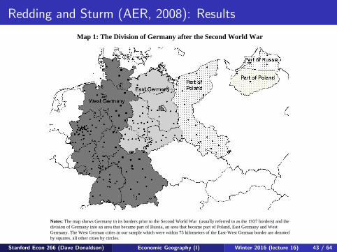
Redding and Sturm (AER, 2008): Results
Map 1: The Division of Germany after the Second World War
Notes: The map shows Germany in its borders prior to the Second World War (usually referred to as the 1937 borders) and the division of Germany into an area that became part of Russia, an area that became part of Poland, East Germany and West Germany. The West German cities in our sample which were within 75 kilometers of the East-West German border are denoted by squares, all other cities by circles.
Stanford Econ 266 (Dave Donaldson) Economic Geography (I) Winter 2016 (lecture 16) 43 / 64
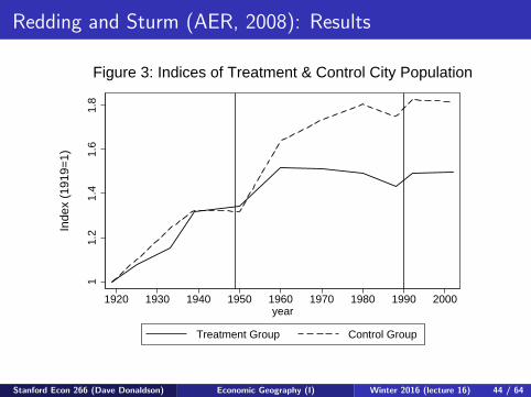
Redding and Sturm (AER, 2008): Results
Figures 3 and 4
11.
21.
41.
61.
8
1920 1930 1940 1950 1960 1970 1980 1990 2000year
Treatment Group Control Group
Inde
x (1
919=
1)Figure 3: Indices of Treatment & Control City Population
−0.
3−
0.2
−0.
10.
0
1920 1930 1940 1950 1960 1970 1980 1990 2000year
Tre
atm
ent G
roup
− C
ontr
ol G
roup
Figure 4: Difference in Population Indices, Treatment − Control
Stanford Econ 266 (Dave Donaldson) Economic Geography (I) Winter 2016 (lecture 16) 44 / 64

Redding and Sturm (AER, 2008): Results
Figure 7
−4
−2
02
4D
ivis
ion
Tre
atm
ent
0 100 200 300Distance to East−West German Border (km)
Simulated Treatment Estimated Treatment
Figure 7: Simulated and Estimated Division Treatments
Stanford Econ 266 (Dave Donaldson) Economic Geography (I) Winter 2016 (lecture 16) 45 / 64

Donaldson and Hornbeck (QJE, 2016)
DH (2016) also pursue a MA approach, in the context of studying theimpact of railroads on the US economy (1870-1890)
MA is not the focus here. Instead, the goal is to develop a regressionapproach for the study of railroad access on local prosperity (asmeasured through land values) that is robust to econometricspillovers. MA delivers this.
Stanford Econ 266 (Dave Donaldson) Economic Geography (I) Winter 2016 (lecture 16) 46 / 64

Donaldson and Hornbeck (2016): SetupNavigable waterways and canals, 1840
Stanford Econ 266 (Dave Donaldson) Economic Geography (I) Winter 2016 (lecture 16) 47 / 64

Donaldson and Hornbeck (2016): SetupWaterways and railroads, 1850
Stanford Econ 266 (Dave Donaldson) Economic Geography (I) Winter 2016 (lecture 16) 48 / 64
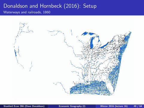
Donaldson and Hornbeck (2016): SetupWaterways and railroads, 1860
Stanford Econ 266 (Dave Donaldson) Economic Geography (I) Winter 2016 (lecture 16) 49 / 64
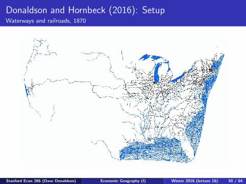
Donaldson and Hornbeck (2016): SetupWaterways and railroads, 1870
Stanford Econ 266 (Dave Donaldson) Economic Geography (I) Winter 2016 (lecture 16) 50 / 64

Donaldson and Hornbeck (2016): SetupWaterways and railroads, 1880
Stanford Econ 266 (Dave Donaldson) Economic Geography (I) Winter 2016 (lecture 16) 51 / 64
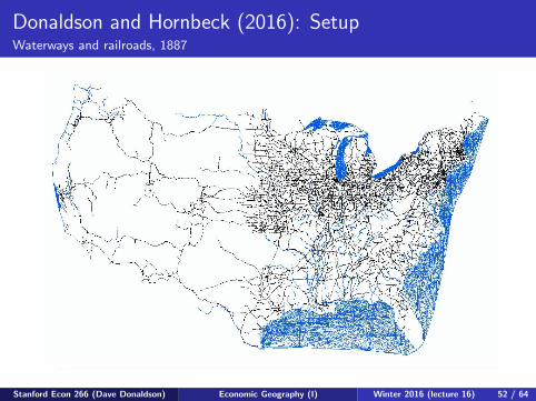
Donaldson and Hornbeck (2016): SetupWaterways and railroads, 1887
Stanford Econ 266 (Dave Donaldson) Economic Geography (I) Winter 2016 (lecture 16) 52 / 64

Donaldson and Hornbeck (2016): SetupWaterways and railroads, 1911
Stanford Econ 266 (Dave Donaldson) Economic Geography (I) Winter 2016 (lecture 16) 53 / 64
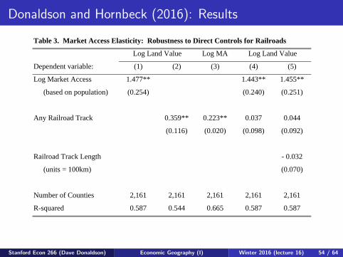
Donaldson and Hornbeck (2016): Results
Table 3. Market Access Elasticity: Robustness to Direct Controls for Railroads
Log MA
(1) (2) (3) (4) (5)
Log Market Access 1.477** 1.443** 1.455**
(based on population) (0.254) (0.240) (0.251)
Any Railroad Track 0.359** 0.223** 0.037 0.044
(0.116) (0.020) (0.098) (0.092)
Railroad Track Length - 0.032
(units = 100km) (0.070)
Number of Counties 2,161 2,161 2,161 2,161 2,161
R-squared 0.587 0.544 0.665 0.587 0.587
Dependent variable:
Log Land ValueLog Land Value
Stanford Econ 266 (Dave Donaldson) Economic Geography (I) Winter 2016 (lecture 16) 54 / 64
Ahlfeldt, Redding, Sturm and Wolf (Ecta, 2015)
ARSW (2015) develop a similar approach to RS (2008) but to thecase of the division (and reunification) of Berlin. So this is about theimportance of proximity at a very different spatial scale(neighborhoods rather than regions).
Paper looks at the effect of the loss of access/proximity to thedowntown region (CBD/“Mitte”), which was in East Berlin, onneighborhoods of West Berlin. And then the reverse for reunification.
Stanford Econ 266 (Dave Donaldson) Economic Geography (I) Winter 2016 (lecture 16) 55 / 64
Ahlfeldt, Redding, Sturm and Wolf (2015)
Model is similar to RS (2008) but with some alterations:
Commuting costs that vary with distance. This is modeled in thestandard ‘logit’ fashion where workers’ places of residence are fixed butthey then receive exogenous utility shocks for each location and theychoose the utility maximizing work location (as a function of the utilityshocks, the wage, and the commuting cost).No trade costs (the logic here is that most of what was produced inBerlin was exported to the rest of the ‘world’ anyway.Consumer amenities that depend on an exogenous local term (as in RS,2008) and a distance-weighted sum of all other regions’ populations.Production externalities that depend on an exogenous local term and adistance-weighted sum of all other regions’ employment .
Stanford Econ 266 (Dave Donaldson) Economic Geography (I) Winter 2016 (lecture 16) 56 / 64

Ahlfeldt, Redding, Sturm and Wolf (2015)
Basic estimation strategy:
Basic principle is that this is a model with a parameter foragglomeration externalities. ARSW then let the data, when fedthrough the model, identify that parameter. Analogous to approachsummarized in Glaeser and Gottlieb (JEL, 2010)—more detail inGlaeser’s 2009 book of lectures on urban economics—or Allen andArkolakis (QJE, 2014).Formulate moments based on the identifying assumption that the(unobserved) production/consumption amenities (for each location)don’t change over time in a way that is correlated with distance to theCBD.This effectively says that the only effect of distance-to-the-CBD isworking through the model’s 3 distance-dependent terms (productionexternalities, consumption externalities, and commuting costs).Remarkably, there is sufficient variation in these 3 terms to allowidentification of 3 separate parameters.
Stanford Econ 266 (Dave Donaldson) Economic Geography (I) Winter 2016 (lecture 16) 57 / 64

Ahlfeldt, Redding, Sturm and Wolf (2015)
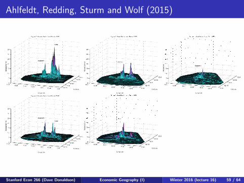
Map 1: Land Values in Berlin in 1936
Stanford Econ 266 (Dave Donaldson) Economic Geography (I) Winter 2016 (lecture 16) 58 / 64
Ahlfeldt, Redding, Sturm and Wolf (2015)
Stanford Econ 266 (Dave Donaldson) Economic Geography (I) Winter 2016 (lecture 16) 59 / 64
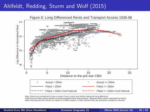
Ahlfeldt, Redding, Sturm and Wolf (2015)
-4-2
02
Log
Diff
eren
ce in
Nor
mal
ized
Ren
t
0 5 10 15 20 25Distance to the pre-war CBD
Actual < 250m Actual >= 250mFitted < 250m Fitted >= 250m
Fitted < 250m Conf Interval Fitted >= 250m Conf Interval
Note: Rents are normalized to have a mean of one in each year before taking the long difference.Solid lines are fitted values based on locally-weighted linear least squares. Separate fitted values estimated for blocks within and beyond 250 metres of U-Bahn or S-Bahn station in 1936. Dashed lines are pointwise confidence intervals.
Figure 6: Long Differenced Rents and Transport Access 1936-86-1
01
23
Log
Diff
eren
ce in
Nor
mal
ized
Ren
t
0 5 10 15 20 25Distance to the pre-war CBD
Actual < 250m Actual >= 250mFitted < 250m Fitted >= 250m
Fitted < 250m Conf Interval Fitted >= 250m Conf Interval
Note: Rents are normalized to have a mean of one in each year before taking the long difference.Solid lines are fitted values based on locally-weighted linear least squares. Separate fitted values estimated for blocks within and beyond 250 metres of U-Bahn or S-Bahn station in 1936. Dashed lines are pointwise confidence intervals.
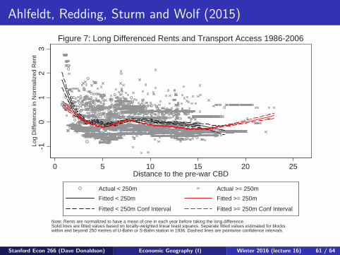
Figure 7: Long Differenced Rents and Transport Access 1986-2006
Stanford Econ 266 (Dave Donaldson) Economic Geography (I) Winter 2016 (lecture 16) 60 / 64
Ahlfeldt, Redding, Sturm and Wolf (2015)
-4-2
02
Log
Diff
eren
ce in
Nor
mal
ized
Ren
t
0 5 10 15 20 25Distance to the pre-war CBD
Actual < 250m Actual >= 250mFitted < 250m Fitted >= 250m
Fitted < 250m Conf Interval Fitted >= 250m Conf Interval
Note: Rents are normalized to have a mean of one in each year before taking the long difference.Solid lines are fitted values based on locally-weighted linear least squares. Separate fitted values estimated for blocks within and beyond 250 metres of U-Bahn or S-Bahn station in 1936. Dashed lines are pointwise confidence intervals.
Figure 6: Long Differenced Rents and Transport Access 1936-86
-10
12
3Lo
g D
iffer
ence
in N
orm
aliz
ed R
ent
0 5 10 15 20 25Distance to the pre-war CBD
Actual < 250m Actual >= 250mFitted < 250m Fitted >= 250m
Fitted < 250m Conf Interval Fitted >= 250m Conf Interval
Note: Rents are normalized to have a mean of one in each year before taking the long difference.Solid lines are fitted values based on locally-weighted linear least squares. Separate fitted values estimated for blocks within and beyond 250 metres of U-Bahn or S-Bahn station in 1936. Dashed lines are pointwise confidence intervals.
Figure 7: Long Differenced Rents and Transport Access 1986-2006
Stanford Econ 266 (Dave Donaldson) Economic Geography (I) Winter 2016 (lecture 16) 61 / 64

Ahlfeldt, Redding, Sturm and Wolf (2015)
One-step Two-step One-step Two-stepCoefficient Coefficient Coefficient Coefficient
Productivity Elasticity (�) 0.1261*** 0.1455*** 0.1314*** 0.1369***(0.0156) (0.0165) (0.0062) (0.0031)
Productivity Decay (�) 0.5749*** 0.6091*** 0.5267*** 0.8791***(0.0189) (0.1067) (0.0128) (0.0025)
Commuting Decay (�) 0.0014** 0.0010* 0.0009 0.0005(0.0006) (0.0006) (0.0024) (0.0016)
Commuting Heterogeneity (�) 4.8789*** 5.2832*** 5.6186*** 6.5409***(0.0423) (0.0074) (0.0082) (0.0031)
Residential Elasticity (�) 0.2212*** 0.2400*** 0.2232*** 0.215***(0.0038) (0.0037) (0.0093) (0.0041)
Residential Decay (�) 0.2529*** 0.2583*** 0.5979*** 0.5647***(0.0087) (0.0075) (0.0124) (0.0019)
Note: Generalized Method of Moments (GMM) estimates using twelve moment conditions based on the difference between the distance-weighted and unweighted mean and variance of production fundamentals and residential fundamentals. Distance weights use the distance of each West Berlin block from the pre-war CBD, inner boundary between East and West Berlin, and outer boundary between West Berlin and its East German hinterland. One-step estimates use the identity matrix as the weighting matrix. Two-step estimates use the efficient weighting matrix. Standard errors in parentheses. See the text of the paper for further discussion.
1936-1986 1986-2006
Table 3: Generalized Method of Moments (GMM) Results
ProductionExternalities
(1 × e-��)
ResidentialExternalities
(1 × e-��)
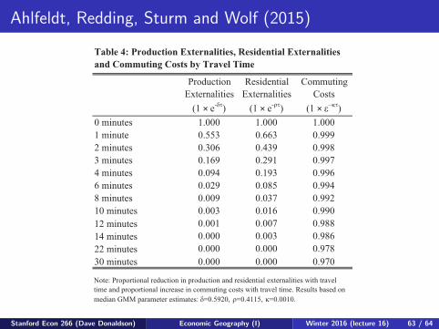
CommutingCosts
(1 × ���0 minutes 1.000 1.000 1.0001 minute 0.553 0.663 0.9992 minutes 0.306 0.439 0.9983 minutes 0.169 0.291 0.9974 minutes 0.094 0.193 0.9966 minutes 0.029 0.085 0.9948 minutes 0.009 0.037 0.99210 minutes 0.003 0.016 0.99012 minutes 0.001 0.007 0.98814 minutes 0.000 0.003 0.98622 minutes 0.000 0.000 0.97830 minutes 0.000 0.000 0.970
Table 4: Production Externalities, Residential Externalities and Commuting Costs by Travel Time
Note: Proportional reduction in production and residential externalities with travel time and proportional increase in commuting costs with travel time. Results based on median GMM parameter estimates: �=0.5920, �=0.4115, �=0.0010.
Stanford Econ 266 (Dave Donaldson) Economic Geography (I) Winter 2016 (lecture 16) 62 / 64
Ahlfeldt, Redding, Sturm and Wolf (2015)
One-step Two-step One-step Two-stepCoefficient Coefficient Coefficient Coefficient
Productivity Elasticity (�) 0.1261*** 0.1455*** 0.1314*** 0.1369***(0.0156) (0.0165) (0.0062) (0.0031)
Productivity Decay (�) 0.5749*** 0.6091*** 0.5267*** 0.8791***(0.0189) (0.1067) (0.0128) (0.0025)
Commuting Decay (�) 0.0014** 0.0010* 0.0009 0.0005(0.0006) (0.0006) (0.0024) (0.0016)
Commuting Heterogeneity (�) 4.8789*** 5.2832*** 5.6186*** 6.5409***(0.0423) (0.0074) (0.0082) (0.0031)
Residential Elasticity (�) 0.2212*** 0.2400*** 0.2232*** 0.215***(0.0038) (0.0037) (0.0093) (0.0041)
Residential Decay (�) 0.2529*** 0.2583*** 0.5979*** 0.5647***(0.0087) (0.0075) (0.0124) (0.0019)
Note: Generalized Method of Moments (GMM) estimates using twelve moment conditions based on the difference between the distance-weighted and unweighted mean and variance of production fundamentals and residential fundamentals. Distance weights use the distance of each West Berlin block from the pre-war CBD, inner boundary between East and West Berlin, and outer boundary between West Berlin and its East German hinterland. One-step estimates use the identity matrix as the weighting matrix. Two-step estimates use the efficient weighting matrix. Standard errors in parentheses. See the text of the paper for further discussion.
1936-1986 1986-2006
Table 3: Generalized Method of Moments (GMM) Results
ProductionExternalities
(1 × e-��)
ResidentialExternalities
(1 × e-��)
CommutingCosts
(1 × ���0 minutes 1.000 1.000 1.0001 minute 0.553 0.663 0.9992 minutes 0.306 0.439 0.9983 minutes 0.169 0.291 0.9974 minutes 0.094 0.193 0.9966 minutes 0.029 0.085 0.9948 minutes 0.009 0.037 0.99210 minutes 0.003 0.016 0.99012 minutes 0.001 0.007 0.98814 minutes 0.000 0.003 0.98622 minutes 0.000 0.000 0.97830 minutes 0.000 0.000 0.970
Table 4: Production Externalities, Residential Externalities and Commuting Costs by Travel Time
Note: Proportional reduction in production and residential externalities with travel time and proportional increase in commuting costs with travel time. Results based on median GMM parameter estimates: �=0.5920, �=0.4115, �=0.0010.
Stanford Econ 266 (Dave Donaldson) Economic Geography (I) Winter 2016 (lecture 16) 63 / 64