Embed Size (px)
Citation preview

Standardization and use of colour for
labelling of injectable drugs
by
H. W. Jennifer Jeon
A thesis presented to the University of Waterloo
in fulfillment of the thesis requirement for the degree of
Master of Applied Science in
Systems Design Engineering
Waterloo, Ontario, Canada, 2008 © H. W. Jennifer Jeon 2008

ii
I hereby declare that I am the sole author of this thesis. This is a true copy of the thesis, including any required final revisions, as accepted by my examiners. I understand that my thesis may be made electronically available to the public.
iii
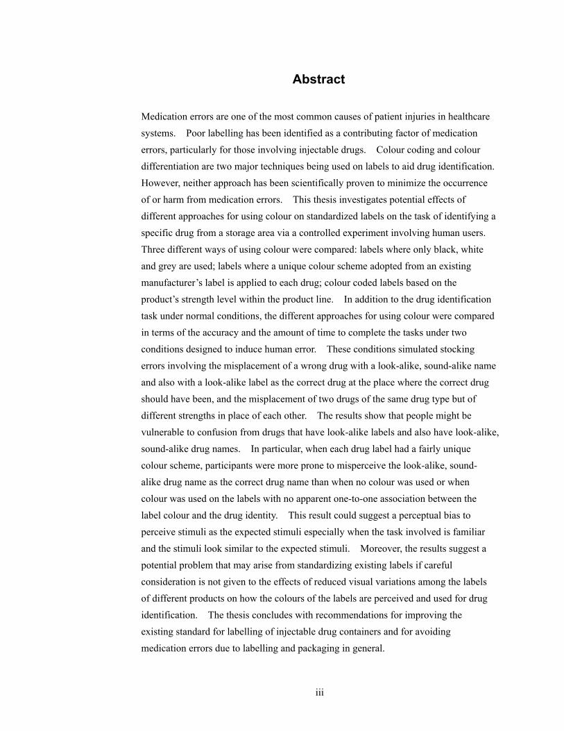
Abstract Medication errors are one of the most common causes of patient injuries in healthcare systems. Poor labelling has been identified as a contributing factor of medication errors, particularly for those involving injectable drugs. Colour coding and colour differentiation are two major techniques being used on labels to aid drug identification. However, neither approach has been scientifically proven to minimize the occurrence of or harm from medication errors. This thesis investigates potential effects of different approaches for using colour on standardized labels on the task of identifying a specific drug from a storage area via a controlled experiment involving human users. Three different ways of using colour were compared: labels where only black, white and grey are used; labels where a unique colour scheme adopted from an existing manufacturer’s label is applied to each drug; colour coded labels based on the product’s strength level within the product line. In addition to the drug identification task under normal conditions, the different approaches for using colour were compared in terms of the accuracy and the amount of time to complete the tasks under two conditions designed to induce human error. These conditions simulated stocking errors involving the misplacement of a wrong drug with a look-alike, sound-alike name and also with a look-alike label as the correct drug at the place where the correct drug should have been, and the misplacement of two drugs of the same drug type but of different strengths in place of each other. The results show that people might be vulnerable to confusion from drugs that have look-alike labels and also have look-alike, sound-alike drug names. In particular, when each drug label had a fairly unique colour scheme, participants were more prone to misperceive the look-alike, sound-alike drug name as the correct drug name than when no colour was used or when colour was used on the labels with no apparent one-to-one association between the label colour and the drug identity. This result could suggest a perceptual bias to perceive stimuli as the expected stimuli especially when the task involved is familiar and the stimuli look similar to the expected stimuli. Moreover, the results suggest a potential problem that may arise from standardizing existing labels if careful consideration is not given to the effects of reduced visual variations among the labels of different products on how the colours of the labels are perceived and used for drug identification. The thesis concludes with recommendations for improving the existing standard for labelling of injectable drug containers and for avoiding medication errors due to labelling and packaging in general.

iv
Acknowledgements I would like to express my deep appreciation to Dr. Catherine M. Burns for her supervision. Without her encouragement, patience and guidance, it would not have been possible to complete this thesis. Dr. Kathryn Momtahan and Sylvia Hyland provided me with invaluable advice and inspiration for this research. Thank you to Sandra Gabriele for letting me use her label prototypes for this research. I would like to thank Erin Harvey for her assistance with the statistical aspects of this research. Thank you to Dr. Graham Strong of the School of Optometry at the University of Waterloo for providing me with the vision testing materials for the experiment. Funding from the Canadian Patient Safety Institute is greatly appreciated. I would like to acknowledge all the members of the Advanced Interface Design Lab (AIDL) for their support. Thank you to Adrian Spânu for developing the application for the experiment with much patience. Thank you to Albert Chen for his assistance with developing the label prototypes. Thank you to Winnie Chen for her emotional support and for always being there during my occasional moments of panic. Thank you to my readers, Dr. Kathryn Momtahan and Dr. Stacey Scott, for their valuable comments and advice. Finally, this thesis would have been impossible without the endless spiritual support and encouragement from my family and friends. I am truly indebted to them.

v
Table of Contents
Abstract ........................................................................................................................................iii
Acknowledgements ......................................................................................................................iv
Table of Contents...........................................................................................................................v
List of Tables ..............................................................................................................................viii
List of Figures ..............................................................................................................................ix
List of Acronyms ..........................................................................................................................xi
Chapter 1 Introduction................................................................................................................1
1.1 Overview ............................................................................................................1
1.2 Focus of investigation.........................................................................................1
1.3 Structure of the thesis .........................................................................................4
Chapter 2 Background Review...................................................................................................5
2.1 Medication errors and poor labelling..................................................................5
2.2 Standardization of labels for injectable drugs.....................................................6
2.3 Colour coding ...................................................................................................10
2.3.1 Colour coding in warnings in general................................................... 10
2.3.2 Research activities on colour coding of warnings ................................ 11
2.3.3 Colour coding in medication labels ...................................................... 12
2.3.4 Summary............................................................................................... 14
2.4 Colour Differentiation ......................................................................................15
2.4.1 Current Practices................................................................................... 15
2.4.2 Supports for colour differentiation........................................................ 16
2.4.3 An empirical study of colour differentiation......................................... 17
2.4.4 Summary............................................................................................... 19
2.5 Perception errors...............................................................................................19
2.5.1 Expectation bias in air traffic control and driving ................................ 19
2.5.2 Expectation bias in medication errors................................................... 20
2.5.3 Expectation bias and colour.................................................................. 21
2.6 Problems with look-alike, sound-alike drug names ..........................................22

vi
2.7 Standardization and using colour on medication labels....................................23
2.8 Summary and motivation..................................................................................24
Chapter 3 Scope and Objectives...............................................................................................26
Chapter 4 Method.....................................................................................................................30
4.1 Participants .......................................................................................................30
4.2 Materials ...........................................................................................................30
4.2.1 All conditions ....................................................................................... 31
4.2.2 Existing condition................................................................................. 31
4.2.3 Strength Colour Coding Condition ....................................................... 32
4.2.4 Drug names and strengths..................................................................... 32
4.3 Experimental Design ........................................................................................35
4.4 Procedure..........................................................................................................37
4.5 Dependent Measures.........................................................................................39
Chapter 5 Results......................................................................................................................40
5.1 Response Time..................................................................................................40
5.2 Response Accuracy...........................................................................................45
Chapter 6 Discussion................................................................................................................49
6.1 Target trials .......................................................................................................49
6.2 Location-foil trials ............................................................................................50
6.3 Name-foil trials.................................................................................................50
6.4 General discussion............................................................................................52
Chapter 7 Limitations and Future Work ...................................................................................58
7.1 Training ............................................................................................................58
7.2 Environment .....................................................................................................58
7.3 Label Prototypes ...............................................................................................59
7.4 Participants .......................................................................................................59
References ...................................................................................................................................60
Appendix A Information on the label prototypes......................................................................66
Appendix B Testing Protocol .................................................................................................68
Appendix C Background Questionnaire...................................................................................70
vii
Appendix D Information Letter & Consent Form ....................................................................71
viii
List of Tables
Table 1: The colour coding system for topical ophthalmic medications......................................13
Table 2: Strength colour coding system.......................................................................................32
Table 3: Target drug name and LASA name pairs .......................................................................36
Table 4: Label arrangement and SS assignment counter-balancing scheme................................36
Table 5: Summary of mean correct response times in microseconds ..........................................41
Table 6: Summary of mean percentage accuracies ......................................................................46
Table 7: Table of frequencies of participants who passed or failed the name-foil trials ..............48

ix
List of Figures
Figure 1: A picture of 1 mL ampoules with a set of standardized black and white labels
following the CSA standard...........................................................................................................8
Figure 2: Pictures of hydromorphone hydrochloride injection vials with the concentration of 10
mg/mL (left) and of 20 mg/mL (right).........................................................................................10
Figure 3: ANSI Z535 safety sign and label formats .................................................................... 11
Figure 4: The international colour coding system for user-applied labels on syringes in
anaesthesia adopted in the UK.....................................................................................................13
Figure 5: Samples using a different background colour and type colour for emphasizing drug
strength ........................................................................................................................................16
Figure 6: Samples using colour differentiation to differentiate multiple products within the same
product line..................................................................................................................................16
Figure 7: A picture of Adrenalin® chloride solution for topical application and for hypodermic
use prior to (left) and after (right) applying colour differentiation ..............................................17
Figure 8: An example drug pack used by Filik et al. (2004)........................................................18
Figure 9: Picture of heparin vials involved in the overdose error................................................20
Figure 10: Samples of drugs with look-alike labelling/packaging reported to the USP ..............22
Figure 11: A sample stimuli set in the monochrome condition....................................................33
Figure 11 (continued): A sample stimuli set in the existing condition (bottom), and in the SCC
condition (top). ............................................................................................................................34
Figure 12: A sample pair of the target drug label (left) and the name-foil label (right) in the
monochrome condition. ...............................................................................................................36
Figure 13: Labels to numeric key mapping scheme ....................................................................38
Figure 14: The sequence of events for the visual search task......................................................39

x
Figure 15: Correct mean response times for the three target trials across the stimuli sets. .........42
Figure 16: Correct mean response times for the name-foil trials across stimuli set & NSL levels.43
Figure 17: Mean correct response times for each drug type for the name-foil trials and the
average of the target trials. ..........................................................................................................44
Figure 18: Mean correct response times for each drug type for the location-foil trials and that
for the average of the target trials ................................................................................................45
Figure 19: Mean accuracy for the name-foil and the target trials of each colour condition ........47

xi
List of Acronyms ANOVA Analysis of variance ANSI American National Standards Institute ASTM American Society for Testing Materials CSA Canadian Standards Association FDA US Food and Drug Administration ISMP Institute for Safe Medication Practices (US) ISMP Canada Institute for Safe Medication Practices Canada LASA Look-alike, sound-alike LSVAV Labels of injectable drugs in small-volume ampoules and vials NPSA National Patient Safety Agency (UK) NSL Number of strength levels (within the same drug type) SCC Strength colour coding SS Stimuli set USP United States Pharmacopoeia USP MER United States Pharmacopoeia Medication Errors Reporting
Program
1
Chapter 1
Introduction
1.1 Overview
Medication errors frequently occur in healthcare systems and endanger patient safety (Aspden, Wolcott, Bootman, & Cronenwett, 2006; Phillips et al., 2001). Injectable drugs have been involved in more than half of the medication errors reported by hospital pharmacists to the United States Pharmacopoeia from 1995 to1999 (United States Pharmacopoeia, 2000), and poor labelling has been identified as a major contributing factor in these errors (Cohen, 1999; Beverley A. Orser, Chen, & Yee, 2001; United States Pharmacopoeia, 1998). In Canada, a standard for labelling of drug ampoules, vials and prefilled syringes has been developed by the Canadian Standards Association (CSA) (Canadian Standards Association, 1999). As the CSA standard requires the information critical for identifying and administrating injectable drugs to be printed in black characters on a white background, use of colour on medication labels is an important issue related to standardizing injectable drug labels following the standard. Nevertheless, there is limited scientific literature to draw concrete conclusions on how colour should be used on medication labels to reduce the occurrence of medication errors. This thesis examines the effects of three different ways of applying colour on injectable drug labels on people’s performance on identifying drugs using their labels.
1.2 Focus of investigation
The Canadian Standards Association (CSA) developed a standard for labelling of drug ampoules, vials and prefilled syringes in 1999 to address the problems with poor labelling of injectable drugs (CAN/CSA-Z264.2-99). The CSA standard complements the requirements in the Food and Drug Act and Regulations by the Government of Canada (Government of Canada, 1985, 2006). The Act and the Regulations focus on ensuring that pertinent information is presented on the labels while the CSA standard focuses on the design aspects related to how the information should be presented on the labels. There is no legal requirement for manufacturers to comply with the requirements in the CSA standard. Although there are some differences in the details of the requirements, the scope of the CSA standard is similar to the standards developed in the US by the American Society for Testing Materials
2
(for further discussion of the standards, see Section 2.2). The CSA standard requires the information that is critical for the safe use of injectable drugs to be printed in black characters on a white background along with other typographical requirements (Clause 4.4.6, Canadian Standards Association, 1999). For parts of the label outside the critical information field, the CSA standard is not very specific about how colour should be used:
The use of colours or trade dress is acceptable on labels, providing they do not intrude upon the critical information field or distract from the legibility of critical information. Note: While colour and graphics can be used to facilitate differentiation among the formulations of the same drug product, the best use of colour and graphics is to supplement legible label information. Black lettering on a white field is the most legible form of communication under daylight conditions (Clause 4.5.1, Canadian Standards Association, 1999).
The labels of small-volume injectable drugs in ampoules or vials (LSVAV) are wrapped around on the rapidly curved surfaces of the containers. Therefore, only the critical information field of a label may be visible before the container is picked up and rotated for careful reading. If all the LSVAV followed the CSA standard, different products may look similar to each other with all of their labels showing the critical information field in black and white, unless there are other salient visual differences such as container shape. This potentially increased similarity amongst different labels arising from standardization is closely related to the issue of using colour on medication labels. Using colour on medication labels is highly controversial (Cohen, 2006; Institute for Safe Medication Practices, 2003b; Kenagy & Stein, 2001; US Food and Drug Administration, 2005). In general, colour differentiation and colour coding are two major ways to apply colour on medication labels for individual drug identification. Colour differentiation is applying colour “to make certain features stand out, or to help distinguish one item from another” (Institute for Safe Medication Practices, 2003b). Colour differentiation is often recommended and used to differentiate products within the same product line. For example, the label on a morphine product with a concentration of 40 mg/mL may have a green background colour while a morphine product with a concentration of 100 mg/mL has a red background colour. Colour coding is “the systematic, standard application of a colour system to aid in the
3
classification and identification of drug products” (Institute for Safe Medication Practices, 2003b). Colour coding by the therapeutic class of drugs is used and supported in a number of specialized areas in healthcare. For example, for user-applied labels on prefilled syringes in anaesthesia, blue is used as the background colour of the labels for narcotics, red for muscle relaxants, orange for hypnotics, etc (see Section 2.3.3 for more examples). Colour differentiation is different from colour coding in that colour itself does not have any special meaning. However, there is concern that colour can become a mental shortcut in the drug identification processes, encouraging people to identify drugs by the colour alone, rather than by reading the labels carefully (R. Filik, Purdy, & Gale, 2004; Institute for Safe Medication Practices, 2003b; Jensen, Merry, Webster, Weller, & Larsson, 2004; Nunn & Baird, 1996). As an alternative, black and white labels that are look-alike to each other have been suggested to remove the colour “shortcut” and to force users to always read and check the labels carefully as it would be the only way to identify drugs. However, the disadvantage to the black and white labels may be that the potential advantages of using colour on labels may not occur. It is difficult to predict which strategy could actually prevent drug identification errors. Humans have a tendency to perceive information following their expectation even though the information may not correspond to their expectation. This perceptual bias has been identified as a cause of human errors involving perceptual confusions in aviation (Shorrock, 2007) and in visual detection tasks in a simulated driving environment (Martens, 2004). In particular, this perceptual bias has been identified as a possible contributing factor for medication errors involving drugs with look-alike labels and packaging or look-alike, sound-alike (LASA) drug names (Cohen, 1999, p. 13.2; Davis, 1994; U, 2003). The suggested mechanism of this bias is that, as users become familiar with the drugs they frequently handle, and each drug has a fairly unique colour scheme, users may develop expectations about drug identity based on the colour of the labels. When the user unexpectedly encounters a wrong drug with a look-alike label and a LASA name, the user is likely to perceive the look-alike drug as the intended drug following his/her expectation. Healthcare professionals, in particular, are expected to be vulnerable to this perceptual bias given their high level of familiarity with the drugs they use frequently and their stressful work environment according to Reason (1990). This thesis aims to examine the potential effects of different ways of using

4
colour on a set of standardized labels via a controlled experiment involving human users. Specifically, three different ways of using colour are compared: labels where only black, white and grey are used; labels where a unique colour scheme adopted from an existing manufacturer’s label is applied to each label; colour coded labels where the colour code indicates the strength level of the drug within the product line. The colour conditions are compared in terms of their effects on people’s performance on a visual search task that simulates the task of finding a specific drug from a storage area. The contributions of this thesis can be summarized as follows: 1. Examination of how different ways of using colour on medication labels can affect
people’s performance on the drug identification task. 2. Examination of the effects of different approaches to using colour on medication
labels on people’s ability to differentiate drugs with look-alike labels and LASA names and their ability to identify misplaced drugs.
3. Developing greater understanding of the human factors involved in the process of identifying drugs using their labels.
4. Providing recommendations for improving the current Canadian standard for labelling of injectable drugs and medication safety in general.
1.3 Structure of the thesis
The remainder of this thesis is structured as follows: Chapter 2 provides background information on how poor labelling contributes to
medication errors, issues related to standardization of injectable drug labels and different ways of using colour on medication labels
Chapter 3 describes the scope and objectives of the thesis Chapter 4 describes the materials, experimental design, participants, procedure
and dependent measures used for the experiment Chapter 5 shows the results of the experiment Chapter 6 discusses the results and concludes with recommendations Chapter 7 discusses the limitations of the study and recommendations for future
work

5
Chapter 2
Background Review This chapter provides background information on medication errors and how labelling and packaging of drugs can contribute to these errors. The Canadian and the US standards for designing labels for injectable drug containers in relation to using colour on the labels are discussed. Different ways of applying colour on medication labels are described with a focus on colour coding and colour differentiation. A perceptual bias involving expectation is hypothesized as a contributing factor of confusions involving drugs with look-alike labels and LASA drug names. Further, possible effects of the bias on users when colour is used on the labels as well as when the labels are standardized are explored.
2.1 Medication errors and poor labelling
Medication errors are a serious issue in healthcare. A medication error is defined as “any preventable event that may cause or lead to inappropriate medication use or patient harm while the medication is in the control of the healthcare professional, patient, or consumer” by the US National Coordinating Council for Medication Error Reporting and Prevention (2008). According to a retrospective analysis of mortalities associated with the medication errors reported to the US Food and Drug Administration (FDA), 469 deaths were caused by the medication errors from 1993 to 1998 (Phillips et al., 2001). A recent report by the US Institute of Medicine estimates that about one medication error occurs per patient per day in hospital care (Aspden, Wolcott, Bootman, & Cronenwett, 2006, p. 111). In Canada, Baker et al. (2004) conducted a national study of the incidence of adverse events across four acute care hospitals in each of the selected five provinces by reviewing the patient charts. Drug- or fluid-related adverse events were the second most frequently related type of events to the identified adverse events following surgical procedures or events. Furthermore, the study found that 36.9 % of the patients who experienced one or more adverse events had highly preventable adverse events. The Institute for Safe Medication Practices Canada (ISMP Canada) has been collecting and analyzing voluntary medication error reports in Canada since 2000. As of September 20, 2005, the ISMP Canada’s database had more than 10,000 medication error reports (Hyland, 2005).
6
Poor labelling has been identified as a major contributing factor of medication errors, particularly those involving injectable drugs. An analysis of 1,045 medication errors reported to the United States Pharmacopoeia (USP) Medication Errors Reporting (MER) Program from October, 1991 to September, 1994 revealed that 766 incidents involved injectable drugs, and 251 of the 766 incidents involved labelling issues (United States Pharmacopoeia, 1994). Another analysis of the medication errors reported to the USP MER program from June 1, 1996 to May 31, 1997 showed that 33 % of the reports (N = 560) cited labelling as a contributing factor (United States Pharmacopoeia, 1998). Concerns over the labelling of injectable drugs led to the establishment of the joint USP/FDA Advisory Panel on Simplification and Improvement of Injection Labelling in 1991. In Canada, Orser, Chen and Yee (2001) surveyed 687 Canadian anaesthesiologists about their experience with medication errors. The misidentification of a syringe or “syringe swap” was reported as the most common cause of error (70.4 %) followed by a failure to read the label (62.9 %) and misidentification of the drug ampoule or vial (46.8 %). In anaesthesia, potent injectable drugs are often pre-drawn from ampoules or vials into syringes before use and administered through complex procedures. Therefore, wrong drug errors from the misidentification of a syringe or drug ampoules or vials have been the leading type of medication errors in anaesthesia (Abeysekera, Bergman, Kluger, & Short, 2005; Currie et al., 1993; B. A. Orser & Oxorn, 1994).
2.2 Standardization of labels for injectable drugs
To address this issue of poor labelling of injectable drugs, the Canadian Standards Association (CSA) developed a standard for labelling of injectable drug ampoules, vials and prefilled syringes in 1999 (Canadian Standards Association, 1999). The CSA standard defines minimum design requirements for the presentation of critical information on the inner labels for injectable drug products in ampoules, vials or prefilled syringes, and complements but does not replace the requirements in the Canadian regulations (Government of Canada, 1985, 2006). Complying with the requirements in the CSA standard is voluntary. In the US, the American Society for Testing Materials (ASTM) International has developed several standards relevant to the labelling of injectable drug containers. ASTM D4267-07 specifies the orientation, type size and the contrast of label contents for the labels of small-volume (100 mL or less) injectable drug containers. The

7
standard discourages using pastel shades such as pink, green, brown or grey for copy, and other colours of these shades for background (Clause 7.1, American Society for Testing and Materials, 2007b). ASTM D6398-01e1 specifies the shape, size, colour, layout, typeface and bar coding on the labels for prescription drug packaging. Consistent with ASTM D4267-07, ASTM D6398-01e1 states that “pastel colours should not be used for the identification of drugs…” (Clause 6.2, American Society for Testing and Materials, 2001). Furthermore, the standard recommends “colour contrasts with bright saturated colours contrasting with the text and the background” with the following suggested text-background colour pairs: black-white, blue-yellow, white-blue and blue-white (Clause 6.3, American Society for Testing and Materials, 2001). ASTM D4775-04 specifies the labelling requirements for identification and configuration of prefilled syringes (American Society for Testing and Materials, 2004). ASTM D5022-07 defines the requirements for identification of vials and ampoules containing drugs to be diluted before use (American Society for Testing and Materials, 2007a). Both ASTM 4775-04 and D5022-07 requires the words “Dilute Before Use”, or similar warning, to be printed within a red box whenever space permits for the containers with concentrated drugs to be diluted before use (Clause 6.2, American Society for Testing and Materials, 2004; Clause 4.2, American Society for Testing and Materials, 2007a). For information that is considered critical for the identification and safe administration of injectable drugs, the requirements concerning using colour on the labels in the CSA standard is more stringent compared to the requirements in the ASTM standards. The CSA standard defines the critical information as the drug’s common name(s) in English and French and the total amount of drug ingredient(s) as mg per total millilitres, followed by the concentration of drug ingredient(s) as mg per one mL. The standard requires the critical information to be printed in black characters on a white background. The black and white colour scheme provides a high contrast between characters and a background, and therefore ensures a high level of legibility of the critical information. However, if all the labels for injectable drugs in small-volume ampoules and vials (LSVAV) followed the standard, labels of different drugs may look very similar to each other since the critical information field which makes up a large portion of the labels would all bear the same type colour and the background colour. The LSVAV are wrapped around on rapidly curved surfaces, and thus only the critical information field may be visible when arranged on a shelf as illustrated in Figure 1. Therefore, if all the LSVAV followed the standard, the
8
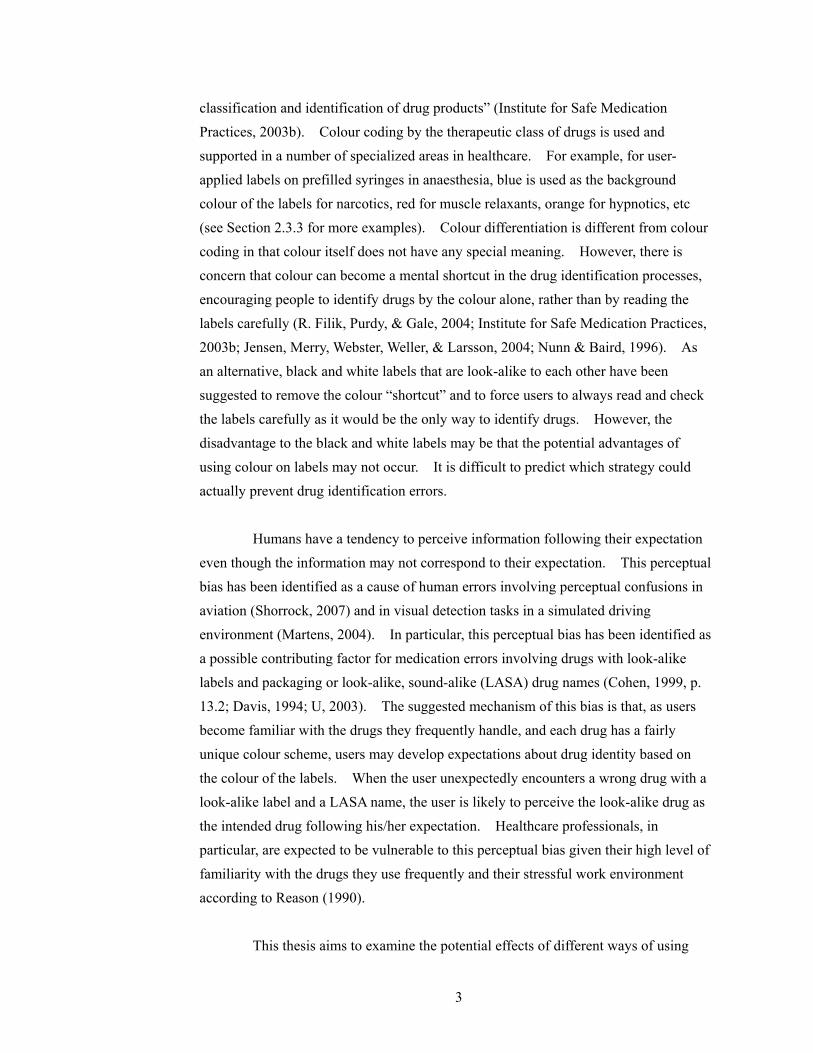
legibility of an individual label may be ensured, but finding a specific drug from a storage area may become difficult.
Figure 1: A picture of 1 mL ampoules with a set of standardized black and white labels
following the CSA standard
In fact, the issue of whether this type of increased similarity amongst medication labels from eliminating colour decreases or increases the risk of medication errors remains unresolved. One view is that no colour should be used on medication labels and that injectable drug containers should come in the same sizes and in the same shape. This way, reading the label carefully would be the only way to identify a drug, and the number of errors related to confusing one drug product from another may be reduced. It is argued that using colour can undermine the process of reading and checking the labels carefully (Aono & Ueda, 2000; Nunn & Baird, 1996). M. R. Cohen of the Institute for Safe Medication Practices (ISMP) suggests this possibility by providing an example that no errors have been linked to unit dose packages produced by automated packaging and dispensing machines despite the fact that the unit dose packages are identically labelled, of the same size and shape for all products (Cohen, 2006, p. 123). A contrary view is that the process of humans reading and checking the labels are bound to fail sometimes, and there needs to be a systematic measure such as colour coding to minimize the occurrence of or harm from human errors involved in the label reading process (Abeysekera, Bergman, Kluger, & Short, 2005; B. A. Orser & Oxorn, 1994; Webster, 2000). In general, there are three ways of using colour on medication labels and packages; colour differentiation, colour coding and colour matching. Colour
9
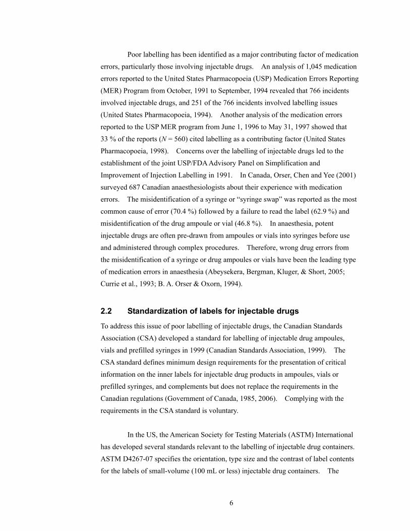
differentiation is applying colour to emphasize certain features of the label/package or to distinguish one drug product from another (Institute for Safe Medication Practices, 2003b). For example, a product warning that a concentrated drug must be diluted may be highlighted on the label by printing a warning message such as “Dilute before use” in red characters. Colour differentiation is different from colour coding in that colour itself does not have any special meaning. For example, Figure 2 shows the labels of two different strengths of hydromophone hydrochloride injection products differentiated by their background colours; the label for 10 mg/mL has a green background colour while the label for 20 mg/mL has an orange background colour. The green and orange themselves, however, do not mean anything. Colour coding is “the systematic, standard application of a colour system to aid in the classification and identification of drug products” (Institute for Safe Medication Practices, 2003b). Therefore, “a colour coding system allows people to memorize a colour and match it to its function” (Institute for Safe Medication Practices, 2003b). For example, the USP and the FDA require the vials containing potassium chloride for injection concentrate to have a black metal closure with a black cap and the ampoules to have a black band(s) above the constriction (Cohen, 2006, p. 147; Council on Science and Public Health, 2004). The requirement is also a part of the ASTM standard D5022-07 (American Society for Testing and Materials, 2007a). No other drug is to be packaged with a black band(s) in an ampoule or with a black cap in a vial. Colour matching is applying the same or similar colours to more than one drug products that are related to each other. It has potential for reducing medication errors although not directly related to the identification of individual products. For example, Berwith, Sinz, Chase and Martin (2007) examined the speed and accuracy of drawing drugs from vials to corresponding syringes with three different labels that were black and white, colour matched and colour mismatched in a controlled simulated study. The number of near misses with colour matched labels was significantly fewer than that with the black and white labels or with the colour mismatched labels. Since colour differentiation and colour coding are most relevant to the LSVAV and medication errors from misidentification, these will be elaborated further in the following sections.

10
Figure 2: Pictures of hydromorphone hydrochloride injection vials with the concentration
of 10 mg/mL (left) and of 20 mg/mL (right)
2.3 Colour coding
Colour coding is an integral component of safety warnings, labels and tags. For warnings in general, there are colour coding systems for informing users of the type or hazard level of the warnings. For medication labels, colour coding is used in specialized areas of medicine to indicate the therapeutic class of drugs. Due to limited scientific evidence, authorities in medication safety either do not support colour coding or advise caution when applying colour coding on medication labels.
2.3.1 Colour coding in warnings in general The International Organization for Standardization (ISO)’s safety sign system use colour-coded surround shapes to inform the viewers the meaning of the type of sign (Peckham, 2006a). A yellow triangle is used for a warning sign, a blue circle is used for a mandatory action sign, and a red outline circle with a diagonal slash is used for a prohibition sign. In the US, the American National Standards Institute (ANSI)’s Z535 standards provide guidelines for developing warning signs, labels and tags (Peckham, 2006b). ANSI Z535.1 Safety Colour Code defines the colour tolerance boundaries for safety colours. The colours are used by other ANSI Z535 standards as the background of the signal word panels to communicate the hazard seriousness level; red for DANGER, orange for WARNING and yellow for CAUTION (see Figure 3 for examples). In Canada, CAN/CSA-Z321-96 standard defines the requirements for the

11
design of signs that are to be used in the workplace for the purpose of communicating a regulatory, warning or information message (Canadian Standards Association, 1996). The standard specifies a set of colours for six sign categories as follows:
1. Prohibition: red and black on white; 2. Mandatory: white on black; 3. Caution: black on yellow; 4. Danger: white on red; 5. Emergency: white on green; and 6. General information: white on blue.
Figure 3: ANSI Z535 safety sign and label formats
(Peckham, 2002)
2.3.2 Research activities on colour coding of warnings The research in warnings largely supports using colour to convey hazard level on warnings. Kline, Braun, Peterson and Silver (1993) found that coloured labels were perceived as more readable and hazardous than black and white labels. Smith-Jackson and Wogalter (2000) presented ten colours from the ANSI Z535.1 safety color standard to participants, and participants were asked to rate how careful they would be if they saw the colour on a sign, poster or label. They found a significant effect of colour on the carefulness ratings; red, yellow, black, orange and magenta were given the five highest hazard ratings (in the order of decreasing hazard level) that were significantly different from each other except for yellow and black. Braun and Silver (1995) also applied five safety colours (red, orange, blue, green and black) from the ANSI Z535.1 standard to five safety words and asked 30 participants to rate their perceived hazard level. Red was perceived to be the most hazardous compared to all the other colours, and orange was perceived to be significantly more hazardous than
12
black, green or blue. Adams and Edworthy (1995) also found that the signal word WARNING printed in black would have to be approximately twice as big as that in red to give the same perceived urgency.
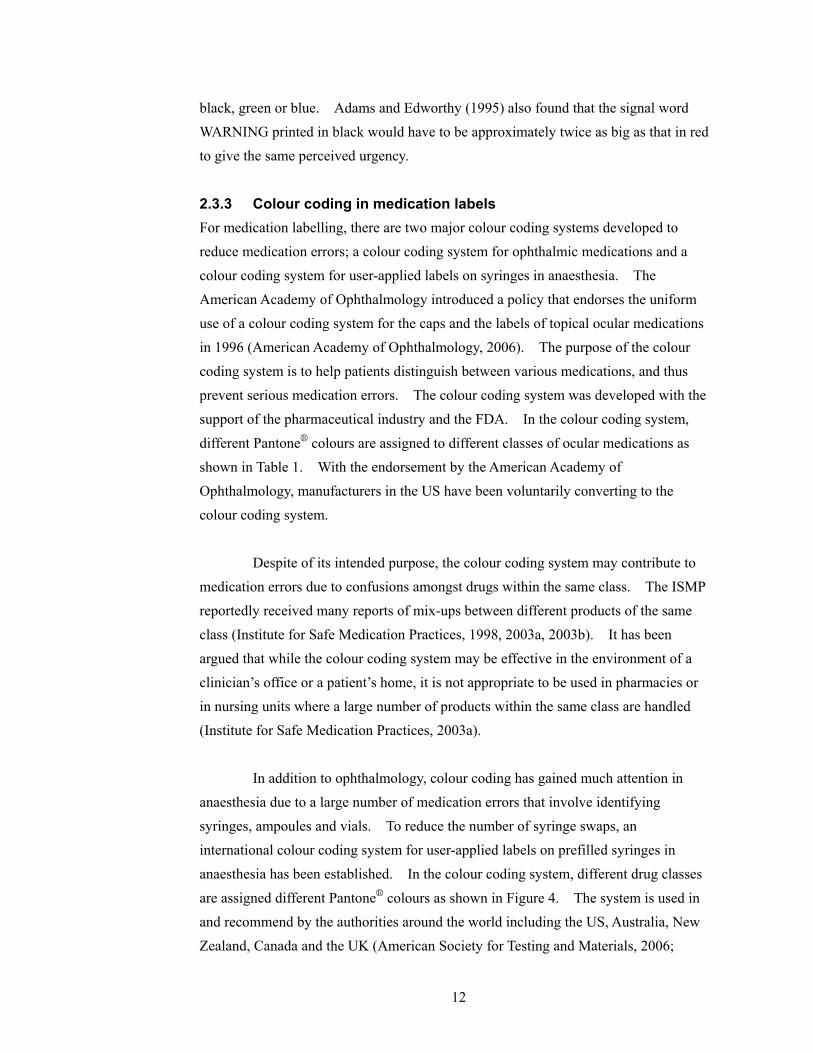
2.3.3 Colour coding in medication labels For medication labelling, there are two major colour coding systems developed to reduce medication errors; a colour coding system for ophthalmic medications and a colour coding system for user-applied labels on syringes in anaesthesia. The American Academy of Ophthalmology introduced a policy that endorses the uniform use of a colour coding system for the caps and the labels of topical ocular medications in 1996 (American Academy of Ophthalmology, 2006). The purpose of the colour coding system is to help patients distinguish between various medications, and thus prevent serious medication errors. The colour coding system was developed with the support of the pharmaceutical industry and the FDA. In the colour coding system,
different Pantone® colours are assigned to different classes of ocular medications as shown in Table 1. With the endorsement by the American Academy of Ophthalmology, manufacturers in the US have been voluntarily converting to the colour coding system. Despite of its intended purpose, the colour coding system may contribute to medication errors due to confusions amongst drugs within the same class. The ISMP reportedly received many reports of mix-ups between different products of the same class (Institute for Safe Medication Practices, 1998, 2003a, 2003b). It has been argued that while the colour coding system may be effective in the environment of a clinician’s office or a patient’s home, it is not appropriate to be used in pharmacies or in nursing units where a large number of products within the same class are handled (Institute for Safe Medication Practices, 2003a). In addition to ophthalmology, colour coding has gained much attention in anaesthesia due to a large number of medication errors that involve identifying syringes, ampoules and vials. To reduce the number of syringe swaps, an international colour coding system for user-applied labels on prefilled syringes in anaesthesia has been established. In the colour coding system, different drug classes
are assigned different Pantone® colours as shown in Figure 4. The system is used in and recommend by the authorities around the world including the US, Australia, New Zealand, Canada and the UK (American Society for Testing and Materials, 2006;

13
Canadian Standards Association, 1998; Royal College of Anaesthetists, 2003; Standards New Zealand, 1998).
Class Colour Pantone® Number
Anti-infectives Tan 467
Anti-inflammatories/steroids Pink 197
Mydriatics and cycloplegics Red 1797
Nonsteroidal anti-inflammatories Gray 4
Miotics Dark Green 348
Beta-blockers Yellow Yellow C
Beta-blocker combinations Dark Blue 281
Adrenergic agonists Purple 2583
Carbonic anhydrase inhibitors Orange 1585
Prostaglandin analogues Turquoise 326
Table 1: The colour coding system for topical ophthalmic medications
Figure 4: The international colour coding system for user-applied labels on syringes in
anaesthesia adopted in the UK
(Royal College of Anaesthetists, 2003)
Nonetheless, the effectiveness of the syringe labelling colour coding system

14
in reducing the number of medication errors has been controversial. Jensen, Merry, Webster, Weller and Larsson (2004) performed a systematic literature review to come up with evidence-based recommendations for the minimization of intravenous drug administration errors in anaesthesia. The recommendations were validated using the reports of medication errors from two tertiary teaching hospitals in New Zealand. One of their recommendations was "colour coding by class of drug according to an agreed national or international standard should be used – of the syringe, part of the syringe, or of the syringe or ampoule labels” (Jensen et al., 2004). The recommendation, however, was weakly supported in their study due to the conflicting views in the literature on the issue of colour coding. Twenty-one authorities supported the recommendation in principle while seven authorities did not support it. The authorities who opposed the use of colour coding were concerned that colour coding may detract users from reading the labels carefully, which they believed to be the sole or at least the central strategy for correctly administrating an intravenous drug. However, the vast majority of the studies supporting or opposing the use of colour coding reviewed in the study did not involve an experimental design or an analysis of prospectively collected medication error reports. Rather, the studies were mostly case reports and/or expert opinions. Due to the limited scientific evidence in the effectiveness of colour coding systems in reducing medication errors, many authorities involved in medication safety either discourage using colour coding systems or recommend caution in applying them (American Society of Health-System Pharmacists; Cohen, 1999, p. 13.6-13.8; Institute for Safe Medication Practices, 2003b; National Patient Safety Agency, 2007, p. 55; US Food and Drug Administration, 2005). For example, the FDA held a public hearing on the use of colour on pharmaceutical product labels, labelling and packaging on March 7, 2005, where the representatives from pharmaceutical manufacturers, physicians from different disciplines and organizations involved in medication safety discussed the issue. The USP, the ISMP, the American Society of Health-System Pharmacists and two manufacturers expressed concern over using colour coding while the American Dental Association and American Academy of Ophthalmology supported their colour coding systems (US Food and Drug Administration, 2005)
2.3.4 Summary Colour coding systems that assign colour to product labels based on drug classes may help reduce medication errors from mixing up drugs from different classes in certain

15
contexts. However, such systems may increase the number of medication errors due to intra-class mix-ups. In addition, the use of colour coding is limited in many ways. There are only a limited number of highly distinguishable colours by human eyes in comparison to the ever increasing number of marketed medications. The same colour can look different under different lighting conditions. Also, it is difficult to reproduce
Pantone® colours exactly every time. Finally, people may not read the labels carefully after using the colour coding system to quickly differentiate products of different classes.
2.4 Colour Differentiation
The effectiveness of colour differentiation in reducing medication errors has not been scientifically proven either. Nevertheless, colour differentiation is widely used by manufacturers of injectable drugs to distinguish drug products of different strengths or of type within the same product line or to emphasize certain features of the labels.
2.4.1 Current Practices As part of a related prior study, seventy-eight injectable drugs were collected from a pharmacy inventory of a large urban hospital (Momtahan, Burns, Hyland, Jeon, & Gabriele, 2008). While these samples were collected for the other study, it was also possible to examine them to look at current practices of colour differentiation. An analysis of the sampled labels revealed that 75 % of them emphasized either the drug strength (for drugs in solution or liquid) or the total mass (for drugs in powder) on the label (N = 77, one sterile water sample was irrelevant for this analysis) by using colour differentiation. A different type colour and a background colour from those used in the vicinity of the field displaying drug strength or total mass were used to highlight the information. Figure 5 shows such samples. Also as a part of the study, nine injectable drug products that use different type colour and/or background colour for expressing different strengths or amounts within the product line were found. Figure 6 shows three of the nine samples.

16
Figure 5: Samples using a different background colour and type colour for emphasizing
drug strength
Figure 6: Samples using colour differentiation to differentiate multiple products within
the same product line
2.4.2 Supports for colour differentiation In comparison to colour coding, colour differentiation is more strongly supported by pharmaceutical manufacturers and authorities related to medication safety. At the FDA’s public hearing on the use of colour on pharmaceutical product labels, labelling and packaging, the representatives from two major pharmaceutical manufacturers expressed their support for using colour differentiation on medication labels (US Food and Drug Administration, 2005). While cautioning any method of using colour on medication labels should be carefully thought through, M. R. Cohen of the ISMP also illustrated that colour differentiation can be helpful for distinguishing different products within the same product line and to draw attention to an important portion of the label

17
using examples as shown in Figure 7 at the FDA’s public hearing (US Food and Drug Administration, 2005). The UK National Patient Safety Agency also supports using colour differentiation to distinguish medications within a product range (National Patient Safety Agency, 2007). Similarly, the Therapeutic Goods Administration of Australia encourages using different colours or colour bars to distinguish between different strengths or presentations of the product range in its best practice guideline for prescription medication labelling (Therapeutic Goods Administration, 2005). Furthermore, the CSA standard allows the use of colour differentiation as it states “While colour and graphics can be used to facilitate differentiation among the formulations of the same drug product, the best use of colour and graphics is to supplement legible label information” (Clause 4.5.1, Canadian Standards Association, 1999).
Figure 7: A picture of Adrenalin® chloride solution for topical application and for
hypodermic use prior to (left) and after (right) applying colour differentiation
© 2005 ISMP
2.4.3 An empirical study of colour differentiation To the best of the author’s knowledge, there has been only one controlled experiment that looks into the effects of colour differentiation on medication labels. Filik, Purdy, Gale and Gerrett (2004) conducted two preliminary experiments investigating pros and cons of using colour to differentiate drugs of different strengths within the same product line. In Experiment 1, participants were shown the image of a target drug pack on a computer screen for a limited amount of time and were shown eight different strengths of the target drug arranged in a circular manner. During 50 % of the trials, a pack of the target strength was present in the array while during the remaining 50 % of

18
the trials, it was not. Also, during half of the trials, all the packs had a grey block above the strength statement (the grey condition) while during the other half of the trials, the packs of different strengths had the blocks in different colours (the colour condition). Figure 8 shows a sample drug pack used in the grey condition. Participants were given as much time as needed to input their response using the key buttons. The accuracy of the responses was higher in the colour condition than in the grey condition by approximately 5 %. In Experiment 2, the target pack was never present in the array but a product with a similar name, the same strength and the same colour as the target was presented. The procedure was identical to that of Experiment 1. Participants made more errors in the colour condition than in the grey condition approximately with a 10 % difference in accuracy. The statistical significance level of the accuracy differences in the two experiments were not reported in the paper. Based on these results, Filik et al. (2004) concluded that while colour can facilitate identifying a product of a particular strength within a range, colour could be used as a mental shortcut in the process of identifying a medication rather than reading the label carefully.
Figure 8: An example drug pack used by Filik et al. (2004)
Filik et al. (2004)’s effort is laudable in that they explore pros and cons of using colour differentiation on medication labels via a controlled experiment. However, their study is limited in a number of ways to apply their results directly to the LSVAV. First of all, the task was remote from the real-world tasks as acknowledged by the authors. Participants were shown an image of the target drug pack just before the search task rather than given information about the target. Furthermore, the block was positioned at the bottom-right corner of each label while the drug name was positioned at the top-left side of the label. Therefore, it is possible that the particular method of applying colour on the labels with a large distance between the drug name the coloured element contributed to the large difference in accuracy between the grey condition and the colour condition in Experiment 2.

19
Moreover, the drug packs were arranged in a circular manner while drugs are usually stored on flat surfaces in a row. The drug packs used by Filik et al. (2004) displayed only the drug name, the drug form (tablets), strength in milligrams and the number of tablets. Compared to the amount of space available on the packs, the amount of information displayed was small, and therefore the packs had a large amount of white surface. In contrast, the LSVAV display a lot of information within a very limited surface area. It is also rare to find an injectable medication that has as many as eight different strengths as those used in Filik et al. (2004)’s study. A review of the drug formulary from a large urban hospital revealed that most injectable medications in ampoules or vials have three or less number of different strengths.
2.4.4 Summary Using colour differentiation to help distinguish medications within the same product line is supported by manufacturers and some authorities of medication safety while the scientific evidence illustrating its effectiveness is very limited. Nonetheless, given the limited number of highly distinguishable colours and the ever increasing number of marketed pharmaceutical products, there are bound to be products that share similar or the same colour(s) and may be confused.
2.5 Perception errors
Medication errors involved in confusing a wrong drug with a look-alike label/package is closely related to perception errors involved in both ‘bottom-up’ and ‘top-down’ processes of human information processing. Humans have tendency to perceive information as their expectation even though the information may not correspond to their expectation. This perceptual bias is called in a number of different ways.
2.5.1 Expectation bias in air traffic control and driving Shorrock and Kirwan (2002) developed a human error identification technique for the retrospective and predictive analysis of cognitive errors in air traffic control called TRACEr. Within TRACEr, people’s tendency to perceive what they expect to perceive is termed ‘expectation bias’. Shorrock and Kirwan (2002) analyzed interviews with UK air traffic controllers and UK aircraft proximity incident reports using TRACEr, and found that controllers sometimes failed to notice inaccuracies in a pilot’s readbacks since most readbacks are correct. Similar effect of expectation has also been observed in visual search tasks by Martens (2004) in a simulated driving
20
environment. When targets appeared when participants expected them to be distractors, participants took longer to respond to the unexpected targets than the expected targets or did not respond to the unexpected targets at all.
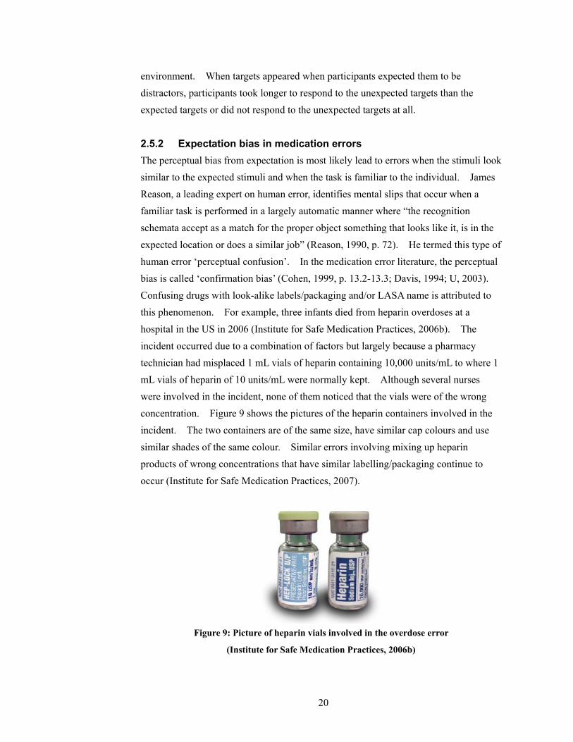
2.5.2 Expectation bias in medication errors The perceptual bias from expectation is most likely lead to errors when the stimuli look similar to the expected stimuli and when the task is familiar to the individual. James Reason, a leading expert on human error, identifies mental slips that occur when a familiar task is performed in a largely automatic manner where “the recognition schemata accept as a match for the proper object something that looks like it, is in the expected location or does a similar job” (Reason, 1990, p. 72). He termed this type of human error ‘perceptual confusion’. In the medication error literature, the perceptual bias is called ‘confirmation bias’ (Cohen, 1999, p. 13.2-13.3; Davis, 1994; U, 2003). Confusing drugs with look-alike labels/packaging and/or LASA name is attributed to this phenomenon. For example, three infants died from heparin overdoses at a hospital in the US in 2006 (Institute for Safe Medication Practices, 2006b). The incident occurred due to a combination of factors but largely because a pharmacy technician had misplaced 1 mL vials of heparin containing 10,000 units/mL to where 1 mL vials of heparin of 10 units/mL were normally kept. Although several nurses were involved in the incident, none of them noticed that the vials were of the wrong concentration. Figure 9 shows the pictures of the heparin containers involved in the incident. The two containers are of the same size, have similar cap colours and use similar shades of the same colour. Similar errors involving mixing up heparin products of wrong concentrations that have similar labelling/packaging continue to occur (Institute for Safe Medication Practices, 2007).
Figure 9: Picture of heparin vials involved in the overdose error
(Institute for Safe Medication Practices, 2006b)
21
The use of term ‘confirmation bias’ can be misleading since the term is used somewhat differently outside the medication error literature. Confirmation bias is more commonly used to describe people’s “unwitting selectivity in the acquisition and use of evidence” in a more conscious and effortful problem solving processes (Nickerson, 1998; Reason, 1990, p. 86). For example, confirmation bias is used to describe “the tendency to focus on evidence that supports a working hypothesis, such as a diagnosis in clinical medicine, rather than to look for evidence that refutes it or provides greater support to an alternative diagnosis” by the US Agency for Healthcare Research and Quality (AHRQ) (Agency for Healthcare Research and Quality, 2008). Therefore, for the purposes of this thesis, the perceptual bias to interpret stimuli as expected especially with familiar tasks and look-alike stimuli will be called ‘expectancy-based perceptual confusion’.
2.5.3 Expectation bias and colour Expectancy-based perceptual confusion is likely to influence the cognitive processes involved in identifying drugs when their labels use colour. The logic behind colour differentiation is letting people use colour to quickly differentiate one drug from another, and then read the label carefully to verify that it is the correct drug. The problem is that while most pharmaceutical products look different (at least within a fixed range of products that a healthcare professional frequently uses) there are a few products that look similar to each other. As healthcare professionals become familiar with the drugs they use, the look of the drug containers and where the drugs are stored, they would develop strong expectation about the drug identity when they select a product based on the look of its label and its location. Therefore, when a healthcare professional is encountered with a drug with look-alike label/packaging at the location of the intended drug, he/she is likely to misread the label content as the drug that is looked for when the label is read for verification. If all the labels look identical with no colours applied, the user would not likely develop an expectation as strong as when different products are approximately identifiable by their look alone. Thus, when a wrong drug with a look-alike label is misplaced at the intended drug’s location, the individual may be less likely to misread the information as the target drug than when no colour is used on the products. In fact, labelling/packaging colour seems to be an important factor that created confusions in medication errors involving drugs with look-alike labelling/packaging. The cases involving similar labelling/packaging reported to the

22
USP MER program from July to December 2003 are shown in Figure 10 (Santell & Camp, 2004; United States Pharmacopoeia, 2004). The similarity in colour is the predominant feature in all the labels shown in Figure 10 as well as the other cases reported to the USP MER that are not shown here (for the photos of the other cases see Santell & Camp (2004) and United States Pharmacopoeia (2004)). Some of the labels in Figure 10 may not look too similar to each other to cause errors. However, healthcare professionals usually deal with a limited variety of drugs that are stored at fixed locations depending on the unit they belong to, the type of healthcare facility and their speciality. Healthcare professionals’ high-level of familiarity with a fixed set of drugs means that the drug identification would be largely automated with degraded stimuli acceptance criteria following their expectation. Consequently, two reasonably similar looking labels that share similar colour can be easily confused as one another.
Figure 10: Samples of drugs with look-alike labelling/packaging reported to the USP
(the top two photos from United States Pharmacopoeia (2004) and the bottom two photos
from Santell & Camp (2004))
2.6 Problems with look-alike, sound-alike drug names
In addition to look-alike labelling/packaging, healthcare professionals are exposed to

23
perception errors from LASA drug names. Wrong drug errors frequently occur due to confusions of LASA drug names. The World Health Organization (WHO) Collaborating Centre for Patient Safety Solutions identified that LASA drug names as a significant cause of medication errors worldwide, and proposed actions for addressing the issue in their Nine Patient Safety Solutions, which was launched in May 2007 (World Health Organization, 2007). In 2001, the FDA’s Center for Drug Evaluation and Research conducted the Name Differentiation Project. As an outcome of the project, the Office of Generic Drugs requested manufacturers of 16 look-alike name pairs to voluntary change the appearance of the drug names (US Food and Drug Administration, 2002). Furthermore, the US Joint Commission on Accreditation of Healthcare Organizations (JCAHO) has required the accredited hospitals to “identify and, at a minimum, annually review a list of LASA drugs used in the organization, and take action to prevent errors involving the interchange of these drugs” since 2005 and maintains a list of LASA drug names (Joint Commission on Accreditation of Healthcare Organizations, 2008a; , 2008b, Requirement 3C). The ISMP also keeps a list of confused drug names (Institute for Safe Medication Practices, 2006a).
2.7 Standardization and using colour on medication labels
If all the LSVAV followed the CSA standard, the colour of a label outside the critical information field can become an important factor that distinguishes one product from another. The space outside the critical information field would be limited, and so would be the use of trade dress. The variation in type size and layout is inherently limited for the LSVAV due to the limited surface area on the containers. Moreover, there is not much variation in shape and size for ampoules and vials of a specific volume, especially within products from the same manufacturer. Consequently, the colour of the non-critical information field would likely become a salient feature distinguishing different products when a product is selected based on its look first before being reading carefully for verification. If care is not given to visual features other than colour that differentiate one product label from another (e.g. type font, use of graphics, layout, etc.) when standardizing the labels following the CSA standard, currently colour differentiated products from a single manufacturer may produce the effects of colour coding. This is especially likely if it is ensured that products that are placed in the vicinity of each other do not use similar colour schemes. Then, at least within a limited range of
24
products, users would likely associate each colour scheme with a unique drug identity. Regardless of whether colour is used or not with standardization, the legibility of individual labels would be high. Therefore, it is possible that users will correctly identify products whether their labels look similar to each other or not. On the other hand, if colour is used on the standardized labels in a manner that allows users to create one-to-one association between the colour scheme of a label and a unique drug, it is difficult to believe that users will not be affected by the perceptual bias to perceive information following their expectation.
2.8 Summary and motivation
Although there exists a standard for labelling of injectable drug containers in Canada, its effectiveness in reducing the number of medication errors if all the LSVAV followed the standard is unclear. If all the LSVAV were standardized following the CSA standard, different drugs may look very similar to each other due to the requirement to have the critical information field in black characters on a white background. Also, due to reduced possible variation amongst different labels, colour may become a stronger feature differentiating the labels than it is for the current LSVAV. The potential fallout from standardizing the LSVAV begs the question of how different ways of using colour on medication labels can affect users when identifying drugs using their labels. Unfortunately, there is limited and mixed scientific evidence of how colour should be used on medication labels to minimize the occurrence of medication errors. Specifically, the use of colour coding and colour differentiation on medication labels is a much debated issue in healthcare. Colour coding is used and supported in a number of specialized areas in healthcare, but there is concern that colour coding based on drug class may increase intra-class mix-ups. Colour differentiation is more largely supported by healthcare professionals, pharmaceutical manufacturers and a number of authorities in healthcare. Nevertheless, colour differentiation is exposed to the inherent limitations with using colour on medication labels including a limited number of highly discernable colours by human eyes, different perception of colour by person to person and depending on lighting condition, limited precision in colour reproduction and possibility of users not reading the labels carefully by relying on colour.

25
A major concern with any method of using colour on medication labels is that colour can become a mental shortcut in the drug identification processes rather than reading the label carefully and/or lead people to misperceive similar labels by triggering expectancy-based perceptual confusion. Monochrome labels that do not use any colour have been suggested to eliminate these possibilities. It seems possible, however, that a colour coding system that codes different strength levels within the same product line but applied across all products may ensure that users read the labels carefully and minimize potential for expectancy-based perceptual confusion. Most injectable drugs do not have more than three levels of strength, and therefore, such colour coding system would only consist of four colours (e.g. grey for single-level drugs, blue for the lowest strength level , yellow for the next strength level and red for the highest strength level within the product line). If all the LSVAV were colour coded using this type of ‘strength colour coding system’, it would be obvious to users that it is impossible to rely on colour alone to identify a drug as there would be many drugs that share the same colours in the vicinity of each other. Therefore, users would have to read the labels carefully to identify drugs. Also, they may not be affected by expectancy-based perceptual confusion significantly since they cannot formulate a strong expectation about the drug identity based on colour alone. To investigate the effects of different ways of applying colour on medication labels rather than based on speculations, a controlled experiment involving human users is a fundamental step; yet, the method has been largely underutilized in healthcare. This research aims to examine the potential effects of three different ways of using colour on a set of standardized LSVAV in a controlled experiment setting. Standardized labels using no colour (i.e. black, white and grey only), those using colour schemes from the existing LSVAV and those using a strength colour coding system are compared in terms of their effects on people’s performance on a visual search task simulating the task of finding a specific drug from a storage area.
26
Chapter 3
Scope and Objectives This thesis investigates the effects of three different ways of using colour on performing the task of searching for an injectable drug from a storage area under the scenario that all the labels are standardized. The three different ways of using colour include monochrome, existing and colour coding of strength (SCC). 1. Monochrome: all the characters are printed in black on a white background or on a
light grey background. 2. Existing: different background colour schemes used by some of the existing
LSVAV from a major manufacturer of injectable drugs are applied as the background colours for different drug labels.
3. Strength colour coding: a colour coding system where different colours are assigned to different strength levels within the same drug type is applied to all the labels. The coding of drug strength is explored since there are only a limited number of different strength levels for most injectable drug products, and therefore only a few highly distinguishable colours are required. Also, the coding of drug strength makes it apparent that there is no one-to-one relationship between the colours of the labels and the drug identity.
Participants were randomly assigned to one of the three colour conditions. The visual search task involved reading a target drug name and strength information, and finding a label that corresponds to the target drug information from a set of six labels displayed on a monitor. The task was conducted under three different scenarios: target trials, name-foil trials and location-foil trials. 1. Target trials: a label that matches the target drug information existed in the set of
labels displayed. 2. Name-foil trials: the target label was replaced with a label for a different drug with
a LASA name while everything else about the label was identical to the target drug label.
3. Location-foil trials: the location of the target drug label was swapped with the location of a label for the same drug but of a different strength.
The two types of foil trials were designed to investigate the resilience of each way of using colour to two of the most common conditions prone to medication errors: when a wrong drug of a LASA name and a look-alike label is misplaced and when the drugs of

27
different strengths with the same product line are misplaced. For each trial type, the following hypotheses were investigated.
Target Trials All the labels in the monochrome condition look identical to each other than the information on the labels. Therefore, it would be necessary to read the drug name and the strength on most of the labels to identify a target drug in the monochrome condition even after getting familiar with the drugs. In contrast, after getting familiar with the drugs, participants in the SCC condition would be able to use colour of the labels to differentiate the products of different strengths within the same drug type. Also, participants in the existing condition would be able to use the colour scheme of a label to identify a specific drug and just read the labels for verification after they become familiar with the labels. It is expected that at least two target trials asking for the same label are necessary to allow participants in the SCC condition and the existing condition to familiarize themselves with the labels so that they can utilize the label colours effectively. Therefore, it is hypothesized that participants would take the longest period of time to find the target drug labels when they are asked the same target labels for the third time in the monochrome condition, a shorter period of time in the SCC condition and the shortest period of time in the existing condition.
Hypothesis 1: The average response time for the third target trials will be the longest in the monochrome condition, shorter in the SCC condition and the shortest in the existing condition.
Location-foil Trials After getting familiar with the location of the target labels, participants are expected to look at the expected location first when searching for the target labels. When two products of the same drug type are misplaced at the place of each other, participants are expected to sometimes fail to recognize the misplacement error unless there are salient differences in the look of the two products, and the labels are carefully read at all times. Even if participants notice the error, it is likely to take them longer to find the correct label than it takes to find the label in the target trials due to their expectation. Since all the labels look identical to each other in the monochrome condition, participants in this condition are likely to take longer to identify the error and find the target label or more likely to fail to recognize the error due to expectancy-based perceptual confusion

28
compared to participants in other colour conditions. In the existing condition, each label is given a unique colour scheme, and therefore it will be relatively easy to recognize that some drugs are misplaced. Since each label within the same drug type is given a unique colour in the SCC condition, participants assigned to this condition are expected to recognize the misplaced drugs within the same drug type as easily as in the existing condition.
Hypothesis 2: The response time for the location foil trials will be longer than the average response time for the target trials regardless of colour condition.
Hypothesis 3: The average response time of participants for the location-foil trials will be longer in the monochrome condition compared to the SCC condition and the existing condition. Hypothesis 4: The accuracy of participants for the location-foil trials will be low in the monochrome condition compared to the SCC condition and the existing condition.
Name-foil Trials When a drug with a LASA name as the target drug name is placed where the target drug is supposed to be located, and when the two labels look-alike, people will sometimes fail to recognize the difference between the two drugs and select the wrong drug. Participants in the existing condition are expected to be most likely to misperceive the name-foil labels as the target labels since they would be able to set a strong expectation about the drug identity by using the colours of the labels alone and therefore would be vulnerable to expectancy-based perceptual confusion. For participants in the SCC condition, it should be obvious to them that there are multiple drugs that share the same colours. Therefore, participants would not be able to develop expectations about the drug identity based on the colour of the labels alone before reading the labels as would be the case for participants in the monochrome condition. Nevertheless, since participants are not aware of when they would encounter the name-foil labels, their expectation that the target label exists in the display would likely make them still somewhat vulnerable to expectancy-based perceptual confusion and lead them to sometimes misperceive the LASA names as the target drug names. Even when participants do not fall prey to the expectancy-based perceptual confusion, participants are expected to take longer to identify the unexpected name-foil label than to identify the target label in the target trials as

29
illustrated by the longer response times observed in the study by Martens (2004) when a visual target appeared when participants did not expect it compared to when it was expected.
Hypothesis 5: The accuracy of participants for the name-foil trials in the existing condition will be lower than that in the monochrome condition and that in the SCC condition.
Hypothesis 6: The average response time for the name-foil trials will be longer than that for the target trials.
Hypothesis 7: The accuracy of participants for the name-foil trials in the monochrome condition and that in the SCC condition will be close to each other.
Hypothesis 8: The overall accuracy for the name-foil trials would be lower than that for the target trials regardless of colour condition.
30
Chapter 4
Method The participants, the materials, the experimental design, the procedure and the dependent measures are discussed in this chapter. The materials include the vision testing tools, the equipments and the different types of the label prototypes that were used as the stimuli. For the experimental design, the statistical design of the experiment including the factors involved, randomization and the counter-balancing schemes are described. For the procedure, the detailed steps that participants followed are described.
4.1 Participants
Thirty-six undergraduate and graduate students from the University of Waterloo participated in the study. Participants consisted of 21 males and 15 females, with age ranging from 18 to 34 (M = 24). None of participants had any experience working at a pharmacy. Participation was voluntary, and participants were remunerated at a rate of $5 per half an hour. Each participant was randomly assigned to one of the colour conditions (i.e. 12 participants per each colour condition). Participants were required to have a normal or corrected-to-normal near-vision acuity of 20/40 or better and normal colour vision.
4.2 Materials
The Waterloo Near Vision Test card was used for measuring participants’ near-vision acuity, and the Ishihara Pseudoisochromatic Plates (38 plate version) were used for examining participants’ colour vision. The visual search tasks were conducted using a Pentium D, 3.4 GHz, Windows XP Professional personal computer with 2.0 GB of RAM. The stimuli for the tasks were displayed on a 22-inch LCD monitor with a 1680 x 1050 resolution. A set of standardized labels were developed for a previous phase of the study that this study is part of. The labels were standardized based on the CSA standard with some modifications. The common name of the drug, the amount of drug ingredient(s) as mg per 1 mL and per total mL as well as the routes of administration were printed in black characters on a white background. The addition of routes of

31
administration to the critical information field was based on the finding from a previous phase of the study that users perceive routes of administration as one of the most important pieces of information on injectable drug labels (Jeon, Hyland, Burns, & Momtahan, 2007). Except for the expiry date, the lot number and the manufacturer name, the non-critical information was printed in black characters on a grey background. All the standardized labels looked identical to each other sharing the same type size, style, spacing between lines of text, etc.
4.2.1 All conditions Utilizing the standardized label prototypes for 5 mL vials, labels for 12 different drugs were developed in three different colour conditions: monochrome, existing and SCC. Regardless of colour condition, all the labels displayed the common name of the drug and the routes of administration in black characters on a white background. The drug strength field was printed with a different background colour (and with a different type colour whenever necessary to provide sufficient contrast, description to follow) from those used for displaying the common name and the routes of administration, following the common method of highlighting drug strength on the existing LSVSV as discussed above. Considering the fact that only a portion of the label is visible when it is wrapped around on a small-volume ampoule or vial, highlighting drug strength in this manner was also considered to be an effective method for differentiating or emphasizing drug strength in the real world scenario. To ensure that the effects from highlighting drug strength does not confound with colour condition, a light grey was chosen as the background colour for drug strength in the monochrome condition.
4.2.2 Existing condition For the existing condition, 24 different background colour schemes used for the LSVAV from a major manufacturer of injectable drugs were selected. Then, the
colours were mapped to the closest Pantone® colours (uncoated), and the resulting Pantone® colour schemes were used as the background colours for the drug strength and the non-critical information (see Appendix A for the Pantone® colours used for the label prototypes). The default type colour was black. However, when a background colour was relatively dark and did not provide sufficient contrast with type in black, white was used as the type colour. This was to ensure that the legibility of the labels do not confound with colour condition. The colour schemes were randomly assigned to the label prototypes such that no similar colour schemes were shared by two or more labels within each stimuli set (description to follow).

32
4.2.3 Strength Colour Coding Condition For the SCC condition, red, yellow, blue and grey Pantone® colours (uncoated) from the international colour coding system for syringes in anaesthesia were selected (Royal College of Anaesthetists, 2003). The colours were selected to ensure maximal difference across the three colours in terms of hue, saturation and brightness. The colours are also not affected by the most common type of colour blindness involving red and green. The grey was used to code drugs that have only one strength level (herein called NSL-1 drugs). The blue was used to code the lowest strength level of drugs that have two or three strength levels (herein called NSL-2 drugs and NSL-3 drugs, respectively). The yellow was used to code the second highest strength level of NSL-3 drugs. Finally, the red was used to code the highest strength level of NSL-2 and NSL-3 drugs. Table 2 illustrates the SCC system. All the information on the labels in the SCC condition was printed in black.
Number of strength levels (NSL)
Low Medium High
1 Grey N/A N/A
2 Blue N/A Red
3 Blue Yellow Red
Table 2: Strength colour coding system
4.2.4 Drug names and strengths Twelve drug names were selected from the list of confused drug names compiled by the ISMP and from the list of drug names from the FDA’s Name Differentiation Project (Institute for Safe Medication Practices, 2006a; US Food and Drug Administration, 2002). The selected drug names were generic names of three or four syllables in length and started with a different letter. The drug names were divided into four stimuli sets consisting three drug types each in an alphabetical order such that each stimuli set (SS) consisted of drugs that are likely to be stored in close proximity to each other. One of the drugs in each group was assigned to be a NSL-1 drug, another drug to be a NSL-2 drug and the remaining drug to be a NSL-3 drug. Therefore, each SS contained six labels; one label for a NSL-1 drug, two labels for a NSL-2 drug and three labels for a NSL-3 drug. Within each SS, one NSL-1 drug label and two NSL-2 drug labels were arranged together in one row, and three NSL-3 drug labels were arranged together in the other row. Within each drug type, the labels were arranged in increasing strength levels from left to right (except in the location-foil condition,

33
description to follow). Therefore, each SS displayed six labels in two rows of three labels. Figure 11 shows a sample SS in the three colour conditions. The lowest strength level for all drugs within each SS had the same concentration value. The concentration values were selected randomly with a constraint that the highest strength level of a NSL-2 drug, and the medium and the highest strength level of a NSL-3 drug do not share the same values. Each label displayed the total volume of the container, a pseudo Drug Identification Number, the common name of the drug, the drug strength in mg per mL and in mg per total mL, the routes of administration, the storage condition, a pseudo lot number, the text indicating sterility, the text indicating single-use, the manufacturer name, the expiry date and a pseudo barcode. See Appendix A for more detailed information displayed on the labels. Franklin Gothic Medium was the font type for all the pieces of information on the labels. Due to the limited resolution of the monitor, the label prototypes were enlarged by 20 % from the actual label size for 5 mL vials to ensure that the text on the label prototypes is clearly legible on the monitor. Each label subtended a visual angle
of 4.3° in width and 9.0° in height, and the labels were separated from each other by 2.9°.
Figure 11: A sample stimuli set in the monochrome condition

34
Figure 11 (continued): A sample stimuli set in the existing condition (bottom), and in the
SCC condition (top)

35
4.3 Experimental Design
The experiment was of a mixed-model design. The between-subject factor was colour condition (three levels: monochrome, existing and SCC). The within-subject factors were SS (four levels: 1, 2, 3, 4), NSL (three levels: NSL-1, NSL-2 and NSL-3), drug type (12 levels) and trial type (five levels: first, second & third target trials, one name-foil trial and one location-foil trial per drug type). There were five trials for each NSL-2 and NSL-3 drug and four trials for each NSL-1 drug (since there was no location-foil trials for the NSL-1 drugs), resulting in a total of 56 trials for each participant in the experimental session. In the target trials, a label that matches the target drug name and the strength existed in the SS. There were three target trials for each target label. In the name-foil trials, the target label was replaced with a label for a different drug with a LASA generic name as the target drug name while everything else about the label was identical to the target drug label. The LASA name was the one paired with each target drug name in the list of confused drug names from the ISMP or the FDA’s Name Differentiation Project. Table 3 shows the pairs of the target drug name and the LASA name used in the study, and Figure 12 shows a sample pair of a target drug label and a name-foil label. In the location-foil trials, the location of the target drug label was swapped with the location of a label of the same drug but of a different strength. For each SS, there were four possible ways to arrange the labels. The four arrangement schemes were assigned to the SSs using a four by four balanced Latin Square such that the assignments were counter-balanced across four participant groups (three participants per group) as shown in Table 4. The same assignment scheme was used across the colour conditions. For NSL-2 and NSL-3 drugs, one of the strength levels was chosen as a target in a random manner across 12 participants per each colour condition. Also, for each NSL-3 drug, the strength level of the drug of which label location was to be swapped with the target label location in the location-foil condition was selected in a random manner across 12 participants per each colour condition. The same randomized target-location-foil selections were used across the colour conditions.

36
Stimuli Set Target Drug Name LASA Name
1 Bupropion* Buspirone*
1 Cisplatin Carboplatin
1 Dopamine* Dobutamine*
2 Ephedrine Epinephrine
2 Glipizide* Glyburide*
2 Hydralazine* Hydroxyzine*
3 Lamivudine Lamotrigine
3 Methimazole Metolazone
3 Nicardipine* Nifedipine*
4 Prednisone* Prednisolone*
4 Tolazamide* Tolbutamide*
4 Vinblastine* Vincristine*
Table 3: Target drug name and LASA name pairs
* from the FDA’s Name Differentiation Project, and the rest from the ISMP’s List of Confused
Drug Names
Figure 12: A sample pair of the target drug label (left) and the name-foil label (right) in
the monochrome condition
Arrangement 1 Arrangement 2 Arrangement 3 Arrangement 4
Group 1 SS-1 SS-4 SS-3 SS-2
Group 2 SS-2 SS-1 SS-4 SS-3
Group 3 SS-3 SS-2 SS-1 SS-4
Group 4 SS-4 SS-3 SS-2 SS-1
Table 4: Label arrangement and SS assignment counter-balancing scheme
37
Twelve randomized order of 56 trials were applied to each colour condition. The orders were randomized with the constraints that the first foil trial (whether it be a location-foil or a name-foil trial) is preceded by at least two target trials and that no two consecutive trials have the same target label. The first constraint was to ensure that participants are given a chance to familiarize themselves with the labels before the foil trials were presented, and the second constraint was to minimize the ordering effects.
4.4 Procedure
Participants read the information letter, signed the consent form (see Appendix B) and completed the background questionnaire (see Appendix C ) that asked their age, gender, discipline, handedness and any experience working at a pharmacy. Then, vision testing was conducted to ensure that each participant had the required level of normal or corrected-to-normal near-vision acuity and normal colour vision. For the visual search tasks, each participant was seated at approximately 40 cm away from the monitor screen. The experimenter described the visual search task (see Appendix D for the testing protocol). A target drug name and strength were displayed on the monitor for five seconds for each trial. After five seconds, a SS was displayed. The task goal was to find the label that corresponds to the target drug name and the strength and input a response using a numeric key as accurately and as fast as possible. Each label in a SS was mapped to one of the keys from four to nine of the numeric keypad based on the label’s position as shown in Figure 13. Participants were told to press the zero key on the numeric keypad if they could not find a label that matches the target drug name and the strength. Therefore, the correct response for the name-foil trials was always the zero key. Participants were given as much time as needed to input their response. Upon pressing a key, the screen displayed another drug name and strength pair for the next trial. Figure 14 shows the sequence of events. When participants inadvertently pressed a key that was not relevant to the study, a window was displayed informing that a wrong key was pressed. Participants were told to press the ‘Enter’ key to close the window, and then input their response using a correct key. For participants assigned to the SCC condition, the colour coding system was explained using Table 2.

38
Figure 13: Labels to numeric key mapping scheme
Participants were given seven practice trials to familiarize themselves with the visual search task and to ask any question they may have. For the practice trials, a SS consisting of three different types of drugs (one NSL-1 drug, one NSL-2 drug and one NSL-3 drug) just like the SSs used in the experimental session was used. The drug names and the strengths were different from the ones used for the experimental session, although the way colour was applied to the labels was the same as the one assigned to each participant. For the practice trials in the existing condition, six random colours that were not used for the labels in the experimental session were applied to the labels. Each label in the SS was asked as the target label once (six trials), and one of the drugs with a wrong strength was the target once (one trial). Therefore, the practice trials allowed participants to practice using all the numeric keys used in the experimental session. Throughout both the practice session and the experimental session, the experimenter sat behind each participant to observe and make any necessary notes. After completing all 56 trials in the experimental session, participants were debriefed and given a chance to ask any questions. The entire session including the vision testing, the instructions, the visual search tasks and debriefing took approximately 30 minutes.
7 8 9
4 5 6

39
Figure 14: The sequence of events for the visual search task
4.5 Dependent Measures
The response time to complete each visual task trial (i.e. amount of time from when the SS was displayed to when a numeric key was pressed) was logged via a computer application as well as the accuracy of the responses.
Target drug name and
strength displayed for 5
seconds
Stimuli set displayed
until response input
40
Chapter 5
Results The performance on the visual search task was analyzed in terms of the response time and the accuracy. Two observations where participants were confused and required the experimenter’s help were considered as outliers and excluded from the analysis (one observation was the first trial, and the other was the second trial for the corresponding participants). Therefore, 2014 observations out of a total of 2016 observations were analysed. For the response time, the results of analyses of variance (ANOVAs) for each trial type and descriptive analysis of all trial types are presented. For the response accuracy, the descriptive analysis for all trial types as well as the results of an ANOVA and chi-square statistics for the name-foil trials are presented.
5.1 Response Time
The response time measurements for only the correct responses were analyzed. Also, four observations where participants pressed a key that was not relevant to the task by mistake were excluded from the response time analysis. Therefore, 1820 measurements out of 2014 measurements were analyzed. Since the response time measurements were positively skewed, log transformed response times were used for the mixed-model ANOVAs to conform to the method’s assumption of normal distribution. An alpha of 0.05 was used as the significance level unless otherwise noted. The results of the statistical analyses on the response times for each trial type are summarized in Table 5. For the target trials, a three (colour condition: monochrome, existing, SCC) x four (SS: SS-1, SS-2, SS-3, SS-4) x three (NSL: NSL-1, NSL-2, NSL-3) x three (order: first, second, third) mixed-model ANOVA was conducted (with all the factors following the first factor as repeated measures factors). There was no significant main effect of colour condition on the mean response times (F2, 33 = 0.28, p = 0.7573). There was a significant main effect of the order of the target trials (F2 66 = 6.73, p = 0.0022) and of SS (F3, 99 = 10.12, p < .0001). A post-hoc analysis using Tukey's Studentized Range test (α = 0.05) showed that participants responded faster when they were asked the same target label for the second (M = 3025 ms, SD = 1438 ms) and the third time (M = 3021 ms, SD = 1313 ms) than when asked for the first time (M = 3207

41
ms, SD = 1333 ms). There was no significant difference between the second and the third target trials. Figure 15 shows the average response times across the three target trials for each SS. The same type of post-hoc analysis for SS showed that it took participants significantly longer to find the target labels in SS-3 (M = 3170 ms, SD = 1267 ms) and SS-4 (M = 3230 ms, SD = 1541 ms) compared to SS-1 (M = 2934 ms, SD = 1255 ms) and SS-2 (M = 3008 ms, SD = 1367 ms).
Trial type
Mono-
chromeExisting SCC
Average
across
colour
conditions
Significant effects
M 3309 3143 3165 3207 1st target
SD 1270 1186 1526 1333
N/A
M 3089 3014 2973 3025 2nd target
SD 1388 1107 1744 1438
N/A
M 3138 3055 2871 3021 3rd target
SD 1357 1435 1127 1313
SS
SS, trial order
and drug type
M
4134 4514 4636 4422
Name-foil
SD
1326 1437 1823 1556
SS, NSL, SS x NSL, drug
type, trial type and drug
type x trial type (name-foil
vs. mean target)
M 3333 3157 3194 3228 Location-
foil SD 1417 1230 1325 1323
none
Table 5: Summary of mean correct response times in milliseconds
The response times for only the third target trials were also analyzed using a three (colour condition: monochrome, existing, SCC) x four (SS: SS-1, SS-2, SS-3, SS-4) x three (NSL: NSL-1, NSL-2, NSL-3) mixed-model ANOVA (with SS and NSL as repeated measures factors). The main effect of colour condition was not significant (F2, 33 = 0.22, p = 0.8000). The only significant effect was SS (F3, 99 = 4.77, p = 0.0038). Tukey's Studentized Range test (α = 0.05) revealed that the mean response time difference between SS-1 (M = 3207 ms, SD = 1317 ms) and SS-3 (M = 2850 ms, SD = 1171 ms) was significant. The differences between the other SS pairs were not significant. A closer examination of the two stimuli sets revealed that the length of the drug names in SS-1 (eight to nine characters) was shorter than those in
42
SS-3 (ten to 11 characters). Furthermore, the concentrations of the drugs in SS-1 were of one digit (for the lowest strength level) or two digits (for higher strength levels) while all the concentrations in SS-3 were of two digits. The shorter length of the drug names and the larger visual differences amongst the concentration values would have made finding a target label easier in SS-1 compared to SS-3.
0
1000
2000
3000
4000
5000
6000
1 2 3 4
Stimuli Set
Mea
n co
rrect
RT
(ms)
1st2nd 3rd
Figure 15: Correct mean response times for the three target trials across the stimuli sets1
For the name-foil trials, a three (colour condition: monochrome, existing, SCC) x four (SS: SS-1, SS-2, SS-3, SS-4) x three (NSL: NSL-1, NSL-2, NSL-3) mixed-model ANOVA was conducted (with SS and NSL as repeated measures factors). The main effect of colour condition was not significant (F2, 33 = 0.37, p = 0.6942). There were significant main effects of SS (F3, 90 = 7.14, p = 0.0002) and of NSL (F2, 59 = 21.96, p < .0001) as well as their interaction effect (F6, 100 = 7.76, p < .0001). Since only the correct responses were analyzed, the dataset was unbalanced, and therefore a post-hoc analysis could not be done for the interaction effect. As shown in Figure 16, the response times for NSL-3 targets (M = 5000 ms, SD = 1580 ms) were longer than NSL-1 (M = 3985 ms, SD = 1601 ms) and NSL-2 targets (M = 4284 ms, SD = 1356 ms) across the SSs. This trend is reasonable since, when participants noticed that the foil label was not the target label, they would have searched through the other labels of different strengths of the same drug type to ensure that the target label did not exist. Since there were more labels to check for NSL-3 targets than for NSL-1 and NSL-2
1 The error bars of the bar graphs in this thesis indicate standard deviations.
43
targets, it would have taken participants the longest to complete NSL-3 name-foil trials compared to those involving the other NSL type targets. However, the trend and the degree of the mean response time difference between NSL-1 and NSL-2 targets differed across the SSs. Since drug type differed across the NSLs and across the SSs, and since the degree of similarity between each pair of the target drug name and LASA name was not controlled, it was suspected that the interaction effect could be due to the differences amongst the individual drugs. Therefore, a three (colour condition: monochrome, existing, SCC) x 12 (drug type) mixed-model ANOVA was conducted (with drug type as repeated measures factor). As suspected, there was a significant main effect of drug type (F11, 252 = 13.28, p < .0001, M = 4422 ms, SD = 1556 ms). Since drug type effect was not a factor of main interest, the data were not further analyzed.
0
1000
2000
3000
4000
5000
6000
7000
8000
1 2 3 4
Stimuli Set
Mea
n co
rrect
RT
(ms)
NSL-1NSL-2NSL-3
Figure 16: Correct mean response times for the name-foil trials across stimuli set & NSL
levels
The response times for the name-foil trials were compared to the corresponding average response times across the three target trials using a three (colour condition: monochrome, existing, SCC) x 12 (drug type) x two (trial type: name-foil, mean of target trials) mixed-model ANOVA. There were significant main effects of drug type (F11, 363 = 10.60, p < .0001) and trial type (F1, 33 = 161.17, p < .0001) as well as their interaction (F11, 252 = 6.24, p < .0001) as shown in Figure 17. The mean response time for the name-foil trials (M = 4422 ms, SD = 1556 ms) for every target drug type was longer than the average response time for the target trials for that target drug type (M = 3095 ms, SD = 1094 ms) while the degree of difference differed across

44
the target drug types. The interaction effect was reasonable since the degree of similarity between each pair of target drug name and LASA name was not controlled. Also, it is likely that the response time increased with the increasing number of strength levels for the reasons discussed above. For the location-foil trials, a three (colour condition: monochrome, existing, SCC) x four (SS: SS-1, SS-2, SS-3, SS-4) x two (NSL: NSL-2, NSL-3) mixed-model ANOVA was conducted (with SS and NSL as repeated measures). There were no significant main effects or interaction effects. A three (colour condition: monochrome, existing, SCC) x 12 (drug type) mixed-model ANOVA did not reveal any significant effect either. The response times for the location-foil trials were compared to the corresponding average response times across the three target trials using a three (colour condition: monochrome, existing, SCC) x 12 (drug type) x two (trial type: location-foil, mean of target trials) mixed-model ANOVA. The main effect of the trial type was not significant (F1, 33 = 0.19, p = 0.6649) as shown in Figure 18.
0
1000
2000
3000
4000
5000
6000
7000
8000
1_1 1_2 1_3 2_1 2_2 2_3 3_1 3_2 3_3 4_1 4_2 4_3
Drug type (SS_NSL)
Mea
n co
rrec
t RT
(ms)
Mean target Name-foil
Figure 17: Mean correct response times for each drug type for the name-foil trials and the
average of the target trials
45
0
1000
2000
3000
4000
5000
6000
1_2 1_3 2_2 2_3 3_2 3_3 4_2 4_3
Drug type (SS_NSL)
Mea
n co
rrec
t RT
(ms)
Mean target Location-foil
Figure 18: Mean correct response times for each drug type for the location-foil trials and
that for the average of the target trials
5.2 Response Accuracy
For each trial type, the mean accuracies of the responses for individual participant were computed and compared across the colour conditions as summarized in Table 6. The accuracy was defined as a percentage of the correct responses. The mean accuracy for the target trials was high for all the colour conditions with small variations across participants (M = 94.9 %, SD = 4.6 %, averaged across the colour conditions). The result was not surprising since participants were given as much time as needed to complete their tasks. Similarly, the mean accuracy for the location-foil trials was very high for all the colour conditions (M = 95.5 %, SD = 8.0 %, averaged across the colour conditions). In fact, the mean accuracy for the location-foil trials was approximately equivalent to that of the target trials. Except for one participant in the SCC condition (accuracy of 62.5 %), all participants either correctly identified all the targets in the location-foil trials or misidentified one target only. It is not clear why the particular participant did poorly on the location-foil trials (the participant’s accuracy was 97 % and 92 % for the target trials and for the name-foil trials, respectively).
46
Trial Type
Colour condition
Mean Median Minimum Maximum SD
Monochrome 95.4 95.8 83.3 100.0 5.1
Existing 93.7 94.4 83.3 100.0 5.0
SCC 95.6 97.2 88.9 100.0 3.8
Target
Average 94.9 95.8 83.3 100.0 4.6
Monochrome 78.5 83.3 33.3 100.0 18.3
Existing 68.1 75.0 16.7 91.7 22.1
SCC 76.4 83.3 8.3 91.7 24.1
Name-foil
Average 74.3 83.3 8.3 100.0 21.5
Monochrome 95.8 100.0 87.5 100.0 6.2
Existing 96.9 100.0 87.5 100.0 5.7
SCC 93.8 100.0 62.5 100.0 11.3
Location-foil
Average 95.5 100.0 62.5 100.0 8.0
Table 6: Summary of mean percentage accuracies
The accuracy of the name-foil trials was analyzed by using participant accuracies collapsed across the drug types. The accuracy for the target-trials per each participant averaged across the drug types was also calculated to compare to the accuracy of the name-foil trials. The participants’ accuracy for the name-foil trials and the target trials were analyzed using a two (trial type: name-foil, target) x three (colour condition: monochrome, existing, SCC) mixed-model ANOVA with colour condition as a repeated measure factor. The main effect of colour condition was not significant (F2, 33 = 0.92, p = 0.4103) as well as the interaction of trial type and colour condition (F2, 33 = 0.58, p = 0.5644). The main effect of trial type was significant (F1,
33 = 35.70, p < .0001). The mean accuracy of the name-foil trials (M = 74.3 %, SD = 21.5 %) was significantly lower than that of the target trials (M = 94.9 %, SD = 4.6 %). Figure 19 shows the mean accuracy of the name-foil trials and the target trials for each colour condition.

47
0%
20%
40%
60%
80%
100%
120%
Monochrome Existing SCC
Colour condition
Mea
n ac
cura
cy
Name-foil Target
Figure 19: Mean accuracy of the name-foil and the target trials for each colour condition
Although the difference in accuracy across the colour conditions for the name-foil trials was not significant using the ANOVA, the trend was consistent with the prediction of Hypothesis 7; 78.5 % for the monochrome condition, 68.1 % for the existing condition and 76.4 % for the SCC condition. Given the relatively large differences in the mean accuracies of participants for the name-foil trials as shown in Table 6, the name-foil accuracy was further analyzed by categorizing participants in terms of their performance using the median accuracy of 83.3 % as the threshold; ‘pass’ (if the mean accuracy is greater than or equal to the median) or ‘fail’ (if less than the median). The frequencies of participants who passed or failed the task were analyzed using a three (colour condition: monochrome, existing, SCC) by two (success: pass or fail) two-way frequency table as shown in Table 7. The association between colour condition and success on the name-foil trials was marginally significant (likelihood ratio chi-square value = 5.7467, d.f. = 2, p = 0.0565). In the existing condition, there were three times as many participants who failed the task as those who passed. In contrast, there were twice as many participants who passed the task as those who failed in both the monochrome condition and the SCC condition. Hypothesis 2 predicted that the accuracy of participants in the existing condition would be lower compared to both the monochrome condition and the SCC condition. Also, as shown in Table 7, the frequencies of participants who passed or failed the task were identical in both the monochrome condition and the SCC condition. Therefore, the two conditions were grouped together, and the probability of success and its association with colour condition was observed using a two (colour condition: existing,

48
monochrome/SCC) by two (success: pass or fail) two-way frequency table. The association between the colour condition and the frequency of success were significantly associated (Fisher’s exact test, two-sided p = 0.0328). Due to the limited number of observations, the accuracy data could not be statistically analyzed across the drug types reliably.
Colour condition Fail Pass Total
Monochrome 4 (33.3%) 8 (66.7%) 12
Existing 9 (75.0%) 3 (25.0%) 12
SCC 4 (33.3%) 8 (66.7%) 12
Total 17 (47.2%) 19 (52.8%) 36
Table 7: Table of frequencies of participants who passed or failed the name-foil trials
For the above accuracy analysis of the name-foil trials, nine observations where a label other than the foil label was selected were counted towards the number of inaccurate trials. It is likely that participants forgot the target drug name and/or strength in these trials. Therefore, it is difficult to say that participants read the foil labels and perceived them as the target labels. Since the focus of interest was the likelihood of perceiving the foil labels as the target labels when the foil labels were read, the data excluding the nine observations were further analyzed. The average rate of perceiving the foil labels as the target labels for each participant was calculated. Then, the median rate of 16.7 % was used to categorize each participant as ‘pass’ (if the rate is less than or equal to the median) or ‘fail’ (if greater than the median). The resulting three (colour condition: monochrome, existing, SCC) by two (success: pass or fail) two-way frequency table was identical to Table 7. Therefore, the association between colour condition and the frequencies of selecting the foil labels as the target labels (across all three colour conditions as well as after grouping the monochrome condition and the SCC condition together) had the same significance level as in the mean accuracy analysis.
49
Chapter 6
Discussion The results of the experiment for each trial type are examined with respect to the corresponding hypotheses. The results are further discussed in context of the work of healthcare professionals and standardization of injectable drug labels. Based on the findings, general recommendations for minimizing the occurrence of medication errors involving labelling and packaging are suggested.
6.1 Target trials
Hypothesis 1: The average response time for the third target trials will be the longest in the monochrome condition, shorter in the SCC condition and the shortest in the existing condition. The mean correct response times for all the target trials as well as for the third target trials alone were not significantly different across the colour conditions, rejecting Hypothesis 1. There are several potential reasons for this result. First of all, the high legibility of the labels in all the colour conditions may have produced a ceiling effect. It was ensured that all the labels had a sufficient contrast between the characters and the background. Moreover, the labels were displayed on a monitor, and therefore a high luminance level was ensured. Since the labels were easy to read, participants may not have found a need to use colour in the existing condition or in the SCC condition. Secondly, it is possible that two target trials were not enough for participants to sufficiently familiarize themselves with the drugs and the number of strength levels available for each drug in order to utilize the SCC system effectively. For the same reason, participants in the existing condition may not have established a mental association between the colour of the label and each drug. Finally, participants could have been motivated to read the labels very carefully as they encountered the location-foil trials and the name-foil trials before some of the third target trials. Also the fact that participants were not familiar with the task of identifying injectable drugs using their labels could have motivated them to read the labels carefully.
50
6.2 Location-foil trials
Hypothesis 2: The response time for the location foil trials will be longer than the average response time for the target trials regardless of colour condition.
Hypothesis 3: The average response time of participants for the location-foil trials will be longer in the monochrome condition compared to the SCC condition and the existing condition. Hypothesis 4: The accuracy of participants for the location-foil trials will be low in the monochrome condition compared to the SCC condition and the existing condition. There was no significant difference in the response time or in accuracy for the location-foil trials across the colour conditions, contrary to the predictions of Hypothesis 2, 3 and 4. The results may also illustrate the ceiling effect. Most participants were rarely confused by the location-foil trials regardless of the colour condition they were assigned to. In fact, the median accuracy across the colour conditions was 100 %, and the mean accuracy was approximately equal to that of the target trials. Given the high legibility of the labels, the misplaced labels could have been too obvious for participants to be affected by different ways of using colour.
6.3 Name-foil trials
Hypothesis 5: The accuracy of participants for the name-foil trials in the existing condition will be lower than that in the monochrome condition and that in the SCC condition.
Hypothesis 6: The average response time for the name-foil trials will be longer than that for the target trials. The trends in the response times and the accuracy for the name-foil trials were consistent with the predictions of Hypothesis 5 and 6. Overall, the accuracy for the name-foil trials was significantly lower than that for the target trials regardless of the colour conditions. The difference in accuracy was as predicted by Hypothesis 5. Moreover, when participants correctly recognized that a name-foil label was presented in place of an expected target label, it took them significantly longer to recognize the error and input a response compared to when they were asked for the same drug in the

51
target trials, consistent with the prediction of Hypothesis 6. The low accuracy and long response time for the name-foil trials occurred even though the legibility of the drug names was ensured on every label as they were printed in black characters on a white background as well as following the legibility requirements of the CSA standard (Section 4.4, Canadian Standards Association, 1999). Clearly, a high level of legibility alone was not sufficient to prevent people from selecting a wrong drug with a LASA name regardless of how colour is used on the labels. The trends in the response times and the accuracy for the name-foil trials suggest that people are in general very vulnerable to confusions from LASA drug names when the problem is compounded by similarity in the look of the labels.
Hypothesis 7: The accuracy of participants for the name-foil trials in the monochrome condition and that in the SCC condition will be close to each other.
Hypothesis 8: The overall accuracy for the name-foil trials would be lower than that for the target trials regardless of the colour condition. How colour is used on the labels also had a significant effect on the accuracy of the name-foil trials although the significance of the result is limited due to the relatively small number of observations. The mean accuracy of participants for the name-foil trials in the existing condition was lower than that in the monochrome condition and that in the SCC condition as predicted by Hypothesis 7. While more participants differentiated the name-foil labels from the target labels with relative success than those who did not in the monochrome and the SCC condition, the trend was reversed in the existing condition. Also, the relative success of participants on the name-foil trials for the monochrome condition and for the SCC condition was not significantly different from each other, partially supporting Hypothesis 8. In the existing condition, there was an approximate one-to-one relationship between the drug identity and the colour scheme of a label while there was no such one-to-one relationship for the labels in the monochrome condition and in the SCC condition. Therefore, participants in the existing condition might have developed a strong expectation about the identity of a drug when they perceived the colours of the label, especially since there were no other visually distinguishable variables other than the label content and colour. People’s tendency to perceive stimuli in a manner such that it is consistent with their expectation especially when the actual stimuli and the expected stimuli are look-alike seems to have made participants in the existing
52
condition more prone to misperceive the name-foil labels as the target labels compared to other colour conditions. It is possible, however, that the similar performance level of participants in the SCC condition and those in the monochrome condition resulted from participants in the SCC condition mostly disregarding the colour coding system rather than participants not associating the colour scheme of a label to a specific drug. As discussed above, the high legibility of the labels may have produced a ceiling effect, and therefore participants in the SCC condition may not have felt a need to use the colour coding system for their task. Moreover, two to four trials before seeing the name-foil labels (since the order in which the third target trial and the foil trials appeared was randomized) may not have been sufficient for participants to familiarize themselves with the drug types and the number of strengths available for each drug type to utilize the colour coding system. Although the relative success on the name-foil trials based on accuracy differed significantly across the colour conditions, there were no significant differences in the response times for the name-foil trials across the colour conditions. Assuming that the length of response time is approximately proportional to how carefully participants read the labels, participants in each colour condition all seem to have read the labels equally carefully. Thus, the lower accuracy of participants in the existing condition does not seem to have resulted from the particular group of participants not reading the labels as carefully as the others. Rather, the lower accuracy in the existing condition may be induced by the expectancy-based perceptual confusion as discussed above.
6.4 General discussion
Healthcare professionals are likely to confuse drugs with look-alike labelling/packaging and LASA drug names as the intended drugs than participants in this experiment given their work environment and experience that create a situation prone to expectancy-based perceptual confusion. Participants in the experiment did not have prior knowledge of the drug names nor injectable drug labels and only saw the same target drug labels two to four times before seeing the name-foil labels. Therefore, it is likely that participants did not rely on their memory to complete their tasks; i.e. they did not use colour extensively to identify the target drug labels. The fact that there were no significant differences in both the response times and the accuracies across the colour conditions in the target trials and in the location-foil trials

53
adds support to this prediction. Furthermore, only one out of eight participants in the existing condition commented that she used colour as a means of identifying the target drug labels. On the contrary, experienced healthcare professionals are very familiar with a set of drugs that they use frequently including their storage location, the look of their containers and the drug names. Therefore, to experienced healthcare professionals, drug identification task is a highly-practiced routine task that is performed in a rapid, automatic manner without conscious effort (Cohen, 1999, p. 13.2). According to Reason (1990), the more often the task is repeated successfully, the more likely that our mind would accept the stimuli input that is look-alike the expected stimuli, and therefore the more likely one would fall prey to perceptual confusion. Moreover, healthcare professionals seem to use their knowledge of the colours of drug labelling/packaging extensively to identify drugs. For example, most of the anaesthesiologists surveyed by Orser et al. (2001) identified colour as the single most important feature to identify drugs. Therefore, the mental expectation about the drug identity that is developed when healthcare professionals see a drug label with a seemingly unique colour scheme would be very strong. Consequently, healthcare professionals are expected to be more prone to confuse drugs with look-alike labels and/or LASA names. Another factor that makes healthcare professionals more vulnerable to expectancy-based perceptual confusion is that the work of healthcare professionals is laden with interruptions and time-constraints. Reason (1990) identifies attention capture associated with distraction or preoccupation as major environmental factors that affect errors at the skill-based level including expectancy-based perceptual confusion. The more the focus of attention is away from the task of interest, the more likely that the individual would fail to perform an attentional check on the stimuli. Interruption and work overload that can create such attentional capture are prevalent in healthcare as they have been identified as the leading contributing factors of medication errors. According to the medication errors reported to the USP’s MedMARX program from 1999 to 2003, distraction and workload increase were the two most frequently cited contributing factors (44.6 % and 21.5 %, respectively) (Hicks, Santell, Cousins, & Williams, 2004). Beso, Franklin and Barber (2005) observed the frequency and the potential causes of dispensing errors at the final check stage and outside of a hospital pharmacy in the UK. The error-producing conditions most frequently reported by the dispensary staff members who were involved in the identified dispensing errors were being busy, subject to time-constraints, short-staffed
54
and physical condition of the individual. It is human nature to internalize regularities in the world and process familiar information in a rapid manner without conscious effort using one’s knowledge such that their limited attentional resources can be freed up for other tasks (Reason, 1990, pp. 20, 72). Considering the hectic nature of the work of healthcare professionals and their high level of familiarity with the drugs that they handle, healthcare professionals are likely to perform the drug identification task more or less automatically using their well-practiced behaviour to minimize load on their limited attentional resources. This is a good adaptive strategy for the cognitive system; yet, processing information in this manner increases the likelihood of accepting look-alike stimuli as the expected stimuli. Therefore, if this experiment were conducted with healthcare professionals with the drugs that they are familiar with and using the colours on the existing labels, there might have been a larger effect of colour condition on the labels on their ability to differentiate the name-foil labels from the target labels. For reducing confusions from LASA drug names, visually differentiating LASA drug names by highlighting the sections of names that are different from each other by using uppercase letters (called tallman lettering) has been suggested. As a result of the FDA’s Name Differentiation Project, the Office of Generic Drugs encouraged the manufacturers of drugs with look-alike names to visually differentiate the names using tallman lettering (US Food and Drug Administration, 2002). For example, Dobutamine and Dopamine were suggested to be printed as DOBUTamine and DOPamine. Filik, Purdy and Gerrett (2006) showed through three experiments that as long as people are aware of the fact that tallman lettering is used for differentiating similar drug names, tallman lettering makes similar drug names easier to distinguish as well as recognizing a correct drug name easier. Gabriele (2006) went further to explore if an alternative typographical contrast other than tallman lettering could be more effective in differentiating LASA drug names. Three word-recognition tests were conducted with 11 critical care nurses where they were given a list of LASA drug names that used one of the three typographical contrasts: tallman lettering, changing medium-weight characters to boldface characters or changing black characters to white characters on a solid black rectangle (e.g. HydrOXYzine,
Hydroxyzine, Hydroxyzine, respectively). Participants recognized most drugs names when the portions of the names were printed in white characters on a black rectangle, followed by tallman lettering and boldface characters. The experiment, however, was limited by the small sample size and the artificial nature of the word-recognition tasks.

55
Currently, the CSA standard does not directly address the issue of LASA drug names. The standard only ensures the legibility of the drug’s common name on an individual label. However, the evidence from this study and from the studies discussed above show that a high level of legibility alone is not sufficient to prevent confusions from LASA drug names, especially when the problem is confounded by the similarity in the look of the drug’s labelling/packaging. Therefore, incorporating appropriate typographical measures such as tallman lettering to help differentiate LASA drug names into the standard is recommended to be considered when the standard is reviewed for improvement. Although the standardized labels using the existing colour schemes in this thesis reflect an extreme hypothetical scenario where there is no variation in type font, size and spacing, the results show cautions to be taken when attempting to standardize the LSVAV following the CSA standard or any other standards. The manufacturer from which the colour schemes for the existing condition were adopted from is a major provider of injectable drugs in Canada. In fact, 60 % of the injectable drug ampoules and vials (N = 78) collected for the previous phase of the project to which this thesis belongs were from the particular manufacturer. The manufacturer uses the type colours and the background colours of the labels extensively for their injectable drug products to differentiate one product from another. In addition to colour, the existing labels are different in terms of several other factors including the alignment of text, the type font and the direction of text. However, when the LSVAV are standardized following the CSA standard, the text is required to be printed in a single direction. Also, the critical information field is required to be printed in black characters on a white background with lines of text flush with the left margin, with a ragged right margin along with other detailed typographical requirements. Therefore, if a manufacturer standardizes all of its LSVAV following the CSA standard without sufficient variation in the portions of the labels outside the critical information field other than colour, then the products that are currently effectively differentiated may produce colour coding effects. As long as there are differences in the colour schemes across a certain set of products that are frequently encountered, users will likely associate the colour of each label with a unique drug identity. Consequently, as demonstrated by the relatively low accuracy of participants in the existing condition for the name-foil trials, users will become very vulnerable to confusions from look-alike labels and LASA names due to expectancy-based perceptual confusions.
56
Ironically, it is desirable that each product has a unique colour scheme in the current context. In fact, healthcare facilities are recommended to purchase products from different manufacturers if necessary to ensure that products that have look-alike labels (and the look of the labels is largely determined by their colour as illustrated in Section 2.5) are not stored in the vicinity of each other. This may be desirable in the current condition since there are many other visual variables of the labels that differentiate one product label from another. However, if the same method of applying colour to differentiate products is applied to standardized labels, the resulting labels may create an error-prone condition. Consistency in layout and high legibility of information critical for the safe use of injectable drugs via standardization would help reduce errors from misreading the labels. However, when standardizing the existing labels, care should be given to ensure that variations in factors other than colour exist across the labels. As discussed in Chapter 2, colour is limited in many ways to be relied upon as a single variable for identifying drugs. Nevertheless, since colour does not require effortful cognitive processing, people are prone to use it as a primary cue for identifying drugs in the absence of other distinguishing features and consequently exposing themselves to the negative effects of expectancy-based perceptual confusions. The UK Medicines and Healthcare products Regulatory Agency (MHRA) encourages the use of “innovative pack design” especially for small container labels where space is at a premium in its best practice guideline on labelling and packaging of medicines (Medicines and Healthcare products Regulatory Agency, 2003). As long as such innovative designs do not distract users from reading the labels for identifying and using the drug safely, they would add to the number of variables that distinguish products, and therefore prevent users from relying on colour of the labels excessively to identify drugs. It is difficult to conclude from this study which method of using colour is optimal for the LSVAV to minimize the risk of medication errors. The study fell short of showing that colour can help identify unique drugs or differentiate products of different strengths within the same drug type compared to when no colour is used. Nevertheless, the limited opportunities for participants to familiarize themselves with the drugs and their label colours and the relatively stress-free condition of the experimental setting may have made the behaviour of participants significantly different from those of healthcare professionals. Nonetheless, the study illustrates

57
that when colour is used on medication labels such that unique colour schemes are used for different drugs in most cases without other distinguishable features, people can be more likely to fail to differentiate a look-alike label with a LASA name than when no colour is used or when colour is used with no apparent one-to-one association between a product and its colour scheme. In the absence of salient features that differentiate the look of the labels other than colour, the user is likely to develop a strong internal expectation about the drug identity based on the look a label (of which colour is a significant factor) when there is a seemingly one-to-one association between the colours of labels and drug identity. The user’s expectation when coupled with the problems with LASA drug names would induce the user to misperceive a wrong drug name as the correct drug name due to expectancy-based perceptual confusion. Furthermore, the results demonstrate a pitfall from standardizing existing labels if careful consideration is not given to how reduced variation within and the number of variables that distinguish the labels can affect how people use colour of the labels. Healthcare professionals are taught to be error-free and sometimes blamed for medication errors; yet, healthcare professionals are not immune from inherent limitations in human cognition. In fact, the prevalence of LASA drug names and look-alike labelling/packaging and the stressful work environment make healthcare professionals very vulnerable to expectancy-based perceptual confusion and human errors in general. To reduce the occurrence of medication errors, it is critical that pharmaceutical manufacturers, healthcare providers and regulators strive together to create a medication delivery system that does not rely on perfect performance of healthcare professionals. Preventing new LASA drug names, thorough analyses of the labelling/packaging of existing products, end users, and the environments in which the product is to be used when designing/changing labelling/packaging of a product and finally ensuring the high legibility of the information on the label are the first and foremost steps. Healthcare professionals should also acknowledge their human limitations and create a culture of reporting products with error-prone labelling/packaging and learning from each other’s experiences.

58
Chapter 7
Limitations and Future Work Although this study provided understanding of how different uses of colour on a set of standardized labels can influence people’s behaviours in a visual search task, the experiment was limited in a number of ways. Further research is necessary before the results of this study can be applied for labelling/packaging of injectable drug containers in the real world.
7.1 Training
As previously discussed, the insignificant differences in the mean response times across the colour conditions and across the trial types could be due to the fact that two to four target trials were not enough for participants to sufficiently familiarize themselves with the drugs and their labels for them to fully utilize the colour of the labels in the existing condition and in the SCC condition. Increasing the number of target trials before displaying a foil trial may show significant differences in the response times for the target trials and the location-foil trials. Also, becoming more familiar with the drugs and the labels may increase the chance of participants failing to differentiate the foil labels from the target labels in the existing condition. It should be noted that the colour of the label for the highest strength level and colour the label for the lowest strength level of the NSL-3 drug in the practice trials was inadvertently switched from each other for eight participants in the SCC condition. The error was corrected for the remaining four participants. The examination of the response times and the accuracy of the participants prior to and after correcting the error did not show any significant difference. Furthermore, none of the eight participants reported the error, and each of the affected labels was asked only once. Although the error does not seem to have affected the results significantly, it is recommended that the results from future studies be compared to the results from this study with this correction in mind.
7.2 Environment
When time-constrained, interrupted and/or placed under other external stressors that compete for their attention, people would likely be more prone to use colour as a

59
mental shortcut to identify a drug whenever they can. Modifying the experiment such that participants are given only a limited amount of time to complete their search tasks as well as being subject to interrupting tasks may yield different results. Also, increasing the number of labels displayed per stimuli set will be closer to the conditions in the real world and may induce people to rely on colour more heavily to complete their tasks as efficiently as possible.
7.3 Label Prototypes
In the experiment, rolled-out images of the labels were displayed on a computer screen. Using the label prototypes attached to ampoules and/or vials would have been closer to the real-world scenario and may have produced different results. In particular, since only a portion of the label would be visible on a curved surface unless the container is picked up and rotated, the coloured portions of the labels could be a stronger cue that differentiates one drug from another. Conducting an experiment with paper prototypes on vials and ampoules was considered to be out of the scope for this study since doing so would have made measuring the response times and the accuracy of the responses challenging.
7.4 Participants
The experiment involved only 12 participants per colour condition, and there were large individual differences in their performances, especially for the name-foil trials. Furthermore, a large portion of the participants were engineering students who did not have any prior knowledge of injectable drugs and the danger of medication errors due to LASA drug names and look-alike labelling/packaging. Healthcare professionals who handle injectable drugs frequently and thus aware of the issues involving LASA drug names and labelling/packaging may show different visual search task behaviours. Further studies involving a large number of healthcare professionals are recommended to examine how different ways of using colour on the labels can affect the actual users of injectable drug labels. It should be cautioned that, when involving healthcare professionals as participants, careful consideration should be given to prevent the differences in their prior knowledge and experience with different drugs becoming a confounding factor. For example, drugs that a nurse from a paediatric hospital is familiar with could be very different those that a nurse from a cardiac hospital is familiar with.

60
References Abeysekera, A., Bergman, I. J., Kluger, M. T., & Short, T. G. (2005). Drug error in
anaesthetic practice: a review of 896 reports from the Australian Incident Monitoring Study database. Anaesthesia, 60(3), 220-227.
Adams, A. S., & Edworthy, J. (1995). Quantifying and predicting the effects of basic text display variables on the perceived urgency of warning labels: tradeoffs involving font size, border weight and colour. Ergonomics, 38(11), 2221 - 2237.
Agency for Healthcare Research and Quality. (2008). AHRQ Patient Safety Network - Glossary. Retrieved March 14, 2008, from http://psnet.ahrq.gov/glossary.aspx
American Academy of Ophthalmology. (2006, October). Policy Statement: Color Codes for Topical Ocular Medications. Retrieved January, 5, 2007, from http://www.aao.org/about/policy/upload/Color_Codes_for_Topical_Ocular_Medications.pdf
American Society for Testing and Materials. (2001). Standard practice to enhance identification of drug names on labels (D6398-01e1): American Society for Testing and Materials.
American Society for Testing and Materials. (2004). Standard specification for identification and configuration of prefilled syringes and delivery systems for drugs (D4775-04): American Society for Testing and Materials.
American Society for Testing and Materials. (2006). Standard specification for user applied drug labels in anesthesiology (D4774-06): American Society for Testing and Materials.
American Society for Testing and Materials. (2007a). Standard specification for identification of vials and ampoules containing concentrated solutions of drugs to be diluted before use (D5022-07): American Society for Testing and Materials.
American Society for Testing and Materials. (2007b). Standard specification for labels for small-volume parenteral drug containers (D4267-07): American Society for Testing and Materials.
American Society of Health-System Pharmacists. (2003). Use of color to identify drug products (ASHP Policy 9608). from http://www.ashp.org/s_ashp/doc1c.asp?CID=512&DID=7337#9608
61
Aono, J., & Ueda, W. (2000). Syringe labels using an empty drug ampoule. Anaesthesia, 55(4), 412.
Aspden, P., Wolcott, J. A., Bootman, J. L., & Cronenwett, L. R. (Eds.). (2006). Preventing Medication Errors. Washington, DC: National Academies Press.
Baker, G. R., Norton, P. G., Flintoft, V., Blais, R., Brown, A., Cox, J., Etchells, E., Ghali, W. A., Hébert, P., Majumdar, S. R., O'Beirne, M., Palacios-Derflingher, L., Reid, R. J., Sheps, S., & Tamblyn, R. (2004). The Canadian Adverse Events Study: the incidence of adverse events among hospital patients in Canada. Canadian Medical Association Journal, 170(11), 1678-1686.
Berwith, G., Sinz, E., Chase, G., & Martin, D. (2007). Enhancing Visual Recognition: Evaluation of Labeling Techniques on Drug Administration Error Rate. Paper presented at the Annual Meeting of the American Society of Anesthesiologists, San Francisco, California.
Beso, A., Franklin, B. D., & Barber, N. (2005). The frequency and potential causes of dispensing errors in a hospital pharmacy. Pharmacy world & science, 27(3), 182-190.
Braun, C. C., & Silver, N. C. (1995). Interaction of signal word and colour on warning labels: differences in perceived hazard and behavioural compliance. Ergonomics, 38(11), 2207 - 2220.
Canadian Standards Association. (1996). Signs and Symbols for the Workplace CAN/CSA-Z321-96. Mississauga, Ontario, Canada.
Canadian Standards Association. (1998). Standard for User-Applied Drug Labels in Anaesthesia and Critical Care CAN/CSA-Z264.3-98. Mississauga, Ontario, Canada.
Canadian Standards Association. (1999). Labelling of Drug Ampoules, Vials, and Prefilled Syringes CAN/CSA-Z264.2-99. Mississauga, Ontario, Canada.
Cohen, M. R. (1999). The role of drug packaging and labeling in medication errors. In M. R. Cohen (Ed.), Medication Errors. Washington, D.C.: American Pharmaceutical Association.
Cohen, M. R. (2006). The role of drug packaging and labeling in medication errors. In M. R. Cohen (Ed.), Medication Errors (2nd ed.). Washington, D.C.: American Pharmaceutical Association.
Council on Science and Public Health. (2004, Oct. 18, 2005). The Role of Color Coding in Medication Error Reduction. Report 5 of the Council on Scientific Affairs Retrieved July 31, 2007, from http://www.ama-assn.org/ama/pub/category/print/13662.html

62
Currie, M., Mackay, P., Morgan, C., Runciman, W. B., Russell, W. J., Sellen, A., Webb, R. K., & Williamson, J. A. (1993). The "Wrong Drug" problem in anaesthesia: an analysis of 2000 incident reports. Anaesthesia and Intensive Care, 21(5), 596-601.
Davis, N. M. (1994). Med Errors: Combating Confirmation Bias. The American Journal of Nursing, 94(7), 17.
Filik, R., Purdy, K., & Gale, A. (2004). Medication errors and the judicious use of colour on the labelling of medicines. Paper presented at the Annual Conference of the Ergonomics Society, Swansea, UK.
Filik, R., Purdy, K., Gale, A., & Gerrett, D. (2006). Labeling of Medicines and Patient Safety: Evaluating Methods of Reducing Drug Name Confusion. Human Factors: The Journal of the Human Factors and Ergonomics Society, 48, 39-47.
Gabriele, S. (2006). The Role of Typography in Differentiating Look-Alike/Sound-Alike Drug Names. Healthcare Quarterly, 9(Sp), 88-95.
Government of Canada. (1985). Food and Drugs Act, R.S.C., c. F-27 (Schedule B as amended): Government of Canada.
Government of Canada. (2006). Food and Drug Regulations, C.R.C., c.870. In J. Canada (Ed.): Government of Canada.
Hicks, R. W., Santell, J. P., Cousins, D. D., & Williams, R. L. (2004). MEDMARX 5th
Anniversary Data Report: A Chartbook of 2003 Findings and Trends 1999-2003. Rockville, MD: USP Center for the Advancement of Patient Safety.
Hyland, S. (2005). Presentation at the Special Meeting on Solution to Labelling and Packaging Issues of Pharmaceuticals and IV Solutions: Institute for Safe Medication Practices Canada.
Institute for Safe Medication Practices. (1998, November 4). Safety Briefs. ISMP Medication Safety Alert, 3.
Institute for Safe Medication Practices. (2003a, July 24). An example of how color-coding can contribute to medication errors. ISMP Medication Safety Alert, 8.
Institute for Safe Medication Practices. (2003b, November 13). A spectrum of problems with using colour. ISMP Medication Safety Alert, 8.
Institute for Safe Medication Practices. (2006a). List of Confused Drug Names. Retrieved August 9, 2006, from http://www.ismp.org/Tools/confuseddrugnames.pdf
Institute for Safe Medication Practices. (2006b, October). Three neonates die from heparin overdoses. ISMP Medication Safety Alert! Nurse Advise-ERR, 4.

63
Institute for Safe Medication Practices. (2007, November 29). Another heparin error: Learning from mistakes so we don’t repeat them. ISMP Medication Safety
Alert! Acute Care edition. Jensen, L. S., Merry, A. F., Webster, C. S., Weller, J., & Larsson, L. (2004). Evidence-
based strategies for preventing drug administration errors during anaesthesia. Anaesthesia, 59(5), 493-504.
Jeon, J., Hyland, S., Burns, C. M., & Momtahan, K. (2007, October 1-5). Challenges
with applying FMEA to the process for reading labels on injectable drug containers. Paper presented at the Human Factors and Ergonomics Society 51st Annual Meeting, Baltimore, Maryland.
Joint Commission on Accreditation of Healthcare Organizations. (2008a). Look-alike/sound-alike drug list. Retrieved February 11, 2008, from http://www.jointcommission.org/NR/rdonlyres/C92AAB3F-A9BD-431C-8628-11DD2D1D53CC/0/LASA.pdf
Joint Commission on Accreditation of Healthcare Organizations. (2008b). National Patient Safety Goals. Retrieved February 11, 2008, from http://www.jointcommission.org/PatientSafety/NationalPatientSafetyGoals/
Kenagy, J. W., & Stein, G. C. (2001). Naming, labeling, and packaging of pharmaceuticals. American Journal of Health-System Pharmacy, 58(21), 2033-2041.
Kline, P. B., Braun, C. C., Peterson, N., & Silver, N. C. (1993). The Impact of Color on Warnings Research. Paper presented at the Human Factors and Ergonomics Society 37th Annual Meeting.
Martens, M. H. (2004). Stimuli Fixation and Manual Response as a Function of Expectancies. Human Factors: The Journal of the Human Factors and Ergonomics Society, 46(3), 410-423.
Medicines and Healthcare products Regulatory Agency. (2003). Best practice guidance on labelling and packaging of medicines. Retrieved January 26, 2007. from http://www.mhra.gov.uk/home/idcplg?IdcService=GET_FILE&dID=2438&noSaveAs=1&Rendition=WEB.
Merry, A. F., Webster, C. S., & Connell, H. (2007). A new infusion syringe label system designed to reduce task complexity during drug preparation. Anaesthesia, 62(5), 486-491.
Momtahan, K., Burns, C. M., Hyland, S., Jeon, J., & Gabriele, S. (2008). Using Human Factors Methods to Evaluate the Labelling of Injectable Drugs. Healthcare Quarterly, 11(Sp), 122-128.
64
National Coordinating Council for Medication Error Reporting and Prevention. (2008). About medication errors. Retrieved January 9, 2008, from http://www.nccmerp.org/aboutMedErrors.html
National Patient Safety Agency. (2007). Design for patient safety. A guide to the graphic design of medication packaging. (2nd ed.). London: National Patient Safety Agency.
Nickerson, R. S. (1998). Confirmation bias: A ubiquitous phenomenon in many guises. Review of General Psychology, 2(2), 175-220.
Nunn, D. S., & Baird, W. L. M. (1996). Ampoule labelling. Anaesthesia, 51(1), 1-2. Orser, B. A., Chen, R. J. B., & Yee, D. A. (2001). Medication errors in anesthetic
practice: a survey of 687 practitioners. Canadian journal of anaesthesia, 48, 139-146.
Orser, B. A., & Oxorn, D. C. (1994). An anaesthetic drug error: minimizing the risk. Canadian journal of anaesthesia, 41(2), 120-124.
Peckham, G. M. (2002, May). Safety Sign Formats. Compliance Engineering Magazine.
Peckham, G. M. (2006a). ISO design standards for safety signs and labels. In M. S. Wogalter (Ed.), Handbook of Warnings. Manwah, NJ: Lawrence Erlbaum Associates.
Peckham, G. M. (2006b). An overview of the ANSI Z535 standards for safety signs, labels, and tags. In M. S. Wogalter (Ed.), Handbook of Warnings. Manwah, NJ: Lawrence Erlbaum Associates.
Phillips, J., Beam, S., Brinker, A., Holquist, C., Honig, P., Lee, L. Y., & Pamer, C. (2001). Retrospective analysis of mortalities associated with medication errors. American Journal of Health-System Pharmacy, 58(19), 1835-1841.
Reason, J. T. (1990). Human Error. New York, NY: Cambridge University Press. Royal College of Anaesthetists. (2003). Syringe Labelling in Critical Care Areas
[Electronic Version]. Retrieved Nov. 14, 2007 from http://www.rcoa.ac.uk/docs/syringelabels.pdf.
Santell, J. P., & Camp, S. (2004). Similarity of Drug Names, Labels, or Packaging Creates Safety Issues. U.S. Pharmacist, 7, 89-91.
Shorrock, S. T. (2007). Errors of perception in air traffic control. Safety Science, 45, 890-904.
Shorrock, S. T., & Kirwan, B. (2002). Development and application of a human error identification tool for air traffic control. Applied Ergonomics, 33, 319-336.
Smith-Jackson, T. L., & Wogalter, M. S. (2000). Users’ Hazard Perceptions of Warning
65
Components:An Examination of Colors and Symbols. Paper presented at the Human Factors and Ergonomics Society 44th Annual Meeting.
Standards New Zealand. (1998). User-Applied Labels for Use on Syringes Containing Drugs Used During Anaesthesia (AS ⁄ NZS 4375). Wellington.
Therapeutic Goods Administration. (2005). Best practice guideline on prescription medicine labelling. Retrieved June 20, 2007. from http://www.tga.gov.au/pmeds/pmbestpractice.htm.
U, D. (2003). Medication safety alerts. Canadian Journal of Hospital Pharmacy, 56(3), 167-169.
United States Pharmacopoeia. (1994, November). Simplifying Overcrowded Injection Labels. USP Quality Review, 45.
United States Pharmacopoeia. (1998, May). National Recommendations: Practice Safe Labeling. USP Quality Review, 62.
United States Pharmacopoeia. (2000, September). DPPR–a Final Glance. USP Quality Review, 75.
United States Pharmacopoeia. (2004, February). Too Much Similarity. USP Quality Review, 78.
US Food and Drug Administration. (2002). Name Differentiation Project. Retrieved October 8, 2006, from http://www.fda.gov/cder/drug/MedErrors/nameDiff.htm
US Food and Drug Administration. (2005). Transcript of the Hearing on Use of Color on Pharmaceutical Labeling and Packaging. Retrieved February 22, 2008. from http://www.fda.gov/cder/meeting/part15_3_2005.htm.
Webster, C. S. (2000). Human psychology applies to doctors too. Anaesthesia, 55(9), 929-930.
World Health Organization. (2007, May). Look-Alike, Sound-Alike Medication Names. Patient Safety Solutions Retrieved June 19, 2007, 1, from http://www.jointcommissioninternational.org/24839/

66
Appendix A
Information on the label prototypes
Stimuli Set Number of Strength Levels
Generic Name
Look-alike Name
Strength (mg/mL)
DIN Routes of Administration
LOT Background colours for the existing condition (Pantone® uncoated)
1 NSL-1 Bupropion Buspirone 1 02180669 IM, IV 120037 orange 021, red 032
1 NSL-2 Cisplatin Carboplatin 1 00876534 IM, SC 114450 4975, 1805
1 NSL-2 Cisplatin Carboplatin 20 00876534 IM, SC 114450 179, 3288
1 NSL-3 Dopamine Dobutamine 1 00804312 IV, SC 121285 rhodamine red, 2745
1 NSL-3 Dopamine Dobutamine 25 00804312 IV, SC 121285 1635
1 NSL-3 Dopamine Dobutamine 50 00804312 IV, SC 121285 yellow, black
2 NSL-1 Ephedrine Epinephrine 5 00392782 IM, IV 119479 warm red, reflex blue
2 NSL-2 Glipizide Glyburide 5 00804312 IM, SC 119472 149, 4985
2 NSL-2 Glipizide Glyburide 50 00804312 IM, SC 119472 yellow, 235
2 NSL-3 Hydralazine Hydroxyzine 5 00897639 IV, SC 119265 382
2 NSL-3 Hydralazine Hydroxyzine 10 00897639 IV, SC 119265 2727
2 NSL-3 Hydralazine Hydroxyzine 15 00897639 IV, SC 119265 blue 072
3 NSL-1 Lamivudine Lamotrigine 10 02048264 IM, IV 121344 256, 262
3 NSL-2 Methimazole Metolazone 10 00497525 IM, SC 121285 492

67
3 NSL-2 Methimazole Metolazone 70 00497525 IM, SC 121285 2707, 032
3 NSL-3 Nircardipine Nifedipine 10 00392693 IV, SC 129044 356
3 NSL-3 Nircardipine Nifedipine 40 00392693 IV, SC 129044 2766
3 NSL-3 Nircardipine Nifedipine 60 00392693 IV, SC 129044 red 032, 356
4 NSL-1 Prednisone Prednisolone 25 02148706 IM, IV 117303 red 032, hexachrome green
4 NSL-2 Tolazamide Tolbutamide 25 02039508 IM, SC 121058 hexacrome cyan
4 NSL-2 Tolazamide Tolbutamide 90 02039508 IM, SC 121058 197
4 NSL-3 Vinblastine Vincristine 25 02242652 IV, SC 121936 304, 336
4 NSL-3 Vinblastine Vincristine 75 02242652 IV, SC 121936 101
4 NSL-3 Vinblastine Vincristine 100 02242652 IV, SC 121936 120, 288

68
Appendix B
Testing Protocol
Recruiting participants & scheduling 1. After receiving permission from the Engineering Society, post the recruitment
posters in the engineering buildings. 2. When contacted by interested prospective participants ask for their email address
and send them the information letter. Also suggest times for the testing in the email.
Preparing for the testing 1. Ensure that the application is turned on and ready to go. 2. Turn off the phone in the testing room.
Conducting the testing 1. Greet the participant. 2. Provide the participant with the Information Letter, and go through it with the
participant answering any question he or she may have. 3. Have the participant complete the Consent Form. 4. Ask the participant to complete the Background Questionnaire. 5. Put “Do Not Disturb” sign on the experiment room door and close the door.
Vision testing 1. Conduct the colour-blindness testing. 2. If the participant’s colour vision is determined to be inadequate for the experiment,
explain the results to the participant and why the participant’s colour vision is not adequate for the study. Provide the feedback letter and the remuneration. Thank the participant.
3. If the participant is determined to have normal colour vision, conduct the visual acuity test.
4. If the participant’s near vision acuity is determined to be inadequate for the experiment, explain the results to the participant and why the participant’s visual acuity is not adequate for the study. Provide the feedback letter and the remuneration. Thank the participant.
5. If the participant is determined to have adequate visual acuity, proceed to the drug

69
selection task.
Drug selection task 1. Explain the task.
The screen will show a drug name and a drug strength in mg/mL. Please read the information carefully. When you are ready, pressing the space bar. The screen will show 6 drug labels. Your task will be to find the label for the specified drug name and drug strength, and press on the corresponding key on the numeric keypad. Please respond as accurately and as fast as possible. Upon pressing a key, the screen will show another drug and drug strength for the next trial. Please keep your left hand fingers on top of the space bar to progress through the trials, and your right hand on top of the numeric keypad for entering your responses throughout the experiment session.
Let’s do some practice trials first. There will be 7 practice trials. Do you have any question before we start the practice trials?
2. Enter participant demographics to the application. 3. Start the practice trials. 4. After the completion of the practice trials, get ready for the experiment
trials.
Now, you are ready to do the actual experiment trials. There will be 56 trials, and it will last approximately 10 minutes. Do you have any question before we start?
5. Load the experiment trials. 6. After completion of all the trials, provide the feedback letter and the
remuneration. 7. Thank the participant.

70
Appendix C
Background Questionnaire
Participant No.: _________
Age: ___________
Gender: F / M
Discipline: ____________________________________________
Handedness: R / L
Question: Have you worked at a pharmacy? Y / N (please circle) If yes, briefly describe what types of tasks you were responsible for. In particular, please describe in detail any tasks that involved reading medication labels or package materials.
71
Appendix D
Information Letter & Consent Form Title of Project: Standardization and effective use of colour for injectable drug
labelling Faculty Advisor: Dr. Catherine M. Burns
University of Waterloo, Department of Systems Design
Engineering
519-888-4567 Ext. 34904 or by email at [email protected] Student Investigator: Jennifer Jeon
University of Waterloo, Department of Systems Design
Engineering
519-888-4567 Ext. 34904 or by email at [email protected]
Purpose: Harm from medication errors is the most common type of adverse medical
events. Poor labelling has been identified as a major contributing factor of medication
errors. The effectiveness of standardizing label design and use of colour in reducing
medication errors remains unresolved. The study aims to investigate potential effects
of standardizing label designs and eliminating colour, applying existing colour schemes
and applying a drug strength colour coding system to injectable labels on the visual
search task involved in selecting a drug from a storage area. The objective will be
achieved by comparing the visual search task performance on the standardized label
prototypes with the three types of colour condition. The accuracy and speed of
responses will be used as measures of the task performance.
Format: The testing will consist of a vision testing and a visual search task and will
be held at the Advanced Interface Design Lab located in E2 1303N. Your participation
is expected to last 30 minutes including set-up. First, your vision will be tested in
terms of near-vision acuity, colour-blindness and contrast sensitivity. The testing will
be done using the Waterloo Near Vision Test (NVT) card and the Ishihara
Pseudoisochromatic Plates. Waterloo Near Vision Test (NVT) card consists of lines of
letters of different sizes and character-to-background contrast ratios designed to test
your near vision acuity and contrast sensitivity. You will be asked to hold the NVT card
at 40 cm away from your eyes and read aloud the lines of letters until you reach the
smallest line that you can read. Ishihara Pseudoisochromatic Plates consist of a
number of coloured plates, each of which contains a circle made of many dots of
different colours and sizes that are designed to test for colour blindness. You will be

72
asked to speak aloud what you see in each of the 17 plates (Plate 1 to 17) of the
Ishihara Pseudoisochromatic Plates. It will take approximately 15 minutes to
complete the vision testing. If your colour vision is determined to be appropriate for
the study, you will be asked to perform two sets of label reading tasks.
The visual search task will consist of 56 trials. There will be 7 practice trials for you to
familiarize yourself with the task. For each trial, you will be shown a drug name and
its strength on a monitor. Then, the monitor will show a screen with 6 drug labels.
Your goal will be to find the drug label that corresponds to the drug name and strength
previously displayed, and input your response by pressing a key on the keyboard as
accurately and quickly as possible. You will be given as much time as needed to
complete the tasks. The test monitor may take general notes on your performance. Although there are no expected risks/side effects associated with participation in this
research, should you feel that you can no longer carry out the tasks for any reason,
you can request to take a break or stop the experiment anytime by informing the test
monitor.
There will be a monetary remuneration for your participation at the rate of $5 per half
an hour with a limit of $10. If you withdraw from the study at any point or your vision
is determined to be inappropriate for the study, your remuneration will be $5.
You may not benefit personally from your participation in this study. However, the
information obtained from this research may lead to improved labels for
pharmaceuticals and reduce errors in medicine. In addition, the findings from the study
may help both healthcare and human factors professionals gain understanding of how
human factors professionals can contribute to improving the quality and safety of
patient care.
All information collected from participants in this study will be aggregated. Thus, your
name will not appear in any report, publication or presentation resulting from this
study. The data, with identifying information removed, will be securely stored for 3
years in a locked office in the research laboratory. Electronic data will be kept on a
computer in the lab and on completion of analyses it will be burnt onto a DVD, stored
in the lab for 3 years, and then destroyed.
If you have any questions about participation in this study, please feel free to ask the
researchers. If you have additional questions at a later date, please contact Dr.
Catherine Burns at ext. 34904. You are under no obligation to participate and may
withdraw from the study at any time by advising the researcher of this decision. I would like to assure you that this study has been reviewed and received ethics
clearance through the Office of Research Ethics at the University of Waterloo. However,

73
the final decision about participation is yours. If you have any comments or concerns
resulting from your participation in this study, you may contact the Director, Office of
Research Ethics at 519-888-4567 ext. 36005.
74
Consent of participant
I agree to participate in a study being conducted under the supervision of Dr. Catherine M. Burns at the University of Waterloo. I have made this decision based on the information I have read in the Information-Consent Letter and have had the opportunity to receive any additional details I wanted about the study. I understand that I may withdraw this consent at any time by telling the researcher.
I also understand that this project has been reviewed by, and received ethics clearance through, the Office of Research Ethics at the University of Waterloo (519-888-4567 ext. 36005), and that I may contact this office if I have any concerns or comments resulting from my involvement in this study.
Name: ___________________________
Signature: _______________________________ Date: __________________
____
Witness Signature: _______________________