Embed Size (px)
DESCRIPTION
Spreadsheet. By Janice Ethapemi. sheet1. I put all my questions from my questionnaire onto the spreadsheet and recorded my answers from each person. I used a validation rule to make it easier to input my results. COUNTIF. I used countif to count how many times a criteria has been selected. - PowerPoint PPT Presentation
Citation preview

Spreadsheet
By Janice Ethapemi

sheet1
I put all my questions from my questionnaire onto the spreadsheet and recorded my answers from each person. I used a validation rule to make it easier to input my results

COUNTIF
I used countif to count how many times a criteria has been selected

Countif s
I used countif S to bring multiple data together e.g gender and how often participants feel good

genderI used count if to show how many males and females took part in my questionnaire
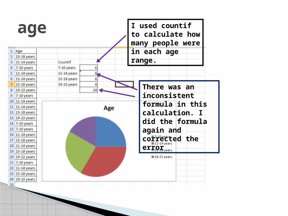
age I used countif to calculate how many people were in each age range.
There was an inconsistent formula in this calculation. I did the formula again and corrected the error

5 a day
I used countif S to calculate what gender ate their 5 a day or not
I used a pie chart to show my results
I used a pie chart to show my results
I used countif to see how many people ate their 5 a day

Food preferences
I used countif to see how many people liked a certain food type
I used a pie chart to display my results
I used a pie chart to show my results
I used countif S to see what gender preferred a certain food type

Sport preferencesI used countif S to see what gender preferred a certain sport
I used countif to show what see what the most preferred sport was
I used a pie chart to show my results
I used a pie chart to show my results

Well being
I used a pie chart to show my results
I used a pie chart to show my results
I used count if S to show what gender felt about what they needed to have an improved well being
I used countif to see what would improve well being. Healthy eating and sport were the same

Sport_ how often
I used a pie chart to show my results
I used a pie chart to show my results
I used count if S to see what gender had did sport the most often
I used countif to see how often people did sport

How long
I used a pie chart to show my results
I used a pie chart to show my results
I used countif to see how long people did sport for
I used countif S to see what gender did sport the longest.

Feeling good
I used a pie chart to show my results
I used a pie chart to show my results
I used countif to what people needed to do in order to feel good
I used countif S to see what each gender thought they needed to do in order to feel good
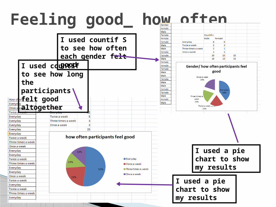
Feeling good_ how oftenI used countif S to see how often each gender felt goodI used countif to
see how long the participants felt good altogether
I used a pie chart to show my results
I used a pie chart to show my results

Order of preferences
I used countif to count what ranking each preference was placed in
I used a pie chart to show my results

challenge
I used a pie chart to display my results
I used a pie chart to display my results
I used count if to show how many people like to do the challenge alone and how many like to do the challenge with their friends
I used countif S to see what gender preferred to do the challenge alone or with their friends