Embed Size (px)
Citation preview
Nighttime lights as proxy
for the spatial growth of
dense urbanized areas
Master Thesis
Nicola Pestalozzi
Supervisor: Prof. Dr. Didier Sornette
Tutors: Dr. Peter Cauwels
Monika Niederhuber
ETH Zürich
Department of Management, Technology and Economics (D-MTEC)
Chair of Entrepreneurial Risks
Chair of Land Use Engineering
November 2012


Nicola Pestalozzi - Spatial distribution of nighttime lights i
Abstract
Nighttime lights constitute a very appealing database that can be used to measure
various different aspects of the human footprint on the planet. The amount of research
and the number of publications around this dataset confirm this, offering a broad
spectrum of applications that involve economics, energy, society and environment.
I chose to use them to study the spatial extension and the relative distribution of
settlements around the Earth and their evolution over time. I analyzed the DMSP-OLS
‘stable lights’ database of the NGCD consisting in a catalog of world images of the last 19
years.
I discovered that the mean center of lights is moving steadily to South-East. This reflects
the extreme growth experienced by the urban centers in the developing countries,
especially in Asia. I further developed a version of the Gini coefficient to compare the
statistical spatial dispersion of nighttime lights, unexpectedly finding that all the
countries show a very similar inequality value, quickly converging to the same coefficient
by raising the lower threshold of light detection.
Further, I analyzed the evolution of the lit area at a country level and in the largest urban
agglomerations, finding that whereas most developing countries and cities are
experiencing an incredible spatial growth in illumination, some ‘historical’ conurbations
present rather constant or even decreasing emissions. This could be a signal of success of
the light pollution abatement programs launched in the last years.

ii

Nicola Pestalozzi - Spatial distribution of nighttime lights iii
Acknowledgments
I wish to heartily thank the whole Land Use Engineering Research Group (LUE) of
Professor Hans Rudolf Heinimann and especially Monika Niederhuber for the helpfulness
demonstrated to me from the beginning, both on the administrative and the technical
sides. I could profit from an excellent infrastructure and the deep know-how of different
people, especially in the field of ArcGIS, which was completely new to me (a special thank
goes here to Daniel Trüssel for its expertise, helpfulness and especially patience). At least
as much important as that, I could work in a really pleasant environment, with
extraordinary people that made me feel part of a team: Maja Messerli, Sarah Brugger,
Daniel Mandallaz, Jochen Breschan, Leo Bont, Fabian Gemperle, Franziska Baumgartner
and Andreas Hill.
A big thank you goes to Professor Didier Sornette and Peter Cauwels for tutoring my
thesis. They provided me many useful inputs and comments during our frequent
meetings and they supported me during the whole project, also together with other
researcher from the Chair of Entrepreneurial Risks.
Thanks also to Luc Girardin and Sebastian Schutte from the International Conflict
Research Group (ICR) of Professor Lars-Erik Cedermann for their help, especially in the
initial phase of the thesis.
A special thanks goes finally to all my friends and relatives that supported me directly or
indirectly during the writing of the thesis: you are for me the best thinkable motivation.

iv

Nicola Pestalozzi - Spatial distribution of nighttime lights v
Website
In order to present the results of this research, I built a website which integrates the full
thesis text, color figures, a Poster in format A0 and several animations of the nighttime
lights evolution over the years for some interesting regions of the world.
The structure of the website follows the sections of the thesis, even if some modifications
were made to fit the content in the web-layout.
The Website is permanently stored in the ETH Web-Archive under the following URL:
http://www.worldatnight.ethz.ch
For any comment or additional information about the thesis and the website, please
contact me at the following email address: [email protected].

vi

Nicola Pestalozzi - Spatial distribution of nighttime lights vii
Table of Contents Abstract i
Acknowledgments iii
Website v
Table of Contents vii
1 Introduction 1
2 Nighttime lights 3 2.1 Motivation 3 2.2 Data source 4 2.3 The products 5
3 Past research 11 3.1 Economic activity 11 3.2 Population estimation 12 3.3 Power consumption and distribution 13 3.4 Poverty and development index 13 3.5 Effects of wars 14 3.6 Urban extent 15 3.7 Environmental issues 16 3.8 Evaluation Table 20
4 Preprocessing 23 4.1 Software 23 4.2 Product choice 24 4.3 Gas flares removal 25 4.4 Intercalibration 26 4.5 Reprojection 30 4.6 Average satellite/year 31
5 Mean center of lights 33 5.1 Motivation 33 5.2 Method 34 5.3 Results 35
6 Spatial light Gini 37 6.1 Motivation 37 6.2 Methods 37 6.3 Results 40 6.4 Evolution over time 43 6.5 Related research and distinctions 46
7 Urban growth 47 7.1 Motivation 47 7.2 Methods 47 7.3 Results 47 7.4 Agglomeration size 53
8 Conclusions 57 8.1 Main findings 57 8.2 Selected findings from the existing literature 58 8.3 Directions for future research 59
9 List of abbreviations 61
10 List of Figures and tables 63
11 References 65

viii
Nicola Pestalozzi - Spatial distribution of nighttime lights 1
1 Introduction
The first time I was confronted with a satellite image of the world at night was quite long
ago: precisely the 27 November 2000. I just started the high school and since I was very
excited about science in general, I checked quite often a website that my astrophysicist
brother earlier suggested to me, called APOD1. APOD stands for Astronomy Picture Of
the Day, it is a website hosted by the NASA and, as the name suggests, it publishes every
day a picture of an astronomy-related subject. Most of the time it features stars, galaxies
or planets far away from us, viewed from telescopes or satellites and colored in the post-
processing in order to obtain a pleasant optical effect. Sometimes there are also scientific
charts or great pictures of infrastructures like space shuttles, space probes or rovers.
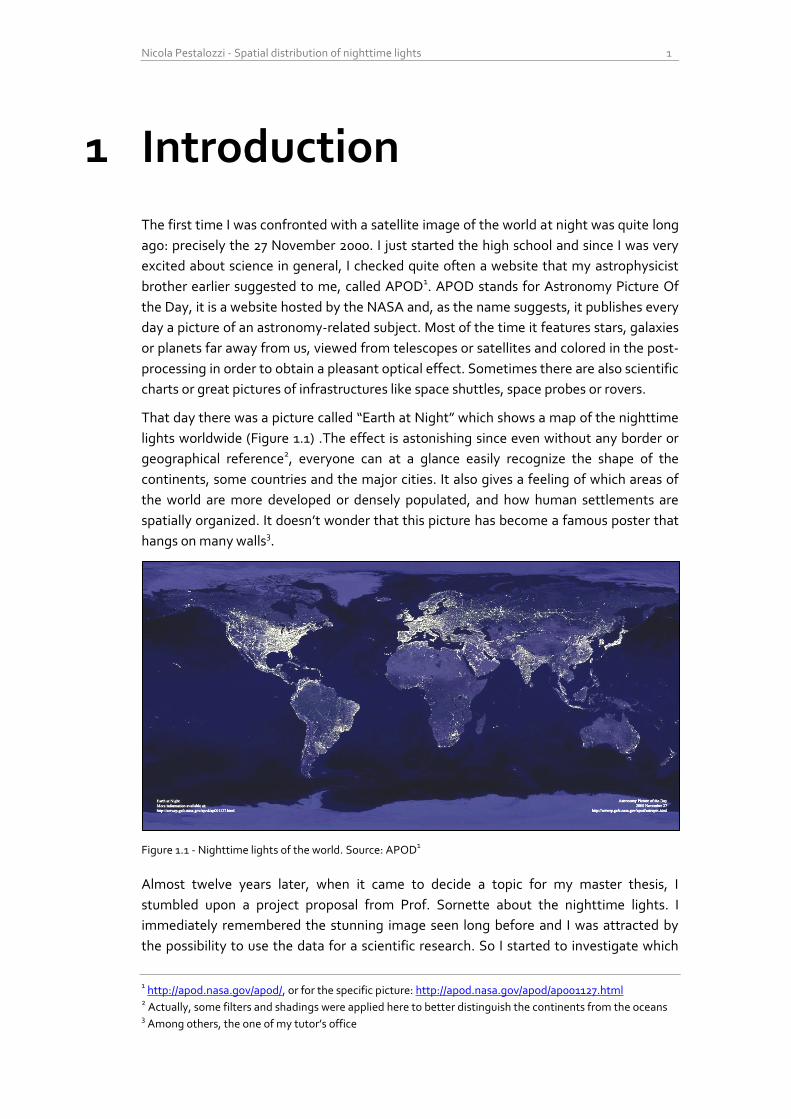
That day there was a picture called “Earth at Night” which shows a map of the nighttime
lights worldwide (Figure 1.1) .The effect is astonishing since even without any border or
geographical reference2, everyone can at a glance easily recognize the shape of the
continents, some countries and the major cities. It also gives a feeling of which areas of
the world are more developed or densely populated, and how human settlements are
spatially organized. It doesn’t wonder that this picture has become a famous poster that
hangs on many walls3.
Figure 1.1 - Nighttime lights of the world. Source: APOD1
Almost twelve years later, when it came to decide a topic for my master thesis, I
stumbled upon a project proposal from Prof. Sornette about the nighttime lights. I
immediately remembered the stunning image seen long before and I was attracted by
the possibility to use the data for a scientific research. So I started to investigate which
1 http://apod.nasa.gov/apod/, or for the specific picture: http://apod.nasa.gov/apod/ap001127.html
2 Actually, some filters and shadings were applied here to better distinguish the continents from the oceans
3 Among others, the one of my tutor’s office
2 Introduction
data were available and how they could be used, discovering a huge research field with a
lot of publications and many different usages of the data.
In chapter 2 I give an extensive motivation of why nighttime lights are an interesting
measure and which features makes them different from other land cover data. Further I
describe how they are captured and which kinds of product are available.
In the subsequent chapter I then scrutinize the past literature in order to understand
which applications have already been developed, starting from which product and with
which methods. This is a major component of this research, since the field was
completely new to me. I finally tried to judge the quality of the publications by analyzing
the level of accuracy with which the data was processed.
Chapter 4 describes my choices of the software, the sources of data, and all the
preprocessing steps that I performed on the data before doing my analyses. The reason
for these preliminary computations is also explained. I tried to carefully document every
step in order to give the possibility to reproduce my results and possibly build further
studies upon them.
In the fifth chapter I present the concept of mean center of lights, which is a nighttime
light based center of gravity of the planet. It builds upon a recent study on the global GDP
center of gravity from McKinsey, confirming the finding that the trend of the last decades
shows a clear shift toward South-East.
Chapter 6 introduces the formulation of a spatial light Gini coefficient, a measure of the
relative dispersion of light in space. I computed this indicator per every country and I
unexpectedly found a very interesting coincidence of the values. The ratio between the
amount of bright and dim lights seems to follow a common pattern throughout the
world. The evolution over time shows further a weak trend toward more inequality in the
light distribution.
In the last chapter I evaluate the size and the evolution of the urban areas per country and
per agglomeration. Some developed countries show a general decline in bright light
emissions over the last two decades, whereas the developing countries experienced an
incredible growth of lit area. This trend is very well observable at both national and
regional scale.
In the conclusions I first summarize my main findings; then I present selected findings
from the existing literature and finally suggest some possible directions for future
research with this dataset.
Nicola Pestalozzi - Spatial distribution of nighttime lights 3
2 Nighttime lights
2.1 Motivation Why use nighttime lights anyway? What is so special about them and which features
make them more convenient, if at all, in respect to other datasets?
First of all, light emission is an objectively and systematically measurable quantity. This
should not be underestimated since we cannot say the same of many other widely used
indicators: gross domestic product, energy consumption, population count and density,
poverty level and many other economic and demographic indicators are based on
estimates, assessments and approximations, which are only partially reliable: they are
often collected from different organizations, in different countries, different timeframes,
with different methods and at different granularities. Biases and inaccuracies are
therefore unavoidable and the comparison of these variables between different countries
is always problematic. On the contrary, nighttime lights are remotely sensed from one
single satellite, with the same resolution, at the same time and in the same way for the
whole world1, thus delivering a more objective and independent measurement.
The measures captured in satellite imagery are obviously also geographically specific, i.e.
they corresponds to a well-defined region of the earth, with a resolution up to few
meters. This is not the case for most country statistics, which lack potentially significant
geographical and spatial information. Consequently, remote sensing is definitely a more
accurate way of measuring the world, but why nighttime lights and no other variables,
like for example land cover data? The answer is quite straightforward and relies on the
nature itself of lights on earth: they are unquestionably human-made. As we will see,
there are some exceptions, like big forest fires, lightning and moon light reflections, but
these are mostly ephemeral events that can be recognized and filtered out. If we look at
lights that are stable, i.e. observable virtually every night for several hours, then we are
almost certainly looking at human-made light. This is a huge advantage over other
measures of land cover, since during day and with normal satellite pictures, it is not
always that easy to distinguish between man-made and natural structures.
Yet another reason to use nighttime lights is that the gathering of the data is relatively
cheap. Although the initial investment can be considerable, the measurements are then
collected very quickly and at a fairly high resolution, so that they can be assessed far
more often than other traditional indicators.
1 We will see later that this is not completely true, but for the sake of comparison it can be said that satellite-
based observations are in general way more objective than human collected statistics.

4 Nighttime lights
2.2 Data source The database I considered in this research comes from the US Air Force Defense
Meteorological Satellite Program (DMSP), and it is archived at the National Geophysical
Data Center (NGDC) of the National Oceanic and Atmospheric Administration (NOAA).
The DMSP mission started in the mid-1960’s under the control of the Department of
Defense (DoD), in order to provide the military with information about the cloud cover
worldwide on a daily basis. Scrutinizing the results, it was discovered that the nighttime
lights were also very well captured by the sensors. This unexpected but very convenient
side-effect gained more and more relevance among the scientific community, and now
the NGDC has a research project dedicated exclusively on developing scientific products
and applications of this dataset.
The system was declassified in 1972 and made publicly available. Since 1992, the
products were digitized and are now downloadable for free from the web.
2.2.1 The satellites
The DMSP Satellites of the actual series (Block-5D) fly in a sun-synchronous low earth
orbit (833 km mean altitude) such that they pass over any given point on earth between
20:30 and 21:30 local time (Elvidge, et al., 2001). With 14 orbits per day, each DMSP
satellite provides global night-time coverage every 24 hours. There are normally 2
satellites orbiting simultaneously and each satellite has a lifespan of 6 to 8 years (see
table 2.1 in section 2.3 for an overview of the satellites used over the years).
Figure 2.1 - Visualization of a DMSP Satellite. Source (United States
Strategic Command, 2001)
2.2.2 The sensors
The sensor arrangement is called Operational Linescan System (OLS) and consists in two
broadband sensors, one for the visible/near infrared (400 to 1100 nm) and one in the
thermal/infrared wavelength (10.5-12.6 µm). The OLS is an oscillating scan radiometer
with a field of view of about 3’000 km and captures images at a resolution of 0.56 km,
which are then smoothed on-board into 5x5 pixels in order to reduce the memory usage
(Doll, 2008).
Nicola Pestalozzi - Spatial distribution of nighttime lights 5
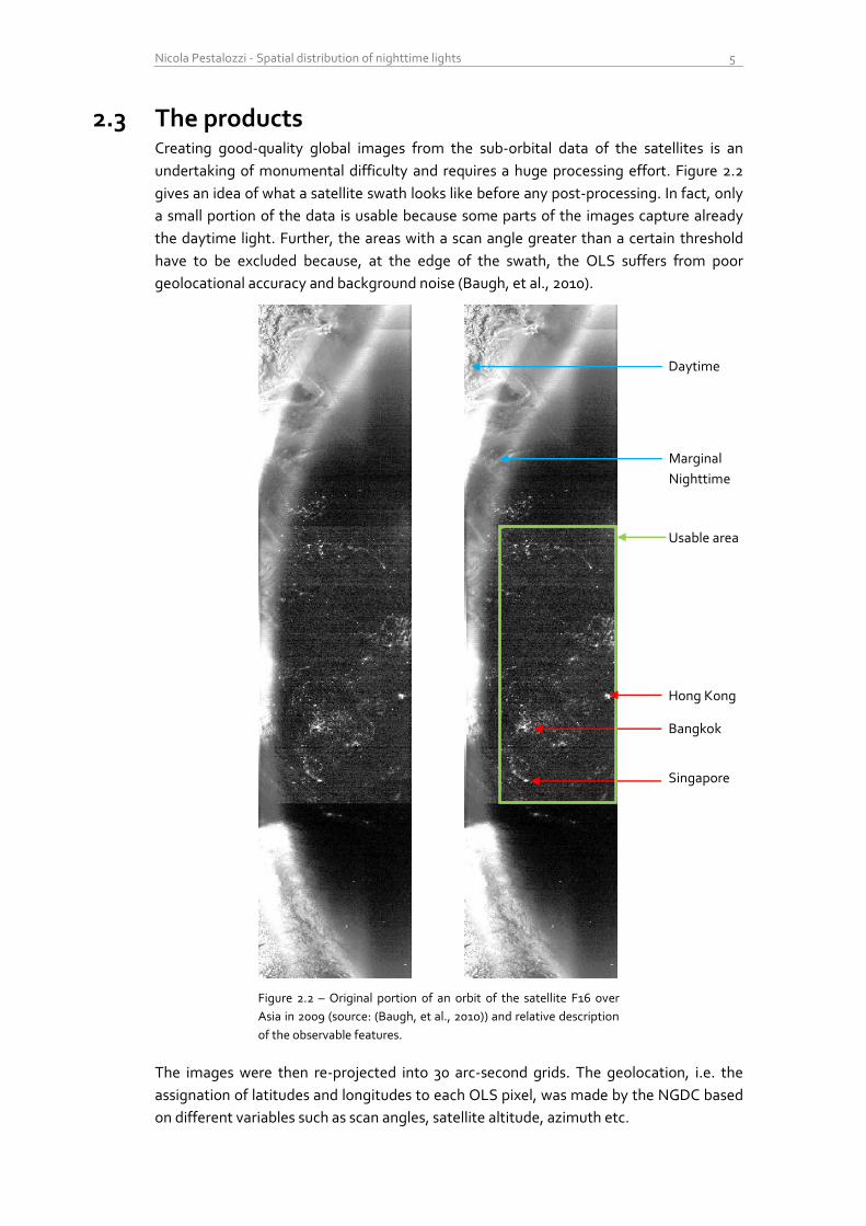
2.3 The products Creating good-quality global images from the sub-orbital data of the satellites is an
undertaking of monumental difficulty and requires a huge processing effort. Figure 2.2
gives an idea of what a satellite swath looks like before any post-processing. In fact, only
a small portion of the data is usable because some parts of the images capture already
the daytime light. Further, the areas with a scan angle greater than a certain threshold
have to be excluded because, at the edge of the swath, the OLS suffers from poor
geolocational accuracy and background noise (Baugh, et al., 2010).
Figure 2.2 – Original portion of an orbit of the satellite F16 over
Asia in 2009 (source: (Baugh, et al., 2010)) and relative description
of the observable features.
The images were then re-projected into 30 arc-second grids. The geolocation, i.e. the
assignation of latitudes and longitudes to each OLS pixel, was made by the NGDC based
on different variables such as scan angles, satellite altitude, azimuth etc.
Hong Kong
Bangkok
Singapore
Usable area
Daytime
Marginal
Nighttime
6 Nighttime lights
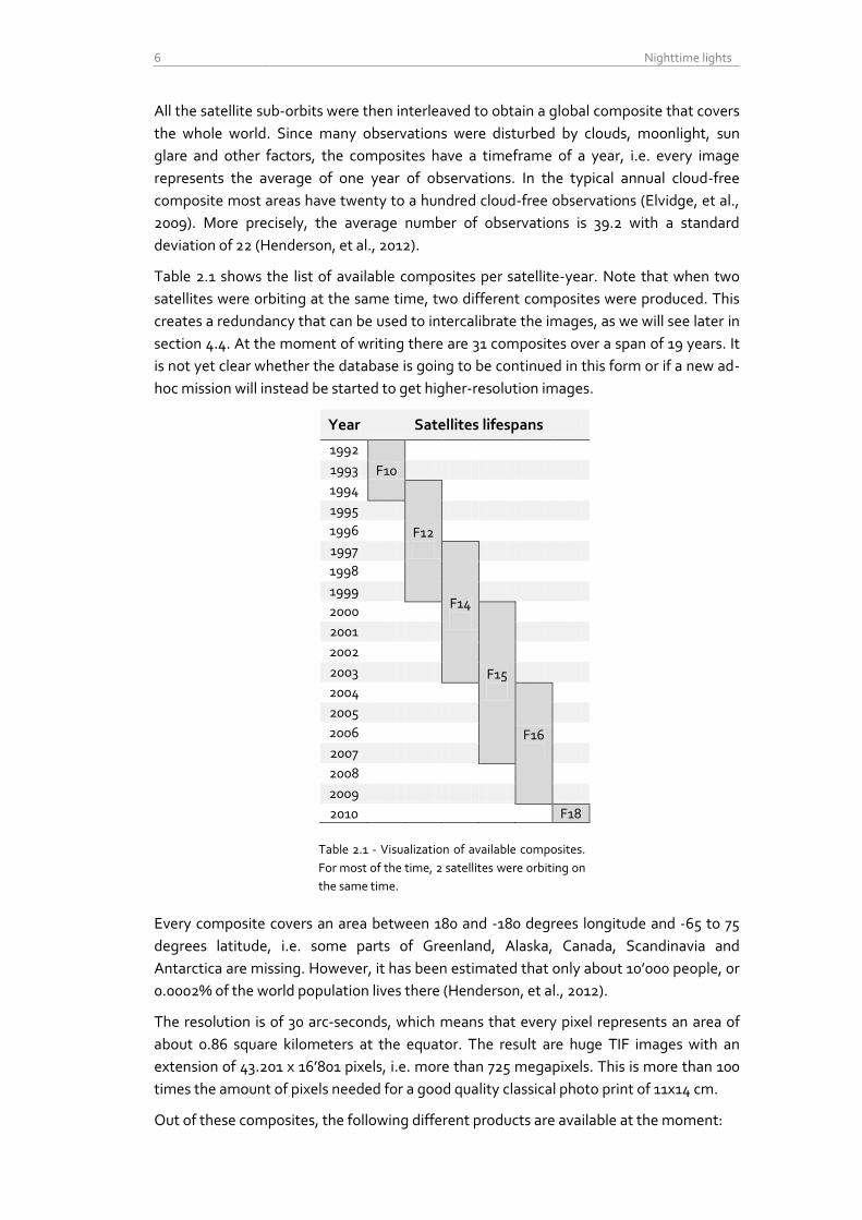
All the satellite sub-orbits were then interleaved to obtain a global composite that covers
the whole world. Since many observations were disturbed by clouds, moonlight, sun
glare and other factors, the composites have a timeframe of a year, i.e. every image
represents the average of one year of observations. In the typical annual cloud-free
composite most areas have twenty to a hundred cloud-free observations (Elvidge, et al.,
2009). More precisely, the average number of observations is 39.2 with a standard
deviation of 22 (Henderson, et al., 2012).
Table 2.1 shows the list of available composites per satellite-year. Note that when two
satellites were orbiting at the same time, two different composites were produced. This
creates a redundancy that can be used to intercalibrate the images, as we will see later in
section 4.4. At the moment of writing there are 31 composites over a span of 19 years. It
is not yet clear whether the database is going to be continued in this form or if a new ad-
hoc mission will instead be started to get higher-resolution images.
Year Satellites lifespans
1992
F10
1993
1994
F12
1995
1996
1997
F14
1998
1999
2000
F15
2001
2002
2003
2004
F16
2005
2006
2007
2008
2009
2010 F18
Table 2.1 - Visualization of available composites.
For most of the time, 2 satellites were orbiting on
the same time.
Every composite covers an area between 180 and -180 degrees longitude and -65 to 75
degrees latitude, i.e. some parts of Greenland, Alaska, Canada, Scandinavia and
Antarctica are missing. However, it has been estimated that only about 10’000 people, or
0.0002% of the world population lives there (Henderson, et al., 2012).
The resolution is of 30 arc-seconds, which means that every pixel represents an area of
about 0.86 square kilometers at the equator. The result are huge TIF images with an
extension of 43.201 x 16’801 pixels, i.e. more than 725 megapixels. This is more than 100
times the amount of pixels needed for a good quality classical photo print of 11x14 cm.
Out of these composites, the following different products are available at the moment:
Nicola Pestalozzi - Spatial distribution of nighttime lights 7
2.3.1 Cloud cover
As already described, the main purpose of the DMSP mission was to detect the cloud
cover worldwide. The presence of clouds can be detected with the thermal sensor
described above. These maps show how many observations were cloud-free for each
pixel of the satellite-year composite, and can therefore be used to infer data quality.
2.3.2 Average lights x percentage
These products show the average Digital Number (DN) of nighttime lights, multiplied by
the percent frequency of light detection. The original DN is assigned according to the
cloud-free observations and it is quantified with 6-bit, i.e. the values range from 0 to 63.
For unknown reasons, after the normalization with the percentage of detection, the pixel
values were stored in float precision (32 bit), so that every composite weighs about 3
Gigabytes.
According to the NGDC, this product still contains a lot of background noise and
ephemeral events like forest fires, so that it is not suited for the analysis of cities.
2.3.3 Stable lights
The main product of this database tries to measures the lights that are ‘stable’, i.e. areas
that were lit most of the time. Considerable effort was devoted to reduce background
noise and to remove transient events with median-like filters. Although most of the post-
processing was done with algorithms, some parts of the noise reduction were done
manually with the help of visual detection for areas that should be unlit, which most
probably introduced some small artifacts in the images (see section 2.3.5). For a
comprehensive description of the used methods see (Baugh, et al., 2010).
The quantization here is again 6-bits and the values are integers ranging from 0 to 63, this
time stored as 8-bit Integers, for a total of about 700 Megabytes per image.
These products were improved over time and released in different versions. This is why I
think it is important to mention which release was used for the analysis, which
unfortunately isn’t always the case in the literature (see Table 3.1 at page 20).
For example, in the CIESIN Thematic Guide to Night-time Lights (Doll, 2008), the stable
lights product version 2 was described as ‘frequency detection product’, having a range
from 0 to 100 (%).
2.3.4 Radiance calibrated data
The Digital Numbers (DN) does not correspond exactly to the physical amount of
radiance received by the satellite for several reasons. The most relevant of them is the
considerable amount of pixel saturation (DN=63) over very bright areas, such as big cities.
An attempt (Elvidge, et al., 1999) to solve this shortcoming was made by changing the
sensor gain of the satellite (sometimes even by a factor of 100), which was possible only
for a limited amount of time. More images with different gain ranges were combined to
obtain a better quantization (pixel values range from 0 to 6’030).
This product is better suited for quantitative analysis of the effective amount of radiation,
and the following formula holds for the calculation of the actual Radiance:
Radiance = (DN)3/2 [Watts/cm2/sr]
8 Nighttime lights
This formula is based on a logarithmic scaling made by Elvidge in order to accomodate
the range of the different radiances detected. No further details on this procedure or on
the exponent are given.
Unfortunately, this product is currently only available for 2006 (apparently it was also
available for 1996-1997 in the past, with a pixel value range of 0-255, (Doll, 2008)), so it is
not suited for longer term time series analysis.
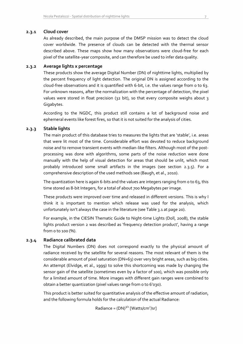
2.3.5 First comparison of the currently available products
To get an idea of the difference between the light maps, I compared the histograms of
the three composite versions for the year 2006 (the only year available for the radiance
calibrated product). The results are visualized as scatterplot in a log-log chart because
otherwise, the shape of the distributions would not be visible.
Figure 2.3 – Log-log plot of the DN intensity distribution of the three products for 2006, satellite F15
The first observation is that indeed, the radiance calibrated composite has a DN range
which is two orders of magnitude larger than the other two. Another remarkable point is
that the shape of all three distributions looks similar and it’s almost a straight line with a
negative slope. For the radiance calibrated and the stable lights product the slope is
about -2, whereas for the Avg_x_pct product it is about -1.5 (these are just rough
estimates based on least squares; in order to fit power laws, maximum likelihood
methods should instead be used).
Another interesting fact is the upward shape of the tail for both the Stable lights version
and the Average_x_percentage. This is most probably due to the saturation effect
discussed before: pixels with high DN (>60) are way too frequent, especially if compared
with the radiance calibrated version.
1
10
100
1'000
10'000
100'000
1'000'000
10'000'000
100'000'000
1'000'000'000
1 10 100 1'000 10'000
Nu
mb
er
of
pix
els
DN
DN distribution
Radiance Calibrated
Stable
Avg_x_pct

Nicola Pestalozzi - Spatial distribution of nighttime lights 9
A strange artifact is visible in the initial part of the distribution for the stable lights and
radiance calibrated products: the amount of dim lit pixels is unreasonably low. As already
noted by other researches (e.g. (Henderson, et al., 2012)), this is probably due to the
empirical operation of noise removal. A direct comparison between the stable lights and
the average products, proposed in figure 2.4, shows however how the artifact is not
limited to the first DNs but rather disseminated over the whole first half of the spectrum.
While it seems reasonable that during the removal of noise, a lot of dim pixels were lost,
it remains unclear why there are no pixels with DN=1 and why the amount of pixels with
DN between 4 and 30 is significantly higher than in the raw data of the avg_x_pct
product.
Figure 2.4 – log-lin histogram plot of the DN distribution in avg_x_pct and stable lights for the year 2000,
satellite F14. Note the artifacts in the first half of the spectrum.
10'000
100'000
1'000'000
10'000'000
100'000'000
1'000'000'000
0 5 10 15 20 25 30 35 40 45 50 55 60
Nu
mb
er
of
pix
els
DN
DN Distribution
Avg_x_pct
Stable Lights

10 Nighttime lights
Nicola Pestalozzi - Spatial distribution of nighttime lights 11
3 Past research
An important part of this research was devoted to the past literature on nighttime lights
in order to get an idea of which applications of this dataset have already been studied. To
the surprise of the writer and the supervisors, we stumbled upon a large research field
with some hundred publications on a very broad variety of topics. The applications range
from the estimation of economic indicators to the assessment of energy consumption,
and from environmental issues to social ones. I’ll try in the next pages to summarize the
actual landscape of research based on this dataset.
3.1 Economic activity One of the most popular applications is to use light as a proxy for the economic activity.
Just by looking at the pictures it seems quite intuitive that there must be some kind of
positive relationship between emitted light and level of economic development. Light
comes mainly from nocturnal illumination of streets, buildings and industry areas, and
since the resolution of the pictures is about 1 square kilometer, the light sources have to
be very dense and constant to produce a bright pixel. Thus brighter pixels must indicate
the presence of dense urbanized areas with potentially high population density (although
the opposite is not always the case, as we will see).
Many studies try to estimate the total income, or Gross Domestic Product (GDP) of
countries at different scales, in particular at a state and regional level. This is a very
appealing application since official statistics are very hard to be collected with this
granularity, especially for developing countries in Africa and Asia. One of the first
attempts (Doll, et al., 2005) was made using the radiation calibrated product of 1996 and
compared regional GDP data with the radiance detected at different scales of regional
aggregation (For Europe, NUTS1-levels 1 to 3) finding a very high positive correlation
(R2=0.979). The tests were made only in 11 European countries (GDP data from Eurostat)
and in the U.S. (US Bureau of Economic Analysis).
Another attempt was made with the stable lights product of 2000 for the US, India, China
and Turkey (Sutton, et al., 2007), also with the combination of population density
measures, but the used method didn’t seem to be significantly superior of official GDP
statistics. Still, a significant log-linear relationship between light night energy and GDP
was found (R2=0.74). For the same countries and with similar methods, but starting from
different products, other more sophisticated studies (Ghosh, et al., 2010) were made to
obtain a better map of the regional economic activity. Other similar but country-specific
studies were also conducted for China (Zhao, et al., 2010), India (Bhandari &
1 Nomenclature of Territorial Units for Statistics, a geocode standard for referencing the subdivisions of
countries for statistical purposes.
12 Past research
Roychowdhury, 2011) and Mexico (Ghosh, et al., 2009), always as a one-year snapshot
and never using the time series.
More recent papers tried to consider the whole time span (Chen & Nordhaus, 2011) and
(Kulkarni, et al., 2011) and conclude that light can be used as a proxy for economic
activity but only for countries with the poorest statistical systems (or with very limited
added value for countries with high-quality statistics).
Besides GDP, another important measure of economic statistics is the economic growth,
usually intended as GDP growth. This is the subject of a more recent paper (Henderson,
et al., 2012) which justifies the choice of this indicator with the fact that it is welfare-
independent and much more convenient to compare across countries than nominal GDP.
The authors try to estimate the growth of real GDP with a combination of light per area
and national account statistics at national and sub-national level. As for the estimate of
GDP, this approximation contains little added value for countries with high-quality
income data, but for countries with low-quality income information, the optimal estimate
puts roughly equal weight on lights growth and official statistics. For these countries, the
growth estimates obtained differ substantially from the official ones. For example, in the
last years Myanmar has an average annual growth rate of 10.02% according to the World
Development Indicator of the World Bank (WDI), whereas the new combined indicator
estimates only 3.26%. For Burundi, the WDI predict a GDP decline of -0.27%, whereas
satellite data imply a growth of 2.89%.
To summarize, nighttime lights are a very appealing instrument to measure economic
activity and economic growth. However, the relationship between the two indicators is
highly complex, so that is difficult to get reliable estimations. Nevertheless, especially for
countries with poor data quality, lights can add significant value to the existing statistics.
3.2 Population estimation Another widely diffused application of nighttime lights is the estimation of population or
population density at a high resolution. As already specified earlier, persistent light is an
unequivocal indicator of the presence of human settlements, and where more light is
produced, there should also be more people. One of the first attempts to model
population density with nighttime lights (Sutton, 1997) used data from the 1990 U.S.
census and a binary DMSP image showing only the saturated pixels. The model found
however accounted only for 25% of the variation in the population density of the urban
areas in the continental U.S.A.
A later study from the same author tried to estimate the global human population at
country level, coming to a 1997 world estimate of 6.3 billion against the general accepted
approximation of 5.9 billion (Sutton, et al., 2001)
Also here, specific studies were conducted at national level, e.g. for China (Lo, 2001) ,
(Zhuo, et al., 2009) and Brazil (Amaral, et al., 2006).
In conclusion, light alone may not be a perfect proxy to measure population, but
combined with other sources it can substantially add value. It is worth noting that the
Gridded Population of the World (GPW), one of the most widespread databases of the
global population density, uses nighttime lights as one of the many inputs data.
Nicola Pestalozzi - Spatial distribution of nighttime lights 13
3.3 Power consumption and distribution Human-produced light, which is almost always the case for stable lighting2, needs
electrical energy or some sort of power source. Thus the Nighttime Lights database
should provide a good approximation of where energy is available. The opposite
statement is of course less reliable, i.e. we cannot really say that where there is no light,
no electricity is available, mainly because of the relative coarse resolution of the images
that cannot capture single and sparse light sources, but also because light may not be the
primary or only one use of electricity. However, it was estimated that about 20% of the
total world energy consumption is due to illumination (Efficient Lighting for Developing
and Emerging Countries, 2012).
A first study showed very strong log-log correlation (R2=0.96) between lit area and
energy consumption at a country level (Elvidge, et al., 1997). Further similar studies were
conducted at national level for India (Kiran Chand, et al., 2009), Brazil (Amaral, et al.,
2005) and Japan (Letu, et al., 2010).
Another very interesting study explored the politics of electricity distribution in regions of
India, where power as public good is a very scarce resource (Min, 2009). Although there is
a relatively reliable network infrastructure, the actual power supply is by far not sufficient
to satisfy the demand. The decisional power of giving energy to a certain municipality,
district or county is quite centralized and involves political control. However, only a weak
correlation could be found between availability of energy in the municipalities (lit pixels)
and political party that won the elections.
Light is thus a quite good proxy for estimating where electricity is available, whereas it is
a bit more delicate to infer the amount of energy consumed (mainly because of the
saturation issue and different uses of energy). In order to analyze the temporal impact of
politics and elections in developing countries, the time resolution of one year may be to
coarse to detect changes: the process used to generate the year-composites may
“average out” most of the relevant information needed.
3.4 Poverty and development index Combining measures of economic activity and population, one can quickly come to other
interesting measures like GDP per person or poverty ratio. A study in this direction
(Elvidge, et al., 2009) was made by dividing the population count from Landsat by the
average lights DN, which gives an idea of where people are living without (from the
satellite detectable) light. The obtained Poverty Index (PI) was then calibrated by
regressing it with the official statistics about the percentage of the population living with
less than $2 a day, aggregated at a country level. The obtained estimate of the number of
people living in poverty was 2.2 billion, which is somewhat consistent with the 2.6 billion
estimated by the World Bank.
2 For a counterexample, see section 3.7 about gas flares
14 Past research
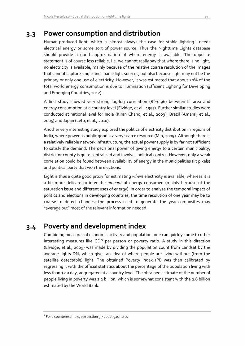
Figure 3.1 – Map of world poverty based on nighttime light. Brighter pixels indicate populated areas with
proportionally few nighttime lights. Source (Elvidge, et al., 2009)
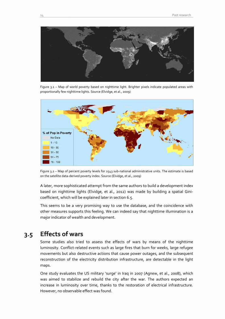
Figure 3.2 – Map of percent poverty levels for 2543 sub-national administrative units. The estimate is based
on the satellite data-derived poverty index. Source (Elvidge, et al., 2009)
A later, more sophisticated attempt from the same authors to build a development index
based on nighttime lights (Elvidge, et al., 2012) was made by building a spatial Gini-
coefficient, which will be explained later in section 6.5.
This seems to be a very promising way to use the database, and the coincidence with
other measures supports this feeling. We can indeed say that nighttime illumination is a
major indicator of wealth and development.
3.5 Effects of wars Some studies also tried to assess the effects of wars by means of the nighttime
luminosity. Conflict-related events such as large fires that burn for weeks, large refugee
movements but also destructive actions that cause power outages, and the subsequent
reconstruction of the electricity distribution infrastructure, are detectable in the light
maps.
One study evaluates the US military ‘surge’ in Iraq in 2007 (Agnew, et al., 2008), which
was aimed to stabilize and rebuild the city after the war. The authors expected an
increase in luminosity over time, thanks to the restoration of electrical infrastructure.
However, no observable effect was found.
Nicola Pestalozzi - Spatial distribution of nighttime lights 15
Another, more complete study looked for effects of the wars in Caucasus regions of
Russia and Georgia (Witmer & Loughlin, 2011). The authors claim to be able to detect oil
fires and large refugee outflows, as well as settlements (re)construction.
Again, as for the power consumption application, the time resolution of one-year may be
in general to coarse to detect the actual impact of wars, but for large conflicts with a
longer duration, light can be used to study damages and reconstruction dynamics.
3.6 Urban extent Another widespread research topic is the validation of urban boundaries. Currently
already more than half of the world population lives in cities (McKinsey Global Institute,
2012), and the percentage is growing. This faces policy makers to big challenges in the
field of land use, the distribution of public goods and transportation infrastructures.
Therefore an understanding of how cities spatially grow and evolve is needed.
One of the first attempts to map urban or densely populated land areas in the U.S. with
the nighttime lights was made by just thresholding the DMSP/OLS images and
comparing them with the official statistics (Imhoff, et al., 1997). A more sophisticated
analysis, using also the radiance-calibrated version of the database, was made for three
cities with different degrees of urbanization and development: Lhasa, San Francisco and
Beijing. (Henderson, et al., 2003).
The spatial size-frequency distribution of settlements was also analyzed using different
thresholds, with the interesting finding that conurbations larger than 80km diameter
account for less than 1% of all settlements but for about half the total lighted area
worldwide (Small, et al., 2005).
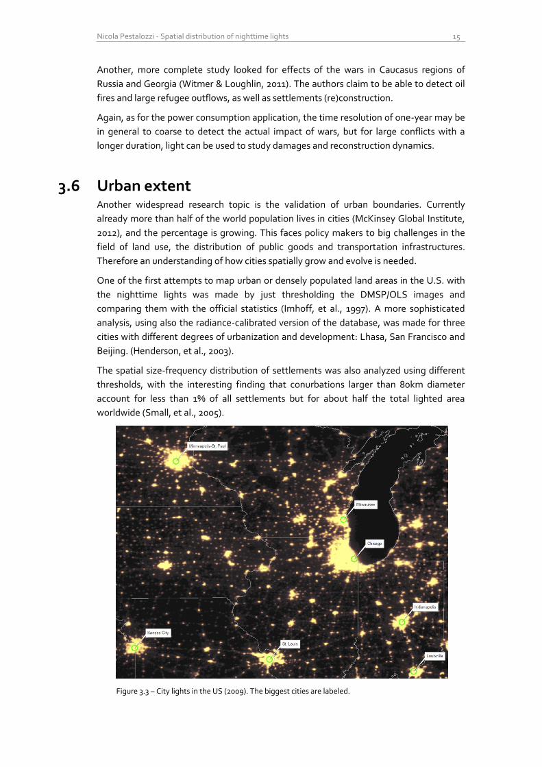
Figure 3.3 – City lights in the US (2009). The biggest cities are labeled.
16 Past research
Another specific paper studied the density of constructed impervious surfaces area (ISA)
on earth (Elvidge, et al., 2007), finding that China has more ISA than any other country
(87’182 km2, i.e. more than twice the total area of Switzerland). This motivates other
studies on the land cover and the level of urbanization in that particular country (Lo,
2002), (Ma, et al., 2012).
Although lights slightly overestimate the urban extent because of blooming (over-spilling
of luminosity around big cities and reflection near water bodies), the use of thresholds
mitigates this drawback and makes this application a very promising research field.
3.7 Environmental issues Until now we have looked mainly at social- and economically-related applications of this
dataset, but other interesting facts about nature events and the human footprint on the
planet are also recorded in nighttime lights.
3.7.1 Forest fires
As already mentioned, large forest fires (natural and human made) are also visible from
the satellites, before the median filter is applied to remove temporary effects and obtain
the stable lights map. Studies were made to monitor the surface of forest affected by
fires in India (Kiran Chand, et al., 2007), Indonesia (Fuller & Fulk, 2010) and Brazil (Elvidge,
et al., 2010).
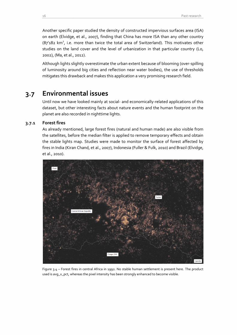
Figure 3.4 – Forest fires in central Africa in 1992. No stable human settlement is present here. The product
used is avg_x_pct, whereas the pixel intensity has been strongly enhanced to become visible.
Nicola Pestalozzi - Spatial distribution of nighttime lights 17
3.7.2 Gas flares
Another less known, but very important aspect recorded in the light maps are the so
called gas flares. Gas flares are combustion devices used mainly in oil wells and big
offshore platforms to burn flammable gas (mostly methane) released during the
operations of oil extraction. The gas is burned only for convenience, or for lack of
infrastructure, so that the whole energy is wasted and huge amounts of CO2 are released
in the atmosphere. The monitoring of this harmful and quite uncontrolled activity is thus
motivated by environmental and health concerns, besides energy efficiency reasons.
Most gas flares burn nonstop, hence this phenomenon is observable also in the stable lights version of the database. The main research in this topic uses nighttime lights to estimate the total volume of gas burned in gas flares. The conclusion was that only in 2008, approximated 139 billion cubic meters gas were wasted, equivalent to 21% of the natural gas consumption of the U.S., with a potential retail market value of $68 billion and an impact on the atmosphere of 278 million metric tons of CO2 equivalent (Elvidge, et al., 2009). Figure 3.5 – Flaring gases from an oil platform in the North Sea. Source: Varodrig, Wikimedia Commons
Figure 3.6 – Onshore and offshore gas flares in Nigeria in 2009 (red zone). Note the characteristic circular
shape, and the remarkable size of the light footprint compared to the surrounding cities (encircled in green).
18 Past research
3.7.3 Fishing activity
It sounds incredible, but fishing boats can be seen from outer space. The main reason is
that for some kind of fish, notably squid, fishing is done by night, and bright lights are
mounted on the fish boats to attract more animals. This illumination is so intense3 and
persistent that can be observed even in the stable lights version of the database.
Particular studies on this subject were made for Japan (Kiyofuji & Saitoh, 2004), where
the spatial and temporal variability of nighttime fishing are analyzed to infer the
migration and ecology of the squid, and for coral reefs worldwide (Aubrecht, et al., 2008),
where nighttime illumination is seen as a stressor and a threat to the coral reefs
ecosystems.
Figure 3.7 – Fishing boats in the sea between Japan and South Korea, in 1992
3 Also, water reflects and diffracts much of the light, which intensifies the amount captured by the satellites.
Some kinds of lights are even mounted directly dozen meters under the water and point toward the surface.
Nicola Pestalozzi - Spatial distribution of nighttime lights 19
3.7.4 Light Pollution
Light pollution is bad for at least three reasons: first, astronomical light pollution reduces
the number of visible stars and disturbs the scientific observation of the sky. Second, the
ecological light pollution represents a threat to entire ecosystems, substantially altering
the behavioral patterns of the animal population (orientation, foraging, reproduction,
migration, communication etc.). Third, wasted light means also wasted energy.
Some human health disorders were also found to be correlated with prolonged exposure
to light during night, mainly because of alterations to the circadian rhythm.
The nighttime lights dataset show where the nighttime illumination is particularly strong,
allowing to model the diffusion of light in the surrounding areas. Studies on this subject
have been done for Europe (Cinzano, et al., 2000), (Cinzano & Elvidge, 2004) and Iran
(Tavoosi, et al., 2009).
Figure 3.8 – Artificial sky brightness at sea level in Europe. In central Europe is almost
impossible to find a spot with complete darkness. Source (Cinzano, et al., 2000).
In conclusion, nighttime lights can be very effectively used to assess the human footprint
on the planet and the ecosystems. Among all the applications, light pollution is the most
straight-forward and reliable one. The planning and the effectiveness of light-pollution
abatement programs could be easily evaluated over the years with the help of this
database.
20 Past research
3.8 Evaluation Table In order to better understand the amount of preprocessing used in the literature, I
prepared a table that shows which data and methods were used in the cited publications.
The facts are inferred from the text of the research, i.e. if a procedure was not explicitly
mentioned, it is assumed that it was not performed. Only the publications with a socio-
economical motivation were considered in the table.
Application
Publication D
atas
et v
ersi
on
sp
ecif
ied
4
Sta
ble
Lig
hts
Rad
ian
ce C
alib
rate
d
Avg
x p
ct a
nd
var
iati
on
s5
Sin
gle
yea
r
Mu
ltip
le y
ears
Inte
rcal
ibra
tio
n6
Gas
Fla
res
Rem
ove
d7
Eq
ual
-are
a re
pro
ject
ion
Economic Activity
(Doll, et al., 2005) x x x x
(Sutton, et al., 2007) x x
(Ghosh, et al., 2010) x x x
(Zhao, et al., 2010) 2 x x x x
(Bhandari & Roychowdhury, 2011) x x x x
(Ghosh, et al., 2009), x x x
(Chen & Nordhaus, 2011) 4 x x x
(Kulkarni, et al., 2011) x x
(Henderson, et al., 2012) 4 x x x
Population
(Sutton, 1997) x x
(Sutton, et al., 2001) x x x
(Lo, 2001) x x x
(Zhuo, et al., 2009) 2 x x x
(Amaral, et al., 2006) x x
Power Consumption
(Elvidge, et al., 1997) x x x
(Kiran Chand, et al., 2009) x x
(Amaral, et al., 2005) x x
(Letu, et al., 2010) x x x
(Min, 2009) x x
Development Index (Elvidge, et al., 2009) x x
(Elvidge, et al., 2012) x x x
Urban Extent
(Imhoff, et al., 1997) x x x
(Henderson, et al., 2003). x x x
(Small, et al., 2005) x x
(Elvidge, et al., 2007) x x x x
(Lo, 2002) x x x
(Ma, et al., 2012) 4 x x x
TOTAL 27 publications 19% 63% 30% 18% 63% 37% 15% 15% 41%
Table 3.1 – Evaluation of data and methods used in the selected publications. Only a minority of the
publications performed an accurate preprocessing of the database.
4 Left blank if not specified. The version refers normally to the algorithm used for detecting the stable lights
5 Apparently there were more different versions of the map using the frequency of detection as pixel value
6 For an explanation of the intercalibration between the satellite composite, see next section
7 Again, if the removal of gas flares was not explicitly mentioned, the cell is left blank
Nicola Pestalozzi - Spatial distribution of nighttime lights 21
3.8.1 Discussion
As we can see from the table, the data sources used in the literature vary a lot. In the
majority of studies the stable light version of the dataset was used, although
unfortunately, most of the time no release version was specified. This makes a
reproduction of the results often difficult, since only the most recent version is available
for download. A smaller percentage used the radiance calibrated product (again,
different versions were released as mentioned before), mainly with the motivation of
quantitative measurements of the emitted energy and to avoid the saturation issues. Yet
another portion of the studies used some version related to the frequency of detection.
The tracking of the data sources was not easy at all because of the continuous
improvements and releases of the database. Most products are not available anymore,
making a comparison somewhat problematic.
An interesting point is that most of the studies considered just only one snapshot,
although the images are available for many satellite-years. This is mostly motivated by
the fact that the other datasets used to find the correlations are released less often.
Another quite surprising fact is that among all studies using more satellite-years, hence
doing time series analysis or comparisons between different years, only very few (the
most recent ones) performed some kind of cross-calibration of the images. It is known
and documented (Elvidge, et al., 2009) that different satellites had different sensor
settings (for example, F14 produced substantially dimmer images (Doll, 2008)), and even
for the same satellite, in addition to the natural deterioration of the sensor over time,
undocumented gain adjustments were made during the mission, so that the comparison
between different image-years is really delicate. A quite new and widely accepted
method for the intercalibration is presented in (Elvidge, et al., 2009) and will be explained
in the next section.
Since for the applications mentioned in the table the gas flares are not relevant, they
should be removed before performing any analysis. This operation was almost never
done, or at least it was not mentioned explicitly in the publication. This phenomenon is
present in at least 20 countries, notably Russia, Nigeria, Iran, Iraq and Algeria, and,
especially for small countries (Qatar, Kuwait), it could lead to misinterpretation of the
results, since gas flares can be easily confounded with small cities. It was calculated that
in 2000, gas flares represented 3.2 percent of lights emanation worldwide, and in some
regions as the sub-Saharan Africa (e.g. Nigeria) they accounted for even 30% of the total
illumination (Henderson, et al., 2012).
The last preprocessing operation considered is the re-projection of the images with an
equal-area method. This is always needed when analyzing spatial extent, because the
pixels in the 30-arc second grid represent different land areas: for example, if one pixel at
the equator represents 0.86 square kilometers, it denotes only 0.59 square kilometers it
in London, at 51.5° Latitude.
Unfortunately, only in the minority of the publications satisfactory attention was given to
these details. I tried to consider all of them during my research, as explained thoroughly
in the next section.

22 Past research
Nicola Pestalozzi - Spatial distribution of nighttime lights 23
4 Preprocessing
4.1 Software Dealing with geographical images of up to 3 Gigabytes size is not trivial. Most
commercial graphical editors have limitations in this sense and even the hardware
architecture becomes a problem (in 32-bit operating systems, single processes can only
use a maximum of 2 Gb of memory). Fortunately I could take advantage of the know-how
of the research group of Prof. Heinimann and dive into the world of GIS.
GIS stands for Geographic Information System, and it is a quite broad concept. Usually it
denotes an application system or a software package that can store, manipulate, analyze
and display multiple geographical datasets like shapefiles (containing vector data as
points, lines and polygons) and rasters (notably aerial photography of satellite imagery).
These databases are mostly geo-referenced, i.e. they contain the geographical location
of the represented information.
The software package used in the group is ArcGIS1 from esri2. ArcGIS is the world leading
GIS software and it features a huge number of ready-to-use geoprocessing functions to
process, edit and analyze different types of inputs.
One of the first functions which I could take advantage of was the implementation of the
“pyramids”: the bitmaps of the rasters are subsampled, smoothed and stored at many
different resolutions, in order to save computational time later and allow real time
editing with the graphical user interface. This facilitated a lot the first approach with the
NGDC database.
For the automation of the many iterative processes, such as recurring calculations for
every single raster, the integrated visual editor ModelBuilder was used. Most of the
processing models created for the research are also reported as figures.
The analysis of the extracted data was performed mostly with MATLAB3 or Microsoft
Excel.
1 In my case, ArcGIS Desktop 10.0, Service Pack 5
2 Environmental Systems Research Institute - http://www.esri.com
3 MATLAB 7.12.0
24 Preprocessing
4.2 Product choice After an attentive study of the literature and a consultation with the authors of the
dataset, the best product type for a research about the spatial extension of cities seems,
despite the small human-introduced artifacts described in section 2.3.5, the stable lights
map. All the described methods and analysis from here onward refer therefore to the
stable lights dataset, version 4 (NOAA National Geophysical Data Center, 2012). In total,
31 composites were downloaded, covering the years 1992 to 2010.
The country boundaries used in the whole research were downloaded as polygonal
shapefile from CShapes (Weidmann, et al., 2010). This database includes also historical
capitals and borders after the Second World War, but these data were excluded because
out of the scope for this research. All countries that ceased to exist as geographical
entities before 2008 (e.g. Yugoslavia, USSR) were removed from the shapefile, such that
a total of 194 non-overlapping countries remained in the dataset.
Unfortunately, only during the final stage of my study, I discovered a few missing islands
in this dataset, the largest ones being Puerto Rico (9’104 km2), Reunion (2’512 km2) and
Guadeloupe (1’626 km2). The reason, according to the authors, is that they are not
unambiguously identifiable as sovereign states. The results of both the global and the
country-related analyses are nevertheless hardly affected by this issue.
For the geolocation of big cities, the point-based shapefile from (Nordpil, 2009) was
used. It features the geolocated center of 589 cities with a population greater than
750’000 in 2010, plus the historical population count from 1950 until 2050 (projection)
analyses.

Nicola Pestalozzi - Spatial distribution of nighttime lights 25
4.3 Gas flares removal As already explained, gas flares are a continuous phenomenon and thus their presence is
recorded also in the stable lights. Since we want to study human settlements, they
should be removed in order to avoid their misinterpretation as small cities or impervious
constructed land. Gas flares are usually very bright and present a characteristic circular
shape of saturated pixels, surrounded by a sort of glowing.
The most extensive study on gas flares (Elvidge, et al., 2009) lead to the estimation of
their total volume and evolution, but also to a map featuring their location and extension.
The group of shapefiles, one per country, was downloaded from the NGDC4 and then
merged within ArcGIS. The obtained mask was then converted in a binary raster so that
the gas flares locations had value zero whereas all others pixels had value one. Every
stable light composite was then multiplied with this raster to obtain images free of gas
flares.
Figure 4.1 – Stable nighttime lights map of the coast of Iran. Different images were produced before (upper left) and after (bottom left) the gas flares removal. Note the multitude and the size of the gas flares, onshore as well as offshore.
Unfortunately, the polygons that encircle the gas flares are quite large. Thus it is
unavoidable that certain areas of human-made lighting are canceled out, in particular if
dim lit and when in proximity of gas flares. This drawback is however less incident on the
amount of city lights than having the whole set of gas flares in the composites (see
section 3.8.1).
4 http://www.ngdc.noaa.gov/dmsp/interest/gas_flares_countries_shapefiles.html
26 Preprocessing
4.4 Intercalibration As mentioned in the previous section, the satellite composite images are not cross-
calibrated. Different satellites had different sensor settings, and even for the same
satellite, in addition to the natural deterioration of the sensor over time, undocumented
gain adjustments were made during the mission (most probably to enhance the
detection of clouds, as this was the primary goal of the DMSP) so that the comparison
between different image-years requires some caution.
An extensive study on that subject (Elvidge, et al., 2009) proposes an intercalibration
based on an empirical process. It is a regression based technique, relying on the
assumption that the illumination in a reference area has changed little over time. First,
F121999 was chosen as base composite, because it presented the highest digital values in
general. Then, a reference area was chosen as follows: all the pixels values of the region
were plotted in a scattergram against the same pixels for F121999. Every outlier from the
diagonal indicates a change in lighting, so the goal was to find an area with a cluster of
points evenly stretched along the diagonal and with as few outliers as possible. Of all
examined regions, Sicily was found to have the most favorable characteristics.
I did a small research about Sicily finding out that the population grew only of about
0.17% from 2001-2010 (Eurostat, 2012). The assumption that the illumination changed
little over time there seems therefore to be somewhat justified. The selection of a
reference sample is a major obstacle for the intercalibration process; a very recent
research (Li, et al., 2012) proposed an automatic intercalibration algorithm which
iteratively looks for outliers in the scattergrams and eliminates them from the sample
group for the regression. The method seems to perform quite well, but it was developed
only for the region of Beijing.
Therefore I decided to use the method of Elvidge, because it is full documented,
complete and already cited in other studies. He developed a second order regression for
each satellite year, based on the scattergrams of Sicily mentioned before, leading to the
three calibrating parameters per image C0, C1, and C2 that have to be applied as follows:
The intercalibration coefficients presented in the mentioned publication include only the
years 1994-2008, but another, not yet published, paper from the same authors was found
(Elvidge, et al., 2011), which provides coefficients from 1992 to 2009. So, only F182010
was discarded for the analysis.
Since the regression actually performs a histogram balancing (for the region of Sicily), it
is not necessary to execute this costly computation on every pixel: each pixel with value
DNold will be transformed in pixel with value DNnew. To save computational time, I thus
computed a lookup Table (LUT) of all DN for every composite, and then just applied the
transformation to the images. Table 4.1 shows a colored visualization of the LUT.
Nicola Pestalozzi - Spatial distribution of nighttime lights 27
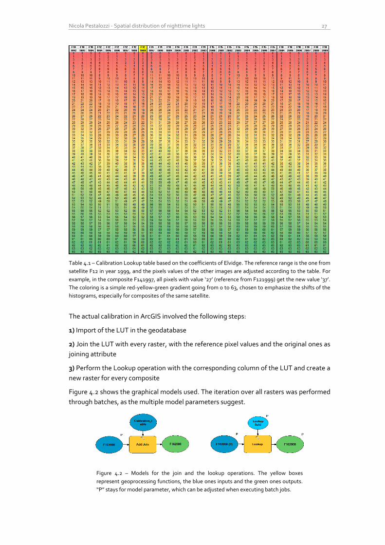
Table 4.1 – Calibration Lookup table based on the coefficients of Elvidge. The reference range is the one from
satellite F12 in year 1999, and the pixels values of the other images are adjusted according to the table. For
example, in the composite F141997, all pixels with value ‘27’ (reference from F121999) get the new value ‘37’.
The coloring is a simple red-yellow-green gradient going from 0 to 63, chosen to emphasize the shifts of the
histograms, especially for composites of the same satellite.
The actual calibration in ArcGIS involved the following steps:
1) Import of the LUT in the geodatabase
2) Join the LUT with every raster, with the reference pixel values and the original ones as
joining attribute
3) Perform the Lookup operation with the corresponding column of the LUT and create a
new raster for every composite
Figure 4.2 shows the graphical models used. The iteration over all rasters was performed
through batches, as the multiple model parameters suggest.
Figure 4.2 – Models for the join and the lookup operations. The yellow boxes
represent geoprocessing functions, the blue ones inputs and the green ones outputs.
“P” stays for model parameter, which can be adjusted when executing batch jobs.

28 Preprocessing
It is important to mention that the calibration introduces substantial alterations in the
histograms. Entire ‘columns’ are shifted from one DN to another, sometimes merging, so
that the actual probability distribution is slightly transformed (Figure 4.3).
Figure 4.3 – Log-lin histogram plot of F141997, before and after the intercalibration. Note how entire columns
of the histogram have been displaced (DN 1 to 2, 2 to 3 etc.), producing some ‘holes’.
Figure 4.4 – Cumulative histogram of F141997, before and after the intercalibration. The last column is
equally high reflecting that the total amount of pixels didn’t change. After the intercalibration, the
cumulative histogram looks much more like the one of the reference composite F121999.
1
10
100
1'000
10'000
100'000
1'000'000
10'000'000
100'000'000
1'000'000'000
0 5 10 15 20 25 30 35 40 45 50 55 60
Nu
mb
er
of
pix
els
DN
before intercalibration after intercalibration
700'000'000
705'000'000
710'000'000
715'000'000
720'000'000
725'000'000
730'000'000
0 5 10 15 20 25 30 35 40 45 50 55 60
Nu
mb
er
of
pix
els
DN
F141997 before intercalibration
F121999 (reference)
F141997 after intercalibration
Nicola Pestalozzi - Spatial distribution of nighttime lights 29
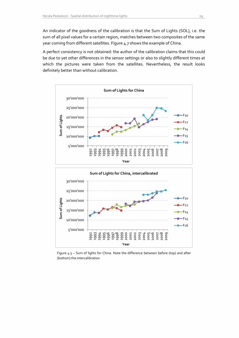
An indicator of the goodness of the calibration is that the Sum of Lights (SOL), i.e. the
sum of all pixel values for a certain region, matches between two composites of the same
year coming from different satellites. Figure 4.7 shows the example of China.
A perfect consistency is not obtained: the author of the calibration claims that this could
be due to yet other differences in the sensor settings or also to slightly different times at
which the pictures were taken from the satellites. Nevertheless, the result looks
definitely better than without calibration.
Figure 4.5 – Sum of lights for China. Note the difference between before (top) and after
(bottom) the intercalibration
5'000'000
10'000'000
15'000'000
20'000'000
25'000'000
30'000'000
199
2
199
3 19
94
19
95
199
6
199
7 19
98
19
99
2
00
0
20
01
20
02
2
00
3 2
00
4
20
05
20
06
2
00
7 2
00
8
20
09
Su
m o
f L
igh
ts
Year
Sum of Lights for China
F10
F12
F14
F15
F16
5'000'000
10'000'000
15'000'000
20'000'000
25'000'000
30'000'000
199
2
199
3 19
94
19
95
199
6
199
7 19
98
19
99
2
00
0
20
01
20
02
2
00
3 2
00
4
20
05
20
06
2
00
7 2
00
8
20
09
Su
m o
f L
igh
ts
Year
Sum of Lights for China, intercalibrated
F10
F12
F14
F15
F16
30 Preprocessing
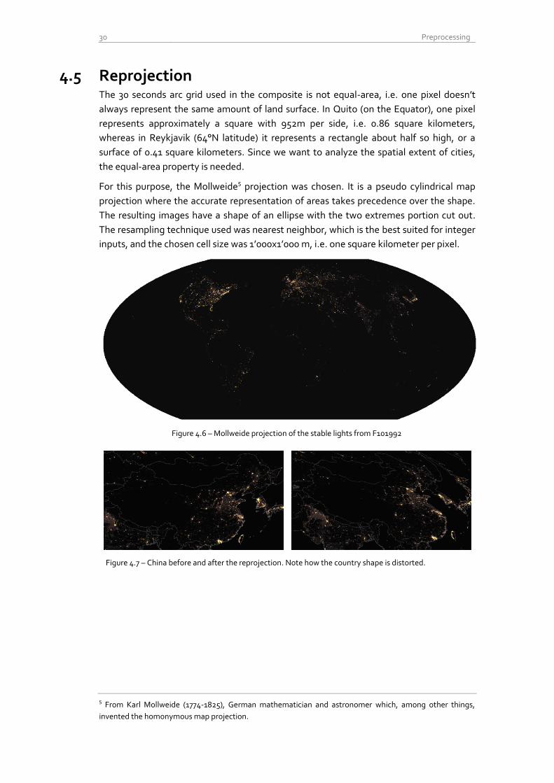
4.5 Reprojection The 30 seconds arc grid used in the composite is not equal-area, i.e. one pixel doesn’t
always represent the same amount of land surface. In Quito (on the Equator), one pixel
represents approximately a square with 952m per side, i.e. 0.86 square kilometers,
whereas in Reykjavik (64°N latitude) it represents a rectangle about half so high, or a
surface of 0.41 square kilometers. Since we want to analyze the spatial extent of cities,
the equal-area property is needed.
For this purpose, the Mollweide5 projection was chosen. It is a pseudo cylindrical map
projection where the accurate representation of areas takes precedence over the shape.
The resulting images have a shape of an ellipse with the two extremes portion cut out.
The resampling technique used was nearest neighbor, which is the best suited for integer
inputs, and the chosen cell size was 1’000x1’000 m, i.e. one square kilometer per pixel.
Figure 4.6 – Mollweide projection of the stable lights from F101992
Figure 4.7 – China before and after the reprojection. Note how the country shape is distorted.
5 From Karl Mollweide (1774-1825), German mathematician and astronomer which, among other things,
invented the homonymous map projection.
Nicola Pestalozzi - Spatial distribution of nighttime lights 31
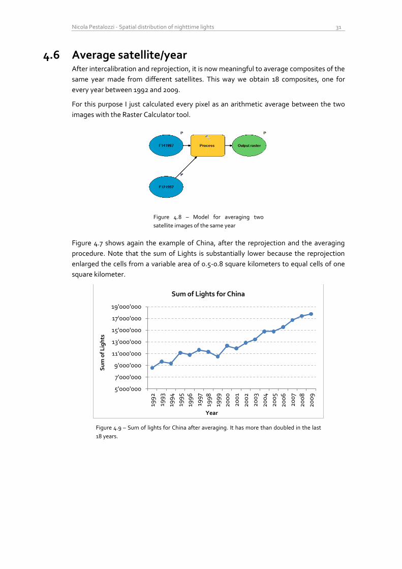
4.6 Average satellite/year After intercalibration and reprojection, it is now meaningful to average composites of the
same year made from different satellites. This way we obtain 18 composites, one for
every year between 1992 and 2009.
For this purpose I just calculated every pixel as an arithmetic average between the two
images with the Raster Calculator tool.
Figure 4.8 – Model for averaging two
satellite images of the same year
Figure 4.7 shows again the example of China, after the reprojection and the averaging
procedure. Note that the sum of Lights is substantially lower because the reprojection
enlarged the cells from a variable area of 0.5-0.8 square kilometers to equal cells of one
square kilometer.
Figure 4.9 – Sum of lights for China after averaging. It has more than doubled in the last
18 years.
5'000'000
7'000'000
9'000'000
11'000'000
13'000'000
15'000'000
17'000'000
19'000'000
199
2
199
3
199
4
199
5
199
6
199
7
199
8
199
9
20
00
20
01
20
02
20
03
20
04
20
05
20
06
20
07
20
08
20
09
Su
m o
f L
igh
ts
Year
Sum of Lights for China

32 Preprocessing
Nicola Pestalozzi - Spatial distribution of nighttime lights 33
5 Mean center of lights
Where is the center of gravity of the light emissions worldwide? Is it moving, and if yes, in
which direction and at which speed? This is one of the research questions that arose
during the analysis of the nighttime lights dataset.
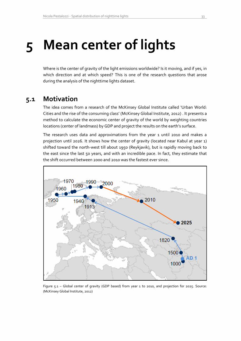
5.1 Motivation The idea comes from a research of the McKinsey Global Institute called ‘Urban World:
Cities and the rise of the consuming class’ (McKinsey Global Institute, 2012) . It presents a
method to calculate the economic center of gravity of the world by weighting countries
locations (center of landmass) by GDP and project the results on the earth’s surface.
The research uses data and approximations from the year 1 until 2010 and makes a
projection until 2026. It shows how the center of gravity (located near Kabul at year 1)
shifted toward the north-west till about 1950 (Reykjavik), but is rapidly moving back to
the east since the last 50 years, and with an incredible pace. In fact, they estimate that
the shift occurred between 2000 and 2010 was the fastest ever since.
Figure 5.1 – Global center of gravity (GDP based) from year 1 to 2010, and projection for 2025. Source:
(McKinsey Global Institute, 2012)
34 Mean center of lights
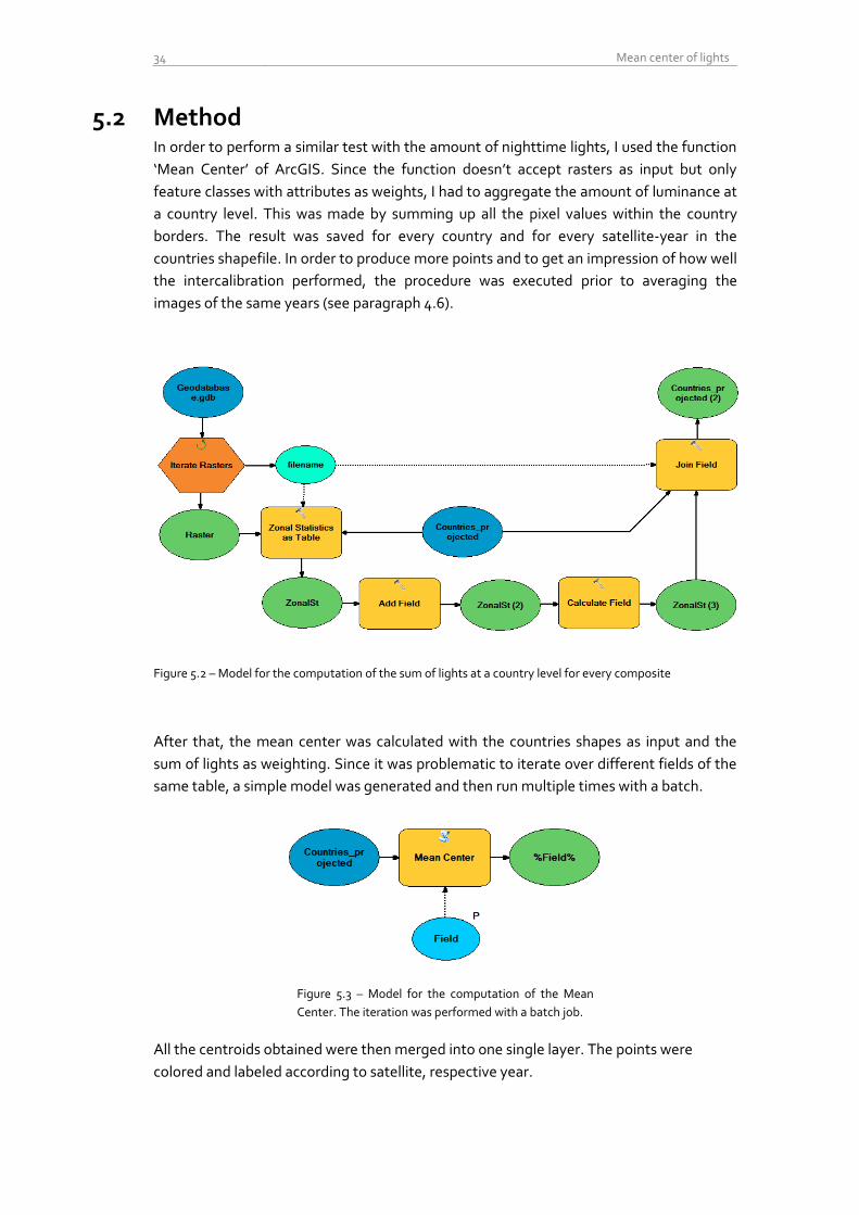
5.2 Method In order to perform a similar test with the amount of nighttime lights, I used the function
‘Mean Center’ of ArcGIS. Since the function doesn’t accept rasters as input but only
feature classes with attributes as weights, I had to aggregate the amount of luminance at
a country level. This was made by summing up all the pixel values within the country
borders. The result was saved for every country and for every satellite-year in the
countries shapefile. In order to produce more points and to get an impression of how well
the intercalibration performed, the procedure was executed prior to averaging the
images of the same years (see paragraph 4.6).
Figure 5.2 – Model for the computation of the sum of lights at a country level for every composite
After that, the mean center was calculated with the countries shapes as input and the
sum of lights as weighting. Since it was problematic to iterate over different fields of the
same table, a simple model was generated and then run multiple times with a batch.
Figure 5.3 – Model for the computation of the Mean
Center. The iteration was performed with a batch job.
All the centroids obtained were then merged into one single layer. The points were
colored and labeled according to satellite, respective year.
Nicola Pestalozzi - Spatial distribution of nighttime lights 35
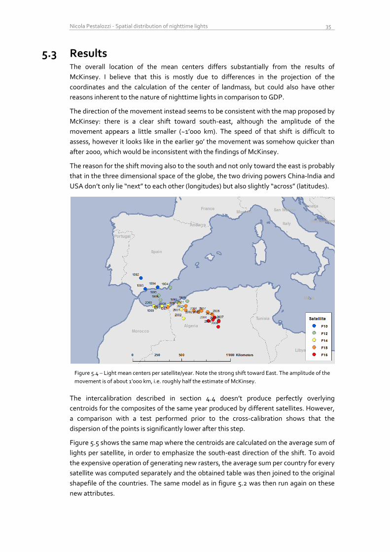
5.3 Results The overall location of the mean centers differs substantially from the results of
McKinsey. I believe that this is mostly due to differences in the projection of the
coordinates and the calculation of the center of landmass, but could also have other
reasons inherent to the nature of nighttime lights in comparison to GDP.
The direction of the movement instead seems to be consistent with the map proposed by
McKinsey: there is a clear shift toward south-east, although the amplitude of the
movement appears a little smaller (~1’000 km). The speed of that shift is difficult to
assess, however it looks like in the earlier 90’ the movement was somehow quicker than
after 2000, which would be inconsistent with the findings of McKinsey.
The reason for the shift moving also to the south and not only toward the east is probably
that in the three dimensional space of the globe, the two driving powers China-India and
USA don’t only lie “next” to each other (longitudes) but also slightly “across” (latitudes).
Figure 5.4 – Light mean centers per satellite/year. Note the strong shift toward East. The amplitude of the
movement is of about 1’000 km, i.e. roughly half the estimate of McKinsey.
The intercalibration described in section 4.4 doesn’t produce perfectly overlying
centroids for the composites of the same year produced by different satellites. However,
a comparison with a test performed prior to the cross-calibration shows that the
dispersion of the points is significantly lower after this step.
Figure 5.5 shows the same map where the centroids are calculated on the average sum of
lights per satellite, in order to emphasize the south-east direction of the shift. To avoid
the expensive operation of generating new rasters, the average sum per country for every
satellite was computed separately and the obtained table was then joined to the original
shapefile of the countries. The same model as in figure 5.2 was then run again on these
new attributes.
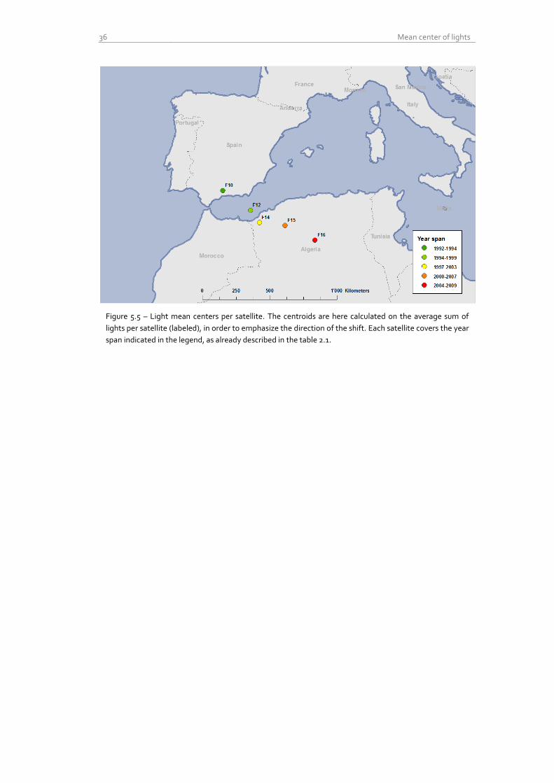
36 Mean center of lights
Figure 5.5 – Light mean centers per satellite. The centroids are here calculated on the average sum of
lights per satellite (labeled), in order to emphasize the direction of the shift. Each satellite covers the year
span indicated in the legend, as already described in the table 2.1.
Nicola Pestalozzi - Spatial distribution of nighttime lights 37
6 Spatial light Gini
6.1 Motivation Another method to study the distribution of lights is to look at their level of dispersion, or
‘inequality’. The intuition is that some countries will show a stronger ‘centralization’, i.e. a
large amount of bright lit pixels and a small amount of dim lit ones, whereas other, more
‘democratic’ countries, will present a more uniform distributed illumination with a lot of
dim lit pixels over their territory.
Can we recognize this kind of configurations with the help of nighttime lights? Can we
understand and categorize the organization dynamics of cities in different kinds of
countries?
6.2 Methods To evaluate the level of inequality I chose the Gini coefficient1, which is a measure of
statistical relative dispersion, initially developed to study the disparity in the distribution
of income. The easiest way to understand the Gini coefficient is by means of the Lorenz
Curve, which displays the cumulative distribution function of wealth (in the original
version) versus the cumulative percentage of population, allowing statements like “the
poorer x% of the population gets y% of the wealth”. A Lorenz curve along the diagonal
indicates therefore complete equality, i.e. everyone gets the same share of income2.
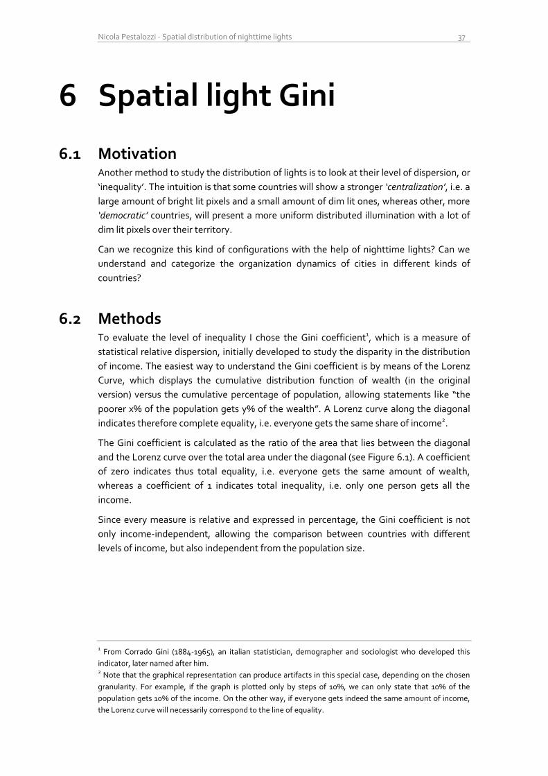
The Gini coefficient is calculated as the ratio of the area that lies between the diagonal
and the Lorenz curve over the total area under the diagonal (see Figure 6.1). A coefficient
of zero indicates thus total equality, i.e. everyone gets the same amount of wealth,
whereas a coefficient of 1 indicates total inequality, i.e. only one person gets all the
income.
Since every measure is relative and expressed in percentage, the Gini coefficient is not
only income-independent, allowing the comparison between countries with different
levels of income, but also independent from the population size.
1 From Corrado Gini (1884-1965), an italian statistician, demographer and sociologist who developed this
indicator, later named after him. 2 Note that the graphical representation can produce artifacts in this special case, depending on the chosen
granularity. For example, if the graph is plotted only by steps of 10%, we can only state that 10% of the
population gets 10% of the income. On the other way, if everyone gets indeed the same amount of income,
the Lorenz curve will necessarily correspond to the line of equality.
38 Spatial light Gini
In our case, the quantity observed is not wealth but light, and the population count is the
amount of pixels, or square kilometer cells, i.e. the geographical dispersion. Our ‘Spatial
Light Gini’ measures therefore how light is spatially distributed over the area of a
country.
Again, because the measures are normalized, we can use our coefficient to compare
countries with very different level of luminosity and very different areas.
Figure 6.1 – An example of the classical Lorenz curve. The Gini coefficient is defined as A/(A+B). Source: Wikipedia.
The computation of the Gini coefficient can be performed in many different ways. I chose
a version which takes as input a discrete probability function, and not a list of samples,
because handling every single pixel as an input would be computationally too expensive
(recall that every image has 725 million pixels, see section 2.3). Also, ArcGIS provides
geoprocessing functions to export directly the histograms.
Given a discrete probability function f(y), where yi are the points with nonzero
probabilities, indexed in increasing order (yi < yi+1), we can compute the Gini coefficient G
with the following formula:
Where
To extract the discrete probability function from the composite I created a model that
computes the histogram of every country for every year. This is done with the help of the
processing function ‘Zonal Histogram’ (Figure 6.2). The result is exported in a Database
file (DBF) that can be read by Excel and MATLAB.

Nicola Pestalozzi - Spatial distribution of nighttime lights 39
For the analysis, the histogram is then converted in a discrete probability function by
simply normalizing the amounts to obtain frequencies that add to 1 (Figure 6.3).
Figure 6.2 – Model for exporting the histograms to DBF. The operation is performed for every country (zonal
histogram), and for every composite (iterator). The histograms are stored as tables with the following
structure: the first column contains the histogram labels, i.e. the light values. The following columns, one per
country, contain the amounts of pixels having the according value.
% Takes a matrix of histogram amounts and normalize them by dividing each
% column by the total of that column
function freq = to_frequency(input)
a = sum(input);
totals = repmat(a,size(input,1),1);
freq = input./totals;
Figure 6.3 – MATLAB function to compute the frequencies out of the histogram amounts.
% Function to calculate the Gini coefficient taking as input an histogram
% INPUTS x_values : the labels of the histograms values (y)
% hist : the amount (count) for every value (f(y))
% OUTPUT G : the Gini coefficient
function G = light_gini(x_values,hist)
% converts the histogram counts in frequencies
list = to_frequency(hist);
% computes f(y)*y s = list.*x_values;
% computes the cumulative summation s = cumsum(s);
% workaround to get S0=0 s2 = [0; s]; s = [s; 0];
% get the second part of the numerator s3 = s+s2;
list = [list; 0];
% compute the Gini coefficient G = 1 - sum(list.*s3)/s2(end);
Figure 6.4 – MATLAB code to compute the Gini coefficient. The calculation follows the formula presented in
the previous page, taking as input a histogram table.

40 Spatial light Gini
6.3 Results As figure 6.5 shows, the Gini coefficients differ substantially from one country to another.
For example, the Netherlands have a very low Gini coefficient whereas Brazil shows
almost complete inequality.
Figure 6.5 – Lorenz curves and relative Gini coefficients for selected countries in 1992. The variable ‘area’ indicates the amount of square kilometers (in thousands) considered, which in this case coincide with the land area; this measure differ slightly from the official numbers, most probably because of the level of precision of the borders shapefile used.
However, an important caveat hides behind this chart: although the Gini coefficient
allows comparing countries with different land area, such a measure doesn’t account for
the portion of land that cannot be inhabited/illuminated. For example, a huge portion of
Brazil is covered by the Amazonian forest which of course is not urbanized, whereas the
surface of the Netherlands is almost completely habitable.
To overcome this drawback, I eliminated from the evaluation all the cells that aren’t lit at
all, i.e. with DN=0. This way we compare the distribution of light intensity only among
cells that are lit, hence performing another sort of ‘normalization’. The curves look
completely different now and the gap between countries has almost completely
disappeared, as figure 6.6 shows. The range of the Gini coefficients goes now only from
0.32 to 0.41. This is quite astonishing, especially if we compare the considered area: the
United States off America has a lit area which is more than 70 times the one of the
Netherlands, but despite that, their Lorenz curves looks pretty similar and the Gini
coefficients don’t differ much.

Nicola Pestalozzi - Spatial distribution of nighttime lights 41
Figure 6.6 – Lorenz curves and relative Gini coefficients for selected countries in 1992, with threshold 1. This time, only lit pixels were considered: the variable ‘area’ indicates the amount of lit surface (in thousand square kilometers). Note how the curves are now very narrow and the Gini coefficients close to each other, around 0.35.
If we go even further, excluding the cells that are dimmer than a certain threshold, we
consider only the more densely urbanized areas. Figure 6.7 show how quickly the Gini
coefficient converges to the same value for every country.
Figure 6.7 – Lorenz curves and relative Gini coefficients for selected countries in 1992, with increasing thresholds. Note how the curves become similar and the Gini coefficient converges to the same value. At the threshold of DN>=25, the Netherlands and United States have the same Gini coefficient, although the considered lit area still differs by a factor of 35.
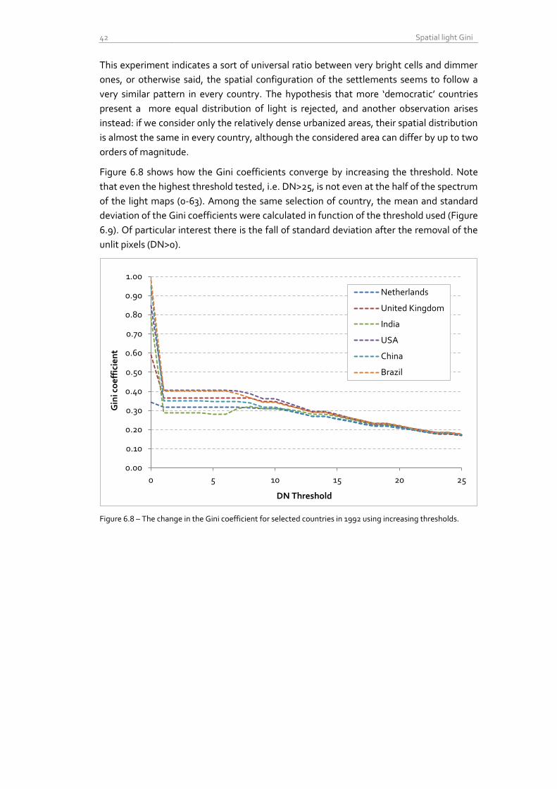
42 Spatial light Gini
This experiment indicates a sort of universal ratio between very bright cells and dimmer
ones, or otherwise said, the spatial configuration of the settlements seems to follow a
very similar pattern in every country. The hypothesis that more ‘democratic’ countries
present a more equal distribution of light is rejected, and another observation arises
instead: if we consider only the relatively dense urbanized areas, their spatial distribution
is almost the same in every country, although the considered area can differ by up to two
orders of magnitude.
Figure 6.8 shows how the Gini coefficients converge by increasing the threshold. Note
that even the highest threshold tested, i.e. DN>25, is not even at the half of the spectrum
of the light maps (0-63). Among the same selection of country, the mean and standard
deviation of the Gini coefficients were calculated in function of the threshold used (Figure
6.9). Of particular interest there is the fall of standard deviation after the removal of the
unlit pixels (DN>0).
Figure 6.8 – The change in the Gini coefficient for selected countries in 1992 using increasing thresholds.
0.00
0.10
0.20
0.30
0.40
0.50
0.60
0.70
0.80
0.90
1.00
0 5 10 15 20 25
Gin
i co
eff
icie
nt
DN Threshold
Netherlands
United Kingdom
India
USA
China
Brazil

Nicola Pestalozzi - Spatial distribution of nighttime lights 43
Figure 6.9 – Mean and standard deviation of the Gini coefficients as function of the threshold. The selection
of countries is the same as in the Figure 6.8. Particularly interesting is the big jump on standard deviation
from ~0.25 to only 0.05 by eliminating the cells with DN=0.
6.4 Evolution over time Interesting is now to look at the evolution of the Gini coefficients over the years. The
“naïve” version of the light Gini, i.e. without any thresholds, looks quite constant over
time. This doesn’t surprise much, since especially for large countries, the result is always
dominated by the vast amount of non-habitable land and thus unlit pixels, which drive
the coefficients up.
Figure 6.10 – Gini coefficients for selected countries over the years, without threshold
0
0.05
0.1
0.15
0.2
0.25
0.00
0.10
0.20
0.30
0.40
0.50
0.60
0.70
0.80
0.90
1.00
0 5 10 15 20 25
Sta
nd
ard
de
via
tio
n
Me
an
Gin
i co
eff
icie
nt
DN Threshold
Mean Standard deviation
0.30
0.40
0.50
0.60
0.70
0.80
0.90
1.00
199
2
199
3
199
4
199
5
199
6
199
7
199
8
199
9
20
00
20
01
20
02
20
03
20
04
20
05
20
06
20
07
20
08
20
09
Gini coefficient over the years - No DN threshold
Netherlands
United Kingdom India
United States
China
Brazil
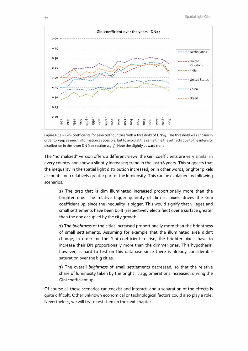
44 Spatial light Gini
Figure 6.11 – Gini coefficients for selected countries with a threshold of DN>4. The threshold was chosen in
order to keep as much information as possible, but to avoid at the same time the artifacts due to the intensity
distribution in the lower DN (see section 2.3.5). Note the slightly upward trend.
The “normalized” version offers a different view: the Gini coefficients are very similar in
every country and show a slightly increasing trend in the last 18 years. This suggests that
the inequality in the spatial light distribution increased, or in other words, brighter pixels
accounts for a relatively greater part of the luminosity. This can be explained by following
scenarios:
1) The area that is dim illuminated increased proportionally more than the
brighter one. The relative bigger quantity of dim lit pixels drives the Gini
coefficient up, since the inequality is bigger. This would signify that villages and
small settlements have been built (respectively electrified) over a surface greater
than the one occupied by the city growth.
2) The brightness of the cities increased proportionally more than the brightness
of small settlements. Assuming for example that the illuminated area didn’t
change, in order for the Gini coefficient to rise, the brighter pixels have to
increase their DN proportionally more than the dimmer ones. This hypothesis,
however, is hard to test on this database since there is already considerable
saturation over the big cities.
3) The overall brightness of small settlements decreased, so that the relative
share of luminosity taken by the bright lit agglomerations increased, driving the
Gini coefficient up.
Of course all these scenarios can coexist and interact, and a separation of the effects is
quite difficult. Other unknown economical or technological factors could also play a role.
Nevertheless, we will try to test them in the next chapter.
0.20
0.25
0.30
0.35
0.40
0.45
0.50
0.55
0.60
199
2
199
3
199
4
199
5
199
6
199
7
199
8
199
9
20
00
20
01
20
02
20
03
20
04
20
05
20
06
20
07
20
08
20
09
Gini coefficient over the years - DN>4
Netherlands
United Kingdom
India
United States
China
Brazil
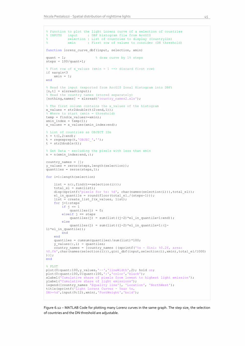
Nicola Pestalozzi - Spatial distribution of nighttime lights 45
% Function to plot the light Lorenz curve of a selection of countries
% INPUTS input : DBF histogram file from ArcGIS
% selection : List of countries to display (CountryIDs)
% xmin : First row of values to consider (DN threshold)
function lorenz_curve_dbf(input, selection, xmin)
quant = 1; % draw curve by 1% steps
steps = 100/quant+1;
% Fist row of x_values (xmin = 1 --> discard first row)
if nargin<3
xmin = 1;
end
% Read the input (exported from ArcGIS Zonal Histogram into DBF)
[n,t] = xlsread(input);
% Read the country names (stored separately)
[nothing,names] = xlsread('country_names2.xls');
% The first column contains the x_values of the histogram
x_values = str2double(t(2:end,1));
% Where to start (xmin = threshold)
temp = find(x_values>=xmin);
xmin_index = temp(1);
x_values = x_values(xmin_index:end);
% List of countries as OBJECT IDs
t = t(1,2:end);
t = regexprep(t,'OBJEC_','');
t = str2double(t);
% Get Data - excluding the pixels with less than xmin
n = n(xmin_index:end,:);
country_names = [];
y_values = zeros(steps,length(selection));
quantiles = zeros(steps,1);
for i=1:length(selection)
list = n(:,find(t==selection(i)));
total_el = sum(list);
disp(sprintf('pixels for %s: %d', char(names(selection(i))),total_el));
el_in_quantile = round(floor(total_el./(steps-1)));
list = create_list_2(x_values, list);
for j=1:steps
if j == 1
quantiles(j) = 0;
elseif j == steps
quantiles(j) = sum(list((j-2)*el_in_quantile+1:end));
else
quantiles(j) = sum(list((j-2)*el_in_quantile+1:(j-
1)*el_in_quantile));
end
end
quantiles = cumsum(quantiles)/sum(list)*100;
y_values(:,i) = quantiles;
country_names = [country_names {(sprintf('%s - Gini: %0.2f, area:
%0.fk',char(names(selection(i))),gini_dbf(input,selection(i),xmin),total_el/1000)
)}];
end
% PLOT
plot(0:quant:100,y_values,'--','lineWidth',2); hold on;
plot(0:quant:100,0:quant:100,':','color','black');
xlabel('Cumulative share of pixels from lowest to highest light emission');
ylabel('Cumulative share of light emissions');
legend([country_names 'Equality line'], 'Location', 'NorthWest');
title(sprintf('Light Lorenz Curves - Year %s,
DN>=%d',input(9:12),xmin),'FontWeight','bold');
Figure 6.12 – MATLAB Code for plotting many Lorenz curves in the same graph. The step size, the selection
of countries and the DN threshold are adjustable.
46 Spatial light Gini
6.5 Related research and distinctions I found only one more and recent publication that uses a variation of the Gini coefficient
adapted for nighttime lights3 which, in addition, normalizes the amount of light by the
population density, that is retrieved from the LandScan in form of global grid (Elvidge, et
al., 2012). This indicator measures the co-distribution of light and people.
Two results are especially interesting: about 1.2 billion people live in areas with no
detectable light, and only 13% of the world population is getting 80% of the total light.
The obtained “Night Light Development Index” (NLDI) was computed per every country
and was found to be (inversely) correlated (R2=0.71) with the Human Development Index
(HDI)4.
The main difference between the NLDI and the above described light Gini is that in the
NLDI, the spatial distribution is not considered anymore5: the dimension space is
canceled out by dividing the two spatially explicit datasets:
Therefore, the NLDI doesn’t say anything about how light is dispersed over the space, but
rather how it is distributed among people.
3 The dataset used there is the radiance calibrated composite of 2006. No time series analysis was performed.
4 The HDI is a composite statistic of life expectancy, education and income indices to rank countries into four
tiers of human development. It was published by the United Nations Development Program. 5 Or better said, it is considered only at the aggregation level used, in this case at country level.
Nicola Pestalozzi - Spatial distribution of nighttime lights 47
7 Urban growth
7.1 Motivation I searched a way to quantify the spatial growth of the largest cities and dense urbanized
areas. Because of the saturation occurring over the city centers, this dataset is not suited
for a quantitative evaluation of the amount of light/power emitted, but is more useful to
better understand the dynamics of the spatial extension of cities.
The basic research question here is: “are urban areas growing even bigger, and at what
pace?” and “in which countries cities grew the most?”
7.2 Methods In order to isolate the cities from the rest of the composites, a threshold technique was
used to produce binary images. This method has several advantages: first of all, the
ambiguous measure “amount of light” is replaced by the much more convenient indicator
“lit area”, which is measured in square kilometers. Second, the problem of saturation
over cities is avoided, since in the binary image, every pixel is either considered as ‘lit’ or
‘non lit’.
Of course the threshold plays an important role: if we set it to 1, i.e. we ignore only the
completely dark pixels, we obtain huge surfaces that extend way beyond the urbanized
areas. On the other hand, if we set the threshold to 63 (saturation), only the very bright
pixels over the city centers are considered, whereas all the suburbs are eliminated.
After several empirical iterations, a threshold of 30 was chosen and applied to all the
composites, giving the value 1 to every pixel with DN greater than 30. Accordingly,
another set was created for all the pixels below or equal to 30, but greater than zero.
For both sets, the sum of bright, respective dim lit area for every country and for every
year was produced used a model analog to the one presented in figure 5.2 at page 34.
7.3 Results First of all we want to test our intuition of section 6.4: is it true that the amount of dim
pixels grew proportionally more than the brighter ones? Table 7.1 gives us the answer:
globally, between 1992 and 2009, the area with DN>30 grew nearly 20%, whereas the
area with DN<30 almost 50%. At a global scale we can therefore confirm this hypothesis.
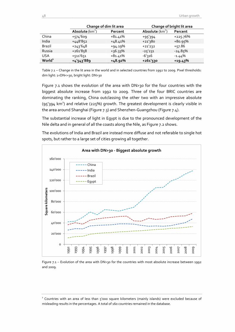
48 Urban growth
Change of dim lit area Change of bright lit area
Absolute (km
2) Percent Absolute (km
2) Percent
China +574’609 +81.41% +95’394 +225.76% India +448’852 +48.41% +21’380 +80.95% Brazil +243’648 +94.19% +21’232 +57.86 Russia +261’858 +36.33% -25’231 -24.85% USA +511’651 +81.41% -6’316 -1.44% World
1 +4’543’889 +48.92% +261’530 +19.43%
Table 7.1 – Change in the lit area in the world and in selected countries from 1992 to 2009. Pixel thresholds:
dim light: 1<DN<=30, bright light: DN>30
Figure 7.1 shows the evolution of the area with DN>30 for the four countries with the
biggest absolute increase from 1992 to 2009. Three of the four BRIC countries are
dominating the ranking, China outclassing the other two with an impressive absolute
(95’394 km2) and relative (225%) growth. The greatest development is clearly visible in
the area around Shanghai (Figure 7.3) and Shenzhen-Guangzhou (Figure 7.4).
The substantial increase of light in Egypt is due to the pronounced development of the
Nile delta and in general of all the coasts along the Nile, as Figure 7.2 shows.
The evolutions of India and Brazil are instead more diffuse and not referable to single hot
spots, but rather to a large set of cities growing all together.
Figure 7.1 – Evolution of the area with DN>30 for the countries with most absolute increase between 1992
and 2009.
1 Countries with an area of less than 5‘000 square kilometers (mainly islands) were excluded because of
misleading results in the percentages. A total of 160 countries remained in the database.
0
20'000
40'000
60'000
80'000
100'000
120'000
140'000
160'000
199
2
199
3
199
4
199
5
199
6
199
7
199
8
199
9
20
00
20
01
20
02
20
03
20
04
20
05
20
06
20
07
20
08
20
09
Sq
ua
re k
ilo
me
ters
Area with DN>30 - Biggest absolute growth
China
India
Brazil
Egypt
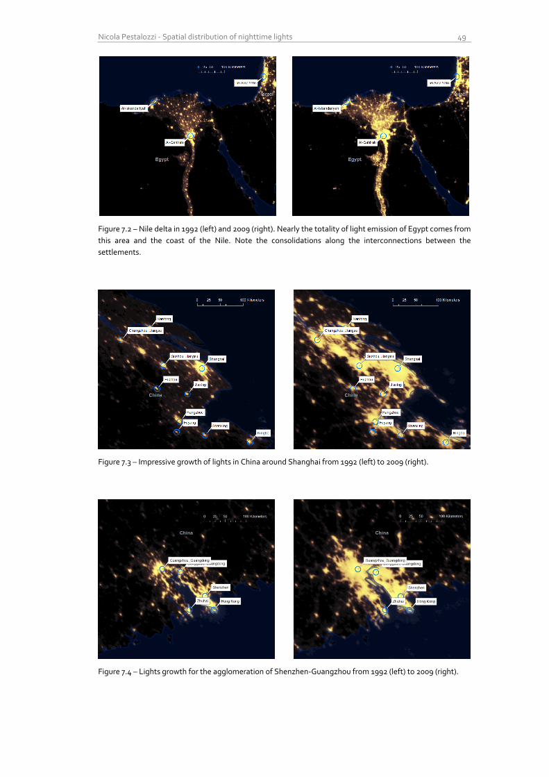
Nicola Pestalozzi - Spatial distribution of nighttime lights 49
Figure 7.2 – Nile delta in 1992 (left) and 2009 (right). Nearly the totality of light emission of Egypt comes from
this area and the coast of the Nile. Note the consolidations along the interconnections between the
settlements.
Figure 7.3 – Impressive growth of lights in China around Shanghai from 1992 (left) to 2009 (right).
Figure 7.4 – Lights growth for the agglomeration of Shenzhen-Guangzhou from 1992 (left) to 2009 (right).
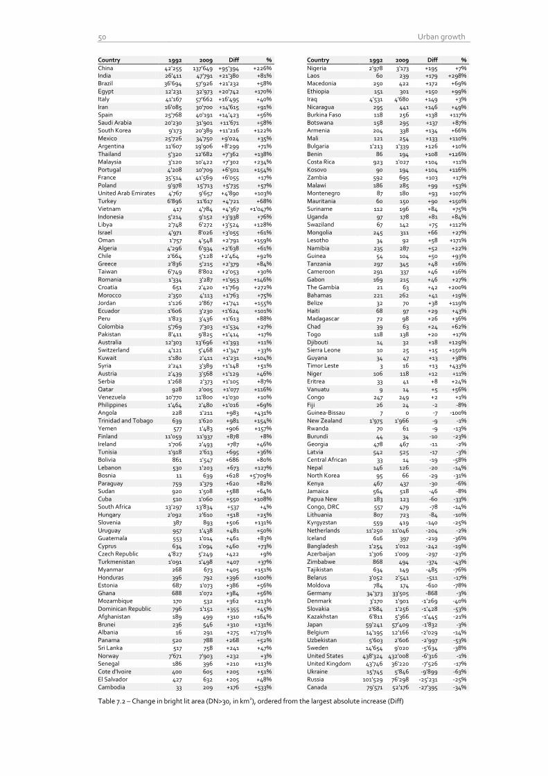
50 Urban growth
Country 1992 2009 Diff % Country 1992 2009 Diff %
China 42'255 137'649 +95'394 +226% Nigeria 2'978 3'173 +195 +7% India 26'411 47'791 +21'380 +81% Laos 60 239 +179 +298% Brazil 36'694 57'926 +21'232 +58% Macedonia 250 422 +172 +69% Egypt 12'231 32'973 +20'742 +170% Ethiopia 151 301 +150 +99% Italy 41'167 57'662 +16'495 +40% Iraq 4'531 4'680 +149 +3% Iran 16'085 30'700 +14'615 +91% Nicaragua 295 441 +146 +49% Spain 25'768 40'191 +14'423 +56% Burkina Faso 118 256 +138 +117% Saudi Arabia 20'230 31'901 +11'671 +58% Botswana 158 295 +137 +87% South Korea 9'173 20'389 +11'216 +122% Armenia 204 338 +134 +66% Mexico 25'726 34'750 +9'024 +35% Mali 121 254 +133 +110% Argentina 11'607 19'906 +8'299 +71% Bulgaria 1'213 1'339 +126 +10% Thailand 5'320 12'682 +7'362 +138% Benin 86 194 +108 +126% Malaysia 3'120 10'422 +7'302 +234% Costa Rica 923 1'027 +104 +11% Portugal 4'208 10'709 +6'501 +154% Kosovo 90 194 +104 +116% France 35'514 41'569 +6'055 +17% Zambia 592 695 +103 +17% Poland 9'978 15'713 +5'735 +57% Malawi 186 285 +99 +53% United Arab Emirates 4'767 9'657 +4'890 +103% Montenegro 87 180 +93 +107% Turkey 6'896 11'617 +4'721 +68% Mauritania 60 150 +90 +150% Vietnam 417 4'784 +4'367 +1'047% Suriname 112 196 +84 +75% Indonesia 5'214 9'152 +3'938 +76% Uganda 97 178 +81 +84% Libya 2'748 6'272 +3'524 +128% Swaziland 67 142 +75 +112% Israel 4'971 8'026 +3'055 +61% Mongolia 245 311 +66 +27% Oman 1'757 4'548 +2'791 +159% Lesotho 34 92 +58 +171% Algeria 4'296 6'934 +2'638 +61% Namibia 235 287 +52 +22% Chile 2'664 5'128 +2'464 +92% Guinea 54 104 +50 +93% Greece 2'836 5'215 +2'379 +84% Tanzania 297 345 +48 +16% Taiwan 6'749 8'802 +2'053 +30% Cameroon 291 337 +46 +16% Romania 1'334 3'287 +1'953 +146% Gabon 169 215 +46 +27% Croatia 651 2'420 +1'769 +272% The Gambia 21 63 +42 +200% Morocco 2'350 4'113 +1'763 +75% Bahamas 221 262 +41 +19% Jordan 1'126 2'867 +1'741 +155% Belize 32 70 +38 +119% Ecuador 1'606 3'230 +1'624 +101% Haiti 68 97 +29 +43% Peru 1'823 3'436 +1'613 +88% Madagascar 72 98 +26 +36% Colombia 5'769 7'303 +1'534 +27% Chad 39 63 +24 +62% Pakistan 8'411 9'825 +1'414 +17% Togo 118 138 +20 +17% Australia 12'303 13'696 +1'393 +11% Djibouti 14 32 +18 +129% Switzerland 4'121 5'468 +1'347 +33% Sierra Leone 10 25 +15 +150% Kuwait 1'180 2'411 +1'231 +104% Guyana 34 47 +13 +38% Syria 2'241 3'389 +1'148 +51% Timor Leste 3 16 +13 +433% Austria 2'439 3'568 +1'129 +46% Niger 106 118 +12 +11% Serbia 1'268 2'373 +1'105 +87% Eritrea 33 41 +8 +24% Qatar 928 2'005 +1'077 +116% Vanuatu 9 14 +5 +56% Venezuela 10'770 11'800 +1'030 +10% Congo 247 249 +2 +1% Philippines 1'464 2'480 +1'016 +69% Fiji 26 24 -2 -8% Angola 228 1'211 +983 +431% Guinea-Bissau 7 0 -7 -100% Trinidad and Tobago 639 1'620 +981 +154% New Zealand 1'975 1'966 -9 -1% Yemen 577 1'483 +906 +157% Rwanda 70 61 -9 -13% Finland 11'059 11'937 +878 +8% Burundi 44 34 -10 -23% Ireland 1'706 2'493 +787 +46% Georgia 478 467 -11 -2% Tunisia 1'918 2'613 +695 +36% Latvia 542 525 -17 -3% Bolivia 861 1'547 +686 +80% Central African
Rep
33 14 -19 -58% Lebanon 530 1'203 +673 +127% Nepal 146 126 -20 -14% Bosnia 11 639 +628 +5'709% North Korea 95 66 -29 -31% Paraguay 759 1'379 +620 +82% Kenya 467 437 -30 -6% Sudan 920 1'508 +588 +64% Jamaica 564 518 -46 -8% Cuba 510 1'060 +550 +108% Papua New
Guinea 183 123 -60 -33%
South Africa 13'297 13'834 +537 +4% Congo, DRC 557 479 -78 -14% Hungary 2'092 2'610 +518 +25% Lithuania 807 723 -84 -10% Slovenia 387 893 +506 +131% Kyrgyzstan 559 419 -140 -25% Uruguay 957 1'438 +481 +50% Netherlands 11'250 11'046 -204 -2% Guatemala 553 1'014 +461 +83% Iceland 616 397 -219 -36% Cyprus 634 1'094 +460 +73% Bangladesh 1'254 1'012 -242 -19% Czech Republic 4'827 5'249 +422 +9% Azerbaijan 1'306 1'009 -297 -23% Turkmenistan 1'091 1'498 +407 +37% Zimbabwe 868 494 -374 -43% Myanmar 268 673 +405 +151% Tajikistan 634 149 -485 -76% Honduras 396 792 +396 +100% Belarus 3'052 2'541 -511 -17% Estonia 687 1'073 +386 +56% Moldova 784 174 -610 -78% Ghana 688 1'072 +384 +56% Germany 34'373 33'505 -868 -3% Mozambique 170 532 +362 +213% Denmark 3'170 1'901 -1'269 -40% Dominican Republic 796 1'151 +355 +45% Slovakia 2'684 1'256 -1'428 -53% Afghanistan 189 499 +310 +164% Kazakhstan 6'811 5'366 -1'445 -21% Brunei 236 546 +310 +131% Japan 59'241 57'409 -1'832 -3% Albania 16 291 +275 +1'719% Belgium 14'195 12'166 -2'029 -14% Panama 520 788 +268 +52% Uzbekistan 5'603 2'606 -2'997 -53% Sri Lanka 517 758 +241 +47% Sweden 14'654 9'020 -5'634 -38% Norway 7'671 7'903 +232 +3% United States 438'324 432'008 -6'316 -1% Senegal 186 396 +210 +113% United Kingdom 43'746 36'220 -7'526 -17% Cote d'Ivoire 400 605 +205 +51% Ukraine 15'745 5'846 -9'899 -63% El Salvador 427 632 +205 +48% Russia 101'529 76'298 -25'231 -25% Cambodia 33 209 +176 +533% Canada 79'571 52'176 -27'395 -34%
Table 7.2 – Change in bright lit area (DN>30, in km2), ordered from the largest absolute increase (Diff)

Nicola Pestalozzi - Spatial distribution of nighttime lights 51
Figure 7.5 – Evolution of the area with DN>30 for the countries with largest absolute decrease between 1992
and 2009
Figure 7.5 shows instead the four countries with the biggest absolute decrease in strong
lit area. Interestingly, two of them are high developed countries whereas other two are
rather developing ones. Therefore, two different reasons for this decrease should coexist:
1) Big cities area has indeed decreased. This can again be due to different reasons
such as wars, economic recession or emigration.
2) Light pollution in big cities has decreased. This is obviously a matter that applies to
rather richer and developed countries, which can afford such projects. A clear example
is Canada, where various programs were adopted from 1991 onwards to reduce the
artificial sky brightness, notably from street and public lighting (Royal Astronomical
Society of Canada, 2011). The worldwide reference for such programs is the
International Dark-Sky association (International Dark-Sky Association, 2012).
To distinguish between the countries that had actually reduced their light pollution and
those in which the urban area actually decreased, I compared the decrease in bright light
with the change in urban population estimated by the indicator “Urban Population” of
the World Bank (World Bank Group, 2012). The result confirms the intuition that the
majority of countries showing a decrease in bright lights area performed some kind of
light pollution abatement, whereas only a few countries experience an actual reduction
of urban population (see table 7.3).
Another possible way to compare countries according to the extent of their bright/dim
areas is to look at a simple categorization suggested in table 7.4. The great majority of
countries (118, or 74%) fall in the category 1, i.e. both bright lit areas and dim lit areas
increased. Only in a small fraction of countries both areas decreased or only bright light
increased. A considerable amount of countries (31, i.e. 19%) instead present a pattern
where bright light decreased, whereas dim light increased.
0
20'000
40'000
60'000
80'000
100'000
120'000
199
2
199
3
199
4
199
5
199
6
199
7
199
8
199
9
20
00
20
01
20
02
20
03
20
04
20
05
20
06
20
07
20
08
20
09
Sq
ua
re k
ilo
me
ters
Area with DN>30 - Biggest absolute decrease
Canada
Russia
Ukraine
United Kingdom
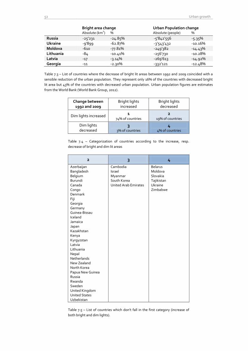
52 Urban growth
Bright area change Urban Population change Absolute (km
2) % Absolute (people) %
Russia -25'231 -24.85% -5'842'556 -5.35% Ukraine -9'899 -62.87% -3'543'432 -10.16% Moldova -610 -77.81% -249'382 -14.43% Lithuania -84 -10.41% -256'730 -10.28% Latvia -17 -3.14% -269'613 -14.92% Georgia -11 -2.30% -332'121 -12.48%
Table 7.3 – List of countries where the decrease of bright lit areas between 1992 and 2009 coincided with a
sensible reduction of the urban population. They represent only 16% of the countries with decreased bright
lit area but 43% of the countries with decreased urban population. Urban population figures are estimates
from the World Bank (World Bank Group, 2012).
Change between 1992 and 2009
Bright lights increased
Bright lights decreased
Dim lights increased 1
74% of countries 2
19% of countries
Dim lights decreased
3 3% of countries
4 4% of countries
Table 7.4 – Categorization of countries according to the increase, resp.
decrease of bright and dim lit areas
2 3 4
Azerbaijan Bangladesh Belgium Burundi Canada Congo Denmark Fiji Georgia Germany Guinea-Bissau Iceland Jamaica Japan Kazakhstan Kenya Kyrgyzstan Latvia Lithuania Nepal Netherlands New Zealand North Korea Papua New Guinea Russia Rwanda Sweden United Kingdom United States Uzbekistan
Cambodia Israel Myanmar South Korea United Arab Emirates
Belarus Moldova Slovakia Tajikistan Ukraine Zimbabwe
Table 7.5 – List of countries which don’t fall in the first category (increase of
both bright and dim lights).
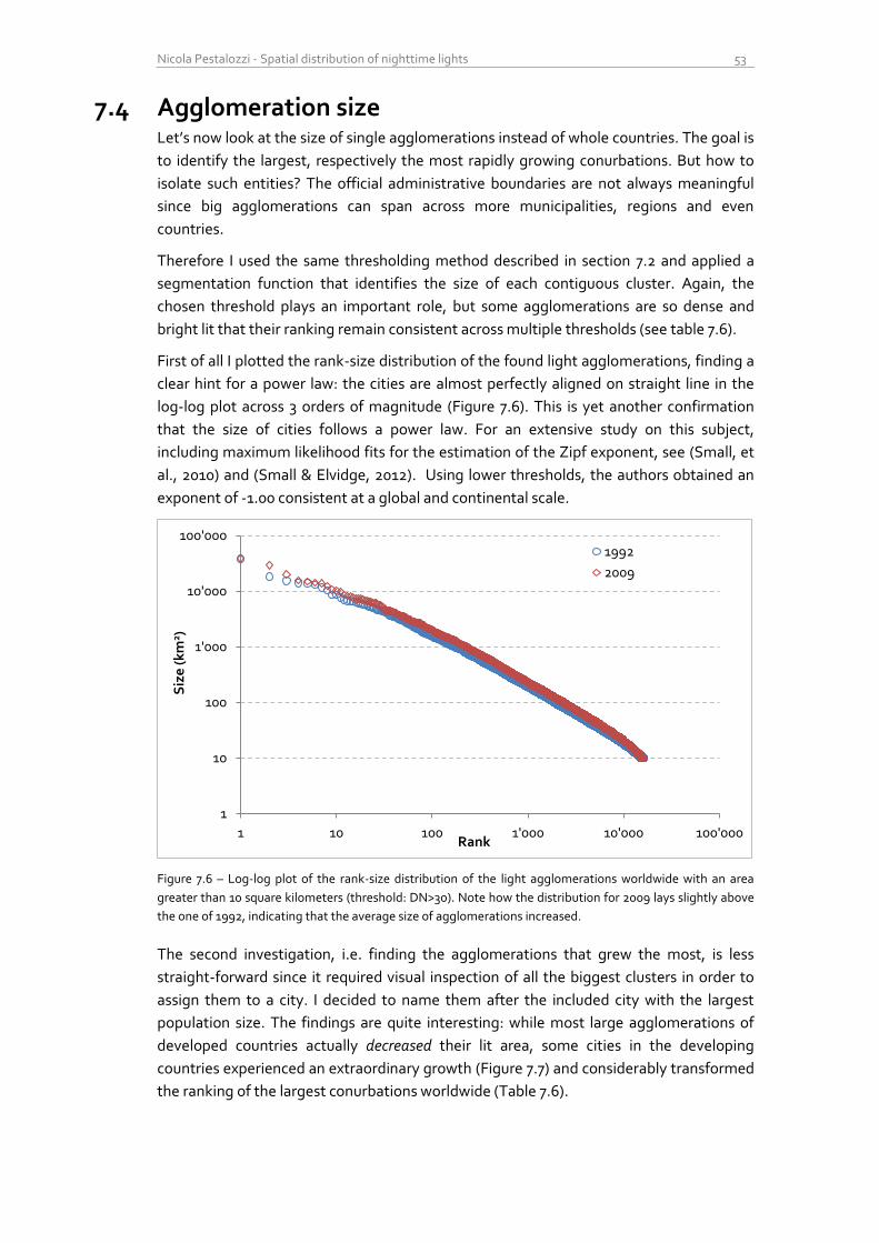
Nicola Pestalozzi - Spatial distribution of nighttime lights 53
7.4 Agglomeration size Let’s now look at the size of single agglomerations instead of whole countries. The goal is
to identify the largest, respectively the most rapidly growing conurbations. But how to
isolate such entities? The official administrative boundaries are not always meaningful
since big agglomerations can span across more municipalities, regions and even
countries.
Therefore I used the same thresholding method described in section 7.2 and applied a
segmentation function that identifies the size of each contiguous cluster. Again, the
chosen threshold plays an important role, but some agglomerations are so dense and
bright lit that their ranking remain consistent across multiple thresholds (see table 7.6).
First of all I plotted the rank-size distribution of the found light agglomerations, finding a
clear hint for a power law: the cities are almost perfectly aligned on straight line in the
log-log plot across 3 orders of magnitude (Figure 7.6). This is yet another confirmation
that the size of cities follows a power law. For an extensive study on this subject,
including maximum likelihood fits for the estimation of the Zipf exponent, see (Small, et
al., 2010) and (Small & Elvidge, 2012). Using lower thresholds, the authors obtained an
exponent of -1.00 consistent at a global and continental scale.
Figure 7.6 – Log-log plot of the rank-size distribution of the light agglomerations worldwide with an area
greater than 10 square kilometers (threshold: DN>30). Note how the distribution for 2009 lays slightly above
the one of 1992, indicating that the average size of agglomerations increased.
The second investigation, i.e. finding the agglomerations that grew the most, is less
straight-forward since it required visual inspection of all the biggest clusters in order to
assign them to a city. I decided to name them after the included city with the largest
population size. The findings are quite interesting: while most large agglomerations of
developed countries actually decreased their lit area, some cities in the developing
countries experienced an extraordinary growth (Figure 7.7) and considerably transformed
the ranking of the largest conurbations worldwide (Table 7.6).
1
10
100
1'000
10'000
100'000
1 10 100 1'000 10'000 100'000
Siz
e (k
m2)
Rank
1992
2009
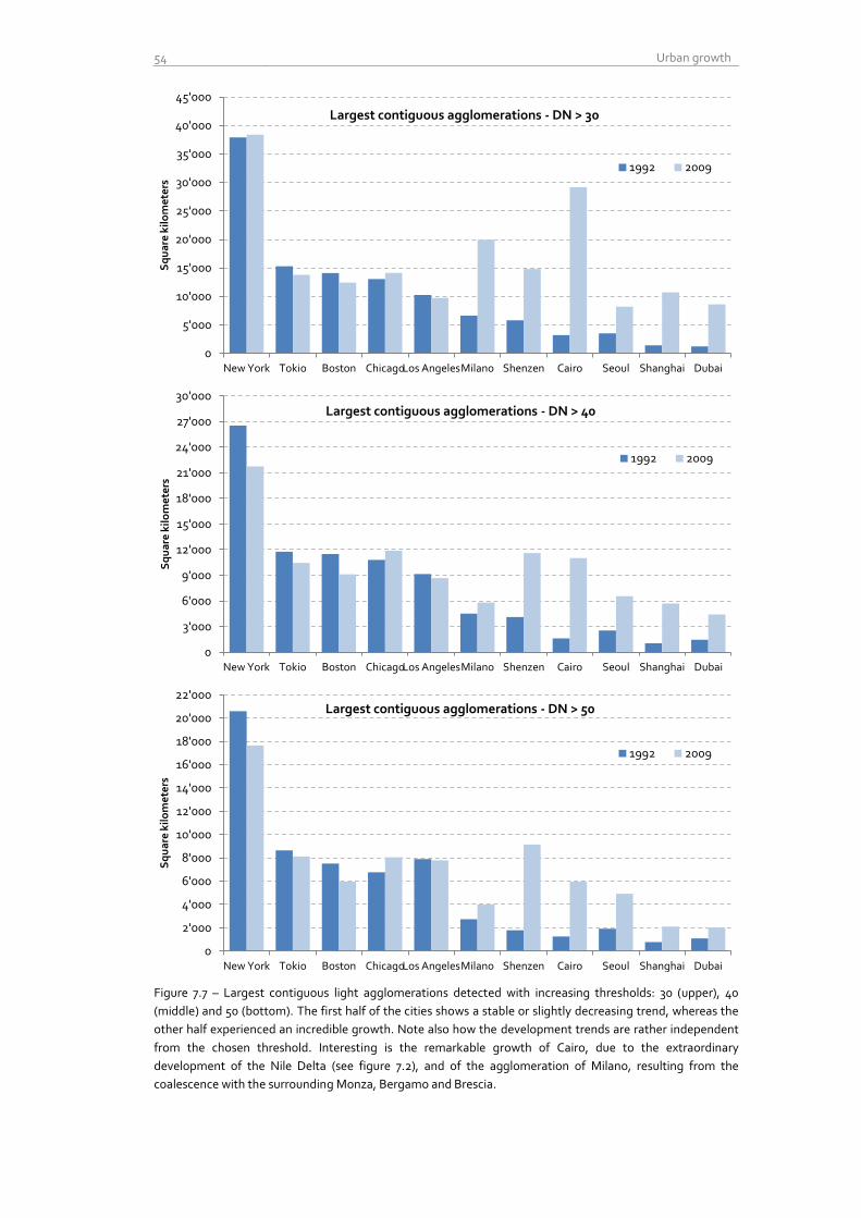
54 Urban growth
Figure 7.7 – Largest contiguous light agglomerations detected with increasing thresholds: 30 (upper), 40
(middle) and 50 (bottom). The first half of the cities shows a stable or slightly decreasing trend, whereas the
other half experienced an incredible growth. Note also how the development trends are rather independent
from the chosen threshold. Interesting is the remarkable growth of Cairo, due to the extraordinary
development of the Nile Delta (see figure 7.2), and of the agglomeration of Milano, resulting from the
coalescence with the surrounding Monza, Bergamo and Brescia.
0
5'000
10'000
15'000
20'000
25'000
30'000
35'000
40'000
45'000
New York Tokio Boston Chicago Los Angeles Milano Shenzen Cairo Seoul Shanghai Dubai
Sq
ua
re k
ilo
me
ters
Largest contiguous agglomerations - DN > 30
1992 2009
0
3'000
6'000
9'000
12'000
15'000
18'000
21'000
24'000
27'000
30'000
New York Tokio Boston Chicago Los Angeles Milano Shenzen Cairo Seoul Shanghai Dubai
Sq
ua
re k
ilo
me
ters
Largest contiguous agglomerations - DN > 40
1992 2009
0
2'000
4'000
6'000
8'000
10'000
12'000
14'000
16'000
18'000
20'000
22'000
New York Tokio Boston Chicago Los Angeles Milano Shenzen Cairo Seoul Shanghai Dubai
Sq
ua
re k
ilo
me
ters
Largest contiguous agglomerations - DN > 50
1992 2009
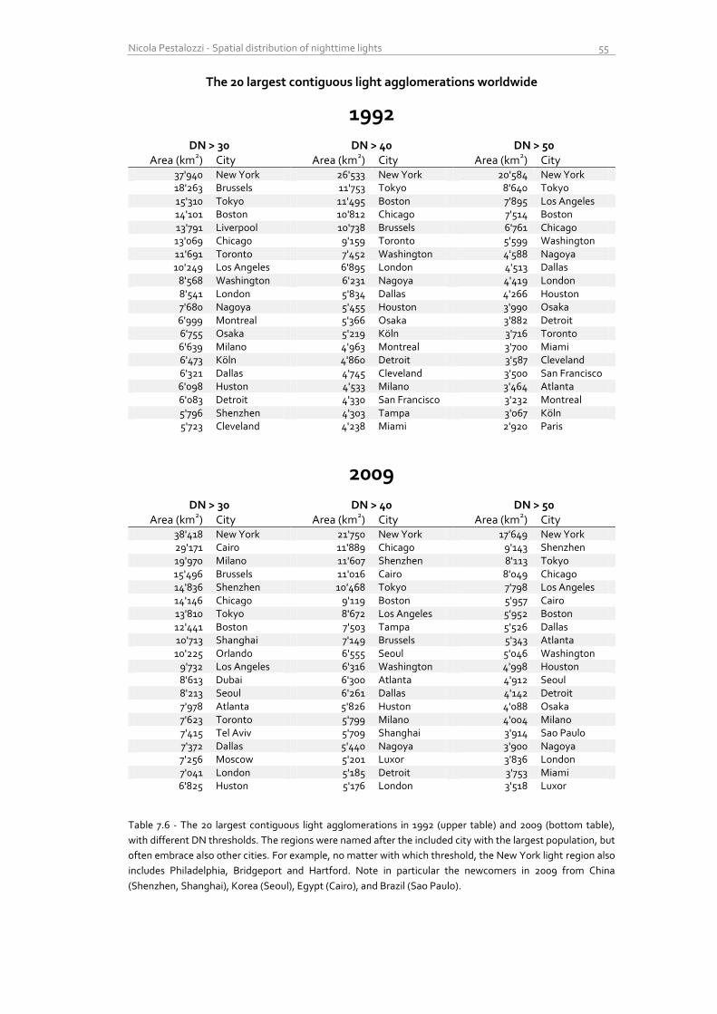
Nicola Pestalozzi - Spatial distribution of nighttime lights 55
The 20 largest contiguous light agglomerations worldwide
1992
DN > 30 DN > 40 DN > 50 Area (km
2) City Area (km
2) City Area (km
2) City
37'940 New York 26'533 New York 20'584 New York 18'263 Brussels 11'753 Tokyo 8'640 Tokyo 15'310 Tokyo 11'495 Boston 7'895 Los Angeles 14'101 Boston 10'812 Chicago 7'514 Boston 13'791 Liverpool 10'738 Brussels 6'761 Chicago 13'069 Chicago 9'159 Toronto 5'599 Washington 11'691 Toronto 7'452 Washington 4'588 Nagoya 10'249 Los Angeles 6'895 London 4'513 Dallas
8'568 Washington 6'231 Nagoya 4'419 London 8'541 London 5'834 Dallas 4'266 Houston 7'680 Nagoya 5'455 Houston 3'990 Osaka 6'999 Montreal 5'366 Osaka 3'882 Detroit 6'755 Osaka 5'219 Köln 3'716 Toronto 6'639 Milano 4'963 Montreal 3'700 Miami 6'473 Köln 4'860 Detroit 3'587 Cleveland 6'321 Dallas 4'745 Cleveland 3'500 San Francisco 6'098 Huston 4'533 Milano 3'464 Atlanta 6'083 Detroit 4'330 San Francisco 3'232 Montreal 5'796 Shenzhen 4'303 Tampa 3'067 Köln 5'723 Cleveland 4'238 Miami 2'920 Paris
2009
DN > 30 DN > 40 DN > 50 Area (km
2) City Area (km
2) City Area (km
2) City
38'418 New York 21'750 New York 17'649 New York 29'171 Cairo 11'889 Chicago 9'143 Shenzhen 19'970 Milano 11'607 Shenzhen 8'113 Tokyo 15'496 Brussels 11'016 Cairo 8'049 Chicago 14'836 Shenzhen 10'468 Tokyo 7'798 Los Angeles 14'146 Chicago 9'119 Boston 5'957 Cairo 13'810 Tokyo 8'672 Los Angeles 5'952 Boston 12'441 Boston 7'503 Tampa 5'526 Dallas 10'713 Shanghai 7'149 Brussels 5'343 Atlanta 10'225 Orlando 6'555 Seoul 5'046 Washington
9'732 Los Angeles 6'316 Washington 4'998 Houston 8'613 Dubai 6'300 Atlanta 4'912 Seoul 8'213 Seoul 6'261 Dallas 4'142 Detroit 7'978 Atlanta 5'826 Huston 4'088 Osaka 7'623 Toronto 5'799 Milano 4'004 Milano 7'415 Tel Aviv 5'709 Shanghai 3'914 Sao Paulo 7'372 Dallas 5'440 Nagoya 3'900 Nagoya 7'256 Moscow 5'201 Luxor 3'836 London 7'041 London 5'185 Detroit 3'753 Miami 6'825 Huston 5'176 London 3'518 Luxor
Table 7.6 - The 20 largest contiguous light agglomerations in 1992 (upper table) and 2009 (bottom table),
with different DN thresholds. The regions were named after the included city with the largest population, but
often embrace also other cities. For example, no matter with which threshold, the New York light region also
includes Philadelphia, Bridgeport and Hartford. Note in particular the newcomers in 2009 from China
(Shenzhen, Shanghai), Korea (Seoul), Egypt (Cairo), and Brazil (Sao Paulo).

56 Urban growth
Nicola Pestalozzi - Spatial distribution of nighttime lights 57
8 Conclusions
8.1 Main findings The global mean center of light shifted considerably to the South-East during the last two
decades. This finding is consistent with similar studies done with GDP and emphasizes
the fact that many countries in Asia are experiencing an extraordinary urban growth. The
speed of the shift looks rather constant over the last 18 years.
In the last two decades, most countries (84%) increased their total light emission, and the
worldwide total amount of luminosity increased of about 17%. This clearly indicates a
substantial growth of the anthropogenic impact on the planet, from an energetic and an
environmental point of view.
The relative spatial dispersion of light follows a very similar pattern in every country. The
spatial light Gini coefficient measures the level of dispersion of light over the space;
unexpectedly, all countries show a comparable level of statistical inequality. This
suggests that the underlying dynamics of the spatial growth of human settlements could
be the emerging result of universal rules, observable across very different levels of
illumination and land size. For example, the spatial light Gini coefficient for the
Netherlands and United States is the same (0.17, with a threshold of DN>=25), although
the considered lit area differs by a factor of 35. Over the last 18 years, the Gini coefficient
of most countries shows a slightly increasing trend.
Globally, dim lit area increased proportionally more than bright lit area. This finding seems
contradictory to the fact that an always greater share of world population lives in cities
(McKinsey Global Institute, 2012). However, the dim illuminated area could arise from
suburbs surrounding current large conurbations or from new growing cities, and an
eventual increase of light emitted by existing cities cannot be recorded by this dataset
due to the saturation of the satellite sensors. Also, some large conurbations reduced their
emissions over time.
In some developed countries, the overall amount of bright lit area and the size of the largest
light agglomerations are slightly diminishing, indicating a possible reduction of light
pollution. This result encourages further research in order to evaluate the success of light
pollution abatement programs launched in different countries around the world.
The ranking of the largest light agglomerations worldwide is dramatically changing because
of the fast-growing megalopolis in the developing countries. This phenomenon is
particularly observable in China (Shenzhen, Shanghai) and Egypt (Cairo and the Nile
delta). Other emerging countries like India, Brazil, Argentina, Vietnam, Indonesia also
present huge growth in illumination of urban centers, although their agglomerations are
not near enough to each other in order to coalesce during the thresholding operation and
hence they don’t appear in the 'top 20' ranking.
58 Conclusions
8.2 Selected findings from the existing literature Nighttime lights are unquestionably a remarkable indicator of the human footprint on the
planet. The amount of research that was performed in the last decade on this topic
confirms this claim and provides several practical applications. The most direct and
therefore reliable application is the evaluation of the worldwide light pollution.
Nighttime lights can be used to add value to the official statistics, notably GDP and GDP
growth. Especially for countries with poor national income accounts, this dataset can
contribute to get more reliable figures and allow assessing the economic activity at a sub-
regional level. However, the relationship between economic activity and illumination is
not yet fully understood and the results vary substantially for different types of countries
(Henderson, et al., 2012), (Chen & Nordhaus, 2011), (Doll, et al., 2005), (Sutton, et al.,
2007).
Light is a very good indicator of development and wealth. Globally, about 1.2 billion people
are living in areas with no detectable light, and only 13% of the world population is
getting 80% of the total light (Elvidge, et al., 2012).
Cities are the main sources of light emissions. Conurbations larger than 80km diameter
account for less than 1% of all settlements but for about half the total lighted area
worldwide (Small, et al., 2005).
From 2010 to 2025, the 600 fastest growing cities will account for 65% of the global GDP
growth. Cities are the main drive of growth and an always bigger share of population is
living in cities (McKinsey Global Institute, 2012).

Nicola Pestalozzi - Spatial distribution of nighttime lights 59
8.3 Directions for future research
8.3.1 Dynamics of the urban growth
The dynamics of the spatial growth of cities could be better understood with the help of
city lights in combinations with other datasets, for example road networks and traffic
counts. Established models from other disciplines, like for examples the percolation
theory, could be used to model the temporal evolutions of urban centers as graph knots
along the major transport axis. Figure 8.1 shows how large cities appear as highly
connected hubs; the size of the conurbations seems to be correlated with their degree of
interconnection.
Figure 8.1 – Nighttime lights map of France for 2009, overlaid with the network of primary roads (highways).
Note how the more a city is interconnected, the larger is its agglomeration size. Road network from
www.esri.com.
8.3.2 Evolution of the light pollution
Some studies have been done on the light pollution worldwide and for selected countries,
but there is no consistent monitoring of the temporal evolution. This dataset could help
governments and NGOs to spatially plan and evaluate the effectiveness of their policies.

60 Conclusions
8.3.3 Geopolitical issues
During the visual inspection of the dataset I discovered some very interesting features
that could be the base for future studies with a geopolitical motivation.
Figure 8.2 shows a portion of the land between India and Pakistan. The line indicated by
the red arrow is not a river or a highway, but the fenced and floodlit border zone between
these two countries, stretching over almost 3’000 km. The official purpose of the fence,
surrounded by barbed wire and surveyed by soldiers, is to discourage smuggling and
arms trafficking, but the relationship between the two countries is anything but relaxed,
and there is no consensus on the shape of the border in the northern region of Kashmir.
This dataset allow to study the progress of the fencing setup over the last two decades.
Figure 8.2 – Floodlit border between India and Pakistan in 2000.
Quite astonishing is also the almost complete darkness of North Korea. While South
Korea experienced a strong increase of illumination in the last two decades, especially
around the capital Seoul, North Korea doesn’t emit any light, except a weak spark from
the capital Pyongyang (Figure 8.3).
Figure 8.3 – Nighttime lights of North- and South Korea in 2009. Also here, the border
between the two countries is very well visible at night.

Nicola Pestalozzi - Spatial distribution of nighttime lights 61
9 List of abbreviations
APOD Astronomy Picture Of the Day
CIESIN Center for International Earth Science Information Network
DBF Database File
DMSP Defense Meteorological Satellite Program
DN Digital Number
DoD Department of Defense
ESRI Environmental Systems Research Institute
GDP Gross Domestic Product
GIS Geographic Information System
GPW Gridded Population of the World
HDI Human Development Index
ISA Impervious Surface Area
LUT Lookup Table
NASA National American Space Agency
NGDC National Geophysical Data Center
NLDI Night Light Development Index
NOAA National Oceanic and Atmospheric Administration
NUTS Nomenclature of Territorial Units for Statistic
OLS Operational Linescan System
SOL Sum of Lights
WDI World Development Indicators

62 List of abbreviations
Nicola Pestalozzi - Spatial distribution of nighttime lights 63
10 List of Figures and tables
Figures
1.1 Nighttime lights of the world
2.1 Visualization of a DMSP Satellite
2.2 Original portion of an orbit of the satellite F16 over Asia in 2009
2.3 Log-log plot of the DN intensity distribution of the three products for 2006
2.4 Log-lin histogram plot of the DN distribution in avg_x_pct and stable lights for the year 2000, F14
3.1 Map of world poverty based on nighttime light
3.2 Map of percent poverty levels for 2543 sub-national administrative units
3.3 City lights in the US (2009)
3.4 Forest fires in central Africa in 1992
3.5 Flaring gases from an oil platform in the North Sea
3.6 Onshore and offshore gas flares in Nigeria in 2009
3.7 Fishing boats in the sea between Japan and South Korea, in 1992
3.8 Artificial sky brightness at sea level in Europe
4.1 Stable nighttime lights map of the coast of Iran
4.2 Models for the join and lookup operations
4.3 Log-lin histogram plot of F141997, before and after the intercalibration
4.4 Cumulative histogram of F141997, before and after the intercalibration
4.5 Sum of lights for China
4.6 Mollweide projection of the stable lights from F101992
4.7 China before and after the reprojection
4.8 Model for averaging two satellite images of the same year
4.9 Sum of lights for China after averaging
5.1 Global center of gravity (GDP based) from year 1 to 2010, and projection for 2025
5.2 Model for the computation of the sum of lights at a country level for every composite
5.3 Model for the computation of the Mean Center
5.4 Light mean centers per satellite/year
5.5 Light mean centers per satellite
6.1 An example of the classical Lorenz curve
6.2 Model for exporting the histograms to DBF
6.3 MATLAB function to compute the frequencies out of the histogram amounts
6.4 MATLAB code to compute the Gini coefficient
6.5 Lorenz curves and relative Gini coefficients for selected countries in 1992
6.6 Lorenz curves and relative Gini coefficients for selected countries in 1992, with threshold 1
6.7 Lorenz curves and relative Gini coefficients for selected countries in 1992, with increasing thresholds
6.8 The change in the Gini coefficient for selected countries in 1992 using increasing thresholds
6.9 Mean and standard deviation of the Gini coefficients as function of the threshold
64 List of Figures and tables
6.10 Gini coefficients for selected countries over the years, without threshold
6.11 Gini coefficients for selected countries with a threshold of DN>4
6.12 MATLAB Code for plotting many Lorenz curves in the same graph
7.1 Evolution of the area with DN>30 for the countries with most absolute increase between 1992 and 2009
7.2 Nile delta in 1992(left) and 2009(right)
7.3 Impressive growth of lights in China around Shanghai from 1992(left) to 2009 (right)
7.4 Lights growth from the agglomeration of Shenzhen-Guangzhou from 1992(left) to 2009(right)
7.5 Evolution of the area with DN>30 for the countries with largest absolute decrease between 1992 and 2009
7.6 Log-log plot of the rank-size distribution of the light agglomerations worldwide with an area greater than 10 square kilometers
7.7 Largest contiguous light agglomerations detected with increasing thresholds: 30 (upper), 40 (middle) and 50 (bottom)
8.1 Nighttime lights map of France for 2009, overlaid with the network of primary roads (highways)
8.2 Floodlit border between India and Pakistan in 2000
8.3 Nighttime lights of North- and South Korea in 2009
Tables
2.1 Visualization of available composites
3.1 Evaluation of data and methods used in the selected publications
4.1 Calibration lookup table based on the coefficients of Elvidge
7.1 Change in the lit area in the world and in selected countries from 1992 to 2009
7.2 Change in bright lit area (DN>30, in km2), ordered from the largest absolute increase
7.3 List of countries where the decrease of bright lit areas between 1992 and 2009 coincided with a sensible reduction of the urban population
7.4 Categorization of countries according to the increase, resp. decrease of bright and dim lit areas
7.5 List of countries which don’t fall in the first category (increase of both bright and dim lights).
7.6 The 20 largest contiguous light agglomerations in 1992 (upper table) and 2009 (bottom table), with different thresholds.
Credits
All figures, tables and charts , if not explicitly specified otherwise in their caption, were
created by the author, based on the freely downloadable data from (NOAA National
Geophysical Data Center, 2012) and the shapefiles from (Weidmann, et al., 2010) and
(Nordpil, 2009). See sections 2.2 and 4.2 for a description of these sources.
Nicola Pestalozzi - Spatial distribution of nighttime lights 65
11 References
Agnew, J., Gillespie, T., Gonzales, J. & Min, B., 2008. Baghdad nights: evaluating the US
military 'surge' using nighttime light signatures. Environment and Planning, Volume 40,
pp. 2285-2295.
Amaral, S. et al., 2005. Estimating population and energy consumption in Brazilian
Amazonia using DMSP night-time satellite data. Computers, Environment and Urban
Systems, Volume 29, pp. 179-195.
Amaral, S., Monteiro, V., Camara, G. & Quintanilha, J. A., 2006. DMSP/OLS night‐time
light imagery for urban population estimates in the Brazilian Amazon. International
Journal of Remote Sensing, 27(5), pp. 855-870.
Aubrecht, C. et al., 2008. A global inventory of coral reef stressors based on satellite
observed nighttime lights. Geocarto International, 23(6), pp. 467-479.
Baugh, K., Elvidge, C., Ghosh, T. & Ziskin, D., 2010. Development of a 2009 Stable Lights
Products using DMSP-OLS data. Hanoi, Asia-Pacific Advanced Network.
Bhandari, L. & Roychowdhury, K., 2011. Night Lights and Economic Activity in India: A
study using DMSP-OLS night time images. Hanoi, Asia-Pacific Advanced Network.
Chen, X. & Nordhaus, W., 2011. Using Luminosity data as proxy for economic statistics.
Proceedings of the National Academy of Science of the United Statates of America, 108(21),
pp. 8589-8594.
Cinzano, P. & Elvidge, C., 2004. Night sky brightness at sites from DMSP-OLS satellite
measurements. Monthly Notices of the Royal Astronomical Society, Volume 353, pp. 1107-
1116.
Cinzano, P., Falchi, F., Elvidge, C. & Baugh, K., 2000. The artificial night sky brightness
mapped from DMSP satellite Operational Linescan System measurements. Monthly
Notices of the Royal Astronomical Society, Volume 318, pp. 641-657.
Doll, C., 2008. CIESIN Thematic Guide to Night-time Lights Remote Sensing and its
Applications, New York: The Trustees of Columbia University.
Doll, C., Muller, J.-P. & Morley, J., 2005. Mapping regional economic activity from night-
time light satellite imagery. Ecological Economics, 57(2006), pp. 75-92.
Efficient Lighting for Developing and Emerging Countries, 2012. en.lighten. [Online]
Available at: http://www.enlighten-initiative.org/
[Accessed 11 October 2012].
Elvidge, C. et al., 2012. The Night Light Development Index (NLDI): a spatially explicit
measure of human development from satellite data. Social Geography, Volume 7, pp. 23-
35.
Elvidge, C. et al., 1999. Radiance Calibration of DMSP-OLS Low-Light Imaging Data of
Human Settlements. Remote Sensing of Environment, Volume 68, pp. 77-88.
66 <References
Elvidge, C. et al., 1997. Relation between satellite observed visible-near infrared
emissions, population, economic activity and electric power consumption. International
Journal of Remote Sensing, 18(6), pp. 1373-1379.
Elvidge, C. et al., 2010. DMSP-OLS estimation of tropical forest area impacted by surface
fires in Roraima Brazil: 1995 versus 1998. International Journal of Remote Sensing, 22(14),
pp. 2661-2673.
Elvidge, C. et al., 2001. Nighttime lights of the world: 1994-1995. ISPRS Journal of
Photogrammetry & Remote Sensing, 56(2001), pp. 81-99.
Elvidge, C. et al., 2011. National Trends in Satellite Observed Lighting: 1992-2009.
Remote Sensing, 3(submitted for publication).
Elvidge, C. et al., 2009. A global poverty map derived from satellite data. Computer &
Geosciences, 35(2009), pp. 1652-1660.
Elvidge, C. et al., 2007. Global Distribution and Density of Constructed Impervious
Surfaces. Sensors, Volume 7, pp. 1962-1979.
Elvidge, C. et al., 2009. A Fifteen Year Record of Global Natural Gas Flaring Derived from
Satellite Data. Energies, 2(2009), pp. 595-622.
Eurostat, 2012. Regional Statistics. [Online]
Available at:
http://epp.eurostat.ec.europa.eu/portal/page/portal/region_cities/regional_statistics/dat
a/database
[Accessed 10 August 2012].
Fuller, D. & Fulk, M., 2010. Comparison of NOAAAVHRRand DMSP-OLS foroperational
fire monitoring in Kalimantan, Indonesia. International Journal of Remote Sensing, 21(1),
pp. 181-187.
Ghosh, T. et al., 2009. Estimation of Mexico’s Informal Economy and Remittances Using
Nighttime Imagery. Remote Sensing, Volume 1, pp. 418-444.
Ghosh, T. et al., 2010. Shedding Light on the Global Distribution of Economic Activity.
Open Geography Journal, Volume 3, pp. 147-160.
Henderson, M., Yeh, E., Gong, P. & Elvidge, C., 2003. Validation of urban boundaries
derived from global night-time satellite imagery. International Journal of Remote Sensing,
24(3), pp. 595-609.
Henderson, V., Storeygard, A. & Weil, D., 2012. Measuring Economic Growth from Outer
Space. American Economic Review, 102(2), pp. 994-1028.
Imhoff, M. et al., 1997. Using Nighttime DMSP/OLS Images of City Lights to Estimate the
Impact of Urban Land Use on Soil Resources in the United States. Remote Sensing of
Environment, Volume 59, pp. 105-117.
International Dark-Sky Association, 2012. International Dark-Sky Association. [Online]
Available at: http://www.darksky.org/resources
[Accessed 15 October 2012].
Nicola Pestalozzi - Spatial distribution of nighttime lights 67
Kiran Chand, T. et al., 2007. Active forest fire monitoring in Uttaranchal State, India using
multi‐temporal DMSP‐OLS and MODIS data. International Journal of Remote Sensing,
28(10), pp. 2123-2132.
Kiran Chand, T., Badarinath, K. V. S., Elvidge, C. & Tuttle, B., 2009. Spatial
characterization of electrical power consumption patterns over India using temporal
DMSP‐OLS night‐time satellite data. International Journal of Remote Sensing, 30(3), pp.
647-661.
Kiyofuji, H. & Saitoh, S.-I., 2004. Use of nighttime visible images to detect Japanese
common squid Todarodes pacificus fishing areas and potential migration routes in the
Sea of Japan. Marine Ecology Progress Series, Volume 276, pp. 173-186.
Kulkarni, R., Haynes, K., Stough, R. & Riggle, J., 2011. Revisiting Night Lights as Proxy for
Economic Growth: A Multi-year light based growth indicator (LGBI) for China, India and
the U.S.. GMU School of Public Policy - Research Paper.
Letu, H. et al., 2010. Estimating energy consumption from night-time DMSP/OLS
imagery after correction for saturation effects. International Journal of Remote Sensing,
31(16), pp. 4443-4458.
Li, X. et al., 2012. Automatic intercalibration of night-time light imagery using robust
regression. Remote Sensing Letters, 4(2013), pp. 46-55.
Lo, C., 2001. Modeling the Population of China Using DMSP Operational Linescan
System Nighttime Data. Photogranimetric Engineering & Remote Sensing, 67(9), pp. 1037-
1047.
Lo, C., 2002. Urban Indicators of China from Radiance-Calibrated Digital DMSP-OLS
Nighttime Images. Annals of the Association of American Geographers, 92(2), pp. 225-240.
Ma, T. et al., 2012. Quantitative estimation of urbanization dynamics using time series of
DMSP/OLS nighttime light data: A comparative case study from China's cities. Remote
Sensing of Environment, Volume 124, pp. 99-107.
McKinsey Global Institute, 2012. Urban world: Cities and the rise of the consuming class,
s.l.: McKinsey&Company.
Min, B., 2009. Distributing Power: Public Service Provision to the Poor in India. Toronto,
American Political Science Association Meeting.
Newman, M., 2005. Power laws, Pareto distributions and Zipf’s law. Contemporary
Physics, 46(5), pp. 323-351.
NOAA National Geophysical Data Center, 2012. Version 4 DMSP-OLS Nighttime Lights
Time Series. [Online]
Available at: http://www.ngdc.noaa.gov/dmsp/downloadV4composites.html
[Accessed 10 June 2012].
Nordpil, 2009. World Database of Large Urban Areas. [Online]
Available at: http://nordpil.com/go/resources/world-database-of-large-cities/
[Accessed 9 July 2012].
68 <References
Royal Astronomical Society of Canada, 2011. Light-Pollution Abatement. [Online]
Available at: http://rasc.ca/lpa
[Accessed 15 October 2012].
Small, C. & Elvidge, C., 2012. Night on Earth: Mapping decadal changes of anthropogenic
night light in Asia. International Journal of Applied Earth Observation and Geoinformation,
Article in press(2012).
Small, C., Elvidge, C., Balk, D. & Montgomery, M., 2010. Spatial Scaling of stable night
lights. Remote Sensing of Environment, 115(2011), pp. 269-280.
Small, C., Pozzi, F. & Elvidge, C., 2005. Spatial analysis of global urban extent from
DMSP-OLS night lights. Remote Sensing of Environment, Volume 96, pp. 277-291.
Sutton, P., 1997. Modeling Population Density with Night-Time Satellite Imagery and
GIS. Computers, Environment and Urban Systems, 21(3/4), pp. 227-244.
Sutton, P., Elvidge, C. & Ghosh, T., 2007. Estimation of Gross Domestic Product at Sub-
National Scales using Nighttime Satellite Imagery. International Journal of Ecological
Economics & Statistics, 8(Online), pp. 5-21.
Sutton, P., Roberts, D., Elvidge, C. & Baugh, K., 2001. Census from Heaven: An estimate
of the global human population using night-time satellite imagery. International Journal
of Remote Sensing, 22(16), pp. 3061-3076.
Tavoosi, H., Darvishzadeh, R., Shakiba, A. & Mirbagheri, B., 2009. Modelling light
pollution in suburbs using remote sensing and GIS. Yokohama, The seventh International
Conference on Urban Climate.
United States Strategic Command, 2001. U.S. Strategic Command - Satellites. [Online]
Available at: http://www.stratcom.mil/image_library/Space/21/Satellites/
[Accessed 2 October 2012].
Weidmann, N., Kuse, D. & Skrede Gleditsch, K., 2010. The Geography of the International
System: The CShapes Dataset. International Interactions, 36(1), pp. 86-106.
Witmer, F. & Loughlin, J., 2011. Detecting the effects of wars in the Caucasus regions of
Russia and Georgia using radiometrically normalized DMSP-OLS nighttime lights
imagery. GISciences & Remote Sensing, Volume 4, pp. 478-500.
World Bank Group, 2012. The World Bank - Working for a World Free of Poverty. [Online]
Available at: www.worldbank.org
[Accessed 2 November 2012].
Zhao, N., Currit, N. & Samson, E., 2010. Net primary production and gross domestic
product in China derived from satellite imagery. Ecological Economics, 70(2011), pp. 921-
928.
Zhuo, L. et al., 2009. Modelling the population density of China at the pixel level based on
DMSP/OLS non‐radiance‐calibrated night‐time light images. International Journal of
Remote Sensing, 30(4), pp. 1003-1018.