Embed Size (px)
Citation preview
Smith Adams Usability ReviewPresented by: The Usability Review
September 7, 2010
Scott [email protected]
415-336-6905
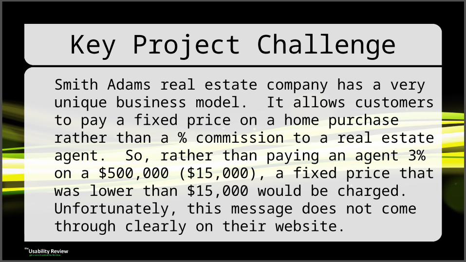
Key Project ChallengeSmith Adams real estate company has a very unique business model. It allows customers to pay a fixed price on a home purchase rather than a % commission to a real estate agent. So, rather than paying an agent 3% on a $500,000 ($15,000), a fixed price that was lower than $15,000 would be charged. Unfortunately, this message does not come through clearly on their website.
2
1
3
4
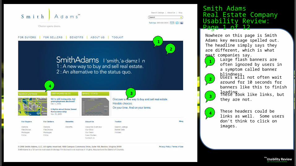
Smith AdamsReal Estate CompanyUsability Review: Page 1 of 12
1 Large flash banners are often ignored by users in a symptom called banner blindness.
2 Users will not often wait around for 10 seconds for banners like this to finish loading.
3 These look like links, but they are not.
These headers could be links as well. Some users don’t think to click on images.
4
Nowhere on this page is Smith Adams key message spelled out. The headline simply says they are different, which is what most companies say.
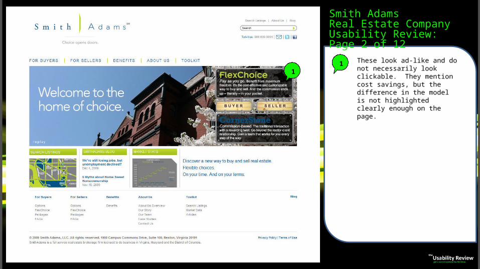
Smith AdamsReal Estate CompanyUsability Review: Page 2 of 12
11 These look ad-like and do not
necessarily look clickable. They mention cost savings, but the difference in the model is not highlighted clearly enough on the page.
1
2
1
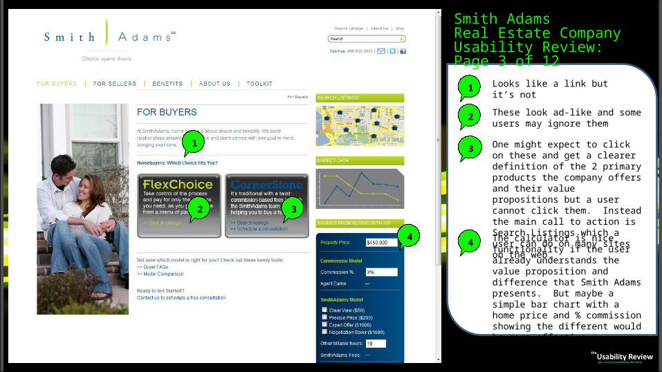
Looks like a link but it’s not
2 These look ad-like and some users may ignore them
3
4
3 One might expect to click on these and get a clearer definition of the 2 primary products the company offers and their value propositions but a user cannot click them. Instead the main call to action is Search Listings which a user can do on many sites on the web.
The calculator is nice functionality if the user already understands the value proposition and difference that Smith Adams presents. But maybe a simple bar chart with a home price and % commission showing the different would be more effective.
4
Smith AdamsReal Estate CompanyUsability Review: Page 3 of 12
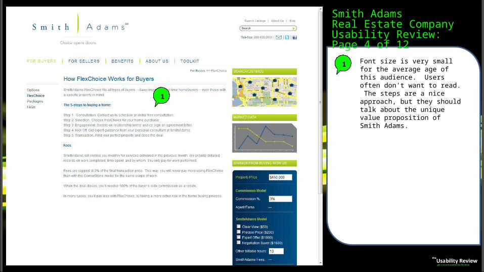
1 Font size is very small for the average age of this audience. Users often don't want to read. The steps are a nice approach, but they should talk about the unique value proposition of Smith Adams.
Smith AdamsReal Estate CompanyUsability Review: Page 4 of 12
1
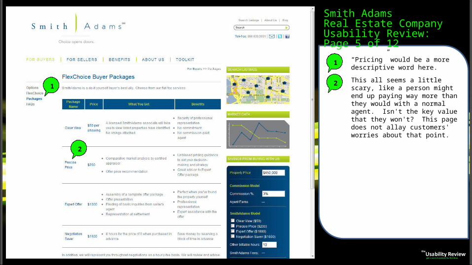
1 “Pricing” would be a more descriptive word here.
2 This all seems a little scary, like a person might end up paying way more than they would with a normal agent. Isn't the key value that they won't? This page does not allay customers' worries about that point.
Smith AdamsReal Estate CompanyUsability Review: Page 5 of 12
1
2
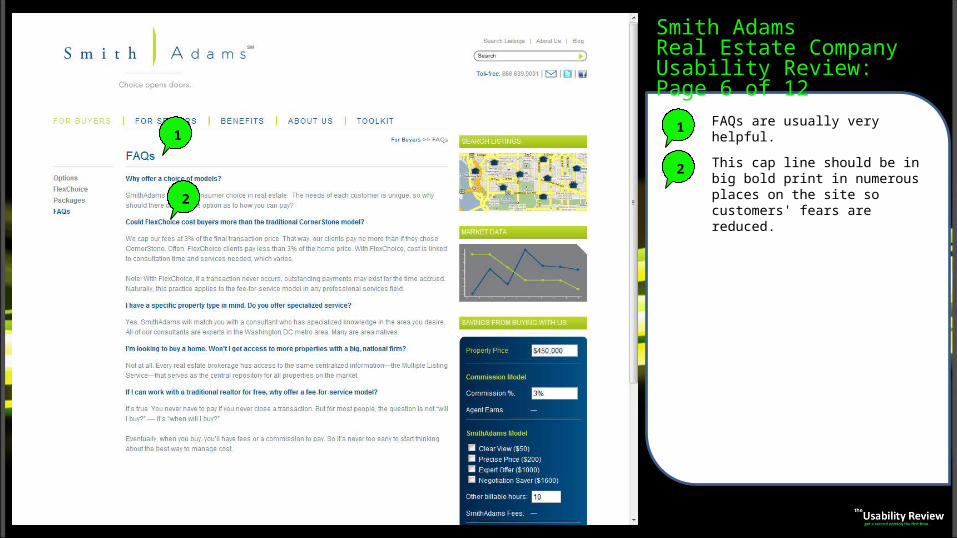
1 FAQs are usually very helpful.
2 This cap line should be in big bold print in numerous places on the site so customers' fears are reduced.
Smith AdamsReal Estate CompanyUsability Review: Page 6 of 12
1
2
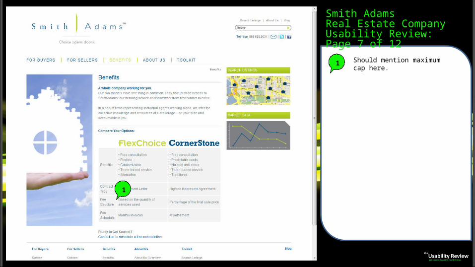
1 Should mention maximum cap here.
Smith AdamsReal Estate CompanyUsability Review: Page 7 of 12
1
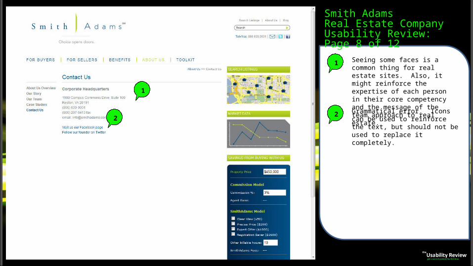
1 Seeing some faces is a common thing for real estate sites. Also, it might reinforce the expertise of each person in their core competency and the message of the team approach to real estate.
2 Grammatical error. Icons can be used to reinforce the text, but should not be used to replace it completely.
Smith AdamsReal Estate CompanyUsability Review: Page 8 of 12
1
2
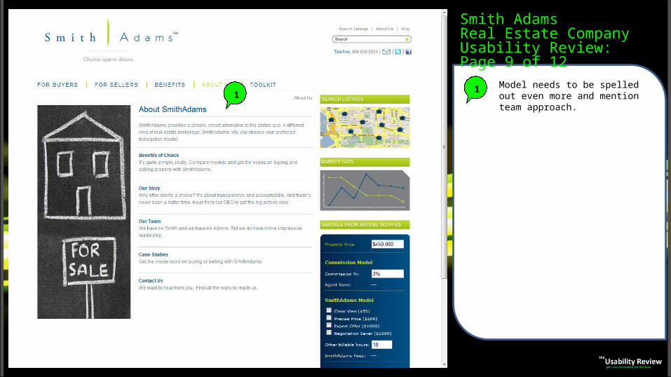
1 Model needs to be spelled out even more and mention team approach.
Smith AdamsReal Estate CompanyUsability Review: Page 9 of 12
1
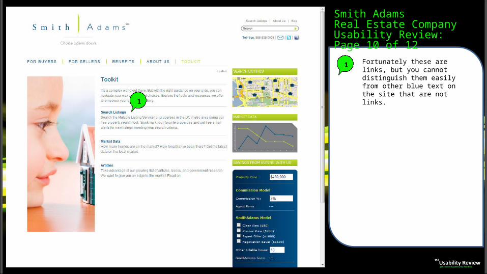
1 Fortunately these are links, but you cannot distinguish them easily from other blue text on the site that are not links.
Smith AdamsReal Estate CompanyUsability Review: Page 10 of 12
1
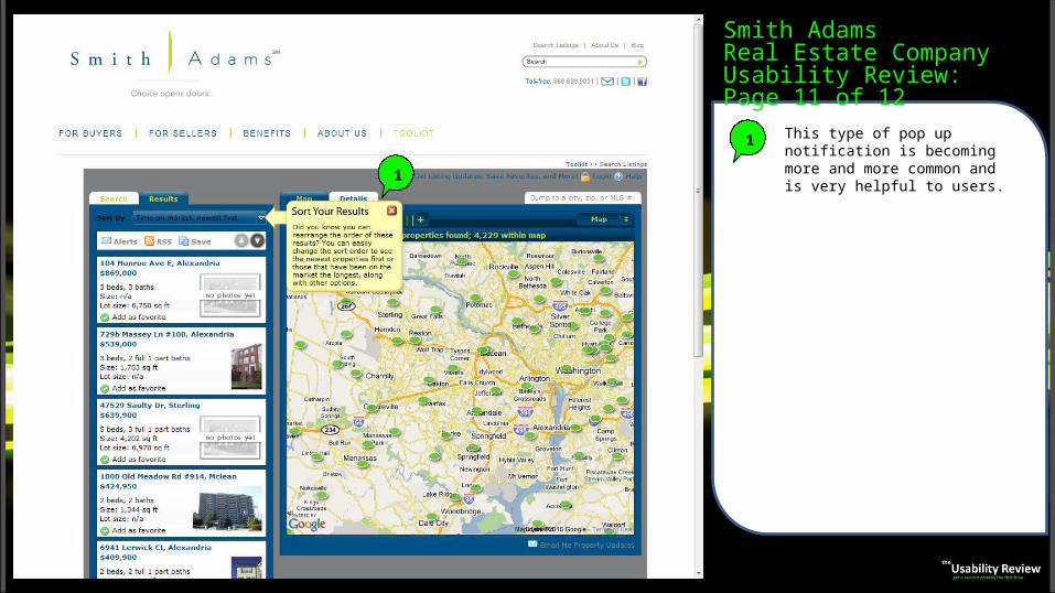
1 This type of pop up notification is becoming more and more common and is very helpful to users.
Smith AdamsReal Estate CompanyUsability Review: Page 11 of 12
1
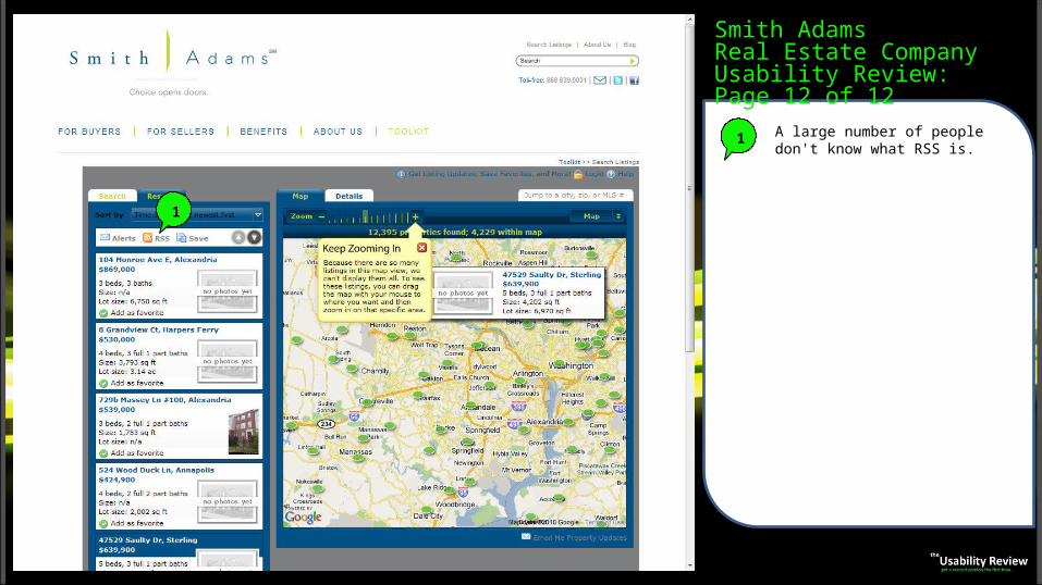
1 A large number of people don't know what RSS is.
Smith AdamsReal Estate CompanyUsability Review: Page 12 of 12
1
About The Usability ReviewWe help to make websites and applications user friendly and intuitive. Better usability leads to higher conversion rates, more
opt-ins, higher sales and more effective websites & applications. The return on investment for usability improvements is typically very dramatic. Our services range from simple usability reviews in order to identify your key problem areas up to full redesigns of your website or application.
Scott Barnard, founder of The Usability Review, has two degrees from MIT. Scott’s work includes the Webby award-winning HP Creative Studio and the Addy award-winning Iron Man site for LG www.insidethesuit.com. Scott has worked with many top web companies and Fortune 100 companies, including HP, LG, PayPal, Stryker, AIG, Bank of America, Capital One, Emirates Airlines, Orbitz, AOL, AAA, TruGreen and numerous others. Despite the company’s maturity, the usability redesign of PayPal’s Merchant Services website resulted in a roughly 20% increase in conversions and 40% increased usage of the product post-conversion.
For more information or to contact us, feel free to call, email or fill out our web form for a free quote:
phone: 1-888-876-5553email: [email protected] quote: http://www.theusabilityreview.com/website-landing-contact.aspx