Embed Size (px)
Citation preview
SLIDE 2- Colin Rowe • I billed this talk as copying some of Colin Rowe’s Mathematics of the
Ideal Villa techniques to analyze and compare two very different urban public spaces, Boston’s Creek Square and Siena’s Piazza del Campo. What do I mean by that?
• For those who don’t know, Rowe was a British-born naturalized American architectural historian, critic, theoretician, and most importantly a teacher. He was influential as mentor to many architects of the 1970’s.
• Rowe’s speculative and at the time avant garde view of architectural history, comparison, and analysis was not a continuous evolution of form tied to dates, influences, and styles. Rowe looked at architectural artifacts; buildings and cities, in a simultaneous non-linear, non-chronological way.
• I’ll point out that I mimic his approach with some justification as Fred Koetter was Rowe’s student and co-author of their book Collage City, and I was Fred’s student (and worked for Koetter Kim Architects for five years).
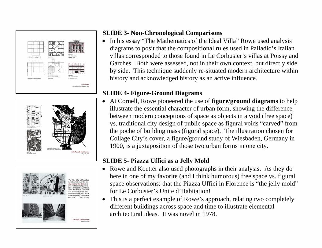
SLIDE 3- Non-Chronological Comparisons • In his essay “The Mathematics of the Ideal Villa” Rowe used analysis
diagrams to posit that the compositional rules used in Palladio’s Italian villas corresponded to those found in Le Corbusier’s villas at Poissy and Garches. Both were assessed, not in their own context, but directly side by side. This technique suddenly re-situated modern architecture within history and acknowledged history as an active influence.
SLIDE 4- Figure-Ground Diagrams • At Cornell, Rowe pioneered the use of figure/ground diagrams to help
illustrate the essential character of urban form, showing the difference between modern conceptions of space as objects in a void (free space) vs. traditional city design of public space as figural voids “carved” from the poche of building mass (figural space). The illustration chosen for Collage City’s cover, a figure/ground study of Wiesbaden, Germany in 1900, is a juxtaposition of those two urban forms in one city.
SLIDE 5- Piazza Uffici as a Jelly Mold • Rowe and Koetter also used photographs in their analysis. As they do
here in one of my favorite (and I think humorous) free space vs. figural space observations: that the Piazza Uffici in Florence is “the jelly mold” for Le Corbusier’s Unite d’Habitation!
• This is a perfect example of Rowe’s approach, relating two completely different buildings across space and time to illustrate elemental architectural ideas. It was novel in 1978.
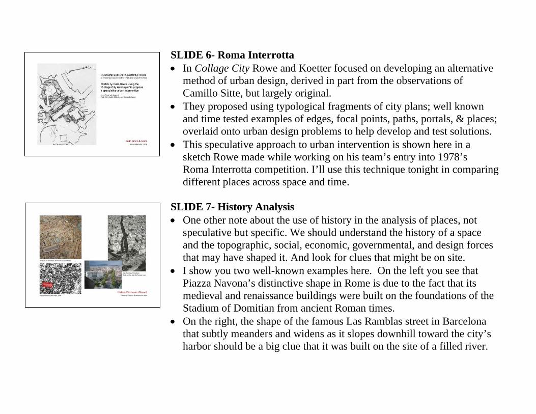
SLIDE 6- Roma Interrotta • In Collage City Rowe and Koetter focused on developing an alternative
method of urban design, derived in part from the observations of Camillo Sitte, but largely original.
• They proposed using typological fragments of city plans; well known and time tested examples of edges, focal points, paths, portals, & places; overlaid onto urban design problems to help develop and test solutions.
• This speculative approach to urban intervention is shown here in a sketch Rowe made while working on his team’s entry into 1978’s Roma Interrotta competition. I’ll use this technique tonight in comparing different places across space and time.
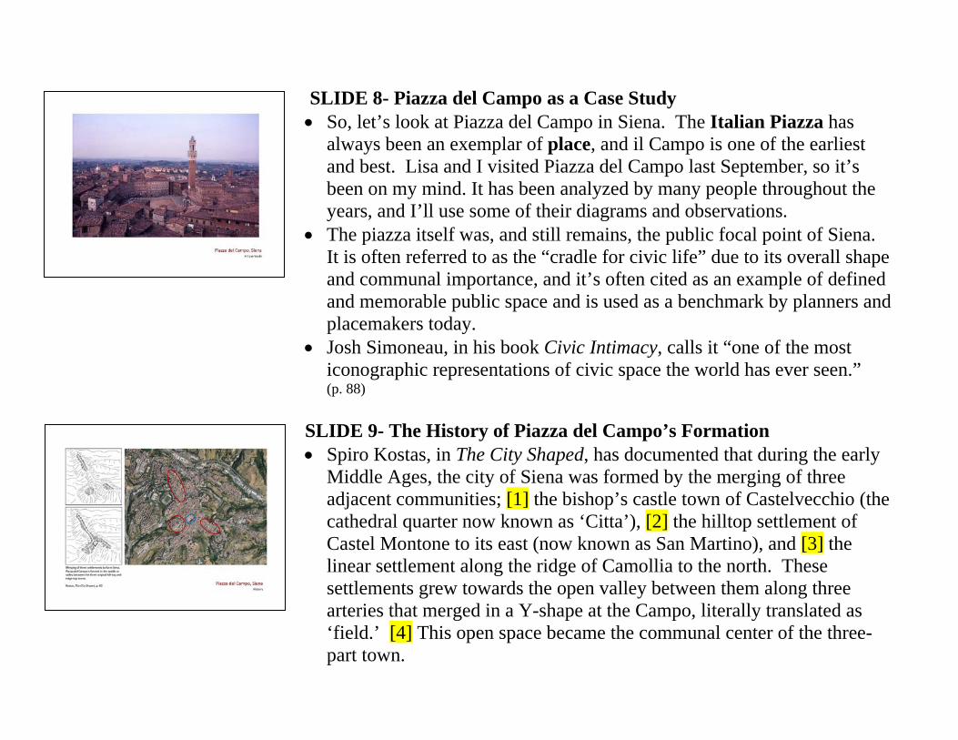
SLIDE 7- History Analysis • One other note about the use of history in the analysis of places, not
speculative but specific. We should understand the history of a space and the topographic, social, economic, governmental, and design forces that may have shaped it. And look for clues that might be on site.
• I show you two well-known examples here. On the left you see that Piazza Navona’s distinctive shape in Rome is due to the fact that its medieval and renaissance buildings were built on the foundations of the Stadium of Domitian from ancient Roman times.
• On the right, the shape of the famous Las Ramblas street in Barcelona that subtly meanders and widens as it slopes downhill toward the city’s harbor should be a big clue that it was built on the site of a filled river.
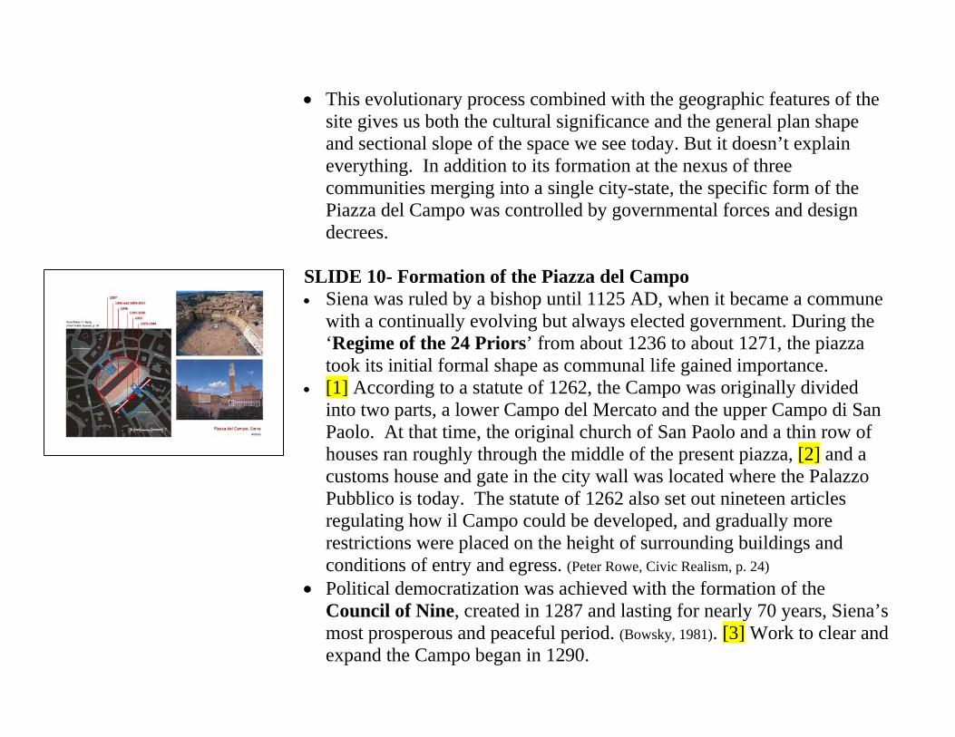
SLIDE 8- Piazza del Campo as a Case Study • So, let’s look at Piazza del Campo in Siena. The Italian Piazza has
always been an exemplar of place, and il Campo is one of the earliest and best. Lisa and I visited Piazza del Campo last September, so it’s been on my mind. It has been analyzed by many people throughout the years, and I’ll use some of their diagrams and observations.
• The piazza itself was, and still remains, the public focal point of Siena. It is often referred to as the “cradle for civic life” due to its overall shape and communal importance, and it’s often cited as an example of defined and memorable public space and is used as a benchmark by planners and placemakers today.
• Josh Simoneau, in his book Civic Intimacy, calls it “one of the most iconographic representations of civic space the world has ever seen.” (p. 88)
SLIDE 9- The History of Piazza del Campo’s Formation • Spiro Kostas, in The City Shaped, has documented that during the early
Middle Ages, the city of Siena was formed by the merging of three adjacent communities; [1] the bishop’s castle town of Castelvecchio (the cathedral quarter now known as ‘Citta’), [2] the hilltop settlement of Castel Montone to its east (now known as San Martino), and [3] the linear settlement along the ridge of Camollia to the north. These settlements grew towards the open valley between them along three arteries that merged in a Y-shape at the Campo, literally translated as ‘field.’ [4] This open space became the communal center of the three-part town.
• This evolutionary process combined with the geographic features of the site gives us both the cultural significance and the general plan shape and sectional slope of the space we see today. But it doesn’t explain everything. In addition to its formation at the nexus of three communities merging into a single city-state, the specific form of the Piazza del Campo was controlled by governmental forces and design decrees.
SLIDE 10- Formation of the Piazza del Campo • Siena was ruled by a bishop until 1125 AD, when it became a commune
with a continually evolving but always elected government. During the ‘Regime of the 24 Priors’ from about 1236 to about 1271, the piazza took its initial formal shape as communal life gained importance.
• [1] According to a statute of 1262, the Campo was originally divided into two parts, a lower Campo del Mercato and the upper Campo di San Paolo. At that time, the original church of San Paolo and a thin row of houses ran roughly through the middle of the present piazza, [2] and a customs house and gate in the city wall was located where the Palazzo Pubblico is today. The statute of 1262 also set out nineteen articles regulating how il Campo could be developed, and gradually more restrictions were placed on the height of surrounding buildings and conditions of entry and egress. (Peter Rowe, Civic Realism, p. 24)
• Political democratization was achieved with the formation of the Council of Nine, created in 1287 and lasting for nearly 70 years, Siena’s most prosperous and peaceful period. (Bowsky, 1981). [3] Work to clear and expand the Campo began in 1290.
• The Nine drew up design ordinances that gave Siena distinctive streets and architecture. They were particularly concerned with il Campo, and their ordinances of 1297 required bifurcated windows and specific architectural features. These regulations gave it a unified appearance that is not typical of most medieval piazzas.
• Paul Zucker, in Town and Square, writes that these are some of the earliest examples of design regulations anywhere in the world.(Zucker,p.87)
• [4] The rough semi-circle uphill perimeter of the piazza was largely in place by this time, but the ordinance of 1297 affected the final form of its buildings, the palazzi of the most important families in medieval Siena. Because of the ordinance they share common rooflines, in contrast to the tower houses of rival families that can be seen most notably in San Gimignano and other Tuscan towns. [5] At the center of this arc is the Casino dei Nobili, a prestigious communal social club.
• [6] The Palazzo Pubblico, Siena’s City Hall, was completed between 1297 and 1310. [7] Its adjoining Torre del Mangia was begun in 1325 and completed in 1344. It is so named for Giovanni di Duccio, popularly known as the “profit eater,” because his role ringing the tower’s bells was considered a superfluous ceremonial frill; eventually simplified to “the eater”as he grew fat on his government stipend. [8] At the base of the tower, the protruding 1352 chapel was built to commemorate the end of the black plague.
• [9] In 1343 the Fonte Gaia (fountain of joy) was constructed; fed by a 20 kilometer aqueduct, it celebrated Siena’s overcoming its dependence on external sources of water. It was originally built on one of the ‘costole,’ or paving ribs, but was then moved to the central segment.
• [10] Installed in 1346, the radially segmented fishbone brick pattern and costole divides the paving into nine sections, symbolic of the “Council of Nine” and their unifying rules. (Barbara Lien) They radiate from the lowest point of the paving at the Gavinone, a sculptured central drain.
• Piazza del Campo was declared a UNESCO World Heritage Site in 1995. Its evolution is a good example of both intentional design planning and of ‘Placemaking Darwinism,’ in which unsuccessful designs get tossed and successful ones survive.
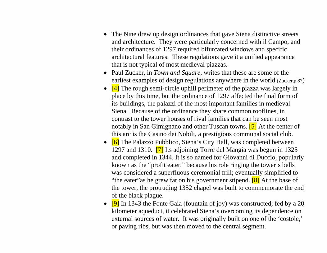
SLIDE 11- Plan Analysis: Piazza del Campo Dimensions • So much for its history. Let’s analyze the space. • [1] It is 395 feet along its southern end and about 340 feet along its north
end. Its cross-axis measures about 328 feet at the widest point. • [2] If we overlay a pure semi-circle, we can demonstrate the degree to
which its shell shape deviates. I’ve chosen to overlay it at the change in paving outlined by bollards, where the piazza has the greatest conformance with the pure semi-circle.
• [3] We then add arrows showing the 11 entrances to the space. At Piazza del Campo, they are all controlled, pedestrian streets and staircases. This is a distinctive and experientially important feature that I’ll talk about in greater detail shortly.
• [4] We’ll locate the important features within the space; the Torre del Mangia and Cappella di Piazza, [5] and the Fonte Gaia and Gavinone. These serve as visual focal points, eye targets if you will.
• [6] Finally we’ll make note of a linked space, the downhill piazza that served as the site of Siena’s public market.
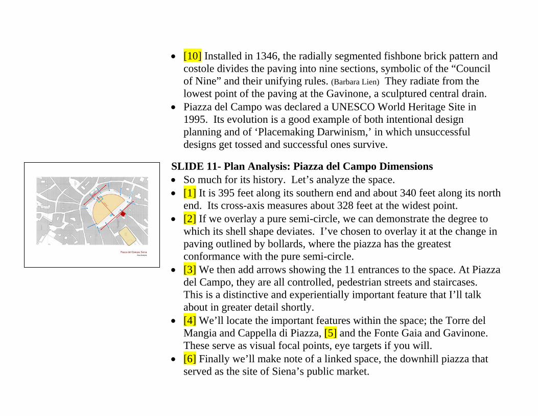
SLIDE 12- Plan Analysis: Path Portal Place • A key to successful placemaking is a strongly articulated degree of
enclosure, and at il Campo this is emphasized by the access points through that enclosure.
• Borrowing from the title of a book by Edward T. White, I’ll call this Path-Portal-Place. It has to do with the sequence of entering a defined space, the proportions of the elements in that sequence, and the contrast in those proportions.
• White maintains that, to one degree or another, all public spaces can be categorized as either path, portal, or place. Paths are linear spaces that imply or aid movement, portals are defined and constricted junctions along paths, places are more equilateral spaces that imply stasis; they have proportions and features that encourage you to stop and linger.
• At Piazza del Campo, there are 11 defined ways into and out of the public space. Given their linear proportions, and their uses as streets or public stairways, the 11 routes leading to the piazza certainly read as paths. Given the almost total enclosure of the piazza by building walls, it’s amphitheater shape, and its communal uses; the piazza can certainly be considered a destination or place. So now let’s focus on the nature of the intersection between them, the portals.
• On the bottom left you see a photographic study of these eleven portals as they appear in the perimeter wall of the piazza. At the top are five of the eleven, photographed looking in, showing their focus on the Palazzo Pubblico and its tower.
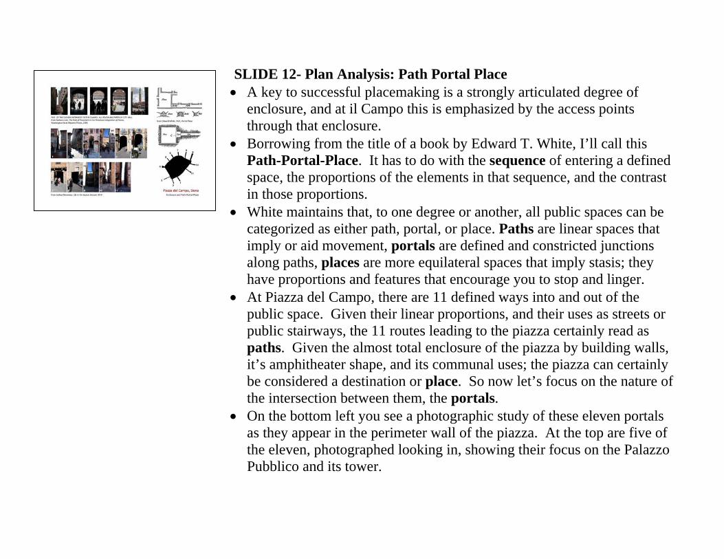
SLIDE 13- Plan Analysis: Path Portal Place 2 • And on this slide you see another photographic study of 5 of the 11
portals showing their constriction and spatial definition. • Many analysts of Piazza del Campo have pointed out the contribution
that the strong definition of these portals makes to not only the sense of enclosure when one is ‘inside’ the piazza, but also to the sense of anticipation created by the attenuation of the paths as one approaches, the heightened contrast of shadows in the portals with the piazza’s bright sunlight, and of the sense of compression and release kinesthetically felt when moving through the portals. All these combine to define the piazza as something very distinct from the city spaces around it.
SLIDE 14- Section Analysis • Edward White uses the word ‘container’ as a synonym for the
characteristics of spatial enclosure. His diagram, lower left, emphasizes that a public space’s container is determined as much by its vertical section as by its horizontal plan. In fact, the section can be thought of as a vertical figure-ground diagram.
• At Piazza del Campo, the surrounding buildings have a roughly uniform cornice height of 95 feet above the piazza’s perimeter. When compared to the north-south width of 328 feet, this can be expressed as a height-to-width ratio of 1 to 3 ½.
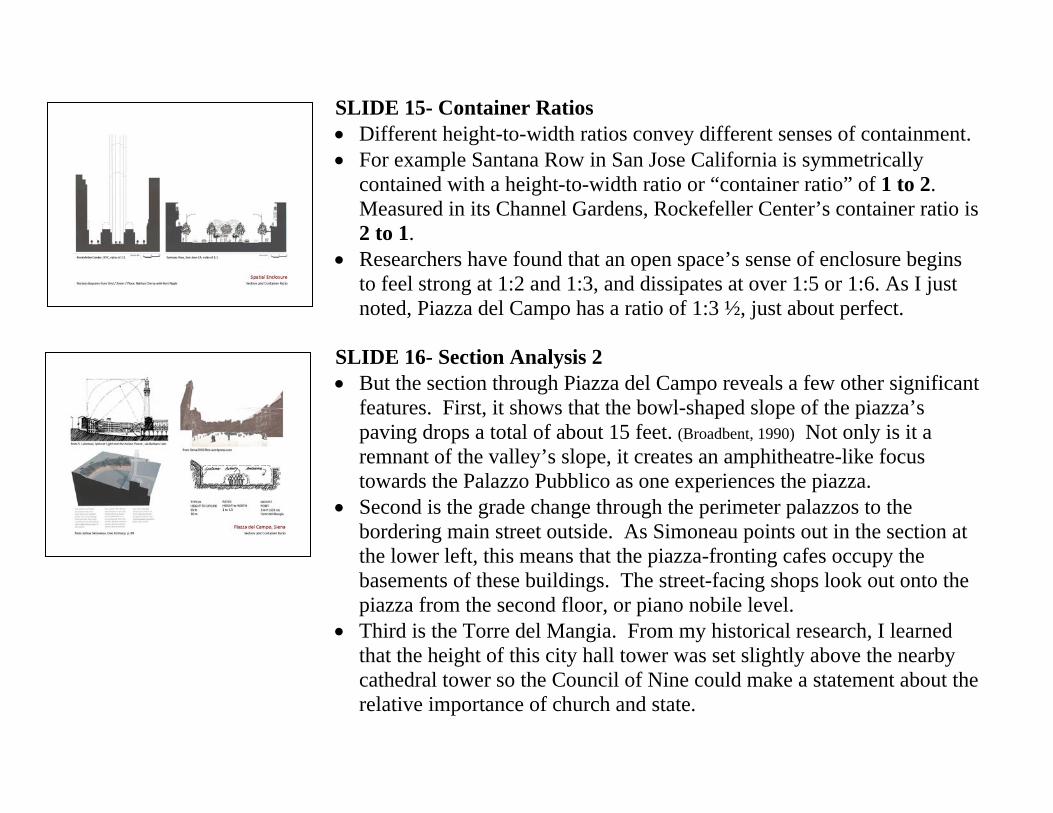
SLIDE 15- Container Ratios • Different height-to-width ratios convey different senses of containment. • For example Santana Row in San Jose California is symmetrically
contained with a height-to-width ratio or “container ratio” of 1 to 2. Measured in its Channel Gardens, Rockefeller Center’s container ratio is 2 to 1.
• Researchers have found that an open space’s sense of enclosure begins to feel strong at 1:2 and 1:3, and dissipates at over 1:5 or 1:6. As I just noted, Piazza del Campo has a ratio of 1:3 ½, just about perfect.
SLIDE 16- Section Analysis 2 • But the section through Piazza del Campo reveals a few other significant
features. First, it shows that the bowl-shaped slope of the piazza’s paving drops a total of about 15 feet. (Broadbent, 1990) Not only is it a remnant of the valley’s slope, it creates an amphitheatre-like focus towards the Palazzo Pubblico as one experiences the piazza.
• Second is the grade change through the perimeter palazzos to the bordering main street outside. As Simoneau points out in the section at the lower left, this means that the piazza-fronting cafes occupy the basements of these buildings. The street-facing shops look out onto the piazza from the second floor, or piano nobile level.
• Third is the Torre del Mangia. From my historical research, I learned that the height of this city hall tower was set slightly above the nearby cathedral tower so the Council of Nine could make a statement about the relative importance of church and state.
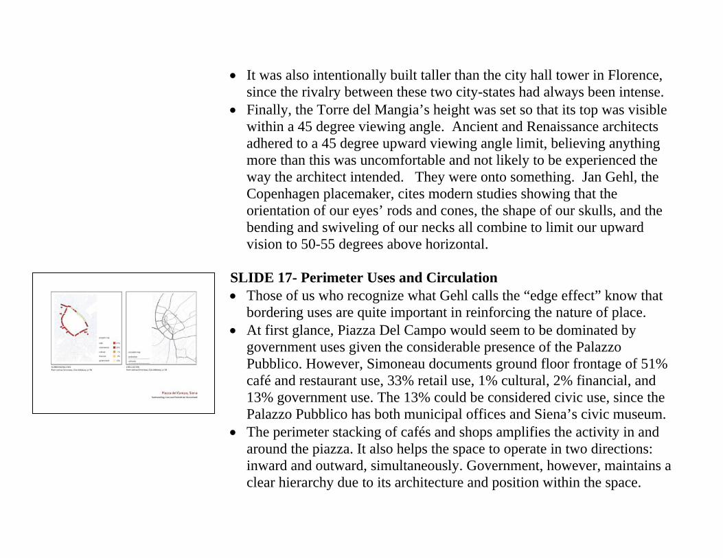
• It was also intentionally built taller than the city hall tower in Florence, since the rivalry between these two city-states had always been intense.
• Finally, the Torre del Mangia’s height was set so that its top was visible within a 45 degree viewing angle. Ancient and Renaissance architects adhered to a 45 degree upward viewing angle limit, believing anything more than this was uncomfortable and not likely to be experienced the way the architect intended. They were onto something. Jan Gehl, the Copenhagen placemaker, cites modern studies showing that the orientation of our eyes’ rods and cones, the shape of our skulls, and the bending and swiveling of our necks all combine to limit our upward vision to 50-55 degrees above horizontal.
SLIDE 17- Perimeter Uses and Circulation • Those of us who recognize what Gehl calls the “edge effect” know that
bordering uses are quite important in reinforcing the nature of place. • At first glance, Piazza Del Campo would seem to be dominated by
government uses given the considerable presence of the Palazzo Pubblico. However, Simoneau documents ground floor frontage of 51% café and restaurant use, 33% retail use, 1% cultural, 2% financial, and 13% government use. The 13% could be considered civic use, since the Palazzo Pubblico has both municipal offices and Siena’s civic museum.
• The perimeter stacking of cafés and shops amplifies the activity in and around the piazza. It also helps the space to operate in two directions: inward and outward, simultaneously. Government, however, maintains a clear hierarchy due to its architecture and position within the space.
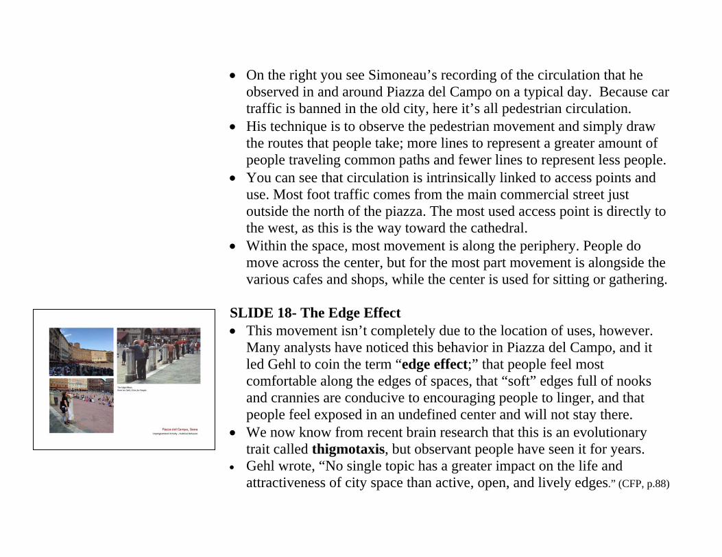
• On the right you see Simoneau’s recording of the circulation that he observed in and around Piazza del Campo on a typical day. Because car traffic is banned in the old city, here it’s all pedestrian circulation.
• His technique is to observe the pedestrian movement and simply draw the routes that people take; more lines to represent a greater amount of people traveling common paths and fewer lines to represent less people.
• You can see that circulation is intrinsically linked to access points and use. Most foot traffic comes from the main commercial street just outside the north of the piazza. The most used access point is directly to the west, as this is the way toward the cathedral.
• Within the space, most movement is along the periphery. People do move across the center, but for the most part movement is alongside the various cafes and shops, while the center is used for sitting or gathering.
SLIDE 18- The Edge Effect • This movement isn’t completely due to the location of uses, however.
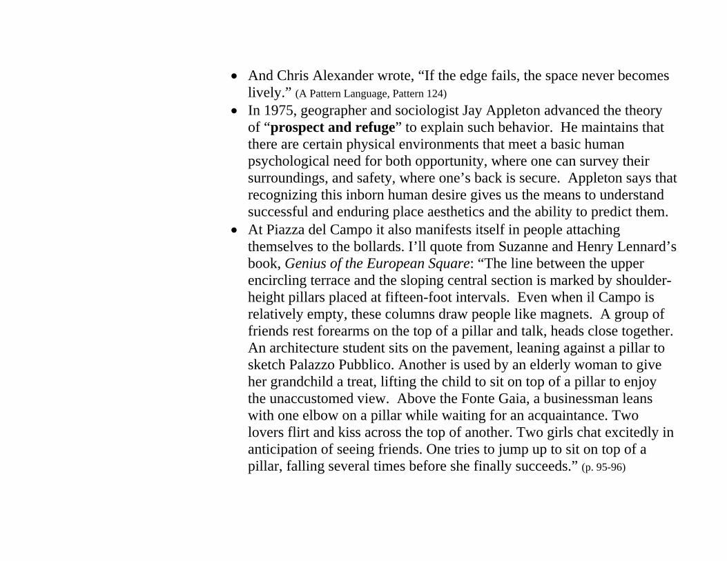
Many analysts have noticed this behavior in Piazza del Campo, and it led Gehl to coin the term “edge effect;” that people feel most comfortable along the edges of spaces, that “soft” edges full of nooks and crannies are conducive to encouraging people to linger, and that people feel exposed in an undefined center and will not stay there.
• We now know from recent brain research that this is an evolutionary trait called thigmotaxis, but observant people have seen it for years.
• Gehl wrote, “No single topic has a greater impact on the life and attractiveness of city space than active, open, and lively edges.” (CFP, p.88)
• And Chris Alexander wrote, “If the edge fails, the space never becomes lively.” (A Pattern Language, Pattern 124)
• In 1975, geographer and sociologist Jay Appleton advanced the theory of “prospect and refuge” to explain such behavior. He maintains that there are certain physical environments that meet a basic human psychological need for both opportunity, where one can survey their surroundings, and safety, where one’s back is secure. Appleton says that recognizing this inborn human desire gives us the means to understand successful and enduring place aesthetics and the ability to predict them.
• At Piazza del Campo it also manifests itself in people attaching themselves to the bollards. I’ll quote from Suzanne and Henry Lennard’s book, Genius of the European Square: “The line between the upper encircling terrace and the sloping central section is marked by shoulder-height pillars placed at fifteen-foot intervals. Even when il Campo is relatively empty, these columns draw people like magnets. A group of friends rest forearms on the top of a pillar and talk, heads close together. An architecture student sits on the pavement, leaning against a pillar to sketch Palazzo Pubblico. Another is used by an elderly woman to give her grandchild a treat, lifting the child to sit on top of a pillar to enjoy the unaccustomed view. Above the Fonte Gaia, a businessman leans with one elbow on a pillar while waiting for an acquaintance. Two lovers flirt and kiss across the top of another. Two girls chat excitedly in anticipation of seeing friends. One tries to jump up to sit on top of a pillar, falling several times before she finally succeeds.” (p. 95-96)
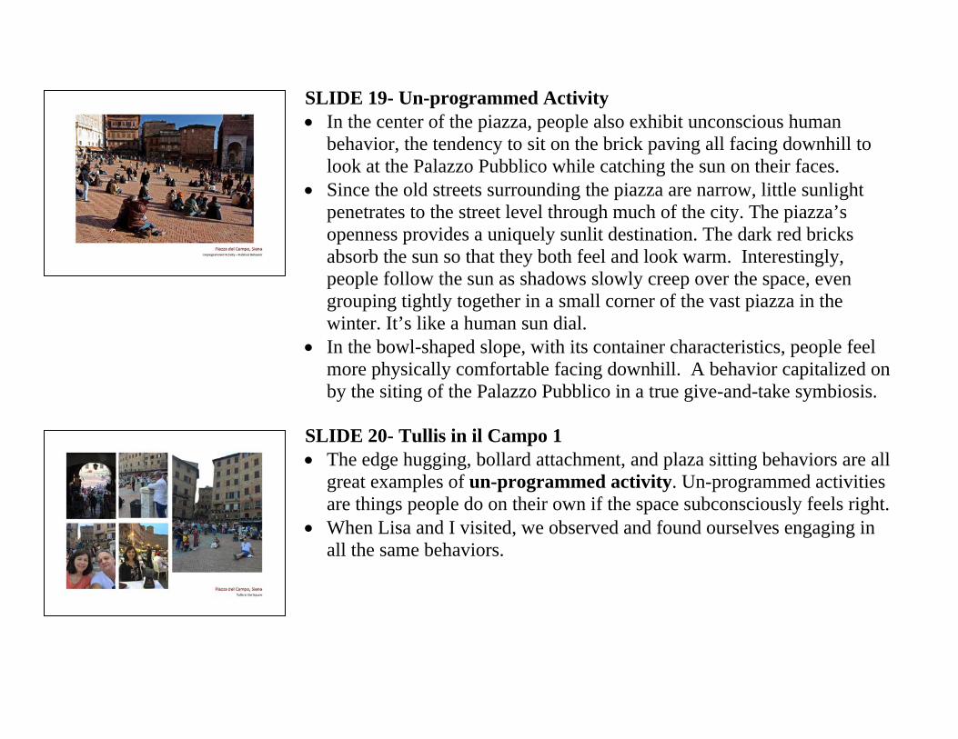
SLIDE 19- Un-programmed Activity • In the center of the piazza, people also exhibit unconscious human
behavior, the tendency to sit on the brick paving all facing downhill to look at the Palazzo Pubblico while catching the sun on their faces.
• Since the old streets surrounding the piazza are narrow, little sunlight penetrates to the street level through much of the city. The piazza’s openness provides a uniquely sunlit destination. The dark red bricks absorb the sun so that they both feel and look warm. Interestingly, people follow the sun as shadows slowly creep over the space, even grouping tightly together in a small corner of the vast piazza in the winter. It’s like a human sun dial.
• In the bowl-shaped slope, with its container characteristics, people feel more physically comfortable facing downhill. A behavior capitalized on by the siting of the Palazzo Pubblico in a true give-and-take symbiosis.
SLIDE 20- Tullis in il Campo 1 • The edge hugging, bollard attachment, and plaza sitting behaviors are all
great examples of un-programmed activity. Un-programmed activities are things people do on their own if the space subconsciously feels right.
• When Lisa and I visited, we observed and found ourselves engaging in all the same behaviors.
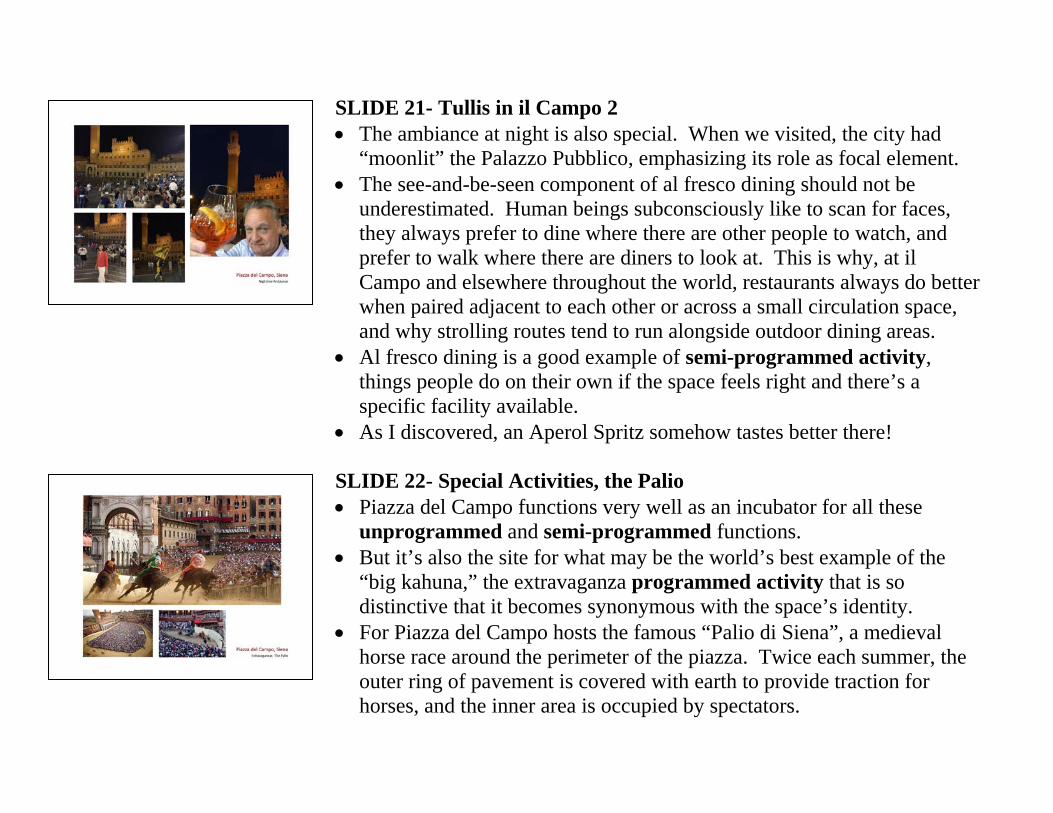
SLIDE 21- Tullis in il Campo 2 • The ambiance at night is also special. When we visited, the city had
“moonlit” the Palazzo Pubblico, emphasizing its role as focal element. • The see-and-be-seen component of al fresco dining should not be
underestimated. Human beings subconsciously like to scan for faces, they always prefer to dine where there are other people to watch, and prefer to walk where there are diners to look at. This is why, at il Campo and elsewhere throughout the world, restaurants always do better when paired adjacent to each other or across a small circulation space, and why strolling routes tend to run alongside outdoor dining areas.
• Al fresco dining is a good example of semi-programmed activity, things people do on their own if the space feels right and there’s a specific facility available.
• As I discovered, an Aperol Spritz somehow tastes better there! SLIDE 22- Special Activities, the Palio • Piazza del Campo functions very well as an incubator for all these
unprogrammed and semi-programmed functions. • But it’s also the site for what may be the world’s best example of the
“big kahuna,” the extravaganza programmed activity that is so distinctive that it becomes synonymous with the space’s identity.
• For Piazza del Campo hosts the famous “Palio di Siena”, a medieval horse race around the perimeter of the piazza. Twice each summer, the outer ring of pavement is covered with earth to provide traction for horses, and the inner area is occupied by spectators.
• Ten horses and riders representing the a randomly selected ten of the seventeen city neighborhoods or districts, called contrada, participate. It would be like a bareback race between Boston’s South End, Back Bay, North End, Southie, and Fenway. With wagering and cheating!
• Many observers have noted that the Palio is the catalyst for the intense neighborhood social involvement that leads to Siena’s strong identity.
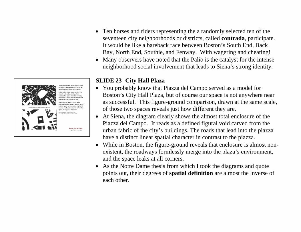
SLIDE 23- City Hall Plaza • You probably know that Piazza del Campo served as a model for
Boston’s City Hall Plaza, but of course our space is not anywhere near as successful. This figure-ground comparison, drawn at the same scale, of those two spaces reveals just how different they are.
• At Siena, the diagram clearly shows the almost total enclosure of the Piazza del Campo. It reads as a defined figural void carved from the urban fabric of the city’s buildings. The roads that lead into the piazza have a distinct linear spatial character in contrast to the piazza.
• While in Boston, the figure-ground reveals that enclosure is almost non-existent, the roadways formlessly merge into the plaza’s environment, and the space leaks at all corners.
• As the Notre Dame thesis from which I took the diagrams and quote points out, their degrees of spatial definition are almost the inverse of each other.
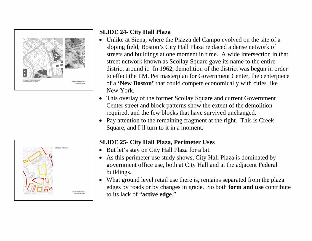
SLIDE 24- City Hall Plaza • Unlike at Siena, where the Piazza del Campo evolved on the site of a
sloping field, Boston’s City Hall Plaza replaced a dense network of streets and buildings at one moment in time. A wide intersection in that street network known as Scollay Square gave its name to the entire district around it. In 1962, demolition of the district was begun in order to effect the I.M. Pei masterplan for Government Center, the centerpiece of a ‘New Boston’ that could compete economically with cities like New York.
• This overlay of the former Scollay Square and current Government Center street and block patterns show the extent of the demolition required, and the few blocks that have survived unchanged.
• Pay attention to the remaining fragment at the right. This is Creek Square, and I’ll turn to it in a moment.
SLIDE 25- City Hall Plaza, Perimeter Uses • But let’s stay on City Hall Plaza for a bit. • As this perimeter use study shows, City Hall Plaza is dominated by
government office use, both at City Hall and at the adjacent Federal buildings.
• What ground level retail use there is, remains separated from the plaza edges by roads or by changes in grade. So both form and use contribute to its lack of “active edge.”
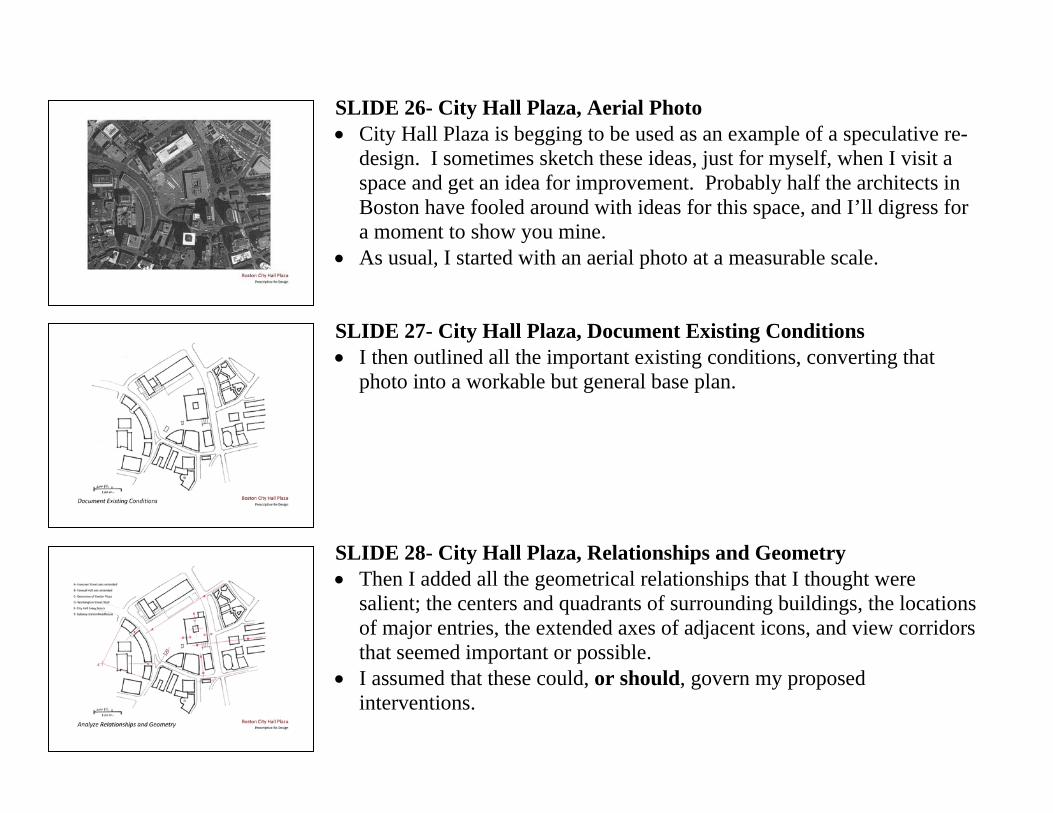
SLIDE 26- City Hall Plaza, Aerial Photo • City Hall Plaza is begging to be used as an example of a speculative re-
design. I sometimes sketch these ideas, just for myself, when I visit a space and get an idea for improvement. Probably half the architects in Boston have fooled around with ideas for this space, and I’ll digress for a moment to show you mine.
• As usual, I started with an aerial photo at a measurable scale. SLIDE 27- City Hall Plaza, Document Existing Conditions • I then outlined all the important existing conditions, converting that
photo into a workable but general base plan. SLIDE 28- City Hall Plaza, Relationships and Geometry • Then I added all the geometrical relationships that I thought were
salient; the centers and quadrants of surrounding buildings, the locations of major entries, the extended axes of adjacent icons, and view corridors that seemed important or possible.
• I assumed that these could, or should, govern my proposed interventions.
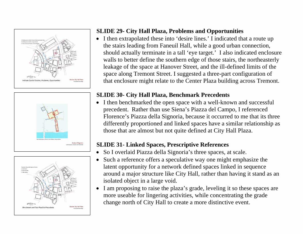
SLIDE 29- City Hall Plaza, Problems and Opportunities • I then extrapolated these into ‘desire lines.’ I indicated that a route up
the stairs leading from Faneuil Hall, while a good urban connection, should actually terminate in a tall ‘eye target.’ I also indicated enclosure walls to better define the southern edge of those stairs, the northeasterly leakage of the space at Hanover Street, and the ill-defined limits of the space along Tremont Street. I suggested a three-part configuration of that enclosure might relate to the Center Plaza building across Tremont.
SLIDE 30- City Hall Plaza, Benchmark Precedents • I then benchmarked the open space with a well-known and successful
precedent. Rather than use Siena’s Piazza del Campo, I referenced Florence’s Piazza della Signoria, because it occurred to me that its three differently proportioned and linked spaces have a similar relationship as those that are almost but not quite defined at City Hall Plaza.
SLIDE 31- Linked Spaces, Prescriptive References • So I overlaid Piazza della Signoria’s three spaces, at scale. • Such a reference offers a speculative way one might emphasize the
latent opportunity for a network defined spaces linked in sequence around a major structure like City Hall, rather than having it stand as an isolated object in a large void.
• I am proposing to raise the plaza’s grade, leveling it so these spaces are more useable for lingering activities, while concentrating the grade change north of City Hall to create a more distinctive event.
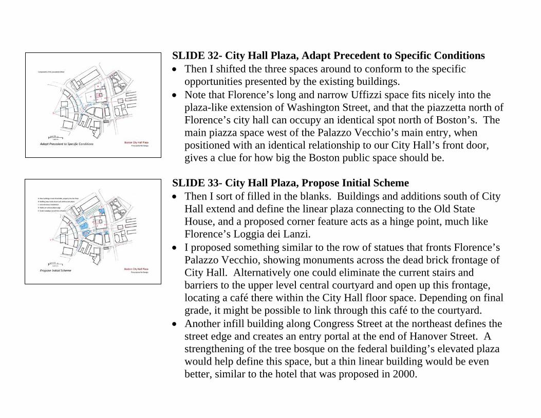
SLIDE 32- City Hall Plaza, Adapt Precedent to Specific Conditions • Then I shifted the three spaces around to conform to the specific
opportunities presented by the existing buildings. • Note that Florence’s long and narrow Uffizzi space fits nicely into the
plaza-like extension of Washington Street, and that the piazzetta north of Florence’s city hall can occupy an identical spot north of Boston’s. The main piazza space west of the Palazzo Vecchio’s main entry, when positioned with an identical relationship to our City Hall’s front door, gives a clue for how big the Boston public space should be.
SLIDE 33- City Hall Plaza, Propose Initial Scheme • Then I sort of filled in the blanks. Buildings and additions south of City
Hall extend and define the linear plaza connecting to the Old State House, and a proposed corner feature acts as a hinge point, much like Florence’s Loggia dei Lanzi.
• I proposed something similar to the row of statues that fronts Florence’s Palazzo Vecchio, showing monuments across the dead brick frontage of City Hall. Alternatively one could eliminate the current stairs and barriers to the upper level central courtyard and open up this frontage, locating a café there within the City Hall floor space. Depending on final grade, it might be possible to link through this café to the courtyard.
• Another infill building along Congress Street at the northeast defines the street edge and creates an entry portal at the end of Hanover Street. A strengthening of the tree bosque on the federal building’s elevated plaza would help define this space, but a thin linear building would be even better, similar to the hotel that was proposed in 2000.
• Finally, the biggest move is the construction of three buildings along Tremont Street to reduce the size of the main plaza and define its western edge, preventing the leakage along Tremont that now occurs. While a bit smaller than the ideal office floor plates, they are reasonable for center core commercial buildings. They could be tall and slender or about eight stories tall to match Center Plaza and create a strong street wall. In either case, the path-proportioned spaces between them could function as animated pedestrian streets if bordered on both sides of the ground floor by cafes and convenience retail, and better yet, covered with glass roofs.
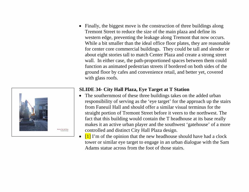
SLIDE 34- City Hall Plaza, Eye Target at T Station • The southernmost of these three buildings takes on the added urban
responsibility of serving as the ‘eye target’ for the approach up the stairs from Faneuil Hall and should offer a similar visual terminus for the straight portion of Tremont Street before it veers to the northwest. The fact that this building would contain the T headhouse at its base really makes it an active urban player and the southwest ‘gatehouse’ of a more controlled and distinct City Hall Plaza design.
• [1] I’m of the opinion that the new headhouse should have had a clock tower or similar eye target to engage in an urban dialogue with the Sam Adams statue across from the foot of those stairs.
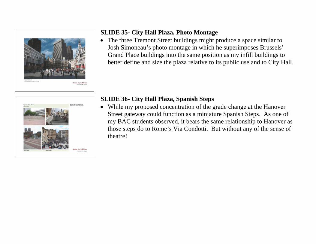
SLIDE 35- City Hall Plaza, Photo Montage • The three Tremont Street buildings might produce a space similar to
Josh Simoneau’s photo montage in which he superimposes Brussels’ Grand Place buildings into the same position as my infill buildings to better define and size the plaza relative to its public use and to City Hall.
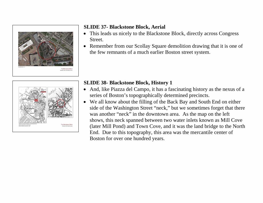
SLIDE 36- City Hall Plaza, Spanish Steps • While my proposed concentration of the grade change at the Hanover
Street gateway could function as a miniature Spanish Steps. As one of my BAC students observed, it bears the same relationship to Hanover as those steps do to Rome’s Via Condotti. But without any of the sense of theatre!
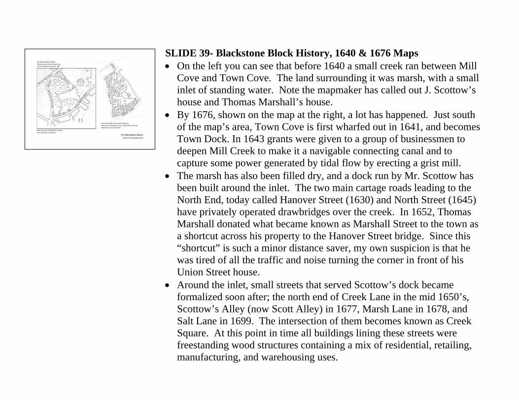
SLIDE 37- Blackstone Block, Aerial • This leads us nicely to the Blackstone Block, directly across Congress
Street. • Remember from our Scollay Square demolition drawing that it is one of
the few remnants of a much earlier Boston street system. SLIDE 38- Blackstone Block, History 1 • And, like Piazza del Campo, it has a fascinating history as the nexus of a
series of Boston’s topographically determined precincts. • We all know about the filling of the Back Bay and South End on either
side of the Washington Street “neck,” but we sometimes forget that there was another “neck” in the downtown area. As the map on the left shows, this neck spanned between two water inlets known as Mill Cove (later Mill Pond) and Town Cove, and it was the land bridge to the North End. Due to this topography, this area was the mercantile center of Boston for over one hundred years.
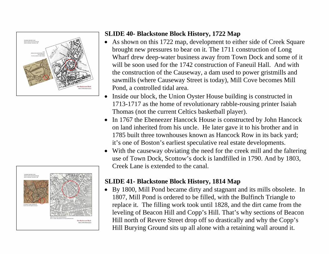
SLIDE 39- Blackstone Block History, 1640 & 1676 Maps • On the left you can see that before 1640 a small creek ran between Mill
Cove and Town Cove. The land surrounding it was marsh, with a small inlet of standing water. Note the mapmaker has called out J. Scottow’s house and Thomas Marshall’s house.
• By 1676, shown on the map at the right, a lot has happened. Just south of the map’s area, Town Cove is first wharfed out in 1641, and becomes Town Dock. In 1643 grants were given to a group of businessmen to deepen Mill Creek to make it a navigable connecting canal and to capture some power generated by tidal flow by erecting a grist mill.
• The marsh has also been filled dry, and a dock run by Mr. Scottow has been built around the inlet. The two main cartage roads leading to the North End, today called Hanover Street (1630) and North Street (1645) have privately operated drawbridges over the creek. In 1652, Thomas Marshall donated what became known as Marshall Street to the town as a shortcut across his property to the Hanover Street bridge. Since this “shortcut” is such a minor distance saver, my own suspicion is that he was tired of all the traffic and noise turning the corner in front of his Union Street house.
• Around the inlet, small streets that served Scottow’s dock became formalized soon after; the north end of Creek Lane in the mid 1650’s, Scottow’s Alley (now Scott Alley) in 1677, Marsh Lane in 1678, and Salt Lane in 1699. The intersection of them becomes known as Creek Square. At this point in time all buildings lining these streets were freestanding wood structures containing a mix of residential, retailing, manufacturing, and warehousing uses.
SLIDE 40- Blackstone Block History, 1722 Map • As shown on this 1722 map, development to either side of Creek Square
brought new pressures to bear on it. The 1711 construction of Long Wharf drew deep-water business away from Town Dock and some of it will be soon used for the 1742 construction of Faneuil Hall. And with the construction of the Causeway, a dam used to power gristmills and sawmills (where Causeway Street is today), Mill Cove becomes Mill Pond, a controlled tidal area.
• Inside our block, the Union Oyster House building is constructed in 1713-1717 as the home of revolutionary rabble-rousing printer Isaiah Thomas (not the current Celtics basketball player).
• In 1767 the Ebeneezer Hancock House is constructed by John Hancock on land inherited from his uncle. He later gave it to his brother and in 1785 built three townhouses known as Hancock Row in its back yard; it’s one of Boston’s earliest speculative real estate developments.
• With the causeway obviating the need for the creek mill and the faltering use of Town Dock, Scottow’s dock is landfilled in 1790. And by 1803, Creek Lane is extended to the canal.
SLIDE 41- Blackstone Block History, 1814 Map • By 1800, Mill Pond became dirty and stagnant and its mills obsolete. In
1807, Mill Pond is ordered to be filled, with the Bulfinch Triangle to replace it. The filling work took until 1828, and the dirt came from the leveling of Beacon Hill and Copp’s Hill. That’s why sections of Beacon Hill north of Revere Street drop off so drastically and why the Copp’s Hill Burying Ground sits up all alone with a retaining wall around it.
• This obviates the need for the mill race and canal at the former Mill Creek, and in 1814 the canal is covered with wooden planking.
• A connecting canal within the Bulfinch Triangle survives for a few years adjacent to what is now called, duh, Canal Street.
• From 1824 to1826, Town Dock is filled, and the resulting 112 acres are redeveloped for Quincy Market.
• Now with no coves left to connect, there’s not even a need for a covered canal, and in 1833 the filling of the former creek starts. The whole topographic impetus for our little Creek Square is all gone.
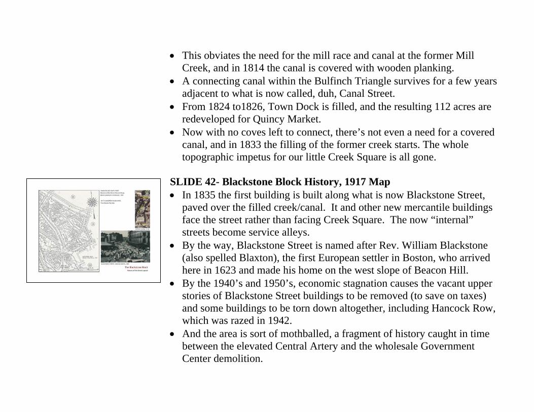
SLIDE 42- Blackstone Block History, 1917 Map • In 1835 the first building is built along what is now Blackstone Street,
paved over the filled creek/canal. It and other new mercantile buildings face the street rather than facing Creek Square. The now “internal” streets become service alleys.
• By the way, Blackstone Street is named after Rev. William Blackstone (also spelled Blaxton), the first European settler in Boston, who arrived here in 1623 and made his home on the west slope of Beacon Hill.
• By the 1940’s and 1950’s, economic stagnation causes the vacant upper stories of Blackstone Street buildings to be removed (to save on taxes) and some buildings to be torn down altogether, including Hancock Row, which was razed in 1942.
• And the area is sort of mothballed, a fragment of history caught in time between the elevated Central Artery and the wholesale Government Center demolition.
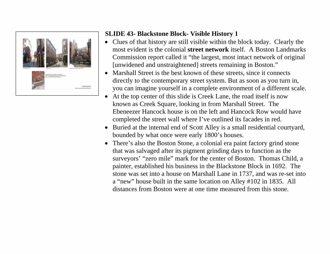
SLIDE 43- Blackstone Block- Visible History 1 • Clues of that history are still visible within the block today. Clearly the
most evident is the colonial street network itself. A Boston Landmarks Commission report called it “the largest, most intact network of original [unwidened and unstraightened] streets remaining in Boston.”
• Marshall Street is the best known of these streets, since it connects directly to the contemporary street system. But as soon as you turn in, you can imagine yourself in a complete environment of a different scale.
• At the top center of this slide is Creek Lane, the road itself is now known as Creek Square, looking in from Marshall Street. The Ebeneezer Hancock house is on the left and Hancock Row would have completed the street wall where I’ve outlined its facades in red.
• Buried at the internal end of Scott Alley is a small residential courtyard, bounded by what once were early 1800’s houses.
• There’s also the Boston Stone, a colonial era paint factory grind stone that was salvaged after its pigment grinding days to function as the surveyors’ “zero mile” mark for the center of Boston. Thomas Child, a painter, established his business in the Blackstone Block in 1692. The stone was set into a house on Marshall Lane in 1737, and was re-set into a “new” house built in the same location on Alley #102 in 1835. All distances from Boston were at one time measured from this stone.
SLIDE 44- Blackstone Block- Visible History 2 • Salt Lane and Marsh Lane may initially look like side-of-building
service alleys, but if you look carefully you can still see the house fronts that faced what were real streets of colonial era width and character.
• It would be great if, as part of the development of a new Creek Square, these house fronts could be restored and made active again.
• There are also six bracket-hung Boston Edison streetlights from the early 1900’s attached to buildings in Creek Square, three of them here on Salt Lane.
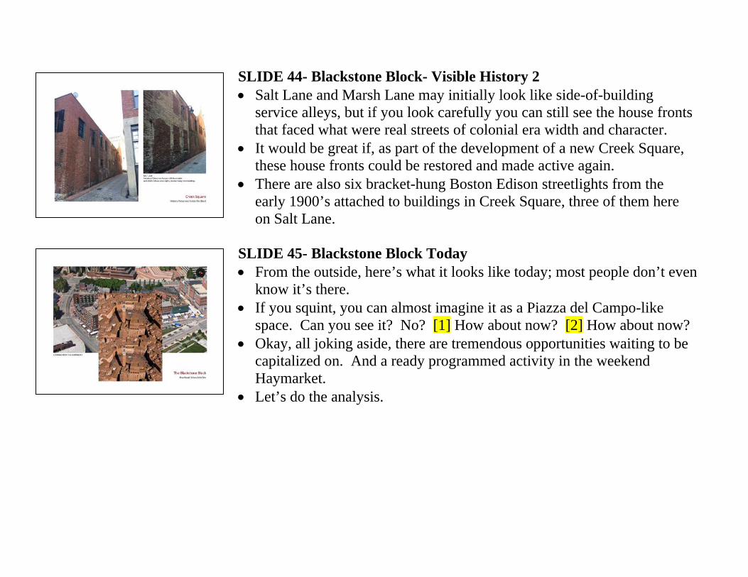
SLIDE 45- Blackstone Block Today • From the outside, here’s what it looks like today; most people don’t even
know it’s there. • If you squint, you can almost imagine it as a Piazza del Campo-like
space. Can you see it? No? [1] How about now? [2] How about now? • Okay, all joking aside, there are tremendous opportunities waiting to be
capitalized on. And a ready programmed activity in the weekend Haymarket.
• Let’s do the analysis.

SLIDE 46- Analysis of Characteristics and Opportunities • We’ll look at the open spaces first. • The Blackstone Block has an open space at its center that’s about where
the Scottow’s Dock water inlet was. [1] This space is the result of 1950’s demolition and is approximately 50’ x 120’. [2] One could imagine this space expanded to a mini-Siena of approximately 160’ x 220’. [3] There’s also a small residential courtyard captured amongst the buildings just off the SW corner of Creek Square.
• [4] The former Hancock Row parcel is vacant today. • [5] But the most distinctive feature is, again, the colonial street network,
and particularly the potential contrast of their narrow proportions to a larger central open space and the potential to create portals at their intersection.
• Clockwise from the 5 o’clock mark those streets are: (1) the extension of Creek Lane incorporated into the Bostonian Hotel and leading to North Street (2) Scott Alley, a 4’-0” wide passage that’s mostly beneath buildings, (3) Salt Lane, the original cartage path to and from Scottow’s Dock, (4) Marsh Lane, it’s near twin, (5) the oldest portion of Creek Lane entering from Marshall Street, and (6) Alley #102, which bends in between the Ebeneezer Hancock house and the backs of the extant Blackstone Street buildings.
SLIDE 47- Portals Similar to Piazza del Campo • Here’s where the real similarity to Piazza del Campo comes in. These
six small scale streets relate, or could relate, to an open central space the same way the eleven Siena streets enter the piazza.
• At the top of this slide you see five of the Siena entries and at the center you see five of the Blackstone Block streets. The compression at portals and expansion into an open space are virtually identical. This intrinsic urban feature is what drew me to make the connection between Creek Square and Piazza del Campo, and it’s the distinctive feature that I believe should be the guiding force in any speculative intervention.
• At the very bottom are two views along Alley #102, showing the sense of mystery produced by its boomerang bend and narrow throat.
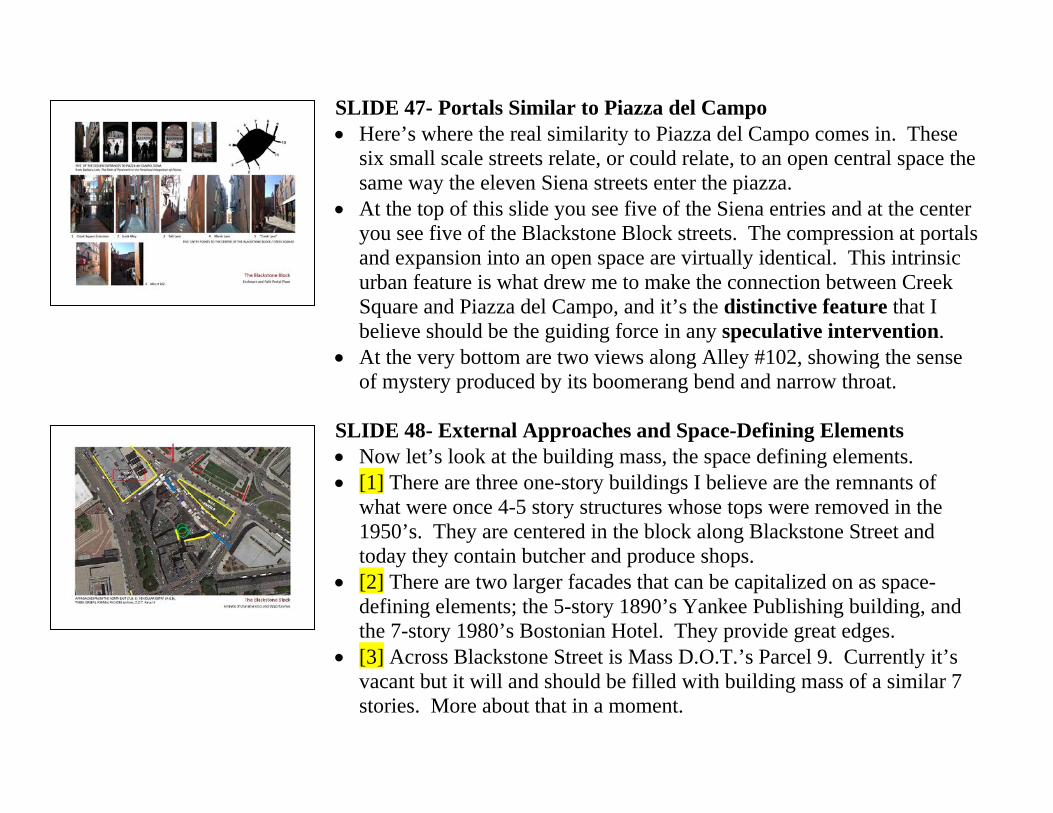
SLIDE 48- External Approaches and Space-Defining Elements • Now let’s look at the building mass, the space defining elements. • [1] There are three one-story buildings I believe are the remnants of
what were once 4-5 story structures whose tops were removed in the 1950’s. They are centered in the block along Blackstone Street and today they contain butcher and produce shops.
• [2] There are two larger facades that can be capitalized on as space-defining elements; the 5-story 1890’s Yankee Publishing building, and the 7-story 1980’s Bostonian Hotel. They provide great edges.
• [3] Across Blackstone Street is Mass D.O.T.’s Parcel 9. Currently it’s vacant but it will and should be filled with building mass of a similar 7 stories. More about that in a moment.
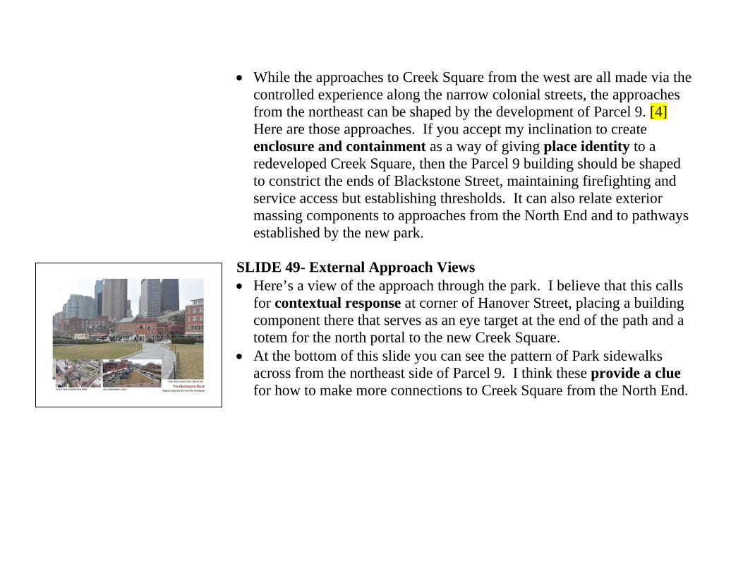
• While the approaches to Creek Square from the west are all made via the controlled experience along the narrow colonial streets, the approaches from the northeast can be shaped by the development of Parcel 9. [4] Here are those approaches. If you accept my inclination to create enclosure and containment as a way of giving place identity to a redeveloped Creek Square, then the Parcel 9 building should be shaped to constrict the ends of Blackstone Street, maintaining firefighting and service access but establishing thresholds. It can also relate exterior massing components to approaches from the North End and to pathways established by the new park.
SLIDE 49- External Approach Views • Here’s a view of the approach through the park. I believe that this calls
for contextual response at corner of Hanover Street, placing a building component there that serves as an eye target at the end of the path and a totem for the north portal to the new Creek Square.
• At the bottom of this slide you can see the pattern of Park sidewalks across from the northeast side of Parcel 9. I think these provide a clue for how to make more connections to Creek Square from the North End.
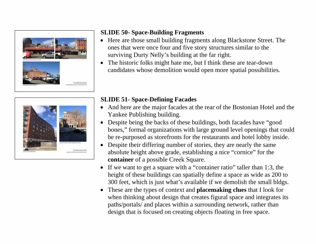
SLIDE 50- Space-Building Fragments • Here are those small building fragments along Blackstone Street. The
ones that were once four and five story structures similar to the surviving Durty Nelly’s building at the far right.
• The historic folks might hate me, but I think these are tear-down candidates whose demolition would open more spatial possibilities.
SLIDE 51- Space-Defining Facades • And here are the major facades at the rear of the Bostonian Hotel and the
Yankee Publishing building. • Despite being the backs of these buildings, both facades have “good
bones,” formal organizations with large ground level openings that could be re-purposed as storefronts for the restaurants and hotel lobby inside.
• Despite their differing number of stories, they are nearly the same absolute height above grade, establishing a nice “cornice” for the container of a possible Creek Square.
• If we want to get a square with a “container ratio” taller than 1:3, the height of these buildings can spatially define a space as wide as 200 to 300 feet, which is just what’s available if we demolish the small bldgs.
• These are the types of context and placemaking clues that I look for when thinking about design that creates figural space and integrates its paths/portals/ and places within a surrounding network, rather than design that is focused on creating objects floating in free space.
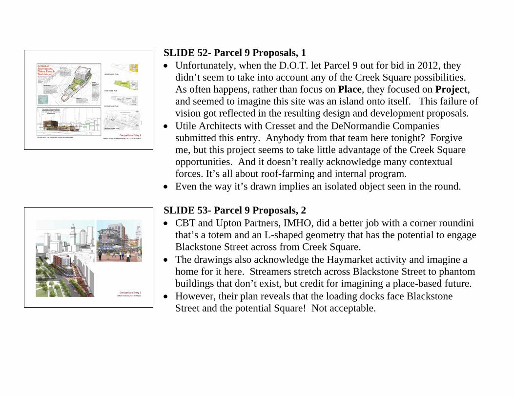
SLIDE 52- Parcel 9 Proposals, 1 • Unfortunately, when the D.O.T. let Parcel 9 out for bid in 2012, they
didn’t seem to take into account any of the Creek Square possibilities. As often happens, rather than focus on Place, they focused on Project, and seemed to imagine this site was an island onto itself. This failure of vision got reflected in the resulting design and development proposals.
• Utile Architects with Cresset and the DeNormandie Companies submitted this entry. Anybody from that team here tonight? Forgive me, but this project seems to take little advantage of the Creek Square opportunities. And it doesn’t really acknowledge many contextual forces. It’s all about roof-farming and internal program.
• Even the way it’s drawn implies an isolated object seen in the round. SLIDE 53- Parcel 9 Proposals, 2 • CBT and Upton Partners, IMHO, did a better job with a corner roundini
that’s a totem and an L-shaped geometry that has the potential to engage Blackstone Street across from Creek Square.
• The drawings also acknowledge the Haymarket activity and imagine a home for it here. Streamers stretch across Blackstone Street to phantom buildings that don’t exist, but credit for imagining a place-based future.
• However, their plan reveals that the loading docks face Blackstone Street and the potential Square! Not acceptable.
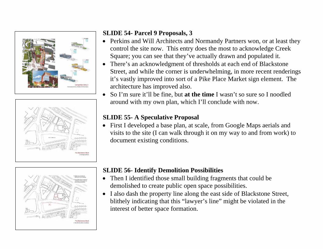
SLIDE 54- Parcel 9 Proposals, 3 • Perkins and Will Architects and Normandy Partners won, or at least they
control the site now. This entry does the most to acknowledge Creek Square; you can see that they’ve actually drawn and populated it.
• There’s an acknowledgment of thresholds at each end of Blackstone Street, and while the corner is underwhelming, in more recent renderings it’s vastly improved into sort of a Pike Place Market sign element. The architecture has improved also.
• So I’m sure it’ll be fine, but at the time I wasn’t so sure so I noodled around with my own plan, which I’ll conclude with now.
SLIDE 55- A Speculative Proposal • First I developed a base plan, at scale, from Google Maps aerials and
visits to the site (I can walk through it on my way to and from work) to document existing conditions.
SLIDE 56- Identify Demolition Possibilities • Then I identified those small building fragments that could be
demolished to create public open space possibilities. • I also dash the property line along the east side of Blackstone Street,
blithely indicating that this “lawyer’s line” might be violated in the interest of better space formation.
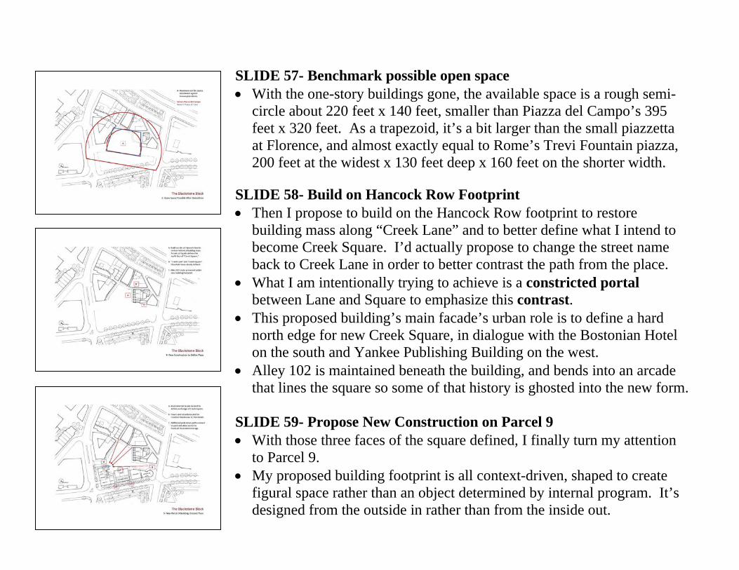
SLIDE 57- Benchmark possible open space • With the one-story buildings gone, the available space is a rough semi-
circle about 220 feet x 140 feet, smaller than Piazza del Campo’s 395 feet x 320 feet. As a trapezoid, it’s a bit larger than the small piazzetta at Florence, and almost exactly equal to Rome’s Trevi Fountain piazza, 200 feet at the widest x 130 feet deep x 160 feet on the shorter width.
SLIDE 58- Build on Hancock Row Footprint • Then I propose to build on the Hancock Row footprint to restore
building mass along “Creek Lane” and to better define what I intend to become Creek Square. I’d actually propose to change the street name back to Creek Lane in order to better contrast the path from the place.
• What I am intentionally trying to achieve is a constricted portal between Lane and Square to emphasize this contrast.
• This proposed building’s main facade’s urban role is to define a hard north edge for new Creek Square, in dialogue with the Bostonian Hotel on the south and Yankee Publishing Building on the west.
• Alley 102 is maintained beneath the building, and bends into an arcade that lines the square so some of that history is ghosted into the new form.
SLIDE 59- Propose New Construction on Parcel 9 • With those three faces of the square defined, I finally turn my attention
to Parcel 9. • My proposed building footprint is all context-driven, shaped to create
figural space rather than an object determined by internal program. It’s designed from the outside in rather than from the inside out.
• There’s a roundini at the north end (right) that exceeds the property lines a bit in an effort to constrict the Blackstone Street portal at that end. Like the CBT competition entry, it’s an eye target at the terminus of the park approach from the North End.
• I’ve created a tower element at the North Street end (left), to constrict that portal but also to create eye target for the approach along the narrow colonial streets. It serves a function similar to that of Siena’s Torre di Mangia when viewed from the entry portals of the Piazza del Campo. Protruding above the roof of my building it would also be a fabulous amenity room overlooking the new Creek Square.
• My building’s main central facade is positioned to face and formalize the spatial center of this Square. It’s articulated as a projecting element to relate in a dialogue with the other form-making facades and so that the Parcel 9 building doesn’t “slip by” the Creek Square open space, but rather registers with it at the important portion along its length.
• Pathways from park are brought through the ground floor on either side of this central facade, making more tentacle-like connections from the exterior context to the Square. These also enable storage space for the Haymarket Pushcart Association to be located against the park-side edge and yet have loading access to the Square. This park frontage, as nice as it is on the upper floors, is bad retail frontage on the ground level. And the fact that the curb is used for tourist bus parking makes it okay for storage. You have to pick one of the facades, and with the opportunities for a quality Square at the “inside,” this frontage is the least valuable. Note that I’ve located my building’s loading dock entrance on North Street opposite the parking garage, also low priority retail frontage.
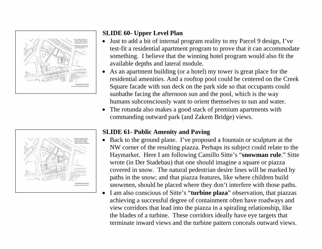
SLIDE 60- Upper Level Plan • Just to add a bit of internal program reality to my Parcel 9 design, I’ve
test-fit a residential apartment program to prove that it can accommodate something. I believe that the winning hotel program would also fit the available depths and lateral module.
• As an apartment building (or a hotel) my tower is great place for the residential amenities. And a rooftop pool could be centered on the Creek Square facade with sun deck on the park side so that occupants could sunbathe facing the afternoon sun and the pool, which is the way humans subconsciously want to orient themselves to sun and water.
• The rotunda also makes a good stack of premium apartments with commanding outward park (and Zakem Bridge) views.
SLIDE 61- Public Amenity and Paving • Back to the ground plane. I’ve proposed a fountain or sculpture at the
NW corner of the resulting piazza. Perhaps its subject could relate to the Haymarket. Here I am following Camillo Sitte’s “snowman rule.” Sitte wrote (in Der Stadebau) that one should imagine a square or piazza covered in snow. The natural pedestrian desire lines will be marked by paths in the snow; and that piazza features, like where children build snowmen, should be placed where they don’t interfere with those paths.
• I am also conscious of Sitte’s “turbine plaza” observation, that piazzas achieving a successful degree of containment often have roadways and view corridors that lead into the piazza in a spiraling relationship, like the blades of a turbine. These corridors ideally have eye targets that terminate inward views and the turbine pattern conceals outward views.
• Here my proposed fountain is an object around which the narrowest view corridors spiral. This node has an energy that seems right for such a surface feature. There’s also a nice tension set up in the diagonal relationship between the fountain and the tower across the space.
• For paving, the big move is to establish Creek Square as a different element than the streets. I imagine a car-restricted space that could admit emergency and service vehicles, but that would be banned to passenger vehicles. The colonial streets (except for Marshall Street) are already car-free, and the new surface artery between Parcel 9 and the park makes passenger car traffic along Blackstone Street superfluous.
• Each end of Blackstone Street has a short street-like segment that makes it read like a threshold or portal, and the new Creek Square has a continuous pedestrian paving. For a pattern, I’ve simply extended the geometry of each space-defining facade out into the ground plane.
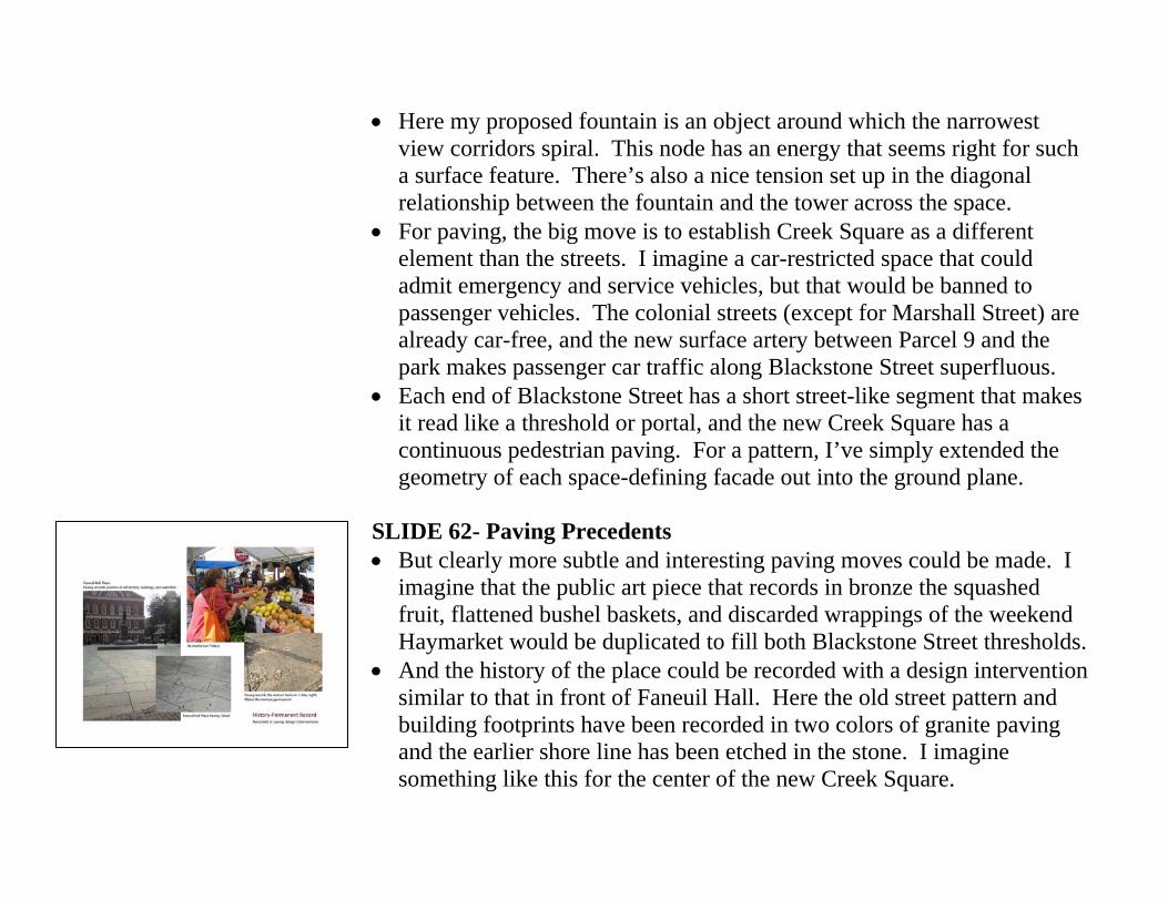
SLIDE 62- Paving Precedents • But clearly more subtle and interesting paving moves could be made. I
imagine that the public art piece that records in bronze the squashed fruit, flattened bushel baskets, and discarded wrappings of the weekend Haymarket would be duplicated to fill both Blackstone Street thresholds.
• And the history of the place could be recorded with a design intervention similar to that in front of Faneuil Hall. Here the old street pattern and building footprints have been recorded in two colors of granite paving and the earlier shore line has been etched in the stone. I imagine something like this for the center of the new Creek Square.
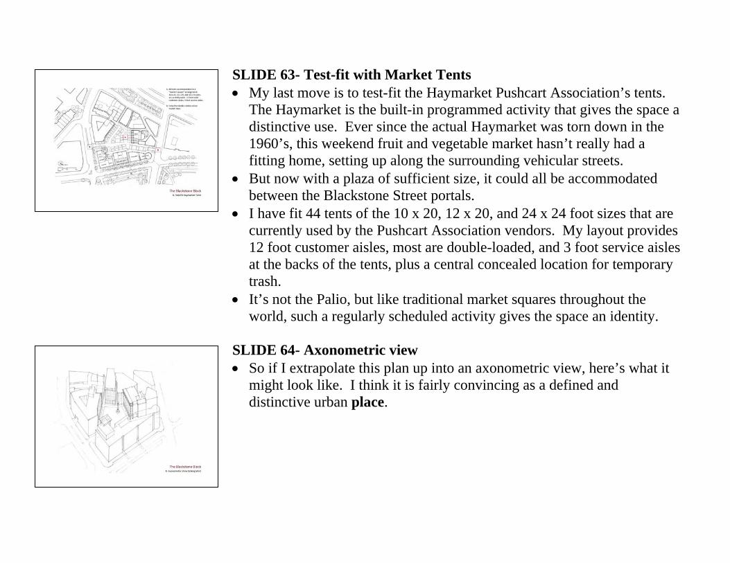
SLIDE 63- Test-fit with Market Tents • My last move is to test-fit the Haymarket Pushcart Association’s tents.
The Haymarket is the built-in programmed activity that gives the space a distinctive use. Ever since the actual Haymarket was torn down in the 1960’s, this weekend fruit and vegetable market hasn’t really had a fitting home, setting up along the surrounding vehicular streets.
• But now with a plaza of sufficient size, it could all be accommodated between the Blackstone Street portals.
• I have fit 44 tents of the 10 x 20, 12 x 20, and 24 x 24 foot sizes that are currently used by the Pushcart Association vendors. My layout provides 12 foot customer aisles, most are double-loaded, and 3 foot service aisles at the backs of the tents, plus a central concealed location for temporary trash.
• It’s not the Palio, but like traditional market squares throughout the world, such a regularly scheduled activity gives the space an identity.
SLIDE 64- Axonometric view • So if I extrapolate this plan up into an axonometric view, here’s what it
might look like. I think it is fairly convincing as a defined and distinctive urban place.
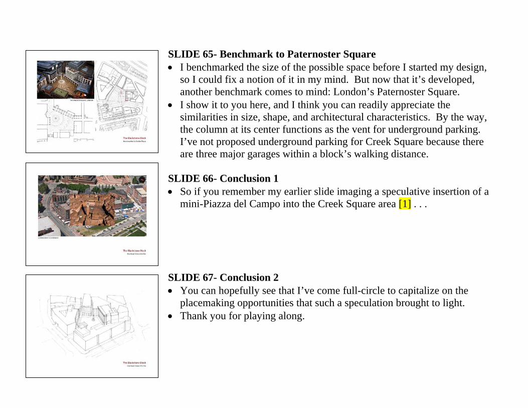
SLIDE 65- Benchmark to Paternoster Square • I benchmarked the size of the possible space before I started my design,
so I could fix a notion of it in my mind. But now that it’s developed, another benchmark comes to mind: London’s Paternoster Square.
• I show it to you here, and I think you can readily appreciate the similarities in size, shape, and architectural characteristics. By the way, the column at its center functions as the vent for underground parking. I’ve not proposed underground parking for Creek Square because there are three major garages within a block’s walking distance.
SLIDE 66- Conclusion 1 • So if you remember my earlier slide imaging a speculative insertion of a
mini-Piazza del Campo into the Creek Square area [1] . . . SLIDE 67- Conclusion 2 • You can hopefully see that I’ve come full-circle to capitalize on the
placemaking opportunities that such a speculation brought to light. • Thank you for playing along.