Embed Size (px)
Citation preview

_______________________________________________________________________________________________________________________________
SEE J Archit Des. 2019 Nov 11; 10041:1-8. 1
ID Design 2012/DOOEL Skopje South East European Journal of Architecture and Design Volume 2019; Article ID 10041, 8 pages http://dx.doi.org/10.3889/seejad.2010.10041 Design
Similarities and Differences in Terms of the Geometry Used in De Stijl and Bauhaus Product Designs Antonio Cvetkovski*, Sofija Sidorenko Faculty of Mechanical Engineering, University Ss “Ciryl and Methodius” of Skopje, Skopje, Republic of Macedonia
Citation: Cvetkovski A, Sidorenko S. Similarities and Differences in Terms of the Geometry Used in De Stijl and Bauhaus Product Designs. SEE J Archit Des. 2019 Nov 11; 10041:1-6. http://dx.doi.org/10.3889/seejad.2019.10041
Key words: Design principles; Design elements; Educational technique; Industrial design history; Product design; Product geometry; De Stilj; Bauhaus *Correspondence: Antonio Cvetkovski, Faculty of Mechanical Engineering, University Ss “Ciryl and Methodius” of Skopje, Skopje, Republic of Macedonia. E-mail: [email protected]
Received: 06-Oct-2019; Revised: 20-Oct-2019; Accepted: 26-Oct-2019; Published: 11-Nov-2019
Copyright: © 2019 Antonio Cvetkovski, Sofija Sidorenko. This is an open-access article distributed under the terms of the Creative Commons Attribution License, which permits unrestricted use, distribution, and reproduction in any medium, provided the original author and source are credited.
Competing Interests: The author have declared that no competing interests exist.
Abstract
This paper presents a case study that analyzes De Stijl and Bauhaus product designs in the frames of a research dedicated to improve the educational process in industrial design history. The main goal of the overall research is to develop a technique for better understanding and learning of the main characteristics of different design styles. The technique is based on the observation method, combined with techniques of product geometry recognition and description.
The main goal of the case study presented in this paper is to identify the similarities and differences between De Stilj and Bauhaus products geometry due to the connections between the designers and same-used philosophy. The typical design elements and principles common to the two observed styles have been recognized and presented in comparative diagrams. The results could be valuable information for the designers as an inspiration for new designs with reminiscence to the analyzed styles.
Introduction
Since the product design means an invention and creation of a new product and geometry deals with the shape of things, it is expected that they would be mutually connected and related. When analyzing industrial design what needs to be taken into consideration are aesthetics, semiotics and color theory, which are all significant product design elements [1].
Geometry, proportion and perspective are studied through the demonstration of any object. Each design and its composition begin with these elements and their relations. Throughout the history, the main research aims of many remarkable designers were to find the proper general principles of combining those elements successfully and appropriately. The major benefit of this achievement is the ability to create art through the product design, as Theo van Doesburg declares in Abstract Art “Art and life are no longer separate domains” [2]. There have been many other various views on the question regarding the significant
factors in product designing, such as M. Ashby’s and K. Johnson’s that the designers’ goal is to merge the practical with the aesthetics, creating a mix of both utilitarian and affecting pleasure [3]. Y. Chuang and L.L. Chen, however, state that “Aesthetics has always been an important factor in design” [4].
As a fundamental science of forms and their order, geometry contributes to the process of composing and designing of products. Geometry is able to make a contribution to these processes by dealing with the figures and forms as design elements as well as the relations between them. Finding the general principles of successfully combining those elements was a research aim of many designers, such as those in the modernist era.
In the frames of the design history course at the Faculty of Mechanical Engineering in Skopje a technique for improvement of the educational process is developed during the last few years. The technique is based on the observation method, as well as recognition and description of product visual elements and principles. The results presented visually could be

Design _______________________________________________________________________________________________________________________________
_______________________________________________________________________________________________________________________________
2 http://www.id-press.eu/seejad/
valuable information for the designers as an inspiration for new designs with reminiscence to former styles.
The main goal of the case study presented in this paper is to identify the similarities of De Stilj and Bauhaus have in the products geometry due to the connections between the designers and same-used philosophy, but also reveals several crucial differences that separate those movements as individual. In the first part a research of both design styles was made with emphasis to their general features. In the second part three phases of the evolution of modernism were analyzed via comparisons of the product geometry of the most significant pieces of designs, representatives from both styles. In the third part the results of the comparisons were discussed and visually presented with intention to become applicable for designers as valuable information in the process of searching for inspiration with reminiscence to the analyzed styles.
General Features of De Stijl and Bauhaus
Styles
De Stijl movement, also known as Neoplasticism, was characterized by cold, abstract aesthetics, whose fundamental visual elements were simple geometric elements such as triangles, squares and circles in the two-dimensional world, or cubes, pyramids and spheres in the three-dimensional world [5]. All these straight-lined forms are always in primary colours. Their perception was that the new modern era needed an appropriate universal visual language which presented through the ideal fusion of form and function, and the balance between universal and individual [6].
In a similar manner as De Stijl movement, Bauhaus is another influential modernist art school of the 20th century. Guided by the very same philosophy used by De Stijl, Bauhaus also used elementary geometric designs, yet the difference was that it employed new materials, leather and textile, which helped a combination of simplicity, firmness and comfort to be achieved. Unlike De Stijl, they used round external forms, contours, or outlines of objects. Regular and repetitive forms were used in design.
Influencing the industrial design in a revolutionary way, the Modernism became significant artistic movement of the 20th century, thus giving us the most iconic and timeless product designs. This movement covered many creative visual disciplines – design and art – and was an influence to architecture, music and literature as well. Modernism was an artistic style, but it was also a revolutionary rebellious state of mind that questioned all aspects of life. With the industrialization and urbanization, the power of machines made way for new ideas and enabled artists and designers to strategically re-think their design of
products. Thus, the machine itself became a design theme. Modernists designed and abided to strict, structured grid system with emphasis on negative space, and were “individuals who addressed themselves to the problem of an appropriate design for the twentieth century” [7]. With this impact across numerous creative disciplines, Modernism is arguably the most influential movement of the 20th century, out of whose disciplines De Stijl and Bauhaus can be singled out.
Design Comparison
Focused on the similarities and differences in the geometry, the next part of the research is based on descriptive approach where direct comparison between two modernist products is applied. Emphasis is placed on the most famous and influential De Stijl and Bauhaus designs. The detail analysis of the products geometry is enriched with an explanation of how the designers use the geometric elements in fulfilment of the principles of design, because whether they were aware of it or not, they produce designs that conform to the design principles. Under consideration are some of the most influential and well-known modernist products. Dividing the research in three modernist phases, the conclusions have been drawn out.
Introducing A New Style
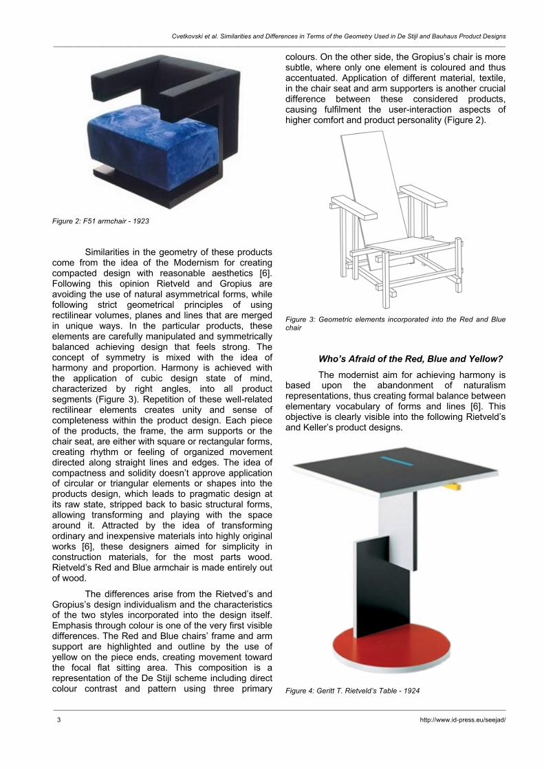
The first selected design object for analyze in this case study is the Red and Blue Chair, which according to J. Pile [8] is the best known De Stijl work designed by Gerrit T. Rietveld (Figure 1). On the other comparable side, representing the aim of the designer activities at the Bauhaus for developing product design competent both in modern technology and in the corresponding language of form [6] is Walter Gropius’s F51 armchair (Figure 2).
Figure 1: Red and Blue chair - 1917
Cvetkovski et al. Similarities and Differences in Terms of the Geometry Used in De Stijl and Bauhaus Product Designs _______________________________________________________________________________________________________________________________
_______________________________________________________________________________________________________________________________
3 http://www.id-press.eu/seejad/
Figure 2: F51 armchair - 1923
Similarities in the geometry of these products come from the idea of the Modernism for creating compacted design with reasonable aesthetics [6]. Following this opinion Rietveld and Gropius are avoiding the use of natural asymmetrical forms, while following strict geometrical principles of using rectilinear volumes, planes and lines that are merged in unique ways. In the particular products, these elements are carefully manipulated and symmetrically balanced achieving design that feels strong. The concept of symmetry is mixed with the idea of harmony and proportion. Harmony is achieved with the application of cubic design state of mind, characterized by right angles, into all product segments (Figure 3). Repetition of these well-related rectilinear elements creates unity and sense of completeness within the product design. Each piece of the products, the frame, the arm supports or the chair seat, are either with square or rectangular forms, creating rhythm or feeling of organized movement directed along straight lines and edges. The idea of compactness and solidity doesn’t approve application of circular or triangular elements or shapes into the products design, which leads to pragmatic design at its raw state, stripped back to basic structural forms, allowing transforming and playing with the space around it. Attracted by the idea of transforming ordinary and inexpensive materials into highly original works [6], these designers aimed for simplicity in construction materials, for the most parts wood. Rietveld’s Red and Blue armchair is made entirely out of wood.
The differences arise from the Rietved’s and Gropius’s design individualism and the characteristics of the two styles incorporated into the design itself. Emphasis through colour is one of the very first visible differences. The Red and Blue chairs’ frame and arm support are highlighted and outline by the use of yellow on the piece ends, creating movement toward the focal flat sitting area. This composition is a representation of the De Stijl scheme including direct colour contrast and pattern using three primary
colours. On the other side, the Gropius’s chair is more subtle, where only one element is coloured and thus accentuated. Application of different material, textile, in the chair seat and arm supporters is another crucial difference between these considered products, causing fulfilment the user-interaction aspects of higher comfort and product personality (Figure 2).
Figure 3: Geometric elements incorporated into the Red and Blue chair
Who’s Afraid of the Red, Blue and Yellow?
The modernist aim for achieving harmony is based upon the abandonment of naturalism representations, thus creating formal balance between elementary vocabulary of forms and lines [6]. This objective is clearly visible into the following Rietveld’s and Keller’s product designs.
Figure 4: Geritt T. Rietveld’s Table - 1924

Design _______________________________________________________________________________________________________________________________
_______________________________________________________________________________________________________________________________
4 http://www.id-press.eu/seejad/
Figure 5: Peter Keler’s Bauhaus cradle - 1922
Designed especially for the Schröder House, the first product in this comparison is Geritt T. Rietveld’s Schröder Table (Figure 4). The designer’s features of the house, which according to B. Mulder and I. van Zijl are “balanced, asymmetrical and three - dimensional composition with horizontal and vertical planes and lines” [9], are also transmitted into the table design. The second product design is effect of Kandinsky’s obsession with the three primary colours and primary forms - triangle, circle and square that is visible in his students’ designs [10], among which is Peter Keler’s Bauhaus Cradle (Figure 5).
Similarities in the geometry of these products come from the De Stijl concept of embracing an abstract, pared-down aesthetics centred in the basic visual elements and their relations. Following this concept, these designs are characterized by the application of primary geometric forms, straight planes and lines. Repetition of these elements creates unity between all components. This harmony of continuity in the geometry, combined with red, blue and yellow surfaces creates an active rhythm, which doesn't undermine the inherent playfulness of the design itself. Movement is directed along emphasis with colour that “served to activate spaces and surfaces so that they might be better understood and experienced as abstract form” [6]. This design principle is an articulation of the modernist transition where artistic forms and colour schemes should be seen as a unified whole, thus creating ultimate objects that expressed the spiritual harmony of geometry and primary colours. The idea of easiness in the products construction, leads to application of ordinary materials, for the most parts wood.
The main functional purpose of these products causes visible difference that goes along with the unique structural use of geometric elements and principles of design. As a result of Rietveld’s idea for creating contemporary experimental design, the distribution of the visual weight of objects, colours and surfaces in the Schröder Table creates asymmetrical
balance, which in that period was not widely used. This design is also characterized by the use of horizontal and vertical lines that overlap, effect that is visible between several objects. On the other comparable side, Peter Keler’s design demonstrates a clear, simple and straightforward order of forms and lines, thus achieving a geometric symmetrically balanced structure that makes its instantly understandable. Another significant difference is the interruption in the pattern of repeating rectilinear shapes and circular design details, throughout the application of triangular elements into the Bauhaus Cradle. Implementation of this effect of union, in terms of the application of all primary shapes and colours into one design, creates interesting rhythm that is defined through the lack of neutral colours, especially black. This rhythm causes design that is identified by the usage of direct contrast and clearly marked surfaces and edges. Closeness with the idea of the Modernism for using black colour, which is preferred as it deflected attention from the surface and put back on the structure, is visible in the Rietveld’s design. Besides that, in the Schröder Table circular shapes are represented and applied through plane elements, unlike the design of the Cradle where somehow a 3D repetition of circular shapes is achieved through the use of cylindrical metal tube-like forms. Application of different material, metal, in the Bauhaus Cradle’s supporting elements is crucial difference between the products, achieving higher product functionality.
Modernism and Technology
During the second phase of the modernist movement new category of seating furniture is established, as a result of connecting the firmness and balance of steel tubing with lightweight coverings [5]. The following products are well-known classics of the modern movement [8] and the prime creators of the cantilever category of products.
Figure 6: S34 armchair - 1926
Cvetkovski et al. Similarities and Differences in Terms of the Geometry Used in De Stijl and Bauhaus Product Designs _______________________________________________________________________________________________________________________________
_______________________________________________________________________________________________________________________________
5 http://www.id-press.eu/seejad/
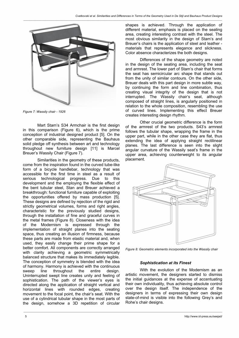
Figure 7: Wassily chair - 1926
Mart Stam’s S34 Armchair is the first design in this comparison (Figure 6), which is the prime conception of industrial designed product [5]. On the other comparable side, representing the Bauhaus solid pledge off synthesis between art and technology throughout new furniture design [11] is Marcel Breuer’s Wassily Chair (Figure 7).
Similarities in the geometry of these products, come from the inspiration found in the curved tube-like form of a bicycle handlebar, technology that was accessible for the first time in steel as a result of serious technological progress. Due to this development and the employing the flexible effect of the bent tubular steel, Stan and Breuer achieved a breakthrough: functional furniture capable of exploiting the opportunities offered by mass production [5]. These designs are defined by rejection of the rigid and strictly geometrical volumes, forms and right angles, characteristic for the previously studied designs, through the installation of fine and graceful curves in the metal frames (Figure 8). Closeness with the idea of the Modernism is expressed through the implementation of straight planes into the seating space, thus creating an illusion of firmness, because these parts are made from elastic material and, when used, they easily change their prime shape for a better comfort. All components are correctly arranged with clarity achieving a geometric symmetrically balanced structure that makes its immediately legible. The conception of symmetry is blended with the idea of harmony. Harmony is achieved with the continuous sweep line throughout the entire design. Uninterrupted swept line creates unity and feeling of sophistication. The path of the viewer’s eyes is directed along the application of straight vertical and horizontal lines with rounded edges, creating movement to the focal point, the chair’s seat. With the use of a cylindrical tubular shape in the most parts of the design, somehow a 3D repetition of circular
shapes is achieved. Through the application of different material, emphasis is placed on the seating area, creating interesting contrast with the steel. The most obvious similarity in the design of Stam’s and Breuer’s chairs is the application of steel and leather - materials that represents elegance and slickness. Color absence characterizes the both designs.
Differences of the shape geometry are noted in the design of the seating area, including the seat and armrest. The lower part of Stam’s chair that forms the seat has semicircular arc shape that stands out from the unity of similar contours. On the other side, Breuer deals with this part design in more subtle way, by continuing the form and line combination, thus creating visual integrity of the design that is not interrupted. The Wassily chair’s seat, although composed of straight lines, is angularly positioned in relation to the whole composition, resembling the use of curved lines. Implementing this effect Breuer creates interesting design rhythm.
Other crucial geometric difference is the form of the armrest of the two products. S43’s armrest follows the tubular shape, wrapping the frame in the upper part, while in the other case they are flat, thus extending the idea of applying straight rectilinear planes. The last difference is seen into the slight angular curvature of the Wassily seat’s frame in the upper area, achieving counterweight to its angular placement.
Figure 8: Geometric elements incorporated into the Wassily chair
Sophistication at its Finest With the evolution of the Modernism as an
artistic movement, the designers started to dismiss the initial guidances at the expense of accentuating their own individuality, thus achieving absolute control over the design itself. The independence of the designers in terms of expressing their own design state-of-mind is visible into the following Grey’s and Rohe’s chair designs.

Design _______________________________________________________________________________________________________________________________
_______________________________________________________________________________________________________________________________
6 http://www.id-press.eu/seejad/
Figure 9: Bibendum chair - 1926
Figure 10: Barcelona chair - 1929
The first product in this comparison is Eileen Grey’s Bibendum Chair (Figure 9), which is a feminist answer to the modernist ideas, identified by the creation of softer, rounder and more feminine design, thus representing the women’s dignified entrance into the male-dominated design world. Specifically designed for the Barcelona Pavilion, the second product is the Barcelona Chair (Figure 10) designed by Mies van der Rohe and described as “an undisputed marker of elegance, grace and luxury, with a price to match” [12].
Similarities in the geometry of these products come from the designers’ goal for creating futuristic and modern chair with functional form which doesn’t displace space, but allows it to be perceived as a continuum. To achieve this goal, the designers begin to use gently tapering forms, thus introducing organic elements as well as a sense of geometric precision [6]. Gray’s and Rohe’s dedication to make changes in the style doesn’t approve the stern principle of using
basic cubist volumes, right angles and straight planes. As a result of this devotion, the Bibendum Chair is characterized by the appliance of rounded edges, circular tire-like elements and sweep tubular forms. On the other side, Rohe is using admirable curved lines, complex angles, flat steel volumes and intersections that collide in unique ways. All those units are captivatingly harmonious and symmetrically balanced achieving design that feels highly disciplined. The theory of symmetry is enriched with refinement of proportion. Both chairs spoke the modern design language fluently, combining the fresh interpretation of the machine aesthetics, geometric purity and unity between all parts that relate well with each other. Movement, in terms of the path of the viewer’s eyes, is directed through the use of different materials and textures. Through the application of different material, emphasis is placed on the seating area, thus creating interesting contrast with the steel. Combining cold, abstract steel elements with the warmth of natural leather, the designers create effect of luxury and elegance. The biggest similarity between the considered products, which at the same time is the biggest difference in terms of the modernism ideology, is the absence of primary colours.
The main differences in the geometry and appearance of the design arise from the Grey’s and Rohe’s personal identity. Geometric differences are noted in the design of the supporting level of the chairs. In the Bibendum Chair, Grey is using multiplication of tube-like shapes. On the other side the Barcelona chair stability is managed with the use of rectilinear steel frame. The firmness of the rectilinear metal frame is softened with the application of clean and graceful curve of the bar, thus forming the chair’s back. Another difference is the texture and smoothness of the leather seating part. Through the application of flat surfaces with rounded edges, Grey expresses her feminine side in a subtle way. Barcelona chair’s extravagance of the buttoned leather seat is at odds with the Bauhaus approach of function over form. Implementing this decorative effect, Rohe creates interesting and unusual design rhythm and abstract pattern.
Results Phase 1 With the beginning of the 20th century and the
emergence of the Modernism, the changes noted in the industrial product’s geometry primarily referred as a protest against the naturalism and the mysticism of the previous artistic movements, at the expense of achieving formal abstraction, universal design and human-created reality. As a result of this revolutionary

Cvetkovski et al. Similarities and Differences in Terms of the Geometry Used in De Stijl and Bauhaus Product Designs _______________________________________________________________________________________________________________________________
_______________________________________________________________________________________________________________________________
7 http://www.id-press.eu/seejad/
concept, the designs in this period are characterized by the avoidance of using natural forms, thus achieving reduced aesthetics centred in the basic visual elements and forms (Figure 11). Similarities in terms of the geometry are perceived throughout the use of primary geometric elements: squares, rectangles, circles or triangles implemented as volumes or planes into the design levels. The movement between those elements is directed along straight horizontal or vertical lines with precise edges. Clearly visible closeness between the designs is the implementation of red, yellow and blue-primary colour accents that served as a transformation tool for the space and surfaces in order for them to be better experienced as abstract form. The usage of black colour was preferred as it deflected attention from the surface and put back on the structure. The idea of easiness in the products construction, leads to application of ordinary materials, for the most design parts wood. The individual ideas of the Bauhaus school for achieving higher product functionality lead to difference in the geometry, through the use of textile (Figure 2) and metal tubular forms (Figure 5).
Figure 11: Design elements used in the first modernist phase
Phase 2 The progressive modernist ideology brought
revolutions in the product designs, which were most often driven by the advancements in the technology and construction methods-such as the ground-breaking development in the processes of metal bending and curving. During this second phase, due to this development and the employing of the flexible effect of the bend tubular steel, much theoretical and practical work was concluded on the concept of function, creating more sophisticated, ergonomic and functionally-inspired products. As a result of this inspiration, the designs were defined by the elimination of solid and strictly geometrical elements, volumes and right angles (Figure 12). Geometric similarities between the designs in this period are recognized through the implementation of cylindrical tube-like shapes and the combination of continuous sweep line with fine and graceful curved edges, thus
achieving design that is complex in appearance but simple in construction. The idea of elegance and aesthetics refinement doesn’t approve the application of primary colours. Avoiding the original modernist idea of using ordinary materials, the designs in the second phase are characterized by mass implementation and use of metal with combination of a series of strong, thick leather slings with pleasant texture. The differences in the compared product’s geometry primary originate from the designers’ individuality in regard to the approach into the implementation of the design principles that are used for achieving the ultimate goal, which is more simplistic and structurally exposed design.
Figure 12: Design elements used in the second modernist phase
Phase 3
Towards the end of the Modernism as an artistic movement, all of the initial design ideas and the representations of the technological achievements became completely used up and somehow exhausted. The designers started to express their own independent vision of modern design, developing products that were legally established as an individual creation of original value that rests in its entirely on a primary, individual designers’ vision. In the third phase, the extravagance of the products is at odds with the modernist approach of function over form, thus creating contemporary designs that were an exception from the idea of creations for the “common man”. Similarities in the geometry of these products come from the designers’ goal for creating futuristic style, very different to the traditional designs of the same period. As a result of this aim, the designs in this period are characterized by the avoidance of the firm principle of using basic elements, right angles and straight planes, resulting with the usage of tapering forms, organic elements, rounded edges and complex angles. The path of the viewer’s eyes is directed along curved lines merged in unique ways. Effect of luxury is achieved through the implementation of the smooth texture of the natural leather, as a contrast to the cold steel elements. The main differences in the geometry of the designs arise from the designers’ personal

Design _______________________________________________________________________________________________________________________________
_______________________________________________________________________________________________________________________________
8 http://www.id-press.eu/seejad/
identity and ability to achieve product structure that is stable.
Figure 13: Design elements used in the third modernist phase
Conclusions
The presented case study is completed within the frames of a research dedicated to improve the educational process in industrial design history. A specific technique is used for better understanding and learning of the main characteristics of different design styles. The technique is based on the observation method, as well as recognition and description of the product geometry. Learning about the geometry and how it relates to the designs is not to be used as a substitute for the creative process, but rather as a means of obtaining a deeper understanding of it.
The presented case study analyzes De Stijl and Bauhaus product designs, highlighting similarities and differences. The results are presented in comparative diagrams as a series of design elements and principles common to the two observed styles. The final goal of the research is not only to offer to the students and designers a technique how to observe and extract the typical design elements and principles of the specific style, but also how to present them visually with intention to become applicable as an inspiration for new designs with reminiscence to or inspired by former styles.
Acknowledgment
The authors are pursuing this research paper as a part of the educational process of the course Industrial Design History within the “Industrial design
and marketing” master program at the Faculty of Mechanical Engineering in Skopje.
References 1. 1. Hauffe T. Design: A Concise History. Laurence King Publishing; 1998.
2. Moszynska A. Abstract art. New York: Thames and Hudson; 1990.
3. Ashby MF, Johnson K. Materials and design: the art and science of material selection in product design. Butterworth-Heinemann; 2013. https://doi.org/10.1016/B978-0-08-098205-2.00007-X
4. Chuang Y, Chen LL. How to rate 100 visual stimuli efficiently. International Journal of Design. 2008; 2(1):31-43.
5. Bürdek BE. Design: History, theory and practice of product design. Walter de Gruyter; 2005.
6. Raizman D. History of modern design: Graphics and products since the industrial revolution. Laurence King Publishing; 2003.
7. Greenhalgh P, editor. Modernism in design. Reaktion books; 1990.
8. Pile JF. A history of interior design. Laurence King Publishing; 2005.
9. Mulder B, Rietveld GT, van Zijl I. Rietveld Schröder House. Princeton Architectural Press; 1999.
10. Bergdoll B, Dickerman L. Bauhaus 1919-1933: Workshops for modernity. The Museum of Modern Art; 2009.
11. Woodham JM, Jonathan M. Twentieth century design. Oxford Paperbacks; 1997.
12. Schulze F, Windhorst E. Mies van der Rohe: A critical biography. University of Chicago Press; 2012. https://doi.org/10.7208/chicago/9780226756028.001.0001