Embed Size (px)
Citation preview
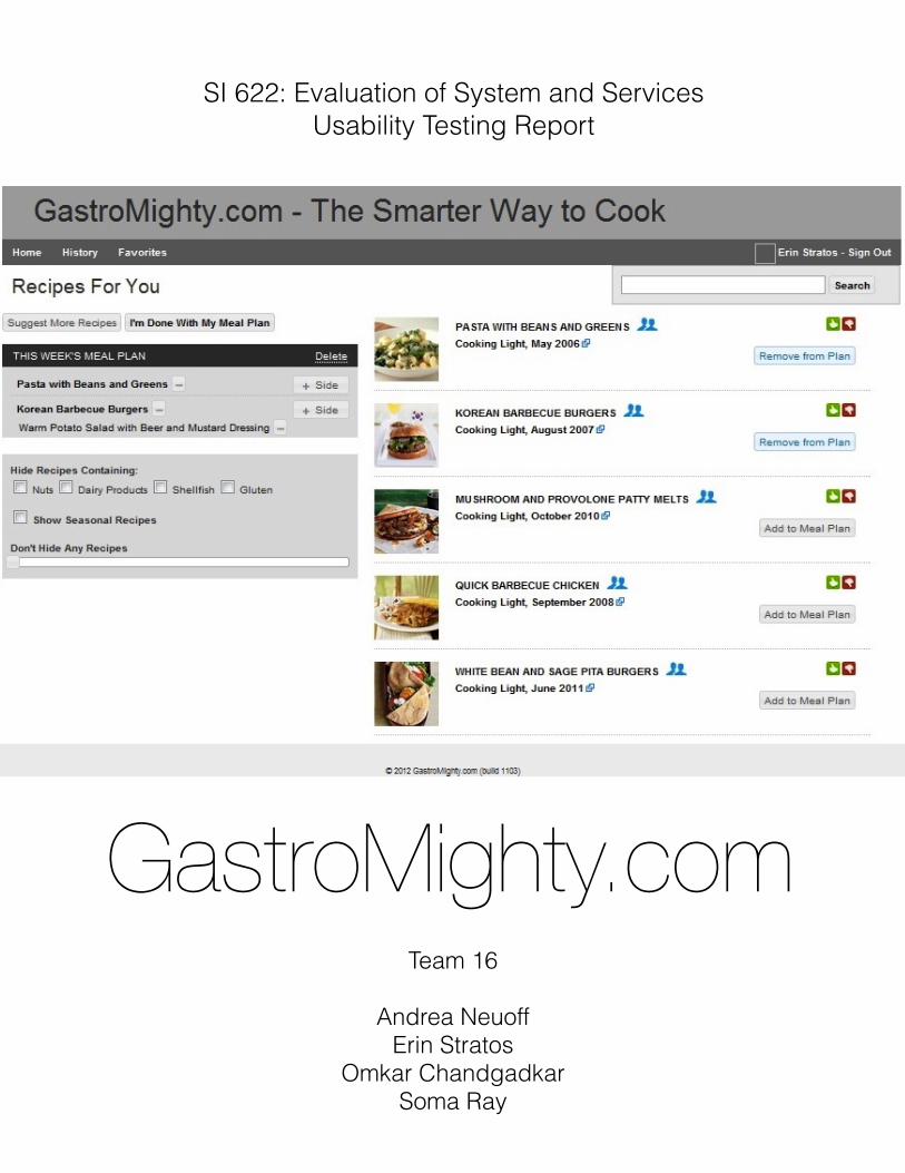
GastroMighty.com
SI 622: Evaluation of System and ServicesUsability Testing Report
Team 16
Andrea NeuoffErin Stratos
Omkar ChandgadkarSoma Ray

Index....................................................................................Executive Summary 3
................................................................................................Introduction 4.....................................................................................................Methods 5
.................................................................Findings and Recommendations 6.....................................................................................Summary Results 6
...........................................................Key Findings & Recommendations 6..............................................1. Participants faced difficulty navigating the website 6
...........................2. “Add New Recipes” page needs to be easier and faster to use 7..........3. “Edit Shopping List” is hard to find and needs to include more information 8
...................................................4. Search and Filter options need to be optimized 9.....5. Interface design should remain minimalist but must meet user expectations 11
6. Ratings and comments should be optimized and system learning capabilities ............................................................................................should be conveyed. 12
................................................................................................Discussion 14...............................................................................................Conclusion 15...............................................................................................References 16
.......................................................................Appendix A: Consent Form 17......................................................................Appendix B: Usability Tasks 18
........................................................Appendix C: Post-Test Questionnaire 21.......................................................................Appendix D: Logging Form 22
................................................Appendix E: Additional Reference Material 23
................................................Appendix F: Additional Recommendations 24........................Appendix G: User Data Logs and Post-Test Questionnaire 25
Usability Testing Report 2

Executive Summary In this study, we conducted usability testing of GastroMighty in order to find areas of the website that can be improved to give users a better experience. We focused on areas that we found issues with in our previous research. Our goal was to find out if these problem areas manifest again during usability testing. We also sought to discover user preferences that can be incorporated in order to increase user base and maintain loyalty.As part of our methods, we developed five tasks for our participants to perform, fill out a post-test questionnaire, and recount their experience in debrief interview. We had three colleague reviewers for these documents and piloted our test with two participants. Using feedback from our reviewers and pilot testers, we revised our tasks and conducted testing with five potential novice users of GastroMighty. All five participants fall within the target demographic.We found that the majority of our participants were excited about the concept of GastroMighty and found the main functions of the site easy to use. A number of our participants expressed that they liked GastroMighty enough to use it for their personal requirements in future.During the usability process, we also found a number of areas where the website can be improved to better meet the needs of its users. Our main findings and recommendations are as follows:1. Participants faced difficulty navigating the website.Recommendations: Add breadcrumbs and back buttons; add “My Current Meal Plan” section to top navigation; optimize “sides” workflow2. “Add New Recipes” page needs to be findable and easier to use.Recommendations: Make page more prominent and easier to find; create more clarity for adding a recipe; and do not force users to use “Location”3. “Edit Shopping List” is hard to find and needs to include more information.Recommendations: Make page easier to find; show amounts of ingredients on shopping list; and connect ingredients to recipes.4. Search and filter options need to be optimized.Recommendations: Improve internal dictionary; ensure accurate search returns; add vegetarian filter; create advanced search option and “Recently Viewed Recipes” list.5. Interface design should remain minimalist but must meet user expectations.Recommendations: Incorporate clear visual cues for users; create more contrast between pages to help users know where they are.6. Ratings and comments should be optimized and system learning capabilities should be conveyed.Recommendations: Inform users about the machine learning capabilities of the website; create awareness about how ratings and comments work; separate rating from favoriting.
Usability Testing Report 3
IntroductionGastroMighty is an online service to help people efficiently and easily plan, shop, and cook their weekly meals. With over 5,000 recipes in its database, GastroMighty remembers what you like, what you don’t, what you cooked last week or last month, and uses this information to recommend new recipes. With a free account, users can quickly decide what they want to cook for the week, and customize a grocery shopping list based on the selected recipes and side dishes. At the moment, GastroMighty’s primary target audience are busy and active adults who want to cook more at home and want a tool that will help facilitate this. In this study, our team conducted usability tests with potential customers of Gastromighty to understand the problems they might face while using the website. We recruited five participants for the study who had to complete a set of tasks using desktop and mobile versions of GastroMighty.com. During the study, we tried to uncover bugs, usability issues, and any inconsistencies between users’ expectation and system deliverables. The tests gave us valuable feedback about how real users might interact with the system, what they feel about the system, and why. Our participants really liked the concept of Gastromighty and how easily they could start using it to create meal plans. They were interested in using features like shopping lists and saving personal recipes and also liked the visual appeal of the website including UI elements like photographs of recipes and the slider on the home page. Most of our recommendations address issues about navigation during and after creating a meal plan, using shopping list and add new recipe pages, and lack of awareness among users about various features.
Usability Testing Report 4

MethodsThe goal of our usability testing was to figure out how potential users interact with the site. Specifically, we ran formative tests to find out which key usability issues of the site need to be fixed in order for GastroMighty to attract new users and ensure loyalty. For GastroMighty, this meant that we looked for places where participants deviated from the expected usage path, made mistakes entering information, had problems either finding or using specific features, and were unable to complete specific tasks key to Gastromighty.With these goals in mind, we created 5 tasks. The tasks focused on certain GastroMighty features that we suspected might have usability issues as indicated by our previous heuristic evaluation, comparative analysis, and survey results. The tasks asked the participants to create a meal plan, modify a meal plan, send the grocery list to a friend or use the grocery list on a mobile device, replace recipes because of dietary needs, enter in a new recipe, and use the rating and commenting features. After the initial draft of our tasks, we had three colleagues review the tasks and then we piloted the entire usability test with two separate individuals. The final version of our tasks that we used can be found in Appendix B. We ran five usability tests with participants from our target population. Each test was run with two team members present (a moderator and note-taker). Each usability test began with a formal introduction to the study that explained the purpose of the test, our expectations, and the rights of the participant. We then asked the participant to sign a consent agreement (See Appendix A), after which we began the test. We used TechSmith’s Camtasia software to capture all on-screen interaction activity and our participant’s facial reactions for contextual reference during team debriefing and reporting. The note-taker logged comments, observations, times, bugs, and other important behavior clues in an excel sheet designed for logging. The excel sheet was designed to auto log time and code description thus allowing the logger to focus on capturing the comments and observations (Appendix D).After completion of the tasks we asked the participant to fill out a post-test questionnaire on their experience using the site. After that, the moderator interviewed the participant about their experiences, the areas they had problems with, and some of the comments they made. When we completed our five usability tests, our team met as a whole and reviewed the data of each test together. We noted common problems and positive comments that were made by participants. We brainstormed about the causes and at a later meeting we compiled our results and came up with a set of key findings and recommendations as follows.
Usability Testing Report 5

Findings and Recommendations
Summary Results
Our usability tests revealed that many people are excited about using a meal planning site. Our usability participants found it easy to create basic meal plan and liked that the system did not pester them with lots of questions, requests, or forms. They liked the large selection of recipes, their source information, and nutritional information. They all liked the ability to enter in their own recipes, although some had problems with the process, and the option to generate an aggregated shopping list they could use and modify. The homepage with the photo slider also received a lot of compliments. In fact, one participant used the slider to find most of their recipes due to the image and description. In general, our participants were very excited to use a system like GastroMighty, despite some of the problems they encountered. In the findings and recommendations that follow, we focus on the key areas where GastroMighty can improve the website for users in order to provide an even better experience. Most of our recommendations address issues about navigation during and after creating a meal plan, using shopping list and add new recipe pages, and lack of awareness among users about various features.
Key Findings & Recommendations
1. Participants faced difficulty navigating the website
Most of our usability test participants commended on how clean and simple GastroMighty appeared to be. However, once they started working on the tasks, almost all participants expressed confusion navigating between different stages of the meal planning process. Adding dishes to create a meal plan was easy but once they navigated to editing grocery lists, or editing previous meal plans it became unclear where they were in the site. They especially felt lost while finishing up with a meal plan as the system does not clearly inform them of the completion while the process leads one to subsequent steps. Alerts or messages like “View Your Finished Meal Plan” are absent, thus leaving participants unsure. More than one participant had trouble navigating to their shopping lists for a previously created meal plan once they exited the list. Some of them were hesitant to browse individual recipe search results as they were not able to navigate back to the same spot in the results page.Some of our participants could not figure out how to add new recipe as the navigation is not indicative of the task. In GastroMighty’s case, to create new recipe one has to click My Recipes>Saved>Enter new Recipe. One participant commented how she would never think of creating a new recipe by navigating to ‘Saved’ as that referred to previously created/saved recipes.Some of our participants also had problems comprehending the process of adding sides to the main dishes. The sides panel is away from the recipes section thus making it difficult to establish a connection between them in the meal plan process. Our participants found that one cannot add the same side to more than one main dish in a meal plan.
Usability Testing Report 6
Recommendations
We recommend that GastroMighty rethink their post meal plan navigation process to match their users’ previous experiences and habits. Users would feel more at ease if they knew during every step of the process what their location was in the website and were given the ability to review their actions or go back to their most recent step. This would include adding features such as breadcrumbs, task review options such as ‘View Your Completed Meal Plan’, and back buttons. Adding meal plan and shopping list links to top navigation would go a long way in terms of usability for users.The Sides’ workflow needs to be better integrated with the main dishes during meal planning. A few of our suggestions include having an ‘add side’ icon closer to the main recipes links, allowing user to add same side to more than one main dish, preventing error if user chooses their own side and clicks on ‘I’m done’ without saving the selection, and allowing display of more than three side options in the overlay.
2. “Add New Recipes” page needs to be easier and faster to use
Tasks #2 and #4 (See Appendix B) asked our usability participants to edit their shopping lists and add a new recipe to the collection, respectively. Almost all participants liked the function and purpose of these pages but, in observing their use of these pages, it became clear that workflow and features on these need to be reconceptualized to match user expectations and behaviors.When we asked our participants to add a recipe to their GastroMighty account, the first trouble they encountered was figuring out where they could accomplish this task. They expected to find this function in the top navigation menu but none of the link names matched. For example, it was only after clicking on every other option that one participant found the “Add New Recipes” page. After participants arrived on “Add New Recipes”, they encountered trouble understanding the workflow of how to add a recipe. Did they need to press the “Add Step” button after entering in every ingredient? Should they enter in all the steps or just one step at a time in the “Directions” text box. Did they need to add the step numbers themselves or would the system take care of that? See Figure 1 for an example. The drop-down “Location” menu for ingredients did not make sense to our participants until they clicked on it and realized that location meant the location of the ingredient in the grocery store. Furthermore, many of our participants had a hard time figuring out which grocery aisle to choose since many of the products either fit more than one category or none.
Usability Testing Report 7

Figure 1. The recipe directions one participant produced
We gave our participants a short recipe for basic chocolate chip cookies and they found the process long and laborious. Many of them complained about the length of time it took to enter in the recipe and explicitly wished there were other options for adding recipes, such as ability to import photos or scans of a recipe and have the site use natural language processing to add it. Others wanted to be able to add photos of their dishes and add specific notes for each ingredient. Despite these problems, our participants liked how the site displayed their recipe input. One commented that it looked like a “real recipe.” They also liked the idea of being able to keep all of their recipes in one place.
Recommendations
We suggest that the “Add New Recipe” page should be easier to access and more prominent on the site. The top navigation drop-down menu, for example, could list “Add Recipe” in addition to the “Saved” option. Users wanted to reach these pages from a variety of places and by making them more accessible through the navigation header, users will be able to take advantage of features.Regarding the “Add New Recipe” page, we recommend adding dynamic clues about how this page works, especially regards to the text box where users add the recipe’s directions. For example, add text field suggestions that inform the user how to enter their directions in. We compiled a list of additional recommendations of varying degrees of importance that can be found in Appendix F: Additional Recommendations.
3. “Edit Shopping List” is hard to find and needs to include more information
The “Edit Shopping List” page was well received by our participants. Many of them liked that the system automatically made the list and sorted it by grocery aisle or section. One said “Oh, they separate them [the ingredients] just like my mom used to.” However, participants wished they could locate the page much easier. They expected to find shopping list option in the top navigation bar. They also had trouble with the meaning “location” and did not appreciate being forced to
Usability Testing Report 8

select options in this field while adding items. Some wished that this field allowed auto suggestion enabled typing and auto population. We also learned that the location drop-down menu is missing some important categories like, health and beauty, paper products, cereal, and snack aisle.Our participants did not have trouble crossing out items on the desktop version of the site, but they wanted to be able to cross out whole sections. “Edit Shopping List” does not display amounts of the specific ingredients (although this is shown in the printed shopping list), nor does it allow users to know which ingredients relate to which recipes. The need to know which ingredient belongs to which recipe also became important when participants noticed duplicate or similar ingredients. They also need additional control over amount of ingredient required based on how much they have in their kitchen. Finally, we asked the participants, who already use a smartphone, to use the mobile version of GastroMighty and try out the shopping list feature. While many of the participants appreciated this additional functionality, they had a hard time figuring out the difference between crossing out items (showing they had bought them) and removing items from the list altogether. We also found two important bugs with respect to the mobile site. First, after participants signed into the mobile site on their mobile device, they were directed to the desktop version of the site, not the mobile version. Secondly, there was no way for participants to log out of the mobile site. This along with the “unfinished” appearance of the mobile site left our participants wanting.
Recommendations
We recommend adding “Edit Shopping List”, page to the top navigation bar. Users should not be required to choose a location when they add ingredients. More importantly, we recommend showing the amounts of ingredients and allowing users to be able to edit these amounts. It will also be important to connect each ingredient with the recipe it has. One way to do this would be to show recipe(s) excerpts when the mouse hovers over the ingredient for a moment. This could also be addressed by showing the recipes on this page and when the cursor hovers over or clicks on the recipe, its specific ingredients change color, become highlighted, or have some visual cue for distinction. An additional list of recommendations can be found in Appendix F: Additional Recommendations.
4. Search and Filter options need to be optimized
Our usability testing exercise found that both the search feature and the filter options are two areas that are highly important to users, and GastroMighty could benefit from optimizing both of them in order to better meet users’ needs. We found that, despite the fact that our tasks did not directly instruct participants to use the search feature, they turned to it often to find their desired meals. In fact, overall, participants used the search feature more often than they used the “Suggest More Recipes” option. Unfortunately, our participants ran into a number of issues when using the search feature.Some examples of search errors that participants encountered were that a search for “vegetarian” returns results that include meat, and the first result in a search for “vegetarian chili” is “vegetarian pad thai.” Our participants also found that there are spelling errors in GastroMighty’s dictionary. For instance, see Figure 2.
Usability Testing Report 9

Figure 2: When users search for “meatloaf” they get a “Did you mean?” result with a misspelling
Participants also expressed a desire to have more advanced search options, as well as the ability to view their most recent searches and recipes.There were a number of issues that our participants found when using the filter options. First, and most importantly, the filters do not currently allow users to select vegetarian or vegan options. One of our participants, who is a vegetarian, was highly frustrated with this and felt that the website was not a good fit for her because of this oversight. We also found that the filters do not always work as expected. For instance, filtering for dairy free options returns results that do, in fact, contain dairy. Specifically, many of these results contained butter. We also found that, in addition to wanting a filter for vegetarian recipes, participants expressed interest in wanting to filter by specific ingredients or nutritional value. There was also some confusion over what the “seasonal” filter referred to, and they wondered if this feature was somehow based on their geographic location.
Recommendations
The search and filter options are of central importance to users, and we recommend that GastroMighty invest in making them as usable as possible. Correcting the internal dictionary of the site, and making sure that search returns appropriate results is of utmost importance for a good experience with the website. Additionally, users would greatly benefit from additional filters, and we feel that a vegetarian filter is critical towards addressing a significant demographic’s needs. Of secondary importance is giving users the ability to filter by vegan recipes, by recipes that are under a certain calorie limit, and by recipes that have specific ingredients. We also suggest creating an advanced search option so that users can search, for example, for recipes that contain chicken but not mushrooms. We feel that Google’s advanced search option would be a good model for GastroMighty to work from. Finally, including a “Recently Viewed” area would help users remember what recipes they have already looked at, and would aid them in easily finding recipes that they want to see again.
Usability Testing Report 10

5. Interface design should remain minimalist but must meet user expectations
GastroMighty’s user interface experience has been paradoxical for our usability participants. On one hand, almost everyone agreed they liked GastroMighty’s modern minimalist look. On the other hand, once participants started working with the website, they encountered hindrances that were due to the interface design. In our opinion, the important examples include:
• Color usage in a predominantly monochromatic theme: Blue is used in a gray palette which caught our participants’ attention thus affecting the tasks contrary to our expectations.
Figure 3: recipe page
In the image above, participants noticed ‘Add comment’ more than they noticed “Back” or “+ Meal Plan” which caused them to exit the page and go back to recipe listing to add it to the meal plan. Another example of confusing color usage is marking the favorited recipe in green which not only is barely distinguishable but also might be a potential problem for colorblind users (508 compliance) • In most cases, buttons and tasks related to a workflow are not placed where one expects them
to be and hence makes it difficult to locate them.
Figure 4: Create meal plan
Usability Testing Report 11
For example, with reference to the Create meal plan image, our participants found it difficult to locate the ‘Suggest More Recipes’ button as it is not close to the recipe list. We feel this violates Gestalt’s principles of proximity (Johnson, Jeff)• Most pages look and feel similar to one another and thus add to the confusion our participants
faced while navigating a task. Not only did the system not provide adequate navigational information (refer to Finding 1) but the similarity of pages design also added to lack of visual cues.
• Other issues include the search box not having a clickable option, the location of the ‘Add sides’ panel and location of recipe filters.
Recommendations
We suggest GastroMighty follow human behavioral fundamentals applicable to human computer interaction for guidelines on interface, look, and feel design. A few suggestions we have are (this is by no means an exhaustive list):• Action buttons, links, or icons related to a particular task flow should be in close proximity. For
example ‘Suggest more Recipes’ should be closer to the list of recipes displayed.• Use highlight colors (in GastroMighty’s case Blue, Red, and Green) for actions one would
consider as important and logical. For example, highlight ‘Add to meal plan’ rather than ‘Add comments’ in a recipe page. Also reconsider color palate to ensure adherence to 508 compliance.
• Ensure the sides workflow is visually better connected to adding main dishes as they form part of the main meal planning activity. Also ensure the recipe filters are better highlighted as currently they blend with the grey color theme and don’t command attention.
We also suggest GastroMighty incorporate some distinct visual cues to help users keep a track of their work process on the website. For example distinguishing the look and feel of home page and create meal plan from finished meal plan and previous meal plans would go a long way in optimizing a user’s experience.
6. Ratings and comments should be optimized and system learning capabilities should be conveyed.
From our usability tests, we found that there was lack of awareness among the participants of how certain aspects of the system actually work. Most of these issues were about the machine learning algorithms, commenting, and rating features on the website. For example, the website does not communicate its machine learning capabilities. Liking or disliking a recipe affects what recipe suggestions the system makes for the user. However, none of our participants could infer this relationship between liking/disliking a recipe and recipe suggestions. So, they did not realize that “disliking” a recipe would block it from appearing in future meal planning suggestions. The system does not clearly communicate that when a user likes a recipe, Gastromighty uses this data to suggest similar recipes in the future and gradually learns from these inputs.We also observed that participants could not understand how the rating and commenting feature works. Most of them were unsure if the comments were only visible to them or if they were publicly
Usability Testing Report 12

available. Some of them asked if their comments could be printed while printing the recipe. We believe that since there were no other comments on the recipe page during testing, the participants expected comments to work like personal notes for the recipes. One of our participants indicated that they would like to have personal notes for each recipe.During the usability tests, all participants expressed confusion about the rating feature. GastroMighty uses terms like “vote up” and “vote down” to add recipes to favorites or block them from appearing in the suggested recipes section. A user’s favourite recipes are visible to their friends. Participants expected “vote up” and “vote down” feature to work like facebook where they can see that how many people have liked this recipe. One participant also suggested that it would help if the recipes could be sorted according to these ratings.
Recommendations
We feel that GastroMighty could benefit from informing the users about its learning capabilities. This could be demonstrated through a short guided tour, which tells them how liking/disliking a recipe affects future recommendations. Alternatively, whenever the user rates a recipe, a notification could appear informing them that GastroMighty will remember their choice when suggesting recipes next time. We also suggest that Gastromighty should separate the rating feature from the favoriting feature in the website. Using a “star” icon to favorite a recipe and the thumbs-up/ thumbs-down icon to rate a recipe would help in reducing the confusion in the user’s mind. Additionally, marking the number of likes or dislikes for a recipe would help them understand that rating is a publicly visible feature whereas “star” icon (similar to Gmail) is for their personal use to mark a recipe as favorite. For the commenting feature, we feel that since Gastromighty does not yet have many comments on its recipe pages, information boxes like “0 users have commented on this recipe. Be the first to comment!”
could provide a clear indication to the users that their comments are visible to the public. Once they have more comments, it will be more obvious to the users that their comments are public.
Usability Testing Report 13

Discussion There are a few points of discussion that should be raised about our usability testing. First, our five usability participants had very similar demographic makeup; they were all women, caucasian, and American-born. It is important to note that this demographic likely falls within GastroMighty’s main target audience, however, diversity of participants in future tests would ensure that GastroMighty is meeting the needs of a greater user base. Likewise, due to geographic and time restraints, all of our participants were either friends of the research team or friends of friends. This may have introduced some level of personal bias to the feedback that could have been prevented were we able to test a different pool of users. There were two areas of the GastroMighty website that we were not able to test in-depth. First, we did not include the History page in our task list; we felt that its current functionality prevented us from devising tasks that would have a logical inclusion of history page’s functions. Despite that, some participants did still happen upon it during the test. They were glad to see that GastroMighty allows them to view past meal plans, but wanted more control over using this feature. One participant wanted to be able to move their meal plans like a widget around on the page. She also felt that the “bunched up” look of the meal plans on the History page was unappealing. As the History page is an important feature of GastroMighty, and participants responded well to the concept, we suggest GastroMighty review our previous heuristic evaluation and comparative analysis of the site in order to find ways to make this page as user-friendly as possible.The second area of GastroMighty that had limited testing was the mobile site. We felt it was important to test the website itself in order to confirm previous research and ensure that we were providing robust feedback about GastroMighty’s main product. Although we included the mobile site in one of our tasks, we did not test as in-depth as we may have if we were only focusing on this interface of the product. We also ran into some trouble during the testing of the mobile site, as the internet connectivity in our testing space was limited. Two of our participants had to use a moderator’s phone in order to complete the mobile task. Because the moderator was unable to sign out of their own account on the mobile site, they were forced to complete the task with the moderator’s account rather than the user testing account. Despite this issue, we feel that the interactions with the mobile site provided enough valuable feedback to include in this report. We strongly recommend that GastroMighty explore the usability of the mobile site further by conducting user research in the future that focuses only on mobile.
Usability Testing Report 14

ConclusionIn this study, our team conducted usability tests with potential customers of Gastromighty to understand the problems they might face while using the website. We recruited five participants for the study who had to complete a set of tasks using the desktop and mobile version of the GastroMighty.com. The tests gave us valuable feedback about how real users interact with the system, what they feel about the system and why. Overall, all of the participants liked the concept of Gastromighty and the problem it tries to solve. We uncovered problems relating to navigation and flow of tasks, usability issues with the shopping list and adding new recipe pages, bugs in the mobile website and other UI problems. We also observed that Gastromighty needs to make its user more aware about its learning capabilities, the effects of the rating recipes and commenting features. We recognize that this report is not exhaustive, and that further research is needed in many areas. However, the recommendations we provide, if implemented, would help GastroMighty better appeal to potential users as well as foster a sense of loyalty in those users.
Usability Testing Report 15

References• Nielsen, J. (1994) Heuristic Evaluation. In J. Nielsen. & R. L. Mack (Eds.) Usability Inspection
Methods. New York, NY: John Wiley & Sons.• Jeff Johnson (2010) Designing with the Mind in Mind, chp-2. Burlington, MA: Morgan Kaufmann
•508compliance.Retrievedfrom http://en.wikipedia.org/wiki/Section_508_Amendment_to_the_Rehabilitation_Act_of_1973
• Usability Training Center. (2012). Log Usability Tests Like a Pro. Retrieved from http://www.userfocus.co.uk/articles/datalogging.html.
Usability Testing Report 16

Appendix A: Consent FormConsent FormPlease read and sign this form.
In this usability test:• We will record you performing the test, with both audio and video.• We will request that you fill out a post-test questionnaire and answer post-test interview
questions.• Your responses will be used in data analysis.• Your personal information will not be disclosed at any point.Participation in this usability study is voluntary. All information will remain strictly confidential. The descriptions and findings gathered from this study may be used in the report(s) we provide to our client, however, at no time will your name or any other identification be used. You can withdraw your consent to the test and stop participation at any time.
If you have any questions after today, please contact:• Erin: [email protected] / 734.834.1586• Andrea: [email protected] / [email protected] / 503.481.6502• Soma: [email protected] / 678.642.4486• Omkar: [email protected] / 734.804.8010
I have read and understood the information on this form and have had all of my questions answered to my satisfaction.
______________________________Subject's Signature
_________________Date
______________________________Usability Consultant
_________________Date
Usability Testing Report 17

Appendix B: Usability TasksTask 1
You need to plan your dinners for the upcoming week (Monday through Friday). It’s Saturday and tomorrow you’ll go grocery shopping to buy the items you need for the coming week. Plan your dinners at gastromighty.com and include at least 3 main dishes and 3 side dishes. You can choose any dishes on the site. Use the following information to sign in:Email: [email protected]: si622When you have finished this task, please let the moderator know.
Task 2
Now that you’ve created a plan for the coming week, you need to modify your grocery list because your partner is going to do the shopping. You need:• toilet paper• cereal• lunch meat• toothpaste• canned peaches
Please add these items to your list so your partner remembers to get them. Also, your kitchen has a pretty extensive collection of spices and basic ingredients, such as flour, sugar, oil, and butter. Remove any pantry items you normally keep on hand and would already have.After you finished these modifications, please do one of the following:A. If you use a smartphone, please bring up your grocery shopping list on the GastroMighty mobile website: www.gastromighty.com/mobile as you would if you were in the grocery store. Please add ice cream to your shopping list and cross out the things you just added to your list. ORB. If you don’t use a smartphone, please email your grocery list to your partner, Erin, at [email protected] you have finished this task, please let the moderator know.
Usability Testing Report 18
Task 3
A good friend of yours is visiting next week and she is lactose intolerant. Return to your plan and change it. Remove the recipes with dairy products and replace them with dairy-free recipes. When you have finished this task, please sign out of your gastromighty.com account and let the moderator know.*If your list is already dairy free, replace the recipes that have gluten.
Task 4
Your great Aunt Nestlé Tollhoüse finally sent you her delicious recipe for chocolate chip cookies. Sign-in to gastromighty.com, add this recipe (see below) to GastroMighty and mark it as a favorite recipe.Prep: 15 minsCooking: 9 minsLevel: EasyCooling: 15 minsYields: 60
Ingredients• 2 1/4 cups all-purpose flour• 1 teaspoon baking soda• 1 teaspoon salt• 1 cup (2 sticks) butter, softened• 3/4 cup granulated sugar• 3/4 cup packed brown sugar• 1 teaspoon vanilla extract• 2 large eggs• 2 cups (12-oz. pkg.) chocolate semi-sweet chips• 1 cup chopped nuts (optional)
Steps:1.PREHEAT oven to 375° F.2.COMBINE all ingredients. Drop dough by rounded tablespoon onto ungreased baking sheets.3.BAKE for 9 to 11 minutes or until golden brown. Cool on baking sheets for 2 minutes; remove to wire racks to cool completely.When you have finished this task, please let the moderator know.
Usability Testing Report 19

Task 5
You’ve got a few extra minutes and have decided to browse the recipes on GastroMighty.com to find a dish you might like to cook in the future. Find 3 recipes that you like and 3 recipes you don’t like. Rate these recipes and leave a comment on one recipe explaining your rating. When you finish rating recipes, show your GastroMighty.com favorites list to your moderator.When you have finished this task, please let the moderator know.
Usability Testing Report 20

Appendix C: Post-Test
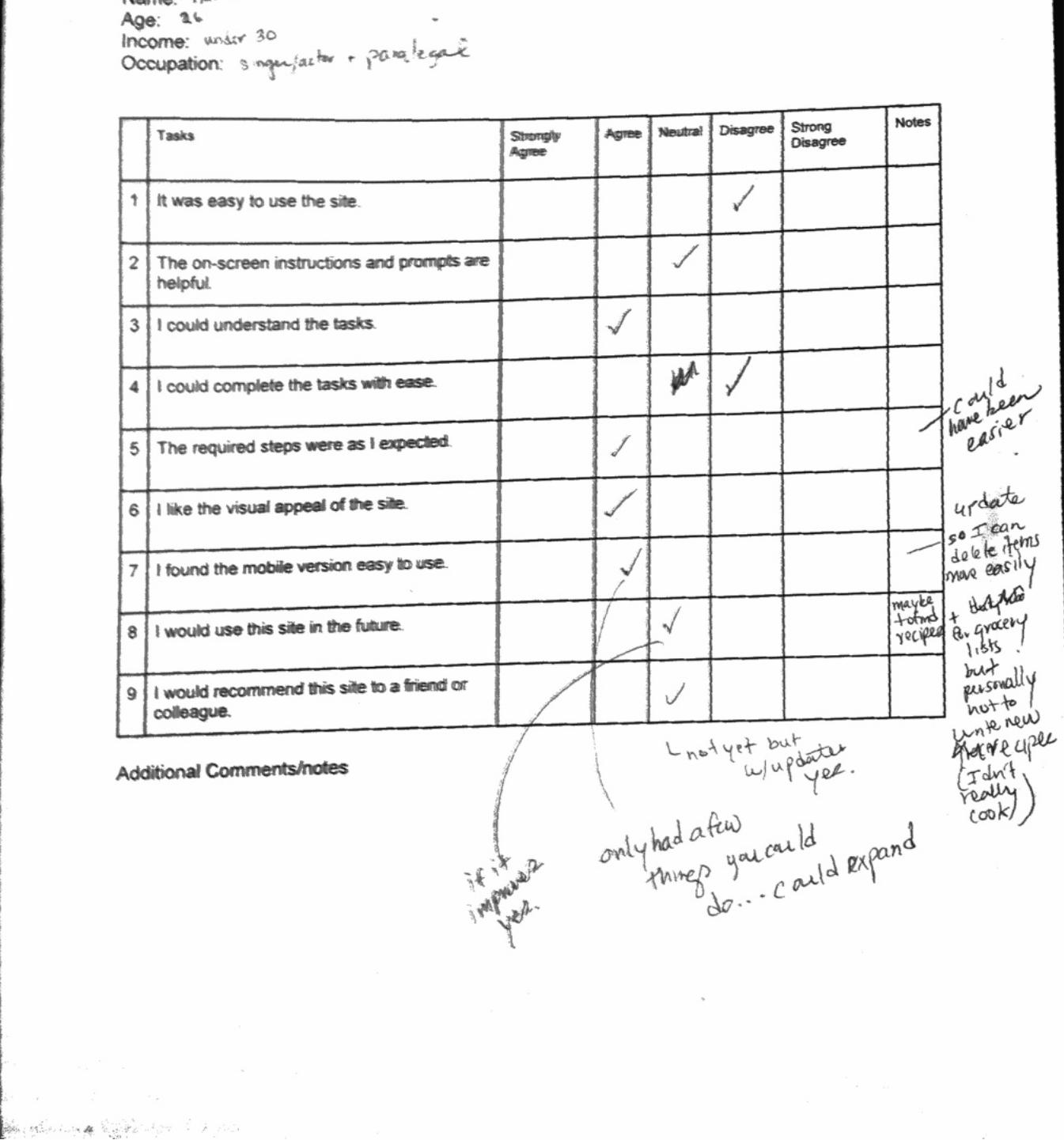
QuestionnaireName: Age: Income: Occupation:
Tasks Strongly Agree
Agree Neutral Disagree Strong Disagree
Notes
1 It was easy to use the site.
2 The on-screen instructions and prompts are helpful.
3 I could understand the tasks.
4 I could complete the tasks with ease.
5 The required steps were as I expected.
6 I like the visual appeal of the site.
7 I found the mobile version easy to use.
8 I would use this site in the future.
9 I would recommend this site to a friend or colleague.
Additional Comments/notes:
Usability Testing Report 21
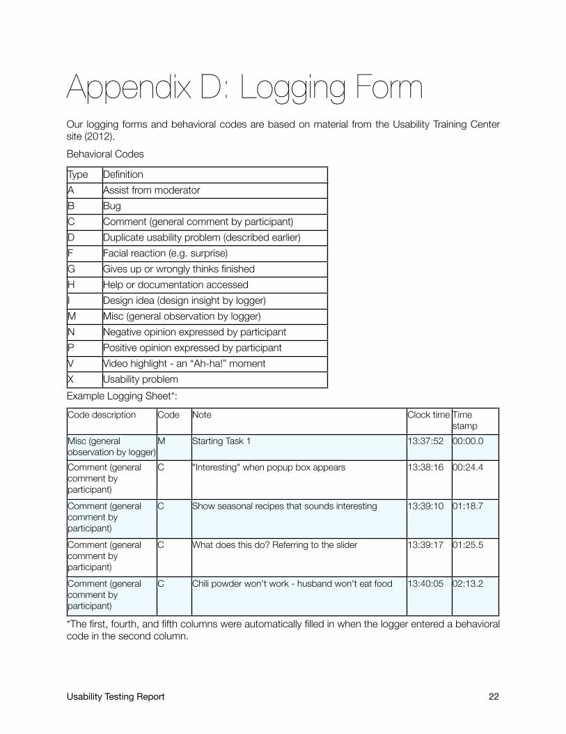
Appendix D: Logging FormOur logging forms and behavioral codes are based on material from the Usability Training Center site (2012). Behavioral Codes
Type DefinitionA Assist from moderatorB BugC Comment (general comment by participant)D Duplicate usability problem (described earlier)F Facial reaction (e.g. surprise)G Gives up or wrongly thinks finishedH Help or documentation accessedI Design idea (design insight by logger)M Misc (general observation by logger)N Negative opinion expressed by participantP Positive opinion expressed by participantV Video highlight - an “Ah-ha!” momentX Usability problemExample Logging Sheet*:Code description Code Note Clock time Time
stampMisc (general observation by logger)
M Starting Task 1 13:37:52 00:00.0
Comment (general comment by participant)
C "Interesting" when popup box appears 13:38:16 00:24.4
Comment (general comment by participant)
C Show seasonal recipes that sounds interesting 13:39:10 01:18.7
Comment (general comment by participant)
C What does this do? Referring to the slider 13:39:17 01:25.5
Comment (general comment by participant)
C Chili powder won't work - husband won't eat food 13:40:05 02:13.2
*The first, fourth, and fifth columns were automatically filled in when the logger entered a behavioral code in the second column.
Usability Testing Report 22

Appendix E: Additional
Reference MaterialJeff Johnson (2010) Designing with the Mind in Mind. Burlington-MA: Morgan KaufmannDon Norman (2002) The Design of Everyday things. New York: Basic BooksChristina Wodke(2002) Information Architecture: Blueprints for the Web. Berkeley, CA: New RidersPeter Morville and Louis Rosenfeld(2007) Information Architecture for the World Wide Web. CA: O’Reilly Media Inc.
Usability Testing Report 23

Appendix F: Additional
Recommendations“Add New Recipe” Page
We highly recommend that GastroMighty:• Change “Location” to “Grocery Aisle” or “Grocery Section”• Add more options to the drop-down “Location” menu, like paper products, pharmacy, health and
beauty, seasonal, household products, seasonal items, cereal, and snack food.• Allow users to add their own categories to the “Location” menu.• Auto-populate or offer suggestions for the “Location” of ingredients.• Provide both abbreviations and the full text for less knowledgeable users.• Allow users to mark their own recipes as favorites from within the add recipe page.• Remove “This Week’s Meal Plan” from this page. Users were confused by the appearance of this
on the “My Saved Recipes” page.
“Edit Shopping List” Page
We suggest GastroMighty make the following changes:• Add the ability to cross out an entire section on the grocery shopping list• Add the ability to move sections and ingredients around (like users can with the ingredients on
the “Add New Recipe” page). The ability to group certain items will help users adapt the system to their everyday behaviors.
• Do not require users to select a location for the items they add to their list.• Add more options to the drop-down “Location” menu, like paper products, pharmacy, health and
beauty, seasonal, household products, seasonal items, cereal, and snack food.• Allow users to add their own categories to the “Location” menu.• Automate the entry of “Location” so users do not need to input this information.• Allow users to log out of the mobile system.• Rework the mobile interface so the difference between crossing out and removing items is clear
to users. We did not do enough usability testing on this aspect to make any specific recommendations.
• When users pressed the “Cancel” button, they were taken to the homepage. Our participants thought this button (despite the reset button) would just clear all the information they had entered.
• Add a pop-up warning the user what they are about to do.
Usability Testing Report 24

Appendix G: User Data Logs
and Post-Test Questionnaire
Usability Testing Report 25