Embed Size (px)
Citation preview
© Ruth Rostron 2014 1
GRAPHOLOGY
SHORT COURSE
by
RUTH ROSTRON
LEARN * What to look for * What it might mean * A method of analysis INCLUDES * 50 samples * Full explanations * Example analysis * 30 exercises ALSO AVAILABLE * Short Course WORKBOOK Includes * 50 samples * 30 exercises * Answers
© Ruth Rostron 2014 2
The Graphology Short Course
is designed to be printed double-sided like a book
© Ruth Rostron 2014 3
GRAPHOLOGY
SHORT COURSE
by
RUTH ROSTRON
MA (Oxon) MBIG (Dip)
CONTENTS
SECTION 1 Introduction, Rhythm, Size, Zones, Width 2 Slant, Starts and Ends, Connectedness, Pressure, Stroke 3 Spacing: Envelopes, Margins, Lines, Words 4 Letter shapes: Forms of connection, Simplification, Legibility Regularity, Speed, Originality, Layout, Form standard 5 Analysing writing: Dominant, Secondary & Miscellaneous movements Example analysis 6 Interpretations 7 Exercises
© Ruth Rostron 2014 4
CONTENTS SECTION 1 Introduction, Rhythm, Size, Zones, Width Page 7 Introduction. Individuality. Sample 1 8 Sample 2. First impressions. Rhythm. Ex. 1 - 3 9 Gender and age. Groups of features 10 Size. Sample 3. 11 Size interpretations. Positive and negative. Ex. 4 12 Relative size of words. Stimulus words. Signature and ‘I’. Sample 4 13 Samples 5, 6 and 7 14 Zones. Ex. 5 15 Relative size of zones. Strengths and weaknesses. Loops 16 Width. Samples 8 and 9. Ex. 6 SECTION 2 Slant, Starts and Ends, Connectedness, Pressure, Stroke 17 Slant. Left - Right symbolism. Body language. Ex. 7 18 Samples 10 - 13 19 Starts and Ends. Hooks 20 Connectedness. False connections. Samples 14 and 15. Ex. 8 and 9 21 Pressure. Samples 16 - 18. Ex. 10 22 Stroke thickness and quality (currency) Samples 19 and 20. Ex. 11 and 12 SECTION 3 Spacing: Envelopes, Margins, Lines and Words Page 23 Spacing. Black and white. Ex. 13 24 The Page. Envelopes and Numbers. Ex. 14 and 15 25 Margins. Straightness. Interpretations. Samples 21 and 22 26 Samples 21 - 23. Ex. 16 27 Paragraphs. Spacing variations. Samples 24 and 25 28 Line Spacing and regularity. Ex. 17 and 18. 29 Baselines. Samples 26 and 27. Ex. 19 30 Line Direction. Samples 28 and 29. Ex. 20 31 Word Spacing. Samples 30 and 31. Ex. 21
© Ruth Rostron 2014 5
SECTION 4 Letter shapes: Forms of connection, Simplification, Legibility Regularity, Speed, Originality, Layout, Form standard 32 Letter shapes. Forms of Connection 33 FOCs: attitudes and motivation. Shape symbolism. Ex. 22 34 Samples 32 - 36 35 Simplification - Elaboration. Capital letters. Sample 37 36 Legibility. Samples 38, 39 and 40. Ex. 23 37 Regularity. Sample 41. Ex. 24 38 Speed. Samples 42 - 44. Ex. 25 39 Originality. Sample 45. Ex. 26 40 Layout. Form Standard. Ex. 27 SECTION 5 Analysing writing: Dominant, Secondary & Miscellaneous movements Example analysis 41 Analysing writing. Dominant, secondary and miscellaneous movements 42 Miscellaneous movements 43 Blank checklist 44 Sample 46. Example analysis 45 Step 1 - Checklist 46 Step 2 - List of dominants 46 - 48 Step 3 - Interpretations 49 Step 4 - Personality profile 50 Sample 47 51 Sample 48 52 Sample 49 53 Sample 50 54 Ex. 28 - 30. Interpretations
© Ruth Rostron 2014 6
SECTION 6 Interpretations Page 55 Size 56 Zones 57 Width 58 Slant 59 Connectedness 60 Pressure 61 Stroke 62 Margins 63 Line spacing 64 Line direction 65 Word spacing 66 Forms of connection 67 Simplification – Elaboration 68 Regularity 69 Speed SECTION 7 Exercises 70 - 71 Exercises 72 Books. Biographical note. Congratulations
© Ruth Rostron 2014 7
INTRODUCTION SECTION 1
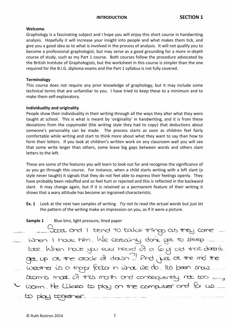
Welcome Graphology is a fascinating subject and I hope you will enjoy this short course in handwriting analysis. Hopefully it will increase your insight into people and what makes them tick, and give you a good idea as to what is involved in the process of analysis. It will not qualify you to become a professional graphologist, but may serve as a good grounding for a more in-depth course of study, such as my Part 1 course. Both courses follow the procedure advocated by the British Institute of Graphologists, but the worksheet in this course is simpler than the one required for the B.I.G. diploma exams and the Part 1 syllabus is not fully covered. Terminology This course does not require any prior knowledge of graphology, but it may include some technical terms that are unfamiliar to you. I have tried to keep these to a minimum and to make them self-explanatory. Individuality and originality People show their individuality in their writing through all the ways they alter what they were taught at school. This is what is meant by ‘originality’ in handwriting, and it is from these deviations from the copymodel (the writing style they had to copy) that deductions about someone’s personality can be made. The process starts as soon as children feel fairly comfortable while writing and start to think more about what they want to say than how to form their letters. If you look at children’s written work on any classroom wall you will see that some write larger than others, some leave big gaps between words and others slant letters to the left. These are some of the features you will learn to look out for and recognise the significance of as you go through this course. For instance, when a child starts writing with a left slant (a style never taught) it signals that they do not feel able to express their feelings openly. They have probably been rebuffed and so feel hurt or rejected and this is reflected in the backward slant. It may change again, but if it is retained as a permanent feature of their writing it shows that a wary attitude has become an ingrained characteristic. Ex. 1 Look at the next two samples of writing. Try not to read the actual words but just let the pattern of the writing make an impression on you, as if it were a picture. Sample 1 Blue biro, light pressure, lined paper
© Ruth Rostron 2014 8
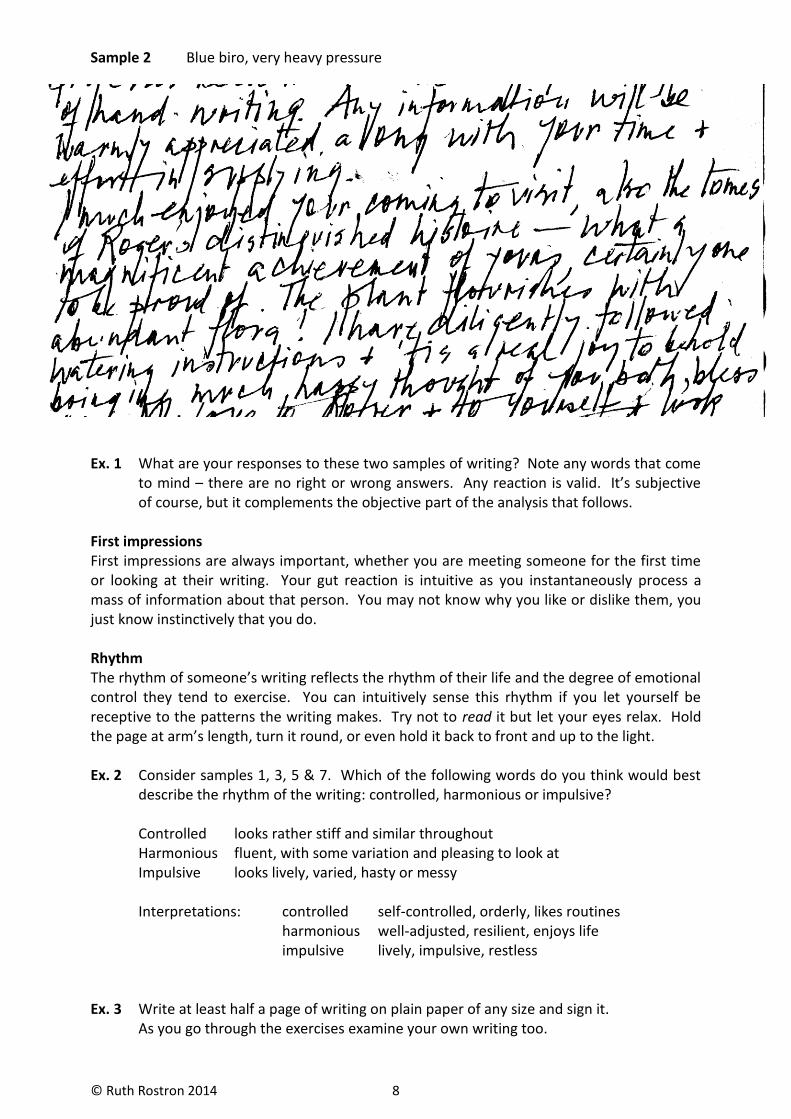
Sample 2 Blue biro, very heavy pressure
Ex. 1 What are your responses to these two samples of writing? Note any words that come to mind – there are no right or wrong answers. Any reaction is valid. It’s subjective of course, but it complements the objective part of the analysis that follows. First impressions First impressions are always important, whether you are meeting someone for the first time or looking at their writing. Your gut reaction is intuitive as you instantaneously process a mass of information about that person. You may not know why you like or dislike them, you just know instinctively that you do. Rhythm The rhythm of someone’s writing reflects the rhythm of their life and the degree of emotional control they tend to exercise. You can intuitively sense this rhythm if you let yourself be receptive to the patterns the writing makes. Try not to read it but let your eyes relax. Hold the page at arm’s length, turn it round, or even hold it back to front and up to the light. Ex. 2 Consider samples 1, 3, 5 & 7. Which of the following words do you think would best describe the rhythm of the writing: controlled, harmonious or impulsive? Controlled looks rather stiff and similar throughout Harmonious fluent, with some variation and pleasing to look at Impulsive looks lively, varied, hasty or messy Interpretations: controlled self-controlled, orderly, likes routines harmonious well-adjusted, resilient, enjoys life impulsive lively, impulsive, restless Ex. 3 Write at least half a page of writing on plain paper of any size and sign it. As you go through the exercises examine your own writing too.
© Ruth Rostron 2014 9
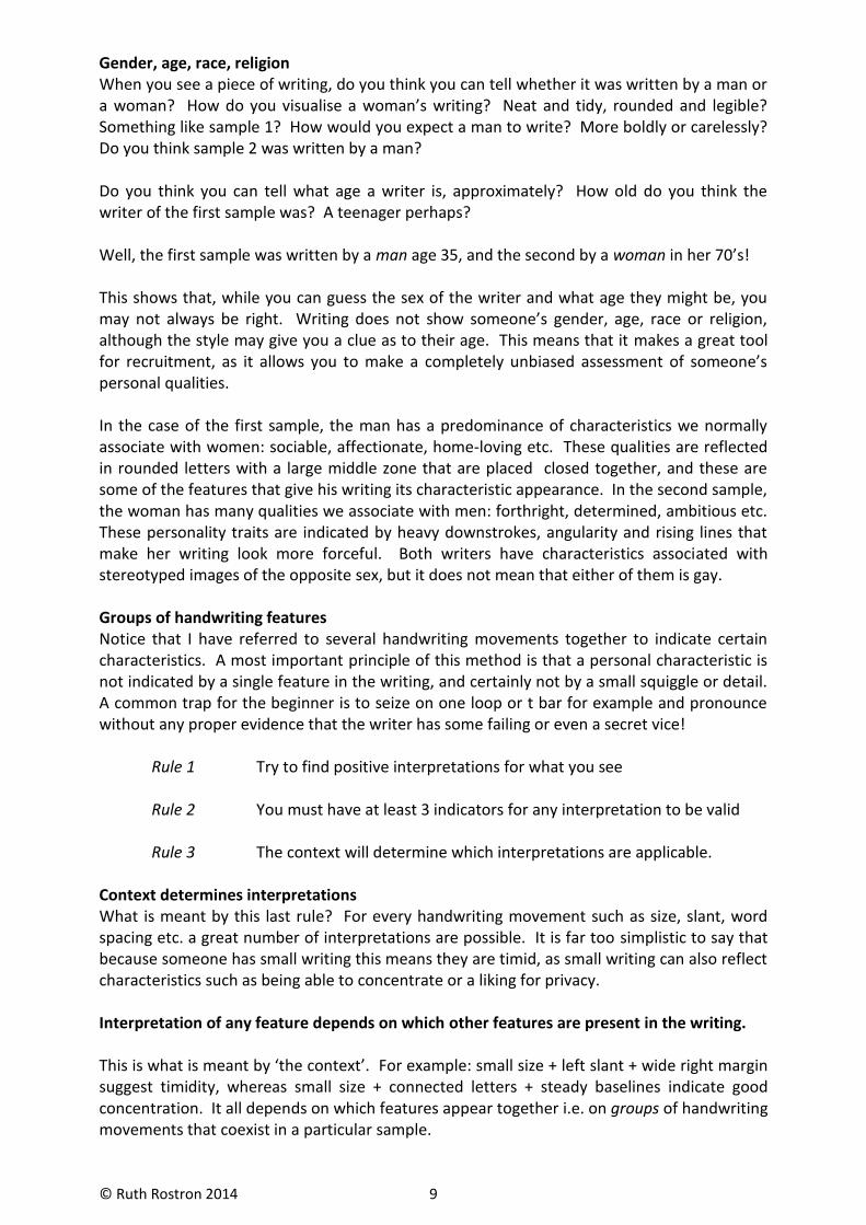
Gender, age, race, religion When you see a piece of writing, do you think you can tell whether it was written by a man or a woman? How do you visualise a woman’s writing? Neat and tidy, rounded and legible? Something like sample 1? How would you expect a man to write? More boldly or carelessly? Do you think sample 2 was written by a man? Do you think you can tell what age a writer is, approximately? How old do you think the writer of the first sample was? A teenager perhaps? Well, the first sample was written by a man age 35, and the second by a woman in her 70’s! This shows that, while you can guess the sex of the writer and what age they might be, you may not always be right. Writing does not show someone’s gender, age, race or religion, although the style may give you a clue as to their age. This means that it makes a great tool for recruitment, as it allows you to make a completely unbiased assessment of someone’s personal qualities. In the case of the first sample, the man has a predominance of characteristics we normally associate with women: sociable, affectionate, home-loving etc. These qualities are reflected in rounded letters with a large middle zone that are placed closed together, and these are some of the features that give his writing its characteristic appearance. In the second sample, the woman has many qualities we associate with men: forthright, determined, ambitious etc. These personality traits are indicated by heavy downstrokes, angularity and rising lines that make her writing look more forceful. Both writers have characteristics associated with stereotyped images of the opposite sex, but it does not mean that either of them is gay. Groups of handwriting features Notice that I have referred to several handwriting movements together to indicate certain characteristics. A most important principle of this method is that a personal characteristic is not indicated by a single feature in the writing, and certainly not by a small squiggle or detail. A common trap for the beginner is to seize on one loop or t bar for example and pronounce without any proper evidence that the writer has some failing or even a secret vice! Rule 1 Try to find positive interpretations for what you see Rule 2 You must have at least 3 indicators for any interpretation to be valid Rule 3 The context will determine which interpretations are applicable. Context determines interpretations What is meant by this last rule? For every handwriting movement such as size, slant, word spacing etc. a great number of interpretations are possible. It is far too simplistic to say that because someone has small writing this means they are timid, as small writing can also reflect characteristics such as being able to concentrate or a liking for privacy. Interpretation of any feature depends on which other features are present in the writing. This is what is meant by ‘the context’. For example: small size + left slant + wide right margin suggest timidity, whereas small size + connected letters + steady baselines indicate good concentration. It all depends on which features appear together i.e. on groups of handwriting movements that coexist in a particular sample.
© Ruth Rostron 2014 10
SIZE
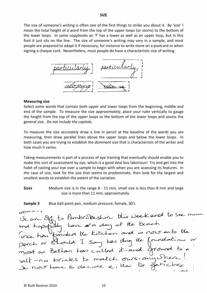
The size of someone’s writing is often one of the first things to strike you about it. By ‘size’ I mean the total height of a word from the top of the upper loops (or stems) to the bottom of the lower loops. In some copybooks an ‘f’ has a lower as well as an upper loop, but in this font it just sits on the line. The size of someone’s writing may vary in a sample, and most people are prepared to adapt it if necessary, for instance to write more on a postcard or when signing a cheque card. Nevertheless, most people do have a characteristic size of writing.
Measuring size Select some words that contain both upper and lower loops from the beginning, middle and end of the sample. To measure the size approximately, place your ruler vertically to gauge the height from the top of the upper loops to the bottom of the lower loops and assess the general size. Do not include the capitals. To measure the size accurately draw a line in pencil at the baseline of the words you are measuring, then draw parallel lines above the upper loops and below the lower loops. In both cases you are trying to establish the dominant size that is characteristic of the writer and how much it varies. Taking measurements is part of a process of eye training that eventually should enable you to make this sort of assessment by eye, which is a good deal less laborious! Try and get into the habit of casting your eye over a sample to begin with when you are assessing its features. In the case of size, look for the size that seems to predominate, then look for the largest and smallest words to establish the extent of the variation. Sizes Medium size is in the range 8 - 11 mm, small size is less than 8 mm and large size is more than 11 mm, approximately. Sample 3 Blue ball-point pen, medium pressure, female, 30’s

© Ruth Rostron 2014 11
SIZE INTERPRETATIONS
In general, the size of someone’s writing relates to their sense of self-importance, confidence, activity level and how outgoing they are. Here are some key words and phrases associated with different sizes of writing: Large extrovert, big personality, likes company and activity restless, attention-seeking, tends to take over Medium realistic, moderate, team person ‘average’, conforming Small introvert, thinks a lot, good with details needs space, timid Variable changeable, moody, variable confidence N.B. One size of writing is not better than another. Each size has its plus and a minus side, and people who have these characteristic sizes of writing will have strengths in some areas and weaknesses in others. Interpretations In Section 6 you will find longer lists of possible interpretations for size, and also other aspects of writing such as slant, word spacing, line direction etc. You will see that these lists are divided into positive and negative, but really there is no clear dividing line. Very often it is a matter of degree, or how strong the trait is. Take ‘caution’ for example. It is wise to exercise a certain amount of caution in a dangerous world. A complete lack of caution would mean that someone was rash or foolish, while excessive caution could make someone afraid to leave the house. If you think of characteristics as being on a continuum, this should help you understand how too much or too little of anything will tend to be negative. As you go through the course you will gradually learn how to work out which interpretations to choose. The balance of positive and negative interpretations that is appropriate for any sample will depend on the general standard or quality of the writing. Assessing this takes practice, so in the meantime always go for positive interpretations first. It is important not to be judgemental when you are considering what a particular feature in someone’s writing might indicate about them, especially when you are a beginner! Which interpretations are appropriate for any particular sample of writing will depend on which other features it contains. You will see that underneath the samples that follow, I have ‘added’ features together: E.g. Sample 5 Large size + large lower zone + right slant = active, likes travel
Large size + large lower zone + irregular = restless, undisciplined, careless This is intended to show how different groups of features indicate different character traits. Ex. 4 Assess the size of samples 1, 2, 3, 5, 6 & 7. In each case is the size large, medium or small?
© Ruth Rostron 2014 12
Relative size of Words
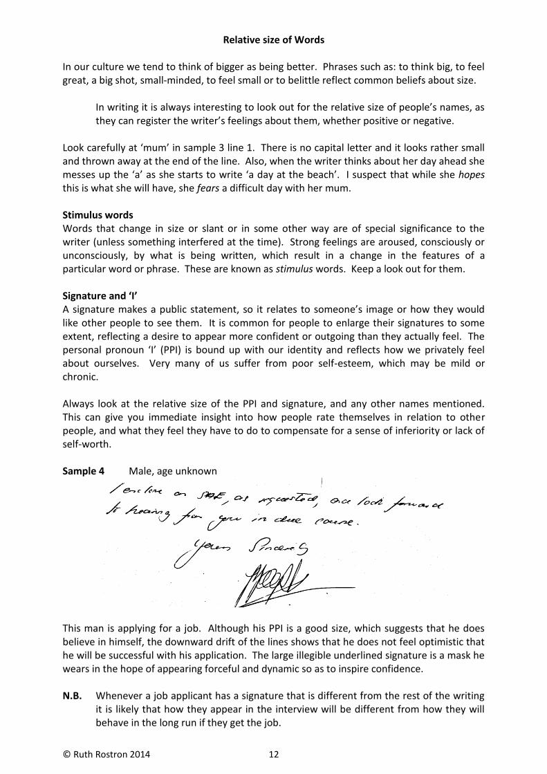
In our culture we tend to think of bigger as being better. Phrases such as: to think big, to feel great, a big shot, small-minded, to feel small or to belittle reflect common beliefs about size. In writing it is always interesting to look out for the relative size of people’s names, as they can register the writer’s feelings about them, whether positive or negative. Look carefully at ‘mum’ in sample 3 line 1. There is no capital letter and it looks rather small and thrown away at the end of the line. Also, when the writer thinks about her day ahead she messes up the ‘a’ as she starts to write ‘a day at the beach’. I suspect that while she hopes this is what she will have, she fears a difficult day with her mum. Stimulus words Words that change in size or slant or in some other way are of special significance to the writer (unless something interfered at the time). Strong feelings are aroused, consciously or unconsciously, by what is being written, which result in a change in the features of a particular word or phrase. These are known as stimulus words. Keep a look out for them. Signature and ‘I’ A signature makes a public statement, so it relates to someone’s image or how they would like other people to see them. It is common for people to enlarge their signatures to some extent, reflecting a desire to appear more confident or outgoing than they actually feel. The personal pronoun ‘I’ (PPI) is bound up with our identity and reflects how we privately feel about ourselves. Very many of us suffer from poor self-esteem, which may be mild or chronic. Always look at the relative size of the PPI and signature, and any other names mentioned. This can give you immediate insight into how people rate themselves in relation to other people, and what they feel they have to do to compensate for a sense of inferiority or lack of self-worth. Sample 4 Male, age unknown
This man is applying for a job. Although his PPI is a good size, which suggests that he does believe in himself, the downward drift of the lines shows that he does not feel optimistic that he will be successful with his application. The large illegible underlined signature is a mask he wears in the hope of appearing forceful and dynamic so as to inspire confidence. N.B. Whenever a job applicant has a signature that is different from the rest of the writing it is likely that how they appear in the interview will be different from how they will behave in the long run if they get the job.
© Ruth Rostron 2014 13
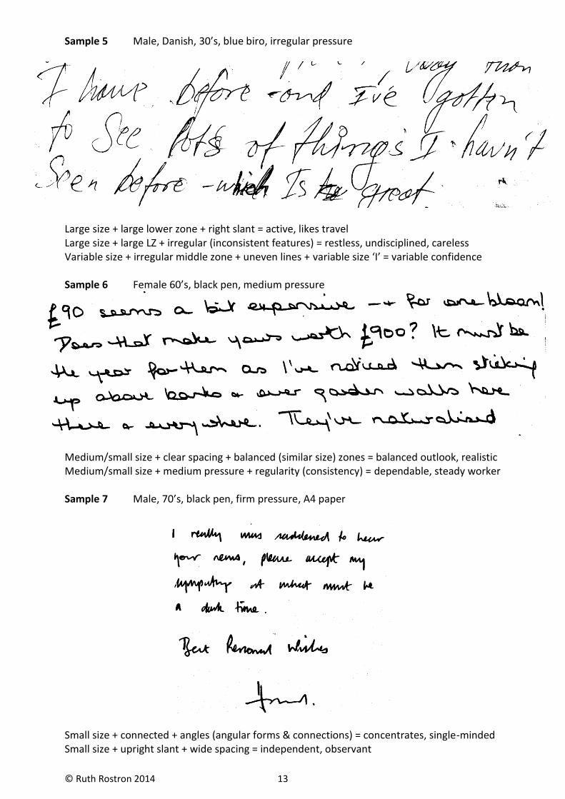
Sample 5 Male, Danish, 30’s, blue biro, irregular pressure
Large size + large lower zone + right slant = active, likes travel Large size + large LZ + irregular (inconsistent features) = restless, undisciplined, careless Variable size + irregular middle zone + uneven lines + variable size ‘I’ = variable confidence Sample 6 Female 60’s, black pen, medium pressure
Medium/small size + clear spacing + balanced (similar size) zones = balanced outlook, realistic Medium/small size + medium pressure + regularity (consistency) = dependable, steady worker Sample 7 Male, 70’s, black pen, firm pressure, A4 paper
Small size + connected + angles (angular forms & connections) = concentrates, single-minded Small size + upright slant + wide spacing = independent, observant


![R v Rostron [2013] NTSC 03 PARTIES: THE QUEEN ROSTRON, Dennis](https://img.pdfslide.us/doc/110x75/61fb6c0b2e268c58cd5dfaf4/r-v-rostron-2013-ntsc-03-parties-the-queen-rostron-dennis.jpg)