Embed Size (px)
Citation preview

SharpShooter Gauges Documentation
Last modified on: September 7, 2011

2
www.perpetuumsoft.com PERPETUUM software
Table of Content
Destination and Basic Features ............................................................................................ 4
SharpShooter Gauges Concepts .......................................................................................... 5
Getting Started ................................................................................................................. 6
Elements Description ....................................................................................................... 11
The General Instrument Model ....................................................................................... 11
Elements Hierarchy ...................................................................................................... 11
Description of General Properties ................................................................................... 17
The Description All Elements and Their Properties ............................................................ 18
Expressions .................................................................................................................... 32
Destination and General Principles of the Expressions Use ................................................. 32
Description of Expression Language Syntax and Semantics ............................................... 33
Use and Capabilities of the Instrument Designer.................................................................. 38
Work in Windows Forms Applications ................................................................................. 45
Components Used in Windows Forms Applications. ........................................................... 45
The Widget Component Use and Capabilities. .................................................................. 45
The IndicatorWidget Component Use and Capabilities. ...................................................... 47
Work in Web Forms Applications ........................................................................................ 51
Components Used in Web Applications. ........................................................................... 51
The WidgetProducer and WidgetHolder Components Use and Capabilities ............................ 51
The Technology of the Instrument Design. .......................................................................... 55
Designing the Simple Instrument with a Slider ................................................................. 55
Creation of Instruments Using Complex Expressions ......................................................... 58
Working With the OPCChannel Component ......................................................................... 64
General Information ..................................................................................................... 64
OPCConnection ............................................................................................................ 64
OPCChannel ................................................................................................................ 64
Step-by-step Example of Application Creation .................................................................. 65
Advanced DataChannel Design .......................................................................................... 66

3
www.perpetuumsoft.com PERPETUUM software
Capabilities ................................................................................................................. 66
Design ........................................................................................................................ 66
Appendix 1 Working with the Expression Editor ................................................................... 67
4
www.perpetuumsoft.com PERPETUUM software
Destination and Basic Features The SharpShooter Gauges is intended for creating and using indication and graphic user interface
manipulation elements.
Nowadays most developers strive to create the most naturally looking, convenient and unique
application interfaces. The SharpShooter Gauges is an ideal solution of this task.
Full-featured graphics editor allows creating new visual components with the unique look and
functionality by means of only a few mouse clicks. It can be both common controls such as
Progress Bars, Meters, Dials, Sliders, Gauges, Odometers, Thermometers, Switches etc. and
specialized elements for your industry: Manipulators, Scales, Special-Purpose Devices and many
others.
Each SharpShooter Gauges control consists of visual and non-visual objects interacting with each
other. Due to these objects use, a developer can create any necessary visual control.
To assign separate elements‟ properties the expressions can be used; it helps to adjust the
property depending on the current instrument status, as well as on the mouse status.
The use of the OPCChannel component gives a unique opportunity to incorporate real-time data
channels with the OPC industry standard. The binding can be implemented both in read only and
write modes.
A created instrument can be saved to a file for reuse.
5
www.perpetuumsoft.com PERPETUUM software
SharpShooter Gauges Concepts The main concept of SharpShooter Gauges is the ability for quick and convenient creation of
original control objects according to specified requirements without challenging a developer to
have some special knowledge or high qualifications.
The SharpShooter Gauges contains components allowing to display the instrument and to
manage it.
The Instrument is a compound object with hierarchical structure. In the instrument structure
there are primitives intended for assigning the instrument appearance and behavior. The
instrument allows designing some control object.
To create an instrument, the designer, that is also included in the SharpShooter Gauges delivery
package, is used. The designer allows creating an instrument with the help of more simple
elements, included in it in different combinations, and also to set the separate properties of the
primitives, using convenient graphic means. To bind the primitives together and to assign the
complex functionality, the expressions can be used.
Different combinations of primitives, included in the instrument, the flexibility in settings
properties of different elements, the use of expressions allow creating the control element,
according to the developer‟s requirements.

6
www.perpetuumsoft.com PERPETUUM software
Getting Started This article describes how a simple Windows Forms control element can be created by means of
the SharpShooter Gauges.
Run Microsoft Visual Studio and create a new project – C# Windows Application.
Put the IndicatorWidget component onto the form.
IndicatorWidget is a visual component intended for displaying an instrument.
It is necessary to assign the instrument that will be displayed in this component. Double click to
run the instrument designer. After the designer is launched, the dialog window in which the
instrument template can be selected appears.

7
www.perpetuumsoft.com PERPETUUM software
On the left of the window the instruments templates that can be used are presented. Choose the
appropriate instrument template. For example, choose the SimpleGauge instrument from the
Gauges group:
Click “OK”, and the selected element will be added to the designer for editing.

8
www.perpetuumsoft.com PERPETUUM software
The instrument consists of the separate elements, each of which has its own functionality and
properties. The designer allows adding, deleting and adjusting their properties. To manipulate the
element it is necessary to select it with a mouse in the instrument window or in the tree,
displaying the instrument structure.
Exit the designer, pressing the “OK” button for confirming changes. The final instrument will be
used by the IndicatorWidget component.
Set indicatorWidget1.Dock property to Top and change Form size.
9
www.perpetuumsoft.com PERPETUUM software
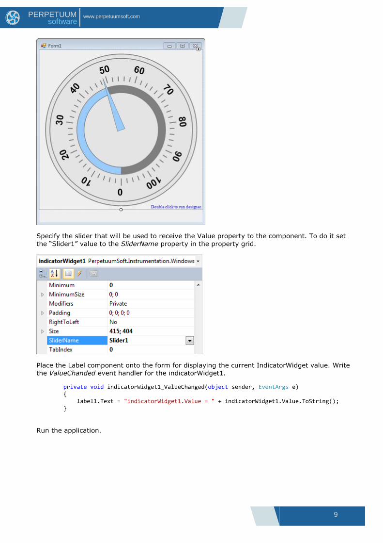
Specify the slider that will be used to receive the Value property to the component. To do it set
the “Slider1” value to the SliderName property in the property grid.
Place the Label component onto the form for displaying the current IndicatorWidget value. Write
the ValueChanded event handler for the indicatorWidget1.
private void indicatorWidget1_ValueChanged(object sender, EventArgs e) { label1.Text = "indicatorWidget1.Value = " + indicatorWidget1.Value.ToString(); }
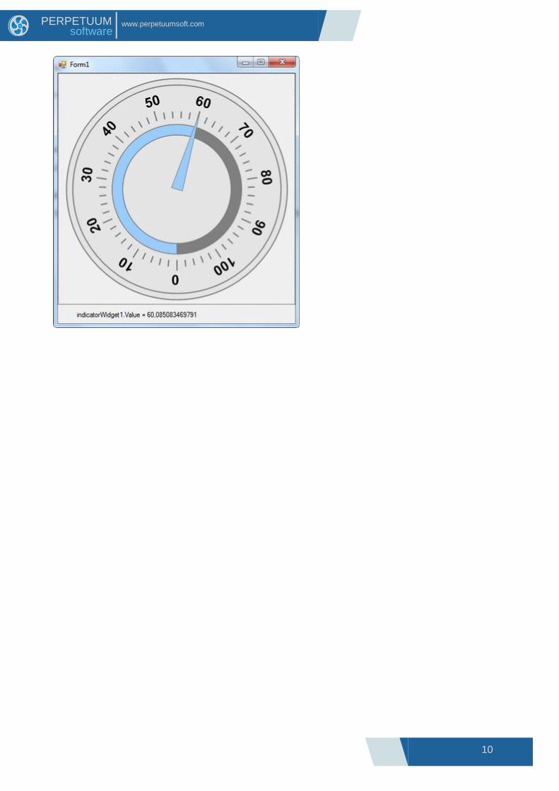
Run the application.
10
www.perpetuumsoft.com PERPETUUM software

11
www.perpetuumsoft.com PERPETUUM software
Elements Description
The General Instrument Model The Instrument is a compound object with a hierarchical structure. Any elements can be included
in the instrument. The elements can be structurally divided into two groups:
simple;
compound (elements that can include any other elements).
The elements can be functionally divided into:
visual (are intended for instrument appearance assigning);
non-visual (intended for elements‟ binding and grouping, as well as for assigning
instrument functionality).
The elements can be included in the instrument in different combinations. However, for practical
use the instruments, specifically intended for displaying and assigning some certain values, are
utilized.
Such elements are built according to the following scheme. One or several scales assigning and
displaying value range are included in the instrument. Several sliders displaying (assigning) the
current value are included. The elements, displaying the value in some other form, for example in
the form of text line, can also be included.
For example, to build a simple instrument the following structure is used:
Elements Hierarchy Let‟s consider the hierarchy of classes, used during the instrument creation.
12
www.perpetuumsoft.com PERPETUUM software
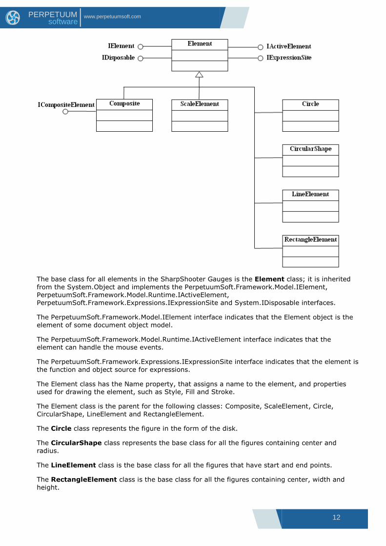
The base class for all elements in the SharpShooter Gauges is the Element class; it is inherited
from the System.Object and implements the PerpetuumSoft.Framework.Model.IElement,
PerpetuumSoft.Framework.Model.Runtime.IActiveElement,
PerpetuumSoft.Framework.Expressions.IExpressionSite and System.IDisposable interfaces.
The PerpetuumSoft.Framework.Model.IElement interface indicates that the Element object is the
element of some document object model.
The PerpetuumSoft.Framework.Model.Runtime.IActiveElement interface indicates that the
element can handle the mouse events.
The PerpetuumSoft.Framework.Expressions.IExpressionSite interface indicates that the element is
the function and object source for expressions.
The Element class has the Name property, that assigns a name to the element, and properties
used for drawing the element, such as Style, Fill and Stroke.
The Element class is the parent for the following classes: Composite, ScaleElement, Circle,
CircularShape, LineElement and RectangleElement.
The Circle class represents the figure in the form of the disk.
The CircularShape class represents the base class for all the figures containing center and
radius.
The LineElement class is the base class for all the figures that have start and end points.
The RectangleElement class is the base class for all the figures containing center, width and
height.

13
www.perpetuumsoft.com PERPETUUM software
The ScaleElement class represents the base class for all objects placed on the scale.
The Composite class is the base class for all container-elements, i.e. elements capable of
involving other elements. Let‟s consider it in details.
The Composite class realizes the ICompositeElement interface, indicating that this class is a
container for the other elements and provides the access to these elements. Instrument, Group,
Scale, SliderBase, and DockableTrajectory classes are inherited from the Composite class.
The object of the Instrument class represents the root element for all elements hierarchy and
realizes the IRootElement interface indicating that it is the root element.
The object of the Group class is a non-visual element intended for grouping the other elements.
The object of the Scale class is a non-visual element assigning the scale range.
The SliderBase class represents the base class for sliders. A slider has the current value that can
be changed with the help of a mouse. It is possible to define the point corresponding to the
current Slider value located at some distance from the trajectory in which the Slider is included.
The Slider class, which object is a non-visual element representing the current value, is inherited
from the SliderBase class.
The Guide and Joint classes realize the ITrajectory interface indicating that classes represent
trajectories. Guide is the trajectory having the form of the line. Joint is the trajectory having the
form of the arc.
The abstract DockableTrajectory class realizes the ITrajectory interface indicating that the class
represents Trjectories. Guide is a linear trajectory. Joint is a circular trajectory.
Let‟s consider the ScaleElement class in details.

14
www.perpetuumsoft.com PERPETUUM software
The descendants of the ScaleElement class are classes intended for scale visualization.
The ScaleMarksBase class represents marks on the scale. It is a base class for the Ticks and
ScaleMarks classes. Objects of the Ticks class are the ticks on the scale. Objects of the
ScaleMarks class are the marks on the scale.
The abstract ScaleLabelsBase class represents text labels on the scale. It is a base class for the
ScaleLabels, CustomLabels, and ScaleTitleclasses. The ScaleLabels class represents numeric
labels within the scale range. The CustomLabels class represents a collection of scale text labels.
The ScaleTitle represents a scale title.
Descendants of the abstract ValuePresenterScaleElement are intended for displaying scale
values. The Tank class represents linear scale value as tank level. The abstract LevelBase class is
a base class for the LinearLevel and RangedLevel classes. LinearLevel visualizes linear scale value
as a level. RangedLevel is intended for displaying scale value as level with variable width.
Let‟s consider the CircularShape class.

15
www.perpetuumsoft.com PERPETUUM software
CircularNotches, Polygon, Gear, and Highlight classes are inherited from the CircularShape class.
The object of the CircularNotches class creates the notch effect. It is used for the slider
appearance design.
The Polygon class represents a polyhedron and has the Sides property that indicates the
quantity of faces. The Star class, which represents a star, is inherited from it.
The Gear class represents gear.
The Highlight class is intended for highlight emulation.
Let‟s consider the LineElement class.
The LineElement class is the base class for Line, Needle, Spring and LinearNotches classes. The
Line class represents a line.
The Needle class represents a pointer, the form of which is assigned with the help of the
NeedlePoints property. It is used for slider visualization.
The Spring class represents a spring.
The object of the LinearNotches class creates the effect of linear notches. It is used for the
slider appearance design.
Let‟s consider the RectangleElement class.

16
www.perpetuumsoft.com PERPETUUM software
Ellipse, Rectangle, RoundedRectangle, Frame, ArcBase, Picture, PictureSet, Label, Digits and
Odometer are inherited from the RectangleElement class.
The Ellipse class represents a figure in the form of ellipse.
The Rectangle class represents a figure in the form of rectangle.
The RoundedRectangle class represents a figure in the form of rectangle with the rounded
angles.
The Frame class represents a rectangular frame.
The ArcBase class is the base of the Arc, Pie and RingSector classes that accordingly represent
an ellipse arc, an ellipse sector and an elliptical ring sector.
The objects of the Picture class are intended for displaying the picture, assigned in the Image
property.
The objects of the PictureSet class are intended for displaying one picture from the assigned
pictures collection.
The objects of the Label class are intended for inscription displaying.
The objects of the Digits class are intended for digital indicator emulation.
17
www.perpetuumsoft.com PERPETUUM software
The objects of the Odometer class are intended for mechanical meter emulation.
Description of General Properties Let‟s consider the Instrument class properties, peculiar to all descendants‟ elements in details.
The Name property assigns the unique name within the entire instrument.
The Fill property assigns the fill, which will be used for element drawing.
Line tracing style, which will be used for element drawing, is assigned in the Stroke property.
The Style property assigns the style name of the element, used for element drawing. Available
styles are assigned in the Styles property of the instrument, the element belongs to. If the
element has no Fill and/or Stroke properties assigned, the style with the name assigned in the
Style property will be applied.
The Smooth property assigns the quality of output graphic.
The Visible property assigns element‟s visibility.
The Active property indicates whether an element will perceive the events from the mouse.
The BreakEventBubbling property indicates whether the events from the mouse will be passed to
the parent element for the further processing.
The RecalculateAll property indicates for what elements the expressions will be recalculated, if the
element state was changed. If RecalculateAll is set to false, the expressions will be recalculated
only for the selected element and all the elements included in it, otherwise the expressions of all
instrument elements will be recalculated.
The process of receiving events from a mouse and their handling is produced in the following
way:
The visual element receives events from the mouse when its pointer is over the element. The
element handles these events and, if the BreakEventBubbling property is set to false, passes the
event to the parent for handling. Thus, the events received from the mouse are spread from the
visual element up the instrument tree. Non-visual elements can receive the event from the
mouse only from the included visual elements.
The Size property is the size of the instrument work area.
The Enabled property indicates whether the instrument will react on the user actions.
The Focused property indicates whether the instrument is in the focus.
During the instrument development these values can be set arbitrarily. When the instrument is
displayed in Widget, these properties are set according to Enabled and Focused Widget
properties. These properties are intended to implement the instrument appearance and behavior
depending on the state of the Widget, in which the instrument is displayed.
The following properties are used only in the instrument design mode and saved with the
instrument: SnapToGrid – snap to grid, the ShowGrid property - the grid visibility, the GridStep
property – the step of the grid, the MeasureUnit property –the measurement units used.

18
www.perpetuumsoft.com PERPETUUM software
The Description All Elements and Their Properties The Joint element is the trajectory in the line of an arc.
The arc is assigned by the center (the Center property), by the radius (the Radius property), by
the starting angle (the StartAngle property) and by the total angle (the TotalAngle property). The
angles are counted clockwise, from the horizontal axis. The Joint element is used for dials
creation.
The Guide element is the trajectory along the line.
The line is assigned by the start (the StartPoint property) and the end (the EndPoint property)
points. This element is used for linear scales creation.
19
www.perpetuumsoft.com PERPETUUM software
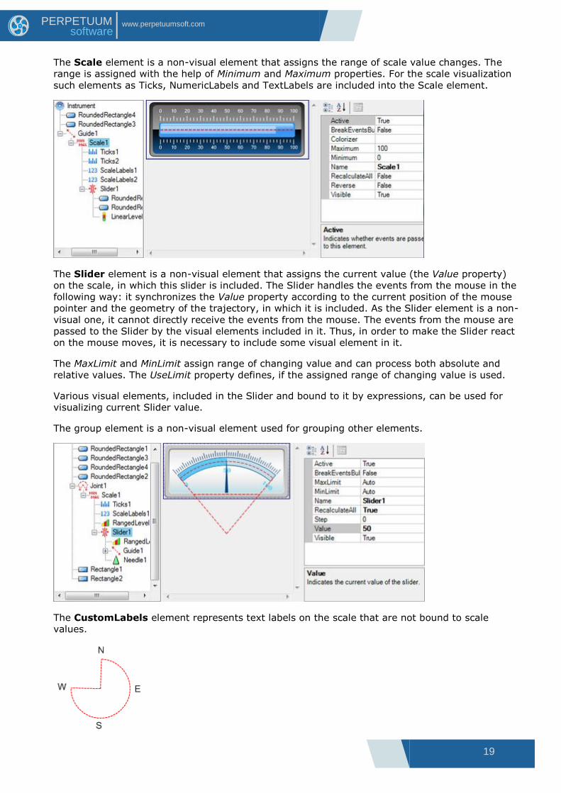
The Scale element is a non-visual element that assigns the range of scale value changes. The
range is assigned with the help of Minimum and Maximum properties. For the scale visualization
such elements as Ticks, NumericLabels and TextLabels are included into the Scale element.
The Slider element is a non-visual element that assigns the current value (the Value property)
on the scale, in which this slider is included. The Slider handles the events from the mouse in the
following way: it synchronizes the Value property according to the current position of the mouse
pointer and the geometry of the trajectory, in which it is included. As the Slider element is a non-
visual one, it cannot directly receive the events from the mouse. The events from the mouse are
passed to the Slider by the visual elements included in it. Thus, in order to make the Slider react
on the mouse moves, it is necessary to include some visual element in it.
The MaxLimit and MinLimit assign range of changing value and can process both absolute and
relative values. The UseLimit property defines, if the assigned range of changing value is used.
Various visual elements, included in the Slider and bound to it by expressions, can be used for
visualizing current Slider value.
The group element is a non-visual element used for grouping other elements.
The CustomLabels element represents text labels on the scale that are not bound to scale
values.

20
www.perpetuumsoft.com PERPETUUM software
Text labels as well as corresponding scale values are assigned in the Labels collection. Scale value
can be assigned both by absolute value and relative value (in percentage from the scale range).
Labels, which value is set to Auto, will be evenly distributed along the scale subject to bench
mark assigned by the Origin property. Shift form the Scale is assigned in the Distance property.
The Dock property defines relative position of the CustomLabels element subject to sifts assigned
in the Padding property. The OddLabelDistance property sets sift of add labels relative to even
ones. Labels alignment relative to each other is assigned by the Position property. The
TextAlingment property defines marks alignment relative to the corresponding scale value. Text
angle is assigned in the Angle property, and text orientation is set in the TextRotationMode
property. The ItemMargins property defines text shift from the label area margins. The
ShowSuperposableLabels defines if the superposable labels will be displayed. If you need to
display labels only in the specified range, use the MaxLimit and MinLimit properties assigning
range bounds. The UseLimit property indicates that limitation of element output will be executed.
This element should be included in the scale.
The ScaleLabels element represents numeric labels on the scale.
Values are displayed within the range, set in the scale, and step, defined by the Step property. If
the Step property is set to Auto, divisions‟ amount is set in the Divisions property. The origin
property defines a benchmark. If the UseRoundValues is set to true, scale marks will be
distributed along the scale in the way that the corresponding values contain minimal amount of
fractional numbers; the number of divisions will be less or equal to the Divisions property value.
When the element is drawn, these labels will be evenly distributed along the scale. Shift from the
scale is assigned by the Distance property.
The Dock property defines relative position of the ScaleLabels subject to shifts, assigned in the
Padding property. The OddLabelDistance property sets shift of the odd labels relative to even
ones. Labels alignment relative to each other is set in the Position property. The TextAlignment
property sets marks alignment relative to the corresponding scale value. Label angle is set in the
Angle property, and label orientation is set in the TextRotationMode property. The
ShowSuperposableLabels defines if the superposable labels will be displayed. The ItemsMargins

21
www.perpetuumsoft.com PERPETUUM software
property defines text shift from the Label area bounds. If you need to display Labels only within
the assigned range, use the MaxLimit and MinLimit properties that set range bounds. The
UseLimit property indicates that limitation of the element output will be executed. This element
should be included in the scale.
The ScaleTitle element represents the scale title.
Title text is defined in the Text property. Element position is assigned is set in the Origin
property. The Dock property assigns relative position of the Scaletitle subject to shifts set in the
Padding property. The TextAlignment defines title alignment. Text angle is set in the Angle
property, and text orientation is assigned in the TextRotationMode property.
The Ticks element is the ticks on the scale.
Values are displayed within the range, assigned in the scale and step defined in the Step
property. The number of the ticks is assigned in the Divisions property. The Origin property
specifies the bench mark. If the UseRoundValues property is set to true, scale ticks will be
distributed in the way that the corresponding values contain minimal amount of the fractional
numbers; the number of divisions will be less or equal to the Divisions property value. The length
of the tick is assigned in the Length property. The intermediate ticks, which divide this range
according to the SubDivisions property, are output between the ticks in the range. The length of
the intermediate ticks is assigned in the SubLength property. The positional relationship of the
ticks and the intermediate ticks can be assigned with the help of the SubTicksPosition property.
When drawing the element, the ticks will be evenly spread in the line of the whole scale. The
indent from the scale is assigned with the help of the Distance property. The Dock property
determines the Ticks element position subject to shifts, set in the Padding property. If there is a
necessity to output the ticks only in the assigned range, use MaxLimit and MinLimit properties
that assign the range borders. The UseLimits property indicates that the limitation on element
outlet will be used. This element is included in the scale.

22
www.perpetuumsoft.com PERPETUUM software
The ScaleMarks element represents graphic markers on the scale.
Shape type is assigned in the Shape property. Values are displayed within the range, set in the
scale, and step, assigned in the Step property. If the Step property value is set to Auto, division
amount is set in the Divisions property. The Origin property sets the benchmark. Marks size is
assigned in the MarkSize property. Submarks are displayed in the within the range between
marks, and they divide this range according to the SubDivisions property. Submarks size is
assigned in the SubMarkSize property.
Marks and submarks relative position is set in the SubTicksPosition property. When the element is
drawn, marks will be evenly distributed along the scale. Shift from the scale is set in the Distance
property. The Dock property determines relative position of the marks subject to shifts, set in the
Padding property. Marks angle is assigned in the MarksAngle property. If you need to display
marks only in the specified range, use the MaxLimit and MinLimit properties, which assign range
bounds. The UseLimit property indicates that limitation of the element output will be performed.
The ScaleMarks element should be included in the scale.
The RangedLevel element is intended for displaying intervals on the scale.

23
www.perpetuumsoft.com PERPETUUM software
The Value property assigns value the element will be displayed up to. The StartWidth and
EndWidth property set width of the element at the beginning and at the end of the scale. If the
Fill property is not set, the RangedLevel element will be painted with colors assigned in the Colors
property. If the Colors property is not set, the element will be painted with colors set by
StartColor and EndColor. The Divisions property determines divisions‟ amount. The
DivisionsStroke property assigns type of lines used to divide divisions. The AlignmentMode
property assigns the way element will bound to the scale. If you need to display markers only
within the specified range, use the MaxLimit and MinLimit properties that set range bounds.
The LinearLevel element is intended for displaying intervals on the linear scale.
The Value property sets value the element will be displayed up to. The Divisions property
determines division‟s amount. The DivisionsStroke property assigns type of lines used to divide
divisions. If the Fill property is not set, the RangedLevel element will be painted with colors
assigned in the Colors property. If the Colors property is not set, the element will be painted with
colors set by StartColor and EndColor.
The Width property determines element width. The StartCap and EndCap properties assign style
of displaying element-start and element-end. Style of displaying the whole element is determined
in the Effect3D property. The ShowAsThermometer property determines if the element will be
displayed as thermometer, i.e. there will be a circle with radius, set in the PocketRadius property,
at the beginning of the scale. The Dock property determines type the of element‟s docking to the
scale.
The Tank element is a visual element, intended for emulating a tank, filled with liquid. The
element is assigned by the Width property, determining tank width, the Depth property, assigning
tank depth, and the TankWidth, determining width of the tank walls. The TankColor and
LiquidColor set tank color and liquid color correspondingly. Style of displaying the whole element
is determined by the Effect3D property. The Dock property determines type the of element‟s
docking to the scale.
24
www.perpetuumsoft.com PERPETUUM software
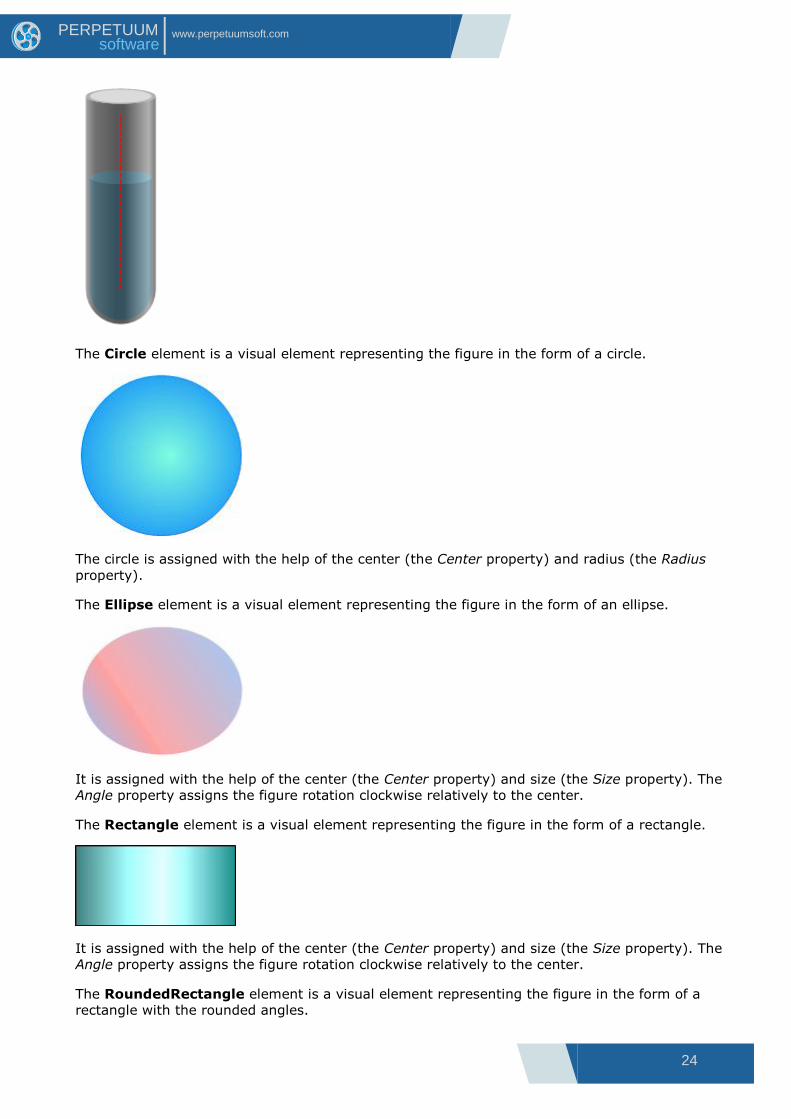
The Circle element is a visual element representing the figure in the form of a circle.
The circle is assigned with the help of the center (the Center property) and radius (the Radius
property).
The Ellipse element is a visual element representing the figure in the form of an ellipse.
It is assigned with the help of the center (the Center property) and size (the Size property). The
Angle property assigns the figure rotation clockwise relatively to the center.
The Rectangle element is a visual element representing the figure in the form of a rectangle.
It is assigned with the help of the center (the Center property) and size (the Size property). The
Angle property assigns the figure rotation clockwise relatively to the center.
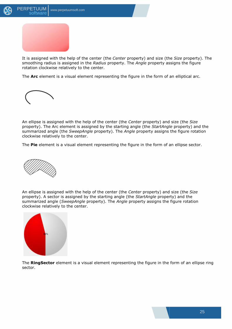
The RoundedRectangle element is a visual element representing the figure in the form of a
rectangle with the rounded angles.
25
www.perpetuumsoft.com PERPETUUM software
It is assigned with the help of the center (the Center property) and size (the Size property). The
smoothing radius is assigned in the Radius property. The Angle property assigns the figure
rotation clockwise relatively to the center.
The Arc element is a visual element representing the figure in the form of an elliptical arc.
An ellipse is assigned with the help of the center (the Center property) and size (the Size
property). The Arc element is assigned by the starting angle (the StartAngle property) and the
summarized angle (the SweepAngle property). The Angle property assigns the figure rotation
clockwise relatively to the center.
The Pie element is a visual element representing the figure in the form of an ellipse sector.
An ellipse is assigned with the help of the center (the Center property) and size (the Size
property). A sector is assigned by the starting angle (the StartAngle property) and the
summarized angle (SweepAngle property). The Angle property assigns the figure rotation
clockwise relatively to the center.
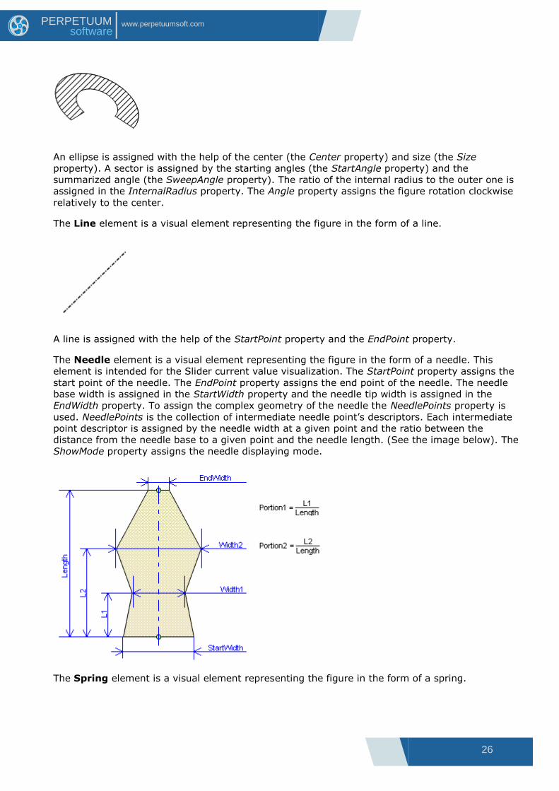
The RingSector element is a visual element representing the figure in the form of an ellipse ring
sector.
26
www.perpetuumsoft.com PERPETUUM software
An ellipse is assigned with the help of the center (the Center property) and size (the Size
property). A sector is assigned by the starting angles (the StartAngle property) and the
summarized angle (the SweepAngle property). The ratio of the internal radius to the outer one is
assigned in the InternalRadius property. The Angle property assigns the figure rotation clockwise
relatively to the center.
The Line element is a visual element representing the figure in the form of a line.
A line is assigned with the help of the StartPoint property and the EndPoint property.
The Needle element is a visual element representing the figure in the form of a needle. This
element is intended for the Slider current value visualization. The StartPoint property assigns the
start point of the needle. The EndPoint property assigns the end point of the needle. The needle
base width is assigned in the StartWidth property and the needle tip width is assigned in the
EndWidth property. To assign the complex geometry of the needle the NeedlePoints property is
used. NeedlePoints is the collection of intermediate needle point‟s descriptors. Each intermediate
point descriptor is assigned by the needle width at a given point and the ratio between the
distance from the needle base to a given point and the needle length. (See the image below). The
ShowMode property assigns the needle displaying mode.
The Spring element is a visual element representing the figure in the form of a spring.

27
www.perpetuumsoft.com PERPETUUM software
A spring is assigned by the starting point (the StartPoint property). Spring width is assigned by
the Amplitude property. The number of coils is assigned by the CoilCount property.
The Star element is a visual element representing the figure in the form of a star.
The star position is assigned by the center (the Center property), the radius of a circle
circumscribed round it (the Radius property) and the radius of an inscribed circle (the
InternalRadius property). The number of star sides is assigned by the Sides property. The Angle
property assigns the figure rotation clockwise relatively to the center.
The Polygon element is a visual element representing a regular polygon inscribed in the circle
with the center assigned by the Center property.
A polygon size is assigned by the radius of a circle circumscribed round it (the Radius property).
The number of polygon faces is assigned by the Side property. The Angle property assigns the
figure rotation clockwise relatively to the center
The Label element is the visual element intended for text output.
28
www.perpetuumsoft.com PERPETUUM software
The Text property assigns the output text. The rectangle, in which the text is output, is assigned
by the center (the Center property) and by size (the Size property). Text alignment relatively to
the rectangle is assigned by the TextAlign property. The Font property assigns the text font. The
Angle property assigns the figure rotation clockwise relatively to the center.
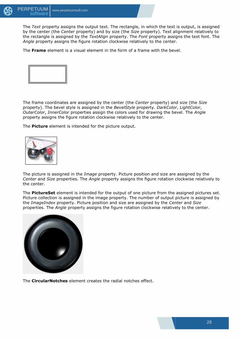
The Frame element is a visual element in the form of a frame with the bevel.
The frame coordinates are assigned by the center (the Center property) and size (the Size
property). The bevel style is assigned in the BevelStyle property. DarkColor, LightColor,
OuterColor, InnerColor properties assign the colors used for drawing the bevel. The Angle
property assigns the figure rotation clockwise relatively to the center.
The Picture element is intended for the picture output.
The picture is assigned in the Image property. Picture position and size are assigned by the
Center and Size properties. The Angle property assigns the figure rotation clockwise relatively to
the center.
The PictureSet element is intended for the output of one picture from the assigned pictures set.
Picture collection is assigned in the image property. The number of output picture is assigned by
the ImageIndex property. Picture position and size are assigned by the Center and Size
properties. The Angle property assigns the figure rotation clockwise relatively to the center.
The CircularNotches element creates the radial notches effect.
29
www.perpetuumsoft.com PERPETUUM software
It is used for control elements design. The notches are inside the circle assigned by the center
(the Center property) and the radius (the Radius property). The number of the notches is
assigned by the Count property, their length is assigned by the Length property. Colors, assigned
by DarkColor and LightColor properties, are used for drawing the notches. The Angle property
assigns the figure rotation clockwise relatively to the center.
The LinearNotches element creates the linear notches effect. It is used for control elements
design.
The notches are placed parallel to the line assigned by the start and end points (the StartPoint
and EndPoint properties). The distance between the extreme notches is assigned by the Width
property. The number of the notches is assigned by the Count property. Colors, assigned by
DarkColor and LightColor properties, are used for drawing the notches.
The Digits element is intended for digital indicator emulation.
It is used for digital values output. The text, displayed in the indicator, is assigned in the Text
property. The following symbols are allowed: numbers (0-9), “point”, “dash”, “colon”, “space”.
The position and size are assigned by the Center and Size properties. The Angle property assigns
the figure rotation clockwise relatively to the center. The indicator number is displayed by the
figures, consisting of segments. Segments thickness is assigned by the SegmentThickness
property. The interval between the segments is assigned by the SegmentSpace property. The
Symbol width is assigned by the DigitWidth property, height is assigned by DigitHeight property,
the space between the figures is assigned by the DigitSpace property. The color of figures active
segments is assigned by the ActiveColor property, the color of inactive segments is assigned by
the InactiveColor property.
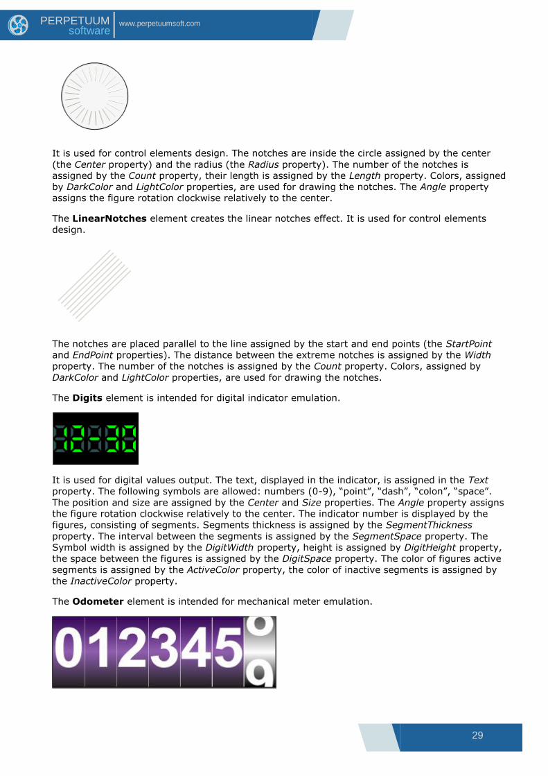
The Odometer element is intended for mechanical meter emulation.

30
www.perpetuumsoft.com PERPETUUM software
It is used for value output. The output number is assigned by the Value property. The position
and size are assigned by the Center and Size properties. The Angle property assigns the figure
rotation clockwise relatively to the center. The font of displayed figures is assigned by the Font
property. The assigned value is output on different meter disks. The disk color, in which the
number last rank is displayed, is assigned by the FirstDigitBackFill property; the figure color,
output on this disk, is assigned by the FirstDigitForeFill property. The color of the other disks is
assigned by the BackFill property; the color of the symbols, output on them, is assigned by the
ForeFill property.
The HighLight element is intended for emulating hightlights on the circular instruments.
Element‟s position is set in the Center and Radius properties assigning center coordinates and
radius. The Angle and SweepAngle properties set element‟s start angle and its angle of turn.
The Gear element is intended for emulating gears.
Element‟s position is assigned by the Center and Radius properties, setting center coordinates
and elements radius. The Count property defines amount of the gear claws. The Depth property
determines claws size. The DimentionsRatio defines relative claws width.

31
www.perpetuumsoft.com PERPETUUM software
The DigitalText element is intended for displaying the text.
The text, displayed in the indicator, is assigned in the Text property. The position and size are
assigned by the Center and Size properties. The Angle property assigns the figure rotation
clockwise relatively to the center. The indicator text is displayed by figures, consisted of rectangle
segments. The color of figures active segments is assigned by the ActiveColor property, the color
of inactive segments is assigned by the InactiveColor property. The segments vertical and
horizontal weight is assigned by the SegmentSize property. The space between the segments is
assigned by the SegmentSpaces property. The text offset relatively to the left element bound is
assigned by the TextHorizontalOffset property. The text offset relatively to the top bound is
assigned by the TextVerticalOffset. Besides that, you can set font by the Font property.
32
www.perpetuumsoft.com PERPETUUM software
Expressions
Destination and General Principles of the Expressions Use Expressions can be used for instrument and all its elements. An expression, which calculation
result will be bound to the property, can be assigned to the majority of instrument properties.
The expressions are used to provide elements interaction and to assign the required instrument
functionality.
The order of expressions calculation is the following. If the element state was changed, the
expressions recalculation of this element as well as of all elements included in it occurs. The
expression calculation result is assigned to the appropriate element properties.
In order to have all instrument element values expressions recalculated during the element state
alteration, it is necessary to set the RecalculateAll property to “true”. The alteration of some
properties, assigning the element appearance, doesn‟t invoke expressions recalculation. For
example, the alteration of such properties as Fill, Stroke doesn‟t invoke expressions recalculation;
therefore there is no need to apply to the values of such properties.
If the expression contains syntax, semantic errors, or the exception appears in the calculation
process, the expression will be ignored.
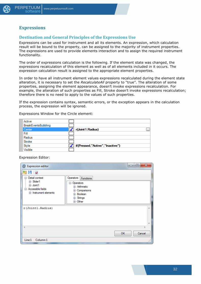
Expressions Window for the Circle element:
Expression Editor:

33
www.perpetuumsoft.com PERPETUUM software
Description of Expression Language Syntax and Semantics An expression is a task on formula calculation. The expression value is a calculation result. The
expression is built out of constants, objects and their properties and methods, operators, function
callings and round brackets.
Data types used:
All data types, available in .NET framework, are used in the expressions. Also there is a special
support for integer-valued, fractional, logical values, strings and vectors.
The PerpetuumSoft.Framework.Drawing.Vector data type is used for vectors.
The following operations are available in expressions:
Arithmetic operations
„+‟ – addition. It is defined for numerical values and vectors.
„-‟ – subtraction. It is defined for numerical values and vectors.
„-‟ – unary minus. It is defined for numerical values.
„*‟ – multiplication. Numerical values and vectors can be the first argument; the numerical value
should be the second argument.
„/‟ – division. It is defined for numerical values.
„%‟ – residue of division. It is defined for numerical values.
Logical operations
„or‟ – logical OR. It is defined for logical values;
„and‟ – logical AND. It is defined for logical values;
„=‟ – equals. It is defined for numerical, logical values and vectors;
„! =‟ – inequality. It is defined for numerical, logical values and vectors;
„<‟ – less. It is defined for numerical values;
„<=‟ – less or equal. It is defined for numerical values.
„>‟ – more. It is defined for numerical values.
„>=‟ – more or equal. It is defined for numerical values.
„not‟ – logical negation. It is defined for logical values.
Operations over strings
„&‟ – strings concatenation. It is defined for string values.
The descending priority operations order.
„–‟(unary), „not‟
„*‟, „/‟, „%‟
„+‟, „–‟, „&‟
„>‟, „>=‟, „<‟, „<=‟

34
www.perpetuumsoft.com PERPETUUM software
„=‟, „!–‟
„and‟
„or‟
Constants assigning
<decimal figure>* - the whole value.
<decimal figure>*.<decimal figure>* - value.
For example, 1234 is the whole, 1234.1234 is the fractional value.
For assigning the linear size in generally accepted units the appropriate postfixes at the end of
numerical constant are used.
“in” – value in inches
“mm” – value in millimeters
“cm” – value in centimeters
“pt” – value in 1/72 inch points
“px” – value in pixels
For example 3in is 3 inches, 3cm is 3 centimeters.
String constants are assigned with the help of double apostrophes.
For example: “It is a string value”.
The vector is assigned with the help of “[” and “]”.
[<numerical value>,< numerical value>] – vector assigning.
Logical constants are assigned with the help of two key words: „true‟ and „false‟.
Access to variables, objects, their fields and methods.
In the expressions, you can apply to variables, available in the instrument by their names. The
search of variables and objects by their names is executed in the following way: if an address by
the object‟s name is present in an expression, the GetObject function that should return the
desired object is called for the element the given expression is written for. For any element the
GetObject function makes the following: the function returns the element itself, in case its name
corresponds to the askable one, otherwise it calls GetObject from the parent. Elements-containers
execute the search of the desired object through all included elements. Thus, all instrument
elements are available in the expressions. For some elements (for example for Slider) the Get
Object function returns special variables. According to the rule pointed out above such variables
will be available for both element-container and elements included in it. The instrument structure
is represented in the picture:

35
www.perpetuumsoft.com PERPETUUM software
You can apply to the instrument elements (Instrument, Joint1, Scale1, NumericLabels1, Ticks1,
Slider1, Needle1) in any element expressions.
Special Slider variables are available in the Slider1 and Needle1 elements expressions.
Special variables
The following special variables are available in the SliderBase element descendants (e.g., the
Slider element):
value – the double type variable. The current Slider value.
hot – the logical type variable. Hot is set to true if the mouse pointer is over an element.
pressed – the logical type variable. Pressed is set to true if the mouse button is pressed when the
pointer is placed over an element.
center – the vector type variable. The point that corresponds to the current Slider value and is
distant from the trajectory center at a 0 distance.
The following special variables are available in the Joint element descendants (e.g., the
Jointelement):
JointRadius - radius of a joint
JointCenter – the vector type variable. The point that corresponds to the current Joint value and
is distant from the trajectory center at a 0 distance.
JointTotalAngle - total angle of a joint.
JointStartAngle - the angle of degrees measured clockwise from the X-axis to the start point of
the joint.
The following special variables are available in the Guide element descendants (e.g., the Guide
element):
GuideLength - length of a Guide.
GuideCenter - center point of a Guide.
GuideEndPoint - end point of a Guide.
GuideStartPoint - start point of a Guide.
For applying to objects‟ fields and methods the point „.‟ is used.
For example:
Slider1.Value – applying to the Slider1 element Value property.
Slider1.ToString() – the Slider1 element ToString() method call.
Line1.StartPoint.Rotate(30) – the call of Line1 element StartPoint property Rotate method.
[10, 20].Rotate(30).X – X vector coordination [20, 30], rotated on 30 degrees receiving
ATTENTION! It is impossible to call the object methods, if they are overloaded.
As the expression language is not typified, it is impossible to define what method should be
invoked.
In the expressions, you can apply to the functions available in the instrument by their names. The
search is executed similarly to the objects search by the names.
36
www.perpetuumsoft.com PERPETUUM software
The following functions are available for any elements:
The functions of conditional choice:
if (condition, value1, value2), the 1st
parameter should be of logical type; the 2nd
and the 3
rd
parameters should be of object type. If the 1st
parameter is true, the function returns the 2nd
parameter value, otherwise it returns the 3rd
parameter value.
switch (condition[0], value[0], … , value by default), if the condition[i] is set to true, the function
returns the value[i], if the condition[i] in any i is false, the value returns by default.
Formatting Functions
format (object, mask), the object is of object type, the mask is of string type. It returns the
object‟s string presentation according to the mask.
Mathematical Functions
sin(argument) – calculates the argument sine. The argument is of the double type, the calculation
result is of the double type.
cos(argument) – calculates the argument cosine. The argument is of the double type, the
calculation result is of the double type.
tan(argument) – calculates the argument tangent. The argument is of the double type, the
calculation result is of the double type.
atan(argument) – calculates the argument arctangent. The argument is of the double type, the
calculation result is of the double type.
sqr(argument) – calculates the argument to square. The argument is of the double type, the
calculation result is of the double type.
sqrt(argument) – calculates the argument‟s square root. The argument is of the double type, the
calculation result is of the double type.
log(argument) – calculates the argument‟s natural logarithm. The argument is of the double type,
the calculation result is of the double type.
exp(argument) – raise E number to the argument degree. The argument is of the double type,
the calculation result is of the double type.
sign(argument) – returns:-1 if the argument is negative, 0 – if the argument is 0, 1 – if the
argument is positive. The argument is of the double type, the calculation result is of the int type.
abs(argument) – returns the argument‟s absolute value. The argument is of the double type, the
calculation result is of the double type.
round(argument1, argument2) – rounds the 1st
argument value to the symbols amount after the
comma, assigned by the 2nd
argument. The 1st
argument is of the double type, the 2nd
argument is of the int type, the calculation result is of the double type.
The expression can be an argument of any function and method. If the expression calculation
result is not appropriate to the argument type, the expression will not be calculated.
Date Processing Functions
getMonth (argument) – returns the string month name by the date assigned by an argument. An
argument should be of the System.DateTime type;
37
www.perpetuumsoft.com PERPETUUM software
getDayOfWeek (argument) – returns the string day of week name by the date assigned by an
argument. An argument should be of the System.DateTime type;
getQuarter (argument) – returns the quarter number of a date specified as an argument. An
argument should be of the System.DateTime type;
Other properties and methods of the System.DateTime type can also be used to get other date
values.
The ranking function
Range (currentValue, range, zeroPoint) – extracts data intervals. All arguments should be of
numeral type. currentValue – the current value; range – the range; zeroPoint – the zero point.
In the expression language the construction for creation of PerpetuumSoft.Framework.Vector
type objects is provided. A vector is created with the help of the following construction:
[<expression>, <expression>]. The creation of objects of other types directly in the expression is
impossible. But it is possible to realize custom functions, used in the expressions for the objects
of desired type creation.
For the SliderBase type elements (for example Slider) and for the elements included in it, the
following special functions are available:
r(radius) – returns the point, corresponding to the current Slider value and distant from the
trajectory center (in which the slider is included) at a radius distance.
r(value, radius) – returns the point corresponding to the value and distant from the trajectory
center (in which the slider is included) at a radius distance.
a() – returns the slider‟s rotation angle.
The realization of custom functions and variables, available in the expressions.
In order to make custom functions and variables available in the element expressions, it is
necessary to realize a custom element, which will correspondingly realize the
PerpetuumSoft.Framework.Expressions.IExpressionSite interface.
After that you need to register your function. It can be done in the following way:
PerpetuumSoft.Framework.Expressions.BuiltInFunctions.RegisterFunction(<Function
name>, <inplemented IFunction object>);

38
www.perpetuumsoft.com PERPETUUM software
Use and Capabilities of the Instrument Designer The SharpShooter Gauges Designer is used for instruments creation. Its appearance is shown on
the picture below. An instrument represents an object on which different elements are placed.
Each element has a set of properties displayed in the Properties Window. You can edit properties
values in this window. Most of properties can be bound to the expressions, assigned in the special
expression language. The expressions are displayed in the Expressions Window. You can edit
expressions in this window.
1 – Toolbar;
2 – Elements Toolbar;
3 – Properties Window;
4 – Instrument Outline;
5 – Expressions Window;
6 – Work Area.
Visual and non-visual elements for instrument creation in the SharpShooter Gauges Designer are
available via the Insert menu or via the buttons on the components toolbox (Elements Toolbox).
In order to place an element in the instrument it is necessary to select it from the menu in the
Elements Toolbox. Then click the left mouse button in the work area (Work Area), or stretch the
element to the desired size by pressing and holding the left mouse button.
39
www.perpetuumsoft.com PERPETUUM software
The instrument structure is displayed in the Instrument outline window. You can change the
elements positional relationship by dragging them with the mouse.
Let‟s consider the functions available via the File menu. The commands for the work with a file
are grouped here.
File\New\Blank menu item (the toolbar button) – allows creation of a new empty instrument.
File\New\Wizard menu item (the toolbar button) – allows creation of a new instrument with
the help of Wizard.
File\Open Ctrl+O menu item (the toolbar button) – calls the dialog box for the instrument
loading from the file.
File\Open and merge menu item calls the dialog box for the instrument loading from the file. At
the same time a new instrument is added to the existing one.
File\Open in wizard and merge menu item calls the Wizard the instrument loading. At the same
time a new instrument is added to the existing one.
File\Save Ctrl+S menu item (the toolbar button) saves the instrument.
File\Save As menu item is used for saving the instrument with a new name.
The File\Export menu item exports an instrument into one of popular bitmapped or vector
graphics formats (JPEG, GIF, PNG, BMP, SVG and Macromedia Flash) and calls the save to file
dialog box.
You can view the recent files history including the file system paths below the separator.
Let‟s consider the functions available via Edit menu. The commands for the instrument editing are
grouped here.
Edit\Undo Ctrl+Z menu item (the toolbar button) means the cancel of the changes made in
the instrument.
Edit\Redo Ctrl+Y menu item (the toolbar button) means the repetition of the canceled actions
when editing the instrument.
Edit\Cut Ctrl+X menu item (the toolbar button) means copying and deleting the selected
elements.
Edit\Copy Ctrl+C menu item (the toolbar button) means the copying of the selected
elements.
Edit\Paste Ctrl+V menu item (the toolbar button) means the elements pasting from the
buffer to the selected element or its parent, if the selected element is not a container.
Edit\Delete Ctrl+Del menu item (the toolbar button) is intended for deleting of the selected
elements.
Let‟s consider the functions available via View menu. The commands for the designer appearance
control are grouped here.

40
www.perpetuumsoft.com PERPETUUM software
View\Show rulers menu item (the toolbar button) is intended for switching on/off the rulers
display in the Working area (Work area)
View\Show grid menu item (the toolbar button) is intended for switching on/off the grid
display in the Working area (Work area).
View\Snap to grid menu item (the toolbar button) is intended for switching on/off the snap of
elements‟ control points to the grid.
Let‟s consider the functions available via Tool menu. The commands of different tools switching
on are grouped here.
The Tool\Select F2 menu item (the toolbar button) is used to switch on the Select tool. The
Select tool allows selecting the elements of the Working area (Work area) and editing the
elements via their designers.
Tool\Test F3 menu item (the toolbar button) allows switching on the Test tool, intended for
edited instrument testing.
Tool\Pan F4 menu item (the toolbar button) is used to panning the picture of the working
area (Work area).
Tool\Zoom in menu item (the toolbar button) is used to zoom an element in.
Tool\Zoom out menu item (the toolbar button) is used to zoom an element out.
Tool\Region zoom menu item (the toolbar button) switches on the Region zoom tool to zoom
a selected section (region) in.
Tool\Dynamic zoom menu item (the toolbar button) switches on the Dynamic zoom tool to
change zoom of a selected section (region).
Let‟s consider the functions available via Insert menu. The commands for adding different
elements in the instrument are grouped here. Adding commands are broken to groups depending
on the element destination.
Elements, grouped in the Insert\Structure menu item, are intended for the instrument structure
assigning.
Insert\Structure\Joint menu item (the button on the Elements toolbox) adds the circular
trajectory (Joint element).
Insert\Structure\Guide menu item (the button on the Elements toolbox) adds the linear
trajectory (Guide element).
Insert\Structure\Scale menu item (the button on the Elements toolbox) adds a scale (Scale
element).
Insert\Structure\Slider menu item (the button on the Elements toolbox) adds a slider (Slider
element).
Insert\Structure\Group menu item (the button on the Elements toolbox) adds a container
(Group element), intended for elements grouping.
41
www.perpetuumsoft.com PERPETUUM software
Insert\Primitives menu item contains the commands of adding the basic primitives, such as
geometrical figures and others.
Insert\Primitives\Line menu item (the button on the Elements toolbox) adds a line (the Line
element).
Insert\Primitives\Circle menu item (the button on the Elements toolbox) adds a circle (the
Circle element).
Insert\Primitives\Ellipse menu item (the button on the Elements toolbox) adds an ellipse (the
Ellipse element).
Insert\Primitives\Rectangle menu item (the button on the Elements toolbox) adds a rectangle
(the Rectangle element).
Insert\Primitives\RoundedRectangle menu item (the button on the Elements toolbox) adds a
rectangle with rounded angles. (the RoundedRectangle element)
Insert\Primitives\Frame menu item (the button on the Elements toolbox) adds a rectangle
with a bevel (the Frame element).
Insert\Primitives\Picture menu item (the button on the Elements toolbox) adds a picture (the
Picture element).
Insert\Primitives\PictureSet menu item (the button on the Elements toolbox) adds a picture
set (the PictureSet element).
Insert\Primitives\Label menu item (the button on the Elements toolbox) adds text inscriptions
(the Label element).
Insert\Primitives\Arc menu item (the button on the Elements toolbox) adds an arc (the Arc
element).
Insert\Primitives\Pie menu item (the button on the Elements toolbox) adds a pie (the Pie
element).
Insert\Primitives\RingSector menu item (the button on the Elements toolbox) adds a ring
sector (the RingSector element).
Insert\Scale Elements menu item contains the commands of adding the elements intended for the
scales design.
Insert\Scale Elements\ScaleLabels menu item (the button on the Elements toolbox) – inserts
element, intended for numbering scale divisions (the ScaleLabels element).
Insert\Scale Elements\ScaleMarks menu item (the buttonon the Elelements toolbox) adds
graphic markers to the scale (the ScaleMarks element).
Insert\Scale Elements\Ticks menu item (the button on the Elements toolbox) adds ticks on a
scale. (Ticks element).
Insert\Scale Elements\CustomLabels menu item adds text labels to the scale (the CustomLabels
element).

42
www.perpetuumsoft.com PERPETUUM software
Insert\Scale Elements\RangedLevel menu item inserts the RangedLevel element.
Insert\Scale Elements\LinearLevel menu item inserts the LinearLevel element.
Insert\Scale Elements\Tank menu item inserts the Tank element.
Insert\Scale Elements\ScaleTitle menu item inserts scale title (the ScaleTitle element).
Insert\Advanced menu item contains the commands of adding the elements with the specific
destination.
Insert\Advanced\Needle menu item (the button on the Elements toolbox) adds a pointer in
the form of a needle (the Needle element).
Insert\Advanced\CircularNotches menu item (the button on the Elements toolbox) adds the
circular notches (the CircularNotches element).
Insert\Advanced\LinearNotches menu item (the button on the Elements toolbox) adds linear
notches (the LinearNotches element).
Insert\Advanced\Spring menu item (the button on the Elements toolbox) adds a figure in the
form of a string (the String element).
Insert\Advanced\Star menu item adds a figure in the form of a star (the Star element).
Insert\Advanced\Polygon menu item (the button on the Elements toolbox) adds a regular
polygon (the Polygon element).
Insert\Advanced\Highlight menu item a inserts the HighLight element.
Insert\Advanced\Gear menu item inserts the Gear element.
Insert\Advanced\Digits menu item (the button on the Elements toolbox) adds a digital
indicator (the Digits element).
Insert\Advanced\Odometer menu item (the button on the Elements toolbox) adds an element
for odometer emulation (the Odometer element).
Help menu item has the About subclause, intended for program data output.
There are also the buttons on the Tool bar intended for the change of output order of the selected
elements.
Move selected objects to forward raises the selected elements up to one position.
Move selected objects to back lowers the selected elements down to one position.
Send selected objects to forward raises the selected elements at the very top.
Send selected objects to back lowers the selected elements at the very bottom.
If the selected elements group order is changed, the relational order inside the group is kept.

43
www.perpetuumsoft.com PERPETUUM software
The button is intended for the expressions syntax (used in the instrument) check-up. Check
scripts.
Let‟s consider using the Select tool in the work area.
In the Select tool mode, any visual element can be selected in the work area with a mouse. It is
possible to select a group of elements either by means of selecting each element while holding
the Ctrl key pressed or by means of “lassoing” the group of elements holding the left mouse
button pressed.
Control points in the form of circles are displayed in the selected elements.
The selected elements are highlighted in the instrument structure tree.
The editing operations are applicable to the selected elements:
copy to clipboard (ClipBoard);
paste from the clipboard;
deletion;
output order changing;
properties changing with Properties Window use;
the element position changing with the help of the mouse;
changing some element‟s properties by moving the element control points.
Control points of the selected element are intended for its main properties changing. The point
position can be changed by dragging it with the mouse.
Each element has its own control points set. For example, the rectangular elements have ten
points, one of which is intended for the center changing, another one is for rotation angle
changing, and the rest of them are intended for the corresponding size of the rectangular area
changing.
Some elements designers have the control points for the specific properties changing, typical only
for the given type elements. For example, the designer for the RingSector.
When the control point position is changed, the appropriate element property also changes. But if
the expression is assigned for this property, it makes no sense to change the control point
position. Such control points are highlighted with red color. If the designer is able to
automatically change the expression that is bound to the property which the control point
changes, such point is highlighted with yellow color.
If the element is included in Slider for the current value indication, it is possible to bind the
element position to the current Slider value with the help of the designer. To do so it is necessary
to click on the control point, keeping pressed the Ctrl key. The expression binding is canceled by
the similar action.
The Instrument Outline window displays the instrument current structure in the form of a tree.
When placing an element on the Work Area it is automatically displayed in the Instrument
Outline. The selected elements are highlighted in the tree with blue color. In this window it is
possible to change the elements positional relationship by dragging them with the mouse.
The Expressions window is intended for editing expressions, bound to the appropriate element
properties. In the left column, the properties names, for which the expression can be assigned,
are displayed. In the right column you can write an expression script or run the script editor. If a
script is not assigned for some property, the white blank rectangle is displayed in the right

44
www.perpetuumsoft.com PERPETUUM software
column. If a script is assigned correctly, the rectangle displays a blue checkmark. If an assigned
script contains syntactical errors, the rectangle displays a red criss-cross.
The Properties window is intended for the selected objects properties displaying and editing.
45
www.perpetuumsoft.com PERPETUUM software
Work in Windows Forms Applications
Components Used in Windows Forms Applications. For displaying and editing instrument in Windows Forms applications two components are used:
Widget and IndicatorWidget. The Widget component is intended for displaying and controlling
instrument with the help of the mouse. The Indicator Widget component is a descendant from the
Widget. It is intended for displaying instruments, containing the Slider element. Indicator Widget
provides additional capabilities for access to the Value property and the ValueChanged event of
the indicated slider.
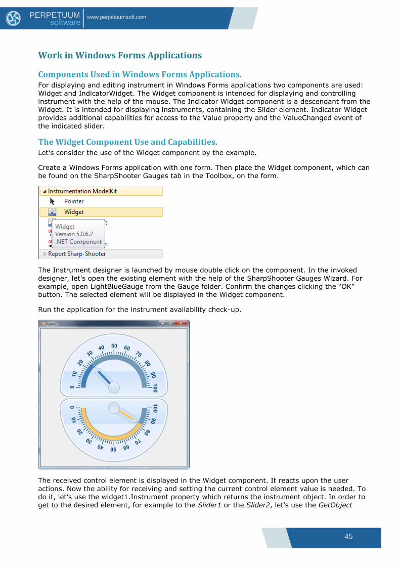
The Widget Component Use and Capabilities. Let‟s consider the use of the Widget component by the example.
Create a Windows Forms application with one form. Then place the Widget component, which can
be found on the SharpShooter Gauges tab in the Toolbox, on the form.
The Instrument designer is launched by mouse double click on the component. In the invoked
designer, let‟s open the existing element with the help of the SharpShooter Gauges Wizard. For
example, open LightBlueGauge from the Gauge folder. Confirm the changes clicking the “OK”
button. The selected element will be displayed in the Widget component.
Run the application for the instrument availability check-up.
The received control element is displayed in the Widget component. It reacts upon the user
actions. Now the ability for receiving and setting the current control element value is needed. To
do it, let‟s use the widget1.Instrument property which returns the instrument object. In order to
get to the desired element, for example to the Slider1 or the Slider2, let‟s use the GetObject
46
www.perpetuumsoft.com PERPETUUM software
function of the instrument. Then put the Label components onto the form for displaying the
control element value in text form.
Add the following lines in the program code. Here the Form1_Load is the Load event handler of
the program main form.
private Slider slider1 = null; private Slider slider2 = null; private void Form1_Load(object sender, System.EventArgs e) { slider1 = widget1.Instrument.GetObject("Slider1") as Slider; slider2 = widget1.Instrument.GetObject("Slider2") as Slider; slider1.ValueChanged += new PerpetuumSoft.Framework.Model.PropertyEventHandler(slider1_ValueChanged); slider2.ValueChanged += new PerpetuumSoft.Framework.Model.PropertyEventHandler(slider2_ValueChanged); } private void slider1_ValueChanged(object sender, PerpetuumSoft.Framework.Model.PropertyEventArgs args) { label1.Text = "Slider1.Value = " + slider1.Value.ToString("0.00"); } private void slider2_ValueChanged(object sender, PerpetuumSoft.Framework.Model.PropertyEventArgs args) { label2.Text = "Slider2.Value = " + slider2.Value.ToString("0.00"); }
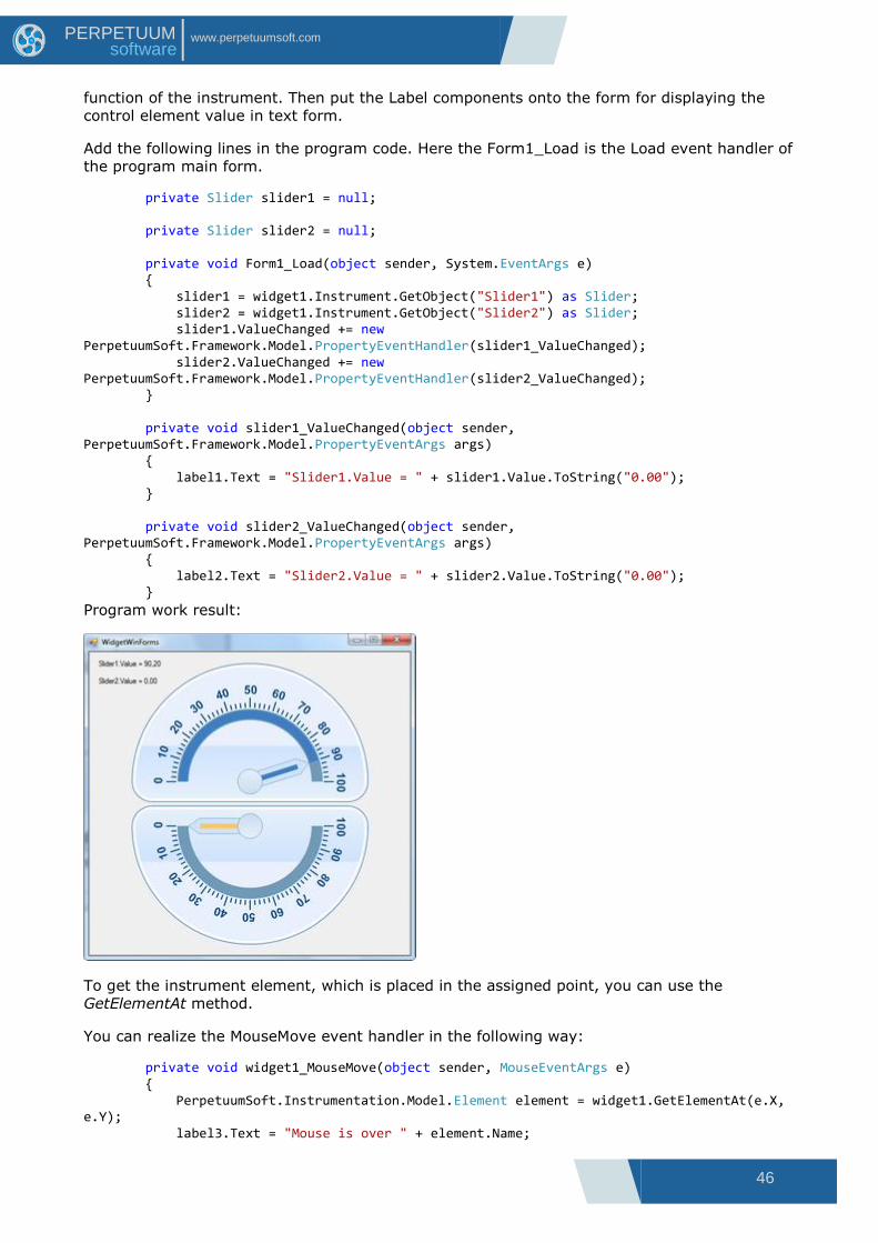
Program work result:
To get the instrument element, which is placed in the assigned point, you can use the
GetElementAt method.
You can realize the MouseMove event handler in the following way:
private void widget1_MouseMove(object sender, MouseEventArgs e) { PerpetuumSoft.Instrumentation.Model.Element element = widget1.GetElementAt(e.X, e.Y); label3.Text = "Mouse is over " + element.Name;

47
www.perpetuumsoft.com PERPETUUM software
}
Program work result:
The Widget component has the following specific properties:
ZoomScale – assigns the instrument scale coefficient;
HideFocusRectangle – indicates whether the rectangle around the control should be drawn, when
it is in a focus.
InvalidateInterval – if this value is more than zero, the timer for renewal of the area, occupied by
the instrument, will be used.
InvalidateInterval assigns the renewal period in milliseconds.
The IndicatorWidget Component Use and Capabilities. The IndicatorWidget component use is similar to the one of the Widget component.
But properties, allowing simple receiving of the current value of one of the instrument sliders, are
added in the IndicatorWidget.
The Value property and the ValueChanged event are added in the IndicatorWidget. They
correspond to the Value property and ValueChanged event of one of the instrument sliders used
in the IndicatorWidget. In order to assign the exploitable slider, its name is assigned in the
SliderName property.
Besides, the IndicatorWidget allows moving a specified slider automatically by means of the
keyboard.
The shift step is assigned in the Increment property.
It is possible to change values range for the selected slider scale using the Minimum and
Maximum properties.
Please, pay special attention to the fact that all above-listed properties have no meaning until the
instrument or the desired instrument slider‟ name for the IndicatorWidget is assigned. If the
instrument is assigned, it is more convenient to assign the name of the used slider with the
pulldown use in the SliderName property. The names of all instrument sliders are displayed in the
list.
Let‟s consider the IndicatorWidget use by the example.
48
www.perpetuumsoft.com PERPETUUM software
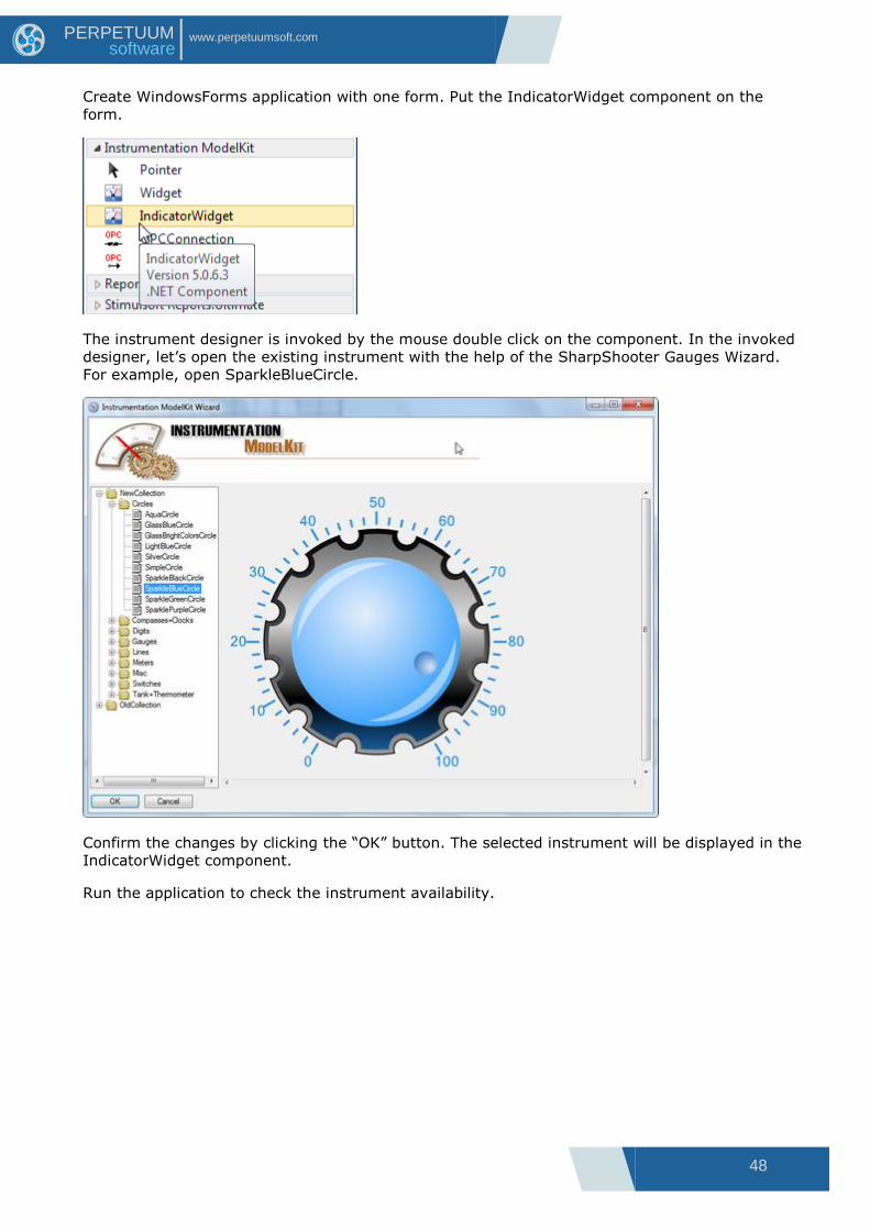
Create WindowsForms application with one form. Put the IndicatorWidget component on the
form.
The instrument designer is invoked by the mouse double click on the component. In the invoked
designer, let‟s open the existing instrument with the help of the SharpShooter Gauges Wizard.
For example, open SparkleBlueCircle.
Confirm the changes by clicking the “OK” button. The selected instrument will be displayed in the
IndicatorWidget component.
Run the application to check the instrument availability.
49
www.perpetuumsoft.com PERPETUUM software
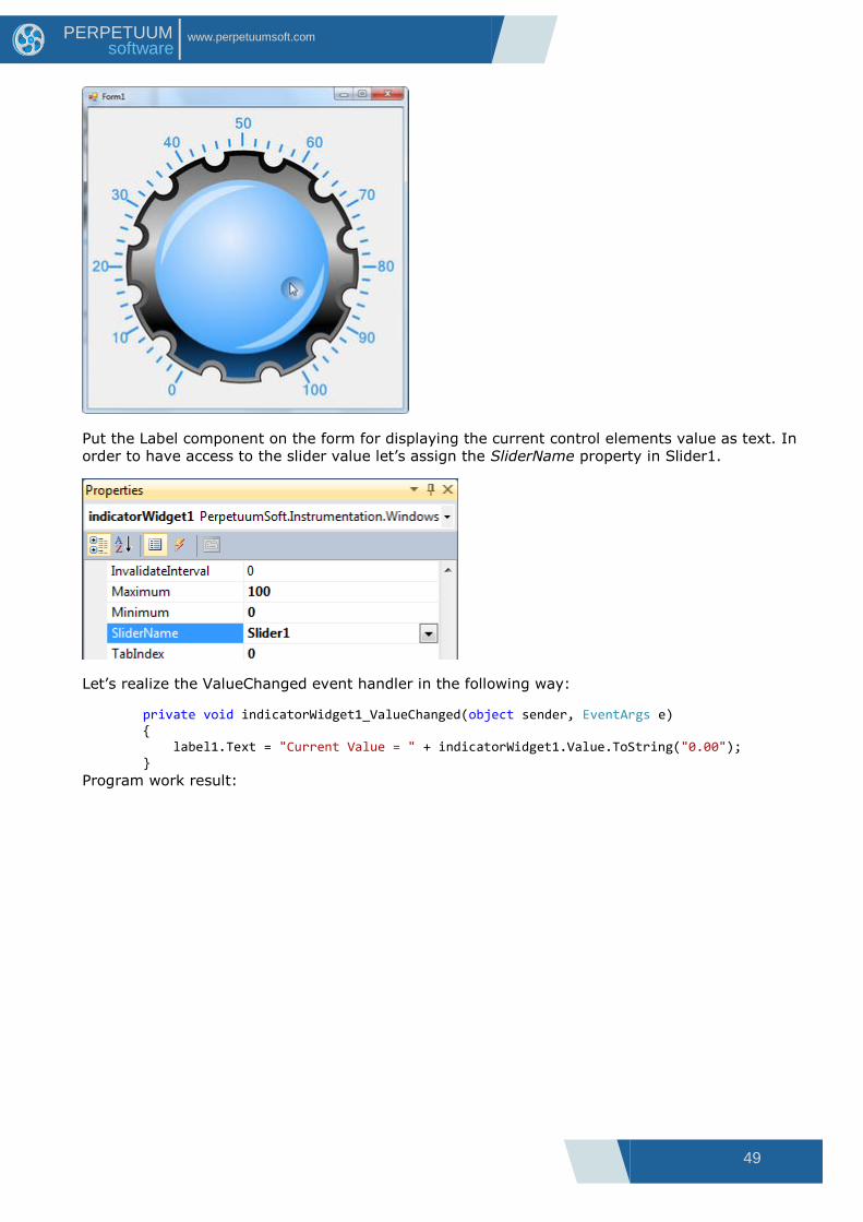
Put the Label component on the form for displaying the current control elements value as text. In
order to have access to the slider value let‟s assign the SliderName property in Slider1.
Let‟s realize the ValueChanged event handler in the following way:
private void indicatorWidget1_ValueChanged(object sender, EventArgs e) { label1.Text = "Current Value = " + indicatorWidget1.Value.ToString("0.00"); }
Program work result:
50
www.perpetuumsoft.com PERPETUUM software
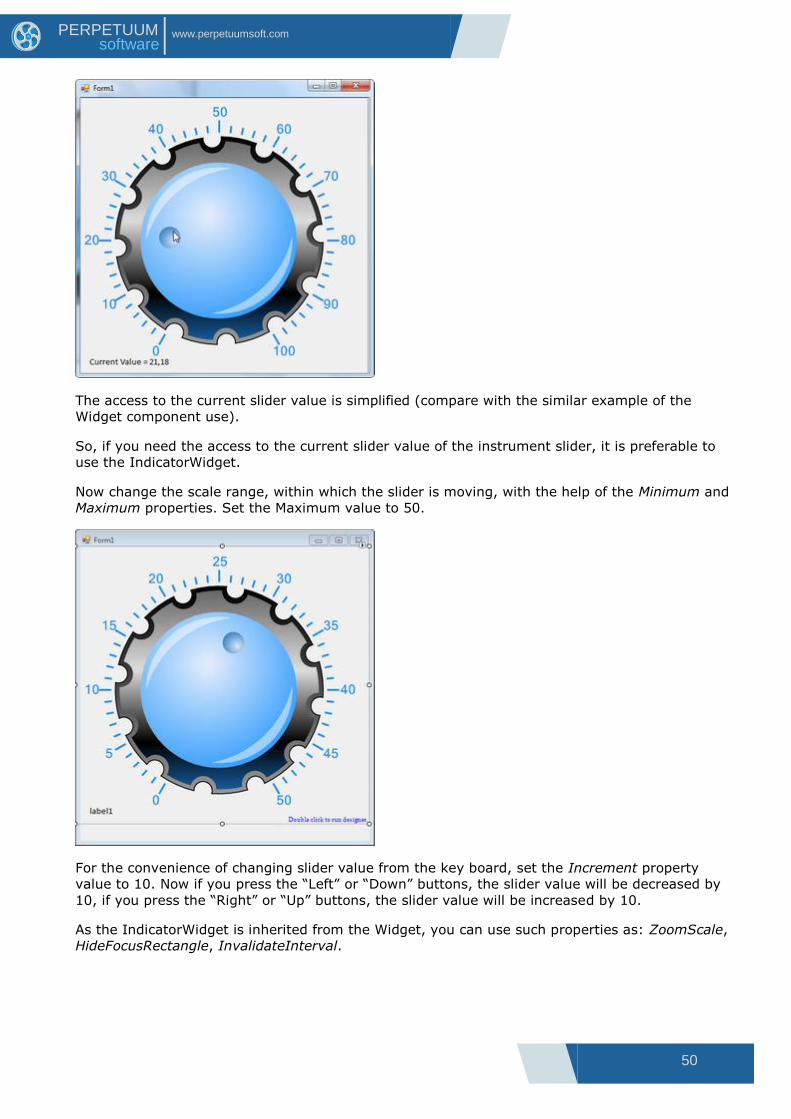
The access to the current slider value is simplified (compare with the similar example of the
Widget component use).
So, if you need the access to the current slider value of the instrument slider, it is preferable to
use the IndicatorWidget.
Now change the scale range, within which the slider is moving, with the help of the Minimum and
Maximum properties. Set the Maximum value to 50.
For the convenience of changing slider value from the key board, set the Increment property
value to 10. Now if you press the “Left” or “Down” buttons, the slider value will be decreased by
10, if you press the “Right” or “Up” buttons, the slider value will be increased by 10.
As the IndicatorWidget is inherited from the Widget, you can use such properties as: ZoomScale,
HideFocusRectangle, InvalidateInterval.
51
www.perpetuumsoft.com PERPETUUM software
Work in Web Forms Applications
Components Used in Web Applications. To display and control an instrument in Web applications two components are used:
WidgetProducer and WidgetHolder. WidgetProducer contains the displayed instrument. This
component is placed on a separate page. When this page is applied to, the component substitutes
the page content by the instrument image. The WidgetHolder component is used for displaying
instrument and for controlling it with a mouse. The WidgetHolder component displays the
instrument, contained within the WidgetProducer component.
The WidgetProducer and WidgetHolder Components Use and Capabilities Let‟s consider the WidgetProducer and WidgetHolder components use by the example.
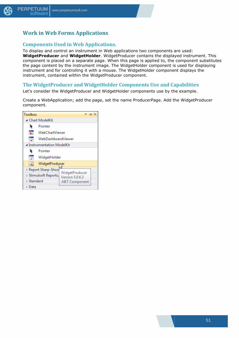
Create a WebApplication; add the page, set the name ProducerPage. Add the WidgetProducer
component.
52
www.perpetuumsoft.com PERPETUUM software
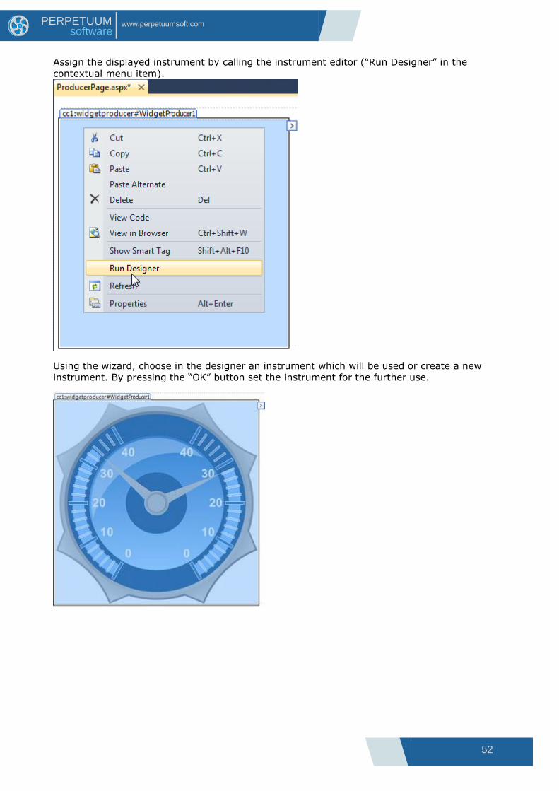
Assign the displayed instrument by calling the instrument editor (“Run Designer” in the
contextual menu item).
Using the wizard, choose in the designer an instrument which will be used or create a new
instrument. By pressing the “OK” button set the instrument for the further use.
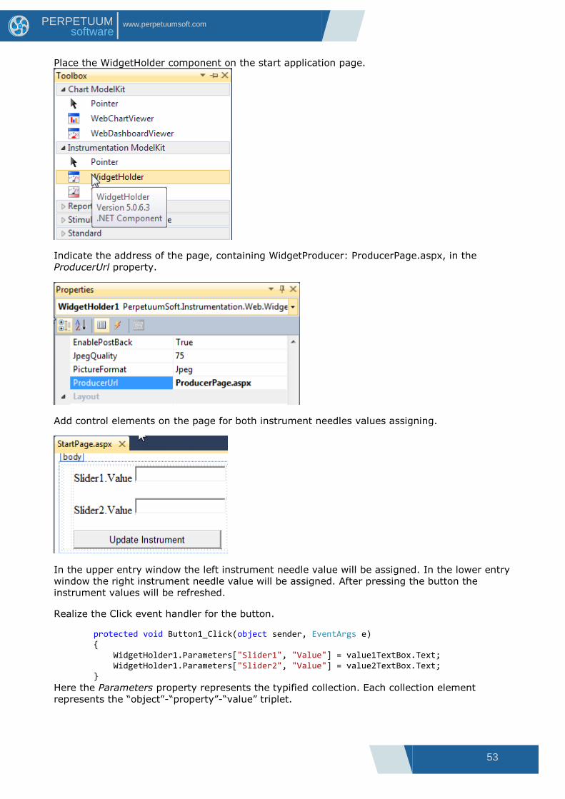
53
www.perpetuumsoft.com PERPETUUM software
Place the WidgetHolder component on the start application page.
Indicate the address of the page, containing WidgetProducer: ProducerPage.aspx, in the
ProducerUrl property.
Add control elements on the page for both instrument needles values assigning.
In the upper entry window the left instrument needle value will be assigned. In the lower entry
window the right instrument needle value will be assigned. After pressing the button the
instrument values will be refreshed.
Realize the Click event handler for the button.
protected void Button1_Click(object sender, EventArgs e) { WidgetHolder1.Parameters["Slider1", "Value"] = value1TextBox.Text; WidgetHolder1.Parameters["Slider2", "Value"] = value2TextBox.Text; }
Here the Parameters property represents the typified collection. Each collection element
represents the “object”-“property”-“value” triplet.
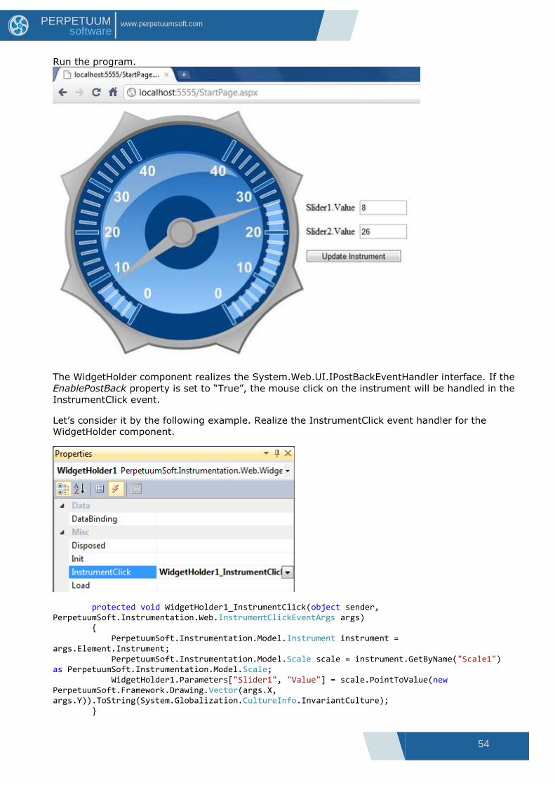
54
www.perpetuumsoft.com PERPETUUM software
Run the program.
The WidgetHolder component realizes the System.Web.UI.IPostBackEventHandler interface. If the
EnablePostBack property is set to “True”, the mouse click on the instrument will be handled in the
InstrumentClick event.
Let‟s consider it by the following example. Realize the InstrumentClick event handler for the
WidgetHolder component.
protected void WidgetHolder1_InstrumentClick(object sender, PerpetuumSoft.Instrumentation.Web.InstrumentClickEventArgs args) { PerpetuumSoft.Instrumentation.Model.Instrument instrument = args.Element.Instrument; PerpetuumSoft.Instrumentation.Model.Scale scale = instrument.GetByName("Scale1") as PerpetuumSoft.Instrumentation.Model.Scale; WidgetHolder1.Parameters["Slider1", "Value"] = scale.PointToValue(new PerpetuumSoft.Framework.Drawing.Vector(args.X, args.Y)).ToString(System.Globalization.CultureInfo.InvariantCulture); }
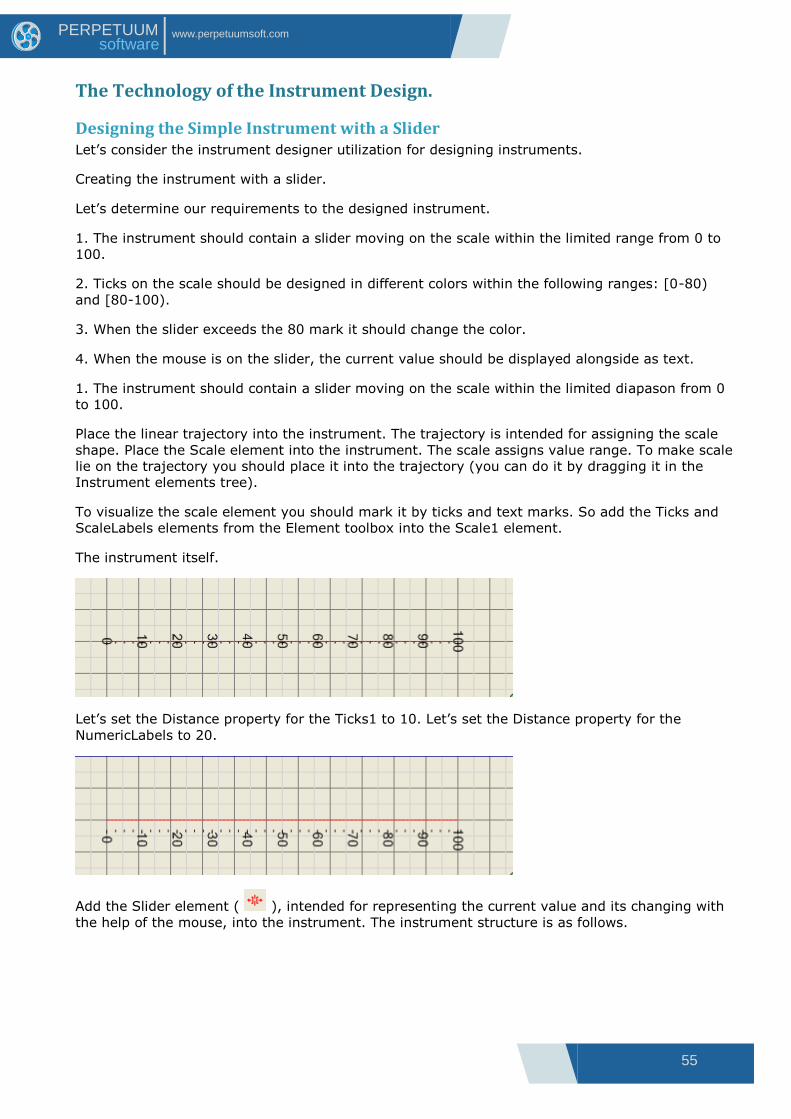
55
www.perpetuumsoft.com PERPETUUM software
The Technology of the Instrument Design.
Designing the Simple Instrument with a Slider Let‟s consider the instrument designer utilization for designing instruments.
Creating the instrument with a slider.
Let‟s determine our requirements to the designed instrument.
1. The instrument should contain a slider moving on the scale within the limited range from 0 to
100.
2. Ticks on the scale should be designed in different colors within the following ranges: [0-80)
and [80-100).
3. When the slider exceeds the 80 mark it should change the color.
4. When the mouse is on the slider, the current value should be displayed alongside as text.
1. The instrument should contain a slider moving on the scale within the limited diapason from 0
to 100.
Place the linear trajectory into the instrument. The trajectory is intended for assigning the scale
shape. Place the Scale element into the instrument. The scale assigns value range. To make scale
lie on the trajectory you should place it into the trajectory (you can do it by dragging it in the
Instrument elements tree).
To visualize the scale element you should mark it by ticks and text marks. So add the Ticks and
ScaleLabels elements from the Element toolbox into the Scale1 element.
The instrument itself.
Let‟s set the Distance property for the Ticks1 to 10. Let‟s set the Distance property for the
NumericLabels to 20.
Add the Slider element ( ), intended for representing the current value and its changing with
the help of the mouse, into the instrument. The instrument structure is as follows.
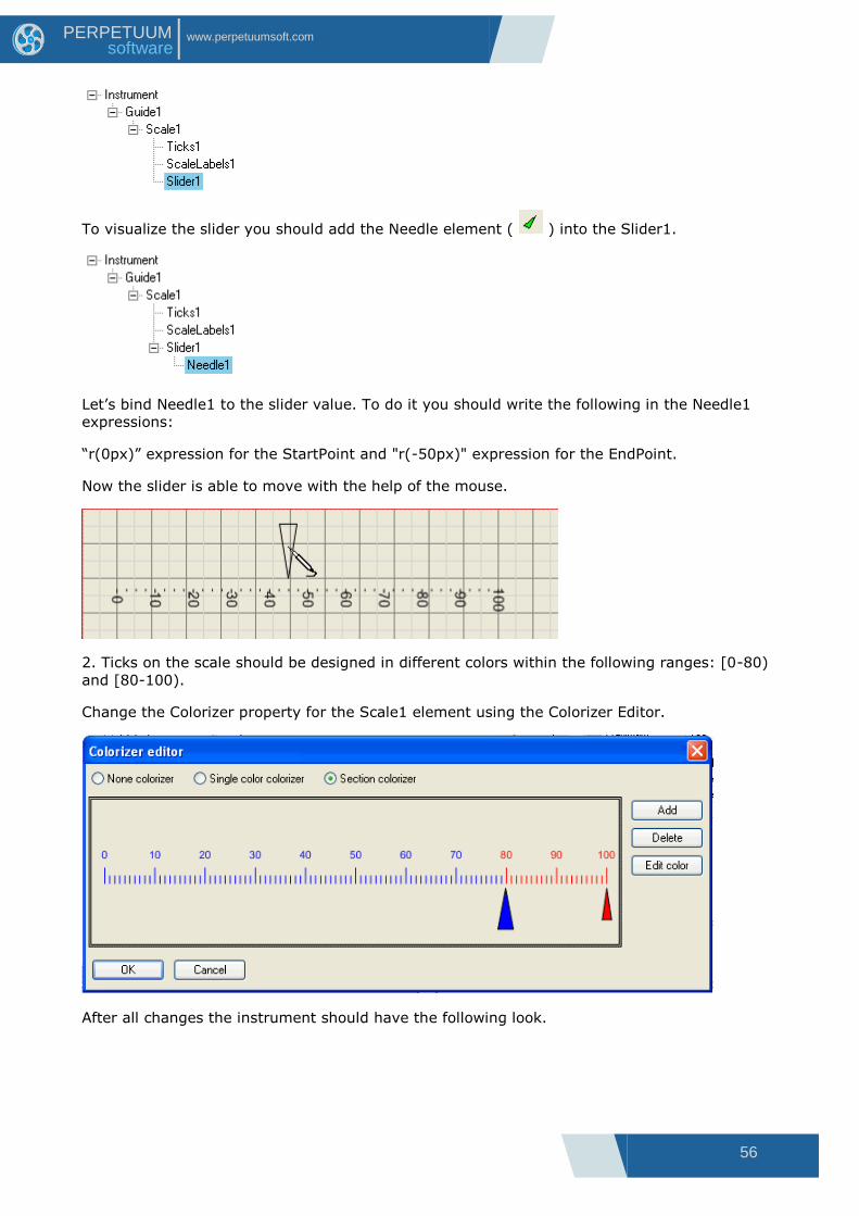
56
www.perpetuumsoft.com PERPETUUM software
To visualize the slider you should add the Needle element ( ) into the Slider1.
Let‟s bind Needle1 to the slider value. To do it you should write the following in the Needle1
expressions:
“r(0px)” expression for the StartPoint and "r(-50px)" expression for the EndPoint.
Now the slider is able to move with the help of the mouse.
2. Ticks on the scale should be designed in different colors within the following ranges: [0-80)
and [80-100).
Change the Colorizer property for the Scale1 element using the Colorizer Editor.
After all changes the instrument should have the following look.

57
www.perpetuumsoft.com PERPETUUM software
3. When the slider exceeds the 80 mark it should change the color.
Add two styles in the instrument styles collection (InstrumentStyles): ColdColor style with blue fill
and HotColor style with red fill. Write the following expression for the Style property of the
Needle1 element: if (Slider1.Value < 80, "ColdColor", "HotColor").
the current value is < 80
the current value is > 80
4. When the mouse is on the slider, the current value should be displayed alongside as text.
Add the Label element ( ) into the Sleder1 element.
Let‟s set the BreakEvenBubbling property of the Label1 element to True. This assigns mouse
events not to be passed from Label1 to Slider1.
Let‟s write the following expressions for the Label1 element:
Write "r(-38px) + [120, 20]" expression for the Center. Label1 center will be set depending on
the slider value and will be shifted on some distance.
Write "format(value, "0.00")" for the Text. The Label1 element will display the slider current value
formatted according to the mask.
Set Visible to “hot”. The Label1 element will be viewed only when mouse is on the Needle1.
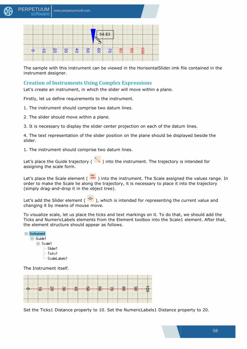
58
www.perpetuumsoft.com PERPETUUM software
The sample with this instrument can be viewed in the HorisontalSlider.imk file contained in the
instrument designer.
Creation of Instruments Using Complex Expressions Let‟s create an instrument, in which the slider will move within a plane.
Firstly, let us define requirements to the instrument.
1. The instrument should comprise two datum lines.
2. The slider should move within a plane.
3. It is necessary to display the slider center projection on each of the datum lines.
4. The text representation of the slider position on the plane should be displayed beside the
slider.
1. The instrument should comprise two datum lines.
Let‟s place the Guide trajectory ( ) into the instrument. The trajectory is intended for
assigning the scale form.
Let‟s place the Scale element ( ) into the instrument. The Scale assigned the values range. In
order to make the Scale lie along the trajectory, it is necessary to place it into the trajectory
(simply drag-and-drop it in the object tree).
Let‟s add the Slider element ( ), which is intended for representing the current value and
changing it by means of mouse move.
To visualize scale, let us place the ticks and text markings on it. To do that, we should add the
Ticks and NumericLabels elements from the Element toolbox into the Scale1 element. After that,
the element structure should appear as follows.
The Instrument itself.
Set the Ticks1 Distance property to 10. Set the NumericLabels1 Distance property to 20.

59
www.perpetuumsoft.com PERPETUUM software
To visualize the slider, add the Needle element ( ) to the Slider1 element.
Let‟s set the Needle1 element Stroke property to SimpleStroke.
And now let us bind the Needle1 element to the slider value. In the expression window for
Needle1 write the following: “r(1.3cm)” for StartPoint and “r(0.8cm)” for EndPoint.
Now the slider should be capable of moving when you manipulate it with a mouse.
As a result we shall get the OX axis.
Let us repeat the above mentioned actions for assigning the other linear trajectory, its scale and
slider. We shall get the OY axis. Then the element structure should appear as it is shown below.
The Instrument itself.
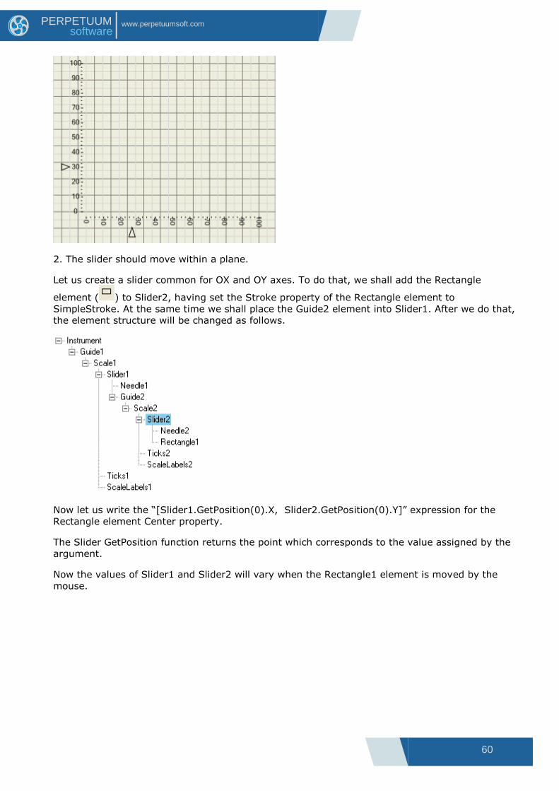
60
www.perpetuumsoft.com PERPETUUM software
2. The slider should move within a plane.
Let us create a slider common for OX and OY axes. To do that, we shall add the Rectangle
element ( ) to Slider2, having set the Stroke property of the Rectangle element to
SimpleStroke. At the same time we shall place the Guide2 element into Slider1. After we do that,
the element structure will be changed as follows.
Now let us write the “[Slider1.GetPosition(0).X, Slider2.GetPosition(0).Y]” expression for the
Rectangle element Center property.
The Slider GetPosition function returns the point which corresponds to the value assigned by the
argument.
Now the values of Slider1 and Slider2 will vary when the Rectangle1 element is moved by the
mouse.

61
www.perpetuumsoft.com PERPETUUM software
3. It is necessary to display the slider center projection on each of the datum lines.
Let us add the Line1 element ( ) into Slider1. We shall define the Line1 Stroke element as
SimpleStroke and choose red line color in the Stroke properties. For the Line1 element we shall
use the following expressions:
“r(0.42cm)” for StartPoint; and
“r(-5.93cm)” for EndPoint. We shall get the OX axis projection.
Let us add the Line2 element ( ) into Slider2. We shall define the Line1 Stroke element as
SimpleStroke and choose blue line color in the Stroke properties. For the Line2 element we shall
use the following expressions:
“r(7.2cm)” for StartPoint; and
“r(-0.42cm)” for EndPoint. We shall get the OY axis projection.
As the result the element structure will take the following look.
The instrument will look as follows:

62
www.perpetuumsoft.com PERPETUUM software
4. The text representation of the slider position on the plane should be displayed beside the
slider.
Let‟s create the Label element ( ) within the Slider2 element.
Let us indicate green color as a fill color in the Label1 element Fill property. For the Label1
element we shall use the following expressions:
“[Slider1.GetPosition(0).X, Slider2.GetPosition(0).Y] + [35px, -15px]” for Center; and
" "(" & format(Slider2.Value, "00.0") & "; " & format(Slider1.Value, "00.0") & ")" ” for Text.

63
www.perpetuumsoft.com PERPETUUM software
You can find the instrument we finally got if you open the Gauge2D.imk file in the instrument
designer.

64
www.perpetuumsoft.com PERPETUUM software
Working With the OPCChannel Component
General Information The SharpShooter Gauges provides the capability to exchange data with OPC-servers. OPC is the
industry standard for interacting with real time devices. Utilizing the PerpetuumSoft
OPCConnection and OPCChannel components, one can perform data exchange without resort to
use complicated COM interfaces.
OPCConnection The OPCConnection component is intended for producer-supplied device COM-server connection
setup. The design time adjusting is conducted by means of a convenient standard interface. It is
enough to place the component onto the form and call the connection setup window in a
corresponding PropertyGrid.
The window displays local OPC-servers and enables to connect to any server available within a
local network (requires necessary permissions including DCOM permissions – please consult your
system administrator).
OPCChannel The OPCChannel component is intended for adjusting the selected connection data transmission
channel. Please note, that it is necessary to set the required OPCConnection for the corresponding
component by means of the OPCConnection property in the PropertyGrid before adjusting data
transmission channel. The connection to an OPC-server takes place when the OPCConnection is
being set up at design time or by user demand at run time (the EstablishConnection method).
After connection setup, a user can select any number of positions available on a server with the
help of the Items property in the PropertyGrid.
After a position is selected, these position properties such as ID, access rights and canonical data
type is displayed.
The canonical data type is the standard CLS-compatible .NET type:
Reading/writing from/into a data channel is handled by the corresponding OPCChannel public
methods:
AsynchronousRead – asynchronous data slice read;
AsynchronousSubscription – asynchronous subscription to a data slice (s) with the assigned
frequency and the number of slices in one event;
Write – write.
The results of any operation are returned asynchronously; in this case OPCChannel generates an
event. At the transmission of data received by asynchronous read or subscription
(AsynchronousRead and AsynchronousSubscription correspondingly), a DataTransmission event
the arguments of which contain the requested data together with the ITransaction transaction
descriptor is generated. The WriteStatus event is used to return the Write operation results.
In order to handle events it is necessary to specify a corresponding event handler like
opcChannel1.DataTransmission += new
PerpetuumSoft.Framework.Connectivity.DataTransmissionEventHandler(this.handler);
Please look up in the ClassReference and utilization examples included in the delivery package for
more information. For proper sample operation installation of Matrikon OPC Simulation Server is
required.
65
www.perpetuumsoft.com PERPETUUM software
Step-by-step Example of Application Creation Let us consider the use of the OPCChannel and OPCConnection components by an example.
Launch a WindowsForms application with one form. Then place the IndicatorWidget component
which will display the derivable values and the OPCConnection situated in the SharpShooter
Gauges onto the form.
Select an OPC-server to connect to with the help of the Server property in the PropertyGrid. In
the dialog window select one of OPC-servers installed on your local host or local network.
Now it is necessary to place the OPCChannel component situated in the SharpShooter Gauges tab
onto the form.
Let us bind the OPCChannel to a preliminarily specified connection. To do that, set the
OPCConnection property in the PropertyGrid.
Now we need to assign the OPC-server positions to receive the data. It is necessary to set the
OPCChannel Items property in the PropertyGrid. You can select any number of positions, but it is
important not to allow the replication of positions in each OPCChannel.
Now your channel is tuned, but you need to dispatch a corresponding query to the channel in
order to read data. It is enough to call the AsynchronousSubscription method at form upload or
by user demand. The primary variant of this method takes one parameter – the event interval in
milliseconds.
private void Form1_Load(object sender, System.EventArgs e)
{
opcChannel1.AsynchronousSubscription(500);
}
The next step is to create an event handler for the DataTransmission event which occurs when
the OPCChannel receives data from the OPC-server. To do that, you should double click the
Events tab in the PropertyGrid and add a new method (the DataTransmission event handler).
private void opcChannel1_DataTransmission(object sender,
PerpetuumSoft.Framework.Connectivity.DataSlicesEventArgs e)
{
DataSlice slice = e[0];
double d =
System.Convert.ToDouble(slice.GetDataPoint(opcChannel1.Items[0].Item.ItemID).Value
);
this.indicatorWidget.Value = Math.Abs(d);
}
In this case, the first position value of the first data slice will be accepted at each event. The
multiple data slices handling is intended for work with the extended version of the
AsynchronousSubscription method that takes the data update frequency as well as data
transmission frequencies.
When you launch your application, you‟ll see the OPC-server data displayed by an instrument in
the real-time mode.

66
www.perpetuumsoft.com PERPETUUM software
Advanced DataChannel Design
Capabilities The DataChannel concept underlying the DataChannel component allows a developer to create
real-time data transmission channels using virtually any data provider including the analytically
specified functionals.
Design To create a custom DataChannel implementation, a developer should only create a component
class inherited from an abstract DataChannel and a component class that will inherit an abstract
Connection. There is no need to functionally implement all methods and properties in order to
implement a functional DataChannel. Many methods and properties providing additional services
(CultureInfo, ProviderCurrentTime etc.) might be non-implemented.
The OPCChannel is an example of a DataChannel implementation. It is useful to explore its source
code before implementing a custom component.
If you have any questions regarding the integration with SharpShooter Gauges don‟t hesitate to
contact us at [email protected]

67
www.perpetuumsoft.com PERPETUUM software
Appendix 1 Working with the Expression Editor Expression editor appearance is displayed in the image below.
Classic operators and expression language functions are located by categories in the TrewView
elements on the Operators and Functions tabs. The TreeView located on the right of the window
contains available data source fields subject to their nesting. Any construction described in either
Tree can be moved to the text entry field by drag-and-drop. Double click on the tree element will
lead to pasting the construction into the current position of the entry field.
After the entry is complete it is required to click the “OK” button to confirm modifications or the
“Cancel” button to cancel modifications. If the “OK” button is pressed, syntax checking is
executed before the window is closed.
Also you can create your own functions which will be displayed and dragged as the rest ones. You
can calculate values that you need by specified parameters. It is necessary to create class that
realizes PerpetuumSoft.Framework.Expressions.ICustomFunction interface. After that you
should register
PerpetuumSoft.Framework.Expressions.BuiltInFunctions in the static class in the following way:
PerpetuumSoft.Framework.Expressions.BuiltInFunctions.RegisterFunction("Custom function", new
CustomFunction());
The expression editor has a button panel.
The “Save” button ( ) allows saving expression text to a file.
The “Open” button ( ) allows reading expression text from a file.
The “Check expression” button ( ) allows executing syntax checking. In case a syntax error is
found a corresponding warning specifying the initial position of the erroneous construction is
displayed.