Embed Size (px)
Citation preview

Elizabethtown College Elizabethtown College
JayScholar JayScholar
Business: Student Scholarship & Creative Works Business
Spring 2020
Seeing Colors: The Impact of Color Priming on Brand Perception Seeing Colors: The Impact of Color Priming on Brand Perception
Catherine Hughes Elizabethtown College, [email protected]
Follow this and additional works at: https://jayscholar.etown.edu/busstu
Part of the Business Commons
Recommended Citation Recommended Citation Hughes, Catherine, "Seeing Colors: The Impact of Color Priming on Brand Perception" (2020). Business: Student Scholarship & Creative Works. 10. https://jayscholar.etown.edu/busstu/10
This Student Research Paper is brought to you for free and open access by the Business at JayScholar. It has been accepted for inclusion in Business: Student Scholarship & Creative Works by an authorized administrator of JayScholar. For more information, please contact [email protected].
Running Head: The Impact of Color Priming
Seeing Colors: The Impact of Color Priming on Brand Perception
By
Catherine Hughes
This thesis is submitted in partial fulfillment of the requirements for Honors in the Discipline in
Business and the Elizabethtown College Honors Program
May 1, 2020
Thesis Director (signature required)________________________
Department Chair (signature required)___________________________
The Impact of Color Priming
2
Honors Senior Thesis
Release Agreement Form
The High Library supports the preservation and dissemination of all papers and projects completed as part of the requirements for the
Elizabethtown College Honors Program (Honors Senior Thesis). Your signature on the following form confirms your authorship of
this work and your permission for the High Library to make this work available. By agreeing to make it available, you are also
agreeing to have this work included in the institutional repository, JayScholar. If you partnered with others in the creation of this work,
your signature also confirms that you have obtained their permission to make this work available.
Should any concerns arise regarding making this work available, faculty advisors may contact the Director of the High Library to
discuss the available options.
Release Agreement
I, as the author of this work, do hereby grant to Elizabethtown College and the High Library a non-exclusive worldwide license to
reproduce and distribute my project, in whole or in part, in all forms of media, including but not limited to electronic media, now or
hereafter known, subject to the following terms and conditions:
Copyright
No copyrights are transferred by this agreement, so I, as the author, retain all rights to the work, including but not limited to the right
to use in future works (such as articles or books). With this submission, I represent that any third-party content included in the project
has been used with permission from the copyright holder(s) or falls within fair use under United States copyright law
(http://www.copyright.gov/title17/92chap1.html#107).
Access and Use
The work will be preserved and made available for educational purposes only. Signing this document does not endorse or authorize
the commercial use of the content. I do not, however, hold Elizabethtown College or the High Library responsible for third party use
of this content.
Term
This agreement will remain in effect unless permission is withdrawn by the author via written request to the High Library.
Signature: Date:
The Impact of Color Priming
3
Table of Contents
I. Abstract……………………………………………………………………………......4
II. Literature Review……………………………………………………………………...5
a. Background………………………………………………………………………..5
b. History of Color…………………………………………………………………...5
c. Color Terminology……………………………………………………………......7
d. Color in Marketing……………………………………………………………….10
e. Priming…………………………………………………………………………...13
III. Hypotheses and Research Questions………………………………………………...16
IV. Methodology…………………………………………………………………………20
V. Results and Discussion………………………………………………………………21
VI. Limitations and Future Research…………………………………………………….30
VII. References……………………………………………………………………………33
VIII. Appendices…………………………………………………………………………...39
The Impact of Color Priming 4
Abstract
Previous research has examined the role that color plays in various contexts. This
research has primarily examined three aspects of color: hue (the primary reflected wavelength or
the color itself), saturation (the dominance of hue in a color or the pureness of a color), and
value (the brightness of the color). The current study seeks to apply the concept of priming to the
study of the effects of color. Priming is defined as the psychological technique in which one
stimulus influences a person’s response to a subsequent stimulus. In this study, priming is
utilized in the form of varying color saturation levels to alter attitudes, purchase intentions, and
value perceptions of several brands. An experimental method was designed to test the difference
between pretest and posttest responses from participants regarding their attitudes, purchase
intentions, and value perceptions of these brands. This method involved a manipulation of color
saturation to ascertain the role that priming plays in magnifying or reducing color effects.
Ultimately, the results indicated partial support for the study’s three hypotheses, demonstrating
to a degree that increased saturation levels can influence brand attitude measures, likelihood to
purchase measures, and perceived value measures.

The Impact of Color Priming 5
Literature Review
Background
Color has primarily been studied based on its hue, value, and saturation, so when we
speak of “color” it is important to remember the various components that belong to this larger
concept. While older interpretations of color were much simpler, distinguishing between
lightness and darkness, more modern interpretations consider the emotive aspects of color. In the
context of marketing, color is used to differentiate brands, build brand recognition, and establish
associations and connections with consumers. Priming, the other area of focus for the current
research, has been studied from numerous perspectives within a variety of fields. Most
commonly, priming has been applied in psychological research and has used words, visuals, and
symbols as primes. This project seeks to apply the concept of priming to our understanding of
how color, in all its forms, may influence behavior.
History of Color
Color has historically carried different meanings and interpretations based on a variety of
cultural and social factors. For example, the Greeks distinguished between darkness (blacks) and
light (whites), while those living in the medieval renaissance times used color to denote religious
symbolism. Interpretations of color were also often dependent on how that specific culture or
society interpreted the natural setting. For example, elements of nature were related to four
colors: “scarlet (later red) with fire, white (later black) with earth, blue with air and purple (later
white) with water” (Aslam, 2006, p. 16). Religious interpretation of these colors related blue to
heaven, red to charity, purple to martyrdom, and white to purity. Older interpretations have been
integrated into many present-day meanings of color. For example, Labrecque and Milne (2012)
supported the association between purple and the brand personality trait of sophistication, while
The Impact of Color Priming
6
purple, among other colors including gold, crimson, and scarlet “indicated power, authority, and
opulence” in olden times (Aslam, 2006, p. 16).
In similar ways, color has also been studied for how it influences behaviors, attitudes, and
emotions. For example, Galileo suggested that colors are “perceiver dependent, dispositional,
laid in the minds of the observers and were not really a property of the object,” which began the
debate on the psychological effects of color, as well as its relation with emotions (Aslam, 2006,
p. 17). In more modern times, Pantin-Sohier (2009) pointed out the associations that can be made
between colors and emotions, specifically in the context of marketing to consumers. Not only
does a color “give the brand identification and a visual distinction,” but it “also provides
emotions and associations capable of reinforcing the symbolism and the benefits produced”
(Pantin-Sohier, 2009, p. 56). Tokutake et al. (2019) categorized colors according to the
personality traits or adjectives they represent in a marketing context. In this study, Tokutake et
al. (2019) explored whether product packaging color had an effect on product perception. The
180 adjectives typically used on a color image scale were expanded using a thesaurus to include
3,204 adjectives, such as active, dynamic, innovative, refreshing, and quiet. Ultimately, each
color corresponded to a range of adjectives, anywhere from two to 24 adjectives.
While many studies explore the role that color plays in perception by showing
respondents specific colors, other studies have taken a different approach. Clarke and Costall
(2008) instead asked participants to visualize each color without a presence of physical color
swatches or samples. Instead of restricting participants to a set list of adjectives, they described
their associations to the colors using an open-ended format of questioning. This more
imaginative approach to research shed light on the intricate ways color associations are formed.
In some cases, “color’s emotive aspects were traditional, cultural, or stereotypical,” but in other

The Impact of Color Priming
7
cases the reported associations of a color were based on individual experiences (Clarke &
Costall, 2008, p. 409). For example, pink and blue have been commonly associated with
femininity and masculinity, respectively, because this fits the traditional gender roles our society
has established for these colors. Based on personal experiences though, the same blue can be
associated with much more than masculinity. For some participants, blue was seen as a “sad” and
“heavy colour when rich,” while others saw blue as a freeing color that reminded them of the sea
and sky (Clarke & Costall, 2008, p. 407). Even within these descriptions exists the possibility for
positive and negative associations to develop. One person may enjoy visiting the beach and
swimming in the blue water, while another may fear what lies beneath the same blue water. This
same blue stimulus, just as any colored stimulus, can be experienced in very different ways, and
these experiences eventually establish strong associations in our minds.
Color Terminology
Isaac Newton created the color wheel that has remained a standard in color theory. Red,
blue and green are the three primary colors along the spectrum, and their interaction creates a
collection of colors. Red, orange, yellow, green, blue, and purple are considered simple colors,
while other colors such as taupe and sea green are considered sophisticated colors. Over the
years, philosophers contemplated the appearance and perception of different colors. Each of the
colors on the color wheel represent the varying wavelengths of light perceived along the color
spectrum, ranging from longer wavelengths (reds) to shorter wavelengths (violets). Color
components such as hue, value, and saturation have long been studied to determine their
relevance in different fields. In the literature, value has also been referred to as lightness or
brightness, and saturation has been referred to as chroma.
The Impact of Color Priming
8
Hue
Hue refers to the color itself, which is distinguished from others by the various
wavelengths of light we perceive. While longer wavelengths represent reds and oranges, shorter
wavelengths represent blues and violets. Previous research has studied several hues, some more
often than others, including red, yellow, blue, purple, black, and white. A review of this previous
research illustrates that no single color can be deemed solely positive or negative based on its
hue, with conflicting results seen for every color that has been studied. This is likely because
people are able to form their own associations between colors and personal experiences, both
good and bad. Red, for example, has been associated with positive emotions of love (Jonauskaite
et al., 2020; Kaya & Epps, 2004; Clarke & Costall, 2008) and excitement (Hanada, 2017; Singla
& Aggarwal, 2016; Labrecque & Milne, 2012; Amsteus et al., 2015) but has also been associated
with negative emotions of anger (Jonauskaite et al., 2020; Clarke & Costall, 2008; Hanada,
2017) and hate (Jonauskaite et al., 2020). Yellow has commonly been related to feelings of joy
(Wexner, 1954; Dael et al., 2016; Jonauskaite et al., 2020) and happiness (Clarke & Costall,
2008; Hemphill, 1996; Hanada, 2017; Labrecque & Milne, 2012), but has also been described as
an anxious and annoying color (Manav, 2007). Blue has elicited positive feelings of comfort
(Wexner, 1954; Clarke & Costall, 2008; Hanada, 2017) and reliability (Labrecque & Milne,
2012; Tamba et al., 2013; Aslam, 2006; Yu et al., 2018), but also sadness (Clarke & Costall,
2008) and fear (Dael et al., 2016). Purple, found to be a soothing (Ko, 2011) and sophisticated
(Labrecque & Milne, 2012) color, has also been viewed as a passive color in other cases (Clarke
& Costall, 2008). Black has frequently been related to power (Labrecque & Milne, 2012; Aslam,
2006; Wexner, 1954) and elegance, particularly in a fashion context (Labrecque & Milne, 2012),
but has also been related to sadness (Wexner, 1954; Jonauskaite et al., 2020; Hanada, 2017;
The Impact of Color Priming 9
Annamary, 2016) and evil (Clarke & Costall, 2008). White is more commonly associated with
purity (Labrecque & Milne, 2012; Aslam, 2006; Clarke & Costall, 2008) and peace (Labrecque
& Milne, 2012; Clarke & Costall, 2008), but has also formed a negative association with death in
Asian cultures (Aslam, 2006). Since the colors mentioned in the literature were associated with
both positive and negative emotions, no single hue could be used in this study as a “positive” or
“negative” color.
Value (Lightness or Brightness)
Value refers to the brightness of a color, or the amount of light it reflects. Labrecque and
Milne (2012) described a color’s value as its “lightness or darkness relative to a scale that ranges
from black (low) to white (high)” (p. 712). A high value blue, for example, will appear as a
pastel that contains a greater proportion of white, while a low value blue will appear darker and
contain a greater proportion of black. Lambert (2004) specified the tinting and shading process
involved in creating high and low value colors where tinting a color adds white to it and shading
a color adds black. A negative relationship between value and arousal, and a positive relationship
between value and calmness has been identified (Lichtlé, 2007; Labrecque & Milne, 2012;
Wilms & Oberfeld, 2018). An association between higher value and positive emotion has also
been seen in certain cases (Clarke & Costall, 2008; Manav, 2007; Dael et al., 2016).
Saturation (Chroma)
Saturation refers to the dominance of hue in a color, or how pure the color appears.
Labrecque and Milne (2012) measured a color’s saturation “on a scale from low (appearing gray
and washed out) to high (appearing vivid)” (p. 717). In contrast to the negative relationship
between value and arousal, research has revealed that saturation has a positive effect on arousal
(Labrecque & Milne, 2012; Wilms & Oberfeld, 2018). Dael et al. (2016) studied the association

The Impact of Color Priming
10
between color saturation and facial/bodily expressions. Participants were shown videos of either
positive (joyful) or negative (fearful) bodily expressions and were then asked to assign a color
that most appropriately represented each video. Dael et al. (2016) found that “participants
selected brighter and more saturated colours for joy expressions than for fear expressions” (para.
1). Takahashi and Kawabata (2017) also found an association between positive emotional
responses and brighter, more saturated colors after collecting research data from college students.
A relationship between increased color saturation levels and positive emotions is seen repeatedly
throughout the literature. Findings indicate a much more consistent relationship for saturation
and emotion than they do for hue and emotion.
Color in Marketing
It is increasingly difficult for brands to stand out in today’s marketplace as product
offerings expand and the media environment continues to clutter, and as such, elements that
could provide marketers with a competitive advantage with respect to branding are playing more
prominent roles. Romaniuk and Nenycz-Thiel (2014) define distinctiveness as “a function of the
strength and uniqueness of the elements that form a brand’s identity” which can include logos,
colors, or taglines, essentially “anything that triggers the brand name in consumer memory” (p.
313). Color can be a useful tool to help brands differentiate from each other. Coca-Cola red and
Pepsi blue are iconic examples of the power colors hold when they are built into a brand.
Belonging to the same product category, Coca-Cola and Pepsi decided to differentiate their
brands based on color and other non-taste attributes, with taste playing only a secondary role.
With respect to the use of color in branding, some scholars have pushed back against the
idea that color should be used as a differentiator. Labrecque and Milne (2013), for example,
presented an idea that contradicts the strategy firms like Coca-Cola and Pepsi use to differentiate.
The Impact of Color Priming
11
Instead of creating uniqueness through color, Labrecque and Milne (2013) proposed that “some
value could be forfeited by straying too far from established product category associations,” such
as a well-established color for a product category (p. 165). To test this proposal, Labrecque and
Milne (2013) examined the color norms within various product categories to see if differentiation
within a category seemed to help or hurt a brand. Overall, Labrecque and Milne (2013) found
that color differentiation can provide benefits in certain product categories but can also threaten a
brand’s success in other product categories. Labrecque and Milne (2013) noted that “adhering to
color norms may be beneficial for product categories containing a dominant market leader,
especially high-involvement categories” (p. 165). In this study, Labrecque and Milne (2013) also
collected data on the colors used in logos and found that 50 percent of fast-food logos primarily
included the color red. Singh (2006) provided a likely explanation for this prevalence of red in
the fast-food sector, identifying red as a color that “stimulates appetite because of its effect on
our metabolism” (p. 785). Aslam (2006) similarly noted the association between the color red
and pizza restaurants. Singh (2006) described the prevalence of yellow in the fast-food industry
as well, as it uses an arousing and exciting color to “gain customers’ attention, increase their
appetite, and encourage them to eat” (p. 785). Aslam (2006) identified product categories most
strongly associated with the color green, which include “health foods, vegetable entrees, toys and
financial services” (p. 23). The green Whole Foods logo, for example, serves as a shorthand for
communication to consumers that their products belong to the health foods sector. Labrecque and
Milne (2013) found data to support the trust and stability that is commonly tied to the color blue,
as 76.9 percent of financial firms incorporate blue into their logo to emulate these reliable
characteristics through color. Aslam (2006) found a strong product category association between
the color pink and products such as cosmetics and Barbie dolls which are typically trying to
The Impact of Color Priming
12
appeal to the same gender in the market. In the context of fashion, “black expresses status,
elegance, richness, and dignity” (Labrecque & Milne, 2012, p. 714), so it is not a surprise to see
71.4 percent of apparel companies incorporating black into their logos instead of other colors
(Labrecque & Milne, 2013).
Color can be used as a marketing tool in other ways too. Oftentimes we see the color red
used to mark clearance items because red has been shown to increase heart rate and therefore
create a sense of urgency in consumers (Hanada, 2017; Jonauskaite et al., 2020; Bagchi &
Cheema, 2013; Clarke & Costall, 2008; Labrecque & Milne, 2012). In addition to feelings of
urgency, color can evoke feelings of relaxation, especially when it is incorporated into the
lighting and ambiance of a store. The retailer Rituals, for example, utilizes darker lighting to
promote important aspects of the brand to consumers, including its products that help customers
relax and take a step away from the bright lights of their busy days.
There are several arguments regarding the rationale for color choices consumers make
when purchasing products. Yu et al. (2018) postulated that color preference is less important than
product perceptions of functionality and performance. Factors that will take precedence over
personal preference specifically included color performance, color functionality, and color
culture, denoted as “primary factors.” Yu et al. (2018) described color performance in a context
“where the consumer might infer that a product works better when it is one colour rather than
another” (para. 8). A few examples of this theory were given, including the differences in
perceived efficacy of mouthwash and dishwashing liquid based on its color or
lightness/darkness. Yu et al. (2018) relates color functionality to “whether a colour is appropriate
for the function of a product” (para. 8). An example of proper color functionality would be a
consumer choosing a red toaster oven over a blue one. In this case, the red color of the toaster
The Impact of Color Priming 13
matches its function of adding heat to food. In contrast, the cold blue color of a toaster would not
align with the heating function of the product. Finally, Yu et al. (2018) relates color culture to
“where it is culturally important that a product is a particular colour” (para. 8). Participants
generally made their hypothetical purchase decisions according to these primary factors.
Individual color preferences only took priority over color performance, functionality, and culture
when these factors were absent from the consumer’s initial interaction with the product (Yu et
al., 2018).
Popa et al. (2013) pointed out another well-known tendency of consumers during the
buying process known as impulse shopping. Popa et al. (2013) found that impulse shoppers
respond more favorably to colors including red, orange, black, and blue, while those shopping
from a planned budget respond well to pink and turquoise. As Gentry and Myers (2016) noted,
60% of a product’s first impression comes from its color, so it is an important marketing tool to
consider when designing a product package.
Priming
Priming is a technique more commonly used in psychology, and is defined as the process
by which exposure to one stimulus influences one’s response to a subsequent stimulus. In 2005,
McNamara described priming as “an improvement in performance in a perceptual or cognitive
task,” but later studies found that this change in performance can also be neutral or result in
worsened performance (Minton et al., 2016, para. 8). Within priming, a prime or stimulus is used
to influence subsequent responses. Priming can either be considered in a conceptual sense or a
perceptual sense. While conceptual priming focuses on the meaning of a stimulus, perceptual
priming focuses on its form. In the context of consumer behavior, both conceptual and perceptual
priming can explain brand choice. For example, Lee (2002) found that conceptual priming
The Impact of Color Priming 14
prompted consumers to make “a memory-based choice” from their prior experiences and
associations with the brand, while perceptual priming caused consumers to make “ a stimulus-
based choice” that was more dependant on the physical characteristics of the product or the
promotion of the brand (para. 26). As a psychological technique, priming has been studied using
a variety of stimuli which have most commonly taken the form of words and visuals/symbols.
Words
Zemack-Rugar et al. (2007) studied priming by utilizing emotional adjectives in two
different contexts. In the first experiment, participants were primed with emotional adjectives
expressing either guilt or sadness. Zemack-Rugar et al. (2007) found that those primed with
guilty emotional words displayed lower levels of indulgence than those primed with sad
emotional words. In a second experiment, participants were primed in the same fashion, but were
then measured based on their willingness to help. Participants primed with emotionally guilty
adjectives showed more willingness to help than participants primed with emotionally sad
adjectives (Zemack-Rugar et al., 2007). Labroo et al. (2008) applied this type of priming with
words to consumer behavior. Labroo et al. (2008) found that participants were more likely to
purchase the target wine bottle that advertised a frog on the label if they had been briefly
exposed to the word “frog.” Laran et al. (2011) primed consumers with low and high quality
brand names. Laran et al. (2011) discovered that consumers were more inclined to purchase low-
value products if they had been primed with low-quality brand names like Walmart than if they
had been primed with high-quality brand names like Nordstrom. Galli and Gorn (2011) tested the
priming effects of the words “black” and “white” alongside either black product target words,
like “cola,” or white product target words, like “soymilk.” They found that product reactions and
The Impact of Color Priming
15
brand attitudes were more positive when the stimulus was in agreement with the target product
(ex: “black” and “cola”) (Galli & Gorn, 2011).
Visuals/Symbols
Although words are useful to use alongside priming, Spruyt et al. (2002) noted that
pictures and visual primes produce more significant priming effects. Stafford et al. (1995)
showed participants an image of a car salesman to activate the “pushy salesmen stereotype” in
their minds and found that participants displayed lower attitudes to an unrelated salesman after
having been primed with the negative stereotype (para. 20). Fitzsimons et al. (2008) studied the
effects of psychological priming with brand logos and found that consumers behaved more
creatively after seeing the Apple logo, compared to consumers who had seen the IBM logo.
McFerran et al. (2010) tested the influence of priming on consumption behavior using various
body type images. Participants from this study were either primed with an image of an obese
body type or a thin body type, after which their consumption levels were measured. McFerran et
al. (2010) found that the obese body type prime prompted participants to lower their
consumption levels, while the thin body type prime caused increased consumption across the
board. Matthes and Naderer (2015) obtained similar results in their study, as participants’
consumption increased after repeated visual exposure to snack food products. Raska and Nichols
(2012) used another form of visual priming to influence consumption behavior. Participants
exposed to love-related symbols displayed healthier eating behaviors than participants who did
not receive this prime (Raska & Nichols, 2012). Guéguen (2013) used love-related symbols in a
different context and found that a jar with a heart symbol on the front received more monetary
donations than a jar with a square or circle on the front when placed next to a bakery cash
register.
The Impact of Color Priming
16
Other Forms
Smith and Branscombe (1987) studied priming in the context of consumer personality
characteristics. Participants were primed with the trait of hostility using a word unscrambling
task, but ended up demonstrating less hostile behavior than participants who had been primed
with a sentence unscrambling/trait matching task. Papies and Hamstra (2010) studied the effects
of goal priming in the context of consumer behavior and found that participants consumed fewer
food samples after they had been primed with a healthy recipe poster in a store to remind them of
their health goals. Loizou and Karageorghis (2014) explored consumer behavior in another
context, specifically relating to sports performance. Participants were exposed to one of four
priming conditions: music, music and video, music with video and emotional primers, and no
music or video (control group). After exposure to one of these four stimuli, participants engaged
in anaerobic exercises to see if differences existed among primers. Loizou and Karageorghis
(2014) found that the combination of music, video, and motivational primers had the greatest
impact on participants’ pre-exercise affect and their subsequent anaerobic performance.
Hypotheses and Research Questions
Priming has been demonstrated to unknowingly influence attitudes, emotions, and
motivations, and as such is a useful tool for marketers. At the same time, color, in all its
components, has been demonstrated to have profound effects on the marketing mix, but has been
primarily studied for the role it plays as part of the brand image or as an attribute of a product or
its packaging. There has been limited research exploring the connection of these two concepts -
priming and color - and how color itself could be used as a priming stimulus. This study seeks to
explore this by utilizing color as a priming vehicle to ascertain how it may influence a variety of
measurable attitudinal and perception variables.
The Impact of Color Priming 17
H1: Individuals primed with higher levels of saturation will perceive a higher dollar value for
products compared to individuals primed with lower levels of saturation.
Previous research studying the impact of color palettes on painting prices found that
paintings with a higher diversity of colors carried a premium over equivalent pieces of artwork
painted in a more monochromatic style (Stepanova, 2019). Among the more diverse colors were
blues, teals, oranges, and yellows, which inherently seem more saturated and vivid than the
monochromatic colors of brown and gray. An econometric analysis also revealed these blue-teal
and orange colors to be associated with higher prices for the paintings (Stepanova, 2019). Other
research looked at the influence of color saturation on product evaluation and the willingness to
pay. Participants were presented with a hypothetical scenario to choose a carry-on bag that was
either “large enough to fit plenty of your belongings” or “small enough to fit easily into an
overhead storage compartment” (Hagtvedt & Brasel, 2017, p. 401). Previous experiments
included in this study determined a relationship between saturation level and perceived object
size, with objects being perceived larger as their color saturation levels were increased. Hagtvedt
and Brasel (2017) found that when the goal was a larger carry-on bag, participants chose the
more highly saturated bag and were willing to pay considerably more for this “larger” bag. In
reality, the carry-on bags being compared were identical in size, shape, hue, and value, and only
varied according to their saturation level. This study hypothesizes that participants will perceive
a higher dollar value for the same products after being primed with increased levels of saturation.
H2: Individuals primed with higher levels of saturation will be more likely to purchase brands
compared to individuals primed with lower levels of saturation.
The Impact of Color Priming
18
Hagtvedt and Brasel (2017) performed single-object and paired-object exposures to study
participants where objects varied only in their saturation levels. Shape, size, hue, and value of
objects were the same. In the case of single-object exposures, the amount of time participants
spent fixated on the object (instead of on the background) was greater for high saturation objects
compared to low saturation objects (Hagtvedt & Brasel, 2017). In the case of paired-object
exposures, participants attended to the more highly saturated object first 60.3 percent of the time
(Hagtvedt & Brasel, 2017). Additionally, for paired-object exposures, the high saturation object
accounted for significantly more fixation time among participants (2.25 seconds) compared to
overall fixation time recorded for the low saturation object (1.63 seconds) (Hagtvedt & Brasel,
2017). Previous research has also demonstrated an association between higher levels of
saturation and higher levels of arousal in individuals (Labrecque & Milne, 2012; Wilms &
Oberfeld, 2018). This study hypothesizes that participants will be more likely to purchase brands
after being primed with increased levels of saturation that have a tendency to capture one’s
attention, increase one’s fixation, and increase one’s arousal.
H3: Individuals primed with higher levels of saturation will possess more positive brand
attitudes than individuals primed with lower levels of saturation.
Finally, previous research has pointed to participants choosing more saturated colors to
represent joyful expressions and positive emotions (Kaya & Epps, 2004; Dael et al., 2016;
Takahashi & Kawabata, 2017). This study hypothesizes that participants will develop more
positive brand attitudes after being primed with increasing levels of saturation, which have been
shown to elicit more positive emotions.
In addition to an exploration of the above hypotheses, this study also seeks to uncover the
role that a number of other variables may play in moderating effects. Prior research into both
The Impact of Color Priming 19
priming and color demonstrated outcomes that could be moderated by a variety of factors,
ranging from participants’ gender to their optimal stimulation level (OSL). Respondent gender
has been found to act as a moderator for certain product perceptions (Van Tilburg et al., 2015),
but has also been found to not moderate study results (Semin & Palma, 2014). Optimal
stimulation level, another variable whose moderating effects have been explored, is defined as
the ideal level of arousal that individuals will attempt to meet and maintain. Although Lichtlé
(2007) found that OSL was not a moderating variable for the relationship between color lightness
and pleasure, OSL did act as a moderating variable for the relationship between color saturation,
hue, and pleasure.
Various selling mechanisms (auctions and negotiations) have also been studied as
moderators, specifically regarding their effects on the relationship between color and consumer
behavior. Bagchi and Cheema (2013) found red to induce aggression, but the intensity and
direction of this aggression was moderated by the selling mechanism that was utilized. When the
selling mechanism took the form of an auction, exposure to the color red increased bid jumps;
however, when the selling mechanism took the form of a negotiation, exposure to the color red
decreased offer amounts (Bagchi & Cheema, 2013).
Personality traits of respondents have been found to influence color perception, as Lichtlé
(2007) notes the general trend for extroverts to prefer warm colors (red, orange, yellow) and
introverts to prefer cool colors (green, blue, purple). This tendency for colors to cluster around
similar personality types signals potential for traits of extraversion and/or introversion to act as
moderating variables. Additionally, certain colors have been found to elicit optimistic and
extroverted feelings which may translate into moderating effects for the relationship between
participants’ personality traits and their reactions to the color prime.

The Impact of Color Priming 20
Given the role that other variables play in moderating effects, the following research
questions are also explored.
RQ1: Does priming with different color saturation levels lead to different brand attitude,
likelihood to purchase, and/or price perception measures for males versus females?
RQ2: Does priming with different color saturation levels lead to different brand attitude,
likelihood to purchase, and/or price perception measures for optimists versus pessimists?
RQ3: Does priming with different color saturation levels lead to different brand attitude,
likelihood to purchase, and/or price perception measures for introverts versus extroverts?
Methodology
In order to test the above hypotheses and research questions, an experimental approach
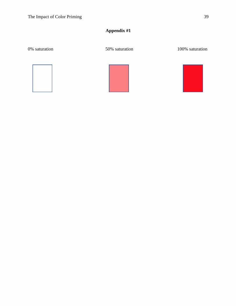
was employed. A survey was designed to test the effects of priming with three different levels of
color saturation (0%, 50%, and 100%). Appendix #1 contains these three color saturation levels.
The current study used various saturation levels of the color red, as it, like all other colors,
elicited both positive emotions (love, excitement) and negative emotions (anger, hate). The
survey was electronically distributed as a PDF file via email to a sample of students from a small
liberal arts college in central Pennsylvania. This sample of students was divided into three
distinct groups in order to test the impact saturation level has on perceived value, likelihood to
purchase, and brand attitude. These three groups were the following:
Group 1: Primed with 0% saturation level of the color red (control group)
Group 2: Primed with 50% saturation level of the color red
Group 3: Primed with 100% saturation level of the color red
The survey contained four distinct parts and 22 questions in total. The structure of survey
questions varied to include open-ended, multiple choice, and scale formats. Participants began by
The Impact of Color Priming
21
answering eight demographic and psychographic questions for Part One of the survey.
Demographic variables included age and gender, while psychographic variables included scales
measuring respondents on introversion vs. extroversion and optimism vs. pessimism. Participants
from all three groups then completed Part Two, answering five brand-related questions. These
brand-related questions in Part Two prompted participants to respond on a “Strongly
Disagree/Strongly Agree” five-point scale to statements such as “I like Nike” and “I like Under
Armour.” This section then prompted participants to respond on a “Very Unlikely/Very Likely”
five-point scale to the statement “How likely is it for you to purchase the following brands?” Part
Two also included an open-ended response format, asking participants to type the expected cost
of several products and services (Nike women’s sweatshirt, Under Armour men’s sweatshirt).
Part Three served as the prime, where page color varied between groups depending on the group
they were assigned to, representing 0%, 50%, and 100% saturation. This section included two
visual perception tasks with a question following each task. Lastly, in Part Four, participants
answered seven brand-related questions. Part Two (the pretest) and Part Four (the posttest)
shared some similar questions in order to control for differences across groups. Appendix #2
contains each survey.
Results and Discussion
The survey was distributed to 500 individuals, with a total of 49 responses, for a response
rate of approximately 10%. This sample included 18 participants in the 0% saturation control
group, 15 in the 50% saturation group, and 16 in the 100% saturation group. A sample of this
size presents challenges with respect to inferential statistical analysis. As such, while inferential
statistics were utilized to ascertain statistical significance, a variety of descriptive statistics were
The Impact of Color Priming
22
also used to explore whether and where differences and/or relationships could be found in order
to speak to the potential for significance if such results held with a larger sample.
Hypothesis 1
The first hypothesis expected that participants primed with higher saturation levels would
display an increase in perceived dollar value of both Under Armour and Nike brands. Expected
product cost scores were recorded within the pretest and posttest, and a cost difference variable
was created. An ANOVA was used to compare the cost difference variable across the three
participant groups (0% saturation/control group, 50% saturation, and 100% saturation). When
looking at the difference between groups with respect to their perceived cost of an Under
Armour men’s sweatshirt and Nike women’s sweatshirt, only results from Nike were
approaching statistical significance at the 95% level between groups (F = 2.68, p = .079).
Additionally, the Nike cost posttest scores were statistically significant at the 95% level between
groups (F = 5.061, p = .01) to show some support for H1. Under Armour did not show
statistically significant results for either variable (posttest cost or cost difference).
In order to identify where the difference between groups was coming from for Nike, a
post hoc analysis was conducted. The cost difference variable was not approaching statistical
significance between any of the groups; however, the post hoc analysis revealed that there was a
statistically significant difference within Nike’s posttest cost variable between the control and
100% saturation groups (p = .009) at the 95% level to partially support H1.
To further explore the meaning behind these mixed results, descriptive statistical
measures were reviewed to better understand the relationship between saturation level and cost
estimates. Looking at the raw estimated costs of both sports brands’ products, mean posttest cost
values supported H1, as an increase in cost estimates followed an increase in saturation level. An
The Impact of Color Priming 23
Under Armour men’s sweatshirt, for example, showed an increase in average perceived cost
from $40.56 to $45.27 to $47.13 when moving from the control group to the 50% saturation
group to the 100% saturation group. Similarly, a Nike women’s sweatshirt showed an increase in
average perceived cost from $39.17 to $45.13 to $48.38 when moving from the control group to
the 50% saturation group to the 100% saturation group. Within control groups, Nike and Under
Armour saw an increase in perceived cost by a mean of only $0.28 and $1.00, respectively. As
saturation level increased to 50% and 100%, Nike showed an increase in perceived cost by a
mean of $0.47 and $3.00, respectively, while Under Armour showed an increase in perceived
cost by a mean of $1.80 and $3.31.
Hypothesis 2
The second hypothesis predicted that participants primed with higher saturation levels
would display an increased likelihood to purchase both Under Armour and Nike brands.
Likelihood to purchase scores were recorded with both pretest and posttest variables, and a
likelihood to purchase difference variable was created. An ANOVA was conducted in order to
compare the likelihood to purchase difference variable across the three participant groups (0%
saturation/control group, 50% saturation, and 100% saturation). When looking at the difference
between the three groups with respect to their likelihood to purchase scores, the Under Armour
brand showed a statistically significant difference at the 95% level between groups (F = 4.556, p
= .016) and Nike was approaching statistical significance between groups (F = 3.01, p = .059).
In order to identify where the difference between groups exists, a post hoc analysis was
utilized. The post hoc analysis for Under Armour revealed a statistically significant difference
between the control and 50% saturation groups (p = .022), which supports H2. The likelihood to
purchase difference variable for Under Armour was approaching statistical significance at the
The Impact of Color Priming 24
95% level between the control and 100% saturation groups (p = .078), but was not between the
50% and 100% saturation groups. With respect to Nike, there was no statistical significance
between the control and 50% saturation groups or between the 50% and 100% saturation groups;
however, the likelihood to purchase difference variable could be approaching statistical
significance at the 95% level between the control and 100% saturation groups (p = .094).
While the likelihood to purchase variable showed some statistical significance, additional
insight was derived from looking at descriptive statistics. The likelihood to purchase scale ranged
from 1 (very unlikely) to 5 (very likely). When looking at the posttest likelihood to purchase
measure across groups (control, 50%, and 100%), Under Armour had mean scores of 3.22, 3.47,
and 3.56, and Nike had mean scores of 3.33, 3.47, and 3.69, respectively. This increase in
average likelihood to purchase scores as saturation levels were increased supports H2.
Likelihood to purchase difference variables were also examined to ascertain the
movement of participants within each group. With respect to the Under Armour brand, the
control group showed 17/18 (≅94%) participants with no change between their pretest and
posttest responses and 1/18 (≅6%) with a decreased likelihood to purchase, the 50% saturation
group showed 10/15 (≅67%) participants with no change and 5/15 (≅33%) with an increased
likelihood to purchase, and the 100% saturation group showed 11/16 (≅69%) participants with
no change and 5/16 (≅31%) with an increased likelihood to purchase. Turning to the Nike brand,
the control group showed 16/18 (≅89%) participants with no change between their pretest and
posttest responses and 2/18 (≅11%) with a decreased likelihood to purchase, the 50% saturation
group showed 7/15 (≅47%) participants with no change, 6/15 (40%) with an increased
likelihood to purchase and 2/15 (≅13%) with a decreased likelihood to purchase, and the 100%
saturation group had 9/16 (≅56%) participants with no change, 6/16 (≅38%) with an increased
The Impact of Color Priming
25
likelihood to purchase and 1/16 (≅6%) with a decreased likelihood to purchase. These results
partially support H2, as likelihood to purchase increased from the 0% to 50% saturation levels,
but did not from the 50% to 100% saturation levels.
Hypothesis 3
The third hypothesis postulated that participants primed with higher saturation levels
would display a more positive attitude toward both the Under Armour and Nike brands. A four-
question attitude scale was utilized to measure overall brand attitude. Other variables that can
speak to brand attitude were included in the analysis, with some utilizing pretest and posttest
measures (brand liking, word), and others measuring post the manipulation of the independent
variable (brand attitude).
Brand liking was measured along a five-point scale ranging from 1 (strongly disagree) to
5 (strongly agree), where participants responded to the phrase “I like Nike” or “I like Under
Armour.” A set of like Nike difference and like Under Armour difference variables were then
created from pretest and posttest responses. After running an ANOVA, a statistically significant
difference was found between groups at the 95% level for both Nike (F = 8.419, p = .001) and
Under Armour (F = 7.258, p = .002). The ANOVA also showed like Nike posttest (p = .076) and
like Under Armour posttest (p = .078) scores approaching statistical significance at the 95%
level.
A post hoc analysis revealed a statistically significant difference between the control and
50% saturation groups (p = .004) and between the control and 100% saturation groups (p = .002)
at the 95% level for the like Nike difference variable. A statistically significant difference was
also shown between the control and 50% saturation groups (p = .005) and between the control
and 100% saturation groups (p = .007) at the 95% level for the like Under Armour difference
The Impact of Color Priming
26
variable. The like Nike and like Under Armour difference variables were not, however,
statistically significant between the 50% and 100% saturation groups.
With respect to descriptive statistics, both like Nike and like Under Armour posttest
scores increased as saturation levels were increased from 0% in the control group, to 50%, and to
100%, with mean scores of 3.17, 3.73, and 3.81 for Nike, and mean scores of 3.39, 4, and 4 for
Under Armour. These findings partially support H3, but the influence of saturation seems to
diminish, as results show a larger initial change when saturation moves from 0% to 50% than
when it moves from 50% to 100%.
An ANOVA was utilized to analyze overall attitude measures across participant groups.
When looking at the difference between the three groups with respect to overall brand attitude
scores, there was a statistically significant difference for Under Armour posttest responses (F =
5.940, p = .005) to support H3, and Nike posttest responses were approaching statistical
significance at the 95% level (F = 3.097, p = .055). A post hoc analysis revealed that Nike
attitude results were statistically significant at the 95% level between the control and 100%
groups (p = .05), but were not between the control and 50% or 50% and 100% groups. Similarly,
Under Armour attitude results were statistically significant at the 95% level between the control
and 100% groups (p = .005) and were approaching statistical significance between the control
and 50% groups (p = .064), but were not between the 50% and 100% groups.
Several descriptive statistics were also utilized to better understand the relationship
between color saturation level and overall attitude. Within the control group, 11/18 (≅61%) and
12/18 (≅67%) participants recorded attitude scores above 3 (neutral) for Under Armour and
Nike, respectively. Within the 50% saturation group, 14/15 (≅93%) and 10/15 (≅67%)
participants recorded attitude scores above 3 for Under Armour and Nike, respectively. Within
The Impact of Color Priming 27
the 100% saturation group, 16/16 (100%) and 15/16 (≅94%) recorded attitude scores of 3 or
greater for Under Armour and Nike, respectively. These results show an increase in positive
attitude scores (above 3) as color saturation levels were increased, which supports H3.
Finally, an ANOVA was utilized to compare word positivity/negativity across the three
groups. Participants recorded a word for each brand in the pretest and the posttest, from which a
word difference variable was created. ANOVA results showed a statistically significant
difference between groups at the 95% level for the word Nike difference variable (F = 3.615, p =
.035), but not for the word Under Armour difference, word Nike posttest, or word Under Armour
posttest variables. A post hoc analysis revealed the word Nike difference variable to be
approaching statistical significance at the 95% level between control and 50% groups (p = .07)
and between control and 100% groups (p = .084), but not between the 50% and 100% groups.
Looking at word difference scores from the pretest to the posttest, Under Armour and
Nike displayed similar movement in responses from negative to more positive words as
saturation levels were increased. For example, the Nike control group had 0/17 participants show
positive change, while the 50% group had 4/15 (≅26%) show positive change and the 100%
group had 4/16 (25%) also show positive change from the pretest to the posttest. Under Armour
results were very similar, with 1/17 (≅5%) participants showing positive change in the control
group, 2/15 (≅13%) showing positive change in the 50% group, and 3/16 (≅19%) showing
positive change in the 100% group. The majority of the remaining participants showed no or
negative change in all of these conditions.
Research Questions
In addition to the goal of understanding the role that saturation plays in influencing
consumer attitudes, purchase intentions, and value perceptions, a secondary goal of this study

The Impact of Color Priming
28
was to explore whether other factors might have a moderating effect on the independent variable
of saturation. To explore this, an analysis of descriptive statistics for subgroups was utilized.
With respect to gender, results were mixed. This could be due to sampling issues - due to
the smaller sample size, subgroup analysis proved even more challenging - or it could speak to
the fact that gender may not play a moderating role or may only play a limited moderating role.
Specifically, when looking at brand liking difference variables (post minus pre), means were
higher in the 50% saturation level vs. the control level, and still higher in the 100% saturation
level vs. the 50% saturation level for men but not for women, where both the 50% and 100%
levels were higher than the control but where 50% was the highest among them all. When
looking at overall attitude scores, means did increase across both Under Armour and Nike
measurements when moving from the control to the 50% level to the 100% level, with one
exception, where the Nike attitude score for men decreased between the control and 50%
saturation level. However, with the sample size for these subgroups in the single digits and a
much larger standard deviation for men in the 50% saturation level vs. the control group, it
appears that one outlier could account for this result. Finally, cost difference measures (post
minus pre) showed mixed results. While cost estimates increased for both males and females in
both the 50% and 100% saturation groups vs. the control group, it does not appear that gender
plays a role, although again, the subgroup sample size presents challenges. Overall, results are
mixed. It appears that in some variables there could be differences across genders, while for
other variables those differences do not exist.
Looking at pessimism and optimism, there were also mixed results. While pessimists
showed an increase in cost estimates as saturation levels increased, the results for optimists
showed a decrease in perceived cost when moving from the 0% to 50% saturation levels and an
The Impact of Color Priming
29
increase in perceived cost when moving from the 50% to 100% saturation levels. The 100%
saturation level reflected the highest cost difference values across the optimist and pessimist
groupings, with the mixed results possibly accounted for by an outlier. Both pessimists and
optimists did however show improved overall attitude scores across brands as saturation levels
increased, with mean attitude scores higher in the 50% saturation level vs. the control level, and
still higher in the 100% saturation level vs. the 50% saturation level. Results were again mixed
for the brand liking difference variable. Means were higher in the 50% saturation level compared
to the control level for both pessimists and optimists, but liking for both brands did not continue
to increase when moving from 50% saturation to 100% saturation. Optimists did however appear
to respond with more positive words than pessimists for both brands, as the mean values for
word difference variables were higher among optimists at all saturation levels. Ultimately, results
are mixed, with certain variables appearing to differ across these psychographic groupings
(optimist vs. pessimist) and others not showing these differences.
Finally, with respect to introversion and extraversion, findings were also mixed. When
looking at brand liking difference variables (post minus pre), mean scores were higher at the
50% level vs. the control level for both introverts and extroverts; however, mean scores showed
conflicting results depending on the brand when they were compared at the 50% and 100%
saturation levels. Shifting focus to the overall brand attitude variable, mean scores were higher at
the 50% level vs. the control level, and still higher at the 100% level vs. the 50% level for
extroverts. These results differed from those of introverts, whose mean scores were higher at the
100% level vs. the 50% level for Nike and lower at the 100% level vs. the 50% level for Under
Armour. Cost difference mean scores in the extraversion condition were lower at the 50% level
vs. the control level, but were higher at the 100% level vs. both the 50% and control levels,
The Impact of Color Priming 30
perhaps speaking to a higher saturation preference among extroverts who favor or require that
level of stimulation. Those in the introversion condition showed higher cost difference mean
scores at the 50% level vs. the control level, but results were mixed when moving from 50% to
100% saturation. With respect to word difference variables, introverts demonstrated somewhat
delayed results, with higher mean scores not appearing until the 100% level for Nike specifically.
Under Armour showed higher mean scores for word difference at the 50% level vs. the control
level, but showed a decrease at the 100% level compared to the 50% level. Extroverts on the
other hand had higher mean scores for this variable at the 50% level compared to the control
level, and even higher at the 100% level compared to the 50% level. Overall, results varied, with
certain variables suggesting a difference between these psychographic groups (introverts vs.
extroverts) and other variables not showing anything to suggest a difference.
Limitations and Future Research
This study faced several limitations that would be helpful to address in future research.
The survey had originally been designed for participants to complete in-person and on paper,
which would have allowed for greater control over the test environment and lower variability in
screen size/brightness/tint. However, due to unforeseen circumstances, the survey was
distributed via email for participants to complete online. The survey had originally been designed
for participants to complete in-person and on paper, which would have allowed for greater
control over the test environment and lower variability in screen size/brightness/tint. With
participants completing the survey online, brightness of the screen, tint of the screen (for
example, if it was in
night mode), or size of the screen (for example, if the survey was completed on a phone
The Impact of Color Priming 31
rather than a computer or tablet) could not be controlled. In addition, although participants
received instructions to take the survey without returning to previous pages or questions, this
could not be ensured through this approach. A similar study could be completed using paper
surveys administered in-person in an effort to reduce variations that accompany the online
experimental format. An in-person study could also be utilized to test these variables using
different formats (for example, video vs. paper) and priming mechanisms (for example, a
manipulation of ambient lighting colors).
Another limitation of this study was its sample size. The online method of distribution
resulted in a lower response rate and, therefore, a smaller final sample size. Future studies could
look to include a larger sample that extends beyond the small liberal arts college population. In
addition, the application of this study to more diverse populations could provide more insight
into how or if the impact of priming through color is moderated by age, ethnicity, race, and other
such variables.
This study was also limited by a lack of control as to the length of time respondents
engaged with the prime. If participants completed all survey sections as they were intended to be
done, the exposure to the color-saturated pages was still fairly low, and this was likely
exacerbated if participants quickly scrolled past the prime to complete the posttest. Future
research could look to manipulate the exposure time of primes to examine how the length of a
prime could influence consumers.
Additionally, since this study focused on one color and just on saturation, the role that
various other colors may play, as well as all the components of these colors, could prove
valuable for future research. Future studies could explore these various factors to ascertain
The Impact of Color Priming 32
similarities and differences between colors, as well as how hue, value, and saturation play similar
or contradictory roles.
With respect to the research questions explored in this study, while the results were
mixed, the data points to the possibility of variables that could play a moderating role. Further
exploration of the variables studied here, as well as an exploration of additional variables that
could play a moderating (or mediating) role should be pursued. In addition, expanding the
sample, both size and scope, could help shed light on whether the variables studied here, or
others, are important factors to understand subgroup differences.
The Impact of Color Priming
33
References
Amsteus, M., As-Shaaban, S., Wallin, E., & Sjöqvist, S. (2015). Colors in marketing: A study of
color associations and context (in)dependence. International Journal of Business and
Social Science, 6, 32– 45.
Annamary, K. (2016). Colour Preference to Emotions in Relation to the Anxiety Level among
School Children in Puducherry – A Cross-Sectional Study. Journal Of Clinical And
Diagnostic Research. doi: 10.7860/jcdr/2016/18506.8128
Aslam, M. M. (2006). Are You Selling the Right Colour? A Cross-cultural Review of Colour as
a Marketing Cue. Journal of Marketing Communications, 12(1), 15–30.
Bagchi, R., & Cheema, A. (2013). The Effect of Red Background Color on Willingness-to-Pay:
The Moderating Role of Selling Mechanism. Journal of Consumer Research, 39(5), 947–
960.
Clarke, T., & Costall, A. (2008). The emotional connotations of color: a qualitative investigation.
Color Research and Application, 33 (5), 406–410.
Dael, N., Perseguers, M.-N., Marchand, C., Antonietti, J.-P., & Mohr, C. (2016). Put on that
colour, it fits your emotion: Colour appropriateness as a function of expressed emotion.
Quarterly Journal of Experimental Psychology, 69(8), 1619–1630.
https://doi.org/10.1080/17470218.2015.1090462
Fitzsimons, G. M., Chartrand, T. L., & Fitzsimons, G. J. (2008). Automatic Effects of Brand
Exposure on Motivated Behavior: How Apple Makes You “Think Different.” Journal of
Consumer Research, 35(1), 21–35. doi: 10.1086/527269
Galli, M., & Gorn, G. (2011). Unconscious transfer of meaning to brands. Journal of Consumer
Psychology, 21(3), 215–225. doi: 10.1016/j.jcps.2010.12.004

The Impact of Color Priming
34
Gentry, S., & Myers, S. (2016). Consumers and Colors: An Exploratory Look at Color
Perceptions and Influence. Society for Marketing Advances Proceedings, 538–539.
Guéguen, N. (2013). Helping with all your heart: the effect of cardioid dishes on tipping
behavior. Journal of Applied Social Psychology, 43(8), 1745–1749.
https://doi.org/10.1111/jasp.12109
Hagtvedt, H., & Brasel, S. A. (2017). Color Saturation Increases Perceived Product Size. Journal
of Consumer Research, 44(2), 396–413.
Hanada, M. (2017). Correspondence analysis of color–emotion associations. Color Research &
Application, 43(2), 224–237. doi: 10.1002/col.22171
Hemphill, M. (1996). A Note on Adults Color–Emotion Associations. The Journal of Genetic
Psychology, 157(3), 275–280. doi: 10.1080/00221325.1996.9914865
Jonauskaite, D., Parraga, C. A., Quiblier, M., & Mohr, C. (2020). Feeling Blue or Seeing Red?
Similar Patterns of Emotion Associations With Colour Patches and Colour Terms. I-
Perception. https://doi.org/10.1177/2041669520902484
Kaya, N., & Epps, H. H. (2004). Color-emotion associations: past experience and personal
preference. AIC 2004 Color and Paints, Interim Meeting of the International Color
Association, Proceedings, 31–34.
Ko, Ya-Hsien. (2011). Influencing Factors on Color and Product-Function Association.
Psychological Reports, 108(3), 861–873.
Labrecque, L. I., & Milne, G. R. (2012). Exciting red and competent blue: The importance of
color in marketing. Journal of the Academy of Marketing Science, 40(5), 711–727.
Labrecque, L., & Milne, G. (2013). To be or not to be different: Exploration of norms and
benefits of color differentiation in the marketplace. Marketing Letters, 24(2), 165–176.
The Impact of Color Priming
35
Labroo, A. A., Dhar, R., & Schwarz, N. (2008). Of Frog Wines and Frowning Watches:
Semantic Priming, Perceptual Fluency, and Brand Evaluation. Journal of Consumer
Research, 34(6), 819–831. doi: 10.1086/523290
Lambert, J. (2004). Colour schemers. Canadian Business, 77(18), 76–82.
Laran, J., Dalton, A. N., & Andrade, E. B. (2011). The Curious Case of Behavioral Backlash:
Why Brands Produce Priming Effects and Slogans Produce Reverse Priming Effects.
Journal of Consumer Research, 37(6), 999–1014. doi: 10.1086/656577
Lee, A. Y. (2002). Effects of Implicit Memory on Memory-Based versus Stimulus-Based Brand
Choice. Journal of Marketing Research, 39(4), 440–454. doi:
10.1509/jmkr.39.4.440.19119
Lichtlé, M.-C. (2007). The effect of an advertisement’s colour on emotions evoked by an ad and
attitudes towards the ad: The moderating role of the optimal stimulation level.
International Journal of Advertising: The Quarterly Review of Marketing
Communications, 26(1), 37–62.
Loizou, G., & Karageorghis, C. I. (2014). Effects of psychological priming, video, and music on
anaerobic exercise performance. Scandinavian Journal of Medicine & Science in Sports,
25(6), 909–920. doi: 10.1111/sms.12391
Manav, B. (2007). Color-emotion associations and color preferences: A case study for
residences. Color Research & Application, 32(2), 144–150. doi: 10.1002/col.20294
Matthes, J., & Naderer, B. (2015). Children's consumption behavior in response to food product
placements in movies. Journal of Consumer Behaviour, 14(2), 127–136. doi:
10.1002/cb.1507
McFerran, B., Dahl, D. W., Fitzsimons, G. J., & Morales, A. C. (2010). Might an overweight
The Impact of Color Priming
36
waitress make you eat more? How the body type of others is sufficient to alter our food
consumption. Journal of Consumer Psychology, 20(2), 146–151. doi:
10.1016/j.jcps.2010.03.006
McNamara, T. P. (2005). Semantic Priming: Perspectives from Memory and Word Recognition.
Psychology Press New York. doi: 10.4324/9780203338001
Minton, E. A., Cornwell, T. B., & Kahle, L. R. (2016). A theoretical review of consumer
priming: Prospective theory, retrospective theory, and the affective-behavioral-cognitive
model. Journal of Consumer Behaviour, 16(4), 309–321. doi: 10.1002/cb.1624
Pantin-Sohier, G. (2009). The Influence of the Product Package on Functional and Symbolic
Associations of Brand Image. Recherche et Applications En Marketing (English Edition)
(AFM c/o ESCP-EAP), 24(2), 53–71.
Papies, E. K., & Hamstra, P. (2010). Goal priming and eating behavior: Enhancing self-
regulation by environmental cues. Health Psychology, 29(4), 384–388. doi:
10.1037/a0019877
Popa, C. N., Popescu, S., Tamba Berehoiu, R. M., & Tamba Berehoiu, S.-M. (2013).
Considerations Regarding Use and Role of Colour in Marketing. Scientific Papers:
Management, Economic Engineering in Agriculture & Rural Development, 13(1), 269–
274.
Raska, D., & Nichols, B. S. (2012). Using subtle reminders of love to foster healthy snack
choices. Journal of Consumer Behaviour, 11(6), 432–442. doi: 10.1002/cb.1381
Romaniuk, J., & Nenycz-Thiel, M. (2014). Measuring the Strength Of Color Brand-Name Links.
Journal of Advertising Research, 54(3), 313–319.
Semin, G. R., & Palma, T. A. (2014). Why the bride wears white: Grounding gender with
The Impact of Color Priming
37
brightness. Journal of Consumer Psychology, 24(2), 217–225.
Singh, S. (2006). Impact of color on marketing. Management Decision, 44(6), 783–789. doi:
10.1108/00251740610673332
Singla, V. & Aggarwal, N. (2016). Examining the Effect of Emotions Associated with Colour of
Logo on Brand Perceptions. Amity Journal of Marketing, 1(1), (20–31).
Smith, E. R., & Branscombe, N. R. (1987). Procedurally mediated social inferences: The case of
category accessibility effects. Journal of Experimental Social Psychology, 23(5), 361–
382. doi: 10.1016/0022-1031(87)90036-9
Spruyt, A., Hermans, D., Houwer, J. D., & Eelen, P. (2002). On The Nature of the Affective
Priming Effect: Affective Priming of Naming Responses. Social Cognition, 20(3), 227–
256. doi: 10.1521/soco.20.3.227.21106
Stafford, T. F., Leigh, T. W., & Martin, L. L. (1995). Assimilation and contrast priming effects
in the initial consumer sales call. Psychology and Marketing, 12(4), 321–347. doi:
10.1002/mar.4220120408
Stepanova, E. (2019). The impact of color palettes on the prices of paintings. Empirical
Economics, 56(2), 755–773.
Takahashi, F., & Kawabata, Y. (2017). The association between colors and emotions for
emotional words and facial expressions. Color Research & Application, 43(2), 247–257.
doi: 10.1002/col.22186
Tamba Berehoiu, R. M., Popa, C. N., Popescu, S., & Tamba Berehoiu, S.-M. (2013). The
Importance of Color in the Major Romanian Brands Marketing. Scientific Papers:
Management, Economic Engineering in Agriculture & Rural Development, 13(1), 419–
425.
The Impact of Color Priming
38
Tokutake, M., Kajiyama, T., & Ouchi, N. (2019). A method for revising package image colors to
express brand perceptions better. Color Research & Application, 44(5), 798–810.
Van Tilburg, M., Lieven, T., Herrmann, A., & Townsend, C. (2015). Beyond “pink it and shrink
it” perceived product gender, aesthetics, and product evaluation. Psychology &
Marketing, 32(4), 422–437.
Wexner, L. B. (1954). The degree to which colors (hues) are associated with mood-tones.
Journal of Applied Psychology, 38(6), 432–435.
Wilms, L., & Oberfeld, D. (2018). Color and emotion: effects of hue, saturation, and brightness.
Psychological Research, 82(5), 896–914.
Yu, L., Westland, S., Li, Z., Pan, Q., Shin, M. J., & Won, S. (2018). The role of individual colour
preferences in consumer purchase decisions. Color Research & Application, 43(2), 258–
267.
Zemack-Rugar, Y., Bettman, J. R., & Fitzsimons, G. J. (2007). The effects of nonconsciously
priming emotion concepts on behavior. Journal of Personality and Social Psychology,
93(6), 927–939.
The Impact of Color Priming
39
Appendix #1
0% saturation 50% saturation 100% saturation

You are invited to participate in a study designed to gather information for an
honors research project. You are not required to participate and there will be no
consequences if you choose not to. If you do agree to participate, there is no risk
involved. You will not be asked for your name or any personally identifiable
information, nor will you be asked for information that would identify others. All
responses are confidential. You may terminate your participation in this study at
any time without any consequences. If you have any questions, please contact
Catherine Hughes at [email protected], or Dr. Bryan Greenberg
Please fill in your answers in the designated spaces and/or check one of thedesignated boxes per question. Once you complete this survey, please save andreturn it to [email protected]
Thank you for your time and willingness to participate.
**Please continue through the survey without returning to previous pages**
This survey is designed to be completed on a computer or a tablet. As a reminder, please complete this survey using a PDF reader.
Appendix #2
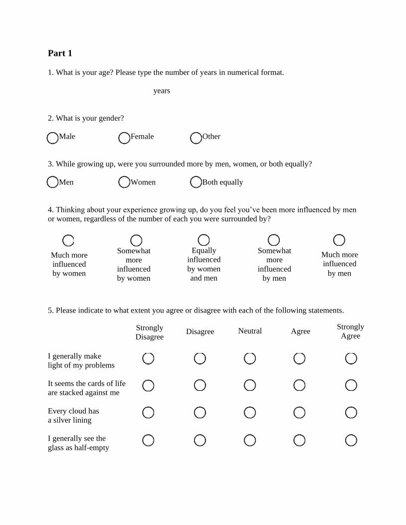
Part 1
1. What is your age? Please type the number of years in numerical format.
years
2. What is your gender?
Male Female Other
3. While growing up, were you surrounded more by men, women, or both equally?
Men Women Both equally
4. Thinking about your experience growing up, do you feel you’ve been more influenced by men
or women, regardless of the number of each you were surrounded by?
5. Please indicate to what extent you agree or disagree with each of the following statements.
I generally make
light of my problems
It seems the cards of life
are stacked against me
Every cloud has
a silver lining
I generally see the
glass as half-empty
Strongly
Disagree Disagree Neutral Agree
Strongly
Agree
Much more
influenced
by women
Somewhat
more
influenced
by women
Equally
influenced
by women
and men
Somewhat
more
influenced
by men
Much more
influenced
by men

6. Please indicate to what extent you agree or disagree with each of the following statements.
In general, I feel
energized after spending
time with others
I prefer to socialize
one on one rather
than in a large group
I enjoy being the
center of attention
I mostly listen to
people in conversations,
sharing my own opinions
sparingly
7. Would you consider yourself an introvert or an extrovert?
Introvert Extrovert
8. Would you consider yourself a pessimist or an optimist?
Pessimist Optimist
Strongly
Disagree Disagree Neutral Agree
Strongly
Agree

Part 2
You will now be asked a series of questions about several brands.
1. Brand names influence my choices when purchasing a product.
Strongly Disagree Neutral Agree Strongly
Disagree Agree
2. For each of the following brands, rate your agreement with the following statements.
I like Patagonia
I like Nike
I like Coca-Cola
I like Lyft
I like Under Armour
I like Dunkin’ Donuts
I like Hulu
3. How much would you expect the following items to cost? Please type in the dollar amount.
A box of Kellogg’s Special K Cereal $
Under Armour men’s sweatshirt $
Six pack of Coca-Cola $
Fifteen-minute Uber ride $
Nike women’s sweatshirt $
Medium (grande) cup of Starbucks coffee $
A notebook from Target $
Strongly
Disagree Disagree Neutral Agree Strongly
Agree

4. How likely is it for you to purchase the following brands?
Tide
Adidas
Pepsi
Under Armour
McDonald’s
Nike
Ulta
5. What is the first word that comes to mind when you think of the following brands?
Sony
Coca-Cola
Nike
Reebok
Chipotle
Under Armour
Columbia
Very
Unlikely Unlikely Neutral Likely
Very
Likely

Part 3
Please do not return to previous questions once you have reached
this page in the survey.
You will now be asked to complete a simple visual task designed
to measure perception. On the following page, you will find two
pictures.
Please carefully examine each picture and then type in your
responses.
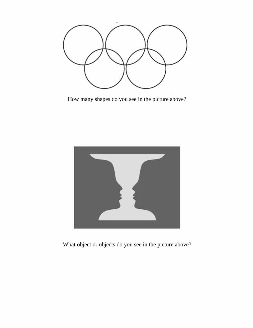
How many shapes do you see in the picture above?
What object or objects do you see in the picture above?
Please do not return to previous questions once you have
reached this page in the survey.
You will now be asked a series of questions about specific
brands.
Please read each question carefully and provide the response
that most accurately represents how you feel.

Very
Negative
Somewhat
Negative Neutral Somewhat
Positive Very
Positive
Very
Unattractive
Somewhat
Unattractive
Neutral Somewhat
Attractive
Very
Attractive
Very Low
Quality
Somewhat
Low
Quality
Neutral Somewhat
High
Quality
Very High
Quality
Very Bad
Value for
Money
Somewhat
Bad Value
for Money
Neutral Somewhat
Good Value
for Money
Very Good Value for
Money
Part 4
1. Please rate your attitude toward the Under Armour brand based on the following dimensions.
2. Please indicate to what extent you agree or disagree with each of the following statements.
Lululemon products
are reasonably priced
Under Armour products
are reasonably priced
Best Buy products
are reasonably priced
Nike products
are reasonably priced
Strongly
Disagree Disagree Neutral Agree
Strongly
Agree
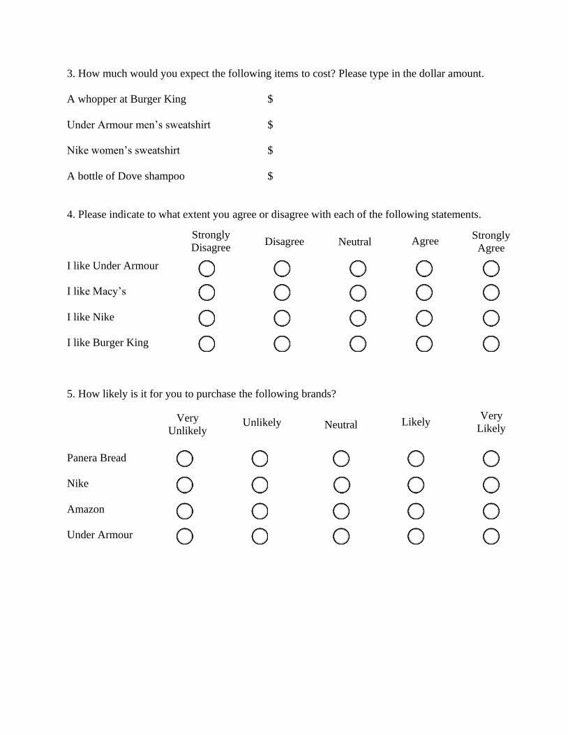
3. How much would you expect the following items to cost? Please type in the dollar amount.
A whopper at Burger King $
Under Armour men’s sweatshirt $
Nike women’s sweatshirt $
A bottle of Dove shampoo $
4. Please indicate to what extent you agree or disagree with each of the following statements.
I like Under Armour
I like Macy’s
I like Nike
I like Burger King
5. How likely is it for you to purchase the following brands?
Panera Bread
Nike
Amazon
Under Armour
Very
Unlikely Unlikely Neutral Likely
Very
Likely
Strongly
Disagree Disagree Neutral Agree
Strongly
Agree

Very
Negative
Somewhat
Negative Neutral Somewhat
Positive Very
Positive
Very
Unattractive
Somewhat
Unattractive
Neutral Somewhat
Attractive
Very
Attractive
Very Low
Quality
Somewhat
Low
Quality
Neutral Somewhat High
Quality
Very High
Quality
Very Bad
Value for
Money
Somewhat
Bad Value
for Money
Neutral Somewhat
Good Value
for Money
Very Good
Value for
Money
6. Please rate your attitude toward the Nike brand based on the following dimensions.
7. What is the first word that comes to mind when you think of the brands below?
Under Armour
Nike
Colgate
Hershey’s
PLEASE READ.
In order to submit this survey, please save the completed version of your survey to your desktop and then email that copy to [email protected]
Thank you for your time!
You are invited to participate in a study designed to gather information for an
honors research project. You are not required to participate and there will be no
consequences if you choose not to. If you do agree to participate, there is no risk
involved. You will not be asked for your name or any personally identifiable
information, nor will you be asked for information that would identify others. All
responses are confidential. You may terminate your participation in this study at
any time without any consequences. If you have any questions, please contact
Catherine Hughes at [email protected], or Dr. Bryan Greenberg
Please fill in your answers in the designated spaces and/or check one of thedesignated boxes per question. Once you complete this survey, please save andreturn it to [email protected]
Thank you for your time and willingness to participate.
**Please continue through the survey without returning to previous pages**
This survey is designed to be completed on a computer or a tablet. As a reminder, please complete this survey using a PDF reader.

Part 1
1. What is your age? Please type the number of years in numerical format.
years
2. What is your gender?
Male Female Other
3. While growing up, were you surrounded more by men, women, or both equally?
Men Women Both equally
4. Thinking about your experience growing up, do you feel you’ve been more influenced by men
or women, regardless of the number of each you were surrounded by?
5. Please indicate to what extent you agree or disagree with each of the following statements.
I generally make
light of my problems
It seems the cards of life
are stacked against me
Every cloud has
a silver lining
I generally see the
glass as half-empty
Strongly
Disagree Disagree Neutral Agree
Strongly
Agree
Much more
influenced
by women
Somewhat
more
influenced
by women
Equally
influenced
by women
and men
Somewhat
more
influenced
by men
Much more
influenced
by men

6. Please indicate to what extent you agree or disagree with each of the following statements.
In general, I feel
energized after spending
time with others
I prefer to socialize
one on one rather
than in a large group
I enjoy being the
center of attention
I mostly listen to
people in conversations,
sharing my own opinions
sparingly
7. Would you consider yourself an introvert or an extrovert?
Introvert Extrovert
8. Would you consider yourself a pessimist or an optimist?
Pessimist Optimist
Strongly
Disagree Disagree Neutral Agree
Strongly
Agree
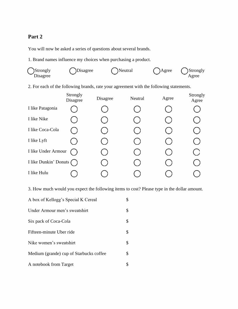
Part 2
You will now be asked a series of questions about several brands.
1. Brand names influence my choices when purchasing a product.
Agree Strongly Strongly Disagree Neutral
Disagree Agree
2. For each of the following brands, rate your agreement with the following statements.
I like Patagonia
I like Nike
I like Coca-Cola
I like Lyft
I like Under Armour
I like Dunkin’ Donuts
I like Hulu
3. How much would you expect the following items to cost? Please type in the dollar amount.
A box of Kellogg’s Special K Cereal $
Under Armour men’s sweatshirt $
Six pack of Coca-Cola $
Fifteen-minute Uber ride $
Nike women’s sweatshirt $
Medium (grande) cup of Starbucks coffee $
A notebook from Target $
Strongly
Disagree Disagree Neutral Agree Strongly
Agree

4. How likely is it for you to purchase the following brands?
Tide
Adidas
Pepsi
Under Armour
McDonald’s
Nike
Ulta
5. What is the first word that comes to mind when you think of the following brands?
Sony
Apple
Nike
Reebok
Chipotle
Under Armour
Columbia
Very
Unlikely Unlikely Neutral Likely
Very
Likely
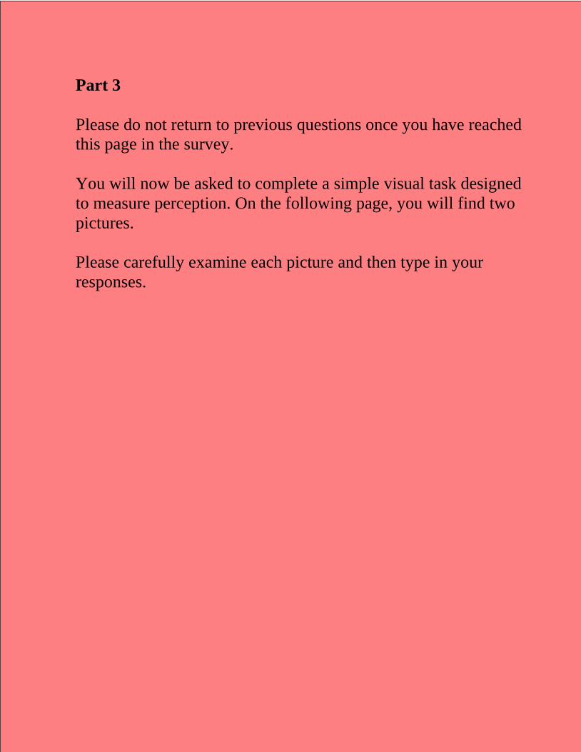
Part 3
Please do not return to previous questions once you have reached
this page in the survey.
You will now be asked to complete a simple visual task designed
to measure perception. On the following page, you will find two
pictures.
Please carefully examine each picture and then type in your
responses.

How many shapes do you see in the picture above?
What object or objects do you see in the picture above?
Please do not return to previous questions once you have
reached this page in the survey.
You will now be asked a series of questions about specific
brands.
Please read each question carefully and provide the response
that most accurately represents how you feel.

Very
Negative
Somewhat
Negative Neutral Somewhat
Positive Very
Positive
Very
Unattractive
Somewhat
Unattractive
Neutral Somewhat
Attractive
Very
Attractive
Very Low
Quality
Somewhat
Low
Quality
Neutral Somewhat
High
Quality
Very High
Quality
Very Bad
Value for
Money
Somewhat
Bad Value
for Money
Neutral Somewhat
Good Value
for Money
Very Good
Value for
Money
Part 4
1. Please rate your attitude toward the Under Armour brand based on the following dimensions.
2. Please indicate to what extent you agree or disagree with each of the following statements.
Lululemon products
are reasonably priced
Under Armour products
are reasonably priced
Best Buy products
are reasonably priced
Nike products
are reasonably priced
Strongly
Disagree Disagree Neutral Agree
Strongly
Agree
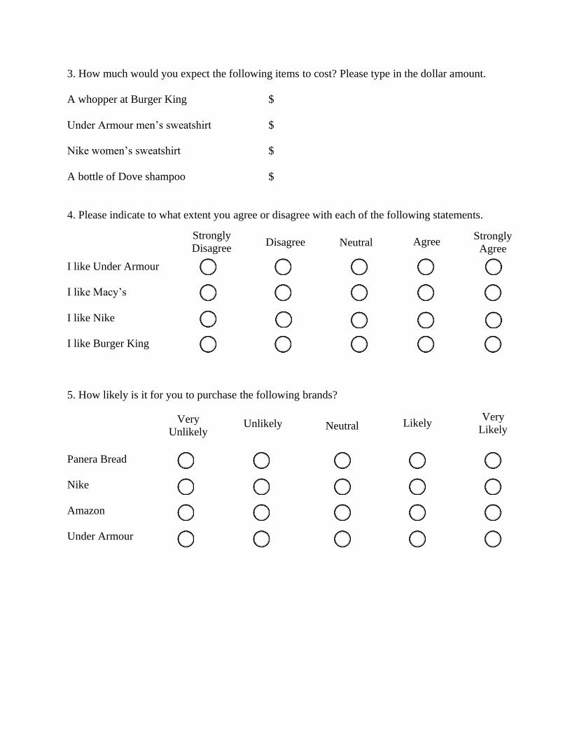
3. How much would you expect the following items to cost? Please type in the dollar amount.
A whopper at Burger King $
Under Armour men’s sweatshirt $
Nike women’s sweatshirt $
A bottle of Dove shampoo $
4. Please indicate to what extent you agree or disagree with each of the following statements.
I like Under Armour
I like Macy’s
I like Nike
I like Burger King
5. How likely is it for you to purchase the following brands?
Panera Bread
Nike
Amazon
Under Armour
Very
Unlikely Unlikely Neutral Likely
Very
Likely
Strongly
Disagree Disagree Neutral Agree
Strongly
Agree
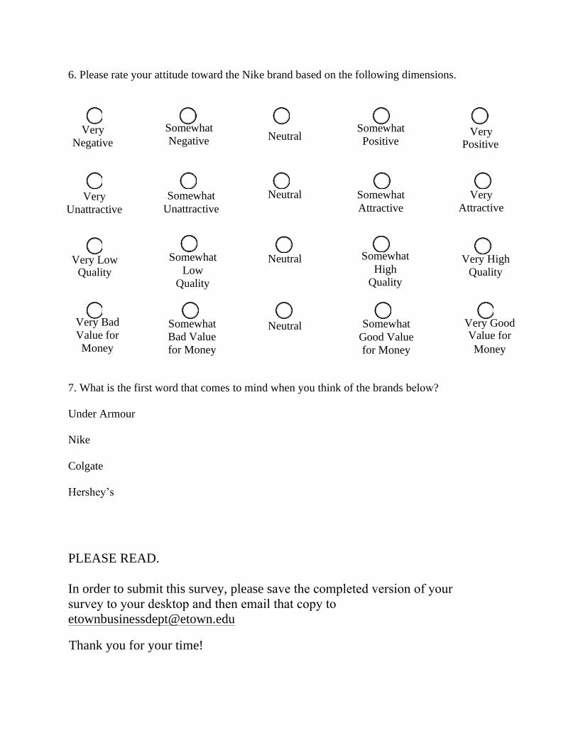
Very
Negative
Somewhat
Negative Neutral Somewhat
Positive Very
Positive
Very
Unattractive
Somewhat
Unattractive
Neutral Somewhat
Attractive
Very
Attractive
Quality
Somewhat
Low
Quality
Neutral Somewhat
High
Quality
Very High
Quality
Very Bad
Value for
Money
Somewhat
Bad Value
for Money
Neutral Somewhat
Good Value
for Money
Very Good Value for
Money
6. Please rate your attitude toward the Nike brand based on the following dimensions.
Very Low
7. What is the first word that comes to mind when you think of the brands below?
Under Armour
Nike
Colgate
Hershey’s
PLEASE READ.
In order to submit this survey, please save the completed version of your survey to your desktop and then email that copy [email protected]
Thank you for your time!
You are invited to participate in a study designed to gather information for an
honors research project. You are not required to participate and there will be no
consequences if you choose not to. If you do agree to participate, there is no risk
involved. You will not be asked for your name or any personally identifiable
information, nor will you be asked for information that would identify others. All
responses are confidential. You may terminate your participation in this study at
any time without any consequences. If you have any questions, please contact
Catherine Hughes at [email protected], or Dr. Bryan Greenberg
Please fill in your answers in the designated spaces and/or check one of thedesignated boxes per question. Once you complete this survey, please save andreturn it to [email protected]
Thank you for your time and willingness to participate.
**Please continue through the survey without returning to previous pages**
This survey is designed to be completed on a computer or a tablet. As a reminder, please complete this survey using a PDF reader.
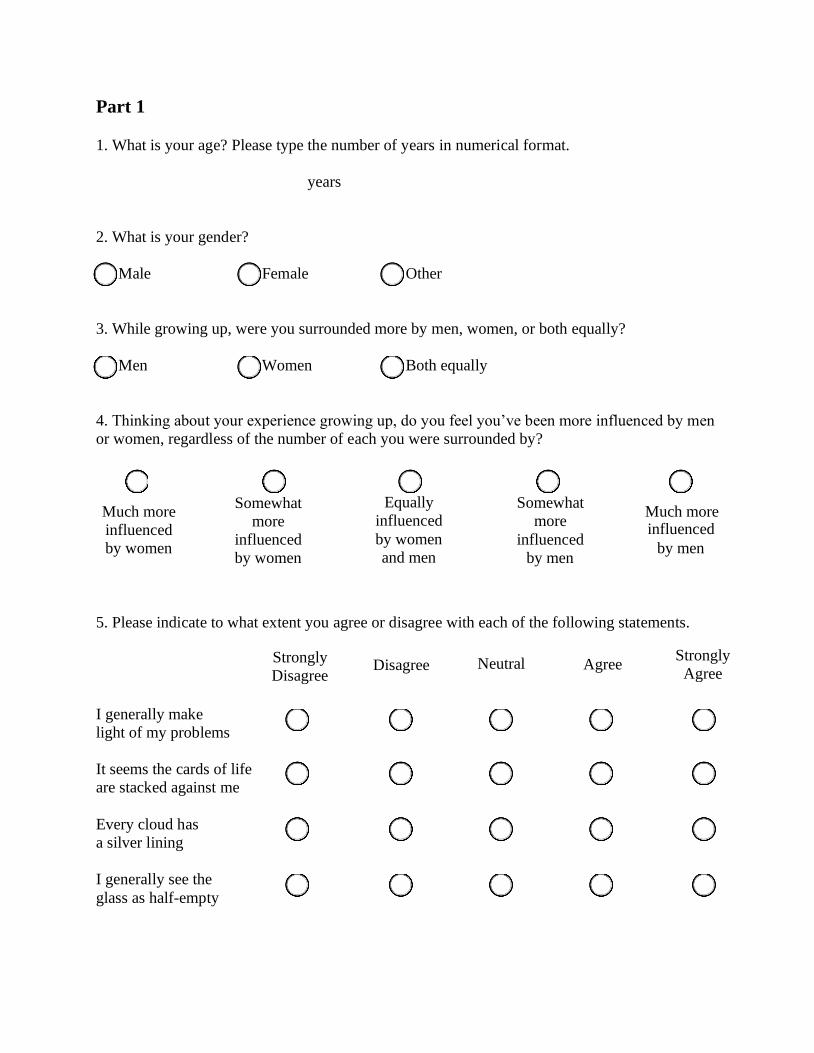
Part 1
1. What is your age? Please type the number of years in numerical format.
years
2. What is your gender?
Male Female Other
3. While growing up, were you surrounded more by men, women, or both equally?
Men Women Both equally
4. Thinking about your experience growing up, do you feel you’ve been more influenced by men
or women, regardless of the number of each you were surrounded by?
5. Please indicate to what extent you agree or disagree with each of the following statements.
I generally make
light of my problems
It seems the cards of life
are stacked against me
Every cloud has
a silver lining
I generally see the
glass as half-empty
Strongly
Disagree Disagree Neutral Agree
Strongly
Agree
Much more
influenced
by women
Somewhat
more
influenced
by women
Equally
influenced
by women
and men
Somewhat
more
influenced
by men
Much more influenced
by men
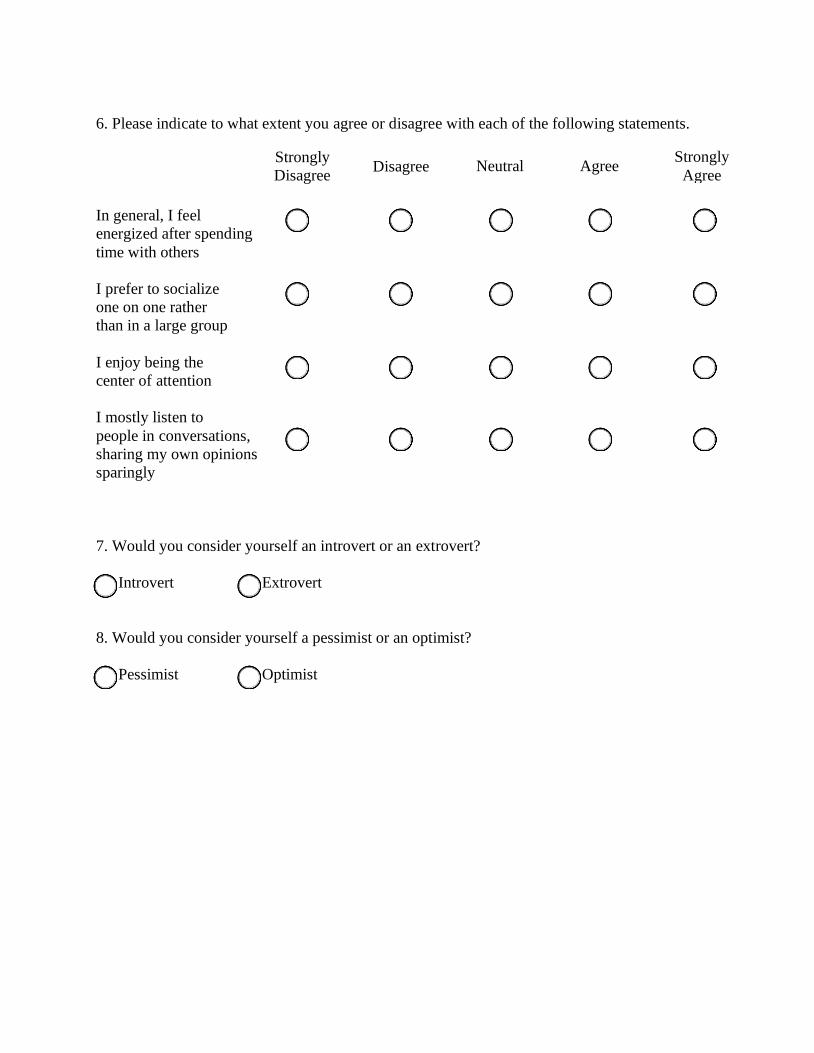
6. Please indicate to what extent you agree or disagree with each of the following statements.
In general, I feel
energized after spending
time with others
I prefer to socialize
one on one rather
than in a large group
I enjoy being the
center of attention
I mostly listen to
people in conversations,
sharing my own opinions
sparingly
7. Would you consider yourself an introvert or an extrovert?
Introvert Extrovert
8. Would you consider yourself a pessimist or an optimist?
Pessimist Optimist
Strongly
Disagree Disagree Neutral Agree
Strongly
Agree
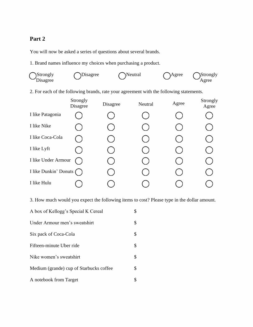
Part 2
You will now be asked a series of questions about several brands.
1. Brand names influence my choices when purchasing a product.
Strongly Disagree Neutral Agree Strongly
Disagree Agree
2. For each of the following brands, rate your agreement with the following statements.
I like Patagonia
I like Nike
I like Coca-Cola
I like Lyft
I like Under Armour
I like Dunkin’ Donuts
I like Hulu
3. How much would you expect the following items to cost? Please type in the dollar amount.
A box of Kellogg’s Special K Cereal $
Under Armour men’s sweatshirt $
Six pack of Coca-Cola $
Fifteen-minute Uber ride $
Nike women’s sweatshirt $
Medium (grande) cup of Starbucks coffee $
A notebook from Target $
Strongly
Disagree Disagree Neutral Agree Strongly
Agree
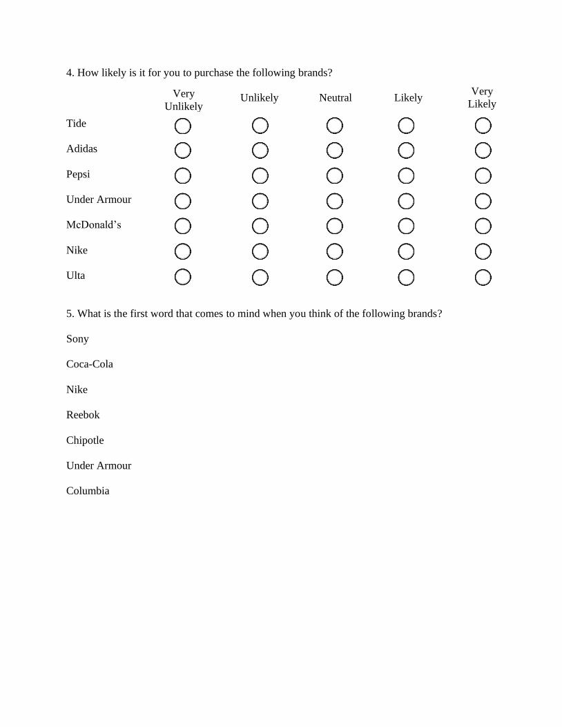
4. How likely is it for you to purchase the following brands?
Tide
Adidas
Pepsi
Under Armour
McDonald’s
Nike
Ulta
5. What is the first word that comes to mind when you think of the following brands?
Sony
Coca-Cola
Nike
Reebok
Chipotle
Under Armour
Columbia
Very
Unlikely Unlikely Neutral Likely
Very
Likely

Part 3
Please do not return to previous questions once you have reached
this page in the survey.
You will now be asked to complete a simple visual task designed
to measure perception. On the following page, you will find two
pictures.
Please carefully examine each picture and then type in your
responses.

How many shapes do you see in the picture above?
What object or objects do you see in the picture above?
Please do not return to previous questions once you have
reached this page in the survey.
You will now be asked a series of questions about specific
brands.
Please read each question carefully and provide the response
that most accurately represents how you feel.
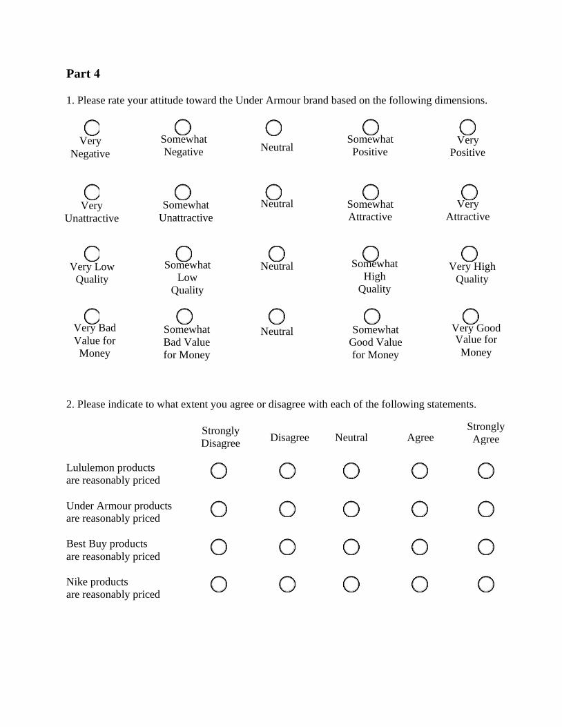
Very
Negative
Somewhat
Negative Neutral Somewhat
Positive Very
Positive
Very
Unattractive
Somewhat
Unattractive
Neutral Somewhat
Attractive
Very
Attractive
Very Low
Quality
Somewhat
Low
Quality
Neutral Somewhat
High
Quality
Very High
Quality
Very Bad
Value for
Money
Somewhat
Bad Value
for Money
Neutral Somewhat
Good Value
for Money
Very Good Value for
Money
Part 4
1. Please rate your attitude toward the Under Armour brand based on the following dimensions.
2. Please indicate to what extent you agree or disagree with each of the following statements.
Lululemon products
are reasonably priced
Under Armour products
are reasonably priced
Best Buy products
are reasonably priced
Nike products
are reasonably priced
Strongly
Disagree Disagree Neutral Agree
Strongly
Agree
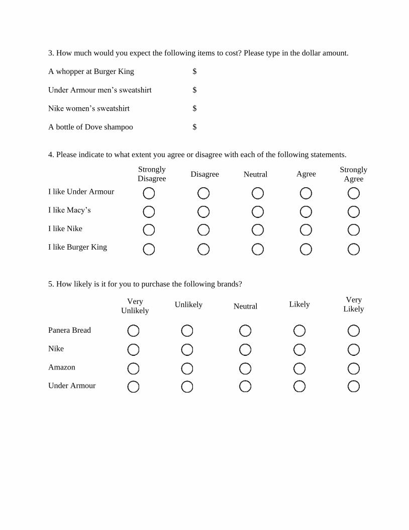
3. How much would you expect the following items to cost? Please type in the dollar amount.
A whopper at Burger King $
Under Armour men’s sweatshirt $
Nike women’s sweatshirt $
A bottle of Dove shampoo $
4. Please indicate to what extent you agree or disagree with each of the following statements.
I like Under Armour
I like Macy’s
I like Nike
I like Burger King
5. How likely is it for you to purchase the following brands?
Panera Bread
Nike
Amazon
Under Armour
Very
Unlikely Unlikely Neutral Likely
Very
Likely
Strongly
Disagree Disagree Neutral Agree
Strongly
Agree

Very
Negative
Somewhat
Negative Neutral Somewhat
Positive Very
Positive
Very
Unattractive
Somewhat
Unattractive
Neutral Somewhat
Attractive
Very
Attractive
Very Low
Quality
Somewhat
Low
Quality
Neutral Somewhat
High
Quality
Very High
Quality
Very Bad
Value for
Money
Somewhat
Bad Value
for Money
Neutral Somewhat
Good Value
for Money
Very Good
Value for
Money
6. Please rate your attitude toward the Nike brand based on the following dimensions.
7. What is the first word that comes to mind when you think of the brands below?
Under Armour
Nike
Colgate
Hershey’s
PLEASE READ.
In order to submit this survey, please save the completed version of your survey to your desktop and then email that copy [email protected]
Thank you for your time!