Embed Size (px)
Citation preview
Section 1.3
Density Curves and Normal Distributions
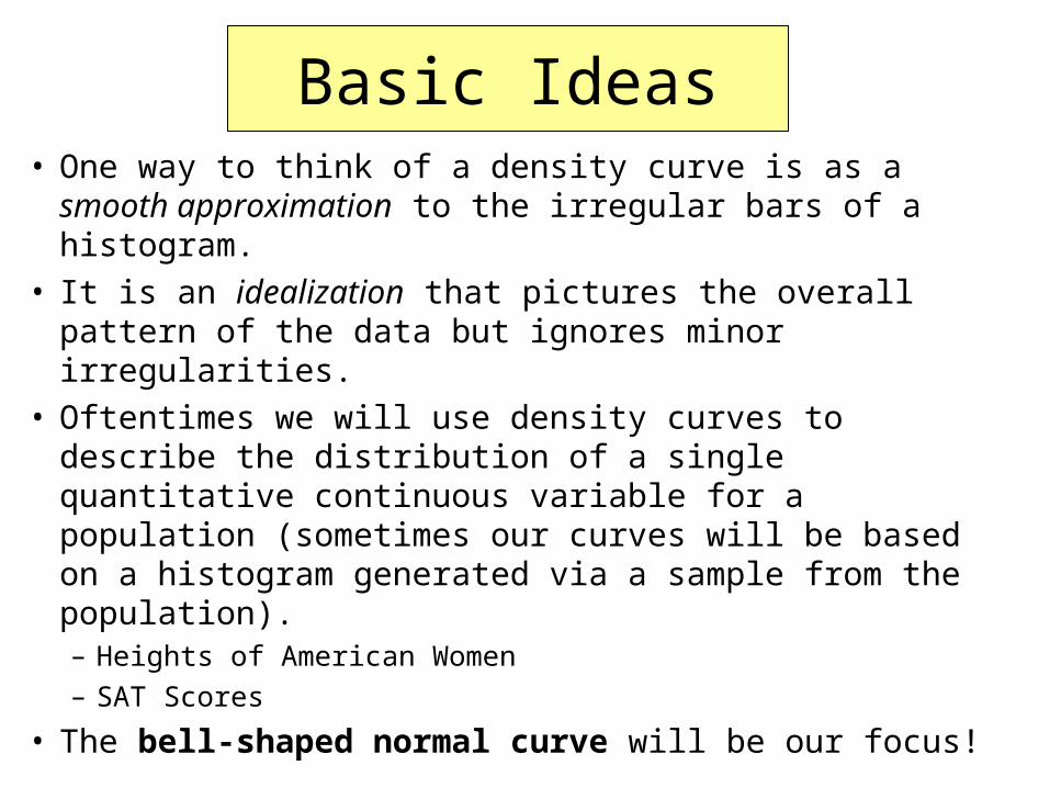
Basic Ideas• One way to think of a density curve is as a smooth
approximation to the irregular bars of a histogram.• It is an idealization that pictures the overall pattern of the
data but ignores minor irregularities.• Oftentimes we will use density curves to describe the
distribution of a single quantitative continuous variable for a population (sometimes our curves will be based on a histogram generated via a sample from the population).– Heights of American Women
– SAT Scores
• The bell-shaped normal curve will be our focus!
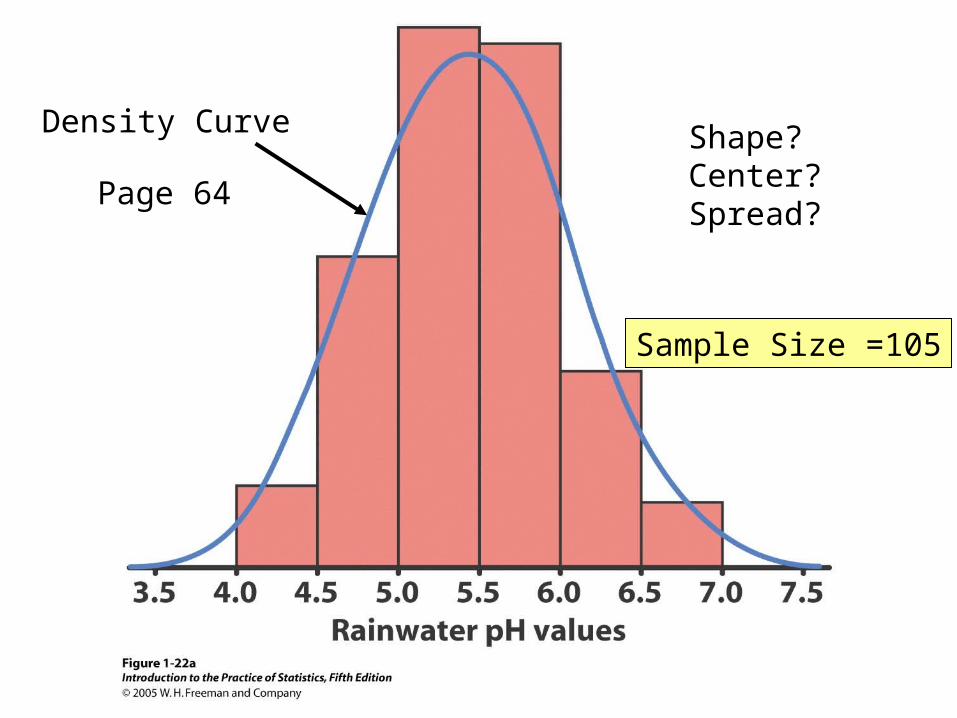
Shape?Center?Spread?
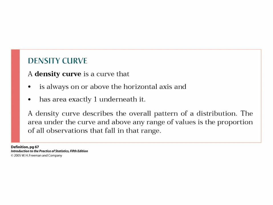
Density Curve
Page 64
Sample Size =105
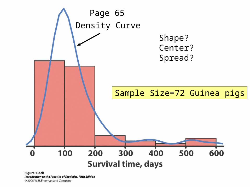
Shape?Center?Spread?
Density Curve
Page 65
Sample Size=72 Guinea pigs
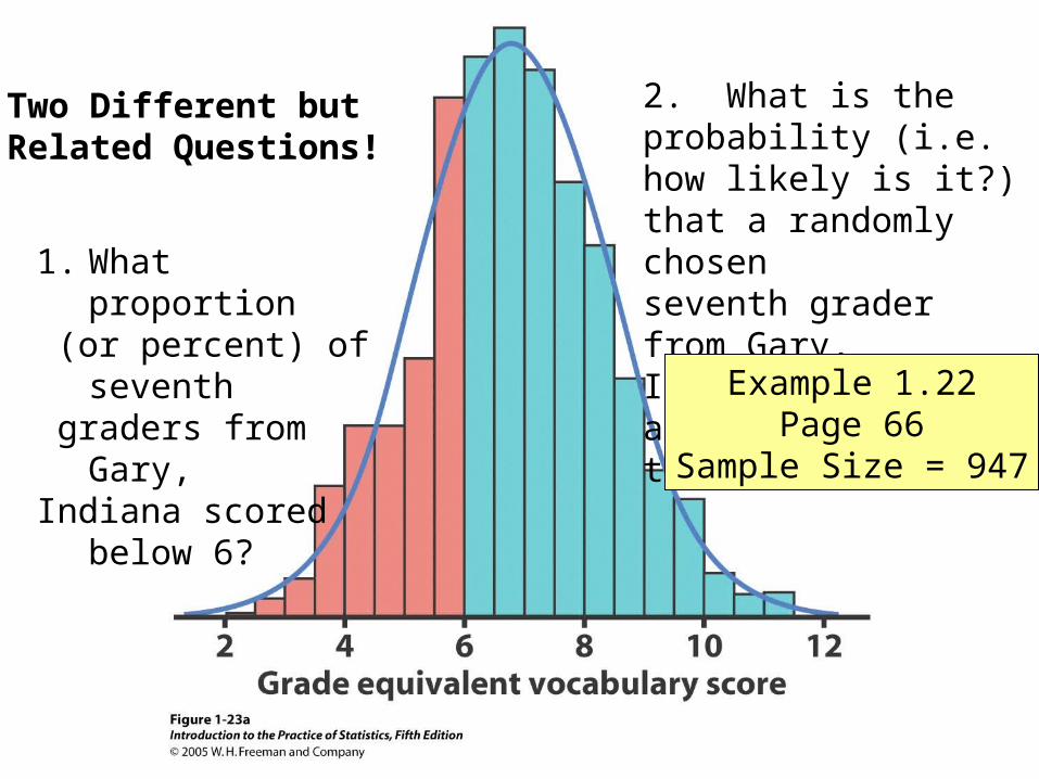
1. What proportion (or percent) of seventh graders from Gary,Indiana scored below 6?
2. What is the probability (i.e. how likely is it?)that a randomly chosenseventh grader from Gary, Indiana will have a test score less than 6?
Two Different butRelated Questions!
Example 1.22Page 66
Sample Size = 947
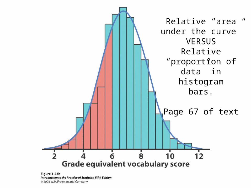
Relative “area under the curve”
VERSUSRelative “proportion of
data” in histogrambars.
Page 67 of text
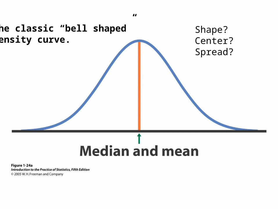
Shape?Center?Spread?
The classic “bell shaped” density curve.
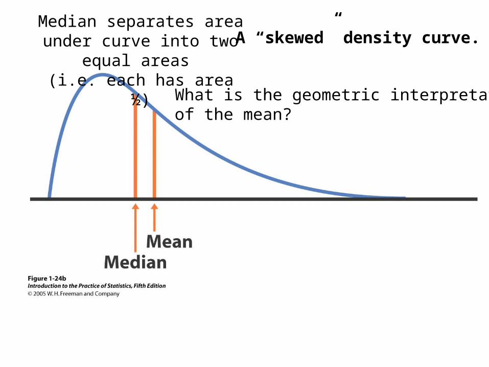
A “skewed” density curve.Median separates area under curve into two equal areas
(i.e. each has area ½)
What is the geometric interpretationof the mean?
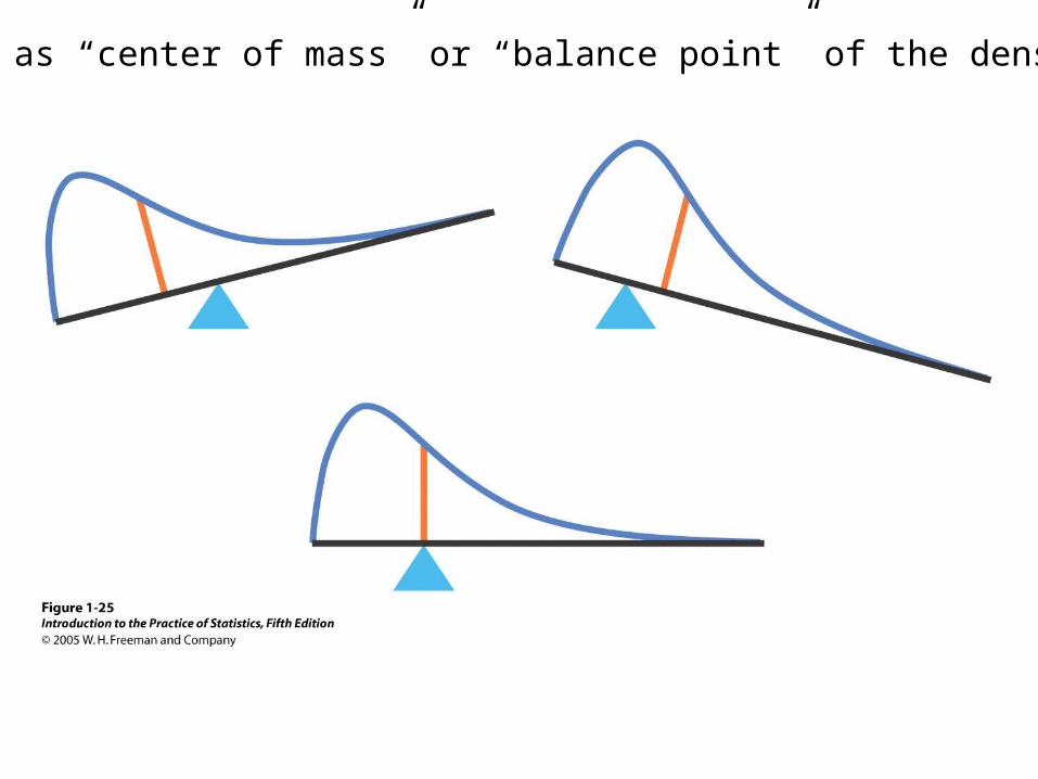
The mean as “center of mass” or “balance point” of the density curve
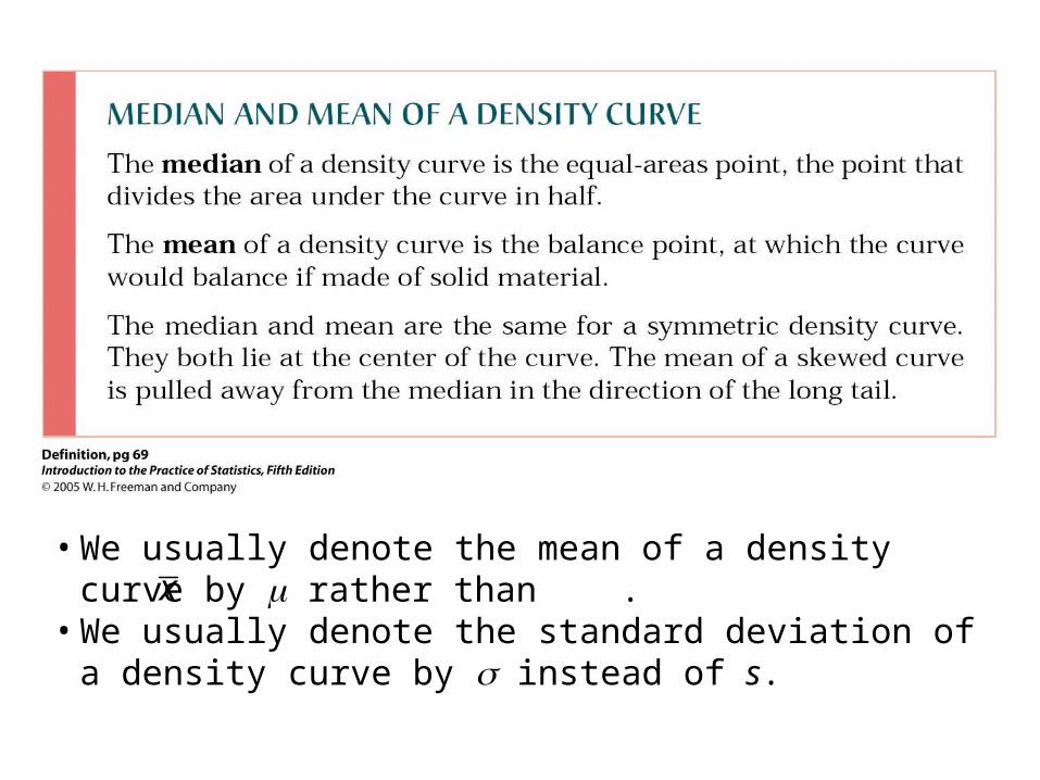
• We usually denote the mean of a density curve by rather than .
• We usually denote the standard deviation of a density curve by instead of s.
x
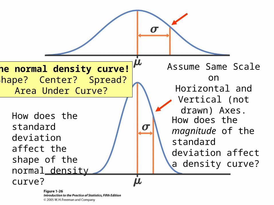
The normal density curve!Shape? Center? Spread?
Area Under Curve?
How does the magnitude of the standard deviation affect a density curve?
How does the standard deviation affect the shape of the normal density curve?
Assume Same Scale onHorizontal and Vertical
(not drawn) Axes.
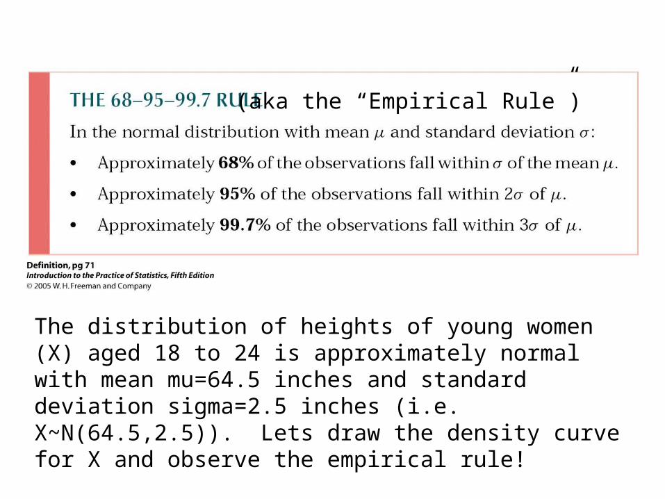
The distribution of heights of young women (X) aged 18 to 24 is approximately normal with mean mu=64.5 inches and standard deviation sigma=2.5 inches (i.e. X~N(64.5,2.5)). Lets draw the density curve for X and observe the empirical rule!
(aka the “Empirical Rule”)
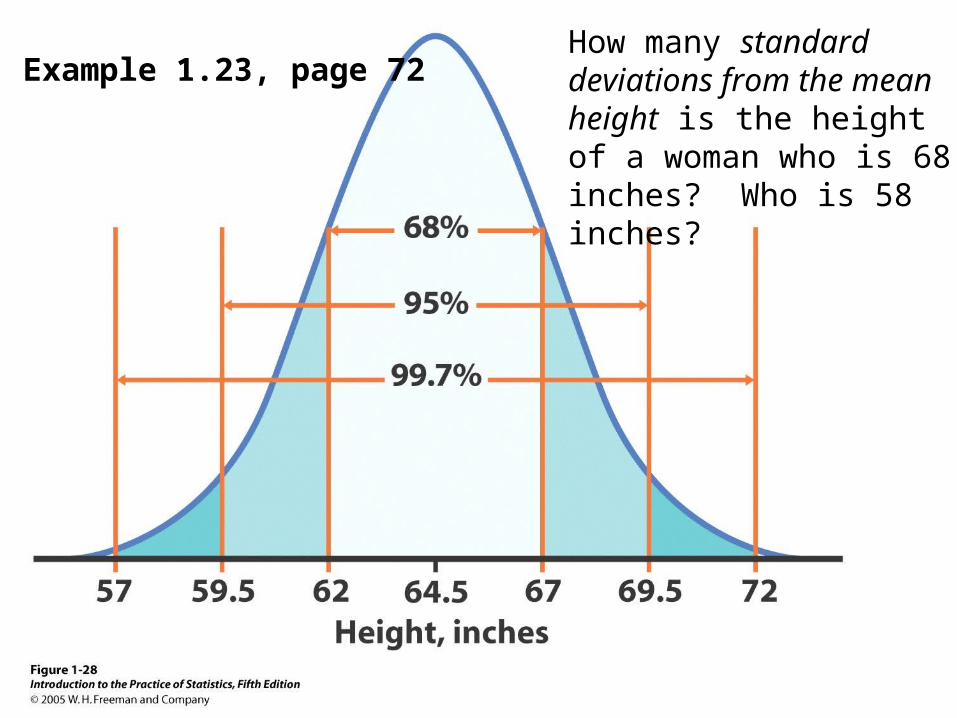
Example 1.23, page 72How many standard deviations from the mean height is the height of a woman who is 68 inches? Who is 58 inches?
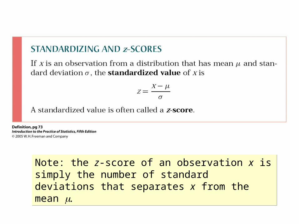
Note: the z-score of an observation x is simply the number of standard deviations that separates x from the mean .
Note: the z-score of an observation x is simply the number of standard deviations that separates x from the mean .
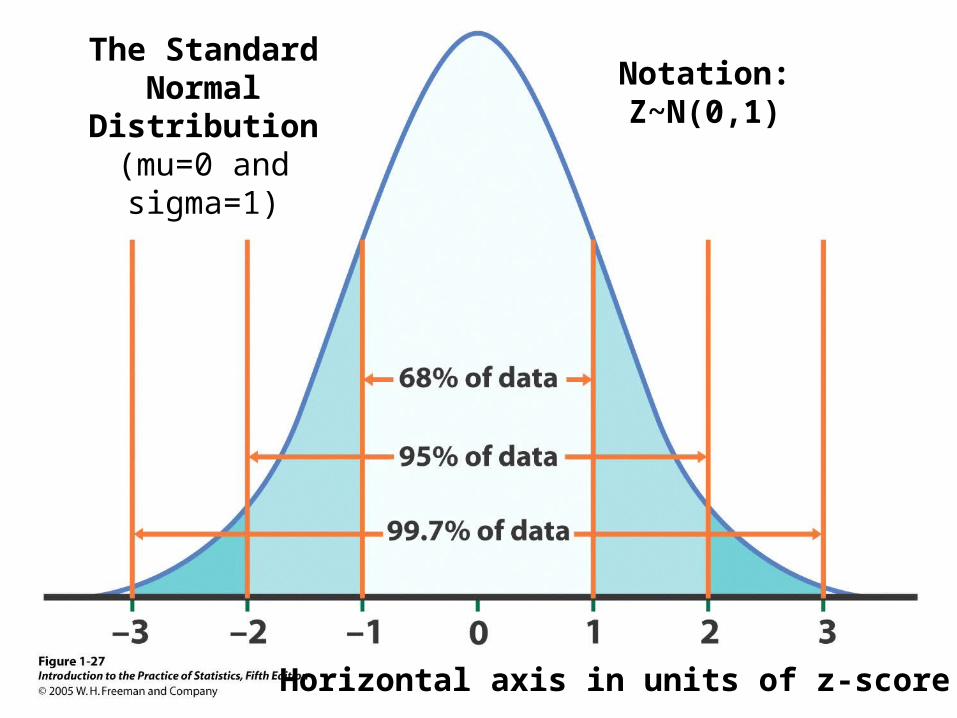
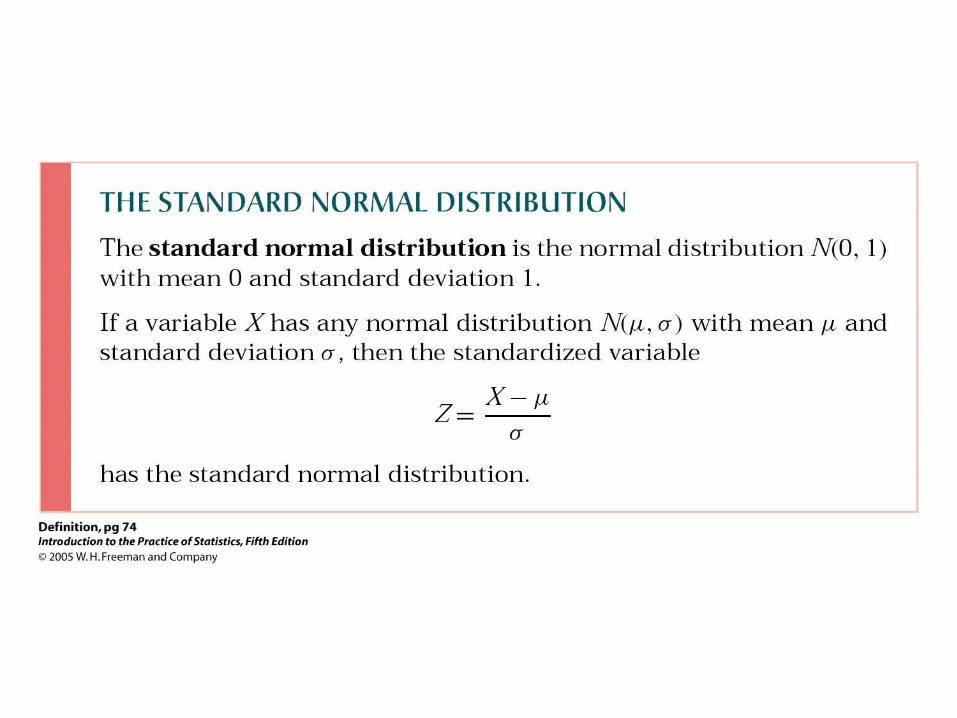
The Standard Normal Distribution
(mu=0 and sigma=1)
Horizontal axis in units of z-score!
Notation:Z~N(0,1)
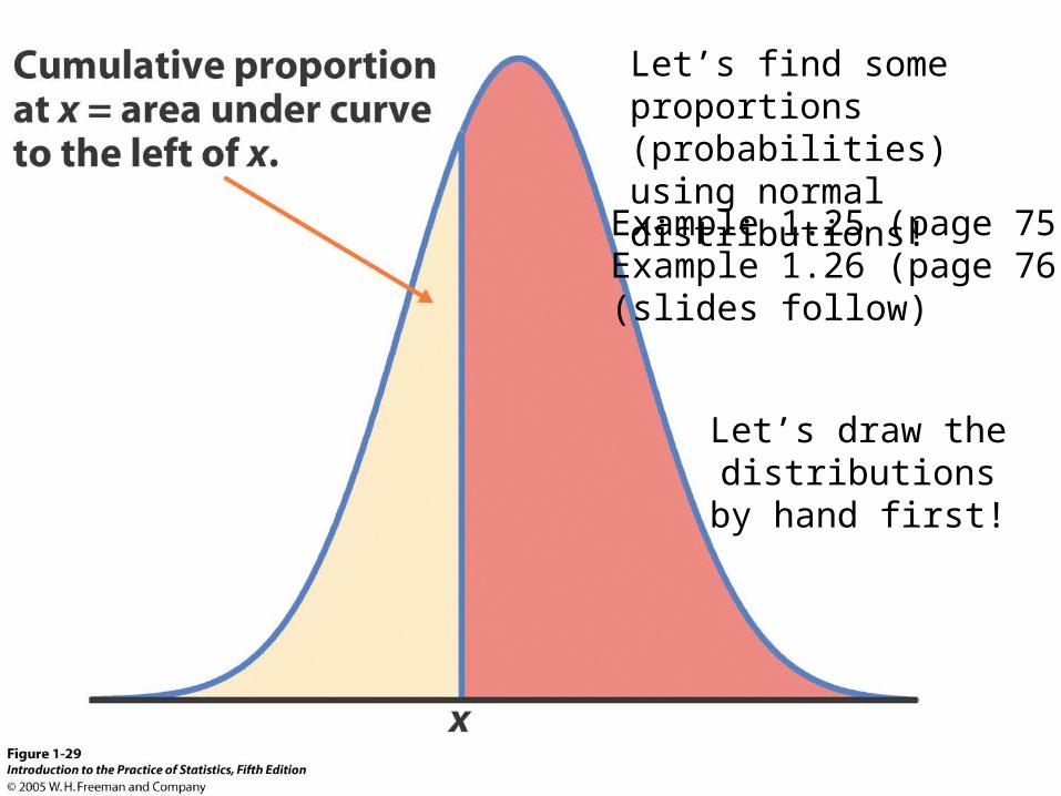
Let’s find some proportions (probabilities) using normal distributions!
Example 1.25 (page 75)Example 1.26 (page 76)(slides follow)
Let’s draw the distributions by hand
first!
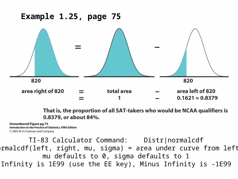
Example 1.25, page 75
TI-83 Calculator Command: Distr|normalcdfSyntax: normalcdf(left, right, mu, sigma) = area under curve from left to right
mu defaults to 0, sigma defaults to 1Infinity is 1E99 (use the EE key), Minus Infinity is -1E99
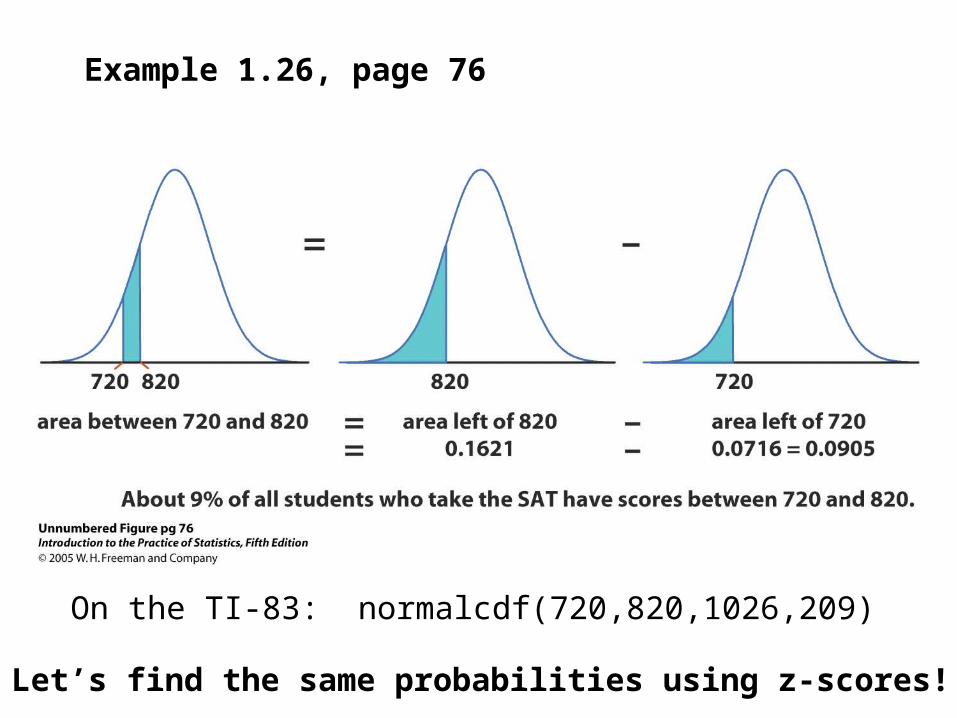
Example 1.26, page 76
Let’s find the same probabilities using z-scores!
On the TI-83: normalcdf(720,820,1026,209)
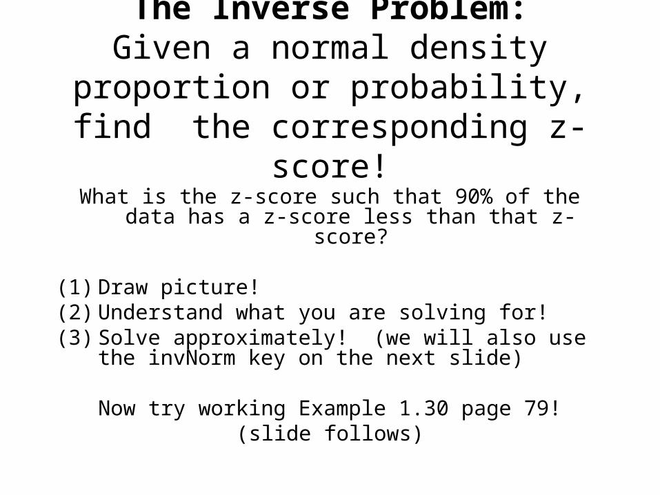
The Inverse Problem:Given a normal density proportion or
probability, find the corresponding z-score!
What is the z-score such that 90% of the data has a z-score less than that z-score?
(1) Draw picture!(2) Understand what you are solving for!(3) Solve approximately! (we will also use the invNorm
key on the next slide)
Now try working Example 1.30 page 79!(slide follows)
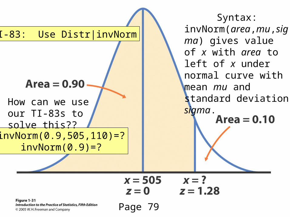
TI-83: Use Distr|invNorm
Syntax:invNorm(area,mu,sigma) gives value of x with area to left of x under normal curve with mean mu and standard deviation sigma.
invNorm(0.9,505,110)=?invNorm(0.9)=?
Page 79
How can we use our TI-83s to solve this??
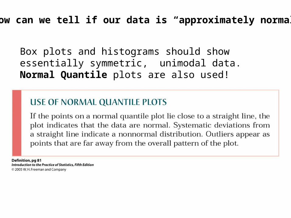
How can we tell if our data is “approximately normal?”
Box plots and histograms should show essentially symmetric, unimodal data. Normal Quantile plots are also used!
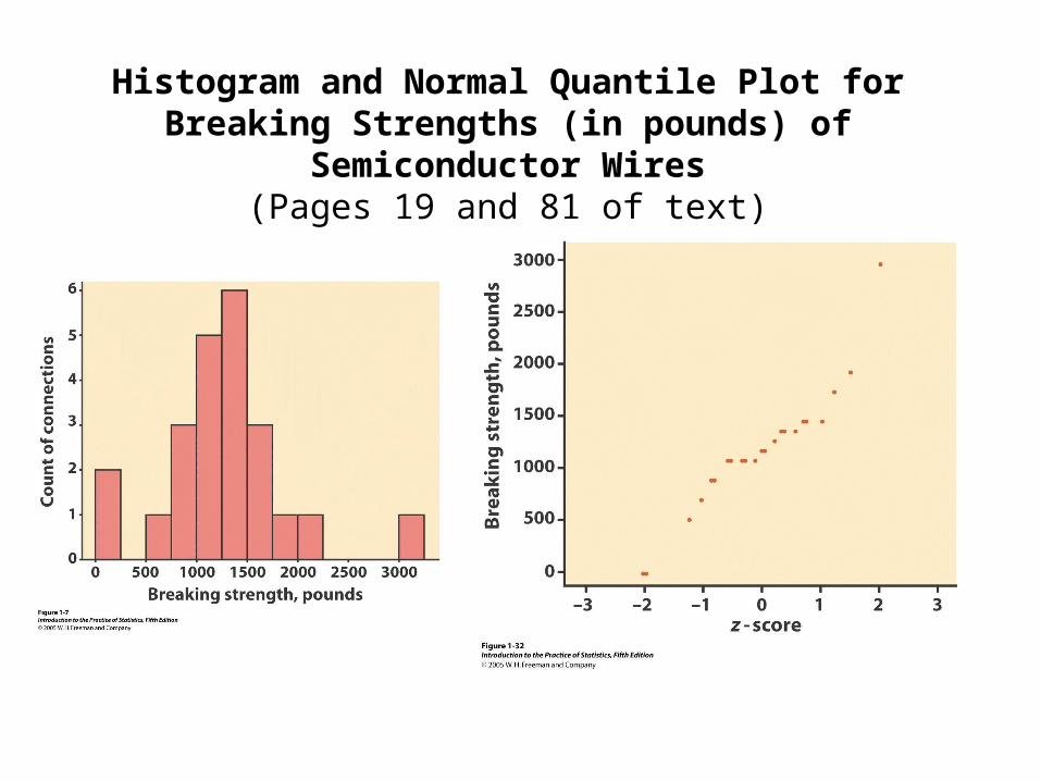
Histogram and Normal Quantile Plot for Breaking Strengths (in pounds) of Semiconductor Wires
(Pages 19 and 81 of text)
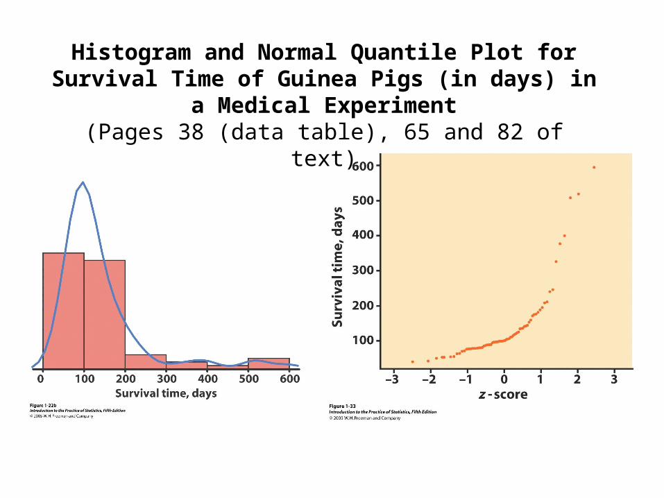
Histogram and Normal Quantile Plot for Survival Time of Guinea Pigs (in days) in a Medical Experiment
(Pages 38 (data table), 65 and 82 of text)
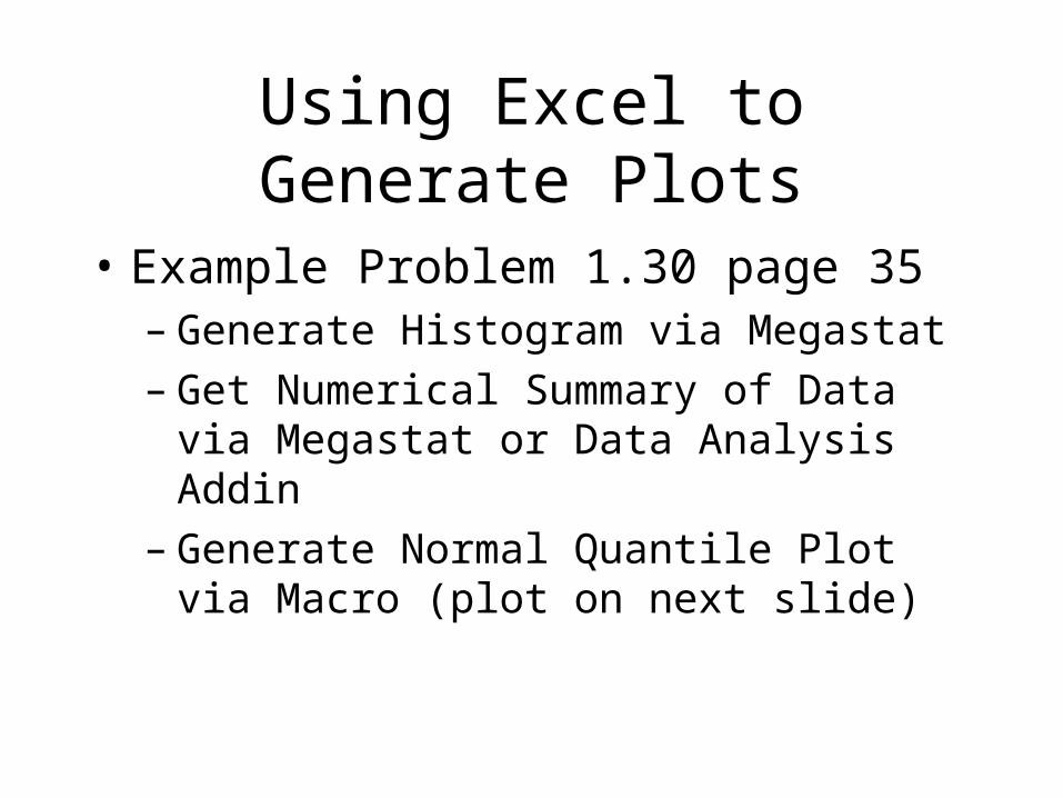
Using Excel to Generate Plots
• Example Problem 1.30 page 35– Generate Histogram via Megastat– Get Numerical Summary of Data via Megastat
or Data Analysis Addin– Generate Normal Quantile Plot via Macro (plot
on next slide)
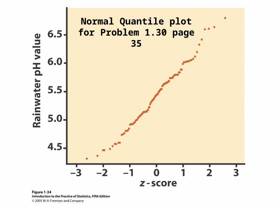
Normal Quantile plot for Problem 1.30 page 35
Extra Slides from Homework
• Problem 1.80• Problem 1.82• Problem 1.119• Problem 1.120• Problem 1.121• Problem 1.222• Problem 1.129• Problem 1.135
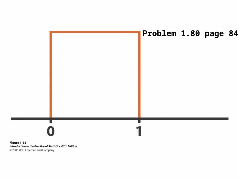
Problem 1.80 page 84
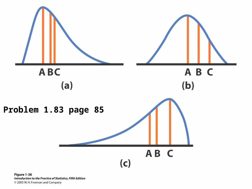
Problem 1.83 page 85
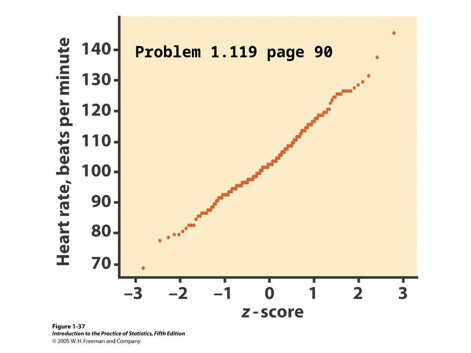
Problem 1.119 page 90
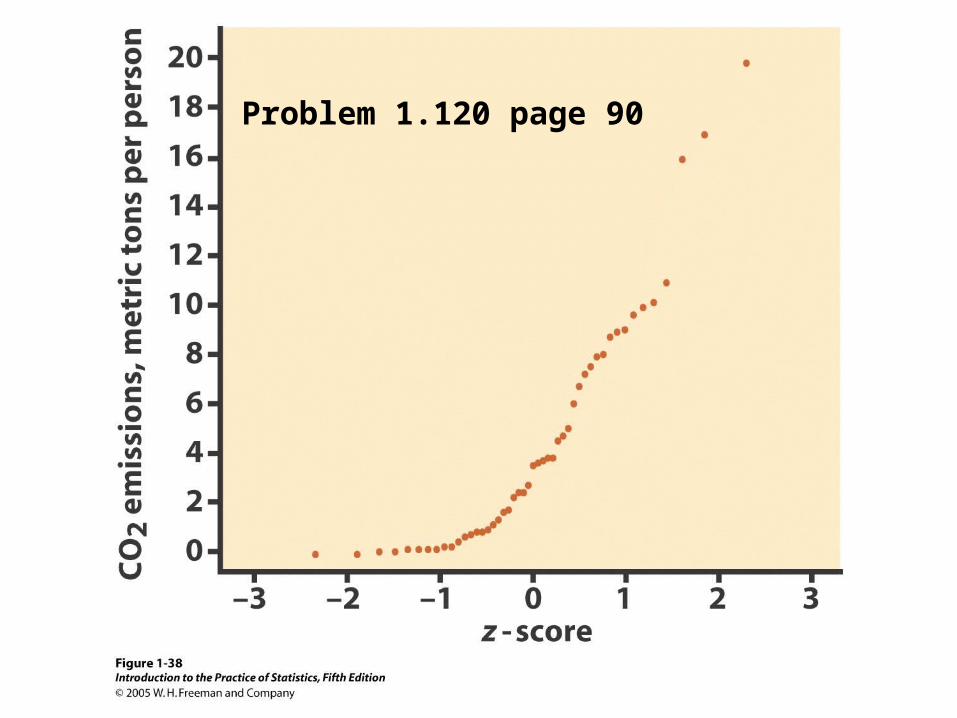
Problem 1.120 page 90
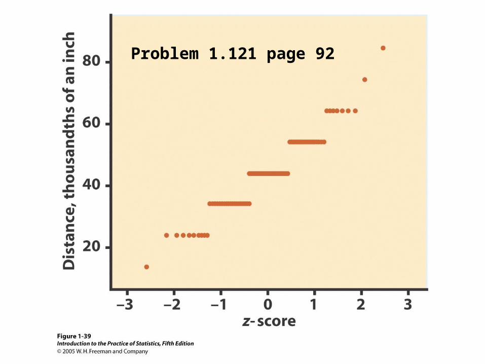
Problem 1.121 page 92
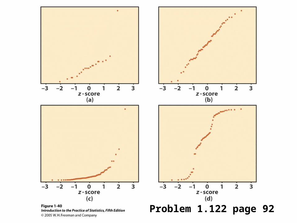
Problem 1.122 page 92
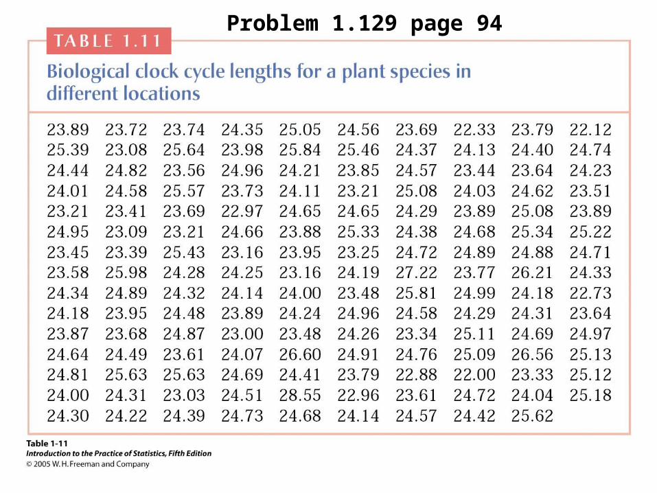
Problem 1.129 page 94
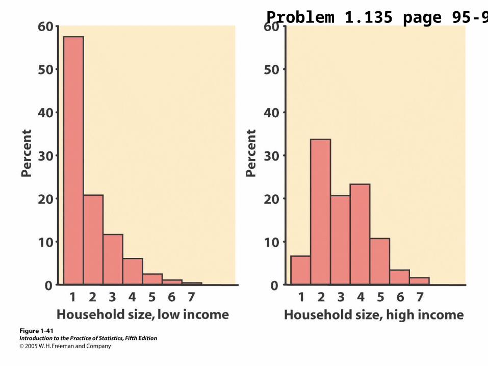
Problem 1.135 page 95-96