Embed Size (px)
Citation preview

1
SCIENCE FAIR HINTS AND TIPSCharlotte Rodeen-Dickertwww.crdesqwriter.com
St. Jerome School
October 29, 2013

Why is Ms. Fiedler-Ross making you do this???
A. It’s the most fun she has all year
B. She really enjoys grading projects
C. She lives to torment you with endless work
D. She wants you to learn valuable skills and information, as well as to have the satisfaction of a job well done
E. All of the above

Experimental Design
Experiment – “the systematic procedure carried out under controlled conditions in order to discover an unknown effect, to test or establish a hypothesis, or to illustrate a known effect.” (https://www.moresteam.com/toolbox/design-of-experiments.cfm)
Not just the PROCEDURE!
Needs to be tied in to the Scientific Method…

Components of Experimental DesignFACTORS
Variables What are you changing? What else is possibly changing?
LEVELS
Settings How much are you changing it?
RESPONSE
ResultsWhat happened?
PURPOSEHYPOTHESIS
PROCEDURE
DATA OBSERVATIONS
RESULTS CONCLUSIONS

6
General Organization and Layout• Make sure it all connects.• Lead the audience through the project with clear headings.• Consider font and image size.
Purpose…
Hypothesis…
Procedure…
Data and Observations Results
Conclusion
Why?
How? What happened?
Explain what happened
Were you correct?What?

7
Presenting Information
TEXT NUMBERS IMAGES“The object accelerates with time.”
0 1 2 3 4 50
50
100
150
200
Time (s)
Accl.(m/s^2)
Time (s)Acceleration
(m/s^2)
0 0
1 10
2 40
3 90
4 160
5 250
**Make sure all tell the same story!

8
Some specifics…• In the Hypothesis, “testing” is not an independent
variable.
• Sources of Error includes things that actually did happen in the experimental proceedings to impact the data, as well as potential things (whether or not they actually occurred).• How did you eliminate these?
• If something goes awry, discuss it and explain how it may have affected the results.
Don’t fudge the data!!!

9
Spellcheck vs. Proofreading
TRIAL vs. TRAIL

10
Spellcheck vs. Proofreading
Effect Affect/əˈfekt/Verb
1.Have an effect on; make a difference to: "the dampness began to affect my health".2.Pretend to have or feel (something): "as usual I affected a supreme unconcern".
Noun
Emotion or desire, esp. as influencing behavior or action.
/iˈfekt/Noun
A change that is a result or consequence of an action or other cause.
Verb
Cause (something) to happen; bring about.
(Grammar Girl: http://grammar.quickanddirtytips.com/affect-versus-effect.aspx)
11
Data Collection and Measurement
• Be clear about the accuracy of your measurement.
(e.g., 6.31 cm)
• Measure the appropriate variable for the experiment.
ALWAYS USE THE CORRECT UNITS!
h
ΔhThat’s 0.01 cm!(thickness of a piece of paper)

12
Using Excel• Organize your data in the worksheet.• Use color and highlighting to help keep track of things.• Use built-in functions when possible.• Always do a “sanity check” of calculations.• Critically evaluate your numbers when troubleshooting.• Choose the right chart for the job.• Watch out for “chart junk”!

13
“Chart junk”
12
34
0
0.5
1
1.5
2
2.5
3
3.5
4
4.5
5
Series 1
Series 2
Series 3
4.3
2.5
3.5
4.5
2.4
4.4
1.8
2.82 2
3
5
Series 1
Series 2
Series 3
(http://junkcharts.typepad.com)
14
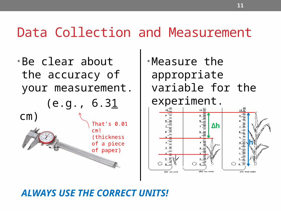
Calculations• Excel is a great tool for performing calculations, but it’s
only as good as the user.
• Just like spellcheck in Word, Excel will only catch errors in syntax (i.e., proper use of mathematical rules and symbols)
→ Be careful translating expressions
from “standard” to “code” notation!

15
Example – Averaging Data
Equation not entered correctly (order of operations)!(B2+B3+B4+B5+B6/5)
Correction:
→→ = ((10+12+10.5+13.2+11.2)/5)
Note decimal places! (should not be more than those in the measurements!)

16
Averaging Data cont’d
Can also use Excel functions:=(SUM(B2:B6)/5)
or=AVERAGE(B2:B6)

17
Data Presentation• Chart Wizard provides a good start, but make your own
modifications to best present the data…• Choose the most effective type of graph.
• Use an appropriate scale.
• Properly label the data.
• Choose a suitable color scheme.
• Use correct units.
• If producing multiple graphs, be consistent with all of this between graphs.

18
So many choices…• Choose the chart that best presents your data:
• Discreet measurements• Quantity changing over time• Part of a whole

19
Axis Scaling
Smaller scale makes changes appear larger.
0
0.5
1
1.5
2
2.5
3
3.5
4
4.5
5
Larger scale diminishes apparent magnitude of changes.
0
2
4
6
8
10
12
14
16
18
20
20
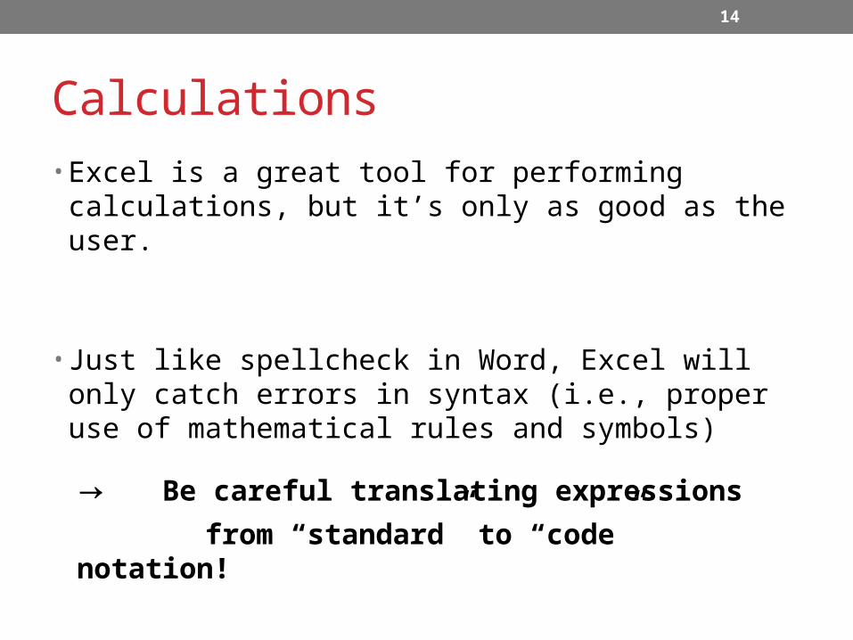
Graph Labelling
0 500 1000 1500 2000 2500 30000
20
40
60
80
100
120
140
FT vs. Tg for H2O2 Microthruster with Material Temperature Limits
(To = 200K, Re = 1000)
Gas Temperature, Tg (K)
Thrust,FT (mN)
Si
Si3N4
SiC
Variable, symbol, and units
Title explaining dependent/independent variables, with constants used in calculations
Color-coded materialsScale clear
enough to show differences

21
Consistency
Si SiC Si3N40
0.1
0.2
0.3
0.4
0.5
0.6
0.7
Mass Comparison for 2x10x10-mm Microthruster
Material
Mass (g)

22
“Insert Chart”

23
Add Titles…

24
Re-label x-axis…

25
And add a little color…

26
Summary for Fixing Up Charts• Click on the chart to bring up Chart Tools:
• Design →Select Data →Horizontal (Axis) Labels
• Layout →Chart Title
→Axis Titles
• Format →(select column/line on graph)→Shape Fill
27
Any Questions?????