Embed Size (px)
Citation preview
School magazine – PREACH
Evaluation
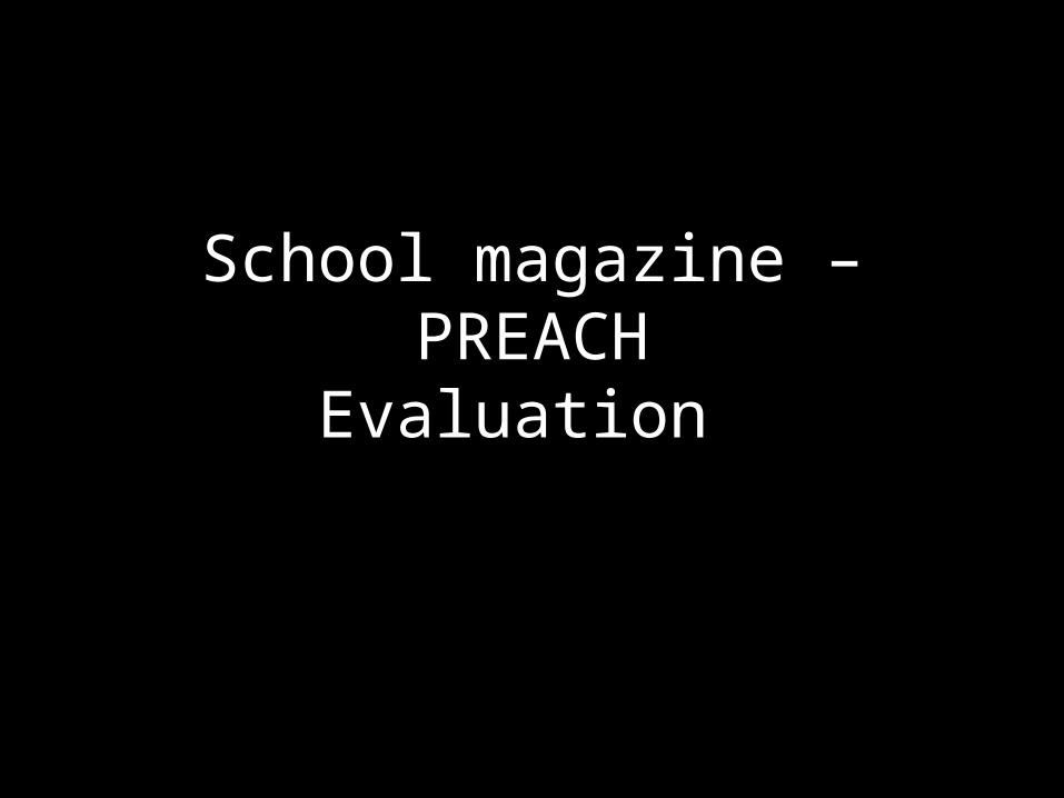
FRONT
COVER
COLOUR does not seem to fit in with the scheme, however using different colours can make the front page more eye catching and draw attention when desired. FONT is relatively hard
to read. It is not sophisticated and does not match the font of the quotation marks, which makes it look odd. However using different fonts can make the page more interesting.Does not target a
particular AUDIENCE. The feature article photo is appropriate and suits the requirements however not specific.
What it is lacking:• A sophisticated puff • Fillers • House style • Specific tone• Mode of address
To much NEGATIVE SPACE, this can be avoided by using fillers
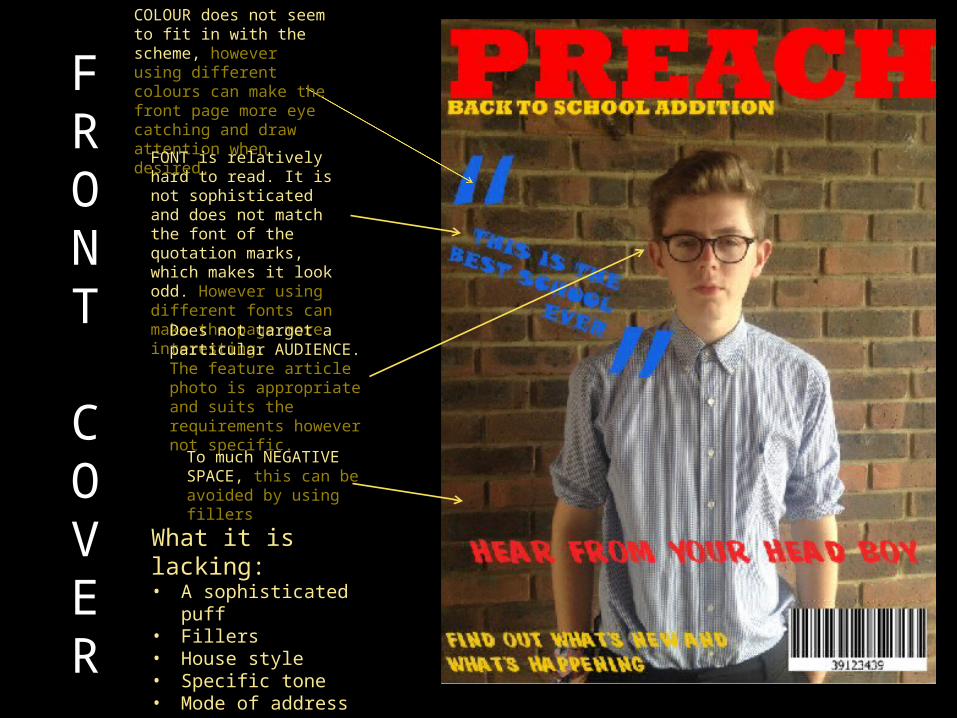
CONTENTS PAGEBLAND AND EMPTY looking background, a lot of negative space, which can make the overall page uninteresting.
Hard to follow, the page seems to be quite chaotic
TYPOGRAPHY is not at all varied, it can seem boring and dull and not very imaginative.
A varied COLOUR SCHEME can make the page seem busy and possibly hard to follow or alternativelymake it eye-catching.
What it is lacking: • Fillers • House style • Specific tone• Mode of address • Sell • A specific standfirst• Flush left/right• Photograph
FUSH LEFT/RIGHT is not considered, which can impact how visually interesting the page is for the reader.
Very little information.
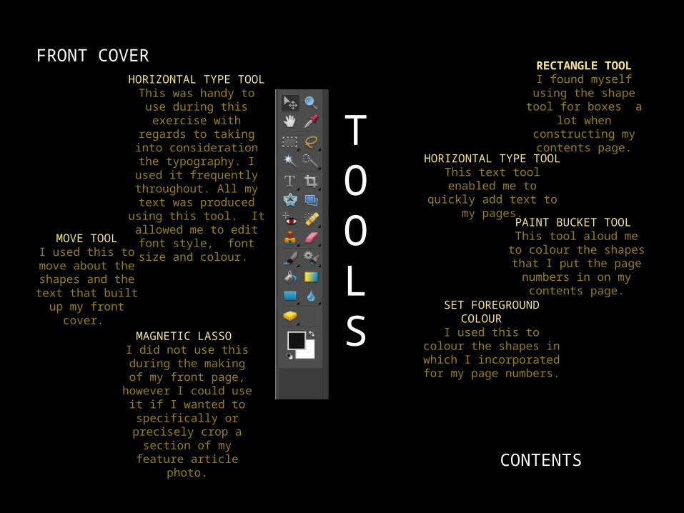
TOOLS
FRONT COVER
CONTENTS
RECTANGLE TOOLI found myself using the shape tool for boxes a lot when constructing my contents page.
HORIZONTAL TYPE TOOL
This was handy to use during this exercise
with regards to taking into consideration the typography. I used it
frequently throughout. All my text was
produced using this tool. It allowed me to edit font style, font
size and colour.
HORIZONTAL TYPE TOOL
This text tool enabled me to quickly add text
to my pages.
MOVE TOOLI used this to move about the shapes and the text that built up my front
cover.
PAINT BUCKET TOOL This tool aloud me to
colour the shapes that I put the page numbers in
on my contents page.
SET FOREGROUND COLOUR
I used this to colour the shapes in which I
incorporated for my page numbers.
MAGNETIC LASSO I did not use this
during the making of my front page,
however I could use it if I wanted to
specifically or precisely crop a section of my feature article photo.
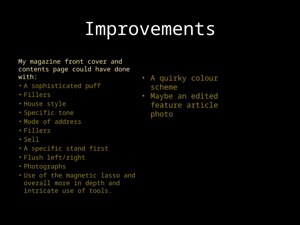
Improvements
My magazine front cover and contents page could have done with:• A sophisticated puff • Fillers • House style • Specific tone• Mode of address • Fillers • Sell • A specific stand first• Flush left/right• Photographs• Use of the magnetic lasso and
overall more in depth and intricate use of tools.
• A quirky colour scheme
• Maybe an edited feature article photo