Embed Size (px)
Citation preview
SAS® Visual Analytics 7.2, 7.3, and 7.4: Getting Started with Analytical Models
SAS® DocumentationAugust 16, 2017

The correct bibliographic citation for this manual is as follows: SAS Institute Inc. 2015. SAS® Visual Analytics 7.2, 7.3, and 7.4: Getting Started with Analytical Models. Cary, NC: SAS Institute Inc.
SAS® Visual Analytics 7.2, 7.3, and 7.4: Getting Started with Analytical Models
Copyright © 2015, SAS Institute Inc., Cary, NC, USA
All Rights Reserved. Produced in the United States of America.
For a hard copy book: No part of this publication may be reproduced, stored in a retrieval system, or transmitted, in any form or by any means, electronic, mechanical, photocopying, or otherwise, without the prior written permission of the publisher, SAS Institute Inc.
For a web download or e-book: Your use of this publication shall be governed by the terms established by the vendor at the time you acquire this publication.
The scanning, uploading, and distribution of this book via the Internet or any other means without the permission of the publisher is illegal and punishable by law. Please purchase only authorized electronic editions and do not participate in or encourage electronic piracy of copyrighted materials. Your support of others' rights is appreciated.
U.S. Government License Rights; Restricted Rights: The Software and its documentation is commercial computer software developed at private expense and is provided with RESTRICTED RIGHTS to the United States Government. Use, duplication, or disclosure of the Software by the United States Government is subject to the license terms of this Agreement pursuant to, as applicable, FAR 12.212, DFAR 227.7202-1(a), DFAR 227.7202-3(a), and DFAR 227.7202-4, and, to the extent required under U.S. federal law, the minimum restricted rights as set out in FAR 52.227-19 (DEC 2007). If FAR 52.227-19 is applicable, this provision serves as notice under clause (c) thereof and no other notice is required to be affixed to the Software or documentation. The Government’s rights in Software and documentation shall be only those set forth in this Agreement.
SAS Institute Inc., SAS Campus Drive, Cary, NC 27513-2414
August 2017
SAS® and all other SAS Institute Inc. product or service names are registered trademarks or trademarks of SAS Institute Inc. in the USA and other countries. ® indicates USA registration.
Other brand and product names are trademarks of their respective companies.
P1:vaamgs
Contents
Using This Book . . . . . . . . . . . . . . . . . . . . . . . . . . . . . . . . . . . . . . . . . . . . . . . . . . . . . . . . . . . . . . v
Chapter 1 / Introduction . . . . . . . . . . . . . . . . . . . . . . . . . . . . . . . . . . . . . . . . . . . . . . . . . . . . . . . . . . . . . . . . . . . . . . . 1About SAS Visual Statistics . . . . . . . . . . . . . . . . . . . . . . . . . . . . . . . . . . . . . . . . . . . . . . . . 1
Chapter 2 / Your First Look at the SAS Visual Analytics Interface . . . . . . . . . . . . . . . . . . . 3The Explorer User Interface . . . . . . . . . . . . . . . . . . . . . . . . . . . . . . . . . . . . . . . . . . . . . . . . 4Managing Explorations and Models . . . . . . . . . . . . . . . . . . . . . . . . . . . . . . . . . . . . . . 11
Chapter 3 / Data Discovery . . . . . . . . . . . . . . . . . . . . . . . . . . . . . . . . . . . . . . . . . . . . . . . . . . . . . . . . . . . . . . . . . 13About the Tasks in This Chapter . . . . . . . . . . . . . . . . . . . . . . . . . . . . . . . . . . . . . . . . . 13Import the Data . . . . . . . . . . . . . . . . . . . . . . . . . . . . . . . . . . . . . . . . . . . . . . . . . . . . . . . . . . . . . 13Identify a Segmentation Variable . . . . . . . . . . . . . . . . . . . . . . . . . . . . . . . . . . . . . . . . . 14Create a Segmentation Variable from a Cluster . . . . . . . . . . . . . . . . . . . . . . . . 15
Chapter 4 / Modeling a Measure Variable . . . . . . . . . . . . . . . . . . . . . . . . . . . . . . . . . . . . . . . . . . . . . . . . 17About the Tasks in This Chapter . . . . . . . . . . . . . . . . . . . . . . . . . . . . . . . . . . . . . . . . . 17Create a Linear Regression . . . . . . . . . . . . . . . . . . . . . . . . . . . . . . . . . . . . . . . . . . . . . . . 17Create a Generalized Linear Model . . . . . . . . . . . . . . . . . . . . . . . . . . . . . . . . . . . . . . 19Compare Your Models . . . . . . . . . . . . . . . . . . . . . . . . . . . . . . . . . . . . . . . . . . . . . . . . . . . . . 20
Chapter 5 / Modeling a Category Variable . . . . . . . . . . . . . . . . . . . . . . . . . . . . . . . . . . . . . . . . . . . . . . . 23About the Tasks in This Chapter . . . . . . . . . . . . . . . . . . . . . . . . . . . . . . . . . . . . . . . . . 23Create a Decision Tree . . . . . . . . . . . . . . . . . . . . . . . . . . . . . . . . . . . . . . . . . . . . . . . . . . . . 23Create a Logistic Regression . . . . . . . . . . . . . . . . . . . . . . . . . . . . . . . . . . . . . . . . . . . . . 29Compare Your Models . . . . . . . . . . . . . . . . . . . . . . . . . . . . . . . . . . . . . . . . . . . . . . . . . . . . . 29
Chapter 6 / Quick Reference . . . . . . . . . . . . . . . . . . . . . . . . . . . . . . . . . . . . . . . . . . . . . . . . . . . . . . . . . . . . . . . . 31Gallery . . . . . . . . . . . . . . . . . . . . . . . . . . . . . . . . . . . . . . . . . . . . . . . . . . . . . . . . . . . . . . . . . . . . . . . 31Where to Find Additional Documentation . . . . . . . . . . . . . . . . . . . . . . . . . . . . . . . 34
Recommended Reading . . . . . . . . . . . . . . . . . . . . . . . . . . . . . . . . . . . . . . . . . . . . . . . . . 35

iv Contents
Using This Book
Audience
This book covers the basics of building and comparing models in SAS Visual Analytics Explorer using the model-building capabilities provided by SAS Visual Statistics. The examples in this book show you how to create an input or segmentation variable, build models for measure and classification targets, and compare completed models. The emphasis is on building and comparing models so that you are familiar with the visualizations provided by SAS Visual Statistics.
Requirements
Prerequisites
If you choose to perform the tasks in this book, you need the following software, information, and privileges:
n a link to a working deployment of SAS Visual Statistics 7.2, 7.3, or 7.4
n a supported web browser (see the SAS support site for supported versions)
n a supported version of the Adobe Flash Player (see the SAS support site for supported versions)
n an account that can log on to the working deployment
n the input data provided for this book
v
n model building capabilities (without the necessary capabilities, you cannot access the visualizations provided by SAS Visual Statistics)
System Requirements
Detailed system requirements, including support for additional web browsers, are available on the SAS support site.
vi Using This Book
1Introduction
About SAS Visual Statistics . . . . . . . . . . . . . . . . . . . . . . . . . . . . . . . . . . . . . . . . . . . . . . 1
About SAS Visual Statistics
SAS Visual Statistics is an add-on modeling tool to SAS Visual Analytics. The modeling capabilities of SAS Visual Statistics are provided in SAS Visual Analytics Explorer (the explorer). The visualizations provided by SAS Visual Statistics include a linear regression, a logistic regression, a generalized linear model (GLM), and a clustering tool. In addition, you gain access to a more powerful decision tree visualization, which includes the ability to interactively train a decision tree by manually selecting which branches to prune, split, or train. Model assessment statistics are available in the core decision tree visualization. To export your models, you can export model score code for any model or export derived columns that contain prediction information (predicted values, residuals, cluster ID, and so on).
Within SAS Visual Statistics, you can perform a variety of tasks critical to creating good predictive models. These tasks include data segmentation (supervised and unsupervised), supervised variable transformation, stratified modeling, outlier detection, interactive feature creation, data filtering, and post-model visualization. The examples in this book are intended to familiarize you with the SAS Visual Statistics interface and workflow. Therefore, not all of these tasks are covered in this book.
1

2 Chapter 1 / Introduction
2Your First Look at the SAS Visual Analytics Interface
The Explorer User Interface . . . . . . . . . . . . . . . . . . . . . . . . . . . . . . . . . . . . . . . . . . . . . . 4The Explorer . . . . . . . . . . . . . . . . . . . . . . . . . . . . . . . . . . . . . . . . . . . . . . . . . . . . . . . . . . . . . . 4Menus and Toolbars . . . . . . . . . . . . . . . . . . . . . . . . . . . . . . . . . . . . . . . . . . . . . . . . . . . . . 5The Data Pane . . . . . . . . . . . . . . . . . . . . . . . . . . . . . . . . . . . . . . . . . . . . . . . . . . . . . . . . . . . 6The Right Pane . . . . . . . . . . . . . . . . . . . . . . . . . . . . . . . . . . . . . . . . . . . . . . . . . . . . . . . . . . 8The Model Pane . . . . . . . . . . . . . . . . . . . . . . . . . . . . . . . . . . . . . . . . . . . . . . . . . . . . . . . . . 9
Managing Explorations and Models . . . . . . . . . . . . . . . . . . . . . . . . . . . . . . . . . . 11Explorations . . . . . . . . . . . . . . . . . . . . . . . . . . . . . . . . . . . . . . . . . . . . . . . . . . . . . . . . . . . . . 11Models . . . . . . . . . . . . . . . . . . . . . . . . . . . . . . . . . . . . . . . . . . . . . . . . . . . . . . . . . . . . . . . . . . . 12
3
The Explorer User Interface
The Explorer
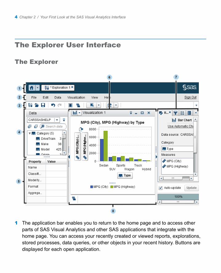
1 The application bar enables you to return to the home page and to access other parts of SAS Visual Analytics and other SAS applications that integrate with the home page. You can access your recently created or viewed reports, explorations, stored processes, data queries, or other objects in your recent history. Buttons are displayed for each open application.
4 Chapter 2 / Your First Look at the SAS Visual Analytics Interface
2 The menu bar offers common tasks, such as creating a new exploration.
3 The toolbar enables you to manage your explorations and visualizations.
4 The Data pane enables you to manage the data that is used in your visualizations.
5 The data properties table enables you to set data item properties.
6 The workspace displays one or more visualizations.
7 The right pane’s tabs enable you to set properties and data roles, create filters and ranks, set global parameter values, and use comments.
8 The dock contains any minimized visualizations.
Menus and Toolbars
From the SAS Visual Statistics main menu, you are able to access all of the features of the application.
The SAS Visual Statistics toolbar enables you to quickly access frequently used tasks:
Icon Description
Creates a new exploration.
Maximizes the modeling workspace.
Returns the modeling workspace to the default view.
Creates a linear regression model.
Creates a logistic regression model.
Creates a generalized linear model (GLM).
Creates a decision tree model.
Creates a cluster model.
The Explorer User Interface 5
Icon Description
Compares two or more models.
The Data Pane
The Data pane enables you to access all of the variables in your data set. Variables are sorted into Category and Measure variable groups. By default, character variables are considered category variables and numeric variables are considered measure variables. Numeric variables with a finite number of levels can be converted into category variables.
You can create variable interactions and calculated items in the Data pane.
When you enter something into the Search data field, only those variables that contain the search term are displayed. Search terms are not case sensitive.
To collapse the variable groups, click to the left of the Search data field. To expand the variable groups, click to the left of the Search data field.
The Data pane drop-down list icon, , is located in the upper right corner of the Data pane. The following items are of interest, but not a complete list of options:
n New Interaction Effect enables you to create interaction effects to use in your visualizations.
6 Chapter 2 / Your First Look at the SAS Visual Analytics Interface
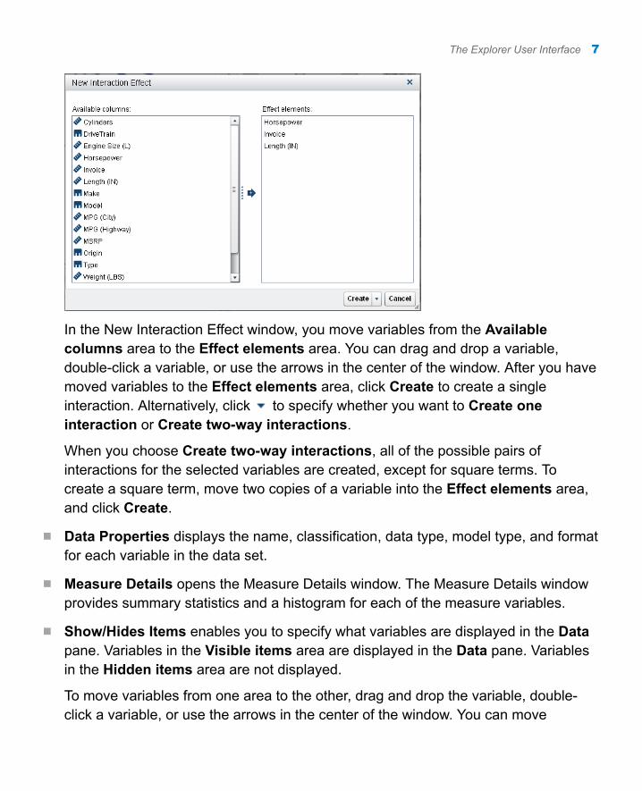
In the New Interaction Effect window, you move variables from the Available columns area to the Effect elements area. You can drag and drop a variable, double-click a variable, or use the arrows in the center of the window. After you have moved variables to the Effect elements area, click Create to create a single interaction. Alternatively, click to specify whether you want to Create one interaction or Create two-way interactions.
When you choose Create two-way interactions, all of the possible pairs of interactions for the selected variables are created, except for square terms. To create a square term, move two copies of a variable into the Effect elements area, and click Create.
n Data Properties displays the name, classification, data type, model type, and format for each variable in the data set.
n Measure Details opens the Measure Details window. The Measure Details window provides summary statistics and a histogram for each of the measure variables.
n Show/Hides Items enables you to specify what variables are displayed in the Data pane. Variables in the Visible items area are displayed in the Data pane. Variables in the Hidden items area are not displayed.
To move variables from one area to the other, drag and drop the variable, double-click a variable, or use the arrows in the center of the window. You can move
The Explorer User Interface 7
multiple variables by selecting them first, and then either dragging and dropping them or using the arrows.
Click OK to close the Show or Hide Items window and save your changes.
n Sort Items enables you to specify whether you want to sort the variables in ascending or descending order.
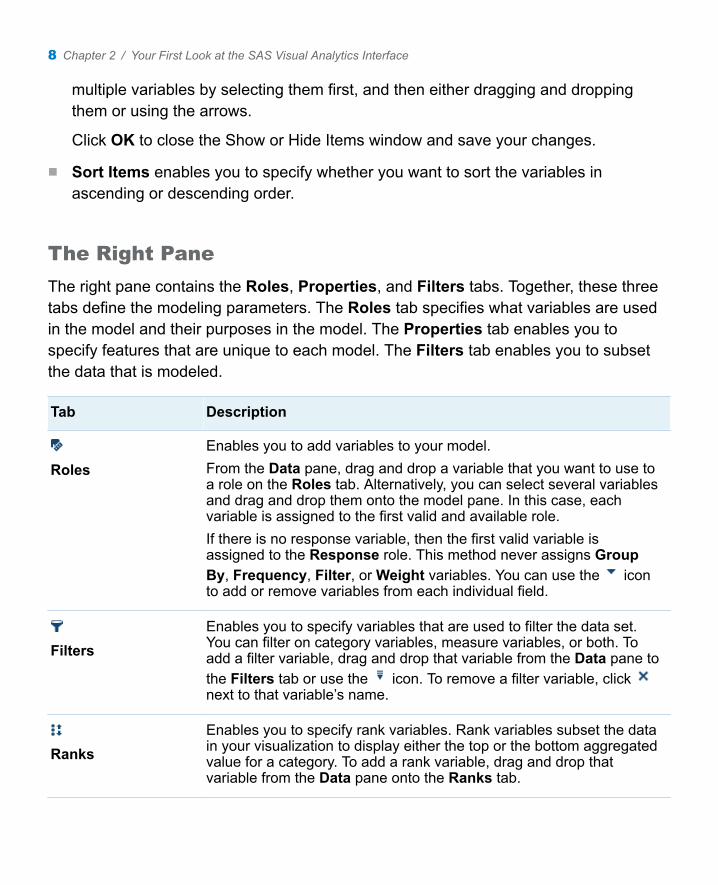
The Right Pane
The right pane contains the Roles, Properties, and Filters tabs. Together, these three tabs define the modeling parameters. The Roles tab specifies what variables are used in the model and their purposes in the model. The Properties tab enables you to specify features that are unique to each model. The Filters tab enables you to subset the data that is modeled.
Tab Description
RolesEnables you to add variables to your model.From the Data pane, drag and drop a variable that you want to use to a role on the Roles tab. Alternatively, you can select several variables and drag and drop them onto the model pane. In this case, each variable is assigned to the first valid and available role.If there is no response variable, then the first valid variable is assigned to the Response role. This method never assigns Group By, Frequency, Filter, or Weight variables. You can use the icon to add or remove variables from each individual field.
FiltersEnables you to specify variables that are used to filter the data set. You can filter on category variables, measure variables, or both. To add a filter variable, drag and drop that variable from the Data pane to the Filters tab or use the icon. To remove a filter variable, click next to that variable’s name.
RanksEnables you to specify rank variables. Rank variables subset the data in your visualization to display either the top or the bottom aggregated value for a category. To add a rank variable, drag and drop that variable from the Data pane onto the Ranks tab.
8 Chapter 2 / Your First Look at the SAS Visual Analytics Interface
Tab Description
PropertiesEnables you to specify features of the model. The available options vary based on the selected model.
CommentsEnables you to enter comments about the current model.
ParametersEnables you to view any parameters that affect a calculated item that is used by the current model.
The Model Pane
The model pane contains the modeling results and plots. Because the windows available depend on the selected model, this section focuses on the common elements for all models. Specific information for each model is available in the SAS Visual Analytics: User’s Guide.
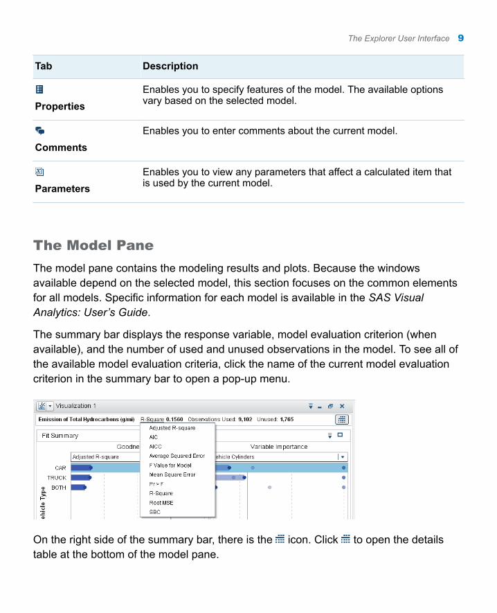
The summary bar displays the response variable, model evaluation criterion (when available), and the number of used and unused observations in the model. To see all of the available model evaluation criteria, click the name of the current model evaluation criterion in the summary bar to open a pop-up menu.
On the right side of the summary bar, there is the icon. Click to open the details table at the bottom of the model pane.
The Explorer User Interface 9
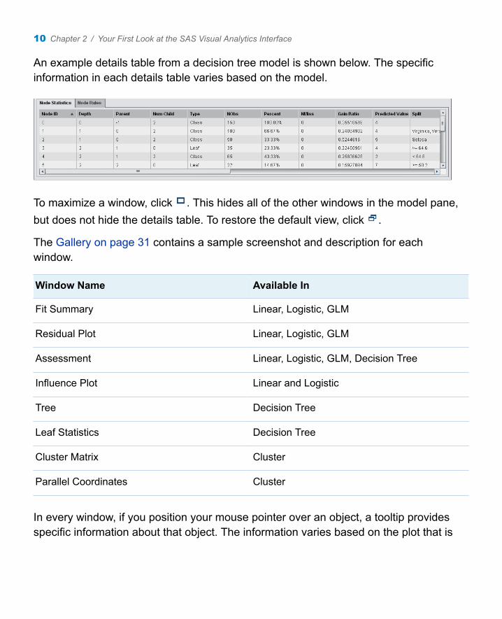
An example details table from a decision tree model is shown below. The specific information in each details table varies based on the model.
To maximize a window, click . This hides all of the other windows in the model pane, but does not hide the details table. To restore the default view, click .
The Gallery on page 31 contains a sample screenshot and description for each window.
Window Name Available In
Fit Summary Linear, Logistic, GLM
Residual Plot Linear, Logistic, GLM
Assessment Linear, Logistic, GLM, Decision Tree
Influence Plot Linear and Logistic
Tree Decision Tree
Leaf Statistics Decision Tree
Cluster Matrix Cluster
Parallel Coordinates Cluster
In every window, if you position your mouse pointer over an object, a tooltip provides specific information about that object. The information varies based on the plot that is
10 Chapter 2 / Your First Look at the SAS Visual Analytics Interface
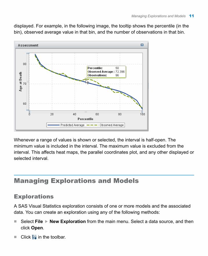
displayed. For example, in the following image, the tooltip shows the percentile (in the bin), observed average value in that bin, and the number of observations in that bin.
Whenever a range of values is shown or selected, the interval is half-open. The minimum value is included in the interval. The maximum value is excluded from the interval. This affects heat maps, the parallel coordinates plot, and any other displayed or selected interval.
Managing Explorations and Models
Explorations
A SAS Visual Statistics exploration consists of one or more models and the associated data. You can create an exploration using any of the following methods:
n Select File New Exploration from the main menu. Select a data source, and then click Open.
n Click in the toolbar.
Managing Explorations and Models 11
Models
To create a model, click the icon for that model type in the toolbar.
To rename a model, select Edit Rename from the main menu. Enter a new name in the New name field, and click OK. This affects the current model in the model pane.
To duplicate a model, click the icon in the upper right corner of the model, and select Duplicate. This creates a model named Copy of Model Name with the same settings as the copied model. You might duplicate a model if you have a good model, but you want to try out some enhancements without overwriting the current model. This feature enables you to leave the original model intact while you adjust the duplicate model. This affects the current model in the model pane.
To delete a model, click the in the upper right corner of the model. Every time you delete a model, you are asked to confirm the action.
12 Chapter 2 / Your First Look at the SAS Visual Analytics Interface
3Data Discovery
About the Tasks in This Chapter . . . . . . . . . . . . . . . . . . . . . . . . . . . . . . . . . . . . . . 13
Import the Data . . . . . . . . . . . . . . . . . . . . . . . . . . . . . . . . . . . . . . . . . . . . . . . . . . . . . . . . . . . . 13
Identify a Segmentation Variable . . . . . . . . . . . . . . . . . . . . . . . . . . . . . . . . . . . . . . 14
Create a Segmentation Variable from a Cluster . . . . . . . . . . . . . . . . . . . . 15
About the Tasks in This Chapter
Data discovery is the process of investigating your data, its characteristics, and its relationships before analysis. This includes a variety of techniques that ensure that your data creates statistically valid models. In this chapter, you will learn how to identify a stratification variable and create a new input variable using the cluster visualization. However, before you can get started, you must download an input data set and import it into SAS Visual Analytics.
Import the Data
This example uses the 2014 Emission and Fuel Economy Test Data published by the United States Environmental Protection Agency. You can use the information in this data set to create four different predictive models.
13
The data is available as a SAS data set on the SAS Visual Analytics product documentation page. Complete the following steps to import this data into the explorer:
1 In a web browser, go to http://support.sas.com/documentation/onlinedoc/va/index.html. Save the SAS Visual Analytics: Getting Started with Analytical Models EPA_CARS data set on your local machine. Note where you saved this data set.
2 Sign in to SAS Visual Analytics, and open the explorer. Click Select a Data Source in the window that appears.
3 In the Import Data area of the Open Data Source window, click SAS Data Set.
4 In the window, navigate to where you saved the EPA_CARS data set. Select it, and click Open.
5 In the Import SAS Data Set window, accept all of the default options.
6 Click OK.
Identify a Segmentation Variable
When working with a large data set, it often contains several heterogeneous subgroups. Therefore, it is beneficial to segment the data into these subgroups and create a separate model for each subgroup. Sometimes, a category variable exists in your data set that is suitable for segmentation. If a pre-defined segmentation variable does not exist, you can derive segmentation information from a decision tree or cluster. This example shows both cases.
In the Data pane, find the category variable Vehicle Type. Notice that this variable contains three distinct values. If you visualize this variable, you can see that most vehicles are classified as cars, some are classified as trucks, and a smaller portion are classified as both a car and a truck. You use the Vehicle Type variable as a segmentation variable for the linear regression model and GLM that you create in the next section.
14 Chapter 3 / Data Discovery
Create a Segmentation Variable from a Cluster
You can segment data by clustering the data. A cluster is a group of observations that are similar in some way that is suggested by the data. SAS Visual Statistics includes a cluster visualization that automatically segments the data based on the properties and variables that you specify. After clustering the data, you can derive a cluster ID variable that specifies which cluster each observation belongs to. This cluster ID variable is then used in your models. For the following example, you want to cluster the data on several other measures.
1 Click to create a new visualization.
2 Click to specify that this visualization is a cluster.
3 Drag and drop the variables Vehicle Cylinders, Vehicle EngineSize (l), and Vehicle Horsepower onto the visualization. By default, five clusters are created.
4 Click in the visualization title bar, and select Derive a Cluster ID Variable. Enter Vehicle Clusters in the Name field. Click OK.
This new cluster ID variable contains the cluster assignment for each observation in the data. Observations with missing values are assigned to their own cluster. You will use this variable in the models that you create in the next sections.
Note: Even though five clusters are created, this variable contains six measurement levels (distinct values). This is because there is an additional measurement level created for observations with missing values.
5 Save the exploration.
You can also use the decision tree visualization to segment the data. After creating a decision tree, you can derive a leaf ID variable that contains the leaf assignment information for each observation.
Create a Segmentation Variable from a Cluster 15

The cluster ID variable and the leaf ID variable can be used in subsequent visualizations as either an effect or a group by variable. The cluster ID and leaf ID variables persist even if you delete the visualization that created them.
16 Chapter 3 / Data Discovery
4Modeling a Measure Variable
About the Tasks in This Chapter . . . . . . . . . . . . . . . . . . . . . . . . . . . . . . . . . . . . . . 17
Create a Linear Regression . . . . . . . . . . . . . . . . . . . . . . . . . . . . . . . . . . . . . . . . . . . . . 17
Create a Generalized Linear Model . . . . . . . . . . . . . . . . . . . . . . . . . . . . . . . . . . . 19
Compare Your Models . . . . . . . . . . . . . . . . . . . . . . . . . . . . . . . . . . . . . . . . . . . . . . . . . . . 20
About the Tasks in This Chapter
Linear regression models and GLMs are two predictive models used for measure target variables. In this chapter, you create both a linear regression and a GLM to predict the amount of total hydrocarbon emissions for each vehicle. Then, you compare these two models using multiple fit statistics.
Create a Linear Regression
A linear regression attempts to predict the value of a measure response variable as a linear function of one or more effects. The linear regression model uses the least squares method to determine the model.
17
To create the linear regression for this example, complete the following steps:
1 Click to create a new visualization.
2 Click to specify that this visualization is a linear regression.
3 Drag and drop the variable Emission of Total Hydrocarbons (g/mi) into the Response field on the Roles tab.
4 Drag and drop the variables Vehicle Clusters, Vehicle Manufacturer, Test Procedure, Vehicle Cylinders, Vehicle MPG, Vehicle Gears, and Vehicle Weight (lbs) onto the visualization. SAS Visual Analytics automatically creates a linear regression model using these variables as the effects.
5 Drag and drop the variable Vehicle Type into the Group By field on the Roles tab. This specifies that Vehicle Type is the segmentation variable.
The results windows are updated. Instead of creating one model for the entire input data set, separate models are created for each measurement level of the group by variable. In this example, that means that separate models were created based on a vehicle’s classification as a car, a truck, or both.
6 Select the Properties tab in the right pane. Select Informative missingness. Enabling this property indicates that missing values are used in the model.
7 In the Fit Summary window, click the CAR segment.
In the Influence Plot, Cook’s D is the default influence statistic. Notice that the first bar in this plot is significantly larger than all the other bars. From this, you can guess that the observations represented by this bar are outliers, and you should exclude them from the model.
To exclude these observations, click the bar to select it. Right-click the bar, and select Exclude Selected.
18 Chapter 4 / Modeling a Measure Variable
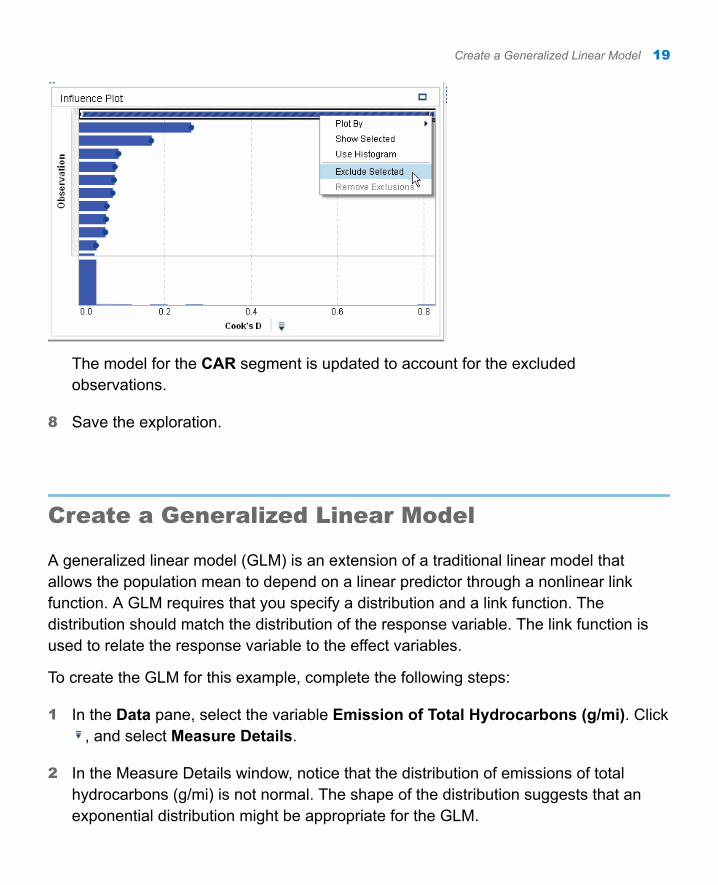
The model for the CAR segment is updated to account for the excluded observations.
8 Save the exploration.
Create a Generalized Linear Model
A generalized linear model (GLM) is an extension of a traditional linear model that allows the population mean to depend on a linear predictor through a nonlinear link function. A GLM requires that you specify a distribution and a link function. The distribution should match the distribution of the response variable. The link function is used to relate the response variable to the effect variables.
To create the GLM for this example, complete the following steps:
1 In the Data pane, select the variable Emission of Total Hydrocarbons (g/mi). Click , and select Measure Details.
2 In the Measure Details window, notice that the distribution of emissions of total hydrocarbons (g/mi) is not normal. The shape of the distribution suggests that an exponential distribution might be appropriate for the GLM.
Create a Generalized Linear Model 19
Close the Measure Details window.
3 Click to create a new visualization.
4 Click to specify that this visualization is a GLM. Maximize the visualization.
5 Drag and drop the variable Emission of Total Hydrocarbons (g/mi) into the Response field on the Roles tab.
6 Select the Properties tab in the right pane. Select Informative missingness.
7 For the Distribution property, select Exponential.
8 Drag and drop the variables Vehicle Clusters, Vehicle Manufacturer, Vehicle Axle Ratio, Vehicle Cylinders, Vehicle Gears, Vehicle MPG, and Vehicle Weight (lbs) onto the visualization. SAS Visual Analytics automatically creates a GLM using these variables as the effects.
9 Drag and drop the variable Vehicle Type into the Group By field on the Roles tab. This specifies that Vehicle Type is used as a segmentation variable.
The results windows are updated. As with the linear regression, separate models are created based on a vehicle’s classification as a car, a truck, or both.
10 Save the exploration.
Compare Your Models
You can compare the performance of these two models using the model comparison visualization. In the explorer, model comparison requires that the response variable, level, and group by variable are identical in the compared models. The effects used in each model can differ.
To compare the models in this example, complete the following steps:
1 Click to create a new model comparison.
20 Chapter 4 / Modeling a Measure Variable
2 In the Model Comparison window, Response should already contain the variable Emission of Total Hydrocarbons (g/mi). Select the variable Vehicle Type for Group By. If you used a group by variable in only one of the models that you created, you cannot compare these two models.
3 Click between the Available models area and the Selected models area to add both visualizations to the model comparison.
4 Click OK.
5 Review the results windows for the model comparison. The default segment chosen is CAR. This is displayed in the summary bar at the top of the visualization.
Because Emission of Total Hydrocarbons (g/mi) is an interval target, the model comparison visualization displays an Assessment plot. This plot compares either the observed average value or predicted average value between each model at each percentile. Notice that these models are relatively similar in regard to both the observed or predicted average.
In the Fit Statistic window, the default displayed value is the average square error (ASE). Hold your mouse pointer over the bar for each visualization to see that the ASE value for the linear regression is better.
The fit statistic Observed Average displays the observed average value at the specified percentile. After selecting Observed Average, you can change the displayed percentile with the slider on the Properties tab.
This information is also in the details table. In addition to ASE, you can view the sum of squared errors (SSE). Notice that the SSE for these two models favors the linear regression.
6 In the summary bar, click the word CAR, and select TRUCK to compare the results for the truck segment. Explore the Assessment and Fit Statistic windows to notice the differences and similarities between the two models.
7 Repeat your exploration for the BOTH segment.
8 Save the exploration.
Compare Your Models 21
Note: Model comparisons do not persist between sessions. If you sign out of SAS Visual Analytics and want to return to this model comparison, then you must re-create it.
22 Chapter 4 / Modeling a Measure Variable
5Modeling a Category Variable
About the Tasks in This Chapter . . . . . . . . . . . . . . . . . . . . . . . . . . . . . . . . . . . . . . 23
Create a Decision Tree . . . . . . . . . . . . . . . . . . . . . . . . . . . . . . . . . . . . . . . . . . . . . . . . . . 23
Create a Logistic Regression . . . . . . . . . . . . . . . . . . . . . . . . . . . . . . . . . . . . . . . . . . 29
Compare Your Models . . . . . . . . . . . . . . . . . . . . . . . . . . . . . . . . . . . . . . . . . . . . . . . . . . . 29
About the Tasks in This Chapter
In this chapter, you create both a decision tree and a logistic regression model to predict vehicle type based on a variety of effects. The decision tree is built by hand with interactive training tools provided by SAS Visual Statistics. You compare the decision tree and logistic regression model using multiple fit statistics.
Create a Decision Tree
A decision tree creates a hierarchical segmentation of the input data based on a series of rules applied to each observation. Each rule assigns an observation to a segment based on the value of one effect. Rules are applied sequentially, which results in a hierarchy of segments within segments.
23
To create the decision tree for this example, complete the following steps:
1 Click to create a new visualization.
2 Click to specify that this visualization is a decision tree.
3 Drag and drop the variable Vehicle Type into the Response field on the Roles tab.
At this point, there is only a single node in your decision tree. The predicted value for this node is CAR because it is the most frequent measurement level in that node.
4 On the Roles tab, click Advanced. Select TRUCK as your event level. Click OK.
This selection indicates that you want to predict whether an observation is a truck for model comparison purposes. The two other measurement levels are grouped together as not trucks.
5 Select the Properties tab in the right pane. For Maximum levels, specify 2.
Select Show diagnostic plots. In the Assessment window, select the Misclassification plot. Observe this plot as you make changes to the decision tree to see how well your model classifies the data.
Enabling this property ensures that the smallest possible decision tree is created when you add predictors to the tree. In the following steps, you add a variety of predictors to the tree and interactively train the tree.
6 Drag and drop the variables Vehicle Clusters, Vehicle Axle Ratio, Vehicle Cylinders, Vehicle EngineSize (l), Vehicle Gears, Vehicle Horsepower, and Vehicle MPG onto the visualization. A two-level decision tree is created.
24 Chapter 5 / Modeling a Category Variable
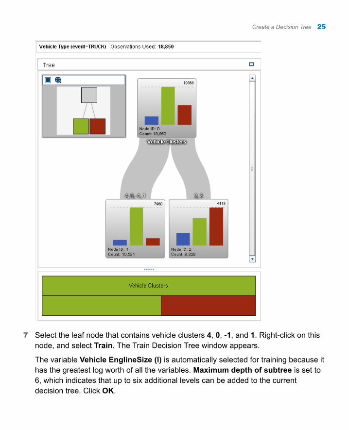
7 Select the leaf node that contains vehicle clusters 4, 0, -1, and 1. Right-click on this node, and select Train. The Train Decision Tree window appears.
The variable Vehicle EnglineSize (l) is automatically selected for training because it has the greatest log worth of all the variables. Maximum depth of subtree is set to 6, which indicates that up to six additional levels can be added to the current decision tree. Click OK.
Create a Decision Tree 25
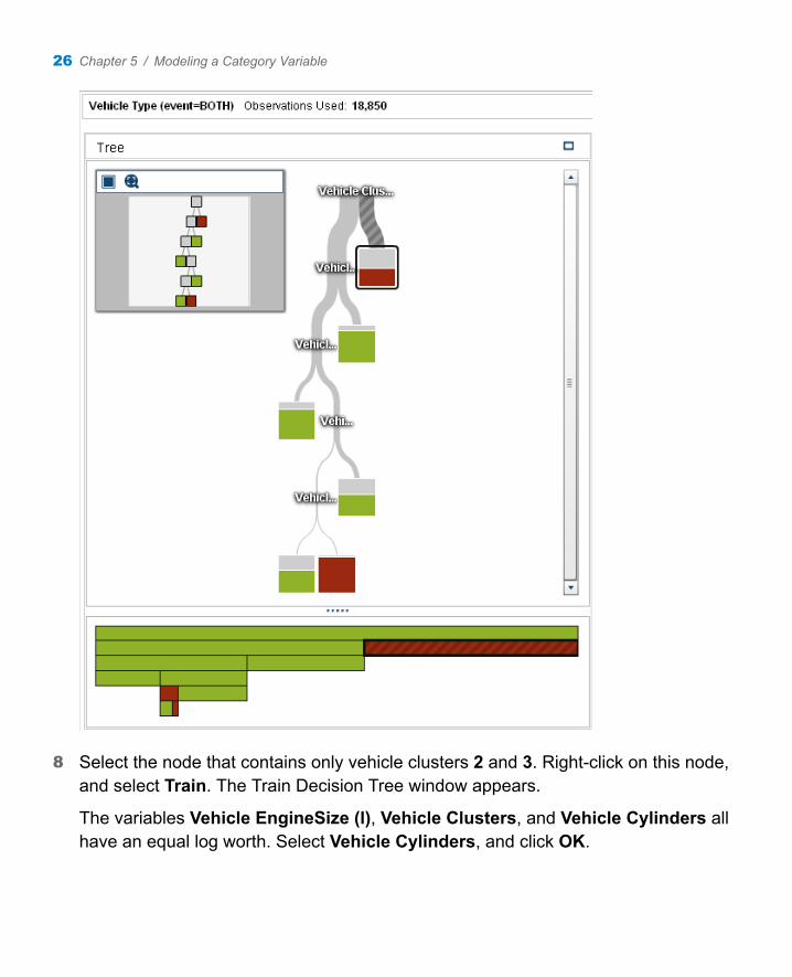
8 Select the node that contains only vehicle clusters 2 and 3. Right-click on this node, and select Train. The Train Decision Tree window appears.
The variables Vehicle EngineSize (l), Vehicle Clusters, and Vehicle Cylinders all have an equal log worth. Select Vehicle Cylinders, and click OK.
26 Chapter 5 / Modeling a Category Variable
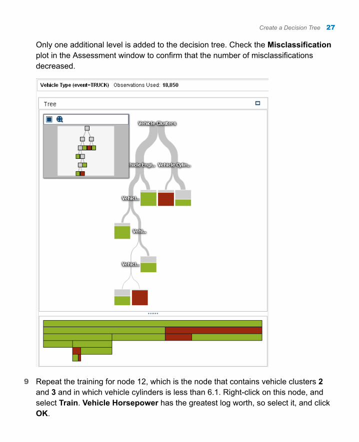
Only one additional level is added to the decision tree. Check the Misclassification plot in the Assessment window to confirm that the number of misclassifications decreased.
9 Repeat the training for node 12, which is the node that contains vehicle clusters 2 and 3 and in which vehicle cylinders is less than 6.1. Right-click on this node, and select Train. Vehicle Horsepower has the greatest log worth, so select it, and click OK.
Create a Decision Tree 27
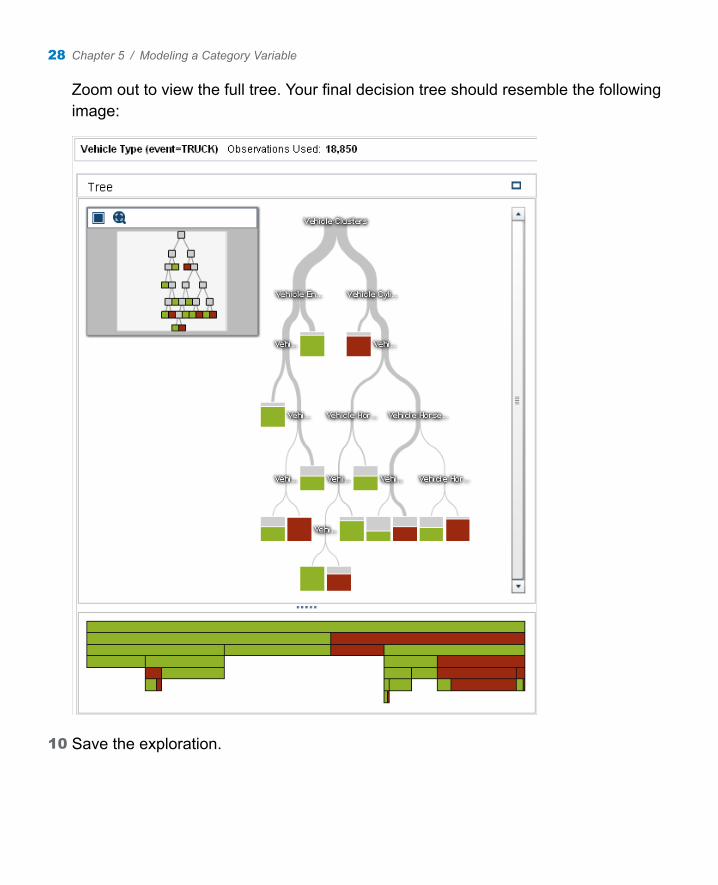
Zoom out to view the full tree. Your final decision tree should resemble the following image:
10 Save the exploration.
28 Chapter 5 / Modeling a Category Variable
Create a Logistic Regression
A logistic regression attempts to predict the value of a binary response variable. A logistic regression analysis models the natural logarithm of the odds ratio as a linear combination of the explanatory variables.
To create the logistic regression for this example, complete the following steps:
1 Click to create a new visualization.
2 Click to specify that this visualization is a logistic regression. Maximize the visualization.
3 Drag and drop the variable Vehicle Type into the Response field on the Roles tab.
4 On the Roles tab, beside the Response field, click Advanced. Select TRUCK as your event level. Click OK.
5 Drag and drop the variables Vehicle Clusters, Emission of Total Hydrocarbons (g/mi), Vehicle Axle Ratio, Vehicle Cylinders, Vehicle EngineSize (l), Vehicle Gears, Vehicle Horsepower, Vehicle MPG, and Vehicle Weight (lbs) onto the visualization. SAS Visual Analytics automatically creates a logistic regression model using these variables as the effects.
6 Select the Properties tab in the right pane. Select Informative missingness.
7 Save the exploration.
Compare Your Models
You can compare the performance of these two models using the model comparison visualization. In the explorer, model comparison requires that the response variable,
Compare Your Models 29
level, and group by variable are identical in the compared models. The effects used in each model can differ.
To compare the models in this example, complete the following steps:
1 Click to create a new model comparison.
2 In the Model Comparison window, select Vehicle Type in the Response field. Select TRUCK in the Level field.
3 The logistic regression and decision tree should be available for comparison. Click between the Available models area and the Selected models area to add both visualizations to the model comparison.
4 Click OK.
5 The default model comparison statistic is the Misclassification rate. In this example, the logistic regression outperforms the decision tree. That is, it misclassifies significantly fewer observations than the decision tree. Use the details table to compare all of the available fit statistics. From these statistics, it is obvious that the logistic regression outperforms the decision tree.
6 Save the exploration.
Note: Model comparisons do not persist between sessions. If you sign out of SAS Visual Analytics and want to return to this model comparison, then you must re-create it.
30 Chapter 5 / Modeling a Category Variable
6Quick Reference
Gallery . . . . . . . . . . . . . . . . . . . . . . . . . . . . . . . . . . . . . . . . . . . . . . . . . . . . . . . . . . . . . . . . . . . . . . 31
Where to Find Additional Documentation . . . . . . . . . . . . . . . . . . . . . . . . . . . 34
Gallery
This is an illustrated gallery of plots and graphs found in SAS Visual Statistics.
TIP Use the following images for orientation. Actual appearance and functionality are affected by the underlying data, any styles that you apply, and the interface that you are using.
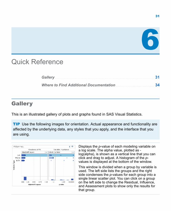
Displays the p-value of each modeling variable on a log scale. The alpha value, plotted as -log(alpha), is shown as a vertical line that you can click and drag to adjust. A histogram of the p-values is displayed at the bottom of the window.This window is divided when a group by variable is used. The left side lists the groups and the right side condenses the p-values for each group into a single linear scatter plot. You can click on a group on the left side to change the Residual, Influence, and Assessment plots to show only the results for that group.
31
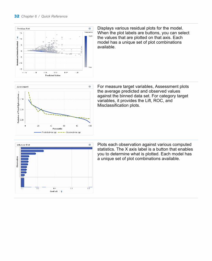
Displays various residual plots for the model. When the plot labels are buttons, you can select the values that are plotted on that axis. Each model has a unique set of plot combinations available.
For measure target variables, Assessment plots the average predicted and observed values against the binned data set. For category target variables, it provides the Lift, ROC, and Misclassification plots.
Plots each observation against various computed statistics. The X axis label is a button that enables you to determine what is plotted. Each model has a unique set of plot combinations available.
32 Chapter 6 / Quick Reference
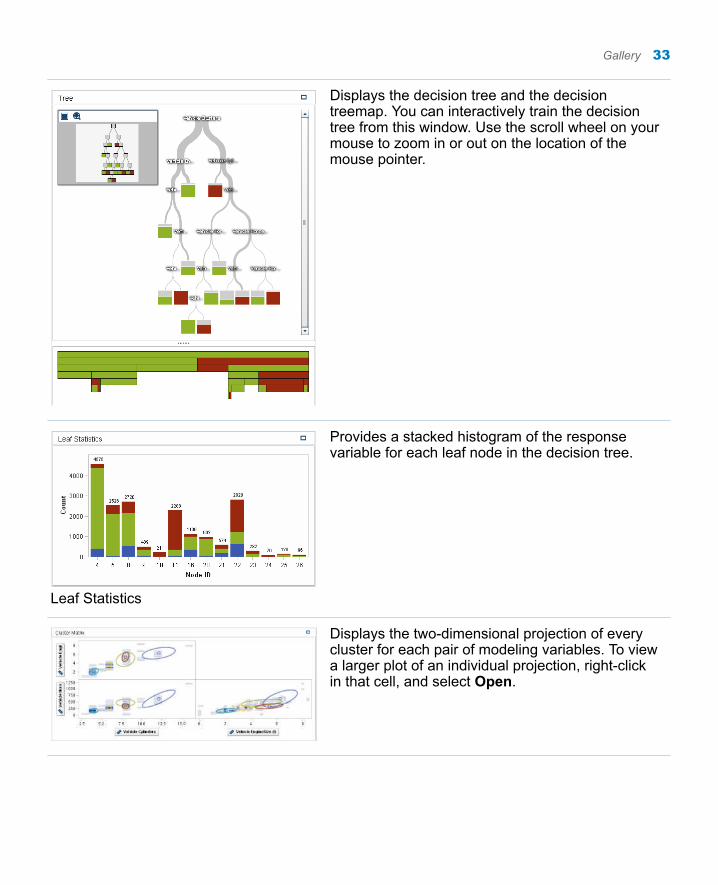
Displays the decision tree and the decision treemap. You can interactively train the decision tree from this window. Use the scroll wheel on your mouse to zoom in or out on the location of the mouse pointer.
Leaf Statistics
Provides a stacked histogram of the response variable for each leaf node in the decision tree.
Displays the two-dimensional projection of every cluster for each pair of modeling variables. To view a larger plot of an individual projection, right-click in that cell, and select Open.
Gallery 33
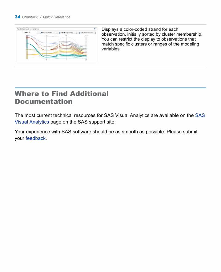
Displays a color-coded strand for each observation, initially sorted by cluster membership. You can restrict the display to observations that match specific clusters or ranges of the modeling variables.
Where to Find Additional Documentation
The most current technical resources for SAS Visual Analytics are available on the SAS Visual Analytics page on the SAS support site.
Your experience with SAS software should be as smooth as possible. Please submit your feedback.
34 Chapter 6 / Quick Reference
Recommended Reading
n SAS Visual Analytics User’s Guide
n SAS Visual Analytics: Getting Started with Exploration and Reporting
For a complete list of SAS publications, go to sas.com/store/books. If you have questions about which titles you need, please contact a SAS Representative:
SAS BooksSAS Campus DriveCary, NC 27513-2414Phone: 1-800-727-0025Fax: 1-919-677-4444Email: [email protected] address: sas.com/store/books
35

36 Recommended Reading