Embed Size (px)
Citation preview
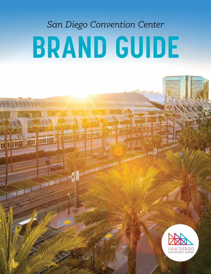
SAN DIEGO CONVENTION CENTER BRAND GUIDE 2
TABLE OF CONTENTS
LOGOIn Detail ............................................................................................... 3
Vertical & Horizontal ............................................................................. 3
Backgrounds ........................................................................................ 4
Clear Space .......................................................................................... 5
Size Requirements ................................................................................ 5
COLORPalette .................................................................................................. 6
TYPOGRAPHYTypefaces ............................................................................................. 7
Sample ................................................................................................. 8
WRITTEN LANGUAGEStyle Tips ............................................................................................. 9
Brand Guide Produced by: Communications Department
SAN DIEGO CONVENTION CENTER BRAND GUIDE 3
LOGO
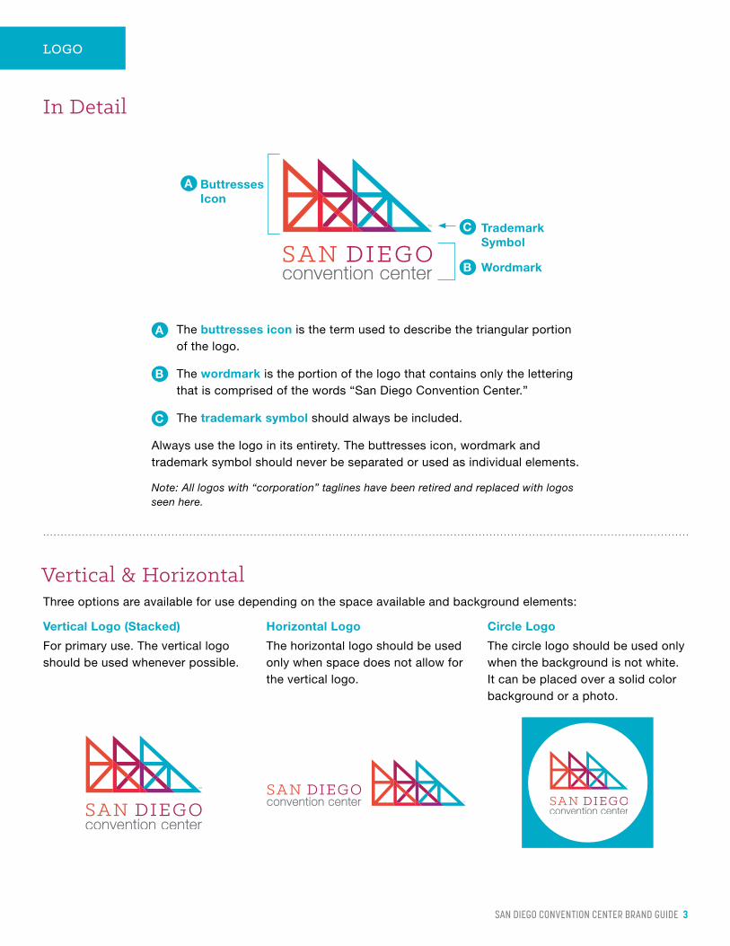
In Detail
The buttresses icon is the term used to describe the triangular portion of the logo.
The wordmark is the portion of the logo that contains only the lettering that is comprised of the words “San Diego Convention Center.”
The trademark symbol should always be included.
Always use the logo in its entirety. The buttresses icon, wordmark and trademark symbol should never be separated or used as individual elements.
Note: All logos with “corporation” taglines have been retired and replaced with logos seen here.
A
B
C
Buttresses Icon
Wordmark
Trademark Symbol
A
C
B
Horizontal Logo Circle Logo
Three options are available for use depending on the space available and background elements:
For primary use. The vertical logo should be used whenever possible.
The horizontal logo should be used only when space does not allow for the vertical logo.
The circle logo should be used only when the background is not white. It can be placed over a solid color background or a photo.
Vertical Logo (Stacked)
Vertical & Horizontal
SAN DIEGO CONVENTION CENTER BRAND GUIDE 4
LOGO
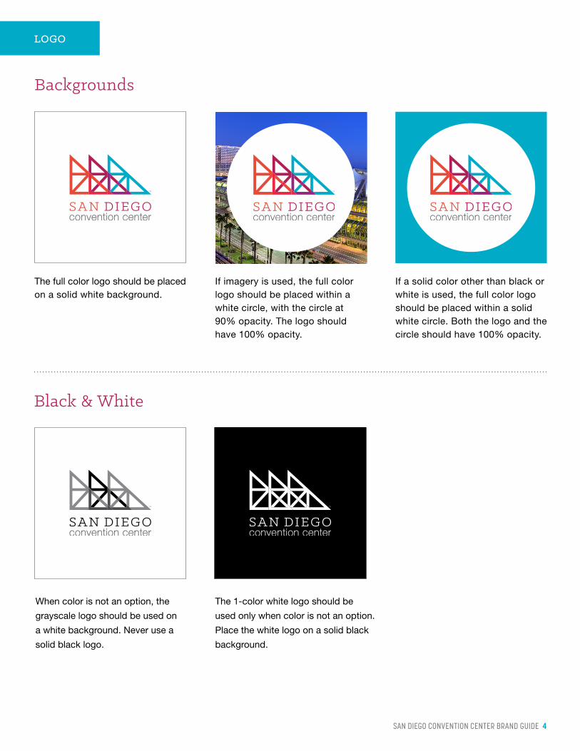
Black & White
When color is not an option, the
grayscale logo should be used on
a white background. Never use a
solid black logo.
The 1-color white logo should be
used only when color is not an option.
Place the white logo on a solid black
background.
Backgrounds
The full color logo should be placed on a solid white background.
If imagery is used, the full color logo should be placed within a white circle, with the circle at 90% opacity. The logo should have 100% opacity.
If a solid color other than black or white is used, the full color logo should be placed within a solid white circle. Both the logo and the circle should have 100% opacity.
SAN DIEGO CONVENTION CENTER BRAND GUIDE 5
LOGO
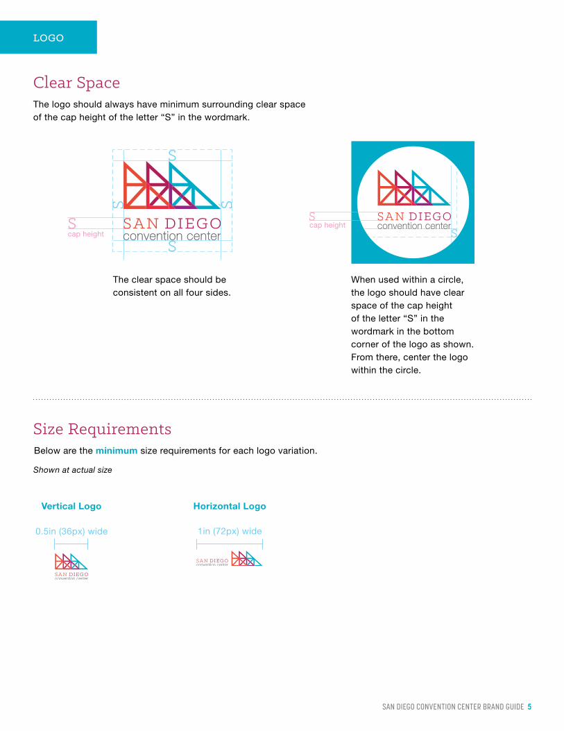
Clear SpaceThe logo should always have minimum surrounding clear space of the cap height of the letter “S” in the wordmark.
The clear space should be consistent on all four sides.
When used within a circle, the logo should have clear space of the cap height of the letter “S” in the wordmark in the bottom corner of the logo as shown. From there, center the logo within the circle.
cap heightcap height
Size RequirementsBelow are the minimum size requirements for each logo variation.
Shown at actual size
0.5in (36px) wide 1in (72px) wide
Horizontal LogoVertical Logo
SAN DIEGO CONVENTION CENTER BRAND GUIDE 6
COLOR
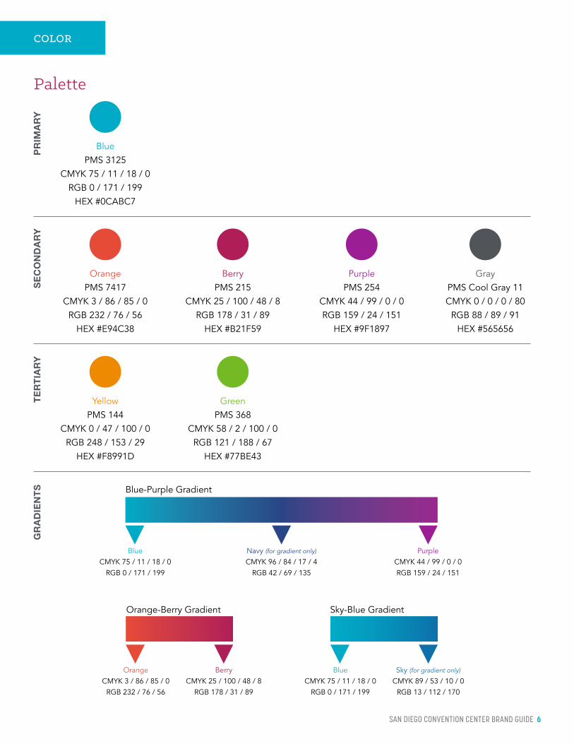
Palette
PR
IMA
RY
Blue PMS 3125
CMYK 75 / 11 / 18 / 0 RGB 0 / 171 / 199
HEX #0CABC7
TE
RT
IAR
Y
Green PMS 368
CMYK 58 / 2 / 100 / 0 RGB 121 / 188 / 67
HEX #77BE43
Yellow PMS 144
CMYK 0 / 47 / 100 / 0 RGB 248 / 153 / 29
HEX #F8991D
SE
CO
ND
AR
Y
Berry PMS 215
CMYK 25 / 100 / 48 / 8 RGB 178 / 31 / 89
HEX #B21F59
Purple PMS 254
CMYK 44 / 99 / 0 / 0 RGB 159 / 24 / 151
HEX #9F1897
Orange PMS 7417
CMYK 3 / 86 / 85 / 0 RGB 232 / 76 / 56
HEX #E94C38
Gray PMS Cool Gray 11CMYK 0 / 0 / 0 / 80
RGB 88 / 89 / 91 HEX #565656
Blue-Purple Gradient
GR
AD
IEN
TS
Blue CMYK 75 / 11 / 18 / 0
RGB 0 / 171 / 199
Navy (for gradient only) CMYK 96 / 84 / 17 / 4
RGB 42 / 69 / 135
Purple CMYK 44 / 99 / 0 / 0 RGB 159 / 24 / 151
Berry CMYK 25 / 100 / 48 / 8
RGB 178 / 31 / 89
Orange CMYK 3 / 86 / 85 / 0
RGB 232 / 76 / 56
Orange-Berry Gradient
Blue CMYK 75 / 11 / 18 / 0
RGB 0 / 171 / 199
Sky (for gradient only) CMYK 89 / 53 / 10 / 0
RGB 13 / 112 / 170
Sky-Blue Gradient
SAN DIEGO CONVENTION CENTER BRAND GUIDE 7
TYPOGRAPHY
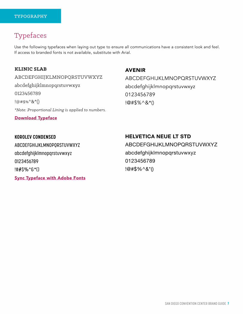
TypefacesUse the following typefaces when laying out type to ensure all communications have a consistent look and feel. If access to branded fonts is not available, substitute with Arial.
KOROLEV CONDENSED
ABCDEFGHIJKLMNOPQRSTUVWXYZ
abcdefghijklmnopqrstuvwxyz
0123456789
!@#$%^&*()
Sync Typeface with Adobe Fonts
AVENIRABCDEFGHIJKLMNOPQRSTUVWXYZ
abcdefghijklmnopqrstuvwxyz
0123456789
!@#$%^&*()
HELVETICA NEUE LT STD
ABCDEFGHIJKLMNOPQRSTUVWXYZ
abcdefghijklmnopqrstuvwxyz
0123456789
!@#$%^&*()
KLINIC SLAB
ABCDEFGHIJKLMNOPQRSTUVWXYZ
abcdefghijklmnopqrstuvwxyz
0123456789
!@#$%^&*()
*Note: Proportional Lining is applied to numbers.
Download Typeface

SAN DIEGO CONVENTION CENTER BRAND GUIDE 8
SAN DIEGO CONVENTION CENTER 1
TYPOGRAPHY
Sample
Your San Diego Convention Center helps drive business to local retailers, attractions and special event venues, hotels, bars and restaurants.
RIPPLE EFFECTWe are an economic engine that produces a ripple effect into the economy that reaches across the county. The employees that work at our neighboring businesses are able to take their income and reinvest it throughout the County of San Diego, further benefiting the community.
+ Modita quo molore, cus pa illatiaerem quas sequiscias apitiumquam
+ Liquis mos utationest, sae nam et mi, quia soloria estionest et aborem venienti resed maionseque dipsam dolora dictur, ut modit endi ab in
+ Ex et re simus, conest accatec torumquam nonseque est qui doluptiantum voloribus dolor solupta menitium aut adipidebit
Ictinto dolut expe velicid molupti animpor eperion sequidebit que omnis et que velitates demqui aliqui dem cus.
Body
Bullets
Footer
Subhead
Intro Paragraph
Headline Lead-in
Headline
San Diego Convention Center’s
ECONOMIC IMPACT
Headline Lead-inKlinic Slab / Book Italic Color: Black
HeadlineKorolev Condensed / Bold / All Caps Color: Primary or Secondary
Intro ParagraphKlinic Slab / Bold Italic Color: Black
SubheadKlinic Slab / Bold / All Caps Color: Secondary
Body*
Avenir / Book Color: Black
*Helvetica or Arial can be substituted if-needed
Bullets*
Avenir / Book Color: Secondary bullet with black text
*Helvetica or Arial can be substituted if-needed
FooterTitle: Korolev Condensed / Medium / All Caps Color: Gray
Page Number: Korolev Condensed / Bold Color: Primary
SAN DIEGO CONVENTION CENTER BRAND GUIDE 9
WRITTEN LANGUAGE
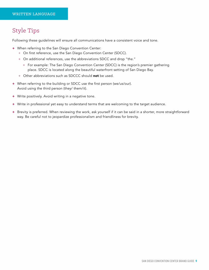
Style TipsFollowing these guidelines will ensure all communications have a consistent voice and tone.
+ When referring to the San Diego Convention Center: + On first reference, use the San Diego Convention Center (SDCC).
+ On additional references, use the abbreviations SDCC and drop “the.”
+ For example: The San Diego Convention Center (SDCC) is the region’s premier gathering place. SDCC is located along the beautiful waterfront setting of San Diego Bay.
+ Other abbreviations such as SDCCC should not be used.
+ When referring to the building or SDCC use the first person (we/us/our). Avoid using the third person (they/ them/it).
+ Write positively. Avoid writing in a negative tone.
+ Write in professional yet easy to understand terms that are welcoming to the target audience.
+ Brevity is preferred. When reviewing the work, ask yourself if it can be said in a shorter, more straightforward way. Be careful not to jeopardize professionalism and friendliness for brevity.
111920
111 W. Harbor Drive, San Diego, CA 92101 619.525.5000
VISITSANDIEGO.COM