Embed Size (px)
Citation preview
Review of the Methodology of the Community Vulnerability in the
Cairns Multi Hazard Risk Assessment
Report prepared by David King, James Moloney and Colin MacGregor
Centre for Disaster Studies
James Cook University
April 2000
1. Review of the Literature on the Use of Social Indicators The information explosion and proliferation of powerful computers and software over the last decade or so has prompted increased emphasis on community vulnerability and its measurement. This has come about in two ways as a consequence of the technological revolution. Firstly the measurement of the impact and occurrence of natural hazards has developed to a high level of understanding. Hazard proof built structures and infrastructure have responded alongside this development in information and research. As the prediction of hazard impact and the establishment of safer building codes etc have been brought under greater control, it has been the vulnerability of the human beings in the community that has emerged as the least known element. Thus the second consequence of the information explosion, has been emphasis on readily available information about the population. There are numerous social, economic and demographic characteristics available to measure the vulnerability of the community, but the problem in using them is how to isolate appropriate characteristics or variables as indicators of community vulnerability. 1.1 The Context of Indicator Research Social indicators have been used since the 1960’s to quantify social characteristics that could influence public policy (Neuman 1997). Expansion of the use of indicators resulted in a journal of Social Indicator Research. A few examples of uses of indicators span a wide range from basic socio-economic indicators (Choguill 1993), urban social patterns (Kloosterman 1996, Gentilli 1997), community medical needs (Mackenbach 1992 and Mapelli 1993) and environmental sustainability (Fenton and MacGregor 1999). In all of these examples of uses, indicators have been selected and then quantified in order to rank or classify spatial and social patterns. Determining useful indicators is not an end in itself. Indicators are simply tools that can be used to define or point to a more significant issue. Indicators are selected from a greater mass of information about the population (in the case of socio-economic indicators). They may be developed from either primary (eg. questionnaires) or secondary (eg. Census) data sources. Characteristics of the population, such as age or occupation for example, are summarised as individual variables, such as an age group, or an occupation category. Certain of these variables may be selected as useful indicators of a particular construct (Neuman 1997, Sarantakos 1994). The construct that we are interested in is vulnerability of communities to natural hazards. Constructs are concepts or ideas, very often abstract, that define or categorise an issue or situation. The construct is what we are really interested in. It is very often theoretical, being presented as a model that aims to express a relationship, or a process or an issue. Thus the construct is what we are researching, and the indicator must be its servant. 1.2. Principles for Developing Social Indicators
2
Definitions of social indicators are often determined by the research disciplines in which the social indicator research is being undertaken. However, a generally accepted definition of a social indicator is given by Andrews and Withey (1976), who state that indicators:
“can be monitored over time…can be disaggregated to the level of the relevant social unit…The set of indicators should be ‘limited’ so that a substantial portion of the most salient or critical aspects of society is included. They should be ‘coherent’ in that it would be helpful to our understanding if they hung together in some form that would eventually lead to a model or theory about how society operates” (p.4).
The Standing Committee on Agriculture and Resource Management (SCARM) also state that the selection of indicators, and in particular social indicators, should be grounded in a reasonable a priori conceptual framework or model. To do otherwise is to simply revert to the selection of indicators on the basis of heuristics, the previous experience of the researcher, or ‘what was thought important at the time’ (Fenton and Macgregor 1999). A review of social indicators undertaken by Fenton and MacGregor (1999) revealed five classifications of indicators.
• Informative indicators (indicators used to describe the social system and the changes taking place e.g. social statistics subject to regular production as a time-series and which can be dis-aggregated by relevant variables)
• Predictive indicators (these indicators are informative indicators which fit into explicit formal models of subsystems of the social system eg. indicators such as family income and urban recreational facility location may be used in a model attempting to predict potential levels of juvenile crime in a neighbourhood)
• Problem-oriented indicators (these are indicators which point particularly toward policy situations and actions on specific social problems)
• Program evaluation indicators (indicators used to monitor the progress and effectiveness of particular policies), and
• Target delineation indicators (variables describing the demographic, environmental, pathological or service provision characteristics, which are useful in identifying geographical areas or population subgroups toward which policy is directed).
With suitable indicator selection, a model can be developed that provides clear directions for the development of specific policies. Indicators can be selected with a variety of scales in mind eg. national, regional, local. The construct of intent determines the scale. Using the model together with socio-economic and socio-demographic data (such as those derived form the ABS) it should enable extrapolation to other rural towns, where an association has been demonstrated. In order to
3
minimise measurement error it is also useful to use composite indicators. This means that rather than relying on a single indicator variable for a specific construct, construct validity can be improved by aggregating several indicator variables together yielding a composite indicator for a specific construct of interest (Fenton and Macgregor 1999). Usually this would require delivery of a reasonably high item reliability value as assessed though such indices as Cronbach’s Alpha. 1.3. Developing Useful Social Indicators The Australian Bureau of Statistics (ABS), collects and examines a broad range of census data that can provide useful insights of community conditions. These include, incomes, housing type and ownership, employment, crime rates, educational status, ethnicity, English proficiency, family structure etc to name but a few. One of the advantages of using indicators developed from such secondary data sources is that they are readily available and obtainable for a relatively small scale; the Census Collection District (CD). Geographical areas, such as suburbs or whole towns can then be aggregated simply by combining the relevant CDs. This level aggregates all population and housing in the district. The Collection District is a block of streets in the city, or a subdivision, or outside the city a number of properties, farms or small communities. They are planned to contain approximately 200 households, which at a national/state average of just under 3 persons a household, is a population of about 600 people. As the workload of one census collector, they also must have identifiable boundaries and should not change at every census, in order to facilitate the measurement of inter-censual change. Consequently Collection Districts are not homogeneous. Some are very small in population but cover an extensive area, some are in decline and some expanding rapidly. The Collection District therefore introduces an element of inaccuracy. Comparisons are constrained by unequal population sizes, and an aggregation that loses some of the precision and detail of the diversity within the Collection District. However, for total figures of specific variables this is not too much of a problem. For example, the number of over 65 year olds living alone, gives a precise figure for an area of a few streets. The data therefore provide an indicator of the likely needs for emergency service intervention. When variables in the Collection District are modified in any way, such as a statistic as simple as a percentage, the lack of homogeneity becomes a more significant problem. The statistic may allow relative comparison of communities, but in being standardised it creates an impression of homogeneity. More sophisticated manipulation of the data exacerbates the distortion. On the other hand comparison of Collection Districts on the basis of whole numbers is accurate in terms of the concentration of the problem, but also distorts on the basis of population size. A vulnerability index is affected in this way because larger populations will drive the vulnerability analysis. The biggest Collection District will appear to have the biggest problem, when in fact the proportion, of for example, no car households, may be sufficiently low that the general community is able to deal with the problem, without significant emergency service intervention. These issues of unequal population size
4
and aggregation of characteristics underlie some of the statistical problems of using more sophisticated techniques to group data in order to generate a vulnerability index. The ABS has used census variables in order to produce indexes of urban and rural socio-economic disadvantage, urban and rural socio-economic advantage, and economic resources, which especially stress educational and occupational characteristics. The indexes rank order census collection districts, but cannot be further quantified, although ranks can be aggregated into larger spatial units. Variables were identified through a process of common sense and relevance, using principal components analysis to group the variables. From these groupings, strong indicators could be selected and given a weighting in relation to their strength as indicators. The indicators that finally formed the indexes contained some aspects of wealth, especially income, rent and mortgage repayments, but family structures are not strongly represented and community facilities not included at all. The ABS claims strong comparability between the 1991 and 1996 censuses for over 77% of collections districts, but because the index numbers are based on a ranked score, no quantification can be made between the rank in one census and the rank in another (McLennan 1998). The resulting five Socio-Economic Indexes For Areas (SEIFA) are largely derived from different indicators (although indexes are not necessarily mutually exclusive of particular indicators). Consequently indexes that appear to be corollaries of one another may appear to be contradictory. For example the index of urban and rural socio-economic disadvantage is not necessarily the opposite of the index of urban and rural socio-economic advantage. Communities that ranks highly on one index do not necessarily rank low on the apparent opposite. This is precisely the same with community vulnerability and resilience to natural hazards. In developing similar indexes of vulnerability for the Northern Beaches suburbs of Cairns, Melick (1996) found that there was no correlation between ranks on the vulnerability index and ranks on the resilience index. There are numerous rational reasons why an advantaged community is not necessarily the opposite of a disadvantaged one, and why vulnerability is not the opposite of resilience, but there is not space to address those issues here. More importantly this contradiction underscores the importance of only using a set of indicators for the single purpose for which they were selected. However, it remains significant that when using census data the data is derived from virtually the entire population of the area in question so the representativeness of the sample population is extremely high. Census indicators go far in describing the socio-demographic and socio-economic conditions of towns or communities. Time series assessment of census data (i.e. considering changes in the data between census periods) can also help give some indication of trends but there is much that cannot be understood, by examining such data alone. Of course, time series cannot be used at the Collection District level, but only at SLA level or larger units. For example, it is acknowledged that community life is more easily sustained when social networks are strong and there are people with common interests and who feel a sense of common future (Clark 1995; Berkowitz 1996). Assessment of these cannot be investigated by just examining census data (although correlations can be investigated). Unfortunately, many communities do not have strong social networks and the members have little in
5
common. Much of this discussion can be associated with the idea of ‘sense of community’. Clark (1995) offers some possible answers to this question when she emphasised that worldviews that promote a ‘sense of belonging’, by way of co-operation, neighbourliness, and unconditional acceptance, are those most likely to be more stable and to have lower levels of conflict. Such societies, she said, “usually offer members…physical and psychic security, sacred meaning and personal identity (Clark 1995:15). The concepts of co-operation, neighbourliness and acceptance (particularly ethnic acceptance) are all very important to northern Australia towns and can be measured using appropriate questionnaires. A sense of place and belonging is a very important aspect of community cohesion, and thus resilience to natural hazards. Berkowitz (1996) also notes the significance of levels of volunteerism and community participation, which he generally believes to be in decline. On a more political level, Berkowitz (1996) suggests that public money will be likely to diminish in the foreseeable future, ultimately forcing communities to rely more on their own local resources. 1.4. Attitudes as Indicators of Sustainability A community’s vulnerability or resilience to natural hazards can also be measure by the attitudes and values of its members. Rapport et al (1998) stated that values can be considered as a set of philosophical, ethical, moral and emotional principles that order an individual or society. Rokeach (1973), however, points out that values and attitudes are significantly different. For example, he contends that a value is a single belief but an attitude is an organisation of beliefs about an attitude object. What is more, Rokeach argues that values drive motivation more strongly than attitudes. Despite the difficulties in clearly defining values and attitudes, it is none the less common-place in social science to use attitude statements in questionnaires to determine an individual’s value orientation. The main purpose of developing a scale is to locate a person’s attitudes to a particular object on an evaluative continuum, i.e. to determine how positive or negative those attitudes are. According to DeVaus (1985:83) a scale is “a composite measure of a concept, a measure composed of information derived from several questions or indicators”. In attitude measurement, the questions are usually in the form of statements to which respondents can offer an answer on a continuum of agreement-disagreement, but, because of the positivistic nature of attitudinal scales they allow comparison of attitude ‘scores’ between individuals or groups of individuals e.g. communities (Ponte 1997). When it comes to attitude measurement, there are a number of different types of scale that may be drawn upon; for example, Thurstone’s (1928) equal-appearing interval scales, Osgood et al’s (1957) semantic differential scale and Guttman’s (1950) scalogram scale. These all have qualities that are useful in a variety of ways. However, one of the most widely used scale in social science is the one developed by Likert (1932). This is very a simple method of summation using ratings for measuring attitudes, generally known as the Likert scale. The scales list a set of items that are designed to elicit attitudes towards a particular attitude object. Each statement is
6
answered on a continuous (often a 5-point) scale so that each item will have a score depending on how it is answered. Unfortunately, such scales deliver ordinal data and a common criticism is that it is not possible to distinguish between the responses on the basis of size. Never the less, the technique is a common one and it is quite possible to design the questions in such a way that persons with different points of view will respond to the statements differently (Likert 1932). As useful as attitude indicators are, they are not available from the census and can only be collected by carrying out time consuming and expensive social surveys. However, research carried out by Berry (1996) and Melick (1996) showed that attitudes as expressed in awareness and preparedness were totally separate sets of vulnerability measurements that did not necessarily relate well to socio-economic indicators such as those derived from the ABS. It is also conceivable that an indicator item may be more relevant in one locality than in another. While geography seems likely to influence ‘relevance’, one can also expect the relevance of the various indicators to vary according to where a community is in terms of its cohesion and spirit. 1.5. Indicators of Vulnerability to Natural Hazards Indicators have been used throughout the last decade to assess the vulnerability of communities and populations to natural hazards. There is a level of concurrence in the sorts of indicators that are appropriate. The socio-economic and demographic characteristics of vulnerability have been identified by Granger (1995), Smith (1994), Blaikie et al (1994) and Keys (1991) among others. The census provides thousands of such population variables, but there is a general group of vulnerability characteristics that are identified as particularly important. Table 1, below summarises major groups that are agreed to be of significance as characteristics of vulnerability. Table 1. Significant Socio-economic and Demographic Characteristics The very young The very old The disabled Single parent households One person households Newcomers to the community and migrants Lack of communication skills Income Source: Keys 1991, Salter 1995, Blaikie et al 1994, Buckle 1995,
Smith 1995, Granger 1993, 1995 Specific groups of people may be identified as vulnerable, such as the elderly or single parent families, but the relative vulnerability of each is difficult to assess. Also an aggregation effect can occur as soon as more than one variable is selected, as several individual socio-economic characteristics may apply to one person or household; for example low income, single parent, no transport, poorly educated etc. At this time there is no rank or measure of sensitivity of each variable (Keys 1991, Granger 1995, Buckle 1995, Smith 1994). However, Granger (1999) has gone on in
7
the multi hazard risk assessments of Cairns and Mackay to integrate social indicators with more easily identifiable physical and infrastructural facilities in the community. 1.6. Constructs and Models In reviewing how other researchers are using indicators, the most important message is that they must serve the needs of the research question. This is formulated as a construct, or a model or a theoretical framework. All uses of indicators are examining some kind of construct. The indicator is a tool. Before social data became easily available, as recently as the 1990’s, social indicators, even from the census, had to be painstakingly assembled. Researchers were consequently sparing in their use of the data and used small numbers of indicators. It is now possible to assemble enormous numbers of indicators for extensive areas, and carry out very powerful statistical techniques quite painlessly. One of the drawbacks of this is that it is too easy to randomly select sets of indicators, or to allow the indicators to drive the model. As empirical research this can sometimes be useful, but there is a great difference between exploratory use of indicators to identify patterns and relationships, and the selection of appropriate indicators to define the a model that may have been developed, at least in part, from initial exploratory research. Earlier assessments of vulnerability (Keys 1991, Salter 1995, Blaikie et al 1994, Buckle 1995, Smith 1995, Granger 1993, 1995) have already listed groups of characteristics as in table 1. The problem in using indicators to predict the vulnerability of actual communities, is that as we add or subtract indicators from the list, the vulnerability ranking for any given community changes (Melick 1996). The ABS SEIFA indexes are standardised sets of weighted indicators. It is appropriate that the same standardisation could be applied to measuring community vulnerability. If the same indicators are used every time, comparability between areas and even times, becomes more realistic. For this to be appropriate though, the theoretical construct needs to be both defined and universally accepted. The basic risk equation is a theoretical framework which, modified by Granger (1999) contains three sets of constructs. Risk = Hazard x Elements at Risk x Vulnerability Hazards are increasingly quantifiable and accurately predicted, the elements at risk are relatively easily quantifiable (although data gathering may be expensive), as they consist of buildings, infrastructure and facilities etc. Vulnerability remains the most difficult to quantify and relies heavily on indicators from available mass data such as the census. Community vulnerability is also an extremely complex concept. For a start vulnerability includes resilience and the ability to recover from a disaster, bot as a corollary and as a parallel of vulnerability. As with the SEIFA indexes, each construct needs its own set of overlapping indicators. For example we would include low income households as an indicator of vulnerability and high income households as an indicator of resilience, and yet probably rank trades occupations etc. as more important for resilience than highly paid, yet less practical occupations.
8
Community Vulnerability
SocietyAttitudes
Indicators
1 - - - 2 - - -
Built Structures
Economy Demography
Values Environment Behaviour
Indicators
1 - - - 2 - - -
Indicators
1 - - - 2 - - -
Indicators
1 - - - 2 - - -
Indicators
1 - - - 2
Indicators 1 - - - 2 - - -
Indicators
1 - - - 2
Indicators
1 - - - 2 - - -
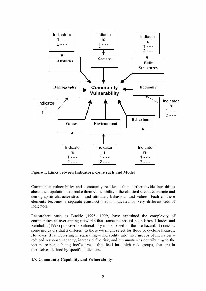
Figure 1. Links between Indicators, Constructs and Model Community vulnerability and community resilience then further divide into things about the population that make them vulnerability – the classical social, economic and demographic characteristics – and attitudes, behaviour and values. Each of these elements becomes a separate construct that is indicated by very different sets of indicators. Researchers such as Buckle (1995, 1999) have examined the complexity of communities as overlapping networks that transcend spatial boundaries. Rhodes and Reinholdt (1998) proposed a vulnerability model based on the fire hazard. It contains some indicators that a different to those we might select for flood or cyclone hazards. However, it is interesting in separating vulnerability into three groups of indicators – reduced response capacity, increased fire risk, and circumstances contributing to the victim' response being ineffective – that feed into high risk groups, that are in themselves defined by specific indicators. 1.7. Community Capability and Vulnerability
9
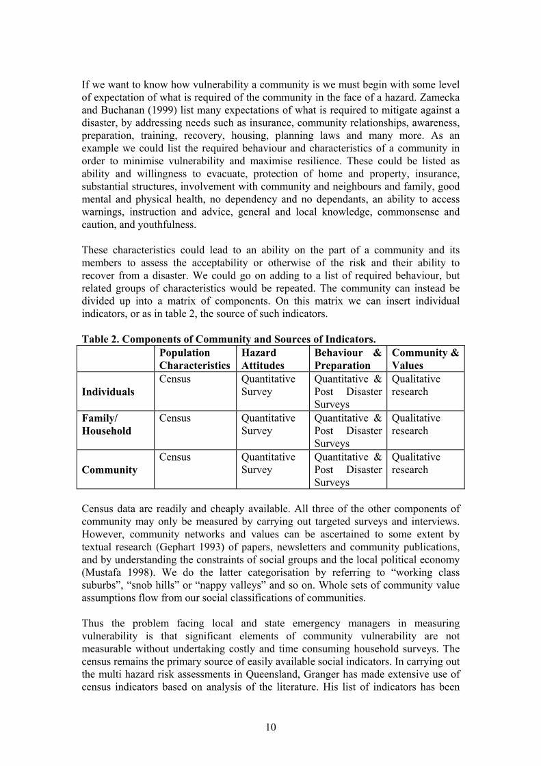
If we want to know how vulnerability a community is we must begin with some level of expectation of what is required of the community in the face of a hazard. Zamecka and Buchanan (1999) list many expectations of what is required to mitigate against a disaster, by addressing needs such as insurance, community relationships, awareness, preparation, training, recovery, housing, planning laws and many more. As an example we could list the required behaviour and characteristics of a community in order to minimise vulnerability and maximise resilience. These could be listed as ability and willingness to evacuate, protection of home and property, insurance, substantial structures, involvement with community and neighbours and family, good mental and physical health, no dependency and no dependants, an ability to access warnings, instruction and advice, general and local knowledge, commonsense and caution, and youthfulness. These characteristics could lead to an ability on the part of a community and its members to assess the acceptability or otherwise of the risk and their ability to recover from a disaster. We could go on adding to a list of required behaviour, but related groups of characteristics would be repeated. The community can instead be divided up into a matrix of components. On this matrix we can insert individual indicators, or as in table 2, the source of such indicators. Table 2. Components of Community and Sources of Indicators. Population
Characteristics Hazard Attitudes
Behaviour & Preparation
Community & Values
Individuals
Census Quantitative Survey
Quantitative & Post Disaster Surveys
Qualitative research
Family/ Household
Census Quantitative Survey
Quantitative & Post Disaster Surveys
Qualitative research
Community
Census Quantitative Survey
Quantitative & Post Disaster Surveys
Qualitative research
Census data are readily and cheaply available. All three of the other components of community may only be measured by carrying out targeted surveys and interviews. However, community networks and values can be ascertained to some extent by textual research (Gephart 1993) of papers, newsletters and community publications, and by understanding the constraints of social groups and the local political economy (Mustafa 1998). We do the latter categorisation by referring to “working class suburbs”, “snob hills” or “nappy valleys” and so on. Whole sets of community value assumptions flow from our social classifications of communities. Thus the problem facing local and state emergency managers in measuring vulnerability is that significant elements of community vulnerability are not measurable without undertaking costly and time consuming household surveys. The census remains the primary source of easily available social indicators. In carrying out the multi hazard risk assessments in Queensland, Granger has made extensive use of census indicators based on analysis of the literature. His list of indicators has been
10
refined as the studies have developed, but most importantly the indicators are grounded firmly in a model of vulnerability. Five elements of vulnerability are identified as the setting, shelter, sustenance, security and society. The setting is primarily made up of indicators that reflect external factors of the place and its infrastructure, but population variables such as total population, density and the sex ratio (because this indicates special purpose institutions like nursing homes and boarding schools) were incorporated. Shelter is primarily concerned with indicators of the structures and uses census indicators on houses and population to calculate ratios such as occupancy etc. and derives indicators on vehicle ownership. Sustenance is entirely concerned with lifelines and logistics. Security is concerned with community health welfare and economy, alongside safety. Social indicators derived from the census include SEIFA indexes as individual indicators, demographic groups and things like renting and unemployment rates. Thus the society element which is primarily concerned with characteristics of the community and its members, is only one of the elements to use census derived indicators. By combining the elements at risk with vulnerability, into an interlinked set of five elements of vulnerability, Granger (1999) has established a carefully constructed model of indicators that are both physical and social, and composites of both. The advantage of this model for emergency managers is that it utilises easily available data. It is made up information that should be in the disaster plan, plus the five yearly census. The selection of the social indicators is based on the definitions of the elements of vulnerability in the model. Thus rather than debate the pros and cons of different variables, or attempt to weight some of the indicators, which we know will change the ranking of individuals communities, it is worthwhile refining the Granger model towards adoption as a standard for measuring vulnerability. If we use a standard in all locations as a basis for vulnerability to multi hazards, measurements can be recalculated and added to relatively easily, thereby maintaining a continually available classification of community vulnerability for all communities. 1.8. Summary There are considerable complications and constraints surrounding the use of social indicators in measuring community vulnerability to natural hazards. Despite that, many types of indicators are readily available for use by emergency managers and councils. Therefore there are three basic conclusions that need stating. Firstly social indicators should not be developed without a theoretical model or construct. That idea must be defined and created first with the indicators selected as tools to serve the model. Secondly it is possible to generate a standardised working model that relies on a fixed set of tested indicators. Thirdly, such a model of vulnerability will necessarily be based upon existing data that can easily be updated. Inevitably this type of model will exclude the extremely important components of vulnerability that are encapsulated in awareness and preparedness. Surveys that ascertain people’s attitudes and behaviour cannot be carried out by every council, and besides these should also be relatively standardised. However, it remains critically important to continue researching these components so that the relationship between a model of community vulnerability based on social and built structure indicators, can be linked to awareness
11

and preparedness, and critical indicators developed that may be used to modify or qualify the model.
12
2. General Methodological Considerations 2.1. Ranking and Degrees of Freedom If Cairns’ vulnerability is assessed at the suburb level there are 43 spatial units (of which 40 contain a population), whereas at the Census Collection District (CD) level there are 183 units. A methodological question is whether or not the greater number of CDs is any more statistically robust than the smaller number of suburbs. There are three specific issues. 1. Forty or 39 degrees of freedom is adequate for most of the statistical tests that we
commonly use. Furthermore the spatial units are not a sample. They are places in an absolute sense.
2. The methodology for vulnerability assessment is intended to be applied to any Local Government Area (LGA). Most will not be able to use suburbs because they are too small, or are rural. In many cases the LGA will comprise a very small number of CDs (ie. Burke Shire with 6) such that the total number of spatial units cannot be an issue.
3. Ranking is relative. A ranking of CDs is not necessarily comparable to a ranking of suburbs. Within each set of spatial units vulnerability is relative to the other units. Each vulnerability ranking is a separate, discrete scale.
2.2. Ranking, Standardisation and Scale The values in each variable have to be standardised because of their extreme variability of scale. Amongst the infrastructural indicators many numbers are very small, while population figures run into thousands, and SEIFA indexes are based around a mean of 1,000. These values also rise or fall according to their relationship to vulnerability. Raw values cannot be used in any useful way as a composite indicator. A simple and commonly used standardisation is conversion of raw values to percentages. Percentages are as effective as rank values in making comparisons between areas. However, this form of standardisation suffers several flaws. Firstly the percentage is on a fixed scale of 0 to 100 that cannot take account of the direction of correlation unless further manipulation is made of the data. Inverting the variable turns it into something other than a percentage. Secondly the SEIFA indexes are based on mean and standard deviation and cannot convert to a percentage scale. Thirdly percentages standardise suburbs. They equalise a suburb with 100 people against a suburb with 10,000. Rates do much the same as percentages and suffer the same flaws in terms of standardisation. Logarithms of values may be used to normalise variables, but the most commonly used is the Z score. A large number of statistical tests employ Z scores as the basis of normalising distributions and standardising scores. In statistical packages, such as SPSS, the Z score is usually the default for normalising data. Thus many sophisticated statistical methods that may be used as alternative routes to defining vulnerability are based on the Z score, or a similar normalisation and standardisation. The Z score is a parametric statistic that thereby allows a greater range of statistical methods than ranking, which is a non-parametric statistic. Both statistics share characteristics. They
13
make allowance for the total population size and the range of the data, and they are capable of taking account of both negatively and positively correlated variables. The major difference between them is the scale on which they operate. The variables have been standardised by ranking them according to perceived vulnerability. The decision to rank in ascending or descending order is according to the negative or positive value of the correlation. Thus the ranking numbers can be aggregated etc. without the complication of a negative relationship (for example the SEIFA disadvantage index against the SEIFA education and occupation index). Ranking is an equal interval ordinal scale that reduces all gaps between cases to the same value. It thus reduces the variability of the range of values and smooths out skews and clumps. It can be argued quite legitimately that if the application of the information is to deal with a hierarchy of needs, this is not a problem. On the other hand rank 1 is not necessarily twice as vulnerable as rank 2 or 3 times as vulnerable as rank 3. The problem may be that 10,000 people are vulnerable in rank 1 suburb, and 1,000 in rank 2 and 950 in rank 3. Ranking will point to a hierarchy of emergency management responses, but will reduce the scale of the problem. However, the composite vulnerability assessment does not function as crudely as this, because it consists of a range of indicators that are both diverse and qualitatively separate. The Z score is based on the mean and standard deviation of the values, thereby making a greater allowance for the variability of the data spread. Thus a vulnerability assessment based on parametric data such as Z scores is on a scale that is both relative and absolute, while the non parametric values created by ranking are only relative. Therefore the basic questions in analysing different methodologies are 1) whether it really matters if vulnerability is relative or absolute, and 2) whether there is any real difference in the results of different methods to assess
vulnerability.
The statistical analysis that follows addresses a number of analytical questions within the broad framework of these two questions.
14
3. Statistical Analysis 3.1. Research Plan 1. Examine the structure of the data and look at the ability of the groups to
distinguish groups that are significantly different at a multivariate level (MRPP). 2. Describe the different possible methods. 3. Compare the different methods at a ranking level, and calculate correlations and
residuals. Establish what sites come out regularly, and what variables seem to drive this. What aspects of the methods make them vulnerable?
4. Compare the different methods at a group level, the proportion of suburbs that disagree, what suburbs disagree, and why?
5. Cluster the different methods of ranking. Which are closer, and more distant, as in McArdle.
6. Carry out chi-squared tests to compare differences between rankings generated through suburbs and through collection districts.
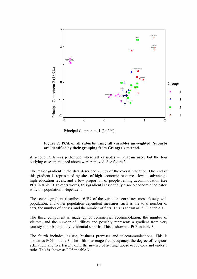
3.2. Overall Look At The Data Structure And Testing For Multivariate Differences The overall structure of the data was investigated by Principal Components Analysis (PCA). The initial step involved looking at an overall ordination to examine the overall distribution of suburbs in ordinal space, and in particular to check for outlying suburbs. Therefore, a Principal Components Analysis was conducted using all suburbs, ordinated by all variables. Original variable values are used, but are standardised using z-scores as per the default (SPSS version 9.0), thus allowing the inclusion of variables which are subject to different scales of measurement. The first two dimensions explain 53.2% of the variation (Figure 1), and clearly, four sites group out strongly as outliers (Kamma, Lamb Range, McAlister Range and Wright’s Creek). These are the areas with no population, and therefore very little or no infrastructure of any sort. For this reason, they were removed from a second analysis. The symbols in both figures 2 and 3 represent the overall vulnerability analysis carried out by Granger (1999), based on the ranking method. Thus symbol 4 is least vulnerable through to 1 which is the most vulnerable group. The figures therefore illustrate the level of concurrence between ranked values and PCA.
15
Principal Component 1 (34.3%)
210-1-2-3
Prin
cipa
l Com
pone
nt 2
(18.
9%)
3
2
1
0
-1
-2
Groups
4
3
2
1
Wright's Creek
Westcourt
Stratford
Portsmith
Parramatta Park
Mount Peter
Manunda
Manoora
Lamb Range SF
Kamma
CityCairns North
Bentley Park
Aeroglen
Figure 2: PCA of all suburbs using all variables unweighted. Suburbs are identified by their grouping from Granger’s method.
A second PCA was performed where all variables were again used, but the four outlying cases mentioned above were removed. See figure 3. The major gradient in the data described 28.7% of the overall variation. One end of this gradient is represented by sites of high economic resources, low disadvantage, high education levels, and a low proportion of people renting accommodation (see PC1 in table 3). In other words, this gradient is essentially a socio economic indicator, which is population independent. The second gradient describes 16.3% of the variation, correlates most closely with population, and other population-dependent measures such as the total number of cars, the number of houses, and the number of flats. This is shown as PC2 in table 3. The third component is made up of commercial accommodation, the number of visitors, and the number of utilities and possibly represents a gradient from very touristy suburbs to totally residential suburbs. This is shown as PC3 in table 3. The fourth includes logistic, business premises and telecommunications. This is shown as PC4 in table 3. The fifth is average flat occupancy, the degree of religious affiliation, and to a lesser extent the inverse of average house occupancy and under 5 ratio. This is shown as PC5 in table 3.
16
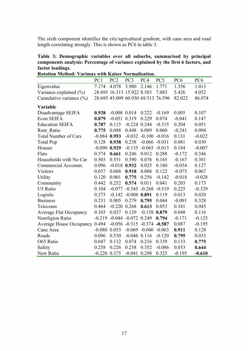
The sixth component identifies the city/agricultural gradient, with cane area and road length correlating strongly. This is shown as PC6 in table 3. Table 3: Demographic variables over all suburbs, summarised by principal components analysis: Percentage of variance explained by the first 6 factors, and factor loadings. Rotation Method: Varimax with Kaiser Normalisation. PC1 PC2 PC3 PC4 PC5 PC6 PC6 Eigenvalue 7.174 4.078 3.980 2.146 1.771 1.356 1.013 Variance explained (%) 28.695 16.313 15.922 8.583 7.083 5.426 4.052 Cumulative variance (%) 28.695 45.009 60.930 69.513 76.596 82.022 86.074
Variable Disadvantage SEIFA 0.938 -0.008 0.014 0.222 -0.169 0.005 0.107 Econ SEIFA 0.879 -0.051 0.319 0.229 0.074 -0.041 0.147 Education SEIFA 0.787 0.115 -0.224 0.244 -0.315 0.204 0.051 Rent_Ratio 0.775 0.088 0.448 0.089 0.060 -0.241 0.094 Total Number of Cars -0.084 0.953 -0.032 -0.100 -0.016 0.131 -0.022 Total Pop 0.128 0.938 0.238 -0.066 -0.031 0.081 0.030 Houses -0.090 0.929 -0.135 -0.065 -0.013 0.184 -0.007 Flats 0.374 0.661 0.246 0.012 0.288 -0.172 0.346 Households with No Car 0.503 0.551 0.390 0.076 0.165 -0.167 0.301 Commercial Accomm. 0.096 -0.018 0.932 0.025 0.180 -0.034 0.127 Visitors 0.037 0.068 0.918 0.008 0.122 -0.075 0.067 Utility 0.120 0.001 0.775 0.256 -0.142 -0.018 -0.028 Community 0.442 0.252 0.574 0.011 0.041 0.203 0.173 U5 Ratio 0.104 -0.077 -0.545 -0.268 -0.519 0.225 -0.329 Logistic 0.273 -0.142 -0.008 0.891 0.119 0.013 0.020 Business 0.231 0.005 0.279 0.795 0.044 -0.091 0.328 Telecoms 0.464 -0.220 0.268 0.613 0.053 0.341 0.045 Average Flat Occupancy 0.103 0.037 0.129 -0.158 0.879 0.048 0.116 Noreligion Ratio -0.219 -0.044 -0.072 0.249 0.794 -0.171 -0.125 Average House Occupancy 0.494 -0.056 -0.315 -0.374 -0.587 0.087 -0.195 Cane Area -0.080 0.053 -0.069 -0.040 -0.063 0.911 0.128 Roads 0.096 0.530 -0.046 0.116 -0.129 0.795 0.033 O65 Ratio 0.047 0.112 0.074 0.216 0.339 0.133 0.775 Safety 0.258 0.226 0.238 0.352 -0.086 0.033 0.644 New Ratio -0.220 0.375 -0.041 0.298 0.325 -0.195 -0.610
17
Principal Component 1 (28.7%)
543210-1-2
Prin
cipa
l Com
pone
nt 2
(16.
3%)
3
2
1
0
-1
-2
Groups
4
3
2
1
Yorkeys Knob
Yarrabah
Woree
Whitfield
White Rock
Westcourt
Trinity ParkTrinity East
Trinity Beach
Stratford
SmithfieldRedlynch
Portsmith
Parramatta Park
Palm Cove
Mount Sheridan
Mount Peter
Mooroobool
Manunda
Manoora
Machans Beach
Kewarra Beach
KanimblaKamerunga
Holloways Beach
Gordonvale
Freshwater
Edmonton
Edge Hill
Earlville
Clifton Beach
City
Caravonica
Cairns North
Brinsmead
Bentley Park
Bayview Heights
Barron
Aeroglen
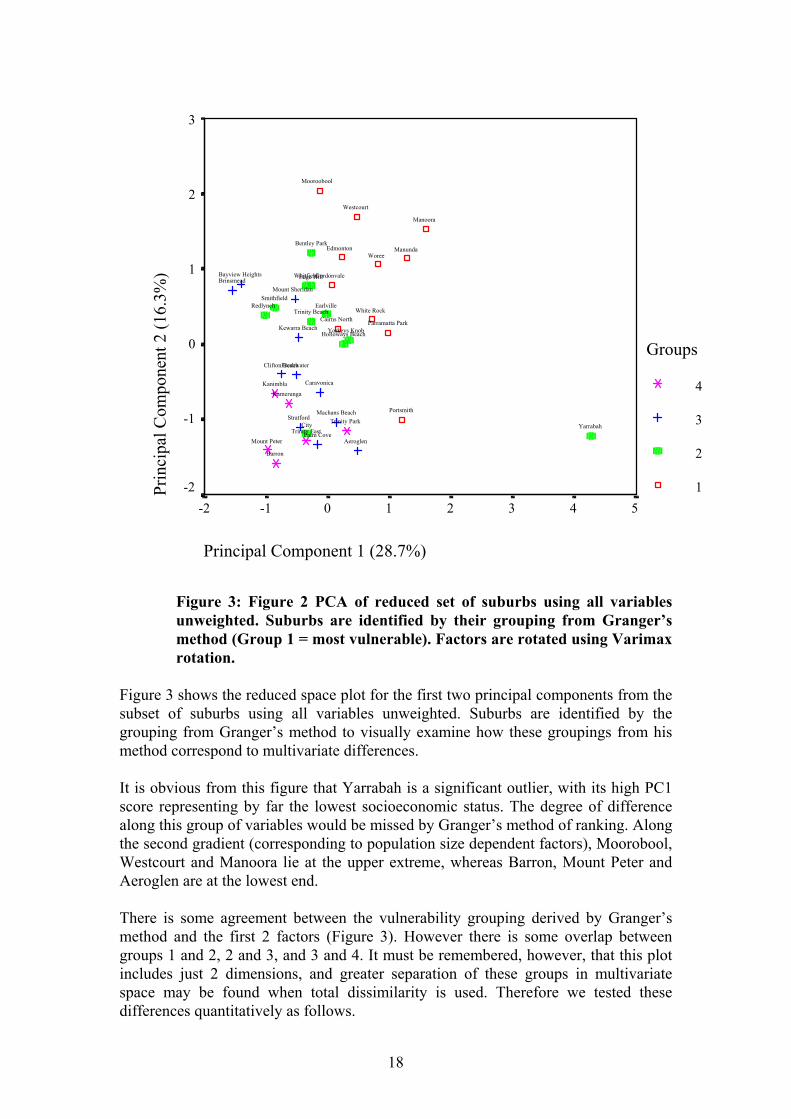
Figure 3: Figure 2 PCA of reduced set of suburbs using all variables unweighted. Suburbs are identified by their grouping from Granger’s method (Group 1 = most vulnerable). Factors are rotated using Varimax rotation.
Figure 3 shows the reduced space plot for the first two principal components from the subset of suburbs using all variables unweighted. Suburbs are identified by the grouping from Granger’s method to visually examine how these groupings from his method correspond to multivariate differences. It is obvious from this figure that Yarrabah is a significant outlier, with its high PC1 score representing by far the lowest socioeconomic status. The degree of difference along this group of variables would be missed by Granger’s method of ranking. Along the second gradient (corresponding to population size dependent factors), Moorobool, Westcourt and Manoora lie at the upper extreme, whereas Barron, Mount Peter and Aeroglen are at the lowest end. There is some agreement between the vulnerability grouping derived by Granger’s method and the first 2 factors (Figure 3). However there is some overlap between groups 1 and 2, 2 and 3, and 3 and 4. It must be remembered, however, that this plot includes just 2 dimensions, and greater separation of these groups in multivariate space may be found when total dissimilarity is used. Therefore we tested these differences quantitatively as follows.
18
3.3. Research Question Do the four groupings derived by Granger significantly differ in a multivariate sense. In other words, do the added-up ranks of weighted variables create groups that are truly different from one-another when one uses all original variables. To test this we used Multi-Response Permutation Procedures (MRPP). MRPP is a non-parametric procedure for testing the hypothesis of no difference between 2 or more groups of entities (in this case, it is the difference between groups of suburbs). Software used was PC-ORD, version 2.05. MjM Software, Oregon. The data were standardised by z-scores, the Euclidean distance measure was used, and groups were weighted by the default (n/sum{n}). Strictly speaking, groups should be derived a priori and groups should not be derived from the same data that is being tested (Zimmerman et al. 1985). However in this instance the grouping technique (Granger’s method) was very much removed from the multivariate distance measures used in MRPP. Unlike MRPP, the former uses ranks rather than standardised variable values, weights variables, and simply adds variables to create a univariate measure. It was therefore felt that a conservative interpretation of this method is justified. Initially, all 4 groups were compared. The result was highly significant (Table 3), so pairwise tests were then conducted. To guard against Type I error, however, Bonferroni corrected significance levels were used (alpha{.05} = 5/p%, where p is the number of tests). With 6 separate post hoc tests, the significance level then becomes (5/6)% = 0.83%. The two most vulnerable groups (1 and 2) were not significantly different, and neither were 2 and 3. All other comparisons showed strong multivariate separation. Therefore, Granger’s method (when applied to the Cairns data at least), results in vulnerability groups that are not significantly different in a multivariate sense, except for group 4, which is probably driven by the outliers (Kamma, Lamb Range, McAlister Range and Wright’s Creek).
19
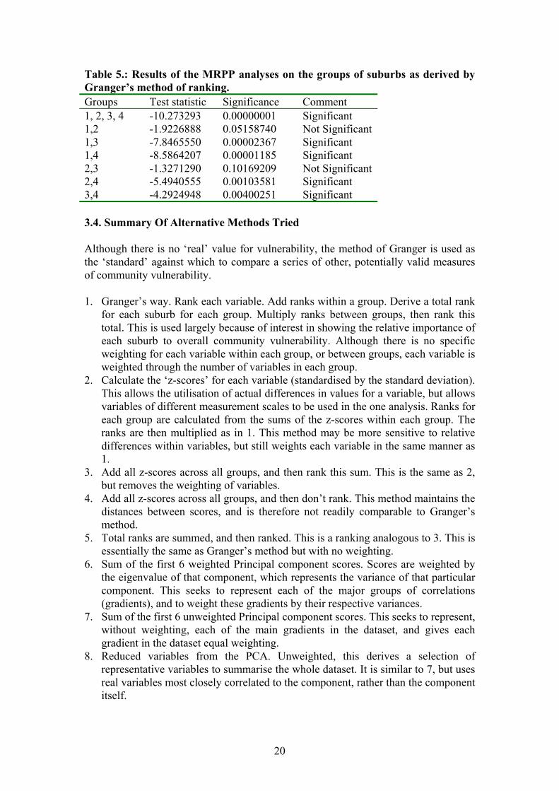
Table 5.: Results of the MRPP analyses on the groups of suburbs as derived by Granger’s method of ranking. Groups Test statistic Significance Comment 1, 2, 3, 4 -10.273293 0.00000001 Significant 1,2 -1.9226888 0.05158740 Not Significant1,3 -7.8465550 0.00002367 Significant 1,4 -8.5864207 0.00001185 Significant 2,3 -1.3271290 0.10169209 Not Significant2,4 -5.4940555 0.00103581 Significant 3,4 -4.2924948 0.00400251 Significant 3.4. Summary Of Alternative Methods Tried Although there is no ‘real’ value for vulnerability, the method of Granger is used as the ‘standard’ against which to compare a series of other, potentially valid measures of community vulnerability. 1. Granger’s way. Rank each variable. Add ranks within a group. Derive a total rank
for each suburb for each group. Multiply ranks between groups, then rank this total. This is used largely because of interest in showing the relative importance of each suburb to overall community vulnerability. Although there is no specific weighting for each variable within each group, or between groups, each variable is weighted through the number of variables in each group.
2. Calculate the ‘z-scores’ for each variable (standardised by the standard deviation). This allows the utilisation of actual differences in values for a variable, but allows variables of different measurement scales to be used in the one analysis. Ranks for each group are calculated from the sums of the z-scores within each group. The ranks are then multiplied as in 1. This method may be more sensitive to relative differences within variables, but still weights each variable in the same manner as 1.
3. Add all z-scores across all groups, and then rank this sum. This is the same as 2, but removes the weighting of variables.
4. Add all z-scores across all groups, and then don’t rank. This method maintains the distances between scores, and is therefore not readily comparable to Granger’s method.
5. Total ranks are summed, and then ranked. This is a ranking analogous to 3. This is essentially the same as Granger’s method but with no weighting.
6. Sum of the first 6 weighted Principal component scores. Scores are weighted by the eigenvalue of that component, which represents the variance of that particular component. This seeks to represent each of the major groups of correlations (gradients), and to weight these gradients by their respective variances.
7. Sum of the first 6 unweighted Principal component scores. This seeks to represent, without weighting, each of the main gradients in the dataset, and gives each gradient in the dataset equal weighting.
8. Reduced variables from the PCA. Unweighted, this derives a selection of representative variables to summarise the whole dataset. It is similar to 7, but uses real variables most closely correlated to the component, rather than the component itself.
20
9. Reduced variables from the PCA. Weighted, and thus again derives a selection of representative variables to summarise the whole dataset. It is similar to 6, but uses real variables most closely correlated to the component, rather than the component itself.
10. Same as 1, except the sum of the group ranks rather than the product. This will be quite similar to 1, but takes less account of wide differences in rankings of a certain group. This method might lower the amount of weighting that is placed due to the size of the groups.
21
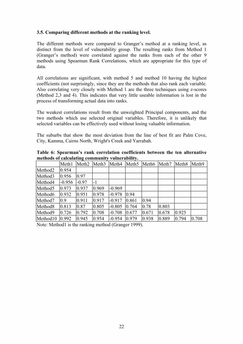
3.5. Comparing different methods at the ranking level. The different methods were compared to Granger’s method at a ranking level, as distinct from the level of vulnerability group. The resulting ranks from Method 1 (Granger’s method) were correlated against the ranks from each of the other 9 methods using Spearman Rank Correlations, which are appropriate for this type of data. All correlations are significant, with method 5 and method 10 having the highest coefficients (not surprisingly, since they are the methods that also rank each variable. Also correlating very closely with Method 1 are the three techniques using z-scores (Method 2,3 and 4). This indicates that very little useable information is lost in the process of transforming actual data into ranks. The weakest correlations result from the unweighted Principal components, and the two methods which use selected original variables. Therefore, it is unlikely that selected variables can be effectively used without losing valuable information. The suburbs that show the most deviation from the line of best fit are Palm Cove, City, Kamma, Cairns North, Wright's Creek and Yarrabah. Table 6: Spearman’s rank correlation coefficients between the ten alternative methods of calculating community vulnerability. Meth1 Meth2 Meth3 Meth4 Meth5 Meth6 Meth7 Meth8 Meth9 Method2 0.954 Method3 0.956 0.97 Method4 -0.956 -0.97 -1 Method5 0.973 0.937 0.969 -0.969 Method6 0.932 0.951 0.978 -0.978 0.94 Method7 0.9 0.911 0.917 -0.917 0.861 0.94 Method8 0.813 0.87 0.805 -0.805 0.764 0.78 0.803 Method9 0.726 0.792 0.708 -0.708 0.677 0.671 0.678 0.925 Method10 0.992 0.945 0.954 -0.954 0.979 0.938 0.889 0.794 0.708 Note: Method1 is the ranking method (Granger 1999).
22
a.
METHOD1
50403020100
MET
HO
D2
50
40
30
20
10
0
WhitfielWhite Ro
Smithfie
Palm Cov
Kamma
Freshwat
City
METHOD1
50403020100
MET
HO
D3
50
40
30
20
10
0
Whitfiel
Smithfie
Palm Cov
Kamma
Clifton
City
Cairns N
Brinsmea
b.
23
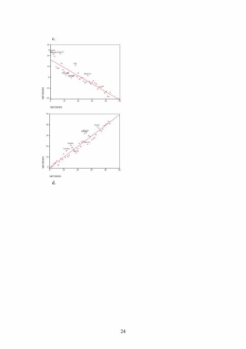
c.
METHOD1
50403020100
MET
HO
D4
30
20
10
0
-10
-20
White Ro
Westcour
SmithfiePalm Cov
Manunda
City
Cairns N
METHOD1
50403020100
MET
HO
D5
50
40
30
20
10
0
Yarrabah
SmithfiePalm Cov
Kamma
Earlvill
BrinsmeaBayview
d.
24
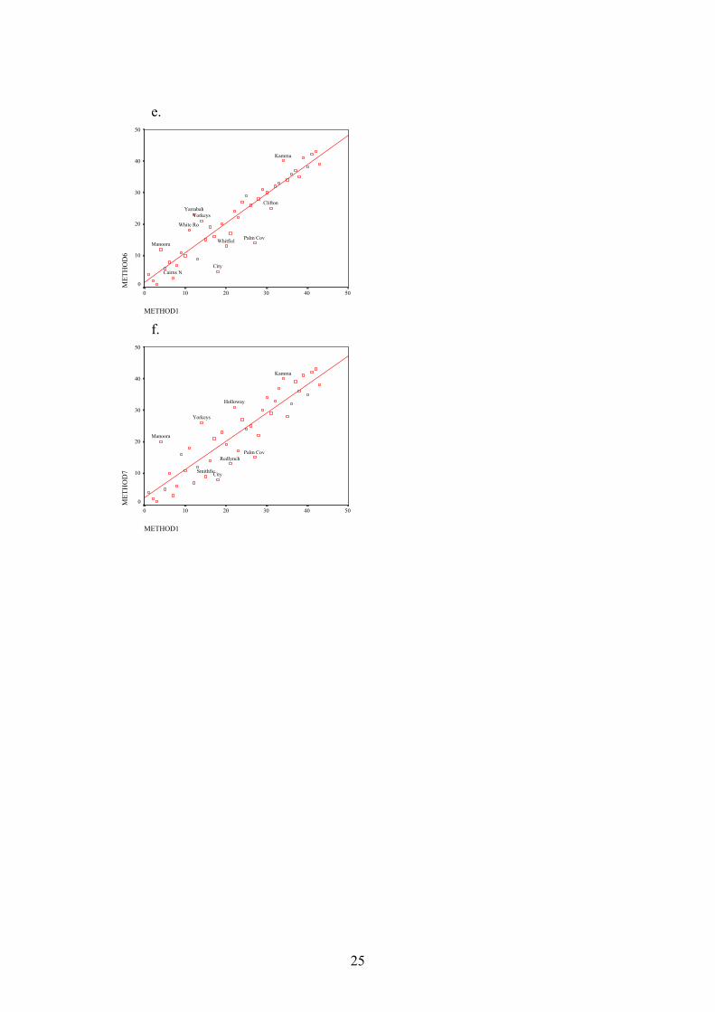
e.
METHOD1
50403020100
MET
HO
D6
50
40
30
20
10
0
YorkeysYarrabah
Whitfiel
White Ro
Palm CovManoora
Kamma
Clifton
CityCairns N
f.
METHOD1
50403020100
MET
HO
D7
50
40
30
20
10
0
Yorkeys
Smithfie
RedlynchPalm Cov
Manoora
Kamma
Holloway
City
25
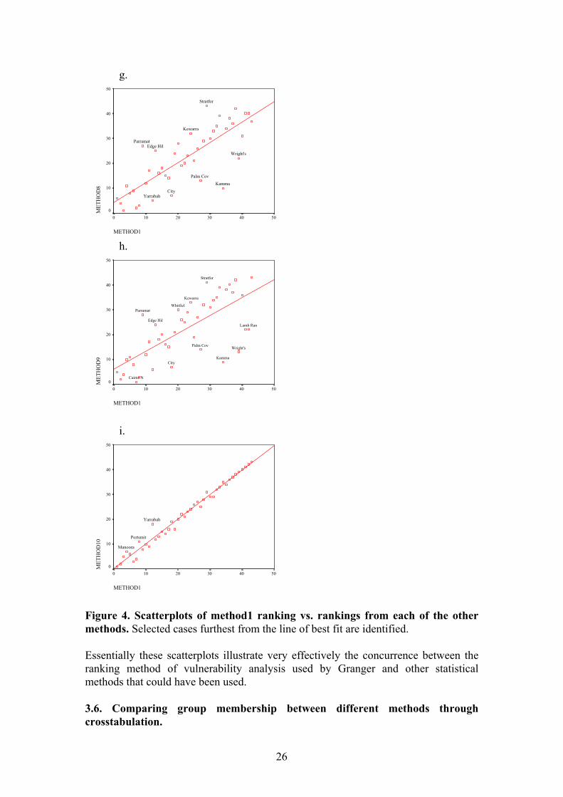
g.
METHOD1
50403020100
MET
HO
D8
50
40
30
20
10
0
Yarrabah
Wright's
Stratfor
Parramat
Palm Cov
Kewarra
Kamma
Edge Hil
City
h.
METHOD1
50403020100
MET
HO
D9
50
40
30
20
10
0
Wright's
Whitfiel
Stratfor
Parramat
Palm Cov
Lamb Ran
Kewarra
Kamma
Edge Hil
City
Cairns N
i.
METHOD1
50403020100
MET
HO
D10
50
40
30
20
10
0
Yarrabah
Portsmit
Manoora
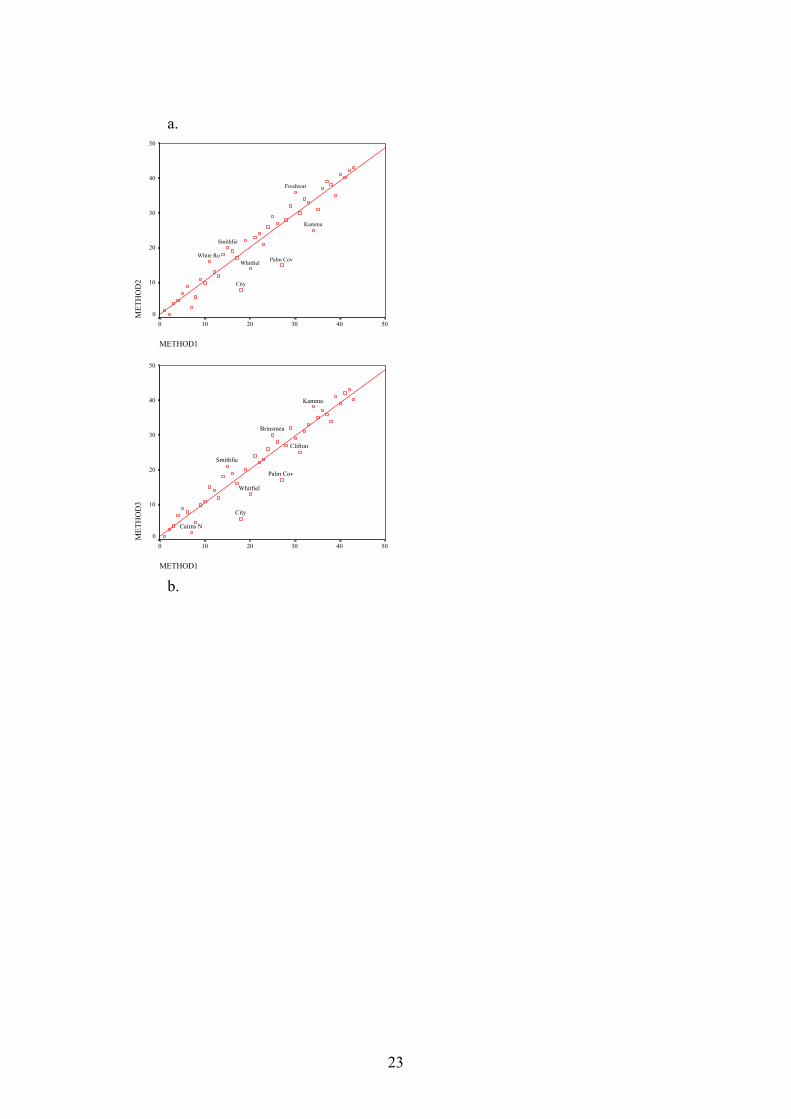
Figure 4. Scatterplots of method1 ranking vs. rankings from each of the other methods. Selected cases furthest from the line of best fit are identified. Essentially these scatterplots illustrate very effectively the concurrence between the ranking method of vulnerability analysis used by Granger and other statistical methods that could have been used. 3.6. Comparing group membership between different methods through crosstabulation.
26
This section looks at the effect of different methods on the placement of suburbs into groups as per Granger (1-4 = most vulnerable - least vulnerable). This is an important level of analysis, as this grouping level may be used in a more practical way by local councils. The degree of matching was examined by crosstabulation, whereby each alternative method was compared to the existing method (Method1). Percentage disagreement was measured, and suburbs which are placed in different groups were identified for each method. Method 10 is in perfect agreement with Method 1, although this may not be the case for all towns. It is not surprising, however, that they are closely matched, as the sole difference between the two is the manner in which the group ranks are treated. Other Methods with high levels of agreement include Methods 5, 4 and 3, with 90.7% agreement. Methods 7, 8 and 9, relate most poorly to the groupings from Method 1, reflecting the general trends found in the above correlations. Methods 2 and 6 resulted in moderate agreement with Method 1 (76.74% and 81.4% respectively). Therefore, the methods that are variations of the rank system agree most strongly with Granger’s method, with close agreement from the ungrouped z-score techniques (Methods 3 and 4). The z-score method which maintains the variable groupings (Method 2) differed from Method 1 to an unexpected degree, considering that there is a strong correlation between the ranks (Figure #, above).
27
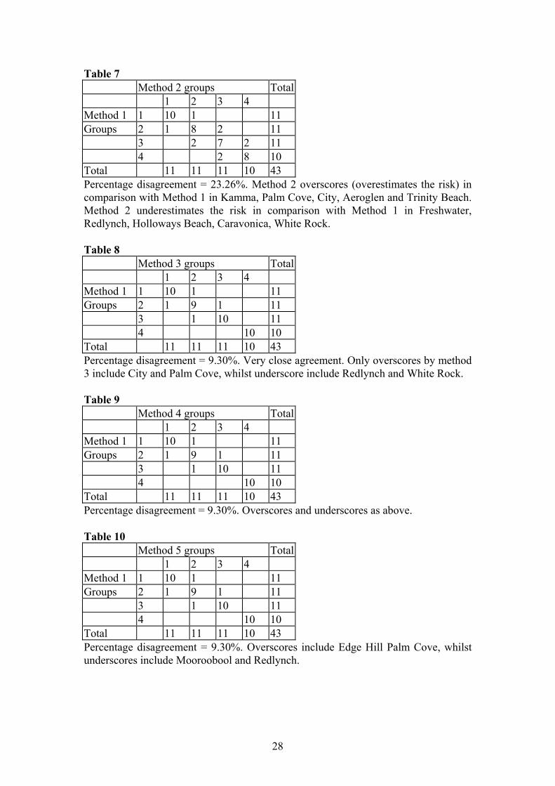
Table 7 Method 2 groups Total 1 2 3 4 Method 1 1 10 1 11 Groups 2 1 8 2 11 3 2 7 2 11 4 2 8 10 Total 11 11 11 10 43 Percentage disagreement = 23.26%. Method 2 overscores (overestimates the risk) in comparison with Method 1 in Kamma, Palm Cove, City, Aeroglen and Trinity Beach. Method 2 underestimates the risk in comparison with Method 1 in Freshwater, Redlynch, Holloways Beach, Caravonica, White Rock. Table 8 Method 3 groups Total 1 2 3 4 Method 1 1 10 1 11 Groups 2 1 9 1 11 3 1 10 11 4 10 10 Total 11 11 11 10 43 Percentage disagreement = 9.30%. Very close agreement. Only overscores by method 3 include City and Palm Cove, whilst underscore include Redlynch and White Rock. Table 9 Method 4 groups Total 1 2 3 4 Method 1 1 10 1 11 Groups 2 1 9 1 11 3 1 10 11 4 10 10 Total 11 11 11 10 43 Percentage disagreement = 9.30%. Overscores and underscores as above. Table 10 Method 5 groups Total 1 2 3 4 Method 1 1 10 1 11 Groups 2 1 9 1 11 3 1 10 11 4 10 10 Total 11 11 11 10 43 Percentage disagreement = 9.30%. Overscores include Edge Hill Palm Cove, whilst underscores include Mooroobool and Redlynch.
28
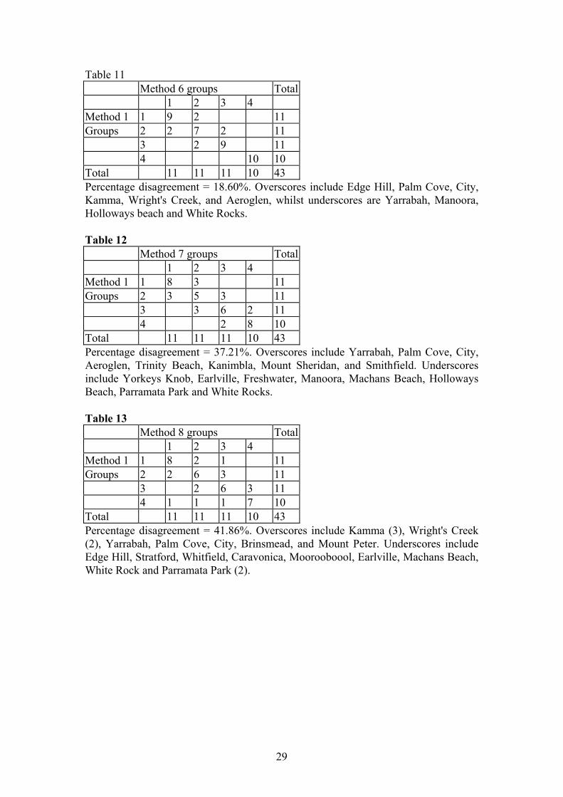
Table 11 Method 6 groups Total 1 2 3 4 Method 1 1 9 2 11 Groups 2 2 7 2 11 3 2 9 11 4 10 10 Total 11 11 11 10 43 Percentage disagreement = 18.60%. Overscores include Edge Hill, Palm Cove, City, Kamma, Wright's Creek, and Aeroglen, whilst underscores are Yarrabah, Manoora, Holloways beach and White Rocks. Table 12 Method 7 groups Total 1 2 3 4 Method 1 1 8 3 11 Groups 2 3 5 3 11 3 3 6 2 11 4 2 8 10 Total 11 11 11 10 43 Percentage disagreement = 37.21%. Overscores include Yarrabah, Palm Cove, City, Aeroglen, Trinity Beach, Kanimbla, Mount Sheridan, and Smithfield. Underscores include Yorkeys Knob, Earlville, Freshwater, Manoora, Machans Beach, Holloways Beach, Parramata Park and White Rocks. Table 13 Method 8 groups Total 1 2 3 4 Method 1 1 8 2 1 11 Groups 2 2 6 3 11 3 2 6 3 11 4 1 1 1 7 10 Total 11 11 11 10 43 Percentage disagreement = 41.86%. Overscores include Kamma (3), Wright's Creek (2), Yarrabah, Palm Cove, City, Brinsmead, and Mount Peter. Underscores include Edge Hill, Stratford, Whitfield, Caravonica, Moorooboool, Earlville, Machans Beach, White Rock and Parramata Park (2).
29
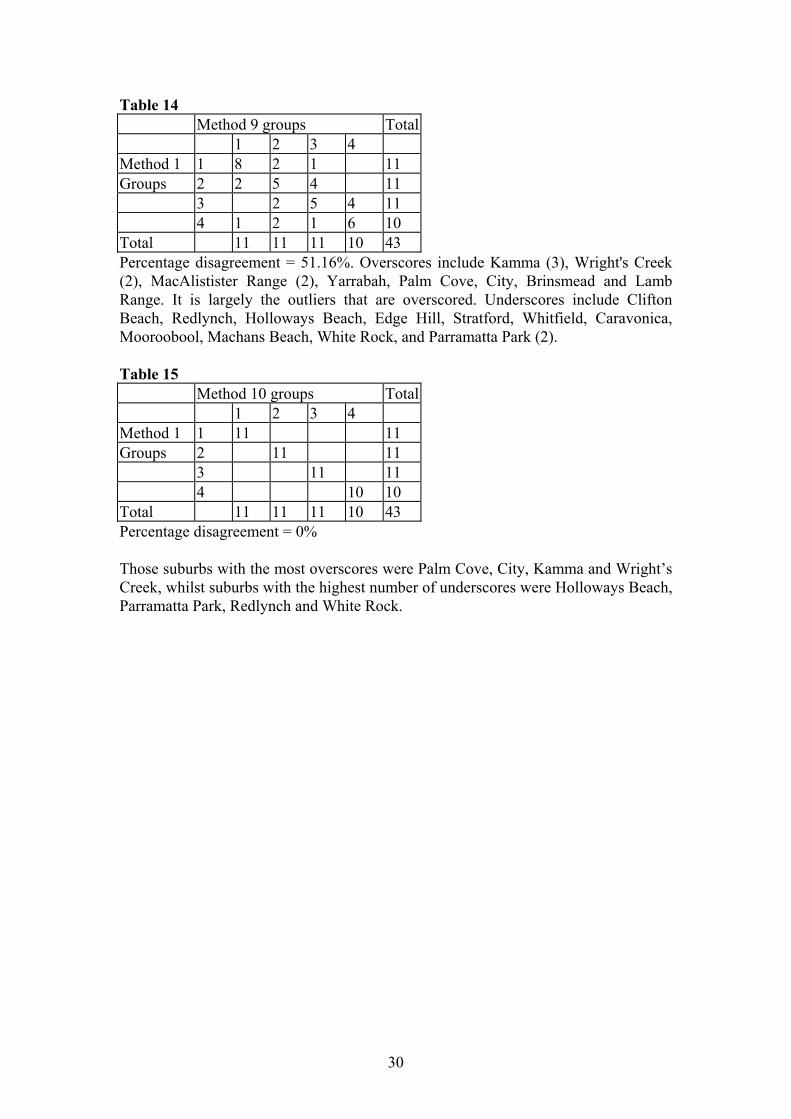
Table 14 Method 9 groups Total 1 2 3 4 Method 1 1 8 2 1 11 Groups 2 2 5 4 11 3 2 5 4 11 4 1 2 1 6 10 Total 11 11 11 10 43 Percentage disagreement = 51.16%. Overscores include Kamma (3), Wright's Creek (2), MacAlistister Range (2), Yarrabah, Palm Cove, City, Brinsmead and Lamb Range. It is largely the outliers that are overscored. Underscores include Clifton Beach, Redlynch, Holloways Beach, Edge Hill, Stratford, Whitfield, Caravonica, Mooroobool, Machans Beach, White Rock, and Parramatta Park (2). Table 15 Method 10 groups Total 1 2 3 4 Method 1 1 11 11 Groups 2 11 11 3 11 11 4 10 10 Total 11 11 11 10 43 Percentage disagreement = 0% Those suburbs with the most overscores were Palm Cove, City, Kamma and Wright’s Creek, whilst suburbs with the highest number of underscores were Holloways Beach, Parramatta Park, Redlynch and White Rock.
30
3.7. Research Question. How do the different methods of calculating overall suburb rankings compare in a multivariate sense?
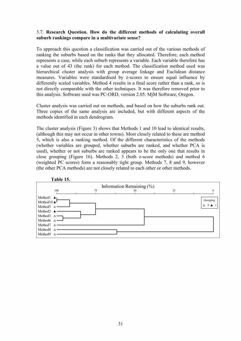
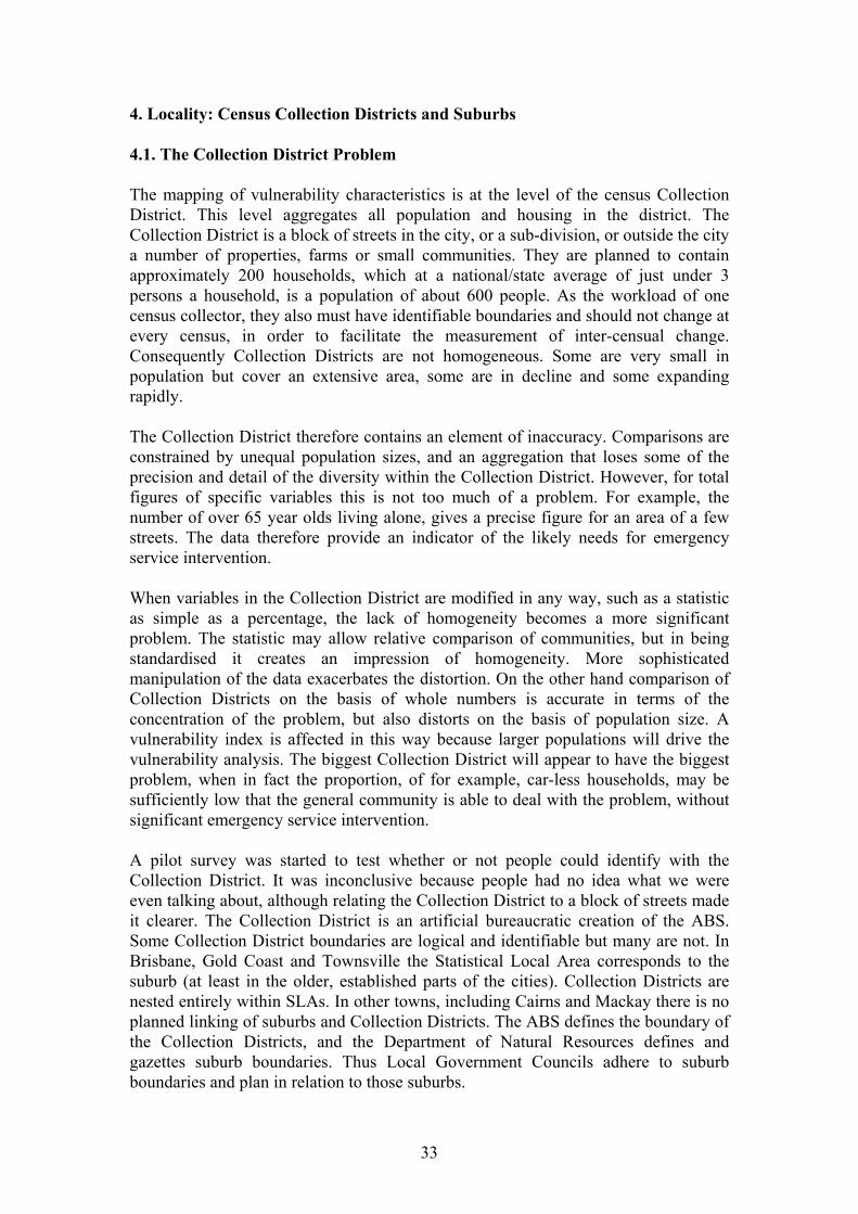
To approach this question a classification was carried out of the various methods of ranking the suburbs based on the ranks that they allocated. Therefore, each method represents a case, while each suburb represents a variable. Each variable therefore has a value out of 43 (the rank) for each method. The classification method used was hierarchical cluster analysis with group average linkage and Euclidean distance measures. Variables were standardised by z-scores to ensure equal influence by differently scaled variables. Method 4 results in a final score rather than a rank, so is not directly comparable with the other techniques. It was therefore removed prior to this analysis. Software used was PC-ORD, version 2.05. MjM Software, Oregon. Cluster analysis was carried out on methods, and based on how the suburbs rank out. Three copies of the same analysis are included, but with different aspects of the methods identified in each dendrogram. The cluster analysis (Figure 3) shows that Methods 1 and 10 lead to identical results, (although this may not occur in other towns). Most closely related to these are method 5, which is also a ranking method. Of the different characteristics of the methods (whether variables are grouped, whether suburbs are ranked, and whether PCA is used), whether or not suburbs are ranked appears to be the only one that results in close grouping (Figure 16). Methods 2, 3 (both z-score methods) and method 6 (weighted PC scores) form a reasonably tight group. Methods 7, 8 and 9, however (the other PCA methods) are not closely related to each other or other methods. Table 15.
Information Remaining (%)100 75 50 25 0
Method1Method10Method5Method2Method3Method6Method7Method8Method9
Grouping
0 1
31
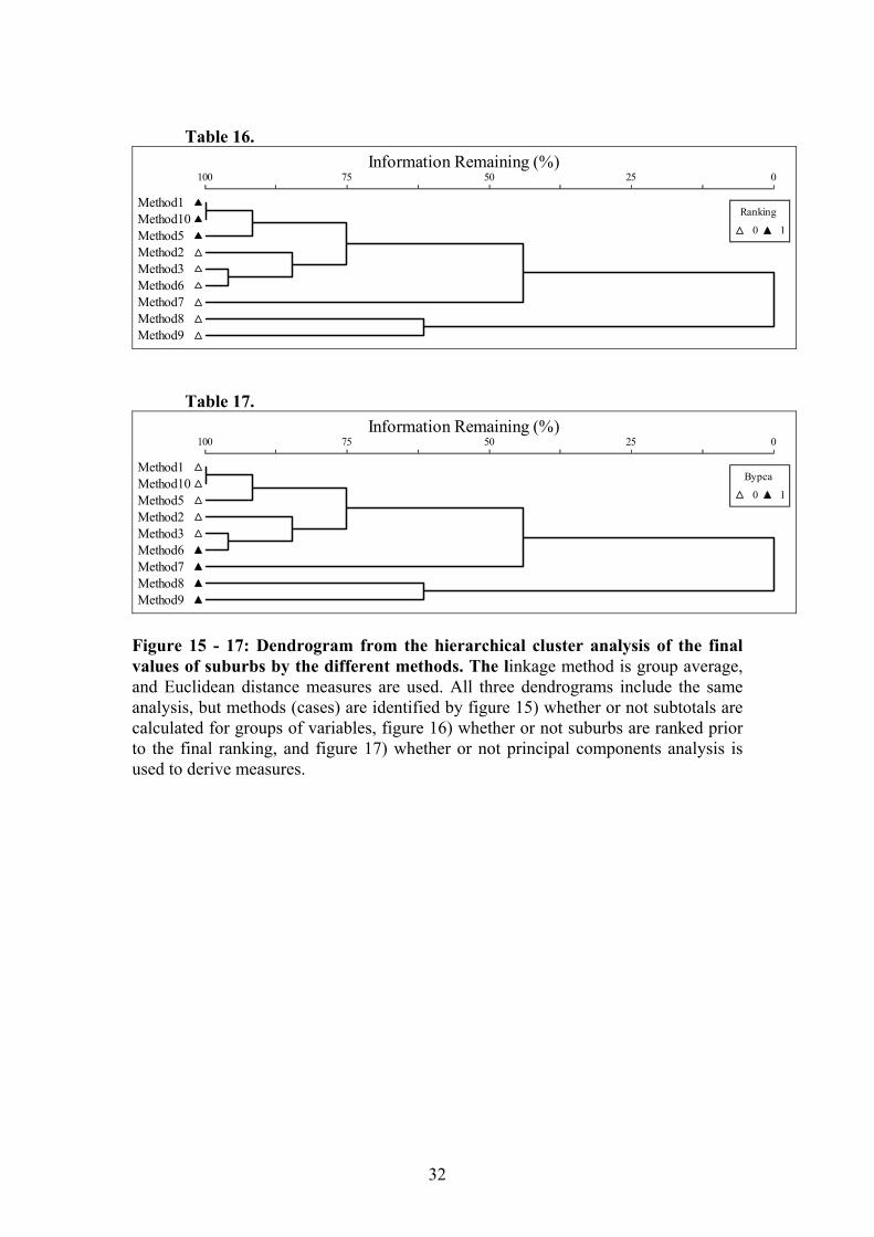
Table 16.
Information Remaining (%)100 75 50 25 0
Method1Method10Method5Method2Method3Method6Method7Method8Method9
Ranking
0 1
Table 17.
Information Remaining (%)100 75 50 25 0
Method1Method10Method5Method2Method3Method6Method7Method8Method9
Bypca
0 1
Figure 15 - 17: Dendrogram from the hierarchical cluster analysis of the final values of suburbs by the different methods. The linkage method is group average, and Euclidean distance measures are used. All three dendrograms include the same analysis, but methods (cases) are identified by figure 15) whether or not subtotals are calculated for groups of variables, figure 16) whether or not suburbs are ranked prior to the final ranking, and figure 17) whether or not principal components analysis is used to derive measures.
32
4. Locality: Census Collection Districts and Suburbs 4.1. The Collection District Problem The mapping of vulnerability characteristics is at the level of the census Collection District. This level aggregates all population and housing in the district. The Collection District is a block of streets in the city, or a sub-division, or outside the city a number of properties, farms or small communities. They are planned to contain approximately 200 households, which at a national/state average of just under 3 persons a household, is a population of about 600 people. As the workload of one census collector, they also must have identifiable boundaries and should not change at every census, in order to facilitate the measurement of inter-censual change. Consequently Collection Districts are not homogeneous. Some are very small in population but cover an extensive area, some are in decline and some expanding rapidly. The Collection District therefore contains an element of inaccuracy. Comparisons are constrained by unequal population sizes, and an aggregation that loses some of the precision and detail of the diversity within the Collection District. However, for total figures of specific variables this is not too much of a problem. For example, the number of over 65 year olds living alone, gives a precise figure for an area of a few streets. The data therefore provide an indicator of the likely needs for emergency service intervention. When variables in the Collection District are modified in any way, such as a statistic as simple as a percentage, the lack of homogeneity becomes a more significant problem. The statistic may allow relative comparison of communities, but in being standardised it creates an impression of homogeneity. More sophisticated manipulation of the data exacerbates the distortion. On the other hand comparison of Collection Districts on the basis of whole numbers is accurate in terms of the concentration of the problem, but also distorts on the basis of population size. A vulnerability index is affected in this way because larger populations will drive the vulnerability analysis. The biggest Collection District will appear to have the biggest problem, when in fact the proportion, of for example, car-less households, may be sufficiently low that the general community is able to deal with the problem, without significant emergency service intervention. A pilot survey was started to test whether or not people could identify with the Collection District. It was inconclusive because people had no idea what we were even talking about, although relating the Collection District to a block of streets made it clearer. The Collection District is an artificial bureaucratic creation of the ABS. Some Collection District boundaries are logical and identifiable but many are not. In Brisbane, Gold Coast and Townsville the Statistical Local Area corresponds to the suburb (at least in the older, established parts of the cities). Collection Districts are nested entirely within SLAs. In other towns, including Cairns and Mackay there is no planned linking of suburbs and Collection Districts. The ABS defines the boundary of the Collection Districts, and the Department of Natural Resources defines and gazettes suburb boundaries. Thus Local Government Councils adhere to suburb boundaries and plan in relation to those suburbs.
33
Table 18. Congruence between Census Collection Districts and Suburbs in Cairns Suburb Name Number of CDs Wholly
within suburb boundary Number of CDs Overlapping suburb boundary
MacAlister Range 1 1 Palm Cove 2 Clifton Beach 3 1 Kewarra Beach 3 3 Trinity Beach 5 3 Trinity Park 0 2 Yorkeys Knob 5 2 Holloways Beach 5 2 Machans Beach 5 2 Smithfield 4 3 Kamerunga 0 1 Barron 1 3 Aeroglen 0 1 Caravonica 2 3 Stratford 0 3 Freshwater 4 1 Redlynch 1 3 Brinsmead 4 2 Whitfield 4 2 Edge Hill 7 1 Manunda 11 Manoora 8 Small portion Kanimbla 1 Small portion Mooroobool 8 2 Cairns North 9 1 City 4 Portsmith 3 Trinity East 0 2 Earlville 5 1 Westcourt 12 1 Paramatta Park 8 Woree 7 3 Bayview Heights 4 3 Mount Sheridan 3 4 White Rock 3 2 Bentley Park 2 3 Edmonton 7 7 Wright’s Creek 0 3 Kamma 0 3 Mount Peter 0 2 Gordonvale 8 3 Lamb Range 0 4 Yarrabah 1 1 Total 160 84 Because suburb boundaries follow many of the same features that are used by Collection Districts, there is often a reasonable level of congruence. Table 18 shows
34
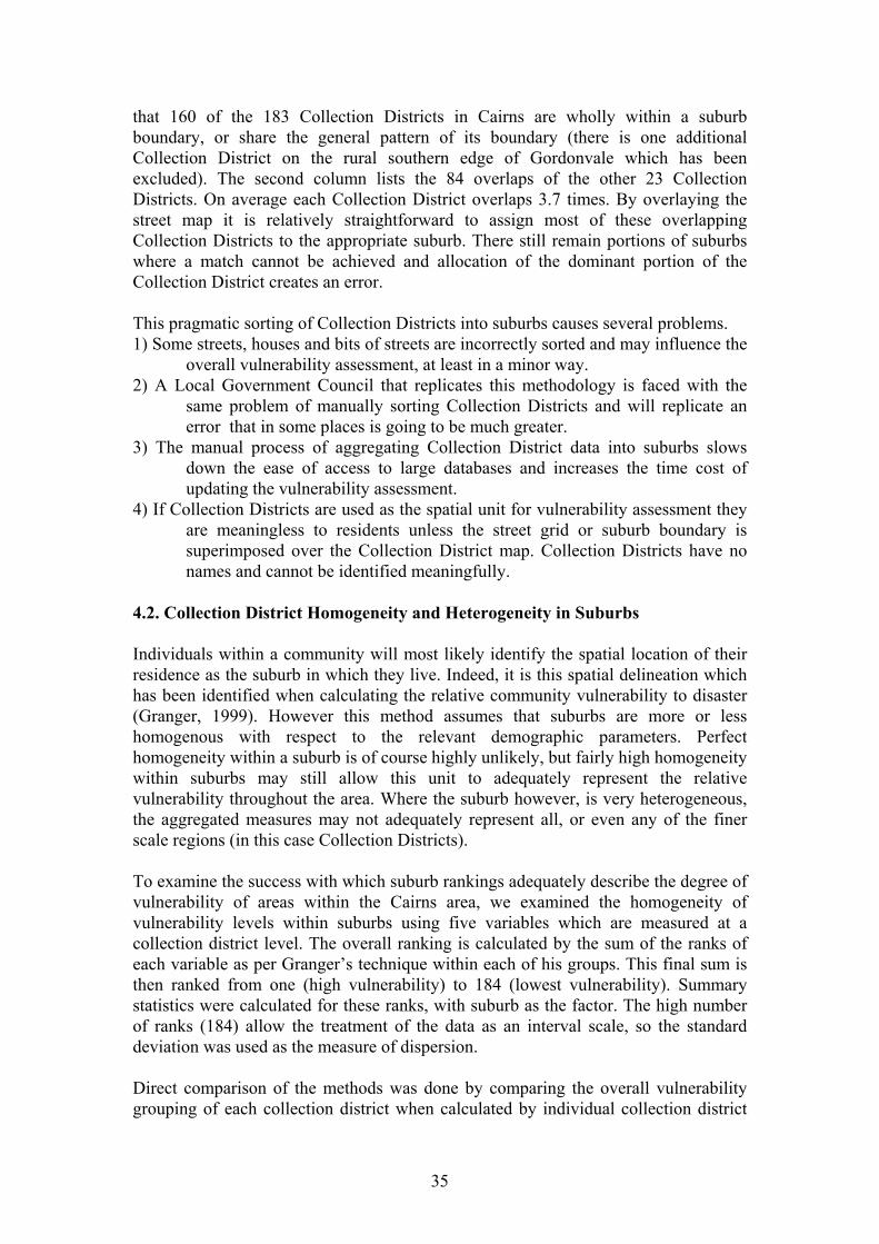
that 160 of the 183 Collection Districts in Cairns are wholly within a suburb boundary, or share the general pattern of its boundary (there is one additional Collection District on the rural southern edge of Gordonvale which has been excluded). The second column lists the 84 overlaps of the other 23 Collection Districts. On average each Collection District overlaps 3.7 times. By overlaying the street map it is relatively straightforward to assign most of these overlapping Collection Districts to the appropriate suburb. There still remain portions of suburbs where a match cannot be achieved and allocation of the dominant portion of the Collection District creates an error. This pragmatic sorting of Collection Districts into suburbs causes several problems. 1) Some streets, houses and bits of streets are incorrectly sorted and may influence the
overall vulnerability assessment, at least in a minor way. 2) A Local Government Council that replicates this methodology is faced with the
same problem of manually sorting Collection Districts and will replicate an error that in some places is going to be much greater.
3) The manual process of aggregating Collection District data into suburbs slows down the ease of access to large databases and increases the time cost of updating the vulnerability assessment.
4) If Collection Districts are used as the spatial unit for vulnerability assessment they are meaningless to residents unless the street grid or suburb boundary is superimposed over the Collection District map. Collection Districts have no names and cannot be identified meaningfully.
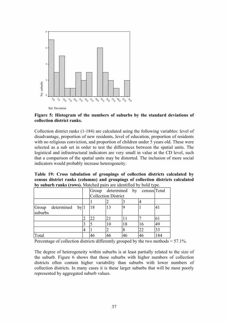
4.2. Collection District Homogeneity and Heterogeneity in Suburbs Individuals within a community will most likely identify the spatial location of their residence as the suburb in which they live. Indeed, it is this spatial delineation which has been identified when calculating the relative community vulnerability to disaster (Granger, 1999). However this method assumes that suburbs are more or less homogenous with respect to the relevant demographic parameters. Perfect homogeneity within a suburb is of course highly unlikely, but fairly high homogeneity within suburbs may still allow this unit to adequately represent the relative vulnerability throughout the area. Where the suburb however, is very heterogeneous, the aggregated measures may not adequately represent all, or even any of the finer scale regions (in this case Collection Districts). To examine the success with which suburb rankings adequately describe the degree of vulnerability of areas within the Cairns area, we examined the homogeneity of vulnerability levels within suburbs using five variables which are measured at a collection district level. The overall ranking is calculated by the sum of the ranks of each variable as per Granger’s technique within each of his groups. This final sum is then ranked from one (high vulnerability) to 184 (lowest vulnerability). Summary statistics were calculated for these ranks, with suburb as the factor. The high number of ranks (184) allow the treatment of the data as an interval scale, so the standard deviation was used as the measure of dispersion. Direct comparison of the methods was done by comparing the overall vulnerability grouping of each collection district when calculated by individual collection district
35
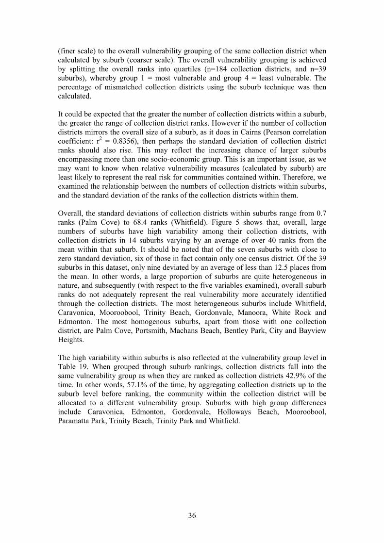
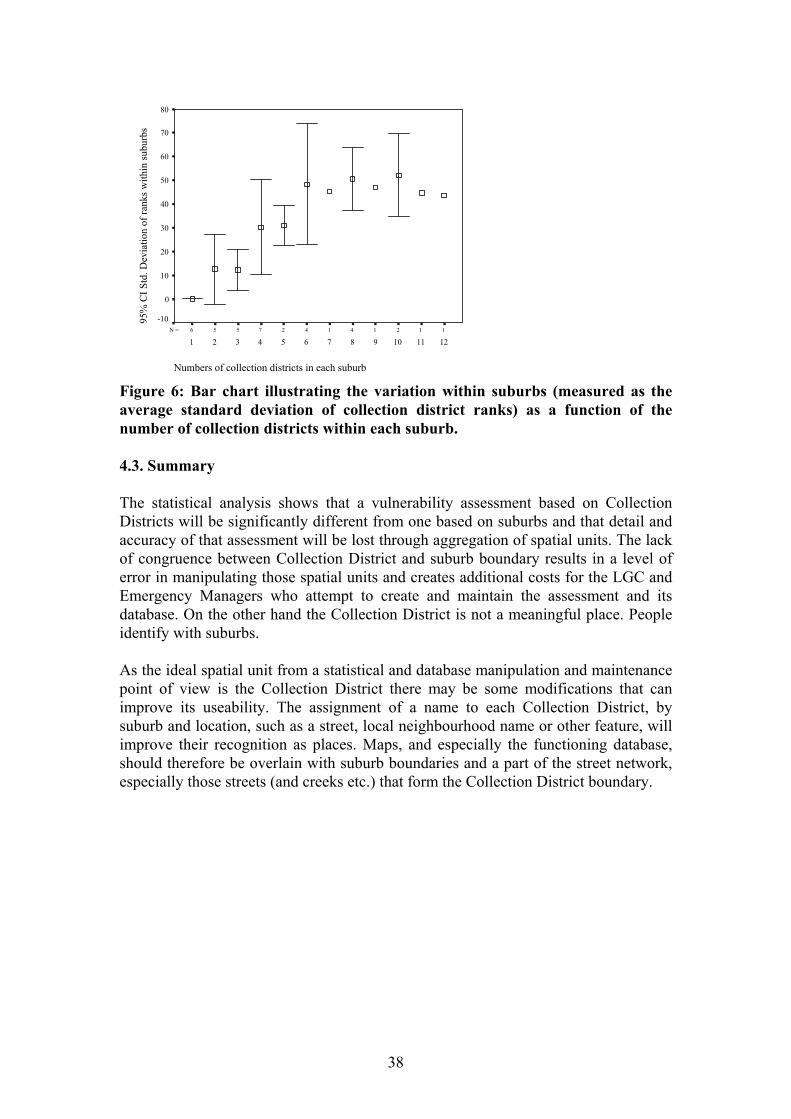
(finer scale) to the overall vulnerability grouping of the same collection district when calculated by suburb (coarser scale). The overall vulnerability grouping is achieved by splitting the overall ranks into quartiles (n=184 collection districts, and n=39 suburbs), whereby group 1 = most vulnerable and group 4 = least vulnerable. The percentage of mismatched collection districts using the suburb technique was then calculated. It could be expected that the greater the number of collection districts within a suburb, the greater the range of collection district ranks. However if the number of collection districts mirrors the overall size of a suburb, as it does in Cairns (Pearson correlation coefficient: r2 = 0.8356), then perhaps the standard deviation of collection district ranks should also rise. This may reflect the increasing chance of larger suburbs encompassing more than one socio-economic group. This is an important issue, as we may want to know when relative vulnerability measures (calculated by suburb) are least likely to represent the real risk for communities contained within. Therefore, we examined the relationship between the numbers of collection districts within suburbs, and the standard deviation of the ranks of the collection districts within them. Overall, the standard deviations of collection districts within suburbs range from 0.7 ranks (Palm Cove) to 68.4 ranks (Whitfield). Figure 5 shows that, overall, large numbers of suburbs have high variability among their collection districts, with collection districts in 14 suburbs varying by an average of over 40 ranks from the mean within that suburb. It should be noted that of the seven suburbs with close to zero standard deviation, six of those in fact contain only one census district. Of the 39 suburbs in this dataset, only nine deviated by an average of less than 12.5 places from the mean. In other words, a large proportion of suburbs are quite heterogeneous in nature, and subsequently (with respect to the five variables examined), overall suburb ranks do not adequately represent the real vulnerability more accurately identified through the collection districts. The most heterogeneous suburbs include Whitfield, Caravonica, Mooroobool, Trinity Beach, Gordonvale, Manoora, White Rock and Edmonton. The most homogenous suburbs, apart from those with one collection district, are Palm Cove, Portsmith, Machans Beach, Bentley Park, City and Bayview Heights. The high variability within suburbs is also reflected at the vulnerability group level in Table 19. When grouped through suburb rankings, collection districts fall into the same vulnerability group as when they are ranked as collection districts 42.9% of the time. In other words, 57.1% of the time, by aggregating collection districts up to the suburb level before ranking, the community within the collection district will be allocated to a different vulnerability group. Suburbs with high group differences include Caravonica, Edmonton, Gordonvale, Holloways Beach, Mooroobool, Paramatta Park, Trinity Beach, Trinity Park and Whitfield.
36
Std. Deviation
70.065.0
60.055.0
50.045.0
40.035.0
30.025.0
20.015.0
10.05.00.0
No.
subu
rbs
8
6
4
2
0
Figure 5: Histogram of the numbers of suburbs by the standard deviations of collection district ranks. Collection district ranks (1-184) are calculated using the following variables: level of disadvantage, proportion of new residents, level of education, proportion of residents with no religious conviction, and proportion of children under 5 years old. These were selected as a sub set in order to test the differences between the spatial units. The logistical and infrastructural indicators are very small in value at the CD level, such that a comparison of the spatial units may be distorted. The inclusion of more social indicators would probably increase heterogeneity. Table 19: Cross tabulation of groupings of collection districts calculated by census district ranks (columns) and groupings of collection districts calculated by suburb ranks (rows). Matched pairs are identified by bold type. Group determined by census
Collection District Total
1 2 3 4 Group determined by suburbs
1 18 13 9 1 41
2 22 21 11 7 61 3 5 10 18 16 49 4 1 2 8 22 33 Total 46 46 46 46 184 Percentage of collection districts differently grouped by the two methods = 57.1%. The degree of heterogeneity within suburbs is at least partially related to the size of the suburb. Figure 6 shows that those suburbs with higher numbers of collection districts often contain higher variability than suburbs with lower numbers of collection districts. In many cases it is these larger suburbs that will be most poorly represented by aggregated suburb values.
37
112141427556N =
Numbers of collection districts in each suburb
121110987654321
95%
CI S
td. D
evia
tion
of ra
nks w
ithin
subu
rbs
80
70
60
50
40
30
20
10
0
-10
Figure 6: Bar chart illustrating the variation within suburbs (measured as the average standard deviation of collection district ranks) as a function of the number of collection districts within each suburb. 4.3. Summary The statistical analysis shows that a vulnerability assessment based on Collection Districts will be significantly different from one based on suburbs and that detail and accuracy of that assessment will be lost through aggregation of spatial units. The lack of congruence between Collection District and suburb boundary results in a level of error in manipulating those spatial units and creates additional costs for the LGC and Emergency Managers who attempt to create and maintain the assessment and its database. On the other hand the Collection District is not a meaningful place. People identify with suburbs. As the ideal spatial unit from a statistical and database manipulation and maintenance point of view is the Collection District there may be some modifications that can improve its useability. The assignment of a name to each Collection District, by suburb and location, such as a street, local neighbourhood name or other feature, will improve their recognition as places. Maps, and especially the functioning database, should therefore be overlain with suburb boundaries and a part of the street network, especially those streets (and creeks etc.) that form the Collection District boundary.
38
4. Conclusion The Cairns multi risk hazard assessment is grounded in theory and experience, in order to function as an applied tool of hazard mitigation. A review of the literature puts vulnerability assessment into a broader context of social index use. The overall direction of the literature is the need for indicator use to be defined and driven by a model or construct. Statistical analysis is simply a relationship between numbers. The numbers represent real characteristics of people, places and infrastructure etc. Thus the selection of indicators cannot be driven by any statistical method. The theoretical model must determine the selection of variables as indicators. Furthermore indicators may be selected to represent a dimension of vulnerability either because they are independent of one another and not necessarily related, or because the strength of a relationship is very strong but still independent. Dependent variables may be considered unnecessary because of repetition, but the range of indicators will encompass many dimensions of vulnerability as defined by the model of vulnerability. Thus the statistical impact of removing or adding variables is not relevant. Obviously if strongly unrelated variables are added to the composite assessment as indicators of vulnerability, they will change the overall assessment. Likewise if strongly related variables are inserted, the composite assessment will remain the same. We know logically that modifications of the elements of vulnerability will alter the relative assessment of spatial units. Statistically proving this is irrelevant, because the decision to add or remove variables as indicators should not be based on a statistical test, but as already stressed, the theoretical model or construct. However, as the addition of indicators will probably change the composite assessment it is preferable that sets are established and replicated as a standard. The range of indicators must be capable of reduction to a meaningful description, based on the indicators, of what a highly vulnerable community is like. That description of vulnerability is far more important than a statistical value. In carrying out this review we are satisfied that the community vulnerability methodology of the Cairns multi hazard risk assessment is grounded in the literature and proceeds from a series of constructs that constitute a classificatory model. As a very minor aside it is worth noting that the labelling of census derived social indicators as “warm and fuzzy” implies a lesser value for these characteristics, and is probably best avoided. The statistical analysis of alternative methods that could have been used to assess community vulnerability concentrated on Principal Components Analysis and ranking methods. While there are differences that result from other methods, the overall conclusion is that Principal Components Analysis predicts similar groupings of suburbs on a composite assessment to the classification predicted by the ranking method used in the Cairns multi hazard risk assessment. Many other, and more sophisticated, statistical tests could be carried out to group spatial units. This has not been done because it would diverge even further from the intended function of the vulnerability assessment. The bottom line of the whole methodology is that it must be replicable at the Local Government level for use and maintenance by council employees and emergency managers. Even the statistical methods that have been used here are probably not available for use in most shire and
39
community councils. The ranking method on the other hand, can be carried out simply, it requires few statistical skills or expensive software, and it measures up as statistically valid. The same concerns impact upon the level of spatial unit that may be used. The Collection District is the finest detail available for social indicators, but it may distort some of the infrastructural indicators. Tests show that suburbs are not representative of the range of vulnerability on the composite assessment. Detail is lost. Additionally many Collection Districts do not fall neatly into suburb boundaries, thereby introducing another level of error. Most significantly, though, the Collection Districts are not meaningful places as they are extracted from Cdata. However, it may be much easier and quicker to make them meaningful by giving them suburb and local neighbourhood/main street names, than dealing with the error, lack of boundary congruence, and loss of detail that is entailed in using suburbs as the main spatial units.
40
6. References Andrews, F.M., & Withey, S.B. 1976. Social Indicators of Well-Being, Plenum Press, New York. Berkowitz, B. 1996 “Personal and Community Sustainability” American Journal of Community Psychology, 24 (4) pp. 441-460. Berry, L. 1996. Community Vulnerability to Tropical Coastal Cyclones and Associated Storm Surges: case study of the Cairns Northern Beaches townships, TCCIP Report, Centre for Disaster Studies, Cairns. Blaikie, P., Cannon, T., Davis, I., and Wisner, B. 1994 At Risk: Natural Hazards, People’s Vulnerability, and Disasters, Routledge, London and New York. Buckle, P. 1995. “A Framework for Assessing Vulnerability,” The Australian Journal of Emergency Management, 10 (1) pp.11-15. Buckle, P. 1999. “Redefining community and vulnerability in the context of emergency management” The Australian Journal of Emergency Management. 13 (4) pp.21-26. Choguill, C. and Solomon, E. 1993. “Social- aspects of economic readjustment in Hungary: a consideration of the role of socio-economic indicators” Social Indicators Research, 29 (2) pp. 205-228. Clark, M. 1995. “Changes in Euro-American Values Needed for Sustainability” Journal of Social Sciences, 51 (4) pp. 63-83. De Vaus, D. 1985. Surveys in Social Research, Sydney, Allen and Unwin. Edwards, A. 1957. Techniques of Attitude Scale Construction, Apple-Century-Crofts, New York. Fenton, D.M. and MacGregor, C. 1999. Framework and Review of Capacity and Motivation for Change to Sustainable Management Practices: Theme 6: Project 6.2.1., Social Sciences Centre, Bureau of Rural Sciences, Canberra. Gentili, J. 1997. “Geographical patterns and some causes of spatial econoetic variations in Perth, Western Australia” Australian Geographical Studies, 35 (1) pp. 74-94. Gephart, R. 1993. “The textual approach: risk and blame in disaster sensemaking” (Special research Forum: Methodological Issues in Management Research), Academy of Management Journal, 36 (6) pp. 1465-1515. Granger, K. 1993. “Understanding Queensland’s Storm Tide Hazard,” paper presented at AURISA 93 - the 21st Annual International Conference of the Australasian Urban and Regional Information Systems Association.
41
Granger, K. 1995. “Community Vulnerability: the Human Dimensions of Disaster” paper presented at AURISA/SIRC’95 - the 7th Colloquium of the Spatial Information Research Centre. Granger, K., Jones, T. & Scott, G. Editors. 1999. (Draft version), Community Risk in Cairns: a multi-hazard risk assessment. Cities Project, AGSO, Canberra. Guttman, L. 1950. “The Basis of Scalogram Analysis” In Stouffer, S. (Ed) Measurement and Prediction (pp 60-90), Wiley, New York. Keys, C. 1991. “Community Analysis: Some Considerations for Disaster Preparedness and Response” The Macedon Digest, 6 (2) pp 13-16 Kloosterman, R. 1996. “Double Dutch: polarisation trends in Amsterdam and Rotterdam after 1980” Regional Studies, 30 (5) pp. 467-477. Likert, R. 1932. “A Technique for the Measurement of Attitudes” Archives of Psychology, 140, pp. 5-53. Mapelli, V. 1993. “Health needs, demand for health services and expenditure across social groups in Italy” Social Science and Medicine, 36 (8) pp. 999-1010. Mackenbach, J. 1992. “Socio-economic health differences in the Netherlands: a review of recent empirical findings” Social Science and Medicine, 35 (3) pp. 213-227. McLennan, W. 1998. 1996 Census of Population and Housing: Socio-Economic Indexes for Areas, Australian Bureau of Statistics, Canberra. Melick, R. 1996. Risk Assessment of the Cairns Northern Beaches to a Storm Surge: Testing the usefulness of ABS data to identify the vulnerability of communities, TCCIP Report, Centre for Disaster Studies, Cairns. Mustafa, D. 1998. “Structural causes of vulnerability to flood hazards in Pakistan” Economic Geography 74 (3) pp. 289-306. Neuman, W.L. 1997. Social Research Methods: Qualitative and Quantitative Approaches, Allyn and Bacon, Boston. Newton, J. 1995. “An assessment of coping with environmental hazards in northern aboriginal communities” The Canadian Geographer, 39 (2) pp. 112-121. Osgood, C., Suci, G. and Tannenbaum, P. 1957. The Measurement of Meaning, University of Illinois Press, Urbana. Ponte, F. 1997. It has Nothing to do with Hunting: An Examination of the Attitudes and values Associated with the Recognition of Indigenous Hunting Rights. PhD Thesis, James Cook University, Townsville.
42
Rhodes, A. and Reinholtd, S. 1998. “Beyond technology: a holistic approach to reducing residential fire fatalities” The Australian Journal of Emergency Management, 13 (1) pp.39-44. Rockeach, M. 1973. The Nature of Human Values, The Free Press, New York. Salter, J. 1995. “Disasters as Manifestations of Vulnerability”, The Australian Journal of Emergency Management, 10 (1) pp.9-10. Sarantakos, S. 1994. Social Research, MacMillan Education, Melbourne. Smith, D.I. 1994. “Storm Tide and Emergency Management”, The Macedon Digest, 9 (3) pp.22-26. Thurstone, L. 1928. “Attitudes can be Measured” American Journal of Sociology, 33 pp. 529-554. Zamecka, A. and Buchanan G. 1999. Disaster Risk Management, Queensland Department of Emergency Services, Brisbane. Zerger, A. 1996. “Application of Spatial Analysis and GIS for Modelling Risk in Storm Surge Prone Areas of Northern Queensland,” paper presented to NDR96, edited by Heathcote, R., Cuttler C. and Koetz J. Conference on Natural Disaster Reduction, Surfers Paradise. Zimmerman, G. M., H. Goetz, and P. W. Mielke. 1985. "Use of an Improved Statistical Method for Group Comparisons to Study Effects of Prairie Fire." Ecology 66(2):606-11.
43