Embed Size (px)
Citation preview

East Tennessee State UniversityDigital Commons @ East
Tennessee State University
Electronic Theses and Dissertations Student Works
8-2010
Reverbotone - Visualize Music With Design.William Baxter BledsoeEast Tennessee State University
Follow this and additional works at: https://dc.etsu.edu/etd
Part of the Art Practice Commons, and the Fine Arts Commons
This Thesis - Open Access is brought to you for free and open access by the Student Works at Digital Commons @ East Tennessee State University. Ithas been accepted for inclusion in Electronic Theses and Dissertations by an authorized administrator of Digital Commons @ East Tennessee StateUniversity. For more information, please contact [email protected].
Recommended CitationBledsoe, William Baxter, "Reverbotone - Visualize Music With Design." (2010). Electronic Theses and Dissertations. Paper 1718.https://dc.etsu.edu/etd/1718

1
Reverotone– Visualize Music With Design
________________________________________________
A thesis
presented to
the faculty of the Department of Art and Design
East Tennessee State University
In partial fulfillment
of the requirements for the degree
Master of Fine Arts in Graphic Design
________________________________________________
by
William Baxter Bledsoe
August 2010
________________________________________________
M. Wayne Dyer, Chair
David Dixon
Ralph Slatton
Keywords: Beatles, Reverbatone, Music Design
2
ABSTRACT
Reverbotone - Visualize Music With Design
by
William Baxter Bledsoe
This thesis was written as a supporting paper for a graphic design exhibit for a Master of
Fine Arts Degree. The focus of my work is to visualize an interpretation of a collection of
songs that make up an album in which the design communicates the content of the body
of music.
This thesis showcases a record that actually exists but has never been released. This
affords me the opportunity to create a design that defines the content of the record work
in a visual manner. This thesis paper covers the methods and motivations by which I
arrived to the final design as well as an analysis of the outcome of the process in regards
to the thesis exhibit.
3
ACKNOWLEDGEMENTS
First and foremost I would like to thank my wife Jennifer and my children,
Cassity, Will, and Greyson for their support and encouragement. Without them, I would
have never mustered the motivation to complete my Master‘s Program. Second, I want to
acknowledge M. Wayne Dyer, David Dixon, and Ralph Slatton for their unwavering
guidance, patience, and friendship. I would also like to recognize Vincent, Alfred, Wass,
Andy, Larry, Anita, Sean, Kathleen, Steve, Jerry, Mom, Dad, Gini, Jennie, John, Paul,
George, and Ringo.

4
CONTENTS
Page
ABSTRACT………………………………………………………………………………2
ACKNOWLEDGEMENTS………………………………………………………………3
PROLOGUE………………………………………………………………………………5
Chapter
1. INTRODUCTION……………………………………………………………..7
2. PERSONAL MOTIVATIONS AND METHODS…………………………...10
3. HISTORICAL INFLUENCES……………………………………………….18
4. ANALYSIS OF WORK……………………………………………………...34
5. SUMMARY AND CONCLUSIONS…………………………………………40
WORKS CITED…………………………………………………………………………41
APPENDIX: CATALOGUE OF EXHIBITION………………………………………..43
VITA……………………………………………………………………………………..63
5
PROLOGUE
I recall the day I received my copy of Sgt. Pepper‘s Lonely Hearts Club Band
album, Christmas of 1977. It would be the first time I would hear the Beatles‘ version of
the album. Six months earlier, Peter Frampton and the Bee Gees had released a remake of
Sgt. Pepper as a soundtrack to the film musical. Although I was familiar with the songs, I
was not privy to the original. I had read a historical review of Sgt. Pepper in a scholastic
publication at school about the Beatles. It is one of the few bright spots of my secondary
education career. It explained the origin of the album and the artwork, the idea behind the
marching band uniforms, colorful lyrics, gate-fold album design, and pull-out give-
always printed with badges, postcards, and stand-ups. I carefully unwrapped my obvious
Christmas gift, went to my room, carefully removed the record with the rainbow label
ring, and placed it on my 1963 vintage RCA stereo system, early inheritance from my
parents. I held that album cover and pull-out in my hands like a sacred document,
flipping it back and forth between reading the lyrics and examining the numerous faces
and articles of curiosity on the cover and everything in between. All the while, the sound
of tuning orchestra instruments and an anticipating crowd took me on a trip I have yet to
get off 35 years later. At that point I began to understand how graphic art design could
communicate if not dictate content. I taught myself how to draw. I had been doing my
own work since I was 3 years old; up to the point of Sgt. Pepper, I was drawing version
of book illustrations from Alfred Hitchcock‘s children‘s books. Now my world expanded
into the stratosphere; for the next three years I drew everything I could get of the Beatles.
Christmas and birthdays were easy for my parents. If it had the fab four on it, records or
otherwise, it was a shoe-in. It was during this time that I made aware of the urban legend

6
of the ―lost‖ Beatle Alum, and I recall clearly thinking on many occasions that the
greatest event that I could imagine in my fourteen years of existence as an artist would be
to create the art from the Beatle album.
7
CHAPTER 1
INTRODUCTION
Art in part is a sales pitch. That is to say a point of persuasion or act of convincing
takes place in motivating the artist to create work that competes for the viewer‘s
attention. This in turn establishes a ―forum‖ to evaluate the work‘s appeal, validity,
message, etc. At this juncture the sales pitch reveals itself, whether a verbal defense on
behalf of the artist, an explanation, artist statement, or simply the exhibition of the work.
Some will verbally defend the many aspects of their work as opposed to those who
remain anonymous and let the work speak for itself. Nevertheless, in all cases the work
has to ultimately stand alone and justify its content. The work must communicate and in
that attempt to sell the idea behind its inception.
Of all the genres of art (drawing, painting, sculpture, photography, etc), I find that
graphic design‘s capacity to communicate must be concise and specific. There is little
room for interpretation unless, of course, it is the objective of the artist to relate the
design to the product. I often equate graphic design with the process of watercolor
painting. Watercolor, seemingly forthright and simplistic, is by nature unforgiving with
regard to technical mistakes of which there are few options for correction. Traditionally,
graphic design‘s objective to communicate an idea is much the same. If the intent
motivating the design is not clear, the artist has little resort but to rethink the design
problem and begin again.
My focus is to explore art‘s capacity to communicate an idea within the structure
of design, specifically its capacity to orchestrate various mediums to compose an overall
design that relates specific content to the viewer. My background in fine art affords me
8
the opportunity to use these varied media (drawing, sculpture, painting, photography, and
digital imagery) to materialize a cohesive body of artwork that stands on its own merit
and at the same time relates to the viewer the idea behind the ―product.‖ The focus of this
thesis revolves around a body of work in the context of music and the packaging (album
covers) for that music.
The album is a collection of songs that were recorded over the course of three
years (1968-70) by the English rock band The Beatles. These songs have never appeared
on an album as a complete body of work. Many of the songs were never released to the
public, thus they were ―lost‖ in a manner of speaking. The existence of this material
presents a challenging problem to create a design that reflects the complexion of the
music, both the individual songs, and a collective whole. The design problem has an
added burden of working visually within the iconic discography of the band. Though the
list hypothetical in nature, I have compiled this list of songs into a body of work in both
LP and CD format. My artistic interpretation of the music is based on hearing the songs
singularly and collectively. Since the music was ultimately never intended for public
consumption as a result of the group disbanding in 1970, the artwork will not be
accompanied by the sequence of songs the design supports. This affords a unique
challenge to compose a design that communicates and idea without the physical evidence
of the idea‘s origin present in the exhibit. This is an unorthodox situation with regard to
album art, which is traditionally accompanied by audio. It is the absence of the audio that
allows the artwork to sell the idea of the songs solely on merits of the art and not the
music. I believe my design work is best suited for such a project, and the partial objective
of this thesis is to shed light on the tendencies and characteristics of my work. It has been

9
my objective as an artist to address graphic design in what I have considered a purist
approach: incorporating every medium, including digital media, that would be best suited
to resolve the design problem. Trained in design prior to the onset of the computer, my
work gravitates to a ―hands-on‖ approach (cutting, pasting, layouts, typography, photo
manipulation, etc.). The history of this project regarding graphic design clearly preceded
the personal computer. I believe that ―stimulating‖ hand work via the computer would
undermine the ―feel‖ of the album as it relates to the music of this particular collection
and the band‘s discography. The basis for satisfying the design problem is to demonstrate
my capacity to work in varied mediums to orchestrate a cohesive resolution to that
problem.
The burden of this paper is to support this Master‘s Exhibit in Graphic Design
entitled ―REVERBOTONE-VISUALIZE MUSIC WITH DESIGN‖ (design
communicating the content of music that was never intended to be heard). Chapter two of
this paper explains the motivation and methods behind this body of work relating to
creative process, design choices, decisions related to imagery, medium, and typography,
etc., all intended to validate this work. The third and fourth chapters deal with historical
aspects dictating certain design choices as they relate to the band as well as the artists and
masterworks which were influential in this exhibit. Chapter five provides an overview of
the exhibit with a summation and conclusion.

10
CHAPTER 2
PERSONAL MOTIVATIONS AND METHODS
This chapter deals with the specific idea behind the term Reverbotone and how it
illustrates my motives and methods related to initiating, perpetuating, and finalizing a
concept to resolve a design problem. The specific challenge is to visualize music with
design that inspired the term Reverbotone. This Chapter also explains why I was
motivated to pursue this particular subject and how it parallels my perspective on the
creative process. I make reference to particular artists and their work, all of whom have
had an effect on the method with which I approached and resolve specific design issues.
These artists are not to be confused with those whom I have cited as historical influences
on my personal work as an artist overall.
As a graphic designer, I search for the novelty in each project. The term novelty
does not suggest something trite or gimmicky; rather, it is an element that has a nuance or
unusual quality that can bring a sense of newness or curiosity to the content of the design.
At this point the challenge for me is not conjuring up enough ideas to work with but
rather choosing which ideas to use. As a part of compiling and stripping away I often
refer to artists and artwork that preceded me and use it as a resource to assist in resolving
the design problem. Art history was and is a foundation for all my work. Therefore, art
history is a significant part of what influences both my particular process and my
methods. My academic experience as a painter has broadened my perception regarding
the ―process‖ as art and the final work as a documentation of the process. The final work
is art; but how it is evaluated as art is based in part on its capacity to document the
11
creative process. This is an important concept that I have implemented in my work since
childhood.
The fascination I have with the artistic process makes me gravitate to design
projects that pose an opportunity to chronicle stages of the process as part of the final
design. The completion of the work I visually reconcile with the initial concept with the
end project. In graphic design this process of reconciliation is necessary. It is the base
concept that perpetuates the idea and carries it through to a finished product; therefore,
the beginning must be seen in the end! I draw a correlation between the structure of this
process and the mechanics of an echo: a sound is initiated, it radiates outward (process),
the sound then comes to an obstruction and stops (the conclusion) and thus, radiates back
to the point of origin where the sound is experienced as an echo (reconciliation). I refer to
the interpretation of the process as REVERBERISM. The ―ism‖ is based on the word
―reverberate‖ which means ―to bounce back—reflect.‖ (Webster, 1002) This work by
definition can refer to among other things sound or color. In regards to design an
objective to a designer is to correlate context and resonance. ―A term borrowed from
music, resonance means the reverberation of echo, a subtle quality of tone or timbre-
Graphic designers bring a resonance to visual communications through, for example, the
use of the scale and contrast, cropping of images, and choice of typefaces and
colors.‖(Meggs, 1) As aforementioned, I am intrigued with projects which allow me to
incorporate stages of development as part of the overall image design. This is one of the
primary reasons I chose the ―lost‖ Beatles album as the subject of my thesis.
It is my personal belief that embracing the process is universal to artists regardless
of their medium; therefore, I do not see my interpretation of REVERBERISM as

12
coincidental as it relates to the Beatles‘ concept for recording much of their music. It is
this aspect of the project that appeals to me as much as my personal appreciation of the
group and the intrigue behind the ―urban legend‖ of the ―lost‖ album. Album art is a
product of conceptual image.
―…the decades after World War II saw the development of the conceptual
image in graphic design. Images conveyed, not merely narrative
information, but ideas and concepts. Mental content joined perceived
content as motif. The illustration interpreting a writer‘s text yielded to the
graphic imagist making a statement.‖ (Meggs, 3)
The novelty of this project is to communicate the content or complexion of the
music as a collective whole through visualization or more simply to visualize music with
design. Reverbotone is a term I derived from REVERBERISM. It conveys the idea of
composing and assigning interpretive imagery to non-tangible subject matter such as
music and sound. I wanted a word or phrase that was a derivative of REVERBISM and
was descriptive of both the visual and non-visual aspects of the project. Reverbotone‘s
root word is taken from REVERBISM, which means as stated earlier ―to bounce back-
reflect.‖ ―Tone‖ is defined as the ―quality or character of sound and the prevailing effect
of harmony of color and values.‖ (Webster, 1242) In the practice of defending one‘s
work, language can serve as a bridge between the artist and the content of the art.
Creating a term that can communicate the method behind the work is product of my
deign. In the development of this thesis exhibit, it was as important to communicate the
construct of my thought process as it was to create the artwork that responded to the
design problem. The term ―reverbotone‖ is my bridge between visualizing music with
design.
When I began to materialize a design, I broke down the accumulation of the ideas
13
that are inspired around the novelty or nuance found in the content of the design problem.
A part of my method of creating, sketches and drawings are always the first tangible
evidence of my thought process and strategy to address possible solutions to the design
problem. Then I select the best solutions and create a ―skeleton‖ of that solution using
basic forms of composition. I customarily use white-on-white layouts of that design to
verify whether or not the construct of the solution will translate. I prefer white-on-white
composition because it aids in the formalizing of layout, space definition, shape
relationships depth, and texture. This approach is greatly influenced by the art of
Constructivists in American art prior to World War II, specifically the work of Theodore
Roszak (1907-81) who was a Polish-born artist trained as a painter. He became abstract
constructionists after having been influenced by industrial design. His work
―Construction in White‖ was made of white-washed wood, white paper, and plastic. It
served as a reference for my white-on-white composition for this project. The traditional
thought from my training in painting is that behind any good painting is a strong
composition which is established by a good drawing. If the drawing is deficient then the
majority of your energy is spend trying to cover it up with the result being that you
emphasize the discrepancy even more! It is imperative that the foundation of the design is
inerrant. (Arnason, 409)
The first objective with this project was to give the album a title. While I would
never assume to put myself in the place of the band members, I concluded the title should
reflect the viewer‘s perspective, the outside looking in, much like an archeologist‘s
viewpoint. Since the existing official discography is the ―complete collection‖ from the
band nature, the ―lost‖ album‘s title needed to be identified more as an archive than

14
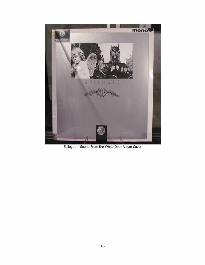
anything else. The word ―epilogue‖ became a recurring theme. Defined as a ―concluding
part,‖ (Webster, 390) epilogue serves as a means to communicate the content of the
album as a ―musical footnote‖ to the actual discography, a bookend to the entire Beatle
catalogue. I wanted to add to the word epilogue that suggested an image and emulated the
idea of music or sound to work with my idea of REVERBISM. ―Sound from the White
door‖ refers specifically to the Beatles‘ Apple Corps. Office in London. In the final days
of the band (Munroe, 100) 3 Saville Row was their personal recording studio. It was also
the site for filming of ―Let it Be.‖ The roof of Saville Row was where the band performed
the open air concert scene at the conclusion of the movie. The entrance to the building
was notable, framing a large white door possible connected with John Lennon‘s ―white‖
period during the time the band moved business into the Saville Row building in 1969.
The emphasis of white as a color reflects back to the initial meeting of John Lennon and
Yoko Ono. This meeting took place in 1966 at the Indica Gallery (a gallery partially
founded and subsidized by Paul McCartney) in London. Ono was exhibiting a collection
of her work which included ―YES PAINTING‖ (white ladder), ―PAINTING TO
HAMMER A NAIL‖(white installation), ―WRAPPING PIECE FOR LONDON,‖ and
―WHITE CHESS SET.‖ (Arnason, 353) These works were painted to my decision to
exhibit my artwork in the form of a installation. I used the color black as the dominant
color and white as a secondary color. This approach was used to accentuate the idea of
―MONO‖ (referring to a type of recording) and create an atmosphere of a ―warehouse
district‖ or ―underground‖ to emphasize the idea of the ―Cost‖ album. Thus, the title,
―EPILOGUE- with sound from the White Door,‖ is a defining part of the design.

15
When visualizing the design for the Beatle album, ―EPILOGUE- with Sound from
the White Door,‖ the front and back of the jacket I focused on a Long-Play packaging
format. I used Roszak‘s ‗Composition in White‖ as a reference, thus creating an actual
layout of the album. I then worked with variations of arrangement based on sketches
which has one prerequisite, not to repeat any layout or mimic previous Beatle album art
unless it was artistically understated. I eventually struck upon the panoramic format,
which had never been used on any previous Beatle album; the elongated picture frame
allowed me to ―sketch out‖ the backgrounds and spread the band members apart or pull
them together depending on aesthetic decisions. The image would be above center,
creating a large negative space below the image. This provided an area for typography as
part of the overall design.
The back side of the album was composed with space allocated for type such as
recording history and related material. Even though the front of the album would have the
imagery, the back must have equal visual significance and weight as well as compliment
the front cover. I see a similarity in the design of typography blocks and the work of
Mondrian. His work was composed of shapes that relate to one another as independent
forms. These modular relationships are composed in a manner that serves as a basis for
the whole. ―The most frequent use of the modular structure in graphic design is the use of
a modular grid of horizontal and vertical linear divisions.‖ (Arnason, 438)
The panoramic format for the album cover image repeats itself throughout the
album design. The images are composed of montages of the particular area depicted. The
areas chosen are suggestions of places the band had associations with either in reality or

16
in the imagination inspired by locations in the lyrics of the band‘s songs. The idea is to
create environments that have the footprint of the band. The construction of montage for
the panoramic perspective and the footprint motif are motivated indirectly by David
Hockey‘s ―the Brooklyn Bridge‖ photo collage and ―A Bigger Splash.‖ (Arnason, 483)
the photo-collage technique of creating a near 180 degrees perspective demonstrates how
images of reality can manipulate reality with arrangements of photographs taken off the
subject matter at various angles from the same point of perspective. The album cover
image used two variations of ST. PETER‘S CHURCH Liverpool, England for the cover.
In order to create the panoramic view of the church, I had to piece several images to the
actual site together to achieve the visual. Hockney‘s photo montage is far more
fragmented, however. By studying Hockney, I was able to maintain a clear sense of
manipulated space with exaggerated scale of monuments, trees, etc. I was eventually able
to capture a sense of reality by manipulating the reality captured by photographs.
The rationale of having two versions of the same locations is based on my
decision to make two versions of the album: MONO and STEREO. The collections of
songs were divided into two categories based on the type of recordings that were made.
The songs that were recorded in their entirety were first demoed in MONO. These songs
make up the heart of the ―album.‖ The STEREO version includes all of the songs in the
MONO version plus additional work which was recorded in STEREO. It is the MONO
album I chose to focus on in regard to my thesis exhibit because it is the basis for the
―lost‖ album. The novelty of the exhibit allowed me to work in monotone colors in
designing the album. This approach allows the album to distinguish itself from the
collective album art from the band‘s discography. In addition, Beatle albums had been

17
subject to release in both mono and stereo formats for each version. In some cases the
album art and title differed. This was a source of criticism from the Beatles‘ point of
view. The group felt the original versions were being edited or changed to make two
records out of one. Due to the sheer magnitude of recorded material and the manner in
which they were recorded (MONO and STEREO), two versions were necessary.
The two versions of the ―Church‖ used required several images from photographs
to compose a ―correct‖ perspective of the landmark featuring the tower, the graveyard
with the band (as both children and adults), and then a third image composed for the gate
fold using a manipulated aerial perspective.
The album cover image communicates the identity of the band without the
resemblance if the members in the composition similar to David Hockey‘s ―The Bigger
Splash‖ (Beatles, 306). The figures clearly play in the imagination of the viewer. The
absence of the subject is often connected with the power of suggestion. This aspect of
design follows the footprint approach of communicating the subject without obvious
recognition of the band in the design. This was important in my overall design for the
album in that the Beatles occasionally entertained the idea of removing their identities
from the cover of the albums, even to the exclusion of the band‘s name. This approach is
quite different from the assumed identities in Sgt. Pepper, where the band‘s likenesses
were merely altered with uniforms and mustaches. EPILOGUE truly exhibits the ghost of
the band, as they become invisible musicians with a presence implied.

18
CHAPTER 3
HISTORICAL INFLUENCES
This chapter chronicles the correlation of historical influences which impact both
this project and my work in general. I considered historical facts that would dictate
specific design decisions and ultimately the outcome of the design. From the beginning I
defined three significant challenges in addressing the design problem, or what I refer to
as the scenario. The first problem illustrates the lyrics of individual songs. Although
interpretive imagery for each song can contribute to the overall visual effect of the album
design, the cover and subsequent album images have the immediate impact on the
viewer. Although the music exists in recorded form, there is no album available to the
viewer/listener. Hence, nothing can be left to interpretation on the part of the viewer or
the designer. Knowing this presents quite a challenge to the design.
The second factor is the historical nature of the music as a collective medium and
the disposition of the artist at the time the music was recorded. Each of the twenty-eight
works (songs) including the introduction and conclusion (reprise) bring specific qualities
to the album as a whole. This project would not have been possible had I not been privy
to the actual songs. The nature of the music is extraordinarily difficult to convey to even
the most ardent Beatle fan. Perhaps only a comparison to ―Revolution NO.9‖ can give
one an idea of the construct of the body of music on this album. (Lewisohn, 109)
EPILOGUE can best be described as an audio collage. It was imperative as a graphic
designer to consider and include the history of the band and its specific goals for: ―The
Album That Never Was.‖ (Lewishon, 45) My support for this overall impression came
from numerous articles, retrospective books, and interviews.

19
Third, although I was trained as a painter in my early years, it was clear as I began
work on this project that photographic imagery would be a focal point of the album
design. I decided to reserve a ―painted‖ work for lyric illustrations and group portraits.
The immediate challenge was to compose photos of the band that never existed, more
specifically, group photo images that were ―made up.‖ I did not want to fool the eye with
seamless photo-shopped images: rather I wanted to capture the collage nature of the
songs in the presentation of the photo montage.
Initially, when studying the interpretation of the music into imagery, my first
reference point was Kandinsky‘s ―Concerning the Spiritual in Art.‖ The influence music
played in Kandinsky‘s abstractions was significant in the orchestration of his
compositions. Though his work was not direct interpretation of a specific musical
composition, Kandinsky clearly responded to the ethereal, spiritual elements of music,
and its effects on the listener. The album art regardless of the imagery‘s structure would
have to have resonance in form. ―Form alone, even though abstract and geometrical, has
it internal resonance, a spirituality whose properties are identical with form.‖ (Wassily
Kandinsky- Concerning the Spiritual in Art) This materialized into whimsical shapes
with corresponding hues of vibrant color, creating a sense of movement and energy on
the canvas. Personally, my work has always been inspired by music. Although my work
is subjective, I have often drawn from Kandinsky‘s palette of color to incorporate into my
own work. I reserved the color aspects of Kandinsky‘s influence on my design to the
STEREO version; the construct of his composition had a huge impact on my early
designs for the MONO version. I made several black and white copies of Kandinsky‘s
work so that I could analyze the structure of the composition in a high-contrast pictorial.
20
It became apparent that the shapes were independent of each other. The color gave the
initial impression that the components are connected. I draw parallel between this and
songs on an album: a composition made up of individual elements-separate but connected
to create an overall impression of cohesion. This was a crucial point in my approach to
creating the images. I chose to concentrate on capturing a ―sense‖ of music to my design.
This led me to establishing a feeling of ‗documentary‖ to the work: piecing together to
tell a story, a moving collage (Arnason, 479).
Richard Hamilton was a resource for study in the use of collage to create
compositions that were purposely layered or applied with added pieces of collage. ―Just
What Is It That Makes Today‘s Homes So Different. So Appealing?‖(1956) depicts the
―ideal‖ male and female in a house full of articles of the perceived ideal of the modern
home c. 1956. (Arnason, 480) This approach to collage provoked me to consider what
became the final concept for the ―photo-sessions‖ of the band. Whereas, ―Just What Is It.
. .‖ was a bit too simplistic for my purpose, Hamilton‘s ―I‘m Dreaming of a White
Christmas‖ (1967-68) hit the nail on the head! The figure (Bing Crosby) is anatomically
correct, but his identity is somewhat obscured. The refined tones in the figure‘s clothes
contrasting the softened background gives the whole composition a feel of three-
dimension. (Arnason, 480) Although this is a painting on canvas, it clearly mimics the
characteristics of a collage and was the main reference for my photo-montages of the
Beatles.
The use of collage is not unprecedented in album art, most specifically Beatle
album artwork. The REVOLVER album and Sgt. Pepper are both albums whose cover
imagery is, in part, collage. It would be crucial that the design for EPILOGUE be
21
distinguished from any previous album in the Beatle discography. Certainly, one of the
challenges in this project is that many of the standards in album art were established by
the Beatles. Hypothetically, this record‘s design and music would follow the band‘s
objective of always ―reinventing themselves‖ as a band, avoiding redundancy. The
album, THE BEATLES (known as the White Album) designed by Richard Hamilton,
was initially going to sport a ―newspaper‖ collage on the cover. This concept was
replaced with the simple white cover, but the concept made its way onto the poster for the
album with news articles replaced with snap-shots supplied by the band members. It was
important to me to take this into consideration once I made the commitment to use
collage as the basis for the album design. I did not want to confuse or repeat an existing
design with EPILOGUE.
Specifically, album art and collage for me have an immediate association with
Peter Blake, He was an obvious resource for study. Artist and Designer involved with the
design of Sgt. Pepper, Blake‘s work in general proved to be a source of history, ideas,
and inspiration. He was an established artist prior to the ―PEPPER‖ commission as a
major force in English Pop Art scene leading up to 1967 (release of Sgt. Pepper). Blake‘s
work on the album cover mimics the collage work on REVOLVER which was the
previous release of Sgt. Pepper and was visually and musically a precursor to Pepper. The
black and white composition designed and drawn by Klaus Voorman, the REVOLVER
album, compliments Blake‘s naïve style (application of images without regard to scale,
creating space with a disregard to correct). The direction of the work on EPILOGUE
would convey an ―actual‖ photographic composition with an understated perspective with
manipulation and distortion but a clear sense of the physical layers of image fragments
22
that cohere into a composition. This is most evident in the composition entitled ―King of
the Castle of Birds,‖ which is in the lower left-hand side of the gate-fold in the album.
The subject of the image is St. Peter‘s Church in Liverpool which is the location where
John Lennon and Paul McCartney first meet and forged their friendship and began to play
music together. Paul McCartney said in the introduction to John‘s first book ―John
Lennon-In His Own Words,‖1964,
―. . .Woolton Cemetery( St.Peter‘s Church ) . . .I used to hang out a
lot with John . . .amongst those graves knocking around with John and
wandering through there. It was the sort of place we used to sunbathe, and
we probably had a crafty fag in the graveyard . . . At Woolton village fete
I met him. I was a fat schoolboy and, as he leaned an arm on my shoulder,
I realized that he was drunk. We were twelve then, but, in spite of his
sideboards; we went on to become teenage pals.‖ (The Beatles, 208)
The composition of two perspectives recall Hockney‘s ―Bridge,‖ an aerial view of
the church cemetery (grave-site of Eleanor Rigby) and a ground view of the church
tower. The two perspectives with the approach of collage create composition with a
photo-realism sensibility that otherwise would be unattainable. The aerial view of the
cemetery is contrasted with ground view of the church tower central to the composition
with the repetition of ―English Skies‖ clouds collaged from various black and white
photos of English skies of Liverpool. The image is framed with fragments of trees that
actually exist on the church grounds. This image provided a transition between the cover
image and the mosaic that occupies the opposite panel in the gate-fold adjacent to the
―Castle of Birds.‖
In evaluating different approaches to collage, Jean Arp (1887-1966) was a point
of reference. Arp was part of the DADA Movement and implemented collage as a major
contribution to the movement. (Arnason, 243) Arp worked with shapes as opposed to

23
images; however, his philosophy was embodied in his work ―Collage Arranged to the
Laws of Chance‖ and was applicable to what I was doing with the album art:
―These pictures are Realities in themselves, without meaning or cerebral
intention. We . . .allowed the elementary and spontaneous to react in full
freedom. Since the disposition of planes, and the proportions and colors of
these planes seems to depend purely on chance, I declared that these
works, like nature, are ordered according to the laws of chance, chance
being for me merely a limited part of an unfathomable ‗raison d‘etre, of
order inaccessible in its league.‘‖ (Arnason, 244)
Romanian poet Tristan Tzara was a colleage of Arp whose approach to prose mirrored
Arp‘s work. He created poetry from random use of words from various sources,
magazines, newspapers, etc. Both artists proclaimed a new sense of artistic freedom
unconfined to established convention of creating art. (Arnason, 241)
I find a strong similarity to Arp and Tzara and John Lennon‘s documented
disposition on writing and recording music during the periods of time the EPILOGUE
collection was recorded while filming ―LET IT BE.‖ ―An album to me is a bunch of what
you can‘t have. . . I‘m not interested in conception of albums. All I‘m interested in is the
sounds. I like it to be whatever happens. I‘m not interested in making the album into a
show. For me, I‘d just put fourteen rock songs on.‖ - John Lennon. (The Beatles, 338)
The ―King of the Castle of Birds‖ is the only collage I created for the album that
had any sense of fragmentation and application suggesting an argument by chance. As I
worked on the photo-montage, I became more compelled to control the composition as
opposed to leaving things to chance. I felt this best served the artwork for continuity
purposes. I wanted to have a ―logical‖ connection to previous covers in the Beatles‘
discography. It was important to avoid the EPILOGUE art as seeming to be too much of
a departure from the previous album artwork. It needed to be distinctive but fit into the

24
discography. ―Castle of Birds‖ however convinced me to embrace a look of pieces ―held
together‖ as opposed to a seamless, polished look. It was enclosed in the album.
Reviewing the afore mentioned work by Arp, it occurred to me that ionic nature of the
rectangles that make up the composition inspired me to create symbols relating as a form
of typography. This results in the ―four squares‖ as a symbol, in place of the name of the
band. It cannot be overlooked that the Beatles following the ―LET IT BE‖ sessions
wanted to use an alternate identity for the band‘s next LP. ―. . . name for us was ‗THE
FLYIG TRELINIS,‘ ‗THEMASKED ALBERTS‖ was one of John‘s favorite names, a
‗goon‘ sort of name. You could imagine hundreds of Albert‘s. (George Harrison). (The
Beatles, 337)
Bob Dylan was a huge influence on the Beatles since their meeting in 1965; the
group‘s connection with Dylan intensified throughout the sixties and into the seventies
after the four has disbanded. Dylan‘s album ―Blonde on Blonde‖ was a ground-breaking
album design in that it bucked the conventional thought that all albums should clearly
displays the likeness of the artist, title of work, and the name of ―Artist.‖ BLONDE ON
BLONDE‖ had for its cover a muted photo of Dylan that was obscured. There was in the
original design no type communicating that this was a Dylan album or even a title for the
work on the outside cover. Only when you opened the album would you find in the
crease of the gate-fold (double album) in small type the title, ―BLONDE ON BLONDE.‖
(Kindersley, 102) The intention here is clear; Dylan understood the power that the album
art played in conveying the intentions of the artist. The Beatles‘ album art was just as
innovative and influenced Dylan. He clearly made a statement about moving away from
the stale marketing practices that were standard for the time this album was made. Dylan

25
wanted to emphasize the ―art‖ of his work and not the marketing of the product. For me,
this is a watershed example for designers who have the opportunity to invent and be
innovative rather that produce ―treadmill‖ design. A good designer understands the
building blocks of his/her trade, but the most important block is the box they think of!
(Kindersley, 224)
I use ―BLONDE ON BLONDE‖ as a starting point to address the design of the
group‘s identity regarding EPILOGUE. Giving the group an alternate name has already
been done with Sgt. Pepper; therefore, using a symbol to communicate the band‘s
identity became both an exciting prospect and a problematic venture. At this point, one
can‘t avoid a relatively recent attempt of a musician to drop his stage name and replace it
with a symbol. Singer/songwriter, Prince, in the early 1990s announced that he would no
longer be identified by his name, reportedly disenchanted with the market saturation of
―Prince.‖ A symbol was presented to the press as his new identity. It failed to assume the
identity of Prince, and from that point forward the recording artist was referred to as ―the
artist formerly known as Prince‖ (Warren, 784). As a designer, it is imperative to recall
design failure as much as design success. To assure the best possible results, a most
crucial aspect of the design for EPILOGUE, I needed to make sure that the symbols
communicated the identity of the band as an artistic element for the album design alone.
The four squares define the visual idea of four members, individual in color, uniform in
shape, closely related, but not attached. It is the symbolic nature of communicable forms
and ideas that inspired me to use four squares as my design to relate the identity of the
band to the viewer. I view the four squares as typography. Typography is the use of
letters which are symbols that can singularly or collectively communicate language. The
26
traditional definition of typography is ―the process of printing,‖ ―general character or
appearance of printed matter.‖ (Meggs, 17) I began to look at letters as symbols that can
communicate an idea without forming a word. For example, the letter ―A‖ aided with the
color of red could communicate the idea of an apple. Letters are simply symbols. The
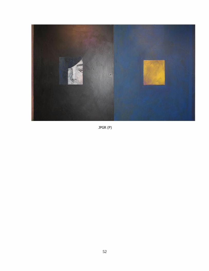
EPILOHUE cover displays the colored squares (yellow, blue, green, and red). When I
began to work on the portraits of each member of the band, I was enthralled with taking
the first letter of each members first name (J,P,G, and R), fragmented as well. ―J P G R‖
is a logogram. Logogram is the basis for Chinese calligraphic characters. The logogram is
a graphic sign or character that represents an entire word. (Meggs, 24) I emphasized the
identity of the band with the squares by reinforcing the association with the obscured
likeliness encasing the fragmented letters and faces in the squares: ―J‖ - (yellow square),
―P‖ (blue square), ―G‖ (green square), and ―R‖ (red square). Each letter has the same font
height except for ―Ringo‖ which is one font size smaller. Note: the squares of the album
cover are without faces, the ―pin-ups‖ portraits are enclosed in the album. By creating a
variation on the squares, the forms on the cover take on a cryptic nature that is suggestive
and mysterious only to be ―uncovered‖ with the discovery of the corresponding portraits
inside the album.
Duchamp‘s ―Boiole en valise‖ (box in a valise) was an important influence in my
design for packaging the artwork. In the early development of my conceptual designs for
the album art, I addressed the problem of visualizing music/sound with drawings that
suggested sound through movement. As I mentioned earlier, Kandisnky‘s artwork was an
obvious resource, but Duchamp‘s ―Nude Descending a Staircase‖ and ―The Passage from
the Virgin to the Bride‖ were also a point of study. In the process of developing
27
illustrations for the individual songs at the onset of this project, I created a series of blind
contour drawings. The compositions were to be a study for a larger work to illustrate the
centerpiece song of the album which is its namesake, ―EPILOGUE.‖
―Boile en Valise‖ provided insight to package design as a sculptural art form. As
for ―Box in a Valise,‖ this work is a ―collection‖ of reproductions of Duchamp‘s more
famous works coupled with more recent work as of the date of this piece, 1941. The
miniatures fold out of the case like a multitude of compact disk covers, revealing various
aspects of the individual works which are arranged in such a manner to complement each
other, as opposed to random arrangement. It became a crucial objective that the way in
which I looked at the building of the album cover for both the vinyl record and the
compact disk needed to convey a clear sense of intention in its presentation in the exhibit,
as a work of art and not merely ―skin‖ for design. Duchamp‘s ―box‖ also conveyed
parallel to the idea of an album (collection of works), the intent of the artist is to present
in some form an accumulation of work for review or consumption.
As aforementioned, I have never been drawn to other established designers in the
field, rather I turn to find that art masters and masterworks for resource of ideas,
direction, and inspiration. When evaluating solutions to design problems, I immediately
recall artwork, specifically to the mid to late 19th
century and into the 20th
century. The
multitude of work, styles, philosophy, movements serve as a guidepost and motivation of
my work. The electric nature of design projects requires one to recall a vast array of
imagery and ideas to choose from. The commitment to one‘s signature style and vision
and the capacity for variation and novelty in regards to the project is a defining quality in
a graphic designer. I believe in first and foremost creating art. It is not merely a strong

28
knowledge of art history but an embracing of it that impacts my work. Art history as a
foundation for what I do artistically holds me accountable to a higher standard.
My work is influenced by numerous factors including the culture in which I was
raised which is grounded in the Southern Appalachian Region of Tennessee. My art is
also impacted by a whole variety of artists both established masters and
regional/contemporary artists. For the purpose of this thesis, I have narrowed the list to
(five) artists and (seven) artworks which I drew resource from in the development of this
project.
The first influence and most enduring is that of Vincent van Gogh. From a very
early age, I was drawn to the movement created in his intense application of brushstrokes
of paint. I was equally impressed by the expressionistic color. I was partially inspired by
his landscapes which was the subject of focus in my undergraduate studies. I was
interested as well in van Gogh‘s portraits, most specifically self portraits. I found these
portraits to be insightful, intense, and in many cases brutally honest. The latter quality
reminded me of Rembrandts self portraits. Both artists spotlighted the primary objective
of self-portraits and portraiture in general. This project required that I formulate
portraiture for the members of the band. The particular challenge was to capture the
―essence‖ of the personality of each member of the band but design the portraits in a
manner that clearly had them work together as a unit responding to one another. It was
important to be aware of the iconic photographs of the Beatles in the form portraits from
MEET THE BEATLES, BEATLES FOR SALE, and RUBBER SOUL by Robert
Freeman. This would both relate and contrast to REVOLVER and SGT. PEPPER
LONELY HEARTS CLUB BAND, Klaus Voorman and Peter Blake respectfully. These
29
would be followed by THE BEATLES( the white album) by Richard Hamilton, LET IT
BE and ABBEY ROAD. I include in this review of portraits the color photographs by
Richard Avedon and Andy Warhol‘s silkscreen series of the early Beatles. It was an early
objective for me to create a portrait series that would be distinctive from the
aforementioned works but compliment their disposition as well. This was an early part of
the development of EPILOGUE. In regards to the anonymity of the band relating to the
album cover, the portraits would be inserts, reminiscent of the THE BEATLES (The
White Album) packaging. (Morgan, 182)
As I have stated, collage was my primary choice of medium to create the imagery
for this album because the aesthetic of collage mimics visually the manner in which the
songs of the album are arranged or connected. It is important to note that the structure of
the album musically is not to be confused with a melody. Melodies are traditionally songs
that are linked together in such a manner that collectively they convey a sense of
continuity. A melody structure creates a common ground for a seamless orchestration of
independent songs which is the format for the second side of ABBEY ROAD.
EPILOGUE‘s musical structure is fragmented like a collage, independent elements
layered to create an overall composition. It is the friction, not harmony, between the
songs that give the work its intensity, its edge. I found a lot of similarity in EPILOGUE
and ―Revolution No.9‖ from THE BEATLES (the White Album). This work was so
―revolutionary‖ in its departure from what was expected from a Beatle Album and yet, it
was exactly what was expected from a Beatle album: creating out of the box, moving
forward, experimenting, not being inhibited by the expectations of others, all the qualities
that artists are praised and ridiculed for.
30
―‘No.9‘ was an unconscious picture of what I actually think will happen
when it happened: just like a drawing of revolution. It was just abstract,
‗musique concrete‘, loops, people, screaming. . . I thought I was painting
in sound, a picture of revolution- but I made a mistake. The mistake was
that it was anti-revolution.‖ ―It‘s like an action painting‖ - John Lennon.
(The Beatles, 307)
―No.9‖ was not the first work the Beatles created in the studio in this vein. ―Carnival of
Light‖ was recorded during the Sgt. Pepper sessions. It was a collection of experimental
sounds and broken pieces of lyric and music reminiscent of some of the choruses and
instrumental background to the songs of Pepper. Of all the songs that I acquired,
―Carnival‖ is the only song for which there is only one copy which Paul McCartney has
in his possession. In STEREO version of EPILOGUE, a listing for 13 minutes and 27
seconds appears on the third side of the double album (the MONO version is a single
LP).
This is referencing ―Carnival of Light‖ whose running time is 13 minutes and 27
seconds. In the Spring of 2008, McCartney announced his intention to release the music
at some point in the near future. As of the date of this thesis, there has been no further
development on this subject. The relevance of ―Revolutionary No.9‖ and ―Carnival of
Light‖ is that their structure is in one regard abstract or non-subjective but clearly
inspired or motivated by a subject idea(s). EPILOGUE is subjective but inspired by an
abstract/non-subject perspective which again recalls Kandinsky‘s work. This dictated my
initial thought process in developing the EPILOGUE design. This overview of ―No.9‖
and ―Carnival of Light‖ established a compare/contrast for evaluation and perspective in
regard to the EPILOGUE work which impacts the direction of the design. Ultimately, this
album is a reaction to the restraints that the band struggled with in the latter years. This
was as much a response to ABBY ROAD (previous Beatle album), as all Beatle albums

31
were responses to the previous album. It is the collage that is key to interpreting visually
music with design.
I begin my history of collage with recognition of Picasso and Braque and their
development of collage as an art form. Both artists used printed materials (newspaper,
wallpaper, programs, and labels) to add dimension to the picture plan, contrasting the
hand-painted aspects of the composition with the addition of structure elements such as
rope, woven material, etc. This work established the threshold for Cubism. For the many
applications of collage as a medium that surfaces during the early to middle 20th
century,
the work of Matisse‘s ―paper colle‖ (paste paper) had a direct impact on this project in
relation to his ―cut paper‖ works. (Eskilson, 149) Related to and different from collage,
the ―cuttings‖ simplified components of the composition to a minimal form, to near
abstraction, using both the positive space of the cut-out shapes as well as the negative
space of the paper the shape was cut from. It is the physicality of cut paper that I wanted
to have in the imagery for the album. It is a goal to capture the sense of layered papers,
one overlaying another that mimics the manner in which the songs on the album are
arranged or layered in relationship to each other. It is intentional that imagery does not
appear seamless but shapes attached or hinged.
Warhol is a primary representation of the many artists who relate to Pop Art.
There are two specific works by Warhol that I used as reference for EPILOGUE. The
first was the repetition of design found in ―200 Cans of Soup-1962‖ and ―Orange Car
Crash-1963‖. The first image I used when designing the placements of space from the
front and back of the album in conjunction with Mondrian which was documented in the
previous chapter. The space is the area I reserve for the layout of photographs,

32
typography, labels, etc. for the cover of the album. I took into consideration the visual
impact of exhibiting the‖stripped down‖ version of the album in multiples as a single
piece of artwork. I believed that this was visually compelling and could stand on its own
and contribute to the overall exhibit. I based the success or failure of the design on the
strength of the layout with only space placement. It was important that my design work in
the context or in repetition at the same time, like a display of several albums in a record
store, or multiples of promotion material side by side to capture the attention of the
public. The correlation of this and Andy Warhol‘s repetition of form is obvious but
necessary to address. In fact it is also the installation quality of Warhol‘s documented
exhibitions as well as people like George Segal and Anselm Kiefer who had a huge
influence in the ―installation‖ format of my thesis exhibit.
The enclosed artwork (imagery inside the album) is as significant to the
impression of the music as the cover; it is delayed only in that it is not the first images to
be seen regarding the package. As mentioned prior, the image entitled ―King of the Castle
of Birds‖ is a combination of an aerial view and a ground perspective of St.Peter‘s
Church-Woolton Fete. This image is on the bottom center of the left-hand side of the
gate-fold. Above the image is the poem that is made up of lyrics from each of the songs
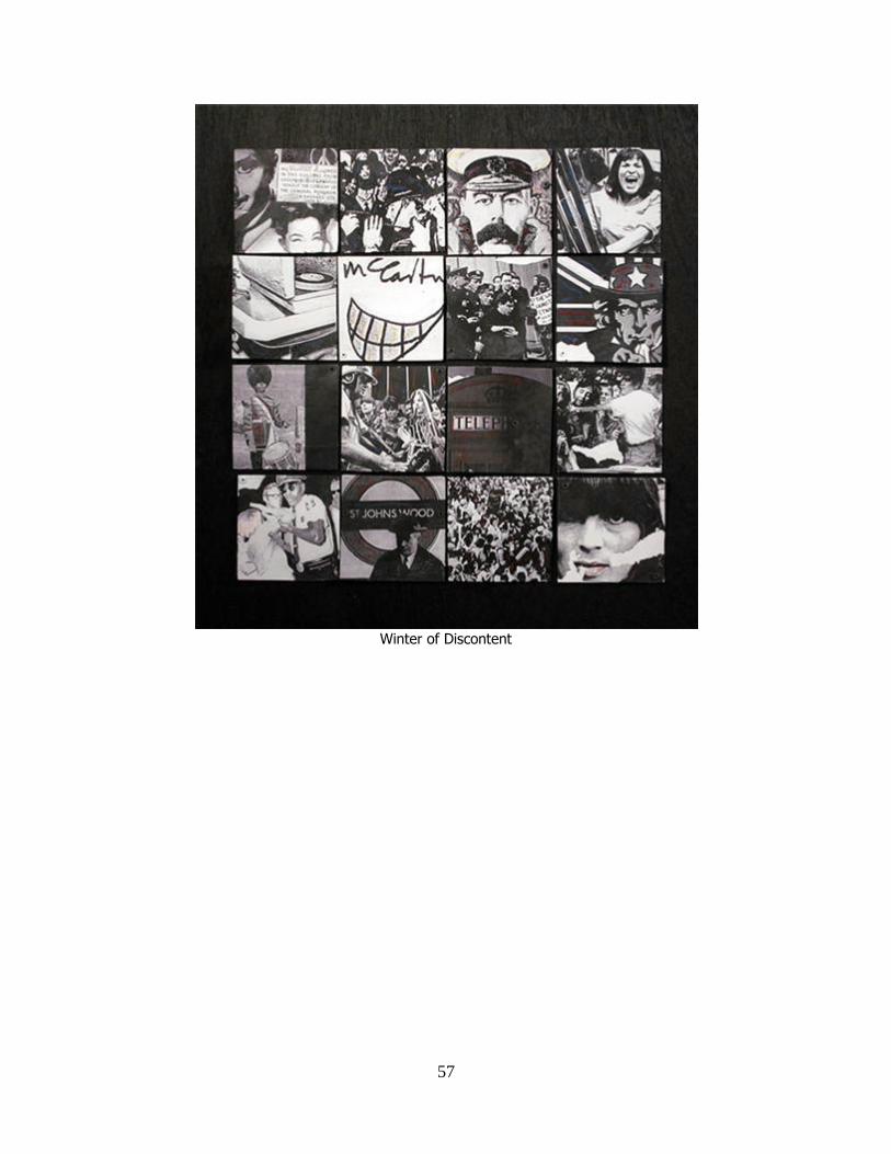
on the album. Adjacent to the ―church‖ is the mosaic. The mosaic, which is entitled
―Winter of Discontent,‖ is a montage of images of a symbolic nature. The mosaic is a
more direct reflection of repetitive arrangement of images that communicates
commentary related to music. This mosaic is a multiple image design which serves as a
metaphor in regards to the musical composition, ―Winter of Discontent.‖ The scale of this
composition in relation to subsequent works of the album is more significant due impart
33
to the ―weight‖ of the music composition and the fact that ―Winter of Discontent‖ is the
introduction for the album and sets the tone for the record as a whole. I use Andy
Warhol‘s ―Orange Car Crash-1963‖ as a historical influence behind this particular work.
The concept behind the mosaic was to repeat relative images made of photos sixteen
times, or four across the top and four down the side. The idea evolved into sixteen
different images that communicate an overall message both subjectively and
symbolically. The paradox of the subject matter in ―Orange Car‖ is established by using
bright, happy colors with a gruesome image. I carried this paradox through with the
mosaic, using a variety of scenes with crowds of fans alongside crowds of protestors and
rioters of the lat sixties/early seventies. Sandwiched between the ―crowds‖ are images of
the ―ideal‖ and symbols with an overall sense of chaos organized only by the physical
order of the mosaic layout of sixteen squares.
Warhol‘s ―Brillo 1964‖ was among many reference I used to develop and
substantiate my design for packaging, not only the album but the manner in which I
would exhibit the entire body of work in the format of an installation as mentioned
earlier. As with Duchamp‘s ―Box in a Valise,‖ ―Brillo 1964‖ proved to be a significant
objective for me to implement into both my perspective of 3-D design an presentation of
the design as an art structure. It is important to note that any discussion or connection
with Warhol, and for that matter, many of his contemporizes raises the issue of
appropriated imagery. EPILOGUE uses to some extent appropriated images particularly
in the area of re-structured photographs (photo session images of the band that never
existed).

34
CHAPTER 4
ANALYSIS OF WORK
This chapter deals with my personal evaluation of specific works of art that
visualize the music with design for this particular project. There are four works that serve
as a foundation for all additional images that reflect specific aspects of the band‘s history.
Along with the history these images have to have a direct relationship with the music that
makes up collection and subsequently the album. It is the burden of these images to
communicate ultimately the content and complexion of the record. In this chapter
references will be made to artistic influences, historical facts relating to the band, and an
argument for the rationale of using these images for the album.
Reference to Magritte has been in this project since the onset. His influence has
more to do directly with the history of the Beatles than a direct influence on my work.
However, the relevance of his art and the impact his work has on the band dictates
significantly to the design. McCartney‘s involvement with the art scene in England and
his hands-on involvement with the album art of the Beatle records acquainted him with
people such as Richard Hamilton and Peter Blake through the famous English art dealer
Robert Fraser, who had a significant impact on the initiation and completion of Sgt.
Pepper‘s album art. Fraser presented McCartney and the band Magritte‘s painting, ―Au
Revoir‖ (Green Apple). This was the inspiration for the Beatle‘s record label namesake.
―one lovely sunny day we were all out in the garden when Robert arrived
for a visit. He‘d brought a picture by Magritte which he knew I‘d like, and
so he just propped up the picture on the table and left. And when we came
in we saw the picture: a big green apple with ―au Revoir‖ written across it
in Magritte‘s handwriting. It was a dead cool conceptual of Robert‘s to do-
he knew I‘d love it and he knew I would pay him for it later. We showed
Magritte‘s apple to Gene Mahon, the ad guy, and used it as a basis for
ours.‖ - Paul McCartney. (Morgan-Wardle, 183)

35
I have made several references to Richard Hamilton, Matisse, and Warhol directly
and indirectly regarding collage. Magritte‘s influence is much more subtle but equally
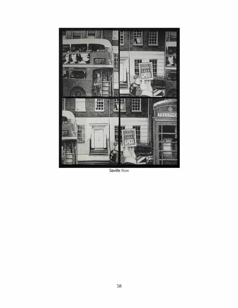
effective. When I designed the environments for the album (Church, Garden, 3 Savile
Row, and the Subway), I referred to Magritte‘s ―The Human Condition‖ (1933),
―Portrait‖ (1935), and ―Time Transfixed‖ (1938) as a resource in the design of the
environments. As aforementioned, the environments are composed of places that have a
footprint of the band. The series I created for the MONO version does not have clear
likenesses of the band member‘s only suggestions or hints of their presence in the
composition. The image ―3 Savile Row‖ was the first composition I created for
EPILOGUE. Originally titled, ―Sound from the White Door,‖ ―3 Savil Row‖ was
composed to seemingly capture an average day on a London street (double Decker bus,
English phone booth, newspaper taxi, and pedestrians). A closer look reveals surreal
qualities in the best Magritte style with a left hand holding a photograph of the entire
building of 3 Saville Row creating a ―double‖ perspective of the subject. ―The Human
Condition‖ having much the same effect, depicts a painting on an easel in front of a
window. The image on the canvas is the view from the window the canvas is obstructing.
It creates a ―double take‖ which was an objective in my environment images. Magritte‘s
composition has a sense of ―formality,‖ an order of placement, clean and uncluttered and
in some ways minimalist. With the exclusion of otherwise decorative elements, Magritte
focuses on objects that suggest silence and sound with movement. He expresses an
interpretation of the real world in an unworldly (fantasy) manner for the sake of art. ―3
Savile Row‖ has much the same qualities as ―Human Condition,‖ but it is not intended to
simulate a Magritte but to cause recall of an experience one could relate to Magritte. This

36
image reflects a series of songs on side one of the MONO versions that used sounds of
the bustling streets of London and Liverpool framing songs of protest and descent
(Winter of Discontent).
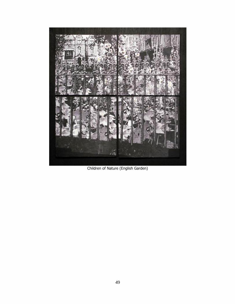
―Child of Nature‖ (garden) is inspired by Magritte‘s ―Portrait‖ (1935). ―Portrait‖
applies an animate object (human eye) to inanimate objects (a plate with a hot cake,
glass, knife, and a fork, bottle, and table) resulting in the composition (regarding) the
viewer as would a portrait by Van Gogh or Rembrandt.
In the ―Child of Nature,‖ four animate objects (the Beatles) among the vast
flowers and foliage of an English garden which is in a manner inanimate, and yet the
―faces‖ incorporated in the composition creates a sense of regard very much like
―Portrait‖ to the viewer. This image reflects a series of songs on side two of the MONO
version that used sounds of nature coupled with songs that used nature as a subject.
―St. John‘s Wood‖ (the subway) of all the works discussed has the most direct
relationship with a Magritte painting/composition. ―Time Transfixed‖ (1938) has an
unusual sense of sound and movement. The emptiness of the room reverberating with a
train whistle suggests by steam bellowing from the engine‘s stack rivaled only by the
steady ticking of a mantle clock in front of a picture mirror that reflects infinity. St.
John‘s Wood is the Underground Station closest to Abbey Road Studio. The Beatles
frequented this station in transit to the studio. Although its importance as an environment
is understandable, it is the sense of surreal found in the ―Tube‖ that conveyed the very
qualities that ―Transfixed‖ possess. ―St. John‘s Wood‖ suggests sound and movement
with the oncoming subway train as the ―conductor‘s box‖ warns waiting passengers to
―MIND THE GAP‖ repeatedly to the rhythm of the subway clock in a tubular corridor
37
that seems to go on forever. This image correlates with the incidental sound and related
songs that capture the atmosphere of the English Underground on side two of the MONO
version.
In correlation I accumulated information related to the relevant history to the
Beatles during the periods of these recordings: the artistic influences of the band,
influences on the band, related artists and masterworks, music and sound directly and
indirectly related to this project. All of these affected the personal perspective and
realization for the design of the album ―EPILOGUE - with Sound from the White Door.‖
The objective was to visualize music with design; the challenge was not how I would
achieve this but which direction I would take to best serve the objective of the design.
Ultimately, my solution was to create pictorial images that depicted areas of interest
regarding the Beatles, inserting visual references that recalled details or hints of the band
without using their likenesses. The images correlating with the ―mood‖ of the songs as a
collective, as opposed to illustrating lyrics of individual songs. The atmosphere of the
music is brooding, melodic, and at times, emphasized by the contrast of the arrangement
of songs overlapping, like an audio collage, creating a tension and edginess to the
complexion of the album as a whole.
As a conceptual image, the album cover is composed of an image of four young
English school boys gathered around a grave in the center at St. Peter‘s Church in
Liverpool, England. The boys have expressions of curiosity, consoling, and bereavement
between imposing marble figures of mortality, over-towered by a Victorian Church under
a grey English sky. The young friends seem to be reading an epitaph, facing the
inevitability together; a fate inscribed somewhere there among the grave-stones of
38
Woolton-Fete. This is my interpretation of the music on EPILOGUE thus the visual
response to that music. The subjective aspects of the songs were divided into four parts
for which corresponding images were created to reflect those parts: ―St. Peter‘s Church-
Woolton Fete‖ ( where the John Lennon and Paul McCartney first meet and forged a
friendship), ―Queen‘s Garden‖ (visual reference to the real ―Strawberry Fields‖ and the
visual of the garden where the Beatles first saw Magritte‘s ―Au Revoir: (Green Apple),
―3 Savile Row‖ (location of the Beatles last recording studio and origin of the ‗‖lost‖
recordings, i.e., ‗Sound from the White Door‘) and ―St. John‘s Wood‖ (the subway
―Tube‖ station closest to Abby Road). Subject matter represented in songs range from
riots to peaceful English gardens, adulthood, adultery, adolescence, and childhood,
acceptance and rejection, friendship and paranoia, hope and despair, life and death,
beginning, middle, and end. . . And back again. Visualization in the design was
accentuated with the mosaic ―Winter of Discontent‖ included in the gate-fold adjacent
from the panoramic pictorial of ―King of the Castle of Birds‖ correlating with a prose
composed of lyrics of each song that appears on the album. (Mark Lewisohn, 153)
Because the Beatles work is so immediately related to the vinyl record format, the
LP was basis for the design. I formatted the placement of borders, labels, logos, and
sticker enticements in a similar vein to ―WITH THE BEATLES‘ (English-Mono
Version). As stated earlier, I created a ―mock-up‖ layout of simple shapes (first, in
‗white-on white-, second in monochromatic colors) in the form of an album. The
backside was laid out as well establishing spaces for type, commentary, song lists, and
credits. The dimension of the LP cover is conducive to a wide variety of imagery, simply
to very elaborate and complicated. This raises a question: Is the standard CD cover

39
adequate to convey album art? In regards to imagery created for work where the vinyl
format was standard, I would have to say that the CD format is not adequate. It has been
my position that an album that was created for vinyl records is lost on the CD. Sgt.
Pepper is an excellent example. Much of the nuance of this cover is lost in the greatly
reduced size of the cover image. Record companies have recognized and responded to
this in the form of ―box sets‖; however, the standard size of the CD jewel case remains
the same and has reduced the effect of the album art. (Turner, 170)
For EPILOGUE I wanted to re-design the CD case. I determined the size of my
design would be based on a ―scaling‖ experiment. I reduced the original size of Sgt.
Pepper (LP VERSION) in black and white to the smallest size without losing the extreme
detail of the composition. This resulted in a 35% reduction from original size. I then
increased the size by 10% which resulted in 75% of the original image size. This became
the dimension for my CD cover. It is clearly smaller than an LP but not so large that it
dwarfs the actual CD disc. At this point I included and the design features I used for the
LP into the CD with a modified layout. I made the cover image wrap around the back of
the CD cover and allocated room for the song list. I took advantage of the clear case
backing that anchors the CD with an image of the:‖White Door‖ (3 Savile Row) which
becomes visible when the CD is removed. It was imperative that the disc was the
completion of the design, a physical part of the aesthetics, above and beyond its purpose
as a digital devoice of sound. The whole design is much like a Novella with pictures. It is
tactile and visually compelling and has a ―presence.‖ I relate this to a hard-back book,
conveying weight, significance, and timelessness.

40
CHAPTER 5
SUMMARY AND CONCLUSIONS
I embraced this project for several reasons: the parallel I saw in the hypothetical
concept of the album and my own perspective of creative process, appreciation for the
band, and the idea of the ―Urban Legend.‖ I stated the art was in part a sales pitch; a goal
for the design was to ―sell‖ to the viewer of the idea of the lost Beatle album, to make it
real. The design needed to visually create sound without music makes it seem as if it had
always been! I think that is what good design/art can do. It can communicate in a way
that the viewer responds with both a sense of new or renewed awareness and familiarity
through the viewer‘s capacity to relate on some personal some level. They are seeing it
again for the first time!
As a kid, my friends and I would speculate about everything under the sun
including the ―lost‖ album. We suggested among ourselves that the band had made the
album but never intended to release it; rather, they would meet every year in some mystic
place, make a pot of tea, and listen to it, just the four of them. ―We did it for ourselves,
―you could hear them say! With all the anticipation I have with this project, the
investment of time, money, and education, there has always been the prospect of the
recordings being released. After all this there is a part of me that thinks this album should
always be ―lost,‖ a mystery. In this way, any person who takes enthusiasm, joy, and
recollection in such things allows personal imaginations to be a part of it. That is what art
ultimately should do, to provoke all of us to imagination in a way that otherwise we
might not do, open a door, broaden an experience. As cliché as it may sound, it is only so,
because it is true.

41
WORKS CITED
Arnason, H.H. History of Modern Art. New Jersey: Prentice Hall Inc, 2003.
Beatles, The. The Beatles Anthology. San Francisco: Chronicle Books LLC, 2000.
Eskilson, Stephen F. Graphic Design- A New History. New Haven, Conn.: Yale
University Press, 2007.
Kandinshy, Wassily. Concerning the Spiritual in Art. New York: Wittenborn, 1947.
Kindersley, Darling. Bob Dylan- Vision Portraits and Back pages. MOJO Publishing,
London, 2005.
Lewisohn, Mark. The Beatles Recording Sessions. Prospero Books, 2000.
Meggs, Phillip B. A History of Graphic Design., New York: Van Nostrand Reinhold
Company Inc., 1983.
Meggs, Phillip B. Type and Image: The language of Graphic Design. John Wiley and
Sons, Inc., 1992.
Miles, Barry. The Beatles Diary. Mass: World Publications Group, Inc., 2007.
Morgan-Wardle, Johny and Ben. The Art of the LP. New York: Sterling Publishing Co.
Inc. 2006.
Munroe, Alexandra - Hendricks, Jon. Yes-Yoko Ono. New York: Harry N. Abrams, Inc.
2000.
Turner, Steve. A Hard Day‘s Write. United Kingdom: Carlton Books Limited, 2005.
Unterberger, Richie. The Unreleased Beatle‘s Music and Film. Back BERT Books, San
Francisco, Ca. 2006.
Warren-Romanowski, George and Patricia. The Rolling Stone Encyclopedia of Rock ‗n‘
Roll- Third Edition. Rolling Stone Press Book. Rolling Stone Press Book New

42
York, 2001.
Webster, Merriam. Merriam- Webster‘s Collegiate Dictionary. Merriam-Webster Inc.
1997.

47
Epilogue
52
JPGR (P)

53
JPGR (J)

54
JPGR (G)

55
JPGR (R)

56
Sound From the White Door (Part 3)
57
Winter of Discontent
60
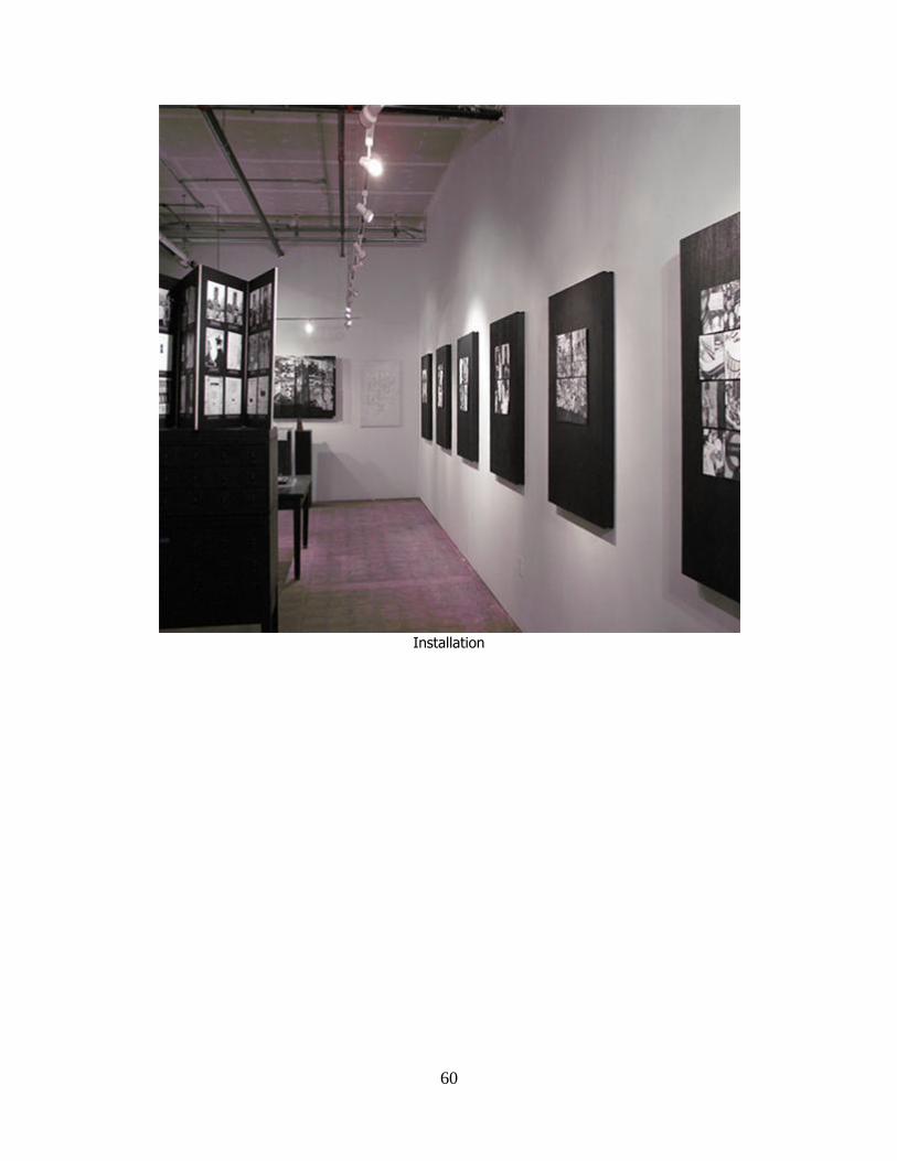
Installation

61
Installation

63
VITA
WILLIAM B. BLEDSOE
Personal Data: Date of Birth: 22 September 1963
Place of Birth: Johnson City, Tennessee
Marital Status: Married
Education: Masters of Fine Arts in Graphic Design, East Tennessee
State University. August 2010.
Bachelor of Fine Arts, Department of Art and Design, East
Tennessee State University. August 1992.
Professional Experience: Providence Academy: Secondary Art Instructor. Created
the first Secondary art program for a classical school,
providing independent study, art history, and studio
courses, including annual art exhibits as part of the
curriculum.