Embed Size (px)
DESCRIPTION
Free ebook. Get more at retailsmartresults.com or buy the premium edition.
Citation preview

Visual MerchandisingArt & Science
Dr Dennis Price

2
Visual Merchandising that Sells
©2009 Dr Dennis Pricewww.retailsmartresults.com
This EBook is distributed free of charge, and
may be re-distributed under the Creative
Commons License with attribution.
To procure a copy without watermarks and
with additional content (as indicated) and
with the printing option enabled, please visit
ganador.litmos.com/courses/ - where you
will be able to download the EBook as a
retail resource for $24.95
The book has been developed and written by
Dr Dennis Price, CEO of Ganador
Management Solution in conjunction with
Moonyeen Price. He has over 20 years
experience in writing, consulting, and
teaching retailing and marketing. More
importantly, he is an ex-retailer who learned
the trade on the shop floor and currently
works with several blue chip organizations
in the retail supply chain to improve and
develop their retail presence through client
acquisition, retention, and education.
Ganador Management Solutions comprises
three divisions, offering a range of solutions
to clients in the retail supply chain.
Ganador Business Academy, a registered
training organization
Ganador ServeSense, a customer
experience measurement company
Ganador RetailSmart, for strategy,
business development and shopper-
marketing solutions in the retail supply
chain.
MEMBERS www.retailsmartresults.com
BLOG www.retailsmart.com.au
WEB www.ganador.com.au
PO BOX 243, Kiama, NSW, 2533 AUS
© 2009
This is the FREE version of
Visual Merchandising that Sells.
Some features and some content has been masked
and/or disabled. If you are a serious student of retail,
you can obtain the premium edition by registering at
this link:
The investment is $19.95.
The return is incalculable.
Whilst some people may be frustrated with the fact
that it is not all for free, I would like to point out that
Unlike most EBooks this is not a glorified marketing
document for our services and we also like to eat
occasionally. Your support is appreciated.

3
Visual Merchandising that Sells
©2009 Dr Dennis Pricewww.retailsmartresults.com
1. INTRODUCTION ................................................................................41.A Purpose...............................................................................................................................................41.B Productivity.........................................................................................................................................41.C Objectives ........................................................................................................................................ 101 D. Summary......................................................................................................................................... 11
2. CONCEPT ........................................................................................122.A Components..................................................................................................................................... 122.B Examples .......................................................................................................................................... 132.C How to develop a concept ............................................................................................................... 142.D The art of common sense ................................................................................................................ 14
3. CONFIGURATION............................................................................153.A Formats............................................................................................................................................ 153.B Flow.................................................................................................................................................. 20
3.B (i) Storefronts............................................................................................................................... 203.B (ii) Entrances ................................................................................................................................ 213.B (i) Traffic-flow patterns ................................................................................................................ 21
3.C Zones................................................................................................................................................ 223.C (i) Exteriors................................................................................................................................... 233.C (ii) Landing Zone........................................................................................................................... 243.C (iii) Gold Zone............................................................................................................................... 243.C (iv) Silver Zone.............................................................................................................................. 253.C (v) Bronze Zone ............................................................................................................................ 25
4. CATEGORY MANAGEMENT...........................................................264.A Range & Assortment........................................................................................................................ 264.B Pricing .............................................................................................................................................. 264.C Shelf Space Management ................................................................................................................ 274.D Display Configurations..................................................................................................................... 28
5. CREATIVE........................................................................................295.A Strategies ......................................................................................................................................... 295.B Elements .......................................................................................................................................... 325.C Principles.......................................................................................................................................... 36
6. COMMUNICATION...........................................................................396.A Packaging & Labelling ...................................................................................................................... 396.B Signage & POS Collateral ................................................................................................................. 40
7. CONTROL........................................................................................417.A Qualitative ....................................................................................................................................... 41
7.A (i) The Brand ................................................................................................................................ 417.B (ii) The Customer Experience....................................................................................................... 42
7.B Quantitative ..................................................................................................................................... 42
8. CONCLUSION..................................................................................439. EXERCISES .....................................................................................44

4
Visual Merchandising that Sells
©2009 Dr Dennis Pricewww.retailsmartresults.com
1. INTRODUCTION
1.A Purpose
Store design is a science and an art – and good deal of common sense. Poor design is almost
always a result of a designer/owner losing track of one of the basic elements of a retail
environment. A store is a place where people shop: everything else is secondary.
As a place of shopping, the layout and design
must in the first instance make shopping
possible, then make it easy and then and only
then different or interesting or exciting. The basic
act of shopping should not be sacrificed on the
altar of ‘image’. But this is no excuse for drab,
functional layouts; it is simply a warning not too
emphasise appearance over substance.
There are two main things you can do to boost
sales which are free or nearly free. One is great
customer service, and the other is by empowering the greatest silent salesmen of all - visual
merchandising. For instance, moving a product from the bottom shelf to the eye-level shelf has
proven to increases sales by as much as 87%1.
1.B Productivity
Visual merchandising is really attempting to manage three assets:
Merchandise (stock)
Space
Fixtures, fittings and equipment.
No business wants unnecessary empty spaces - which costs money to rent - or a lot of ‘dead’ or
duplicate stock - which cost money to buy, or expensive, impractical or unusable fixtures and
equipment.
The objective of visual merchandising is therefore MAXIMUM SALES from MINIMUM STOCK
and SPACE. The retailer must therefore achieve the optimum balance between sales and
investment in merchandise and space in the shortest possible time. In order to know if these
1I sometimes remember facts like these but lose the source. Sorry.
Premium
edition
only

5
Visual Merchandising that Sells
©2009 Dr Dennis Pricewww.retailsmartresults.com
objectives are achieved, the manager can use a number of measures of productivity. Just like a
doctor checks heartbeat per minute or cholesterol levels, a retail manager must make certain
such checks from time to time. Most of these metrics are produced as part of the standard
reporting of any POS system, but is important to understand how they are derived.
Productivity of Space
The measurement of space productivity is also known as Trading Density, and measured as
sales per square metre. The formula is:
Turnover
Trading Area
The formula can be applied to the total store, a product line or a department - as required.
Trading area measurement must just correspond with sales (turnover) figure.
Example
Total Sales : $12 000 000 (Per annum)
Trading Area : 2 000 m2
Trading Density : $ 6 000/m2
It does not really matter whether one uses annual or monthly sales figures for the calculations,
as long as you do not try and compare a store using monthly data with one using annual data.
Productivity of Stock
Stockturn is also sometimes referred to as turnover - and strictly speaking it is more correct
than using the word 'turnover' to refer to total sales. It is, however, widespread practice, and we
shall use the word stockturn to refer to the turnover rate of merchandise. That it is, how many
times (per year) a store turns over its stock.
Once again, there are two ways of doing this calculation. The distinction is not between
monthly and annual sales, but between retail prices and cost prices. The norm is to use annual
data, as monthly data would result in fractions, which are hard to work with and benchmarks
have been recorded based on annual numbers anyway.
Either of the following two formulae can be used:
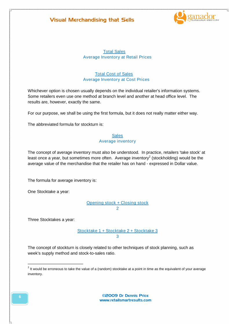
Premium edition only
6
Visual Merchandising that Sells
©2009 Dr Dennis Pricewww.retailsmartresults.com
Total Sales
Average Inventory at Retail Prices
Total Cost of Sales
Average Inventory at Cost Prices
Whichever option is chosen usually depends on the individual retailer's information systems.
Some retailers even use one method at branch level and another at head office level. The
results are, however, exactly the same.
For our purpose, we shall be using the first formula, but it does not really matter either way.
The abbreviated formula for stockturn is:
Sales
Average inventory
The concept of average inventory must also be understood. In practice, retailers 'take stock' at
least once a year, but sometimes more often. Average inventory2 (stockholding) would be the
average value of the merchandise that the retailer has on hand - expressed in Dollar value.
The formula for average inventory is:
One Stocktake a year:
Opening stock + Closing stock
2
Three Stocktakes a year:
Stocktake 1 + Stocktake 2 + Stocktake 3
3
The concept of stockturn is closely related to other techniques of stock planning, such as
week's supply method and stock-to-sales ratio.
2It would be erroneous to take the value of a (random) stocktake at a point in time as the equivalent of your average
inventory.
7
Visual Merchandising that Sells
©2009 Dr Dennis Pricewww.retailsmartresults.com
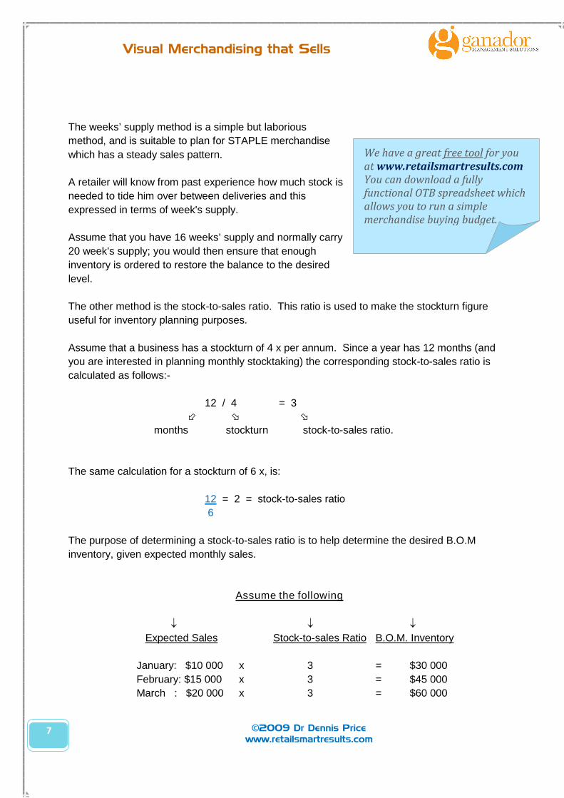
The weeks’ supply method is a simple but laborious
method, and is suitable to plan for STAPLE merchandise
which has a steady sales pattern.
A retailer will know from past experience how much stock is
needed to tide him over between deliveries and this
expressed in terms of week's supply.
Assume that you have 16 weeks’ supply and normally carry
20 week's supply; you would then ensure that enough
inventory is ordered to restore the balance to the desired
level.
The other method is the stock-to-sales ratio. This ratio is used to make the stockturn figure
useful for inventory planning purposes.
Assume that a business has a stockturn of 4 x per annum. Since a year has 12 months (and
you are interested in planning monthly stocktaking) the corresponding stock-to-sales ratio is
calculated as follows:-
12 / 4 = 3
months stockturn stock-to-sales ratio.
The same calculation for a stockturn of 6 x, is:
12 = 2 = stock-to-sales ratio
6
The purpose of determining a stock-to-sales ratio is to help determine the desired B.O.M
inventory, given expected monthly sales.
Assume the following
Expected Sales Stock-to-sales Ratio B.O.M. Inventory
January: $10 000 x 3 = $30 000
February: $15 000 x 3 = $45 000
March : $20 000 x 3 = $60 000
We have a great free tool for youat www.retailsmartresults.comYou can download a fullyfunctional OTB spreadsheet whichallows you to run a simplemerchandise buying budget.
8
Visual Merchandising that Sells
©2009 Dr Dennis Pricewww.retailsmartresults.com
There is a distinct relationship between TOTAL SALES and SIZE of INVENTORY. This makes
intuitive sense, because the bigger the store (more stock) the higher the sales. There is that
point where an increment in stock is not offset by a corresponding increase in sales. For
example, if a store had to double in size, the TOTAL SALES will definitely increase, but it
probably will not double in sales. The question that arises is what the optimum stock-to-sales
(or stockturn ratio) might be.
This is a crucial point that bears repeating because in our experience most retailers don’t
instinctively understand this.
There is a distinct relationship between TOTAL SALES and SIZE of INVENTORY.
This relationship is, within a certain range also FIXED. That is:
- For a given store
- In a certain location
- Selling a certain range of products
- Assuming effective and stable marketing efforts
there is a GIVEN amount of sales to be achieved
AND
that given amount of sales requires a FIXED ratio of stock to support the level of sales.
Fortunately you do not have to do it by trial-and-error for every business, as most types of retail
businesses have been around long enough to have built up a history of results. So, managers
will know from experience, and will be able to verify with industry averages, what the typical
stockturn for a specific type of retail business is or should be.
The following table is an example of some of the typical stockturns3 for various types of
retailers.
3These numbers have been adapted and ‘smoothed’ to highlight the differences based on our experience. The
actual numbers may vary subject to merchandise assortment carried in that category.
all things being equal…
9
Visual Merchandising that Sells
©2009 Dr Dennis Pricewww.retailsmartresults.com
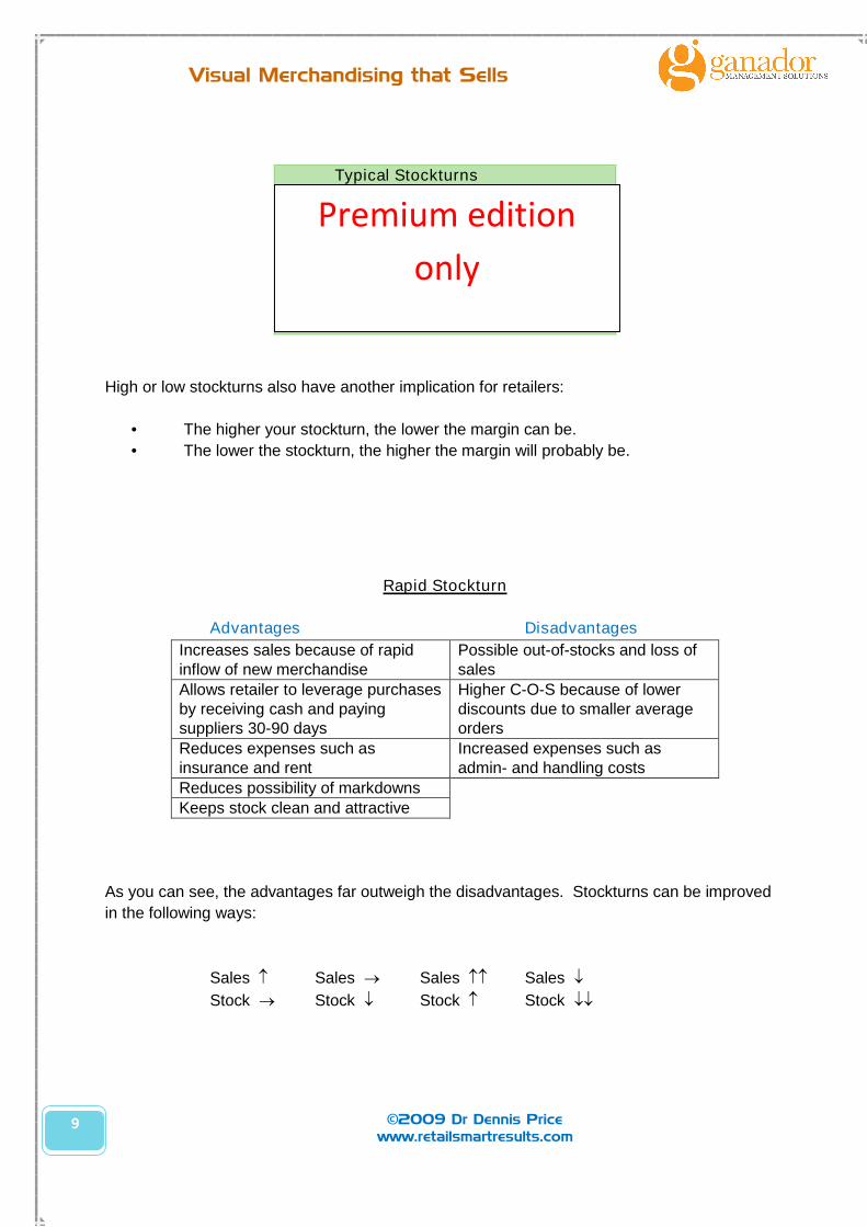
Typical Stockturns
Dairies : 95 xButcheries : 60 xNewsagents : 10 xChemists : 7 xFashion : 6 xHardware : 4 xJeweller : 2 x
High or low stockturns also have another implication for retailers:
• The higher your stockturn, the lower the margin can be.
• The lower the stockturn, the higher the margin will probably be.
Rapid Stockturn
Advantages Disadvantages
Increases sales because of rapidinflow of new merchandise
Possible out-of-stocks and loss ofsales
Allows retailer to leverage purchasesby receiving cash and payingsuppliers 30-90 days
Higher C-O-S because of lowerdiscounts due to smaller averageorders
Reduces expenses such asinsurance and rent
Increased expenses such asadmin- and handling costs
Reduces possibility of markdownsKeeps stock clean and attractive
As you can see, the advantages far outweigh the disadvantages. Stockturns can be improved
in the following ways:
Sales Sales Sales Sales
Stock Stock Stock Stock
Premium edition
only
10
Visual Merchandising that Sells
©2009 Dr Dennis Pricewww.retailsmartresults.com
As can be seen, some strategies require you to reduce your stock. Such a reduction can be
achieved by:
• Cut slow moving stock items out completely.
• Reduce variety (range) by emphasizing popular items only.
• Reduce assortment by minimising price, colour, style, fabric and size choices.
Average Sale
This measure of productivity is probably the easiest and it makes a lot of common sense.
There are only three ways in which you can increase your sales:
• Charge more for the same number of units
• Sell more units by adding customers
• Sell more often to same customers
The average sale is calculated as the total sales divided by number of customers. It is
suggested that more than one measure is used by retail store managers; as each measure
emphasizes a different aspect and you cannot get the full picture if only one diagnostic tool is
used.
1.C Objectives
As stated earlier, the primary objective of visual merchandising is to generate more sales. This
can only be achieved by attaining the following (secondary) objectives. (The 5 A’s.) As we later
consider various strategies and merchandising principles, these objectives will be borne in mind.
Accessibility
A display that discourages the customer from shopping from it has very little value. Obstacles
must be cleared and the products must be reachable.
Accessibility also relates to the ‘shoppability’ of a display/ store, especially within the context of
people with a variety of disabilities.
Attention
Displays must get and hold the customer's attention long enough for him/her to make a decision
about the product.

11
Visual Merchandising that Sells
©2009 Dr Dennis Pricewww.retailsmartresults.com
Adjacency
Having a plan and a purpose for which merchandise should go together, goes a long way towards
increasing sales.
The golden rule is to present your merchandise the way a customer would use/buy it. Appropriate
adjacencies is the silent salesman’s way of cross-selling merchandise.
Anthropometrics
This aspect concerns itself with the physical dimensions of the customer's body. Whether it is child
or adult, male or female plays a role when attempting to determine eye-level. Similarly it would be
hard to buy (and lift) a 5kg bag of sugar from the top shelf.
Arrangement
Arrangement refers to things being put in order. This aspect emphasizes that there is a certain
element of logic in any display. Products are normally sized from small to large, and tops/shirts are
always hung above the trousers.
1 D. Summary
To set the scene, these first few pages have been devoted to the WHY of visual merchandising. In
summary, VM has one purpose alone and that is move stock.
In technical terms this means we should be keenly aware of merchandise productivity (stockturns)
and we should measure our success against this metric.
And finally, in order to achieve that overall purpose, there are specific objectives (the 5As) we can
set for each individual display. Meeting these objectives will drive the business towards the overall
purpose of being a successful (and productive) retailer.
12
Visual Merchandising that Sells
©2009 Dr Dennis Pricewww.retailsmartresults.com
2. CONCEPT
2.A Components
The first aspect of creating a display is the hardest to explain and probably the hardest to
execute. The fact is, all of what follows in this section is simply an attempt to recreate in a
logical fashion what is essentially a creative process. With that I mean that all of the following
explanation can be obviated by simply having an idea.
However, when you work as part of a team in a structured environment, it is useful to have a
framework for discussing and evaluating these creative concepts (ideas) even if the
accompanying explanation does not do justice to the process of creative inspiration.
There are three necessary components of the concept that needs to be in place and these three
components are universal and as such can be evaluated and systematically considered.
Positioning
Every creative concept must resonate with the positioning of the store brand. Positioning is a
marketing concept which won’t be explored here; suffice to say that ideally all displays should
be consistent with the brand story.
To use an extreme example, a store aimed at children and families (e.g. Build-A-Bear) would
not (and probably won’t) ever build displays which are risqué.
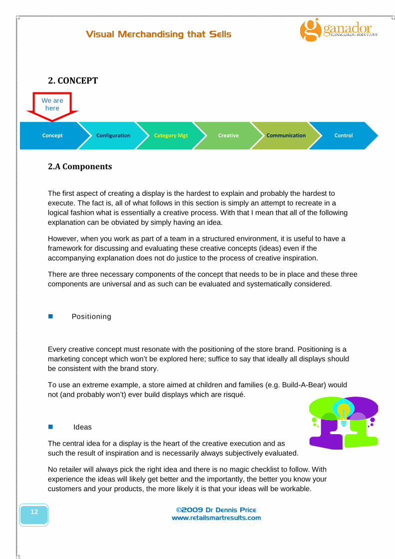
Ideas
The central idea for a display is the heart of the creative execution and as
such the result of inspiration and is necessarily always subjectively evaluated.
No retailer will always pick the right idea and there is no magic checklist to follow. With
experience the ideas will likely get better and the importantly, the better you know your
customers and your products, the more likely it is that your ideas will be workable.
Concept Configuration Category Mgt Creative Communication Control
We arehere

13
Visual Merchandising that Sells
©2009 Dr Dennis Pricewww.retailsmartresults.com
Stories
The essence of a good idea is one that tells a story. Many
people mistakenly believe that to ‘theme’ a display is the right or
indeed the only way to tell a story.
Some stories can be really simple and not every story needs
extravagant accessories to create a particular mood.
This image of a paper display in a newsagency tells a strong
story about the fun and the variety of papers in store – making a
statement that is relevant to any purchaser of art supplies: ‘we
are in the paper business.’
2.B ExamplesThis simple kid’s corner tells a story that the store cares about
children. It is also an example of how a the store’s display goes
beyond merchandise itself – but you can easily see how this
little corner allows mum or dad to shop in peace for a few
minutes
The novelty entrance of this store is similarly engaging and no
doubt tempts kids to enter the store – with mum (or dad) hot on
their heels.
Stores like Lush and Body Shop are excellent
at telling stories. If you wonder around and
Body Shop you will get a very strong sense of
the overall brand story (caring about nature
caring about people) and it is reflected in the
signage, the packaging and every single
product display.
Premium
edition
only
Premium
edition
only
Premium
edition
only
Premium
edition
only
Premium
edition
only

14
Visual Merchandising that Sells
©2009 Dr Dennis Pricewww.retailsmartresults.com
And sometimes retailers try to tell stories (like in this racy
Christmas window) which most people won’t get, and probably
offends most people who value Christmas.
2.C How to develop a concept
The process of developing a concept is simple, but creating good ideas is not. ‘Ideating’ is a
whimsical, ephemeral activity. Brainstorming is a technique that may or may not produce a food
idea.
The ideas must then be interpreted. That is it must
be translated into an actual physical construct that
is practical (can be built) and feasible (resources
required).
Finally the specific interpretation must be
evaluated for its ‘fit’. Does it actually meet a customer’s need? Is what we are selling a good fit
for our business? Does the display fit our brand proposition and positioning? (This is hard to do
objectively because people tend to fall in love with their own ideas.)
2.D The art of common sense
If this book achieves nothing but gets home the message that visual merchandising is NOT an
exact science and that NOBODY has the tight answers all the time – it has succeeded. Visual
Merchandising is a discipline that demands much experimentation, and the worst thing a
retailer can do is look to and rely solely on experts.
All it takes is common senses, and the litmus test for any display is three
simple questions:
1. Is this the right merchandise in the right place?
2. Does it attract customers’ attention?
3. Does it tell a compelling story?
Don’t be afraid to experiment. Think through what you have created from
a practical perspective and consider it from the customer’s perspective. Easy. Peasy.
Ideate Interpret Fit
Premium
edition
only
15
Visual Merchandising that Sells
©2009 Dr Dennis Pricewww.retailsmartresults.com
3. CONFIGURATION
Some aspects of retail are often quite static after the initial floor plate has been configured, so it
is important to make an effort to get it right at the outset.
3.A Formats
Determining Optimum Store Size
The size of the store is obviously fixed – after a lease has been signed – but that does not make
it less important. Size is a major factor in determining rent, and rent is one of the biggest fixed
expenses a retailer will have. The right size is determined by working backwards from the likely
productivity that will be achieved in that space. Sales must be forecasted (allow for some
growth) and then base the size requirement on the benchmark productivity. For example:
If, forecast sales $2,000 000
And, Benchmark Trading Density $10,000/m2
Required store size 200m2
Carefully consider any strange shapes that will result in shopping being made inconvenient, as
well as impediments like columns, changes in floor heights and even the width of the entrance.
Restaurants may be able to accommodate ‘interesting’ configurations, but a supermarket or toy
shop (where trolleys and prams are common) ideally require a flat, rectangular layout. Once the
ideal store size is ascertained, this should be weighed up against the commercial realities –
including the availability of that space in the desired location.
Space Allocation
Once the appropriate size is selected, the next decision is how much non-trading space is
required vs. trading space. This also differs between different types of retailers, with some
requiring very little (5%) and other requiring a great deal (50%) of non-trading space.
Concept Configuration Category Mgt Creative Communication Control
We arehere
16
Visual Merchandising that Sells
©2009 Dr Dennis Pricewww.retailsmartresults.com
In shopping malls it is now common practice to have some storage space off-site because it is
so much less expensive than having relatively unproductive space incorporated into the store.
This has implications for staffing levels and security, but is nonetheless considered an
acceptable trade-off. There is no definitive answer, but the more expensive the space is, the
less one can afford to allocate space to non-sales areas. Most speciality stores would allocate
approximately 15%-20% to non-sales areas. Most stores of course also have to allocate space to
non-selling activities.
There are four strategies a retailer can follow to accommodate the non-selling areas.
1. Sandwich approach is used in a multi-level store where one of the middle floors is
allocated to non- selling activities.
2. Core approach assigns the centre of the store to non-selling activities.
3. Peripheral approach assigns the perimeters (along the sides) to non-selling activities.
4. Annex approach assigns an add-on (appendage) to the main bulk of the selling area.
Non-selling areas include:
• Cash desk
• Other customer service areas
• Dressing room (cubicles)
• Ablution facilities
• Stock room
• Offices
• Staff rooms
Without doubt, the most common design/ configuration error made by specialty stores is the
location of the cash desk. Again there is a fallacious assumption that the best location for the
cash desk is near the entrance where it is easy to keep an eye on the comings and goings of all
customers for ‘security’ reasons. The truth is that the front of the store is your most productive
sales area, so locating the cash desk there could easily diminish sales by 10%- 20%.
Furthermore, research has shown that only about 20% of shrinkage is directly attributable to
customers who shoplift. (The rest is due to employee theft, collusion between employees and
outsiders and administrative errors.) Even assuming an incidence of 5% stock loss due to
shrinkage, this means only 1% in real terms is a result of customer theft. The loss in sales
(20%) far outweighs the shrinkage factor.
The astute use of modern technology can further minimise customer theft, so it makes little
sense to sacrifice your most productive trading area for the sake of ‘security’. The right place to
put the POS is where the customer would expect it – at the end of the customer journey, and in
the least productive part of that particular zone.
17
Visual Merchandising that Sells
©2009 Dr Dennis Pricewww.retailsmartresults.com
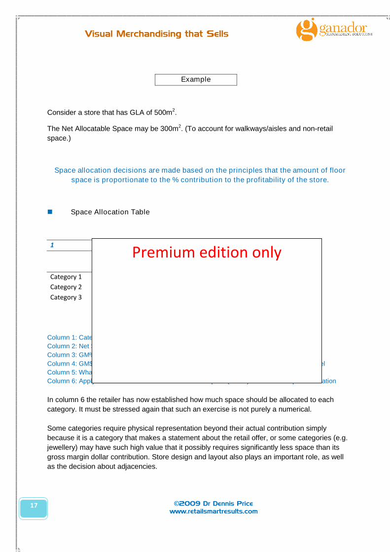
Example
Consider a store that has GLA of 500m2.
The Net Allocatable Space may be 300m2. (To account for walkways/aisles and non-retail
space.)
Space allocation decisions are made based on the principles that the amount of floor
space is proportionate to the % contribution to the profitability of the store.
Space Allocation Table
1 2 3 4 5 6
GM% Sales GM$
% Dollars
contributed
Net Floor
Space=
Category 1 30% $ 1,000,000 $ 300,000 44% 132 m2
Category 2 25% $ 500,000 $ 125,000 19% 57 m2
Category 3 50% $ 500,000 $ 250,000 37% 111 m2
Sales $ 2,000,000 $ 675,000 100% 300 m2
Column 1: Category (e.g. Shoes, Skates) is a given.
Column 2: Net Sales per category is taken from the POS
Column 3: GM% of that category is a calculation (GP÷Net Sales)
Column 4: GM$ of the category = how much GM does that category contribute a that sales level
Column 5: What ratio is the Gross Margin contribution of each category?
Column 6: Apply the contribution ratio to available floor space (NAFS) to determine space allocation
In column 6 the retailer has now established how much space should be allocated to each
category. It must be stressed again that such an exercise is not purely a numerical.
Some categories require physical representation beyond their actual contribution simply
because it is a category that makes a statement about the retail offer, or some categories (e.g.
jewellery) may have such high value that it possibly requires significantly less space than its
gross margin dollar contribution. Store design and layout also plays an important role, as well
as the decision about adjacencies.
Premium edition only

18
Visual Merchandising that Sells
©2009 Dr Dennis Pricewww.retailsmartresults.com
The final step is to compare the theoretical allocation (calculated above) with the actual
allocation and to make an executive decision about an appropriate response to any
discrepancy. The actual allocation is a simple physical measurement of the actual amount of
space currently allocated to the category.
Example
Theoretical
Allocation
Actual
Allocation
Final
Allocation
Category 1 44% 40% ?
Category 2 19% 25% ?
Category 3 37% 35% ?
The next decision is the allocation of departments/ merchandise categories to across the sales
floor. This is not a simple linear decision. The retailer cannot simply allocate more space to the
biggest selling merchandise category. A specific retail format will dictate that certain lines must
be carried, even though it is a relatively slow seller. Logic dictates that if you constantly cull the
lowest selling category from the sales floor, you will pretty soon be left with only one category.
(This will turn your department store into a shoe store quick smart.)
A simple way of assessing adjacencies is to map all categories on a simple table according to
the sequence in which the typical shopper would experience the shopping trip. This is done by
listing each department in a logical order down a list, and then simply to cluster any 3
successive categories together to evaluate whether a category is appropriately complemented
by the preceding and following category.
That is does the merchandise category just before and just after (i.e. maybe just to the left or
just to the right) make sense as a shopping experience for the typical customer? In the example
below:
Is the sequence/ adjacency of categories 1-2 [Shoes/ Swimwear] sensible?
Is the sequence/ adjacency of categories 2-3 [Swimwear/Socks] sensible?
Example
Evaluate in sequence of categories (as experienced by the shopper) and evaluate whether it is
a sensible adjacency. Depending on the design of the store you may need to evaluate more
than 2 categories simultaneously.
Premium edition only

19
Visual Merchandising that Sells
©2009 Dr Dennis Pricewww.retailsmartresults.com
1. Shoes (M)
2. Swimwear3. Socks/Hosiery
4. Bags
5. Jewellery
6. Surfboards
7. Skateboards
8. Shoes (F)9. T-shirts
10. Streetwear (M)
11. Streetwear(F)
12. Boardshorts
The general rule of thumb is to expose the customer to the product category in the order in
which they would buy it: first the pants, then belts, first the dress then handbag.
The next space allocation decision is the LOCATION of the various departments/ categories on
the floor plate. It is completely wrong to locate your best sellers far away from the entrance
under the fallacious assumption that you should use the best seller category as your ‘magnet’ to
draw customers into the store.
The requirements of your retail format should dictate the minimum stock levels per category, but
that leaves plenty of room to apply category management principles and some retail science to
be applied. (That will be addressed in a following section.)
Many people assume that supermarkets put the bread and the milk near the back of the store to
‘pull’ customers through the store. The reality is that the deli/ bakery areas of the supermarket
require large service areas immediately adjacent, and supermarkets have to design these
departments on the periphery of the store (with easy access to loading docks.)
In the following paragraphs reference will be made to display tactics and principles. But the
number one, fundamental principle or objective is obviously that goods must be displayed in such
a manner that it maximises sales. Like all other spheres of business, the computer has also made
a big impact on the way merchandise is displayed. This is particularly true in the supermarket
industry, where planograms are becoming popular.
20
Visual Merchandising that Sells
©2009 Dr Dennis Pricewww.retailsmartresults.com
3.B Flow
Good design will ensure the store is configured to capitalise on the natural patterns of shopping
and browsing. For this type of research one can usually find studies that have drawn the exact
opposite conclusions, but some of the findings that that are congruent with our experience are:
The tendency of shoppers (in Australia) to traverse a store in a clockwise pattern.
Males and females to adopt (traditional, even primeval) roles of hunter and gatherer.
Males to shop for shorter periods of time than females.
Some may argue that these findings are dated and not applicable in the modern age. In our view,
disregarding these observations represents politically correct wishful thinking.
Nevertheless, the main lesson here is that the retail store owner should think about the
configuration of the store within the context of how the customers will likely be using the space.
With clever use of flexible fixturing, one can adapt and respond to changes as required.
3.B (i) Storefronts
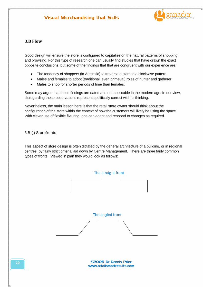
This aspect of store design is often dictated by the general architecture of a building, or in regional
centres, by fairly strict criteria laid down by Centre Management. There are three fairly common
types of fronts. Viewed in plan they would look as follows:
The straight front
The angled front

21
Visual Merchandising that Sells
©2009 Dr Dennis Pricewww.retailsmartresults.com
The arcade front
Many specialty store have (virtually no) storefront, but is rather simply an ‘entrance.
3.B (ii) Entrances
In some cases (e.g. supermarkets) the store front is the entrance and there are no windows to
speak of. An entrance is an important aspect of store design and the primary rule is that entrance
should be inviting and not present a barrier to a prospective customer. This is achieved by:
Ensuring steps are not placed at the entrance.
Good lighting.
Sufficient width for easy passage.
No merchandise/fixtures to clutter entrance.
Easy access for pregnant/handicapped persons or those with trolleys where appropriate.
Because the front of the store is the most productive, many retailers crowd this area (or trade out
of the store – beyond the lease line) or use to display specials all the time. This results in the
creation of ‘discount’ image which may not be the desirable outcome in the long run.
3.B (i) Traffic-flow patterns
Straight (gridiron) traffic flow pattern
Straight (gridiron) traffic flow. (Food retailers,
hardware and discount stores.)
An efficient atmosphere.
More floor space is devoted to product displays.
People can shop quickly, and customers enjoy
clearly marked and distinct aisles.
The customer develops a routine – a way of walking through the store.
Self-service is easy, reducing labour cost.
Premium
edition
only

22
Visual Merchandising that Sells
©2009 Dr Dennis Pricewww.retailsmartresults.com
Curving (free-flowing) pattern
Boutiques and department stores – i.e. David Jones
This pattern creates a friendly atmosphere.
Shoppers do not feel rushed and will browse.
People are encouraged to walk around in the store.
Customers can choose their own pattern of shopping.
Impulse and unplanned purchase are enhanced.
3.C Zones
The following information could serve as a guideline when allocating space4. The percentages
indicate the percentage of sales typically generated in that part of the store. The basic rule of
thumb is that your most profitable stock should be located in the area likely to generate the most
‘turn’.
Multi-Level Stores
The distribution of sales across the various levels of a multilevel store is as per the table below.
In essence, people prefer to go up one level rather than down level (in a multi-level) store by a
factor of 2:1.
Level % of Sales
3rd floor 15%
2nd floor 30%
Ground floor 40%
Basement 15%
4Again, these numbers have been amended and smoothed from the original source documents to reflect a wider
range of stores. It is by no means accurate and is used only to illustrate the general principle that the ‘value’ ofproductivity of retail space generally, progressively diminishes towards the rear of the store.
Premium
edition
only
Premium
edition only
23
Visual Merchandising that Sells
©2009 Dr Dennis Pricewww.retailsmartresults.com
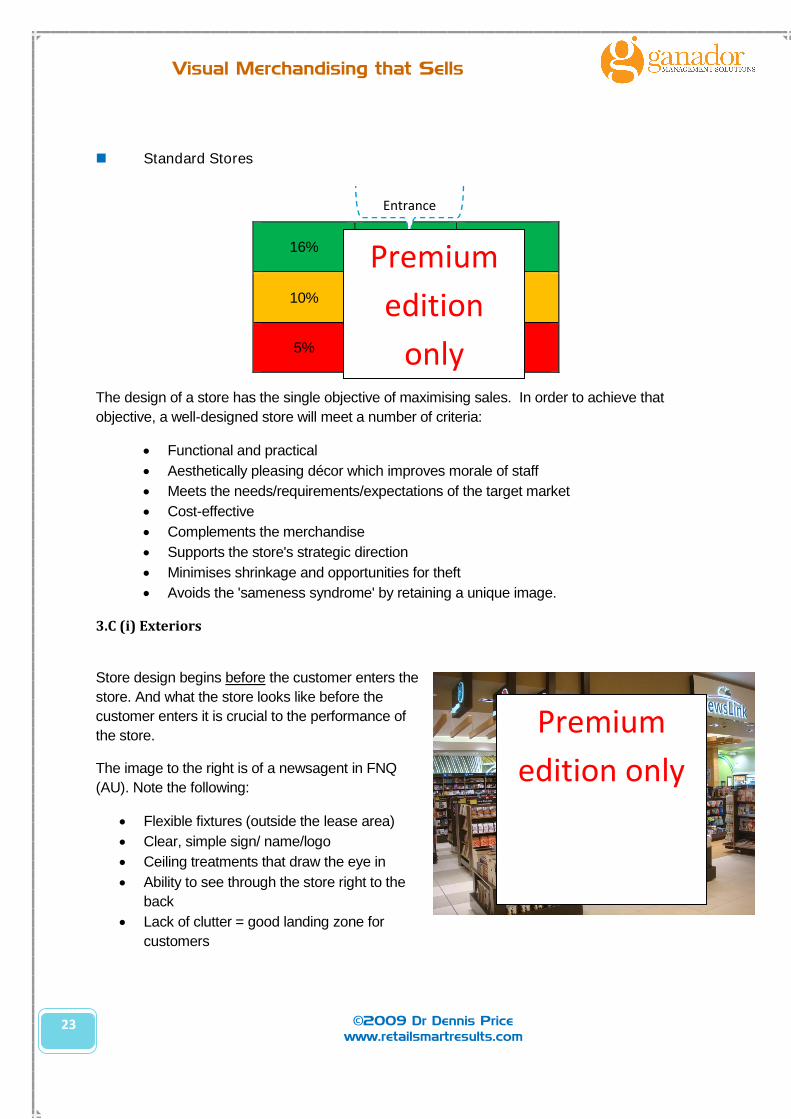
Standard Stores
16% 18% 18%
10% 10% 12%
5% 6% 5%
The design of a store has the single objective of maximising sales. In order to achieve that
objective, a well-designed store will meet a number of criteria:
Functional and practical
Aesthetically pleasing décor which improves morale of staff
Meets the needs/requirements/expectations of the target market
Cost-effective
Complements the merchandise
Supports the store's strategic direction
Minimises shrinkage and opportunities for theft
Avoids the 'sameness syndrome' by retaining a unique image.
3.C (i) Exteriors
Store design begins before the customer enters the
store. And what the store looks like before the
customer enters it is crucial to the performance of
the store.
The image to the right is of a newsagent in FNQ
(AU). Note the following:
Flexible fixtures (outside the lease area)
Clear, simple sign/ name/logo
Ceiling treatments that draw the eye in
Ability to see through the store right to the
back
Lack of clutter = good landing zone for
customers
Entrance
Premium
edition
only
Premium
edition only
24
Visual Merchandising that Sells
©2009 Dr Dennis Pricewww.retailsmartresults.com
Legible, simple signage (e.g. ‘new fiction’) AND it is the right type of merchandise for this
particular zone
Graphic treatments of back wall
Rhythm & harmony in the merchandise (stacks of books) to make a strong statement.
Textures & floor covering
Effective (bright) lighting without creating a ‘warehouse’ look
Graduating heights: low in the front of the store to high at the back.
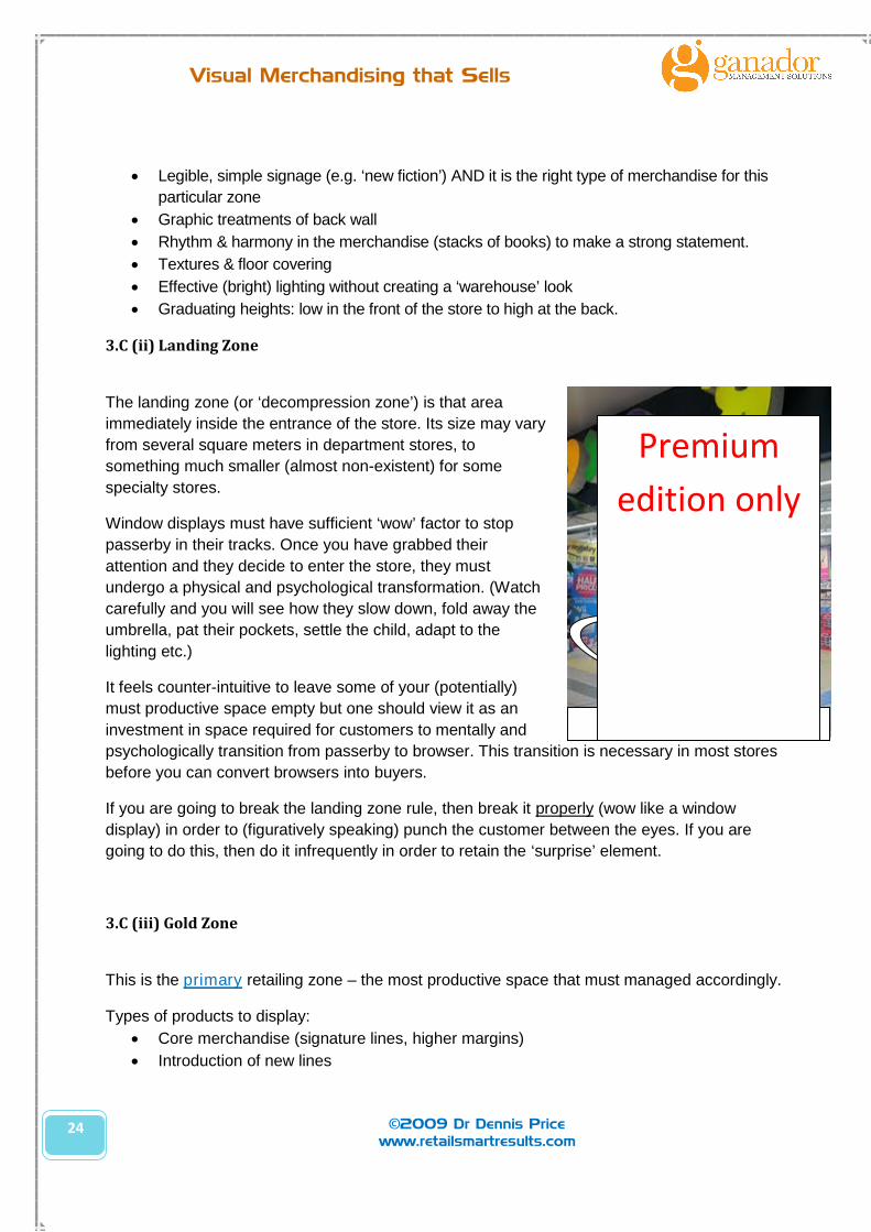
3.C (ii) Landing Zone
The landing zone (or ‘decompression zone’) is that area
immediately inside the entrance of the store. Its size may vary
from several square meters in department stores, to
something much smaller (almost non-existent) for some
specialty stores.
Window displays must have sufficient ‘wow’ factor to stop
passerby in their tracks. Once you have grabbed their
attention and they decide to enter the store, they must
undergo a physical and psychological transformation. (Watch
carefully and you will see how they slow down, fold away the
umbrella, pat their pockets, settle the child, adapt to the
lighting etc.)
It feels counter-intuitive to leave some of your (potentially)
must productive space empty but one should view it as an
investment in space required for customers to mentally and
psychologically transition from passerby to browser. This transition is necessary in most stores
before you can convert browsers into buyers.
If you are going to break the landing zone rule, then break it properly (wow like a window
display) in order to (figuratively speaking) punch the customer between the eyes. If you are
going to do this, then do it infrequently in order to retain the ‘surprise’ element.
3.C (iii) Gold Zone
This is the primary retailing zone – the most productive space that must managed accordingly.
Types of products to display:
Core merchandise (signature lines, higher margins)
Introduction of new lines
Orig Photo: shoppologist.blogspot.com
Landing Zone
Premium
edition only

25
Visual Merchandising that Sells
©2009 Dr Dennis Pricewww.retailsmartresults.com
Major promotions
Price Leader
Brand Leader
Best practice merchandising:
Change weekly
WOW creative impact
Strong Signage
3.C (iv) Silver Zone
This is the secondary retailing zone that must managed accordingly.
Types of products to display:
Secondary merchandise (A and B lines)
Support stock introduction of new lines
Best practice merchandising:
Clear sightlines from front of store
Change fortnightly/ monthly
3.C (v) Bronze Zone
This is the tertiary retailing zone – the least productive space that must managed accordingly.
Types of products to display:
Bulk of stock
Staples
Lower margin
Comparison
Best practice merchandising:
Change quarterly (refresh)
Priority is housekeeping & ease of shopping (not wow!)
26
Visual Merchandising that Sells
©2009 Dr Dennis Pricewww.retailsmartresults.com
4. CATEGORY MANAGEMENT
Is the product bought by brand, price, benefit or function (size or by style)? This is one of the
first questions a retailer should answer: How do people buy my product? (In fact, top notch
marketers argue that this is a more important question than ‘who’ is buying your product.)
And the answer to this question determines how you would like them sold and merchandised.
This then determines in what order you do the major and minor category management, your
‘planogramming’ and even ticketing.
4.A Range & Assortment
The less experienced retailers often fall victim to the sales efforts of representatives. They rely
on manufacturers’ reps to not only sell, but also merchandise whole categories of the store.
Invariably the retailer ends up being overstocked and with unbalanced categories.
4.B Pricing
The pricing of products plays an important role in the creating of an image of a business. The
retailer can use different strategies to establish the prices of their products or services. At a
macro level, the retailer must select from one of these three generic strategies:
ABOVE the market
AT the market
BELOW the market
The notion of ‘price’ is used by the customer as a shortcut for quality. Buyers generally see
price on a sliding scale, like this:
If the price is seen as . . .
Way Too Low ___________________ Way Too High
1 2 3 4 5
Buyers may think. . .
Something's Wrong That's OK You're Joking
Prices can really be ‘too good to be true’.
Concept Configuration Category Mgt Creative Communication Control
We arehere
27
Visual Merchandising that Sells
©2009 Dr Dennis Pricewww.retailsmartresults.com
4.C Shelf Space Management
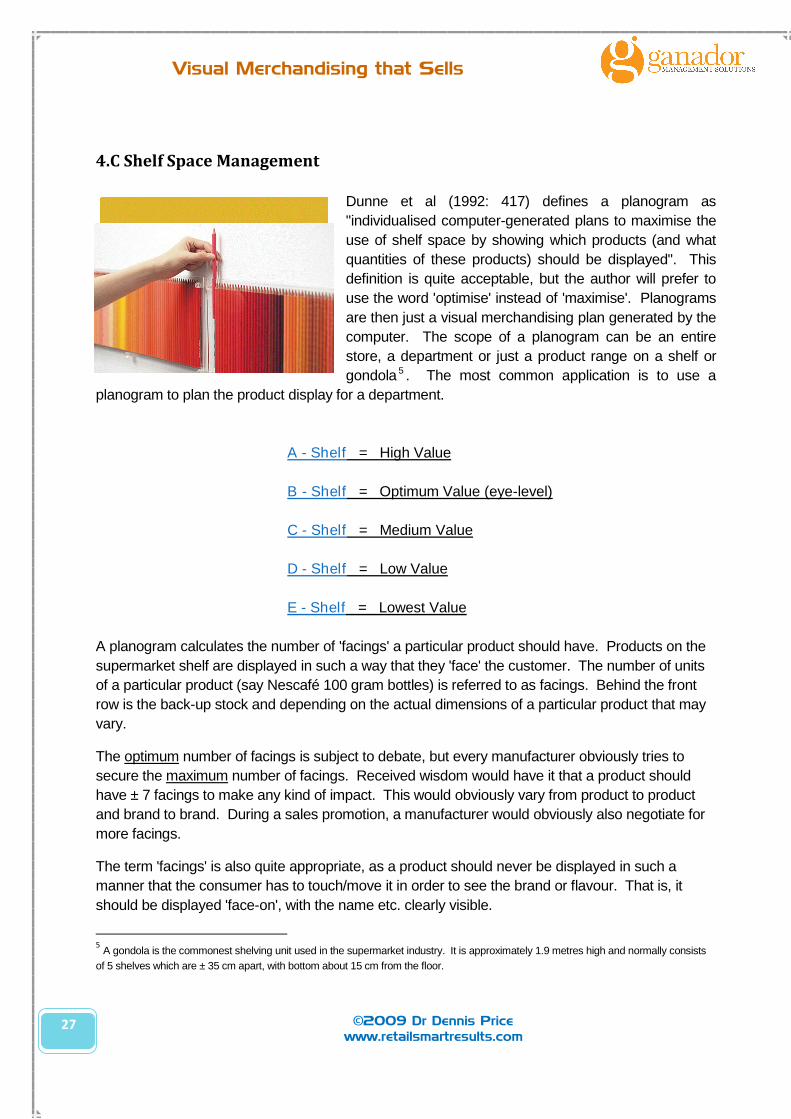
Dunne et al (1992: 417) defines a planogram as
"individualised computer-generated plans to maximise the
use of shelf space by showing which products (and what
quantities of these products) should be displayed". This
definition is quite acceptable, but the author will prefer to
use the word 'optimise' instead of 'maximise'. Planograms
are then just a visual merchandising plan generated by the
computer. The scope of a planogram can be an entire
store, a department or just a product range on a shelf or
gondola 5 . The most common application is to use a
planogram to plan the product display for a department.
A - Shelf = High Value
B - Shelf = Optimum Value (eye-level)
C - Shelf = Medium Value
D - Shelf = Low Value
E - Shelf = Lowest Value
A planogram calculates the number of 'facings' a particular product should have. Products on the
supermarket shelf are displayed in such a way that they 'face' the customer. The number of units
of a particular product (say Nescafé 100 gram bottles) is referred to as facings. Behind the front
row is the back-up stock and depending on the actual dimensions of a particular product that may
vary.
The optimum number of facings is subject to debate, but every manufacturer obviously tries to
secure the maximum number of facings. Received wisdom would have it that a product should
have ± 7 facings to make any kind of impact. This would obviously vary from product to product
and brand to brand. During a sales promotion, a manufacturer would obviously also negotiate for
more facings.
The term 'facings' is also quite appropriate, as a product should never be displayed in such a
manner that the consumer has to touch/move it in order to see the brand or flavour. That is, it
should be displayed 'face-on', with the name etc. clearly visible.
5A gondola is the commonest shelving unit used in the supermarket industry. It is approximately 1.9 metres high and normally consists
of 5 shelves which are ± 35 cm apart, with bottom about 15 cm from the floor.
28
Visual Merchandising that Sells
©2009 Dr Dennis Pricewww.retailsmartresults.com
All facings should be uniformly displayed; otherwise most of its impact would be lost. The
exception would be when displaying a product with a side view. This could be used with products
such as steam irons, where a side view is used to:
show a unique feature
to create interest
fill up space that would otherwise be empty.
For products like coffee/shampoo/deodorants and so forth, there would not be much use in
employing side views.
4.D Display Configurations
An Assortment Display
Retailers (e.g. supermarkets) use this type
of display to exhibits a wide range of
merchandise. The customers are
encouraged to “interact’ with the products in
an open assortment display. With a closed
assortment display the customers are
encouraged to look at the display (jewellery)
but the staff usually have to unlock the
display cabinet for the customer to touch it.
An Ensemble Display
This type of display consists of merchandise from separate categories merchandise in one
display. The merchandise compliments each other. Customers enjoy the ease of purchasing an
entire ensemble.
A Rack Display
The primarily function of a rack display is to present the products. It is a high maintenance
display because customers put the products in the wrong place.
A Cut Case
The merchandise is displayed in its original boxes. It projects a “cheaper image”. (E.g. Aldi
Supermarkets.)
Dump Bins
A dump bin is a box or case that holds sale merchandise, and is an inexpensive display option
and also projects a ‘cheap’ image but may lure customers into the store. The location of the bin
is important as well as the type of products inside the bin.
Premium
edition only

29
Visual Merchandising that Sells
©2009 Dr Dennis Pricewww.retailsmartresults.com
5. CREATIVE
5.A Strategies
Most retailers can use the following merchandising strategies and they need not follow only one.
In fact, many retailers will use many of these strategies simultaneously.
Homogenous Merchandising
This is a strategy that is used in a retail environment where there is a high degree of product
specialisation - that is speciality stores. It is the opposite of standard, heterogeneous
merchandising approach.
Concept Configuration Category Mgt Creative Communication Control
We arehere
A day in the life of a store designer. Extracted from Debi Ward Kennedy’ s blog
Using the principle of Zone Design, the space was divided into functional areas containing products oflike purpose/use. By taking an inventory of the lines carried and placing them in categories (Wine,Kitchen/Cooking, Tabletop, and Outdoors/Home Décor/Entertaining), I was able to determine how bigeach Zone would need to be to hold them all, and where each Zone would be located within the space.
I moved on to determine what fixtures worked together (same finishes, similar structure, etc.) and whatproduct would show best on those fixtures. My goal is to coordinate the style of the fixtures with the styleof the product - for example, a formal dark wood shelf unit with glass shelves holds crystal vases &glasses, while a rustic pine hutch & table displays handpainted pottery. The fixture isn't so incongruentthat it calls attention to itself - it lets the products take center stage. In some cases, manufacturersprovided fixtures specific to their products, and I left those as they were.
Each Zone was plotted, fitting fixtures into the space to allow for adequate walkways and to keepsightlines clear, so that certain areas can be made to POP with large colorful displays to draw youthrough the space. Placing season-specific merchandise in one area in each Zone keeps things lookingfresh and exciting, and allows for flexibility in resetting displays each season without having to moveeverything in the space.
Premium edition only
30
Visual Merchandising that Sells
©2009 Dr Dennis Pricewww.retailsmartresults.com
Themed Merchandising
The use of themes (Disneyland/On the Farm)
as a unifying factor, either on a storewide basis
or only a department - or product range basis.
Fashion stores are particularly fond of their
'stories' and often create theme displays such
as Hawaiian or Nautical.
Lifestyle Displays
This is also a themed display, but it does not tell a story for the sake of a story, but rather to fit and
compliment the customer's lifestyle. Typical lifestyles are identified in the field of Consumer
Behaviour, and could be for instance; Yuppies, Greens or Health Nuts – all of which are distinct
customer groups that could be targeted by the retailer.
Vertical Merchandising
This is the strategy of emphasizing variety of product ranges by putting all product ranges next to
each other and using the depth (vertically) to put back-up stock of the same variety on the shelf.
Many retail managers under-estimate the contribution of vertical merchandising, which is the
underlying construct of planograms.
Premium
edition only
Premium edition only
31
Visual Merchandising that Sells
©2009 Dr Dennis Pricewww.retailsmartresults.com
Variety refers to the number of product lines carried (tea,
coffee, etc.); and assortment refers to the depth of these line
(brands, sizes, styles, etc.). Vertical merchandising is the
strategy of displaying the variety of merchandise lines (width)
next to each other, (horizontally) and to display the depth or
range vertically - under each category. Refer back to the
diagram to see what is meant by the above explanation.
Vertical merchandising capitalises on the fact that shoppers
scan the aisles from left to right - usually at eye level - until
they see the product line (e.g. coffee) they want. They would
then scan the shelves above and below for their favourite
brand/preferred size etc.
Warehouse Display
This strategy requires virtually all stock to be on the sales floor - stacked to the ceiling and with
industrial-type shelving. (E.g. Bunnings.)
Scrambled Merchandising
This strategy emphasizes the cross merchandising of product ranges that do not - at first glance -
belong together. Most newsagents adopt a strategy of selling confectionery alongside books and
magazines.
Minimalist
This merchandising strategy is especially
suited for stores that are attempting to portray
an exclusive image. A boutique with shiny
marble floors, two statues, a painting and five
dresses against the one wall, would be
following a minimalist strategy.
Premium
edition
only
Premium edition
only

32
Visual Merchandising that Sells
©2009 Dr Dennis Pricewww.retailsmartresults.com
Standard or Classic Merchandising
The standard merchandising strategy makes use of the maximum merchandise on the traditional
shelving and rails - displayed in the conventional manner. This strategy is usually applied in larger
stores' bulk-of-stock areas and specialists strategies will be followed for feature displays.
5.B Elements
Lines
Lines are combined to form shapes and shapes are effective in drawing
customer's attention.
The variables of lines are:
Fat vs. Thin
Short vs. Long
Straight vs. Curved
Sharp vs. Fuzzy
The line is determined by the physical dimensions of the merchandise,
individually or the way in which it is 'lined-up'.
Straight lines denote order, precision, and rigidity.
Horizontal straight lines denote calm and restfulness.
Curved lines denote flexibility, action and femininity.
Lines are used to organise by:
frames/ borders
delineation
emphasis
Lines are used to reflect a mood/ emotion
McRay Nagleby

33
Visual Merchandising that Sells
©2009 Dr Dennis Pricewww.retailsmartresults.com
Colour
The use of colour is an important and powerful aspect of display. Colours are interpreted
differently by most people. Findings often vary from project to project and one can’t read too
much into it other than treating it as a general guideline.
6Original reference lost – happy to acknowledge if advised.
COLOUR6 PERSONALITY LINK MARKETING INSIGHT
BLUE Respect, Authority Coffee in blue can = mild
IBM
Associated with club soda
Men prefer blue packaging
Blue houses avoided
YELLOW Caution, Novelty,
Temporary, Warmth
Registered quickest by eyes
Stops traffic and sells a house
Coffee in yellow tastes weak
GREEN Secure, natural, Relaxed Green = sugar-free
Vegetables & Gum
Good work environment
RED Human, Hot, Exciting,
Strong, Passion, Impulsive,
Aggressive
Makes food smell better
Coffee= rich
Men prefer yellowish red
Women prefer bluish red
Coca Cola
ORANGE Powerful, Affordable,
Informal
Draws attention quickly
BROWN Relaxed, Masculine, Nature,
Steady, Reliable
Coffee in dark brown = too strong
Men seek brown packaging
WHITE Goodness, Purity, Chastity,
Clean, Delicate, Refined
Suggests reduced calories
Pure and wholesome food
Clean, feminine
BLACK Sophistication, Power,
Authority, Mystery
Powerful clothing
Hi-tech electronics
SILVER/GOLD/ PLATINUM Regal, Wealth, Status Premium price
Premium edition only

34
Visual Merchandising that Sells
©2009 Dr Dennis Pricewww.retailsmartresults.com
Another 10 pages that follows
Premium edition only
(see table of contents)
Thank you for reading this free edition.
Please feel free to pass it on to anyone you like.
© 2009 Ganador