Embed Size (px)
DESCRIPTION
Responsive web design is becoming the preferred method for building websites that look and work consistently on all devices. This guide outlines the key challenges of developing, testing and maintaining responsive websites.
Citation preview
A W H I T E P A P E R B Y E R A N K I N S B R U N E R
Complete Guide to Building a Responsive Web Testing Strategy
2
Table of Contents
Introduction.............................................................................................. 3
What’s Driving the Shift to RWD? ................................................................... 4
5 RWD Test Plan Building Blocks .................................................................... 5
Add Visual Testing to Your Test Automation Code ........................................ 6
Do Client Side Performance Testing .......................................................... 6
Test Your Navigation Across Platforms ...................................................... 7
Integrate Real User Conditions into Your Testing ........................................ 8
Use Analytics to Establish Your Digital Test Coverage Plan ............................ 9
Create Actionable Test Reports for RWD ........................................................... 11
Summary: Answering the RWD Challenge......................................................... 12
3
Introduction
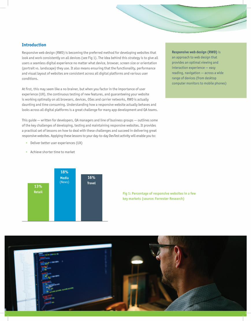
Responsive web design (RWD) is becoming the preferred method for developing websites that look and work consistently on all devices (see Fig 1). The idea behind this strategy is to give all users a seamless digital experience no matter what device, browser, screen size or orientation (portrait vs. landscape) they use. It also means ensuring that the functionality, performance and visual layout of websites are consistent across all digital platforms and various user conditions.
At fi rst, this may seem like a no brainer, but when you factor in the importance of user experience (UX), the continuous testing of new features, and guaranteeing your website is working optimally on all browsers, devices, OSes and carrier networks, RWD is actually daunting and time consuming. Understanding how a responsive website actually behaves and looks across all digital platforms is a great challenge for many app development and QA teams.
This guide — written for developers, QA managers and line of business groups — outlines some of the key challenges of developing, testing and maintaining responsive websites. It provides a practical set of lessons on how to deal with these challenges and succeed in delivering great responsive websites. Applying these lessons to your day-to-day DevTest activity will enable you to:
• Deliver better user experiences (UX)
• Achieve shorter time to market
Responsive web design (RWD) is an approach to web design that provides an optimal viewing and interaction experience — easy reading, navigation — across a wide range of devices (from desktop computer monitors to mobile phones)
Fig 1: Percentage of responsive websites in a few key markets (source: Forrester Research)
13%Retail
18%Media(News)
16%Travel
4
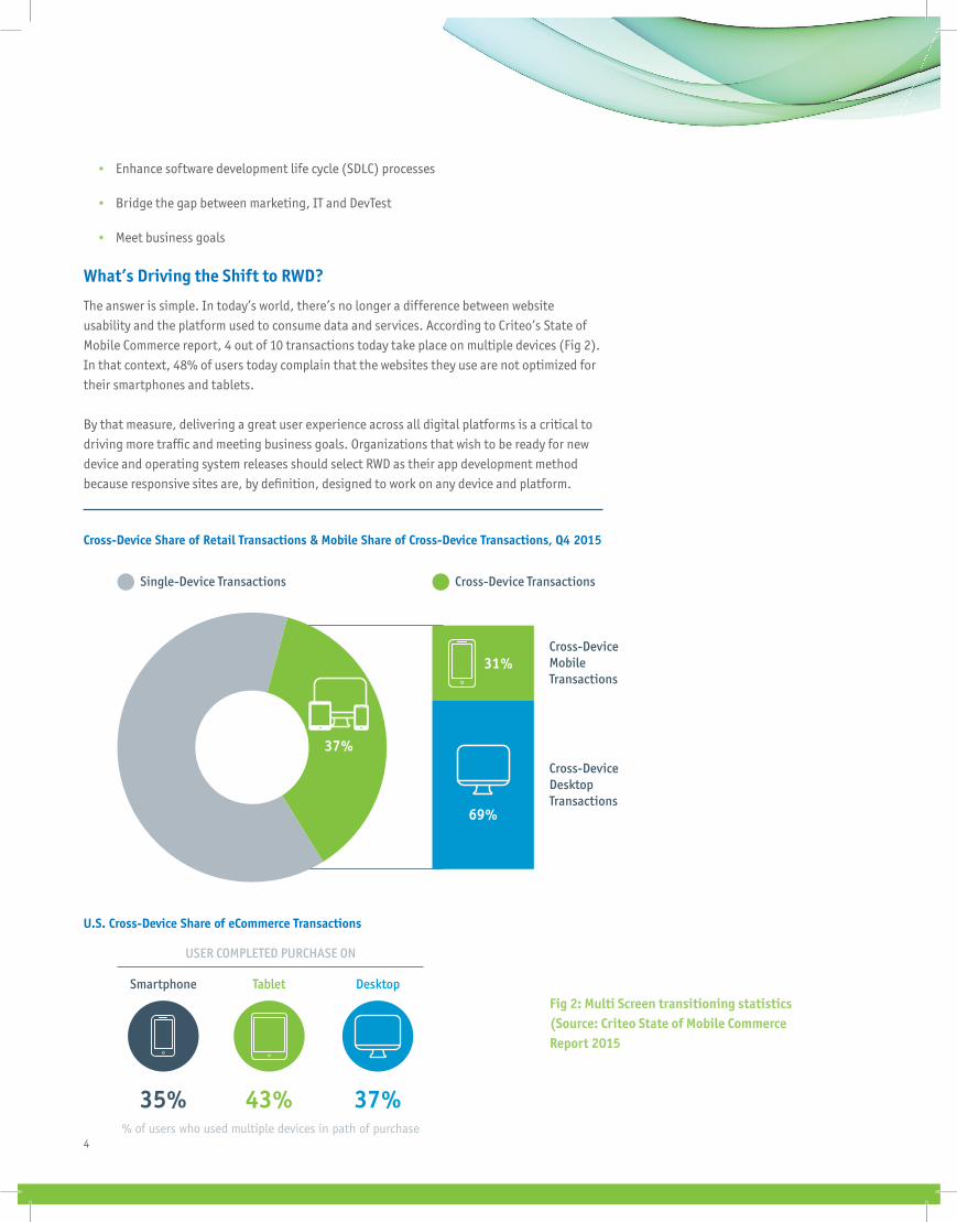
Cross-Device Share of Retail Transactions & Mobile Share of Cross-Device Transactions, Q4 2015
Single-Device Transactions
USER COMPLETED PURCHASE ON
% of users who used multiple devices in path of purchase
U.S. Cross-Device Share of eCommerce Transactions
Cross-Device Transactions
Cross-DeviceMobile Transactions
Cross-DeviceDesktop Transactions
Smartphone Tablet Desktop
37%43%35%
37%
69%
31%
Fig 2: Multi Screen transitioning statistics (Source: Criteo State of Mobile Commerce Report 2015
• Enhance software development life cycle (SDLC) processes
• Bridge the gap between marketing, IT and DevTest
• Meet business goals
What’s Driving the Shift to RWD?
The answer is simple. In today’s world, there’s no longer a difference between website usability and the platform used to consume data and services. According to Criteo’s State of Mobile Commerce report, 4 out of 10 transactions today take place on multiple devices (Fig 2). In that context, 48% of users today complain that the websites they use are not optimized for their smartphones and tablets.
By that measure, delivering a great user experience across all digital platforms is a critical to driving more traffi c and meeting business goals. Organizations that wish to be ready for new device and operating system releases should select RWD as their app development method because responsive sites are, by defi nition, designed to work on any device and platform.
5
“Context” is a key success factor for RWD adoption. If your website is used primarily on a large desktop, it makes sense to display as much content on the screen as possible, but what happens when users consume the data on a mobile device or a system with a smaller viewport?
It probably means that less relevant content needs to be hidden and creative elements and fonts need to be resized. The same considerations need to be made about the location from which a user is accessing your site. When connected via a strong Wi-Fi, your site may be optimized, but what happens when network connectivity is diminished or the website relies on delivering location-based content? The context of your site will factor into how you approach RWD.
Another reason for the shift to RWD is that it helps assure quality and fast website updates across all digital platforms. Because mobile and web evolved in parallel, many organizations created silo’d teams with different skill sets. They often relied on the same tools but disconnected roadmaps and different release schedules. This disconnect prevents web and mobile DevTest teams from having control over the entire digital portfolio. When developing for different platforms, it’s hard to assess the quality of every digital viewport and function across web and mobile because different teams are executing different test cases instead of running tests side by side.
The RWD approach is seen as the most effi cient because it consolidates efforts, synchronizes the digital teams and reduces the R&D budget.
So how do you test for RWD?
5 RWD Test Plan Building Blocks
Here are the top fi ve areas that need to be covered in an RWD test plan.
Test Scenario Test Description
Visual testing Assure RWD content looks right on any screen and platform.
Client side performance testingTest and measure the time it takes your website’s objects to render on screens and optimize the content size accordingly.
Navigation testingAssure that the site performs the expected function correctly (i.e. Log-in functions well across web and mobile platforms).
User condition testingTest your site across platforms for real user conditions such as incoming calls, ads, popups and other interruptions.
Platform coverageUse analytics to test your website against all relevant devices, browsers and OS versions covering screen sizes and resolutions in various conditions and locations.
6
1. Add Visual Testing to Your Test Automation Code
A responsive website will display content differently when screens resize and user conditions change. With this layer of complexity, app development and testing teams must combine various validations to make sure that when context changes, the viewports also change and the content being displayed is accurate, not truncated, and does not cause usability glitches.
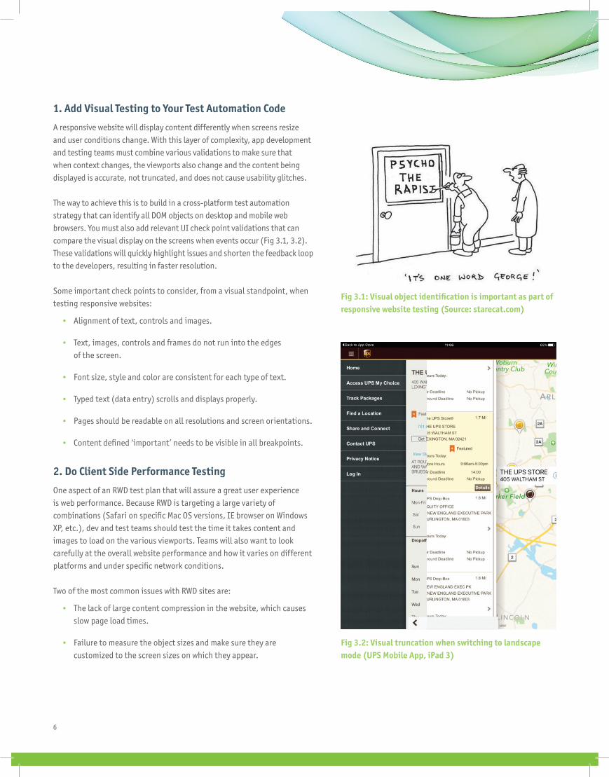
The way to achieve this is to build in a cross-platform test automation strategy that can identify all DOM objects on desktop and mobile web browsers. You must also add relevant UI check point validations that can compare the visual display on the screens when events occur (Fig 3.1, 3.2). These validations will quickly highlight issues and shorten the feedback loop to the developers, resulting in faster resolution.
Some important check points to consider, from a visual standpoint, when testing responsive websites:
• Alignment of text, controls and images.
• Text, images, controls and frames do not run into the edges of the screen.
• Font size, style and color are consistent for each type of text.
• Typed text (data entry) scrolls and displays properly.
• Pages should be readable on all resolutions and screen orientations.
• Content defined ‘important’ needs to be visible in all breakpoints.
2. Do Client Side Performance Testing
One aspect of an RWD test plan that will assure a great user experience is web performance. Because RWD is targeting a large variety of combinations (Safari on specifi c Mac OS versions, IE browser on Windows XP, etc.), dev and test teams should test the time it takes content and images to load on the various viewports. Teams will also want to look carefully at the overall website performance and how it varies on different platforms and under specifi c network conditions.
Two of the most common issues with RWD sites are:
• The lack of large content compression in the website, which causes slow page load times.
• Failure to measure the object sizes and make sure they are customized to the screen sizes on which they appear.
Fig 3.2: Visual truncation when switching to landscape mode (UPS Mobile App, iPad 3)
Fig 3.1: Visual object identifi cation is important as part of responsive website testing (Source: starecat.com)
7
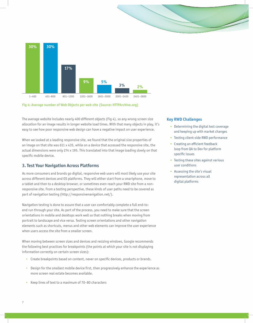
The average website includes nearly 400 different objects (Fig 4), so any wrong screen size allocation for an image results in longer website load times. With that many objects in play, it’s easy to see how poor responsive web design can have a negative impact on user experience.
When we looked at a leading responsive site, we found that the original size properties of an image on that site was 611 x 435, while on a device that accessed the responsive site, the actual dimensions were only 274 x 195. This translated into that image loading slowly on that specifi c mobile device.
3. Test Your Navigation Across Platforms
As more consumers and brands go digital, responsive web users will most likely use your site across different devices and OS platforms. They will either start from a smartphone, move to a tablet and then to a desktop browser, or sometimes even reach your RWD site from a non-responsive site. From a testing perspective, these kinds of user paths need to be covered as part of navigation testing (http://responsivenavigation.net/).
Navigation testing is done to assure that a user can comfortably complete a full end-to-end run through your site. As part of the process, you need to make sure that the screen orientations in mobile and desktops work well so that nothing breaks when moving from portrait to landscape and vice versa. Testing screen orientations and other navigation elements such as shortcuts, menus and other web elements can improve the user experience when users access the site from a smaller screen.
When moving between screen sizes and devices and resizing windows, Google recommends the following best practices for breakpoints (the points at which your site is not displaying information correctly on certain screen sizes):
• Create breakpoints based on content, never on specifi c devices, products or brands.
• Design for the smallest mobile device fi rst, then progressively enhance the experience as more screen real estate becomes available.
• Keep lines of text to a maximum of 70–80 characters
Fig 4: Average number of Web Objects per web site (Source: HTTPArchive.org)
30%
1–400 401–800 801–1200 1201–1600 1601–2000 2001–2400 2401–2800
30%
17%
9%3%
5%2%
Key RWD Challenges
• Determining the digital test coverage and keeping up with market changes
• Testing client-side RWD performance
• Creating an effi cient feedback loop from QA to Dev for platform specifi c issues
• Testing these sites against various user conditions
• Assessing the site’s visual representation across all digital platforms
8
Another tip is to test what happens when users transition between responsive and non-responsive web environments.
4. Integrate Real User Conditions into Your Testing
Now that you’re testing for mobile and desktop combinations, you need to guarantee that these environments also mimic your users’ daily, real world conditions. We recommend you start by collaborating with marketing and business groups on target user data, including insight into who your target user is, where they live, and what are their network conditions.
Testing ideal “happy path” scenarios (i.e. strong Wi-Fi, full battery, no competing apps) will provide very limited insights into how your app will actually behave under real user conditions, so consider creating personas (profi les of your target customers) that account for complex, real-world environments.
Instead of running only functional tests such as log-in, search, payment and checkout under generic conditions, we recommend you also test responsive websites against user conditions including location, preferred device(s), network coverage, and other apps running in the background. This will help ensure that your content is laid out correctly on any viewport.
By defi nition, RWD requires constant network connection, so it’s key to test real world conditions with both Internet connectivity and without, and test for the poor connectivity that occurs when moving through tunnels and switching to airplane mode.
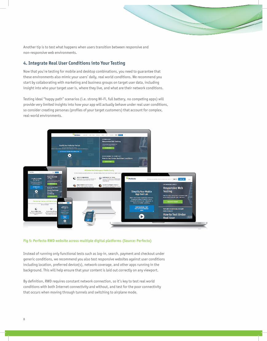
Fig 5: Perfecto RWD website across multiple digital platforms (Source: Perfecto)
9
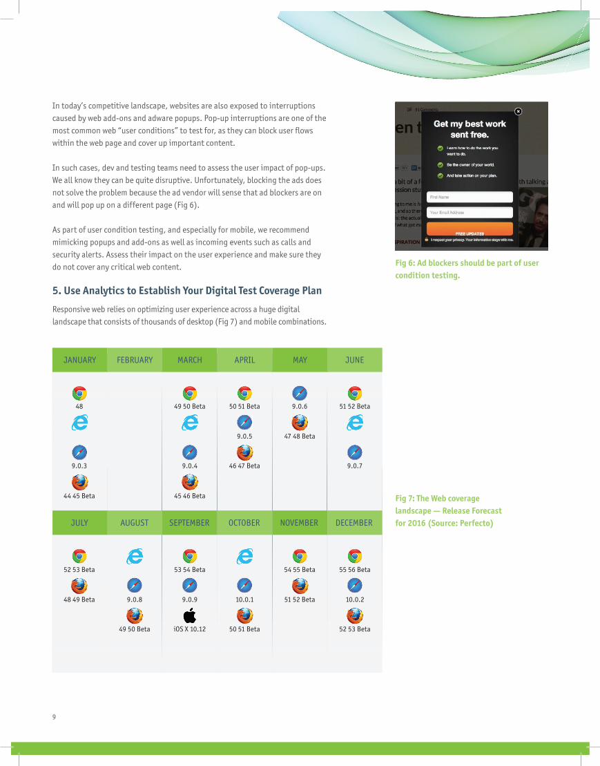
In today’s competitive landscape, websites are also exposed to interruptions caused by web add-ons and adware popups. Pop-up interruptions are one of the most common web “user conditions” to test for, as they can block user fl ows within the web page and cover up important content.
In such cases, dev and testing teams need to assess the user impact of pop-ups. We all know they can be quite disruptive. Unfortunately, blocking the ads does not solve the problem because the ad vendor will sense that ad blockers are on and will pop up on a different page (Fig 6).
As part of user condition testing, and especially for mobile, we recommend mimicking popups and add-ons as well as incoming events such as calls and security alerts. Assess their impact on the user experience and make sure they do not cover any critical web content.
5. Use Analytics to Establish Your Digital Test Coverage Plan
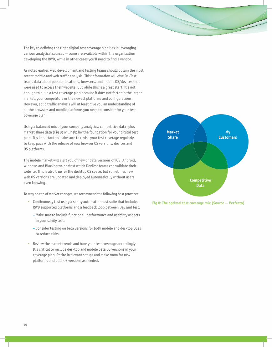
Responsive web relies on optimizing user experience across a huge digital landscape that consists of thousands of desktop (Fig 7) and mobile combinations.
Fig 6: Ad blockers should be part of user condition testing.
Fig 7: The Web coverage landscape — Release Forecast for 2016 (Source: Perfecto)
JANUARY FEBRUARY MARCH APRIL MAY JUNE
JULY AUGUST SEPTEMBER OCTOBER NOVEMBER DECEMBER
48 49 50 Beta 50 51 Beta 51 52 Beta9.0.6
9.0.5 47 48 Beta
9.0.3 9.0.4 46 47 Beta 9.0.7
44 45 Beta 45 46 Beta
52 53 Beta 53 54 Beta 55 56 Beta54 55 Beta
48 49 Beta 9.0.9 10.0.1 10.0.251 52 Beta
iOS X 10.12
9.0.8
49 50 Beta 50 51 Beta 52 53 Beta
10
MarketShare
MyCustomers
CompetitiveData
Fig 8: The optimal test coverage mix (Source — Perfecto)
The key to defi ning the right digital test coverage plan lies in leveraging various analytical sources — some are available within the organization developing the RWD, while in other cases you’ll need to fi nd a vendor.
As noted earlier, web development and testing teams should obtain the most recent mobile and web traffi c analysis. This information will give DevTest teams data about popular locations, browsers, and mobile OS/devices that were used to access their website. But while this is a great start, it’s not enough to build a test coverage plan because it does not factor in the larger market, your competitors or the newest platforms and confi gurations. However, solid traffi c analysis will at least give you an understanding of all the browsers and mobile platforms you need to consider for your test coverage plan.
Using a balanced mix of your company analytics, competitive data, plus market share data (Fig 8) will help lay the foundation for your digital test plan. It’s important to make sure to revise your test coverage regularly to keep pace with the release of new browser OS versions, devices and OS platforms.
The mobile market will alert you of new or beta versions of iOS, Android, Windows and Blackberry, against which DevTest teams can validate their website. This is also true for the desktop OS space, but sometimes new Web OS versions are updated and deployed automatically without users even knowing.
To stay on top of market changes, we recommend the following best practices:
• Continuously test using a sanity automation test suite that includes RWD supported platforms and a feedback loop between Dev and Test.
– Make sure to include functional, performance and usability aspects in your sanity tests
– Consider testing on beta versions for both mobile and desktop OSes to reduce risks
• Review the market trends and tune your test coverage accordingly. It’s critical to include desktop and mobile beta OS versions in your coverage plan. Retire irrelevant setups and make room for new platforms and beta OS versions as needed.
11
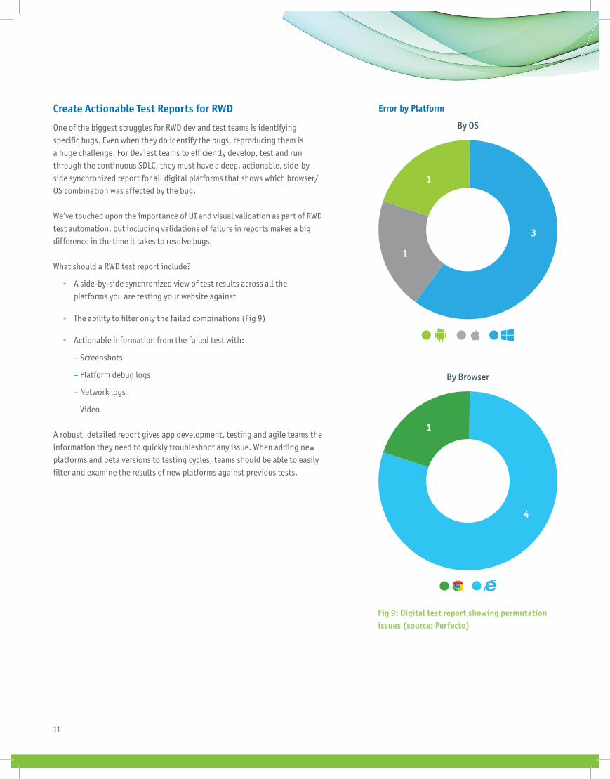
Error by Platform
By OS
By Browser
Fig 9: Digital test report showing permutation issues (source: Perfecto)
Create Actionable Test Reports for RWD
One of the biggest struggles for RWD dev and test teams is identifying specifi c bugs. Even when they do identify the bugs, reproducing them is a huge challenge. For DevTest teams to effi ciently develop, test and run through the continuous SDLC, they must have a deep, actionable, side-by-side synchronized report for all digital platforms that shows which browser/OS combination was affected by the bug.
We’ve touched upon the importance of UI and visual validation as part of RWD test automation, but including validations of failure in reports makes a big difference in the time it takes to resolve bugs.
What should a RWD test report include?
• A side-by-side synchronized view of test results across all the platforms you are testing your website against
• The ability to fi lter only the failed combinations (Fig 9)
• Actionable information from the failed test with:
– Screenshots
– Platform debug logs
– Network logs
– Video
A robust, detailed report gives app development, testing and agile teams the information they need to quickly troubleshoot any issue. When adding new platforms and beta versions to testing cycles, teams should be able to easily fi lter and examine the results of new platforms against previous tests.
1
1
4
1
3
© 2016 Perfecto Mobile Ltd.www.perfectomobile.com
781.205.4111
About Perfecto
Perfecto enables exceptional digital experiences. We help you transform your business and strengthen every digital interaction with a quality-fi rst approach to creating web and native apps, through a cloud-based test environment called the Continuous Quality Lab. The CQ Lab is comprised of real devices and real end-user conditions, giving you the truest test environment available.
More than 1,500 customers, including 50% of the Fortune 500 across the banking, insurance, retail, telecommunications and media industries rely on Perfecto to deliver optimal mobile app functionality and end user experiences, ensuring their brand’s reputation, establishing loyal customers, and continually attracting new users. For more information about Perfecto, visit perfectomobile.com, join our community, or follow us on Twitter at @PerfectoMobile.
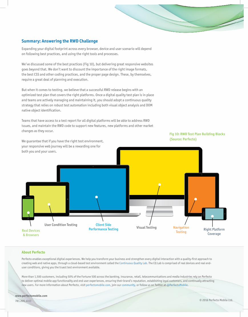
Fig 10: RWD Test Plan Building Blocks (Source: Perfecto)
Real Devices & Browsers
User Condition Testing Client Side Performance Testing Visual Testing Navigation
TestingRight Platform
Coverage
Summary: Answering the RWD Challenge
Expanding your digital footprint across every browser, device and user scenario will depend on following best practices, and using the right tools and processes.
We’ve discussed some of the best practices (Fig 10), but delivering great responsive websites goes beyond that. We don’t want to discount the importance of the right image formats, the best CSS and other coding practices, and the proper page design. These, by themselves, require a great deal of planning and execution.
But when it comes to testing, we believe that a successful RWD release begins with an optimized test plan that covers the right platforms. Once a digital quality test plan is in place and teams are actively managing and maintaining it, you should adopt a continuous quality strategy that relies on robust test automation including both visual object analysis and DOM native object identifi cation.
Teams that have access to a test report for all digital platforms will be able to address RWD issues, and maintain the RWD code to support new features, new platforms and other market changes as they occur.
We guarantee that if you have the right test environment,your responsive web journey will be a rewarding one forboth you and your users.