Embed Size (px)
Citation preview
Brief books for people who make websites No.
4
RESPONSIVEWEB DESIGN
Ethan Marcotte
Foreword by Jeremy Keith

RESPONSIVE WEB DESIGN
Ethan Marcotte
Copyright © 2011 by Ethan MarcotteAll rights reserved
Publisher: Jeffrey ZeldmanDesigner: Jason Santa MariaEditor: Mandy BrownTechnical Editor: Dan CederholmCopyeditor: Krista StevensCompositor: Neil Egan
ISBN 978-0-9844425-7-7
A Book ApartNew York, New Yorkhttp://abookapart.com
10 9 8 7 6 5 4 3 2 1
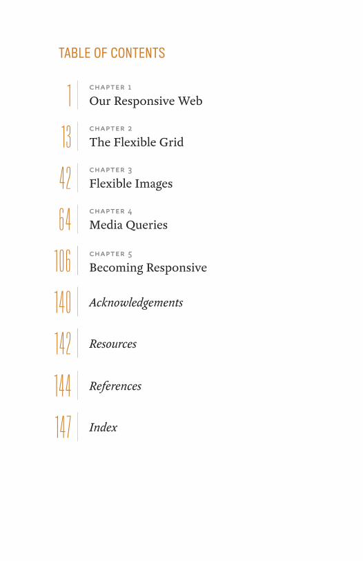
TABLE OF CONTENTS
chapter 1
Our Responsive Web1chapter 2
The Flexible Grid1 3chapter 3
Flexible Images42chapter 4
Media Queries
chapter 5
Becoming Responsive
64
106
140
142
Acknowledgements
Resources
References
Index
1 44
14 7

FOREWORDLanguage has magical properties. The word “glamour”—which was originally a synonym for magic or spell-casting—has its origins in the word “grammar.” Of all the capabilities of language, the act of naming is the most magical and powerful of all.
The short history of web design has already shown us the transformative power of language. Jeffrey Zeldman gave us the term “web standards” to rally behind. Jesse James Garrett changed the nature of interaction on the web by minting the word “Ajax.”
When Ethan Marcotte coined the term “responsive web design” he conjured up something special. The technologies existed already: fluid grids, flexible images, and media queries. But Ethan united these techniques under a single banner, and in so doing changed the way we think about web design.
Ethan has a way with words. He is, of course, the perfect person to write a book on responsive web design. But he has done one better than that: he has written the book on respon-sive web design.
If you’re hoping for a collection of tricks and tips for add-ing a little bit of superficial flair to the websites that you build, then keep looking, my friend. This little beauty operates at a deeper level.
When you’ve finished reading this book (and that won’t take very long) take note of how you approach your next proj-ect. It’s possible that you won’t even notice the mind-altering powers of Ethan’s words, delivered, as they are, in his light-hearted, entertaining, sometimes downright hilarious style; but I guarantee that your work will benefit from the presti-digitation he is about to perform on your neural pathways.
Ethan Marcotte is a magician. Prepare to be spellbound.
—Jeremy Keith

1
OUR RESPONSIVE WEB
Something there is that doesn’t love a wall . . . ”—robert Frost, “Mending Wall”
As I begIn wrItIng thIs book, I realize I can’t guarantee you’ll read these words on a printed page, holding a tiny pa-perback in your hands. Maybe you’re sitting at your desk with an electronic copy of the book up on your screen. Perhaps you’re on your morning commute, tapping through pages on your phone, or swiping along on a tablet. Or maybe you don’t even see these words as I do: maybe your computer is simply reading this book aloud.
Ultimately, I know so little about you. I don’t know how you’re reading this. I can’t.
Publishing has finally inherited one of the web’s central characteristics: flexibility. Book designer and publisher Craig Mod believes that his industry is quickly entering a “post-artifact” phase (http://bkaprt.com/rwd/1/), that the digital age is revising our definition of what constitutes a “book.”
1“
OUR RESPONSIVE WEB
2 RESPONSIVE WEB DESIGN
Of course, web designers have been grappling with this for some time. In fact, our profession has never had an “artifact” of its own. At the end of the day, there isn’t any thing produced by designing for the web, no tangible objects to hold, to cher-ish, to pass along to our children. But despite the oh-so-ethe-real nature of our work, the vocabulary we use to talk about it is anything but: “masthead,” “whitespace,” “leading,” even the much-derided “fold.” Each of those words is directly inherited from print design: just taken down from the shelf, dusted off, and re-applied to our new, digital medium.
Some of that recycling is perfectly natural. We’re creatures of habit, after all: as soon as we move into a new city, or start a new job, we’re mapping previous experiences onto the new,
fig 1.1: The canvas, even a blank one, provides a boundary for an artist’s work. (Photo by Cara StHilaire: http://bkaprt.com/rwd/2/)
3 OUR RESPONSIVE WEB
more foreign one, using them to gradually orient ourselves. And since the web is a young medium, it’s only natural to bor-row some terms from what we know: graphic design provides us with a rich history that spans centuries, and we’d be remiss not to use its language to help shape our industry.
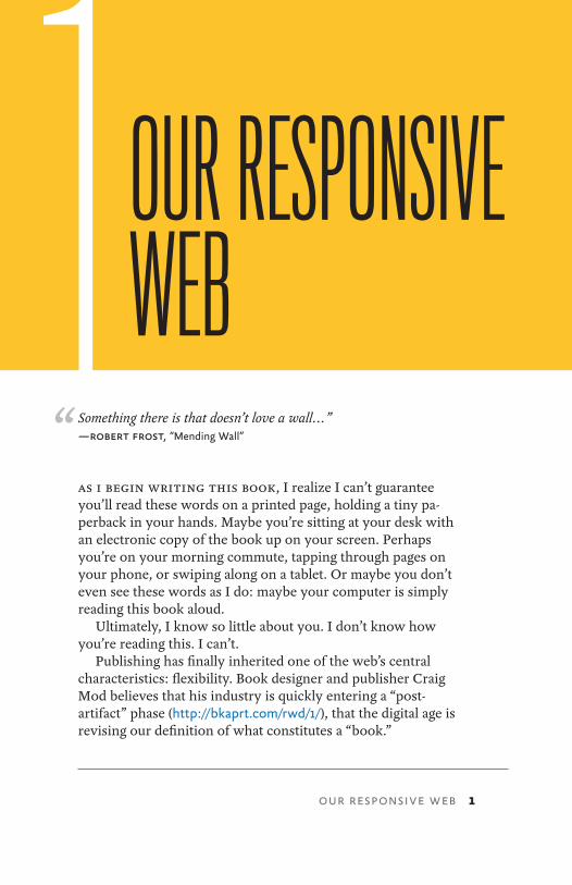
But our debt to print goes much deeper than language. In fact, there’s another concept we’ve borrowed, one we might not acknowledge all that often: the canvas (Fig 1.1).
In every other creative medium, the artist begins her work by selecting a canvas. A painter chooses a sheet of paper or fabric to work on; a sculptor might select a block of stone from a quarry. Regardless of the medium, choosing a canvas is a powerful, creative act: before the first brush stroke, before striking the chisel, the canvas gives the art a dimension and shape, a width and a height, establishing a boundary for the work yet to come.
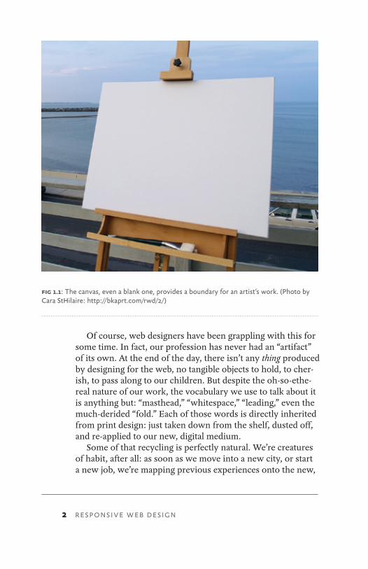
On the web, we try to mimic this process. We even call it the same thing: we create a “canvas” in our favorite image editor, a blank document with a width and height, with di-mension and shape. The problem with this approach is that we’re one step removed from our actual canvas: the browser window, and all of its inconsistencies and imperfections (Fig 1.2). Because let’s face it: once they’re published online, our designs are immediately at the mercy of the people who view
fig 1.2: The browser window, our true canvas. (For better or worse.)
4 RESPONSIVE WEB DESIGN
them—to their font settings, to the color of their display, to the shape and size of their browser window.
So in the face of all that uncertainty, that flexibility, we begin by establishing constraints: we set our type in pixels, or create fixed-width layouts that assume a minimum screen resolution. Establishing those constraints is a bit like selecting a canvas—they give us known parameters to work from, cer-tainties that help quarantine our work from the web’s inher-ent flexibility.
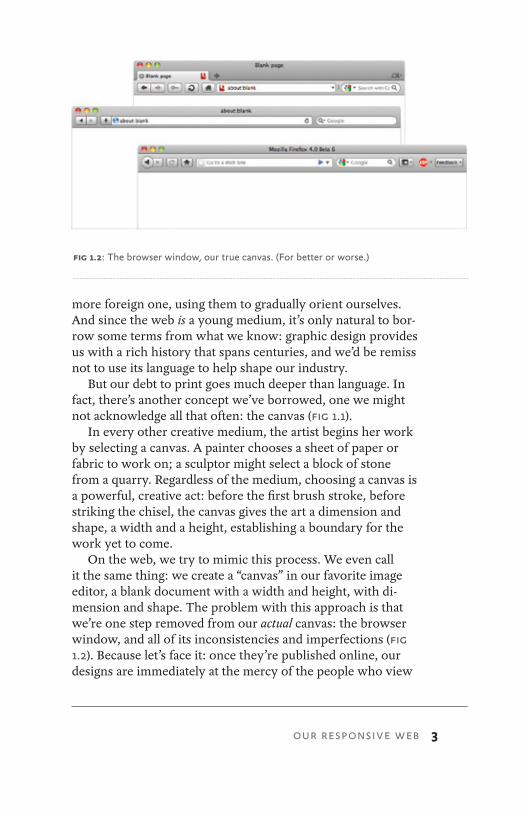
But the best thing—and often, the worst thing—about the web is that it defies easy definition. If I was feeling especially bitter, I’d even go so far as to say it revels in its ability to shrug off whatever constraints we place around it. And the param-eters we place on our designs are no different: they’re easily broken. If a browser drops even slightly below our expected minimum width (Fig 1.3), a site’s visitor might find her reading
fig 1.3: Deviating slightly from our “ideal” parameters can negatively impact the user…
5 OUR RESPONSIVE WEB
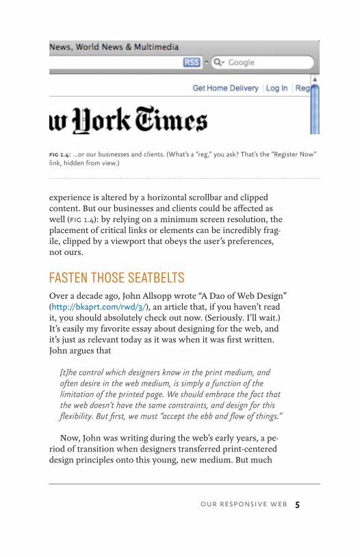
experience is altered by a horizontal scrollbar and clipped content. But our businesses and clients could be affected as well (Fig 1.4): by relying on a minimum screen resolution, the placement of critical links or elements can be incredibly frag-ile, clipped by a viewport that obeys the user’s preferences, not ours.
FASTEN THOSE SEATBELTSOver a decade ago, John Allsopp wrote “A Dao of Web Design” (http://bkaprt.com/rwd/3/), an article that, if you haven’t read it, you should absolutely check out now. (Seriously. I’ll wait.) It’s easily my favorite essay about designing for the web, and it’s just as relevant today as it was when it was first written. John argues that
[t]he control which designers know in the print medium, and often desire in the web medium, is simply a function of the limitation of the printed page. We should embrace the fact that the web doesn’t have the same constraints, and design for this flexibility. But first, we must “accept the ebb and flow of things.”
Now, John was writing during the web’s early years, a pe-riod of transition when designers transferred print-centered design principles onto this young, new medium. But much
fig 1.4: …or our businesses and clients. (What’s a “reg,” you ask? That’s the “Register Now” link, hidden from view.)
6 RESPONSIVE WEB DESIGN
of what he wrote ten years ago still rings true today. Because the web has never felt more in flux, more variable than it does right now.
After all, we’ve been entering our own transition period for some time. We’re now faced with a browser landscape that’s become increasingly untethered from the desktop, with devices becoming smaller and larger simultaneously. Small-screen devices are estimated to become the dominant form of web access in a matter of years (http://bkaprt.com/rwd/4/), while modern game consoles have made a widescreen, tele-vision-centric web more readily accessible. Tablet computing has become wildly popular of late, presenting us with a mode of web access that is neither fully “mobile” nor “desktop,” but somewhere in between.
The long and short of it is that we’re designing for more de-vices, more input types, more resolutions than ever before. The web has moved beyond the desktop, and it’s not turning back.
Unfortunately, our early attempts at designing beyond the desktop have felt pretty similar to our old approaches, apply-ing constraints in the face of uncertainty. A few months ago, a friend emailed me a link to an article she’d just read on her phone:
http://www.bbc.co.uk/news/mobile/science-environment-13095307
See the /mobile/ directory? The site’s owners had quaran-tined the “mobile experience” on a separate URL, assuming a page width of 320 pixels. But whenever that link is shared on Twitter, Facebook, or via email, visitors will be locked into that small-screen friendly view, regardless of the device they use to read it. And speaking for myself, the reading experience was, well, awful on a desktop browser.
That’s not to say that mobile websites are inherently flawed, or that there aren’t valid business cases for creating them. But I do think fragmenting our content across different “device-optimized” experiences is a losing proposition, or at least an unsustainable one. As the past few years have shown
7
us, we simply can’t compete with the pace of technology. Are we really going to create a custom experience for every new browser or device that appears?
And if not, what’s the alternative?
RESPONSIVE ARCHITECTUREI’ve been an amateur fan of architecture for as long as I can re-member. And as a web designer, there’s something appealing about the number of constraints that architects seem to enjoy: from sketch to schematic, from foundation to façade, every step of the architectural process is more permanent than the one that preceded it. In Parentalia, the English architect Christopher Wren wrote that “architecture aims at eternity,” and there’s something to that: an architect’s creative decisions will stand for decades, perhaps centuries.
After a day spent cursing at Internet Explorer, that kind of constancy sounds really, really nice.
But in recent years, a relatively new design discipline called “responsive architecture” has been challenging some of the permanence at the heart of the architectural discipline. It’s a very young discipline, but this more interactive form has al-ready manifested itself in several interesting ways.
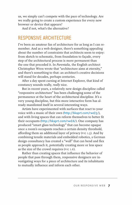
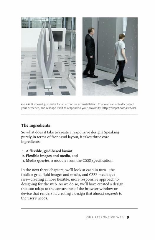
Artists have experimented with surfaces that react to your voice with a music of their own (http://bkaprt.com/rwd/5/), and with living spaces that can reform themselves to better fit their occupants (http://bkaprt.com/rwd/6/). One company has produced “smart glass technology” that can become opaque once a room’s occupants reaches a certain density threshold, affording them an additional layer of privacy (Fig 1.5). And by combining tensile materials and embedded robotics, a German design consultancy has created a “wall” that can bend and flex as people approach it, potentially creating more or less space as the size of the crowd requires (Fig 1.6).
Rather than creating spaces that influence the behavior of people that pass through them, responsive designers are in-vestigating ways for a piece of architecture and its inhabitants to mutually influence and inform each other.
OUR RESPONSIVE WEB
8 RESPONSIVE WEB DESIGN
THE WAY FORWARDWhat’s fascinating to me is that architects are trying to over-come the constraints inherent to their medium. But web designers, facing a changing landscape of new devices and contexts, are now forced to overcome the constraints we’ve imposed on the web’s innate flexibility.
We need to let go.Rather than creating disconnected designs, each tailored to
a particular device or browser, we should instead treat them as facets of the same experience. In other words, we can craft sites that are not only more flexible, but that can adapt to the media that renders them.
In short, we need to practice responsive web design. We can embrace the flexibility inherent to the web, without sur-rendering the control we require as designers. All by embed-ding standards-based technologies in our work, and by mak-ing a slight change in our philosophy toward online design.
fig 1.5: Now you see it, now you don’t: smart glass can be configured to become opaque automatically (http://bkaprt.com/rwd/7/).
9
The ingredients
So what does it take to create a responsive design? Speaking purely in terms of front-end layout, it takes three core ingredients:
1. A flexible, grid-based layout,2. Flexible images and media, and3. Media queries, a module from the CSS3 specification.
In the next three chapters, we’ll look at each in turn—the flexible grid, fluid images and media, and CSS3 media que-ries—creating a more flexible, more responsive approach to designing for the web. As we do so, we’ll have created a design that can adapt to the constraints of the browser window or device that renders it, creating a design that almost responds to the user’s needs.
fig 1.6: It doesn’t just make for an attractive art installation. This wall can actually detect your presence, and reshape itself to respond to your proximity (http://bkaprt.com/rwd/8/).
OUR RESPONSIVE WEB
10 RESPONSIVE WEB DESIGN
But before we dive in, I should probably come clean: I’m a bit of a science fiction nut. I love me some laser pistols, androids, and flying cars, as well as movies and television shows containing copious amounts thereof. And I don’t much care about the quality of said shows and movies, honestly. Whether directed by Kubrick or sporting a budget lower than what I paid for lunch, I’ll watch it: just make sure there’s at least one rocket ship, and I’m happy.
In all the sci-fi I’ve watched, good or bad, there’s a narrative device that genre writers really seem to love: the secret ro-bot. I’m sure you’ve come across yarns like this before. They always start with a plucky band of adventurers trying to over-come some faceless evil, lead by some upstanding hero type, armed with pithy one-liners and/or steely resolve. But lurking somewhere within their ranks is . . . a secret robot. (Cue ominous music.) This devious, devilish device is an unfeeling being, wrought from cold steel and colder calculations, but made to look like a human, and it has a decidedly nefarious purpose: to take our band of heroes down from the inside.
The revelation of the secret robot is where the story gets most of its drama. You know the hero, and you know the ro-botic spy, sure. But among the rest of the characters, you’re always left asking yourself: who is, and who isn’t, a robot?
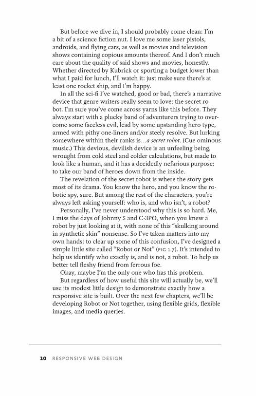
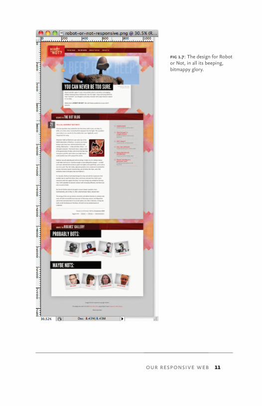
Personally, I’ve never understood why this is so hard. Me, I miss the days of Johnny 5 and C-3PO, when you knew a robot by just looking at it, with none of this “skulking around in synthetic skin” nonsense. So I’ve taken matters into my own hands: to clear up some of this confusion, I’ve designed a simple little site called “Robot or Not” (Fig 1.7). It’s intended to help us identify who exactly is, and is not, a robot. To help us better tell fleshy friend from ferrous foe.
Okay, maybe I’m the only one who has this problem.But regardless of how useful this site will actually be, we’ll
use its modest little design to demonstrate exactly how a responsive site is built. Over the next few chapters, we’ll be developing Robot or Not together, using flexible grids, flexible images, and media queries.
11
fig 1.7: The design for Robot or Not, in all its beeping, bitmappy glory.
OUR RESPONSIVE WEB
12 RESPONSIVE WEB DESIGN
Now, maybe you’re not one for suspense. Or, more likely, maybe you’re already tired of hearing me blather on at length, and just want to see the finished product. If that’s the case, then simply point your browser to http://responsivewebdesign.com/robot/, and feel free to kick the tires a bit.
Still here? Great. Let’s get started.
13
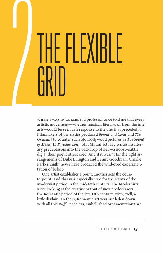
when I wAs In college, a professor once told me that every artistic movement—whether musical, literary, or from the fine arts—could be seen as a response to the one that preceded it. Filmmakers of the sixties produced Bonnie and Clyde and The Graduate to counter such old Hollywood pictures as The Sound of Music. In Paradise Lost, John Milton actually writes his liter-ary predecessors into the backdrop of hell—a not-so-subtle dig at their poetic street cred. And if it wasn’t for the tight ar-rangements of Duke Ellington and Benny Goodman, Charlie Parker might never have produced the wild-eyed experimen-tation of bebop.
One artist establishes a point; another sets the coun-terpoint. And this was especially true for the artists of the Modernist period in the mid-20th century. The Modernists were looking at the creative output of their predecessors, the Romantic period of the late 19th century, with, well, a little disdain. To them, Romantic art was just laden down with all this stuff—needless, embellished ornamentation that
2 THE FLEXIBLE GRID
THE FLEXIBLE GRID
14 RESPONSIVE WEB DESIGN
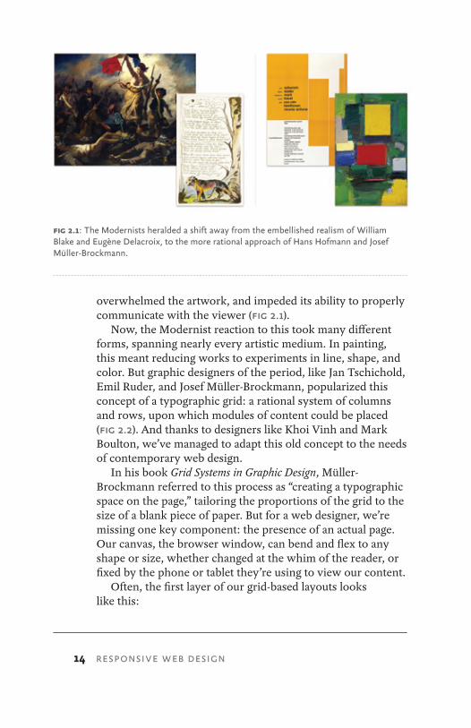
overwhelmed the artwork, and impeded its ability to properly communicate with the viewer (Fig 2.1).
Now, the Modernist reaction to this took many different forms, spanning nearly every artistic medium. In painting, this meant reducing works to experiments in line, shape, and color. But graphic designers of the period, like Jan Tschichold, Emil Ruder, and Josef Müller-Brockmann, popularized this concept of a typographic grid: a rational system of columns and rows, upon which modules of content could be placed (Fig 2.2). And thanks to designers like Khoi Vinh and Mark Boulton, we’ve managed to adapt this old concept to the needs of contemporary web design.
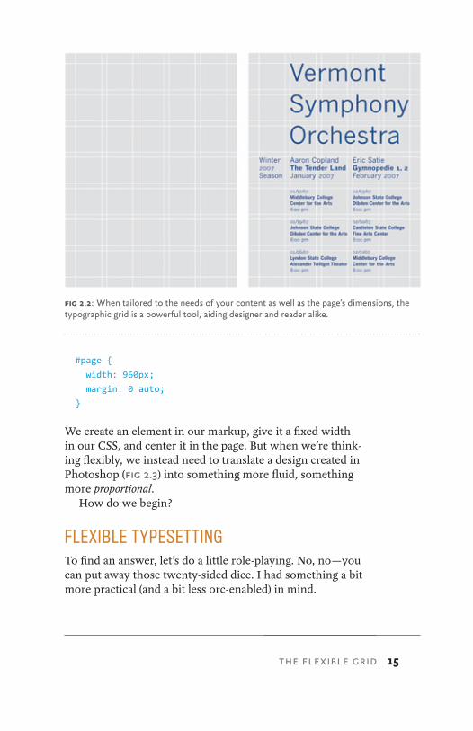
In his book Grid Systems in Graphic Design, Müller-Brockmann referred to this process as “creating a typographic space on the page,” tailoring the proportions of the grid to the size of a blank piece of paper. But for a web designer, we’re missing one key component: the presence of an actual page. Our canvas, the browser window, can bend and flex to any shape or size, whether changed at the whim of the reader, or fixed by the phone or tablet they’re using to view our content.
Often, the first layer of our grid-based layouts looks like this:
fig 2.1: The Modernists heralded a shift away from the embellished realism of William Blake and Eugène Delacroix, to the more rational approach of Hans Hofmann and Josef Müller-Brockmann.
15
#page {
width: 960px;
margin: 0 auto;
}
We create an element in our markup, give it a fixed width in our CSS, and center it in the page. But when we’re think-ing flexibly, we instead need to translate a design created in Photoshop (Fig 2.3) into something more fluid, something more proportional.
How do we begin?
FLEXIBLE TYPESETTINGTo find an answer, let’s do a little role-playing. No, no—you can put away those twenty-sided dice. I had something a bit more practical (and a bit less orc-enabled) in mind.
fig 2.2: When tailored to the needs of your content as well as the page’s dimensions, the typographic grid is a powerful tool, aiding designer and reader alike.
THE FLEXIBLE GRID

16 RESPONSIVE WEB DESIGN
fig 2.3: Our PSD is looking pretty, but that grid’s more than slightly pixel-heavy. How can we become more flexible?
17
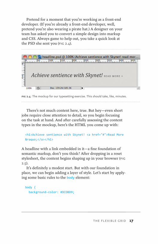
Pretend for a moment that you’re working as a front-end developer. (If you’re already a front-end developer, well, pretend you’re also wearing a pirate hat.) A designer on your team has asked you to convert a simple design into markup and CSS. Always game to help out, you take a quick look at the PSD she sent you (Fig 2.4).
There’s not much content here, true. But hey—even short jobs require close attention to detail, so you begin focusing on the task at hand. And after carefully assessing the content types in the mockup, here’s the HTML you come up with:
<h1>Achieve sentience with Skynet! <a href="#">Read More
»</a></h1>
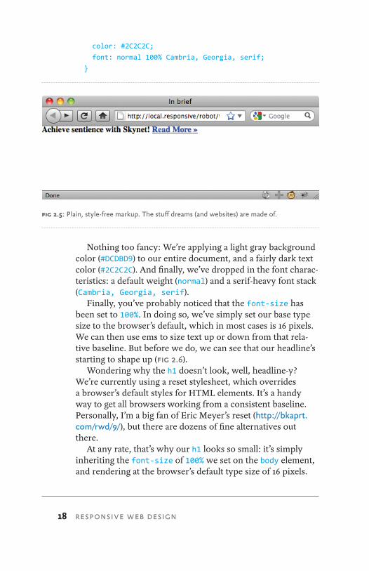
A headline with a link embedded in it—a fine foundation of semantic markup, don’t you think? After dropping in a reset stylesheet, the content begins shaping up in your browser (Fig 2.5).
It’s definitely a modest start. But with our foundation in place, we can begin adding a layer of style. Let’s start by apply-ing some basic rules to the body element:
body {
background-color: #DCDBD9;
fig 2.4: The mockup for our typesetting exercise. This should take, like, minutes.
THE FLEXIBLE GRID
18 RESPONSIVE WEB DESIGN
color: #2C2C2C;
font: normal 100% Cambria, Georgia, serif;
}
Nothing too fancy: We’re applying a light gray background color (#DCDBD9) to our entire document, and a fairly dark text color (#2C2C2C). And finally, we’ve dropped in the font charac-teristics: a default weight (normal) and a serif-heavy font stack (Cambria, Georgia, serif).
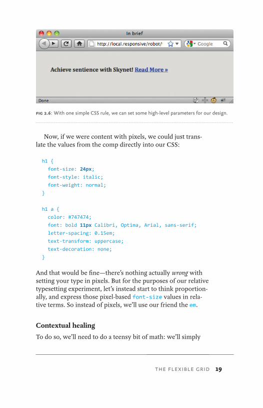
Finally, you’ve probably noticed that the font-size has been set to 100%. In doing so, we’ve simply set our base type size to the browser’s default, which in most cases is 16 pixels. We can then use ems to size text up or down from that rela-tive baseline. But before we do, we can see that our headline’s starting to shape up (Fig 2.6).
Wondering why the h1 doesn’t look, well, headline-y? We’re currently using a reset stylesheet, which overrides a browser’s default styles for HTML elements. It’s a handy way to get all browsers working from a consistent baseline. Personally, I’m a big fan of Eric Meyer’s reset (http://bkaprt.com/rwd/9/), but there are dozens of fine alternatives out there.
At any rate, that’s why our h1 looks so small: it’s simply inheriting the font-size of 100% we set on the body element, and rendering at the browser’s default type size of 16 pixels.
fig 2.5: Plain, style-free markup. The stuff dreams (and websites) are made of.
19
Now, if we were content with pixels, we could just trans-late the values from the comp directly into our CSS:
h1 {
font-size: 24px;
font-style: italic;
font-weight: normal;
}
h1 a {
color: #747474;
font: bold 11px Calibri, Optima, Arial, sans-serif;
letter-spacing: 0.15em;
text-transform: uppercase;
text-decoration: none;
}
And that would be fine—there’s nothing actually wrong with setting your type in pixels. But for the purposes of our relative typesetting experiment, let’s instead start to think proportion-ally, and express those pixel-based font-size values in rela-tive terms. So instead of pixels, we’ll use our friend the em.
Contextual healing
To do so, we’ll need to do a teensy bit of math: we’ll simply
fig 2.6: With one simple CSS rule, we can set some high-level parameters for our design.
THE FLEXIBLE GRID
20 RESPONSIVE WEB DESIGN
take the target font size from our comp, and divide it by the font-size of its containing element—in other words, its con-text. The result is our desired font-size expressed in relative, oh-so-flexible ems.
In other words, relative type sizes can be calculated with this simple formula:
target ÷ context = result
(Quick aside: If you’re at all like me, the word “math” causes immediate and serious panic. But speaking as someone who took a philosophy course for his college math credit, don’t run screaming into the hills quite yet. I rely on my computer’s calculator program heavily, and simply paste the result into my CSS. That keeps me from really having to, you know, do the math.)
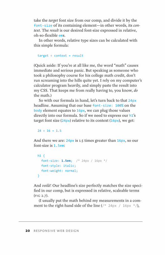
So with our formula in hand, let’s turn back to that 24px headline. Assuming that our base font-size: 100% on the body element equates to 16px, we can plug those values directly into our formula. So if we need to express our h1’s target font size (24px) relative to its context (16px), we get:
24 ÷ 16 = 1.5
And there we are: 24px is 1.5 times greater than 16px, so our font-size is 1.5em:
h1 {
font-size: 1.5em; /* 24px / 16px */
font-style: italic;
font-weight: normal;
}
And voilà! Our headline’s size perfectly matches the size speci-fied in our comp, but is expressed in relative, scaleable terms (Fig 2.7).
(I usually put the math behind my measurements in a com-ment to the right-hand side of the line (/* 24px / 16px */),
21
which makes future adjustments much, much easier for me to make.)
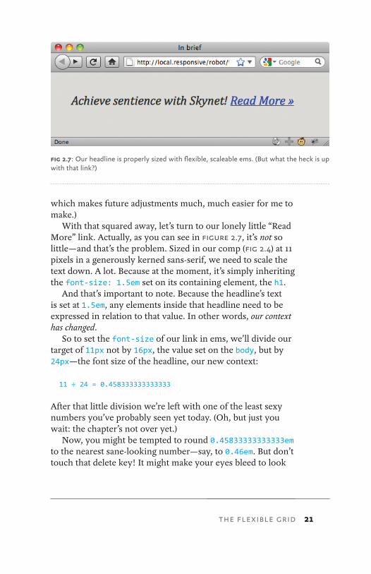
With that squared away, let’s turn to our lonely little “Read More” link. Actually, as you can see in Figure 2.7, it’s not so little—and that’s the problem. Sized in our comp (Fig 2.4) at 11 pixels in a generously kerned sans-serif, we need to scale the text down. A lot. Because at the moment, it’s simply inheriting the font-size: 1.5em set on its containing element, the h1.
And that’s important to note. Because the headline’s text is set at 1.5em, any elements inside that headline need to be expressed in relation to that value. In other words, our context has changed.
So to set the font-size of our link in ems, we’ll divide our target of 11px not by 16px, the value set on the body, but by 24px—the font size of the headline, our new context:
11 ÷ 24 = 0.458333333333333
After that little division we’re left with one of the least sexy numbers you’ve probably seen yet today. (Oh, but just you wait: the chapter’s not over yet.)
Now, you might be tempted to round 0.45833333333333em to the nearest sane-looking number—say, to 0.46em. But don’t touch that delete key! It might make your eyes bleed to look
fig 2.7: Our headline is properly sized with flexible, scaleable ems. (But what the heck is up with that link?)
THE FLEXIBLE GRID
22 RESPONSIVE WEB DESIGN
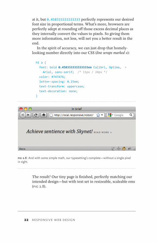
at it, but 0.458333333333333 perfectly represents our desired font size in proportional terms. What’s more, browsers are perfectly adept at rounding off those excess decimal places as they internally convert the values to pixels. So giving them more information, not less, will net you a better result in the end.
In the spirit of accuracy, we can just drop that homely-looking number directly into our CSS (line wraps marked »):
h1 a {
font: bold 0.458333333333333em Calibri, Optima, »
Arial, sans-serif; /* 11px / 24px */
color: #747474;
letter-spacing: 0.15em;
text-transform: uppercase;
text-decoration: none;
}
The result? Our tiny page is finished, perfectly matching our intended design—but with text set in resizeable, scaleable ems (Fig 2.8).
fig 2.8: And with some simple math, our typesetting’s complete—without a single pixel in sight.
23
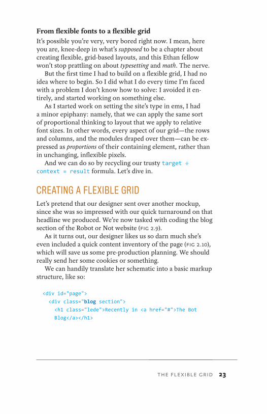
From flexible fonts to a flexible gridIt’s possible you’re very, very bored right now. I mean, here you are, knee-deep in what’s supposed to be a chapter about creating flexible, grid-based layouts, and this Ethan fellow won’t stop prattling on about typesetting and math. The nerve.
But the first time I had to build on a flexible grid, I had no idea where to begin. So I did what I do every time I’m faced with a problem I don’t know how to solve: I avoided it en-tirely, and started working on something else.
As I started work on setting the site’s type in ems, I had a minor epiphany: namely, that we can apply the same sort of proportional thinking to layout that we apply to relative font sizes. In other words, every aspect of our grid—the rows and columns, and the modules draped over them—can be ex-pressed as proportions of their containing element, rather than in unchanging, inflexible pixels.
And we can do so by recycling our trusty target ÷ context = result formula. Let’s dive in.
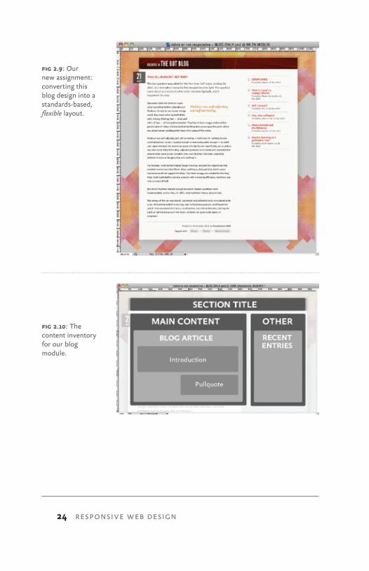
CREATING A FLEXIBLE GRIDLet’s pretend that our designer sent over another mockup, since she was so impressed with our quick turnaround on that headline we produced. We’re now tasked with coding the blog section of the Robot or Not website (Fig 2.9).
As it turns out, our designer likes us so darn much she’s even included a quick content inventory of the page (Fig 2.10), which will save us some pre-production planning. We should really send her some cookies or something.
We can handily translate her schematic into a basic markup structure, like so:
<div id="page">
<div class="blog section">
<h1 class="lede">Recently in <a href="#">The Bot
Blog</a></h1>
THE FLEXIBLE GRID
24 RESPONSIVE WEB DESIGN
fig 2.10: The content inventory for our blog module.
fig 2.9: Our new assignment: converting this blog design into a standards-based, flexible layout.
25
<div class="main">
…
</div><!-- /end .main -->
<div class="other">
…
</div><!-- /end .other -->
</div><!-- /end .blog.section -->
</div><!-- /end #page -->
Our skeleton markup is lean, mean, and semantically rich, perfectly matching the high-level content inventory. We’ve created a generic container for the entire page (#page), which in turn contains our .blog module. And within .blog we’ve created two more containers: a div classed as .main for our main article content, and another div classed as .other for, um, other stuff. Poetry it ain’t, but poetry it doesn’t have to be.
At this point, we’re going to skip a few steps in our exer-cise. In fact, let’s pretend that this is one of those cooking shows where the chef throws a bunch of ingredients into a pot, and then turns around to produce a fully cooked turkey. (This metaphor handily demonstrates how infrequently I watch cooking shows. Or cook turkey.)
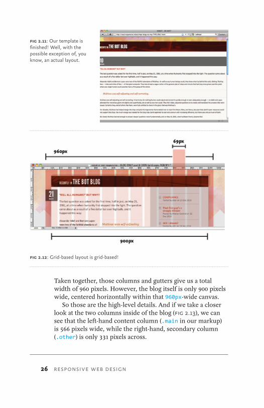
But let’s assume that we’ve already done all the CSS related to typesetting, background images, and just about every ele-ment of our design that isn’t related to layout (Fig 2.11). With those other details finished, we can focus exclusively on pro-ducing our fluid grid.
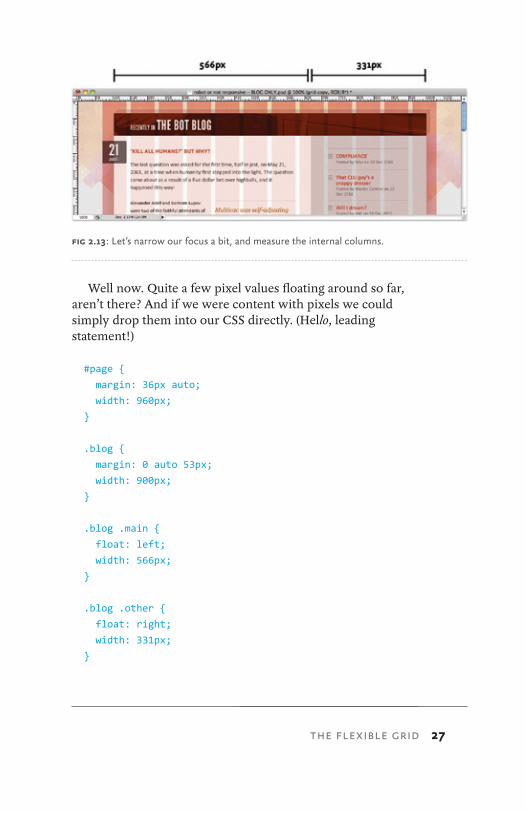
So how exactly do we turn those .main and .other blocks into proper columns? With our content inventory finished and some basic markup in place, let’s go back to our comp and take a closer look at the grid’s physical characteristics (Fig 2.12).
Reviewing the design tells us a few things: first, that the grid itself is divided into 12 columns, each measuring 69 pixels across and separated by regular 12px-wide gutters.
THE FLEXIBLE GRID
26 RESPONSIVE WEB DESIGN
Taken together, those columns and gutters give us a total width of 960 pixels. However, the blog itself is only 900 pixels wide, centered horizontally within that 960px-wide canvas.
So those are the high-level details. And if we take a closer look at the two columns inside of the blog (Fig 2.13), we can see that the left-hand content column (.main in our markup) is 566 pixels wide, while the right-hand, secondary column (.other) is only 331 pixels across.
fig 2.12: Grid-based layout is grid-based!
fig 2.11: Our template is finished! Well, with the possible exception of, you know, an actual layout.
27
Well now. Quite a few pixel values floating around so far, aren’t there? And if we were content with pixels we could simply drop them into our CSS directly. (Hello, leading statement!)
#page {
margin: 36px auto;
width: 960px;
}
.blog {
margin: 0 auto 53px;
width: 900px;
}
.blog .main {
float: left;
width: 566px;
}
.blog .other {
float: right;
width: 331px;
}
fig 2.13: Let’s narrow our focus a bit, and measure the internal columns.
THE FLEXIBLE GRID
28 RESPONSIVE WEB DESIGN
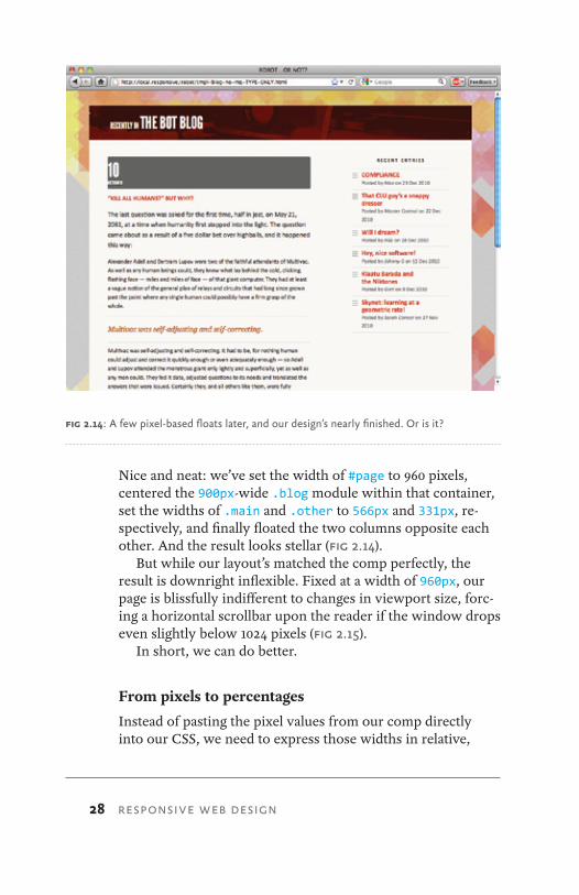
Nice and neat: we’ve set the width of #page to 960 pixels, centered the 900px-wide .blog module within that container, set the widths of .main and .other to 566px and 331px, re-spectively, and finally floated the two columns opposite each other. And the result looks stellar (Fig 2.14).
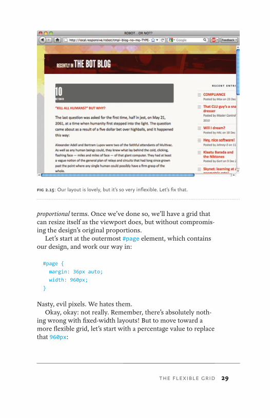
But while our layout’s matched the comp perfectly, the result is downright inflexible. Fixed at a width of 960px, our page is blissfully indifferent to changes in viewport size, forc-ing a horizontal scrollbar upon the reader if the window drops even slightly below 1024 pixels (Fig 2.15).
In short, we can do better.
From pixels to percentages
Instead of pasting the pixel values from our comp directly into our CSS, we need to express those widths in relative,
fig 2.14: A few pixel-based floats later, and our design’s nearly finished. Or is it?
29
proportional terms. Once we’ve done so, we’ll have a grid that can resize itself as the viewport does, but without compromis-ing the design’s original proportions.
Let’s start at the outermost #page element, which contains our design, and work our way in:
#page {
margin: 36px auto;
width: 960px;
}
Nasty, evil pixels. We hates them.Okay, okay: not really. Remember, there’s absolutely noth-
ing wrong with fixed-width layouts! But to move toward a more flexible grid, let’s start with a percentage value to replace that 960px:
fig 2.15: Our layout is lovely, but it’s so very inflexible. Let’s fix that.
THE FLEXIBLE GRID
30 RESPONSIVE WEB DESIGN
#page {
margin: 36px auto;
width: 90%;
}
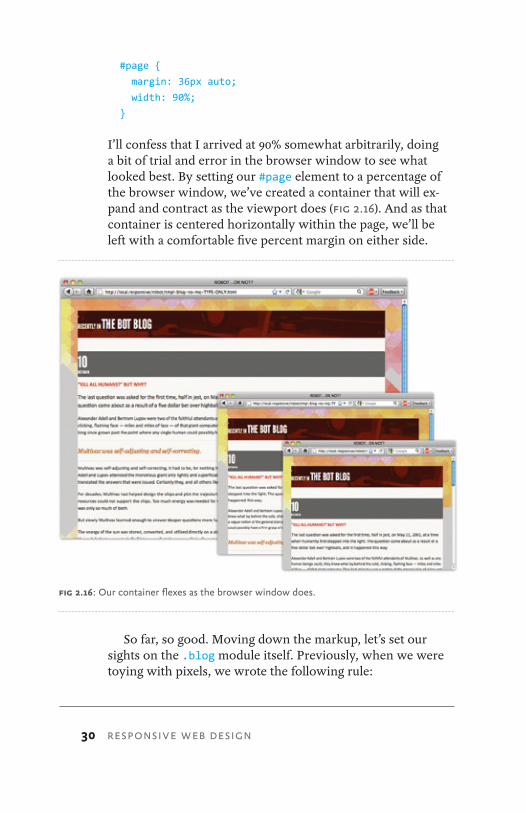
I’ll confess that I arrived at 90% somewhat arbitrarily, doing a bit of trial and error in the browser window to see what looked best. By setting our #page element to a percentage of the browser window, we’ve created a container that will ex-pand and contract as the viewport does (Fig 2.16). And as that container is centered horizontally within the page, we’ll be left with a comfortable five percent margin on either side.
So far, so good. Moving down the markup, let’s set our sights on the .blog module itself. Previously, when we were toying with pixels, we wrote the following rule:
fig 2.16: Our container flexes as the browser window does.
31
.blog {
margin: 0 auto 53px;
width: 900px;
}
Instead of a value set in pixels, we need to express .blog’s width of 900px in proportional terms: specifically, describing it as a percentage of the width of its containing element. And this is where our beloved target ÷ context = result for-mula comes back into play.
We already know our target pixel width for our blog: that’s 900px, as defined in our mockup. What we want is to describe that width in relative terms, as a percentage of .blog’s con-taining element. Since .blog is nested within the #page ele-ment, we’ve got our context—namely, 960 pixels, the width of #page as it was designed in the mockup.
So let’s divide our target width for .blog (900) by its context (960):
900 ÷ 960 = 0.9375
We’re left with a result of 0.9375. Doesn’t look like much, I’ll admit. But by moving the decimal over two places we’re left with 93.75%, a percentage we can drop directly into our CSS:
.blog {
margin: 0 auto 53px;
width: 93.75%; /* 900px / 960px */ }
(Just as I did with our relative typesetting exercise, I’ve left the formula in a comment off to the right of the width prop-erty. This is a personal preference, of course, but I’ve found it to be incredibly helpful.)
So that takes care of our two containing elements. But what about our content columns?
THE FLEXIBLE GRID
32 RESPONSIVE WEB DESIGN
.blog .main {
float: left;
width: 566px;
}
.blog .other {
float: right;
width: 331px;
}
Our left-hand content column is floated to the left, and set at 566px; the additional content is floated opposite, sized at a width of 331px. Once again, let’s replace those pixel-based tar-get widths with percentages.
But before we drop those values into our target ÷ context = result formula, it’s important to note that our con-text has changed. Last time, we divided the width of our blog module by 960px, the width of its container (#page). But since they’re nested inside .blog, we need to express our columns’ widths in relation to 900px—the width of the blog.
So we’ll divide our two target values (566px and 331px) by 900px, our new context:
566 ÷ 900 = .628888889
331 ÷ 900 = .367777778
Once we move our decimal points we’re left with 62.8888889% and 36.7777778%, the proportional widths of .main and .other:
.blog .main {
float: left;
width: 62.8888889%; /* 566px / 900px */ }
.blog .other {
float: right;
width: 36.7777778%; /* 331px / 900px */ }
33
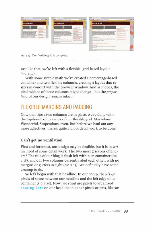
Just like that, we’re left with a flexible, grid-based layout (Fig 2.17).
With some simple math we’ve created a percentage-based container and two flexible columns, creating a layout that re-sizes in concert with the browser window. And as it does, the pixel widths of those columns might change—but the propor-tions of our design remain intact.
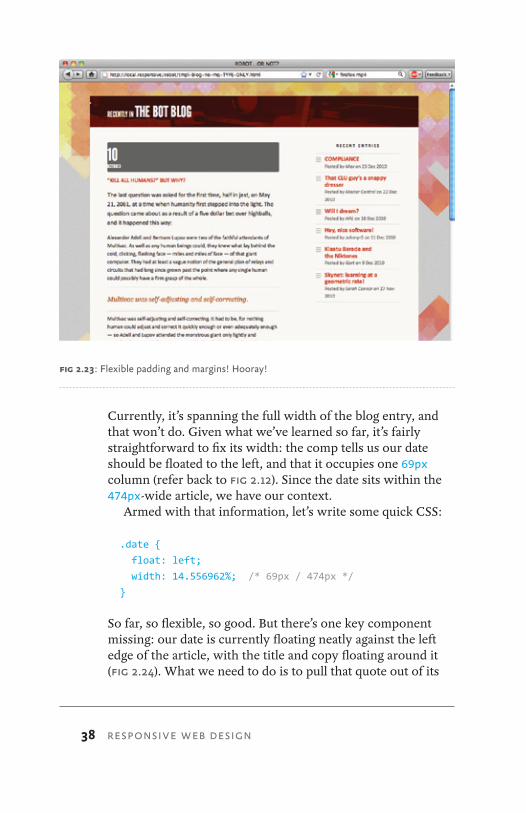
FLEXIBLE MARGINS AND PADDINGNow that those two columns are in place, we’re done with the top-level components of our flexible grid. Marvelous. Wonderful. Stupendous, even. But before we haul out any more adjectives, there’s quite a bit of detail work to be done.
Can’t get no ventilation
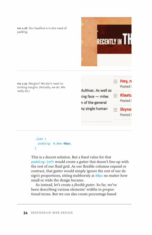
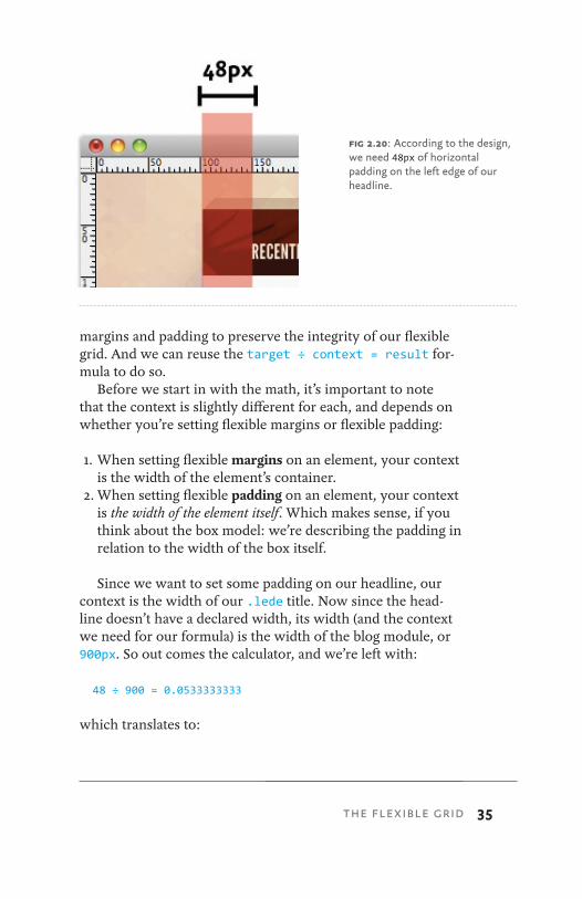
First and foremost, our design may be flexible, but it is in seri-ous need of some detail work. The two most grievous offend-ers? The title of our blog is flush left within its container (Fig 2.18), and our two columns currently abut each other, with no margins or gutters in sight (Fig 2.19). We definitely have some cleanup to do.
So let’s begin with that headline. In our comp, there’s 48 pixels of space between our headline and the left edge of its container (Fig 2.20). Now, we could use pixels to set a fixed padding-left on our headline in either pixels or ems, like so:
fig 2.17: Our flexible grid is complete.
THE FLEXIBLE GRID
34 RESPONSIVE WEB DESIGN
.lede {
padding: 0.8em 48px;
}
This is a decent solution. But a fixed value for that padding-left would create a gutter that doesn’t line up with the rest of our fluid grid. As our flexible columns expand or contract, that gutter would simply ignore the rest of our de-sign’s proportions, sitting stubbornly at 48px no matter how small or wide the design became.
So instead, let’s create a flexible gutter. So far, we’ve been describing various elements’ widths in propor-tional terms. But we can also create percentage-based
fig 2.18: Our headline is in dire need of padding.
fig 2.19: Margins? We don’t need no stinking margins. (Actually, we do. We really do.)
35
margins and padding to preserve the integrity of our flexible grid. And we can reuse the target ÷ context = result for-mula to do so.
Before we start in with the math, it’s important to note that the context is slightly different for each, and depends on whether you’re setting flexible margins or flexible padding:
1. When setting flexible margins on an element, your context is the width of the element’s container.
2. When setting flexible padding on an element, your context is the width of the element itself. Which makes sense, if you think about the box model: we’re describing the padding in relation to the width of the box itself.
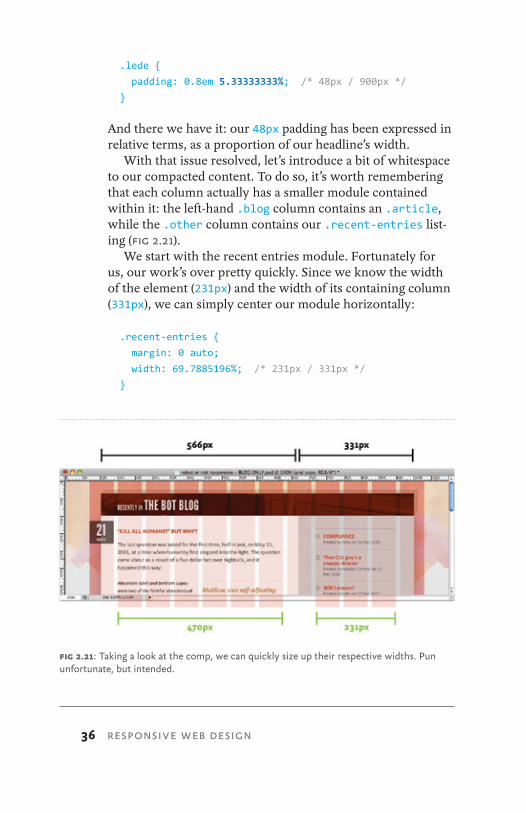
Since we want to set some padding on our headline, our context is the width of our .lede title. Now since the head-line doesn’t have a declared width, its width (and the context we need for our formula) is the width of the blog module, or 900px. So out comes the calculator, and we’re left with:
48 ÷ 900 = 0.0533333333
which translates to:
fig 2.20: According to the design, we need 48px of horizontal padding on the left edge of our headline.
THE FLEXIBLE GRID
36 RESPONSIVE WEB DESIGN
.lede {
padding: 0.8em 5.33333333%; /* 48px / 900px */ }
And there we have it: our 48px padding has been expressed in relative terms, as a proportion of our headline’s width.
With that issue resolved, let’s introduce a bit of whitespace to our compacted content. To do so, it’s worth remembering that each column actually has a smaller module contained within it: the left-hand .blog column contains an .article, while the .other column contains our .recent-entries list-ing (Fig 2.21).
We start with the recent entries module. Fortunately for us, our work’s over pretty quickly. Since we know the width of the element (231px) and the width of its containing column (331px), we can simply center our module horizontally:
.recent-entries {
margin: 0 auto;
width: 69.7885196%; /* 231px / 331px */ }
fig 2.21: Taking a look at the comp, we can quickly size up their respective widths. Pun unfortunate, but intended.
37
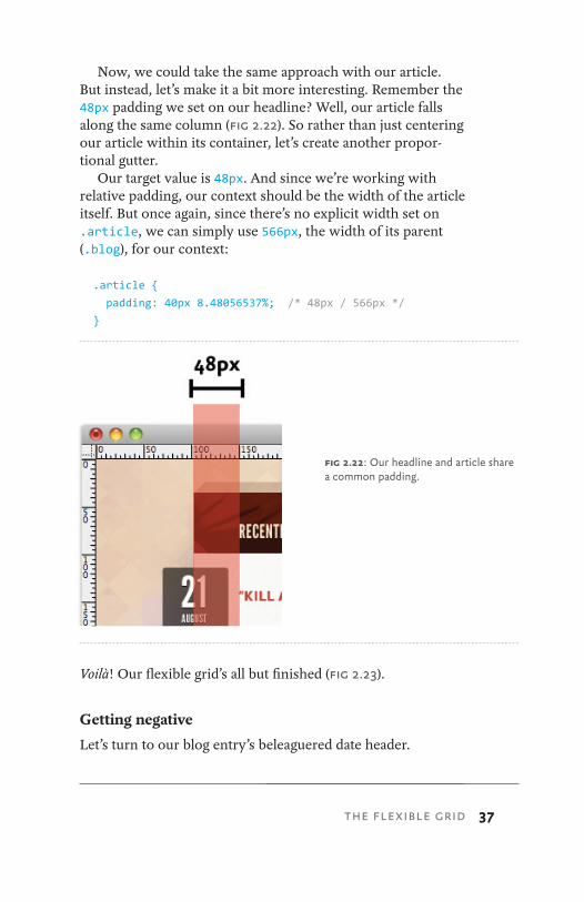
Now, we could take the same approach with our article. But instead, let’s make it a bit more interesting. Remember the 48px padding we set on our headline? Well, our article falls along the same column (Fig 2.22). So rather than just centering our article within its container, let’s create another propor-tional gutter.
Our target value is 48px. And since we’re working with relative padding, our context should be the width of the article itself. But once again, since there’s no explicit width set on .article, we can simply use 566px, the width of its parent (.blog), for our context:
.article {
padding: 40px 8.48056537%; /* 48px / 566px */ }
Voilà! Our flexible grid’s all but finished (Fig 2.23).
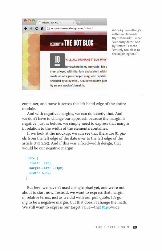
Getting negative
Let’s turn to our blog entry’s beleaguered date header.
fig 2.22: Our headline and article share a common padding.
THE FLEXIBLE GRID
38 RESPONSIVE WEB DESIGN
Currently, it’s spanning the full width of the blog entry, and that won’t do. Given what we’ve learned so far, it’s fairly straightforward to fix its width: the comp tells us our date should be floated to the left, and that it occupies one 69px column (refer back to Fig 2.12). Since the date sits within the 474px-wide article, we have our context.
Armed with that information, let’s write some quick CSS:
.date {
float: left;
width: 14.556962%; /* 69px / 474px */ }
So far, so flexible, so good. But there’s one key component missing: our date is currently floating neatly against the left edge of the article, with the title and copy floating around it (Fig 2.24). What we need to do is to pull that quote out of its
fig 2.23: Flexible padding and margins! Hooray!
39
container, and move it across the left-hand edge of the entire module.
And with negative margins, we can do exactly that. And we don’t have to change our approach because the margin is negative: just as before, we simply need to express that margin in relation to the width of the element’s container.
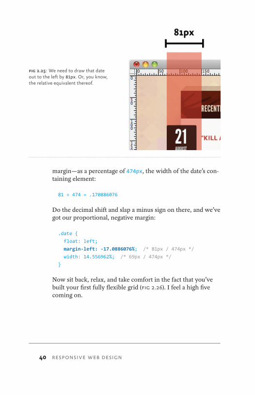
If we look at the mockup, we can see that there are 81 pix-els from the left edge of the date over to the left edge of the article (Fig 2.25). And if this was a fixed-width design, that would be our negative margin:
.date {
float: left;
margin-left: -81px;
width: 69px;
}
But hey: we haven’t used a single pixel yet, and we’re not about to start now. Instead, we want to express that margin in relative terms, just as we did with our pull quote. It’s go-ing to be a negative margin, but that doesn’t change the math. We still want to express our target value—that 81px-wide
fig 2.24: Something’s rotten in Denmark. (By “Denmark,” I mean “our entry date.” And by “rotten,” I mean “entirely too close to the adjoining text.”)
THE FLEXIBLE GRID
40 RESPONSIVE WEB DESIGN
margin—as a percentage of 474px, the width of the date’s con-taining element:
81 ÷ 474 = .170886076
Do the decimal shift and slap a minus sign on there, and we’ve got our proportional, negative margin:
.date {
float: left;
margin-left: -17.0886076%; /* 81px / 474px */ width: 14.556962%; /* 69px / 474px */ }
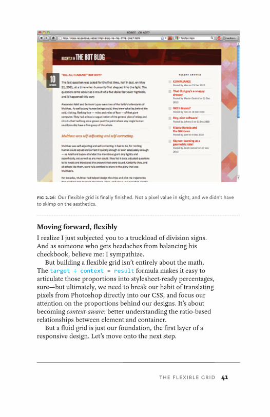
Now sit back, relax, and take comfort in the fact that you’ve built your first fully flexible grid (Fig 2.26). I feel a high five coming on.
fig 2.25: We need to draw that date out to the left by 81px. Or, you know, the relative equivalent thereof.
41
Moving forward, flexiblyI realize I just subjected you to a truckload of division signs. And as someone who gets headaches from balancing his checkbook, believe me: I sympathize.
But building a flexible grid isn’t entirely about the math. The target ÷ context = result formula makes it easy to articulate those proportions into stylesheet-ready percentages, sure—but ultimately, we need to break our habit of translating pixels from Photoshop directly into our CSS, and focus our attention on the proportions behind our designs. It’s about becoming context-aware: better understanding the ratio-based relationships between element and container.
But a fluid grid is just our foundation, the first layer of a responsive design. Let’s move onto the next step.
fig 2.26: Our flexible grid is finally finished. Not a pixel value in sight, and we didn’t have to skimp on the aesthetics.
THE FLEXIBLE GRID
42 RESPONSIVE WEB DESIGN
thIngs Are lookIng good so FAr: we’ve got a grid-based layout, one that doesn’t sacrifice complexity for flexibility. I have to admit that the first time I figured out how to build a fluid grid, I was feeling pretty proud of myself.
But then, as often happens with web design, despair set in. Currently, our page is awash in words, and little else. Actually, nothing else: our page is nothing but text. Why is this a prob-lem? Well, text reflows effortlessly within a flexible con-tainer—and I don’t know if you’ve noticed, but the Internet seems to have one or two of those “image” things lying around. None of which we’ve incorporated into our fluid grid.
So what happens when we introduce fixed-width images into our flexible design?
GOING BACK, BACK TO MARKUP, MARKUPTo find an answer, let’s do another quick experiment: let’s drop an image directly into our blog module, and see how our
FLEXIBLE IMAGES3
FLEXIBLE IMAGES 43
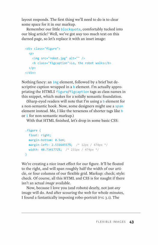
layout responds. The first thing we’ll need to do is to clear some space for it in our markup.
Remember our little blockquote, comfortably tucked into our blog article? Well, we’ve got way too much text on this darned page, so let’s replace it with an inset image:
<div class="figure">
<p>
<img src="robot.jpg" alt="" />
<b class="figcaption">Lo, the robot walks</b>
</p>
</div>
Nothing fancy: an img element, followed by a brief but de-scriptive caption wrapped in a b element. I’m actually appro-priating the HTML5 figure/figcaption tags as class names in this snippet, which makes for a solidly semantic foundation.
(Sharp-eyed readers will note that I’m using a b element for a non-semantic hook. Now, some designers might use a span element instead. Me, I like the terseness of shorter tags like b or i for non-semantic markup.)
With that HTML finished, let’s drop in some basic CSS:
.figure {
float: right;
margin-bottom: 0.5em;
margin-left: 2.53164557%; /* 12px / 474px */ width: 48.7341772%; /* 231px / 474px */ }
We’re creating a nice inset effect for our figure. It’ll be floated to the right, and will span roughly half the width of our arti-cle, or four columns of our flexible grid. Markup: check; style: check. Of course, all this HTML and CSS is for naught if there isn’t an actual image available.
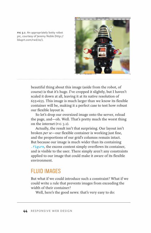
Now, because I love you (and robots) dearly, not just any image will do. And after scouring the web for whole minutes, I found a fantastically imposing robo-portrait (Fig 3.1). The
44 RESPONSIVE WEB DESIGN
beautiful thing about this image (aside from the robot, of course) is that it’s huge. I’ve cropped it slightly, but I haven’t scaled it down at all, leaving it at its native resolution of 655×655. This image is much larger than we know its flexible container will be, making it a perfect case to test how robust our flexible layout is.
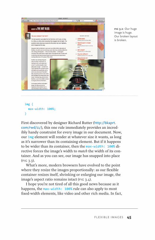
So let’s drop our oversized image onto the server, reload the page, and—oh. Well. That’s pretty much the worst thing on the internet (Fig 3.2).
Actually, the result isn’t that surprising. Our layout isn’t broken per se—our flexible container is working just fine, and the proportions of our grid’s columns remain intact. But because our image is much wider than its containing .figure, the excess content simply overflows its container, and is visible to the user. There simply aren’t any constraints applied to our image that could make it aware of its flexible environment.
FLUID IMAGESBut what if we could introduce such a constraint? What if we could write a rule that prevents images from exceeding the width of their container?
Well, here’s the good news: that’s very easy to do:
fig 3.1: An appropriately botty robot pic, courtesy of Jeremy Noble (http://bkaprt.com/rwd/10/).
FLEXIBLE IMAGES 45
img {
max-width: 100%;
}
First discovered by designer Richard Rutter (http://bkaprt.com/rwd/11/), this one rule immediately provides an incred-ibly handy constraint for every image in our document. Now, our img element will render at whatever size it wants, as long as it’s narrower than its containing element. But if it happens to be wider than its container, then the max-width: 100% di-rective forces the image’s width to match the width of its con-tainer. And as you can see, our image has snapped into place (Fig 3.3).
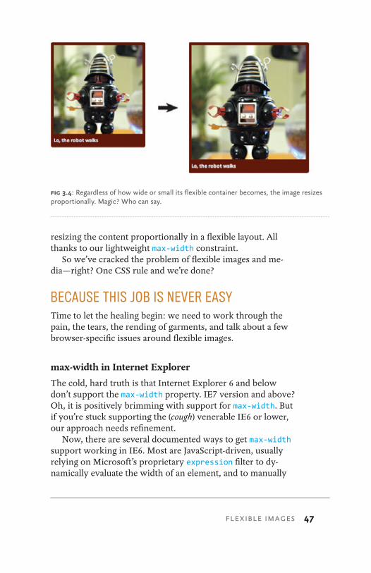
What’s more, modern browsers have evolved to the point where they resize the images proportionally: as our flexible container resizes itself, shrinking or enlarging our image, the image’s aspect ratio remains intact (Fig 3.4).
I hope you’re not tired of all this good news because as it happens, the max-width: 100% rule can also apply to most fixed-width elements, like video and other rich media. In fact,
fig 3.2: Our huge image is huge. Our broken layout is broken.
46 RESPONSIVE WEB DESIGN
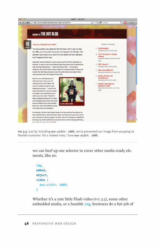
we can beef up our selector to cover other media-ready ele-ments, like so:
img,
embed,
object,
video {
max-width: 100%;
}
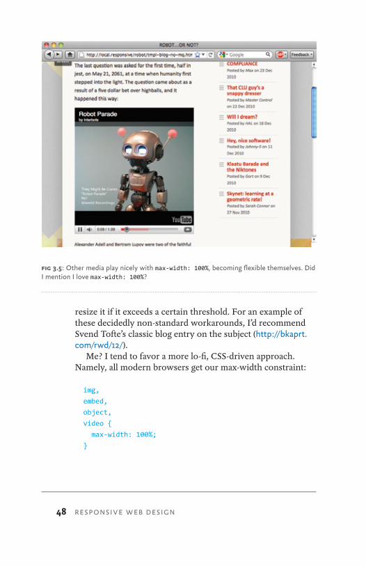
Whether it’s a cute little Flash video (Fig 3.5), some other embedded media, or a humble img, browsers do a fair job of
fig 3.3: Just by including max-width: 100%, we’ve prevented our image from escaping its flexible container. On a related note, I love max-width: 100%.
FLEXIBLE IMAGES 47
resizing the content proportionally in a flexible layout. All thanks to our lightweight max-width constraint.
So we’ve cracked the problem of flexible images and me-dia—right? One CSS rule and we’re done?
BECAUSE THIS JOB IS NEVER EASYTime to let the healing begin: we need to work through the pain, the tears, the rending of garments, and talk about a few browser-specific issues around flexible images.
max-width in Internet Explorer
The cold, hard truth is that Internet Explorer 6 and below don’t support the max-width property. IE7 version and above? Oh, it is positively brimming with support for max-width. But if you’re stuck supporting the (cough) venerable IE6 or lower, our approach needs refinement.
Now, there are several documented ways to get max-width support working in IE6. Most are JavaScript-driven, usually relying on Microsoft’s proprietary expression filter to dy-namically evaluate the width of an element, and to manually
fig 3.4: Regardless of how wide or small its flexible container becomes, the image resizes proportionally. Magic? Who can say.
48 RESPONSIVE WEB DESIGN
resize it if it exceeds a certain threshold. For an example of these decidedly non-standard workarounds, I’d recommend Svend Tofte’s classic blog entry on the subject (http://bkaprt.com/rwd/12/).
Me? I tend to favor a more lo-fi, CSS-driven approach. Namely, all modern browsers get our max-width constraint:
img,
embed,
object,
video {
max-width: 100%;
}
fig 3.5: Other media play nicely with max-width: 100%, becoming flexible themselves. Did I mention I love max-width: 100%?
FLEXIBLE IMAGES 49
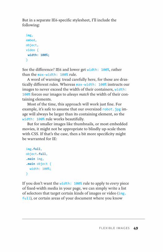
But in a separate IE6-specific stylesheet, I’ll include the following:
img,
embed,
object,
video {
width: 100%; }
See the difference? IE6 and lower get width: 100%, rather than the max-width: 100% rule.
A word of warning: tread carefully here, for these are dras-tically different rules. Whereas max-width: 100% instructs our images to never exceed the width of their containers, width: 100% forces our images to always match the width of their con-taining elements.
Most of the time, this approach will work just fine. For example, it’s safe to assume that our oversized robot.jpg im-age will always be larger than its containing element, so the width: 100% rule works beautifully.
But for smaller images like thumbnails, or most embedded movies, it might not be appropriate to blindly up-scale them with CSS. If that’s the case, then a bit more specificity might be warranted for IE:
img.full,
object.full,
.main img,
.main object {
width: 100%;
}
If you don’t want the width: 100% rule to apply to every piece of fixed-width media in your page, we can simply write a list of selectors that target certain kinds of images or video (img.full), or certain areas of your document where you know
50
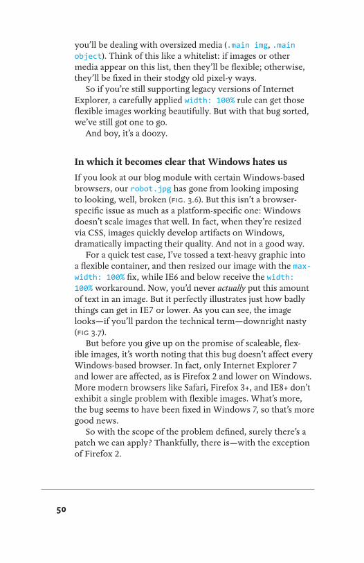
you’ll be dealing with oversized media (.main img, .main object). Think of this like a whitelist: if images or other media appear on this list, then they’ll be flexible; otherwise, they’ll be fixed in their stodgy old pixel-y ways.
So if you’re still supporting legacy versions of Internet Explorer, a carefully applied width: 100% rule can get those flexible images working beautifully. But with that bug sorted, we’ve still got one to go.
And boy, it’s a doozy.
In which it becomes clear that Windows hates us
If you look at our blog module with certain Windows-based browsers, our robot.jpg has gone from looking imposing to looking, well, broken (Fig. 3.6). But this isn’t a browser-specific issue as much as a platform-specific one: Windows doesn’t scale images that well. In fact, when they’re resized via CSS, images quickly develop artifacts on Windows, dramatically impacting their quality. And not in a good way.
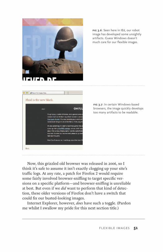
For a quick test case, I’ve tossed a text-heavy graphic into a flexible container, and then resized our image with the max-width: 100% fix, while IE6 and below receive the width: 100% workaround. Now, you’d never actually put this amount of text in an image. But it perfectly illustrates just how badly things can get in IE7 or lower. As you can see, the image looks—if you’ll pardon the technical term—downright nasty (Fig 3.7).
But before you give up on the promise of scaleable, flex-ible images, it’s worth noting that this bug doesn’t affect every Windows-based browser. In fact, only Internet Explorer 7 and lower are affected, as is Firefox 2 and lower on Windows. More modern browsers like Safari, Firefox 3+, and IE8+ don’t exhibit a single problem with flexible images. What’s more, the bug seems to have been fixed in Windows 7, so that’s more good news.
So with the scope of the problem defined, surely there’s a patch we can apply? Thankfully, there is—with the exception of Firefox 2.
FLEXIBLE IMAGES 51
Now, this grizzled old browser was released in 2006, so I think it’s safe to assume it isn’t exactly clogging up your site’s traffic logs. At any rate, a patch for Firefox 2 would require some fairly involved browser-sniffing to target specific ver-sions on a specific platform—and browser-sniffing is unreliable at best. But even if we did want to perform that kind of detec-tion, these older versions of Firefox don’t have a switch that could fix our busted-looking images.
Internet Explorer, however, does have such a toggle. (Pardon me whilst I swallow my pride for this next section title.)
fig 3.6: Seen here in IE6, our robot image has developed some unsightly artifacts. Guess Windows doesn’t much care for our flexible images.
fig 3.7: In certain Windows-based browsers, the image quickly develops too many artifacts to be readable.
52 RESPONSIVE WEB DESIGN
Hail AlphaImageLoader, the conquering hero
Ever tried to get transparent PNGs working in IE6 and below? Chances are good you’ve encountered AlphaImageLoader, one of Microsoft’s proprietary CSS filters (http://bkaprt.com/rwd/13/). There have since been more robust patches created for IE’s lack of support for the PNG alpha channel (Drew Diller’s DD_belatedPNG library is a current favorite of mine: http://bkaprt.com/rwd/14/), but historically, if you had a PNG attached to an element’s background, you could drop the fol-lowing rule into an IE-specific stylesheet:
.logo {
background: none;
filter: progid:DXImageTransform.Microsoft. »
AlphaImageLoader(src="/path/to/logo.png", »
sizingMethod="scale");
}
This AlphaImageLoader patch does a few things. First, it removes the background image from the element, then inserts it into an AlphaImageLoader object that sits “between” the proper background layer and the element’s content. But the sizingMethod property (http://bkaprt.com/rwd/15/) is the clev-er bit, dictating whether the AlphaImageLoader object should crop any parts of the image that overflow its container, treat it like a regular image, or scale it to fit it within its containing element.
I can hear you stifling your yawns by now: after all, what does an IE-specific PNG fix have to do with our broken image rendering?
Quite a bit, as it turns out. At one point I discovered that applying AlphaImageLoader to an image dramatically im-proves its rendering quality in IE, bringing it up to par with, well, every other browser on the planet. Furthermore, by setting the sizingMethod property to scale, we can use our AlphaImageLoader object to create the illusion of a flexible image.
FLEXIBLE IMAGES 53
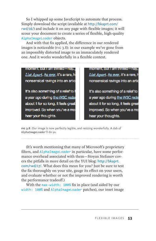
So I whipped up some JavaScript to automate that process. Simply download the script (available at http://bkaprt.com/rwd/16/) and include it on any page with flexible images; it will scour your document to create a series of flexible, high-quality AlphaImageLoader objects.
And with that fix applied, the difference in our rendered images is noticeable (Fig 3.8): in our example we’ve gone from an impossibly distorted image to an immaculately rendered one. And it works wonderfully in a flexible context.
(It’s worth mentioning that many of Microsoft’s proprietary filters, and AlphaImageLoader in particular, have some perfor-mance overhead associated with them—Stoyan Stefanov cov-ers the pitfalls in more detail on the YUI blog: http://bkaprt.com/rwd/17/. What does this mean for you? Just be sure to test the fix thoroughly on your site, gauge its effect on your users, and evaluate whether or not the improved rendering is worth the performance tradeoff.)
With the max-width: 100% fix in place (and aided by our width: 100% and AlphaImageLoader patches), our inset image
fig 3.8: Our image is now perfectly legible, and resizing wonderfully. A dab of AlphaImageLoader’ll do ya.
54 RESPONSIVE WEB DESIGN
is resizing beautifully across our target browsers. No matter the size of the browser window, our image scales harmoni-ously along with the proportions of our flexible grid.
But what about images that aren’t actually in our markup?
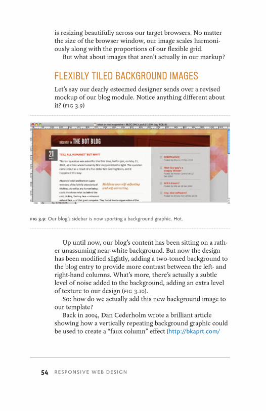
FLEXIBLY TILED BACKGROUND IMAGESLet’s say our dearly esteemed designer sends over a revised mockup of our blog module. Notice anything different about it? (Fig 3.9)
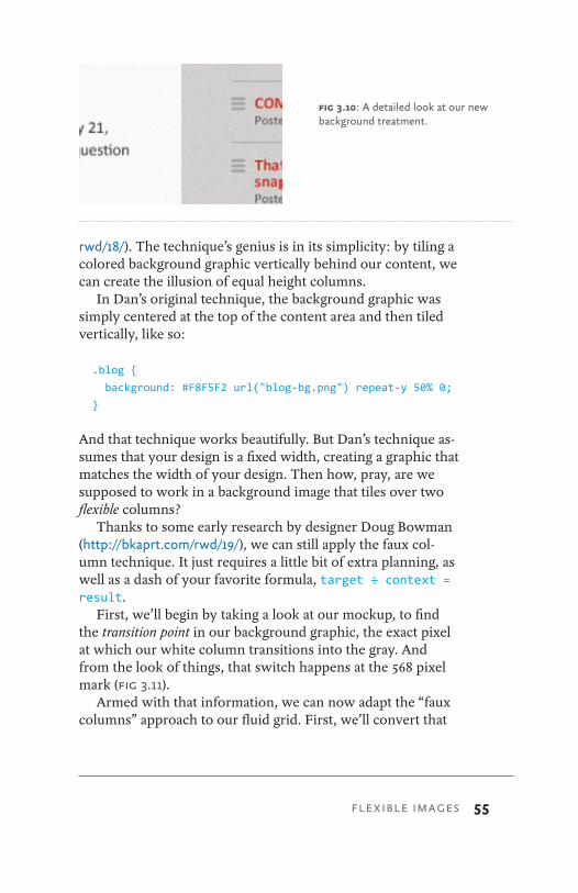
Up until now, our blog’s content has been sitting on a rath-er unassuming near-white background. But now the design has been modified slightly, adding a two-toned background to the blog entry to provide more contrast between the left- and right-hand columns. What’s more, there’s actually a subtle level of noise added to the background, adding an extra level of texture to our design (Fig 3.10).
So: how do we actually add this new background image to our template?
Back in 2004, Dan Cederholm wrote a brilliant article showing how a vertically repeating background graphic could be used to create a “faux column” effect (http://bkaprt.com/
fig 3.9: Our blog’s sidebar is now sporting a background graphic. Hot.
FLEXIBLE IMAGES 55
rwd/18/). The technique’s genius is in its simplicity: by tiling a colored background graphic vertically behind our content, we can create the illusion of equal height columns.
In Dan’s original technique, the background graphic was simply centered at the top of the content area and then tiled vertically, like so:
.blog {
background: #F8F5F2 url("blog-bg.png") repeat-y 50% 0;
}
And that technique works beautifully. But Dan’s technique as-sumes that your design is a fixed width, creating a graphic that matches the width of your design. Then how, pray, are we supposed to work in a background image that tiles over two flexible columns?
Thanks to some early research by designer Doug Bowman (http://bkaprt.com/rwd/19/), we can still apply the faux col-umn technique. It just requires a little bit of extra planning, as well as a dash of your favorite formula, target ÷ context = result.
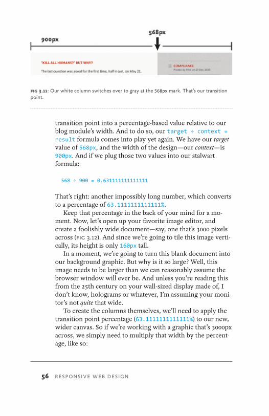
First, we’ll begin by taking a look at our mockup, to find the transition point in our background graphic, the exact pixel at which our white column transitions into the gray. And from the look of things, that switch happens at the 568 pixel mark (Fig 3.11).
Armed with that information, we can now adapt the “faux columns” approach to our fluid grid. First, we’ll convert that
fig 3.10: A detailed look at our new background treatment.
56 RESPONSIVE WEB DESIGN
transition point into a percentage-based value relative to our blog module’s width. And to do so, our target ÷ context = result formula comes into play yet again. We have our target value of 568px, and the width of the design—our context—is 900px. And if we plug those two values into our stalwart formula:
568 ÷ 900 = 0.631111111111111
That’s right: another impossibly long number, which converts to a percentage of 63.1111111111111%.
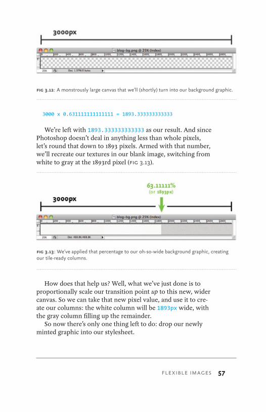
Keep that percentage in the back of your mind for a mo-ment. Now, let’s open up your favorite image editor, and create a foolishly wide document—say, one that’s 3000 pixels across (Fig 3.12). And since we’re going to tile this image verti-cally, its height is only 160px tall.
In a moment, we’re going to turn this blank document into our background graphic. But why is it so large? Well, this image needs to be larger than we can reasonably assume the browser window will ever be. And unless you’re reading this from the 25th century on your wall-sized display made of, I don’t know, holograms or whatever, I’m assuming your moni-tor’s not quite that wide.
To create the columns themselves, we’ll need to apply the transition point percentage (63.1111111111111%) to our new, wider canvas. So if we’re working with a graphic that’s 3000px across, we simply need to multiply that width by the percent-age, like so:
fig 3.11: Our white column switches over to gray at the 568px mark. That’s our transition point.
FLEXIBLE IMAGES 57
3000 x 0.631111111111111 = 1893.333333333333
We’re left with 1893.333333333333 as our result. And since Photoshop doesn’t deal in anything less than whole pixels, let’s round that down to 1893 pixels. Armed with that number, we’ll recreate our textures in our blank image, switching from white to gray at the 1893rd pixel (Fig 3.13).
How does that help us? Well, what we’ve just done is to proportionally scale our transition point up to this new, wider canvas. So we can take that new pixel value, and use it to cre-ate our columns: the white column will be 1893px wide, with the gray column filling up the remainder.
So now there’s only one thing left to do: drop our newly minted graphic into our stylesheet.
fig 3.12: A monstrously large canvas that we’ll (shortly) turn into our background graphic.
fig 3.13: We’ve applied that percentage to our oh-so-wide background graphic, creating our tile-ready columns.
58 RESPONSIVE WEB DESIGN
.blog {
background: #F8F5F2 url("blog-bg.png") repeat-y »
63.1111111111111% 0; /* 568px / 900px */ }
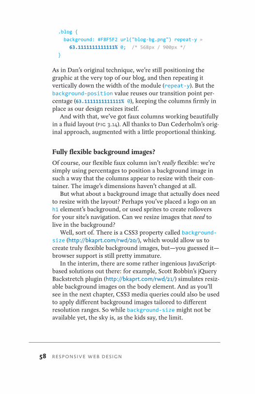
As in Dan’s original technique, we’re still positioning the graphic at the very top of our blog, and then repeating it vertically down the width of the module (repeat-y). But the background-position value reuses our transition point per-centage (63.1111111111111% 0), keeping the columns firmly in place as our design resizes itself.
And with that, we’ve got faux columns working beautifully in a fluid layout (Fig 3.14). All thanks to Dan Cederholm’s orig-inal approach, augmented with a little proportional thinking.
Fully flexible background images?
Of course, our flexible faux column isn’t really flexible: we’re simply using percentages to position a background image in such a way that the columns appear to resize with their con-tainer. The image’s dimensions haven’t changed at all.
But what about a background image that actually does need to resize with the layout? Perhaps you’ve placed a logo on an h1 element’s background, or used sprites to create rollovers for your site’s navigation. Can we resize images that need to live in the background?
Well, sort of. There is a CSS3 property called background-size (http://bkaprt.com/rwd/20/), which would allow us to create truly flexible background images, but—you guessed it—browser support is still pretty immature.
In the interim, there are some rather ingenious JavaScript-based solutions out there: for example, Scott Robbin’s jQuery Backstretch plugin (http://bkaprt.com/rwd/21/) simulates resiz-able background images on the body element. And as you’ll see in the next chapter, CSS3 media queries could also be used to apply different background images tailored to different resolution ranges. So while background-size might not be available yet, the sky is, as the kids say, the limit.
FLEXIBLE IMAGES 59
LEARNING TO LOVE OVERFLOWThere are a few other options for working fixed-width im-ages into a fluid context. In fact, you might consider brows-ing through Richard Rutter’s experiments with wide images placed in flexible layouts (http://bkaprt.com/rwd/11/). There are a number of promising experiments listed there, some of which might prove useful to you as you start tinkering with flexible layouts.
One method I’ve used on a few occasions is the overflow property. As we saw earlier in the chapter, wide images will, by default, simply bleed out of their containing elements. And in most cases, the max-width: 100% rule is the best way to constrain them, snapping them back down to a manage-able size. But alternately, you could simply clip off that excess
fig 3.14: Our flexibly faux columns.
60 RESPONSIVE WEB DESIGN
image data by applying overflow: hidden. So rather than set-ting our inset image to resize itself automatically:
.feature img {
max-width: 100%;
}
We could instead simply clip off all that excess, overflowing data like so:
.feature {
overflow: hidden;
}
.feature img {
display: block;
max-width: auto;
}
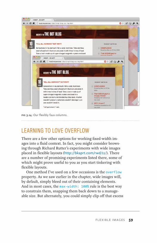
And there you have it: one image, cropped to fit inside its con-tainer (Fig 3.15). The image is all still there, but the excess bits have just been hidden from view.
Now, as you can see, this isn’t really a workable solution. In fact, I’ve found that in the overwhelming majority of cases, overflow is generally less useful than scaling the image via max-width. But still, it’s an option to be considered, and one you might find some use for.
fig 3.15: And with a dash of overflow: hidden applied to our image’s container, we’re left with an image that’s . . . well, cropped. Yay, I guess?
FLEXIBLE IMAGES 61
NEGOTIATE THAT CONTENTIt’s worth noting that both the overflow and max-width: 100% approaches to flexible images are actually pretty robust, and work remarkably well for most kinds of media. In fact, I’ve used them successfully on a number of complex fluid grids.
However, both approaches are ultimately “content-blind.” Each establishes some basic rules for the way an image in-teracts with its container: max-width: 100% scales oversized images down to match the width of their containers, while controlling overflow allows the designer to conceal any image data that might bleed out of its containing element.
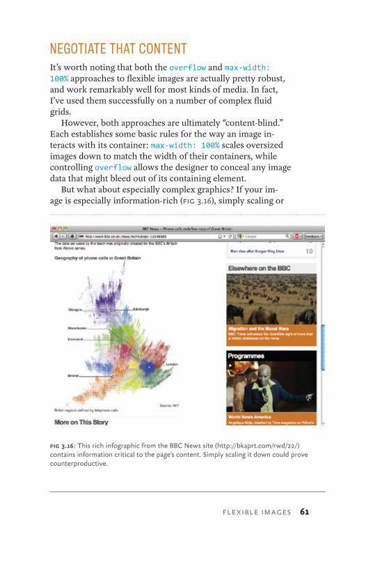
But what about especially complex graphics? If your im-age is especially information-rich (Fig 3.16), simply scaling or
fig 3.16: This rich infographic from the BBC News site (http://bkaprt.com/rwd/22/) contains information critical to the page’s content. Simply scaling it down could prove counterproductive.
62 RESPONSIVE WEB DESIGN
cropping it might be less than desirable—in fact, those ap-proaches might actually impede your readers’ ability to under-stand the content contained in that image.
If that’s the case, it might be worth investigating ways of delivering different versions of the same image to different resolution ranges. In other words, you could create multiple versions of your infographic—say, one ideal for desktop browsers, as well as another, more linearized version for small-screen devices. With those options established, a server-side solution could intelligently serve the most appropriate image for that resolution range.
Creating such a solution is beyond the scope of this book (and beyond the skill of your humble author), but designer/developer Bryan Rieger has outlined one possible approach on his blog (http://bkaprt.com/rwd/23/), and made his solution available for download.
If you decide to implement a back-end solution, it could be augmented by the various client-side techniques we’ve discussed so far. For example, you could serve images to a lim-ited number of resolutions, and then use max-width: 100% to smooth the transition to other devices, browsers, and resolu-tion ranges on an as-needed basis.
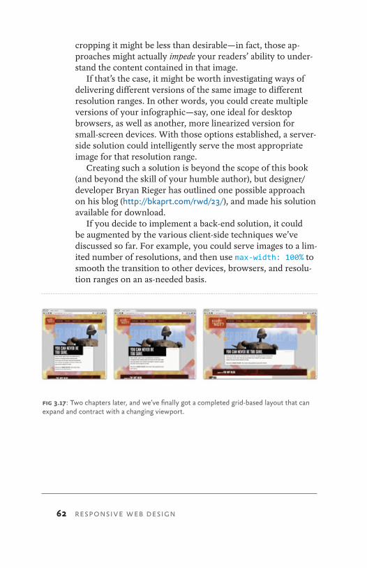
fig 3.17: Two chapters later, and we’ve finally got a completed grid-based layout that can expand and contract with a changing viewport.
FLEXIBLE IMAGES 63
FLEXIBLE GRIDS AND IMAGES, UP IN THE PROVERBIAL TREE
At this point, we’ve explored everything you need to build complex but flexible grid-based layouts: the simple math be-hind flexible grids and some strategies for working images and other media into that framework. While we’ve been focusing on building a fairly simple blog module, we can actually use this to build the rest of the Robot or Not site, creating a design that’s founded on a system of proportions and percentages, with nary a pixel in sight (Fig 3.17).
With this flexible foundation in place, we’re ready to add the final ingredient to our responsive design.
(And no, it’s not mixed metaphors.)
64 RESPONSIVE WEB DESIGN
For most oF my cAreer, I’ve been a staunch proponent of non-fixed layouts. Flexible or completely fluid, it didn’t matter: I felt that building some measure of fluidity into our designs better prepared them for the changes inherent to the web: changes in the user’s browser window size, in display or device resolution. What’s more, I’d often use words like “fu-ture-proof” and “device-agnostic” when describing the need for this flexibility. Often while standing alone at parties.
But at some point, everything breaks.As flexible as the Robot site is right now, it’s not completely
bulletproof. Sure, its fluid grid makes it pretty resilient to changes in window size and screen resolution—much more so than a fixed layout would. But even slight changes to the size and shape of the browser window will cause our layout to warp, bend, and possibly break outright.
Here’s the thing, though: that’s okay.
MEDIA QUERIES4
MEDIA QUERIES 65
LET THE HEALING BEGINAs painful as it might be, let’s look at some of the areas where our design breaks as it reshapes itself. By identifying the prob-lems we’re facing, we’ll be in a better position to apply the needed fixes. Even if we shed a tear or three in the process.
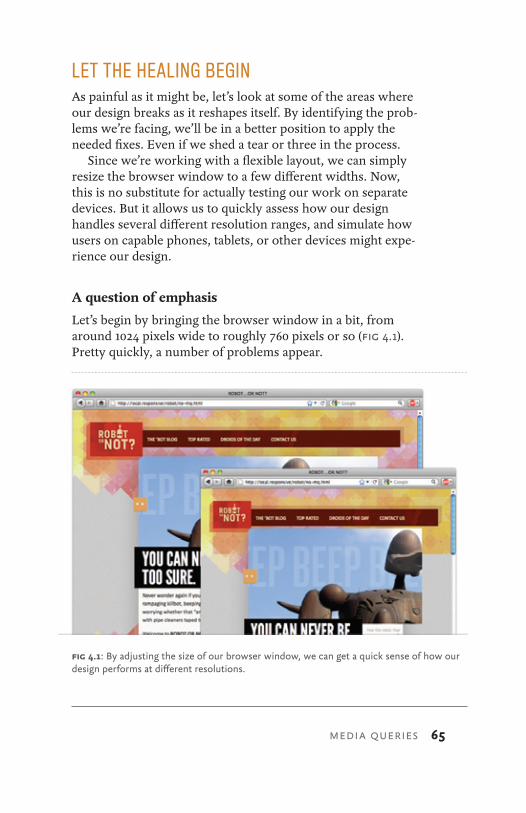
Since we’re working with a flexible layout, we can simply resize the browser window to a few different widths. Now, this is no substitute for actually testing our work on separate devices. But it allows us to quickly assess how our design handles several different resolution ranges, and simulate how users on capable phones, tablets, or other devices might expe-rience our design.
A question of emphasis
Let’s begin by bringing the browser window in a bit, from around 1024 pixels wide to roughly 760 pixels or so (Fig 4.1). Pretty quickly, a number of problems appear.
fig 4.1: By adjusting the size of our browser window, we can get a quick sense of how our design performs at different resolutions.
66 RESPONSIVE WEB DESIGN
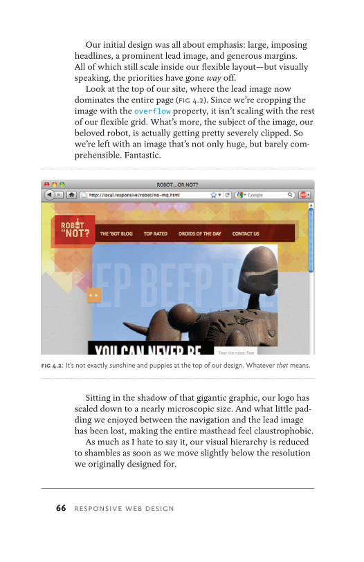
Our initial design was all about emphasis: large, imposing headlines, a prominent lead image, and generous margins. All of which still scale inside our flexible layout—but visually speaking, the priorities have gone way off.
Look at the top of our site, where the lead image now dominates the entire page (Fig 4.2). Since we’re cropping the image with the overflow property, it isn’t scaling with the rest of our flexible grid. What’s more, the subject of the image, our beloved robot, is actually getting pretty severely clipped. So we’re left with an image that’s not only huge, but barely com-prehensible. Fantastic.
Sitting in the shadow of that gigantic graphic, our logo has scaled down to a nearly microscopic size. And what little pad-ding we enjoyed between the navigation and the lead image has been lost, making the entire masthead feel claustrophobic.
As much as I hate to say it, our visual hierarchy is reduced to shambles as soon as we move slightly below the resolution we originally designed for.
fig 4.2: It’s not exactly sunshine and puppies at the top of our design. Whatever that means.
MEDIA QUERIES 67
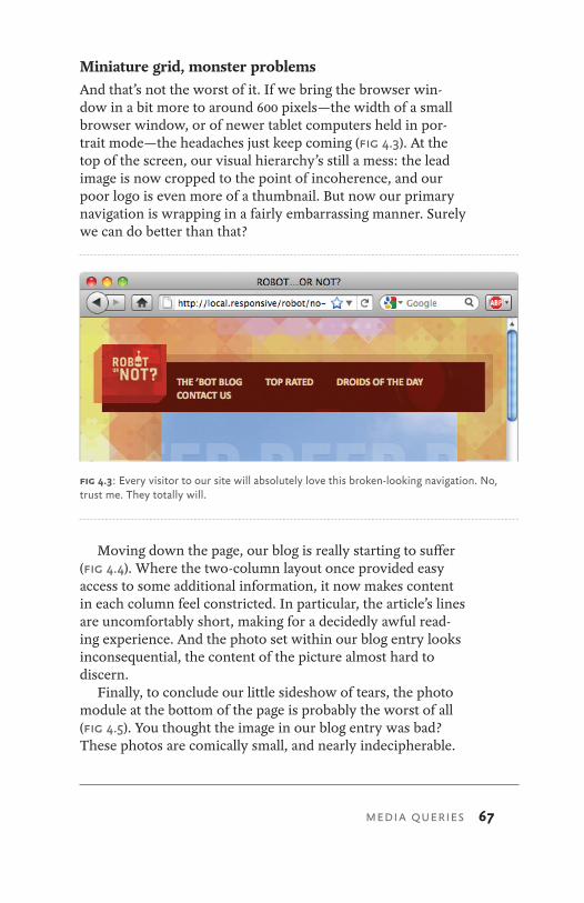
Miniature grid, monster problemsAnd that’s not the worst of it. If we bring the browser win-dow in a bit more to around 600 pixels—the width of a small browser window, or of newer tablet computers held in por-trait mode—the headaches just keep coming (Fig 4.3). At the top of the screen, our visual hierarchy’s still a mess: the lead image is now cropped to the point of incoherence, and our poor logo is even more of a thumbnail. But now our primary navigation is wrapping in a fairly embarrassing manner. Surely we can do better than that?
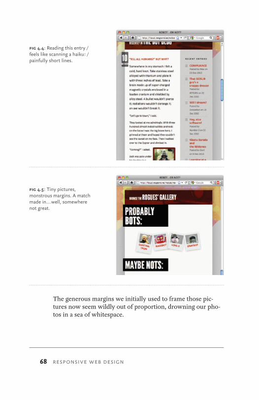
Moving down the page, our blog is really starting to suffer (Fig 4.4). Where the two-column layout once provided easy access to some additional information, it now makes content in each column feel constricted. In particular, the article’s lines are uncomfortably short, making for a decidedly awful read-ing experience. And the photo set within our blog entry looks inconsequential, the content of the picture almost hard to discern.
Finally, to conclude our little sideshow of tears, the photo module at the bottom of the page is probably the worst of all (Fig 4.5). You thought the image in our blog entry was bad? These photos are comically small, and nearly indecipherable.
fig 4.3: Every visitor to our site will absolutely love this broken-looking navigation. No, trust me. They totally will.
68 RESPONSIVE WEB DESIGN
The generous margins we initially used to frame those pic-tures now seem wildly out of proportion, drowning our pho-tos in a sea of whitespace.
fig 4.4: Reading this entry / feels like scanning a haiku: / painfully short lines.
fig 4.5: Tiny pictures, monstrous margins. A match made in . . . well, somewhere not great.
MEDIA QUERIES 69
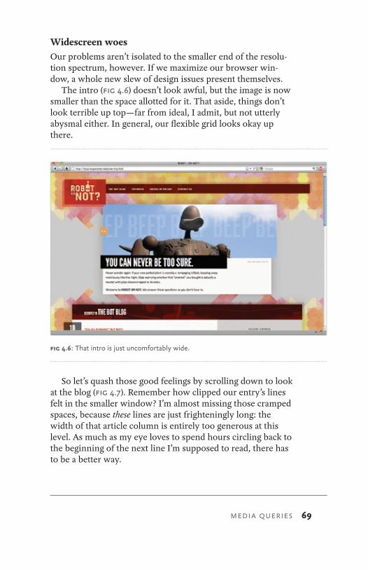
Widescreen woesOur problems aren’t isolated to the smaller end of the resolu-tion spectrum, however. If we maximize our browser win-dow, a whole new slew of design issues present themselves.
The intro (Fig 4.6) doesn’t look awful, but the image is now smaller than the space allotted for it. That aside, things don’t look terrible up top—far from ideal, I admit, but not utterly abysmal either. In general, our flexible grid looks okay up there.
So let’s quash those good feelings by scrolling down to look at the blog (Fig 4.7). Remember how clipped our entry’s lines felt in the smaller window? I’m almost missing those cramped spaces, because these lines are just frighteningly long: the width of that article column is entirely too generous at this level. As much as my eye loves to spend hours circling back to the beginning of the next line I’m supposed to read, there has to be a better way.
fig 4.6: That intro is just uncomfortably wide.
70 RESPONSIVE WEB DESIGN
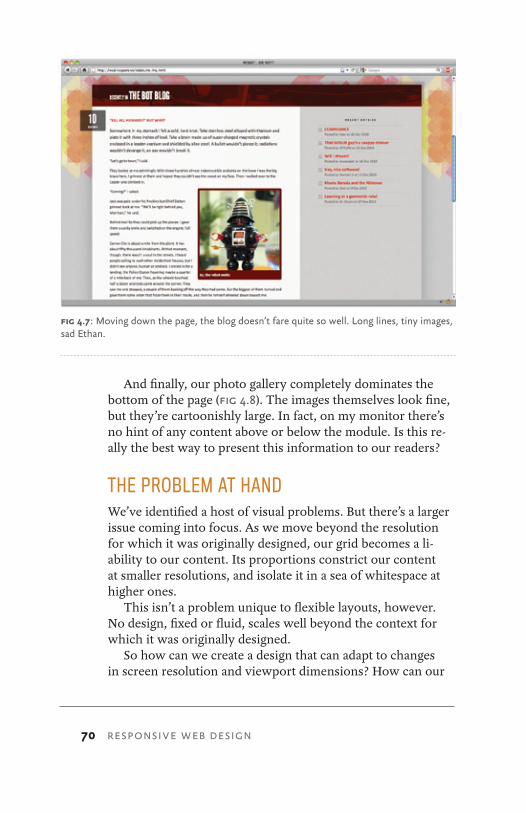
And finally, our photo gallery completely dominates the bottom of the page (Fig 4.8). The images themselves look fine, but they’re cartoonishly large. In fact, on my monitor there’s no hint of any content above or below the module. Is this re-ally the best way to present this information to our readers?
THE PROBLEM AT HANDWe’ve identified a host of visual problems. But there’s a larger issue coming into focus. As we move beyond the resolution for which it was originally designed, our grid becomes a li-ability to our content. Its proportions constrict our content at smaller resolutions, and isolate it in a sea of whitespace at higher ones.
This isn’t a problem unique to flexible layouts, however. No design, fixed or fluid, scales well beyond the context for which it was originally designed.
So how can we create a design that can adapt to changes in screen resolution and viewport dimensions? How can our
fig 4.7: Moving down the page, the blog doesn’t fare quite so well. Long lines, tiny images, sad Ethan.
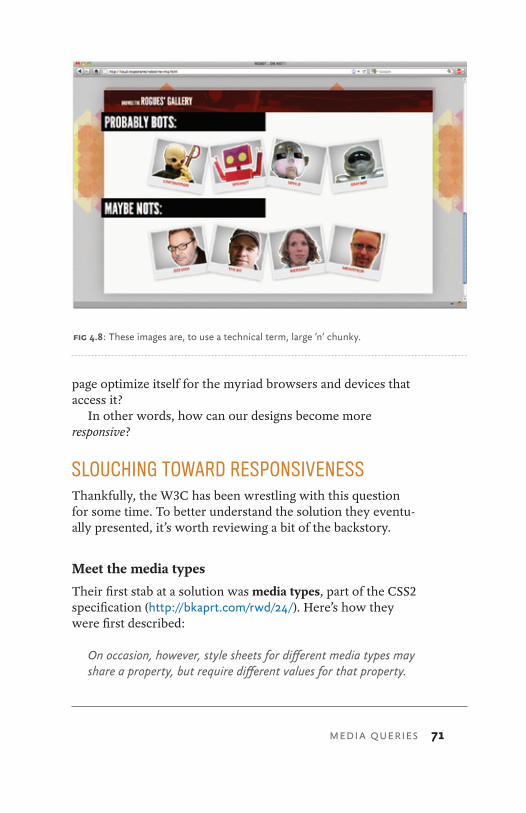
MEDIA QUERIES 71
page optimize itself for the myriad browsers and devices that access it?
In other words, how can our designs become more responsive?
SLOUCHING TOWARD RESPONSIVENESSThankfully, the W3C has been wrestling with this question for some time. To better understand the solution they eventu-ally presented, it’s worth reviewing a bit of the backstory.
Meet the media types
Their first stab at a solution was media types, part of the CSS2 specification (http://bkaprt.com/rwd/24/). Here’s how they were first described:
On occasion, however, style sheets for different media types may share a property, but require different values for that property.
fig 4.8: These images are, to use a technical term, large ’n‘ chunky.
72 RESPONSIVE WEB DESIGN
For example, the “font-size” property is useful both for screen and print media. The two media types are different enough to require different values for the common property; a document will typically need a larger font on a computer screen than on paper. Therefore, it is necessary to express that a style sheet, or a section of a style sheet, applies to certain media types.
Okay, yeah. That’s a bit obtuse, isn’t it? Let’s try it in non-robot terms.
Ever written a print stylesheet (http://bkaprt.com/rwd/25/)? Then you’re already familiar with the concept of designing for different kinds of media. The ideal browsing experience couldn’t differ more between desktop browsers and printers, or between handheld devices and speaking browsers. To address this the W3C created a list of media types (http://bkaprt.com/ rwd/26/), attempting to classify each browser or device under a broad, media-specific category. The recognized media types are: all, braille, embossed, handheld, print, projection, screen, speech, tty, and tv.
Some of these media types, like print or screen, or per-haps even projection, are probably ones you’ve used before. Perhaps others like embossed (for paged braille printers) or speech (for speaking browsers and interfaces) seem new. But all of these media types were created so that we could better design for each type of browser or device, by conditionally loading CSS tailored for each. So a screen-based device would ignore CSS loaded with the print media type, and vice versa. And for style rules meant to apply to all devices, the specifica-tion created the all supergroup.
In practice, that meant customizing the media attribute of a link:
<link rel="stylesheet" href="global.css" media="all" />
<link rel="stylesheet" href="main.css" media="screen" />
<link rel="stylesheet" href="paper.css" media="print" />
Or perhaps creating an @media block in your stylesheet, and associating it with a particular media type:
MEDIA QUERIES 73
@media screen {
body {
font-size: 100%;
}
}
@media print {
body {
font-size: 15pt;
}
}
In each case, the specification suggests the browser would identify itself as belonging to one of the media types. (“I’m a desktop browser! I belong to the screen media type.” “I smell like ink cartridges and toner: I’m print media.” “I’m your video game console’s browser: I’m media tv.” And so on.) Upon loading the page, the browser would then render only the CSS pertaining to its particular media type, and disregard the rest. And in theory, this is a fantastic idea.
Theory being, of course, the last thing hard-working web designers need.
Miscast types
Several problems with media types became evident when all these little small-screen browsers, like phones and tablets, ar-rived on the scene. According to the specification, designers could have targeted them simply by creating a stylesheet for the handheld media type:
<link rel="stylesheet" href="main.css" media="screen" />
<link rel="stylesheet" href="paper.css" media="print" />
<link rel="stylesheet" href="tiny.css" media="handheld"/>
The problem with this approach is, well, us—at least in part. Early mobile devices didn’t have sufficiently capable browsers so we largely ignored them, choosing instead to
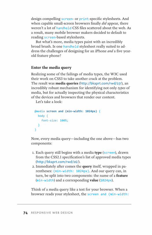
74 RESPONSIVE WEB DESIGN
design compelling screen- or print-specific stylesheets. And when capable small-screen browsers finally did appear, there weren’t a lot of handheld CSS files scattered about the web. As a result, many mobile browser makers decided to default to reading screen-based stylesheets.
But what’s more, media types paint with an incredibly broad brush. Is one handheld stylesheet really suited to ad-dress the challenges of designing for an iPhone and a five year-old feature phone?
Enter the media query
Realizing some of the failings of media types, the W3C used their work on CSS3 to take another crack at the problem. The result was media queries (http://bkaprt.com/rwd/27/), an incredibly robust mechanism for identifying not only types of media, but for actually inspecting the physical characteristics of the devices and browsers that render our content.
Let’s take a look:
@media screen and (min-width: 1024px) {
body {
font-size: 100%;
}
}
Now, every media query—including the one above—has two components:
1. Each query still begins with a media type (screen), drawn from the CSS2.1 specification’s list of approved media types (http://bkaprt.com/rwd/26/).
2. Immediately after comes the query itself, wrapped in pa-rentheses: (min-width: 1024px). And our query can, in turn, be split into two components: the name of a feature (min-width) and a corresponding value (1024px).
Think of a media query like a test for your browser. When a browser reads your stylesheet, the screen and (min-width:
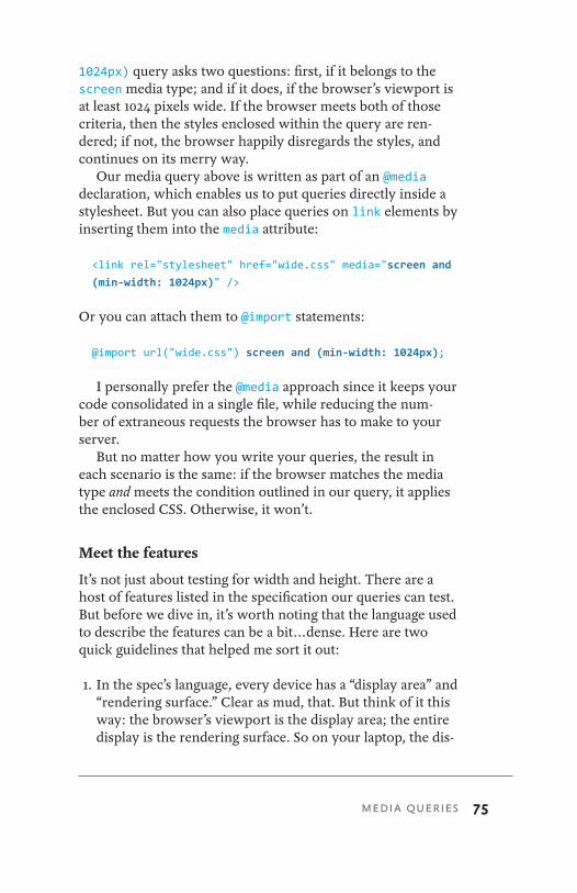
MEDIA QUERIES 75
1024px) query asks two questions: first, if it belongs to the screen media type; and if it does, if the browser’s viewport is at least 1024 pixels wide. If the browser meets both of those criteria, then the styles enclosed within the query are ren-dered; if not, the browser happily disregards the styles, and continues on its merry way.
Our media query above is written as part of an @media declaration, which enables us to put queries directly inside a stylesheet. But you can also place queries on link elements by inserting them into the media attribute:
<link rel="stylesheet" href="wide.css" media="screen and
(min-width: 1024px)" />
Or you can attach them to @import statements:
@import url("wide.css") screen and (min-width: 1024px);
I personally prefer the @media approach since it keeps your code consolidated in a single file, while reducing the num-ber of extraneous requests the browser has to make to your server.
But no matter how you write your queries, the result in each scenario is the same: if the browser matches the media type and meets the condition outlined in our query, it applies the enclosed CSS. Otherwise, it won’t.
Meet the features
It’s not just about testing for width and height. There are a host of features listed in the specification our queries can test. But before we dive in, it’s worth noting that the language used to describe the features can be a bit . . . dense. Here are two quick guidelines that helped me sort it out:
1. In the spec’s language, every device has a “display area” and “rendering surface.” Clear as mud, that. But think of it this way: the browser’s viewport is the display area; the entire display is the rendering surface. So on your laptop, the dis-
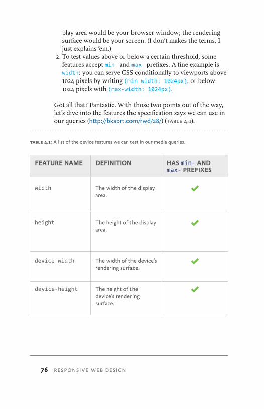
76 RESPONSIVE WEB DESIGN
play area would be your browser window; the rendering surface would be your screen. (I don’t makes the terms. I just explains ’em.)
2. To test values above or below a certain threshold, some features accept min- and max- prefixes. A fine example is width: you can serve CSS conditionally to viewports above 1024 pixels by writing (min-width: 1024px), or below 1024 pixels with (max-width: 1024px).
Got all that? Fantastic. With those two points out of the way, let’s dive into the features the specification says we can use in our queries (http://bkaprt.com/rwd/28/) (table 4.1).
FEATURE NAME DEFINITION HAS min- AND max- PREFIXES
width The width of the display area.
height The height of the display area.
device-width The width of the device’s rendering surface.
device-height The height of the device’s rendering surface.
table 4.1: A list of the device features we can test in our media queries.
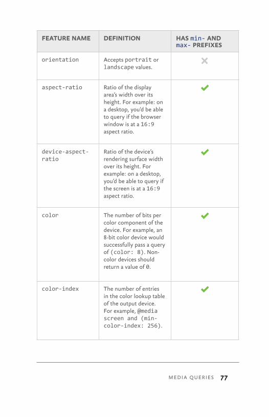
MEDIA QUERIES 77
FEATURE NAME DEFINITION HAS min- AND max- PREFIXES
orientation Accepts portrait or landscape values.
aspect-ratio Ratio of the display area’s width over its height. For example: on a desktop, you’d be able to query if the browser window is at a 16:9 aspect ratio.
device-aspect-ratio
Ratio of the device’s rendering surface width over its height. For example: on a desktop, you’d be able to query if the screen is at a 16:9 aspect ratio.
color The number of bits per color component of the device. For example, an 8-bit color device would successfully pass a query of (color: 8). Non-color devices should return a value of 0.
color-index The number of entries in the color lookup table of the output device. For example, @media screen and (min-color-index: 256).
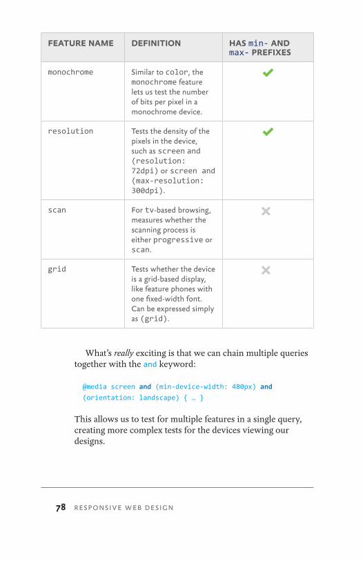
78 RESPONSIVE WEB DESIGN
FEATURE NAME DEFINITION HAS min- AND max- PREFIXES
monochrome Similar to color, the monochrome feature lets us test the number of bits per pixel in a monochrome device.
resolution Tests the density of the pixels in the device, such as screen and (resolution: 72dpi) or screen and (max-resolution: 300dpi).
scan For tv-based browsing, measures whether the scanning process is either progressive or scan.
grid Tests whether the device is a grid-based display, like feature phones with one fixed-width font. Can be expressed simply as (grid).
What’s really exciting is that we can chain multiple queries together with the and keyword:
@media screen and (min-device-width: 480px) and
(orientation: landscape) { … }
This allows us to test for multiple features in a single query, creating more complex tests for the devices viewing our designs.
MEDIA QUERIES 79
Know thy features
Feeling drunk with power yet? Well, I should take this oppor-tunity to mention that not all @media-aware browsers support querying for all features outlined in the specification.
Here’s a quick example: when Apple’s iPad first launched, it shipped with media query support for orientation. That meant you could write orientation: landscape or orientation: portrait queries to conditionally serve up CSS to the device, depending on how it was being held. Cool, no? Sadly, the iPhone didn’t support the orientation query until an OS upgrade arrived a few months later. While each device allowed the user to change its orientation, the iPhone’s browser didn’t understand the queries for that particular feature.
The moral of this story? Research your target devices and browsers thoroughly for the query features they do support, and test accordingly.
But while support is still developing among modern brows-ers and devices, media queries already give us an incredibly broad vocabulary, one we can use to articulate how we’d like our designs to appear in various devices and browsers.
A MORE RESPONSIVE ROBOTAnd this is why media queries are the final component of a responsive website. We’ve spent two chapters implementing our flexible, grid-based layout—but this is only our founda-tion. As that layout scales up or down, we can use media queries to correct any visual imperfections that crop up as the viewport reshapes itself.
What’s more, we can use media queries to optimize the dis-play of our content to best meet the needs of the device, creat-ing alternate layouts tailored to different resolution ranges. By conditionally loading style rules that target these ranges, media queries allow us to create pages that are more sensitive to the needs of the devices that render them.
In other words, by combining flexible layouts and media queries, we’ll finally be able to make our sites responsive.
Let’s get started.
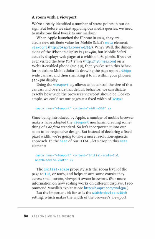
80 RESPONSIVE WEB DESIGN
A room with a viewport
We’ve already identified a number of stress points in our de-sign. But before we start applying our media queries, we need to make one final tweak to our markup.
When Apple launched the iPhone in 2007, they cre-ated a new attribute value for Mobile Safari’s meta element: viewport (http://bkaprt.com/rwd/29/). Why? Well, the dimen-sions of the iPhone’s display is 320×480, but Mobile Safari actually displays web pages at a width of 980 pixels. If you’ve ever visited the New York Times (http://nytimes.com) on a WebKit-enabled phone (Fig 4.9), then you’ve seen this behav-ior in action: Mobile Safari is drawing the page upon a 980px-wide canvas, and then shrinking it to fit within your phone’s 320×480 display.
Using the viewport tag allows us to control the size of that canvas, and override that default behavior: we can dictate exactly how wide the browser’s viewport should be. For ex-ample, we could set our pages at a fixed width of 320px:
<meta name="viewport" content="width=320" />
Since being introduced by Apple, a number of mobile browser makers have adopted the viewport mechanic, creating some-thing of a de facto standard. So let’s incorporate it into our soon-to-be responsive design. But instead of declaring a fixed pixel width, we’re going to take a more resolution-agnostic approach. In the head of our HTML, let’s drop in this meta element:
<meta name="viewport" content="initial-scale=1.0,
width=device-width" />
The initial-scale property sets the zoom level of the page to 1.0, or 100%, and helps ensure some consistency across small-screen, viewport-aware browsers. (For more information on how scaling works on different displays, I rec-ommend Mozilla’s explanation: http://bkaprt.com/rwd/30/.)
But the important bit for us is the width=device-width setting, which makes the width of the browser’s viewport
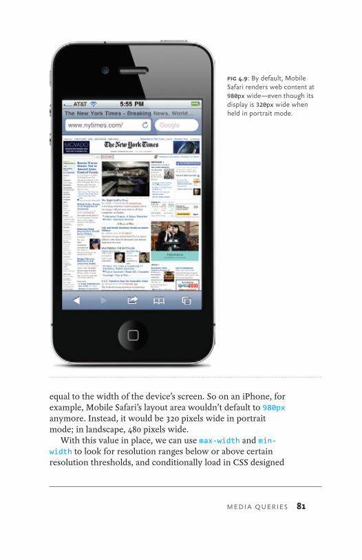
MEDIA QUERIES 81
equal to the width of the device’s screen. So on an iPhone, for example, Mobile Safari’s layout area wouldn’t default to 980px anymore. Instead, it would be 320 pixels wide in portrait mode; in landscape, 480 pixels wide.
With this value in place, we can use max-width and min-width to look for resolution ranges below or above certain resolution thresholds, and conditionally load in CSS designed
fig 4.9: By default, Mobile Safari renders web content at 980px wide—even though its display is 320px wide when held in portrait mode.
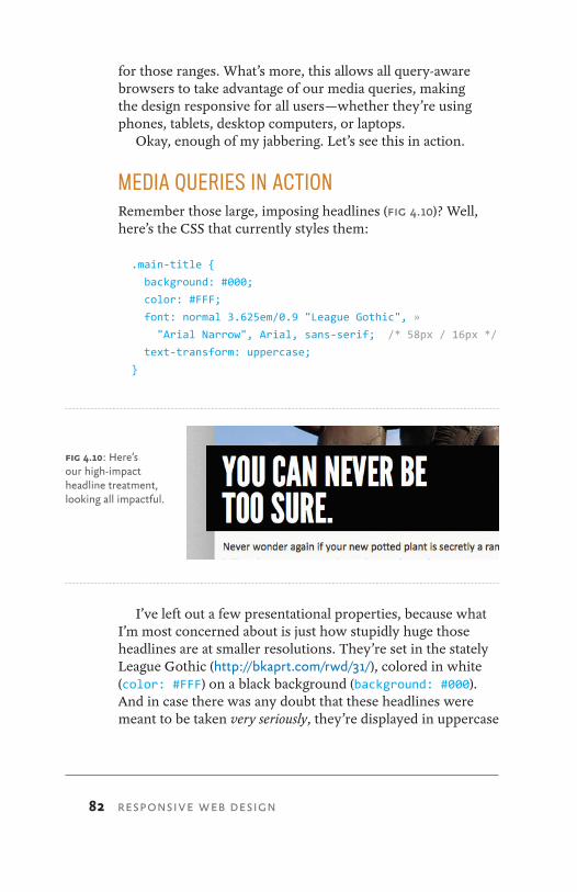
82 RESPONSIVE WEB DESIGN
for those ranges. What’s more, this allows all query-aware browsers to take advantage of our media queries, making the design responsive for all users—whether they’re using phones, tablets, desktop computers, or laptops.
Okay, enough of my jabbering. Let’s see this in action.
MEDIA QUERIES IN ACTIONRemember those large, imposing headlines (Fig 4.10)? Well, here’s the CSS that currently styles them:
.main-title {
background: #000;
color: #FFF;
font: normal 3.625em/0.9 "League Gothic", »
"Arial Narrow", Arial, sans-serif; /* 58px / 16px */
text-transform: uppercase;
}
I’ve left out a few presentational properties, because what I’m most concerned about is just how stupidly huge those headlines are at smaller resolutions. They’re set in the stately League Gothic (http://bkaprt.com/rwd/31/), colored in white (color: #FFF) on a black background (background: #000). And in case there was any doubt that these headlines were meant to be taken very seriously, they’re displayed in uppercase
fig 4.10: Here’s our high-impact headline treatment, looking all impactful.
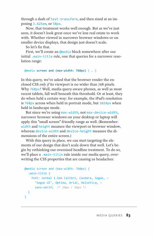
MEDIA QUERIES 83
through a dash of text-transform, and then sized at an im-posing 3.625em, or 58px.
Now, that treatment works well enough. But as we’ve just seen, it doesn’t look great once we’ve less real estate to work with. Whether viewed in narrower browser windows or on smaller device displays, that design just doesn’t scale.
So let’s fix that.First, we’ll create an @media block somewhere after our
initial .main-title rule, one that queries for a narrower reso-lution range:
@media screen and (max-width: 768px) { … }
In this query, we’ve asked that the browser render the en-closed CSS only if its viewport is no wider than 768 pixels. Why 768px? Well, media query-aware phones, as well as most recent tablets, fall well beneath this threshold. Or at least, they do when held a certain way: for example, the iPad’s resolution is 768px across when held in portrait mode, but 1024px when held in landscape mode.
But since we’re using max-width, not max-device-width, narrower browser windows on your desktop or laptop will apply this “small screen”-friendly range as well. (Remember: width and height measure the viewport or browser window, whereas device-width and device-height measure the di-mensions of the entire screen.)
With this query in place, we can start targeting the ele-ments of our design that don’t scale down that well. Let’s be-gin by rethinking our oversized headline treatment. To do so, we’ll place a .main-title rule inside our media query, over-writing the CSS properties that are causing us headaches:
@media screen and (max-width: 768px) {
.main-title {
font: normal 1.5em Calibri, Candara, Segoe, »
"Segoe UI", Optima, Arial, Helvetica, »
sans-serif; /* 24px / 16px */ }
}
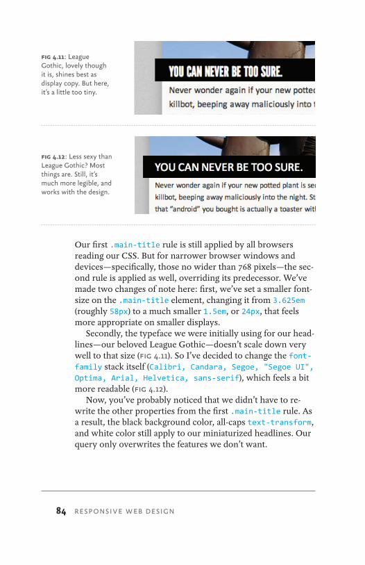
84 RESPONSIVE WEB DESIGN
Our first .main-title rule is still applied by all browsers reading our CSS. But for narrower browser windows and devices—specifically, those no wider than 768 pixels—the sec-ond rule is applied as well, overriding its predecessor. We’ve made two changes of note here: first, we’ve set a smaller font-size on the .main-title element, changing it from 3.625em (roughly 58px) to a much smaller 1.5em, or 24px, that feels more appropriate on smaller displays.
Secondly, the typeface we were initially using for our head-lines—our beloved League Gothic—doesn’t scale down very well to that size (Fig 4.11). So I’ve decided to change the font-family stack itself (Calibri, Candara, Segoe, "Segoe UI", Optima, Arial, Helvetica, sans-serif), which feels a bit more readable (Fig 4.12).
Now, you’ve probably noticed that we didn’t have to re-write the other properties from the first .main-title rule. As a result, the black background color, all-caps text- transform, and white color still apply to our miniaturized headlines. Our query only overwrites the features we don’t want.
fig 4.12: Less sexy than League Gothic? Most things are. Still, it’s much more legible, and works with the design.
fig 4.11: League Gothic, lovely though it is, shines best as display copy. But here, it’s a little too tiny.

MEDIA QUERIES 85
And presto: by quickly applying a media query, we’ve whipped up a headline treatment that feels much more appro-priate for smaller displays (Fig 4.13).
But this is just the beginning. Not only can we fine-tune our typography to respond to changes in resolution, we can also tackle our larger design problems as well.
Thinking in miniature
In fact, let’s begin by building on our new media query, and make a slight change to our page’s layout. Remember our flex-ible #page container from Chapter 2? Here’s what its CSS cur-rently looks like:
#page {
margin: 36px auto;
width: 90%;
}
fig 4.13: Our default headline view above, with the media query-corrected version below.
86 RESPONSIVE WEB DESIGN
Our container’s currently set to 90% of the browser win-dow, and centered horizontally (margin: 36px auto). Works great, but let’s add a rule inside our existing media query to tweak its behavior once we start falling below our initial resolution:
@media screen and (max-width: 768px) {
#page {
position: relative;
margin: 20px;
width: auto;
}
}
Below 768px, we’re instructing the #page element to occupy the full width of the browser window, save for a fixed 20px-wide margin around its edges. A minor change, but this will afford us a bit more space at smaller screen resolutions.
With our container sorted, we can turn our attention to the content area.
@media screen and (max-width: 768px) {
#page {
margin: 20px;
width: auto;
}
.welcome,
.blog,
.gallery {
margin: 0 0 30px;
width: auto;
}
}
This new rule selects the three top-level content modules—our introduction (.welcome), the blog (.blog), and photo gal-lery (.gallery)—and disables their horizontal margins, mak-ing them occupy the full width of #page.
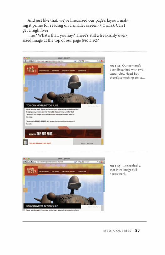
MEDIA QUERIES 87
And just like that, we’ve linearized our page’s layout, mak-ing it prime for reading on a smaller screen (Fig 4.14). Can I get a high five?
…no? What’s that, you say? There’s still a freakishly over-sized image at the top of our page (Fig 4.15)?
fig 4.14: Our content’s been linearized with two extra rules. Neat! But there’s something amiss . . .
fig 4.15: . . . specifically, that intro image still needs work.
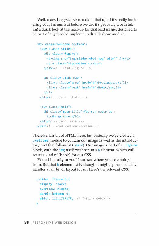
88 RESPONSIVE WEB DESIGN
Well, okay. I suppose we can clean that up. If it’s really both-ering you, I mean. But before we do, it’s probably worth tak-ing a quick look at the markup for that lead image, designed to be part of a (yet-to-be-implemented) slideshow module.
<div class="welcome section">
<div class="slides">
<div class="figure">
<b><img src="img/slide-robot.jpg" alt="" /></b>
<div class="figcaption">…</div>
</div><!-- /end .figure -->
<ul class="slide-nav">
<li><a class="prev" href="#">Previous</a></li>
<li><a class="next" href="#">Next</a></li>
</ul>
</div><!-- /end .slides -->
<div class="main">
<h1 class="main-title">You can never be »
too sure.</h1>
</div><!-- /end .main --> </div><!-- /end .welcome.section -->
There’s a fair bit of HTML here, but basically we’ve created a .welcome module to contain our image as well as the introduc-tory text that follows it (.main). Our image is part of a .figure block, with the img itself wrapped in a b element, which will act as a kind of “hook” for our CSS.
Feel a bit crufty to you? I can see where you’re coming from. But that b element, silly though it might appear, actually handles a fair bit of layout for us. Here’s the relevant CSS:
.slides .figure b {
display: block;
overflow: hidden;
margin-bottom: 0;
width: 112.272727%; /* 741px / 660px */
}
MEDIA QUERIES 89
.slides .figure b img {
display: block;
max-width: inherit;
}
First, we’ve set overflow to hidden on the b element, creat-ing a container that will crop any oversized content. But cur-rently, our flexible images will simply resize themselves as the b element does, preventing that nice crop effect. So we’ve disabled the max-width: 100% scaling on our slideshow im-ages (max-width: inherit). As a result, our big robot picture will simply get cropped if it’s wider than the b element that contains it.
You might have noticed that the width of our b element is actually larger than 100%. We’ve actually used our old target ÷ context = result formula to create an element larger than the .welcome module, allowing the enclosed image to extend a bit off to the right.
But as my luck would have it, none of these effects work especially well at lower resolutions. (Related: I have awful luck.) So let’s add a bit more to the end of our media query:
@media screen and (max-width: 768px) {
.slides .figure b {
width: auto;
}
.slides .figure b img {
max-width: 100%;
}
}
The first rule sets the width of our b container to auto, making it the same width as its container. The second rule actually reinstates the max-width: 100% behavior we discussed in Chapter 3, once again making the image expand and contract as its container does. Taken together, these two simple little rules do quite a bit, bringing our unruly image back in line with its container and, by extension, the rest of
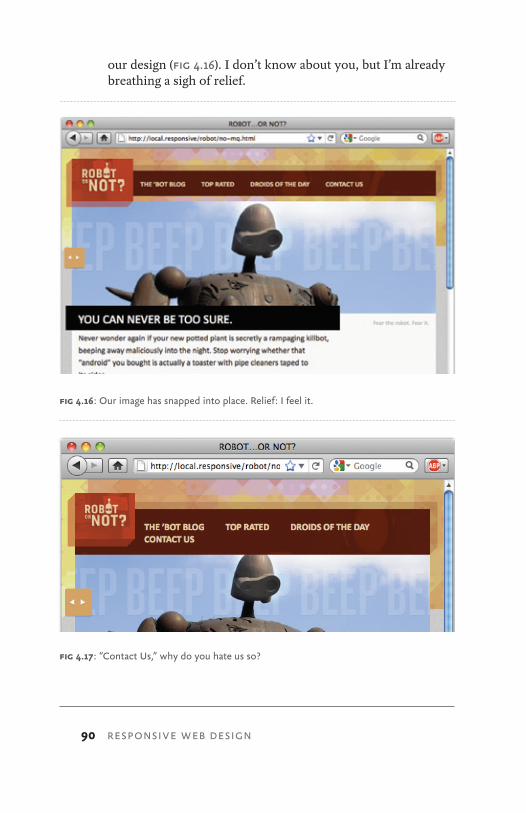
90 RESPONSIVE WEB DESIGN
our design (Fig 4.16). I don’t know about you, but I’m already breathing a sigh of relief.
fig 4.17: “Contact Us,” why do you hate us so?
fig 4.16: Our image has snapped into place. Relief: I feel it.
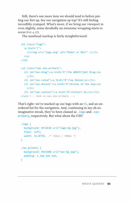
MEDIA QUERIES 91
Still, there’s one more item we should tend to before put-ting our feet up. See our navigation up top? It’s still feeling incredibly cramped. What’s more, if we bring our viewport in even slightly, some decidedly un-awesome wrapping starts to occur (Fig 4.17).
The masthead markup is fairly straightforward:
<h1 class="logo">
<a href="/">
<i><img src="logo.png" alt="Robot or Not?" /></i>
</a>
</h1>
<ul class="nav nav-primary">
<li id="nav-blog"><a href="#">The ’Bot Blog</a>
</li>
<li id="nav-rated"><a href="#">Top Rated</a></li>
<li id="nav-droids"><a href="#">Droids of the Day</a>
</li>
<li id="nav-contact"><a href="#">Contact Us</a></li>
</ul><!-- /end ul.nav.nav-primary -->
That’s right: we’ve marked up our logo with an h1, and an un-ordered list for the navigation. And, continuing in my oh-so-imaginative streak, they’ve been classed as .logo and .nav-primary, respectively. But what about the CSS?
.logo {
background: #C52618 url("logo-bg.jpg");
float: left;
width: 16.875%; /* 162px / 960px */ }
.nav-primary {
background: #5E140D url("nav-bg.jpg");
padding: 1.2em 1em 1em;
}
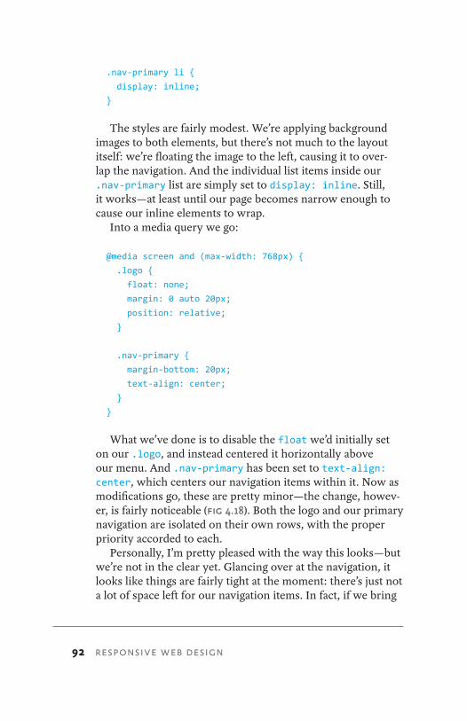
92 RESPONSIVE WEB DESIGN
.nav-primary li {
display: inline;
}
The styles are fairly modest. We’re applying background images to both elements, but there’s not much to the layout itself: we’re floating the image to the left, causing it to over-lap the navigation. And the individual list items inside our .nav-primary list are simply set to display: inline. Still, it works—at least until our page becomes narrow enough to cause our inline elements to wrap.
Into a media query we go:
@media screen and (max-width: 768px) {
.logo {
float: none;
margin: 0 auto 20px;
position: relative;
}
.nav-primary {
margin-bottom: 20px;
text-align: center;
}
}
What we’ve done is to disable the float we’d initially set on our .logo, and instead centered it horizontally above our menu. And .nav-primary has been set to text-align: center, which centers our navigation items within it. Now as modifications go, these are pretty minor—the change, howev-er, is fairly noticeable (Fig 4.18). Both the logo and our primary navigation are isolated on their own rows, with the proper priority accorded to each.
Personally, I’m pretty pleased with the way this looks—but we’re not in the clear yet. Glancing over at the navigation, it looks like things are fairly tight at the moment: there’s just not a lot of space left for our navigation items. In fact, if we bring
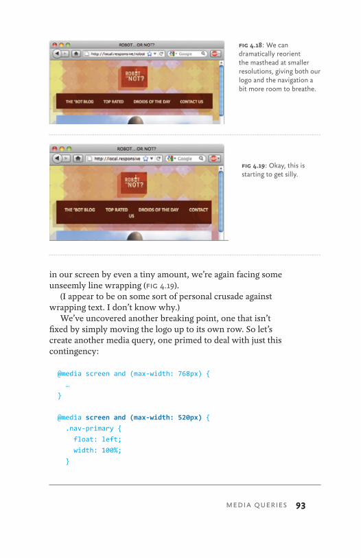
in our screen by even a tiny amount, we’re again facing some unseemly line wrapping (Fig 4.19).
(I appear to be on some sort of personal crusade against wrapping text. I don’t know why.)
We’ve uncovered another breaking point, one that isn’t fixed by simply moving the logo up to its own row. So let’s create another media query, one primed to deal with just this contingency:
@media screen and (max-width: 768px) {
…
}
@media screen and (max-width: 520px) {
.nav-primary {
float: left;
width: 100%;
}
fig 4.18: We can dramatically reorient the masthead at smaller resolutions, giving both our logo and the navigation a bit more room to breathe.
MEDIA QUERIES 93
fig 4.19: Okay, this is starting to get silly.
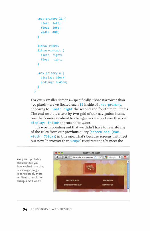
94 RESPONSIVE WEB DESIGN
.nav-primary li {
clear: left;
float: left;
width: 48%;
}
li#nav-rated,
li#nav-contact {
clear: right;
float: right;
}
.nav-primary a {
display: block;
padding: 0.45em;
}
}
For even smaller screens—specifically, those narrower than 520 pixels—we’ve floated each li inside of .nav-primary, choosing to float: right the second and fourth menu items. The end result is a two-by-two grid of our navigation items, one that’s more resilient to changes in viewport size than our display: inline approach (Fig 4.20).
It’s worth pointing out that we didn’t have to rewrite any of the rules from our previous query (screen and (max-width: 768px)) in this one. That’s because screens that meet our new “narrower than 520px” requirement also meet the
fig 4.20: I probably shouldn’t tell you how excited I am that our navigation grid is considerably more resilient to resolution changes. So I won’t.
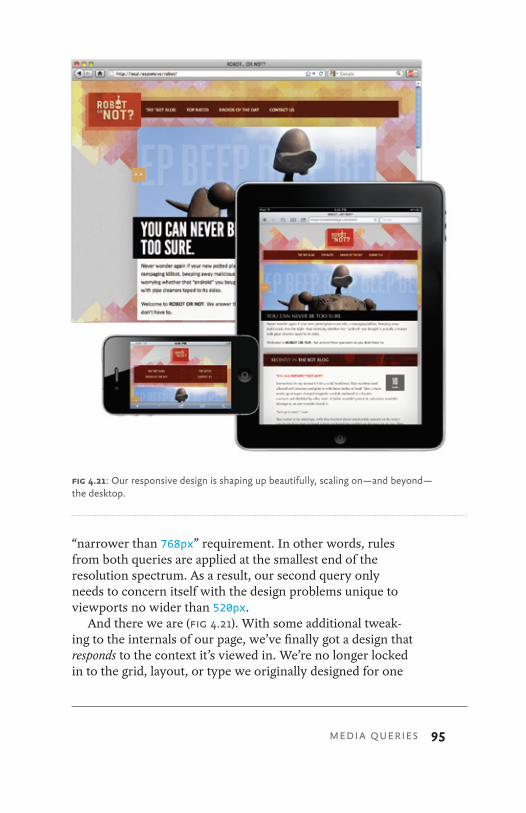
MEDIA QUERIES 95
“narrower than 768px” requirement. In other words, rules from both queries are applied at the smallest end of the resolution spectrum. As a result, our second query only needs to concern itself with the design problems unique to viewports no wider than 520px.
And there we are (Fig 4.21). With some additional tweak-ing to the internals of our page, we’ve finally got a design that responds to the context it’s viewed in. We’re no longer locked in to the grid, layout, or type we originally designed for one
fig 4.21: Our responsive design is shaping up beautifully, scaling on—and beyond—the desktop.
96 RESPONSIVE WEB DESIGN
specific resolution range. When layered on top of our flexible layout, media queries allow us to address the design problems that result from those shrinking viewports.
This layout goes to eleven
But responsive web design isn’t just about making designs accessible to smaller screens. You might recall that our de-sign had a significant number of issues when it was viewed in a maximized browser window: images grew to unseemly sizes while lines of text became uncomfortably long, our grid stretched beyond the limits of usefulness (Figs 4.6–4.8). Now, we could impose some sort of outer limit on our design, per-haps with a max-width set in ems or pixels. But let’s instead treat this as an opportunity to design for another resolution range.
First, we’ll begin by introducing another media query to do just that:
@media screen and (max-width: 768px) {
…
}
@media screen and (max-width: 520px) {
…
}
@media screen and (min-width: 1200px) {
…
}
Our first media query set a resolution ceiling of 768 pixels: in other words, devices and browser windows wider than that max-width limit would simply ignore the enclosed CSS. We quickly followed that up with another query for an even nar-rower range of 520px, once again using max-width to do so.
For our next query, we’re instead using min-width to set 1200px as a baseline width requirement for all incoming
MEDIA QUERIES 97
browsers and devices. If they’re wider than 1200 pixels, then they’ll apply the enclosed styles; otherwise, they’ll simply ig-nore the CSS, and go blithely about their business.
So let’s roll up our sleeves and set to work on a widescreen-friendly layout:
@media screen and (min-width: 1200px) {
.welcome,
.blog,
.gallery {
width: 49.375%;
}
.welcome,
.gallery {
float: right;
margin: 0 0 40px;
}
.blog {
float: left;
margin: 0 0 20px;
}
}
In the live Robot site (http://responsivewebdesign.com/robot), you’ll see a bunch of other changes that occur on this wides-creen layout. But these three rules are really the critical ones. We’re taking our three main content modules ( .welcome, .blog, and .gallery), and setting them to roughly half (49.375%) the width of the entire page. Then, we’re floating the .welcome and .gallery modules off to the right, and the blog to the left. The result? A design that’s perfectly primed for reading on larger displays (Fig 4.22). Our over-long line lengths have been reined in, and the blog—the key piece of content—has been brought higher on the page, making it con-siderably more accessible.
In other words, our responsive design is finished.
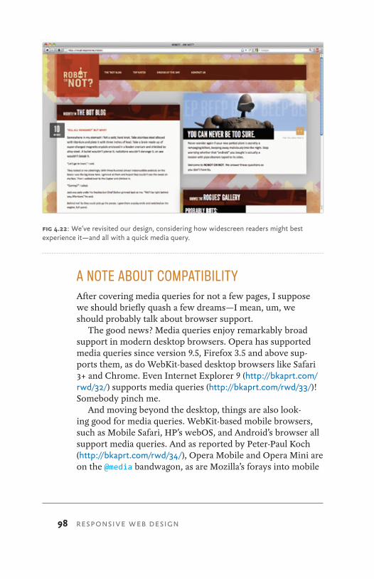
98 RESPONSIVE WEB DESIGN
A NOTE ABOUT COMPATIBILITYAfter covering media queries for not a few pages, I suppose we should briefly quash a few dreams—I mean, um, we should probably talk about browser support.
The good news? Media queries enjoy remarkably broad support in modern desktop browsers. Opera has supported media queries since version 9.5, Firefox 3.5 and above sup-ports them, as do WebKit-based desktop browsers like Safari 3+ and Chrome. Even Internet Explorer 9 (http://bkaprt.com/rwd/32/) supports media queries (http://bkaprt.com/rwd/33/)! Somebody pinch me.
And moving beyond the desktop, things are also look-ing good for media queries. WebKit-based mobile browsers, such as Mobile Safari, HP’s webOS, and Android’s browser all support media queries. And as reported by Peter-Paul Koch (http://bkaprt.com/rwd/34/), Opera Mobile and Opera Mini are on the @media bandwagon, as are Mozilla’s forays into mobile
fig 4.22: We’ve revisited our design, considering how widescreen readers might best experience it—and all with a quick media query.
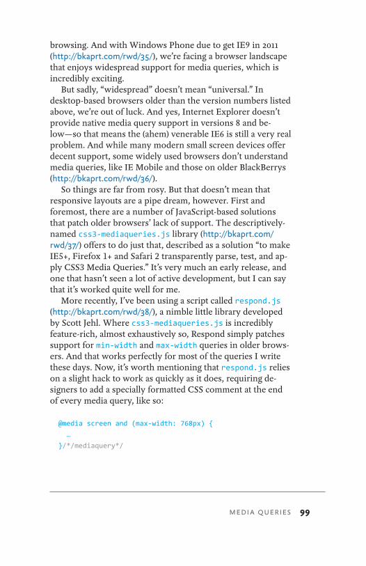
MEDIA QUERIES 99
browsing. And with Windows Phone due to get IE9 in 2011 (http://bkaprt.com/rwd/35/), we’re facing a browser landscape that enjoys widespread support for media queries, which is incredibly exciting.
But sadly, “widespread” doesn’t mean “universal.” In desktop-based browsers older than the version numbers listed above, we’re out of luck. And yes, Internet Explorer doesn’t provide native media query support in versions 8 and be-low—so that means the (ahem) venerable IE6 is still a very real problem. And while many modern small screen devices offer decent support, some widely used browsers don’t understand media queries, like IE Mobile and those on older BlackBerrys (http://bkaprt.com/rwd/36/).
So things are far from rosy. But that doesn’t mean that responsive layouts are a pipe dream, however. First and foremost, there are a number of JavaScript-based solutions that patch older browsers’ lack of support. The descriptively-named css3-mediaqueries.js library (http://bkaprt.com/rwd/37/) offers to do just that, described as a solution “to make IE5+, Firefox 1+ and Safari 2 transparently parse, test, and ap-ply CSS3 Media Queries.” It’s very much an early release, and one that hasn’t seen a lot of active development, but I can say that it’s worked quite well for me.
More recently, I’ve been using a script called respond.js (http://bkaprt.com/rwd/38/), a nimble little library developed by Scott Jehl. Where css3-mediaqueries.js is incredibly feature-rich, almost exhaustively so, Respond simply patches support for min-width and max-width queries in older brows-ers. And that works perfectly for most of the queries I write these days. Now, it’s worth mentioning that respond.js relies on a slight hack to work as quickly as it does, requiring de-signers to add a specially formatted CSS comment at the end of every media query, like so:
@media screen and (max-width: 768px) {
…
}/*/mediaquery*/
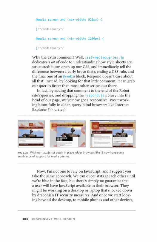
100 RESPONSIVE WEB DESIGN
@media screen and (max-width: 520px) {
… }/*/mediaquery*/
@media screen and (min-width: 1200px) {
…
}/*/mediaquery*/
Why the extra comment? Well, css3-mediaqueries.js dedicates a lot of code to understanding how style sheets are structured: it can open up our CSS, and immediately tell the difference between a curly brace that’s ending a CSS rule, and the final one of an @media block. Respond doesn’t care about all that: instead, by looking for that little comment, it can grab our queries faster than most other scripts out there.
In fact, by adding that comment to the end of the Robot site’s queries, and dropping the respond.js library into the head of our page, we’ve now got a responsive layout work-ing beautifully in older, query-blind browsers like Internet Explorer 7 (Fig 4.23).
Now, I’m not one to rely on JavaScript, and I suggest you take the same approach. We can quote stats at each other until we’re blue in the face, but there’s simply no guarantee that a user will have JavaScript available in their browser. They might be working on a desktop or laptop that’s locked down by draconian IT security measures. And once we start look-ing beyond the desktop, to mobile phones and other devices,
fig 4.23: With our JavaScript patch in place, older browsers like IE now have some semblance of support for media queries.
MEDIA QUERIES 101
JavaScript support is notoriously scant, bordering on nonexis-tent in many devices.
In the hopes of addressing those issues, we’ll spend some time in Chapter 5 discussing less JavaScript-reliant work-arounds. But ultimately, it’s completely understandable if JavaScript-based patches don’t appeal to you. However, that only highlights the need to build your responsive design atop a flexible foundation, ensuring your design has some measure of device- and resolution-independence.
WHY GO FLEXIBLE?If you’ll permit me one fanboyish outburst: media queries are downright awesome. They let us conditionally serve up CSS based on the capabilities of the device rendering our sites, al-lowing us to more fully tailor our design to our users’ reading environment.
However, media queries alone do not a responsive design make. A truly responsive design begins with a flexible layout, with media queries layered upon that non-fixed foundation. There are a number of arguments for this, most notably that a flex-ible layout provides a rich fallback for JavaScript- and @media-blind devices and browsers.
But that’s not the only reason. The software company 37signals recently began experimenting with a responsive de-sign for one of their applications, and had this to say (http://bkaprt.com/rwd/39/):
As it turned out, making the layout work on a variety of devices was just a matter of adding a few CSS media queries to the finished product. The key to making it easy was that the layout was already liquid, so optimizing it for small screens meant collapsing a few margins to maximize space and tweaking the sidebar layout in the cases where the screen is too narrow to show two columns.
In other words, starting from a flexible foundation means we have less code to produce. When working with media que-ries, fixed-width layouts often need to be re-coded at every
102 RESPONSIVE WEB DESIGN
resolution breakpoint, whereas a design built with percent-ages, not pixels, maintains its proportions from one resolution to the next. As we’ve seen in this chapter, we can selectively remove or change the properties at each breakpoint, optimiz-ing our layout with a few quick edits.
What’s more, a flexible layout is better prepared for devices that haven’t yet launched. A year ago, mentioning “tablet” would conjure up images of the iPad in the listener’s mind. But now, seven inch tablets like Samsung’s Galaxy Tab are beginning to ship, and devices like the Kindle and Nook are also carrying fantastic little browsers. We simply can’t keep up with the different resolutions entering the marketplace. A flexible foundation allows us to step back from targeting indi-vidual resolutions, and better prepare our designs for devices that haven’t even been imagined yet.
Establish constraints as needed
With that said, nobody knows your design—and its users—better than you do. If you feel that placing a max-width on an element will help it maintain its integrity, go right ahead. Here’s 37signals describing their responsive experiments again (http://bkaprt.com/rwd/39/):
The CSS max-width property seems almost forgotten in the web designer’s toolbox since it wasn’t supported by Internet Explorer 6. With that restriction lifted, it’s the perfect complement to a liquid layout, letting the content re-flow naturally at a variety of widths but not expanding to the point of absurdity where extreme line lengths make reading a chore. It’s a great compromise between liquid and fixed layouts.
I’m currently working on a responsive redesign project where a similar discussion popped up. The design has a fixed max-width of 1200px, but is completely flexible below that point. So why not make it completely fluid? Well, we’ve spent a lot of time considering how the page looks when it passes certain breakpoints. And the media queries we’ve put in place reflect that design thinking, ensuring the site is as pleasing
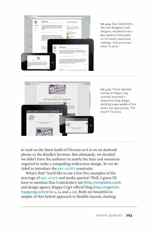
fig 4.24: Dan Cederholm, the web designer’s web designer, decided to set a max-width of 960 pixels on his newly responsive redesign. And you know what? It works.
MEDIA QUERIES 103
to read on the latest build of Chrome as it is on an Android phone or the Kindle’s browser. But ultimately, we decided we didn’t have the audience to justify the time and resources required to make a compelling widescreen design. So we de-cided to introduce the max-width constraint.
What’s that? You’d like to see a few live examples of the marriage of max-width and media queries? Well, I guess I’d have to mention Dan Cederholm’s site (http://simplebits.com), and design agency Happy Cog’s official blog (http:// cognition.happycog.com) (Figs 4.24 and 4.25). Both are beautiful ex-amples of this hybrid approach to flexible layouts, starting
fig 4.25: Those talented scamps at Happy Cog recently launched a responsive blog design, deciding a max-width of 820 pixels was appropriate. The result? It’s purty.
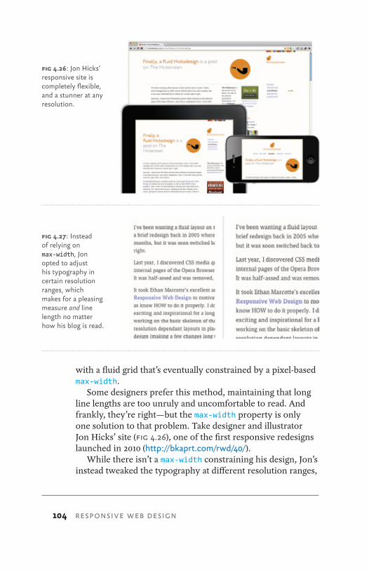
104 RESPONSIVE WEB DESIGN
with a fluid grid that’s eventually constrained by a pixel-based max-width.
Some designers prefer this method, maintaining that long line lengths are too unruly and uncomfortable to read. And frankly, they’re right—but the max-width property is only one solution to that problem. Take designer and illustrator Jon Hicks’ site (Fig 4.26), one of the first responsive redesigns launched in 2010 (http://bkaprt.com/rwd/40/).
While there isn’t a max-width constraining his design, Jon’s instead tweaked the typography at different resolution ranges,
fig 4.26: Jon Hicks’ responsive site is completely flexible, and a stunner at any resolution.
fig 4.27: Instead of relying on max-width, Jon opted to adjust his typography in certain resolution ranges, which makes for a pleasing measure and line length no matter how his blog is read.
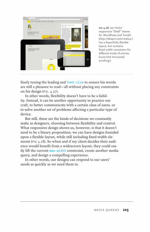
MEDIA QUERIES 105
finely tuning the leading and font-size to ensure his words are still a pleasure to read—all without placing any constraints on his design (Fig. 4.27).
In other words, flexibility doesn’t have to be a liabil-ity. Instead, it can be another opportunity to practice our craft, to better communicate with a certain class of users, or to solve another set of problems affecting a particular type of device.
But still, these are the kinds of decisions we constantly make as designers, choosing between flexibility and control. What responsive design shows us, however, is that it doesn’t need to be a binary proposition; we can have designs founded upon a flexible layout, while still including fixed-width ele-ments (Fig 4.28). So when and if my client decides their audi-ence would benefit from a widescreen layout, they could eas-ily lift the current max-width constraint, create another media query, and design a compelling experience.
In other words, our designs can respond to our users’ needs as quickly as we need them to.
fig 4.28: Jon Hicks’ responsive “Shelf” theme for WordPress and Tumblr (http://bkaprt.com/rwd/41/) has a beautifully flexible layout, but contains fixed-width containers for different kinds of entries. (Love that horizontal scrolling!)
106 RESPONSIVE WEB DESIGN
The Way is shaped by use,But then the shape is lost.Do not hold fast to shapesBut let sensation flow into the worldAs a river courses down to the sea.— Dao De Jing, section 32, “Shapes”
by now, you hAve All the tools you need to start build-ing responsive layouts. You’ve mastered the proportional thinking behind the flexible grid, investigated a few strategies for incorporating fixed-width media into your design, and explored how media queries can bring our designs beyond the desktop.
But up until this point, we’ve been looking at responsive design in a vacuum. In this chapter, let’s look at some differ-ent ways to begin incorporating it into our work, as well as a few paths to improve on some of the techniques we’ve already discussed.
BECOMING RESPONSIVE5
“
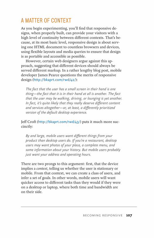
BECOMING RESPONSIVE 107
A MATTER OF CONTEXTAs you begin experimenting, you’ll find that responsive de-signs, when properly built, can provide your visitors with a high level of continuity between different contexts. That’s be-cause, at its most basic level, responsive design is about serv-ing one HTML document to countless browsers and devices, using flexible layouts and media queries to ensure that design is as portable and accessible as possible.
However, certain web designers argue against this ap-proach, suggesting that different devices should always be served different markup. In a rather lengthy blog post, mobile developer James Pearce questions the merits of responsive design (http://bkaprt.com/rwd/42/):
The fact that the user has a small screen in their hand is one thing—the fact that it is in their hand at all is another. The fact that the user may be walking, driving, or lounging is yet another. In fact, it’s quite likely that they really deserve different content and services altogether—or, at least, a differently prioritized version of the default desktop experience.
Jeff Croft (http://bkaprt.com/rwd/43/) puts it much more suc-cinctly:
By and large, mobile users want different things from your product than desktop users do. If you’re a restaurant, desktop users may want photos of your place, a complete menu, and some information about your history. But mobile users probably just want your address and operating hours.
There are two prongs to this argument: first, that the device implies a context, telling us whether the user is stationary or mobile. From that context, we can create a class of users, and infer a set of goals. In other words, mobile users will want quicker access to different tasks than they would if they were on a desktop or laptop, where both time and bandwidth are on their side.
108 RESPONSIVE WEB DESIGN
Second, if the user’s priorities and goals do indeed differ from one context to the next, then serving one HTML docu-ment to everyone won’t cut it. Take Jeff ’s example: if the restaurant site features photos prominently at the top of every page, then chances are good that they’re near the top of the HTML. Which means that a mobile visitor, when presented with the same markup in a more linear fashion, will have to do a considerable amount of scrolling just to find the hours of operation they wanted.
For what it’s worth, I agree with these arguments—but up to a point. It’s absolutely fair to assume a user’s context from their device, but it’s just that: an assumption. For example, much of my “mobile” browsing happens on the couch in my living room, flipping idly through sites on my wireless net-work. Now, this isn’t just another of my “Ethan doesn’t have a life” jokes: research has shown that a significant percentage of people use “the mobile web” from the comfort of their home (http://bkaprt.com/rwd/44/, http://bkaprt.com/rwd/45/).
That’s not to say that the context question isn’t valuable, or that we shouldn’t be thinking about these difficult questions. But we can’t simply infer a user’s context from a class of de-vices—in many cases, the implementation of these separate, “context-aware” sites can often be lacking (Fig 5.1). Relying upon all-too-convenient terms like “mobile” and “desktop” is no substitute for conducting the proper research into how your audience accesses your site: not only the devices and browsers they use, but how, where, and why they use them.
But most importantly, responsive web design isn’t intended to serve as a replacement for mobile web sites. Responsive de-sign is, I believe, one part design philosophy, one part front-end development strategy. And as a development strategy, it’s meant to be evaluated to see if it meets the needs of the proj-ect you’re working on. Perhaps there’s a compelling reason to keep your site’s desktop and mobile experiences separate, or perhaps your content would be better served by a responsive approach. Only you and your users know for certain.
While I agree with mobile web designers who say that cer-tain users of certain sites deserve different content, I think the reverse is also true: many sites can benefit from serving one
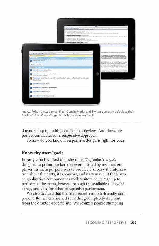
BECOMING RESPONSIVE 109
document up to multiple contexts or devices. And those are perfect candidates for a responsive approach.
So how do you know if responsive design is right for you?
Know thy users’ goals
In early 2010 I worked on a site called Cog’aoke (Fig 5.2), designed to promote a karaoke event hosted by my then-em-ployer. Its main purpose was to provide visitors with informa-tion about the party, its sponsors, and its venue. But there was an application component as well: visitors could sign up to perform at the event, browse through the available catalog of songs, and vote for other prospective performers.
We also decided that the site needed a mobile-friendly com-ponent. But we envisioned something completely different from the desktop-specific site. We realized people stumbling
fig 5.1: When viewed on an iPad, Google Reader and Twitter currently default to their “mobile” sites. Great design, but is it the right context?
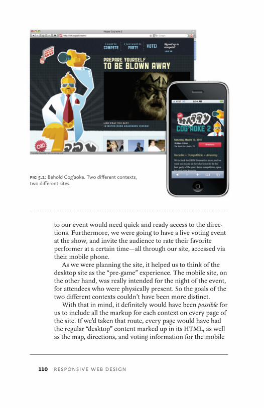
110 RESPONSIVE WEB DESIGN
to our event would need quick and ready access to the direc-tions. Furthermore, we were going to have a live voting event at the show, and invite the audience to rate their favorite performer at a certain time—all through our site, accessed via their mobile phone.
As we were planning the site, it helped us to think of the desktop site as the “pre-game” experience. The mobile site, on the other hand, was really intended for the night of the event, for attendees who were physically present. So the goals of the two different contexts couldn’t have been more distinct.
With that in mind, it definitely would have been possible for us to include all the markup for each context on every page of the site. If we’d taken that route, every page would have had the regular “desktop” content marked up in its HTML, as well as the map, directions, and voting information for the mobile
fig 5.2: Behold Cog’aoke. Two different contexts, two different sites.
BECOMING RESPONSIVE 111
site. And with those two modes baked into every HTML page, we could have used some combination of media queries and display: none to deliver the two sites to the right devices.
But that wouldn’t have been the right approach. We real-ized it would have been irresponsible of us to ask our visitors to download all that extraneous HTML, marking up content that they’d never see, much less benefit from. And I don’t say that just out of concern for mobile visitors: regardless of whether our visitors were on a phone-or a desktop-based browser, we would have been penalizing them with extra markup.
MEET “MOBILE FIRST”When you have a free moment (and a stiff drink in hand), I recommend browsing through Merlin Mann’s “Noise to Noise Ratio” Flickr set (http://bkaprt.com/rwd/46/). These screen grabs showcase some of the most content-saturated pages on the web: the pages are drowning in a sea of cruft. And the ac-tual article, both paragraphs of it, is nigh unfindable.
While the sites in Merlin’s gallery might be new to you, I wager the problems they demonstrate are pretty familiar. What’s more, I think this trend informs some of our precon-ceptions about designing for “mobile” users: namely, we as-sume mobile users need less content in part because desktop users can tolerate more. After all, screens are larger, users are often more stationary, and can generally better focus on searching for the content they want.
But just because desktop users can sift through more con-tent, does that mean they need to? In other words, why is easy access to key tasks only the domain of mobile users? Why can’t all users of our sites enjoy the same level of fo-cused, curated content?
Toward the end of 2009, designer Luke Wroblewski fired off a little challenge to our industry, suggesting a website’s mobile experience shouldn’t be an afterthought (http://bkaprt.com/rwd/47/). Citing the explosive growth of mobile web traffic, as well as the exciting new technical capabilities of modern phones, Luke suggests that instead today’s web

112 RESPONSIVE WEB DESIGN
professionals should begin designing for mobile first.“Mobile first” is a wonderful design philosophy. What’s
more, I’ve found it absolutely invaluable for the responsive design projects I’ve worked on. As more browsers and devices begin accessing our designs, and as our clients become inter-ested in designing beyond the desktop, it’s a perfect oppor-tunity to take a hard look at how we design for the web: our processes and vocabulary, as well as the questions we ask and the solutions we apply.
TOWARD A RESPONSIVE WORKFLOWOf course, it’s the early days yet. Many designers, studios, and agencies are still learning about responsive design. As a result, we don’t have many “best practices” to share within our com-munity. That’ll change over time, as we start thinking more responsively in our work. So in the meantime, I thought I’d share some of my experiences working with a more respon-sive workflow. Perhaps they’ll be helpful to you, and (more likely) you’ll find a way to improve upon them.
As I write this, I’m working on the redesign of a large, con-tent-rich site. Over the course of a given day, a reader might access the site from home in the morning over coffee, read an article or two during their morning train commute, and pos-sibly check in a few more times during the day.
Given the diversity of their readership, the client decided that a responsive approach would be the most appropriate one for their audience. So during the planning phases, the design team has taken a hard look at every proposed piece of content for the site, and asked one question: How does this content or feature benefit our mobile users?
Okay, maybe I should’ve made that sound a bit more excit-ing—I never was especially good at marketing. But it’s a ques-tion we’ve derived from the “mobile first” approach, and one we’ve found incredibly useful as the site’s designed. Here’s Luke’s rationale for the value of this thinking in site planning (http://bkaprt.com/rwd/48/):
BECOMING RESPONSIVE 113
If you design mobile first, you create agreement on what matters most. You can then apply the same rationale to the desktop/laptop version of the web site. We agreed that this was the most important set of features and content for our customers and business—why should that change with more screen space?
It’s all too easy to fill a desktop browser window with so-cial media toolbars, links to related articles, battalions of RSS links, and tag clouds galore. (This process is called “adding val-ue,” I believe.) But when we’re forced to work with a screen that’s 80% smaller than our usual canvas, nonessential content and cruft quickly fall away, allowing us to focus on the truly critical aspects of our designs.
In other words, designing for mobile devices first can en-rich the experience for all users, by providing the element often missing from modern web design: focus. That’s not to say that our client’s pages are light on content, or lack-ing in features. But by framing our design process with that simple question, we’ve gained a handy acid test to apply when considering each proposed element, each new piece of functionality.
Identifying the breakpoints
Our design process kicks off by surveying the different de-vices for which we’re planning to design. From that research, we’ll compile a list of resolution breakpoints: horizontal widths we’ll need to accommodate in our responsive design. For ex-ample, our list might look like table 5.1.
That’s not to say that resolutions above or below this threshold will be ignored, or that we won’t accommodate some devices whose resolutions aren’t listed. (After all, the responsive layout will be based on a flexible grid, so there’s some resolution independence built in.) But building a list like this helps define a scope for our efforts, allowing us to identify the devices most commonly used by our audience, and how best to test against their respective resolutions.
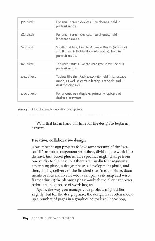
114 RESPONSIVE WEB DESIGN
320 pixels For small screen devices, like phones, held in portrait mode.
480 pixels For small screen devices, like phones, held in landscape mode.
600 pixels Smaller tablets, like the Amazon Kindle (600×800) and Barnes & Noble Nook (600×1024), held in portrait mode.
768 pixels Ten-inch tablets like the iPad (768×1024) held in portrait mode.
1024 pixels Tablets like the iPad (1024×768) held in landscape mode, as well as certain laptop, netbook, and desktop displays.
1200 pixels For widescreen displays, primarily laptop and desktop browsers.
With that list in hand, it’s time for the design to begin in earnest.
Iterative, collaborative design
Now, most design projects follow some version of the “wa-terfall” project management workflow, dividing the work into distinct, task-based phases. The specifics might change from one studio to the next, but there are usually four segments: a planning phase, a design phase, a development phase, and then, finally, delivery of the finished site. In each phase, docu-ments or files are created—for example, a site map and wire-frames during the planning phase—which the client approves before the next phase of work begins.
Again, the way you manage your projects might differ slightly. But for the design phase, the design team often mocks up a number of pages in a graphics editor like Photoshop,
table 5.1: A list of example resolution breakpoints.
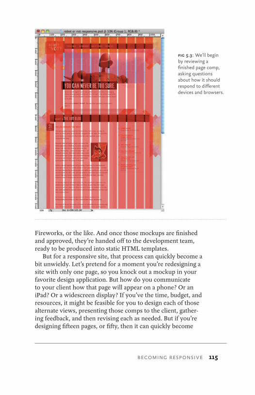
BECOMING RESPONSIVE 115
Fireworks, or the like. And once those mockups are finished and approved, they’re handed off to the development team, ready to be produced into static HTML templates.
But for a responsive site, that process can quickly become a bit unwieldy. Let’s pretend for a moment you’re redesigning a site with only one page, so you knock out a mockup in your favorite design application. But how do you communicate to your client how that page will appear on a phone? Or an iPad? Or a widescreen display? If you’ve the time, budget, and resources, it might be feasible for you to design each of those alternate views, presenting those comps to the client, gather-ing feedback, and then revising each as needed. But if you’re designing fifteen pages, or fifty, then it can quickly become
fig 5.3: We’ll begin by reviewing a finished page comp, asking questions about how it should respond to different devices and browsers.
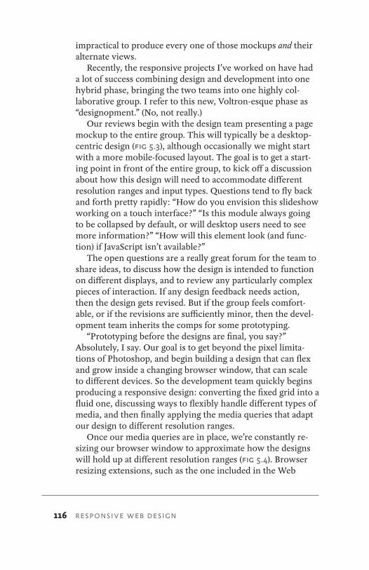
116 RESPONSIVE WEB DESIGN
impractical to produce every one of those mockups and their alternate views.
Recently, the responsive projects I’ve worked on have had a lot of success combining design and development into one hybrid phase, bringing the two teams into one highly col-laborative group. I refer to this new, Voltron-esque phase as “designopment.” (No, not really.)
Our reviews begin with the design team presenting a page mockup to the entire group. This will typically be a desktop-centric design (Fig 5.3), although occasionally we might start with a more mobile-focused layout. The goal is to get a start-ing point in front of the entire group, to kick off a discussion about how this design will need to accommodate different resolution ranges and input types. Questions tend to fly back and forth pretty rapidly: “How do you envision this slideshow working on a touch interface?” “Is this module always going to be collapsed by default, or will desktop users need to see more information?” “How will this element look (and func-tion) if JavaScript isn’t available?”
The open questions are a really great forum for the team to share ideas, to discuss how the design is intended to function on different displays, and to review any particularly complex pieces of interaction. If any design feedback needs action, then the design gets revised. But if the group feels comfort-able, or if the revisions are sufficiently minor, then the devel-opment team inherits the comps for some prototyping.
“Prototyping before the designs are final, you say?” Absolutely, I say. Our goal is to get beyond the pixel limita-tions of Photoshop, and begin building a design that can flex and grow inside a changing browser window, that can scale to different devices. So the development team quickly begins producing a responsive design: converting the fixed grid into a fluid one, discussing ways to flexibly handle different types of media, and then finally applying the media queries that adapt our design to different resolution ranges.
Once our media queries are in place, we’re constantly re-sizing our browser window to approximate how the designs will hold up at different resolution ranges (Fig 5.4). Browser resizing extensions, such as the one included in the Web
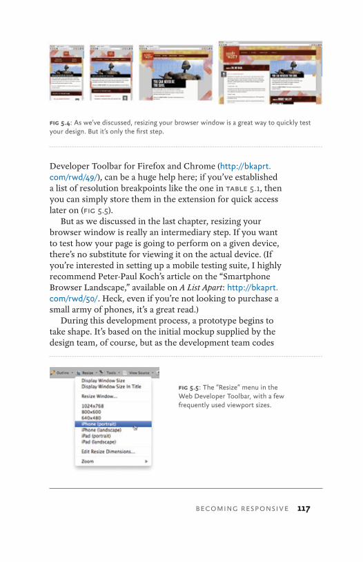
BECOMING RESPONSIVE 117
Developer Toolbar for Firefox and Chrome (http://bkaprt.com/rwd/49/), can be a huge help here; if you’ve established a list of resolution breakpoints like the one in table 5.1, then you can simply store them in the extension for quick access later on (Fig 5.5).
But as we discussed in the last chapter, resizing your browser window is really an intermediary step. If you want to test how your page is going to perform on a given device, there’s no substitute for viewing it on the actual device. (If you’re interested in setting up a mobile testing suite, I highly recommend Peter-Paul Koch’s article on the “Smartphone Browser Landscape,” available on A List Apart: http://bkaprt.com/rwd/50/. Heck, even if you’re not looking to purchase a small army of phones, it’s a great read.)
During this development process, a prototype begins to take shape. It’s based on the initial mockup supplied by the design team, of course, but as the development team codes
fig 5.4: As we’ve discussed, resizing your browser window is a great way to quickly test your design. But it’s only the first step.
fig 5.5: The “Resize” menu in the Web Developer Toolbar, with a few frequently used viewport sizes.
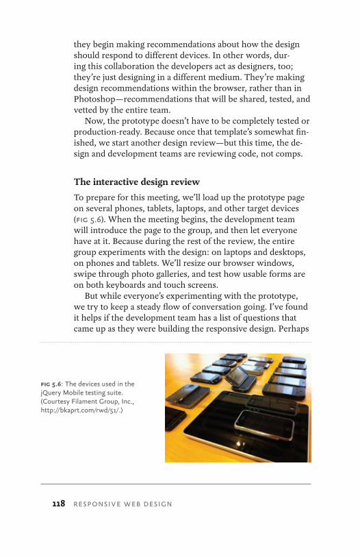
118 RESPONSIVE WEB DESIGN
they begin making recommendations about how the design should respond to different devices. In other words, dur-ing this collaboration the developers act as designers, too; they’re just designing in a different medium. They’re making design recommendations within the browser, rather than in Photoshop—recommendations that will be shared, tested, and vetted by the entire team.
Now, the prototype doesn’t have to be completely tested or production-ready. Because once that template’s somewhat fin-ished, we start another design review—but this time, the de-sign and development teams are reviewing code, not comps.
The interactive design review
To prepare for this meeting, we’ll load up the prototype page on several phones, tablets, laptops, and other target devices (Fig 5.6). When the meeting begins, the development team will introduce the page to the group, and then let everyone have at it. Because during the rest of the review, the entire group experiments with the design: on laptops and desktops, on phones and tablets. We’ll resize our browser windows, swipe through photo galleries, and test how usable forms are on both keyboards and touch screens.
But while everyone’s experimenting with the prototype, we try to keep a steady flow of conversation going. I’ve found it helps if the development team has a list of questions that came up as they were building the responsive design. Perhaps
fig 5.6: The devices used in the jQuery Mobile testing suite. (Courtesy Filament Group, Inc., http://bkaprt.com/rwd/51/.)
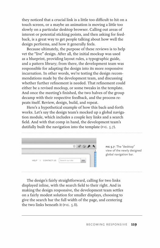
BECOMING RESPONSIVE 119
they noticed that a crucial link is a little too difficult to hit on a touch screen, or a maybe an animation is moving a little too slowly on a particular desktop browser. Calling out areas of interest or potential sticking points, and then asking for feed-back, is a great way to get people talking about how well the design performs, and how it generally feels.
Because ultimately, the purpose of these reviews is to help vet the “live” design. After all, the initial mockup was used as a blueprint, providing layout rules, a typographic guide, and a pattern library; from there, the development team was responsible for adapting the design into its more responsive incarnation. In other words, we’re testing the design recom-mendations made by the development team, and discussing whether further refinement is needed. That refinement could either be a revised mockup, or some tweaks in the template. And once the meeting’s finished, the two halves of the group decamp with their respective feedback, and the process re-peats itself. Review, design, build, and repeat.
Here’s a hypothetical example of how this back-and-forth works. Let’s say the design team’s mocked up a global naviga-tion module, which includes a couple key links and a search field. And with that comp in hand, the development team’s dutifully built the navigation into the template (Fig. 5.7).
The design’s fairly straightforward, calling for two links displayed inline, with the search field to their right. And in making the design responsive, the development team settles on a fairly modest solution for smaller displays, choosing to give the search bar the full width of the page, and centering the two links beneath it (Fig. 5.8).
fig 5.7: The “desktop” view of the newly designed global navigation bar.
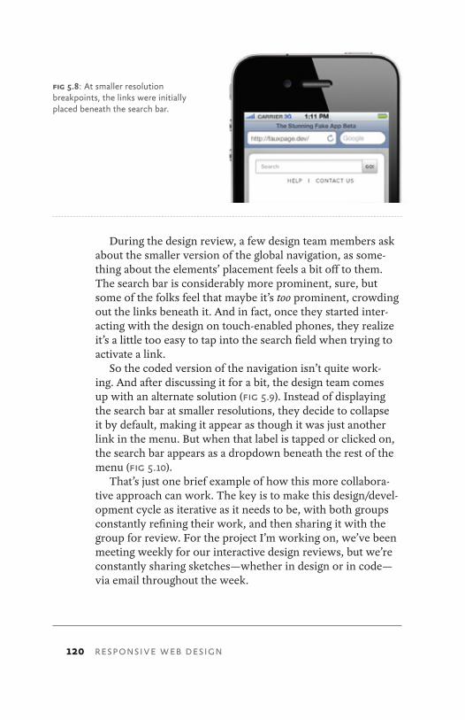
120 RESPONSIVE WEB DESIGN
During the design review, a few design team members ask about the smaller version of the global navigation, as some-thing about the elements’ placement feels a bit off to them. The search bar is considerably more prominent, sure, but some of the folks feel that maybe it’s too prominent, crowding out the links beneath it. And in fact, once they started inter-acting with the design on touch-enabled phones, they realize it’s a little too easy to tap into the search field when trying to activate a link.
So the coded version of the navigation isn’t quite work-ing. And after discussing it for a bit, the design team comes up with an alternate solution (Fig 5.9). Instead of displaying the search bar at smaller resolutions, they decide to collapse it by default, making it appear as though it was just another link in the menu. But when that label is tapped or clicked on, the search bar appears as a dropdown beneath the rest of the menu (Fig 5.10).
That’s just one brief example of how this more collabora-tive approach can work. The key is to make this design/devel-opment cycle as iterative as it needs to be, with both groups constantly refining their work, and then sharing it with the group for review. For the project I’m working on, we’ve been meeting weekly for our interactive design reviews, but we’re constantly sharing sketches—whether in design or in code—via email throughout the week.
fig 5.8: At smaller resolution breakpoints, the links were initially placed beneath the search bar.
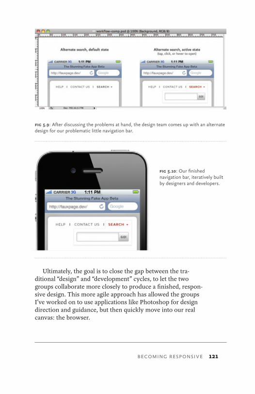
BECOMING RESPONSIVE 121
Ultimately, the goal is to close the gap between the tra-ditional “design” and “development” cycles, to let the two groups collaborate more closely to produce a finished, respon-sive design. This more agile approach has allowed the groups I’ve worked on to use applications like Photoshop for design direction and guidance, but then quickly move into our real canvas: the browser.
fig 5.10: Our finished navigation bar, iteratively built by designers and developers.
fig 5.9: After discussing the problems at hand, the design team comes up with an alternate design for our problematic little navigation bar.
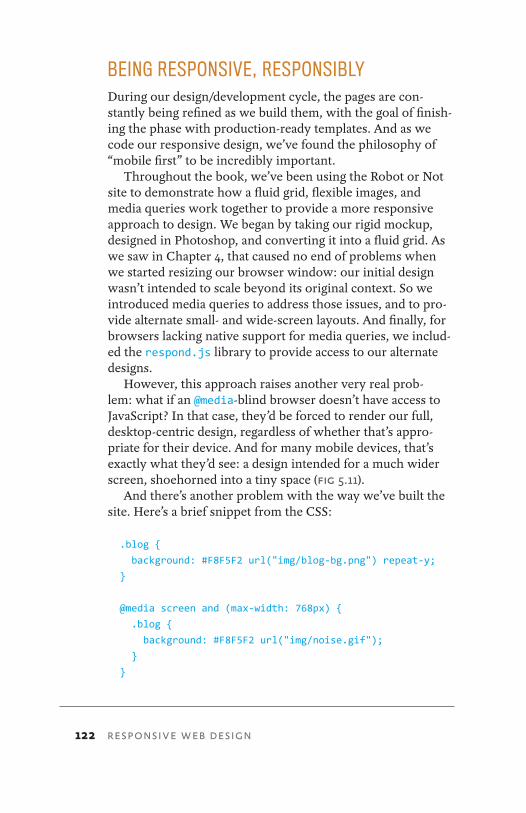
122 RESPONSIVE WEB DESIGN
BEING RESPONSIVE, RESPONSIBLYDuring our design/development cycle, the pages are con-stantly being refined as we build them, with the goal of finish-ing the phase with production-ready templates. And as we code our responsive design, we’ve found the philosophy of “mobile first” to be incredibly important.
Throughout the book, we’ve been using the Robot or Not site to demonstrate how a fluid grid, flexible images, and media queries work together to provide a more responsive approach to design. We began by taking our rigid mockup, designed in Photoshop, and converting it into a fluid grid. As we saw in Chapter 4, that caused no end of problems when we started resizing our browser window: our initial design wasn’t intended to scale beyond its original context. So we introduced media queries to address those issues, and to pro-vide alternate small- and wide-screen layouts. And finally, for browsers lacking native support for media queries, we includ-ed the respond.js library to provide access to our alternate designs.
However, this approach raises another very real prob-lem: what if an @media-blind browser doesn’t have access to JavaScript? In that case, they’d be forced to render our full, desktop-centric design, regardless of whether that’s appro-priate for their device. And for many mobile devices, that’s exactly what they’d see: a design intended for a much wider screen, shoehorned into a tiny space (Fig 5.11).
And there’s another problem with the way we’ve built the site. Here’s a brief snippet from the CSS:
.blog {
background: #F8F5F2 url("img/blog-bg.png") repeat-y;
}
@media screen and (max-width: 768px) {
.blog {
background: #F8F5F2 url("img/noise.gif");
}
}
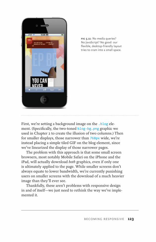
BECOMING RESPONSIVE 123
First, we’re setting a background image on the .blog ele-ment. (Specifically, the two-toned blog-bg.png graphic we used in Chapter 2 to create the illusion of two columns.) Then for smaller displays, those narrower than 768px wide, we’re instead placing a simple tiled GIF on the blog element, since we’ve linearized the display of those narrower pages.
The problem with this approach is that some small screen browsers, most notably Mobile Safari on the iPhone and the iPad, will actually download both graphics, even if only one is ultimately applied to the page. While smaller screens don’t always equate to lower bandwidth, we’re currently punishing users on smaller screens with the download of a much heavier image than they’ll ever see.
Thankfully, these aren’t problems with responsive design in and of itself—we just need to rethink the way we’ve imple-mented it.
fig 5.11: No media queries? No JavaScript? No good: our flexible, desktop-friendly layout tries to cram into a small space.
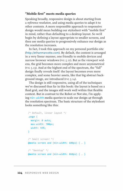
124 RESPONSIVE WEB DESIGN
“Mobile first” meets media queries
Speaking broadly, responsive design is about starting from a reference resolution, and using media queries to adapt it to other contexts. A more responsible approach to responsive design would mean building our stylesheet with “mobile first” in mind, rather than defaulting to a desktop layout. So we’d begin by defining a layout appropriate to smaller screens, and then use media queries to progressively enhance our design as the resolution increases.
In fact, I took this approach on my personal portfolio site (http://ethanmarcotte.com). By default, the content is arranged in a very linear manner, one friendly to mobile devices and narrow browser windows (Fig 5.12). But as the viewport wid-ens, the grid becomes more complex and more asymmetrical (Fig 5.13). And at the highest end of the spectrum, the “full” design finally reveals itself: the layout becomes even more complex, and some heavier assets, like that big abstract back-ground image, are introduced (Fig 5.14).
The design is still responsive, using all of the techniques we’ve discussed thus far in this book: the layout is based on a fluid grid, and the images still work well within that flexible context. But in contrast to the Robot or Not site, I’m apply-ing min-width media queries to scale our design up through the resolution spectrum. The basic structure of the stylesheet looks something like this:
/* Default, linear layout */ .page {
margin: 0 auto;
max-width: 700px;
width: 93%;
}
/* Small screen! */
@media screen and (min-width: 600px) { … }
/* "Desktop" */ @media screen and (min-width: 860px) { … }
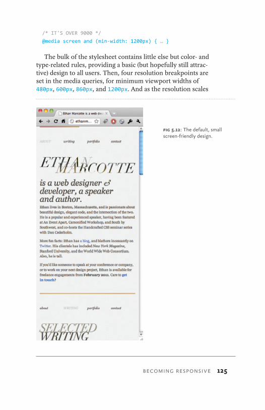
BECOMING RESPONSIVE 125
/* IT'S OVER 9000 */
@media screen and (min-width: 1200px) { … }
The bulk of the stylesheet contains little else but color- and type-related rules, providing a basic (but hopefully still attrac-tive) design to all users. Then, four resolution breakpoints are set in the media queries, for minimum viewport widths of 480px, 600px, 860px, and 1200px. And as the resolution scales
fig 5.12: The default, small screen-friendly design.
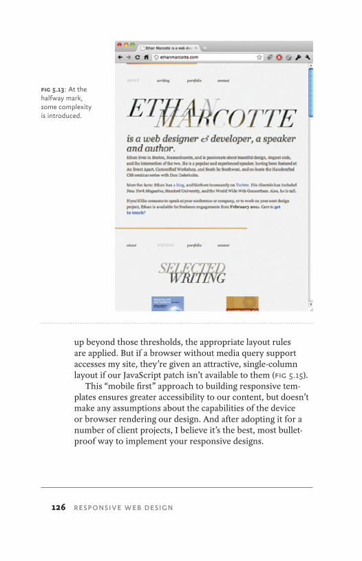
126 RESPONSIVE WEB DESIGN
up beyond those thresholds, the appropriate layout rules are applied. But if a browser without media query support accesses my site, they’re given an attractive, single-column layout if our JavaScript patch isn’t available to them (Fig 5.15).
This “mobile first” approach to building responsive tem-plates ensures greater accessibility to our content, but doesn’t make any assumptions about the capabilities of the device or browser rendering our design. And after adopting it for a number of client projects, I believe it’s the best, most bullet-proof way to implement your responsive designs.
fig 5.13: At the halfway mark, some complexity is introduced.
BECOMING RESPONSIVE 127
REVISITING PROGRESSIVE ENHANCEMENTA more thorough implementation of this approach would be the recent redesign of Yiibu (http://yiibu.com), a mobile-focused design studio. Bryan and Stephanie Rieger, Yiibu’s founders, call the redesign a merger of “mobile first” and re-sponsive design, and describe their approach thusly (http://bkaprt.com/rwd/52/):
fig 5.14: Finally, the full design appears at the higher end of the resolution spectrum, progressively enhanced with media queries.
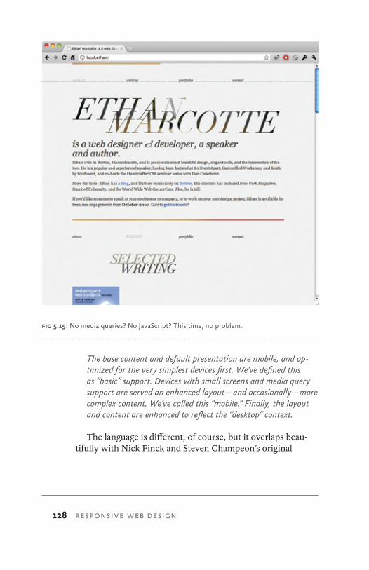
128 RESPONSIVE WEB DESIGN
The base content and default presentation are mobile, and op-timized for the very simplest devices first. We’ve defined this as “basic” support. Devices with small screens and media query support are served an enhanced layout—and occasionally—more complex content. We’ve called this ”mobile.” Finally, the layout and content are enhanced to reflect the “desktop” context.
The language is different, of course, but it overlaps beau-tifully with Nick Finck and Steven Champeon’s original
fig 5.15: No media queries? No JavaScript? This time, no problem.
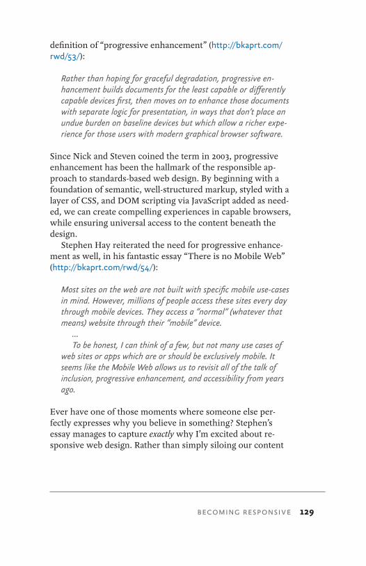
BECOMING RESPONSIVE 129
definition of “progressive enhancement” (http://bkaprt.com/rwd/53/):
Rather than hoping for graceful degradation, progressive en-hancement builds documents for the least capable or differently capable devices first, then moves on to enhance those documents with separate logic for presentation, in ways that don’t place an undue burden on baseline devices but which allow a richer expe-rience for those users with modern graphical browser software.
Since Nick and Steven coined the term in 2003, progressive enhancement has been the hallmark of the responsible ap-proach to standards-based web design. By beginning with a foundation of semantic, well-structured markup, styled with a layer of CSS, and DOM scripting via JavaScript added as need-ed, we can create compelling experiences in capable browsers, while ensuring universal access to the content beneath the design.
Stephen Hay reiterated the need for progressive enhance-ment as well, in his fantastic essay “There is no Mobile Web” (http://bkaprt.com/rwd/54/):
Most sites on the web are not built with specific mobile use-cases in mind. However, millions of people access these sites every day through mobile devices. They access a “normal” (whatever that means) website through their “mobile” device.
…To be honest, I can think of a few, but not many use cases of
web sites or apps which are or should be exclusively mobile. It seems like the Mobile Web allows us to revisit all of the talk of inclusion, progressive enhancement, and accessibility from years ago.
Ever have one of those moments where someone else per-fectly expresses why you believe in something? Stephen’s essay manages to capture exactly why I’m excited about re-sponsive web design. Rather than simply siloing our content
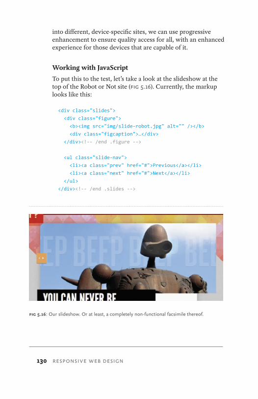
130 RESPONSIVE WEB DESIGN
into different, device-specific sites, we can use progressive enhancement to ensure quality access for all, with an enhanced experience for those devices that are capable of it.
Working with JavaScript
To put this to the test, let’s take a look at the slideshow at the top of the Robot or Not site (Fig 5.16). Currently, the markup looks like this:
<div class="slides">
<div class="figure">
<b><img src="img/slide-robot.jpg" alt="" /></b>
<div class="figcaption">…</div>
</div><!-- /end .figure -->
<ul class="slide-nav">
<li><a class="prev" href="#">Previous</a></li>
<li><a class="next" href="#">Next</a></li>
</ul>
</div><!-- /end .slides -->
fig 5.16: Our slideshow. Or at least, a completely non-functional facsimile thereof.
BECOMING RESPONSIVE 131
Not too fancy. But also, not too functional: we’ve marked up the interface for a slideshow, but it isn’t implemented yet. We’ve included a single slide in our template, as well as the previous/next navigation. But clicking on those links won’t do a darned thing.
So, we’ll need to introduce a bit of JavaScript, and bring some interactivity into our design. But first, we need slides! So, let’s grab some more images, and augment our HTML a bit:
<div class="slides">
<div class="figure">
<b><img src="img/slide-robot.jpg" alt="" /></b>
<div class="figcaption">…</div>
</div><!-- /end .figure -->
<div class="figure">
<b><img src="img/slide-tin.jpg" alt="" /></b>
<div class="figcaption">…</div>
</div><!-- /end .figure -->
<ul class="slide-nav">
<li><a class="prev" href="#">Previous</a></li>
<li><a class="next" href="#">Next</a></li>
</ul>
</div><!-- /end .slides -->
Let’s drop in four more slides, using the same .figure markup pattern as before.
This looks a little weird right now, as our slides are cur-rently just stacked on top of each other (Fig 5.17). So to get our slideshow up and running, we’ll be using a free jQuery plugin designed by developer Mat Marquis (http://bkaprt.com/rwd/55/). It’s one of the more robust slideshow scripts I’ve used. I like it because it works incredibly well with flexible content; if your slides have different amounts of text or im-ages in them, this plugin handles them with ease—all without resorting to convoluted CSS foofery. (Oh, yes. I said “foofery.” I’m not messing around.)
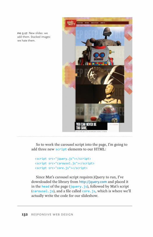
132 RESPONSIVE WEB DESIGN
So to work the carousel script into the page, I’m going to add three new script elements to our HTML:
<script src="jquery.js"></script>
<script src="carousel.js"></script>
<script src="core.js"></script>
Since Mat’s carousel script requires jQuery to run, I’ve downloaded the library from http://jquery.com and placed it in the head of the page (jquery.js), followed by Mat’s script (carousel.js), and a file called core.js, which is where we’ll actually write the code for our slideshow.
fig 5.17: New slides: we add them. Stacked images: we hate them.
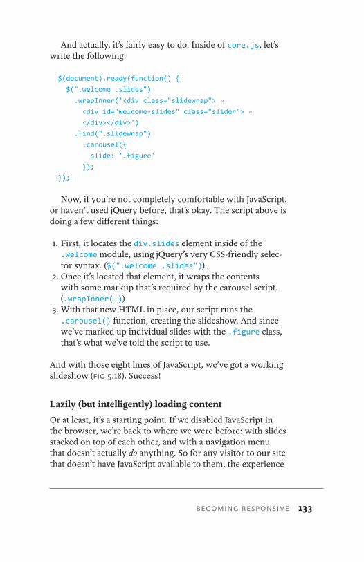
BECOMING RESPONSIVE 133
And actually, it’s fairly easy to do. Inside of core.js, let’s write the following:
$(document).ready(function() {
$(".welcome .slides")
.wrapInner('<div class="slidewrap"> »
<div id="welcome-slides" class="slider"> »
</div></div>')
.find(".slidewrap")
.carousel({
slide: '.figure'
});
});
Now, if you’re not completely comfortable with JavaScript, or haven’t used jQuery before, that’s okay. The script above is doing a few different things:
1. First, it locates the div.slides element inside of the .welcome module, using jQuery’s very CSS-friendly selec-tor syntax. ($(".welcome .slides")).
2. Once it’s located that element, it wraps the contents with some markup that’s required by the carousel script. (.wrapInner(…))
3. With that new HTML in place, our script runs the .carousel() function, creating the slideshow. And since we’ve marked up individual slides with the .figure class, that’s what we’ve told the script to use.
And with those eight lines of JavaScript, we’ve got a working slideshow (Fig 5.18). Success!
Lazily (but intelligently) loading content
Or at least, it’s a starting point. If we disabled JavaScript in the browser, we’re back to where we were before: with slides stacked on top of each other, and with a navigation menu that doesn’t actually do anything. So for any visitor to our site that doesn’t have JavaScript available to them, the experience
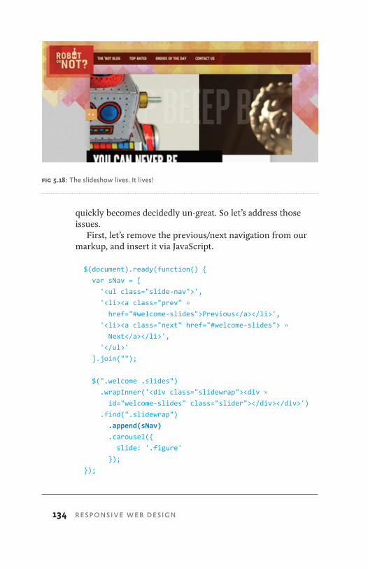
134 RESPONSIVE WEB DESIGN
quickly becomes decidedly un-great. So let’s address those issues.
First, let’s remove the previous/next navigation from our markup, and insert it via JavaScript.
$(document).ready(function() {
var sNav = [
'<ul class="slide-nav">',
'<li><a class="prev" »
href="#welcome-slides">Previous</a></li>',
'<li><a class="next" href="#welcome-slides"> »
Next</a></li>',
'</ul>'
].join("");
$(".welcome .slides")
.wrapInner('<div class="slidewrap"><div »
id="welcome-slides" class="slider"></div></div>')
.find(".slidewrap")
.append(sNav)
.carousel({
slide: '.figure'
});
});
fig 5.18: The slideshow lives. It lives!
BECOMING RESPONSIVE 135
Our code looks quite a bit more complex now, but we’ve really only introduced one new piece of functionality. First, we’re declaring a variable called sNav, which stores the HTML for our slide navigation. Then, just before the carousel() function is called, we’re inserting that markup into our slide-show. By using jQuery to insert the navigation into the page, we’ve ensured that users without JavaScript won’t see it. Progressive enhancement in action.
Now, that doesn’t solve the problem of our stacked images. For that, we’re going to get a bit tricky: we’re going remove all but one of the slides from the page, and put them in a sepa-rate HTML file. So now, our page’s source looks considerably lighter:
<div class="slides">
<div class="figure">
<b><img src="img/slide-robot.jpg" alt="" /></b>
<div class="figcaption">…</div>
</div><!-- /end .figure -->
</div><!-- /end .slides -->
However, we’ve created a separate file (let’s call it slides.html), and pasted in the markup for our four remaining slides:
<div class="figure">
<b><img src="img/slide-tin.jpg" alt="" /></b>
<div class="figcaption">…</div>
</div><!-- /end .figure -->
<div class="figure">
<b><img src="img/slide-statue.jpg" alt="" /></b>
<div class="figcaption">…</div>
…
</div><!-- /end .figure -->
You’ve probably noticed that slides.html isn’t even a valid HTML document. In fact, it’s more like a markup stub, a mini-document we can use to store some HTML for later use. In fact, we’ll just use jQuery to open slides.html and load the images into the slideshow, like so:
136 RESPONSIVE WEB DESIGN
$(document).ready(function() {
$.get("slides.html", function(data) {
var sNav = [
'<ul class="slide-nav">',
'<li><a class="prev" href= »
"#welcome-slides">Previous</a></li>',
'<li><a class="next" href="#welcome-slides"> »
Next</a></li>',
'</ul>'
].join("");
$(".welcome .slides")
.append(data)
.wrapInner('<div class="slidewrap"> »
<div id="welcome-slides" class="slider"> »
</div></div>')
.find(".slidewrap")
.append(sNav)
.carousel({
slide: '.figure'
});
});
});
And that’s that. The jQuery .get() function opens our HTML snippet (slides.html), and inserts its contents into our mod-ule by using append(). If JavaScript isn’t available, or if jQuery can’t load that file, then the user is presented with a single image at the top of the page: a perfectly acceptable fallback for our design (Fig 5.19).
Further improvements
We’ve augmented our simple slideshow script with consider-ably more code, but the end result is a much more robust and accessible experience. We’re not assuming anything about the capabilities of the browser or device rendering our page: if JavaScript is available to them, then our slideshow will appear.
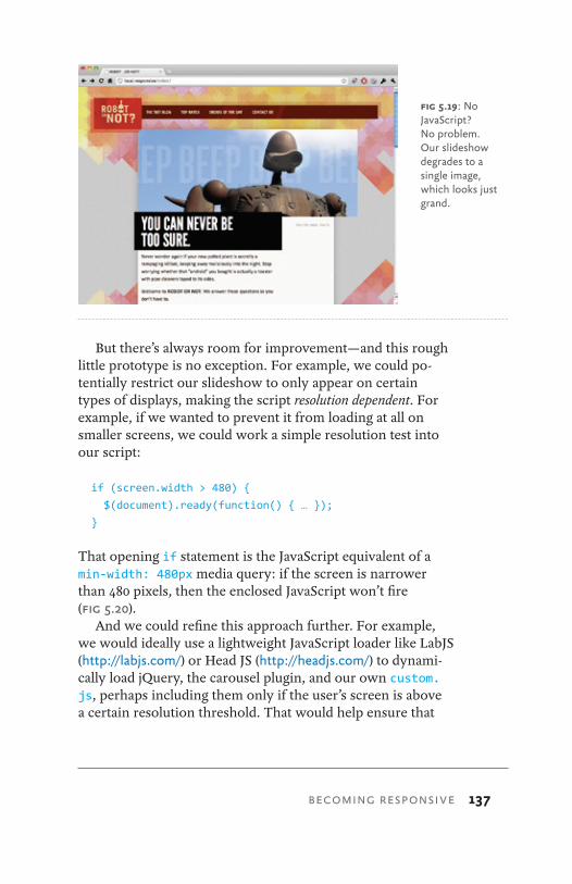
BECOMING RESPONSIVE 137
But there’s always room for improvement—and this rough little prototype is no exception. For example, we could po-tentially restrict our slideshow to only appear on certain types of displays, making the script resolution dependent. For example, if we wanted to prevent it from loading at all on smaller screens, we could work a simple resolution test into our script:
if (screen.width > 480) {
$(document).ready(function() { … });
}
That opening if statement is the JavaScript equivalent of a min-width: 480px media query: if the screen is narrower than 480 pixels, then the enclosed JavaScript won’t fire (Fig 5.20).
And we could refine this approach further. For example, we would ideally use a lightweight JavaScript loader like LabJS (http://labjs.com/) or Head JS (http://headjs.com/) to dynami-cally load jQuery, the carousel plugin, and our own custom.js, perhaps including them only if the user’s screen is above a certain resolution threshold. That would help ensure that
fig 5.19: No JavaScript? No problem. Our slideshow degrades to a single image, which looks just grand.
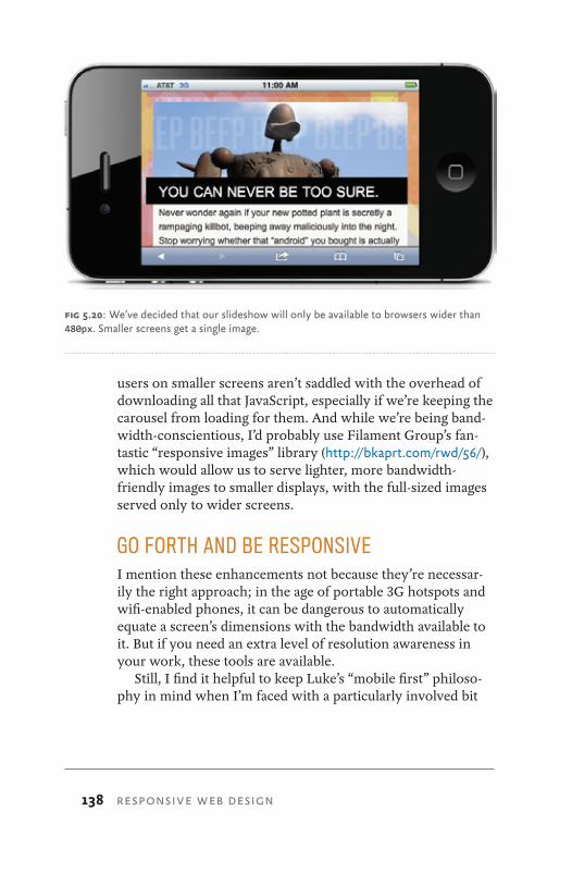
138 RESPONSIVE WEB DESIGN
users on smaller screens aren’t saddled with the overhead of downloading all that JavaScript, especially if we’re keeping the carousel from loading for them. And while we’re being band-width-conscientious, I’d probably use Filament Group’s fan-tastic “responsive images” library (http://bkaprt.com/rwd/56/), which would allow us to serve lighter, more bandwidth-friendly images to smaller displays, with the full-sized images served only to wider screens.
GO FORTH AND BE RESPONSIVEI mention these enhancements not because they’re necessar-ily the right approach; in the age of portable 3G hotspots and wifi-enabled phones, it can be dangerous to automatically equate a screen’s dimensions with the bandwidth available to it. But if you need an extra level of resolution awareness in your work, these tools are available.
Still, I find it helpful to keep Luke’s “mobile first” philoso-phy in mind when I’m faced with a particularly involved bit
fig 5.20: We’ve decided that our slideshow will only be available to browsers wider than 480px. Smaller screens get a single image.
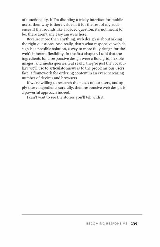
BECOMING RESPONSIVE 139
of functionality. If I’m disabling a tricky interface for mobile users, then why is there value in it for the rest of my audi-ence? If that sounds like a loaded question, it’s not meant to be: there aren’t any easy answers here.
Because more than anything, web design is about asking the right questions. And really, that’s what responsive web de-sign is: a possible solution, a way to more fully design for the web’s inherent flexibility. In the first chapter, I said that the ingredients for a responsive design were a fluid grid, flexible images, and media queries. But really, they’re just the vocabu-lary we’ll use to articulate answers to the problems our users face, a framework for ordering content in an ever-increasing number of devices and browsers.
If we’re willing to research the needs of our users, and ap-ply those ingredients carefully, then responsive web design is a powerful approach indeed.
I can’t wait to see the stories you’ll tell with it.
140 RESPONSIVE WEB DESIGN
ACKNOWLEDGEMENTSI don’t have the words—or the space—to properly thank the people that have influenced my work, let alone this little book. Still, I have to try.
First and foremost, I’m impossibly grateful to A Book Apart for being interested in responsive design, and for offering me the chance to write my first solo book. Jason Santa Maria’s attention to detail and quality is unparalleled. Mandy Brown is an impossibly incisive editor, and I feel so lucky to have had her help and patience in shaping this book. And of course, my heartfelt thanks to Jeffrey Zeldman: for his impassioned writing and tireless work, and for the opportunities they’ve afforded me over the years.
If I can form a decent sentence from time to time, it’s be-cause of Garret Keizer.
Peter-Paul Koch, Bryan and Stephanie Rieger, Jason Grigsby, and Stephen Hay have taught me much of what I know about designing for mobile, and improved my thinking about responsive design in countless subtle, significant ways. And for any design project, responsive or otherwise, Luke Wroblewski’s work on “mobile first” is invaluable.
Khoi Vinh and Mark Boulton have taught our commu-nity—and me—much about the history behind our craft. What’s more, a fluid grid would never have proven feasible without Richard Rutter’s early research.
If I hadn’t read John Allsopp’s magnificent “A Dao Of Web Design” over a decade ago, my understanding of the web would be drastically different, and this book would have never happened.
David Sleight, the team at Filament Group—Patty Toland, Todd Parker, Maggie Costello, and Scott Jehl—and Mat Marquis provided indispensable feedback on an early draft of the book. Furthermore, Filament offered me the chance to work on a large-scale responsive redesign as I began writing this book, which has been a fantastically educational experi-ence from which both I and the book have benefitted.
Dan Cederholm’s technical edit was thoughtful, thorough, and hilarious. Just like him.
141
I can’t quite articulate how honored I am that Jeremy Keith agreed to write the foreword. Hell, “honored” doesn’t even adequately cover it.
My family—my parents, my brothers, my sisters, and my grandmother—were there for me throughout the writing pro-cess. I love you guys.
And finally, to my wife Elizabeth. This book, and every-thing else, is for her.
ACKNOWLEDGEMENTS
142 RESPONSIVE WEB DESIGN
RESOURCESFor a more complete history behind the typographic grid, I’d suggest the following:
• Wikipedia’s entry on the canons of page construction: http://bkaprt.com/rwd/57/
• The New Typography by Jan Tschichold (Second Edition, University of California Press, 2006): http://bkaprt.com/rwd/58/
• Grid Systems in Graphic Design by Josef Müller-Brockmann (Verlag Niggli AG): http://bkaprt.com/rwd/59/
In looking at how grids apply specifically to web design, I’d suggest:
• Ordering Disorder: Grid Principles for Web Design by Khoi Vinh (New Riders Press, 2010): http://bkaprt.com/rwd/60/
• A Practical Guide to Designing Grid Systems for the Web by Mark Boulton (Five Simple Steps, forthcoming): http://bkaprt.com/rwd/61/
• Mark Boulton’s blog entry, “A Richer Canvas”: http://bkaprt.com/rwd/62/
• The Grid System: http://bkaprt.com/rwd/63/• My article for A List Apart on “Fluid Grids”: http://
bkaprt.com/rwd/64/
Looking for a reference on media queries? While the follow-ing two links are somewhat tech-y, I think they’re still acces-sible, fantastic reads:
• The W3C’s media query specification: http://bkaprt.com/rwd/65/
• Mozilla’s developer reference on media queries: http://bkaprt.com/rwd/66/
If you’re working with images and other media in a flexible context, I recommend checking out:
143
• Filament Group’s “Responsive Images” script: http://bkaprt.com/rwd/67/, with related blog entries: http://bkaprt.com/rwd/68/, http://bkaprt.com/rwd/69/
• Richard Rutter’s original image resizing experiments: http://bkaprt.com/rwd/70/
• Bryan Rieger’s early experiments with image adaptation: http://bkaprt.com/rwd/71/
For more information to help you decide when and how to adopt a responsive approach, I’d recommend:
• John Allsopp’s seminal “A Dao of Web Design”: http://bkaprt.com/rwd/72/
• Luke Wroblewski’s articles on “mobile first”: http://bkaprt.com/rwd/47/, with related readings available http://www.lukew.com/ff/archive.asp?tag&mobilefirst
• Jeremy Keith’s “One Web”: http://bkaprt.com/rwd/73/and “Context”: http://bkaprt.com/rwd/74/
• Tim Kadlec’s entry on “Responsive Web Design and Mobile Context”: http://bkaprt.com/rwd/75/
• Josh Clark (http://bkaprt.com/rwd/76/) and Jason Grigsby (http://bkaprt.com/rwd/77/) round up some great discus-sions to help you decide when a responsive approach is appropriate, and for which projects. (You should be reading Josh and Jason’s blogs anyway.)
• My own blog entries on “With Good References” (http://bkaprt.com/rwd/78/) and “Toffee-Nosed” (http://bkaprt.com/rwd/79/).
RESOURCES
144 RESPONSIVE WEB DESIGN
REFERENCESShortened URLs are numbered sequentially; the related long URLs are listed below for reference.
Chapter 1
1 http://www.dolectures.com/speakers/craig-mod/
2 http://www.flickr.com/photos/carabanderson/3033798968/
3 http://www.alistapart.com/articles/dao/
4 http://www.morganstanley.com/institutional/techresearch/mobile_internet_report122009.html
5 http://vimeo.com/14899669
6 http://vimeo.com/14899445
7 http://www.smartglassinternational.com/
8 http://vimeo.com/4661618
Chapter 2
9 http://meyerweb.com/eric/tools/css/reset/
Chapter 3
10 http://www.flickr.com/photos/uberculture/1385828839/
11 http://clagnut.com/sandbox/imagetest/
12 http://www.svendtofte.com/code/max_width_in_ie/
13 http://msdn.microsoft.com/en-us/library/ms532969.aspx
14 http://www.dillerdesign.com/experiment/DD_belatedPNG/
15 http://msdn.microsoft.com/en-us/library/ms532920(VS.85).aspx
16 http://unstoppablerobotninja.com/entry/fluid-images
17 http://www.yuiblog.com/blog/2008/12/08/imageopt-5/
18 http://www.alistapart.com/articles/fauxcolumns/
19 http://stopdesign.com/archive/2004/09/03/liquid-bleach.html
20 http://www.w3.org/TR/css3-background/#the-background-size
21 http://srobbin.com/jquery-plugins/jquery-backstretch/
22 http://www.bbc.co.uk/news/technology-11948680
23 http://bryanrieger.com/issues/mobile-image-replacement/
145
Chapter 4
24 http://www.w3.org/TR/CSS2/media.html
25 http://www.alistapart.com/articles/goingtoprint/
26 http://www.w3.org/TR/CSS21/media.html#media-types
27 http://www.w3.org/TR/css3-mediaqueries/
28 http://www.w3.org/TR/css3-mediaqueries/#media1
29 http://developer.apple.com/library/safari/#documentation/appleapplications/reference/SafariHTMLRef/Articles/MetaTags.html
30 https://developer.mozilla.org/en/Mobile/Viewport_meta_tag#Viewport_basics
31 http://www.theleagueofmoveabletype.com/fonts/7-league-gothic
32 http://windows.microsoft.com/ie9
33 http://ie.microsoft.com/testdrive/HTML5/CSS3MediaQueries/
34 http://www.quirksmode.org/mobile/#t14
35 http://blogs.msdn.com/b/iemobile/archive/2011/02/14/ie9-coming-to-windows-phone-in-2011.aspx
36 http://www.quirksmode.org/m/css.html#t021
37 http://code.google.com/p/css3-mediaqueries-js/
38 https://github.com/scottjehl/Respond
39 http://37signals.com/svn/posts/2661-experimenting-with-responsive-design-in-iterations
40 http://hicksdesign.co.uk/journal/finally-a-fluid-hicksdesign
41 http://thethemefoundry.com/shelf/
Chapter 5 42 http://tripleodeon.com/2010/10/not-a-mobile-web-merely-a-320px-wide-
one
43 http://jeffcroft.com/blog/2010/aug/06/responsive-web-design-and-mobile-context/
44 http://thefonecast.com/News/tabid/62/EntryId/3602/Mobile-shopping-is-popular-when-watching-TV-says-Orange-UK-research.aspx
45 http://www.lukew.com/ff/entry.asp?1263
46 http://www.flickr.com/photos/merlin/sets/72157622077100537/
47 http://www.lukew.com/ff/entry.asp?933
48 http://www.lukew.com/ff/entry.asp?1117
REFERENCES
146 RESPONSIVE WEB DESIGN
49 http://chrispederick.com/work/web-developer/
50 http://www.alistapart.com/articles/smartphone-browser-landscape/
51 http://www.flickr.com/photos/filamentgroup/5149016958/
52 http://yiibu.com/about/site/
53 http://www.hesketh.com/publications/inclusive_web_design_for_the_future/
54 http://www.the-haystack.com/2011/01/07/there-is-no-mobile-web/
55 http://matmarquis.com/carousel/
56 http://filamentgroup.com/lab/responsive_images_experimenting_with_context_aware_image_sizing/
Resources
57 http://en.wikipedia.org/wiki/Canons_of_page_construction
58 http://www.amazon.com/dp/0520250125/
59 http://www.amazon.com/dp/3721201450/
60 http://www.amazon.com/gp/product/0321703537/
61 http://www.fivesimplesteps.com/books/practical-guide-designing-grid-systems-for-the-web
62 http://www.markboulton.co.uk/journal/comments/a-richer-canvas
63 http://www.thegridsystem.org/
64 http://www.alistapart.com/articles/fluidgrids/
65 http://www.w3.org/TR/css3-mediaqueries/
66 https://developer.mozilla.org/En/CSS/Media_queries
67 https://github.com/filamentgroup/Responsive-Images
68 http://unstoppablerobotninja.com/entry/responsive-images/
69 http://filamentgroup.com/lab/responsive_images_experimenting_with_context_aware_image_sizing/
70 http://clagnut.com/blog/268/
71 http://bryanrieger.com/issues/mobile-image-adaptation
72 http://www.alistapart.com/articles/dao
73 http://adactio.com/journal/1716/
74 http://adactio.com/journal/4443/
75 http://timkadlec.com/2011/03/responsive-web-design-and-mobile-context/
76 http://globalmoxie.com/blog/mobile-web-responsive-design.shtml
77 http://www.cloudfour.com/weekend-reading-responsive-web-design-and-mobile-context/
78 http://unstoppablerobotninja.com/entry/with-good-references/
79 http://unstoppablerobotninja.com/entry/toffee-nosed/
147
37signals 101–102.get() 136
AA List Apart 117, 142, 151Allsopp, John 5, 140, 143AlphaImageLoader 52–54Android 98, 103append() 136Apple 79, 80
Bbackground-position 58background-size 58BlackBerry 99Boulton, Mark 14, 140, 142Bowman, Doug 55
CCederholm, Dan 54, 58, 103, 140Champeon, Steven 128Cog’aoke 109–110Croft, Jeff 107css3-mediaqueries.js 99–100
DDao De Jing 106DD_belatedPNG library 52Diller, Drew 52display area 75–77display: none 111
FFinck, Nick 128fluid grid 25, 34, 41font-size 18–21, 73, 74, 84, 105Frost, Robert 1
GGalaxy Tab 102Grid Systems in Graphic Design 14, 142
HHappy Cog 103, 151Hay, Stephen 129, 140Hicks, Jon 104–105
Iinitial-scale 80interactive design review 118Internet Explorer 7, 47–52iPad 79, 83, 102iPhone 74, 79–81
JJehl, Scott 99, 140jQuery 131–137jQuery Backstretch plugin 58
KKindle 102–103, 114Koch, Peter-Paul 98, 117, 140
LLeague Gothic 82, 84link 73, 75
MMann, Merlin 111margin 27, 29–31, 33–40Marquis, Mat 131, 140max-width: 100% 45–53, 59–62media types 71–74Meyer, Eric 18mobile first 111–113, 122, 124–127, 138,
140, 143
INDEX
INDEX
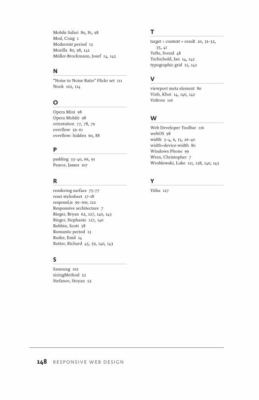
148 RESPONSIVE WEB DESIGN
Mobile Safari 80, 81, 98Mod, Craig 1Modernist period 13Mozilla 80, 98, 142Müller-Brockmann, Josef 14, 142
N“Noise to Noise Ratio” Flickr set 111Nook 102, 114
OOpera Mini 98Opera Mobile 98orientation 77, 78, 79overflow 59–61overflow: hidden 60, 88
Ppadding 33–40, 66, 91Pearce, James 107
Rrendering surface 75–77reset stylesheet 17–18respond.js 99–100, 122Responsive architecture 7Rieger, Bryan 62, 127, 140, 143Rieger, Stephanie 127, 140Robbin, Scott 58Romantic period 13Ruder, Emil 14Rutter, Richard 45, 59, 140, 143
SSamsung 102sizingMethod 52Stefanov, Stoyan 53
Ttarget ÷ context = result 20, 31–32,
35, 41Tofte, Svend 48Tschichold, Jan 14, 142typographic grid 15, 142
Vviewport meta element 80Vinh, Khoi 14, 140, 142Voltron 116
WWeb Developer Toolbar 116webOS 98width 3–4, 6, 15, 26–40width=device-width 80Windows Phone 99Wren, Christopher 7Wroblewski, Luke 111, 138, 140, 143
YYiibu 127
149
ABOUT A BOOK APARTWeb design is about multi-disciplinary mastery and laser fo-cus, and that’s the thinking behind our brief books for people who make websites. We cover the emerging and essential topics in web design and development with style, clarity, and, above all, brevity—because working designer-developers can’t afford to waste time.
The goal of every title in our catalog is to shed clear light on a tricky subject, and do it fast, so you can get back to work. Thank you for supporting our mission to provide profession-als with the tools they need to move the web forward.
COLOPHONThe text is set in FF Yoga and its companion, FF Yoga Sans, both by Xavier Dupré. Headlines and cover are set in Titling Gothic by David Berlow, code excerpts in Consolas by Lucas de Groot.
ABOUT A BOOK APART
150 RESPONSIVE WEB DESIGN
ABOUT THE AUTHOR Ethan Marcotte (http://ethanmarcotte.com) is a versatile designer/developer whose work demonstrates a passion for the intersection of quality code and compelling design. A resident of Cambridge, Massachusetts, Ethan is fortunate to have worked with such clients as New York Magazine, Stanford University, the Sundance Film Festival, and the W3C. More fun facts: Ethan has a blog (http://
unstoppablerobotninja.com), and blathers incessantly on Twitter (@beep). Also, he is tall.
Ethan is a contributing author and technical editor at A List Apart, the magazine for people who make websites. He is also a popular educator, and has been a featured speaker at An Event Apart, the SXSW Interactive Festival, Future of Web Design, and AIGA’s In Control conference.
An experienced author, Ethan collaborated with Happy Cog founder Jeffrey Zeldman on the third edition of Designing with Web Standards (New Riders, 2009), the classic title that sits on every savvy designer’s bookshelf. Additionally, he acted as a contributing author to Handcrafted CSS (New Riders, 2009), Web Standards Creativity (friends of ED, 2007) and Professional CSS (Wrox, 2005).
Responsive Web Design is Ethan’s first solo book, and he’s pretty darn excited about that. He’d like to thank you for read-ing it.


