Embed Size (px)
Citation preview
DESIGN & DEVELOPMENTRESPONSIVE eLEARNING
ContentsChapter 1 A Responsive World
1.1: How It All Began 4
1.2: Responsive Design: Understanding the Term 7
Chapter 2 Understanding Responsive eLearning Design
2.1: The Need for Responsive Design in eLearning 10
2.2: Key Features of Responsive Design 12
2.3: Adaptive Vs. Responsive Design 14
2.4: Benefits of Responsive eLearning Design 21
2.5: What Does a Responsive eLearning Design Look Like? 23
ContentsChapter 3 Determining a Responsive eLearning Design Strategy
3.1: When to Use Responsive eLearning Design 28
3.2: Getting Started Responsively 31
3.3: Challenges and Solutions 34
3.3.1: Design 35
3.3.2: Development 52
3.3.3: Testing 57
Chapter 4 Conclusion
Share Some Love
References
Authors
65
66
69
1 A Responsive World
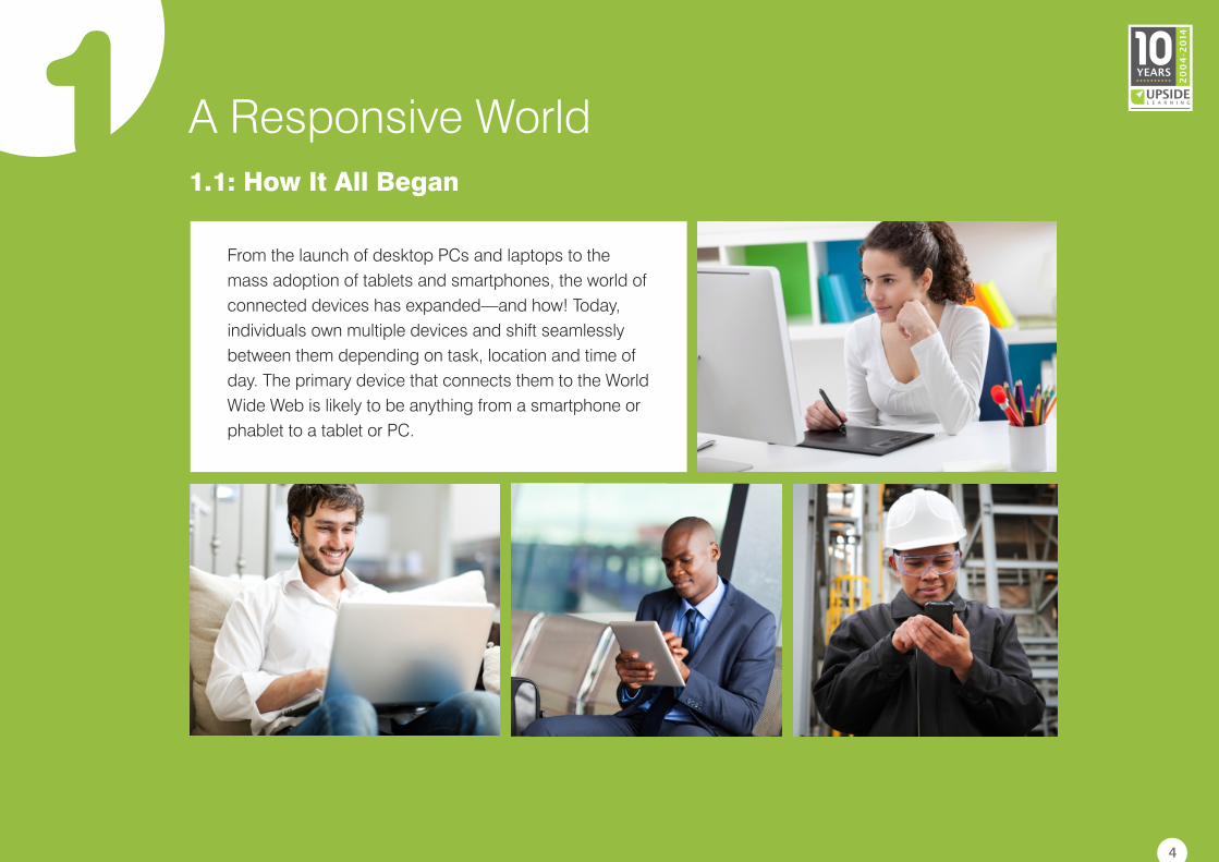
From the launch of desktop PCs and laptops to the
mass adoption of tablets and smartphones, the world of
connected devices has expanded—and how! Today,
individuals own multiple devices and shift seamlessly
between them depending on task, location and time of
day. The primary device that connects them to the World
Wide Web is likely to be anything from a smartphone or
phablet to a tablet or PC.
1.1: How It All Began
4
1 A Responsive World
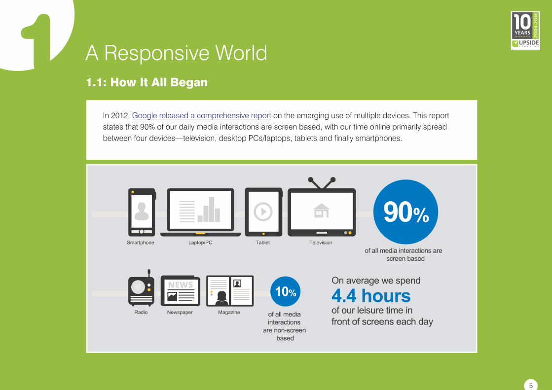
In 2012, on the emerging use of multiple devices. This report
states that 90% of our daily media interactions are screen based, with our time online primarily spread
between four devices—television, desktop PCs/laptops, tablets and finally smartphones.
Google released a comprehensive report
1.1: How It All Began
5
1 A Responsive World
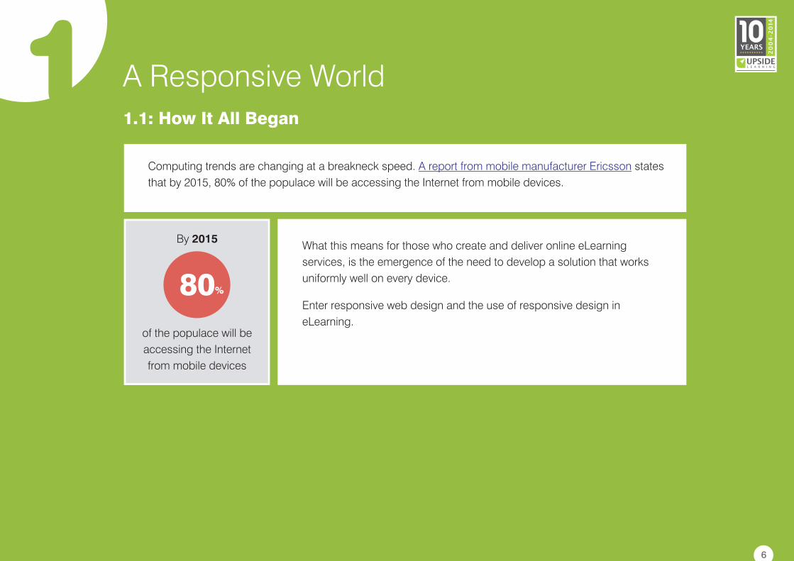
Computing trends are changing at a breakneck speed. states
that by 2015, 80% of the populace will be accessing the Internet from mobile devices.
A report from mobile manufacturer Ericsson
What this means for those who create and deliver online eLearning
services, is the emergence of the need to develop a solution that works
uniformly well on every device.
Enter responsive web design and the use of responsive design in
eLearning.
1.1: How It All Began
6
By 2015
of the populace will be
accessing the Internet
from mobile devices
80%
1 A Responsive World1.2: Responsive Design: Understanding the Term
Before we move to responsive eLearning design, it is
important to understand responsive design in general.
The term 'responsive web design' (RWD) was coined
by , a web designer, in an article in
in May 2010. He further described the theory
and practice of responsive web design in his
According to Marcotte, responsive web design means
designing for optimal viewing experiences on different
devices by using technology to make designs flexible
and more adaptive to the media that renders them.
Ethan Marcotte A
List Apart
book
titled Responsive Web Design.
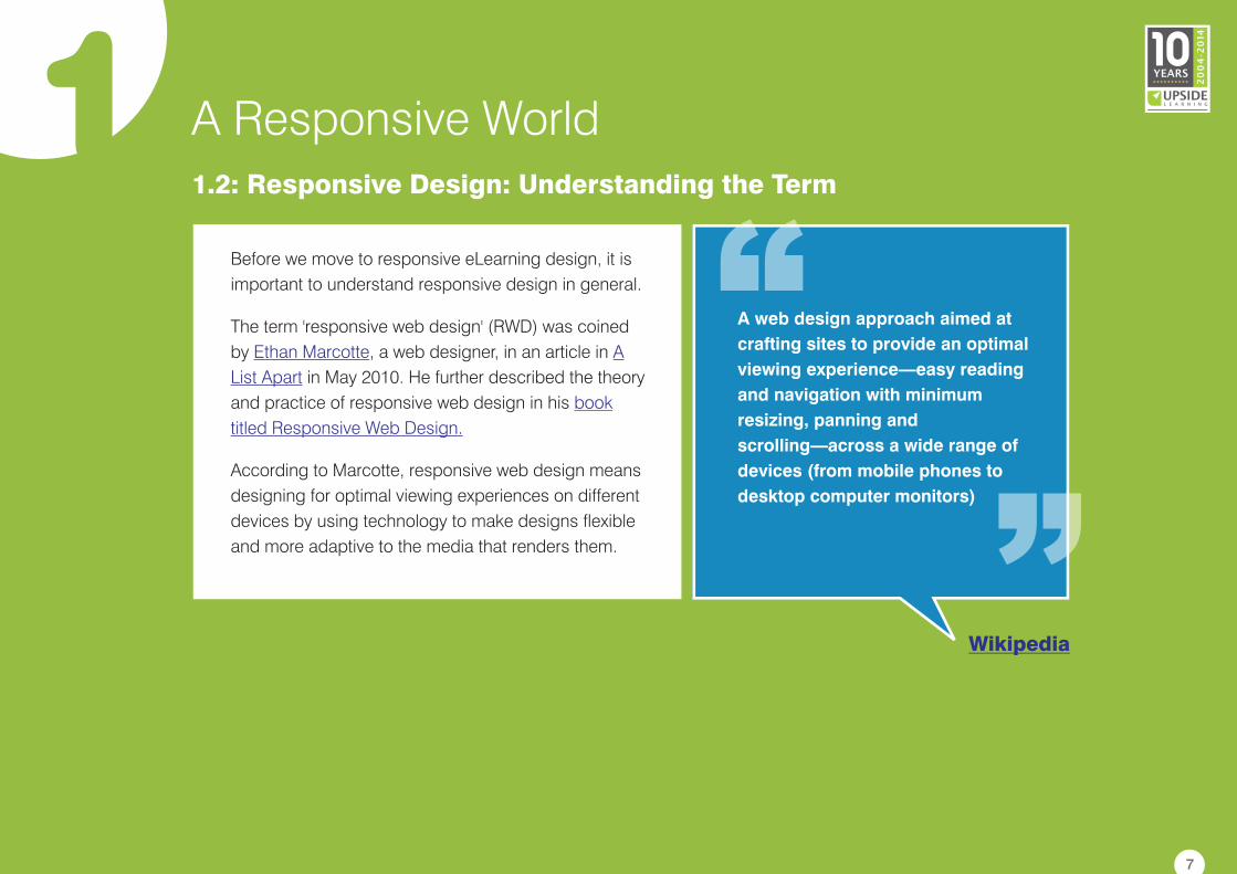
A web design approach aimed at
crafting sites to provide an optimal
viewing experience—easy reading
and navigation with minimum
resizing, panning and
scrolling—across a wide range of
devices (from mobile phones to
desktop computer monitors)
Wikipedia
7
1 A Responsive World1.2: Responsive Design: Understanding the Term
Responsive design does not target particular resolutions or screen sizes; rather, the aim is to design for
multiple screens in such a manner that content responds to the target environment and reflows to fit into
different layouts and treatments on the basis of the display size and type.
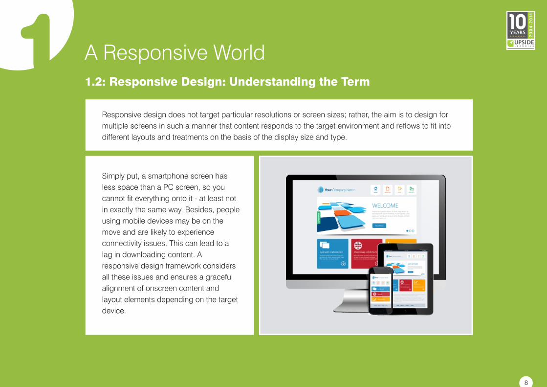
Simply put, a smartphone screen has
less space than a PC screen, so you
cannot fit everything onto it - at least not
in exactly the same way. Besides, people
using mobile devices may be on the
move and are likely to experience
connectivity issues. This can lead to a
lag in downloading content. A
responsive design framework considers
all these issues and ensures a graceful
alignment of onscreen content and
layout elements depending on the target
device.
8
1 A Responsive World1.2: Responsive Design: Understanding the Term
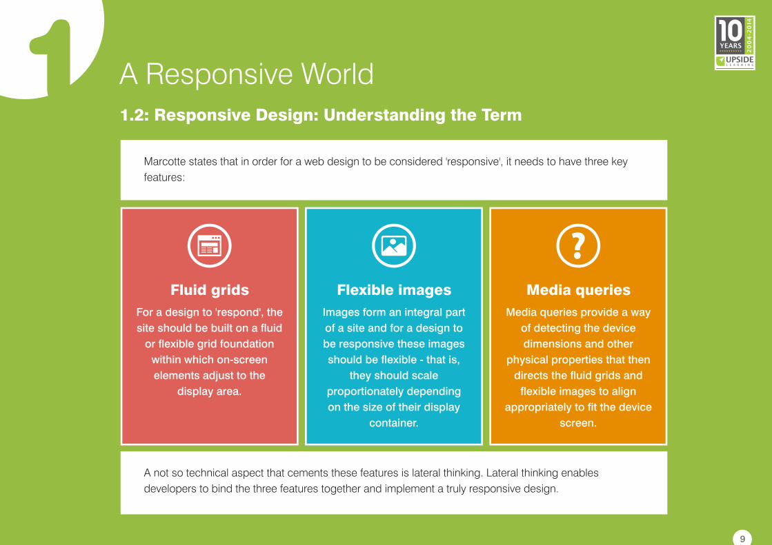
Marcotte states that in order for a web design to be considered 'responsive', it needs to have three key
features:
A not so technical aspect that cements these features is lateral thinking. Lateral thinking enables
developers to bind the three features together and implement a truly responsive design.
Images form an integral part
of a site and for a design to
be responsive these images
should be flexible - that is,
they should scale
proportionately depending
on the size of their display
container.
Flexible images
For a design to 'respond', the
site should be built on a fluid
or flexible grid foundation
within which on-screen
elements adjust to the
display area.
Fluid grids
Media queries provide a way
of detecting the device
dimensions and other
physical properties that then
directs the fluid grids and
flexible images to align
appropriately to fit the device
screen.
Media queries
9
2 Understanding Responsive eLearning Design2.1: The Need for Responsive Design in eLearning
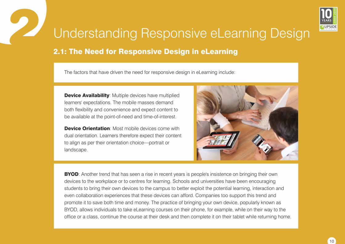
Device Availability: Multiple devices have multiplied
learners' expectations. The mobile masses demand
both flexibility and convenience and expect content to
be available at the point-of-need and time-of-interest.
Device Orientation: Most mobile devices come with
dual orientation. Learners therefore expect their content
to align as per their orientation choice—portrait or
landscape.
BYOD: Another trend that has seen a rise in recent years is people's insistence on bringing their own
devices to the workplace or to centres for learning. Schools and universities have been encouraging
students to bring their own devices to the campus to better exploit the potential learning, interaction and
even collaboration experiences that these devices can afford. Companies too support this trend and
promote it to save both time and money. The practice of bringing your own device, popularly known as
BYOD, allows individuals to take eLearning courses on their phone, for example, while on their way to the
office or a class, continue the course at their desk and then complete it on their tablet while returning home.
The factors that have driven the need for responsive design in eLearning include:
10
2 Understanding Responsive eLearning Design2.1: The Need for Responsive Design in eLearning
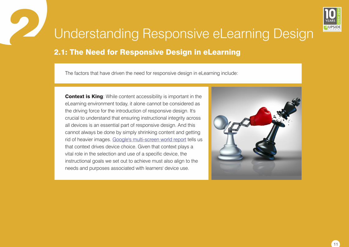
Context is King: While content accessibility is important in the
eLearning environment today, it alone cannot be considered as
the driving force for the introduction of responsive design. It's
crucial to understand that ensuring instructional integrity across
all devices is an essential part of responsive design. And this
cannot always be done by simply shrinking content and getting
rid of heavier images. tells us
that context drives device choice. Given that context plays a
vital role in the selection and use of a specific device, the
instructional goals we set out to achieve must also align to the
needs and purposes associated with learners' device use.
Google's multi-screen world report
The factors that have driven the need for responsive design in eLearning include:
11
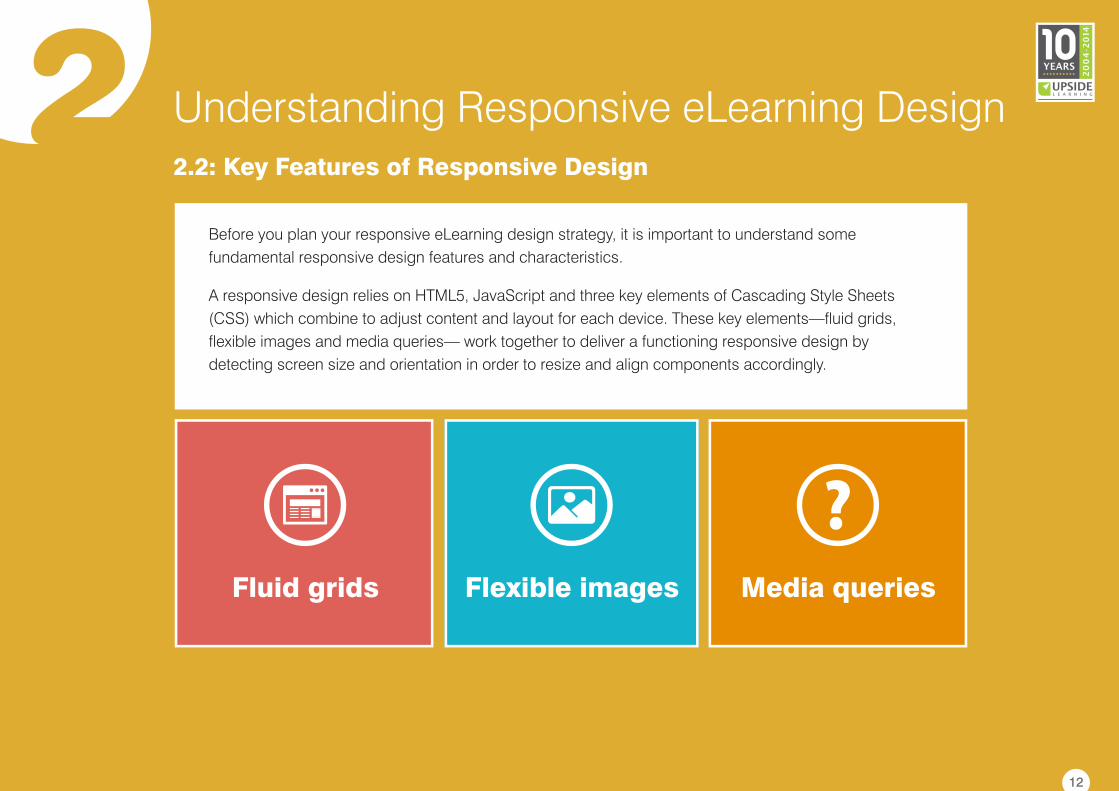
2 Understanding Responsive eLearning Design2.2: Key Features of Responsive Design
Before you plan your responsive eLearning design strategy, it is important to understand some
fundamental responsive design features and characteristics.
A responsive design relies on HTML5, JavaScript and three key elements of Cascading Style Sheets
(CSS) which combine to adjust content and layout for each device. These key elements—fluid grids,
flexible images and media queries— work together to deliver a functioning responsive design by
detecting screen size and orientation in order to resize and align components accordingly.
Fluid grids Flexible images Media queries
12
2 Understanding Responsive eLearning Design
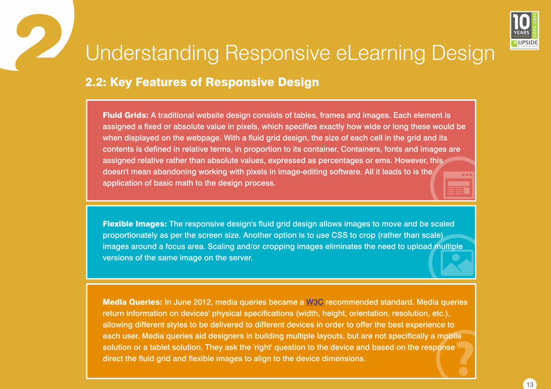
Fluid Grids: A traditional website design consists of tables, frames and images. Each element is
assigned a fixed or absolute value in pixels, which specifies exactly how wide or long these would be
when displayed on the webpage. With a fluid grid design, the size of each cell in the grid and its
contents is defined in relative terms, in proportion to its container. Containers, fonts and images are
assigned relative rather than absolute values, expressed as percentages or ems. However, this
doesn't mean abandoning working with pixels in image-editing software. All it leads to is the
application of basic math to the design process.
Flexible Images: The responsive design's fluid grid design allows images to move and be scaled
proportionately as per the screen size. Another option is to use CSS to crop (rather than scale)
images around a focus area. Scaling and/or cropping images eliminates the need to upload multiple
versions of the same image on the server.
Media Queries: In June 2012, media queries became a recommended standard. Media queries
return information on devices' physical specifications (width, height, orientation, resolution, etc.),
allowing different styles to be delivered to different devices in order to offer the best experience to
each user. Media queries aid designers in building multiple layouts, but are not specifically a mobile
solution or a tablet solution. They ask the 'right' question to the device and based on the response
direct the fluid grid and flexible images to align to the device dimensions.
W3C
2.2: Key Features of Responsive Design
13
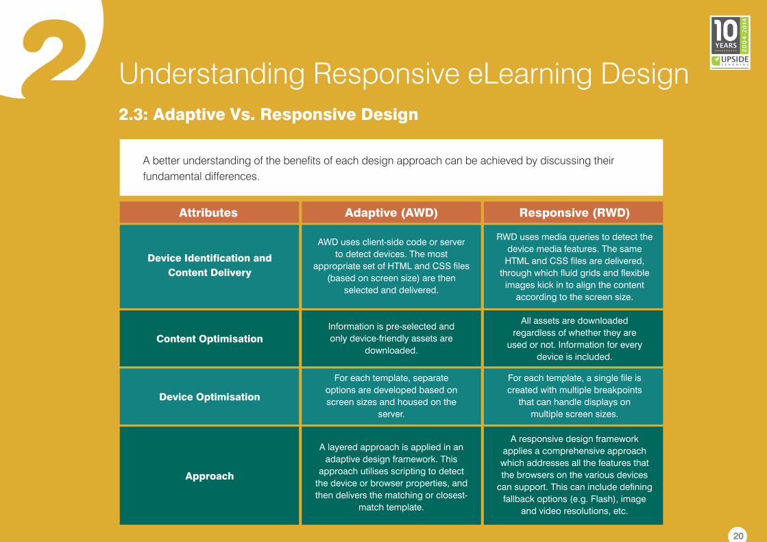
2 Understanding Responsive eLearning Design2.3: Adaptive Vs. Responsive Design
Similar to responsive design is a parallel branch of design called adaptive design. Both adaptive and
responsive designs render device-friendly content, but in slightly different ways.
The term adaptive web design (AWD) was coined by in his
. In an adaptive design, fixed pre-defined layouts are developed for different screen sizes
(breakpoints).
In a responsive design, content gets realigned, resized and or restructured within a fluid grid at as well as
between breakpoints.
Aaron Gustafson book titled Adaptive Web
Design
14
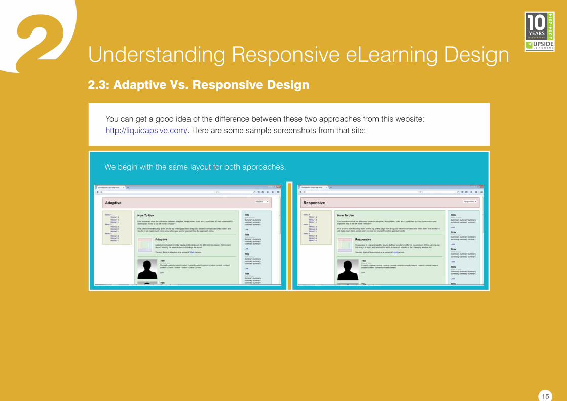
2 Understanding Responsive eLearning Design2.3: Adaptive Vs. Responsive Design
You can get a good idea of the difference between these two approaches from this website:
. Here are some sample screenshots from that site:http://liquidapsive.com/
We begin with the same layout for both approaches.
15
2 Understanding Responsive eLearning Design
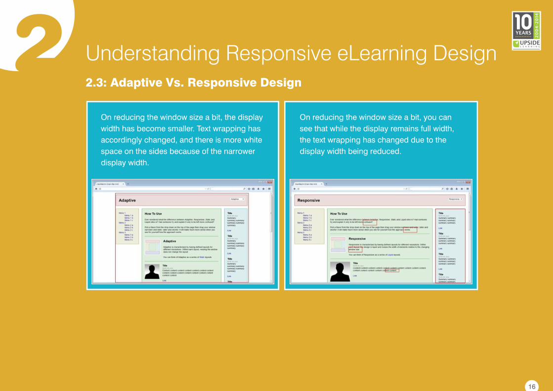
On reducing the window size a bit, you can
see that while the display remains full width,
the text wrapping has changed due to the
display width being reduced.
2.3: Adaptive Vs. Responsive Design
On reducing the window size a bit, the display
width has become smaller. Text wrapping has
accordingly changed, and there is more white
space on the sides because of the narrower
display width.
16
2 Understanding Responsive eLearning Design2.3: Adaptive Vs. Responsive Design
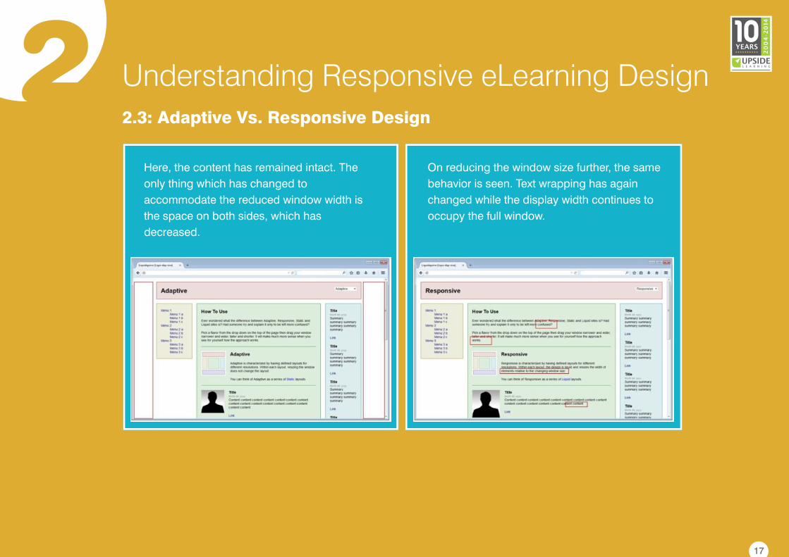
On reducing the window size further, the same
behavior is seen. Text wrapping has again
changed while the display width continues to
occupy the full window.
Here, the content has remained intact. The
only thing which has changed to
accommodate the reduced window width is
the space on both sides, which has
decreased.
17
2 Understanding Responsive eLearning Design2.3: Adaptive Vs. Responsive Design
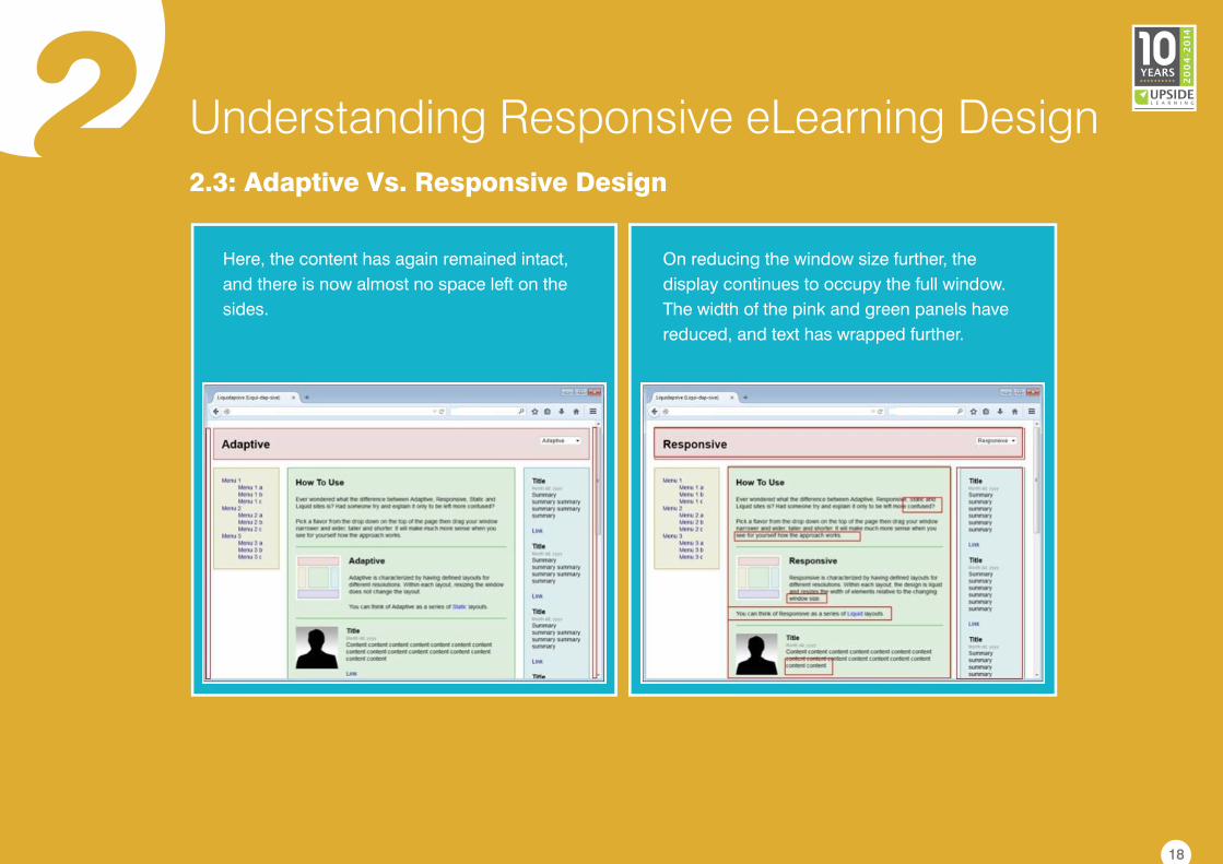
Here, the content has again remained intact,
and there is now almost no space left on the
sides.
On reducing the window size further, the
display continues to occupy the full window.
The width of the pink and green panels have
reduced, and text has wrapped further.
18
2 Understanding Responsive eLearning Design2.3: Adaptive Vs. Responsive Design
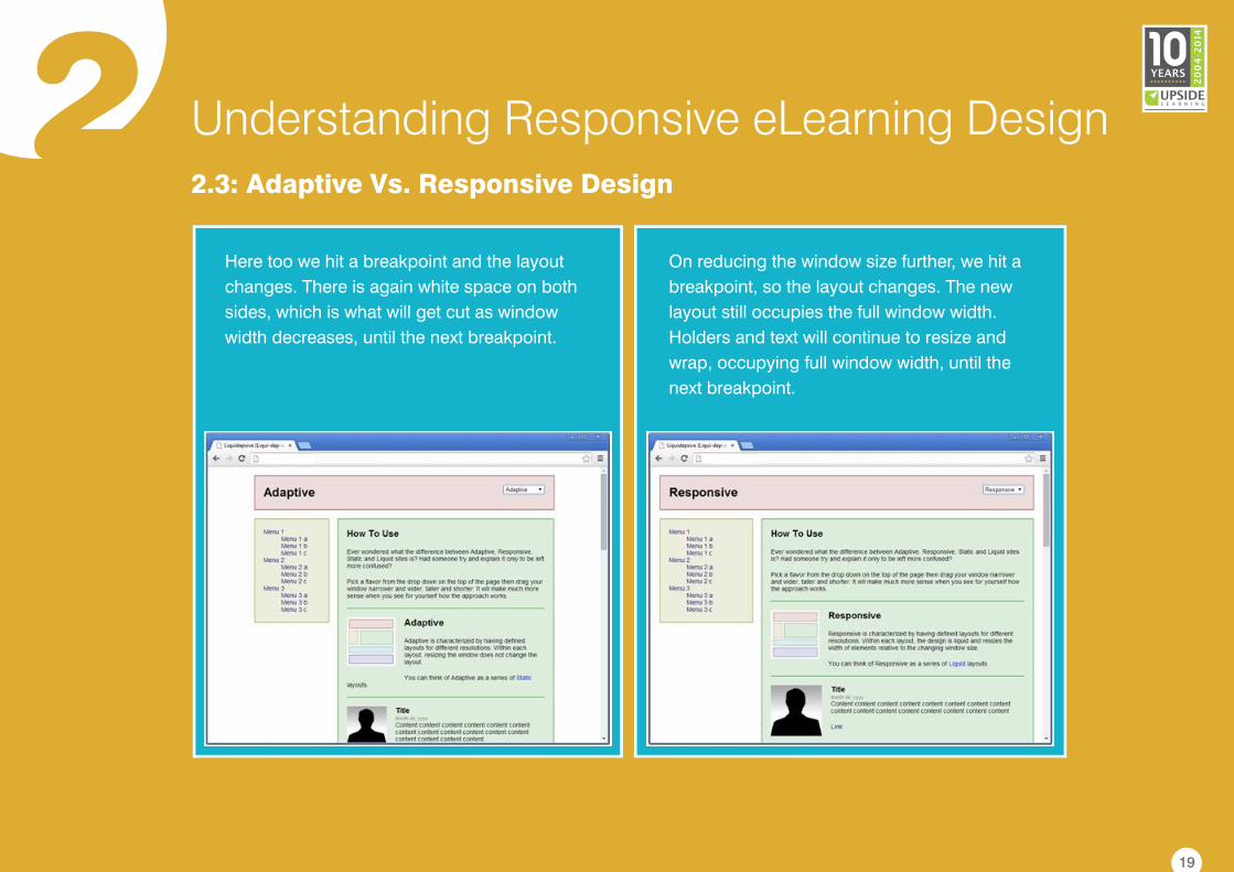
Here too we hit a breakpoint and the layout
changes. There is again white space on both
sides, which is what will get cut as window
width decreases, until the next breakpoint.
On reducing the window size further, we hit a
breakpoint, so the layout changes. The new
layout still occupies the full window width.
Holders and text will continue to resize and
wrap, occupying full window width, until the
next breakpoint.
19
2 Understanding Responsive eLearning Design2.3: Adaptive Vs. Responsive Design
A better understanding of the benefits of each design approach can be achieved by discussing their
fundamental differences.
Adaptive (AWD)Attributes
A responsive design framework
applies a comprehensive approach
which addresses all the features that
the browsers on the various devices
can support. This can include defining
fallback options (e.g. Flash), image
and video resolutions, etc.
Responsive (RWD)
For each template, a single file is
created with multiple breakpoints
that can handle displays on
multiple screen sizes.
All assets are downloaded
regardless of whether they are
used or not. Information for every
device is included.
RWD uses media queries to detect the
device media features. The same
HTML and CSS files are delivered,
through which fluid grids and flexible
images kick in to align the content
according to the screen size.
A layered approach is applied in an
adaptive design framework. This
approach utilises scripting to detect
the device or browser properties, and
then delivers the matching or closest-
match template.
For each template, separate
options are developed based on
screen sizes and housed on the
server.
Information is pre-selected and
only device-friendly assets are
downloaded.
AWD uses client-side code or server
to detect devices. The most
appropriate set of HTML and CSS files
(based on screen size) are then
selected and delivered.
Device Identification and
Content Delivery
Content Optimisation
Device Optimisation
Approach
20
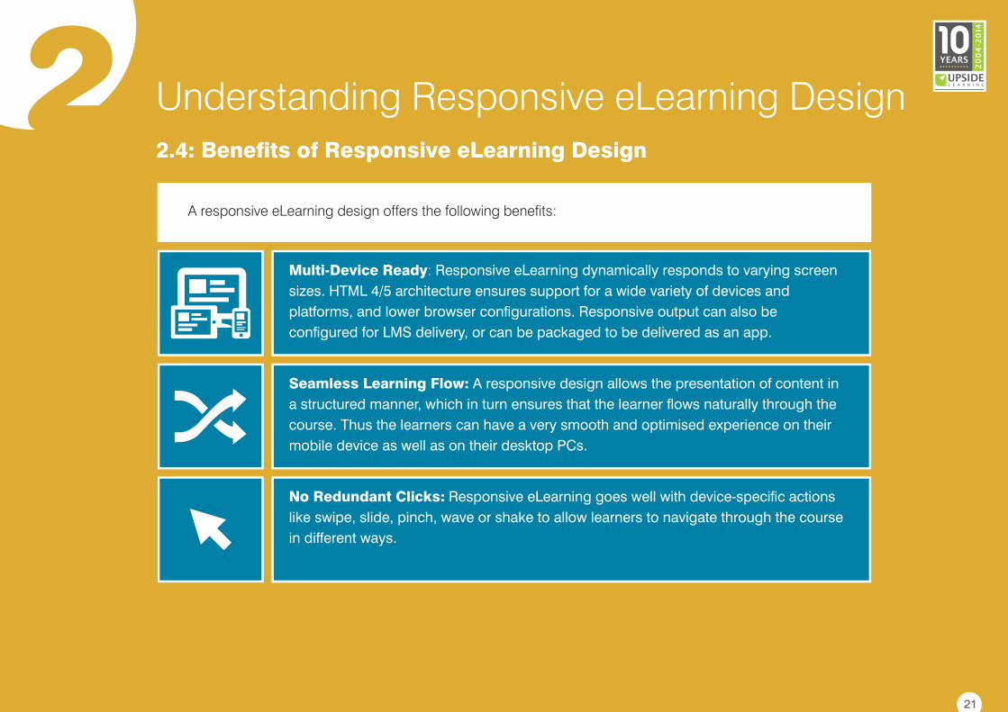
2 Understanding Responsive eLearning Design2.4: Benefits of Responsive eLearning Design
A responsive eLearning design offers the following benefits:
Multi-Device Ready: Responsive eLearning dynamically responds to varying screen
sizes. HTML 4/5 architecture ensures support for a wide variety of devices and
platforms, and lower browser configurations. Responsive output can also be
configured for LMS delivery, or can be packaged to be delivered as an app.
Seamless Learning Flow: A responsive design allows the presentation of content in
a structured manner, which in turn ensures that the learner flows naturally through the
course. Thus the learners can have a very smooth and optimised experience on their
mobile device as well as on their desktop PCs.
No Redundant Clicks: Responsive eLearning goes well with device-specific actions
like swipe, slide, pinch, wave or shake to allow learners to navigate through the course
in different ways.
21
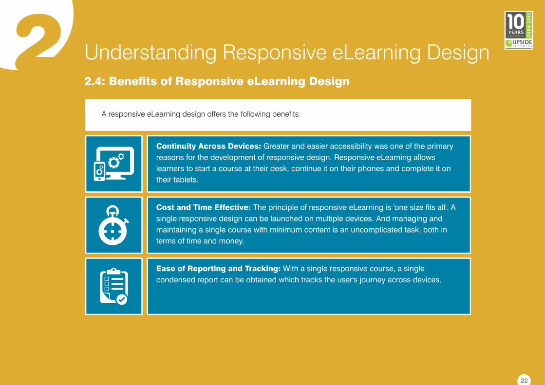
2 Understanding Responsive eLearning Design2.4: Benefits of Responsive eLearning Design
Continuity Across Devices: Greater and easier accessibility was one of the primary
reasons for the development of responsive design. Responsive eLearning allows
learners to start a course at their desk, continue it on their phones and complete it on
their tablets.
Cost and Time Effective: The principle of responsive eLearning is 'one size fits all'. A
single responsive design can be launched on multiple devices. And managing and
maintaining a single course with minimum content is an uncomplicated task, both in
terms of time and money.
Ease of Reporting and Tracking: With a single responsive course, a single
condensed report can be obtained which tracks the user's journey across devices.
A responsive eLearning design offers the following benefits:
22
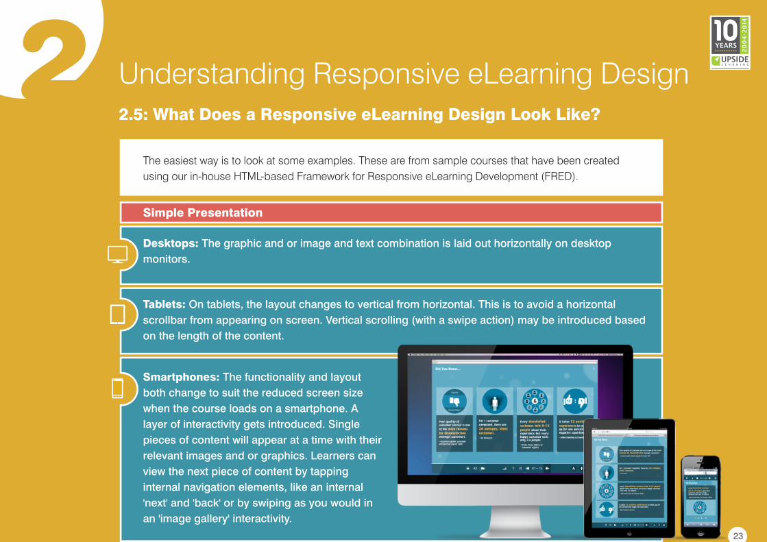
2 Understanding Responsive eLearning Design2.5: What Does a Responsive eLearning Design Look Like?
The easiest way is to look at some examples. These are from sample courses that have been created
using our in-house HTML-based Framework for Responsive eLearning Development (FRED).
Desktops: The graphic and or image and text combination is laid out horizontally on desktop
monitors.
Tablets: On tablets, the layout changes to vertical from horizontal. This is to avoid a horizontal
scrollbar from appearing on screen. Vertical scrolling (with a swipe action) may be introduced based
on the length of the content.
Smartphones: The functionality and layout
both change to suit the reduced screen size
when the course loads on a smartphone. A
layer of interactivity gets introduced. Single
pieces of content will appear at a time with their
relevant images and or graphics. Learners can
view the next piece of content by tapping
internal navigation elements, like an internal
'next' and 'back' or by swiping as you would in
an 'image gallery' interactivity.
Simple Presentation
23
2 Understanding Responsive eLearning Design2.5: What Does a Responsive eLearning Design Look Like?
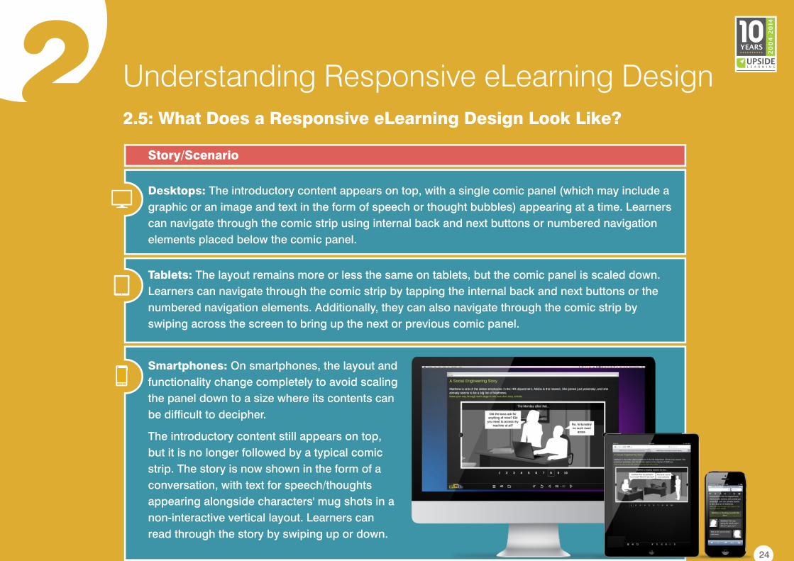
Desktops: The introductory content appears on top, with a single comic panel (which may include a
graphic or an image and text in the form of speech or thought bubbles) appearing at a time. Learners
can navigate through the comic strip using internal back and next buttons or numbered navigation
elements placed below the comic panel.
Tablets: The layout remains more or less the same on tablets, but the comic panel is scaled down.
Learners can navigate through the comic strip by tapping the internal back and next buttons or the
numbered navigation elements. Additionally, they can also navigate through the comic strip by
swiping across the screen to bring up the next or previous comic panel.
Smartphones: On smartphones, the layout and
functionality change completely to avoid scaling
the panel down to a size where its contents can
be difficult to decipher.
The introductory content still appears on top,
but it is no longer followed by a typical comic
strip. The story is now shown in the form of a
conversation, with text for speech/thoughts
appearing alongside characters' mug shots in a
non-interactive vertical layout. Learners can
read through the story by swiping up or down.
Story/Scenario
24
2 Understanding Responsive eLearning Design2.5: What Does a Responsive eLearning Design Look Like?
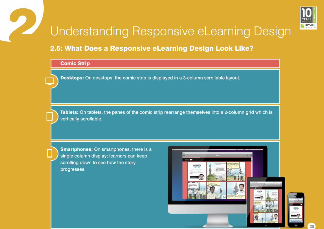
Desktops: On desktops, the comic strip is displayed in a 3-column scrollable layout.
Tablets: On tablets, the panes of the comic strip rearrange themselves into a 2-column grid which is
vertically scrollable.
Smartphones: On smartphones, there is a
single column display; learners can keep
scrolling down to see how the story
progresses.
Comic Strip
25
22.5: What Does a Responsive eLearning Design Look Like?
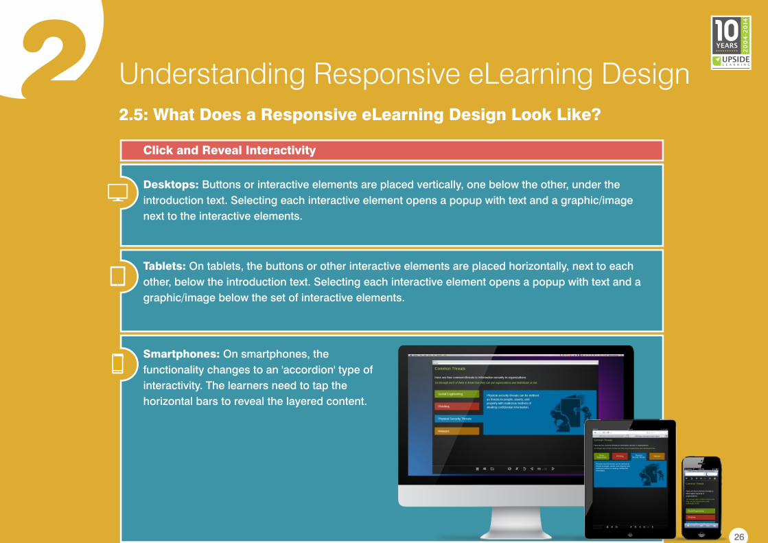
Desktops: Buttons or interactive elements are placed vertically, one below the other, under the
introduction text. Selecting each interactive element opens a popup with text and a graphic/image
next to the interactive elements.
Tablets: On tablets, the buttons or other interactive elements are placed horizontally, next to each
other, below the introduction text. Selecting each interactive element opens a popup with text and a
graphic/image below the set of interactive elements.
Smartphones: On smartphones, the
functionality changes to an 'accordion' type of
interactivity. The learners need to tap the
horizontal bars to reveal the layered content.
Click and Reveal Interactivity
Understanding Responsive eLearning Design
26
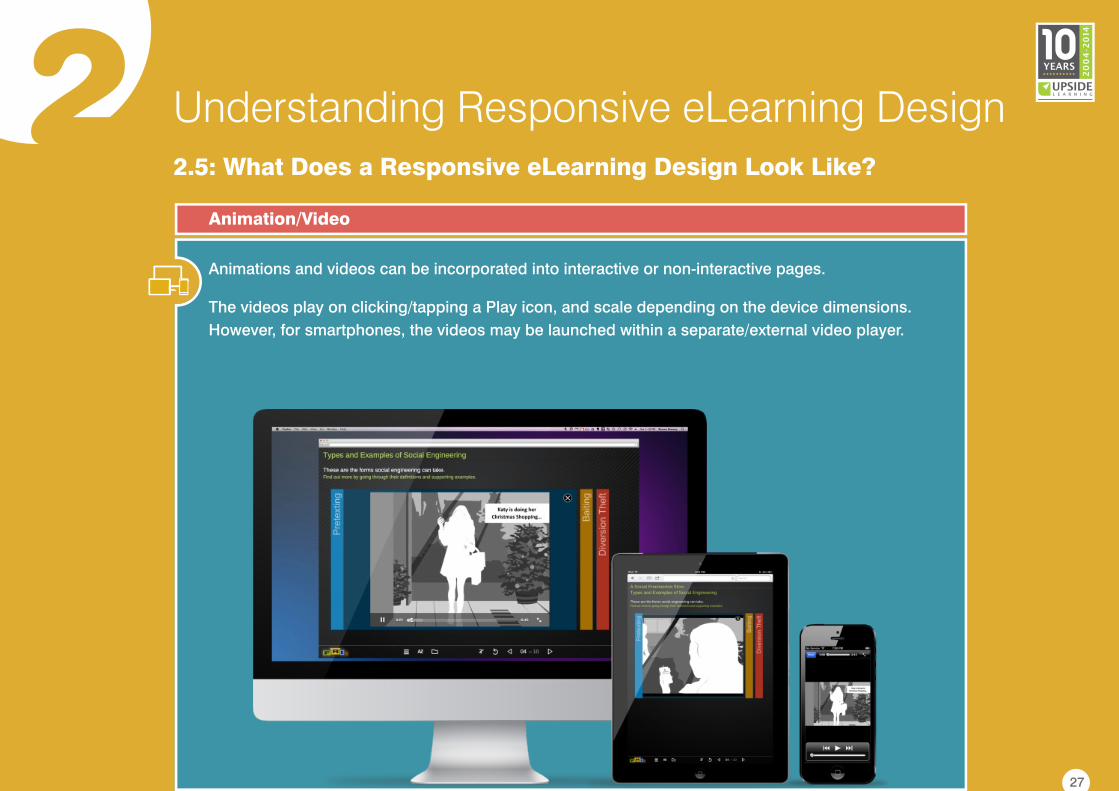
2Animations and videos can be incorporated into interactive or non-interactive pages.
The videos play on clicking/tapping a Play icon, and scale depending on the device dimensions.
However, for smartphones, the videos may be launched within a separate/external video player.
Animation/Video
Understanding Responsive eLearning Design2.5: What Does a Responsive eLearning Design Look Like?
27
3 DeterminingA Responsive eLearning Design Strategy
3.1: When to Use Responsive eLearning Design
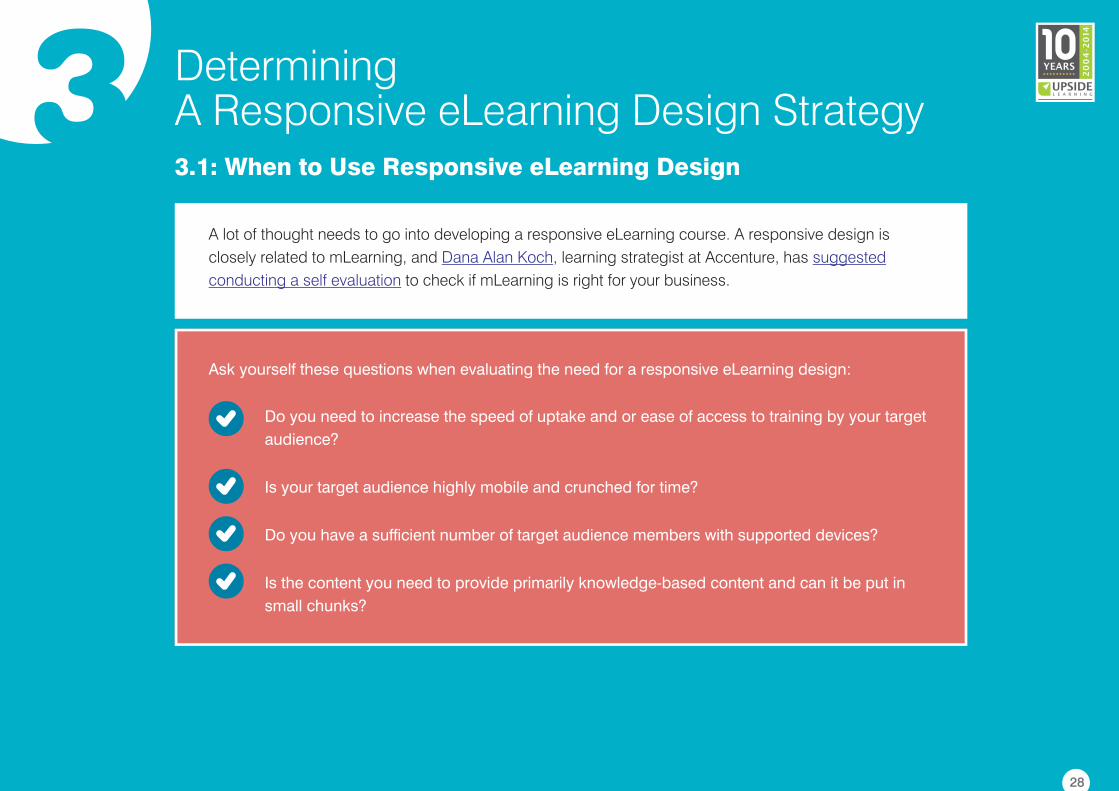
A lot of thought needs to go into developing a responsive eLearning course. A responsive design is
closely related to mLearning, and , learning strategist at Accenture, has
to check if mLearning is right for your business.
Dana Alan Koch suggested
conducting a self evaluation
Do you need to increase the speed of uptake and or ease of access to training by your target
audience?
Is your target audience highly mobile and crunched for time?
Do you have a sufficient number of target audience members with supported devices?
Is the content you need to provide primarily knowledge-based content and can it be put in
small chunks?
Ask yourself these questions when evaluating the need for a responsive eLearning design:
28
3 DeterminingA Responsive eLearning Design Strategy
3.1: When to Use Responsive eLearning Design
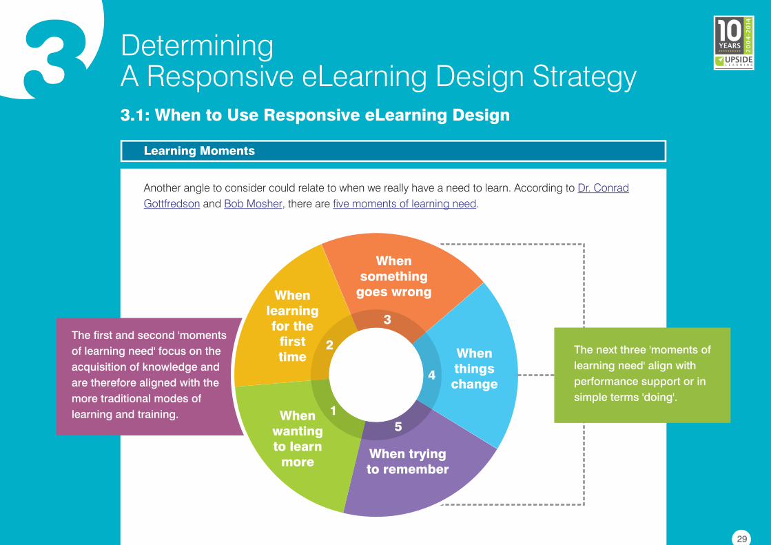
Another angle to consider could relate to when we really have a need to learn. According to
and , there are .
Dr. Conrad
Gottfredson Bob Mosher five moments of learning need
Learning Moments
29
When learning for the
first time
When wanting to learn
moreWhen trying to remember
When things change
When something
goes wrong
The next three 'moments of
learning need' align with
performance support or in
simple terms 'doing'.
The first and second 'moments
of learning need' focus on the
acquisition of knowledge and
are therefore aligned with the
more traditional modes of
learning and training.
3
4
51
2
3 DeterminingA Responsive eLearning Design Strategy
3.1: When to Use Responsive eLearning Design
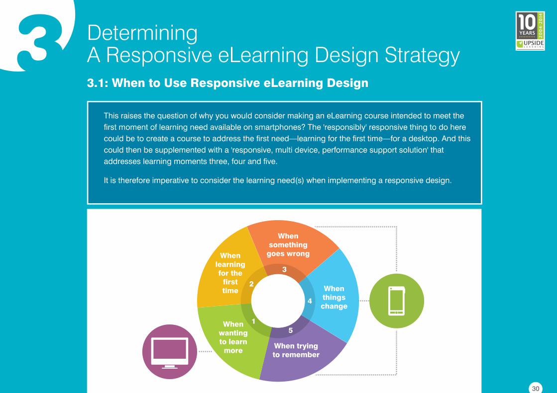
This raises the question of why you would consider making an eLearning course intended to meet the
first moment of learning need available on smartphones? The 'responsibly' responsive thing to do here
could be to create a course to address the first need—learning for the first time—for a desktop. And this
could then be supplemented with a 'responsive, multi device, performance support solution' that
addresses learning moments three, four and five.
It is therefore imperative to consider the learning need(s) when implementing a responsive design.
30
When learning for the
first time
When wanting to learn
moreWhen trying to remember
When things change
When something
goes wrong
3
4
51
2
3 DeterminingA Responsive eLearning Design Strategy3.2: Getting Started Responsively
Designing, developing, testing and launching a responsively designed eLearning course requires intricate
planning and execution. While there are a few frameworks and tools to assist designers in developing a
responsive course, the process still is time consuming. Hence planning plays a pivotal role when
developing a responsive eLearning design.
Here are some best practices to keep in mind when planning for a responsive course:
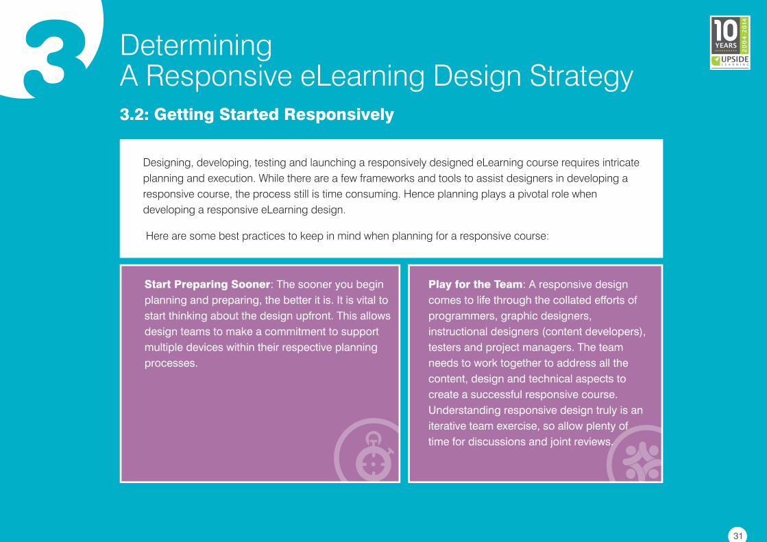
Start Preparing Sooner: The sooner you begin
planning and preparing, the better it is. It is vital to
start thinking about the design upfront. This allows
design teams to make a commitment to support
multiple devices within their respective planning
processes.
Play for the Team: A responsive design
comes to life through the collated efforts of
programmers, graphic designers,
instructional designers (content developers),
testers and project managers. The team
needs to work together to address all the
content, design and technical aspects to
create a successful responsive course.
Understanding responsive design truly is an
iterative team exercise, so allow plenty of
time for discussions and joint reviews.
31
3 DeterminingA Responsive eLearning Design Strategy3.2: Getting Started Responsively
Progressive Enhancement or Graceful Degradation: Progressive enhancement and graceful
degradation are two sides of the same coin. In the graceful degradation technique, courses are
designed with desktops and possibly tablets in mind as primary display devices, and the content is then
restructured for smaller devices. With progressive enhancement, the primary target device is the
smartphone. The design is focused around smaller display sizes, and content is then readjusted for
larger screens. The choice of design approaches depends upon the nature and scope of the project, but
making the right choice is vital.
Target Devices: Clearly identify the targeted
primary and secondary devices right at the
outset. This will help determine whether to go
with a desktop first or a mobile first approach,
and the design and development approach
can then be aligned accordingly.
Content Treatment and Use Contexts:
Understand the nature of the content and the
overall learning outcomes, as well as the context
in which the learning material will be accessed.
Sometimes, it may not be possible - or even
necessary - to effectively display all content on a
smaller screen by simply shrinking or resizing it.
It is important to identify such content in the
beginning stages, and work out alternative
approaches where required.
32
3 DeterminingA Responsive eLearning Design Strategy3.2: Getting Started Responsively
Delivery and Compliance: Online and/or
offline delivery mechanism(s) should be
considered during initial planning, especially
from the technical viewpoint. It's also
important to know what learning standards
and compliances will need to be adhered to.
Testing, Testing and Some More Testing:
Remember you are designing a course that
can be launched on a variety of different
devices running different operating systems
and through different browsers. For the
product to run seamlessly it takes a great deal
more testing. This testing should be
conducted on as many device and browser
combinations as possible. Never forget to
allocate ample time for the testing exercise.
33
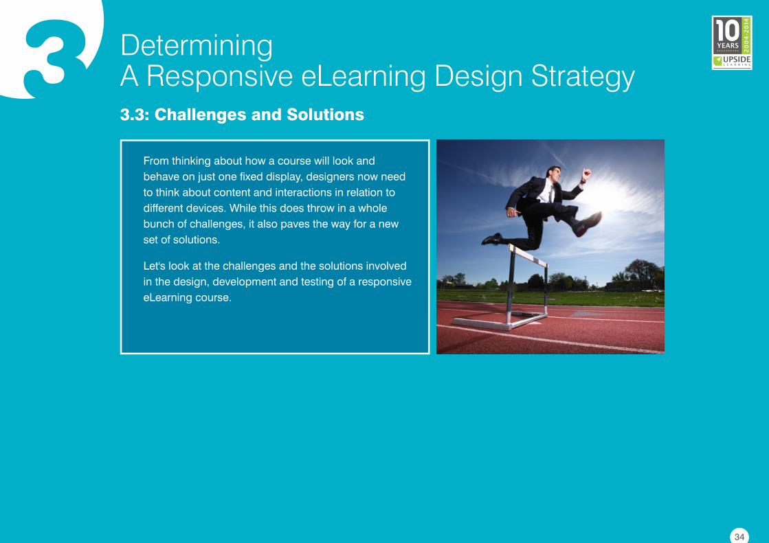
3 DeterminingA Responsive eLearning Design Strategy3.3: Challenges and Solutions
From thinking about how a course will look and
behave on just one fixed display, designers now need
to think about content and interactions in relation to
different devices. While this does throw in a whole
bunch of challenges, it also paves the way for a new
set of solutions.
Let's look at the challenges and the solutions involved
in the design, development and testing of a responsive
eLearning course.
34
3 DeterminingA Responsive eLearning Design Strategy3.3: Challenges and Solutions
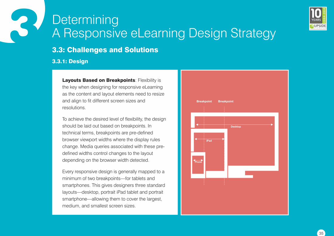
3.3.1: Design
Layouts Based on Breakpoints: Flexibility is
the key when designing for responsive eLearning
as the content and layout elements need to resize
and align to fit different screen sizes and
resolutions.
To achieve the desired level of flexibility, the design
should be laid out based on breakpoints. In
technical terms, breakpoints are pre-defined
browser viewport widths where the display rules
change. Media queries associated with these pre-
defined widths control changes to the layout
depending on the browser width detected.
Every responsive design is generally mapped to a
minimum of two breakpoints—for tablets and
smartphones. This gives designers three standard
layouts—desktop, portrait iPad tablet and portrait
smartphone—allowing them to cover the largest,
medium, and smallest screen sizes.
Desktop
iPad
Phone
Breakpoint Breakpoint
35
3 DeterminingA Responsive eLearning Design Strategy3.3: Challenges and Solutions
3.3.1: Design
Think Device Classes: When thinking about breakpoints, it's vital that designers remember to consider
about device classes. If you are thinking smartphones, tablets, laptops/desktops, TVs, you are in the right
direction. But, if you are thinking about brand names, then you are going the wrong way.
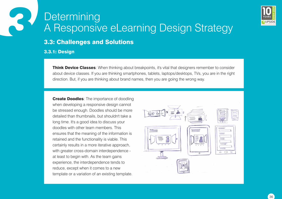
Create Doodles: The importance of doodling
when developing a responsive design cannot
be stressed enough. Doodles should be more
detailed than thumbnails, but shouldn't take a
long time. It's a good idea to discuss your
doodles with other team members. This
ensures that the meaning of the information is
retained and the functionality is viable. This
certainly results in a more iterative approach,
with greater cross-domain interdependence -
at least to begin with. As the team gains
experience, the interdependence tends to
reduce, except when it comes to a new
template or a variation of an existing template.
36
3 DeterminingA Responsive eLearning Design Strategy3.3: Challenges and Solutions
3.3.1: Design
The Right Font: A major challenge in designing responsive eLearning is the selection of the right font.
The right font ensures good readability across devices. When selecting the right font designers need to
think about several considerations. We have listed a few here:
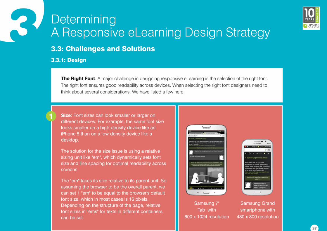
Size: Font sizes can look smaller or larger on
different devices. For example, the same font size
looks smaller on a high-density device like an
iPhone 5 than on a low-density device like a
desktop.
The solution for the size issue is using a relative
sizing unit like "em", which dynamically sets font
size and line spacing for optimal readability across
screens.
The "em" takes its size relative to its parent unit. So
assuming the browser to be the overall parent, we
can set 1 "em" to be equal to the browser's default
font size, which in most cases is 16 pixels.
Depending on the structure of the page, relative
font sizes in "ems" for texts in different containers
can be set.
1
Samsung 7"
Tab with
600 x 1024 resolution
Samsung Grand
smartphone with
480 x 800 resolution
37
3 DeterminingA Responsive eLearning Design Strategy3.3: Challenges and Solutions
3.3.1: Design
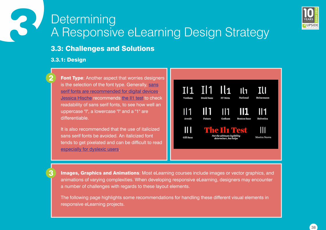
Font Type: Another aspect that worries designers
is the selection of the font type. Generally,
.
recommends to check
readability of sans serif fonts, to see how well an
uppercase "I", a lowercase "l" and a "1" are
differentiable.
It is also recommended that the use of italicized
sans serif fonts be avoided. An italicized font
tends to get pixelated and can be difficult to read
.
sans
serif fonts are recommended for digital devices
Jessica Hische the Il1 test
especially for dyslexic users
2
Images, Graphics and Animations: Most eLearning courses include images or vector graphics, and
animations of varying complexities. When developing responsive eLearning, designers may encounter
a number of challenges with regards to these layout elements.
The following page highlights some recommendations for handling these different visual elements in
responsive eLearning projects.
3
38
3 DeterminingA Responsive eLearning Design Strategy3.3: Challenges and Solutions
3.3.1: Design
Resizing JPGs and PNGs: Photos or vector graphics can be exported as JPGs or PNGs. There are a
couple of options to resize JPGs and PNGs to fit different display sizes.a
Scaling: Scaling is nothing
but resizing images based
on screen size. Scaling
raster (bitmap) images may
lead to quality loss. It is
therefore recommended to
use bigger images, and
dynamically scale them
down based on device size.
Combination: The third
and final option is to
combine both the above
approaches to dynamically
crop and then scale images
depending on device size.
Cropping: When images are
scaled to a very small size,
details can no longer be seen
and their meaning can get
lost. An effective alternative is
to crop the image around a
focus area that holds the
meaning. This means using a
larger image, and then
reducing its size by cutting
non-essential areas.
39
3 DeterminingA Responsive eLearning Design Strategy3.3: Challenges and Solutions
3.3.1: Design
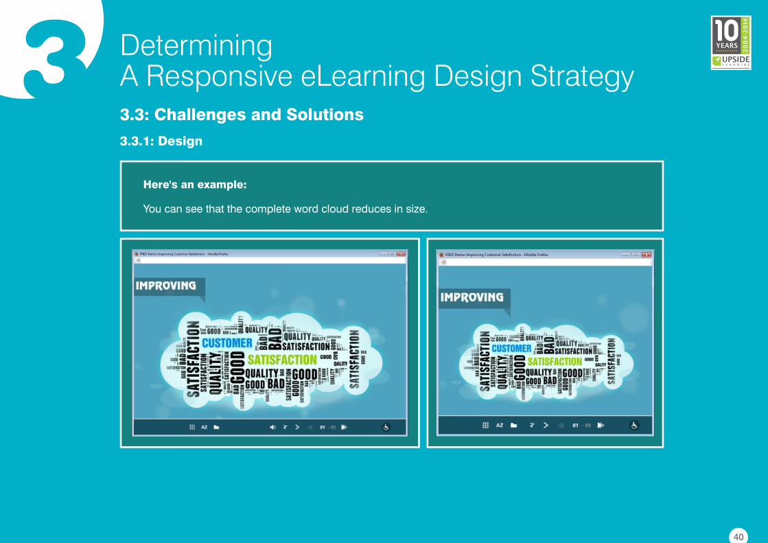
Here's an example:
You can see that the complete word cloud reduces in size.
40
3 DeterminingA Responsive eLearning Design Strategy3.3: Challenges and Solutions
3.3.1: Design
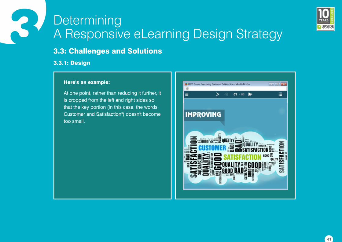
Here's an example:
At one point, rather than reducing it further, it
is cropped from the left and right sides so
that the key portion (in this case, the words
Customer and Satisfaction") doesn't become
too small.
41
3 DeterminingA Responsive eLearning Design Strategy3.3: Challenges and Solutions
3.3.1: Design
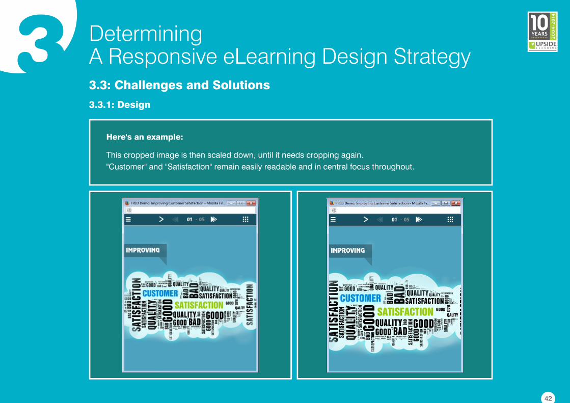
Here's an example:
This cropped image is then scaled down, until it needs cropping again.
"Customer" and "Satisfaction" remain easily readable and in central focus throughout.
42
3 DeterminingA Responsive eLearning Design Strategy3.3: Challenges and Solutions
3.3.1: Design
SVGs and SVG Animations: Converting vectors to images and then scaling them can lead to quality
loss. A better solution is to convert vectors to Scalable Vector Graphics (SVG) format.
The SVG format offers the following benefits:
�It bypasses the problem of screen resolution.
�It is built with XML, and therefore gives a relatively lightweight file.
�It can be manipulated and styled just like any other element on a Web page.
b
SVGs can be static, animated (for short, simple animations) or interactive. Small animations created in
Flash can be converted into SVGs . But SVGs come with a disclaimer. Some older
browsers like IE 8 and its earlier versions do not support the SVG format. So the best and
recommended practice is to in targeted browsers before using them.
using Swiffy
verify browser support
43
3 DeterminingA Responsive eLearning Design Strategy3.3: Challenges and Solutions
3.3.1: Design
Icon Fonts: An alternative to SVGs are . These are font families that contain a set of
predesigned icons. Icon fonts behave just like any other font—their colour and size can be changed; a
hover effect, varying levels of transparency or a shadow effect can be added. They can also be made
interactive. Compared to SVGs, icon fonts are smaller in size and are supported on lower versions of
IE. On the downside, icon fonts cannot be given gradients; and if not Web safe, they need to be
embedded into the eLearning package.
icon fontsc
44
3 DeterminingA Responsive eLearning Design Strategy3.3: Challenges and Solutions
3.3.1: Design
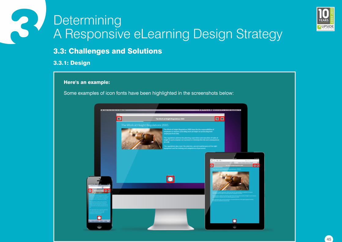
Here's an example:
Some examples of icon fonts have been highlighted in the screenshots below:
45
3 DeterminingA Responsive eLearning Design Strategy3.3: Challenges and Solutions
3.3.1: Design
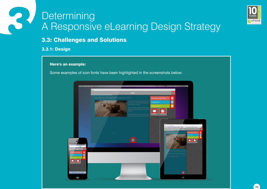
Here's an example:
Some examples of icon fonts have been highlighted in the screenshots below:
46
3 DeterminingA Responsive eLearning Design Strategy3.3: Challenges and Solutions
3.3.1: Design
Sprite Sheets: Using CSS sprite sheets is recommended if a responsive design contains a lot of
small, short, looped or reused animations.
A sprite sheet is a single PNG image that contains a sequential array of smaller, distinct images or
graphics that make up an animation. These smaller images/graphics (frames) get displayed in quick
succession, so it seems like an animation.
d
Sprite sheets offer several benefits:
�They tend to have a smaller file size (as opposed to if each image were saved as a separate file).
�They consume less memory and resources as compared to video animations.
�They load quickly as only one file needs to be picked up.
�The viewport can be easily adjusted to view one or more frames at a time.
However, keep in mind that sprite sheets can have certain dimension and depending
on the resolution and the RAM size of the device on which they are displayed.
file size limitations
47
3 DeterminingA Responsive eLearning Design Strategy3.3: Challenges and Solutions
3.3.1: Design
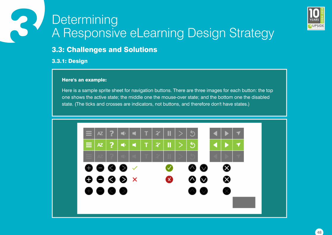
Here's an example:
Here is a sample sprite sheet for navigation buttons. There are three images for each button: the top
one shows the active state; the middle one the mouse-over state; and the bottom one the disabled
state. (The ticks and crosses are indicators, not buttons, and therefore don't have states.)
48
3 DeterminingA Responsive eLearning Design Strategy3.3: Challenges and Solutions
3.3.1: Design
Interactive and Navigation Elements: Interactivities and navigational elements form an important
part of an eLearning course. Presenting elements like a multi-layer drop-down menu or an accordion
interactivity on a desktop screen is no big deal. But on smaller devices, designers will always encounter
the problem of limited screen space. And, this makes designing intuitive interactivities and navigational
menus a challenge.
e
49
3 DeterminingA Responsive eLearning Design Strategy3.3: Challenges and Solutions
3.3.1: Design
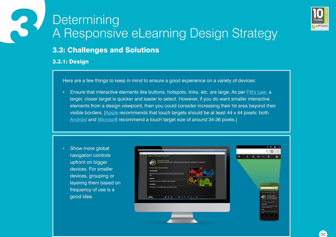
�Show more global
navigation controls
upfront on bigger
devices. For smaller
devices, grouping or
layering them based on
frequency of use is a
good idea.
Here are a few things to keep in mind to ensure a good experience on a variety of devices:
�Ensure that interactive elements like buttons, hotspots, links, etc. are large. As per , a
larger, closer target is quicker and easier to select. However, if you do want smaller interactive
elements from a design viewpoint, then you could consider increasing their hit area beyond their
visible borders. [ recommends that touch targets should be at least 44 x 44 pixels; both
and recommend a touch target size of around 34-36 pixels.]
Fitt's Law
Apple
Android Microsoft
50
3 DeterminingA Responsive eLearning Design Strategy3.3: Challenges and Solutions
3.3.1: Design
�Make sure interactive elements look distinctive. The users should be able to figure out just by
looking at an element that it's clickable or touchable. This is all the more important on touch-based
devices as these do not support hover effects.
51
3 DeterminingA Responsive eLearning Design Strategy3.3: Challenges and Solutions
3.3.2: Development
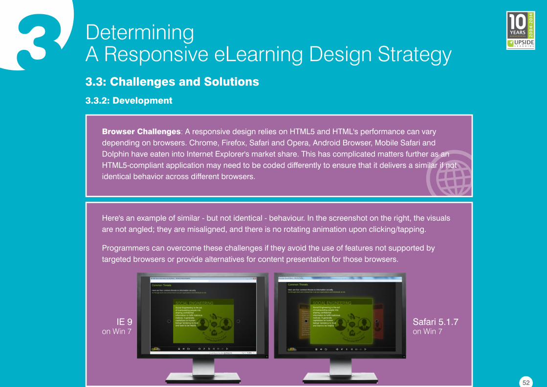
Browser Challenges: A responsive design relies on HTML5 and HTML's performance can vary
depending on browsers. Chrome, Firefox, Safari and Opera, Android Browser, Mobile Safari and
Dolphin have eaten into Internet Explorer's market share. This has complicated matters further as an
HTML5-compliant application may need to be coded differently to ensure that it delivers a similar if not
identical behavior across different browsers.
Here's an example of similar - but not identical - behaviour. In the screenshot on the right, the visuals
are not angled; they are misaligned, and there is no rotating animation upon clicking/tapping.
Programmers can overcome these challenges if they avoid the use of features not supported by
targeted browsers or provide alternatives for content presentation for those browsers.
IE 9 on Win 7
Safari 5.1.7 on Win 7
52
3 DeterminingA Responsive eLearning Design Strategy3.3: Challenges and Solutions
3.3.2: Development
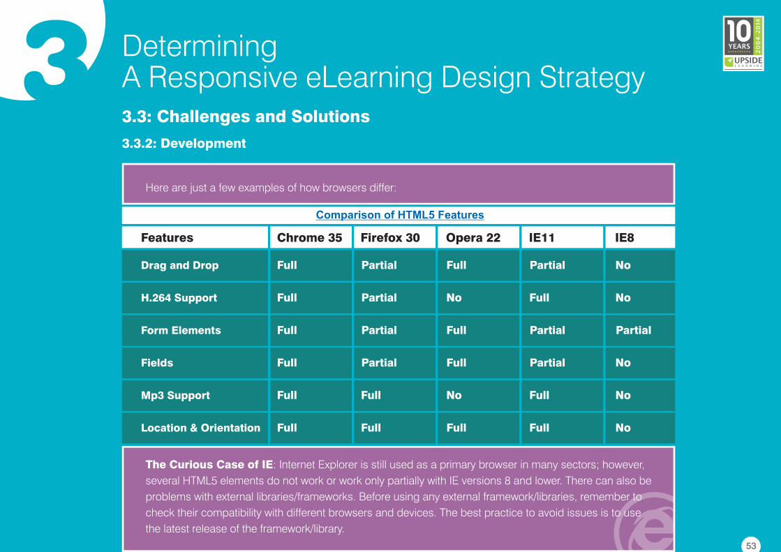
Here are just a few examples of how browsers differ:
Chrome 35Features IE8
Drag and Drop
Firefox 30 Opera 22 IE11
NoPartialFullPartialFull
H.264 Support NoFullNoPartialFull
Form Elements PartialPartialFullPartialFull
Fields NoPartialFullPartialFull
Mp3 Support NoFullNoFullFull
Location & Orientation NoFullFullFullFull
The Curious Case of IE: Internet Explorer is still used as a primary browser in many sectors; however,
several HTML5 elements do not work or work only partially with IE versions 8 and lower. There can also be
problems with external libraries/frameworks. Before using any external framework/libraries, remember to
check their compatibility with different browsers and devices. The best practice to avoid issues is to use
the latest release of the framework/library.
Comparison of HTML5 Features
53
3 DeterminingA Responsive eLearning Design Strategy3.3: Challenges and Solutions
3.3.2: Development
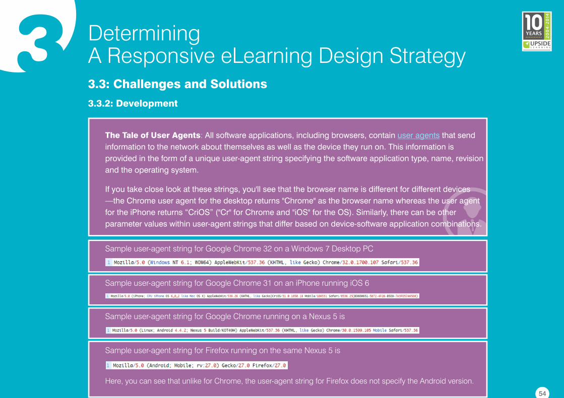
The Tale of User Agents: All software applications, including browsers, contain that send
information to the network about themselves as well as the device they run on. This information is
provided in the form of a unique user-agent string specifying the software application type, name, revision
and the operating system.
If you take close look at these strings, you'll see that the browser name is different for different devices
—the Chrome user agent for the desktop returns "Chrome" as the browser name whereas the user agent
for the iPhone returns “CriOS” ("Cr" for Chrome and "iOS" for the OS). Similarly, there can be other
parameter values within user-agent strings that differ based on device-software application combinations.
user agents
Sample user-agent string for Google Chrome 32 on a Windows 7 Desktop PC
Sample user-agent string for Google Chrome 31 on an iPhone running iOS 6
Sample user-agent string for Google Chrome running on a Nexus 5 is
Here, you can see that unlike for Chrome, the user-agent string for Firefox does not specify the Android version.
Sample user-agent string for Firefox running on the same Nexus 5 is
54
3 DeterminingA Responsive eLearning Design Strategy3.3: Challenges and Solutions
3.3.2: Development
When developing responsive eLearning design in HTML, developers need to be aware of the different
user-agent strings for each targeted device-browser-platform combination. They need to code
accordingly to develop eLearning which is compatible across all user agents, so that information or
content can be displayed accordingly.
Media Issues (Audio/Video): Browsers use HTML5 <video> and <audio> tags to play media, and
most of them support different video (e.g., MP4, OGV and WebM) and audio (e.g., MP3, OGG and WAV)
formats. The hiccup here is you'll need to include audio/video files in ALL these formats to cover a wide
range of devices. Also, if you want the video quality to adapt to the users' connection speed (useful when
targeting mobile devices), you will have to create multiple versions of the same video or consider using a
media server to stream videos; however, that comes with certain limitations as well. Note that having
multiple versions of the same video/audio file will also have an effect on the size of the eLearning
package which could be problematic depending on the LMS's upload limits.
55
3 DeterminingA Responsive eLearning Design Strategy3.3: Challenges and Solutions
3.3.2: Development
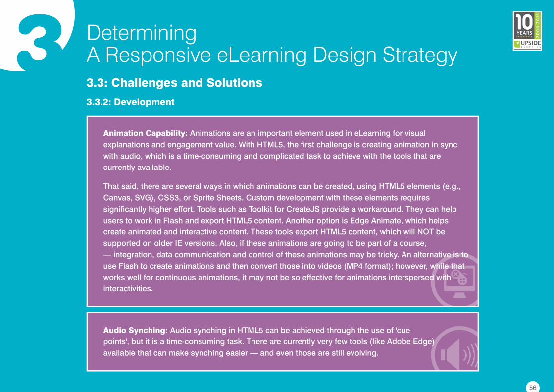
Animation Capability: Animations are an important element used in eLearning for visual
explanations and engagement value. With HTML5, the first challenge is creating animation in sync
with audio, which is a time-consuming and complicated task to achieve with the tools that are
currently available.
That said, there are several ways in which animations can be created, using HTML5 elements (e.g.,
Canvas, SVG), CSS3, or Sprite Sheets. Custom development with these elements requires
significantly higher effort. Tools such as Toolkit for CreateJS provide a workaround. They can help
users to work in Flash and export HTML5 content. Another option is Edge Animate, which helps
create animated and interactive content. These tools export HTML5 content, which will NOT be
supported on older IE versions. Also, if these animations are going to be part of a course,
— integration, data communication and control of these animations may be tricky. An alternative is to
use Flash to create animations and then convert those into videos (MP4 format); however, while that
works well for continuous animations, it may not be so effective for animations interspersed with
interactivities.
Audio Synching: Audio synching in HTML5 can be achieved through the use of 'cue
points', but it is a time-consuming task. There are currently very few tools (like Adobe Edge)
available that can make synching easier — and even those are still evolving.
56
3 DeterminingA Responsive eLearning Design Strategy3.3: Challenges and Solutions
3.3.3: Testing
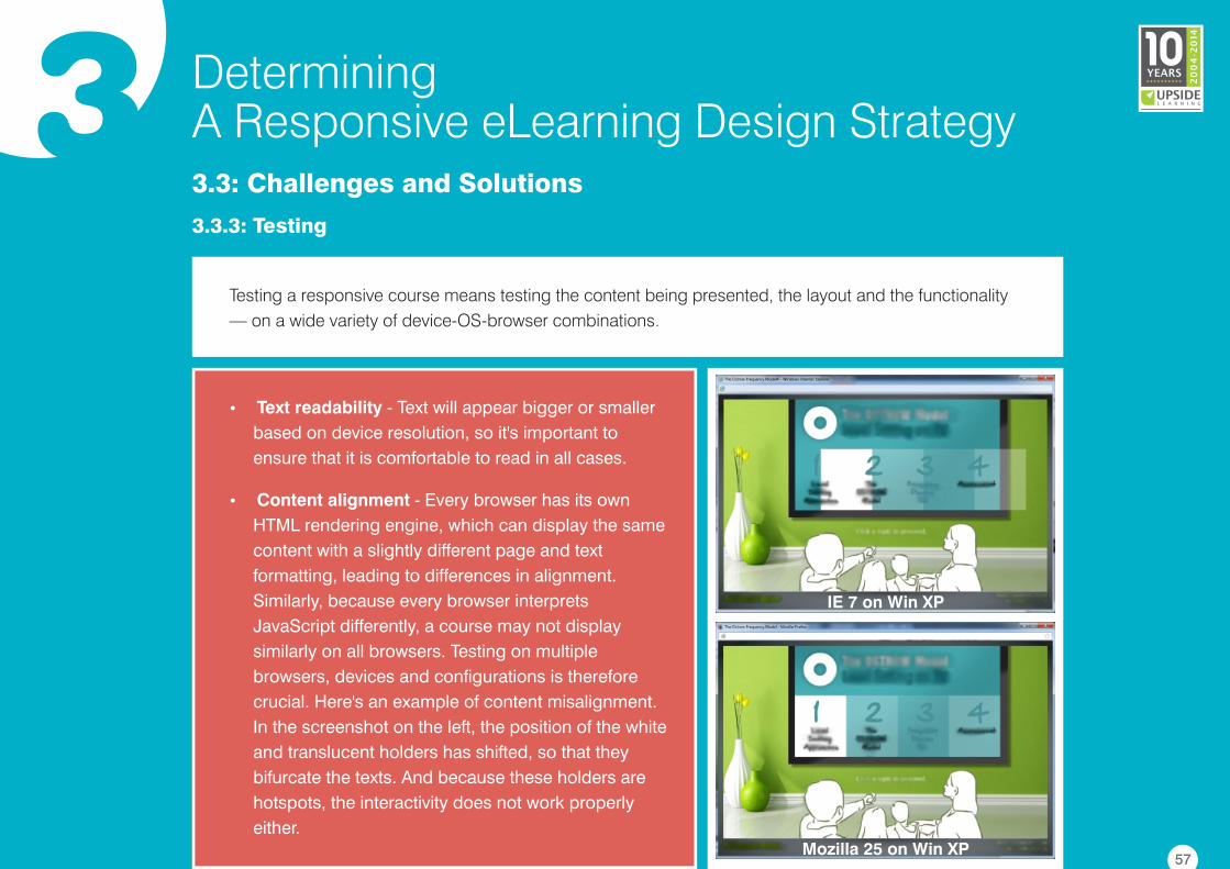
�Text readability - Text will appear bigger or smaller
based on device resolution, so it's important to
ensure that it is comfortable to read in all cases.
�Content alignment - Every browser has its own
HTML rendering engine, which can display the same
content with a slightly different page and text
formatting, leading to differences in alignment.
Similarly, because every browser interprets
JavaScript differently, a course may not display
similarly on all browsers. Testing on multiple
browsers, devices and configurations is therefore
crucial. Here's an example of content misalignment.
In the screenshot on the left, the position of the white
and translucent holders has shifted, so that they
bifurcate the texts. And because these holders are
hotspots, the interactivity does not work properly
either.
IE 7 on Win XP
Mozilla 25 on Win XP
Testing a responsive course means testing the content being presented, the layout and the functionality
— on a wide variety of device-OS-browser combinations.
57
3 DeterminingA Responsive eLearning Design Strategy3.3: Challenges and Solutions
3.3.3: Testing
�Target areas for touch interactions - The smaller the device, the harder it can be to touch a
precise spot. While testing, check that touch targets are large and wide apart enough to be
comfortably used.
�Navigation controls - While there may be space on larger devices to display all navigation
controls upfront, it is recommended that they be logically grouped and layered on smaller devices.
When testing, check the location of the controls and how well they have been grouped and layered
in terms of frequency of use.
�Visual cues for new or specific gestures on touch devices - If the eLearning course includes
interactivities or navigation that require specific gestures, check whether there are clear and explicit
visual cues right at the beginning and or the first time such gestures are required.
�User instructions - If device-specific instructions are being used (e.g. click/tap), then make sure
the right instructions are displayed on the different types of test devices. If task-based instructions
are being used (e.g. explore, find out, go through), then check to see whether they provide the
required clarity in terms of what the learner is expected to do.
58
3 DeterminingA Responsive eLearning Design Strategy3.3: Challenges and Solutions
3.3.3: Testing
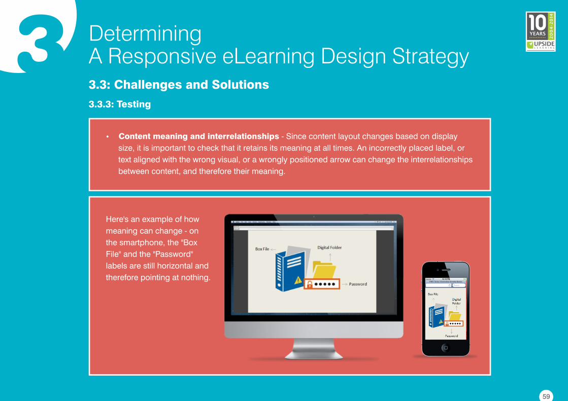
�Content meaning and interrelationships - Since content layout changes based on display
size, it is important to check that it retains its meaning at all times. An incorrectly placed label, or
text aligned with the wrong visual, or a wrongly positioned arrow can change the interrelationships
between content, and therefore their meaning.
Here's an example of how
meaning can change - on
the smartphone, the "Box
File" and the "Password"
labels are still horizontal and
therefore pointing at nothing.
59
3 DeterminingA Responsive eLearning Design Strategy3.3: Challenges and Solutions
3.3.3: Testing
Testing responsive eLearning is a complex and intricate activity. Tools like Ghostlab or
can reduce testing time to a certain extent. , for example, allows testers to wirelessly pair
multiple iOS, Android, Windows, and BlackBerry devices to their computer and sync them. Changes can
be simultaneously seen on all connected devices:
If you don't have sufficient physical devices, you can also use SDK simulators for different operating
systems or web-based simulators like BrowserStack for testing. SDK simulators need to be installed on
local machines. The target (OS) environment can be simulated and testers can see the simulated results
of any changes. can be used to test how a course functions on different devices and
operating platforms including iOS, Android and Windows.
Adobe Edge
Inspect Ghostlab
BrowserStack
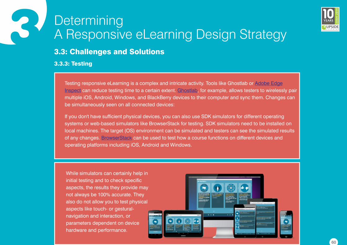
While simulators can certainly help in
initial testing and to check specific
aspects, the results they provide may
not always be 100% accurate. They
also do not allow you to test physical
aspects like touch- or gestural-
navigation and interaction, or
parameters dependent on device
hardware and performance.
60
3 DeterminingA Responsive eLearning Design Strategy3.3: Challenges and Solutions
3.3.3: Testing
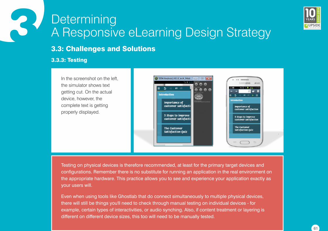
In the screenshot on the left,
the simulator shows text
getting cut. On the actual
device, however, the
complete text is getting
properly displayed.
Testing on physical devices is therefore recommended, at least for the primary target devices and
configurations. Remember there is no substitute for running an application in the real environment on
the appropriate hardware. This practice allows you to see and experience your application exactly as
your users will.
Even when using tools like Ghostlab that do connect simultaneously to multiple physical devices,
there will still be things you'll need to check through manual testing on individual devices - for
example, certain types of interactivities, or audio synching. Also, if content treatment or layering is
different on different device sizes, this too will need to be manually tested.
61
3 DeterminingA Responsive eLearning Design Strategy3.3: Challenges and Solutions
3.3.3: Testing
Testing — or rather checking to see how the eLearning looks and works - comes into play from a
programmer's viewpoint too — both during development itself and while fixing any issues logged
during the testing stage.
With responsive eLearning, the most common causes for issues could be:
• The code is not HTML5 compliant.
• The code is not compliant with a specific browser.
• The code is neither HTML5 nor specific-browser compliant.
A programmer must check the code and logic to identify the correct cause and make the required fixes;
and as browsers and the HTML5 standard continue to evolve, the process of identifying the causes of
issues will also continue to evolve.
While checking, a programmer needs to load the page on every device and follow the same steps every
time they make changes to the code. Programmers too can benefit to a certain extent from the use of
tools and simulators; however, for them as well, there's no escaping checking on physical devices.
62
4 Conclusion
With the changing learning and computing paradigms, the need and demand for responsive design in
eLearning is certainly on the rise.
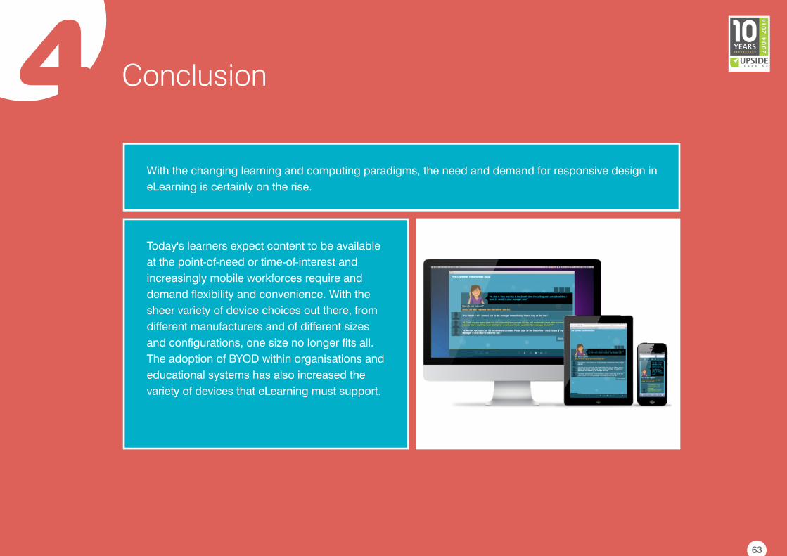
Today's learners expect content to be available
at the point-of-need or time-of-interest and
increasingly mobile workforces require and
demand flexibility and convenience. With the
sheer variety of device choices out there, from
different manufacturers and of different sizes
and configurations, one size no longer fits all.
The adoption of BYOD within organisations and
educational systems has also increased the
variety of devices that eLearning must support.
63
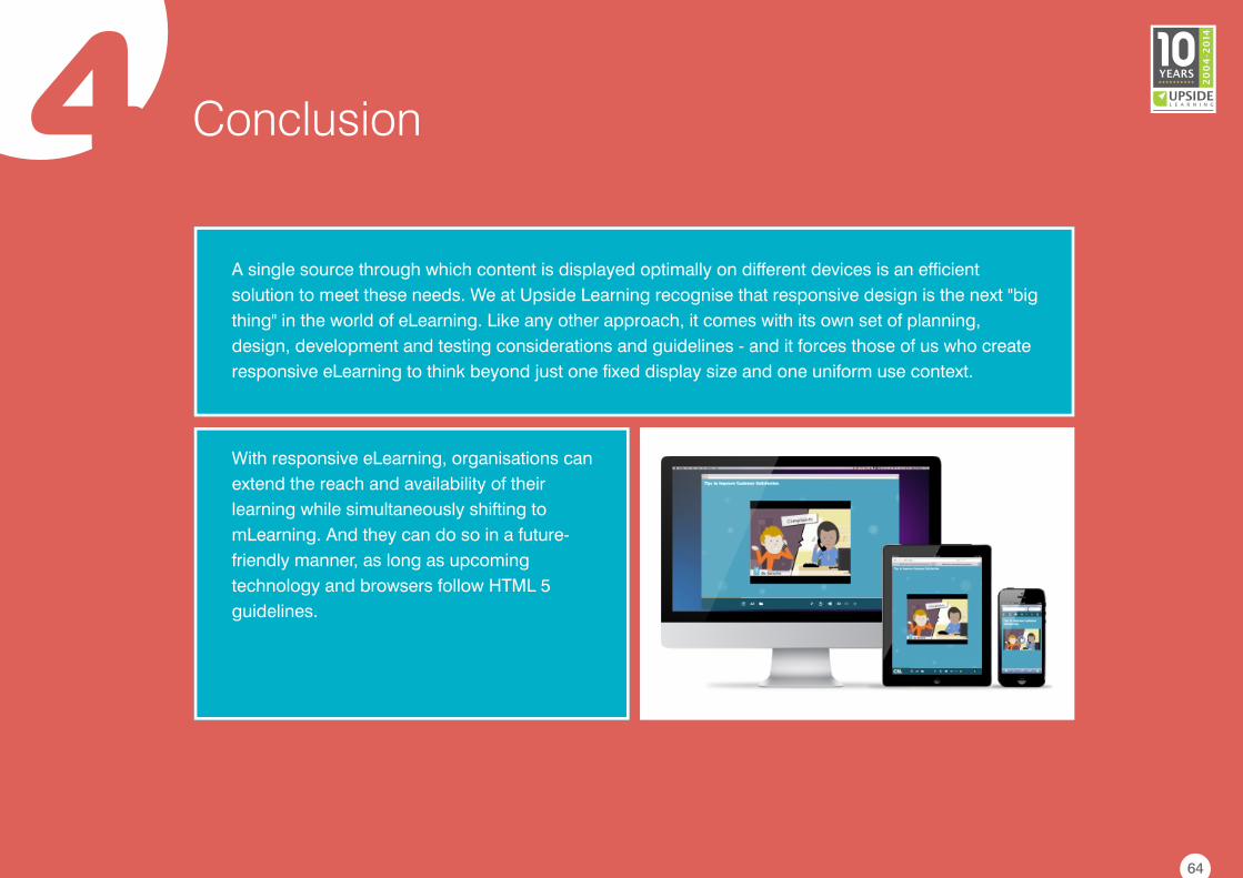
4 Conclusion
A single source through which content is displayed optimally on different devices is an efficient
solution to meet these needs. We at Upside Learning recognise that responsive design is the next "big
thing" in the world of eLearning. Like any other approach, it comes with its own set of planning,
design, development and testing considerations and guidelines - and it forces those of us who create
responsive eLearning to think beyond just one fixed display size and one uniform use context.
With responsive eLearning, organisations can
extend the reach and availability of their
learning while simultaneously shifting to
mLearning. And they can do so in a future-
friendly manner, as long as upcoming
technology and browsers follow HTML 5
guidelines.
64
Share Some Love
The more you share, the more you receive!
So why not share this knowledge with your colleagues and friends? Just click on the social media
icons and let the love flow. Share it (the ebook) freely!
Wondering where can you find other awesome eBooks on a variety of topics in eLearning?
Just log on to – www.upsidelearning.com/free-elearning-ebooks.asp
65
References
http://aaron-gustafson.com/
http://abookapart.com/products/responsive-web-design
http://alistapart.com/article/fluidgrids
http://alistapart.com/article/responsive-web-design/
http://applysynergies.com/about-us/bob-mosher
http://applysynergies.com/about-us/dr-conrad-gottfredson
http://astd.org/Publications/Author.aspx?ItemId=BD39A9347D6A44159820450D598695A4
http://blog.pickcrew.com/the-science-behind-fonts-and-how-they-make-you-feel/
http://browserstack.com/
http://caniuse.com/#search=svg
http://codecraftingblueprints.com/make-click-areas-comfortably-large/
https://creative.adobe.com/products/inspect
https://css-tricks.com/examples/IconFont/
http://despreneur.com/responsive-web-design-vs-adaptive-web-design-whats-the-difference/
http://despreneur.com/responsive-web-design-vs-adaptive-web-design-whats-the-difference/
http://developer.android.com/design/patterns/accessibility.html
https://developer.apple.com/library/ios/documentation/userexperience/conceptual/mobilehig/LayoutandAppearance.html66
References
https://developer.mozilla.org/en-US/docs/Tools/Responsive_Design_View
http://easy-readers.net/books/adaptive-web-design/
http://en.wikipedia.org/wiki/Fitts's_law
http://en.wikipedia.org/wiki/Jessica_Hische
http://en.wikipedia.org/wiki/Responsive_Web_Design
http://en.wikipedia.org/wiki/User_agent
http://en.wikipedia.org/wiki/Web_typography
http://en.wikipedia.org/wiki/World_Wide_Web_Consortium
http://ericsson.com/jm/news/1430616
http://ericsson.com/res/docs/2013/ericsson-mobility-report-june-2013.pdf
http://ethanmarcotte.com/
http://googlecode.blogspot.in/2011/06/swiffy-convert-swf-files-to-html5.html
http://html5test.com/compare/browser/chrome-35/firefox-30/opera-22/ie-11/ie-8.html
http://jessicahische.is/talkingtype
http://learningsolutionsmag.com/articles/949/
http://liquidapsive.com/
67
References
http://msdn.microsoft.com/en-us/library/windowsphone/design/hh202889%28v=vs.105%29.aspx
https://scirra.com/blog/87/under-the-hood-spritesheets-in-construct-2
http://smashingmagazine.com/2012/02/21/finger-friendly-design-ideal-mobile-touchscreen-target-sizes/
http://studiopress.com/design/google-font-combinations.htm
http://techrepublic.com/blog/web-designer/what-is-the-difference-between-responsive-vs-adaptive-web-design/
http://thinkwithgoogle.com/research-studies/the-new-multi-screen-world-study.html
http://thinkwithgoogle.com/research-studies/the-new-multi-screen-world-study.html
http://upsidelearning.com/blog/index.php/2010/07/14/creating-successful-mobile-learning-strategy-mlearncon-part-ii/
http://upsidelearning.com/blog/index.php/2014/02/13/top-6-html5-challenges/
http://upsidelearning.com/blog/index.php/2014/02/20/testing-of-multi-device-elearning-projects/
http://upsidelearning.com/blog/index.php/2014/04/15/design-challenges-and-considerations-for-responsive-elearning/
http://upsidelearning.com/blog/index.php/2014/05/20/5-key-guidelines-for-managing-responsive-elearning-projects/
http://uxmovement.com/content/6-surprising-bad-practices-that-hurt-dyslexic-users/
http://vanamco.com/ghostlab/
http://williammalone.com/articles/html5-javascript-ios-maximum-image-size/
http://zachis.it/blog/how-are-responsive-design-and-adaptive-design-different/
68
Authors
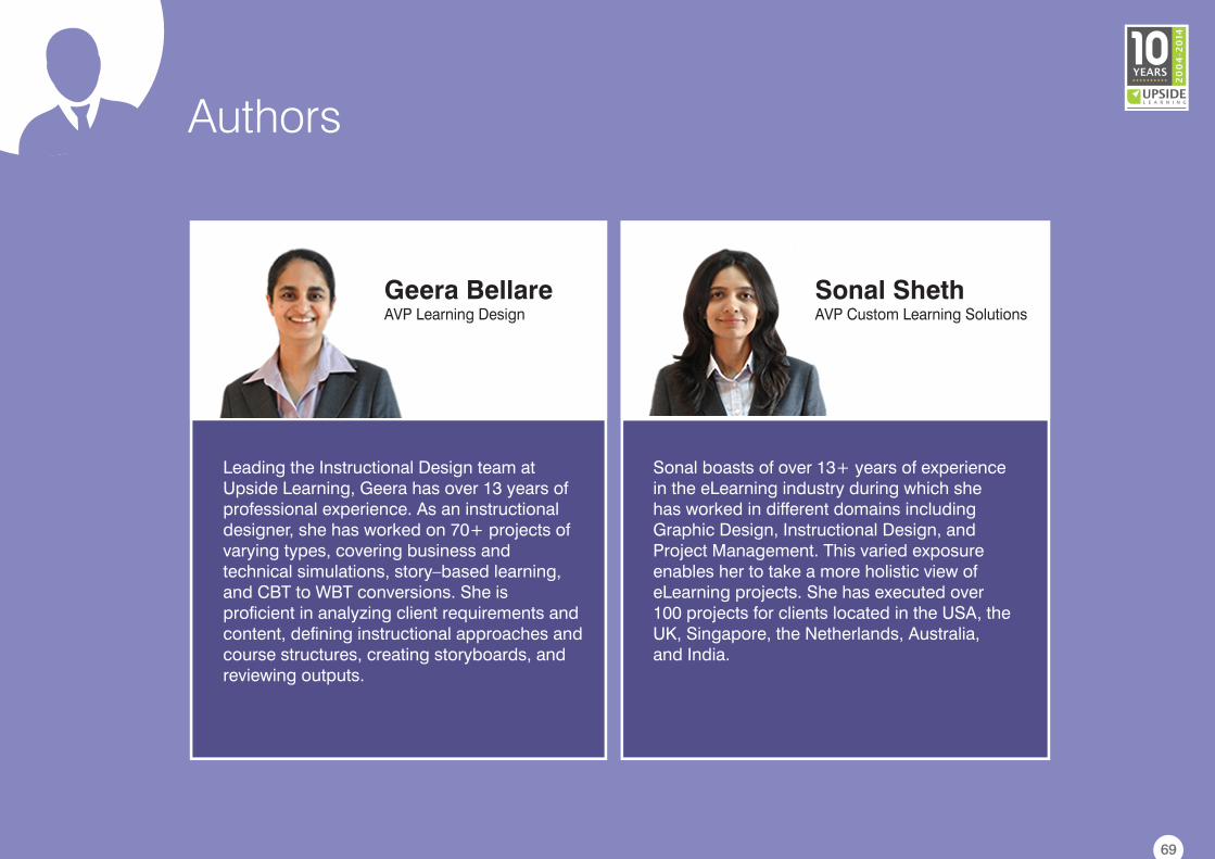
Geera BellareAVP Learning Design
Sonal boasts of over 13+ years of experience in the eLearning industry during which she has worked in different domains including Graphic Design, Instructional Design, and Project Management. This varied exposure enables her to take a more holistic view of eLearning projects. She has executed over 100 projects for clients located in the USA, the UK, Singapore, the Netherlands, Australia, and India.
Leading the Instructional Design team at Upside Learning, Geera has over 13 years of professional experience. As an instructional designer, she has worked on 70+ projects of varying types, covering business and technical simulations, story–based learning, and CBT to WBT conversions. She is proficient in analyzing client requirements and content, defining instructional approaches and course structures, creating storyboards, and reviewing outputs.
Sonal ShethAVP Custom Learning Solutions
69
About Upside Learning
70
Learn More: www.upsidelearning.com
Upside Learning is one of the world’s leading workplace learning technology solutions companies. For over 10
years, we have been helping organisations improve performance through our innovative learning solutions. With a
collective experience of 800+ person-years, we have successfully completed more than 1000 corporate and
academic projects for over 200 clients worldwide.
Our solutions and services portfolio comprises –
• UpsideLMS – A multi-award winning, best value Learning Management System
• Upside2Go - A mobile performance support platform
• Custom eLearning Solutions
• Custom mLearning Solutions
We have been consistently picking up awards and other recognition every year and today, boast of 30+ such
awards and recognitions received from renowned bodies in eLearning and technology. These include Brandon Hall
Research, Training Industry, Chief Learning Officer (CLO), Deloitte, Red Herring, APEX to name a few.


![Responsive Design Fundamentals [Read-Only] - … Design Fundame… · Responsive Design Fundamentals Carolyn Yon, PMI-ACP Development Manager ... Responsive Design • web design](https://img.pdfslide.us/doc/110x75/5b7c060b7f8b9adb4c8df8c4/responsive-design-fundamentals-read-only-design-fundame-responsive-design.jpg)