Embed Size (px)
Citation preview
Research Posters
Summary of Topics
• Posters – what are they and what are they used for• Poster content• Layout/organization• Good and bad practices in poster design
• Fonts• Colors• Graphics
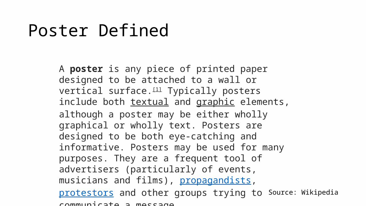
Poster Defined
A poster is any piece of printed paper designed to be attached to a wall or vertical surface.[1] Typically posters include both textual and graphic elements, although a poster may be either wholly graphical or wholly text. Posters are designed to be both eye-catching and informative. Posters may be used for many purposes. They are a frequent tool of advertisers (particularly of events, musicians and films), propagandists, protestors and other groups trying to communicate a message.
Source: Wikipedia
Research posters
• Represents a condensed, graphical or visual presentation of work by a researcher
• Allows an audience to see many different topics in a short time span • Allows a researcher to talk one-on-one in depth with interested
viewers (without boring the other audience members as would happen in a presentation)
• Poster sessions are normally part of technical conferences or meetings
• Allow studies/results that are not ready for publication in a journal or conference proceedings to be presented
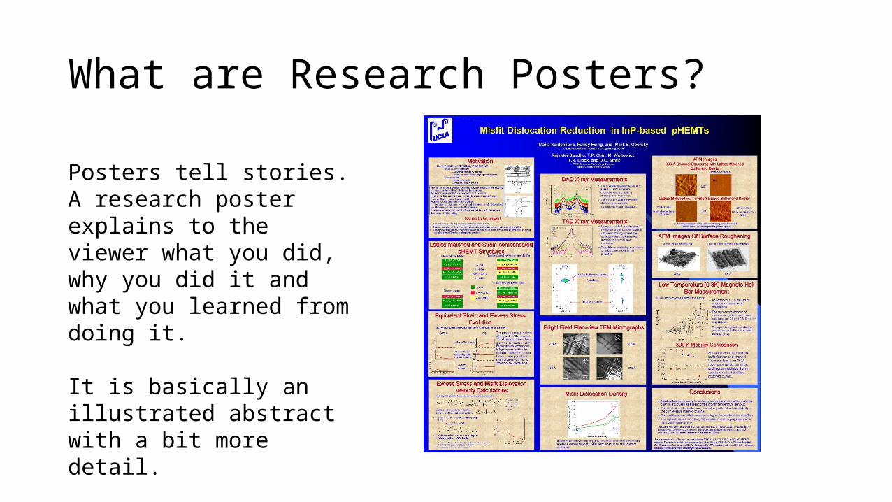
What are Research Posters?
Posters tell stories. A research poster explains to the viewer what you did, why you did it and what you learned from doing it.
It is basically an illustrated abstract with a bit more detail.
Research Posters
• Posters are a special type of presentation. • They are not simply journal papers pasted onto boards. • They are not mounted sets of presentation slides
• The purpose is to present work to an audience who is walking through a hallway or exhibit at conferences• the presenter usually stands next to the poster, thus allowing
for passers-by to engage in one-on-one • They are also used as advertising in the hallways of laboratories,
universities, and corporations as stand-alone presentations for passers-by.
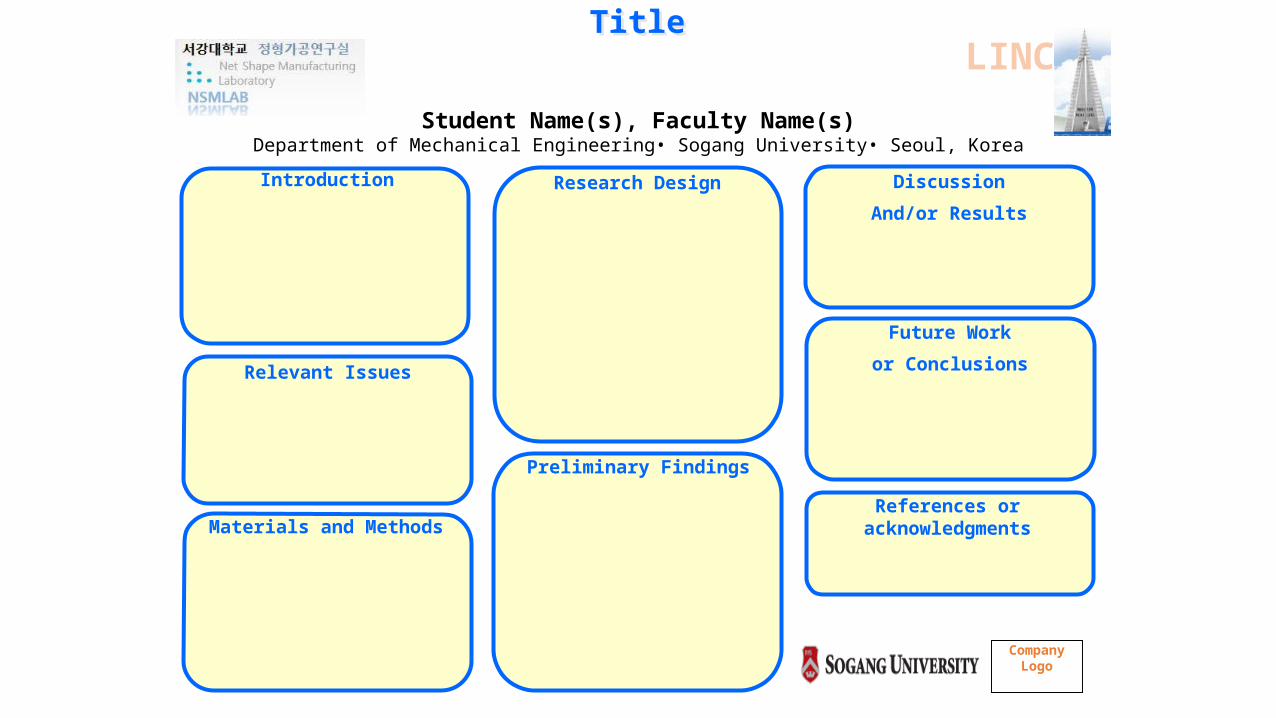
TitleTitle
Student Name(s), Faculty Name(s)Department of Mechanical Engineering• Sogang University• Seoul, Korea
Introduction
Materials and Methods
Relevant Issues
Research Design
Preliminary Findings
Discussion
And/or Results
Future Work
or Conclusions
References or acknowledgments
Company Logo
LINC
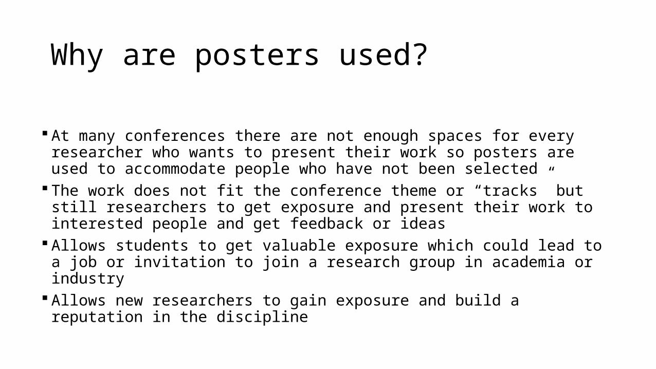
Why are posters used?
At many conferences there are not enough spaces for every researcher who wants to present their work so posters are used to accommodate people who have not been selected
The work does not fit the conference theme or “tracks” but still researchers to get exposure and present their work to interested people and get feedback or ideas
Allows students to get valuable exposure which could lead to a job or invitation to join a research group in academia or industry
Allows new researchers to gain exposure and build a reputation in the discipline
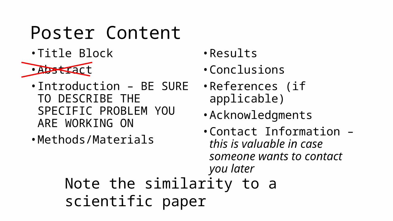
Poster Content• Title Block• Abstract• Introduction – BE SURE TO
DESCRIBE THE SPECIFIC PROBLEM YOU ARE WORKING ON
• Methods/Materials
• Results• Conclusions• References (if applicable)• Acknowledgments• Contact Information – this is
valuable in case someone wants to contact you later
Note the similarity to a scientific paper
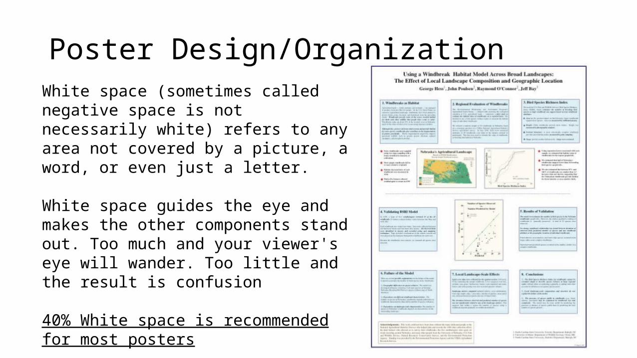
Poster Design/OrganizationWhite space (sometimes called negative space is not necessarily white) refers to any area not covered by a picture, a word, or even just a letter.
White space guides the eye and makes the other components stand out. Too much and your viewer's eye will wander. Too little and the result is confusion
40% White space is recommended for most posters
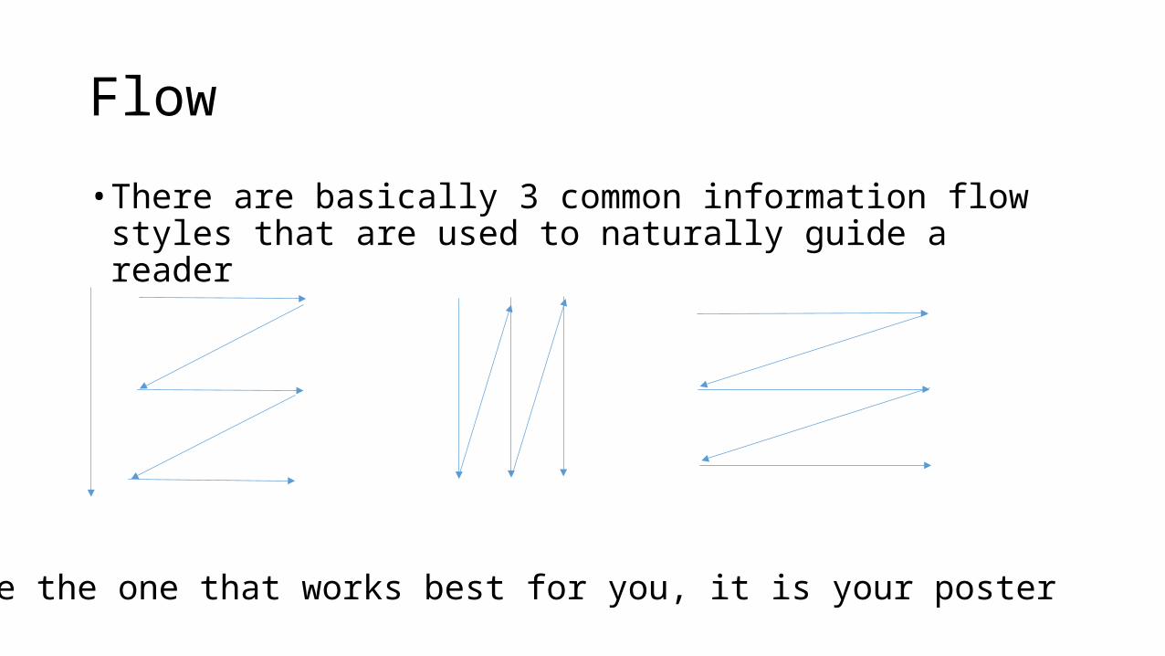
Flow
• There are basically 3 common information flow styles that are used to naturally guide a reader
Use the one that works best for you, it is your poster
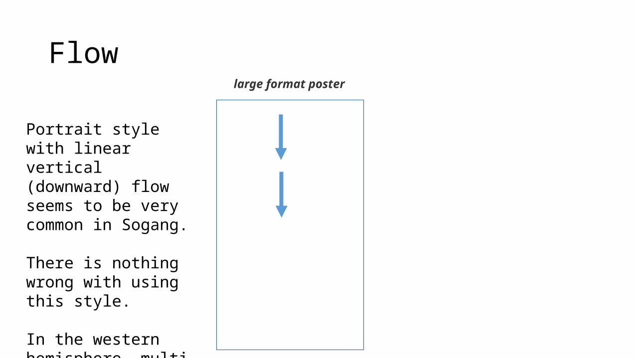
Flow
Portrait style with linear vertical (downward) flow seems to be very common in Sogang.
There is nothing wrong with using this style.
In the western hemisphere, multi panel posters are most common
large format poster
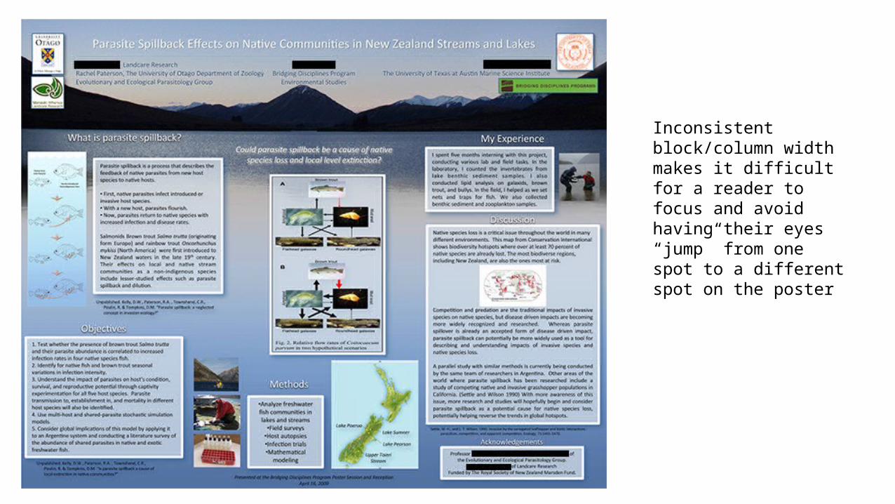
Inconsistent block/column width makes it difficult for a reader to focus and avoid having their eyes “jump” from one spot to a different spot on the poster
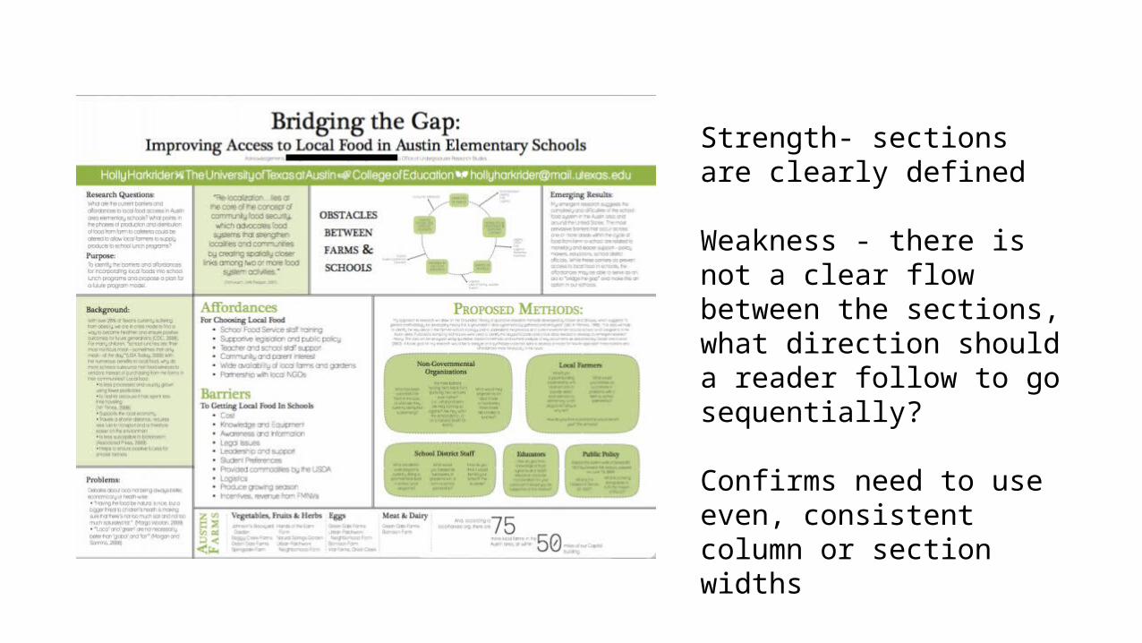
Strength- sections are clearly defined
Weakness - there is not a clear flow between the sections, what direction should a reader follow to go sequentially?
Confirms need to use even, consistent column or section widths
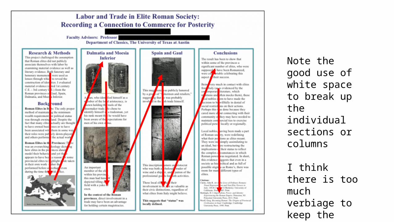
Note the good use of white space to break up the individual sections or columns
I think there is too much verbiage to keep the reader’s attention
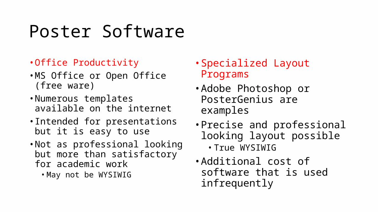
Poster Software
• Office Productivity• MS Office or Open Office (free
ware)• Numerous templates available on
the internet• Intended for presentations but it is
easy to use• Not as professional looking but
more than satisfactory for academic work
• May not be WYSIWIG
• Specialized Layout Programs• Adobe Photoshop or
PosterGenius are examples• Precise and professional looking
layout possible• True WYSIWIG
• Additional cost of software that is used infrequently
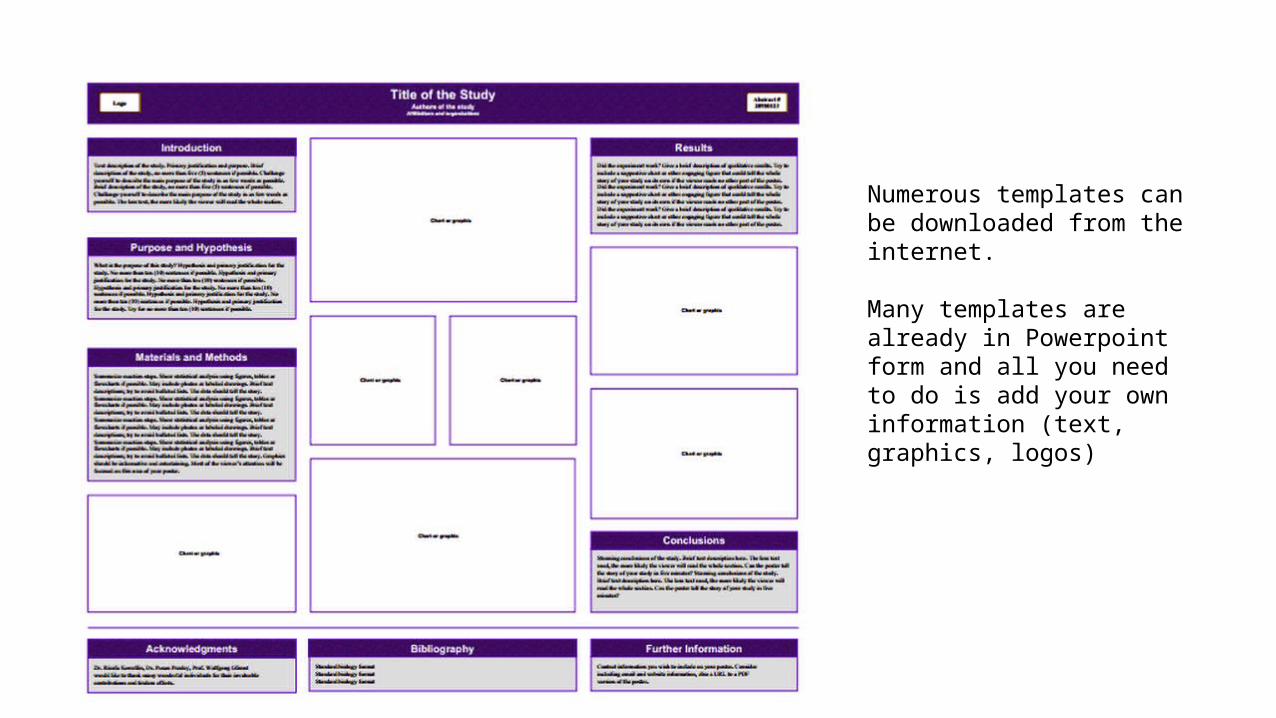
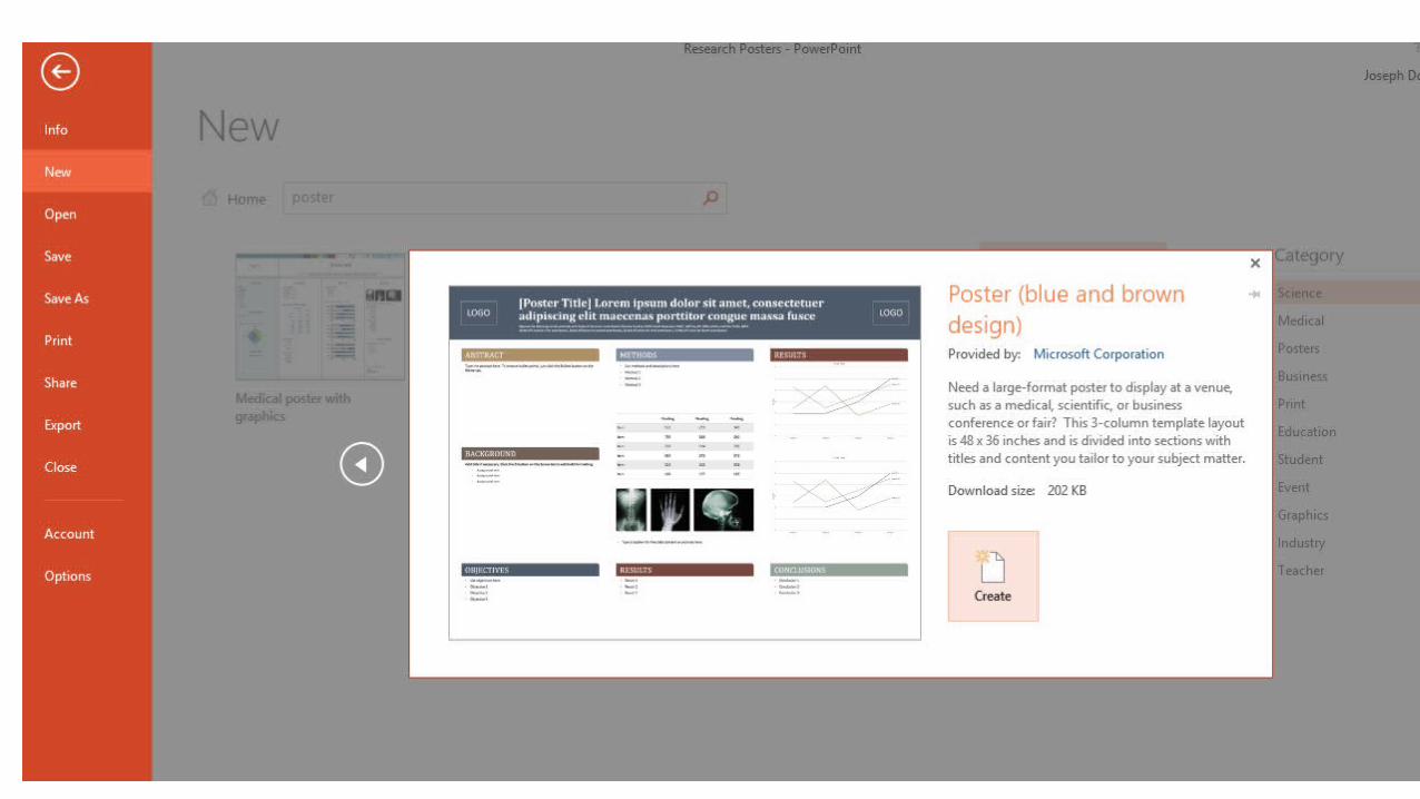
Numerous templates can be downloaded from the internet.
Many templates are already in Powerpoint form and all you need to do is add your own information (text, graphics, logos)
you
Title Block
Assuming the overall look of your poster has gotten their attention, you need to make sure that the title keeps it. Make sure to keep the length of the title as brief as possible without taking away crucial information. The title should be no longer than 2 lines.
The title should be about 5cm tall or larger, the font size to use will depend on the actual font
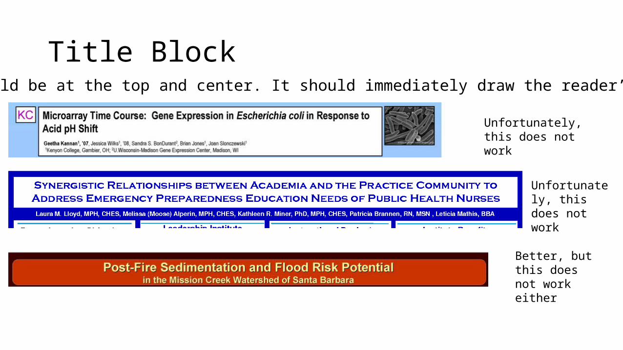
Title BlockThis should be at the top and center. It should immediately draw the reader’s eyes
Unfortunately, this does not work
Unfortunately, this does not work
Better, but this does not work either
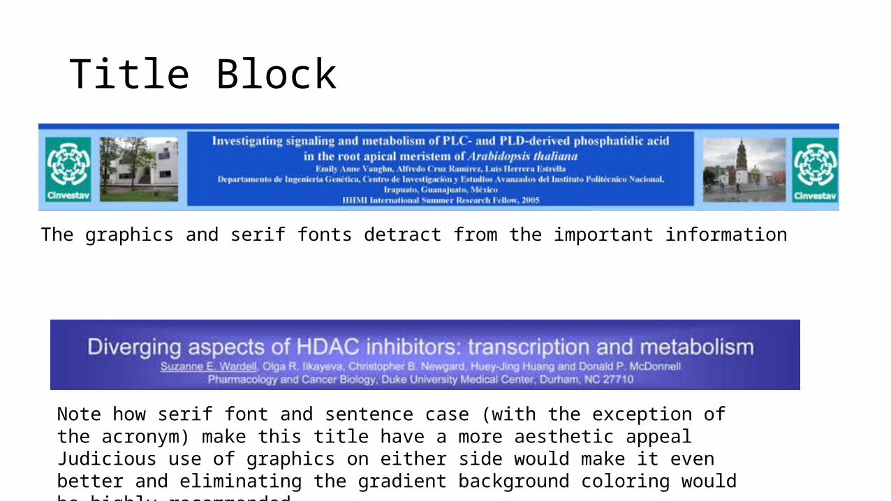
Title Block
The graphics and serif fonts detract from the important information
Note how serif font and sentence case (with the exception of the acronym) make this title have a more aesthetic appealJudicious use of graphics on either side would make it even better and eliminating the gradient background coloring would be highly recommended
Posters are a visual medium
•Minimize text - use images and graphs instead as much as possible•Keep text elements to 50 words or less•Use phrases rather than full sentences•Use an active voice•Avoid jargon (depends somewhat on the audience, know them, well).•Left-justify text; avoid centering and right-justifying text.
Writing the poster
Design - Visualization
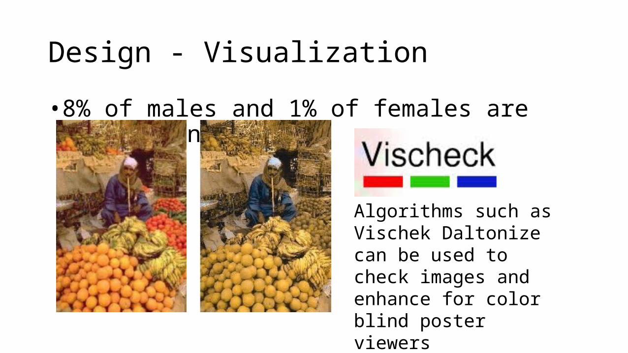
• 8% of males and 1% of females are color blind (색맹 )
Algorithms such as Vischek Daltonize can be used to check images and enhance for color blind poster viewers
Graphic Images
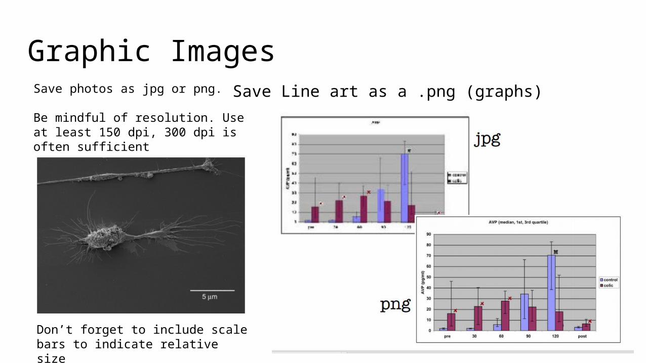
Don’t forget to include scale bars to indicate relative size
Save photos as jpg or png.
Be mindful of resolution. Use at least 150 dpi, 300 dpi is often sufficient
Save Line art as a .png (graphs)
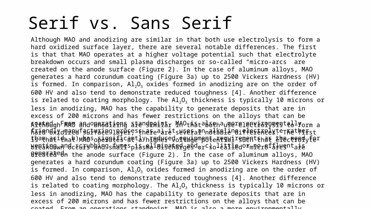
Serif vs. Sans SerifAlthough MAO and anodizing are similar in that both use electrolysis to form a hard oxidized surface layer, there are several notable differences. The first is that that MAO operates at a higher voltage potential such that electrolyte breakdown occurs and small plasma discharges or so-called “micro-arcs” are created on the anode surface (Figure 2). In the case of aluminum alloys, MAO generates a hard corundum coating (Figure 3a) up to 2500 Vickers Hardness (HV) is formed. In comparison, Al2O3 oxides formed in anodizing are on the order of 600 HV and also tend to demonstrate reduced toughness [4]. Another difference is related to coating morphology. The Al2O3 thickness is typically 10 microns or less in anodizing, MAO has the capability to generate deposits that are in excess of 200 microns and has fewer restrictions on the alloys that can be coated. From an operations standpoint, MAO is also a more environmentally friendly manufacturing process as a) it uses an alkaline electrolyte rather than acid, b) has significantly reduced equipment requirements as the need for venting and scrubbing fumes is eliminated and, c) little or no effluent is generated.
Although MAO and anodizing are similar in that both use electrolysis to form a hard oxidized surface layer, there are several notable differences. The first is that that MAO operates at a higher voltage potential such that electrolyte breakdown occurs and small plasma discharges or so-called “micro-arcs” are created on the anode surface (Figure 2). In the case of aluminum alloys, MAO generates a hard corundum coating (Figure 3a) up to 2500 Vickers Hardness (HV) is formed. In comparison, Al2O3 oxides formed in anodizing are on the order of 600 HV and also tend to demonstrate reduced toughness [4]. Another difference is related to coating morphology. The Al2O3 thickness is typically 10 microns or less in anodizing, MAO has the capability to generate deposits that are in excess of 200 microns and has fewer restrictions on the alloys that can be coated. From an operations standpoint, MAO is also a more environmentally friendly manufacturing process as a) it uses an alkaline electrolyte rather than acid, b) has significantly reduced equipment requirements as the need for venting and scrubbing fumes is eliminated and, c) little or no effluent is generated.
Fonts• use sans serif fonts for titles, headlines, or labels
• Sans serif fonts work well for titles and labels because of the clarity and simplicity of the letter forms. Without the distinctive serif strokes, sans serif fonts can be difficult and tiring to read.
• Use common serif fonts for body text• easiest to read and provide quick comprehension: the small finishing
strokes aid the eye and character recognition• Use 2-3 font types maximum
• Otherwise your information gets confusing and your poster starts to look disorganized
• Be consistent (title, headings, body, and captions)• Do not mix font types in the same sentence
.
Fonts - Continued
• Be mindful of how two different serif and san serif fonts complement each other or not
• Helvetica and Times Roman are examples of 2 that work well and complement each other
• The fonts should be large enough such that the text can be read easily at a distance
• Step back 1.5 meters and test the readability
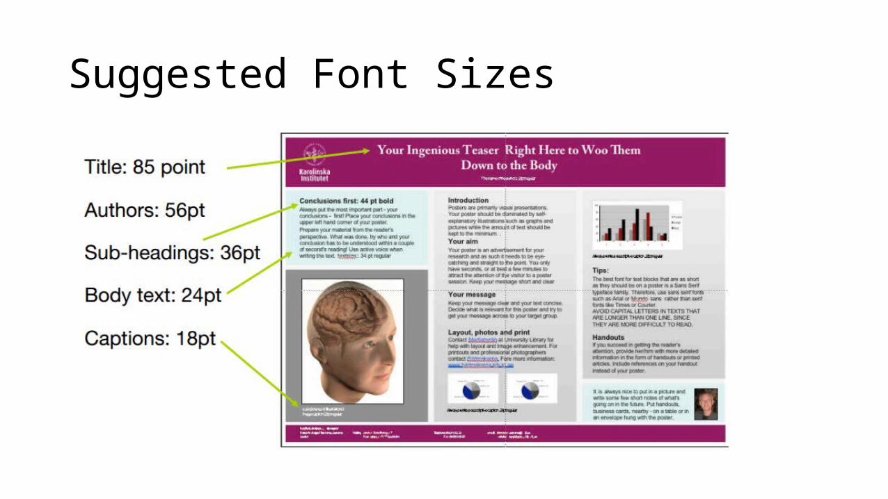
Suggested Font Sizes
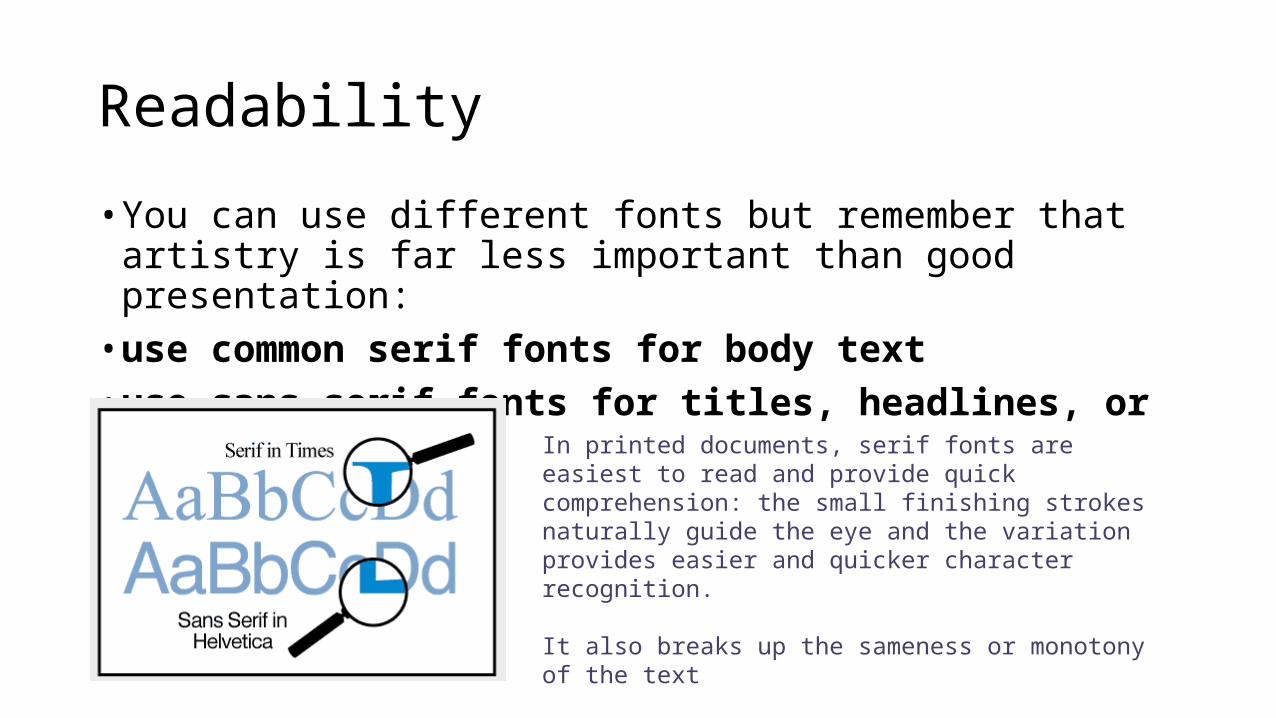
Readability
• You can use different fonts but remember that artistry is far less important than good presentation:
• use common serif fonts for body text• use sans serif fonts for titles, headlines, or labels
In printed documents, serif fonts are easiest to read and provide quick comprehension: the small finishing strokes naturally guide the eye and the variation provides easier and quicker character recognition.
It also breaks up the sameness or monotony of the text
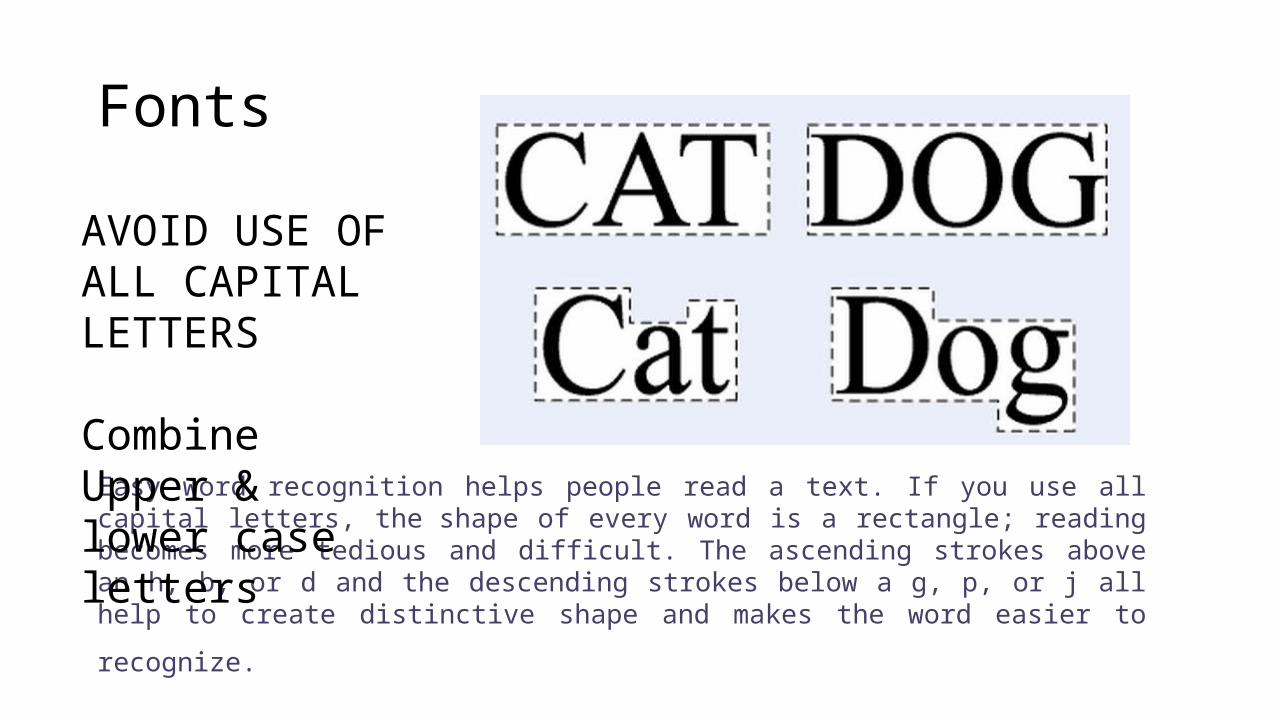
Fonts
Easy word recognition helps people read a text. If you use all capital letters, the shape of every word is a rectangle; reading becomes more tedious and difficult. The ascending strokes above an h, b, or d and the descending strokes below a g, p, or j all help to create distinctive shape and makes the
word easier to recognize.
AVOID USE OF ALL CAPITAL LETTERS
Combine Upper & lower case letters
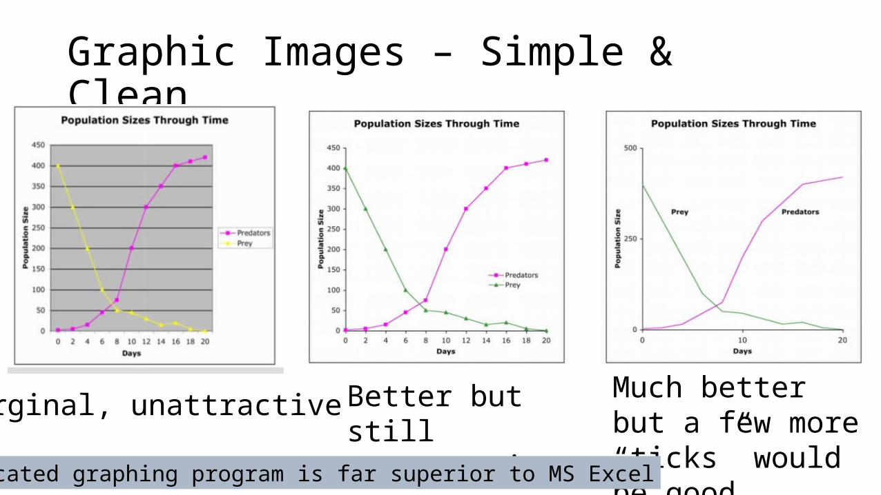
Graphic Images – Simple & Clean
Marginal, unattractive Better but still unattractive
Much better but a few more “ticks” would be good
A dedicated graphing program is far superior to MS Excel
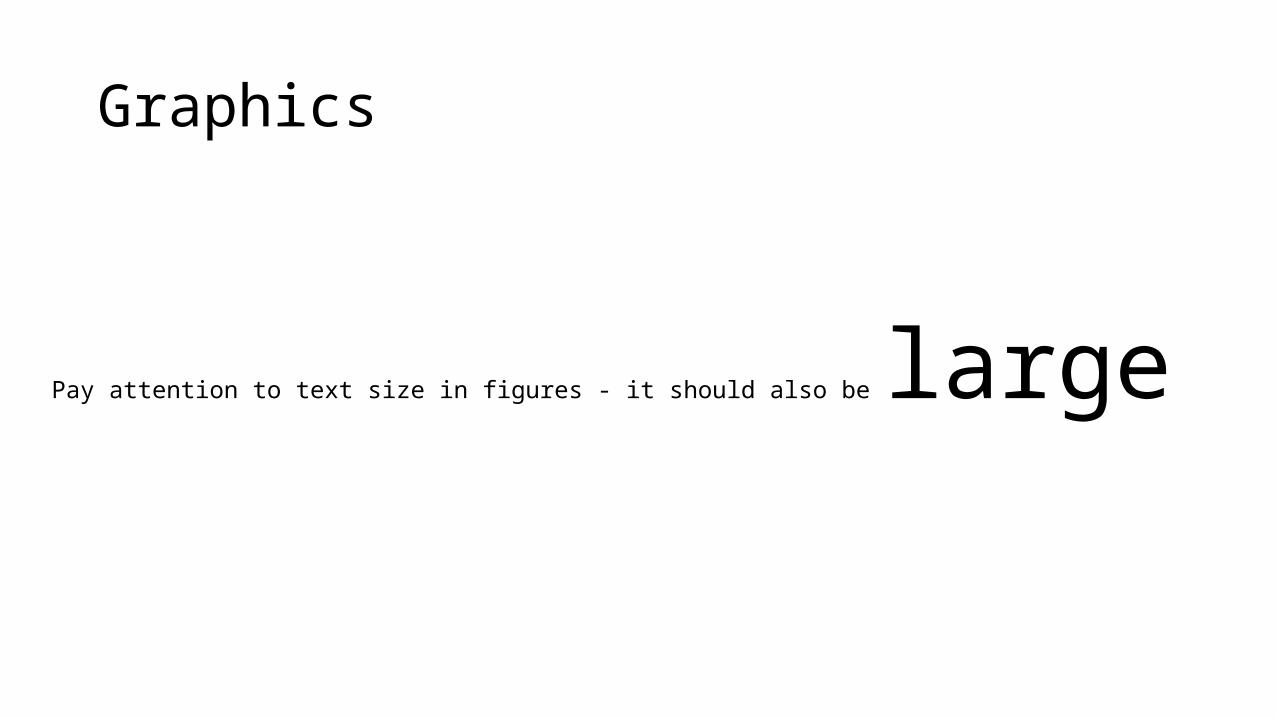
Graphics
Pay attention to text size in figures - it should also be large
Colors & color schemes
Two or three related colors will give your poster a cohesive look that is attractive to people walking by
Random choices of color can make your poster appear unattractive
Black text on white has high impact and excellent readability.- It is hard to go wrong using this on a poster
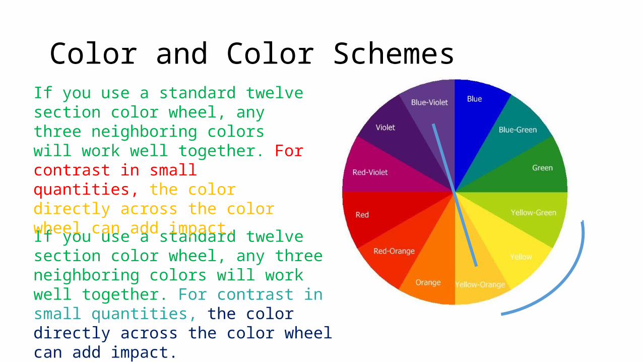
Color and Color Schemes
If you use a standard twelve section color wheel, any three neighboring colors will work well together. For contrast in small quantities, the color directly across the color wheel can add impact.
If you use a standard twelve section color wheel, any three neighboring colors will work well together. For contrast in small quantities, the color directly across the color wheel can add impact.
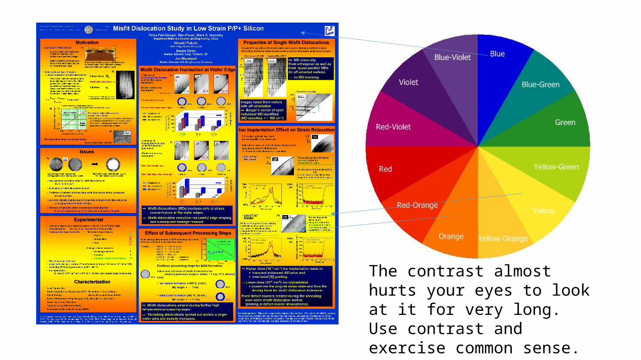
The contrast almost hurts your eyes to look at it for very long.Use contrast and exercise common sense.
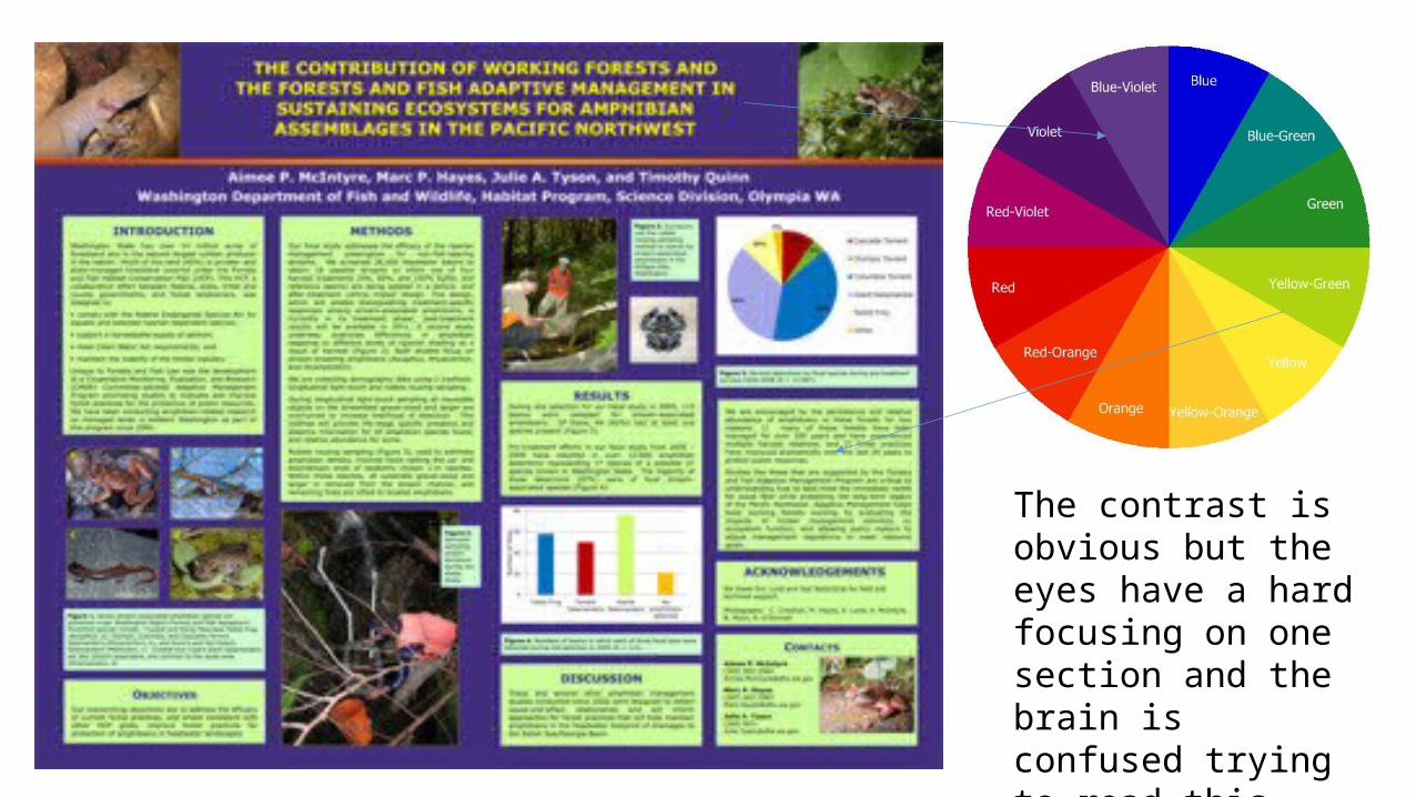
The contrast is obvious but the eyes have a hard focusing on one section and the brain is confused trying to read this poster.
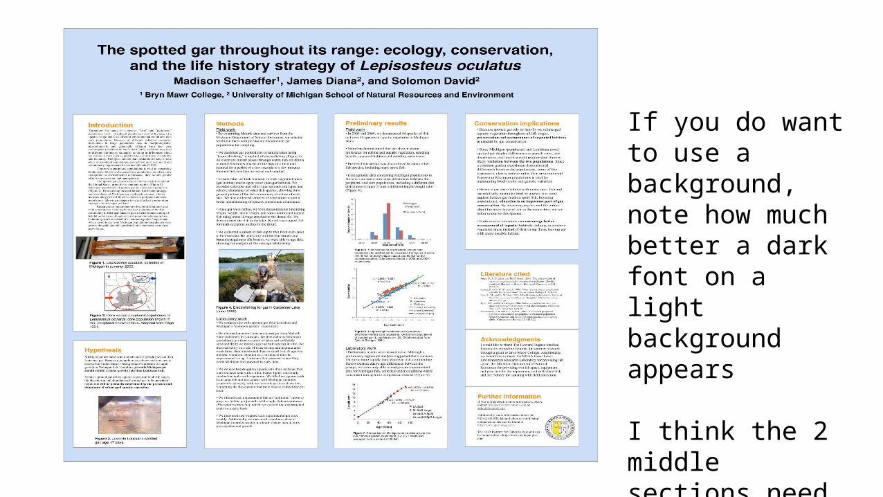
If you do want to use a background, note how much better a dark font on a light background appears
I think the 2 middle sections need to be broken up rather than being continuous as there is too much text
Summary
Keep it simple and don't overload with text. Brevity is key!
Summarize your information and remember the goal is to make your poster easy to scan over quickly and quickly comprehend.
While you may not be a graphic designer, think about how to present the information in a visually interesting way. Use charts and graphs wherever possible instead of tables or a large number of paragraphs containing text.
If a reader takes more than 5 minutes to go through the poster, you have failed, miserably.