Embed Size (px)
Citation preview

1
Cost Quality Customer
Statistical Benchmarking
Report to stakeholders
Dr Phill Wheat (ITS)
Institute for Transport Studies (ITS)
University of Leeds
Tel (direct): + 44 (0) 113 34 35344
Tel (enquires): +44 (0)113 34 35325
Fax: + 44 (0) 113 34 35334
December 2014 (revised January 2015)
brought to you by COREView metadata, citation and similar papers at core.ac.uk
provided by White Rose Research Online

2
1. INTRODUCTION
The Institute for Transport Studies at the University of Leeds has been commissioned
through measure2improve, on behalf of the NHT Network, and the HMEP (Highway
Maintenance Efficiency Programme) to undertake a follow-on study of statistical
benchmarking for the HMEP CQC Project which proceeds from the pilot study of 2013. The
analysis uses Customer, Quality and Cost data gathered for four highway maintenance
functions from 65 participating English Local Authorities. The functions considered are
Highway Pavement Maintenance, Street Lighting, Winter Service and Gully Clearance.
Background to CQC
Since April 2009 the National Highways & Transport Network has been exploring the
relationship between Satisfied Customers, Cost Effective Delivery and Technical Quality
which are generally considered to be the three key components of all round excellent
performance, the ‘three legs’ of the performance stool.
It has been doing this by bringing together the views of Customers, Quality data and Cost for
individual local highway authorities across the country with a view to identifying and sharing
efficiency, improvement and best practice. The work has been given the acronym title CQC.
CQC is the first time these three crucial strands of performance have been brought together
in this way for the sector and it offers more reasoned, balanced and objective ways of
measuring and comparing performance, whilst also offering opportunities for seeking and
delivering improvements.
The NHT Network is in a unique position to make this evaluation, using the results of the
NHT Public Survey, which provide the first national benchmarks of customer issues and
satisfaction in the Highways and Transport Sector.
The Highway Maintenance Efficiency Programme (HMEP) has recognized that CQC offers the
sector the prospect of a consistent and verifiable means of measuring efficiency for
different strands of service and has provided funding to develop CQC work in relation to
maintenance to provide the following:
1 A sector definition of efficiency
2 A verifiable means of evaluating and comparing efficiency
3 Context and insight into factors affecting efficiency
4 A means of identifying exponents of efficient services for knowledge sharing purposes
5 Potential targets for efficiency savings
6 A verifiable means of quality cross checking after savings have been delivered

3
Aims of the Statistical Benchmarking analysis
For each of the four cost models the aim of this work is to:
Develop a minimum cost frontier, which provides an expression for how (efficient) cost
is affected by multiple cost drivers
To provide measures as to the extent that each authority is away from the frontier, that
is the extent to which an authority is above its minimum cost of providing the current
level of service
Confidentiality of data and results
The study recognises that cost benchmarking is a sensitive subject. As such as part of the
agreement of collecting data from participating authorities, this study will not release the
base data or release results which would identify the efficiency opportunity for any specific
authorities.
Purpose of this report
The aim of this report is to outline the results of this work. The report majors on three
aspects of the work:
Concepts and background to the approach
Data issues
The presentation of a model for each of the four cost categories, namely road
maintenance, street lighting, winter service and drainage.
Structure of this report
Following this introduction, section 2 outlines the key economic concepts relevant to the
analysis. Section 3 discusses the new data set and how this is a development on that
available for the pilot study. Section 4-7 provide descriptions of the cost models and
outlines summarises of the efficiency predictions.
4
2. ECONOMIC BENCHMARKING CONCEPTS
In this section the relevant economic concepts are discussed. The Appendix provides more
information and also discusses statistical issues in more detail.
The cost frontier: an alternative to KPIs
In this work we use statistical techniques to estimate the minimum cost relationship
between cost (of an activity in a highway department) and the drivers of cost, such as the
number of street lights to be maintained (the output) and also the quality of the output,
such as citizen satisfaction with street lighting. This is called the minimum cost frontier.
It is important to accurately model the cost frontier, rather than, say, just comparing unit
costs across authorities, since there are many reasons why authorities costs can differ, many
of which are due to factors outside of the control of authorities. Thus to get a measure of
the potential cost saving which an authority could realise if they adopted best practice, but
still continued to provide the same service at the same quality, requires controlling for these
factors simultaneously i.e. modelling the cost frontier.
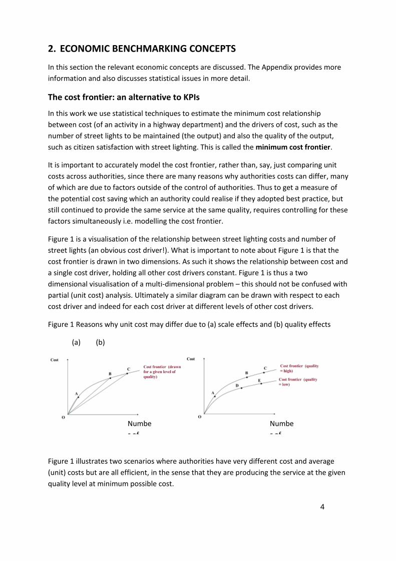
Figure 1 is a visualisation of the relationship between street lighting costs and number of
street lights (an obvious cost driver!). What is important to note about Figure 1 is that the
cost frontier is drawn in two dimensions. As such it shows the relationship between cost and
a single cost driver, holding all other cost drivers constant. Figure 1 is thus a two
dimensional visualisation of a multi-dimensional problem – this should not be confused with
partial (unit cost) analysis. Ultimately a similar diagram can be drawn with respect to each
cost driver and indeed for each cost driver at different levels of other cost drivers.
Figure 1 Reasons why unit cost may differ due to (a) scale effects and (b) quality effects
(a) (b)
Figure 1 illustrates two scenarios where authorities have very different cost and average
(unit) costs but are all efficient, in the sense that they are producing the service at the given
quality level at minimum possible cost.
Numbe
r of
street
lights
Numbe
r of
street
lights

5
Panel (a) illustrates the potential impact of ‘economies of scale’. This is economics
terminology for decreasing unit (average) cost as the size of the operation is increased.
Intuitively this arises because fixed costs (depot cost etc) can be spread over more units of
output. As such authorities A, B and C are all producing at minimum possible cost but A’s
unit costs are much greater than B and C’s. Unless A is allowed to merge its highway
operations with another authority, it cannot be expected to reduce unit costs any further.
Note that when we do the model estimation, we do not assume economies of scale are
present. Instead we let the data determine whether economies of scale (or otherwise) are
present.
Panel (b) illustrates the effect of differing quality between authorities. A lower quality of
service may be expected to result in lower costs, for a given number of street lighting units.
Thus it can be seen that all authorities A-E are producing at minimum cost but have
different unit costs due to differing number of street lights and quality combinations.
Economic efficiency
In sum, Figure 1 provides a motivation for why there is a need to move away from simple
unit cost comparisons. Now we need to establish in what sense an authority can actually be
‘inefficient’ and thus have the potential to make savings while still maintaining the same
service level and quality. It is important to note that the following is a theoretical discussion
based on a fully specified economic cost model. In reality the analysis makes best use of the
available data, but is still an abstraction from the complex reality. As such care should be
taken in how to interpret the ‘inefficiency’ opportunity (see next section).
An authority must be above or on the frontier as by definition it cannot provide its outputs
(for a given quality) at less than the minimum possible cost. If an authority is ‘on’ the
frontier then it is producing at the minimum possible cost for the given set of outputs and
quality that it provides. In this case the authority is termed fully efficient. If the authority is
producing its output (again for a given quality) above minimum cost then it is termed
inefficient.
6
Figure 2: illustration of the cost frontier and efficiency
We measure the degree to which authorities are fully efficient by the efficiency score. This is
a number between 0 and 1. 1 indicates that the authority is fully efficient, anything less than
1 indicates that the authority could continue to produce its level of output, maintain the
same quality but at lower cost; the exact cost proportion given by the score. For example an
efficiency score of 0.8 indicates that an authority can potentially reduce costs by 20% of the
current level and still maintain the same output (and quality) as at present.
So in summary, using frontier benchmarking produces a single measure of performance and
provides a financial quantification as to the scope for improvement. This is opposed to
partial Key Performance Indicators, which by construction yield many different measures of
performance.1
Caution in literal interpretation of efficiency scores
It is tempting (and potentially alarming!) to conclude that an authority with an efficiency
score of 0.6 should be required to make a 40% cost saving. This can be misleading for two
sets of reasons. Firstly there will be limitations in the data and analysis and such factors are
clearly evident in this pilot study (which is to be expected). In particular:
1 This should not be taken to mean that KPIs do not have a strong role to play in
understanding performance. They are easily understood and are very clear
communications tools. Different benchmarking tools have different pros and cons and
thus understanding data through a wide range of techniques is often optimal to support
robust decision making. Thus this work should be seen in the context of wider
benchmarking activities within the CQC project and HMEP in general.

7
The models use a limited set of cost driving variables. It is likely that there are other
variables that explain costs which are not included in the model. The result of omitting
such variables tends to inflate the opportunity between the estimated minimum cost
frontier and the authorities actual cost. Thus efficiency scores tend to be too low.
There is some statistical imprecision with respect to the minimum cost frontier given the
sample size partly driven by missing observations. The impact of this is that the cost
frontier may not be as reflective of the true cost structure as would be possible with
more complete observations. For example, some variables were found to have a counter
intuitive influence on cost (e.g. reduced cost rather than increased cost) which meant
that they were removed from the specification. This may not have been the case if more
complete observations were available. Ultimately it should be clear from Figure 1 that
there is interplay between the measure of efficiency and the cost frontier so if the cost
frontier is forced to be simplistic it can yield inaccurate efficiency scores.
In addition to these statistical factors, there are more general caveats in interpreting top-
down efficiency scores. Fundamentally the efficiency score quantifies an unexplained
‘opportunity’ between actual and modelled minimum cost. Not all of this opportunity will be
under the authority’s control for the following reasons:
Missing cost drivers which are outside of the authority’s control which act to inflate their
costs relative to other authorities. The analysis can only control for what is actually
included in the model. Thus an authority is being penalised in the analysis for just facing
different operating conditions rather than being truly inefficient (an example would be
failure to control for topographical factors in winter maintenance which would penalise
those authorities subject to unfavourable environmental factors).
Identification of best practice techniques: The model does identify which authorities are
efficient, however why they are efficient is not indicated. This requires further ‘bottom-
up’ analysis to compare practices between the efficient and inefficient authorities. In
undertaking such an analysis it may be concluded that it is not feasible to introduce all of
the process reforms for various reasons e.g. incompatibility with fixed capital
infrastructure.
Phasing issues: it takes time to introduce cost reduction measures; thus efficiency scores
are (at best) long term targets.
The Mathematical Cost Frontier
In practice the cost frontier is represented by a mathematical equation. This allows for the
effect on cost of multiple cost drivers to be controlled for simultaneously.
Thus while the graphical representation in Figure 1 is useful for illustrating the relationship
between cost and a single output, this has to be drawn holding the levels of all other cost

8
drivers constant. If we were to change the level of another cost driver, then the frontier
would ‘shift’ up or down. So, for example if Figure 1 represents the relationship between
street lighting cost and number of lighting units for a given quality level (measured as
percentage of street lighting units operational at one time). If the quality was to improve we
may expect that the cost frontier would shift upwards. That is for any number of street
lights, the (minimum) cost of maintaining it at a higher quality is greater than at a lower
quality.
In most applications, the mathematical equation has the cost drivers transformed by
logarithms as this makes computation of cost efficiency easier. So a cost function would look
something like:
Log(min cost) = a0 + a1 . Log (cost driver 1) + a2 . Log (cost driver 2) + …
… + ak . Log (cost driver k)
We use data on costs and cost drivers (that were supplied by participating authorities) to
estimate the parameters (a0, …, ak). Following estimation we then have an equation that
allows us to predict minimum cost for any combination of the levels of the cost drivers. This
can allow undertaking of ‘what if’ analysis, such as what would happen to cost
if authorities merged highway functions and so doubled street light numbers for a
given operation
if an authority increased the percentage of street lighting units operational by, say
1%
if an authority was prepared to reduce citizen satisfaction by 1%
One important caveat to the above is that the model parameters are estimated using data.
This has two implications in this context. Firstly, there will be a degree of error relating to
the estimated value relative to the ‘true’ value. We summarise the degree of error in each
parameter estimate by computation of a standard error.
Secondly, and intuitively, the model will be most representative of actual costs when we
consider what if scenarios which are close to data that we already observe. Clearly there is
more extrapolation (and thus more margin for error) if we try and predict the cost impact of
doing something that is far different to what we have now (far ‘out of sample’). An example
would be a ‘what if’ experiment involving the creation of a ‘super authority’, which would
be double the size of anything that exists in the analysis already.
9
3. THE UPDATED DATA SET
Introduction
Following the Pilot Study of 2013, a much more targeted and refined data collection
exercise was undertaken for this study. It was decided to develop further the three cost
categories previously studied, as well as beginning work on a new cost category, drainage.
The data collection, broadly, included two sources of data; those sourced direct (and in
confidence) from participating local authorities and those sourced from existing data
sources in the public domain. Crucially the cost information is direct from Local Authorities,
as this allowed a more consistent and targeted set of definitions for each cost category.
Data was requested for five years from 2008 to 2013. An observation is a statistical term
used to describe a single entry in a dataset. In this case it refers to an entry for a certain
Authority for a given year. Thus an Authority has up to 5 entries in the dataset (one for each
year).
However, understandably, not all Authorities were able to supply information for all cost
and cost drivers requested. As such, both before and during model estimation, it was/is
necessary to balance the need to explain costs by as many (relevant) cost drivers as possible
whilst also ensuring that as many as possible Authorities are included in the estimation. The
latter concern is important for two reasons. First, there is the benefit of likely increased
statistical precision from including as many observations as possible. Second, the inclusion
of more Authorities means that the model can predict the cost frontier (and thus give a
measure of ‘efficiency’) of as many Authorities as possible (however note that we do plan to
make some assumptions about some of the other authorities to use the model to predict
the cost frontier – see below).
The cost data
Table 1 summarises the cost data available for the study and itemises the number of
observations available for analysis of each cost category taking into account the availability
of other variables for the analysis.
In general it can be seen that there are many more complete observations available for this
follow-on study than for the pilot. New cost categories are also available for analysis. Finally,
as will be described in the following sections, many more cost driving variables are available
to explain these costs and thus the dataset is a clear step forward from that used in the pilot
study.

10
Table 1 Summary of the cost data available for analysis
Cost Category Observations Authorities Cost Drivers
Roads
Maintenance
(Reactive + Structural
Maintenance)
145 51 Highway length by road type
Traffic volume Road Condition Index by road type Urban/rural mix Citizen satisfaction
Street Lighting 180 50 Number of lighting columns % of units operational Citizens Satisfaction with Street Lighting
Repairs Winter
maintenance
120 34 Highway length by road type
Length of Precautionary Salting Network Number of Non Precautionary Days
Tonnes of salt used Percentage of road length classified as rural
The total of Tonnes of Salt used per annum Citizen Satisfaction with Winter Maintenance
Gullies and
other
131 40 Number of gullies
Number of gullies cleared per annum Proportion of network in rural areas Proportion of network which is U road
Cost drivers sourced directly from Local Authorities
In addition to the cost data, data on certain cost drivers not already (easily) in the public
domain has been sourced directly from Authorities. Such data includes:
Proportion of street lighting operational at a given time (Street Lighting model)
Tonnes of salt used in Winter Operations (Winter maintenance model)
Number of Gritting runs (Winter Maintenance model)
Number of Gullies (Gullies Model)
Number of Gullies Cleared (Gullies Model)
Some of the data was not fully populated and as such using these cost drivers does restrict
the number of complete observations which can be included in any models (i.e. the choice
of cost driver influences the number of complete observations in Table 1).

11
Cost drivers sourced from the NHT Customer Satisfaction Survey
The study also draws on the Customer Satisfaction Survey data collected by the NHT. With a
few exceptions, this data is available for all Authorities and so using it does not constrain the
number of complete observations.
Cost drivers sourced from public data sources
As well as a more detailed and targeted cost data collection exercise, we have also collected
data on cost drivers, which is in the public domain. Such data has been very useful for the
highway pavement maintenance model reported in the next section, but also of use for the
other models. Further this data is available for (nearly) all observations so inclusion of these
variables does not reduce the sample size.
Such data includes:
Highway length by road type
Traffic volume
Road Condition Index by road type (allowing a weighted average to be computed for
the whole network)
Length of road network which is urban/rural
12
4. HIGHWAY PAVEMENT MAINTENANCE MODEL
This section and the following three sections discuss each cost model in turn.
The Cost Frontier
The cost variable is the sum of reactive and structural maintenance. Some supplementary
analysis has been undertaken on reactive and structural spend individually, however to keep
the presentation simple, only the total model is discussed below. The results for the
supplementary models are broadly in line with the total model however.
The sum of reactive and structural maintenance is explained by the following cost drivers:
Length of the sum of A, B and C classified roads (disaggregating further did not yield
sensible results)
Length of U classified Roads
Traffic per Annum (measured as number of vehicle-km)
The road condition measure (a weighted average of the road condition measures for
A roads, B and C roads and U roads)
The influence of citizen satisfaction
Time dummy variables which pick up systematic variations in expenditure over time
(such as the results of abnormally severe winters)
For reference, Table 2 presents the parameter estimates of the model. Unlike the models
reported in the pilot study2, the model below uses a Translog flexible functional form.
Adopting such a functional form means that the cost frontier is very flexible in terms of its
shape. The implication is that this model should provide a ‘tighter fit’ to the data and thus
maximise the chance of Authorities being found to be near the cost frontier.
2 The pilot study did consider the use of flexible functional forms, however the number of
data points and data quality meant that this approach was not feasible.
13
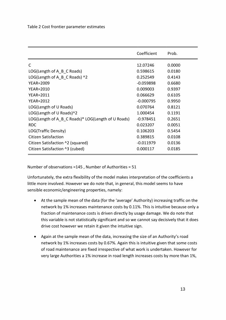
Table 2 Cost frontier parameter estimates
Coefficient Prob. C 12.07246 0.0000
LOG(Length of A_B_C Roads) 0.598615 0.0180
LOG(Length of A_B_C Roads) ^2 0.252549 0.4143
YEAR=2009 -0.059898 0.6680
YEAR=2010 0.009003 0.9397
YEAR=2011 0.066629 0.6105
YEAR=2012 -0.000795 0.9950
LOG(Length of U Roads) 0.070764 0.8121
LOG(Length of U Roads)^2 1.000454 0.1191
LOG(Length of A_B_C Roads)* LOG(Length of U Roads) -0.978451 0.2651
RDC 0.023207 0.0051
LOG(Traffic Density) 0.106203 0.5454
Citizen Satisfaction 0.389815 0.0108
Citizen Satisfaction ^2 (squared) -0.011979 0.0136
Citizen Satisfaction ^3 (cubed) 0.000117 0.0185
Number of observations =145 , Number of Authorities = 51
Unfortunately, the extra flexibility of the model makes interpretation of the coefficients a
little more involved. However we do note that, in general, this model seems to have
sensible economic/engineering properties, namely:
At the sample mean of the data (for the ‘average’ Authority) increasing traffic on the
network by 1% increases maintenance costs by 0.11%. This is intuitive because only a
fraction of maintenance costs is driven directly by usage damage. We do note that
this variable is not statistically significant and so we cannot say decisively that it does
drive cost however we retain it given the intuitive sign.
Again at the sample mean of the data, increasing the size of an Authority’s road
network by 1% increases costs by 0.67%. Again this is intuitive given that some costs
of road maintenance are fixed irrespective of what work is undertaken. However for
very large Authorities a 1% increase in road length increases costs by more than 1%,

14
indicating that at a certain road length there are coordination problems. Thus there
is an optimal size of a highway authority.3
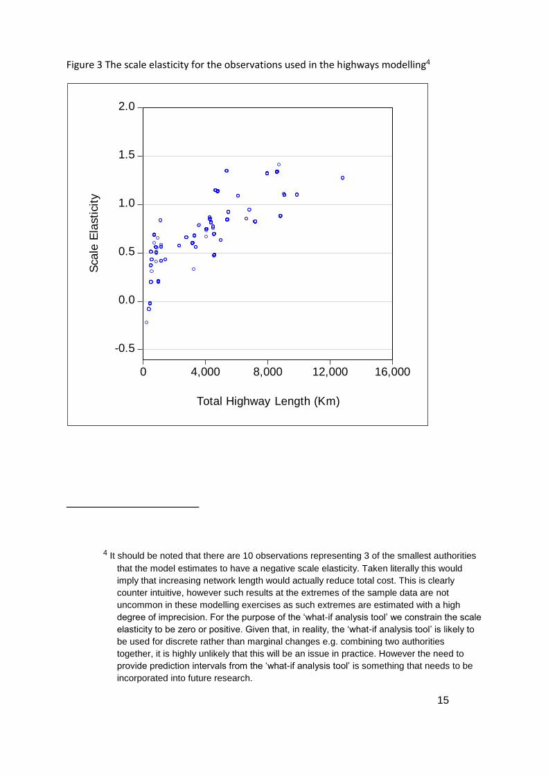
The relationship between a 1% change in size of an authority’s network and the
corresponding % change in cost is called scale elasticity, e.g. 1% increase in scale implying
0.67% increase in cost as above is represented as 0.67. Figure 3 below shows the plot of the
scale elasticity for the (145) observations within the dataset. It clearly shows an upward
relationship, with the ‘minimum efficient scale point’ (MESP) somewhere in the order of 6
000 to 10 000 km (the exact MESP depends on the mix of U road to A,B,C road length in the
authority). The MESP represents the level of scale, here road length, where average costs
(cost per highway-km) are minimum. So it is important to note that an elasticity value less
than one does not imply a fall in absolute cost from growing the authority size, only that
average cost falls as the authority gets larger (up to the MESP and then average costs start
to rise).
3 We do note that the second order terms (the squares and cross products) are each
individually not statistically from zero at any reasonable significance level (e.g. 10%).
However they are jointly significant, that is the null hypothesis that all the coefficients on
the second order terms are zero can be rejected. Thus we maintain the specification.
This also has the advantage of more tightly enveloping the data i.e. giving each authority
the ‘best chance’ of being efficient (or close to being efficient).
15
Figure 3 The scale elasticity for the observations used in the highways modelling4
4 It should be noted that there are 10 observations representing 3 of the smallest authorities
that the model estimates to have a negative scale elasticity. Taken literally this would
imply that increasing network length would actually reduce total cost. This is clearly
counter intuitive, however such results at the extremes of the sample data are not
uncommon in these modelling exercises as such extremes are estimated with a high
degree of imprecision. For the purpose of the ‘what-if analysis tool’ we constrain the scale
elasticity to be zero or positive. Given that, in reality, the ‘what-if analysis tool’ is likely to
be used for discrete rather than marginal changes e.g. combining two authorities
together, it is highly unlikely that this will be an issue in practice. However the need to
provide prediction intervals from the ‘what-if analysis tool’ is something that needs to be
incorporated into future research.
-0.5
0.0
0.5
1.0
1.5
2.0
0 4,000 8,000 12,000 16,000
Total Highway Length (Km)
Sca
le E
lasti
cit
y
16
Increasing RDC i.e. the average number of road defects increases cost, probably
reflecting the need to do more maintenance to bring the network back up to a
desired quality.
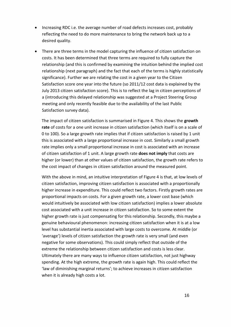
There are three terms in the model capturing the influence of citizen satisfaction on
costs. It has been determined that three terms are required to fully capture the
relationship (and this is confirmed by examining the intuition behind the implied cost
relationship (next paragraph) and the fact that each of the terms is highly statistically
significance). Further we are relating the cost in a given year to the Citizen
Satisfaction score one year into the future (so 2011/12 cost data is explained by the
July 2013 citizen satisfaction score). This is to reflect the lag in citizen perceptions of
a (introducing this delayed relationship was suggested at a Project Steering Group
meeting and only recently feasible due to the availability of the last Public
Satisfaction survey data).
The impact of citizen satisfaction is summarised in Figure 4. This shows the growth
rate of costs for a one unit increase in citizen satisfaction (which itself is on a scale of
0 to 100). So a large growth rate implies that if citizen satisfaction is raised by 1 unit
this is associated with a large proportional increase in cost. Similarly a small growth
rate implies only a small proportional increase in cost is associated with an increase
of citizen satisfaction of 1 unit. A large growth rate does not imply that costs are
higher (or lower) than at other values of citizen satisfaction, the growth rate refers to
the cost impact of changes in citizen satisfaction around the measured point.
With the above in mind, an intuitive interpretation of Figure 4 is that, at low levels of
citizen satisfaction, improving citizen satisfaction is associated with a proportionally
higher increase in expenditure. This could reflect two factors. Firstly growth rates are
proportional impacts on costs. For a given growth rate, a lower cost base (which
would intuitively be associated with low citizen satisfaction) implies a lower absolute
cost associated with a unit increase in citizen satisfaction. So to some extent the
higher growth rate is just compensating for this relationship. Secondly, this maybe a
genuine behavioural phenomenon: increasing citizen satisfaction when it is at a low
level has substantial inertia associated with large costs to overcome. At middle (or
‘average’) levels of citizen satisfaction the growth rate is very small (and even
negative for some observations). This could simply reflect that outside of the
extreme the relationship between citizen satisfaction and costs is less clear.
Ultimately there are many ways to influence citizen satisfaction, not just highway
spending. At the high extreme, the growth rate is again high. This could reflect the
‘law of diminishing marginal returns’; to achieve increases in citizen satisfaction
when it is already high costs a lot.
17
Figure 4 Growth rate of cost associated with a (small) increase in citizen satisfaction at
different levels of citizen satisfaction
The following section discusses a web based tool which is being developed as part of this
work. This will allow interrogation of the cost frontier results for each authority in more
detail rather than the simple ‘average’ results discussed above. The aim of the tool is to
allow an Authority to conduct ‘what-if analysis’ with respect to the cost implications of
varying the levels of the cost drivers.
Efficiency Predictions
Once we have estimated the cost frontier we can determine how far each of the 54
Authorities is from the frontier and thus what scope there is for each Authority to
potentially make cost savings (subject of course to such an opportunity representing
something under control of the Authority). Table 3 gives descriptive statistics for the
distribution of efficiency predictions from this model.
-.04
.00
.04
.08
.12
.16
10 20 30 40 50 60
Citizen Satisfaction (HMBI01 one year in advance)
Gro
wth
ra
te o
f co
sts
fo
r a
(sm
all)
ch
an
ge
in
cit
ize
n s
ati
sfa
cti
on
18
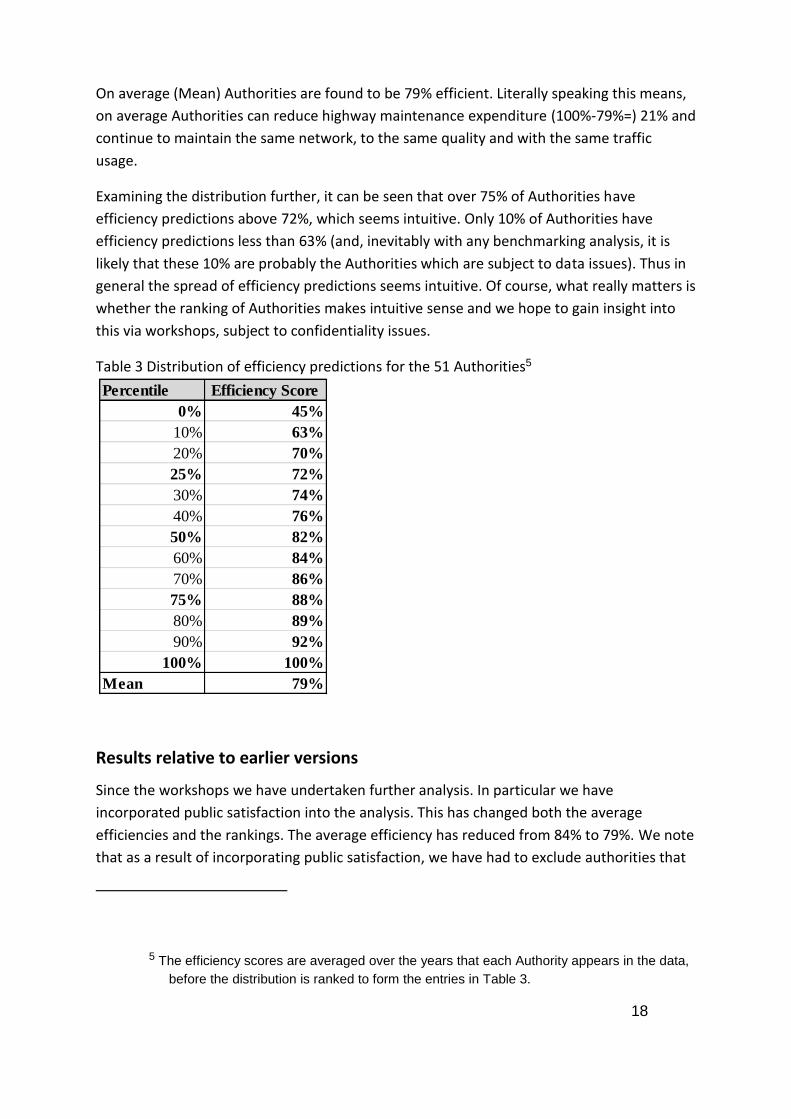
On average (Mean) Authorities are found to be 79% efficient. Literally speaking this means,
on average Authorities can reduce highway maintenance expenditure (100%-79%=) 21% and
continue to maintain the same network, to the same quality and with the same traffic
usage.
Examining the distribution further, it can be seen that over 75% of Authorities have
efficiency predictions above 72%, which seems intuitive. Only 10% of Authorities have
efficiency predictions less than 63% (and, inevitably with any benchmarking analysis, it is
likely that these 10% are probably the Authorities which are subject to data issues). Thus in
general the spread of efficiency predictions seems intuitive. Of course, what really matters is
whether the ranking of Authorities makes intuitive sense and we hope to gain insight into
this via workshops, subject to confidentiality issues.
Table 3 Distribution of efficiency predictions for the 51 Authorities5
Results relative to earlier versions
Since the workshops we have undertaken further analysis. In particular we have
incorporated public satisfaction into the analysis. This has changed both the average
efficiencies and the rankings. The average efficiency has reduced from 84% to 79%. We note
that as a result of incorporating public satisfaction, we have had to exclude authorities that
5 The efficiency scores are averaged over the years that each Authority appears in the data,
before the distribution is ranked to form the entries in Table 3.
Percentile Efficiency Score
0% 45%
10% 63%
20% 70%
25% 72%
30% 74%
40% 76%
50% 82%
60% 84%
70% 86%
75% 88%
80% 89%
90% 92%
100% 100%
Mean 79%

19
do not participate in the public satisfaction survey directly from the analysis. For the
authorities which are only excluded from analysis because they have not been involved in
the public satisfaction survey, we will, ex post of model estimation and this report, use the
model to predict their efficiency score assuming that the authority received the average
public satisfaction score. This is reported in the authority specific results in Section 9 where
applicable.

20
5. WINTER SERVICE MODEL
The Cost Frontier
The cost variable is expenditure on all winter service activities. This covers such activities as
gritting, ploughing and capital spend [check]. Winter service expenditure is explained by the
following cost drivers:
Length of the sum of A, B and C classified roads (disaggregating further did not yield
sensible results) and also this specification was preferred to including the sum of all
roads or including u roads separately.
Length of the Precautionary Salting Network
Number of Non Precautionary Days
Percentage of road length which is classified as rural
The total of Tonnes of Salt used per annum
Time dummy variables which pick up systematic variations in expenditure over time
(such as the results of abnormally severe winters)
The citizen satisfaction measure, HMBI15, interacted with a sub-set of the years;
2008, 2009 and 2012. After investigating many functional forms (ways of
incorporating citizen satisfaction into the model), interacting the measure with the
year of observation was found to yield the most intuitive and best fitting approach.
This implies that the relationship between cost and citizen satisfaction can be
different for each year. After testing separate interactions for each year, we
combined the years 2008, 2009 and 2012 as these had similar coefficient estimates
(the benefit of combining is increased precision in the estimated relationship). There
was not a significant relationship or even correct sign for the years 2010 and 2011
and so these were dropped from the specification. The intuition of allowing this
form, is that depending on the severity of the winter very substantially different
amounts of cost are associated with a rise in citizen satisfaction as the higher
standard of service has to be maintained for longer or shorter periods depending on
the weather . A mild winter may reduce the strength of the relationship between
citizen satisfaction and cost as cost tends to be incurred to some extent irrespective
of whether citizen receive direct winter clearance. Note, unlike the citizen
satisfaction measure in the highways maintenance model, here the citizen
satisfaction measure is not offset by one year. Intuitively people notice the
performance of winter service directly after the winter under consideration.

21
For reference, Table 4 presents the parameter estimates of the model. In comparison to the
model developed in the pilot study, many explanatory variables have been collected and
included in the model. The advantage of this is that this model should provide a ‘tighter fit’
to the data and thus maximise the chance of Authorities being found to be near the cost
frontier. The disadvantages are twofold. Firstly there may be redundant variables i.e.
variables which are included which actually are picking up the same effect as other
variables. However the workshops that were run in the latter half of 2014 did not point to
anything specific being superfluous. Secondly, including more explanatory variables reduces
the number of complete observations. Only 34 authorities have (any years of) data for all
these variables. In total 120 observations are used. Removing variables will most likely result
in more observations/Authorities being included in the model. Note however for those
authorities that are missing only one or two variables (but importantly have provided costs)
then we can use the model to predict a minimum cost by using an average value for the
missing data. We have not undertaken such prediction yet, but could do this in future.
Features of the cost relationship are discussed below:
Network Size: As a starting point it is most useful to consider the question: How do
costs change if the size of the network increases holding the % split between ABC
and U roads the same, the % of the network which is rural, the proportion of roads
which comprise the precautionary network, and the number of gritting runs per year
constant. For this model this means to consider the effect on costs from increasing
the length of the precautionary network, length of ABC roads and tonnes of salt used
(as the network has got larger but the number of runs is held constant) by a given
proportion. This indicates that if the scale of the authority is increased by 1% then
costs increase 1.20% (=0.570+0.493+0.133); that is, there are dis-economies of scale.
Saying that, for a given size authority, increasing provision of winter service through
increasing the precautionary network by 1% and by increasing correspondingly total
salt used by 1%, increases cost by only 0.70% (=0.570+0.133). Thus there are
increase returns to service provision.
Authorities with a higher proportion of rural roads, for a given size precautionary
network and a given length of ABC roads, have lower winter service costs.
More non-precautionary days increase costs. For the average authority in sample; a
1 extra precautionary day increases annual costs by 1.6%.
With respect to the findings on citizen satisfaction, we find a positive relationship for
the years 2008(/09), 2009(/10) and 2012(/13). This relationship is only weakly
significant (at the 20% level which generally is not seen as very strong). However it is
an intuitive relationship i.e. improved citizen satisfaction is associated with higher
cost. For the years 2010(/11) and 2011(/12) no statistically significant relationship is
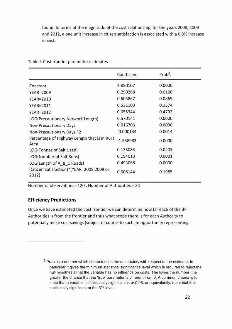
22
found. In terms of the magnitude of the cost relationship, for the years 2008, 2009
and 2012, a one unit increase in citizen satisfaction is associated with a 0.8% increase
in cost.
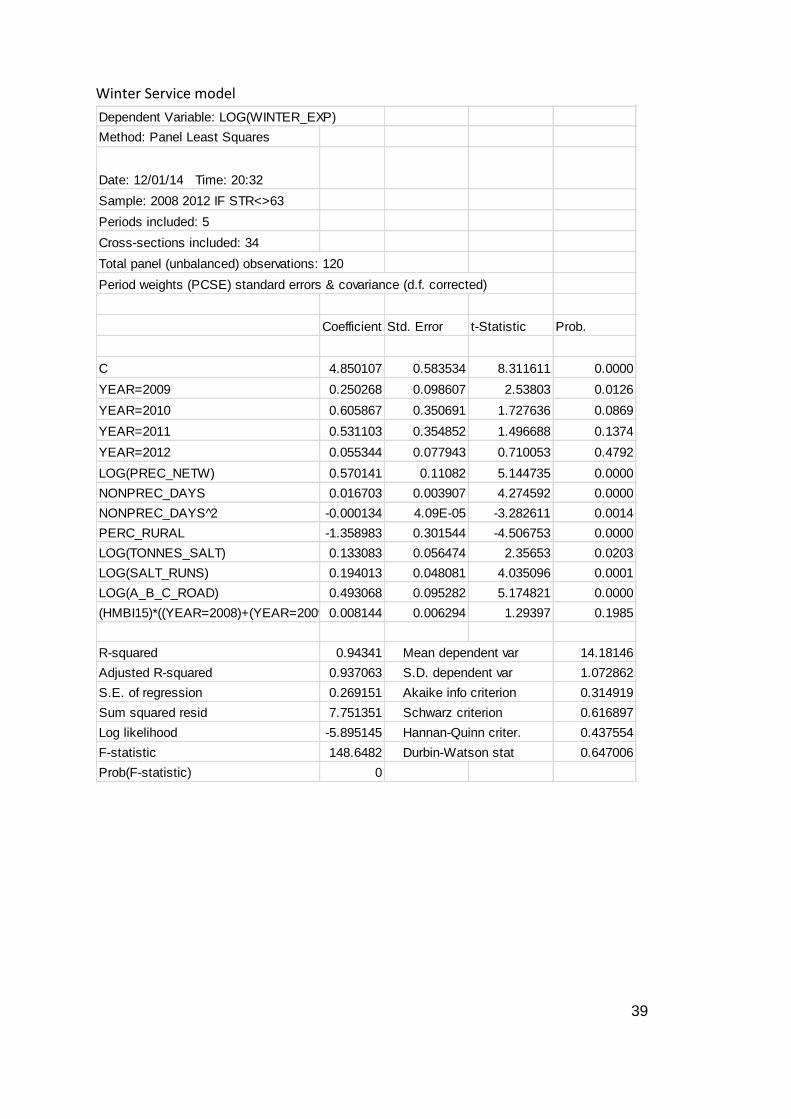
Table 4 Cost frontier parameter estimates
Coefficient Prob6. Constant 4.850107 0.0000
YEAR=2009 0.250268 0.0126
YEAR=2010 0.605867 0.0869
YEAR=2011 0.531103 0.1374
YEAR=2012 0.055344 0.4792
LOG(Precautionary Network Length) 0.570141 0.0000
Non-Precautionary Days 0.016703 0.0000
Non-Precautionary Days ^2 -0.000134 0.0014
Percentage of Highway Length that is in Rural Area
-1.358983 0.0000
LOG(Tonnes of Salt Used) 0.133083 0.0203
LOG(Number of Salt Runs) 0.194013 0.0001
LOG(Length of A_B_C Roads) 0.493068 0.0000
(Citizen Satisfaction)*(YEAR=2008,2009 or 2012)
0.008144 0.1985
Number of observations =120 , Number of Authorities = 34
Efficiency Predictions
Once we have estimated the cost frontier we can determine how far each of the 34
Authorities is from the frontier and thus what scope there is for each Authority to
potentially make cost savings (subject of course to such an opportunity representing
6 Prob. is a number which characterises the uncertainty with respect to the estimate. In
particular it gives the minimum statistical significance level which is required to reject the
null hypothesis that the variable has no influence on costs. The lower the number, the
greater the chance that the ‘true’ parameter is different from 0. A common criteria is to
state that a variable is statistically significant is p<0.05, or equivalently, the variable is
statistically significant at the 5% level.

23
something under control of the Authority). Table 5 gives descriptive statistics for the
distribution of efficiency predictions from this model.
On average (Mean) Authorities are found to be 92% efficient. Literally speaking this means,
on average Authorities can reduce highway maintenance expenditure (100%-92%=) 8% and
continue to maintain the same network, do the same number of salting runs etc.
Examining the distribution further, it can be seen that over 75% of Authorities have
efficiency predictions above 90%, which seems a little high. Only 10% of Authorities have
efficiency predictions less than 88% which is remarkably high. One possible explanation for
this is that efficiency here is evaluating a relatively narrow set of management decisions. In
particular by including explanatory variables such as tonnes of salt used and number of runs
undertaken, we are not considering whether the number of runs or salt used (i.e. spread
density) is optimal, instead we assume that it is when evaluating performance. Thus there is
an argument that efficiency differences should be small when efficiency is measured using
this model. That is not to say that understanding the determinants of inefficiency (such as
contracting model) are not interesting however.
Table 5 Distribution of efficiency predictions for the 33 Authorities7
7 The efficiency scores are averaged over the years that each Authority appears in the data,
before the distribution is ranked to form the entries in Table 3.
Percentile Efficiency
Score
0% 77%
10% 88%
20% 89%
25% 90%
30% 90%
40% 92%
50% 92%
60% 93%
70% 94%
75% 94%
80% 95%
90% 97%
100% 100%
Mean 92%

24
6. STREET LIGHTING MODEL
The street lighting cost category was included in the Pilot Study. As such this work is a
continuation. While new data was requested, such as proportion of units LED and
proportion of units on part time operation, the data response rate for these variables were
not sufficient to include them in the analysis. As such the variables available for analysis
were the same as for the Pilot Study.
The Cost Frontier
The cost category is all street lighting expenditure. Cost drivers are the number of lighting
columns and the citizen satisfaction measure (KBI25) relating to satisfaction with street
lighting. This measure is included in the model as the value from the proceeding year i.e. we
use the value surveyed 16 months after the end of the financial year we are modelling. The
motivation for doing is this is that it is important to recognise the lag effect in measuring
citizen satisfaction.
Compared to the model in the Pilot Study, this model does not contain the explanatory
factor of the proportion of lighting units operational. The reason for the lack of inclusion
was that when it was included, the implied relationship with cost was negative i.e. the fewer
lighting units that were inoperative the lower the cost. This seems counter intuitive given
that it would be expected that the higher proportion of lighting units operational, the
quicker a response required when a light failed (to maintain over time the same level of
operational units). This is counter to the finding of a positive relationship in the Pilot Study.
The functional form adopted is flexible, i.e. the relationship between cost and the two cost
drivers varies with the level of the cost drivers. As such care has to be taken in
interpretation. Table 6 reports the parameter estimates for the model. There are two key
aspects to focus on:
The results on economies of scale: the variables relating to number of lighting
columns capture the relationship between cost and the size of the authority. For the
average authority, a literal interpretation of the model estimates is that a 1%
increase in the number of street lights maintained results in a 1.13% increase in costs
i.e. at the size of the average authority, unit costs (cost divided by number of street
lights) increase if that authority gets larger; that is there are diseconomies of scale at
the sample mean. However the hypothesis that this estimate is consistent with the
null hypothesis of constant returns to scale i.e. constant unit cost canot be rejected.
However, the model formulation means that this relationship is flexible enough to
allow economies of scale to vary with the number of lighting columns. Figure 5
summarises this relationship for the authorities in sample. It shows that small
authorities (measured by number of lighting columns) suffer from economies of
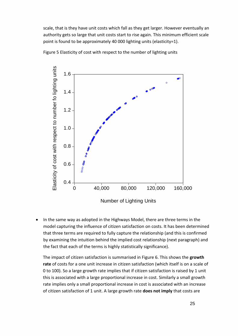
25
scale, that is they have unit costs which fall as they get larger. However eventually an
authority gets so large that unit costs start to rise again. This minimum efficient scale
point is found to be approximately 40 000 lighting units (elasticity=1).
Figure 5 Elasticity of cost with respect to the number of lighting units
In the same way as adopted in the Highways Model, there are three terms in the
model capturing the influence of citizen satisfaction on costs. It has been determined
that three terms are required to fully capture the relationship (and this is confirmed
by examining the intuition behind the implied cost relationship (next paragraph) and
the fact that each of the terms is highly statistically significance).
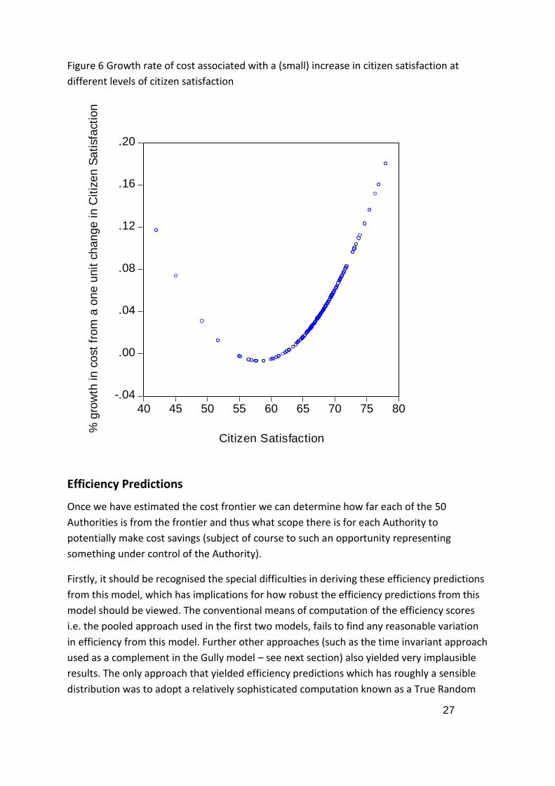
The impact of citizen satisfaction is summarised in Figure 6. This shows the growth
rate of costs for a one unit increase in citizen satisfaction (which itself is on a scale of
0 to 100). So a large growth rate implies that if citizen satisfaction is raised by 1 unit
this is associated with a large proportional increase in cost. Similarly a small growth
rate implies only a small proportional increase in cost is associated with an increase
of citizen satisfaction of 1 unit. A large growth rate does not imply that costs are
0.4
0.6
0.8
1.0
1.2
1.4
1.6
0 40,000 80,000 120,000 160,000
Number of Lighting Units
Ela
sti
cit
y o
f co
st
wit
h r
esp
ect
to n
um
be
r fo
lig
hti
ng
un
its
26
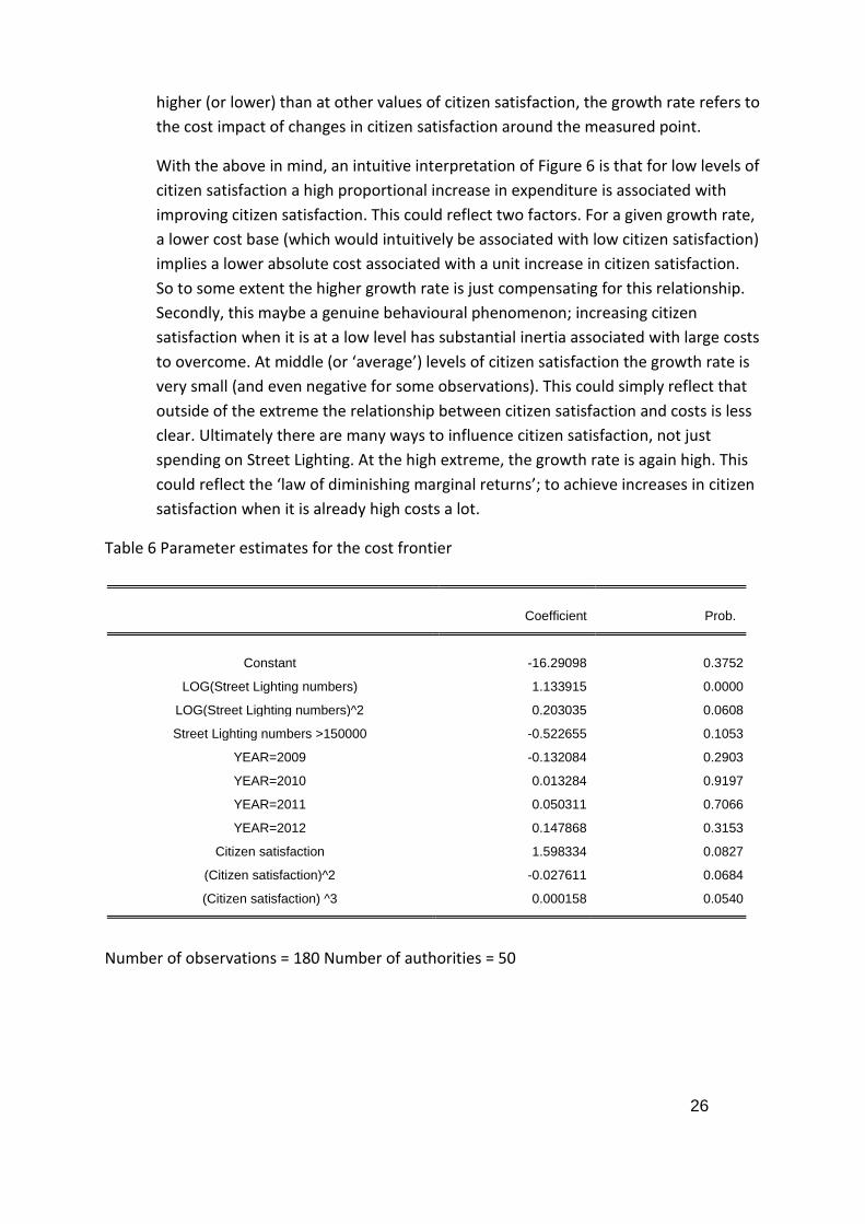
higher (or lower) than at other values of citizen satisfaction, the growth rate refers to
the cost impact of changes in citizen satisfaction around the measured point.
With the above in mind, an intuitive interpretation of Figure 6 is that for low levels of
citizen satisfaction a high proportional increase in expenditure is associated with
improving citizen satisfaction. This could reflect two factors. For a given growth rate,
a lower cost base (which would intuitively be associated with low citizen satisfaction)
implies a lower absolute cost associated with a unit increase in citizen satisfaction.
So to some extent the higher growth rate is just compensating for this relationship.
Secondly, this maybe a genuine behavioural phenomenon; increasing citizen
satisfaction when it is at a low level has substantial inertia associated with large costs
to overcome. At middle (or ‘average’) levels of citizen satisfaction the growth rate is
very small (and even negative for some observations). This could simply reflect that
outside of the extreme the relationship between citizen satisfaction and costs is less
clear. Ultimately there are many ways to influence citizen satisfaction, not just
spending on Street Lighting. At the high extreme, the growth rate is again high. This
could reflect the ‘law of diminishing marginal returns’; to achieve increases in citizen
satisfaction when it is already high costs a lot.
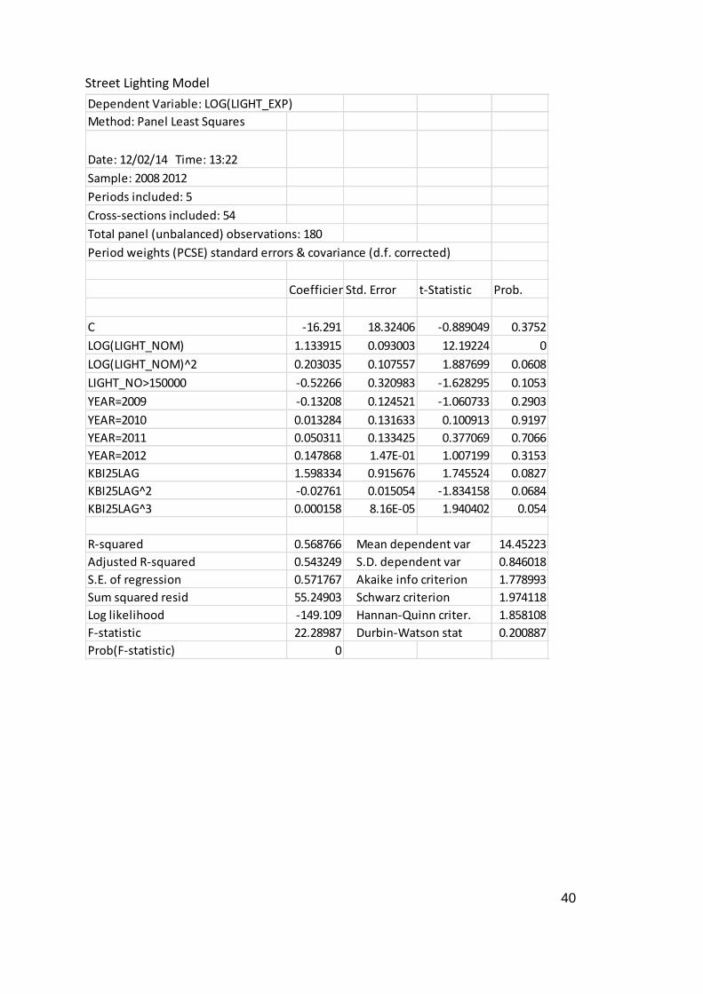
Table 6 Parameter estimates for the cost frontier
Coefficient Prob.
Constant -16.29098 0.3752
LOG(Street Lighting numbers) 1.133915 0.0000
LOG(Street Lighting numbers)^2 0.203035 0.0608
Street Lighting numbers >150000 -0.522655 0.1053
YEAR=2009 -0.132084 0.2903
YEAR=2010 0.013284 0.9197
YEAR=2011 0.050311 0.7066
YEAR=2012 0.147868 0.3153
Citizen satisfaction 1.598334 0.0827
(Citizen satisfaction)^2 -0.027611 0.0684
(Citizen satisfaction) ^3 0.000158 0.0540
Number of observations = 180 Number of authorities = 50
27
Figure 6 Growth rate of cost associated with a (small) increase in citizen satisfaction at
different levels of citizen satisfaction
Efficiency Predictions
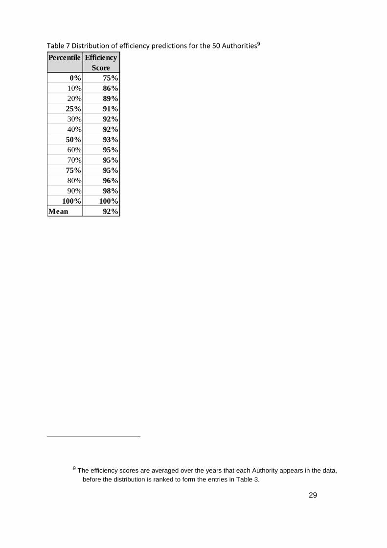
Once we have estimated the cost frontier we can determine how far each of the 50
Authorities is from the frontier and thus what scope there is for each Authority to
potentially make cost savings (subject of course to such an opportunity representing
something under control of the Authority).
Firstly, it should be recognised the special difficulties in deriving these efficiency predictions
from this model, which has implications for how robust the efficiency predictions from this
model should be viewed. The conventional means of computation of the efficiency scores
i.e. the pooled approach used in the first two models, fails to find any reasonable variation
in efficiency from this model. Further other approaches (such as the time invariant approach
used as a complement in the Gully model – see next section) also yielded very implausible
results. The only approach that yielded efficiency predictions which has roughly a sensible
distribution was to adopt a relatively sophisticated computation known as a True Random
-.04
.00
.04
.08
.12
.16
.20
40 45 50 55 60 65 70 75 80
Citizen Satisfaction
% g
row
th in
co
st
fro
m a
on
e u
nit
ch
an
ge
in
Cit
ize
n S
ati
sfa
cti
on

28
Effects approach (Greene, Journal of Econometrics, 2005). Ultimately the problem appears
to be in the distribution of the data, particularly the cost data. For many authorities it is
fluctuating relatively widely from year to year. This, in turn, implies a substantial amount of
unexplained variation in any estimated model8, which results in very unstable inefficiency
predictions (unstable from one method to another). It is recommended that there is a
working group formed to explore the reasons for the cost data variations to take this model
forward.
However, we proceed to describe the distribution of the predicted efficiency scores. Table 7
gives descriptive statistics for the distribution of efficiency predictions from this model. The
average score is 92% which literally implies that on average an authority can reduce their
costs by (100-92=) 8% can still maintain the same street lighting network at the same citizen
satisfaction. This seems plausible
However there are two specific issues with this distribution. First there is a lot of variation
within the years for each authority. This is averaged away and so not reflected in this
distribution (footnote 9 is important in explaining the averaging process). Second, the
middle 50 percentile only has an efficiency variation of five percentage points. This is partly
a symptom of the first point. Overall a further iteration with stakeholders is required to
improve this model.
8 One simple way to quantify this unexplained part of the model is to examine the R-squared
from the regression. This shows the proportion of the variation in the (log) cost variable
explained by the regression variables; thus a higher figure indicates lower unexplained
variation. For this model the R-Squared is 0.57, for the other cost categories the R-
Squared is in excess of 0.85, indicating that this model has poor explanatory power
relative to the models for the other cost categories.
29
Table 7 Distribution of efficiency predictions for the 50 Authorities9
9 The efficiency scores are averaged over the years that each Authority appears in the data,
before the distribution is ranked to form the entries in Table 3.
Percentile Efficiency
Score
0% 75%
10% 86%
20% 89%
25% 91%
30% 92%
40% 92%
50% 93%
60% 95%
70% 95%
75% 95%
80% 96%
90% 98%
100% 100%
Mean 92%

30
7. GULLY CLEARANCE MODEL
The Cost Frontier
The Gully Clearance model is the first time that this cost category has entered the analysis;
that is, it was not in the pilot study. As a result the model should be seen as a ‘first pass’ at
modelling this cost category. Further discussions at the working groups held in October and
November pointed to this being a difficult cost category to model, partly reflecting the lack
of robust asset register data.
For this analysis we have the following variables available to explain gully clearance costs:
Number of Gullies – This is a measure of the relevant scale of the operation
Number of Gullies Cleared per Annum – This captures the intensity of activity
Proportion of network (by km) in rural areas – This captures the likely difference in
complexity in the drainage network in rural and urban areas.
Proportion of network (by km) which is U road – U roads could be conceptualised as
requiring a lower drainage provision than A, B or C roads, all other things equal.
Dummy variables capturing year on year systematic expenditure differences
(common to all authorities)
Note, no citizen satisfaction measure is available for this cost category (there has
recently been a relevant question added for the year 2012 onwards, but given this is
the last year in sample, including it would severely limit the sample size).
The parameter estimates of the cost frontier are given in Table 8. The form of the model is
again a flexible functional form (similar to the highways and street lighting models). In
general this seems a sensible model:
In terms of how costs change as the scale or size of the operation increases, this can
be seen in Figure 6. The plot shows how the cost elasticity with respect to the scale
of operation increases (here allowing both the number of gullies and the number of
gullies cleared per annum to increase10). It shows that there is an increasing
elasticity, indicating that initially there are falling unit costs (cost per gully) from
expanding the scale of an authority. However there comes a point, at approximately
10 The number of gullies cleared has to increase otherwise the computation would assume
that the network size increased but that no more gullies were cleared.
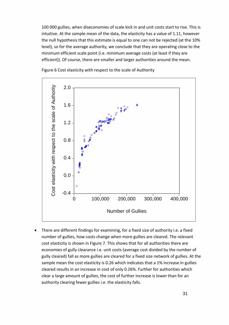
31
100 000 gullies, when diseconomies of scale kick in and unit costs start to rise. This is
intuitive. At the sample mean of the data, the elasticity has a value of 1.11, however
the null hypothesis that this estimate is equal to one can not be rejected (at the 10%
level), so for the average authority, we conclude that they are operating close to the
minimum efficient scale point (i.e. minimum average costs (at least if they are
efficient)). Of course, there are smaller and larger authorities around the mean.
Figure 6 Cost elasticity with respect to the scale of Authority
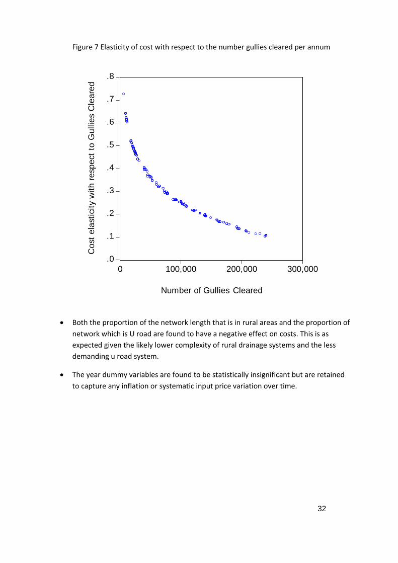
There are different findings for examining, for a fixed size of authority i.e. a fixed
number of gullies, how costs change when more gullies are cleared. The relevant
cost elasticity is shown in Figure 7. This shows that for all authorities there are
economies of gully clearance i.e. unit costs (average cost divided by the number of
gully cleared) fall as more gullies are cleared for a fixed size network of gullies. At the
sample mean the cost elasticity is 0.26 which indicates that a 1% increase in gullies
cleared results in an increase in cost of only 0.26%. Further for authorities which
clear a large amount of gullies, the cost of further increase is lower than for an
authority clearing fewer gullies i.e. the elasticity falls.
-0.4
0.0
0.4
0.8
1.2
1.6
2.0
0 100,000 200,000 300,000 400,000
Number of Gullies
Co
st
ela
sti
cit
y w
ith
re
sp
ect
to t
he s
ca
le o
f A
uth
ori
ty
32
Figure 7 Elasticity of cost with respect to the number gullies cleared per annum
Both the proportion of the network length that is in rural areas and the proportion of
network which is U road are found to have a negative effect on costs. This is as
expected given the likely lower complexity of rural drainage systems and the less
demanding u road system.
The year dummy variables are found to be statistically insignificant but are retained
to capture any inflation or systematic input price variation over time.
.0
.1
.2
.3
.4
.5
.6
.7
.8
0 100,000 200,000 300,000
Number of Gullies Cleared
Co
st
ela
sti
cit
y w
ith r
esp
ect
to G
ullie
s C
lea
red
33
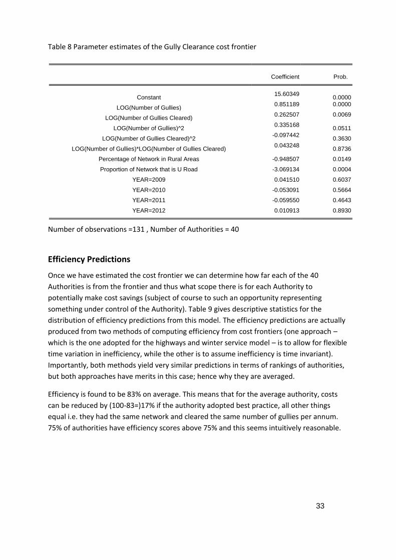
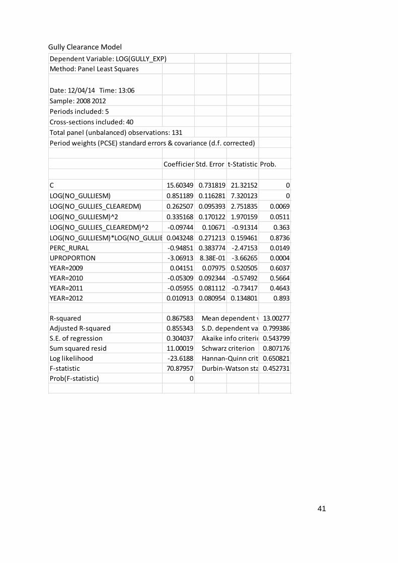
Table 8 Parameter estimates of the Gully Clearance cost frontier
Coefficient Prob.
Constant 15.60349
0.0000
LOG(Number of Gullies) 0.851189 0.0000
LOG(Number of Gullies Cleared) 0.262507 0.0069
LOG(Number of Gullies)^2 0.335168
0.0511
LOG(Number of Gullies Cleared)^2 -0.097442
0.3630
LOG(Number of Gullies)*LOG(Number of Gullies Cleared) 0.043248
0.8736
Percentage of Network in Rural Areas -0.948507 0.0149
Proportion of Network that is U Road -3.069134 0.0004
YEAR=2009 0.041510 0.6037
YEAR=2010 -0.053091 0.5664
YEAR=2011 -0.059550 0.4643
YEAR=2012 0.010913 0.8930
Number of observations =131 , Number of Authorities = 40
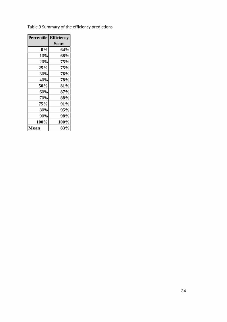
Efficiency Predictions
Once we have estimated the cost frontier we can determine how far each of the 40
Authorities is from the frontier and thus what scope there is for each Authority to
potentially make cost savings (subject of course to such an opportunity representing
something under control of the Authority). Table 9 gives descriptive statistics for the
distribution of efficiency predictions from this model. The efficiency predictions are actually
produced from two methods of computing efficiency from cost frontiers (one approach –
which is the one adopted for the highways and winter service model – is to allow for flexible
time variation in inefficiency, while the other is to assume inefficiency is time invariant).
Importantly, both methods yield very similar predictions in terms of rankings of authorities,
but both approaches have merits in this case; hence why they are averaged.
Efficiency is found to be 83% on average. This means that for the average authority, costs
can be reduced by (100-83=)17% if the authority adopted best practice, all other things
equal i.e. they had the same network and cleared the same number of gullies per annum.
75% of authorities have efficiency scores above 75% and this seems intuitively reasonable.
34
Table 9 Summary of the efficiency predictions
Percentile Efficiency
Score
0% 64%
10% 68%
20% 75%
25% 75%
30% 76%
40% 78%
50% 81%
60% 87%
70% 88%
75% 91%
80% 95%
90% 98%
100% 100%
Mean 83%

35
8. APPENDIX: DETAILED ECONOMIC AND STATISTICAL CONCEPTS
Interpreting the minimum cost frontier
The cost frontier relates cost to the drivers of cost. In order to estimate this relationship,
further structure needs to be imposed on the relationship. In particular we estimate the
model by assuming that the model is a constant elasticity model. We do this for a number of
reasons. Firstly it allows us to easily derive the efficiency scores from the model. Second it is
easy to estimate and the coefficients (the values we estimate) can be interpreted as cost
elasticities. A cost elasticity with respect to cost driver x is the % change in cost resulting
from a 1% change in cost driver x. A positive cost elasticity implies a positive relationship
between cost and the driver; while negative cost elasticity implies a negative relationship
between cost and the driver. Further the size of the coefficient has a useful interpretation:
If (in absolute value) the elasticity is equal to one, then costs change proportionally with
the cost driver. If we consider the cost driver to be output then an elasticity value of one
indicates constant returns to scale. This implies that average costs (or unit costs) do not
change as the scale of operation increases. In practice this means that large authorities
do not face scale advantages (or disadvantages) relative to smaller authorities.
If (in absolute value) the elasticity is less than one, then costs change proportionally less
with the cost driver. Again, if we consider the cost driver to be output then an elasticity
value of one indicates increasing returns to scale. This implies that average costs (or unit
costs) fall as the scale of operation increases. This implies that a larger authority has a
unit cost advantage over a smaller authority. Notice that this is a property of the cost
relationship; thus any efficiency score should not penalize a smaller authority for simply
being small. Thus we control for these effects separately to the efficiency score
computation11.
If (in absolute value) the elasticity is less than one, then costs change proportionally
more with the cost driver. Again, if we consider the cost driver to be output then an
elasticity value of one indicates decreasing returns to scale. This implies that average
costs (or unit costs) increase as the scale of operation increases. This implies that a
larger authority has a unit cost disadvantage over a smaller authority. Again, notice that
this is a property of the cost relationship; thus any efficiency score should not penalize a
larger authority for simply being large. Thus we control for these effects separately to
the efficiency score computation.
11 Findings on economies of scale may be useful in evaluating the potential for unit cost
saving from merging functions across a number of authorities however.
36
Statistical note: The constant elasticity model is estimated by first transforming variables
into logarithms (the statistical reason for doing this is that the model becomes linear in
parameters which makes life easier). Further, we can consider (and test) generalisations to
this model such that the elasticities are no longer constant but vary with the level of the
cost drivers. This provides a better fit of the data, but potentially introduces spurious
accuracy. At this early stage of the work we maintain the constant elasticity model.
Statistical testing and significance
When we estimate a model, we are trying to use a sample of data (in this case from 46
authorities for a select number of years) to learn about the properties of the cost frontier
for the population (in this case all authorities over many years). Thus any numbers that we
generate will have a degree of error around them in the sense of how close they are to the
‘true’ values. We can use statistical testing to better understand if our estimates are
different from a given level. An example would be we wish to test whether a cost driver
does actually impact on cost. In this case we want to find evidence against the value of the
relevant cost elasticity being zero (no impact). This is called the null hypothesis.
Importantly, a necessary limitation of statistical analysis is that we can never say with
certainty that an estimate is different from a given value; there is always some (hopefully
small) probability that the true estimate could be zero (in the example above) irrespective of
the value of our estimate. Instead we make probabilistic statements. In particular we
compute a test which allows us to state whether we can reject the null hypothesis at a
certain significance level. The significance level represents the probability that we reject the
null hypothesis when it is true i.e. the percentage of times (in resampling) that we make the
wrong judgement in rejecting the null. Clearly we wish to reject the null and have a very low
chance of us being wrong. Thus a statistical test reports the minimum statistical significance
level possible to reject the null (reported as a p-value). Ultimately we have more faith in our
decision to reject the null if the p-value is small.
It is important to note the following: statistical testing only allows us to reject a null
hypothesis; importantly we cannot accept a null hypothesis through statistical testing alone.
This is important and best illustrated by an example. Consider if we are modelling street
lighting costs and find that we cannot reject the null hypothesis that the cost elasticity with
respect to number of street lighting columns is zero (fortunately in Section 4 we show this is
not the case!). If we accepted the null hypothesis then we would be saying that street
lighting costs are not impacted upon by the number of street lights! But this is not what the
statistical test would imply. All it would say is that we find no evidence against the

37
hypothesis, not that it itself is true.12 Thus it is likely that we would retain number of street
lighting columns in the model.
Statistical estimation methodology
There are a number of statistical techniques that can be used to estimate the cost frontier
and predict each authority’s efficiency score. Most readers will have heard about linear
regression. This is a useful technique but does not allow for an authority to be operating
above the minimum possible cost. As such we have to depart from the usual “fitting a line
through a cloud of points”.
For the purpose of this report we adopt the techniques known as ‘pooled stochastic frontier
analysis’. The advantages of this approach, relative to other approaches, can be summarised
as:
The method accounts for statistical noise as well as inefficiency. Thus there is an attempt
to distinguish between random events outside the model which influence costs and the
remaining inefficiency
The method produces plausible predictions of inefficiency as compared to other
approaches which ignore statistical noise (where the efficiency scores are implausibly
small)
The method can deal with the highly unbalanced nature of the panel. This presents
problems to more standard methods which are used to analyse panel data since for a
large number of authorities we only have one or two years of data.
However it is also important to acknowledge the disadvantages with this approach,
primarily the need for distributional assumptions to be made to identify noise from
inefficiency. Ultimately there is little choice at present as to which approach to use. As the
dataset develops, and in particular as the number of years per authority increases, so more
panel data specific methods (which are more robust) can be applied.
12 Intuitively the reason for this distinction is as well as failing to reject the null hypothesis of
zero impact, we would also fail to reject may other possible null hypothesis including
those that make sense!
38
Full Statistical Output
For reference, the full statistical output for estimation of the cost frontiers is provided
below:
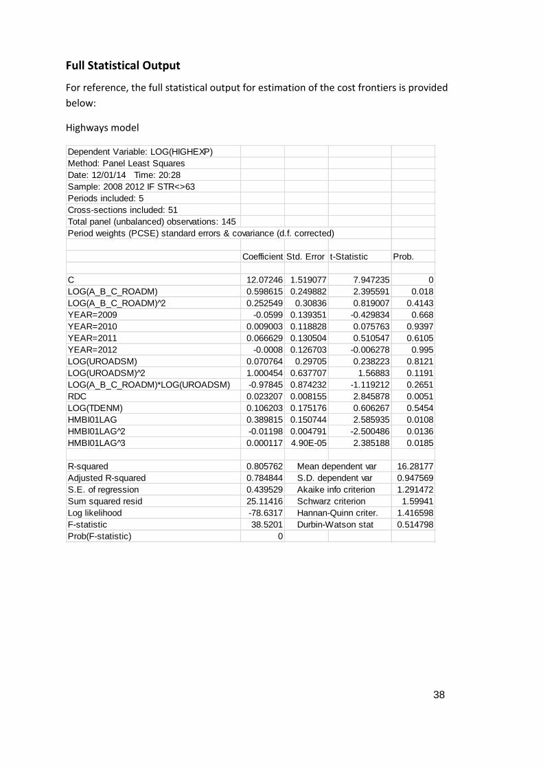
Highways model
Dependent Variable: LOG(HIGHEXP)
Method: Panel Least Squares
Date: 12/01/14 Time: 20:28
Sample: 2008 2012 IF STR<>63
Periods included: 5
Cross-sections included: 51
Total panel (unbalanced) observations: 145
Period weights (PCSE) standard errors & covariance (d.f. corrected)
Coefficient Std. Error t-Statistic Prob.
C 12.07246 1.519077 7.947235 0
LOG(A_B_C_ROADM) 0.598615 0.249882 2.395591 0.018
LOG(A_B_C_ROADM) 2̂ 0.252549 0.30836 0.819007 0.4143
YEAR=2009 -0.0599 0.139351 -0.429834 0.668
YEAR=2010 0.009003 0.118828 0.075763 0.9397
YEAR=2011 0.066629 0.130504 0.510547 0.6105
YEAR=2012 -0.0008 0.126703 -0.006278 0.995
LOG(UROADSM) 0.070764 0.29705 0.238223 0.8121
LOG(UROADSM) 2̂ 1.000454 0.637707 1.56883 0.1191
LOG(A_B_C_ROADM)*LOG(UROADSM) -0.97845 0.874232 -1.119212 0.2651
RDC 0.023207 0.008155 2.845878 0.0051
LOG(TDENM) 0.106203 0.175176 0.606267 0.5454
HMBI01LAG 0.389815 0.150744 2.585935 0.0108
HMBI01LAG 2̂ -0.01198 0.004791 -2.500486 0.0136
HMBI01LAG 3̂ 0.000117 4.90E-05 2.385188 0.0185
R-squared 0.805762 Mean dependent var 16.28177
Adjusted R-squared 0.784844 S.D. dependent var 0.947569
S.E. of regression 0.439529 Akaike info criterion 1.291472
Sum squared resid 25.11416 Schwarz criterion 1.59941
Log likelihood -78.6317 Hannan-Quinn criter. 1.416598
F-statistic 38.5201 Durbin-Watson stat 0.514798
Prob(F-statistic) 0
39
Winter Service model
Dependent Variable: LOG(WINTER_EXP)
Method: Panel Least Squares
Date: 12/01/14 Time: 20:32
Sample: 2008 2012 IF STR<>63
Periods included: 5
Cross-sections included: 34
Total panel (unbalanced) observations: 120
Period weights (PCSE) standard errors & covariance (d.f. corrected)
Coefficient Std. Error t-Statistic Prob.
C 4.850107 0.583534 8.311611 0.0000
YEAR=2009 0.250268 0.098607 2.53803 0.0126
YEAR=2010 0.605867 0.350691 1.727636 0.0869
YEAR=2011 0.531103 0.354852 1.496688 0.1374
YEAR=2012 0.055344 0.077943 0.710053 0.4792
LOG(PREC_NETW) 0.570141 0.11082 5.144735 0.0000
NONPREC_DAYS 0.016703 0.003907 4.274592 0.0000
NONPREC_DAYS 2̂ -0.000134 4.09E-05 -3.282611 0.0014
PERC_RURAL -1.358983 0.301544 -4.506753 0.0000
LOG(TONNES_SALT) 0.133083 0.056474 2.35653 0.0203
LOG(SALT_RUNS) 0.194013 0.048081 4.035096 0.0001
LOG(A_B_C_ROAD) 0.493068 0.095282 5.174821 0.0000
(HMBI15)*((YEAR=2008)+(YEAR=2009)+(YEAR=2012))0.008144 0.006294 1.29397 0.1985
R-squared 0.94341 Mean dependent var 14.18146
Adjusted R-squared 0.937063 S.D. dependent var 1.072862
S.E. of regression 0.269151 Akaike info criterion 0.314919
Sum squared resid 7.751351 Schwarz criterion 0.616897
Log likelihood -5.895145 Hannan-Quinn criter. 0.437554
F-statistic 148.6482 Durbin-Watson stat 0.647006
Prob(F-statistic) 0
40
Street Lighting Model
Dependent Variable: LOG(LIGHT_EXP)
Method: Panel Least Squares
Date: 12/02/14 Time: 13:22
Sample: 2008 2012
Periods included: 5
Cross-sections included: 54
Total panel (unbalanced) observations: 180
Period weights (PCSE) standard errors & covariance (d.f. corrected)
CoefficientStd. Error t-Statistic Prob.
C -16.291 18.32406 -0.889049 0.3752
LOG(LIGHT_NOM) 1.133915 0.093003 12.19224 0
LOG(LIGHT_NOM)^2 0.203035 0.107557 1.887699 0.0608
LIGHT_NO>150000 -0.52266 0.320983 -1.628295 0.1053
YEAR=2009 -0.13208 0.124521 -1.060733 0.2903
YEAR=2010 0.013284 0.131633 0.100913 0.9197
YEAR=2011 0.050311 0.133425 0.377069 0.7066
YEAR=2012 0.147868 1.47E-01 1.007199 0.3153
KBI25LAG 1.598334 0.915676 1.745524 0.0827
KBI25LAG^2 -0.02761 0.015054 -1.834158 0.0684
KBI25LAG^3 0.000158 8.16E-05 1.940402 0.054
R-squared 0.568766 Mean dependent var 14.45223
Adjusted R-squared 0.543249 S.D. dependent var 0.846018
S.E. of regression 0.571767 Akaike info criterion 1.778993
Sum squared resid 55.24903 Schwarz criterion 1.974118
Log likelihood -149.109 Hannan-Quinn criter. 1.858108
F-statistic 22.28987 Durbin-Watson stat 0.200887
Prob(F-statistic) 0
41
Gully Clearance Model
Dependent Variable: LOG(GULLY_EXP)
Method: Panel Least Squares
Date: 12/04/14 Time: 13:06
Sample: 2008 2012
Periods included: 5
Cross-sections included: 40
Total panel (unbalanced) observations: 131
Period weights (PCSE) standard errors & covariance (d.f. corrected)
CoefficientStd. Error t-Statistic Prob.
C 15.60349 0.731819 21.32152 0
LOG(NO_GULLIESM) 0.851189 0.116281 7.320123 0
LOG(NO_GULLIES_CLEAREDM) 0.262507 0.095393 2.751835 0.0069
LOG(NO_GULLIESM)^2 0.335168 0.170122 1.970159 0.0511
LOG(NO_GULLIES_CLEAREDM)^2 -0.09744 0.10671 -0.91314 0.363
LOG(NO_GULLIESM)*LOG(NO_GULLIES_CLEAREDM)0.043248 0.271213 0.159461 0.8736
PERC_RURAL -0.94851 0.383774 -2.47153 0.0149
UPROPORTION -3.06913 8.38E-01 -3.66265 0.0004
YEAR=2009 0.04151 0.07975 0.520505 0.6037
YEAR=2010 -0.05309 0.092344 -0.57492 0.5664
YEAR=2011 -0.05955 0.081112 -0.73417 0.4643
YEAR=2012 0.010913 0.080954 0.134801 0.893
R-squared 0.867583 Mean dependent var13.00277
Adjusted R-squared 0.855343 S.D. dependent var 0.799386
S.E. of regression 0.304037 Akaike info criterion0.543799
Sum squared resid 11.00019 Schwarz criterion 0.807176
Log likelihood -23.6188 Hannan-Quinn criter.0.650821
F-statistic 70.87957 Durbin-Watson stat 0.452731
Prob(F-statistic) 0