Embed Size (px)
Citation preview
Universitat Pompeu Fabra ‐ Research and Expertise Centre for Survey Methodology Edifici ESCI‐Born ‐ Despatxos 19.517‐19.527
Passeig Pujades, 1 ‐ 08003 Barcelona Tel.: +34 93 542 11 63 web: http://www.upf.edu/survey/ e‐mail: [email protected]
RECSM Working Paper Number 35
2013
How the form of asking respondents’ three preferred brands changes the results
Melanie Revilla,
Research and Expertise Centre for Survey Methodology, Universitat Pompeu Fabra Carlos Ochoa, Germán Loewe
Netquest
Acknowledgements We would like to thank the Netquest company for providing use with the data for this study and Professor Willem Saris for his very useful comments on previous drafts of this paper.
Abstract In surveys, different results can be obtained depending the form used to ask the information to respondents. A lot is already known about the impact of some characteristics of the scales. However, little is known about others. In this note we investigate the impact of asking in different ways to select the three preferred brands out of a list. Using data from the Netquest online panel in Spain, Mexico and Colombia, we show that significant differences are obtained when the different forms are. However, the causes of these differences are not clear. It is also hard to say that one of the forms performs better than the others: i.e. provides results closer to the reality. But researchers should be aware that even small changes in the form of asking for information can have big impact on the results. More time and efforts should therefore be dedicated to the questionnaires design.
Introduction Surveys are used a lot in research in order to collect behaviors and factual
information, opinions, attitudes, feelings. In the past decades, the number of surveys in all areas has increased a lot. With the development of very friendly-user software for creating Web surveys, more and more persons started to do surveys themselves instead of passing by a professional survey institution.
This is a very risky way to go, since surveys are not as easy to design as one could
think. Already Payne in 1951 showed that designing a survey is a very complex and long task that requires specific knowledge and expertise. Many scholars have been studying the impact on the results of taking one or the other decision at several steps of the survey process.
In this context, it has been shown (Converse 1964; Zaller 1992; Tourangeau, Rips,
and Rasinski 2000) that respondents do not already have in memory an answer about everything they are asked about in a survey. Instead, for many questions, they form their answer in the moment using all the available information.
It has also been shown that often respondents do not try to optimize their answers.
The workload of answering a survey may be quite high if one tries to optimize each answer and the motivation of the respondents as well as their cognitive capacities, in many cases, are not sufficient for them to determine the best answer for each question. Instead, respondents tend to satisfice, meaning that they only attempt to meet an acceptability threshold (Krosnick, 1991).
Consequently, changes in the way of asking the question to the respondents can
provoke changes in their answers (Schuman and Presser, 1981; Tversky and Kahneman, 1981). The respondents use the question characteristics and the context as extra information to decide about their answers.
A lot is already known about how some scales characteristics affect the answers of
the respondents (e.g. Alwin, 2007 or Saris and Gallhofer, 2007). However, there is a lack of information concerning the impact of changes in the way of asking for information in the frame of more complex tasks. For instance, what is the impact of asking in different ways to order a list of brands from the most till the least liked?
Besides, with the development of new technologies, new possibilities appear for which we do not know what effects to expect. What we want to investigate in this note is to what extent different interactive ways of asking respondents about their first three preferred brands out of a list can affect the answers.
In the next section, the design of the experiment is presented. Then, come some
information about the survey and the data used. Finally, the results are shown and discussed.
The experiment
The experiment is about 12 different brands of cars. The questions aim to identify
what are the first, the second and the third brands that the respondents prefer. There are a lot of possible ways of asking this information to the respondents, mainly in a web surveys that allows all kind of new techniques. We have to focus only on a few of them.
Indeed, for sampling size reasons, the sample was divided in three split-ballot
groups. Each respondent was randomly assigned to one of these groups at the beginning of the survey. Each split-ballot group was asked to provide the three preferred brands in a different way. Therefore, three different forms could be used. We choose three forms that are taking advantage of the interactivity of web surveys.
In form 1, the respondents were asked in a first question to select the three brands
they preferred out of a list of 12. In a follow up question, they got these three brands only and had to order them from 1 to 3.
In form 2, the respondents were asked which brand (only one) they preferred out of
the 12. In a follow up question, they got the list of brands minus the one they already selected and were asked again the same question. Finally they got a third time the same question but applying only to the 10 brands not selected yet.
In form 3 (“order by click”), the respondents were asked to click on the brand they
preferred. The brand was selected and a message appeared on the same page asking them, now, to click on the second preferred brand. The brand was selected too and a final message asked them to select the third preferred brand. The complete questionnaire can be found online1. Moreover, Appendix 1 provides screen shots of the questions.
Also, we used images of the brands’ logos in all three forms. The name of the brand
was always visible together with the logo. The same images were used since the interest was not to study the impact of images but the impact of varying the form in which respondents should complete the task.
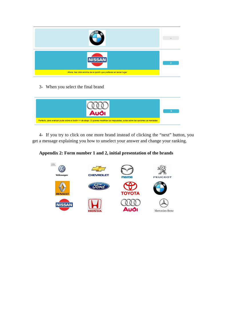
It is important to note that in the forms 1 and 2, the list of brands on a computer
screen was presented as a 4 columns and 3 rows matrix (see Appendix 2). On the contrary, in form 3, all the brands appeared in only one column. The order of the brands on the list was not randomized but always kept the same. Again, we refer to the online questionnaire (footnote 1) and Appendices 1 and 2 for more details on how the questions looked like.
1 http://test.nicequest.com/surveys/global_glacier/f8e0c689-0d48-4d62-8839-a6a708ae27f9
This change in the visual presentation can be considered as a characteristic of the way of asking the question. Even if it is possible to program it differently, by default, the software is using a different presentation for the “order by click” form with respect to the other two forms. We wanted to respect this difference because it is what is happening in normal surveys done by Netquest – and very probably by other online fieldwork companies too. This is important to notice it because it can have an impact on the answers.
The survey
The experiment was part of a survey done by Netquest between the 14th of May and
the 18th of June 2013. Netquest2 is an online fieldwork company with panels in 17 countries in Latin America, Spain and Portugal. The panelists are recruited “by invitation only” from a database of users of many websites that agreed to be contacted to do surveys. Once they agreed to participate in the online panel, the panelists are contacted regularly to answer surveys. In average, a panelist completes around two surveys per month. In reward of their participation, Netquest panelists are given points that can be cumulated and exchanged for gifts.
The survey used in this study was carried on in three countries: Spain, Mexico and
Colombia, with around 1000 respondents in each. Quotas for age and gender were used in order to get a representative sample from the general population on these key background variables. Within each country, the respondents were split-up into three groups. Each group got a different version of the questionnaire. The assignment to the different forms of the questionnaire was random. The questionnaire was prepared to take around 25-30 minutes to be completed. The main topics were food and beverage consumptions, opinions about several brands of cars and media use.
Analyzes and results
Brand selected as the preferred one
First, we look at the percentage of respondents that selected the different brands as
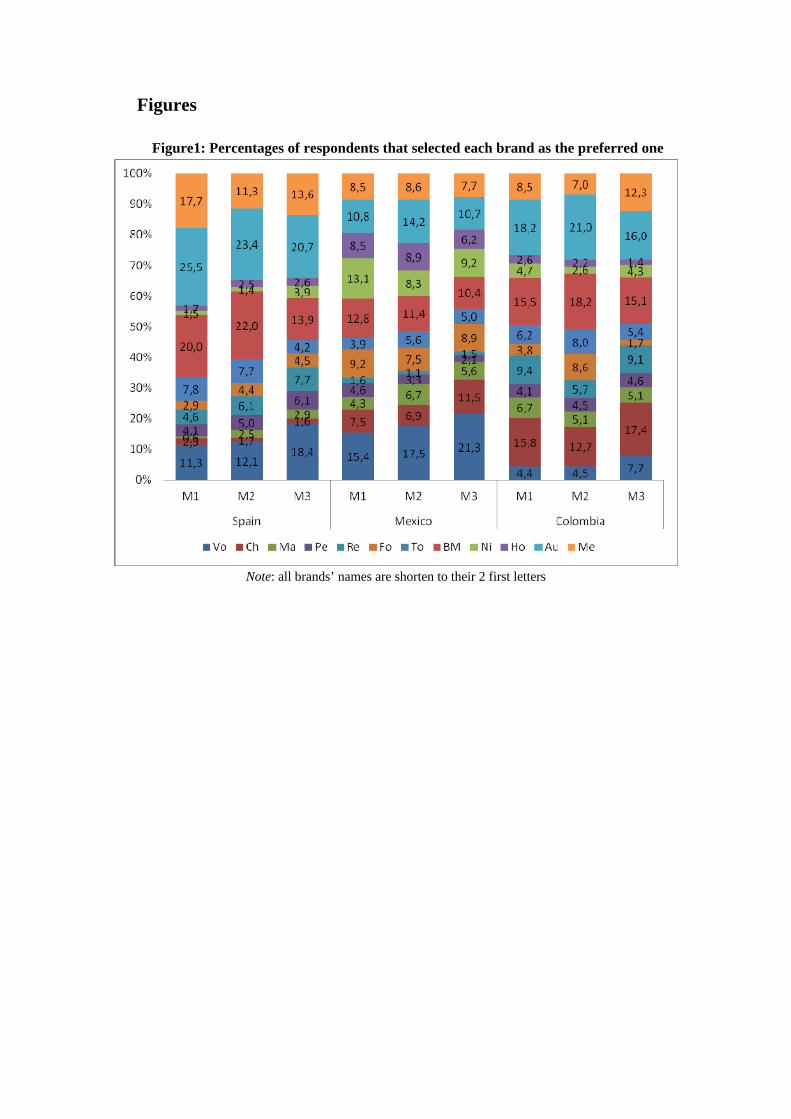
the preferred one. Figure 1 shows the results. *Figure1 about here*
Figure 1 shows that very different results can be obtained depending which form is
used to ask the respondents. For instance, if one is especially interested in how good or bad the brand Chevrolet is doing in Mexico. When asking the question about the preferred brand using form 3, one gets 11.5% of the respondents that put this brand as the preferred one. This is the second higher percentage, just after Volkswagen, which is preferred by 21.3%. Now, when asking the question using form 2, there are only 6.9%
2 More information on the website: http://www.netquest.com/en/panel_netquest/
of the respondents that answer that Chevrolet is their preferred brand. This is lower than the percentage of respondents answering that their preferred brand is Volkswagen (17.5%), but also that the percentages of respondents answering that their preferred brand is Audi (14.2%), BMW (11.4%), Peugeot (8.9%), Mercedes (8.6%), Mazda (8.3%) and Ford (7.5%). This places Chevrolet in the 9th position according to the percentage of respondents saying that this is their preferred brand.
Therefore, using form 2 or form 3 gives a completely different picture of what is the
situation for the brand Chevrolet in Mexico. The same applies for other brands and countries as can be seen in Figure 1: the choice of one form of asking the question is crucial because it can completely change the results.
Comparing the percentages of respondents selecting each brand as preferred one, we
can see that some differences are small and even not statistically significant. But others are quite large and significant at the 5% level. For instance in Spain, form 3 leads to a significantly lower percentage of respondents selecting BMW as the preferred brand (13.9% versus 20% in form 1 and 22% in form 2) and a significantly higher percentage of respondents selecting Volkswagen as the preferred brand (18.4% versus 11.3% in form 1 and 12.1% in form 2). However, in Mexico, even if the differences go in the same direction for these two brands, they are not statistically significant anymore at the 5% level. Therefore, it seems that there are differences across countries.
In the “order by click” form (form 3), all brands appear in the same column. It means
that respondents have to scroll down in order to see all the brands, whereas in forms 1 and 2, they can directly see the complete list. Because scrolling down requires some extra effort and we assume that respondents often tend to satisfice as mentioned in the introduction, we expect some primacy effect in form 3 that we do not expect in forms 1 and 2. “Primacy effects occur when placement of an item at the beginning of a list increases the likelihood that it will be selected” (Krosnick and Alwin, 1987, pp202).
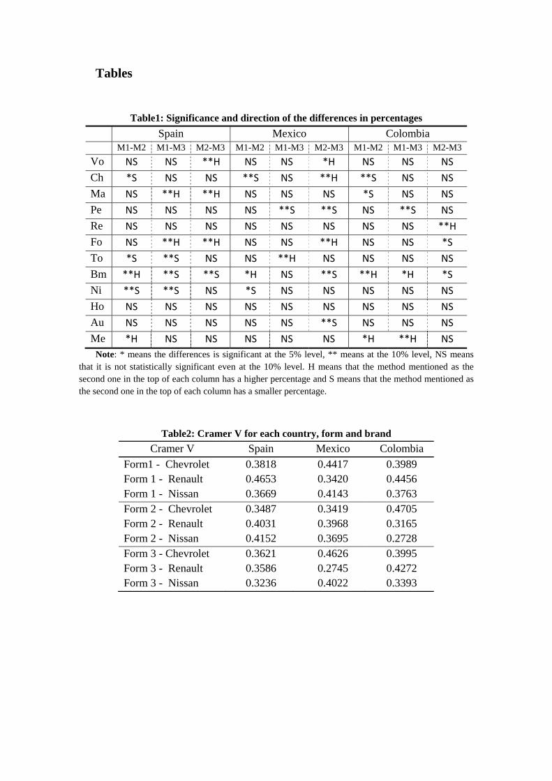
Table 1 shows that to some extent the brands that appear at the top of the list in form
3 are indeed selected more often in that form. We can see it, for instance, by comparing the cumulative percentages for the four brands that appeared at the top (which are the ones a respondent sees without needing to scroll down on an average size computer screen). In Spain, 18.3% of the respondents chose one of the four first brands in form 1 versus 21.2% in form 2 and 29.0% in form 3. In Mexico, we get respectively 31.7%, 34.4% and 40.5% and in Colombia, 31.1%, 26.8% and 34.8%. This suggests there are some primacy effects, mainly in Spain and Mexico.
If we expect the brands at the top of the list in form 3 to be selected more, we would
also expect the brands that appear at the bottom to be selected less in that form than in the two others. Nevertheless, if we consider the four brands at the bottom, for Spain and Colombia, the cumulative percentage of people choosing these four brands is not the lowest in form 3 but in form 2 (40.7% in form 3 versus 38.6% in form 2 in Spain and
33.9% in form 3 versus 32.8% in form 2 in Colombia). Only in Mexico the pattern seems to be as expected (40.9% in form 1, 40.0% in form 2 and 33.7% in form 3).
One possible explanation could be that respondents have to scroll down anyway to
the bottom of the page in order to click on the “Next” button and go on with the survey. Therefore, one could imagine that they select more brands at the top (directly visible) but also at the bottom (close to the “Next” button) and ignore more the ones in the middle (scrolling down directly to the bottom of the page and not little by little). It can also be simply that the extremes attract more the attention.
Concerning forms 1 and 2, they seem to be more similar in general. However, there
are also some significant differences, for instance in Spain for Mercedes (chosen preferred brand by only 11.3% of the respondents in form 2, versus 17.7% in form 1) or in Mexico for Nissan (8.3% in form 2 versus 13.1% in form 1) or in Colombia for Renault (5.7% in form 2 versus 9.4% in form 1).
Finally, we should add that in fact, none of the rankings is probably the true one.
Indeed, each form has its limits so the results observed are most of the time different from the reality.
Brands selected as second and third
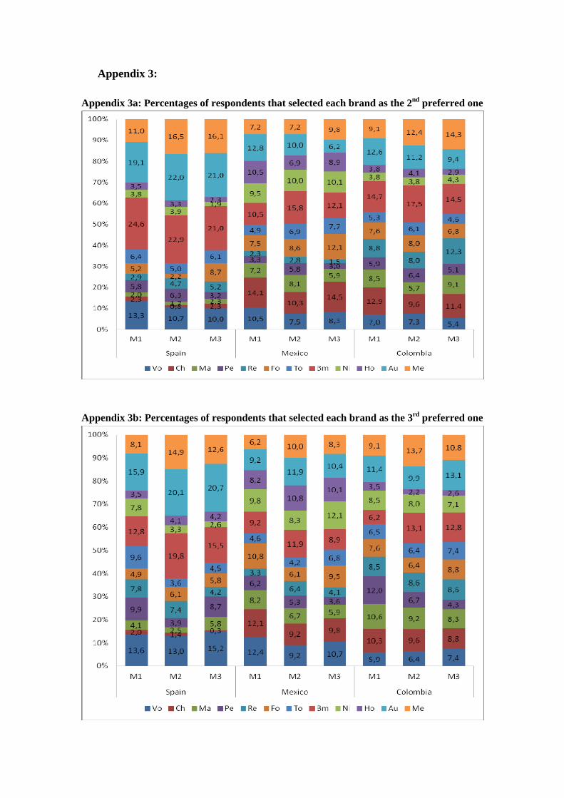
Then, we look at the percentages of respondents that selected the different brands as being the second and third preferred one. Since the results are very similar, they are provided only in Appendix.
Appendices 3a and 3b show again differences across countries, with some large
significant differences for some brands depending on the form used to ask the question. However, there is no clear evidence of a pattern or what could explain these differences.
The visual presentation, which differs in form 3 by being only one column, probably
plays a role since form 3 presents somehow more differences with the two others than forms 1 and 2 with each other. But this is probably not the only mechanism going on.
Brands selected as one of the three first
In order to try to simplify the problem, we finally look at the percentages of
respondents that selected the different brands as one of the first three. In that case, if the brand was chosen as first, second or third one does not matter anymore. We expect by looking at the three together to have less differences that maybe can also be understood better. Figure 2 gives the results.
*Figure 2 about here*
Figure 2 shows clear differences across the different methods within country. To try to identify better the patterns, Table 1 summarizes the results of the tests of significance of differences between methods.
*Table1 about here*
First, we see in Table 1 that out of 108 significance tests, 35 lead to the rejection of
the null hypothesis, meaning that there are significant differences in percentages in around 32.4% of the cases. This confirms that there is a huge impact of the form of asking the question, even when ignoring the exact order of the three preferred brands.
Second, form 3 does not seem to be the most different now. The significant
differences are quite spread over the different columns of Table 1. There are significant differences between forms 1 and 2, as well as forms 1 and 3, or forms 2 and 3. This suggests that the primacy effects are not the main mechanism.
Nevertheless, there is some evidence going in the direction of primacy effects for
form 3, since the brands at the top of the list (first rows in Table 1) shows at several occasions a significantly higher percentage of respondents selecting them when form 3 is used (Volkswagen in Spain and Mexico, Chevrolet in Mexico, Mazda in Spain). But this is not systematic. For instance, in Colombia, there is no evidence of primacy effects for form 3 (no significant differences in the brands at the top).
More generally, some patterns of differences across the forms are similar for the
three countries but not so many. The two similar effects across all three countries are the following:
- Form 2 leads to a significantly smaller percentage of respondents choosing Chevrolet as one of the three preferred brands
- Form 2 leads to a significantly higher percentage of respondents choosing BMW as one of the three first brands than form 1
But already for the second one, the position of form 3 with respect to the two others differs in Spain and Mexico on the one hand and Colombia on the other hand.
Overall, we observe differences between the different scales. Part of them can be
explained by existing theories, like the primacy effects, but in many cases how to explain these differences is not clear. However, even if we do not know where the differences come from, if we can assess which of the three forms is performing better, meaning which gives results closer to the reality, then we would know which form should be used. So the next question is: is one of the three forms reproducing better the reality?
External validity test
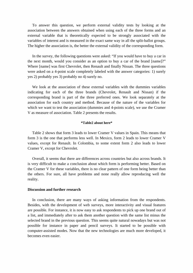
To answer this question, we perform external validity tests by looking at the association between the answers obtained when using each of the three forms and an external variable that is theoretically expected to be strongly associated with the variables of interest and is measured in the exact same way in all the split-ballot groups. The higher the association is, the better the external validity of the corresponding form.
In the survey, the following questions were asked: “If you would have to buy a car in
the next month, would you consider as an option to buy a car of the brand [name]?” Where [name] was first Chevrolet, then Renault and finally Nissan. The three questions were asked on a 4-point scale completely labeled with the answer categories: 1) surely yes 2) probably yes 3) probably no 4) surely no.
We look at the association of these external variables with the dummies variables
indicating for each of the three brands (Chevrolet, Renault and Nissan) if the corresponding brand is part of the three preferred ones. We look separately at the association for each country and method. Because of the nature of the variables for which we want to test the association (dummies and 4-points scale), we use the Cramer V as measure of association. Table 2 presents the results.
*Table2 about here*
Table 2 shows that form 3 leads to lower Cramer V values in Spain. This means that
form 3 is the one that performs less well. In Mexico, form 2 leads to lower Cramer V values, except for Renault. In Colombia, to some extent form 2 also leads to lower Cramer V, except for Chevrolet.
Overall, it seems that there are differences across countries but also across brands. It
is very difficult to make a conclusion about which form is performing better. Based on the Cramer V for these variables, there is no clear pattern of one form being better than the others. For sure, all have problems and none really allow reproducing well the reality.
Discussion and further research
In conclusion, there are many ways of asking information from the respondents.
Besides, with the development of web surveys, more interactivity and visual features are possible. For instance, it is now easy to ask respondents to pick up one brand out of a list, and immediately after to ask them another question with the same list minus the selected brand in the previous question. This seems quite natural nowadays but was not possible for instance in paper and pencil surveys. It started to be possible with computer-assisted modes. Now that the new technologies are much more developed, it becomes even easier.
In this note, we investigated the effect on the responses of asking respondents in three different ways to give their first, second and third preferred brands of cars out of a list of 12. The three forms used pictures with the logos of the brands and took advantage of the interactivity of web surveys.
Depending on the form used, the percentages of respondents selecting one or the
other brand as the preferred one varies quite a lot. As a result, completely different conclusions can be obtained based on the comparison of percentages when one or another form is used.
To some extent, it seems that the visual presentation in form 3 leads to primacy
effects in Spain and Mexico, but not as strong as expected and not in Colombia. Moreover, the brands from the end of the list were not less selected, which can maybe be explained by the fact that they are closed to the “Next” button. In that way, the brands from the middle of the list would be the less chosen ones.
Besides the potential primacy effects, we did not manage to identify other patterns of
differences, because the differences are often not systematic across countries. The external validity test was also not very successful in finding one form that would perform better than the others. Nevertheless, there is some evidence suggesting that form 3 is the one that performs worse in Spain, whereas it is form 2 in Mexico and Colombia.
We should add that in fact, all forms come with their own effects. It is not so that one
is the good one and the others are bad. All have their limits. The key is to be aware of them and take them into account when analyzing the results.
We hope this first exploratory study demonstrates how large the effects of the form
chosen to ask the question can be and how little we still know about the effects of certain forms of asking, in particular of new kinds of interactive scales with images as the ones considered in the study. More research is clearly needed. A replication of these results would be a nice starting point, to confirm if we observe in different surveys and experiments the same kinds of differences. If this is confirmed, then, we should put our efforts in understanding what are the mechanisms going on and why we do get such differences.
References Alwin, D.F. (2007) Margins of errors: a study of reliability in survey measurement.
Wiley-Interscience Converse P. (1964). The nature of belief systems in mass publics. In D. A. Apter
(ed.), Ideology and Discontent, New York: Free Press, 206–261. Krosnick, J.A. (1991). “Response strategies for coping with the cognitive demands
of attitude measures in surveys”. Applied Cognitive Psychology, 5, 213-236. Krosnick, J. A., and Alwin, D. F. (1987). An evaluation of a cognitive theory of
response-order effects in survey measurement. Public Opinion Quarterly, 51(2), 201–219.
Payne, S.L. (1951). The Art of Asking Questions. Princeton: Princeton University
Press. Saris, W.E. and I. Gallhofer (2007). Design, Evaluation, and Analysis of
Questionnaires for Survey Research. New York: Wiley Schuman H., and S. Presser (1981). Questions and Answers in Attitude Survey:
Experiments on Question Form, Wording and Context. New York: Academic Press.
Tourangeau R., L. J. Rips, and K. Rasinski (2000). The Psychology of Survey
Response. Cambridge MA: Cambridge University Press. Tversky, A., and D. Kahneman (1981). “The framing of decisions and the
psychology of choice.” Science 211:453-458. Zaller J. R. (1992). The Nature and Origins of Mass Opinion. Cambridge:
Cambridge University Press. Zanna M. P., and J. K. Rempel
Tables
Table1: Significance and direction of the differences in percentages Spain Mexico Colombia
M1-M2 M1-M3 M2-M3 M1-M2 M1-M3 M2-M3 M1-M2 M1-M3 M2-M3 Vo NS NS **H NS NS *H NS NS NS Ch *S NS NS **S NS **H **S NS NS Ma NS **H **H NS NS NS *S NS NS Pe NS NS NS NS **S **S NS **S NS Re NS NS NS NS NS NS NS NS **HFo NS **H **H NS NS **H NS NS *S To *S **S NS NS **H NS NS NS NS Bm **H **S **S *H NS **S **H *H *S Ni **S **S NS *S NS NS NS NS NS Ho NS NS NS NS NS NS NS NS NS Au NS NS NS NS NS **S NS NS NS Me *H NS NS NS NS NS *H **H NS
Note: * means the differences is significant at the 5% level, ** means at the 10% level, NS means that it is not statistically significant even at the 10% level. H means that the method mentioned as the second one in the top of each column has a higher percentage and S means that the method mentioned as the second one in the top of each column has a smaller percentage.
Table2: Cramer V for each country, form and brand Cramer V Spain Mexico Colombia
Form1 - Chevrolet 0.3818 0.4417 0.3989 Form 1 - Renault 0.4653 0.3420 0.4456 Form 1 - Nissan 0.3669 0.4143 0.3763 Form 2 - Chevrolet 0.3487 0.3419 0.4705 Form 2 - Renault 0.4031 0.3968 0.3165 Form 2 - Nissan 0.4152 0.3695 0.2728 Form 3 - Chevrolet 0.3621 0.4626 0.3995 Form 3 - Renault 0.3586 0.2745 0.4272 Form 3 - Nissan 0.3236 0.4022 0.3393
Figures
Figure1: Percentages of respondents that selected each brand as the preferred one
Note: all brands’ names are shorten to their 2 first letters
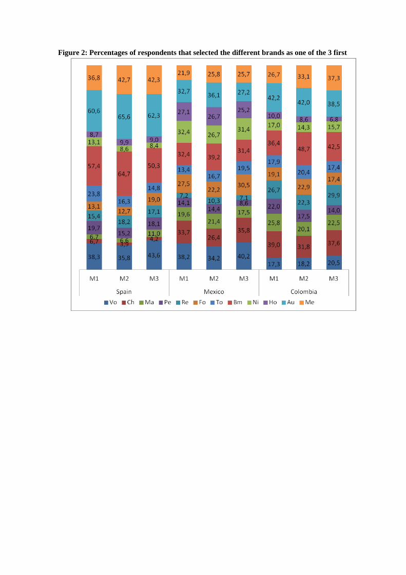
Figure 2: Percentages of respondents that selected the different brands as one of the 3 first
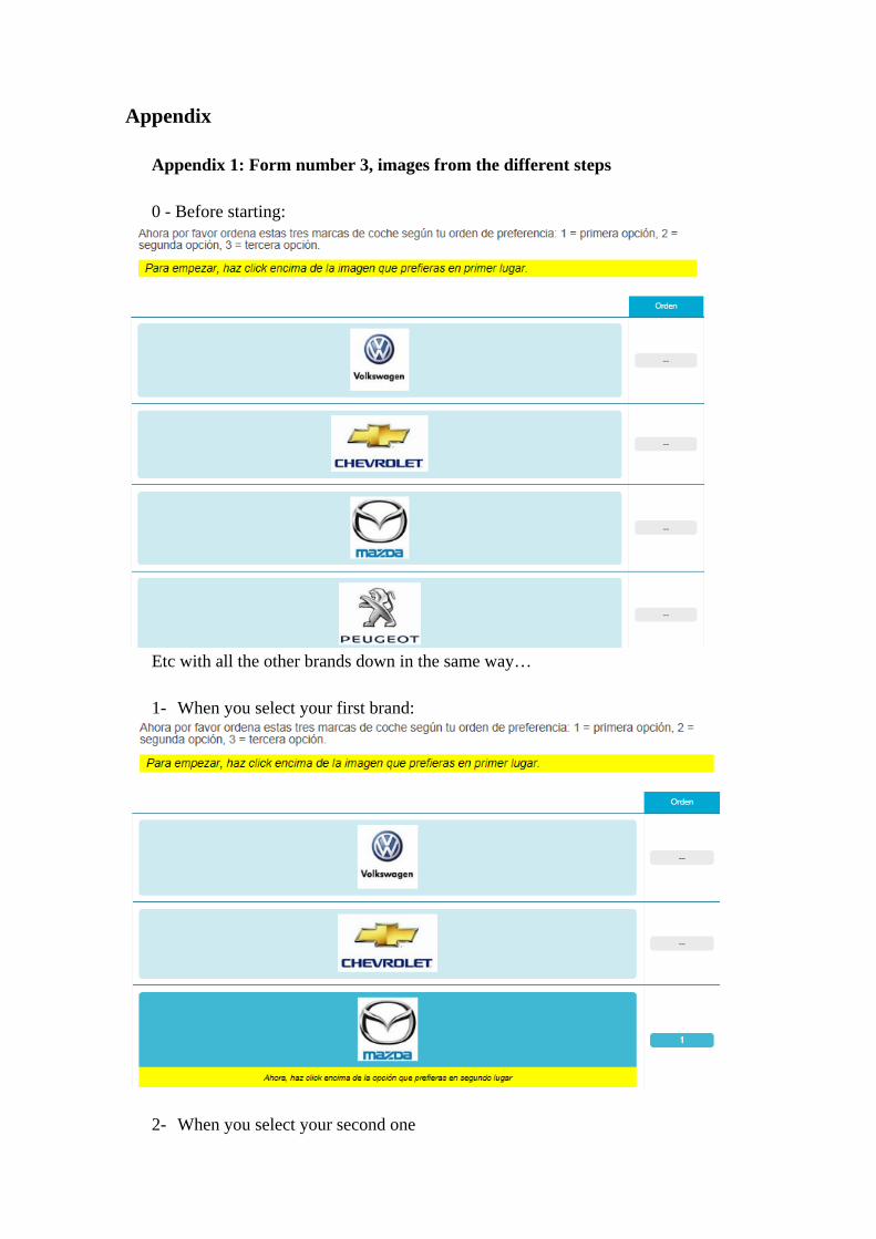
Appendix Appendix 1: Form number 3, images from the different steps 0 - Before starting:
Etc with all the other brands down in the same way… 1- When you select your first brand:
2- When you select your second one
3- When you select the final brand
4- If you try to click on one more brand instead of clicking the “next” button, you
get a message explaining you how to unselect your answer and change your ranking. Appendix 2: Form number 1 and 2, initial presentation of the brands
Appendix 3:
Appendix 3a: Percentages of respondents that selected each brand as the 2nd preferred one
Appendix 3b: Percentages of respondents that selected each brand as the 3rd preferred one