Embed Size (px)
Citation preview

CHAPTER 3
GRAPHICS AND VISUALIZATION
SO FAR we have created programs that print out words and numbers, but of-
ten wewill also want our programs to produce graphics, meaning pictures
of some sort. In this chapter we will see how to produce the two main types
of computer graphics used in physics. First, we look at that most common of
scientific visualizations, the graph: a depiction of numerical data displayed on
calibrated axes. Second, we look at methods for making scientific diagrams
and animations: depictions of the arrangement or motion of the parts of a
physical system, which can be useful in understanding the structure or behav-
ior of the system.
3.1 GRAPHS
A number of Python packages include features for making graphs. In this
book we will use the powerful, easy-to-use, and popular package pylab.1 The
package contains features for generating graphs of many different types. We
will concentrate of three types that are especially useful in physics: ordinary
line graphs, scatter plots, and density (or heat) plots. We start by looking at
line graphs.2
To create an ordinary graph in Python we use the function plot from the
1The name pylab is a reference to the scientific calculation program Matlab, whose graph-drawing features pylab is intended to mimic. The pylab package is a part of a larger packagecalled matplotlib, some of whose features can occasionally be useful in computational physics,although we will use only the ones in pylab in this book. If you’re interested in the other featuresof matplotlib, take a look at the on-line documentation, which can be found at matplotlib.org.
2The pylab package can alsomake contour plots, polar plots, pie charts, histograms, andmore,and all of these find occasional use in physics. If you find yourself needing one of these morespecialized graph types, you can find instructions for making them in the on-line documentationat matplotlib.org.
88

3.1 | GRAPHS
pylab package. In the simplest case, this function takes one argument, which
is a list or array of the values we want to plot. The function creates a graph of
the given values in the memory of the computer, but it doesn’t actually display
it on the screen of the computer—it’s stored in the memory but not yet visible
to the computer user. To display the graph we use a second function from
pylab, the show function, which takes the graph in memory and draws it on
the screen. Here is a complete program for plotting a small graph:
from pylab import plot,show
y = [ 1.0, 2.4, 1.7, 0.3, 0.6, 1.8 ]
plot(y)
show()
After importing the two functions from pylab, we create the list of values to be
plotted, create a graph of those values with plot(y), then display that graph
on the screen with show(). Note that show() has brackets after it—it is a func-
tion that has no argument, but the brackets still need to be there.
If we run the program above, it produces a newwindow on the screen with
a graph in it like this:
0 1 2 3 4 50.0
0.5
1.0
1.5
2.0
2.5
The computer has plotted the values in the list y at unit intervals along the x-
axis (starting from zero in the standard Python style) and joined them up with
straight lines.
89

CHAPTER 3 | GRAPHICS AND VISUALIZATION
While it’s better than nothing, this is not a very useful kind of graph for
physics purposes. Normally we want to specify both the x- and y-coordinates
for the points in the graph. We can do this using a plot statement with two list
arguments, thus:
from pylab import plot,show
x = [ 0.5, 1.0, 2.0, 4.0, 7.0, 10.0 ]
y = [ 1.0, 2.4, 1.7, 0.3, 0.6, 1.8 ]
plot(x,y)
show()
which produces a graph like this:
0 2 4 6 8 100.0
0.5
1.0
1.5
2.0
2.5
The first of the two lists now specifies the x-coordinates of each point, the sec-
ond the y-coordinates. The computer plots the points at the given positions
and then again joins them with straight lines. The two lists must have the
same number of entries, as here. If they do not, you’ll get an error message
and no graph.
Why do we need two commands, plot and show, to make a graph? In the
simple examples above it seems like it would be fine to combine the two into
a single command that both creates a graph and shows it on the screen. How-
ever, there are more complicated situations where it is useful to have separate
commands. In particular, in cases where we want to plot two or more different
curves on the same graph, we can do so by using the plot function two or
90

3.1 | GRAPHS
more times, once for each curve. Then we use the show function once to make
a single graph with all the curves. We will see examples of this shortly.
Once you have displayed a graph on the screen you can do other things
with it. You will notice a number of buttons along the bottom of the window
in which the graph appears (not shown in the figures here, but you will see
them if you run the programs on your own computer). Among other things,
these buttons allow you to zoom in on portions of the graph, move your view
around the graph, or save the graph as an image file on your computer. You
can also save the graph in “PostScript” format, which you can then print out
on a printer or insert as a figure in a word processor document.
Let us apply the plot and show functions to the creation of a slightly more
interesting graph, a graph of the function sin x from x = 0 to x = 10. To do this
we first create an array of the x values, then we take the sines of those values
to get the y-coordinates of the points:
from pylab import plot,show
from numpy import linspace,sin
x = linspace(0,10,100)
y = sin(x)
plot(x,y)
show()
Notice howwe used the linspace function from numpy (see Section 2.5) to gen-
erate the array of x-values, and the sin function from numpy, which is a special
version of sine that works with arrays—it just takes the sine of every element
in the array. (We could alternatively have used the ordinary sin function from
the math package and taken the sines of each element individually using a for
loop, or using map(sin,x). As is often the case, there’s more than one way to
do the job.)
If we run this programwe get the classic sine curve graph shown in Fig. 3.1.
Notice that we have not really drawn a curve at all here: our plot consists of a
finite set of points—a hundred of them in this case—and the computer draws
straight lines joining these points. So the end result is not actually curved; it’s
a set of straight-line segments. To us, however, it looks like a convincing sine
wave because our eyes are not sharp enough to see the slight kinks where the
segments meet. This is a useful and widely used trick for making curves in
computer graphics: choose a set of points spaced close enough together that
when joined with straight lines the result looks like a curve even though it
really isn’t.
91

CHAPTER 3 | GRAPHICS AND VISUALIZATION
0 2 4 6 8 10�1.0
�0.5
0.0
0.5
1.0
Figure 3.1: Graph of the sine function. A simple graph of the sine function produced
by the program given in the text.
As another example of the use of the plot function, suppose we have some
experimental data in a computer file values.txt, stored in two columns, like
this:
0 12121.71
1 12136.44
2 12226.73
3 12221.93
4 12194.13
5 12283.85
6 12331.6
7 12309.25
...
We can make a graph of these data as follows:
from numpy import loadtxt
from pylab import plot,show
data = loadtxt("values.txt",float)
92

3.1 | GRAPHS
0 200 400 600 800 1000 12006000
7000
8000
9000
10000
11000
12000
13000
14000
15000
Figure 3.2: Graph of data from a file. This graph was produced by reading two
columns of data from a file using the program given in the text.
x = data[:,0]
y = data[:,1]
plot(x,y)
show()
In this example we have used the loadtxt function from numpy (see Section
2.4.3) to read the values in the file and put them in an array and then we have
used Python’s array slicing facilities (Section 2.4.5) to extract the first and sec-
ond columns of the array and put them in separate arrays x and y for plotting.
The end result is a plot as shown in Fig. 3.2.
In fact, it’s not necessary in this case to use the separate arrays x and y. We
could shorten the program by saying instead
data = loadtxt("values.txt",float)
plot(data[:,0],data[:,1])
show()
which achieves the same result. (Arguably, however, this program is more
difficult to read. As we emphasized in Section 2.7, it is a good idea to make
programs easy to read where possible, so you might, in this case, want to use
93

CHAPTER 3 | GRAPHICS AND VISUALIZATION
the extra arrays x and y even though they are not strictly necessary.)
An important point to notice about all of these examples is that the pro-
gram stopswhen it displays the graph. To be precise it stops when it gets to the
show function. Once you use show to display a graph, the program will go no
further until you close the window containing the graph. Only once you close
the window will the computer proceed with the next line of your program.
The function show is said to be a blocking function—it blocks the progress of
the program until the function is done with its job. We have seen one other
example of a blocking function previously, the function input, which collects
input from the user at the keyboard. It too halts the running of the program
until its job is done. (The blocking action of the show function has little impact
in the programs above, since the show statement is the last line of the program
in each case. But in more complex examples there might be further lines af-
ter the show statement and their execution would be delayed until the graph
window was closed.)
A useful trick that wewill employ frequently in this book is to build the lists
of x- and y-coordinates for a graph step by step as we go through a calculation.
It will happen often that we do not know all of the x or y values for a graph
ahead of time, but work them out one by one as part of some calculation we
are doing. In that case, a good way to create a graph of the results is to start
with two empty lists for the x- and y-coordinates and add points to them one
by one, as we calculate the values. Going back to the sine wave example, for
instance, here is an alternative way to make a graph of sin x that calculates the
individual values one by one and adds them to a growing list:
from pylab import plot,show
from math import sin
from numpy import linspace
xpoints = []
ypoints = []
for x in linspace(0,10,100):
xpoints.append(x)
ypoints.append(sin(x))
plot(xpoints,ypoints)
show()
If you run it, this program produces a picture of a sine wave identical to the
one in Fig. 3.1 on page 92. Notice how we created the two empty lists and
94

3.1 | GRAPHS
then appended values to the end of each one, one by one, using a for loop. We
will use this technique often. (See Section 2.4.1 for a discussion of the append
function.)
The graphs we have seen so far are very simple, but there are many extra
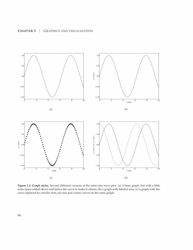
features we can add to them, some of which are illustrated in Fig. 3.3. For
instance, in all the previous graphs the computer chose the range of x and
y values for the two axes. Normally the computer makes good choices, but
occasionally you might like to make different ones. In our picture of a sine
wave, Fig. 3.1, for instance, you might decide that the graph would be clearer
if the curve did not butt right up against the top and bottom of the frame—
a little more space at top and bottom would be nice. You can override the
computer’s choice of x- and y-axis limits with the functions xlim and ylim.
These functions take two arguments each, for the lower and upper limits of
the range of the respective axes. Thus, for instance, we might modify our sine
wave program as follows:
from pylab import plot,ylim,show
from numpy import linspace,sin
x = linspace(0,10,100)
y = sin(x)
plot(x,y)
ylim(-1.1,1.1)
show()
The resulting graph is shown in Fig. 3.3a and, as we can see, it now has a little
extra space above and below the curve because the y-axis has been modified to
run from−1.1 to +1.1. Note that the ylim statement has to come after the plot
statement but before the show statement—the plot statement has to create the
graph first before you can modify its axes.
It’s good practice to label the axes of your graphs, so that you and anyone
else knows what they represent. You can add labels to the x- and y-axes with
the functions xlabel and ylabel, which take a string argument—a string of
letters or numbers in quotation marks. Thus we could again modify our sine
wave program above, changing the final lines to say:
plot(x,y)
ylim(-1.1,1.1)
xlabel("x axis")
ylabel("y = sin x")
show()
95
CHAPTER 3 | GRAPHICS AND VISUALIZATION
0 2 4 6 8 10
�1.0
�0.5
0.0
0.5
1.0
(a)
0 2 4 6 8 10x axis
�1.0
�0.5
0.0
0.5
1.0
y =
sin
x
(b)
0 2 4 6 8 10x axis
�1.0
�0.5
0.0
0.5
1.0
y =
sin
x
(c)
0 2 4 6 8 10x axis
−1.0
−0.5
0.0
0.5
1.0
y =
sin
x o
r y
= c
os x
(d)
Figure 3.3: Graph styles. Several different versions of the same sine wave plot. (a) A basic graph, but with a little
extra space added above and below the curve to make it clearer; (b) a graph with labeled axes; (c) a graph with the
curve replaced by circular dots; (d) sine and cosine curves on the same graph.
96

3.1 | GRAPHS
which produces the graph shown in Fig. 3.3b.
You can also vary the style in which the computer draws the curve on the
graph. To do this a third argument is added to the plot function, which takes
the form of a (slightly cryptic) string of characters, like this:
plot(x,y,"g--")
The first letter of the string tells the computer what color to draw the curve
with. Allowed letters are r, g, b, c, m, y, k, and w, for red, green, blue, cyan,
magenta, yellow, black, and white, respectively. The remainder of the string
says what style to use for the line. Here there are many options, but the ones
we’ll use most often are “-” for a solid line (like the ones we’ve seen so far),
“--” for a dashed line, “o” to mark points with a circle (but not connect them
with lines), and “s” to mark points with a square. Thus, for example, this
modification:
plot(x,y,"ko")
ylim(-1.1,1.1)
xlabel("x axis")
ylabel("y = sin x")
show()
tells the computer to plot our sine wave as a set of black circular points. The
result is shown in Fig. 3.3c.
Finally, we will often need to plot more than one curve or set of points on
the same graph. This can be achieved by using the plot function repeatedly.
For instance, here is a complete program that plots both the sine function and
the cosine function on the same graph, one as a solid curve, the other as a
dashed curve:
from pylab import plot,ylim,xlabel,ylabel,show
from numpy import linspace,sin,cos
x = linspace(0,10,100)
y1 = sin(x)
y2 = cos(x)
plot(x,y1,"k-")
plot(x,y2,"k--")
ylim(-1.1,1.1)
xlabel("x axis")
ylabel("y = sin x or y = cos x")
show()
97

CHAPTER 3 | GRAPHICS AND VISUALIZATION
The result is shown in Fig. 3.3d. You could also, for example, use a variant of
the same trick to make a plot that had both dots and lines for the same data—
just plot the data twice on the same graph, using two plot statements, one
with dots and one with lines.
There are many other variations and styles available in the pylab package.
You can add legends and annotations to your graphs. You can change the
color, size, or typeface used in the labels. You can change the color or style
of the axes, or add a background color to the graph. These and many other
possibilities are described in the on-line documentation at matplotlib.org.
Exercise 3.1: Plotting experimental data
In the on-line resources3 you will find a file called sunspots.txt, which contains the
observed number of sunspots on the Sun for each month since January 1749. The file
contains two columns of numbers, the first being the month and the second being the
sunspot number.
a) Write a program that reads in the data and makes a graph of sunspots as a func-
tion of time.
b) Modify your program to display only the first 1000 data points on the graph.
c) Modify your program further to calculate and plot the running average of the
data, defined by
Yk =1
2r
r
∑m=−r
yk+m ,
where r = 5 in this case (and the yk are the sunspot numbers). Have the program
plot both the original data and the running average on the same graph, again
over the range covered by the first 1000 data points.
Exercise 3.2: Curve plotting
Although the plot function is designed primarily for plotting standard xy graphs, it
can be adapted for other kinds of plotting as well.
a) Make a plot of the so-called deltoid curve, which is defined parametrically by the
equations
x = 2 cos θ + cos 2θ, y = 2 sin θ − sin 2θ,
where 0 ≤ θ < 2π. Take a set of values of θ between zero and 2π and calculate x
and y for each from the equations above, then plot y as a function of x.
3The on-line resources for this book can be downloaded in the form of a single “zip” file fromhttp://www.umich.edu/~mejn/cpresources.zip.
98

3.2 | SCATTER PLOTS
b) Taking this approach a step further, one can make a polar plot r = f (θ) for some
function f by calculating r for a range of values of θ and then converting r and
θ to Cartesian coordinates using the standard equations x = r cos θ, y = r sin θ.
Use this method to make a plot of the Galilean spiral r = θ2 for 0 ≤ θ ≤ 10π.
c) Using the same method, make a polar plot of “Fey’s function”
r = ecos θ − 2 cos 4θ + sin5 θ
12
in the range 0 ≤ θ ≤ 24π.
3.2 SCATTER PLOTS
In an ordinary graph, such as those of the previous section, there is one in-
dependent variable, usually placed on the horizontal axis, and one depen-
dent variable, on the vertical axis. The graph is a visual representation of the
variation of the dependent variable as a function of the independent one—
voltage as a function of time, say, or temperature as a function of position. In
other cases, however, we measure or calculate two dependent variables. A
classic example in physics is the temperature and brightness—also called the
magnitude—of stars. Typically wemightmeasure temperature andmagnitude
for each star in a given set and we would like some way to visualize how the
two quantities are related. A standard approach is to use a scatter plot, a graph
in which the two quantities are placed along the axes and we make a dot on
the plot for each pair of measurements, i.e., for each star in this case.
0 0.1 0.2 0.30
0.1
0.2
0.3
0 0.1 0.2 0.30
0.1
0.2
0.3
A small scatter plot.
There are two different ways to make a scatter plot using the
pylab package. One of them we have already seen: we can make
an ordinary graph, but with dots rather than lines to represent
the data points, using a statement of the form:
plot(x,y,"ko")
This will place a black dot at each point. A slight variant of the
same idea is this:
plot(x,y,"k.")
which will produce smaller dots.
Alternatively, pylab provides the function scatter, which is
designed specifically for making scatter plots. It works in a sim-
ilar fashion to the plot function: you give it two lists or arrays,
99

CHAPTER 3 | GRAPHICS AND VISUALIZATION
one containing the x-coordinates of the points and the other containing the
y-coordinates, and it creates the corresponding scatter plot:
scatter(x,y)
You do not have to give a third argument telling scatter to plot the data
as dots—all scatter plots use dots automatically. As with the plot function,
scatter only creates the scatter plot in the memory of the computer but does
not display it on the screen. To display it you need to use the function show.
Suppose, for example, that we have the temperatures and magnitudes of a
set of stars in a file called stars.txt on our computer, like this:
4849.4 5.97
5337.8 5.54
4576.1 7.72
4792.4 7.18
5141.7 5.92
6202.5 4.13
...
The first column is the temperature and the second is the magnitude. Here’s a
Python program to make a scatter plot of these data:
File: hrdiagram.py from pylab import scatter,xlabel,ylabel,xlim,ylim,show
from numpy import loadtxt
data = loadtxt("stars.txt",float)
x = data[:,0]
y = data[:,1]
scatter(x,y)
xlabel("Temperature")
ylabel("Magnitude")
xlim(0,13000)
ylim(-5,20)
show()
If we run this program it produces the figure shown in Fig. 3.4.
Many of the same variants illustrated in Fig. 3.3 for the plot function work
for the scatter function also. In this program we used xlabel and ylabel
to label the temperature and magnitude axes, and xlim and ylim to set the
ranges of the axes. You can also change the size and style of the dots and
many other things. In addition, as with the plot function, you can use scatter
100

3.2 | SCATTER PLOTS
0 2000 4000 6000 8000 10000 12000Temperature
�5
0
5
10
15
20
Mag
nitude
Figure 3.4: The Hertzsprung–Russell diagram. A scatter plot of the magnitude
(i.e., brightness) of stars against their approximate surface temperature (which is es-
timated from the color of the light they emit). Each dot on the plot represents one star
out of a catalog of 7860 stars that are close to our solar system.
two or more times in succession to plot two or more sets of data on the same
graph, or you can use any combination of scatter and plot functions to draw
scatter data and curves on the same graph. Again, see the on-line manual at
matplotlib.org for more details.
The scatter plot of the magnitudes and temperatures in Fig. 3.4 reveals an
interesting pattern in the data: a substantial majority of the points lie along a
rough band running from top left to bottom right of the plot. This is the so-
called main sequence to which most stars belong. Rarer types of stars, such as
red giants and white dwarfs, stand out in the figure as dots that lie well off
the main sequence. A scatter plot of stellar magnitude against temperature is
called a Hertzsprung–Russell diagram after the astronomers who first drew it.
The diagram is one of the fundamental tools of stellar astrophysics.
In fact, Fig. 3.4 is, in a sense, upside down, because the Hertzsprung–
101

CHAPTER 3 | GRAPHICS AND VISUALIZATION
Russell diagram is, for historical reasons,4 normally plotted with both themag-
nitude and temperature axes decreasing, rather than increasing. One of the nice
things about pylab is that it is easy to change this kind of thing with just a
small modification of the Python program. All we need to do in this case is
change the xlim and ylim statements so that the start and end points of each
axis are reversed, thus:
xlim(13000,0)
ylim(20,-5)
Then the figure will be magically turned around.
3.3 DENSITY PLOTS
There are many times in physics when we need to work with two-dimensional
grids of data. A condensedmatter physicist mightmeasure variations in charge
or temperature or atomic deposition on a solid surface; a fluid dynamicist
might measure the heights of waves in a ripple tank; a particle physicist might
measure the distribution of particles incident on an imaging detector; and so
on. Two-dimensional data are harder to visualize on a computer screen than
the one-dimensional lists of values that go into an ordinary graph. But one
tool that is helpful in many cases is the density plot, a two-dimensional plot
where color or brightness is used to indicate data values. Figure 3.5 shows an
example.
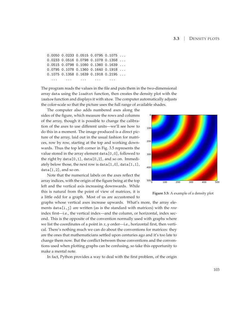
In Python density plots are produced by the function imshow from pylab.
Here’s the program that produced Fig. 3.5:
from pylab import imshow,show
from numpy import loadtxt
data = loadtxt("circular.txt",float)
imshow(data)
show()
The file circular.txt contains a simple array of values, like this:
4The magnitude of a star is defined in such a way that it actually increases as the star getsfainter, so reversing the vertical axis makes sense since it puts the brightest stars at the top. Thetemperature axis is commonly plotted not directly in terms of temperature but in terms of the so-called color index, which is a measure of the color of light a star emits, which is in turn a measureof temperature. Temperature decreases with increasing color index, which is why the standardHertzsprung–Russell diagram has temperature decreasing along the horizontal axis.
102
3.3 | DENSITY PLOTS
0.0050 0.0233 0.0515 0.0795 0.1075 ...
0.0233 0.0516 0.0798 0.1078 0.1358 ...
0.0515 0.0798 0.1080 0.1360 0.1639 ...
0.0795 0.1078 0.1360 0.1640 0.1918 ...
0.1075 0.1358 0.1639 0.1918 0.2195 ...
... ... ... ... ...
The program reads the values in the file and puts them in the two-dimensional
array data using the loadtxt function, then creates the density plot with the
imshow function and displays it with show. The computer automatically adjusts
the color-scale so that the picture uses the full range of available shades.
0 100 200 300 400 500
0
100
200
300
400
500
Figure 3.5: A example of a density plot
The computer also adds numbered axes along the
sides of the figure, which measure the rows and columns
of the array, though it is possible to change the calibra-
tion of the axes to use different units—we’ll see how to
do this in a moment. The image produced is a direct pic-
ture of the array, laid out in the usual fashion for matri-
ces, row by row, starting at the top and working down-
wards. Thus the top left corner in Fig. 3.5 represents the
value stored in the array element data[0,0], followed to
the right by data[0,1], data[0,2], and so on. Immedi-
ately below those, the next row is data[1,0], data[1,1],
data[1,2], and so on.
Note that the numerical labels on the axes reflect the
array indices, with the origin of the figure being at the top
left and the vertical axis increasing downwards. While
this is natural from the point of view of matrices, it is
a little odd for a graph. Most of us are accustomed to
graphs whose vertical axes increase upwards. What’s more, the array ele-
ments data[i,j] are written (as is the standard with matrices) with the row
index first—i.e., the vertical index—and the column, or horizontal, index sec-
ond. This is the opposite of the convention normally used with graphs where
we list the coordinates of a point in x, y order—i.e., horizontal first, then verti-
cal. There’s nothing much we can do about the conventions for matrices: they
are the ones that mathematicians settled upon centuries ago and it’s too late to
change them now. But the conflict between those conventions and the conven-
tions used when plotting graphs can be confusing, so take this opportunity to
make a mental note.
In fact, Python provides a way to deal with the first problem, of the origin
103

CHAPTER 3 | GRAPHICS AND VISUALIZATION
in a density plot being at the top. You can include an additional argument with
the imshow function thus:
imshow(data,origin="lower")
which flips the density plot top-to-bottom, putting the array element data[0,0]
in the lower left corner, as is conventional, and changing the labeling of the ver-
tical axis accordingly, so that it increases in the upward direction. The resulting
plot is shown in Fig. 3.6a. We will use this trick for most of the density plots
in this book. Note, however, that this does not fix our other problem: indices
i and j for the element data[i,j] still correspond to vertical and horizontal
positions respectively, not the reverse. That is, the index i corresponds to the y-
coordinate and the index j corresponds to the x-coordinate. You need to keep
this in mind when making density plots—it’s easy to get the axes swapped by
mistake.
The black-and-white printing in this book doesn’t really do justice to the
density plot in Fig. 3.6a. The original is in bright colors, ranging through the
spectrum from dark blue for the lowest values to red for the highest. If you
wish, you can run the program yourself to see the density plot in its full glory—
both the program, which is called circular.py, and the data file circular.txt
can be found in the on-line resources. Density plots with this particular choice
of colors from blue to red (or similar) are sometimes called heat maps, because
the same color scheme is often used to denote temperature, with blue being
the coldest temperature and red being the hottest.5 The heat map color scheme
is the default choice for density maps in Python, but it’s not always the best.
In fact, for most purposes, a simple gray-scale from black to white is easier to
read. Luckily, it’s simple to change the color scheme. To change to gray-scale,
for instance, you use the function gray, which takes no arguments:
from pylab import imshow,gray,show
from numpy import loadtxt
data = loadtxt("circular.txt",float)
imshow(data,origin="lower")
gray()
show()
5It’s not completely clear why people use these colors. As every physicist knows, red lighthas the longest wavelength of the visible colors and corresponds to the coolest objects, while bluehas the shortest wavelengths and corresponds to the hottest—the exact opposite of the traditionalchoices. The hottest stars, for instance, are blue and the coolest are red.
104

3.3 | DENSITY PLOTS
0 100 200 300 400 5000
100
200
300
400
500
(a)
0 100 200 300 400 5000
100
200
300
400
500
(b)
0 2 4 6 8 100
1
2
3
4
5
(c)
2 3 4 5 6 7 80
1
2
3
4
5
(d)
Figure 3.6: Density plots. Four different versions of the same density plot. (a) A plot using the default “heat map”
color scheme, which is colorful on the computer screen but doesn’t make much sense with the black-and-white
printing in this book. (b) The gray color scheme, which runs from black for the lowest values to white for the
highest. (c) The same plot as in panel (b) but with the calibration of the axes changed. Because the range chosen
is different for the horizontal and vertical axes, the computer has altered the shape of the figure to keep distances
equal in all directions. (d) The same plot as in (c) but with the horizontal range reduced so that only the middle
portion of the data is shown.
105

CHAPTER 3 | GRAPHICS AND VISUALIZATION
Figure 3.6b shows the result. Even in black-and-white it looks somewhat dif-
ferent from the heat-map version in panel (a), and on the screen it looks entirely
different. Try it if you like.6
All of the density plots in this book use the gray scale (except Figs. 3.5
and 3.6a of course). It may not be flashy, but it’s informative, easy to read, and
suitable for printing on monochrome printers or for publications (like many
scientific books and journals) that are in black-and-white only. However, pylab
provides many other color schemes, which you may find useful occasionally.
A complete list, with illustrations, is given in the on-line documentation at
matplotlib.org, but here are a few that might find use in physics:
jet The default heat-map color scheme
gray Gray-scale running from black to white
hot An alternative heat map that goes black-red-yellow-white
spectral A spectrum with 7 clearly defined colors, plus black and white
bone An alternative gray-scale with a hint of blue
hsv A rainbow scheme that starts and ends with red
Each of these has a corresponding function, jet(), spectral(), and so forth,
that selects the relevant color scheme for use in future density plots. Many
more color schemes are given in pylab and one can also define one’s own
schemes, although the definitions involve some slightly tricky programming.
Example code is given in Appendix E and in the on-line resources to define
three additional schemes that can be useful for physics:7
redblue Runs from red to blue via black
redwhiteblue Runs from red to blue via white
inversegray Runs from white to black, the opposite of gray
There is also a function colorbar() in the pylab package that instructs Python
to add a bar to the side of your figure showing the range of colors used in the
plot along with a numerical scale indicating which values correspond to which
colors, something that can be helpful when you want to make a more precise
quantitative reading of a density plot.
6The function gray works slightly differently from other functions we have seen that modifyplots, such as xlabel or ylim. Those functions modified only the current plot, whereas gray (andthe other color scheme functions in pylab) changes the color scheme for all subsequent densityplots. If you write a program that makes more than one plot, you only need to call gray once.
7To use these color schemes copy the file colormaps.py from the on-line resources into thefolder containing your program and then in your program say, for example, “from colormaps
import redblue”. Then the statement “redblue()” will switch to the redblue color map.
106
3.3 | DENSITY PLOTS
As with graphs and scatter plots, you can modify the appearance of den-
sity plots in various ways. The functions xlabel and ylabel work as before,
adding labels to the two axes. You can also change the scale marked on the
axes. By default, the scale corresponds to the elements of the array holding the
data, but you might want to calibrate your plot with a different scale. You can
do this by adding an extra parameter to imshow, like this:
imshow(data,origin="lower",extent=[0,10,0,5])
which results in amodified plot as shown in Fig. 3.6c. The argument consists of
“extent=” followed by a list of four values, which give, in order, the beginning
and end of the horizontal scale and the beginning and end of the vertical scale.
The computer will use these numbers to mark the axes, but the actual content
displayed in the body of the density plot remains unchanged—the extent ar-
gument affects only how the plot is labeled. This trick can be very useful if you
want to calibrate your plot in “real” units. If the plot is a picture of the surface
of the Earth, for instance, you might want axes marked in units of latitude and
longitude; if it’s a picture of a surface at the atomic scale you might want axes
marked in nanometers.
Note also that in Fig. 3.6c the computer has changed the shape of the plot—
its aspect ratio—to accommodate the fact that the horizontal and vertical axes
have different ranges. The imshow function attempts to make unit distances
equal along the horizontal and vertical directions where possible. Sometimes,
however, this is not what we want, in which case we can tell the computer to
use a different aspect ratio. For instance, if we wanted the present figure to
remain square we would say:
imshow(data,origin="lower",extent=[0,10,0,5],aspect=2.0)
This tells the computer to use unit distances twice as large along the vertical
axis as along the horizontal one, which will make the plot square once more.
Note that, as here, we are free to use any or all of the origin, extent, and
aspect arguments together in the same function. We don’t have to use them
all if we don’t want to—any selection is allowed—and they can come in any
order.
We can also limit our density plot to just a portion of the data, using the
functions xlim and ylim, just as with graphs and scatter plots. These func-
tions work with the scales specified by the extent argument, if there is one,
or with the row and column indices otherwise. So, for instance, we could say
xlim(2,8) to reduce the density plot of Fig. 3.6b to just the middle portion of
107

CHAPTER 3 | GRAPHICS AND VISUALIZATION
the horizontal scale, from 2 to 8. Figure 3.6d shows the result. Note that, un-
like the extent argument, xlim and ylim do change which data are displayed
in the body of the density plot—the extent argument makes purely cosmetic
changes to the labeling of the axes, but xlim and ylim actually change which
data appear.
Finally, you can use the functions plot and scatter to superimpose graphs
or scatter plots of data on the same axes as a density plot. You can use any
combination of imshow, plot, and scatter in sequence, followed by show, to
create a single graph with density data, curves, or scatter data, all on the same
set of axes.
EXAMPLE 3.1: WAVE INTERFERENCE
Suppose we drop a pebble in a pond and waves radiate out from the spot
where it fell. We could create a simple representation of the physics with a sine
wave, spreading out in a uniform circle, to represent the height of the waves at
some later time. If the center of the circle is at x1, y1 then the distance r1 to the
center from a point x, y is
r1 =√
(x− x1)2 + (y− y1)2 (3.1)
and the sine wave for the height is
ξ1(x, y) = ξ0 sin kr1 , (3.2)
where ξ0 is the amplitude of the waves and k is the wavevector, related to the
wavelength λ by k = 2π/λ.
Now suppose we drop another pebble in the pond, creating another circu-
lar set of waves with the same wavelength and amplitude but centered on a
different point x2, y2:
ξ2(x, y) = ξ0 sin kr2 with r2 =√
(x− x2)2 + (y− y2)2. (3.3)
Then, assuming the waves add linearly (which is a reasonable assumption for
water waves, provided they are not too big), the total height of the surface at a
point x, y is
ξ(x, y) = ξ0 sin kr1 + ξ0 sin kr2. (3.4)
Suppose the wavelength of the waves is λ = 5 cm, the amplitude is 1 cm, and
the centers of the circles are 20 cm apart. Here is a program tomake an image of
the height over a 1m square region of the pond. To make the image we create
108

3.3 | DENSITY PLOTS
an array of values representing the height ξ at a grid of points and then use
that array to make a density plot. In this example we use a grid of 500× 500
points to cover the 1m square, which means the grid points have a separation
of 100/500 = 0.2 cm.
File: ripples.pyfrom math import sqrt,sin,pi
from numpy import empty
from pylab import imshow,gray,show
wavelength = 5.0
k = 2*pi/wavelength
xi0 = 1.0
separation = 20.0 # Separation of centers in cm
side = 100.0 # Side of the square in cm
points = 500 # Number of grid points along each side
spacing = side/points # Spacing of points in cm
# Calculate the positions of the centers of the circles
x1 = side/2 + separation/2
y1 = side/2
x2 = side/2 - separation/2
y2 = side/2
# Make an array to store the heights
xi = empty([points,points],float)
# Calculate the values in the array
for i in range(points):
y = spacing*i
for j in range(points):
x = spacing*j
r1 = sqrt((x-x1)**2+(y-y1)**2)
r2 = sqrt((x-x2)**2+(y-y2)**2)
xi[i,j] = xi0*sin(k*r1) + xi0*sin(k*r2)
# Make the plot
imshow(xi,origin="lower",extent=[0,side,0,side])
gray()
show()
This is the longest and most involved program we have seen so far, so it
may be worth taking a moment to make sure you understand how it works.
Note in particular how the height is calculated and stored in the array xi. The
109

CHAPTER 3 | GRAPHICS AND VISUALIZATION
0 20 40 60 80 1000
20
40
60
80
100
Figure 3.7: Interference pattern. This plot, produced by the program given in the text,
shows the superposition of two circular sets of sine waves, creating an interference
pattern with fringes that appear as the gray bars radiating out from the center of the
picture.
variables i and j go through the rows and columns of the array respectively,
and from these we calculate the values of the coordinates x and y. Since, as dis-
cussed earlier, the rows correspond to the vertical axis and the columns to the
horizontal axis, the value of x is calculated from j and the value of y is calcu-
lated from i. Other than this subtlety, the program is a fairly straightforward
translation of Eqs. (3.1–3.4).8
If we run the program above, it produces the picture shown in Fig. 3.7. The
picture shows clearly the interference of the two sets of waves. The interference
8One other small detail is worth mentioning. We called the variable for the wavelength“wavelength”. You might be tempted to call it “lambda” but if you did you would get an er-ror message and the program would not run. The word “lambda” has a special meaning in thePython language and cannot be used as a variable name, just as words like “for” and “if” cannotbe used as variable names. (See footnote 5 on page 13.) The names of other Greek letters—alpha,beta, gamma, and so on—are allowed as variable names.
110
3.4 | 3D GRAPHICS
fringes are visible as the gray bands radiating from the center.
Exercise 3.3: There is a file in the on-line resources called stm.txt, which contains a
grid of values from scanning tunneling microscope measurements of the (111) surface
of silicon. A scanning tunneling microscope (STM) is a device that measures the shape
of a surface at the atomic level by tracking a sharp tip over the surface and measuring
quantum tunneling current as a function of position. The end result is a grid of values
that represent the height of the surface and the file stm.txt contains just such a grid of
values. Write a program that reads the data contained in the file and makes a density
plot of the values. Use the various options and variants you have learned about tomake
a picture that shows the structure of the silicon surface clearly.
3.4 3D GRAPHICS
One of the flashiest applications of computers today is the creation of 3D graph-
ics and computer animation. In any given week millions of people flock to
cinemas worldwide to watch the latest computer-animated movie from the
big animation studios. 3D graphics and animation find a more humble, but
very useful, application in computational physics as a tool for visualizing the
behavior of physical systems. Python provides some excellent tools for this
purpose, which we’ll use extensively in this book.
There are a number of different packages available for graphics and anima-
tion in Python, but we will focus on the package visual, which is specifically
designed with physicists in mind. This package provides a way to create sim-
ple pictures and animations with a minimum of effort, but also has enough
power to handle complex situations when needed.
The visual package works by creating specified objects on the screen, such
as spheres, cylinders, cones, and so forth, and then, if necessary, changing their
position, orientation, or shape to make them move around. Here’s a short first
program using the package:
from visual import sphere
sphere()
Whenwe run this program awindow appears on the screenwith a large sphere
in it, like this:
111

CHAPTER 3 | GRAPHICS AND VISUALIZATION
The window of course is two-dimensional, but the computer stores the shape
and position of the sphere in three dimensions and automatically does a per-
spective rendering of the sphere with a 3D look to it that aids the eye in under-
standing the scene.
You can choose the size and position of the sphere like this
sphere(radius=0.5,pos=[1.0,-0.2,0.0])
The radius is specified as a single number. The units are arbitrary and the
computer will zoom in or out as necessary to make the sphere visible. So you
can set the radius to 0.5 as here, or to 10−15 if you’re drawing a picture of a
proton. Either will work fine.
The position of the sphere is a three-dimensional vector, which you give as
a list or array of three real numbers x, y, z (we used a list in this case). The x-
and y-axes run to the right and upwards in the window, as normal, and the
z-axis runs directly out of the screen towards you. You can also specify the
position as a list or array of just two numbers, x and y, in which case Python
will assume the z-coordinate to be zero. This can be useful for drawing pictures
of two-dimensional systems, which have no z-coordinate.
You can also change the color of the sphere thus:
from visual import sphere,color
sphere(color=color.green)
Note how we have imported the object called color from the visual package,
then individual colors are called things like color.green and color.red. The
available colors are the same as those for drawing graphs with pylab: red,
112

3.4 | 3D GRAPHICS
green, blue, cyan, magenta, yellow, black, and white.9 The color argument
can be used at the same time as the radius and position arguments, so one
can control all features of the sphere at the same time.
We can also create several spheres, all in the same window on the screen,
by using the sphere function repeatedly, putting different spheres in different
places to build up an entire scene made of spheres. The following exercise
gives an example.
EXAMPLE 3.2: PICTURING AN ATOMIC LATTICE
Suppose we have a solid composed of atoms arranged on a simple cubic lattice.
We can visualize the arrangement of the atoms using the visual package by
creating a picture with many spheres at positions (i, j, k) with i, j, k = −L . . . L,
thus:
File: lattice.pyfrom visual import sphere
L = 5
R = 0.3
for i in range(-L,L+1):
for j in range(-L,L+1):
for k in range(-L,L+1):
sphere(pos=[i,j,k],radius=R)
Notice how this program has three nested for loops that run through all com-
binations of the values of i, j, and k. Run this program and it produces the
picture shown in Fig. 3.8. Download the program and try it if you like.
After running the program, you can rotate your view of the lattice to look
at it from different angles by moving the mouse while holding down either the
right mouse button or the Ctrl key on the keyboard (the Command key on a
Mac). You can also hold down both mouse buttons (if you have two), or the
Alt key (the Option key on a Mac) and move the mouse in order to zoom in
and out of the picture.
9All visible colors can be represented as mixtures of the primary colors red, green, and blue,and this is how they are stored inside the computer. A “color” in the visual package is actuallyjust a list of three floating-point numbers giving the intensities of red, green, and blue (in thatorder) on a scale of 0 to 1 each. Thus red is [ 1.0, 0.0, 0.0 ], yellow is [ 1.0, 1.0, 0.0 ],and white is [ 1.0, 1.0, 1.0 ]. You can create your own colors if you want by writing thingslike midgray = [ 0.5, 0.5, 0.5 ]. Then you can use “midgray” just like any other color. (Youwould just say midgray, not color.midgray, because the color you defined is an ordinary variable,not a part of the color object in visual.)
113

CHAPTER 3 | GRAPHICS AND VISUALIZATION
Figure 3.8: Visualization of atoms in a simple cubic lattice. A perspective rendering
of atoms in a simple cubic lattice, generated using the visual package and the program
lattice.py given in the text.
Exercise 3.4: Using the program from Example 3.2 above as a starting point, or starting
from scratch if you prefer, do the following:
a) A sodium chloride crystal has sodium and chlorine atoms arranged on a cubic
lattice but the atoms alternate between sodium and chlorine, so that each sodium
is surrounded by six chlorines and each chlorine is surrounded by six sodiums.
Create a visualization of the sodium chloride lattice using two different colors to
represent the two types of atoms.
b) The face-centered cubic (fcc) lattice, which is themost common lattice in naturally
occurring crystals, consists of a cubic lattice with atoms positioned not only at the
Atoms in the fcc lattice lieat the corners and centerof each face of a cubic cell.
corners of each cube but also at the center of each face. Create a visualization of
an fcc lattice with a single species of atom (such as occurs in metallic iron, for
instance).
It is possible to change the properties of a sphere after it is first created,
including its position, size, and color. When we do this the sphere will actually
move or change on the screen. In order to refer to a particular sphere on the
screen we must use a slightly different form of the sphere function to create it,
like this:
114
3.4 | 3D GRAPHICS
s = sphere()
This form, in addition to drawing a sphere on the computer screen, creates a
variable s in a manner similar to the way functions like zeros or empty create
arrays (see Section 2.4.2). The new variable s is a variable of type ”sphere”,
in the same way that other variables are of type int or float. This is a spe-
cial variable type used only in the visual package to store the properties of
spheres. Each sphere variable corresponds to a sphere on the screen and when
we change the properties stored in the sphere variable the on-screen sphere
changes accordingly. Thus, for example, we can say
s.radius = 0.5
and the radius of the corresponding sphere on the screen will change to 0.5,
right before our eyes. Or we can say
s.color = color.blue
and the color will change. You can also change the position of a sphere in this
way, in which case the sphere will move on the screen. We will use this trick
in Section 3.5 to create animations of physical systems.
You can use variables of the sphere type in similar ways to other types of
variable. A useful trick, for instance, is to create an array of spheres thus:
from visual import sphere
from numpy import empty
s = empty(10,sphere)
This creates an array, initially empty, of ten sphere-type variables that you can
then fill with actual spheres thus:
for n in range(10):
s[n] = sphere()
As each sphere is created, a corresponding sphere will appear on the screen.
This technique can be useful if you are creating a visualization or animation
with many spheres and you want to be able to change the properties of any of
them at will. Exercise 3.5 involves exactly such a situation, and the trick above
would be a good one to use in solving that exercise.
Spheres are by no means the only shape one can draw. There is a large
selection of other elements provided by the visual package, including boxes,
115

CHAPTER 3 | GRAPHICS AND VISUALIZATION
cones, cylinders, pyramids, and arrows. Here are the functions that create each
of these objects:
from visual import box,cone,cylinder,pyramid,arrow
box(pos=[x,y,z], axis=[a,b,c], \
length=L, height=H, width=W, up=[q,r,s])
cone(pos=[x,y,z], axis=[a,b,c], radius=R)
cylinder(pos=[x,y,z], axis=[a,b,c], radius=R)
pyramid(pos=[x,y,z], size=[z,b,c])
arrow(pos=[x,y,z], axis=[a,b,c], \
headwidth=H, headlength=L, shaftwidth=W)
For a detailed explanation of the meaning of all the parameters, take a look at
the on-line documentation at www.vpython.org. In addition to the parameters
above, standard ones like color can also be used to give the objects a different
appearance. And each element has a corresponding variable type—box, cone,
cylinder, and so forth—that is used for storing and changing the properties
of elements after they are created.
Another useful feature of the visual package is the ability to change vari-
ous properties of the screen window in which your objects appear. You can, for
example, change the window’s size and position on the screen, you can change
the background color, and you can change the direction that the “camera” is
looking in. All of these things you do with the function display. Here is an
example:
from visual import display
display(x=100,y=100,width=600,height=600, \
center=[5,0,0],forward=[0,0,-1], \
background=color.blue,foreground=color.yellow)
This will produce a window 600× 600 in size, where size is measured in pixels
(the small dots that make up the picture on a computer screen). The win-
dow will be 100 pixels in from the left and top of the screen. The argument
“center=[5,0,0]” sets the point in 3D space that will be in the center of the
window, and “forward=[0,0,-1]” chooses the direction in which we are look-
ing. Between the two of them these two arguments determine the position and
direction of our view of the scene. The background color of the window will
be blue in this case and objects appearing in the window—the “foreground”—
will be yellow by default, although you can specify other colors for individual
objects in the manner described above for spheres.
116
3.5 | ANIMATION
(Notice also how we used the backslash character ”\” in the code above to
indicate to the computer that a single logical line of code has been spread over
more than one line in the text of the program. We discussed this use of the
backslash previously in Section 2.7.)
The arguments for the display function can be in any order and you do
not have to include all of them. You need include only those you want. The
ones you don’t include have sensible default values. For example, the default
background color is black and the default foreground color is white, so if you
don’t specify any colors you get white objects on a black background.
As with the sphere function you can assign a variable to keep track of the
display window by writing, for example,
d = display(background=color.blue)
or even just
d = display()
This allows you to change display parameters later in your program. For in-
stance, you can change the background color to black at any time by writ-
ing “d.background = color.black”. Some parameters, however, cannot be
changed later, notably the size and position of the window, which are fixed
when the window is created (although you can change the size and position
manually by dragging the window around the screen with your mouse).
There are many other features of the visual package that are not listed
here. For more details take a look at www.vpython.org.
3.5 ANIMATION
Aswe have seen, the visual package allows you to change the properties of an
on-screen object, such as its size, color, orientation, or position. If you change
the position of an object repeatedly and rapidly, you can make the object ap-
pear to be moving and you have an animation. We will use such animations in
this book to help us understand the behavior of physical systems.
For example, to create a sphere and then change its position you could do
the following:
from visual import sphere
s = sphere(pos=[0,0,0])
s.pos = [1,4,3]
117

CHAPTER 3 | GRAPHICS AND VISUALIZATION
This will create a sphere at the origin, then move it to the new position (1, 4, 3).
This is not not a very useful program, however. The computer is so fast
that you probably wouldn’t even see the sphere in its first position at the ori-
gin before it gets moved. To slow down movements to a point where they are
visible, visual provides a function called rate. Saying rate(x) tells the com-
puter to wait until 1/x of a second has passed since the last time you called
rate. Thus if you call rate(30) immediately before each change you make on
the screen, you will ensure that changes never get made more than 30 times a
second, which is very useful for making smooth animations.
EXAMPLE 3.3: A MOVING SPHERE
Here is a program to move a sphere around on the screen:
File: revolve.py from visual import sphere,rate
from math import cos,sin,pi
from numpy import arange
s = sphere(pos=[1,0,0],radius=0.1)
for theta in arange(0,10*pi,0.1):
rate(30)
x = cos(theta)
y = sin(theta)
s.pos = [x,y,0]
Here the value of the angle variable theta increases by 0.1 radians every 30th
of a second, the rate function ensuring that we go around the for loop 30 times
each second. The angle is converted into Cartesian coordinates and used to up-
date the position of the sphere. The net result, if we run the program is that
a sphere appears on the screen and moves around in a circle. Download the
program and try it if you like. This simple animation could be the basis, for in-
stance, for an animation of the simultaneous motions of the planets of the solar
system. Exercise 3.5 below invites you to create exactly such an animation.
Exercise 3.5: Visualization of the solar system
The innermost six planets of our solar system revolve around the Sun in roughly cir-
cular orbits that all lie approximately in the same (ecliptic) plane. Here are some basic
parameters:
118

3.5 | ANIMATION
Radius of object Radius of orbit Period of orbit
Object (km) (millions of km) (days)
Mercury 2440 57.9 88.0
Venus 6052 108.2 224.7
Earth 6371 149.6 365.3
Mars 3386 227.9 687.0
Jupiter 69173 778.5 4331.6
Saturn 57316 1433.4 10759.2
Sun 695500 – –
Using the facilities provided by the visual package, create an animation of the solar
system that shows the following:
a) The Sun and planets as spheres in their appropriate positions and with sizes pro-
portional to their actual sizes. Because the radii of the planets are tiny compared
to the distances between them, represent the planets by spheres with radii c1times larger than their correct proportionate values, so that you can see them
clearly. Find a good value for c1 that makes the planets visible. You’ll also need
to find a good radius for the Sun. Choose any value that gives a clear visualiza-
tion. (It doesn’t work to scale the radius of the Sun by the same factor you use for
the planets, because it’ll come out looking much too large. So just use whatever
works.) For added realism, you may also want to make your spheres different
colors. For instance, Earth could be blue and the Sun could be yellow.
b) The motion of the planets as they move around the Sun (by making the spheres
of the planets move). In the interests of alleviating boredom, construct your pro-
gram so that time in your animation runs a factor of c2 faster than actual time.
Find a good value of c2 that makes the motion of the orbits easily visible but not
unreasonably fast. Make use of the rate function to make your animation run
smoothly.
Hint: You may find it useful to store the sphere variables representing the planets in an
array of the kind described on page 115.
Here’s one more trick that can prove useful. As mentioned above, you can
make your objects small or large and the computer will automatically zoom
in or out so that they remain visible. And if you make an animation in which
your objects move around the screen the computer will zoom out when ob-
jects move out of view, or zoom in as objects recede into the distance. While
this is useful in many cases, it can be annoying in others. The display func-
tion provides a parameter for turning the automatic zooming off if it becomes
distracting, thus:
119

CHAPTER 3 | GRAPHICS AND VISUALIZATION
display(autoscale=False)
More commonly, one calls the display function at the beginning of the pro-
gram and then turns off the zooming separately later, thus:
d = display()
d.autoscale = False
One can also turn it back on with
d.autoscale = True
A common approach is to place all the objects of your animation in their initial
positions on the screen first, allow the computer to zoom in or out appropri-
ately, so that they are all visible, then turn zooming off with “d.autoscale =
False” before beginning the animation proper, so that the view remains fixed
as objects move around.
FURTHER EXERCISES
3.6 Deterministic chaos and the Feigenbaum plot: One of the most famous examples
of the phenomenon of chaos is the logistic map, defined by the equation
x′ = rx(1− x). (3.5)
For a given value of the constant r you take a value of x—say x = 12—and you feed it
into the right-hand side of this equation, which gives you a value of x′. Then you take
that value and feed it back in on the right-hand side again, which gives you another
value, and so forth. This is a iterative map. You keep doing the same operation over and
over on your value of x, and one of three things happens:
1. The value settles down to a fixed number and stays there. This is called a fixed
point. For instance, x = 0 is always a fixed point of the logistic map. (You put
x = 0 on the right-hand side and you get x′ = 0 on the left.)
2. It doesn’t settle down to a single value, but it settles down into a periodic pat-
tern, rotating around a set of values, such as say four values, repeating them in
sequence over and over. This is called a limit cycle.
3. It goes crazy. It generates a seemingly random sequence of numbers that appear
to have no rhyme or reason to them at all. This is deterministic chaos. “Chaos”
because it really does look chaotic, and “deterministic” because even though the
values look random, they’re not. They’re clearly entirely predictable, because they
120

EXERCISES
are given to you by one simple equation. The behavior is determined, although it
may not look like it.
Write a program that calculates and displays the behavior of the logisticmap. Here’s
what you need to do. For a given value of r, start with x = 12 , and iterate the logistic
map equation a thousand times. That will give it a chance to settle down to a fixed
point or limit cycle if it’s going to. Then run for another thousand iterations and plot
the points (r, x) on a graph where the horizontal axis is r and the vertical axis is x. You
can either use the plot function with the options "ko" or "k." to draw a graph with
dots, one for each point, or you can use the scatter function to draw a scatter plot
(which always uses dots). Repeat the whole calculation for values of r from 1 to 4 in
steps of 0.01, plotting the dots for all values of r on the same figure and then finally
using the function show once to display the complete figure.
Your program should generate a distinctive plot that looks like a tree bent over onto
its side. This famous picture is called the Feigenbaum plot, after its discoverer Mitchell
Feigenbaum, or sometimes the figtree plot, a play on the fact that it looks like a tree and
Feigenbaum means “figtree” in German.10
Give answers to the following questions:
a) For a given value of r what would a fixed point look like on the Feigenbaum plot?
How about a limit cycle? And what would chaos look like?
b) Based on your plot, at what value of r does the system move from orderly be-
havior (fixed points or limit cycles) to chaotic behavior? This point is sometimes
called the “edge of chaos.”
The logistic map is a very simple mathematical system, but deterministic chaos is
seen in many more complex physical systems also, including especially fluid dynamics
and the weather. Because of its apparently random nature, the behavior of chaotic
systems is difficult to predict and strongly affected by small perturbations in outside
conditions. You’ve probably heard of the classic exemplar of chaos in weather systems,
the butterfly effect, which was popularized by physicist Edward Lorenz in 1972 when
he gave a lecture to the American Association for the Advancement of Science entitled,
“Does the flap of a butterfly’s wings in Brazil set off a tornado in Texas?”11
10There is another approach for computing the Feigenbaum plot, which is neater and faster,making use of Python’s ability to perform arithmetic with entire arrays. You could createan array r with one element containing each distinct value of r you want to investigate:[1.0, 1.01, 1.02, ... ]. Then create another array x of the same size to hold the correspond-ing values of x, which should all be initially set to 0.5. Then an iteration of the logistic map can beperformed for all values of r at once with a statement of the form x = r*x*(1-x). Because of thespeed with which Python can perform calculations on arrays, this method should be significantlyfaster than the more basic method above.
11Although arguably the first person to suggest the butterfly effect was not a physicist at all,but the science fiction writer Ray Bradbury in his famous 1952 short story A Sound of Thunder, inwhich a time traveler’s careless destruction of a butterfly during a tourist trip to the Jurassic erachanges the course of history.
121

CHAPTER 3 | GRAPHICS AND VISUALIZATION
3.7 The Mandelbrot set: The Mandelbrot set, named after its discoverer, the French
mathematician Benoı̂t Mandelbrot, is a fractal, an infinitely ramified mathematical ob-
ject that contains structure within structure within structure, as deep as we care to look.
The definition of the Mandelbrot set is in terms of complex numbers as follows.
Consider the equation
z′ = z2 + c,
where z is a complex number and c is a complex constant. For any given value of
c this equation turns an input number z into an output number z′. The definition of
the Mandelbrot set involves the repeated iteration of this equation: we take an initial
starting value of z and feed it into the equation to get a new value z′. Then we take that
value and feed it in again to get another value, and so forth. The Mandelbrot set is the
set of points in the complex plane that satisfies the following definition:
For a given complex value of c, start with z = 0 and iterate repeatedly. If the
magnitude |z| of the resulting value is ever greater than 2, then the point in the
complex plane at position c is not in the Mandelbrot set, otherwise it is in the set.
In order to use this definition one would, in principle, have to iterate infinitely many
times to prove that a point is in the Mandelbrot set, since a point is in the set only if
the iteration never passes |z| = 2 ever. In practice, however, one usually just performs
some large number of iterations, say 100, and if |z| hasn’t exceeded 2 by that point then
we call that good enough.
Write a program tomake an image of theMandelbrot set by performing the iteration
for all values of c = x + iy on an N × N grid spanning the region where −2 ≤ x ≤ 2
and −2 ≤ y ≤ 2. Make a density plot in which grid points inside the Mandelbrot set
are colored black and those outside are colored white. The Mandelbrot set has a very
distinctive shape that looks something like a beetle with a long snout—you’ll know it
when you see it.
Hint: You will probably find it useful to start off with quite a coarse grid, i.e., with a
small value of N—perhaps N = 100—so that your program runs quickly while you are
testing it. Once you are sure it is working correctly, increase the value of N to produce
a final high-quality image of the shape of the set.
If you are feeling enthusiastic, here is another variant of the same exercise that can
produce amazing looking pictures. Instead of coloring points just black or white, color
points according to the number of iterations of the equation before |z| becomes greater
than 2 (or the maximum number of iterations if |z| never becomes greater than 2). If you
use one of the more colorful color schemes Python provides for density plots, such as
the “hot” or “jet” schemes, you can make some spectacular images this way. Another
interesting variant is to color according to the logarithm of the number of iterations,
which helps reveal some of the finer structure outside the set.
3.8 Least-squares fitting and the photoelectric effect: It’s a common situation in
physics that an experiment produces data that lies roughly on a straight line, like the
dots in this figure:
122

EXERCISES
x
y
The solid line here represents the underlying straight-line form, which we usually don’t
know, and the points representing the measured data lie roughly along the line but
don’t fall exactly on it, typically because of measurement error.
The straight line can be represented in the familiar form y = mx + c and a frequent
question is what the appropriate values of the slope m and intercept c are that corre-
spond to the measured data. Since the data don’t fall perfectly on a straight line, there
is no perfect answer to such a question, but we can find the straight line that gives the
best compromise fit to the data. The standard technique for doing this is the method of
least squares.
Suppose we make some guess about the parameters m and c for the straight line.
We then calculate the vertical distances between the data points and that line, as rep-
resented by the short vertical lines in the figure, then we calculate the sum of the
squares of those distances, which we denote χ2. If we have N data points with co-
ordinates (xi, yi), then χ2 is given by
χ2 =N
∑i=1
(mxi + c− yi)2.
The least-squares fit of the straight line to the data is the straight line that minimizes
this total squared distance from data to line. We find the minimum by differentiating
with respect to both m and c and setting the derivatives to zero, which gives
mN
∑i=1
x2i + cN
∑i=1
xi −N
∑i=1
xiyi = 0,
mN
∑i=1
xi + cN −N
∑i=1
yi = 0.
For convenience, let us define the following quantities:
Ex =1
N
N
∑i=1
xi, Ey =1
N
N
∑i=1
yi, Exx =1
N
N
∑i=1
x2i , Exy =1
N
N
∑i=1
xiyi,
123

CHAPTER 3 | GRAPHICS AND VISUALIZATION
in terms of which our equations can be written
mExx + cEx = Exy ,
mEx + c = Ey .
Solving these equations simultaneously for m and c now gives
m =Exy − ExEy
Exx − E2x
, c =ExxEy − ExExy
Exx − E2x
.
These are the equations for the least-squares fit of a straight line to N data points. They
tell you the values of m and c for the line that best fits the given data.
a) In the on-line resources you will find a file called millikan.txt. The file contains
two columns of numbers, giving the x and y coordinates of a set of data points.
Write a program to read these data points and make a graph with one dot or circle
for each point.
b) Add code to your program, before the part that makes the graph, to calculate the
quantities Ex, Ey, Exx, and Exy defined above, and from them calculate and print
out the slope m and intercept c of the best-fit line.
c) Now write code that goes through each of the data points in turn and evaluates
the quantity mxi + c using the values of m and c that you calculated. Store these
values in a new array or list, and then graph this new array, as a solid line, on the
same plot as the original data. You should end up with a plot of the data points
plus a straight line that runs through them.
d) The data in the file millikan.txt are taken from a historic experiment by Robert
Millikan that measured the photoelectric effect. When light of an appropriate wave-
length is shone on the surface of a metal, the photons in the light can strike con-
duction electrons in the metal and, sometimes, eject them from the surface into the
free space above. The energy of an ejected electron is equal to the energy of the
photon that struck it minus a small amount φ called the work function of the sur-
face, which represents the energy needed to remove an electron from the surface.
The energy of a photon is hν, where h is Planck’s constant and ν is the frequency
of the light, and we can measure the energy of an ejected electron by measuring
the voltage V that is just sufficient to stop the electron moving. Then the voltage,
frequency, and work function are related by the equation
V =h
eν − φ,
where e is the charge on the electron. This equation was first given by Albert
Einstein in 1905.
The data in the file millikan.txt represent frequencies ν in hertz (first column)
and voltages V in volts (second column) from photoelectric measurements of this
kind. Using the equation above and the program you wrote, and given that the
charge on the electron is 1.602× 10⁻¹⁹ C, calculate from Millikan’s experimental
124

EXERCISES
data a value for Planck’s constant. Compare your value with the accepted value
of the constant, which you can find in books or on-line. You should get a result
within a couple of percent of the accepted value.
This calculation is essentially the same as the one that Millikan himself used to de-
termine of the value of Planck’s constant, although, lacking a computer, he fitted his
straight line to the data by eye. In part for this work, Millikan was awarded the Nobel
prize in physics in 1923.
125