Embed Size (px)
Citation preview
2) How effective is the combination of your main product (video) and ancillary texts (digipak and advertisement)?
Whilst producing the video and ancillary work, I was thinking a lot about visual links and how I wanted it all to connect. Whilst creating the video, we had already created visual links to other videos and stuck by conventions, but I wanted my video to link well with the digipak and advertisement, like a real artists.
First off, the pictures that we had to take for the ancillary work had to be done. We put a lot of thought into how we would do this;
The costume
I decided that the costume and makeup should be the same as in the video. This would not only create a visual link but also help give her good promotion which actually promotes this artists look.
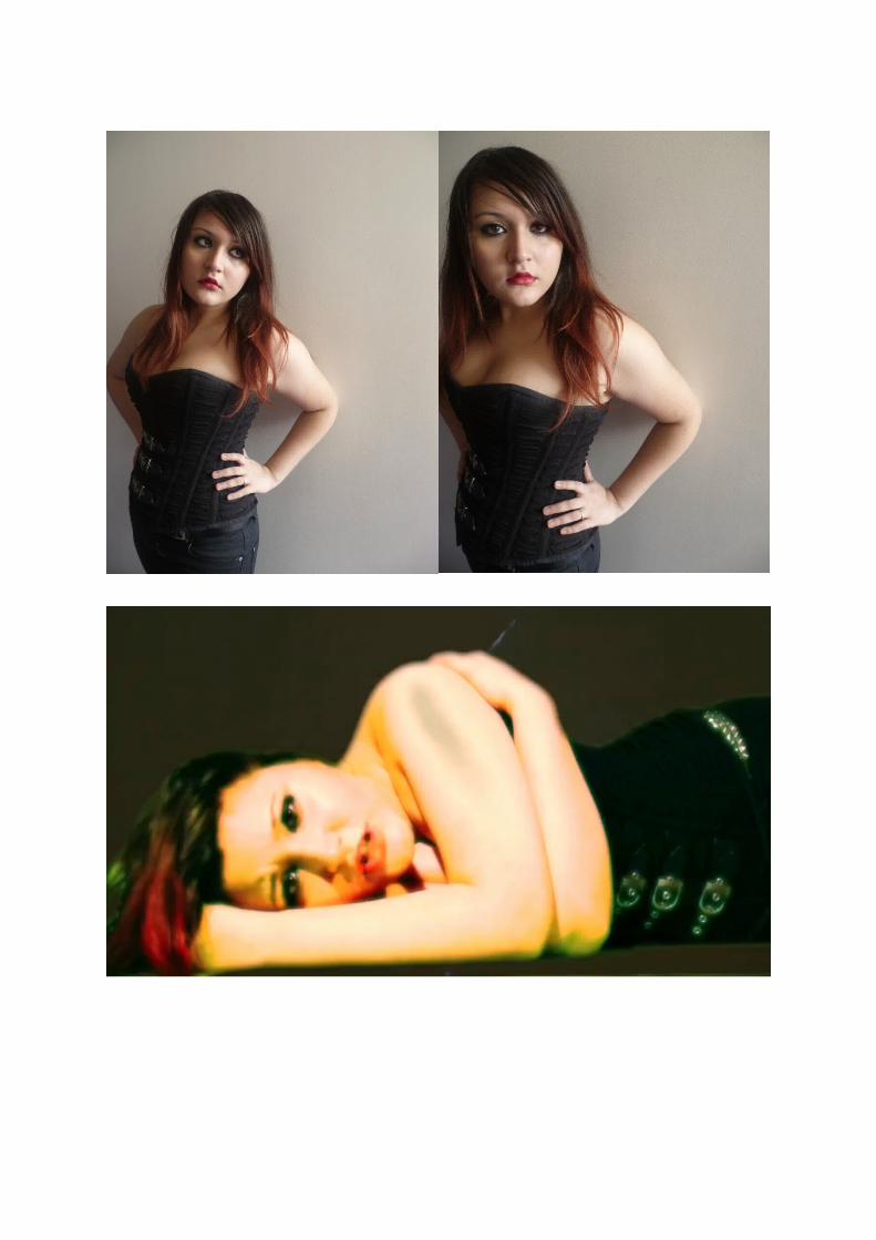
Here are some shots we took for the ancillary work. As you can see keeping her in the same costume and makeup already helped with a visual link and this is before we started the editing process.
The colours
We thought very carefully about the background colours and also her makeup and hair. The colours we had decided on were:
Red white Blue
So we one so pictures in a white and blue background. We left out the red as we already had those elements from her hair ends and lips.
However I personally had decided to leave out the blue and go for a softer look. This included red
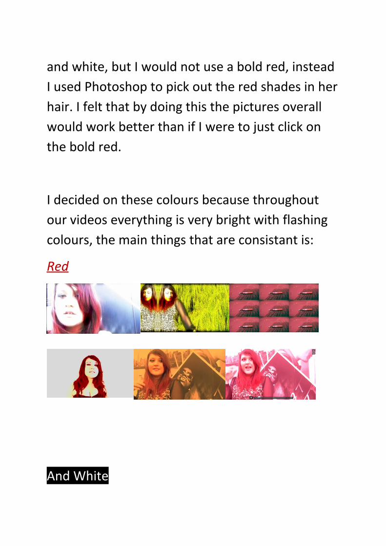
and white, but I would not use a bold red, instead I used Photoshop to pick out the red shades in her hair. I felt that by doing this the pictures overall would work better than if I were to just click on the bold red.
I decided on these colours because throughout our videos everything is very bright with flashing colours, the main things that are consistant is:
Red
And White
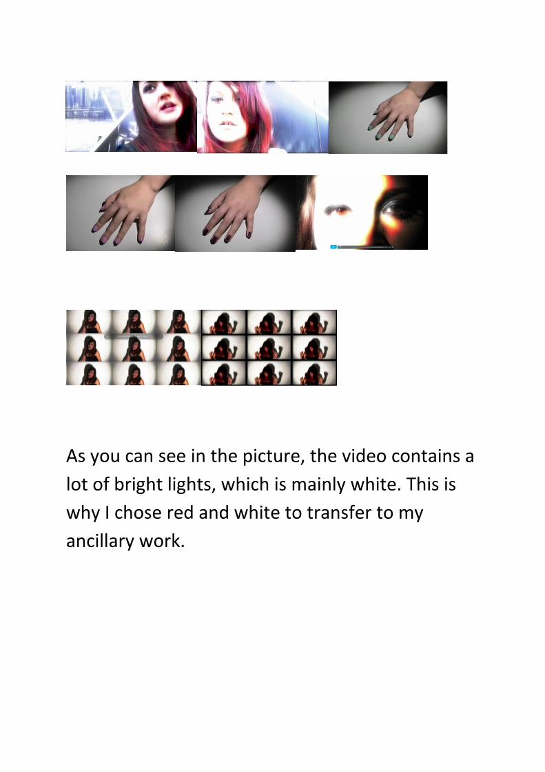
As you can see in the picture, the video contains a lot of bright lights, which is mainly white. This is why I chose red and white to transfer to my ancillary work.
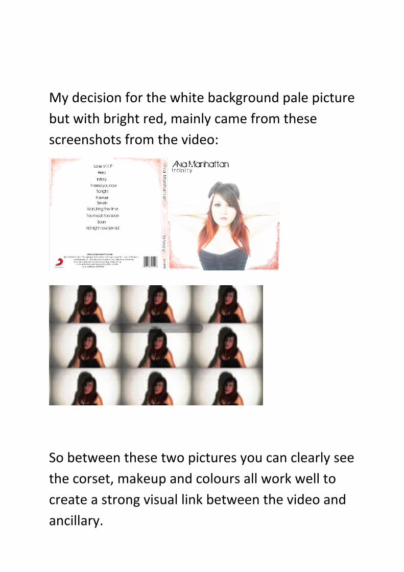
My decision for the white background pale picture but with bright red, mainly came from these screenshots from the video:
So between these two pictures you can clearly see the corset, makeup and colours all work well to create a strong visual link between the video and ancillary.
How my audience will recognise these as linked products.
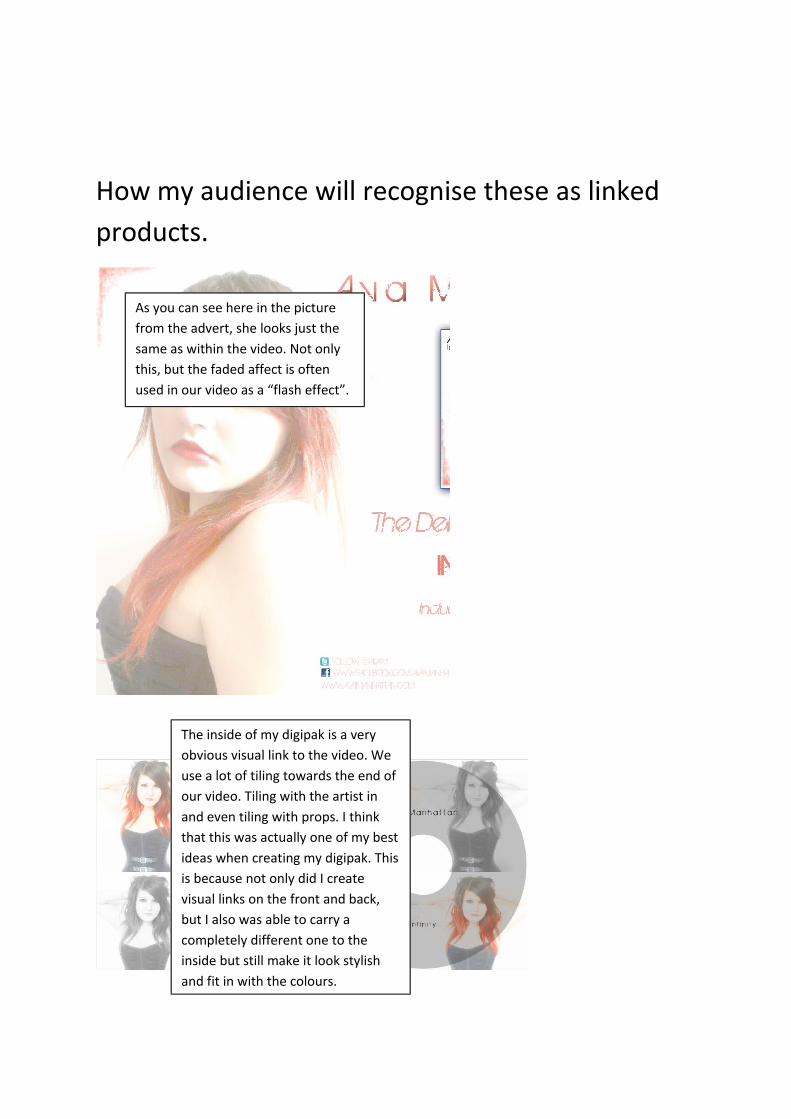
As you can see here in the picture from the advert, she looks just the same as within the video. Not only this, but the faded affect is often used in our video as a “flash effect”.
The inside of my digipak is a very obvious visual link to the video. We use a lot of tiling towards the end of our video. Tiling with the artist in and even tiling with props. I think that this was actually one of my best ideas when creating my digipak. This is because not only did I create visual links on the front and back, but I also was able to carry a completely different one to the inside but still make it look stylish and fit in with the colours.
Target audience
In terms of my target audience, i think they would enjoy the video and digipak. From the beginning we always tried to relate to them and make it fit their persona. We wanted the artist to be a girl so that we could use Mulvey’s theory on the “male gaze”. I did not use this a lot in my ancillary work as I did not want it to come across as inappropriate, but I still think it would attract male attention, which was the overall agenda. We looked at magazines and hobbies that the target audience is attracted to, and in my opinion even the album cover works well as a type of magazine they would buy.
However I do feel that if I were to do this again, this would be the area I would definitely enhance on. Even though I think that in this area I done well, I would like to look further into attracting the target audience further with the promotion side.
How I included real elements of digipaks in my work
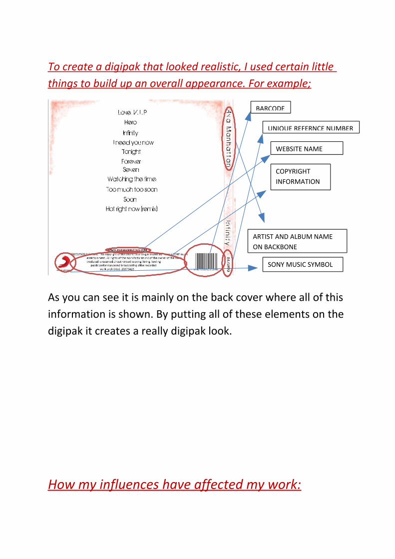
To create a digipak that looked realistic, I used certain little things to build up an overall appearance. For example;
As you can see it is mainly on the back cover where all of this information is shown. By putting all of these elements on the digipak it creates a really digipak look.
How my influences have affected my work:
BARCODE
UNIQUE REFERNCE NUMBER
WEBSITE NAME
COPYRIGHT INFORMATION
ARTIST AND ALBUM NAME ON BACKBONE
SONY MUSIC SYMBOL
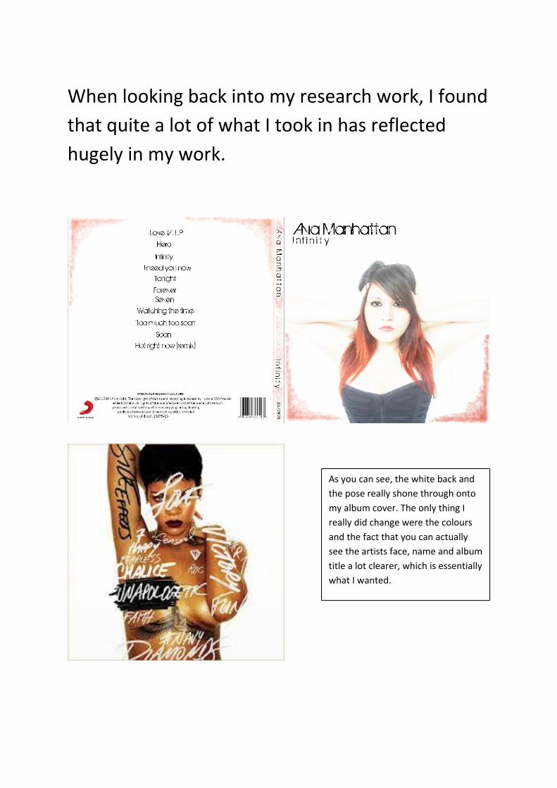
When looking back into my research work, I found that quite a lot of what I took in has reflected hugely in my work.
As you can see, the white back and the pose really shone through onto my album cover. The only thing I really did change were the colours and the fact that you can actually see the artists face, name and album title a lot clearer, which is essentially what I wanted.

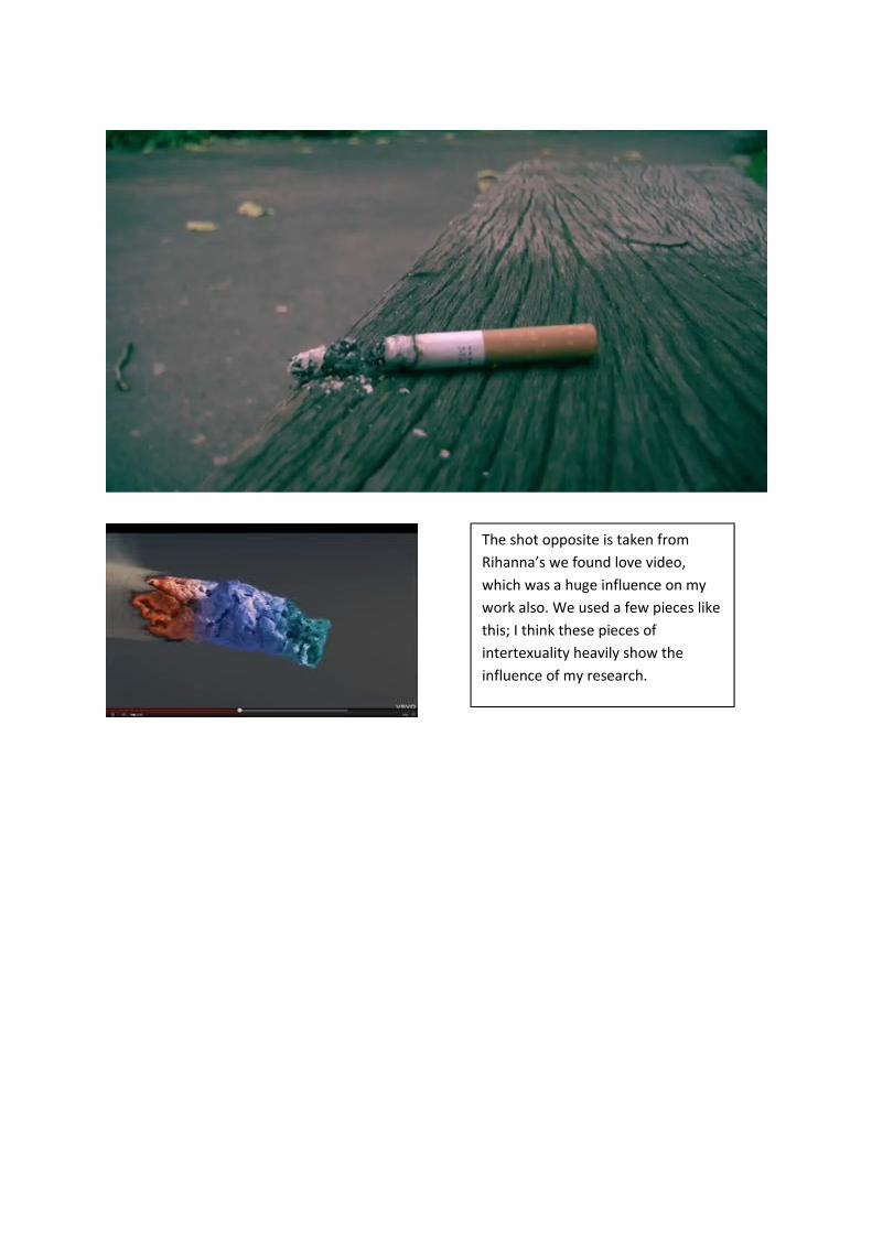
The shot opposite is taken from Rihanna’s we found love video, which was a huge influence on my work also. We used a few pieces like this; I think these pieces of intertexuality heavily show the influence of my research.
The shot opposite is taken from Rihanna’s we found love video, which was a huge influence on my work also. We used a few pieces like this; I think these pieces of intertexuality heavily show the influence of my research.