Embed Size (px)
DESCRIPTION
question 1
Citation preview

A horror trailer often follows a set of conventions and these are the things
that make the trailer fit the genre that it’s supposed to be in. For example, many horror trailers have a similar structure that starts of slowly and the build up pace
and the edits start to get quicker as well, not only this but they will often use a lot of edits so that pace is very quick and can often disorientate the audience. A horror
trailer often has a big finish as well as this will be the last thing the audience will
see and it is the last shot that will convince the audience to go and watch the movie. There is often a clear identification of the event taking place as well as
whom the main character is. For the horror trailer that we created I think we
conformed to some of the codes and conventions of other horror trailers and we didn’t take it upon ourselves to challenge too many of these conventions because
these are the things that have made previous movies successful. An obvious convention that we followed was leaving the title to be shown at
the end of the trailer, because by doing this it is the last piece of text that is seen ad
therefore the last thing the audience will remember but it also means that the audience have to watch the trailer until the end in order to find out what the name
of the movie is. This is a technique that is common in a lot of other trailers and not
just in the horror genre, for example all the trailers that I analysed had the title of the movie towards the end of the trailer and it was probably for the same reasons.
We also made sure that the release date was on the same shot as well and the title was in a large font so that it caught the audience’s attention. We also had other text
in the trailer and this was to make the trailer tenser and give the audience an idea of
what was going to happen in the movie. It acted as a snippet of the movie and almost gave the audience a moral for the movie, and this isn’t something that all
trailers do, but most tend to do it and it isn’t necessarily the horror genre that conforms to this.
Another convention that we followed in our trailer was to have a signifier (Ouija board) that would be obvious to the audience; it was the signifier for the
event that takes place in the movie as well as being the major part in the trailer and so wanted to have it in the spotlight and make it noticeable. One of the shots we
had was the Ouija board and we had it so that it looked as though the Ouija board
was being used and it was a bird eye view shot of the board on its own, which allows the audience to see that this object plays a large part in the story of the
movie. We also had another shot of the Ouija board towards the beginning of the
trailer and it showed the characters in the trailer finding the Ouija board and it was
Screenshot from our own trailer
Screenshot from the Hannibal
Rising trailer
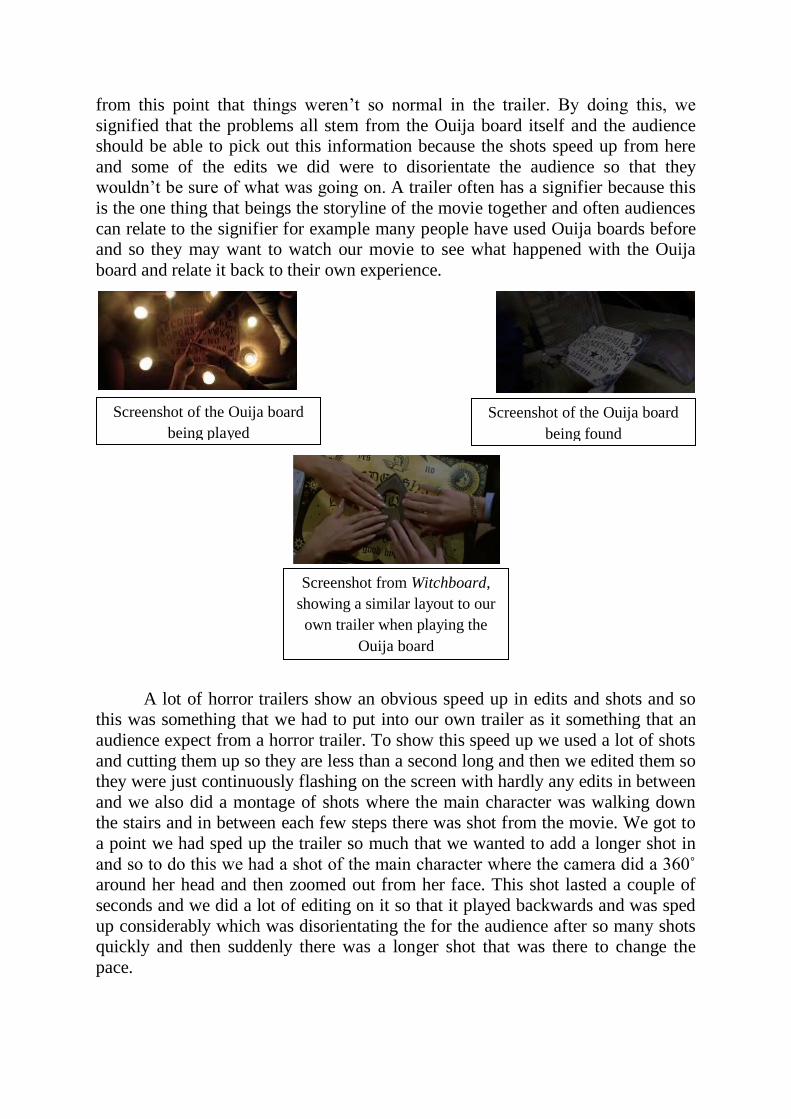
from this point that things weren’t so normal in the trailer. By doing this, we
signified that the problems all stem from the Ouija board itself and the audience should be able to pick out this information because the shots speed up from here
and some of the edits we did were to disorientate the audience so that they wouldn’t be sure of what was going on. A trailer often has a signifier because this
is the one thing that beings the storyline of the movie together and often audiences
can relate to the signifier for example many people have used Ouija boards before and so they may want to watch our movie to see what happened with the Ouija
board and relate it back to their own experience.
A lot of horror trailers show an obvious speed up in edits and shots and so this was something that we had to put into our own trailer as it something that an
audience expect from a horror trailer. To show this speed up we used a lot of shots
and cutting them up so they are less than a second long and then we edited them so they were just continuously flashing on the screen with hardly any edits in between
and we also did a montage of shots where the main character was walking down the stairs and in between each few steps there was shot from the movie. We got to
a point we had sped up the trailer so much that we wanted to add a longer shot in
and so to do this we had a shot of the main character where the camera did a 360˚ around her head and then zoomed out from her face. This shot lasted a couple of
seconds and we did a lot of editing on it so that it played backwards and was sped
up considerably which was disorientating the for the audience after so many shots quickly and then suddenly there was a longer shot that was there to change the
pace.
Screenshot of the Ouija board
being found
Screenshot of the Ouija board
being played
Screenshot from Witchboard,
showing a similar layout to our
own trailer when playing the
Ouija board

We wanted to make it obvious who the main characters in the movie would be and so there was the main girl who we made sure was in most of the shots and
was focal for most of the trailer and there was also another character who was
mean to be the villain and we put him into the trailer very subtly so that when the trailer was watched several times, his character become more obvious. Although
we followed the convention in the sense that we wanted to show who would be
featuring the movie more than anyone else, we challenged this convention by showing the villain subtly instead of putting him out there with the other main
character, we also challenged the convention of the main character in general because the audience aren’t aware of whether she is the villain or the victim in the
trailer and therefore this should make them want to watch the movie and find out.
The reason for the audience not being able to work out whether they should be on the side of the main character or not is because at the start of the trailer she comes
across as the victim being affected by the Ouija board but as the trailer goes on it turns out the main character is doing terrible things to her friends but the audience
won’t know whether this is an affect of the Ouija board or not.
Screenshot of the longer shot
that slows down the pace of the
trailer and disorientates the
audience
Screenshot from The
Messengers trailer that shows
the main character with a
similar facial expression to our
main character
Screenshot from the montage
of shots that speed up the pace
of the trailer
Screenshot from Saw II trailer,
where they also use similar
shots to build up pace
Screenshot of the two main
characters in the movie, one of
them is placed so we can see
them clearly and the other is
subtly shown at top of stairs
We also had other conventions that we followed such as having no
voiceover because we found that this is something that a lot of horror trailer didn’t do. Instead they would rely on the writing and the shots in general to get across the
message, and this is something that we took on board in our planning. Also by not having a voiceover, it made the music and sounds a lot easier to work with, and it
also doesn’t allow the audience to just listen to the trailer, they have to watch it
instead. I think one of the conventions that we challenged in our trailer is the use of locations and this is because the locations we used weren’t dark or scary like an
audience would expect from a horror trailer. The most conventional location we
used was an attic and the lighting we used for this was candles so that the shots would become a lot more ‘horror like’ and look more like they belonged in a
horror trailer. We also used the woods as a location but because we shot in the light, the location didn’t fit the convention however if we had shot in the dark with
less natural light, I think that many of our locations would have been scarier and
would have conformed to a real horror trailer. To begin the planning we thought that the way to go for an ending was to have a conventional big end that would
make the audience jump but as we filmed and put all the shots together we realised
that we didn’t want to have a typical ending to the trailer and so we challenged the normal convention and instead had a longer shot on the end with disorientating
editing instead of making the audience jump because this is what they would be expecting from the ending on the trailer.
Overall I think that our trailer both challenged as well as conformed to the
conventions set out by other movie trailers both horror and other genre, and by challenging these conventions it made our trailer a bit different from what is
usually expected. But by also keeping some of the regular conventions it still made it recognisable to the audience what we were trying to get across through the
aspects that we used.