Embed Size (px)
DESCRIPTION
Quantitative Data Analysis
Citation preview

Bar ChartTable 1: Cocoa Production of selected countries in Africa for 2010
Country Output in tonnesGhana 1,000,000Nigeria 560,000Cote d' Ivoire 1,240,000Togo 150,000Guinea 200,000Benin 70,000
Ghana Nigeria Cote d' Ivoire Togo Guinea Benin0
200,000
400,000
600,000
800,000
1,000,000
1,200,000
1,400,000
Output in tonnes
Country
Output in tonnes

Bar ChartTable 1: Cocoa Production of selected countries in Africa for 2010
Ghana Nigeria Cote d' Ivoire Togo Guinea Benin0
200,000
400,000
600,000
800,000
1,000,000
1,200,000
1,400,000
Output in tonnes
Country
Output in tonnes


Table 2: Cocoa Production in Ghana between 2000 and 2010
Year Output in tonnes2000 750,000.00 2001 770,000.00 2002 670,000.00 2003 700,000.00 2004 800,000.00 2005 820,000.00 2006 950,000.00 2007 960,000.00 2008 970,000.00 2009 985,000.00 2010 1,000,000.00
20002001200220032004200520062007200820092010 -
200,000.00
400,000.00
600,000.00
800,000.00
1,000,000.00
1,200,000.00
Output in tonnes
Year
Output in tonnes

Line graphTable 2: Cocoa Production in Ghana between 2000 and 2010
20002001200220032004200520062007200820092010 -
200,000.00
400,000.00
600,000.00
800,000.00
1,000,000.00
1,200,000.00
Output in tonnes
Year
Output in tonnes

20002001200220032004200520062007200820092010 -
200,000.00
400,000.00
600,000.00
800,000.00
1,000,000.00
1,200,000.00
Output in tonnes
Year
Output in tonnes

Assume you collect the following data on customer spending per visit at Woollon's supermarket for the period of 11-17th February 2008
Customer ID spending1 212 24.33 234 24.85 226 24.97 248 259 25.8
10 29.811 2712 3013 31.114 30.615 3816 3417 3718 4519 4220 44.521 48.222 4623 4724 43.725 22.526 2127 24.828 2629 3430 3031 3132 20.9
You can notice that the data on customer spending is a continuous data as a customers spending take on any value including decimals.
We can use histogram to represent this.
The prices ranges from GHC20 to about GHC50
Lets put the prices in groups of GHC 5 apart; i.e.GHC 20 to just below 25 25 to just below 30 30 to just below 35 35 to just below 40 40 to just belwo 45 45 to just below 50
To make counting the frequency for each group above easier, put the data on spending in order from lowest to highest as shown in Table 2.

Assume you collect the following data on customer spending per visit at Woollon's supermarket for the period of 11-17th February 2008
Table 2Customer ID spending Spending
32 20.9 20 to <251 21 25 to <30
26 21 30 to <355 22 35 to <40
25 22.5 40 to <453 23 45 to <507 242 24.34 24.8
27 24.86 24.98 259 25.8
28 2611 2710 29.812 3030 3014 30.631 3113 31.116 3429 3417 3715 3819 4224 43.720 44.518 4522 4623 4721 48.2
0
2
4
6
8
10
12
Amount Spent per visit in GHC
Frequency (Number of Customers)

Assume you collect the following data on customer spending per visit at Woollon's supermarket for the period of 11-17th February 2008
Frequency (Number of customers)11
57234
0
2
4
6
8
10
12
Amount Spent per visit in GHC
Frequency (Number of Customers)

XYZ Ltd: Breakdown of Sales by region in 2007
Product Sales in GHCPepsodent 1,600,000.00 Keysoap 800,000.00 Lux 500,000.00 Geisha 650,000.00 Frytol 1,400,000.00
Product Sales in GHC Product Sales (%)Pepsodent 1,600,000.00 32% Pepsodent 32%Keysoap 800,000.00 16% Keysoap 16%Lux 500,000.00 10% Lux 10%Geisha 650,000.00 13% Geisha 13%Frytol 1,400,000.00 28% Frytol 28%Total 4,950,000.00
In using a pie chart, we usually use percentages.
So calculate the percentage for each product. The total percentage should add to 100%

Pepsodent; 32%
Keysoap; 16%Lux; 10%
Geisha; 13%
Frytol; 28%
Total Sales = GHC 4,950,000

Pepsodent; 32%
Keysoap; 16%Lux; 10%
Geisha; 13%
Frytol; 28%
Total Sales = GHC 4,950,000

COMPARATIVE PROPORTIONAL PIE CHARTS COMPARING BOTH PROPORTIONS AND TOTALS BETWEEN VARIABLES
2007Product Sales (%)Pepsodent 32%Keysoap 16%Lux 10%Geisha 13%Frytol 28%
PERCENTAGE COMPONENT BAR CHART - USED TO COMPARE PROPORTIONS BETWEEN VARIABLES
To draw the component bar chart we would need to put the three tables above together
Product 2007 2008 2009Pepsodent 32% 40% 51%
Keysoap 16% 12% 12%Lux 10% 13% 7%Geisha 13% 20% 15%Frytol 28% 15% 15%
Pepsodent; 32%
Keysoap; 16%
Lux; 10%
Geisha; 13%
Frytol; 28%
2007: Total Sales = GHC 4,950,000
2007 2008 20090%
10%
20%
30%
40%
50%
60%
70%
80%
90%
100%
32% 40% 51%
16%12%
12%10%13%
7%13%
20%15%28%
15% 15%
Frytol
Geisha
Lux
Keysoap
Pepsodent

EXAMPLE 2
Responses to "Would you purchase this product again?".
Product Definitely Probably Unsure NoProduct A 50% 35% 15% 0% 100%Product B 40% 30% 10% 20% 100%Product C 30% 45% 18% 7% 100%Product D 37% 39% 4% 20% 100%

COMPARATIVE PROPORTIONAL PIE CHARTS COMPARING BOTH PROPORTIONS AND TOTALS BETWEEN VARIABLES
2008 2009Product Sales (%) ProductPepsodent 40% PepsodentKeysoap 12% KeysoapLux 13% LuxGeisha 20% GeishaFrytol 15% Frytol
PERCENTAGE COMPONENT BAR CHART - USED TO COMPARE PROPORTIONS BETWEEN VARIABLES
To draw the component bar chart we would need to put the three tables above together
Pepsodent; 40%
Keysoap; 12%Lux; 13%
Geisha; 20%
Frytol; 15%
2008: Total Sales = GHC 3,874,000
Pepsodent; 51%
Keysoap; 12%Lux; 7%
Geisha; 15%
Frytol; 15%
2009: Total Sales = GHC 5,101,800
2007 2008 20090%
10%
20%
30%
40%
50%
60%
70%
80%
90%
100%
32% 40% 51%
16%12%
12%10%13%
7%13%
20%15%28%
15% 15%
Frytol
Geisha
Lux
Keysoap
Pepsodent

X
Which of the two graphs is more appropriate?What can we do to enhance the graph you choose?
Definitely Probably Unsure No0%
10%
20%
30%
40%
50%
60%
70%
80%
90%
100%
Product D
Product C
Product B
Product A

COMPARATIVE PROPORTIONAL PIE CHARTS COMPARING BOTH PROPORTIONS AND TOTALS BETWEEN VARIABLES
2009Sales (%)
51%12%
7%15%15%
PERCENTAGE COMPONENT BAR CHART - USED TO COMPARE PROPORTIONS BETWEEN VARIABLES
Enhance this graph
Pepsodent; 51%
Keysoap; 12%Lux; 7%
Geisha; 15%
Frytol; 15%
2009: Total Sales = GHC 5,101,800
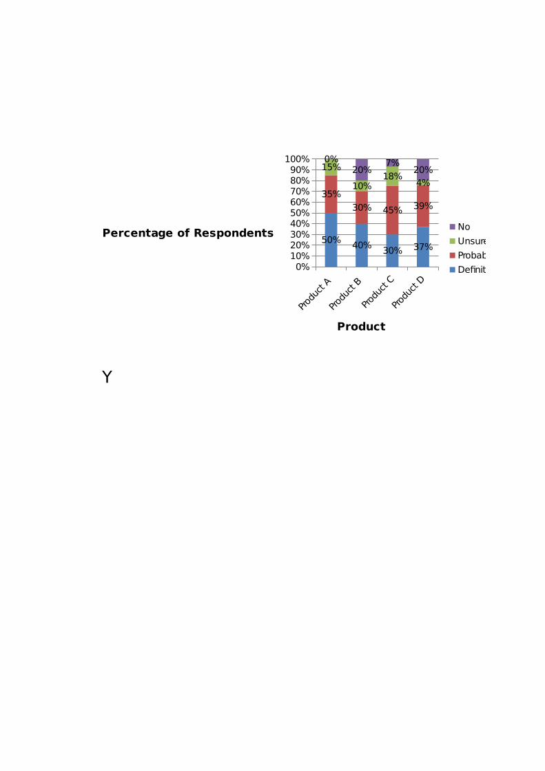
Y
Definitely Probably Unsure No0%
10%
20%
30%
40%
50%
60%
70%
80%
90%
100%
Product D
Product C
Product B
Product A 0%10%20%30%40%50%60%70%80%90%
100%
50% 40%30% 37%
35%
30% 45% 39%
15%
10%18%
4%
0%20%
7%20%
No
Unsure
Probably
Definitely
Product
Percentage of Respondents


0%10%20%30%40%50%60%70%80%90%
100%
50% 40%30% 37%
35%
30% 45% 39%
15%
10%18%
4%
0%20%
7%20%
No
Unsure
Probably
Definitely
Product
Percentage of Respondents

STACKED BAR CHART OR COMPONENT BAR CHAR
Sales by quarter in $ million 1st Qtr 2nd Qtr 3rd Qtr 4th Qtr Total
Company A 115 140 150 130 535Company B 115 150 155 145 565Company C 120 170 165 150 605
If we were interested in comparing proportions by quarter across the companies, then we could transform the data into percentages and use a percentage component bar chart

STACKED BAR CHART OR COMPONENT BAR CHARUSED TO COMPARE TOTALS BETWEEN VARIABLES
If we were interested in comparing proportions by quarter across the companies, then we could transform the data into percentages and use a percentage component bar chart
Company A Company B Company C0
100
200
300
400
500
600
700
115 115 120
140 150 170
150 155165
130145
150
4th Qtr
3rd Qtr
2nd Qtr
1st Qtr
Company
Sales in $ million

MULTIPLE BAR CHART - Comparisons of variables that emphasise the highest and lowest rather than precise values
Exports and Imports for country XYZ for 2000 - 2004
Years Export Import2000 4,100 12,100 2001 5,200 9,050 2002 8,000 9,800 2003 7,500 11,190 2004 2,300 10,000
2000 2001 2002 2003 2004 -
2,000
4,000
6,000
8,000
10,000
12,000
14,000
Export and Import for 2000 - 2004
Export
Import
Year
Amount in $million

- Comparisons of variables that emphasise the highest and lowest rather than precise values
2000 2001 2002 2003 2004 -
2,000
4,000
6,000
8,000
10,000
12,000
14,000
Export and Import for 2000 - 2004
Export
Import
Year
Amount in $million

- Comparisons of variables that emphasise the highest and lowest rather than precise values

CONTIGENCY TABLEto show specific values
Table 12.3: Number of insurance claims by gender, 2008Number of claims* Male Female Total
0 10032 13478 235101 2156 1430 35862 120 25 1453 13 4 17
Total 12321 14937 27258*No clients had more than three claimsSource: PJ Insurance Services

MULTIPLE LINE GRAPH to compare trends for two or more variables
Month Chocolate Vanilla StrawberryJan-07 11 5 4.5Feb-07 10 6 4Mar-07 10 6 4Apr-07 12 7.5 5
May-07 14 8 6Jun-07 15 9 7Jul-07 17 10.1 8.5
Aug-07 18.5 11.5 9Sep-07 12 10.1 8.8Oct-07 11 7 5.5Nov-07 10 6 5Dec-07 11.5 6.5 6Jan-08 12 7 7Feb-08 12 7 7Mar-08 13 8 7.5Apr-08 15 9 8
May-08 17 10 9Jun-08 22 13.5 13Jul-08 24 14.5 14
Aug-08 21 13 12.5Sep-08 18 12 11.8Oct-08 12.5 8.5 7.5Nov-08 12 7.5 7Dec-08 12.5 8 9
0
5
10
15
20
25
30
Chocolate
Vanilla
Strawberry
Month
Sales in 000 litres

to compare trends for two or more variables
0
5
10
15
20
25
30
Chocolate
Vanilla
Strawberry
Month
Sales in 000 litres

0
5
10
15
20
25
30
Chocolate
Vanilla
Strawberry
Month
Sales in 000 litres

SCATTER GRAPH to show relationship between two variables
Exploring the relationship between price and units purchased of Product A, 2007
Price in GHC Units purchased 10 16715 14920 13525 10830 8235 5540 23
5 10 15 20 25 30 35 40 450
20
40
60
80
100
120
140
160
180
Units purchased
Price in GHC
Units purchased

to show relationship between two variables
This graph shows a negative relationship between price and the units purchased
5 10 15 20 25 30 35 40 450
20
40
60
80
100
120
140
160
180
Units purchased
Price in GHC
Units purchased

This graph shows a negative relationship between price and the units purchased