Embed Size (px)
Citation preview
Quality Control

Juran and Godfrey define Quality Control as “a managerial process for conducting operations so as to provide stability – to prevent adverse change and to “maintain the status quo”
To maintain stability, quality control process includes the following:Evaluates actual performanceCompares actual performance to goalsTakes action on the differences
Another definition: Operational techniques and activities used to fulfill quality requirements.
What is Quality Control?

Quality Control (QC) and Quality Assurance (QA) compare performance to goals. However !!!!!!
In QC performance is evaluated during operations and performance is compared to goals during operations and the action is taken by the operating force.
In QA performance is evaluated and compared after operations and resulting information is provided to operating forces and others who have needs to know.
The difference between QC and QA
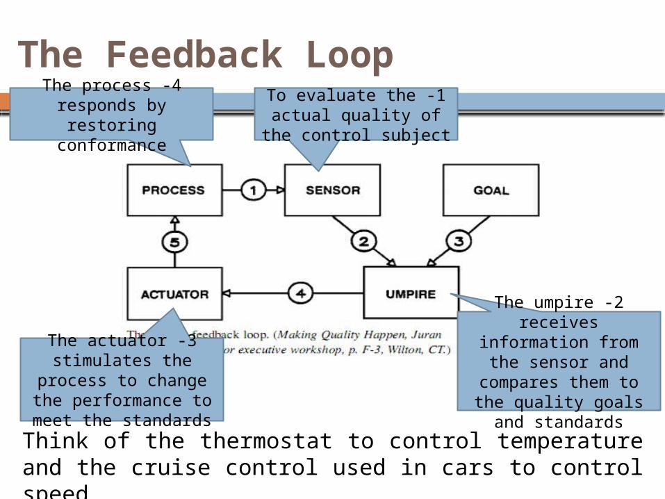
Think of the thermostat to control temperature and the cruise control used in cars to control speed
The Feedback Loop1 -To evaluate the
actual quality of the control subject
2 -The umpire receives information from the sensor and compares them to the quality goals and standards
3 -The actuator stimulates the process
to change the performance to meet
the standards
4 -The process responds by restoring
conformance

A flowchart for the quality control process

1. Check Sheets
2. Scatter Diagrams
3. Cause-and-Effect Diagrams
4. Pareto Charts
5. Flowcharts
6. Histograms
7. Control Charts
The 7 Quality Control tools
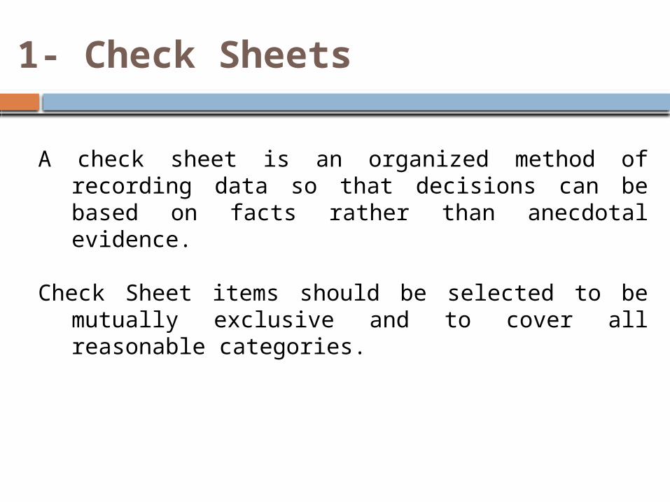
A check sheet is an organized method of recording data so that decisions can be based on facts rather than anecdotal evidence.
Check Sheet items should be selected to be mutually exclusive and to cover all reasonable categories.
1- Check Sheets

The following figure shows a check sheet used to determine the causes of defects in a hypothetical assembly process.
1- Check Sheets
If we had too many defects under the category “others”, a new set of categories is needed

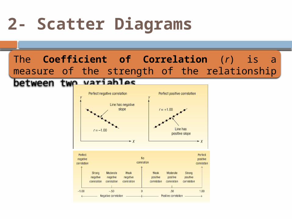
Scatter Diagrams show the relationship between two measurements. One measurement is plotted on the horizontal axis (x-axis) and the other is plotted on the vertical axis (y-axis). The distribution of their intersection points reveals the relationship pattern.
2- Scatter Diagrams
2- Scatter Diagrams
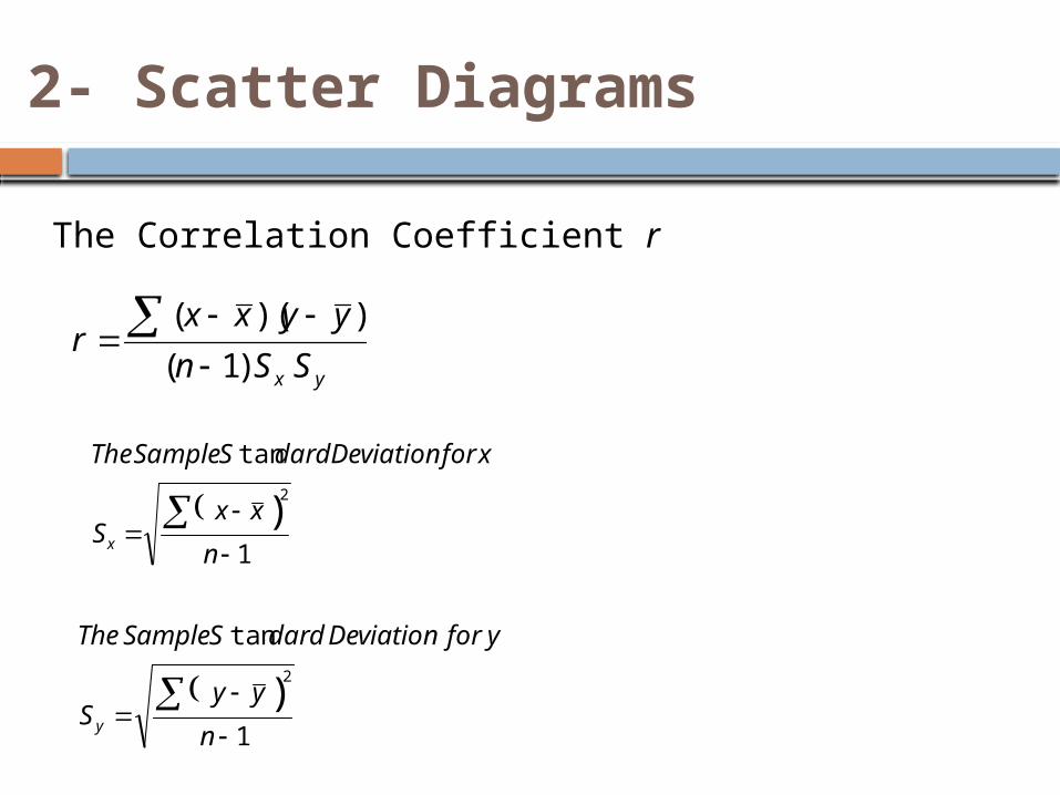
The Coefficient of Correlation (r) is a measure of the strength of the relationship between two variables.
2- Scatter Diagrams
The Correlation Coefficient r
1
tan
)2
n
xxS
xforDeviationdardSSampleThe
x
1
tan
)2
n
yyS
yforDeviationdardSSampleThe
y
yx SSn
yyxxr
)1(
))((

2- Scatter Diagrams
The sales manager of Copier Sales company wants to determine whether there is a relationship between the number of sales calls made in a month and the number of copiers sold that month.
The manager selects a random sample of 10 representatives and determines the number of sales calls each representative made last month and the number of copiers sold.

2- Scatter Diagrams
Does this mean that more sales calls cause more sales? No, we have not demonstrated cause and effect here, only that the two variables are related.
3- Cause-and-Effect Diagrams
Known as the Fishbone charts and the Ishikawa diagramsIshikawa diagrams are used to identify and understand the factors that are causing an undesired effect. The factors are identified by people who are familiar with the process involved.
Contributing factors (Categories) could be the “four M’s”: Method, Manpower, Material, and Machinery or the “four P’s”: Policies, Procedures, People, and Plant.
Individual causes associated with each categories are tied in a separate bones along that branch, often through a brainstorming process.
3- Cause-and-Effect Diagrams
Contributing factors are not root causes. The team needs to examine the contributing factors to find the root causes. This can be done by digging deeper – asking repeated “why” questions of the contributing factors.
Example: for a basketball quality control problem- missed free throws. Each bone represents a possible source of error (category or factor)
The figure in the following slide showed that the Method category has problems caused by hand positions, follow-through, aiming point, bent knees, and balance. Further causes for the sub-branches can be developed and analyzed.

Material(ball)
Method(shooting process)
Machine(hoop &
backboard)
Manpower(shooter)
Missed free-
throws
Rim
alignment
Rim size
Backboard stability
Rim height
Follow-
through
Hand position
Aiming point
Bend knees
Balance
Size of ball
Lopsidedness
Grain/Feel (grip)
Air pressure
Training
Conditioning Motivatio
n
Concentrati
on
Consistency
3- Cause-and-Effect Diagrams

4- Pareto Charts
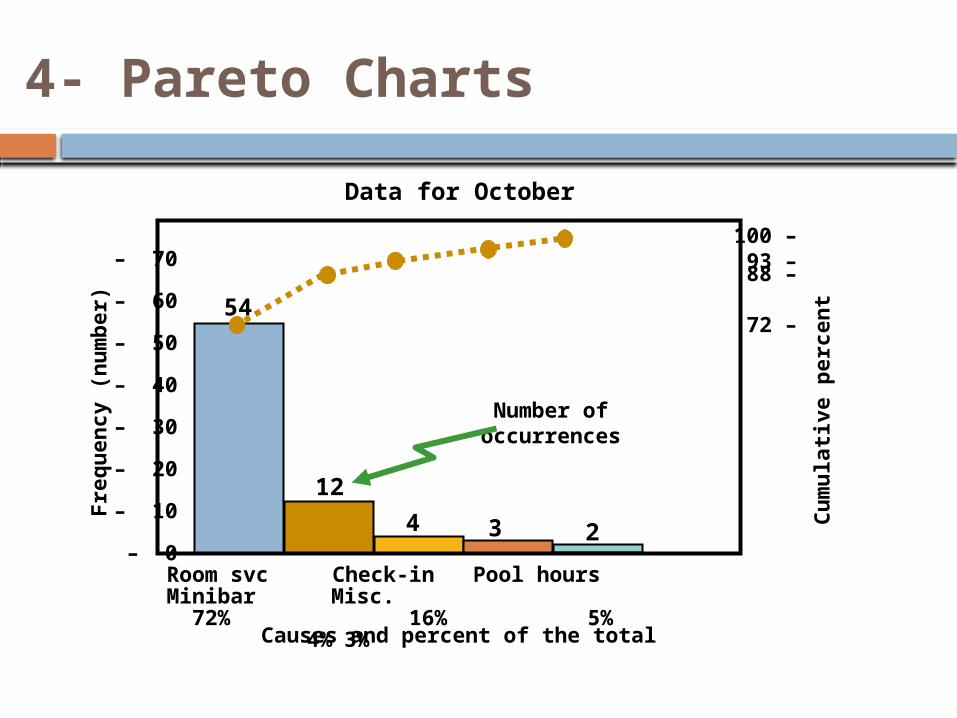
Pareto charts are a method of organizing errors, problems, or defects to help focus on problem solving efforts. They are used to identify a set of priorities.
They are based on the work of Vilfredo Pareto, a 19th-centory economist who noted that a few people controlled most of the nation’s wealth.
Joseph Juran popularized Pareto’s work when he suggested that 80% of a firm’s problems are a result of only 20% of the causes.
Separating the “vital few” from the “trivial many” can be done using the Pareto Charts.

4- Pareto Charts
Using the data from the hypothetical assembly process
Number of occurrence
s
Room svc Check-in Pool hours Minibar Misc.
72% 16% 5% 4%3%
124 3 2
54
–100 –93 –88
–72
70–
60–
50–
40–
30–
20–
10–
0–
Fre
qu
en
cy (
nu
mb
er)
Causes and percent of the total
Cu
mu
lati
ve p
erc
en
t
Data for October
4- Pareto Charts
5- Flowcharts
Flowcharts graphically present a process or system using annotated boxes and interconnected lines.
They are a simple but great tool for trying to make sense of a process or explain a process.
Flowcharts should reflect the actual process used rather than what the process owner thinks it is or wants it to be.
We can get a brief idea about the critical path of the process and the events involved in the critical path.
Measurements could be taken at each step to find the significant causes of delays.

A hospital is undertaken a series of process improvement initiatives. One of these is to make the MRI service efficient for patients, doctors, and hospital. The first step is to develop a flowchart for this process1. Physician schedules MRI2. Patient taken to MRI3. Patient signs in4. Patient is prepped5. Technician carries out MRI6. Technician inspects film
7. If unsatisfactory, repeat8. Patient taken back to
room9. MRI read by radiologist10. MRI report transferred to
physician11. Patient and physician
discuss
11
10
20%
9
880%
1 2 3 4 5 6 7
5- Flowcharts

6- Histograms
Histograms show the range of values of a measurement and the frequency with which each value occurs.
They show the most frequently occurring reading as well as the variations on the measurements.
Descriptive statistics, such as the average and the standard deviation, may be calculated to describe the distribution.
The visual presentation of the distribution may also provide insight into the cause of variation.

6- Histograms
Example
Another example could be the time spent to take a blood sample. If the intended average is in the middle and the variation is not that high then thing could be accepted.
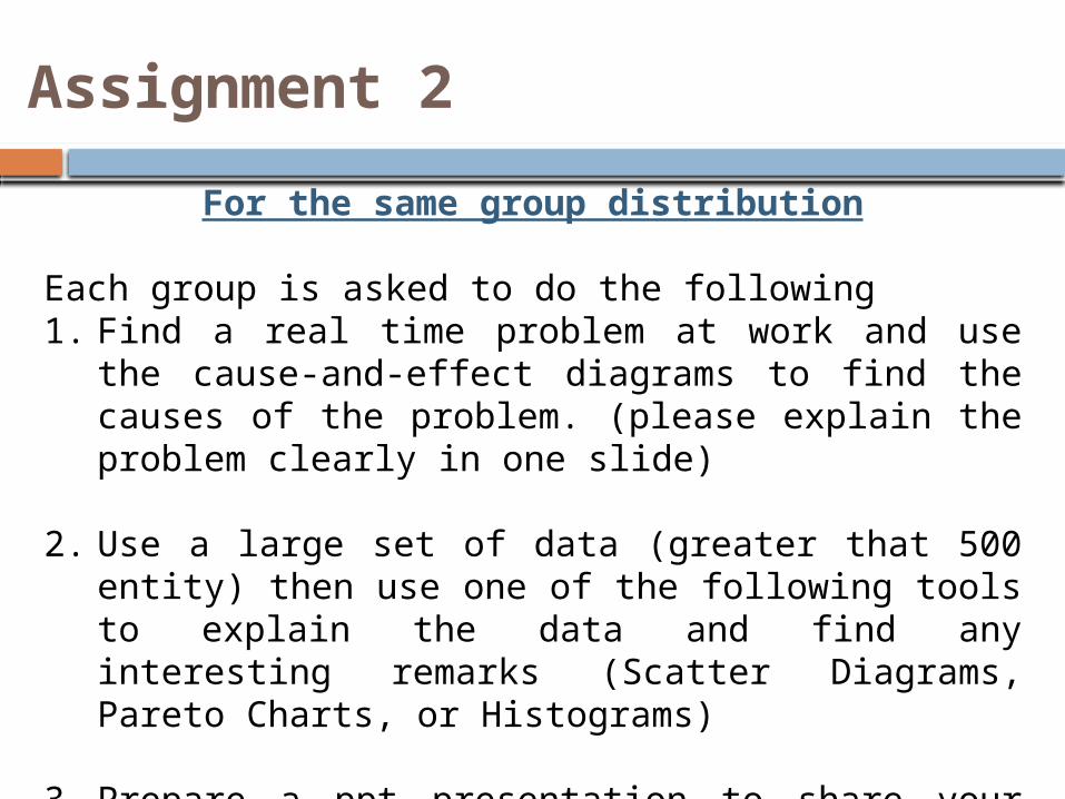
Assignment 2
For the same group distribution
Each group is asked to do the following1. Find a real time problem at work and use the
cause-and-effect diagrams to find the causes of the problem. (please explain the problem clearly in one slide)
2. Use a large set of data (greater that 500 entity) then use one of the following tools to explain the data and find any interesting remarks (Scatter Diagrams, Pareto Charts, or Histograms)
3. Prepare a ppt presentation to share your findings with your classmates next week. (I expect to receive your ppt slides and the data file at 11:30 am of the day of the lecture)