Embed Size (px)
DESCRIPTION
The eleventh "fable" from Mario Garcia's "Pure design"
Citation preview

43
type
H OW TO U S E F O N T S
mario garcia
44
Selecting typePerhaps no task is more painful for the designer than the selection
of typographic fonts. Many agonize over their choices. Today,
with so many well-drawn alphabets, the task becomes even more
difficult. Some tips for picking type:
Fonts should be easy to read. Especially for text type, it is best to use
type of 9 points or above; many newspapers even go for 10 points for
texts, knowing that their older readers appreciate it.
Fonts should allow for contrast. Headlines should be bold,
and in large sizes, and typefaces should provide contrast through
combinations of demi and lighter tones.
The font should include a well-designed condensed version.
Headline writers will always appreciate this.
Fonts should include an elegant italic. It is always needed.
Fonts should be appropriate to the publication. I have said many
times that there are Bodoni towns and Helvetica towns. Relate
your selection to the culture of the publication’s home.
Finally, do not select trendy fonts that will not age well.
Fortunately for designers, classic fonts will always be around.
My desert island favorites are: Caslon, Baskerville, Scotch Roman,
Franklin Gothic, Frutiger, Bauer Bodoni, Griffith, Miller, Poynter
and Old Modern.
pure design
45
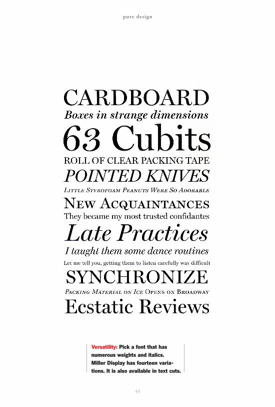
Versatility: Pick a font that hasnumerous weights and italics. Miller Display has fourteen varia-tions. It is also available in text cuts.